Governed Dashboards
  • About Dashboard Designer
    • What is Dashboard Designer?
    • Why is it used?
  • Getting Started
    • Accessing the Designer Module
    • Overview of Designer Module
      • Homepage
        • Guided Tour
        • Left Menu Panel
          • New
          • Manage
          • Open Dashboard
          • Preferences
          • Save As
          • Help
          • Exit
      • Dashboard Canvas Page
        • Right side Panel
          • Connection Page
          • Chart Container
          • Manage Window
          • Script Window
          • Guided Tour
        • Canvas Properties
          • Global Properties
          • Dashboard Themes
        • Context Menu Properties
  • Create New Workspace
    • Workspace Creation: Complete Flow
    • Creating a Workspace
    • Renaming a Workspace
    • Deleting a Workspace
  • Create New Dashboard
    • Dashboard Creation: Basic Workflow
    • Adding a New Dashboard
    • Create Connection
    • Drag and Drop Charts
    • Associate the Dataset
    • Preview the Dashboard
    • Save the Dashboard
    • User Alert Notification
  • Managing Options for a Dashboard
    • Open Dashboard in Designer
    • Publish a Dashboard
    • Share a Dashboard
    • Dashboard Version Control
    • Action Menu
      • Preview Dashboard
      • Export to Local Disk
      • Rename
      • Delete
      • Moving a Dashboard
      • Information Icon
      • Dashboard as Template
  • Connecting to a Data Source
    • Accessing the Data Connectors
    • Establishing a Data Connection
      • CSV Connection
      • Excel Connection
      • Data Service Connection
      • Data Store Connection
      • Data Sheet Connection
        • Data Sheet Enhancements
      • WebSocket Connection
      • Merged Connection
  • Charts Gallery
    • Charts
      • Area chart
      • Bar Chart
      • Bubble Chart
      • Circumplex Chart
      • Column Chart
      • Funnel Chart
      • Histogram Chart
      • Inverted Funnel
      • KPI Tile
      • Line Chart
      • Map Chart
      • Mito Plot
      • Mixed Chart
      • Pie Chart
      • Project Timeline
      • Pyramid Chart
      • Scatter Plot
      • Spark Line
      • Spider Chart
      • Waterfall Chart
    • Grids
      • Data Grid
      • Paging Grid
      • Data Sheet
      • Scorecard
      • Pivot Grid
    • Filters
      • Checkbox
      • Combobox
      • Hierarchical Combobox
      • List
      • Radio Button
    • Advanced Charts
      • Box Plot
      • Candle Stick
      • Chevron
      • Data Search
      • Decision Tree
      • Group Bar
      • Group Column
      • Heat Map
      • Sankey
      • Text Analyzer
      • Time Series
      • Decomposition
      • Knowledge Graph
      • Tree Map
      • Trellis
      • Word Cloud
      • New Word Cloud
    • Other Charts
      • Box
      • Bullet
      • Date Picker
      • Export
      • Filter Chips
      • Filter Saver
      • Gauge
      • Graphics
      • Guided Tour
      • H-Slider
      • Image
      • Info Button
      • Input Box
      • Label
      • Legend
      • Progress Pie
      • Semi Gauge
      • Stepper
      • SVG Image
      • Text Box
      • Trend
      • URL Button
      • V-Slider
      • Tab Component
      • Inputbox component
      • Button component
    • Custom Charts
    • Common Chart Properties
      • Background
      • Title & Sub-title
      • X & Y Axis Properties
      • Legend Properties
      • Formatter
      • Axis Setup
      • Export Options
      • Copy Paste Chart Properties
  • Dashboard Objects
    • Manage Dashboard Components
    • Dashboard Objects Properties
  • Configurations
    • Filtering the Data
    • Drill Through
      • Drill Highlighter
    • Dataset Properties
    • Indicators in Charts
    • Tooltip(Default & Custom)
    • Data Label
    • Geo Mapping
    • Language Mapping
    • Legend Mapping
    • Alerts in Grids
  • Script Help Section
    • Navigate to Script Help page
    • How to use Scripts?
Powered by GitBook
On this page
  • Best Situation to use Checkbox
  • Default Checkbox Image
  • Properties of the Checkbox filter
  • General
  • Multi-checkbox Settings
  • Toggle Style
  • Background
  • Modified Checkbox filter after changing its properties
  • Checkbox Use Case
  1. Charts Gallery
  2. Filters

Checkbox

PreviousFiltersNextCombobox

Last updated 1 year ago

Check out the given walk-through to understand the Checkbox filter component.

The checkbox is used to filter data on any associated components. Enabling a checkbox will change the data displayed in the associated components.

Best Situation to use Checkbox

  • To filter data displayed in the associated components

  • To select multiple items at a time

Default Checkbox Image

Properties of the Checkbox filter

General

  • The user can change the height, width, top, and left position for the checkbox filter component.

  • The user can set a name to the label and change its font color-style-weight-family from the General Properties.

  • If the Show Checked option is enabled a checkmark will appear by default.

  • Chrome color is used to set the component background, the user can change its transparency.

  • A value can be set to the Checked Value so that when the user clicks on the check box, this value will get passed.

Please Note: If initial visibility is not enabled, the chart won’t be available for the first preview.​

Multi-checkbox Settings

The user can provide multiple checkboxes while enabling this property option.

  • Multiple Checkboxes: Enable the Multiple Checkboxes option from the MultiCheckbox Settings property to add multiple checkboxes with labels.

  • Toggle Checkboxes: Enable the option to access the new Toggle Switch UI as checkboxes.

  • Manage Checkbox: Click the Manage Checkbox icon to access the dialog window for managing multiple checkboxes.

    • The user can add or delete checkboxes.

    • Provide Label Text, select the default display to be checked or unchecked, and provide value for the checked toggle checkboxes.

  • Direction: Select an option from the drop-down menu to choose the direction of the checkboxes. It can be Horizontal or Vertical.

Toggle Style

The user can style the toggle switch UI using the Toggle Style property option.

  • The user can modify the Width, Height, and Toggle Switch Shape (Round or Square) from the Toggle Stypes property option.

  • The user can also define colors for the Toggle Slider, Checked Color, and UnChecked Color.

Background

  • The user can get the reflection of the chart by enabling the shadow option.

  • The user can also change the color and increase/decrease the transparency of the shadow.

Modified Checkbox filter after changing its properties

Checkbox Use Case

The following use case explains the steps to connect and use a Checkbox with a Data Grid component.

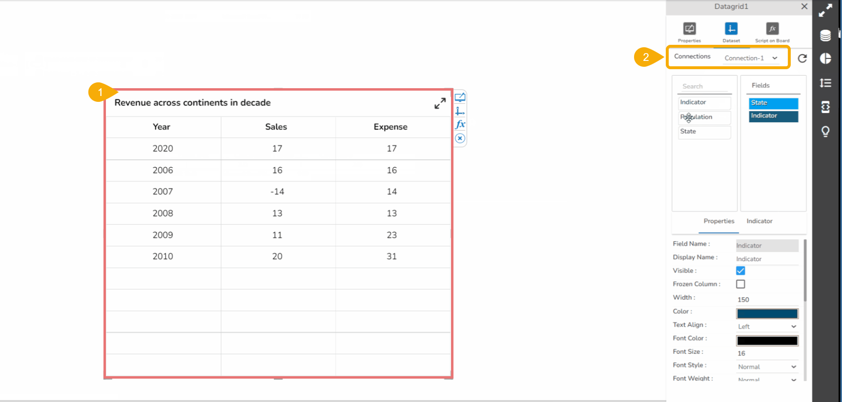
  • Drag a Data Grid component to the Designer canvas.

  • Associate a Data Connection with it.

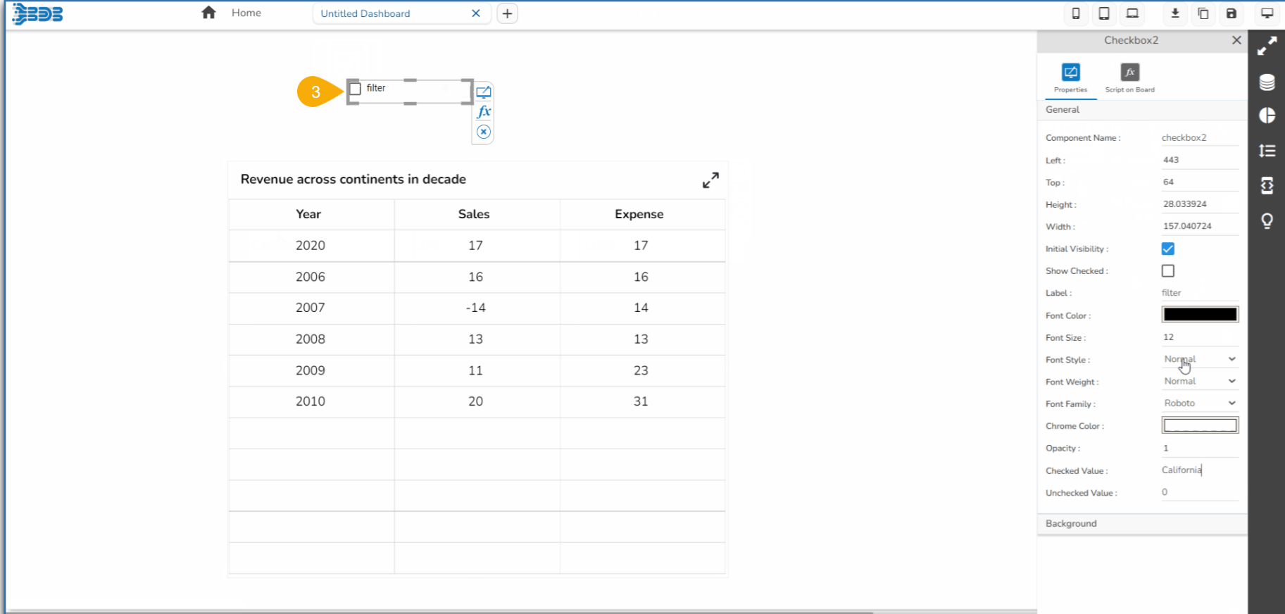
  • Drag a Checkbox component from the Filter group to the canvas.

  • Open the Checkbox Properties, provide the necessary properties, and apply them.

    • Provide the text for the Label.

    • Provide the Checked Value.

    • Keep the Unchecked Value blank.

    ​

  • Use the component object page to write the required script at the component level.

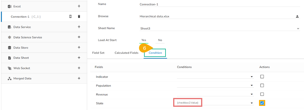
  • Configure the Condition tab by providing a field value for the conditions (the field State is chosen in the given image).

  • Click the Preview icon to preview the Dashboard.

  • Use a checkmark in the given box to display the Checked Value in the chart.

  • Uncheck the Check Box to display the Unchecked Value in the chart (In this case, no value has been assigned as Unchecked Value so it will display all the records).

​

​

​​

​