
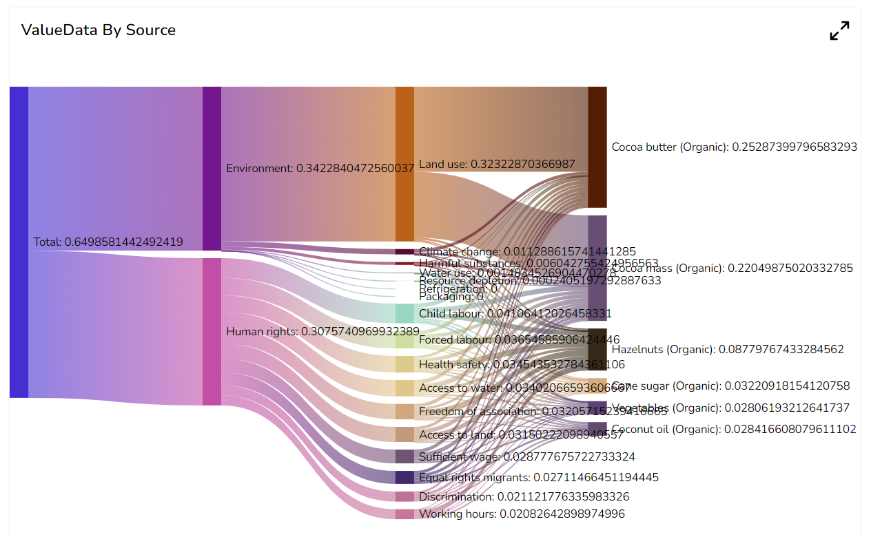
Sankey
A Sankey chart is a type of flow diagram that represents the flow of data or resources between different nodes or stages of a process. It is a visual tool used to illustrate complex systems or processes and show how different components are interconnected. The chart uses the thickness of arrows or lines to represent the quantity or flow of a variable. The width of each arrow corresponds to the relative size of the flow, making it easier to understand the proportions and relationships between different elements.
Best situation to use a Sankey chart
When you need to visualize the flow of data or resources between different components of a system or process.
To illustrate the flow of energy, materials, money, or customer journey mapping through a system by identifying the areas of inefficiency or waste. E.g., If an energy analyst wants to identify the areas of energy waste in a manufacturing plant, A Sankey chart can help here to visualize the flow of energy through the different components of the plant, this can help you to build a strategy for improving efficiency by identifying areas where energy is being wasted.
Variations of this chart
There are following variations of the Sankey chart available to use this chart effectively.
Multi-level Sankey chart: A Multi-Level Sankey chart extends the traditional Sankey chart by allowing multiple layers or levels of nodes. This grants for a more detailed representation of complex systems with subcategories or sub-processes.
Circular Sankey chart: The Circular Sankey chart places the nodes and flows in a circular layout, making it easier to visualize cyclic or feedback processes. It is particularly useful when there are interconnected loops in the flow data.
Marimekko (Mekko) chart: The Marimekko chart, also known as the Mekko chart or Variable Width Bar chart, is a combination of a bar chart and a Sankey chart. Instead of flowing lines, it uses varying width bars to represent the flow between different entities or categories.
Interactive Sankey chart: Interactive Sankey charts allow users to explore the data by interactively filtering or highlighting specific flows or nodes. This enhances the user experience and provides a more engaging visualization.
Stacked Sankey chart: The Stacked Sankey chart displays multiple flows within a single node, showing the distribution of different sub-flows coming from or going to the same entity.
Default Chart Image
The Properties of Sankey Chart
Sankey Chart
Implemented query support for source and target fields.
Added indicator support for value field.
Default color for node.
Tooltip precision control as property.
Component Formatter.
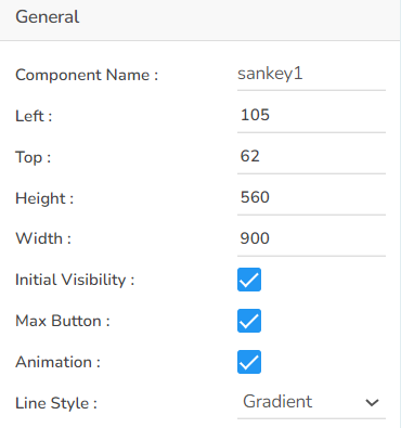
General
The user can change the height, width, top, left, chart type, column type & Line form. In this case, we have changed the scroll view to disable.
Background
The user can show the description of the series can use the tooltip by enabling it.
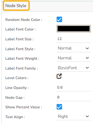
Node Style
The user can enable and select various Node specific properties for the Sankey chart by using the Node Style properties fields.
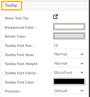
Tooltip
The user can choose to display Tooltip for the Sankey chart using these properties fields. This option also helps the users to set background color, border color, and various properties for the Tooltip fonts. Precision display can be defined using the Precision field.
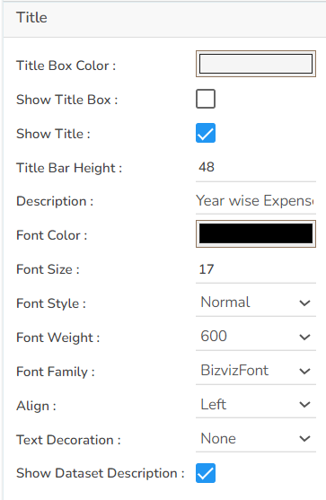
Title
The user can insert or modify the inserted (default) Title text (description), Font color, size, style, etc. The user can also enable or disable the Title box or title text using this properties option. By enabling the Show Dataset Description option the Title will get added from the mapped dataset.
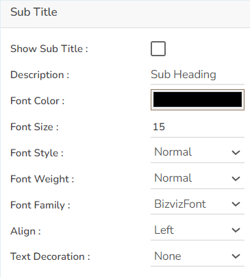
Sub Title
The user can enable the subtitle to display the second title. The user can change the Name, Font color, size, style for the subtitle.
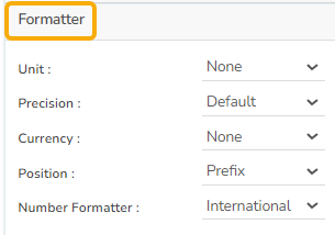
Formatter
The Number formatter helps to choose whether the user wants it in Indian or International format.
The user can change Y-Axis values in units such as %, T, Lacs, M, etc.
The user can set the ‘Precision’ option to get the value in decimal format.
The Currency option helps to select the currency value in INR, Pound, and USD.
The Position of the currency displays the selected currency symbol in prefix or suffix.
For example, if the Currency symbol is rupees and the prefix option is selected, then it will be displayed on the left side. Likewise, the suffix displays the selected currency symbol on the right side.
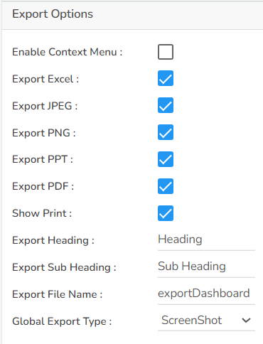
Export Options
The user can enable the Enable Context Menu to download the reports in different formats if we click on the chart from the preview section. The heading and sub heading of that downloaded chart and the name of the downloaded file can be change from this section.
Sankey chart after Applying Properties
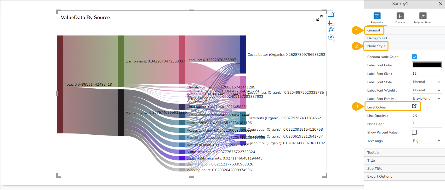
Setting Level Colors
Navigate to the appearance properties of the Sankey chart.
Open the Node Style properties.
Click the Level Colors icon.
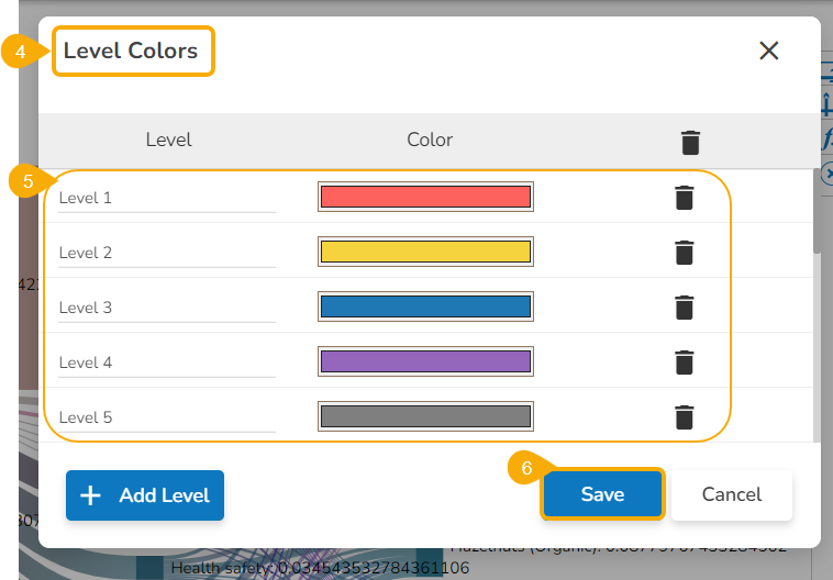
The Level Colors window opens.
Set various colors for the different levels.
Click the Save option.
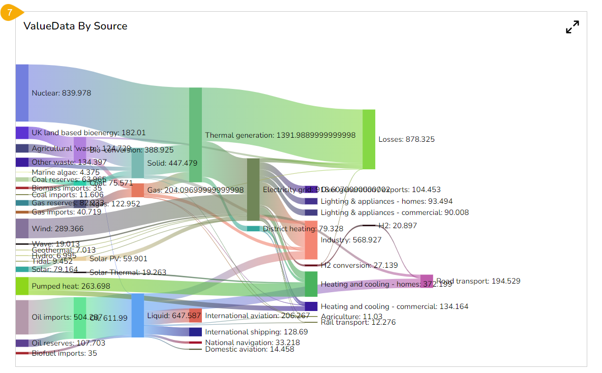
The level colors get changed accordingly in the preview mode of the chart.
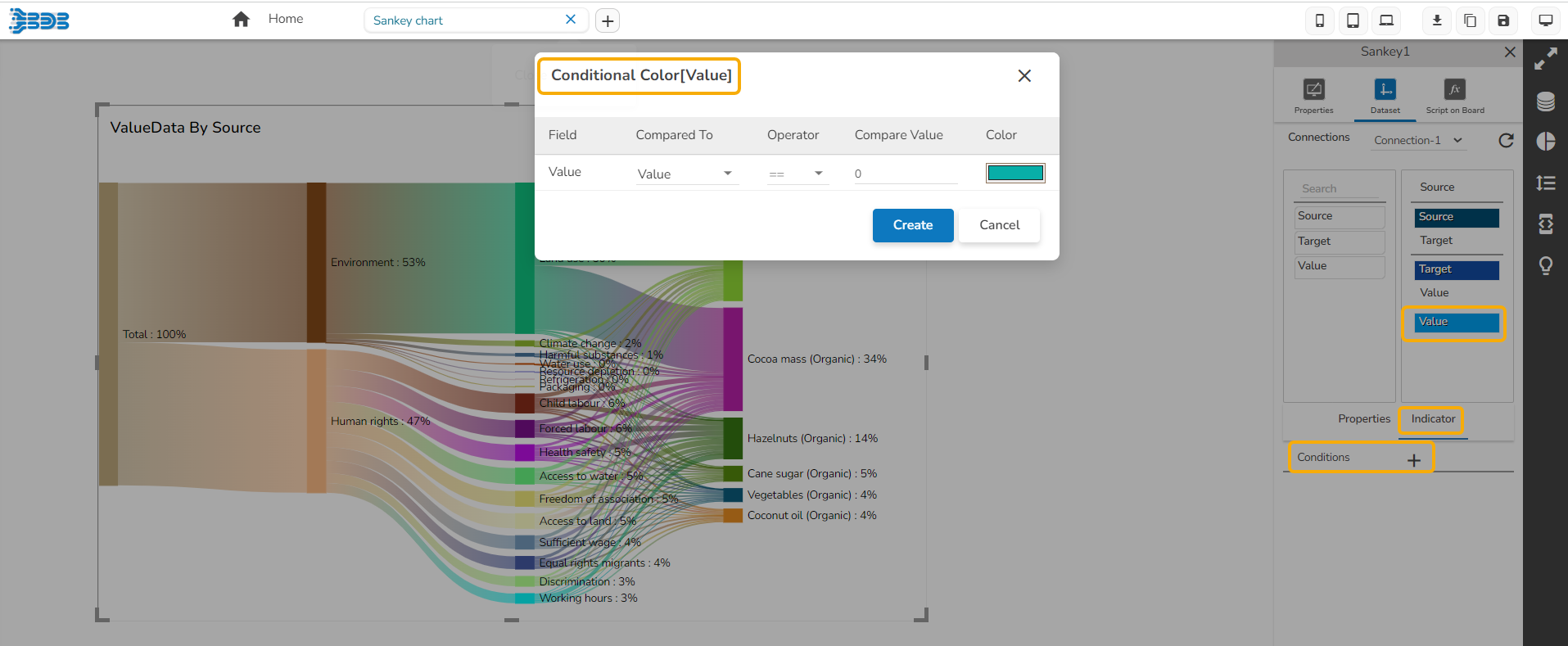
Dataset Properties
The user can provide color based on the Categories of the Source field and Sub-Categories of the Target field using the Indicators tab. Based on the inserted names the colors get reflected in the preview mode.
Check out the given illustration to understand how to provide colors for the source categories and access them in preview mode.
The user can also define conditional colors for the value field using the Indicator tab.
Sample Data
Download the given sample data and map it as mentioned below to plot your Sankey chart:
Select the Source column as Source, Target column as Target and Value column as Value fields to plot the above mentioned data.