
Waterfall Chart
A Waterfall Chart is a form of data visualization that helps in understanding the cumulative effect of sequentially introduced positive or negative values. The waterfall chart is also known as a flying bricks chart or Mario chart due to the apparent suspension of columns (bricks) in mid-air. The Waterfall Chart is used to show how an initial value is increased and decreased by a series of intermediate values, leading to a final value.
Best Situations to Use Waterflow chart
To show incremental changes in the values over time.
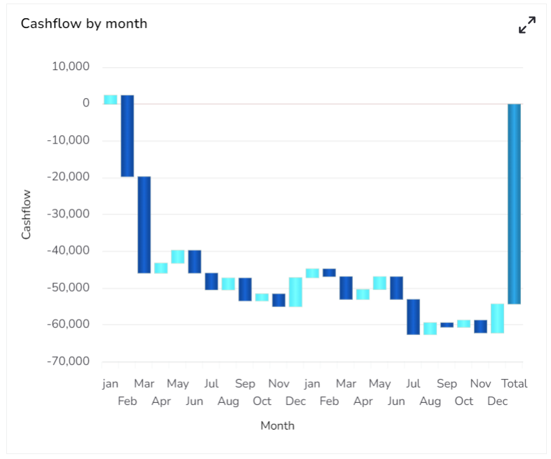
Default Chart Image

Properties of the Waterfall Chart
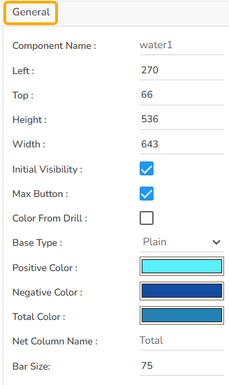
General
The user can change the height, width, top, and left values. If initial visibility is not enabled, then the chart will not be available for the first preview. If the Max Button is enabled, then the user can maximize the chart. The user can change the base type between Plain, Gradient 1, Gradient 2, and Gradient 3. The user can set colors for positive, negative, and Total Values. It is also possible to adjust the bar size.
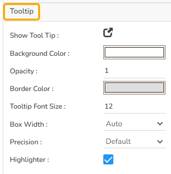
Tooltip
If the user wants to show the description of the series can use the tooltip by enabling it.
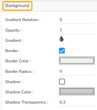
Background
The user can get the reflection of the chart by enabling the shadow option can also change the color and increase & decrease the transparency of the shadow. The user can also change the background color, adjust its transparency as well as enable a border and change its color.
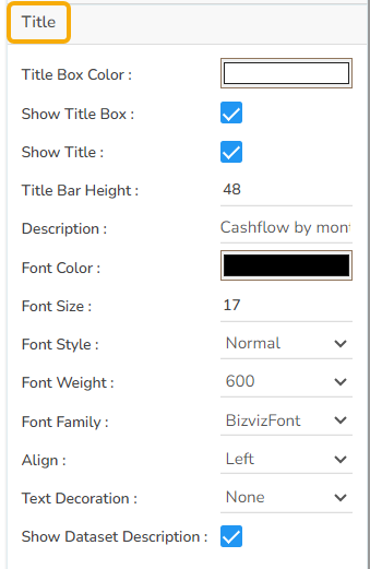
Title
The user can change Title Name, Font color, font size, font style, etc.
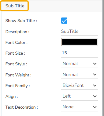
Subtitle
The user can enable the subtitle there is any second title. The user can change the name, font color, font size, font style, etc.
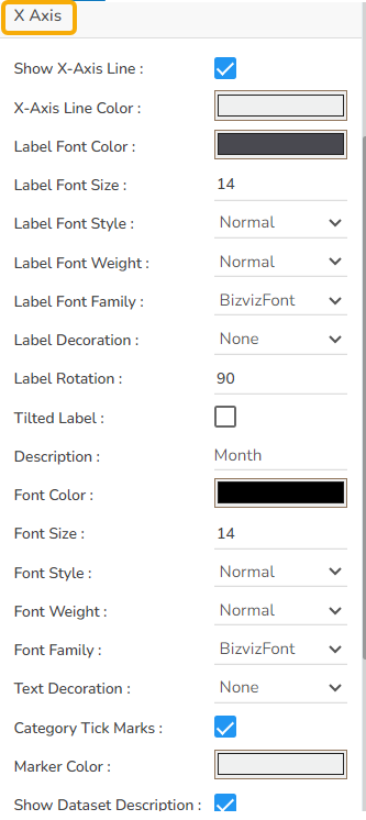
X-Axis
The user can show the x-axis line, change the x-axis line color, label color, font size, font weight, font family, description, etc. The user can rotate the label using the X-Axis.
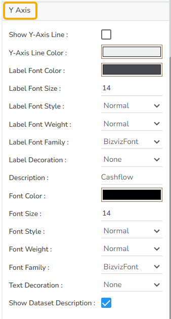
Y-Axis
The user can show the y-axis line, change the y-axis line color, label color, font size, font weight, font family, description, etc.
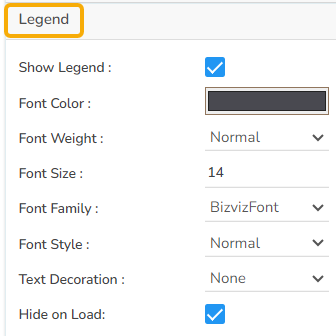
Legend
The user can enable the internal legend to show and change the font size, font color, font style, etc.
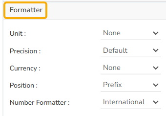
Formatter
The user can change units to % or none. The user can set the Precision option to see value in decimal format. The user can display currency value in INR, Pound, USD. The position of the currency symbol can be set as Prefix (if the currency is in INR format) otherwise, it can appear on the right-side as Suffix. Number Formatter can set it in Indian or International.
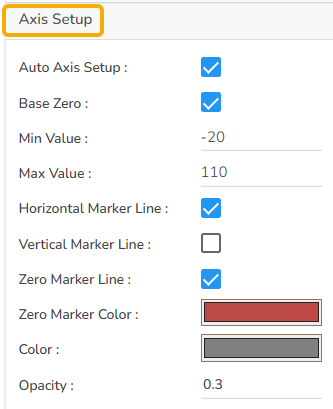
Axis Setup
The user can either set up the base as zero or else set up another minimum value. The user can include horizontal Marker lines as well as Vertical marker lines and change their color.
Export Options
The Export Options also helps to provide heading, subheading, file name. The user can also select an option for Global Export Type.
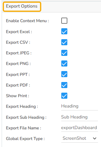
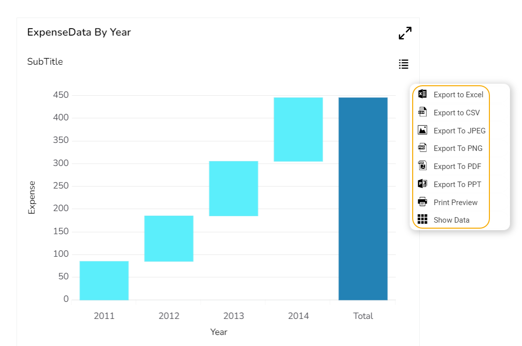
The user can enable the Enable Context Menu from the preview section to download the reports in different formats.
Dataset Property
The users can map a dataset with the dragged Waterfall chart component, and map the data fields as displayed in the given image:

Waterfall charts after changing its properties
Base Type with Plain

Base Type with Gradient 1

Base Type with Gradient 2

Base Type with Gradient 3
Sample Data
Download the given sample data and map it as mentioned below to plot your Waterfall chart.
Select the Year column as Category field and Expense or Revenue column as Series field to plot the data.
Please Note: The Waterfall chart supports only one series field.
Last updated