
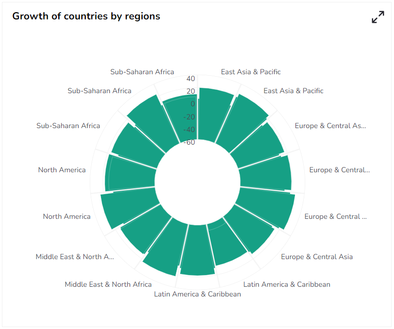
Circumplex Chart
The Circumplex chart, also known as the Polar Area chart or Nightingale Rose chart, is a combination of the Bar chart and Pie chart. The Circumplex chart can be drawn on a polar coordinate grid. Each category or interval in data is divided into equal segments on the radial chart. The distance of each segment from the center, as per the denoted values, depends on a polar axis. Therefore, each ring from the center of the polar grid can be used as a scale to plot the segment size and represent a higher value.Each category may have more than one sub-category, where each sub-category is shown by a section of the disc and each section has the same angle. The value of the corresponding sub-category is shown through the area. By changing the radius in a Circumplex chart, the user can adjust the area of each segment (based on data).
Best Situation to Use a Circumplex chart
To display manifold data in the form of a two-dimensional chart of three or more measurable variables represented on axes starting from the same point.
Default Chart Image

The Properties of Circumplex chart
General
The user can change the height, width, top, and left values, chart type, column type, Line form. In this case, the user has changed the Chart Type to Clustered and the Web Type to Circle.
The user needs to put a checkmark for the Initial Visibility option to avail the preview at the first time.
The user can also change the Doughnut Width and select Web Type, Web Stroke color, and Category Stroke color using the General option.
It is possible to Use Series Colors and define the range of Series Colors from the General Properties.
The user can also enable Animation and Clockwise display of the selected categories.

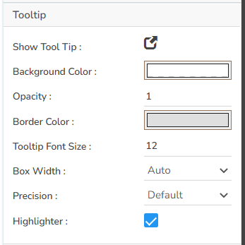
Tooltip
The user can show the description of the series by enabling the tooltip.
The user can set and modify background color, opacity, border color, Tooltip font size properties using these properties fields.
The user can also set the Box width, and select a precision option using the Tooltip properties.
Use the given checkbox to enable Highlighter for the tooltip.
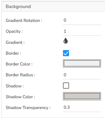
Background
The user can modify the Gradient related properties such as Gradient Rotation, Opacity, Gradient color using these properties fields.
Change the Background color of the chart, get the border for the chart, and change the border color.
Enable the shadow option to get the reflection of the chart. The user can also change the color and increase or decrease the transparency of the shadow.
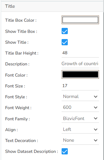
Title
The user can enable or disable the Title Box and Title by using this properties field.
The user can change Title Name, Font color, Font size, Font style, etc.
By enabling the Show Dataset Description, the X Axis description will be taken from the mapped data fields.
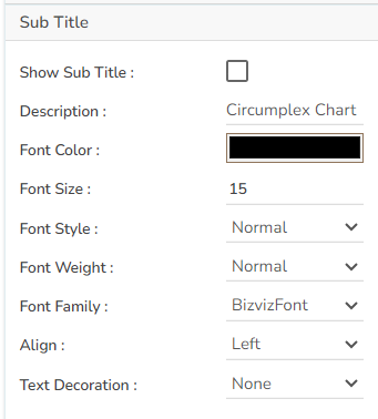
Subtitle
The user can enable the subtitle if it is required.
These properties fields will help to enable or disable the Subtitle, Provide description if it has been enabled and set the font related properties for the same.
The users can also set the display alignment of the Subtitle and select any text decoration option from the given drop-down menu.
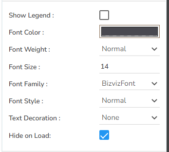
Legend
The user can enable or disable internal legend in the chart.
The Font related properties such as Font Color, Font Weight, Font Size, Font Family, Font Style can be set and modified using this properties fields.
The user can also select a Text Decoration option for the Legend. Put a check mark in the Hide on Load checkbox to hide the Legend while loading the chart.
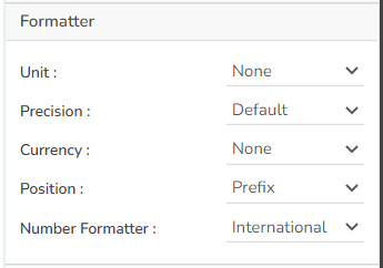
Formatter
The Number formatter helps to choose whether the user wants it in Indian or International format.
The user can change Y-Axis values in units such as %, T, Lacs, M, etc.
The user can set the ‘Precision’ option to get the value in decimal format.
The Currency option helps to select the currency value in INR, Pound, and USD.
The Position of the currency displays the selected currency symbol in prefix or suffix.
For example, if the Currency symbol is rupees and the prefix option is selected, then it will be displayed on the left side. Likewise, the suffix displays the selected currency symbol on the right side.
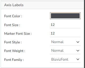
Axis Labels
The user can select or change the Font color, font style, weight, and family of the Axis labels using this properties option.
The user can select or change the size of the labels as well the marker.
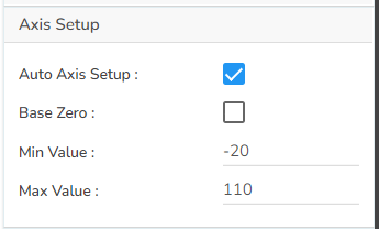
Axis Setup
The user can specify whether they need an Auto axis, or want to start the display with Base Zero value.
The Axis Setup fields also helps to set the Min and Max values for the Axis.
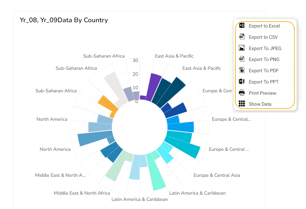
Export Options
The Export Options also helps to provide heading, sub heading, file name. The user can also select an option for Global Export Type.
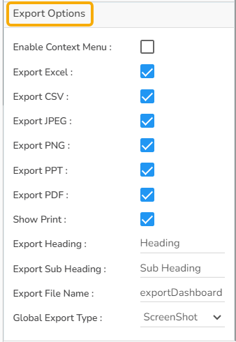
By enabling the Enable Context Menu the user gets a context menu with various export options to download the report in the Preview mode.
Variants of Circumplex chart
After modifying the chart properties the user can the following variants of the Circumplex chart.
Clustered Circumplex with Polygon Web Type (using Series Colors)

Overlaid Circumplex with Circular Web Type (not using Series Colors)
Sample Data
Download the given sample data and map it as mentioned below to plot your Circumplex chart:
Use the Country column as Category field, use Region as Sub Category and the other columns as Series to plot data.
Please Note: The Category field can be any data type line, string, or numeric. But, Series fields can be only numeric data type.
Last updated