> For the complete documentation index, see [llms.txt](https://docs.bdb.ai/governed-dashboards-5/llms.txt). Markdown versions of documentation pages are available by appending `.md` to page URLs; this page is available as [Markdown](https://docs.bdb.ai/governed-dashboards-5/charts-gallery/charts/pyramid-chart.md).
# Pyramid Chart
{% hint style="success" %}
*Check out the below given walk-through on how to use the Pyramid chart component in Designer module.*
{% endhint %}
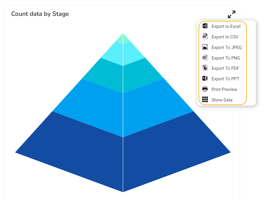
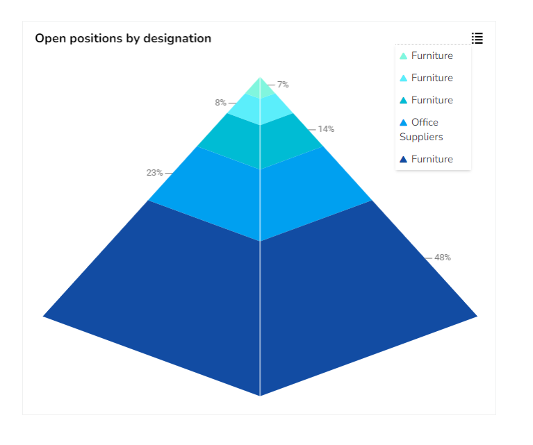
Pyramid charts are used when items need to be shown in a hierarchical structure. Generally, the chart will be a triangle sliced into no of parts. The items and topics will be represented in a progressive order based on quantity and size.
## **Best Situations to Use a Pyramid chart**
### **Hierarchical Breakdown**
To represent levels of hierarchy in an organization or a process.
### **Variations of this chart**
Inverted Funnel Chart & **Funnel Chart:** This is just a reversed format of the Pyramid chart.
## **Default Chart Image**
## **Properties of the Pyramid chart**
### **General**
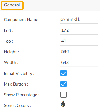
The user can change the height, width, top, left values and change the series colors.
### **Background**
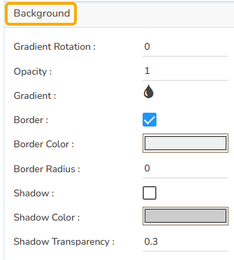
The user can change the background color of the chart, get the border for the chart, and change the border color. Get the reflection of the chart by enabling the shadow option and also change the color, increase or decrease the transparency of the shadow.
### **Tooltip**
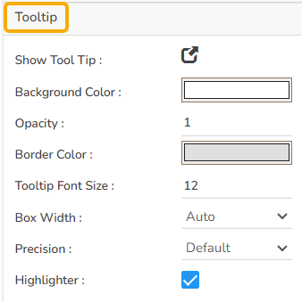
The user can show the description of the series can use the tooltip by enabling it.
### **Title**
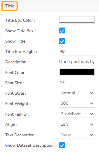
The user can change Title Name, Font color, font size, font style, etc.
### **Subtitle**
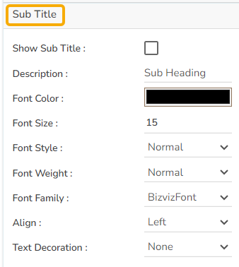
The user can enable the subtitle to display the second title. The user can change the Name, Font color, Font size, Font style for the subtitle.
### **Legend**
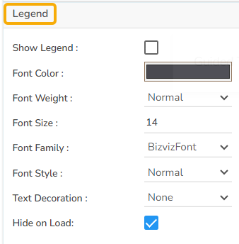
The user can enable the internal legend if we want to show and can change the font size, font color, font style, etc.
### **Formatter**
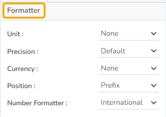
The user can change Y-axis values in units to %, T, Lacs, M, etc. Precision if we want the value in decimal format. Currency if we want the value in INR, Pound, USD. Position of the currency if it's in prefix and currency in Rupee then the sign will be seen in left-side if it's in suffix then it will be seen in right-side. Number Formatter if we want it in Indian or international.
### **Export Options**
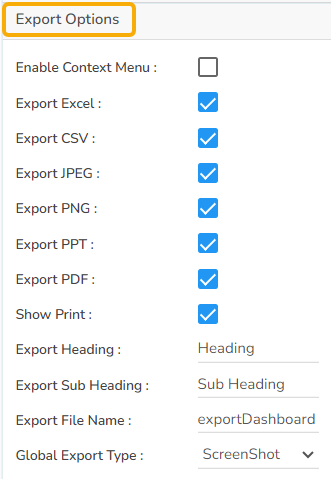
The Export Options also helps to provide heading, subheading, file name. The user can also select an option for ***Global Export Type***.
The user can enable the ***Enable Context Menu*** from the preview section to download the reports in different formats.
## **Pyramid Timeline chart by changing the Properties**
## Sample Data
Download the given sample data and map it as mentioned below to plot your ***Pyramid*** chart.
Use the ***Stage*** column as ***Category*** field, ***Count*** column as ***Series*** field *to plot data.*
{% file src="/files/kbf5SqtPGOkc879G7rnG" %}