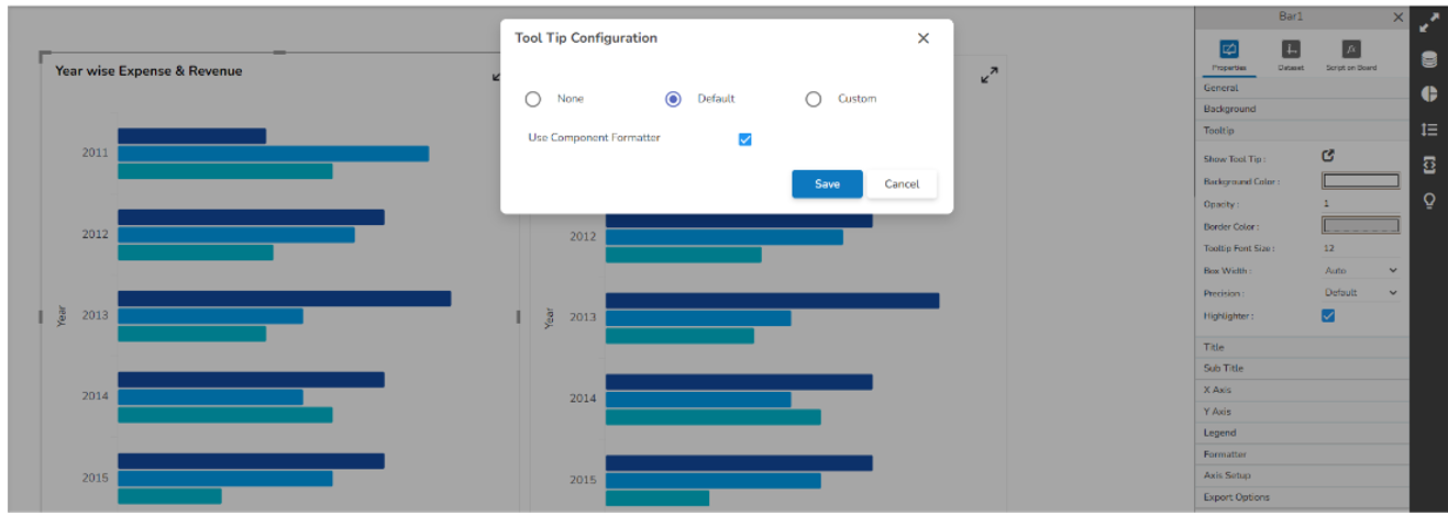
# Tooltip(Default & Custom)
{% hint style="success" %}
*Check out the walk-through given below on how to Tooltip are configured in the Designer charting components.*
{% endhint %}
* The Tooltip property block is available under the component property section.
* Tooltip block contains ‘Show Tool Tip ’, ‘Background Color ’, ‘Opacity ’, ‘Border Color ’, ‘Box Width ’, ‘Precision ’ & ‘Highlighter ’.
* Show Tool Tip: Configures tooltip as Default, Custom, or None.
* Background Color: Configures tooltip background color.
* Opacity: Configures tooltip background color opacity.
* Border Color: Configures the border color of the tooltip.
* Box Width: Configures the width of the tooltip box it contains a select box from where width can assign to the tooltip box.
* Precision: Configures the tooltip display data precision.
* Highlighter: By enabling this property through the checkbox tooltip highlighted field background color change.
* Show Tool Tip: By clicking this a model box opens which contains three radio buttons, its default selection is ‘Default ’
* None: On selection of None, the tooltip doesn't be shown on the selected component.
* Default: It's by default a selected tooltip, that displays the default configuration of the selected component.
* Custom: On selection of Custom, tooltip content can be configured.
* Custom Tool Tip: On selection of Custom, an editable text box opens.
* Editable text box contains property buttons on top, a select box that contains all the fields of the data set, and a save and cancel button.
* Editable text box contains selected fields of data set by default.

* Custom Tooltip configuration
* Additional fields can be selected from the select box.

* Display name then field name inside the bracket, field data replaces brackets.
* After selection of the content font properties like font color, font size, font family, etc can be changed from property buttons.

* **\\**: With the help of this tag, any HTML content can be passed directly into tooltip.
* Video and image can be displayed in the tooltip through this HTML tag.
* The field which contains video links that name would be written in the brackets after "scr=" for example src=\[Field Name]. For displaying a single video or image the only link to that particular video or image need to give under "src=" for example src=""
* Font Color property does not support Internet Explorer.
* For changing the field data font property, you need to select the entire bracket otherwise value won’t be displayed in the tooltip.
## **Mobile Tooltip configuration**
* For Timeline, Bar, Heatmap & Pie mobile specific Tooltip is available.
* This Tooltip works only when the component is in maximized state.
* Default Tooltip can be enabled through this script-->
```javascript
// SSDK.getWidget( 'ComponentID').m_mobiletooltipstyle = "default";ome code
```