Governed Dashboards
  • About Dashboard Designer
    • What is Dashboard Designer?
    • Why is it used?
  • Getting Started
    • Accessing the Designer Module
    • Overview of Designer Module
      • Homepage
        • Guided Tour
        • Left Menu Panel
          • New
          • Manage
          • Open Dashboard
          • Preferences
          • Save As
          • Help
          • Exit
      • Dashboard Canvas Page
        • Right side Panel
          • Connection Page
          • Chart Container
          • Manage Window
          • Script Window
          • Guided Tour
        • Canvas Properties
          • Global Properties
          • Dashboard Themes
        • Context Menu Properties
  • Create New Workspace
    • Workspace Creation: Complete Flow
    • Creating a Workspace
    • Renaming a Workspace
    • Deleting a Workspace
  • Create New Dashboard
    • Dashboard Creation: Basic Workflow
    • Adding a New Dashboard
    • Create Connection
    • Drag and Drop Charts
    • Associate the Dataset
    • Preview the Dashboard
    • Save the Dashboard
    • User Alert Notification
  • Managing Options for a Dashboard
    • Open Dashboard in Designer
    • Publish a Dashboard
    • Share a Dashboard
    • Dashboard Version Control
    • Action Menu
      • Preview Dashboard
      • Export to Local Disk
      • Rename
      • Delete
      • Moving a Dashboard
      • Information Icon
      • Dashboard as Template
  • Connecting to a Data Source
    • Accessing the Data Connectors
    • Establishing a Data Connection
      • CSV Connection
      • Excel Connection
      • Data Service Connection
      • Data Store Connection
      • Data Sheet Connection
        • Data Sheet Enhancements
      • WebSocket Connection
      • Merged Connection
  • Charts Gallery
    • Charts
      • Area chart
      • Bar Chart
      • Bubble Chart
      • Circumplex Chart
      • Column Chart
      • Funnel Chart
      • Histogram Chart
      • Inverted Funnel
      • KPI Tile
      • Line Chart
      • Map Chart
      • Mito Plot
      • Mixed Chart
      • Pie Chart
      • Project Timeline
      • Pyramid Chart
      • Scatter Plot
      • Spark Line
      • Spider Chart
      • Waterfall Chart
    • Grids
      • Data Grid
      • Paging Grid
      • Data Sheet
      • Scorecard
      • Pivot Grid
    • Filters
      • Checkbox
      • Combobox
      • Hierarchical Combobox
      • List
      • Radio Button
    • Advanced Charts
      • Box Plot
      • Candle Stick
      • Chevron
      • Data Search
      • Decision Tree
      • Group Bar
      • Group Column
      • Heat Map
      • Sankey
      • Text Analyzer
      • Time Series
      • Decomposition
      • Knowledge Graph
      • Tree Map
      • Trellis
      • Word Cloud
      • New Word Cloud
    • Other Charts
      • Box
      • Bullet
      • Date Picker
      • Export
      • Filter Chips
      • Filter Saver
      • Gauge
      • Graphics
      • Guided Tour
      • H-Slider
      • Image
      • Info Button
      • Input Box
      • Label
      • Legend
      • Progress Pie
      • Semi Gauge
      • Stepper
      • SVG Image
      • Text Box
      • Trend
      • URL Button
      • V-Slider
      • Tab Component
      • Inputbox component
      • Button component
    • Custom Charts
    • Common Chart Properties
      • Background
      • Title & Sub-title
      • X & Y Axis Properties
      • Legend Properties
      • Formatter
      • Axis Setup
      • Export Options
      • Copy Paste Chart Properties
  • Dashboard Objects
    • Manage Dashboard Components
    • Dashboard Objects Properties
  • Configurations
    • Filtering the Data
    • Drill Through
      • Drill Highlighter
    • Dataset Properties
    • Indicators in Charts
    • Tooltip(Default & Custom)
    • Data Label
    • Geo Mapping
    • Language Mapping
    • Legend Mapping
    • Alerts in Grids
  • Script Help Section
    • Navigate to Script Help page
    • How to use Scripts?
Powered by GitBook
On this page
  • Best Situation to use Candlestick Chart
  • Default Chart Image
  • Properties of Candle chart
  • Axis Setup
  • Background
  • Formatter
  • General
  • Legend
  • Range
  • Subtitle
  • Title
  • Tooltip
  • X Axis
  • Y Axis
  • Property Tab for Dataset Property Pallet
  • Modified Candle chart after modifying its properties
  • Sample Data
  1. Charts Gallery
  2. Advanced Charts

Candle Stick

PreviousBox PlotNextChevron

Check out the below given walk-through on how to use the Candle Stick chart component in Designer module.

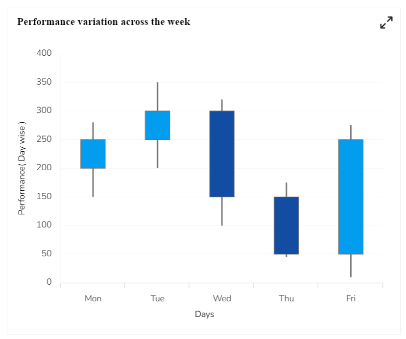
Candlestick chart is a popular way of representing price fluctuations like opening, closing, high, and low prices for a given period. The candle chart has shadows coming out of each end representing the high and low prices of each trading day. The candles are colored white when the prices increased and black when the price has decreased.

Best Situation to use Candlestick Chart

  • Mainly used to perform technical analysis in financial markets.

Default Chart Image

Properties of Candle chart

Axis Setup

User can set auto axis provide maximum & minimum value to the axis. Also, if user need to see the zero-marker line, horizontal marker line and vertical marker line, then enable it here. User can change its color also.

Background

User can change the background color of the chart, can enable the border for the chart and can change the border color. Also, can get the reflection of the chart by enable the shadow option can also change the color and increase & decrease the transparency of the shadow.

Formatter

The user can change units to % or none. Precision if user want the value in decimal format. Currency if user want the value in INR, Pound, USD. Position of the currency: if it's in prefix and currency in Rupee then the sign will be seen in left-side if it's in suffix then it will be seen in right-side. Number Formatter if user want it in Indian or international.
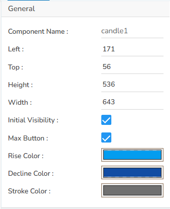
General

User can change the height, width, top, left. If initial visibility is unchecked, then the chart won’t be visible at the first preview. If max button is unchecked, then user can’t maximize the chart separately. User can also provide the rise color, decline color and stroke color.
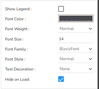
Legend

User can enable the internal legend if user want to show and can change the font size, color, style etc.

Range

Either enable Auto range option or else provide it in the range section.

Subtitle

User can enable the subtitle if user have any second title and also, user can change the Name, Font color, size, style etc.
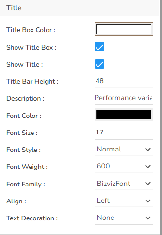
Title

User can change Title Name, Font color, size, style, etc.

Tooltip

If user want to show the description of series can use tooltip by enabling it.
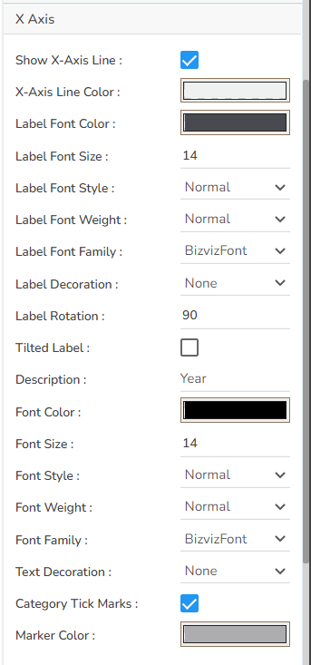
X Axis

User can show the x-axis line, change the x-axis line color, label color, font size, font weight, font family, description etc. here. Also, if user want to rotate the label, it is also possible.

Y Axis

User can show the y-axis line, change the y-axis line color, label color, font size, font weight, font family, description etc. here.

Property Tab for Dataset Property Pallet

Modified Candle chart after modifying its properties

Sample Data

Download the given sample data and map it as mentioned below to plot your Candle Stick chart:

Select the Day column as Category. Select the rest of the columns based on their names such as choose the High column under the High field, the Low column under the Low field.

8KB
Sample Data_Candle Stick Chart.xlsx