Line chart
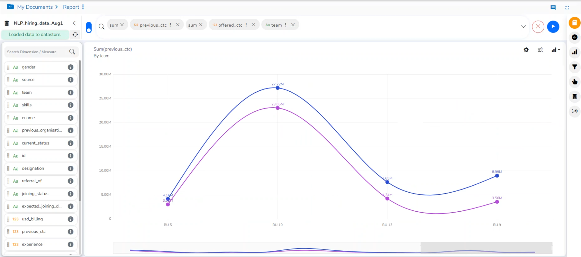
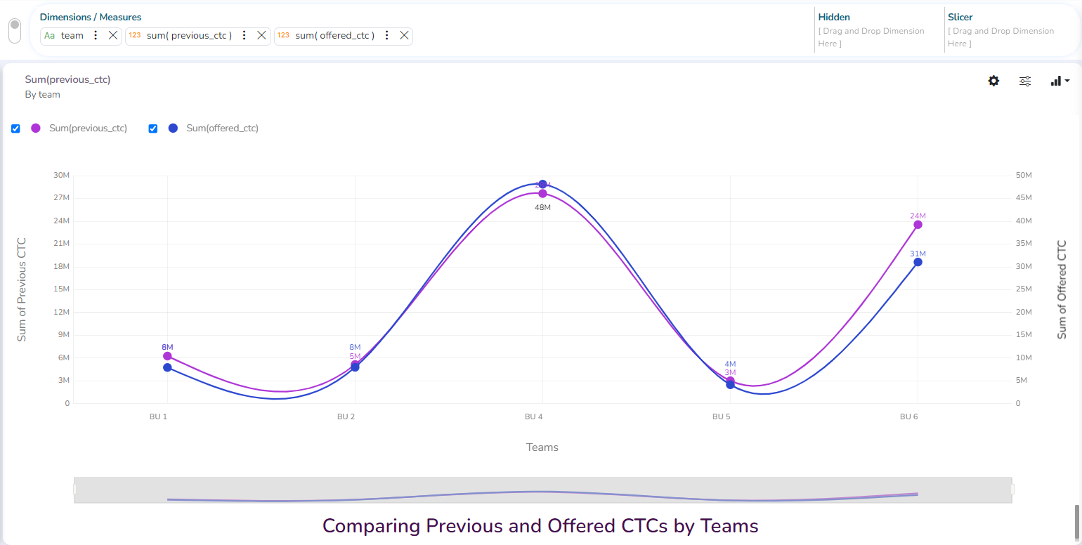
The line chart connects individual numeric data points to create a sequence of values. They are primarily used to display trends over a period.
Check out the illustration on applying Line chart properties to View.
Best Situation to use Line Charts: View trends in data over a period
Examples: To indicate increasing revenue or varying stock price
Variations of this chart
Mixed Chart- Combine a line graph with column charts to provide visual cues for further investigation
Example: A column chart representing the numeric score of students combined with the line chart corresponding proficiency score.
Properties
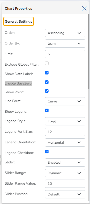
General Settings
Style: Select a style to display the data (the provided choices for this field are Cluster, Stack, Stack Percentage, Stack Overlaid)
Order: Select a sequence for displaying information
None (default option)
Ascending
Descending
Manual Sort (Users need to sort the dimensions by using the indicator signs manually)
(If the user selects the Manual Sort as the ordering option, they get an icon clicking which the Manual Sort window appears)
By selecting an order (ascending or descending), the user needs to configure the following fields:
Order By- Select a value option from the drop-down menu to order the sequence of the data.
Limit- Set a number to display the requested data by this limit.
Exclude Global Filter: The view gets excluded from the Global Filter condition by putting a checkmark in the box.
Show Data Label: The data label is displayed using a checkmark in the given box.
Enable Base Zero: Base value gets presented from Zero using a checkmark in the given box.
Show Point: Enable the Show Point option using a checkmark in the given box.
Line Form: Select a line format from the drop-down menu (the provided choices for this field are Curve and Segment)
Show Legend: Displays legend by turning on the radio button. After enabling ‘Show Legend,’ users need to select the following information:
Legend Style: Select one of the following options using the drop-down menu.
Fixed
Floating
The following fields appear when the selected Legend Style option is Fixed.
Legend Font Size: This option allows to increase or decrease the font size of the legend.
Legend Orientation: This option appears when ‘Show Legend’ is enabled, and the selected ‘Legend Style’ is ‘Fixed.’ Users need to select an option out of the given choices using the drop-down menu.
Vertical
Horizontal
Legend Checkbox: Enable this option with a checkmark to add the checkbox beside the Legend.
Slider: The slider is displayed by putting a checkmark in the box.
Slider Range: Select an option from Fixed or Dynamic
Slider Position: Select the slider position from the choices such as Default, left, central, and right.
General Settings
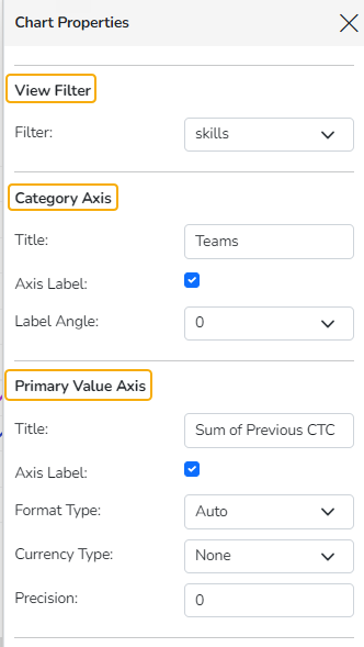
View Filter
Filter: Select a filter condition using the drop-down menu.
Please Note: The selected View Filter option will be reflected to customize the View data after adding the View to the report.
Category Axis
Title: Provide a title for the axis.
Axis Label: Enable the category axis label by using a checkmark in the box.
Label Angle: Select a display angle for the axis label.
Primary Value Axis
Title: Provide a title for the Primary Value Axis.
Axis Label: Enable the Primary Value Axis label by using a checkmark in the box.
Format Type: Select a desired format type from the drop-down menu (the provided options for this field are: None, Auto, Percent, Thousand, Lacs, Crore, Million, Billion, Trillion, Quadrillion).
Currency Type: Select a currency symbol to be displayed in the view (the provided options for this field are: None, Rupees, Euro, Pound, USD, Yen, Cent).
Precision: Set the after-decimal value (It displays up to 5 precision).
Secondary Value Axis
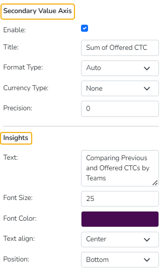
Properties for the Secondary Value Axis are displayed when two measures are dragged on the canvas.
Enable: Put a checkmark in the box to enable the Secondary Value Axis.
Title: Provide a title for the Secondary Value Axis.
Format Type: Select a desired format type from the drop-down menu (the provided options for this field are: None, Auto, Percent, Thousand, Lacs, Crore, Million, Billion, Trillion, Quadrillion).
Currency Type: Select a currency symbol to be displayed in the view (the provided options for this field are: None, Rupees, Euro, Pound, USD, Yen, Cent).
Precision: Set the after-decimal value (It displays up to 5 precision).
Please Note:
You don't get the Currency Type field when the selected Format Type is Percentage.
The users must configure the Series Properties of the dragged measure after enabling the Secondary Value Axis to display the same in the chart.
Insights
Text: Provide any information regarding the chart. If any digit or character is required to be highlighted, put it inside two asterisks. (E.g., *70%* or *skills*).
Font Size: Set/modify the Font Size of the Insights text.
Font Color: Select a Font color for the Insights Text.
Text align: There are three alignments to align the text.
Left
Right
Centre
Position: There are two options to position the text.
Bottom
Right
Secondary Value Axis & Insights
Annotation Settings
Annotation lines in a chart are used to highlight specific points or thresholds for easier analysis and interpretation. They typically represent key events, milestones, or significant values that help provide context or draw attention to important aspects of the data.
Check out the illustration on getting Annotation lines in the Line chart.
Navigate to the dimension and measure panel on the Design page.
Select the required dimensions and measures for the given space.
Click the Play button.

A View will be plotted based on the selected dimensions and measures.

Please Note: One of the Dimensions should be with date values. E.g., Event Date is such dimension for this case.
Click the ellipsis for the dragged Dimension that contains the Date values.
A window for the dimension will open on the right side of the page.
The user can set or modify the dimension's Display Name, Date Interval, and Date Format.

Please Note: The selected data must be in one of the supported date formats for correctly plotting the View.
Open the Chart Properties.
Go to the Annotation Property section.
Click the Select Annotation Type option to get the drop-down menu.
Select an option from the drop-down. The supported Annotation Types are File Upload and Data Sheet.
By selecting the File Upload option, the user will be redirected to upload a file.

Click the Choose File option.

Choose a file from the system and upload it.

The file name of the uploaded file will appear next to the Choose File option.
Configure the Annotation Property by adjusting the following fields:
Select Sheet: Choose the specific sheet to annotate from the drop-down menu.
Label Field: Specify which field will be used as the label for your annotations.
Annotation Field: Define the field that contains the annotation data.
Line Color: Select the color for annotation lines to ensure visibility and distinction.
Tooltip Title: Set a custom title for the tooltip that appears on hover.
Line Width: Determine the thickness of the annotation lines to suit your preferences.
Line Opacity: Adjust the transparency level of the lines for better visual integration with the chart.
Click the Show Annotation button.
Click the Annotation checkbox.
The Annotation line(s) will appear in the View.
The user can access the tooltip by hovering the cursor on the annotation line.

The user can access the tooltip by hovering the cursor on the annotation line.
All the dates for a common year will be plotted together in a column. All the dates for a common year will be plotted together in a column.

Data Sheet as an Annotation Type
By selecting the Data Sheet option, the user will be asked to choose a Data Sheet from the available list and proceed to the remaining Annotation Property settings.

Please Note: All the other fields for annotation property remain the same for a Data Sheet when selected as an Annotation Type.
Threshold Settings
Show Threshold Line: Put the checkmark in the given box to display the Threshold line on the chart.
Threshold 1: Set a value to draw the first threshold line.


Last updated