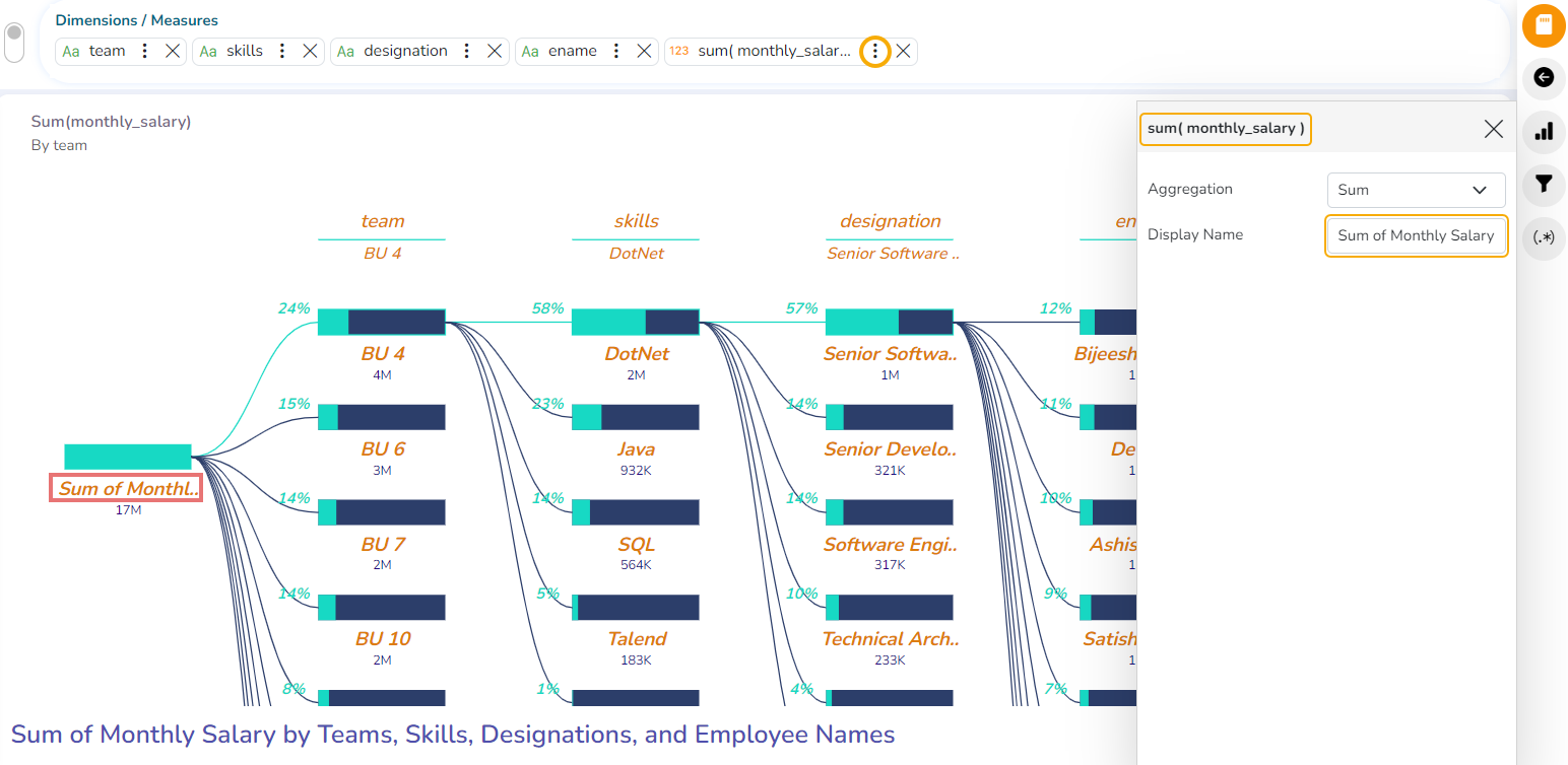
Dissolution/Decomposition chart
Check out the illustration on how to use the Dissolution/Decomposition chart.
The dissolution chart lets you visualize data across multiple dimensions. It automatically aggregates data and enables drilling into your dimensions in any order. The visualization requires two types of input:
Dimension/ Measures: The metric you would like to analyze. It must be a measure or an aggregate.
Others: One or more dimensions you would like to drill down into (The maximum dimension that can be used is 7).
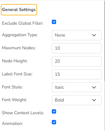
Properties
You can access the chart-specific properties from the Design page. It gets listed under the Chart Properties icon on the right-top panel.
General Settings
Exclude Global Filter: The view gets excluded from the Global Filter condition by putting a checkmark in the box.
Aggregation Type: The selected aggregation type gets applied to the chart. The supported aggregation types are Percentage and Count.
Maximum Nodes: Set maximum nodes for the Sankey chart.
Node Height: Set Node Height by using this properties field.
Label Font Size: Set the Label Font Size using this properties field.
Font Style: Select a Font Style by selecting an option from the drop-down menu. The supported options are Normal and Italic.
Font Weight: Select an option from the drop-down menu to display the Font weight. The supported options are Normal, Bold, 300, 600, 900).
Show Context Levels: Enable this option to display the context levels based on the user's choice. After enabling this option, the user can right-click on the first node. All the selected Dimensions are listed in the displayed context menu. The user can select a dimension from the context menu to display it as the next level.
Check out the given illustration on how to use the Show Context Levels properties option.
Animation: If the Animation option is enabled, the View will display in an animated format or if disabled it will be static at the position.
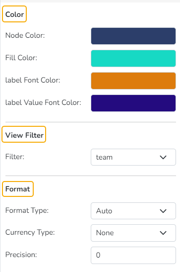
Color
Node Color: Select a node color using the color pallet.
Fill Color: Select a fill color using the color pallet.
Label Font Color: Select a Label Font Color using the color pallet.
Label Value Font Color: Select a Label Value Font Color from the color pallet.
View Filter
Filter: Select a filter condition using the drop-down menu.
Format
Format Type: Select a desired format type from the drop-down menu (the provided options for this field are: None, Auto, Percent, Thousand, Lacs, Crore, Million, Billion, Trillion, Quadrillion).
Currency Type: Select a currency symbol to be displayed in the view (the provided options for this field are: None, Rupees, Euro, Pound, USD, Yen, Cent).
Precision: Set the precision value by using this property field.
Insights
Text: Provide any information regarding the chart. If any digit or character is required to be highlighted, put it inside two asterisks. (E.g., *70%* or *skills*).
Font Size: Set/modify the Font Size of the Insights text.
Font Color: Select a Font color for the Insights Text.
Text align: There are three alignments to align the text.
Left
Right
Centre
Position: There are two options to position the text.
Bottom
Right
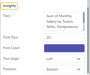
Insights Properties
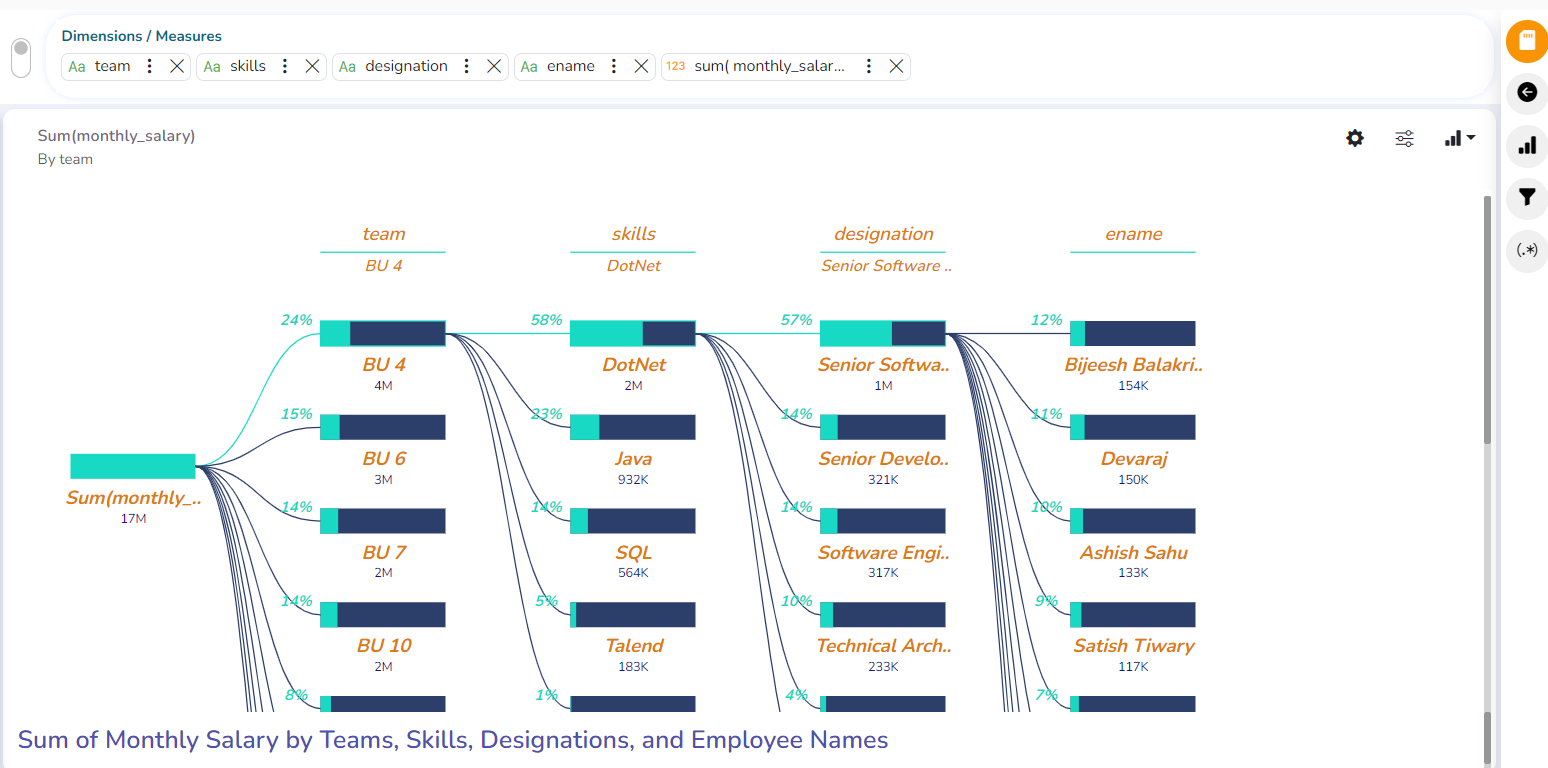
Modified View after applying various Decomposition/ Dissolution Properties
Series Properties
Click the Series Properties provided next to the measure name.
A new window opens.
Configure the required details:
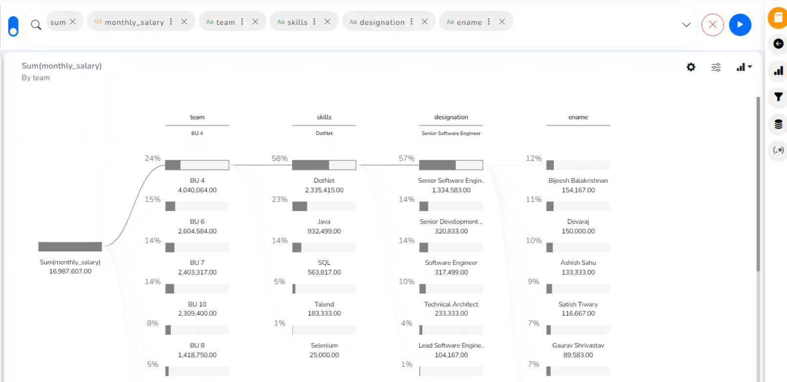
Aggregation-select an aggregation using the drop-down menu (By default, it displays the second aggregation type which is Sum.)
Display Name- provide a name to be displayed in the legend.
The configured Series Properties gets applied to the chart.