Self-Service Visualization
  • What is a Report?
  • Creating a new Report
    • Accessing the Report Module
    • Create New Report
      • Creating a new Report with an Existing Data Store
        • Creating and Updating Instance
      • Creating a new Report by Uploading a File
        • Creating a new Report by Uploading a CSV File
        • Creating a new Report by Uploading an Excel File
      • Creating a new Report with Data Preparation
        • Create a Report with Data Preparation - Inside the Report UI
        • Create a Report with Data Preparation- Partly from the Data Center
    • Designing a View
    • Saving Multiple Views
  • Design Canvas
    • Dimension Profiling
    • View Measure Summary
    • Customize Category Color
    • Series Properties
    • Create Calculated Field
      • Creating a Formula
        • Record Level Formula
        • Summary Level Formula
      • Creating Range
    • Order by and Limit
    • Adding a Slicer
  • Chart Gallery
    • Mixed chart
    • Area chart
    • Bar chart
    • Bubble chart
    • Column Stack chart
    • Line chart
    • Pie chart
    • Scattered Plot chart
    • TreeMap chart
    • Circumplex chart
    • Pareto chart
    • Semi Gauge
    • KPI Tile
    • KPI Tile: Comparative Tile
    • KPI Tile: Sparkline
    • Map
    • Data Grid
    • Metric Summary
    • Dissolution/Decomposition chart
    • Spider chart
    • Waterfall chart
    • Funnel chart
    • Inverted Funnel chart
    • Heat Map chart
    • Geo chart
    • Sankey chart
    • Word Cloud
    • Candlestick chart
    • Benchmark Analysis
  • Report Final Screen
    • Tab
    • Search
    • Create a New ML View
    • Shared Views
    • Live Refresh
    • Export
      • Export Properties
    • Change Theme
    • Data Store Information
    • Options Assigned to a View
      • Analyse
        • Timeline Play
        • Data Drills
          • Drill Into
          • Drill Through
      • Editing a saved View
      • Duplicate
      • Remove
  • Applying Filters
    • View Specific Filter
      • Dimension-based View Filter
      • Measure-based View Filter
      • Date-based View Filter
    • Global Filter
      • Exclude from the Global Filter
      • Saving a Global Filter
      • Custom View Filter
      • LOV Settings
  • Interactions
Powered by GitBook
On this page
Export as PDF
  1. Design Canvas

Series Properties

The Series Properties option allows the users to setup or modify the display of the Measure in the selected View.

PreviousCustomize Category ColorNextCreate Calculated Field

Check out the walk-through on configuring the Series Properties for a selected measure in a View.

The users can configure and modify various measure-related properties through the Series Properties window.

  • Navigate to the Design page for a view with one or more selected measure values.

  • Click the Series Properties option provided next to a dragged measure.

  • A tab opens by the default name of the selected measure.

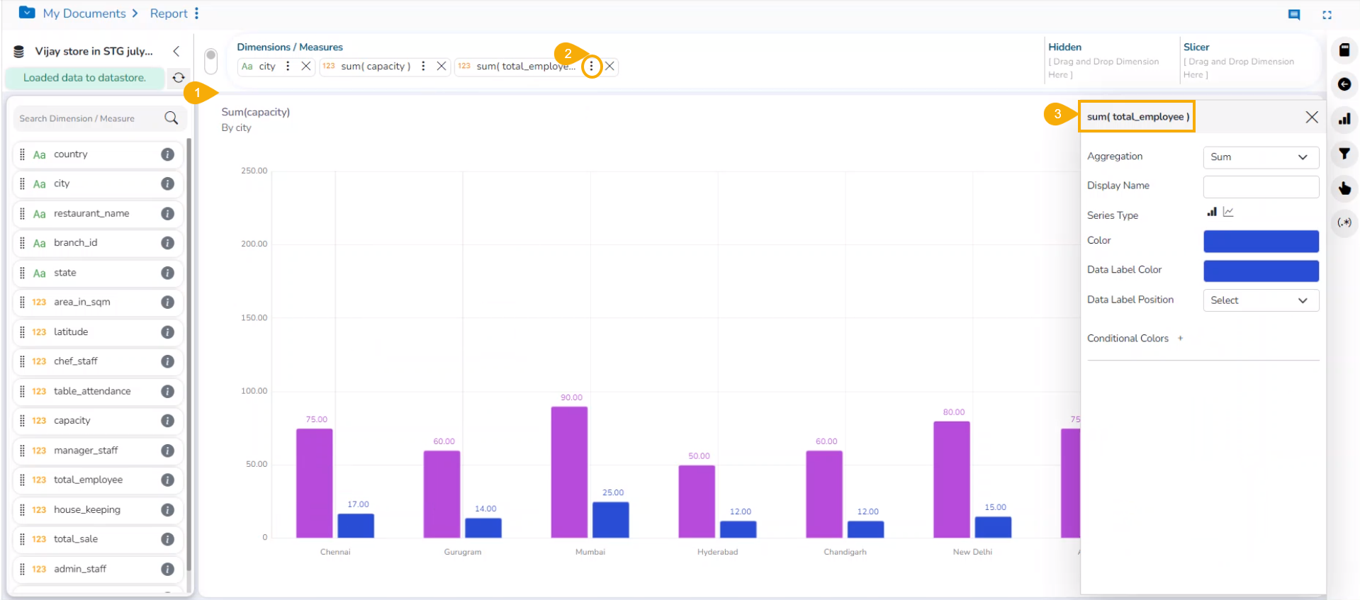
  • The users can set the following properties from a pop-up window for a mixed chart with two measures dragged on the workspace:

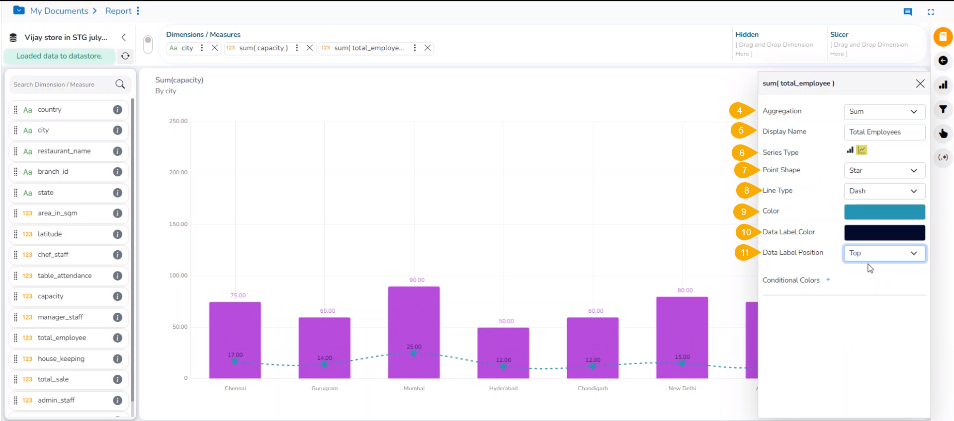
    • Aggregation: Select an aggregation option from the drop-down menu (the given choices are: Sum, Min, Max, Variance, Mean, Standard Deviation, and Cumulative Sum)

    • Display Name: Enter the title for the measure to be displayed in the data label

    • Series Type: Choose a series-type format for the selected measure

    • Point Shape: Select a point shape from the drop-down menu. (the given choices are: Cross, Cube, Hexagon, Point, Quad, Star, and Triangle)

    • Line Type: Select a line type from the drop-down menu (the given choices are: Straight, Dot, Dash, Dash1)

    • Axis: Select an axis out of the given choices (the users need to enable the Secondary Value Axis to get the Axis option in the Series Properties window)

    • Color: Select the color of the chart presentation from the given menu

    • Data Label Color: Choose a color for the data label from the given menu

    • Data Label Position: Select a position to display the data label (the given choices are: Top, Middle, Bottom)

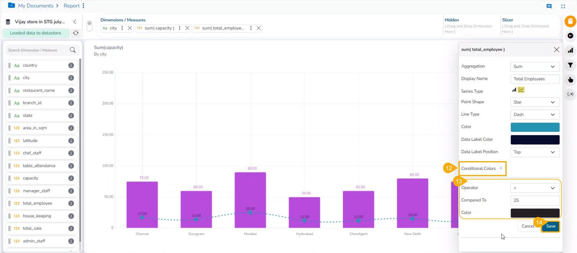
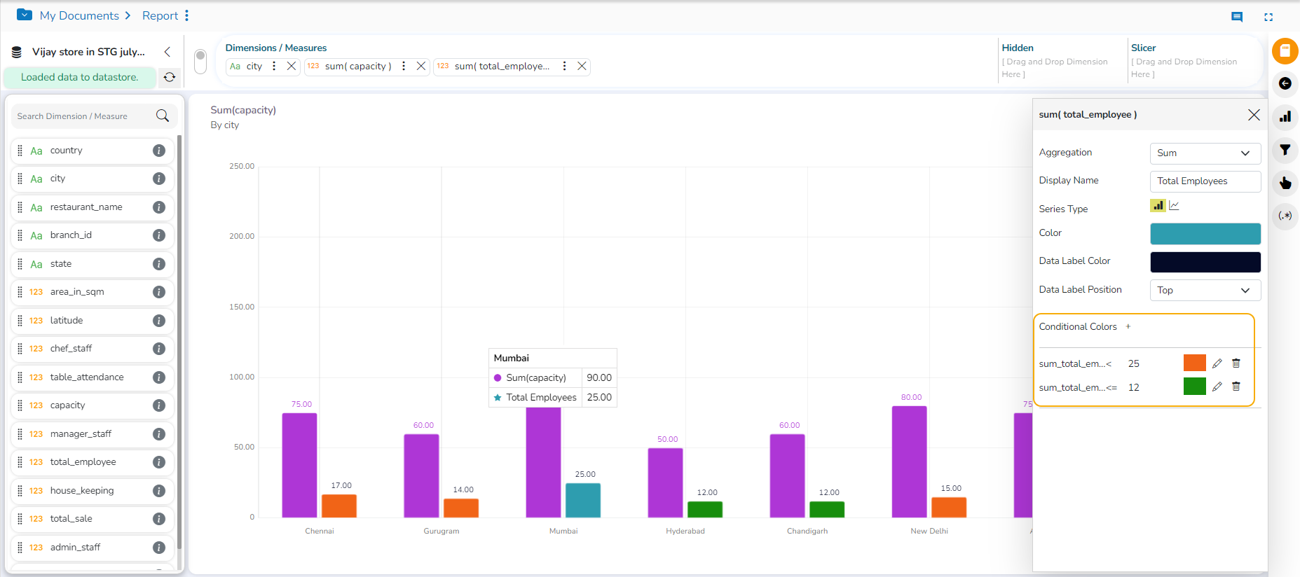
    • Conditional Colors: Click the Conditional Colors icon to insert a new condition.

    • Configure the below-given fields to apply a new condition on the selected measure.

      • Operator- Select an operator from the drop-down menu (the supported operations are <, <=, >, >=, ==, !=).

      • Compared To - Set a value to which the operator can be applied.

      • Color- Choose a color to be applied when the set condition is met.

    • Click the Save option.

  • The user can provide multiple conditions for a single measure column.

Please Note:

  • The Series Properties may differ as per the selected chart components.

  • Users must enable the Secondary Value Axis from the Properties tab to get the Axis field in the Series Properties.

  • Users can change or modify the View title by clicking on the edit options next to the View name.

  • Click the Edit icon > Modify/change the title for the selected measure or dimension > click the Checkmark icon to save the change and the Close mark icon for not to save the change.

Series Properties
Multiple Conditions applied using the Conditional Colors option