Self-Service Visualization
  • What is a Report?
  • Creating a new Report
    • Accessing the Report Module
    • Create New Report
      • Creating a new Report with an Existing Data Store
        • Creating and Updating Instance
      • Creating a new Report by Uploading a File
        • Creating a new Report by Uploading a CSV File
        • Creating a new Report by Uploading an Excel File
      • Creating a new Report with Data Preparation
        • Create a Report with Data Preparation - Inside the Report UI
        • Create a Report with Data Preparation- Partly from the Data Center
    • Designing a View
    • Saving Multiple Views
  • Design Canvas
    • Dimension Profiling
    • View Measure Summary
    • Customize Category Color
    • Series Properties
    • Create Calculated Field
      • Creating a Formula
        • Record Level Formula
        • Summary Level Formula
      • Creating Range
    • Order by and Limit
    • Adding a Slicer
  • Chart Gallery
    • Mixed chart
    • Area chart
    • Bar chart
    • Bubble chart
    • Column Stack chart
    • Line chart
    • Pie chart
    • Scattered Plot chart
    • TreeMap chart
    • Circumplex chart
    • Pareto chart
    • Semi Gauge
    • KPI Tile
    • KPI Tile: Comparative Tile
    • KPI Tile: Sparkline
    • Map
    • Data Grid
    • Metric Summary
    • Dissolution/Decomposition chart
    • Spider chart
    • Waterfall chart
    • Funnel chart
    • Inverted Funnel chart
    • Heat Map chart
    • Geo chart
    • Sankey chart
    • Word Cloud
    • Candlestick chart
    • Benchmark Analysis
  • Report Final Screen
    • Tab
    • Search
    • Create a New ML View
    • Shared Views
    • Live Refresh
    • Export
      • Export Properties
    • Change Theme
    • Data Store Information
    • Options Assigned to a View
      • Analyse
        • Timeline Play
        • Data Drills
          • Drill Into
          • Drill Through
      • Editing a saved View
      • Duplicate
      • Remove
  • Applying Filters
    • View Specific Filter
      • Dimension-based View Filter
      • Measure-based View Filter
      • Date-based View Filter
    • Global Filter
      • Exclude from the Global Filter
      • Saving a Global Filter
      • Custom View Filter
      • LOV Settings
  • Interactions
Powered by GitBook
On this page
  • Properties
  • General Settings​
  • Series Color
  • View Filter
  • Adding a Color
  • Insights
Export as PDF
  1. Chart Gallery

Inverted Funnel chart

PreviousFunnel chartNextHeat Map chart

Check out the given walk-through on the Properties of the inverted Funnel chart.

Inverted Funnel charts are a great way to track progress through a workflow with multiple steps. They can highlight how well a process is being followed and easily identify any bottlenecks.​

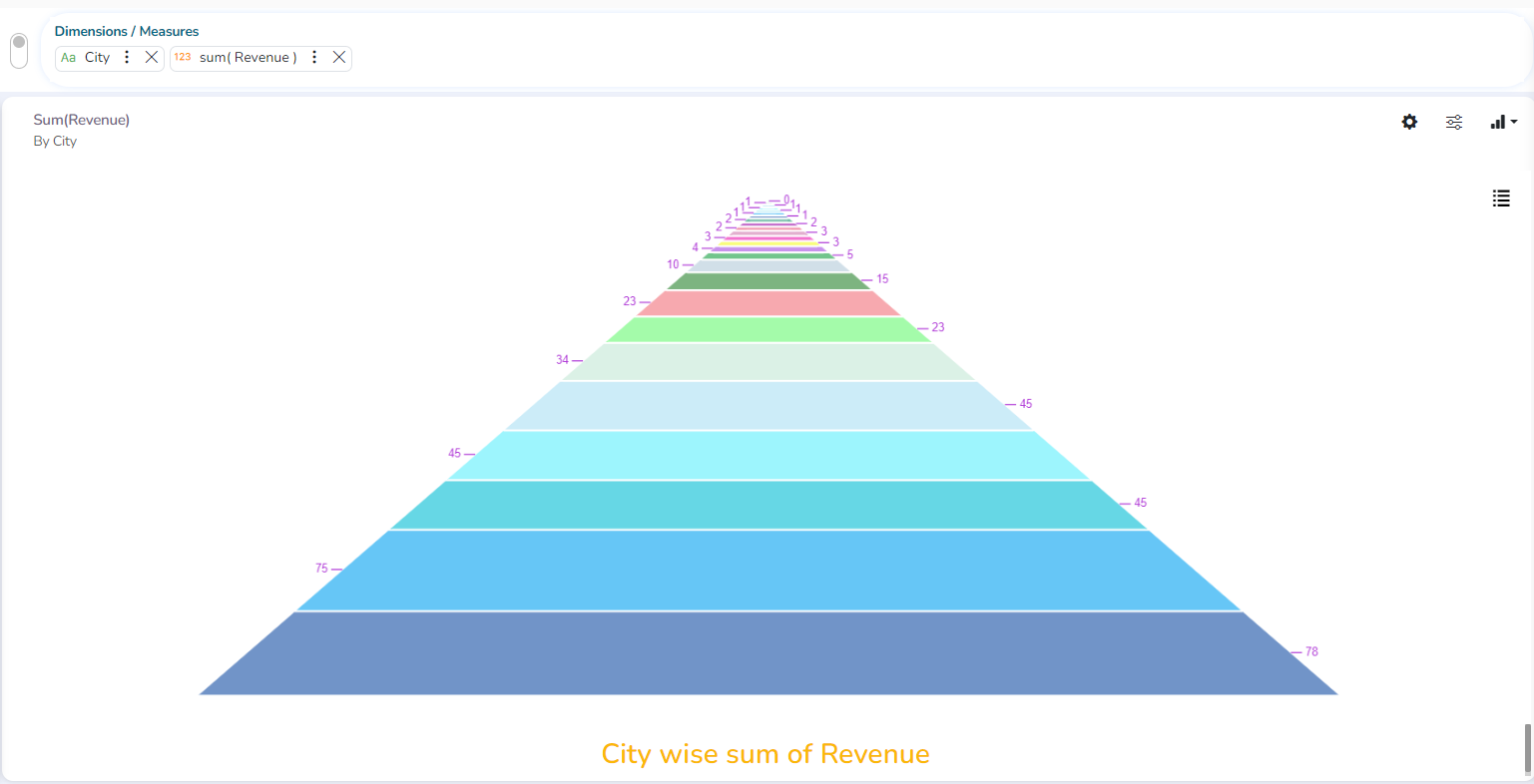
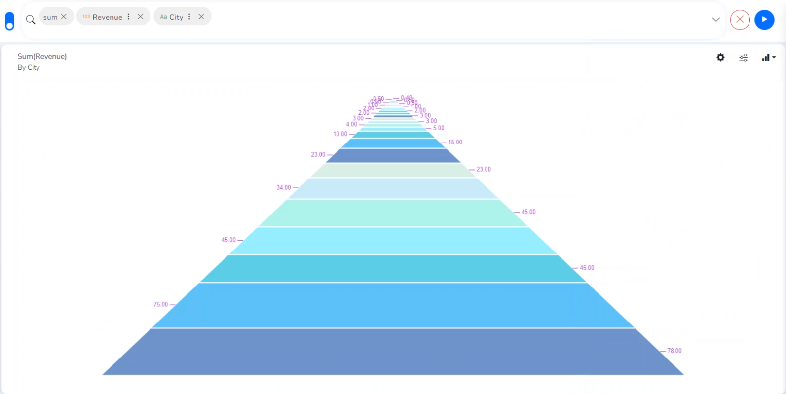
The users can invert the funnel chart to see things from a different point of view. It widens at the bottom and narrows at the top pinpointing the various phases in a classified structure. This chart can be used to see the hierarchical structure of an organization or distribution process of fund/salary/profit etc. ​

​Best Situations to Use an Inverted Funnel Chart​

To display a hierarchical pattern​

Example:​

To categorize the administrative structure in an organization

Properties

General Settings​

  • Exclude Global Filter: The view gets excluded from the Global Filter condition by putting a checkmark in the box.​

  • Show Data Label: The data label is displayed by using a checkmark in the given box.​

  • Show Legend: Provide a checkmark in the box to display Legend. After enabling ‘Show Legend,’ users need to select the following information.

  • Show Percentage: Provide a checkmark in the box to display the percentage.

Please Note: At present, the supported Legend Style is Floating only.
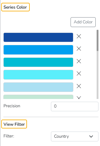
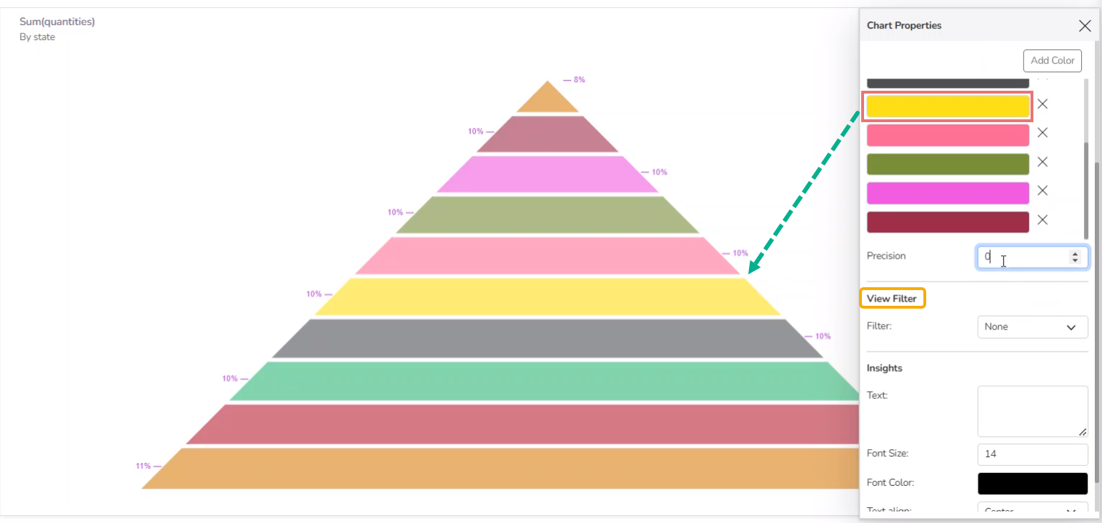
Series Color

  • Add Color: Click the Add Color option to insert new colors into the series or modify the added color.

  • Precision: Set or modify precision value.

View Filter

  • Filter: Select a filter option from the drop-down menu.

Adding a Color

  • Click the Add Color option. A new color gets added to the displayed series list.
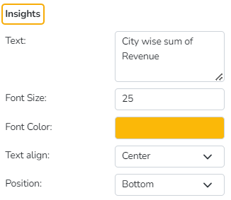
Insights

  • Text: Provide any information regarding the chart. If any digit or character is required to be highlighted, put it inside two asterisks. (E.g., *70%* or *skills*).

  • Font Size: Set/modify the Font Size of the Insights text.

  • Font Color: Select a Font color for the Insights Text.

  • Text align: There are three alignments to align the text.

    • Left

    • Right

    • Centre

  • Position: There are two options to position the text.

    • Bottom

    • Right

Applying Inverted Funnel chart Properties to a View
Default View with Inverted Funnel chart
Modified View after applying Inverted Funnel chart properties