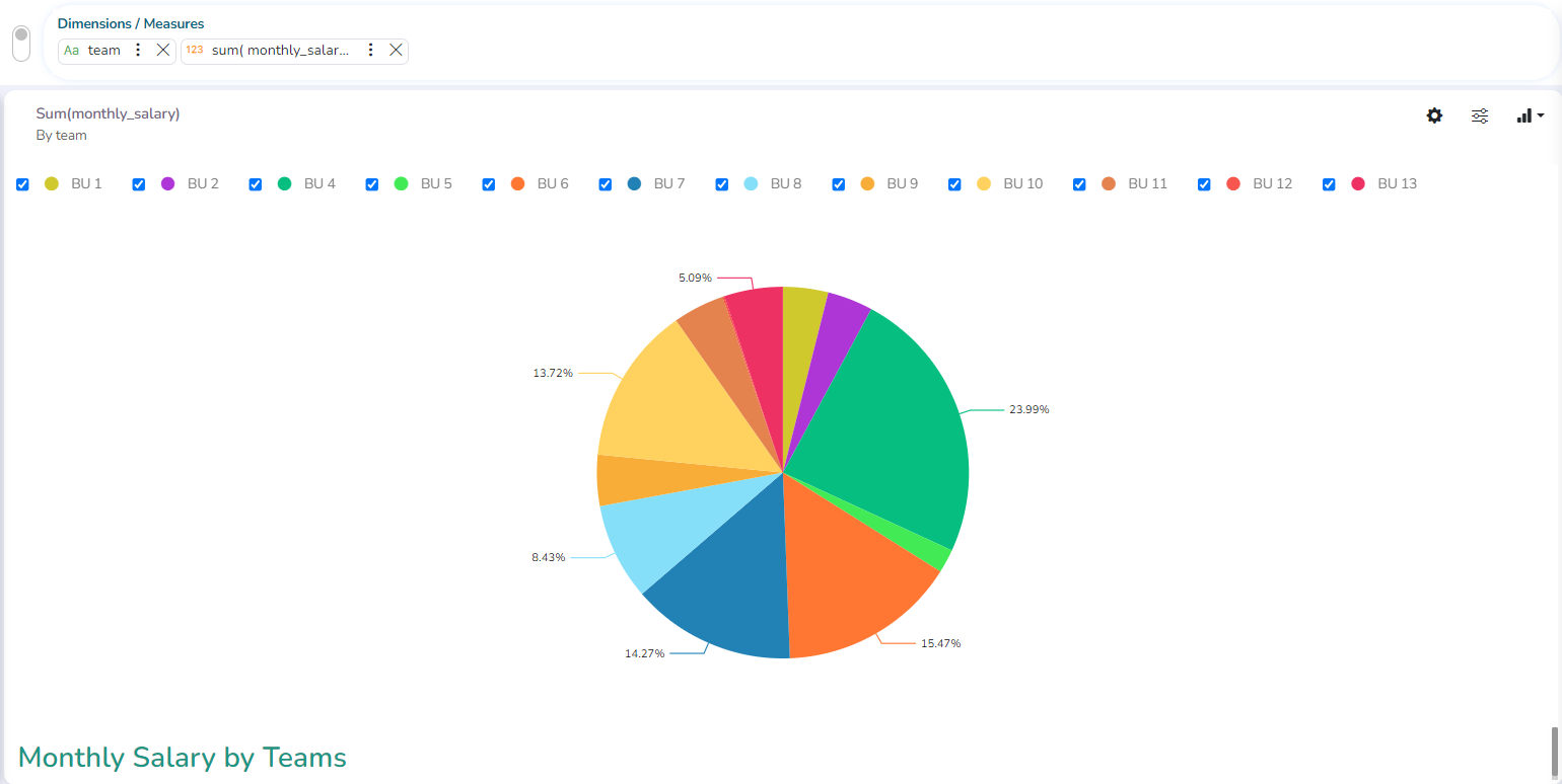
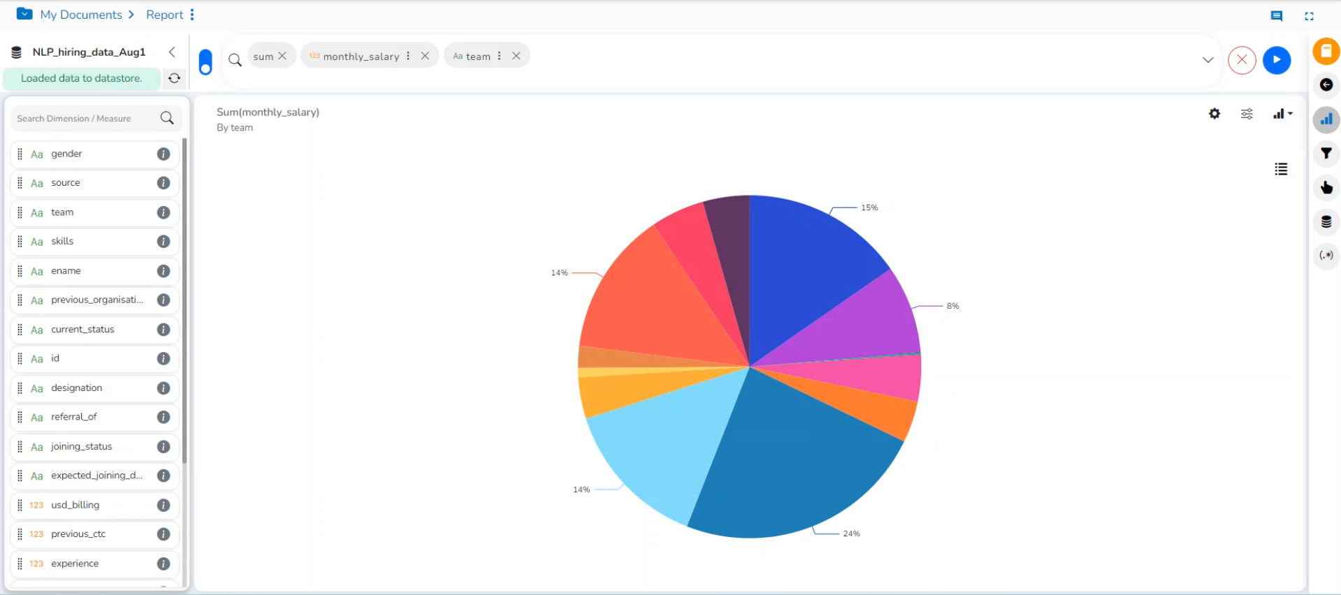
Pie chart
The most widely used chart to show proportions, percentages, and categorize information is the Pie Chart. It is mainly used for comparison where the users can quickly determine which category is most popular, and which is least.
Check out the illustration on PIe chart properties.
The best situation to use a Pie Chart: Mainly to compare categories available on the pie to find out top performers, and least performers. It is better for viewing if the category is limited to 6 or fewer.
Variations of this chart:
Pie-Doughnut: Doughnut charts are like Pie-chart if wished the user can switch from a pie chart to a doughnut chart.
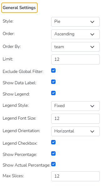
Properties
General Settings
Style: Select a style to display data
Pie
Doughnut
Semi Doughnut
Doughnut width: Set the width of the doughnut using this property field.
Order: Select a sequence for displaying data
None
Ascending
Descending
Manual Sort
By selecting an order (ascending or descending, users will be required to configure the following fields:
Order By- Select a value option from the drop-down menu to order the data sequence.
Limit- Set a number to display the requested data by this limit.
Exclude from Global Filter: The view will be excluded from the Global Filter condition by putting a checkmark in the box.
Show Data Label: The data label will be displayed using the radio button.
Show Actual Values: This option displays the actual values on the chart.
Show Legend: Displays legend by turning on the radio button. After enabling ‘Show Legend,’ users need to select the following information:
Legend Style: Select one of the following options using the drop-down menu.
Fixed
Floating
The following fields appear when the selected Legend Style option is Fixed.
Legend Font Size: This option allows to increase or decrease the font size of the legend.
Legend Orientation: This option appears when ‘Show Legend’ is enabled, and the selected ‘Legend Style’ is ‘Fixed.’ Users must choose an option from the given choices using the drop-down menu.
Vertical
Horizontal
Legend Checkbox: The user can enable or disable the display of a particular series in the Pie chart using the Legend Checkbox.
Use the following options to display the percentage for the series data.
Show Percentage
Show Actual Percentage
Max Slices: Set a number to limit the maximum displayed slices in the chart.
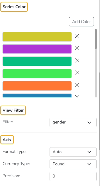
Series Color
The user can add a series color and modify the existing series color using this properties option.
View Filter
Filter: Select a filter condition using the drop-down menu.
Please Note: The selected View Filter option will be reflected to customize the View data after adding the View to the report.
Axis
Format Type: Select a desired format type from the drop-down menu (the provided options for this field are: None, Auto, Percent, Thousand, Lacs, Crore, Million, Billion, Trillion, Quadrillion).
Currency Type: Select a currency symbol to be displayed in the view (the provided options for this field are: None, Rupees, Euro, Pound, USD, Yen, Cent).
Precision: Set the after-decimal value (It will show up to 5 precision).
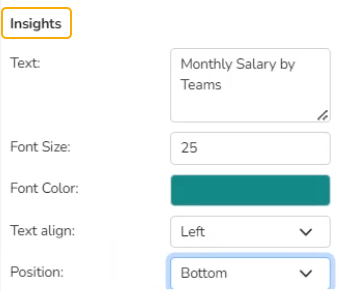
Insights
Text: Provide any information regarding the chart. If any digit or character is required to be highlighted, put it inside two asterisks. (E.g., *70%* or *skills*).
Font Size: Set/modify the Font Size of the Insights text.
Font Color: Select a Font color for the Insights Text.
Text align: There are three alignments to align the text.
Left
Right
Centre
Position: There are two options to position the text.
Bottom
Right