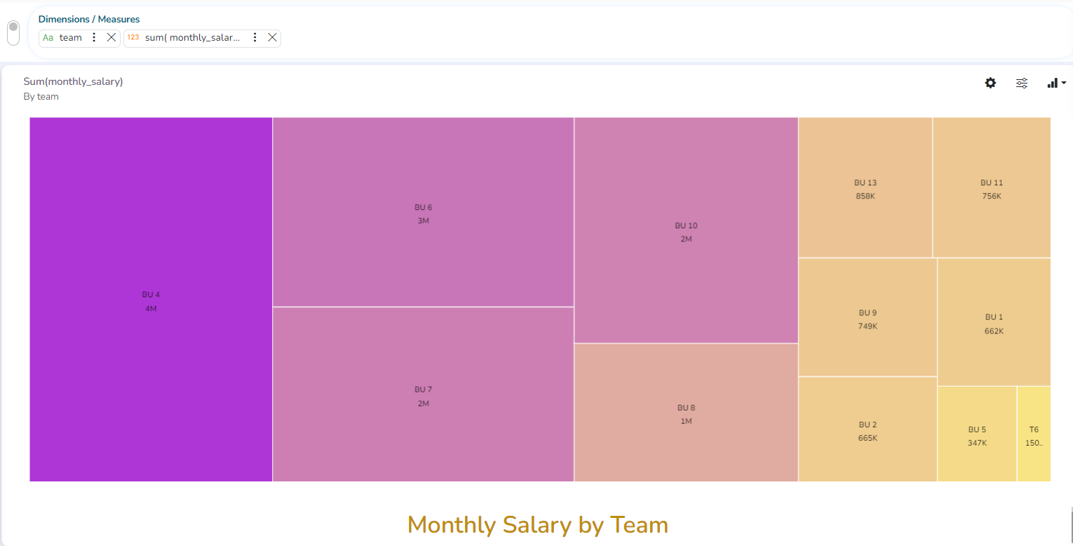
TreeMap chart
The Tree Map charts are mainly used to demonstrate vast amounts of classified data. It can be the best choice when users want to view all their hierarchical data at one time. Each rectangle represents a branch in a tree, and it shows how much data it comprises. The size and position of the boxes are based on the quantitative variable used for the chart. Patterns across the data can be identified using the size and color of the boxes.
Check out the illustration on TreeMap chart properties.
The best situation to use TreeMap: To view all the hierarchical data at one time.
Variations of this chart: Each rectangle can be colored differently so the user can understand by a glance how the hierarchical data is structured.
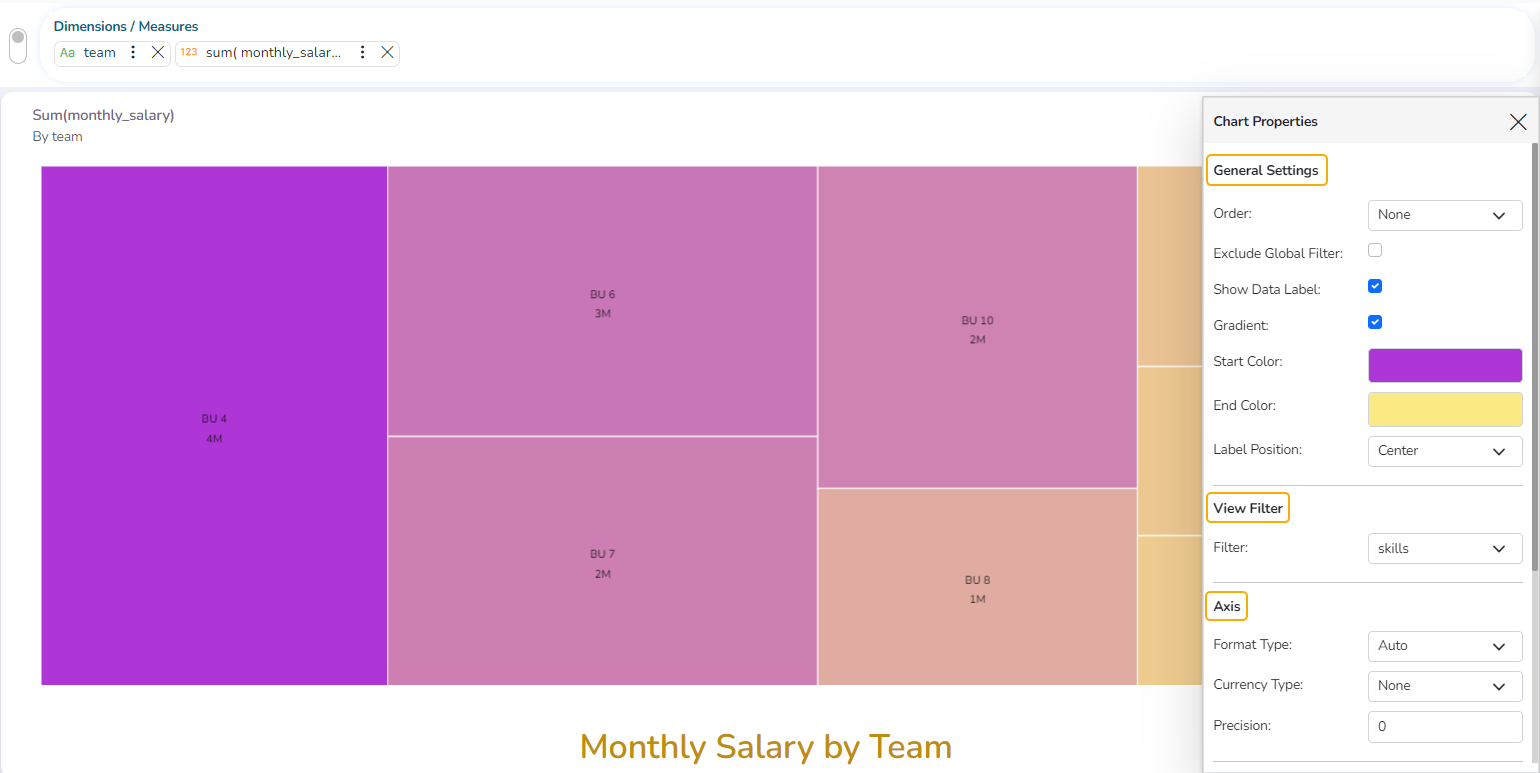
Properties
General Settings
Order: Select a sequence for displaying data
None
Ascending
Descending
Manual Sort
By selecting an order (ascending or descending), users will be required to configure the following fields:
Order By- Select a value option from the drop-down menu to order the sequence of the data
Limit- Set a number to display the requested data by this limit
Exclude Global Filter: The view gets excluded from the Global Filter condition by turning on the radio button
Show Data Label: The data label is displayed by turning on the radio button
Gradient: Enable or disable the color gradient effect on the chart using the checkmark in the box.
By enabling the Gradient option, the user gets redirected to select Start Color and End Color from the respective menus.
The user gets redirected to select Color for the TreeMap sections by disabling the Gradient option.
View Filter
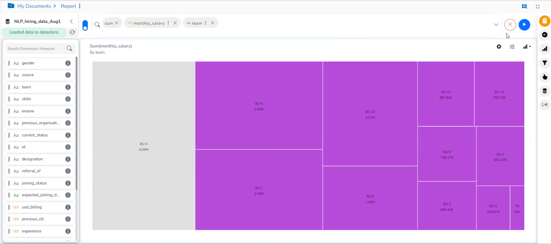
Filter: Select a filter condition using the drop-down menu (E.g., ‘Source’ is the selected filter condition in the following image).
Please Note: The selected View Filter option will be reflected to customize the View data after adding the View to the report.
Axis
Format Type: Select a desired format type from the drop-down menu (the provided options for this field are: None, Auto, Percent, Thousand, Lacs, Crore, Million, Billion, Trillion, Quadrillion).
Currency Type: Select a currency symbol to be displayed in the view (the provided options for this field are: None, Rupees, Euro, Pound, USD, Yen, Cent).
Precision: Set the after-decimal value (It displays up to 5 precision).
E.g., The image displays the Sum of Experience sliced based on Team.
Insights
Text: Provide any information regarding the chart. If any digit or character is required to be highlighted, put it inside two asterisks. (E.g., *70%* or *skills*).
Font Size: Set/modify the Font Size of the Insights text.
Font Color: Select a Font color for the Insights Text.
Text align: There are three alignments to align the text.
Left
Right
Centre
Position: There are two options to position the text.
Bottom
Right
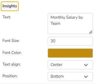
Insights Properties