Waterfall chart
Check out the walk-through on the properties of the Waterfall chart.
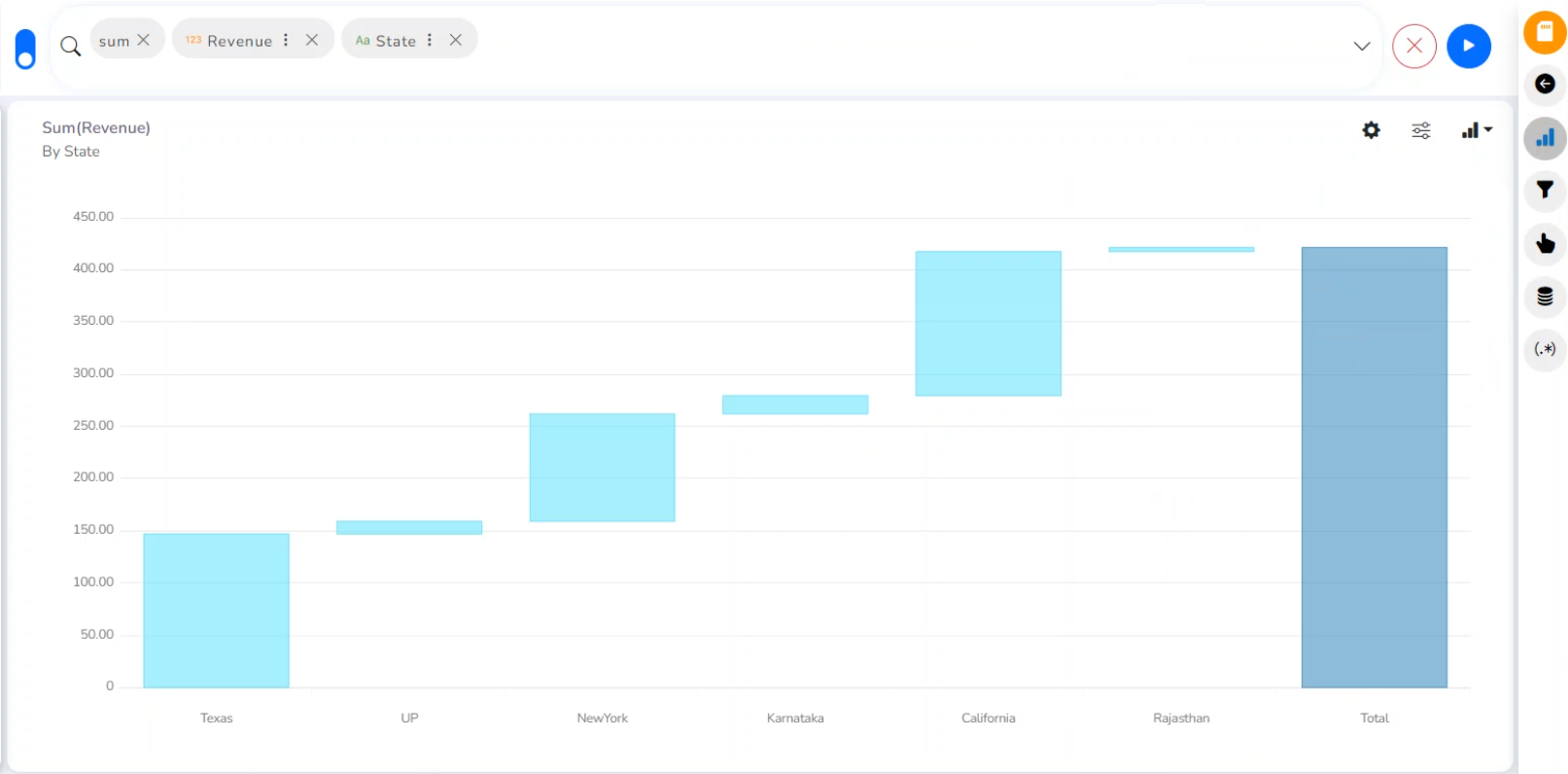
A Waterfall Chart is a form of data visualization that helps in understanding the cumulative effect of sequentially introduced positive or negative values. The Waterfall Chart is used to show how an initial value is increased and decreased by a series of intermediate values, leading to a final value.
Best Situations to Use Waterflow chart:
To show incremental changes in the values over time
Properties
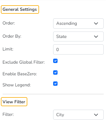
General Settings
Order: Select a sequence for displaying information.
None
Ascending
Descending
Manual Sort: The user needs to sort the dimensions by using the indicator signs manually. By selecting an order (ascending or descending), the user needs to configure the following fields:
Order By- Select a value option from the drop-down menu to order the sequence of the data.
Limit- Set a number to display the requested data by this limit.
Exclude Global Filter: The view gets excluded from the Global Filter condition by putting a checkmark in the box.
Enable Base Zero: Base value gets presented from Zero by providing a checkmark in the box.
Show Legend: By enabling this option the Legend gets added to the chart.
Please Note: At present, the supported Legend Style is Floating only.
View Filter
Filter: Select a filter condition using the drop-down menu.
Column Colors
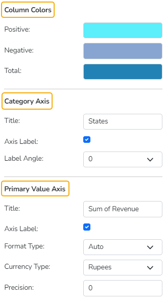
Users can specify colors for the Positive, Negative, and Total fields.
Category Axis
Title: Provide a title for the axis
Axis Label: Enable the Category Axis label by putting a checkmark in the box.
Label Angle: Select a display angle for the axis label.
Primary Value Axis
Title: Provide a title for the Primary Value Axis.
Axis Label: Enable the Primary Value Axis label by putting a checkmark in the box.
Format Type: Select a desired format type from the drop-down menu (the provided options for this field are: None, Auto, Percent, Thousand, Lacs, Crore, Million, Billion, Trillion, Quadrillion).
Currency Type: Select a currency symbol to be displayed in the view (the provided options for this field are: None, Rupees, Euro, Pound, USD, Yen, Cent).
Precision: Set the after-decimal value (It displays up to 5 precision).
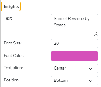
Insights
Text: Provide any information regarding the chart. If any digit or character is required to be highlighted, put it inside two asterisks. (E.g., *70%* or *skills*).
Font Size: Set/modify the Font Size of the Insights text.
Font Color: Select a Font color for the Insights Text.
Text align: There are three alignments to align the text.
Left
Right
Centre
Position: There are two options to position the text.
Bottom
Right
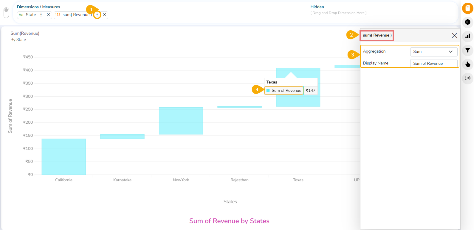
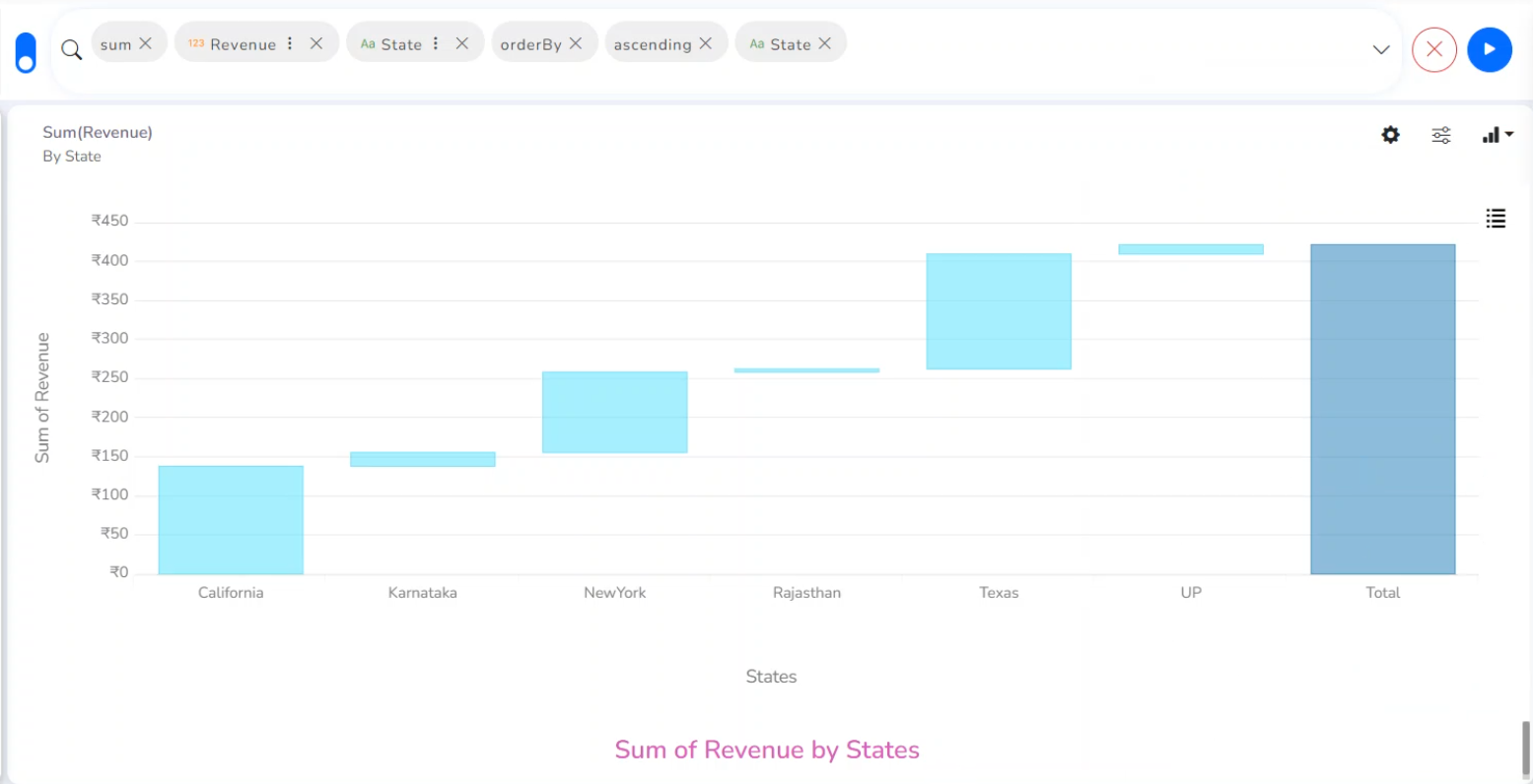
The modified chart View after the chart properties get applied.
Please Note: When the selected Format Type is Percentage, you don’t get the Currency Type field.
Series Properties
Click the Series Properties provided next to the measure name.
A new window opens.
Configure the required details:
Aggregation-select an aggregation using the drop-down menu (By default, it displays the second aggregation type which is Sum).
Display Name- provide a name to be displayed in the legend.
The configured Series Properties get applied to the chart.
