Sankey chart
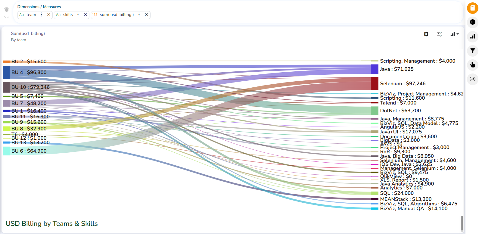
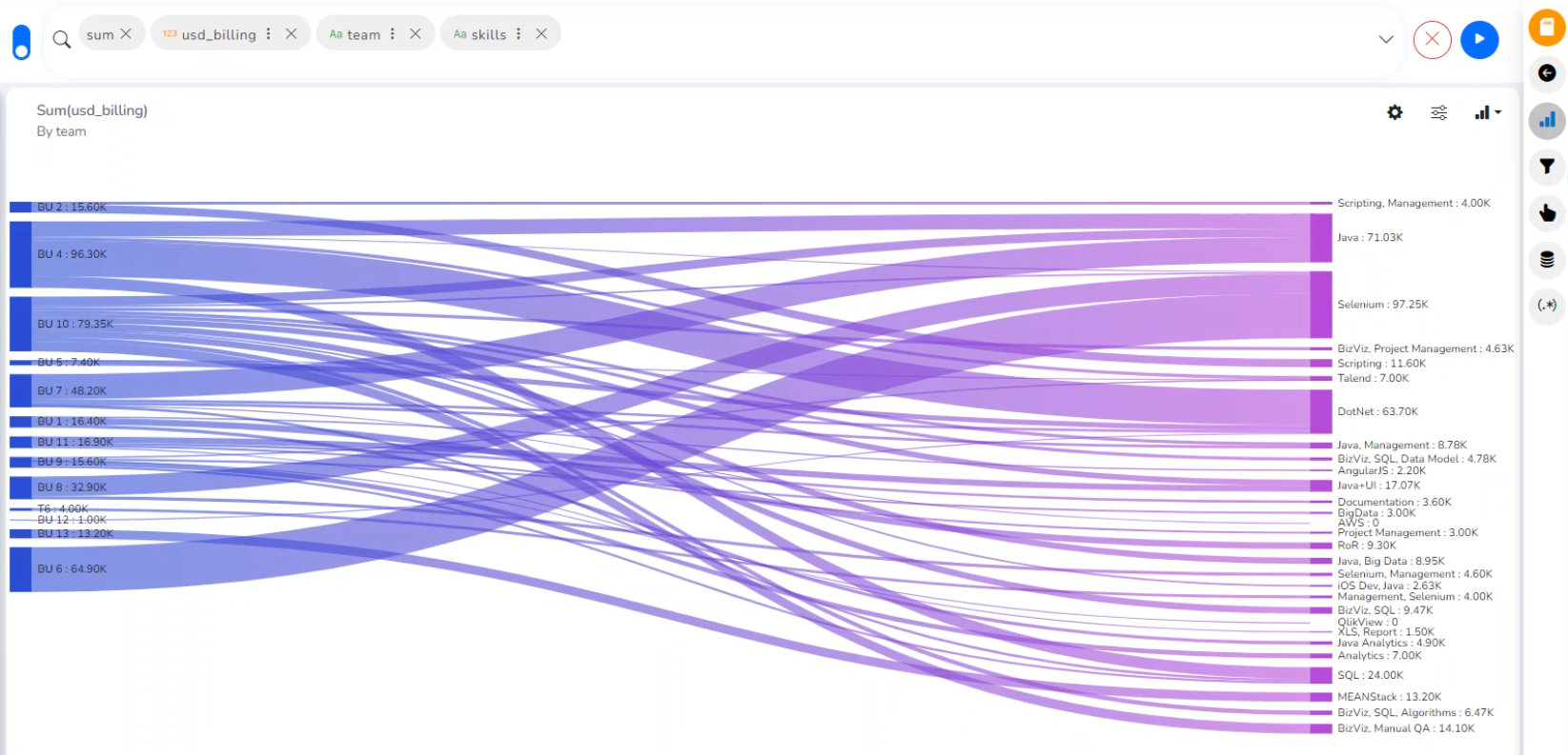
A Sankey diagram is a visualization used to depict a flow from one set of values to another. The things being connected are called nodes and the connections are called links.
Check out the walk-through on how to configure properties of the Sankey chart.
Best Situations to Use Sankey chart
To show a many-to-many mapping between two domains.
To display multiple paths through a set of stages.
Example: To show mapping on Energy and Resource Flows.
Properties
You can access the chart-specific properties from the Design page. It gets listed under the Chart Properties icon on the right-top panel.
General Settings
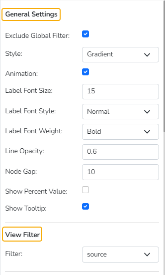
Exclude Global Filter: The view gets excluded from the Global Filter condition by putting a checkmark in the box.
Style: Select a style to display the data (the provided choices for this field are Gradient, Source, Target).
Gradient: The color pattern will be gradient from source to target
Source: The color pattern will be from the source to near of target one & for the target another color.
Target: The color pattern will be one for the source & up to the target end another color given.
Animation- If the Animation option is enabled, the View will display in an animated format or if disabled it will be static at the position.
Label Font Size: This is applicable for the labels from 0 to 25, by default label size will be 10
Label Font Style: There are 2 types Normal & Italic which will reflect to label
Label Font Weight: This is of 5 types: Normal, Bold, 300,600,900. Changes will be seen to the labels
Line Opacity: This will define the opacity of the links connecting the nodes, the value should be less than or equal to 1
Node Gap: This is to define the gap between nodes (interlink lines) from 0 to 20, by default it will be 8
Show Percent Value: This will show the percentage value of actual data if the checkbox is enabled or the actual value of data if the checkbox is disabled.
Show Tooltip: If the checkbox is enabled, tooltip will come & vice versa
View Filter
Select a Filter value from the given drop-down menu to use as a View Filter.
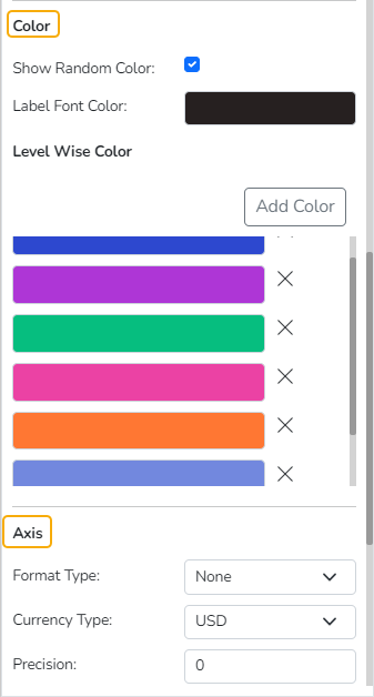
Color
Show Random Color: When the checkbox is enabled it will show the color given on “Level wise color” properties & if enabled it will show random multiple colors.
Label Font Color: Select a Label Font Color using the color pallet.
Level Wise Color: This is to show the color of the chart as per user requirements.
Axis
Format Type: Select a format type from the drop-down menu. The supported options are None, Auto, Percent, Thousand, Lacs, Crore, Million, Billion, Trillion, Quadrillion.
Currency Type: Select a currency type from the drop-down menu. The supported options are None, Euro, Rupees. Pound, USD, Yen, Cent.
Precision: Set Precision value using this field.
Insights
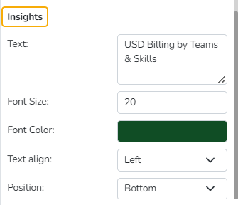
Text: Provide any information regarding the chart. If any digit or character is required to be highlighted, put it inside two asterisks. (E.g., *70%* or *skills*).
Font Size: Set/modify Font Size of the Insights text.
Font Color: Select a Font color for the Insights Text.
Text align: There are three alignments to align the text.
Left
Right
Centre
Position: There are two options to position the text.
Bottom
Right
