> For the complete documentation index, see [llms.txt](https://docs.bdb.ai/governed-dashboards-4/llms.txt). Markdown versions of documentation pages are available by appending `.md` to page URLs; this page is available as [Markdown](https://docs.bdb.ai/governed-dashboards-4/charts-gallery/grids/data-grid.md).
# Data Grid
The Data Grid component is used to represent data in tabular form. Data Grid is also known as 'Grid View' as the data will be displayed within a grid.
## **Best Situation to Use Data Grid**
When the end-user need to view data in numerical format. When alerts need to be shown.
## **Default Data Grid Chart Image**
## **Properties of the Data Grid chart**
### **Background**
The user can change the background color of the chart, can get the border for the chart and can change the border color, can get the reflection of the chart by enabling the shadow option can also change the color and increase & decrease the transparency of the shadow.
### **Export Options**
The user can enable the “Enable Context Menu”, then it is possible to download the reports in different formats if we click on the chart from the preview section. The heading and subheading of that downloaded chart and the name of the downloaded file can be changed from this section.
### **General**
The user can change the height, width, top, left, chart type, column type & Line form. In this case, we have changed the scroll view to disable.

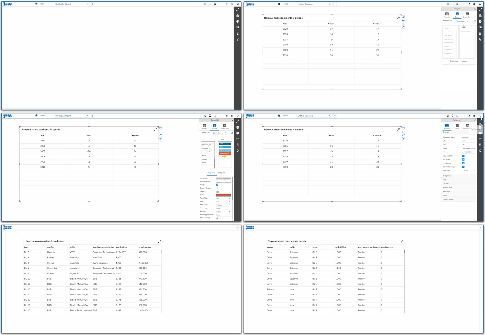
Rearrange Column Property in the Data Grid component
#### Access Check Boxes for the Multi-selection of the Rows
Enable the Show Checkbox property from the General section and provide the "allowmultipleselection = true" in the Dashboard script to avail the checkboxes in the preview mode of the Data Grid.
{% hint style="success" %}
*Check out the given illustration on accessing checkboxes for the multi selection of the Grid Rows.*
{% endhint %}
{% embed url="" %}
***Implementing Checkbox property for the multi selection of the rows in the Data Grid***
{% endembed %}
### **Header Style**
The user can change the header text color, font size, font style, and background color.

### **Row Style**
The user can change the font size, font color, text decoration, and enable the text wrap. The user can also increase the row height.

### **Styles**
The user can change the background color, rollover color, selection color, user can enable horizontal grid lines also can change the color for horizontal & vertical lines.

### **Subtitle**
The user can enable the subtitle to display the second title. The user can change the Name, Font color, size, style for the subtitle.
### **Title**
The user can change Title Name, Font color, size, style, etc.

## **Properties Tab from the Dataset Pallet**

## **Data Grid after changing the Properties**
{% hint style="info" %}
*Please Note:*
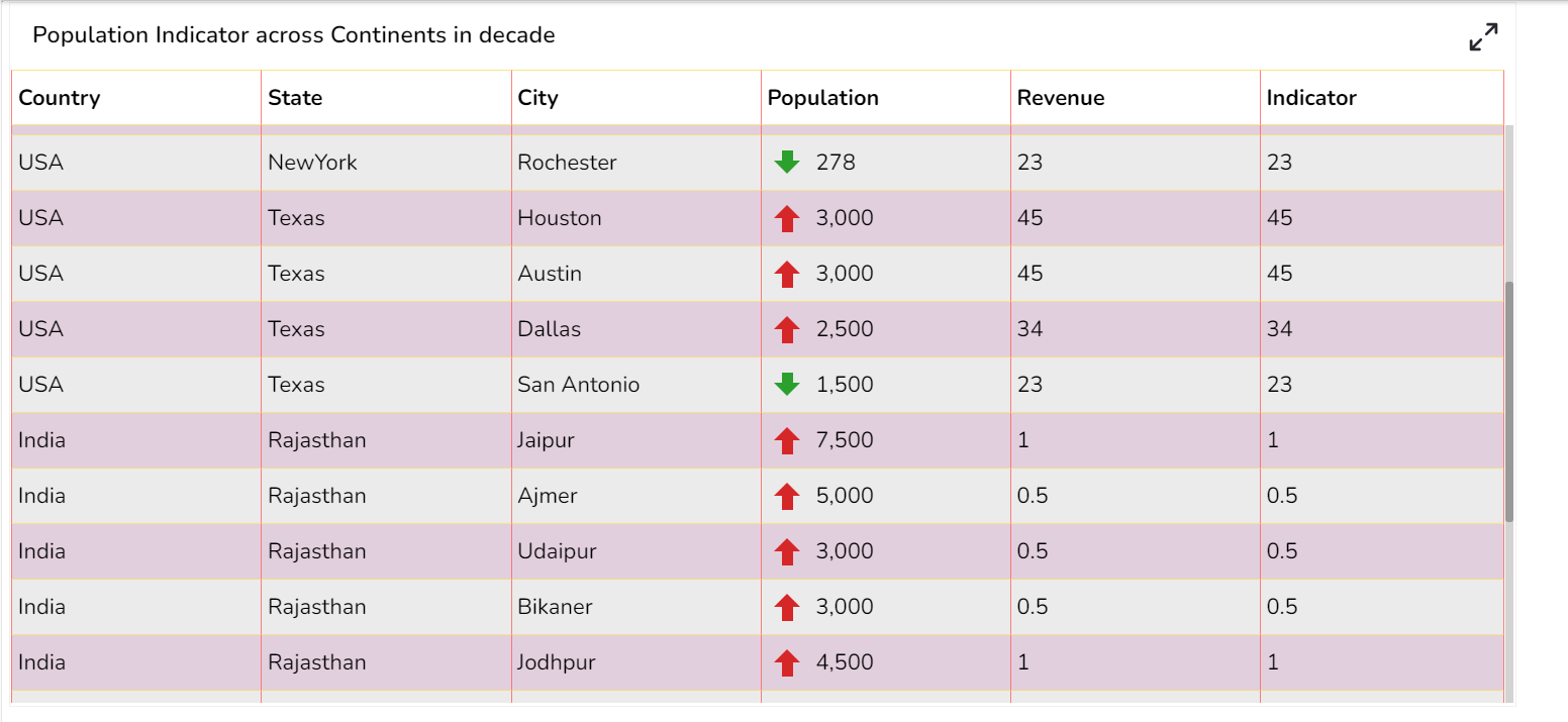
* *The user needs to select the **Column Type** as **Numeric** for the selected Data Grid fields using the **Properties** tab provided for the Dataset, so they become responsive to the changes that the user set using the **Indicator** tab.*

* *Refer the* [***Alerts in Grids***](https://docs.bdb.ai/governed-dashboards/configurations/alerts-in-grids) *page provided under* [***Configurations***](https://docs.bdb.ai/governed-dashboards/configurations) *section to understand how to insert Alerts in a Grid component.*
{% endhint %}