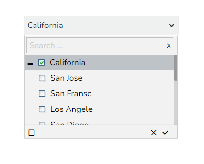
Hierarchical Combo Box is similar to Check Box and Combo Box but here the list will be arranged in the hierarchical manner and users will be allowed to select multiple items simultaneously.
Best situation to use Hierarchical Combo Box
When users should be given the option to select 1 or more cities that will be used in the table/chart (instead of displaying data for all cities)
Default Component Image

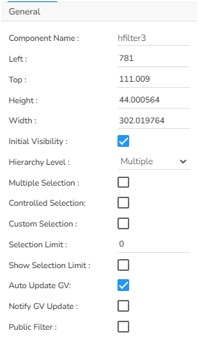
Properties of the Hierarchical Combo Box Filter
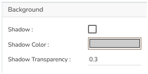
Background
The user can get the reflection of the chart by enabling the shadow option can also change the color and increase & decrease the transparency of the shadow.
General
The user can change the height, width, top, left. If initial visibility is not enabled, then the chart won’t be available for the first preview. Hierarchy level can be selected between Multiple or Single. Also, user can set the selection limit as either user can show it in the preview or not. Enable the Notify GV Update so that when user change values in this filter, those values get updated in the filter.
Style
If user set a Rollover Color, then when user move from one cell to another, they can see those cells in that color. Selection color highlights the selected cells. Also, they can adjust the panel color and background color as well as their font properties.

Hierarchical Combo box filter variant after changing its properties