Governed Dashboards
  • About Dashboard Designer
    • What is Dashboard Designer?
    • Why is it used?
  • Getting Started
    • Accessing the Designer Module
    • Overview of Designer Module
      • Homepage
        • Guided Tour
        • Left Menu Panel
          • New
          • Manage
          • Open Dashboard
          • Preferences
          • Save As
          • Help
          • Exit
      • Dashboard Canvas Page
        • Right side Panel
          • Connection Page
          • Chart Container
          • Manage Window
          • Script Window
          • Guided Tour
        • Canvas Properties
          • Global Properties
          • Dashboard Themes
        • Context Menu Properties
  • Create New Workspace
    • Workspace Creation: Complete Flow
    • Creating a Workspace
    • Renaming a Workspace
    • Deleting a Workspace
  • Create New Dashboard
    • Dashboard Creation: Basic Workflow
    • Adding a New Dashboard
    • Create Connection
    • Drag and Drop Charts
    • Associate the Dataset
    • Preview the Dashboard
    • Save the Dashboard
    • User Alert Notification
  • Managing Options for a Dashboard
    • Open Dashboard in Designer
    • Publish a Dashboard
    • Share a Dashboard
    • Dashboard Version Control
    • Action Menu
      • Preview Dashboard
      • Export to Local Disk
      • Rename
      • Delete
      • Moving a Dashboard
      • Information Icon
      • Dashboard as Template
  • Connecting to a Data Source
    • Accessing the Data Connectors
    • Establishing a Data Connection
      • CSV Connection
      • Excel Connection
      • Data Service Connection
      • Data Store Connection
      • Data Sheet Connection
        • Data Sheet Enhancements
      • WebSocket Connection
      • Merged Connection
  • Charts Gallery
    • Charts
      • Area chart
      • Bar Chart
      • Bubble Chart
      • Circumplex Chart
      • Column Chart
      • Funnel Chart
      • Histogram Chart
      • Inverted Funnel
      • KPI Tile
      • Line Chart
      • Map Chart
      • Mito Plot
      • Mixed Chart
      • Pie Chart
      • Project Timeline
      • Pyramid Chart
      • Scatter Plot
      • Spark Line
      • Spider Chart
      • Waterfall Chart
    • Grids
      • Data Grid
      • Paging Grid
      • Data Sheet
      • Scorecard
      • Pivot Grid
    • Filters
      • Checkbox
      • Combobox
      • Hierarchical Combobox
      • List
      • Radio Button
    • Advanced Charts
      • Box Plot
      • Candle Stick
      • Chevron
      • Data Search
      • Decision Tree
      • Group Bar
      • Group Column
      • Heat Map
      • Sankey
      • Text Analyzer
      • Time Series
      • Decomposition
      • Knowledge Graph
      • Tree Map
      • Trellis
      • Word Cloud
      • New Word Cloud
    • Other Charts
      • Box
      • Bullet
      • Date Picker
      • Export
      • Filter Chips
      • Filter Saver
      • Gauge
      • Graphics
      • Guided Tour
      • H-Slider
      • Image
      • Info Button
      • Input Box
      • Label
      • Legend
      • Progress Pie
      • Semi Gauge
      • Stepper
      • SVG Image
      • Text Box
      • Trend
      • URL Button
      • V-Slider
      • Tab Component
      • Inputbox component
      • Button component
    • Custom Charts
    • Common Chart Properties
      • Background
      • Title & Sub-title
      • X & Y Axis Properties
      • Legend Properties
      • Formatter
      • Axis Setup
      • Export Options
      • Copy Paste Chart Properties
  • Dashboard Objects
    • Manage Dashboard Components
    • Dashboard Objects Properties
  • Configurations
    • Filtering the Data
    • Drill Through
      • Drill Highlighter
    • Dataset Properties
    • Indicators in Charts
    • Tooltip(Default & Custom)
    • Data Label
    • Geo Mapping
    • Language Mapping
    • Legend Mapping
    • Alerts in Grids
  • Script Help Section
    • Navigate to Script Help page
    • How to use Scripts?
Powered by GitBook
On this page
  • Default Chart Image
  • Default Preview Image
  • Properties of the Date picker component
  • General
  • Background
  • Style
  • Possible Variants of the Date Picker by modifying Properties
  1. Charts Gallery
  2. Other Charts

Date Picker

PreviousBulletNextExport

The Data Picker component is used to select a date.

Default Chart Image

​​

Default Preview Image

Properties of the Date picker component

Background: The user can enable the shadow, change the shadow color, and transparency of that shadow.

General

  • The user can change values for the height, width, top, and left fields.

  • The chart will not be visible at the first preview if the initial visibility option is unchecked.

  • The user can use a checkmark to enable year navigation so that we can navigate through different years.

  • By enabling date range and providing date values in the Date From and Date Up to fields, the user can navigate through those months only in the month selection part of the date picker.

  • The user can select one date as default and that one will get highlighted in the date picker.

  • Different date formats are available inside the Date Picker component which the user can select based on the requirement of the data input or output formats.

  • The user can connect the output format with some chart components.

Background

  • Shadow: Put a checkmark in the given box to enable the Shadow for the component.

  • Shadow Color: It prompts a color menu to choose color for the shadow.

  • Shadow Transparency: Set transparency for the component shadow
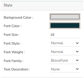
Style

  • The user can change the header color of the date picker in the header color section.

  • The Section color helps to set the Font color of our default date.

  • The Roll Over Color option allows the user to set a change of color while moving from one cell to another.

  • The font color helps to set the color of the dates.

  • The user can change the font size, font style, and font family.

Possible Variants of the Date Picker by modifying Properties

  • Date picker component with date only

  • Date picker with Date range Property

​

​​

​​

​​​

Style