
Mixed Chart

Best Situations to Use a Mixed Chart
Variations of this chart
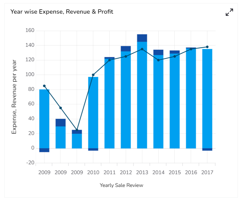
Default Mixed Chart Image

Properties of the Mixed chart
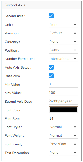
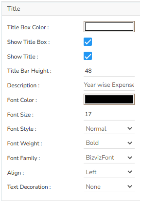
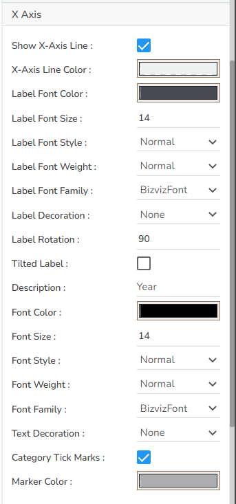
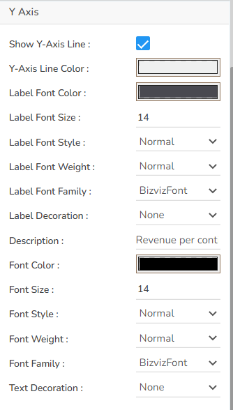
Axis Setup
Background
Export Options


Formatter
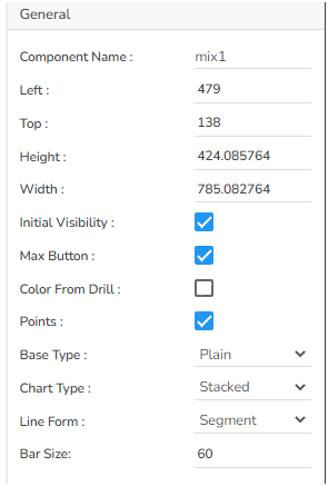
General
Properties Tab from the Dataset Pallet

Modified Properties Tab from the Dataset Pallet:

Variants of the Mixed chart by changing the Properties
Various Stacked Chart & Segment Line
Mixed Chart with Plain base Stacked Chart & Segment line

Mixed Chart with Plain base Stacked Chart & Curve line

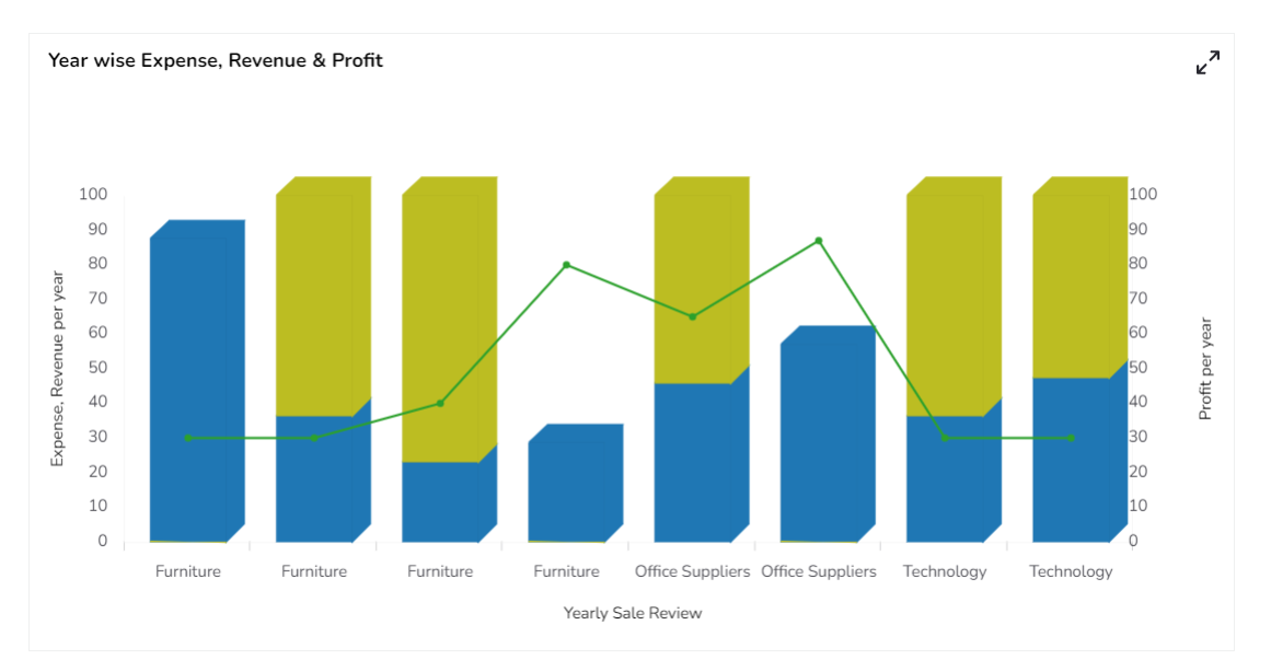
Mixed Chart with Rectangle base Stacked Chart & Segment line

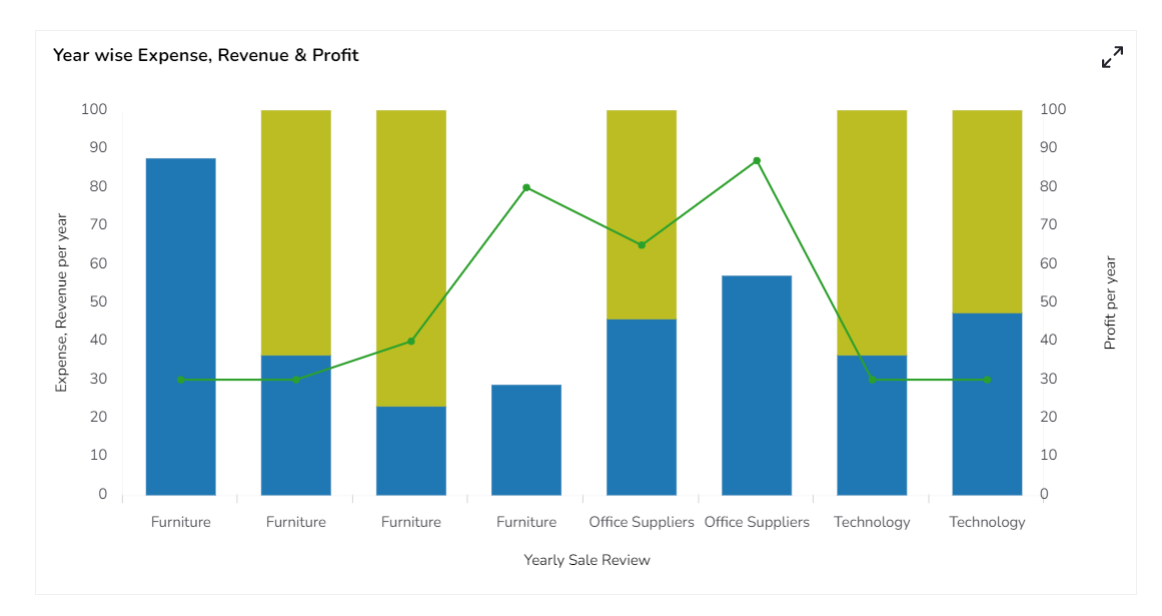
Mixed Chart with Cylinder base Stacked Chart & Segment line

Mixed Chart with Gradient1 base Stacked Chart & Segment line

Mixed Chart with Gradient2 base Stacked Chart & Segment line

Mixed Chart with Gradient3 base Stacked Chart & Segment line

Clustered Chart & Segment Line
Mixed Chart with Rectangle base Clustered Chart & Segment line

Mixed Chart with Cylinder base Clustered Chart & Segment line

Mixed Chart with Pain base Clustered Chart & Segment line

Mixed Chart with Gradient1 base Clustered Chart & Segment line

Mixed Chart with Gradient2 base Clustered Chart & Segment line

Mixed Chart with Gradient3 base Clustered Chart & Segment line

Overlaid Chart & Segment Line
Mixed Chart with Rectangle base Overlaid Chart & Segment line

Mixed Chart with Cylinder base Overlaid Chart & Segment line

Mixed Chart with Plain base Overlaid Chart & Segment line

Mixed Chart with Gradient1 base Overlaid Chart & Segment line

Mixed Chart with Gradient2 base Overlaid Chart & Segment line

Mixed Chart with Gradient3 base Overlaid Chart & Segment line

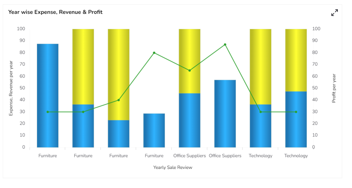
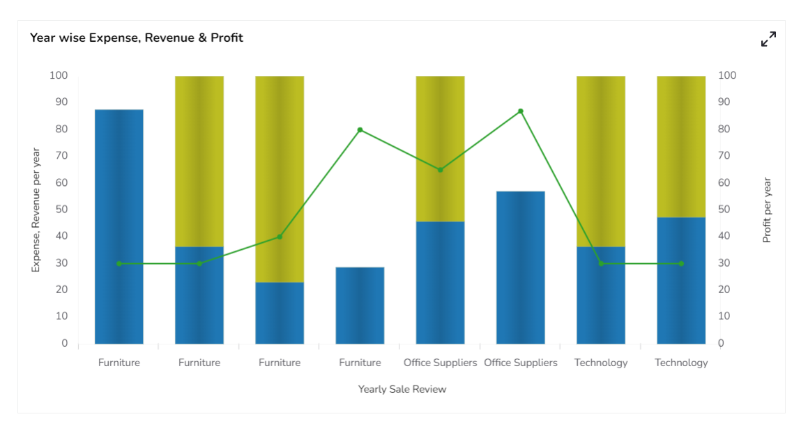
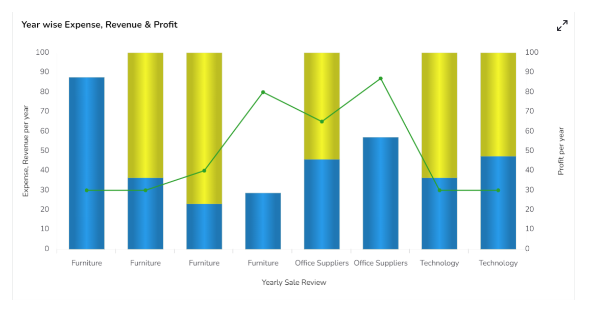
100% Chart & Segment Line
Mixed Chart with Rectangle base 100% Chart & Segment line
Mixed Chart with Cylinder base 100% Chart & Segment line

Mixed Chart with Plain base 100% Chart & Segment line
Mixed Chart with Gradient1 base 100% Chart & Segment line
Mixed Chart with Gradient2 base 100% Chart & Segment line
Mixed Chart with Gradient3 base 100% Chart & Segment line
Sample Data
Last updated