# Knowledge Graph
A network graph, also referred to as a network diagram or node-link diagram, is an effective visual tool for illustrating connections between various entities or nodes. This visualization method is valuable for depicting intricate relationships within a system involving multiple interconnected components. It proves especially useful for analyzing intricate systems characterized by numerous interdependent elements.
## Best situation to use a Knowledge Graph
* When the user needs to visualize and understand the relationships between different entities or nodes in a system.
* E.g., To analyze transportation planning, where a network graph can visualize the connections between different modes of transportation.
* To visualize the connections between different individuals and identify key influencers or social clusters within the social network.
### Variations of this Chart
* **Network Knowledge Graph:** In this chart, nodes represent individual pieces of information or concepts, and the connections between nodes indicate relationships. It's useful for illustrating complex interconnections and dependencies within a dataset.
* **Concept Map:** A concept map is a visual representation that links ideas or concepts using lines and connecting phrases. It's suitable for illustrating relationships between various concepts and how they relate to a central theme.
* **Hierarchical Knowledge Graph:** This type of chart represents information in a hierarchical structure, where each level showcases different levels of detail. It's great for showing parent-child relationships and organizing concepts from broad to specific.
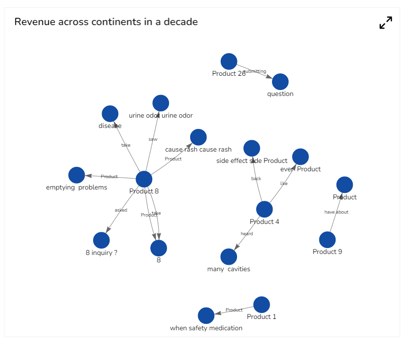
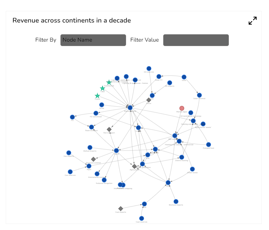
## Default Chart Image
Default Display of the Knowledge Graph component
## Appearance Properties
### General
Users can change the height, width, top, and left. If the Initial Visibility option is unchecked, then the component won’t be visible at the first preview. Users can manage the max button to minimize and maximize the chart.
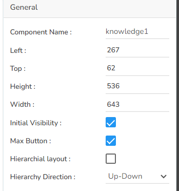
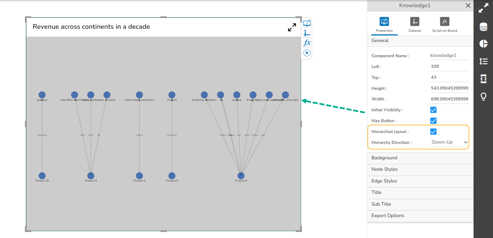
The user can enable the hierarchy layout by using the check box and select the suitable Hierarchy direction as well.
Hierarchical Layout from Down to Up direction
### Background
Users can set the following background properties for the Knowledge chart:
1. Gradient Rotation
2. Opacity
3. Gradient
4. Border
5. Border Color
6. Border Radius
7. Shadow
8. Shadow Color
9. Shadow Transparency

### Node Styles
The user can set the Node shape, color, size, and various Font related properties using the Node Styles properties option.

###
### Edge Styles
Users can provide a style or modify the existing style to Edge by using this properties.

### Title
Users can enable or disable the title, insert title description, set various properties such as Title Box color, Font color, Font Style, Font Weight, Font Family, alignment, and select a Text decoration option using the Title properties.

### Sub Title
Enable or disable sub-title, provide description for the sub-title, and set various Font related properties, alignment and text decoration using the Sub-Title properties.

### Export Options
Users can select various Export options, heading, sub-heading, Name of the exported file, and Global export type using the Export Options properties.

## Applying Properties
### Setting Custom Node Shapes
{% hint style="info" %}
Check out the given walk-through on how to set custom node shapes.
{% endhint %}
{% embed url="" %}
***Setting Custom Node Shapes***
{% endembed %}
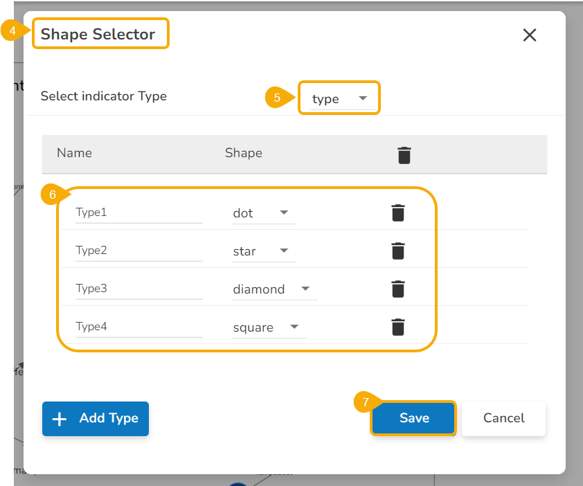
* Navigate to the ***Node Styles*** section given under the appearance properties of the Knowledge chart.
* Enable the checkbox given for ***Use Custom Shapes***.
* Click the ***Custom Shapes*** icon.

* The ***Shape Selector*** window opens.
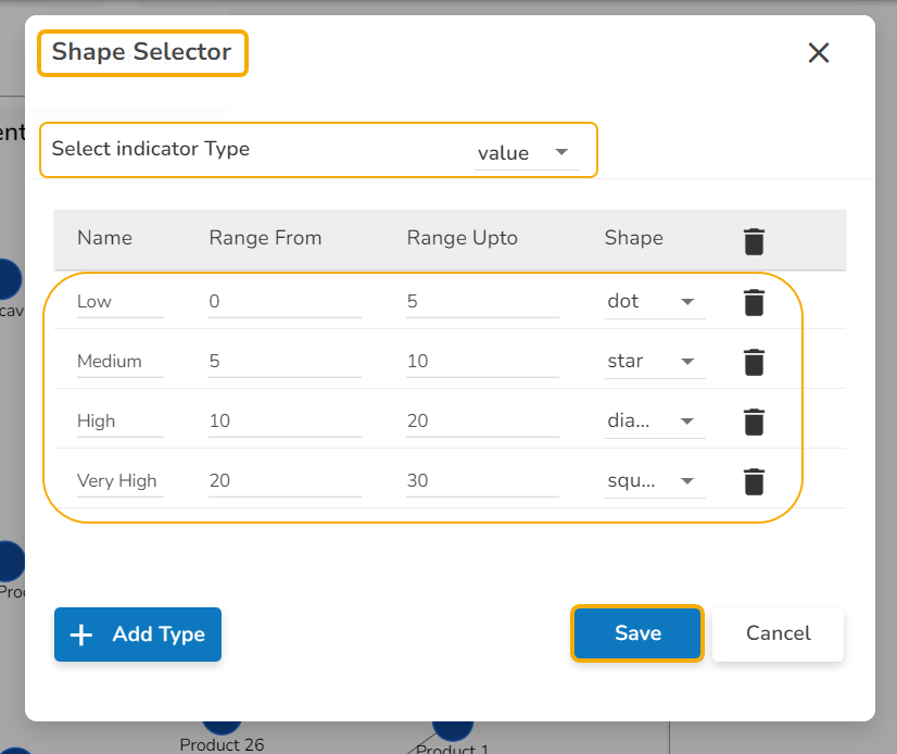
* Select the Indicator Type using the drop-down menu. It can be based on ***Type*** or ***Value***.
* Select various ***Shapes*** for the range of types.
* Click the ***Save*** option.
The user needs to provide the ***Range From*** and ***Range Up to*** limit while using ***Value*** option as indicator type.
* The customized node shapes get added to the chart. The user may see it in the preview mode.
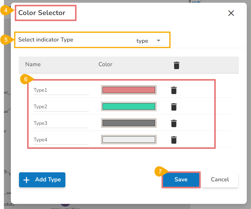
### Setting Custom Node Colors
{% hint style="success" %}
*Check out the given walk-through on how to set Custom Node Colors in the knowledge Graph chart.*
{% endhint %}
{% embed url="" %}
***Setting Custom Node Colors***
{% endembed %}
* Navigate to the ***Node Styles*** section given under the appearance properties of the Knowledge chart.
* Enable the checkbox given for ***Use Custom Colors***.
* Click the ***Custom Colors*** icon.

* The ***Color Selector*** window opens.
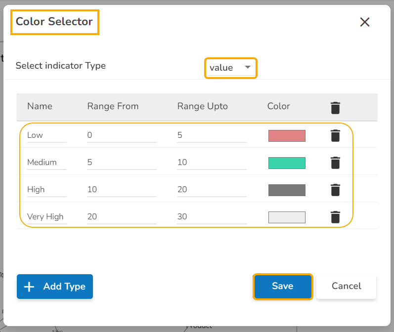
* Select the Indicator Type using the drop-down menu. It can be based on ***Type*** or ***Value***.
* Select various ***Colors*** for the range of types.
* Click the ***Save*** option.
The user needs to provide ***Range From*** and ***Range Up to*** limit while using ***Value*** as the ***Indicator Type*** option.
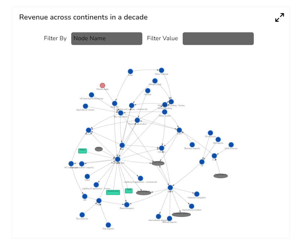
* The customized node colors get added to the chart. The user can see the changes in the ***Preview*** mode.
## Sample Data
Download the given sample data and map it as mentioned below to plot your ***Knowledge Graph*** chart:
Select ***parent\_label*** column as ***Source***, ***child\_label*** as ***Target***, ***edge\_label*** as ***Edge*** field. Drop the ***value*** and ***type*** fields respectively under the ***Value*** and ***Type*** headings given below to plot the size of the nodes.
{% file src="" %}
##