
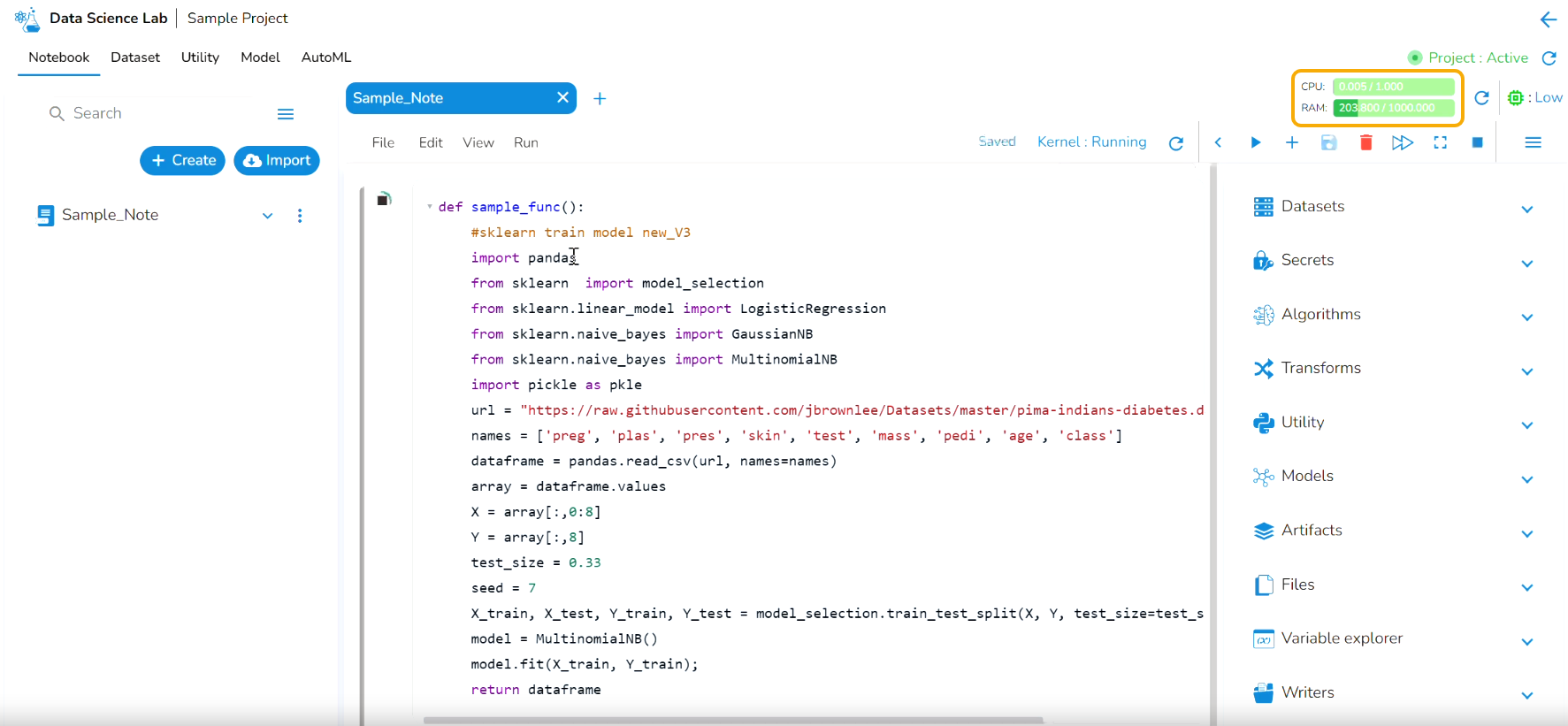
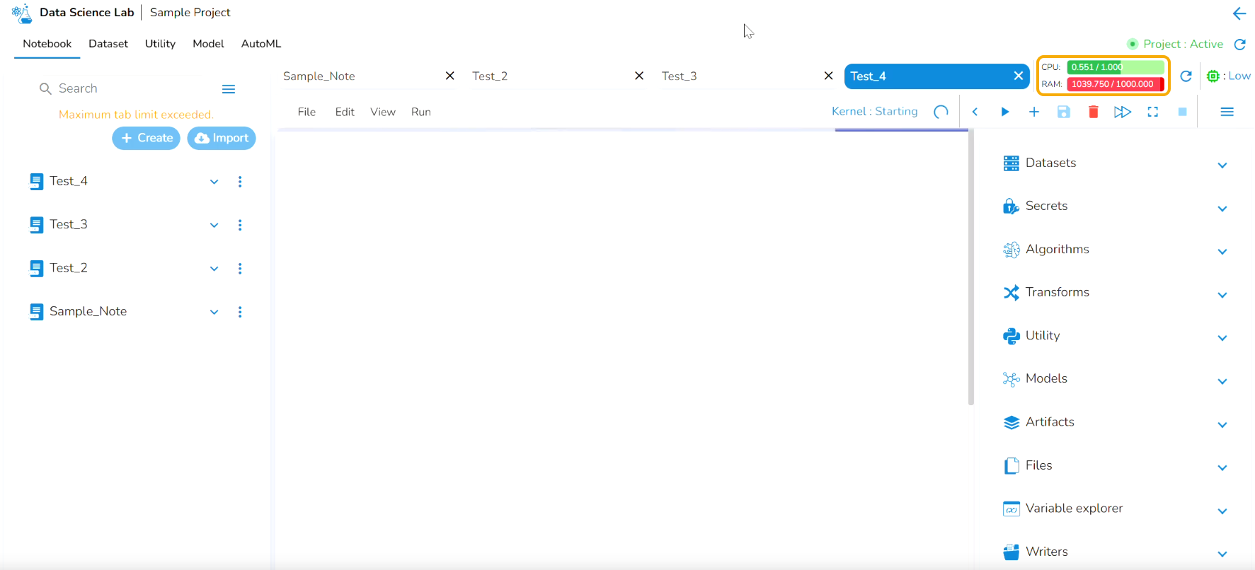
Resource Utilization Graph
It helps to identify the resource utilization of a Data Science Lab Project where the Notebook is saved and getting executed.
Last updated
It helps to identify the resource utilization of a Data Science Lab Project where the Notebook is saved and getting executed.
Last updated