Loading...
Loading...
Loading...
Loading...
Loading...
Loading...
Loading...
Loading...
Loading...
Loading...
Loading...
Loading...
Loading...
Loading...
Loading...
Loading...
Loading...
Loading...
Loading...
Loading...
Loading...
Loading...
Loading...
Loading...
Loading...
Loading...
Loading...
Loading...
Loading...
Loading...
Loading...
Loading...
Loading...
Loading...
Loading...
Loading...
Loading...
Loading...
Loading...
Loading...
Loading...
Loading...
Loading...
Loading...
Loading...
Loading...
Loading...
Loading...
Loading...
Loading...
Loading...
Loading...
Loading...
Loading...
Loading...
Loading...
Loading...
Loading...
Loading...
Loading...
Loading...
Loading...
Loading...
Loading...
Loading...
Loading...
Loading...
Loading...
Loading...
Loading...
Loading...
Loading...
Loading...
Loading...
Loading...
Loading...
Loading...
Loading...
Loading...
Loading...
Loading...
Loading...
Loading...
Loading...
Loading...
Loading...
Loading...
Loading...
Loading...
Loading...
Loading...
Loading...
Loading...
Loading...
Loading...
Loading...
Loading...
Loading...
Loading...
Loading...
BDB’s Designer module is a web browser-based application used to build governed dashboards and design analytics.
BDB’s Designer module is a web browser-based application used to build governed dashboards and design analytics.
The Designer Homepage contains a menu panel on the left side. This section aims to explains the options provided under that panel.
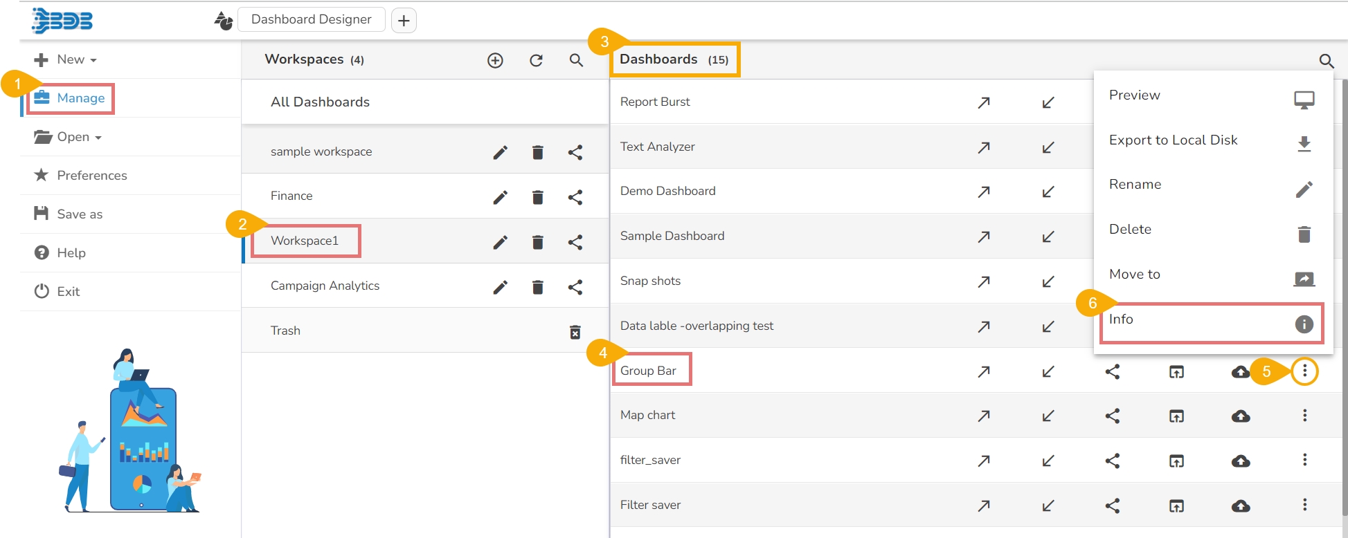
The Actions menu contains some more options like Preview, Export to Local Disk, Rename and Move to that can be applied on the dashboards Action.
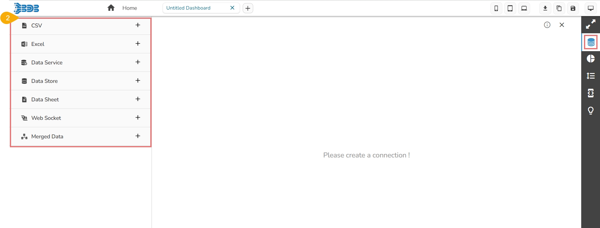
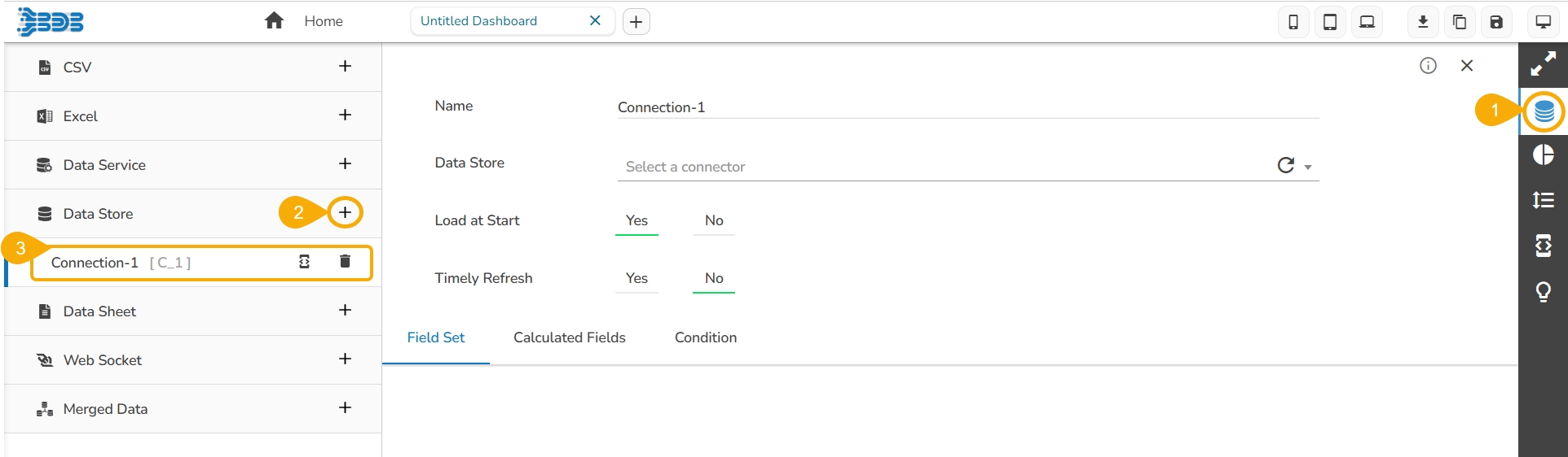
This section explains how to access the various data connector options and step-by-step process to create a connection by using all the available data connectors.
This page displays steps involved in establishing various choices of Data Connectors available inside the Designer module.
Navigate to the Designer homepage.
Click the Exit option.
If work is not saved, the user gets an option while closing to leave or cancel the action of exit. Select the Cancel option if you require to save the work, or else choose Leave to close the designer.
The user gets directed to the Platform homepage.
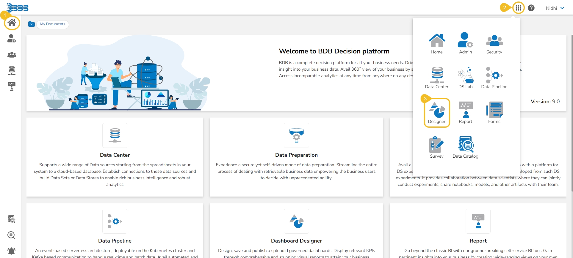
This section covers steps to access the Designer module from the Platform Apps menu.
Navigate to the Homepage of the platform.
Click the Apps menu icon.
Click the Designer module.
The Designer homepage opens.
The Designer canvas page offers an icon to access the supported charting components for the dashboard creation.
Navigate to the Dashboard canvas.
Click the Component Library icon.
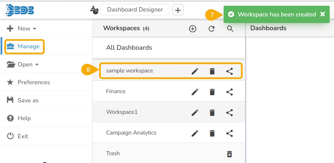
A Workspace is a placeholder where users can save multiple dashboards.
Workspace once created under the Designer module works as a placeholder for multiple dashboards. If you compare a dashboard with a document/file, then the Workspace created to store them is like a folder. The creation of a new Workspace and understanding the various credited options to an available Workspace under the Designer module are aimed to be explained through an illustration. Check out the given walk-through on the complete flow of Workspace creation.
Workspace once created under the Designer module works as a placeholder for multiple dashboards. If you compare a dashboard with a document/file, then the Workspace created to store them is like a folder. The creation of a new Workspace and understanding the various credited options to an available Workspace under the Designer module are aimed to be explained through an illustration.
Check out the illustration to understand the Workspace creation and apply various actions to a created Workspace.
Right click on the dragged component.
Select the Dataset property option.
Select the created connection from the list.
To create a dashboard the user needs to go through multiple pages and use various options provided under the Designer module. It begins with adding a new Dashboard and goes all the way to create a data connection, drag multiple charting components, associate the created data connections with the dragged charts, preview the dashboard data, and finally save the created dashboard.
This option directs users to create a new workspace or dashboard.
Navigate to the Designer homepage.
Click the New drop-down menu.
The user gets two options:
The Export to Local Disk option exports the selected dashboard to the local disk.
Select a dashboard using the Manage option.
Choose the Export to Local Disk option from the More Actions context menu.
This section aims to give an overview of the Dashboard Designer focusing on the two main screens that appear under the Designer module: Homepage and Designer Canvas.
Check out the following walk-through to get an overview of the Designer module.
Navigate to the Dashboard canvas page.
Click the Preview icon.
The selected Dashboard opens in the Preview
This section covers two ways to add a new Dashboard.
Navigate to the Designer homepage.
Click the New drop-down menu and select Dashboard.
Or
Workspace: Clicking this option redirect the users to create a new workspace/place holder for the dashboard.
Dashboard: By clicking this option, the users get redirected to the Designer Canvass to create a new dashboard.
The selected dashboard gets exported to the local disk.
The Help content gets displayed to understand the Designer plugin.
Click on the ‘+’ icon, the users get redirected to the Designer Canvas.
The user gets guided across various important sections of the Designer plugin. The tour begins from the Designer Homepage.
Click the Take a tour option provided on the top right side of the Designer homepage.
A new dialog box opens initiating the landing page tour.
Click the Next option to move ahead in the guided tour.
Click the Prev option to go back to the guided tour.
Click the End Tour option if you want to end the tour at any given point (The End Tour option will get highlighted by default at the end of the guided tour).
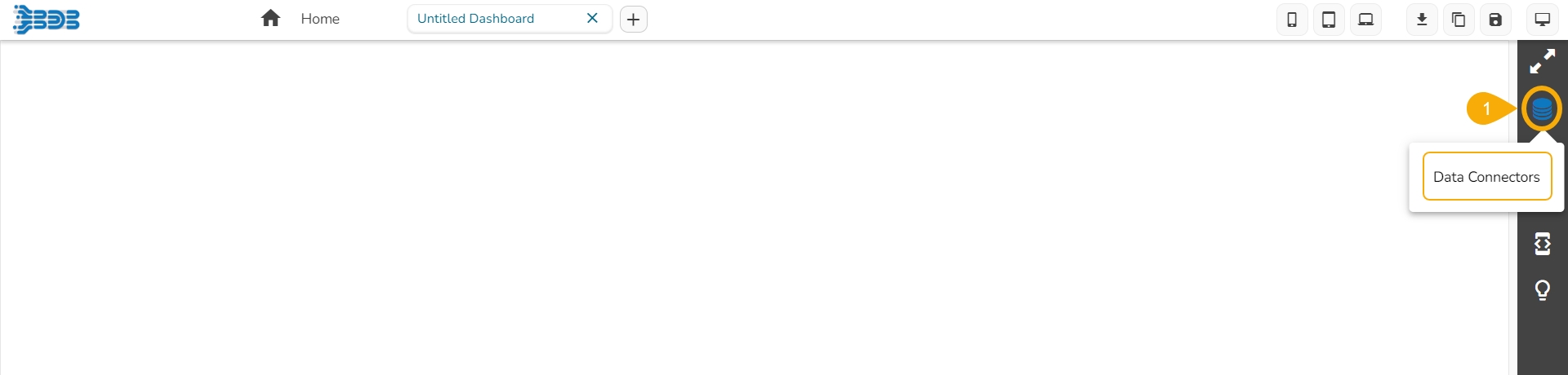
The Designer canvas page offers an icon to access the supported connectors page to establish a data connection for the dashboard creation.
Navigate to the Dashboard canvas.
Click the Data Connectors icon.
A page opens displaying various options to establish data connections.
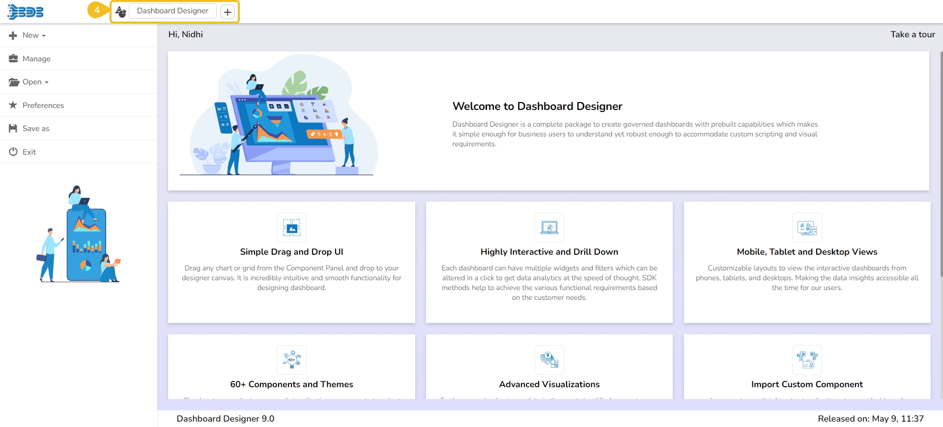
It is the landing page for the Designer module.
The Designer homepage displays a list of tasks in the left panel that users can perform on a dashboard.
The Designer Homepage also contains Guided Tour.
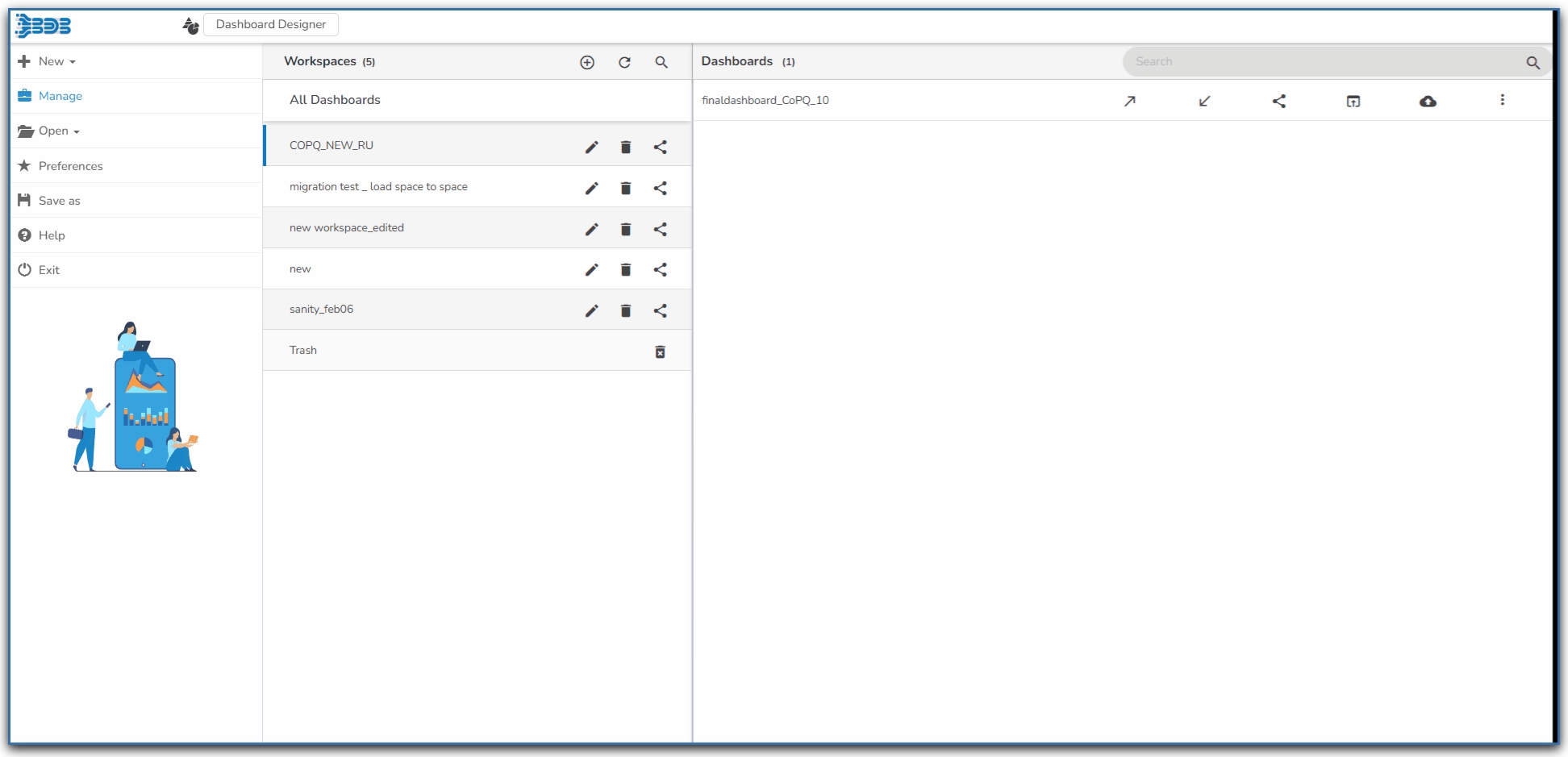
This option helps to manage the created Workspaces or Dashboards inside a user account.
Navigate to the Designer homepage.
Click the Manage option.
The user gets directed to manage the following tasks for a Workspace or Dashboard:
Search in Workspaces: Searches for a specific Workspace.
Reload Workspaces: Reloads all the Workspaces.
New Workspace: Adds a new Workspace.
To access the options, the users need to select a dashboard from an existing workspace as displayed in the following image:
Search: Searches for a Dashboard
GIT Export: Export a dashboard to GIT and get a pushed version from the GIT repository (Push to VCS and Pull from VCS)
Open in Designer: Opens the dashboard in Designer to Edit or modify
The users get the following options while clicking the More Actions icon provided for a Dashboard.
Preview the dashboard
Export to Local Disk
Rename the Dashboard
Delete Dashboard
Learn about the Dashboard Objects and manage them using this option.
Every component in the dashboard is considered as an object. The Designer canvas page offers an icon to access the Dashboard Objects and the various related properties to manage the dashboard components.
Navigate to the Dashboard canvas.
Click the Manage Dashboard Components icon.
A panel opens displaying various icons for the used dashboard objects (The following image displays empty dashboard, so no objects are mentioned).
The Designer module offers a scripting mechanism in the Designer plugin to help the users experience the next level of customization in dashboard creation.
The scripting mechanism makes the creation of complex dashboards easy and quick. The users get an icon to access the scripting window on the Designer Canvas page.
Navigate to the Dashboard canvas.
Click the Component Variable and Script icon.
The user gets redirected to the scripting window displaying the Components and Connections tabs to open the related panel for the each option. The Components tab opens by default.
Navigate to the Designer homepage.
Open the Manage option.
Open an existing dashboard from the list of available dashboards (You can find the list of dashboards inside a Workspace).
Click the Save As option from the left panel.
The Save As window appears to confirm the action.
The original dashboard name appears with the “Copy_Of” prefix (the users can edit the name as per their wish).
Select a workspace from the drop-down menu.
A copy of the selected dashboard gets saved in the chosen workspace.
It covers the major options provided on the Designer Canvas page through a guided tour pop-up window.
The user can avail a guided tour to the Designer canvas page using the Guided Tour icon provided on the right side panel.
Navigate to the Designer Canvas page.
Click the Guided Tour icon.
A dialog box appears next to the major options of the Designer Page. It begins from the .
Click the Next option to move forward.
It redirects the users on the icon to open the Dashboard Canvas page.
Click the Prev option to go to the back page.
Click the End tour option to close the guided tour window at any given point.
Navigate to the Designer homepage.
Click the Open option from the given options.
The Open from Local Disk appears.
The user gets directed to open the downloaded files (.bvzx) from the local disk.
The selected dashboard (.bvzx file) opens inside the designer workspace.
Select a workspace from the Workspaces list.
Click the Rename icon.
The Rename window appears to assure the action.
Provide a new name for the dashboard.
Click the Rename to save the new name.
A message appears to assure the success of the renaming action.
The selected workspace gets saved with the new name.
Go through the given illustration on opening a dashboard from the Manage options.
The users can open the desired dashboard into the designer workspace once they have created and saved it to a workspace.
Click the Manage option on the Designer homepage.
Select and click on a workspace from the list of Workspaces.
Select a Dashboard from the list of all the saved dashboards under the selected workspace.
Click the Open in Designer icon.
The selected dashboard opens in the designer workspace.
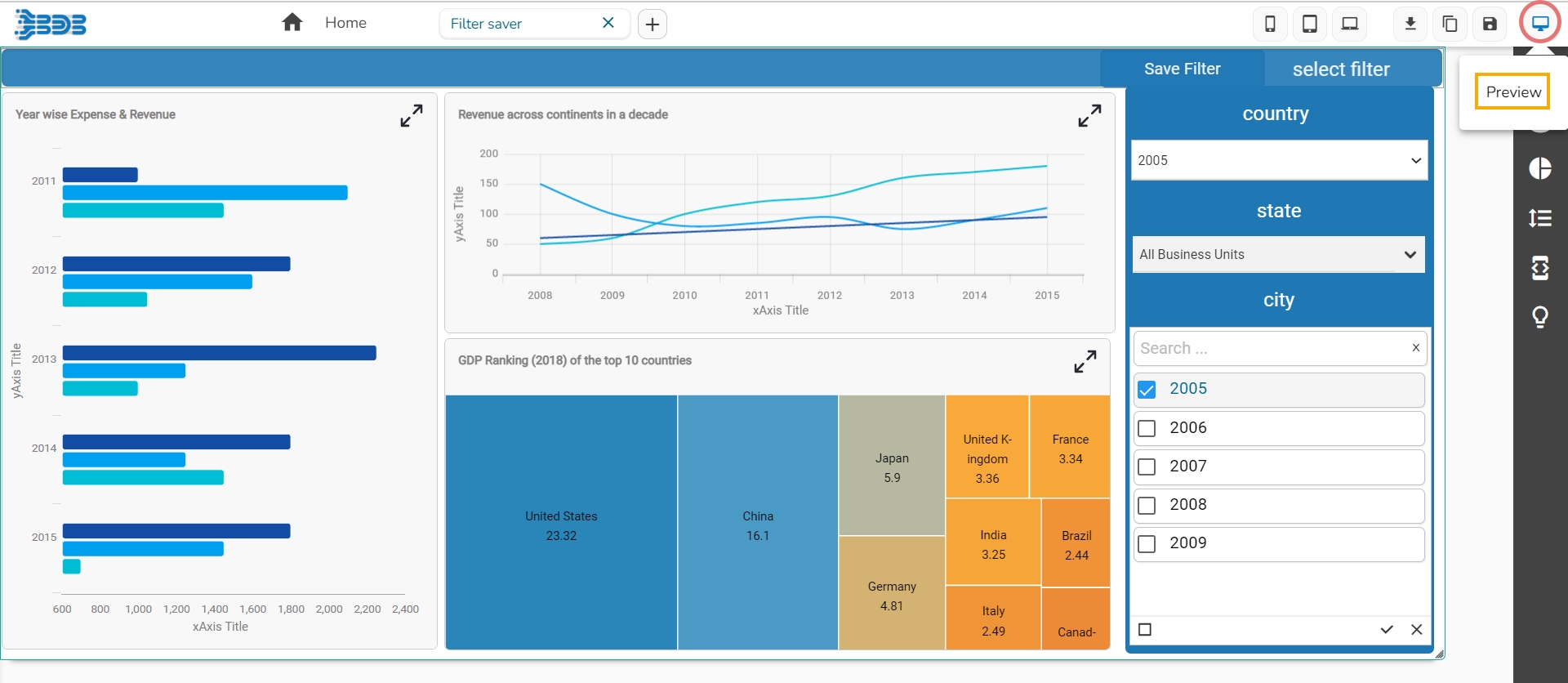
The Preview action option opens the selected dashboard in the preview mode.
Navigate to a saved dashboard using the Manage option.
Select a dashboard and click the More Actions icon.
Choose the Preview action from the context menu.
The selected dashboard opens in Preview mode.
The designer module is a complete package to create governed dashboards with pre-built charting capabilities that make it simple enough for business users to understand their business data, yet robust enough to accommodate complex custom scripting. High-level visualizations backed with accurate predictions and real-time updates are available at seamless speed to provide precise insights to users and help them make informed business decisions.
The Designer module comes preloaded with a wide range of charts, features, and data integration capabilities that empower the users to create informative and appealing visual representations of their data.
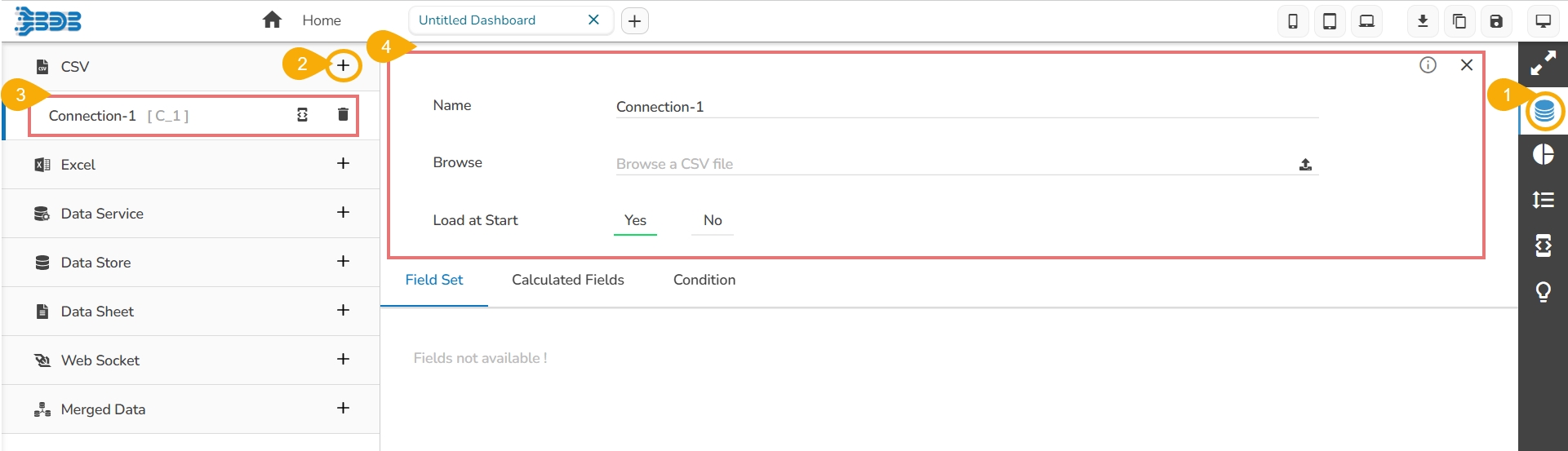
Click the Data Connectors icon to display all the available data sources.
Click the Create New Connection icon provided next to the Data Service connector.
A new connection gets added under the Data Service connector type.
Name: Name the connection.
Data Connectors: Select a data source from the drop-down menu.
Data Sets: Select a data service from the drop-down menu.
This page guides you on how to access the Data Connectors icon and navigate to the Data Connectors page.
Click the Data Connectorsicon using the Designer canvas.
A new screen opens, displaying the following data connection options:
Select a data connection type and click the Create New Connection icon.
A new connection appears below.
Configure the required details to create a data connection.
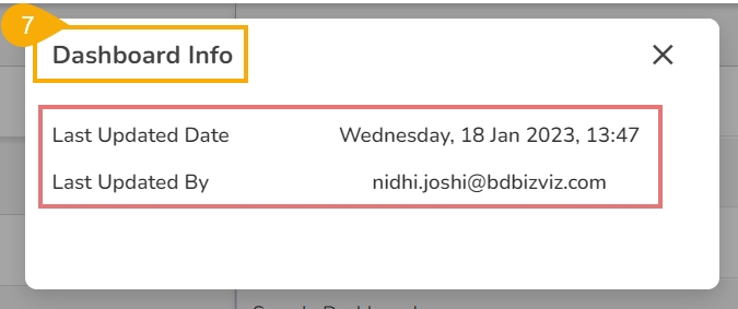
Click the Manage option from the Designer Homepage Left Menu Panel.
Select a Workspace from the list of available Workspaces.
A list of available Dashboards inside the selected Workspace opens.
Select a Dashboard from the list.
Click the Action menu icon for the dashboard.
Click the Info icon from the Action menu.
The Dashboard Info window opens displaying the related information such as Last Updated Date and Last Updated By.
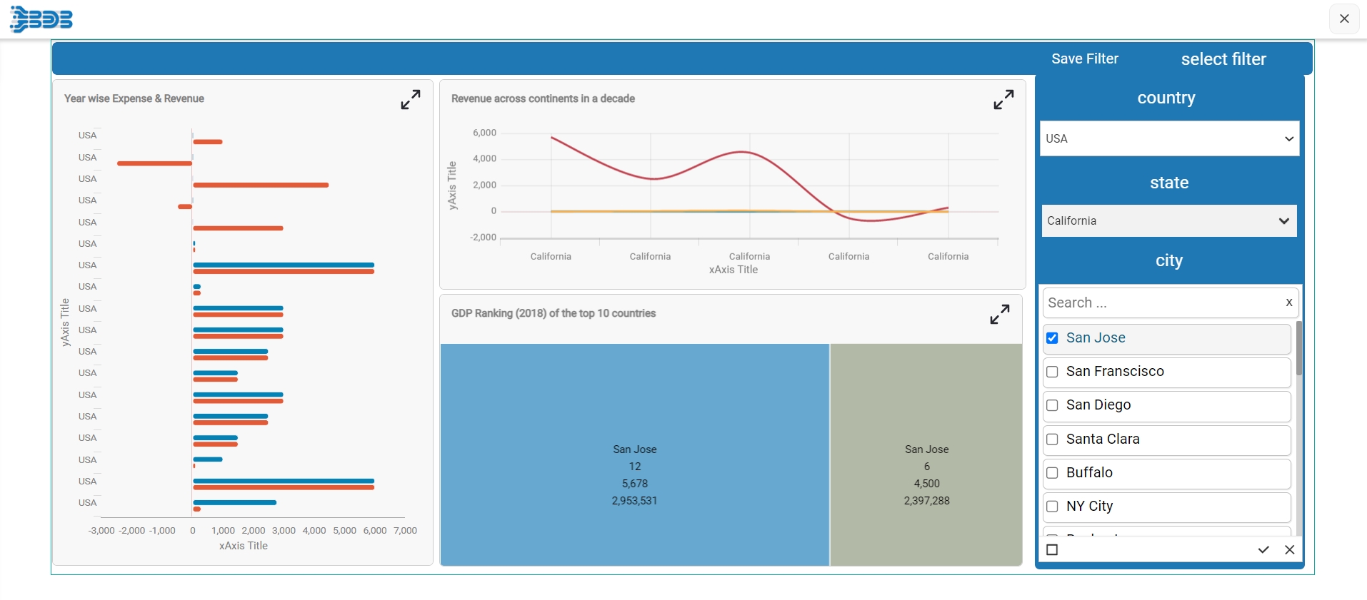
This page provides step-by-step process to understand the User alert notification functionality provided for a shared Dashboard.
Check out the below-given demonstration on the User Alert Notification functionality.
Click the Component Library icon from the right edge of the window.
Various categories of the available charting components get displayed (The Charts category gets selected by default).
Select and drag a component on the canvas.
This section explains the steps on how to create a new Workspace in the Designer module.
Navigate to the Dashboard Designer homepage.
Click New or click the Add option.
Click Workspace from the context menu.
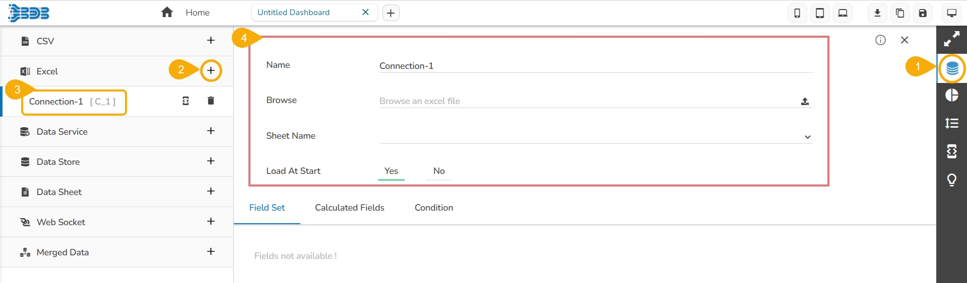
Steps to develop a data connection based on the Excel file.
Check out the given illustration on how to create an Excel connection and associate it to a charting component.
Click the Data Connectors icon to display all the available data sources.
Previously created dashboards can be renamed using this option. This part provides steps on how to rename an existing dashboard.
Select a dashboard using the Manage option.
Click the Rename icon from the More Actions context menu.
Steps to develop a data connection based on the Data Service.
Check out the given illustration on how to create a Data Service connection and associate it to a charting component.
Click the Data Connectors icon to display all the available data sources.
Steps to develop a data connection based on the Data Store.
Check out the given walk-through on how to create a Data store connection and associate it to a charting component.
Click the Data Connectors icon to display all the available data sources.
The users can move the created dashboards from one workspace to another using this option. This section explains the steps to move dashboards.
Select a dashboard using the Manage option.
Click the Move to icon from the More Actions context menu.
Remove: Removes the selected workspace from the list and move to the Trash Workspace.
Share: Shares the selected workspace to a user or user group. The rights to access an already shared workspace can be excluded by using the same option.
Empty the Trash: Removes all the workspaces from the Trash workspace.
Remove: Deletes the Dashboard
Actions: Applies the various actions on a dashboard
Move the Dashboard from one Workspace to another Workspace
Click the Save option.
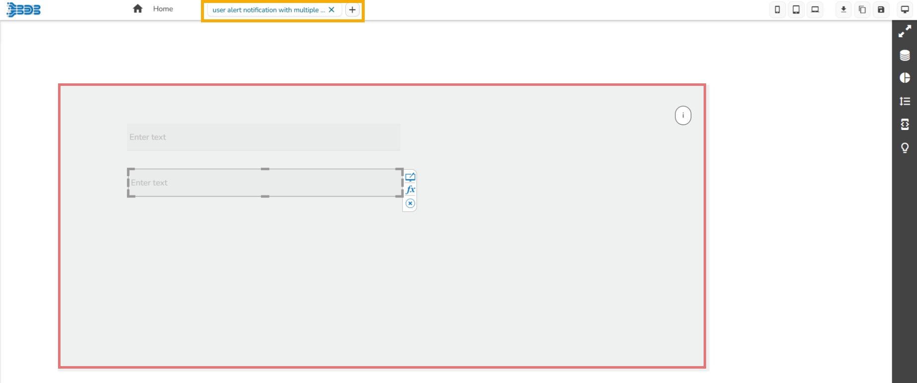
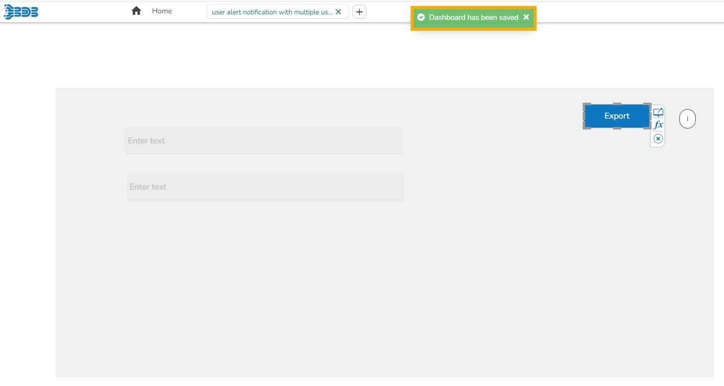
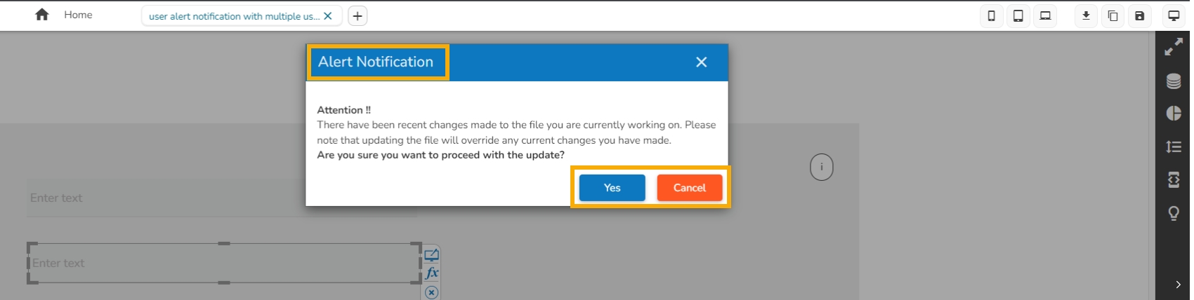
The users will get the alert notification when multiple users are working on the same dashboard. The alert message will pop-up while one of them would like to save the updates on the same dashboard.
The user who gets the Alert Notification has two choices:
Please check out the following scenario to understand how the User Alert Notification functionality works.
A dashboard is shared to multiple users.
If more than one users are working parallelly on the same dashboard and one of the users i.e., User-A saves the dashboard to save the updates added by him in the dashboard. A notification message appears and all the updates committed by the User-A gets saved.
All the other users (i.e., User-B and User-C) who are working still on the same dashboard will receive an alert notification as displayed in the below-given image.
They can either accept it by clicking the Yes option or deny it by using the Cancel option.
If the User-B accepts the alert, then User-B's dashboard will get closed.
There is a User-C who has cancelled the alert option. So, User-C can continue the work on the same dashboard.
A dialog box appears.
Workspace Name: Enter a title for the Workspace in the given field.
Click the Save option.
A confirmation message appears to inform the creation of a new Workspace.
The newly created workspace gets saved under the list of the existing Workspaces (The list of the Workspaces can be seen under the Manage option).
Click the Create New Connection icon provided next to the Excel option.
A new connection gets added under the Excel connection type.
The connection-specific details get displayed on the right side of the page.
Configure the following information:
Name: Name the connection.
Browse: Click the Browse icon to browse an Excel file.
Sheet Name: Select a specific sheet using the drop-down menu.
Load at Start: Enable this option to get the updated data from the data source before loading it into charts.
The Field Set tab displays all the fields after establishing the data connection.
Select the Condition tab and provide a condition to be applied as a filter on the selected data by putting checkmarks in the given boxes. E.g., The selected Conditions for the Category field is Catalog.
Click the Manage option.
Select and open a Workspace from the list of Workspaces.
Select a dashboard from the dashboard list.
Click the Push to VCS icon for the selected dashboard.
Accessing the Push to VCS icon for a dashboard
The Push into Version Controlling System dialog box opens.
Provide a commit message.
Select a Push Type out of Dashboard Versioning and GIT Export
Click the Push option.
A Confirmation message appears and the selected dashboard version gets pushed to VCS.
Click the Manage option.
Select and open a Workspace from the list of Workspaces.
Select a dashboard from the dashboard list.
Click the Pull from VCS icon for the selected dashboard.
The Pull from Version Controlling System dialog box opens.
Select a Version by using the given checkbox.
Click the Pull option.
A confirmation message appears and the selected version of the dashboard gets pulled.
The Rename window appears.
Enter a new name for the selected dashboard.
Click the Rename option to save the new name.
A success message appears.
The selected dashboard gets renamed.
Click the Create New Connection icon provided next to the Data Service connector.
A new connection gets added under the Data Service connector type.
The configurable connection-specific fields display on the right side of the page as explained below:
Name: Name the connection.
Data Connectors: Select a data source from the drop-down menu.
Data Services: Select a data service from the drop-down menu.
Load at Start: Enable this option to get up-to-date data / pull the updated data from the data source before loading it into charts.
Timely Refresh: Enable this option to get the refreshed data.
Refresh Interval: Set the time for refresh interval. (This field appears when the Timely Refresh the field has been enabled.)
The Field Set tab displays all the fields after establishing the data connection.
Click the Create New Connection icon provided next to the Data Store connector.
A new connection gets created under the Data Store connector type.
The configurable connection-specific fields display on the right side of the page as explained below:
Name: Provide a name for the connection.
Data Store: Select a datastore from the drop-down menu.
Load at Start: Enable this option to get up-to-date data / pull the updated data from the data source before loading it into charts.
Timely Refresh: Enable this option to get the refreshed data.
Refresh Interval: Set the time for refresh interval. (This field will appear only when the Timely Refreshed field has been enabled.)
The Field Set tab displays all the fields after establishing the data connection.
The Move to Another Workspace window appears.
Select a Workspace from the drop-down menu.
Click the Move option to move the selected dashboard into the desired workspace.
A success message appears.
The dashboard gets moved to the selected Workspace.
Navigate to the Designer homepage.
Click the Preferences option from the left panel.
The Preferences for a dashboard canvass appear.
Set the desired preferences either by enabling it through a checkmark or selecting it from the provided menus.
Click the Save option.
The selected preferences get applied to the dashboard canvass.
The available preferences for a dashboard are as described below:
Dashboard Designer space can be understood as a folder that contains Data Source connections, Components, Dashboard Objects, and Component Attributes.
Navigate to the Designer homepage.
Click the Add Dashboard icon on the homepage.
or
Click the New drop-down icon on the homepage.
Select the Dashboard option.
The Designer space/Canvas opens with a Designer Canvas space, header menu panel, and a right-side menu panel.
The user can access wide range of charting components, filters, and Grid components available in the Designer module from the Designer canvas page to create a dashboard.
Refer to the following image to understand the various components provided on the Designer Canvas:
Tab: Place where dashboard design takes place. Drag and drop charts and components here to create dashboards.
Mobile : Displays Dashboard screen like a Mobile device.
Tablet : Displays Dashboard screen like Tablet.
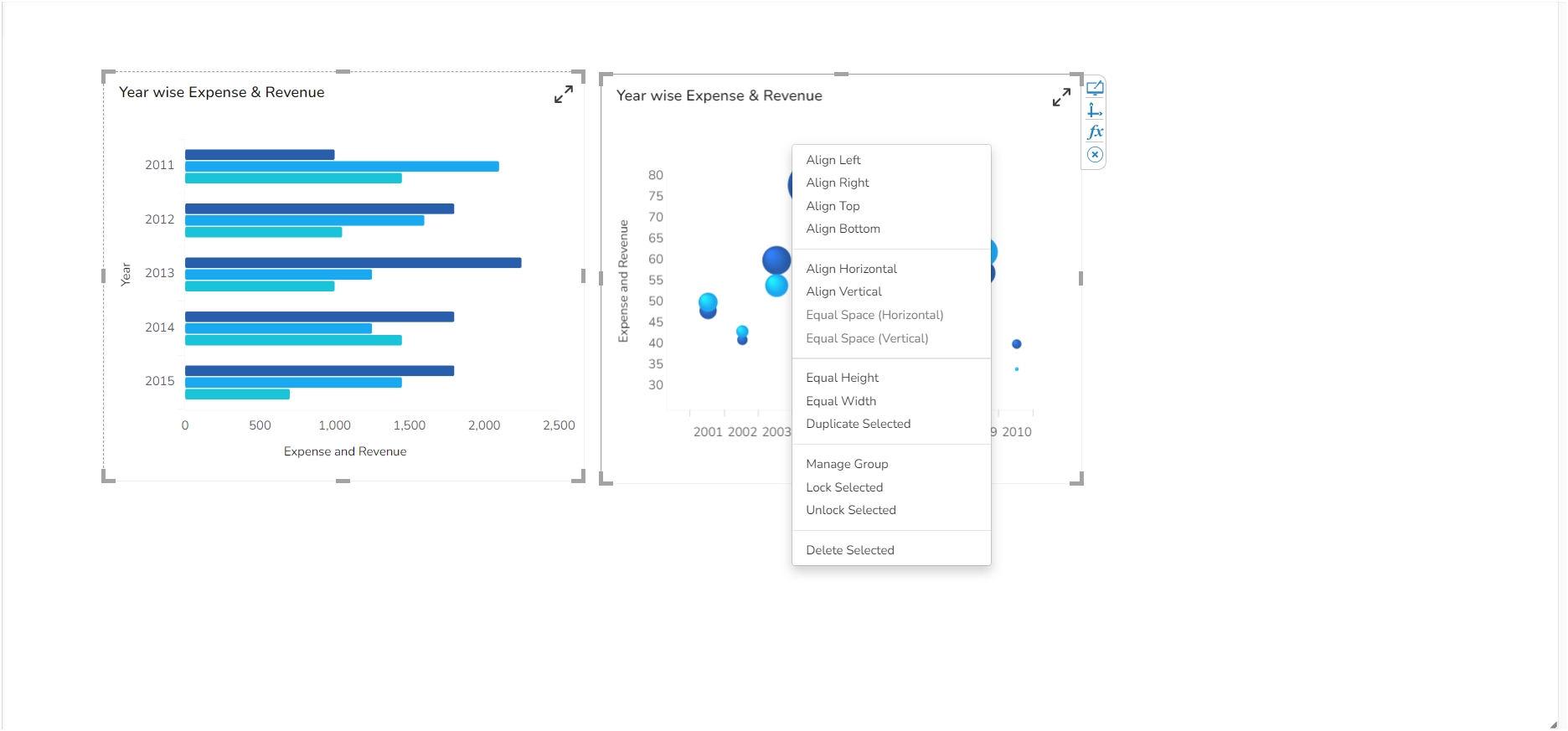
This section describes properties applied to multiple components when dragged into the designer canvas and selected.
This page describes the steps to access the Context Menu Properties:
Drag multiple components into the designer canvas (At least three components to avail all the properties).
Select multiple components from the canvas(at least three).
Use right-click to open the context menu.
The following properties will be listed in the context menu:
Align Left: All the selected components get aligned to the left.
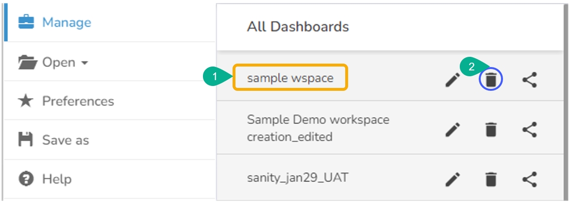
This section describes steps to delete an existing Workspace and restoring the deleted workspace.
Select a workspace from the Workspaces list.
Click the Remove icon.
The Remove dialog window appears to confirm the deletion.
Click the Remove option.
The selected workspace gets removed from the list.
The removed workspace gets added to the Trash Workspace.
Click the Manage option.
Navigate to the Trash workspace created under the list of all the workspaces.
Select a deleted workspace that you want to restore and click the Restore icon.
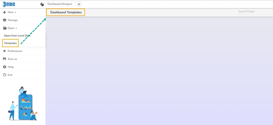
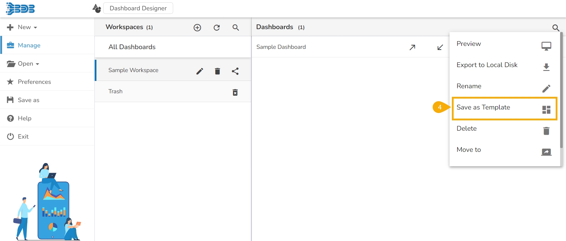
This page provides steps to save a dashboard template using the Designer module.
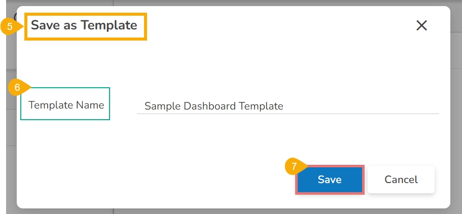
The Save as Template option has been provided under the More Actions menu for each saved dashboard. By clicking this option it will create the selected dashboard as a Card in the Templates section.
Check out the given illustration on how to create and use the Dashboard Templates inside the Designer module.
Navigate to the saved Dashboards list using the Manage option.
Select a Dashboard from the list.
Click the More Actions icon for the selected dashboard.
Click the Save as Template option from the More Actions context menu.
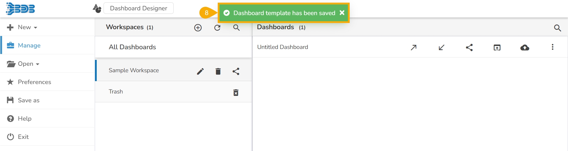
The Save as Template dialog box opens.
Provide the Template Name in the given space.
Click the Save option.
A notification message appears to inform the completion of the action.
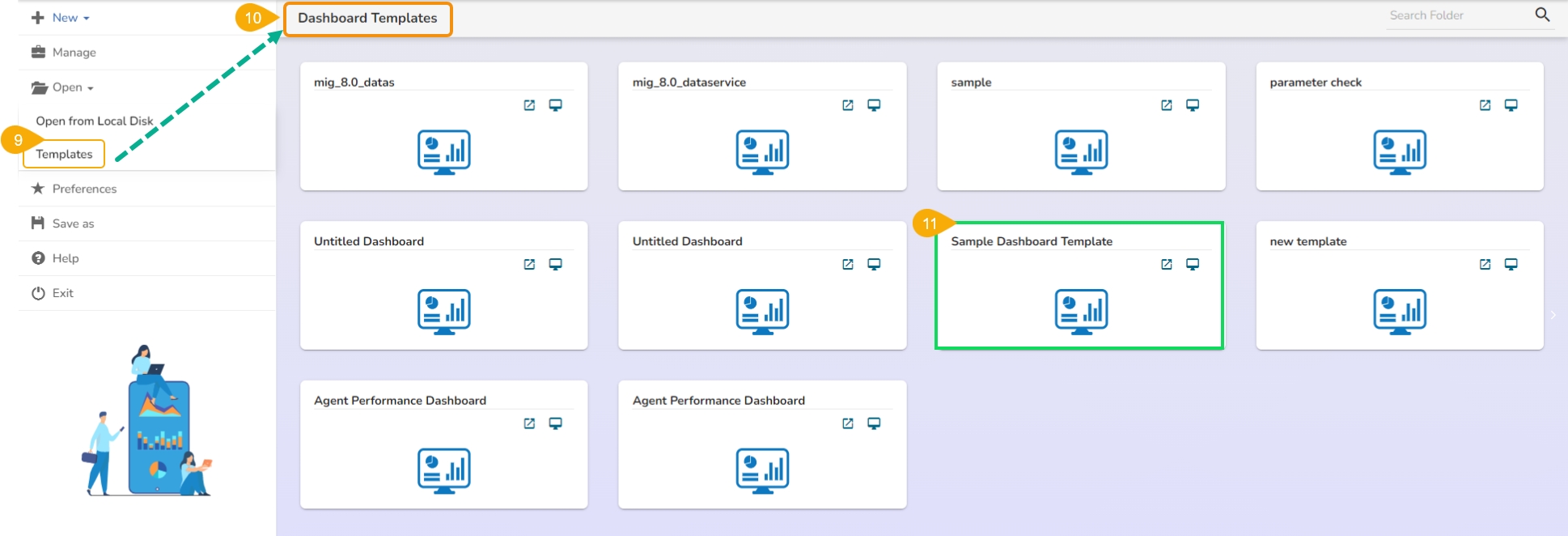
Click the Templates option provided under the Open option from the Designer homepage.
The Dashboard Templates page opens listing all the available dashboard templates.
The recently saved dashboard template gets listed under the Dashboard Templates page.
The Designer module contains three types of Save options for a Dashboard. They are as explained below:
Click the Save icon from the Designer canvas header menu.
A pop-up window appears with the following details:
Dashboard Name: The name of the selected dashboard gets displayed.
Workspace: Select a workspace via the drop-down menu.
Click the Save option.
A success message appears to assure the same.
The dashboard gets saved to the selected workspace.
Click the Save to Another Workspace icon from the Designer canvas header menu.
The Save As pop-up window appears asking to save a copy of the selected dashboard.
Name: The dashboard name gets displayed as Copy_of_ the original Dashboard Name.
Two consecutive notification messages appear.
A copy of the selected dashboard gets saved in another workspace.
A dashboard can be saved to a local disk via the Save to Local Disk option.
Click the Save to Local Disk icon from the Designer canvas header menu.
The selected dashboard gets saved to the local system.
This page explains the steps to Delete a dashboard and restore a deleted dashboard.
Users can delete a dashboard by following the steps explained over here.
Select a dashboard using the Manage option.
Click the Delete icon from the More Actions context menu.
A pop-up window appears to confirm the deletion.
Select the Remove option from the pop-up window.
A message appears to notify the completion of the action and the selected dashboard gets removed from the list.
By default, the dashboard gets moved to the Trash Workspace. The users can open the Trash Workspace and restore the dashboard to the desired workspace.
Click the Manage option from the Designer homepage.
Navigate to the Trash workspace created under the list of all the workspaces.
Select a deleted dashboard that you want to restore Click the Restore icon.
The Restore window appears.
Select a workspace using the drop-down menu.
Click the Restore option.
A success message appears to assure the restoration.
The dashboard gets restored to the selected workspace.
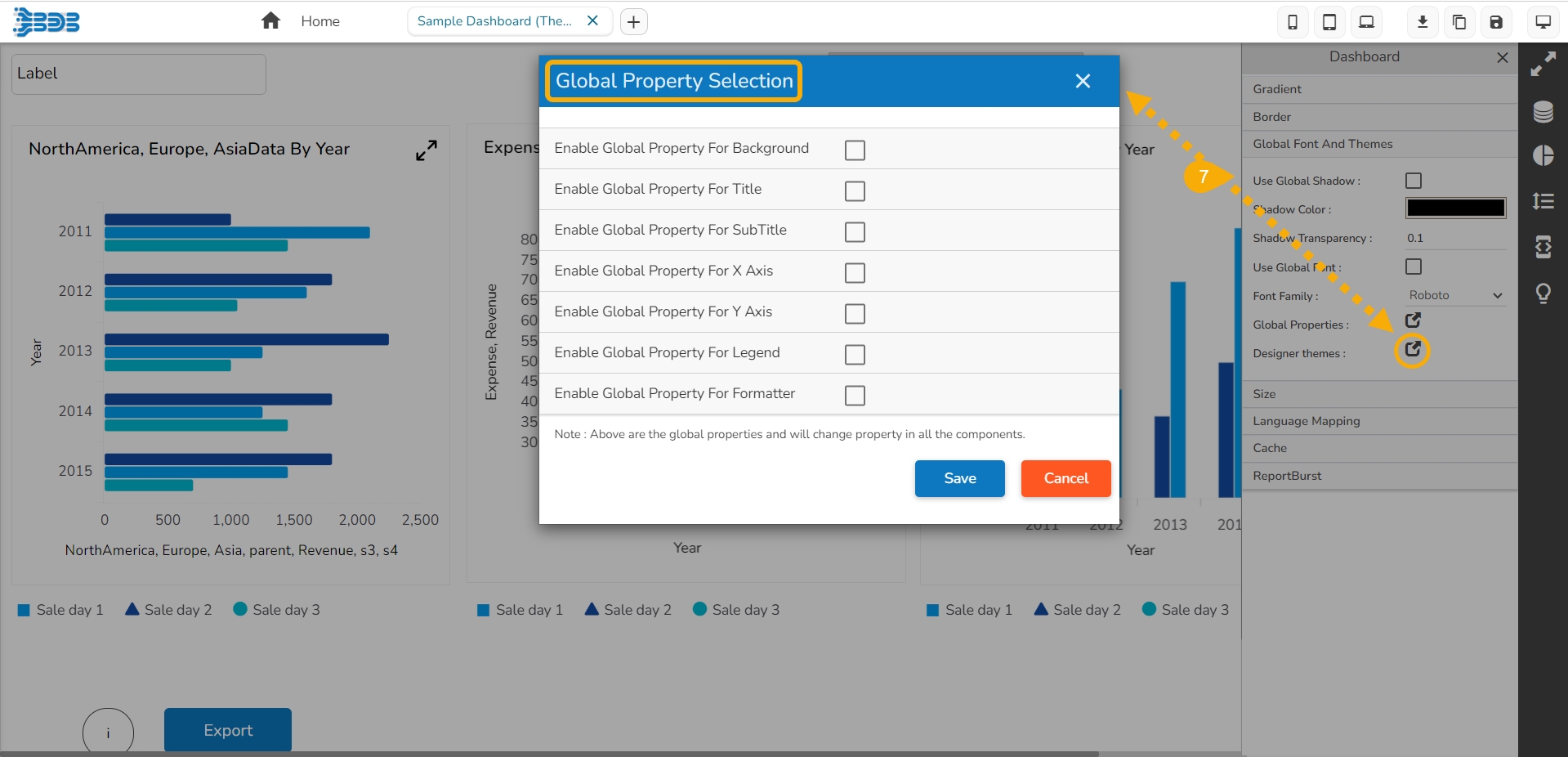
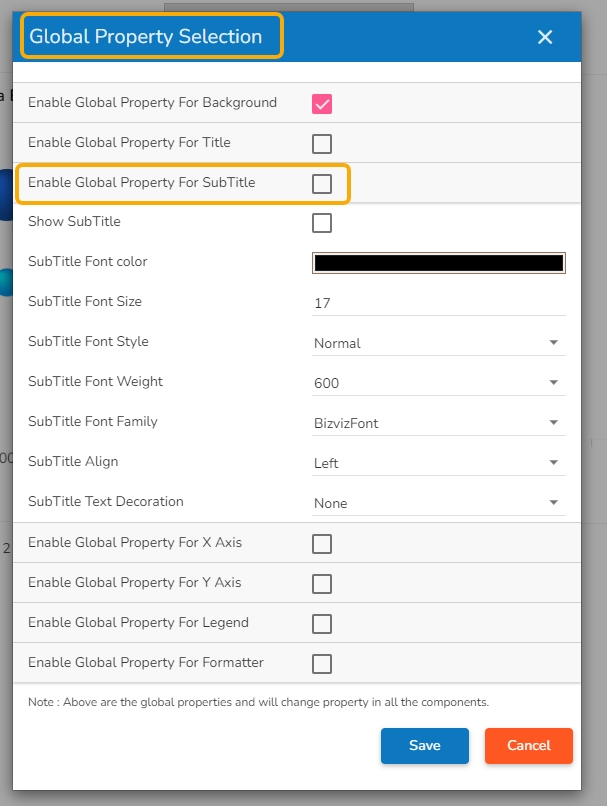
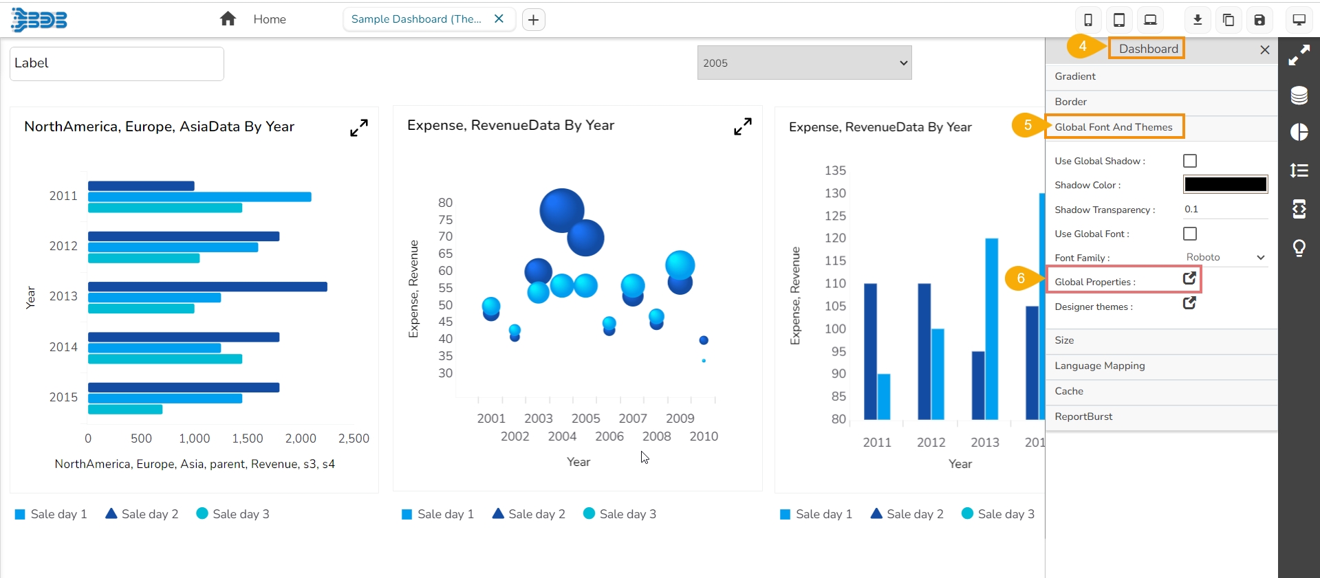
Align appearance of various dashboard components from one place by using the Global level properties for a dashboard.
The Global Properties feature in the Dashboard canvas empowers users to apply appearance properties at the dashboard level. These properties facilitate the seamless alignment of various dashboard components, ensuring a consistent and visually harmonious display.
Navigate to a Dashboard within its canvas framework.
Steps to develop a data connection based on the Data Sheet.
Check out the given walk-through on how to create a Data Sheet connection under the Designer module and associate it to a charting component.
Click the Data Connectors icon to display all the available data sources.
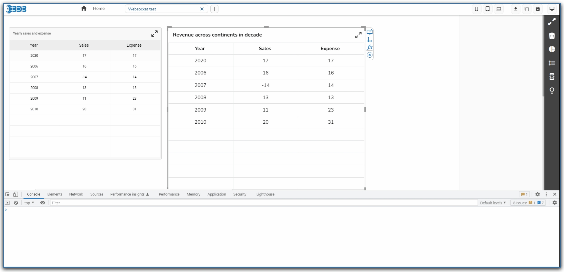
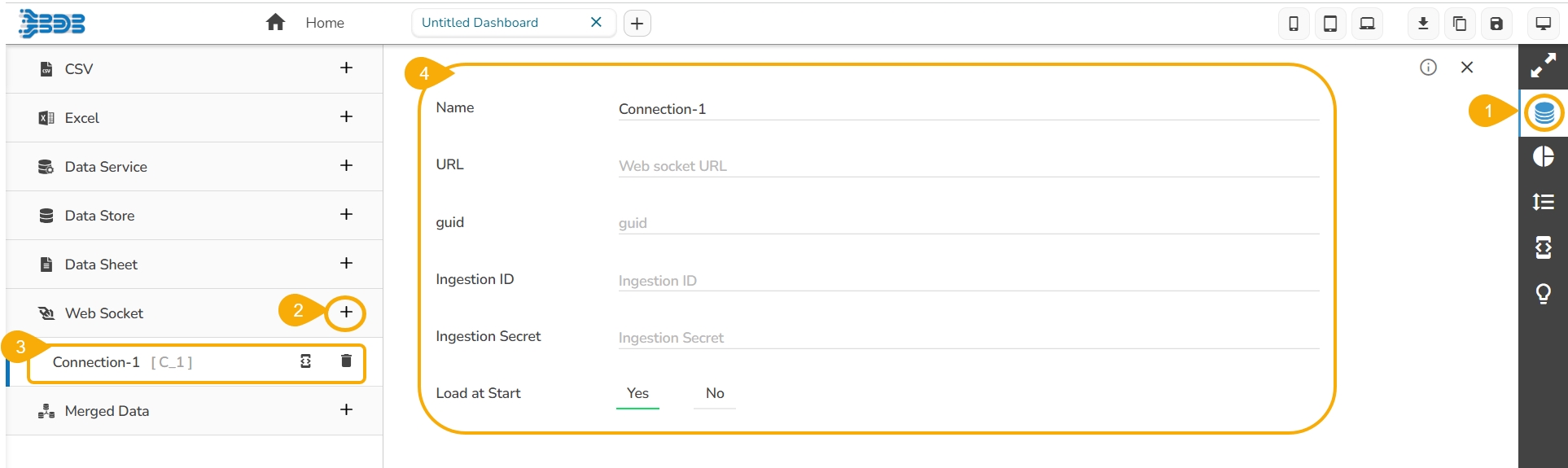
Steps to develop a data connection based on the WebSocket.
Click the Data Connectors icon.


Redirects to select a color to display when any component when dragged to the canvass
Selection Thickness
Set (increase/decrease) the thickness of the component border
Show Border
Enable this option to display a border on the dashboard
Border Color
Redirects to select a border color to display in the Dashboard
Background Color
Redirects to select a color to display in the dashboard background
Hide Shadow
Enable this option to hide the shadow of the components
Sync Component Property
Enable this option to synchronize the component property
Enable Multiple Drag
Enable this option to select multiple charts and then move them together in the dashboard
Fixed Dimension
Enable this option to set the fixed height & width of the dashboard
Property Name
Description
Show Grid Lines
Enable this option to display grid lines in the designer area
Snap to Grid Size
Select an option to display the grid size (None/5/10/15)
Notify on Success
Enable this option to get a notification of success
Block Notification
Enable this option to block the notification message
Show Settings Button
Enable this option to display the toolbar when any component is selected
Selection Color
Save to Local Disk : Saves the created dashboards to your local disk.
Save to Another Workspace (Save As) : Saves a copy of the original dashboard to another workspace or the same workspace.
Save (Dashboard) : Saves the created dashboards in a workspace.
Preview : Displays the preview mode of the dashboard.
Full Screen : Maximizes the dashboard for a better view.
Data Connectors : Connects to a wide range of data sources.
Component Library : Includes a compelling range of charts, filters, and data grids.
Manage Dashboard Components : Option used to lock, hide, and order the layout of the components on the dashboard.
Component Variables and Script : Option used to define component scripts.
Guided Tour : Begins the guided tour for the Designer canvas.
Align Right: All the selected components get aligned to the right.
Align Top: All the selected components get aligned to the top.
Align Bottom: All the selected components get aligned to the bottom.
Align Horizontal: All the selected components get aligned horizontally.
Align Vertical: All the selected components get aligned vertically.
Equal Space (Horizontal): All the selected components get equal space horizontally.
Equal Space (Vertical): All the selected components get equal space vertically.
Equal Height: All the selected components get an equal height.
Equal Width: All the selected components get an equal width.
Manage Group: The user gets redirected to manage the group.
Lock Selected: All the selected components get locked.
Unlock Selected: All the selected components get unlocked.
Delete Selected: To delete the selected components.
Duplicate Selected : To duplicate the selected components.
Each dragged component gets some Context Menu Properties as shown in the below image:
Click the Restore icon from the Trash workspace to restore deleted workspaces.
Click the Remove Permanently icon from the Trash workspace to delete a workspace or dashboard permanently.
Workspace: Select a workspace from the workspace drop-down menu.
Click the Save option.
Use right-click to get the Dashboard context menu.
Click the Properties option from the context menu.
The Dashboard Properties gets listed in a context menu.
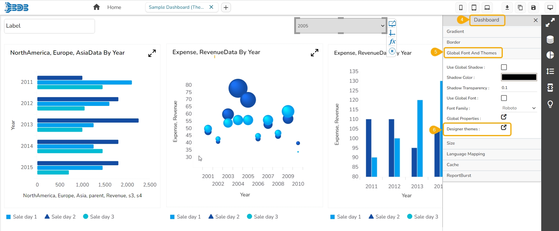
Select the Global Font and Themes option.
The Global Properties icon can be accessed within it.
By clicking on the Global Properties icon, the Global Properties Selection window opens displaying a list of the Global Properties that can be set or modified at the dashboard level.
The Global Properties feature streamlines the design process and saves time by providing a single point to manage appearance settings for the entire dashboard.
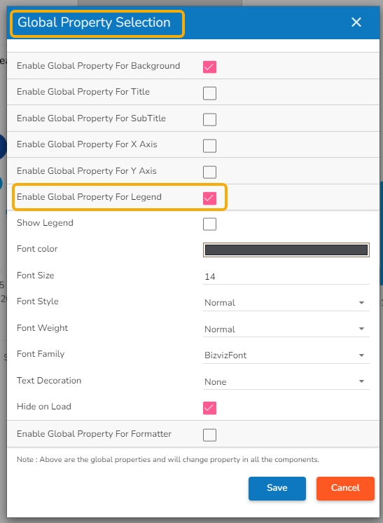
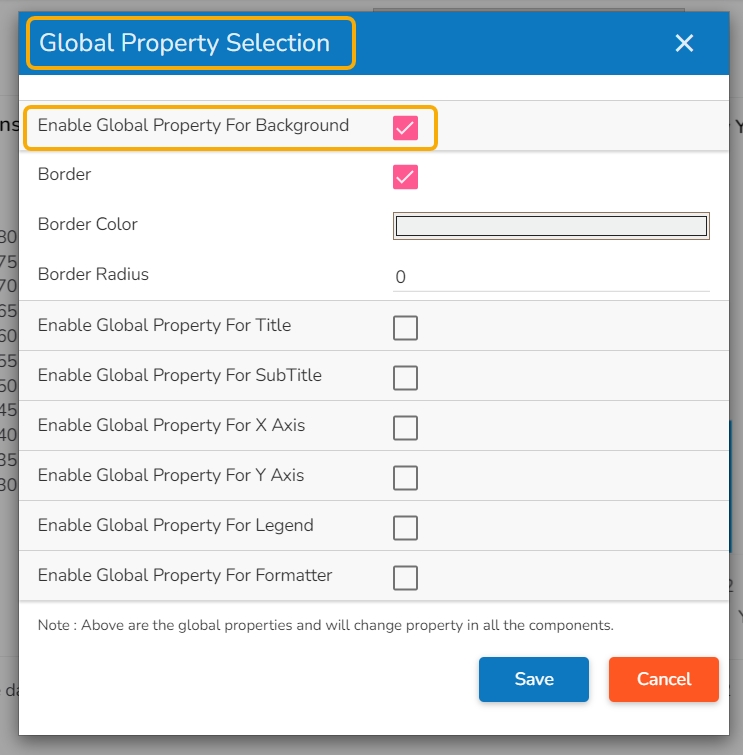
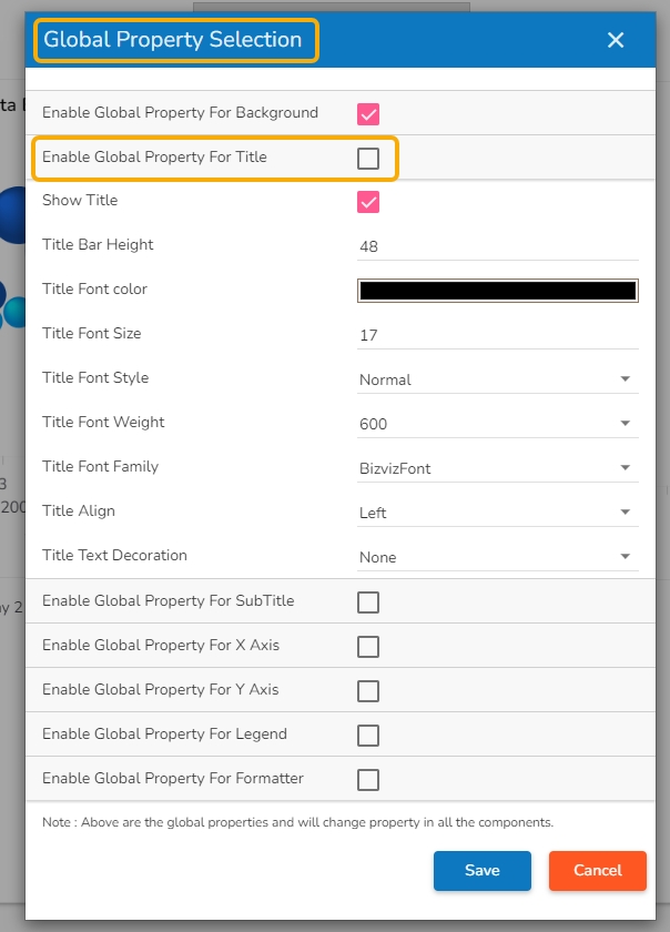
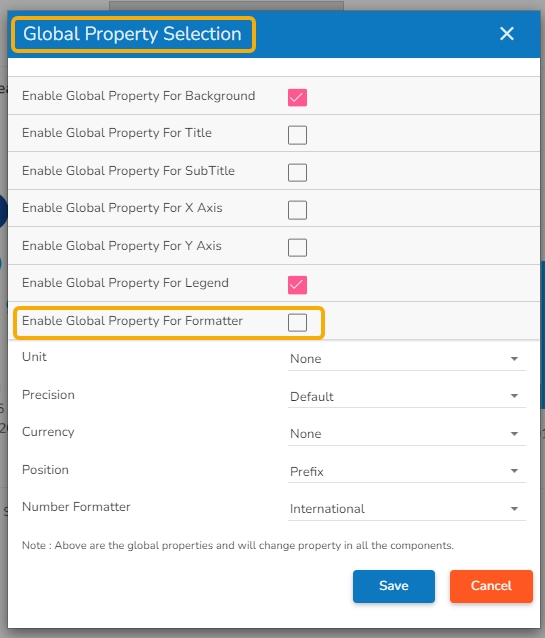
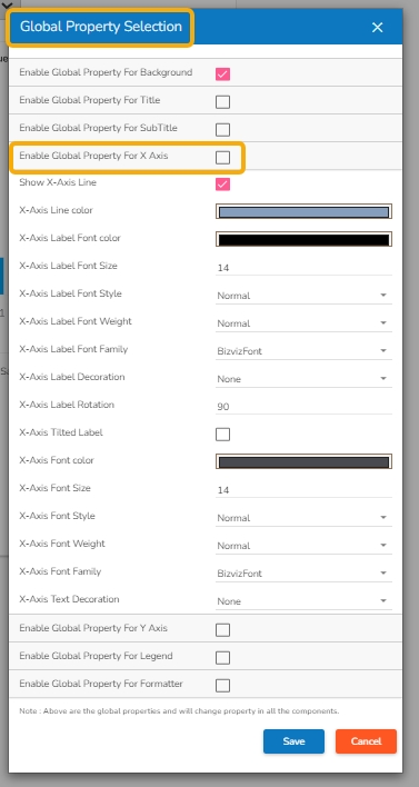
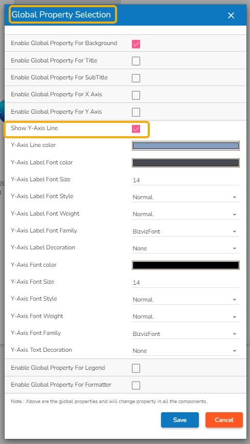
A dashboard is provided with the below-given Global Properties:
Apply a border for all the dashboard components and set color and radius of the border for all components enabling the Global Property for Background.
The Global Properties for the dashboard title ensure consistent branding and visual coherence throughout the entire dashboard. It helps the user to effectively convey the purpose behind the selected dashboard by aligning the Title display together with Title Bar height, Font color, Font Size, Font Style, font Weight, and Font family. It also allows to enable decoration for the inserted Title text.
The Global Sub-title Properties feature in the Dashboard application enables users to apply appearance properties at the dashboard level for sub-titles. By utilizing Global Sub-title Properties, users can ensure consistency and visual harmony across all sub-titles in the dashboard.
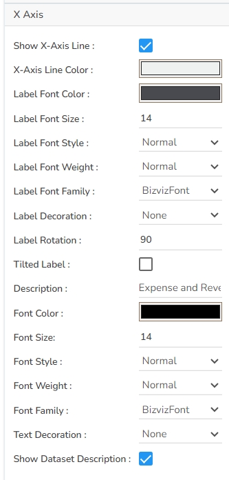
By utilizing Global Properties for the X-axis, users can ensure consistency and visual coherence across all charts and graphs in the dashboard that use the X-axis. It helps to bring in uniformity for all the dashboard components containing X-Axis in terms of Label appearance and readability.
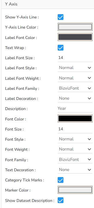
Ensure consistency and visual coherence across all the charts in the dashboard by utilizing Global Properties for the Y-axis. It helps to standardize all the dashboard components containing Y-Axis in terms of Label appearance, readability, and text decoration.
The Global Properties for Legend allows the user to customize the appearance properties of the legend to align with your design preferences.
The Global Properties for Formatter allows the user to standardize various formatter related properties .
The user must click the Save option after setting or modifying the desired set of Global Properties to apply them on the selected dashboard.
Open the Manage option.
Navigate to the Workspaces section.
Select a Workspace from the list.
Click the Share Workspace icon.
The Manage Access window opens.
Select permissions using the Grant Permissions.
The Users, User Groups, and Exclude Users tabs will be displayed. Choose users or user groups tabs to share the workspace.
Search specific users or user groups using the Search bar.
Select a user or user group using checkboxes.
Click the Share option.
A notification message appears.
Re-open the Manage Access window.
The selected user/ user group gets listed under the Granted Permissions section.
Check out the illustration on revoking privileges for a shared workspace.
Open the Manage Access window for a shared Workspace.
Navigate to the Granted Permissions section.
Select a user/ user group from the Granted Permissions section.
Click the Revoke icon.
The Revoke dialog box opens.
Click the Yes option to revoke the permission.
A notification message appears and the privileges get revoked.
Check out the illustration on excluding users from a user group to access the privileges for a shared workspace.
Open the Manage Access window for a Workspace.
Select permissions using the given checkboxes for the Grant Permissions.
The Users, User Groups, and Exclude Users tabs display. Select the User Groups tab to share a workspace.
Search a specific user/ user group using the Search bar.
Select a user group by using a checkbox.
Navigate to the Exclude Users tab.
Select users using the checkboxes.
Click the Share option.
A notification message appears.
Re-open the Manage Access window.
The excluded user(s) will be listed under the Excluded Users section.
Click the Create New Connection icon provided next to the Data Sheet connector.
A new connection gets created under the Data Sheet connector type.
The configurable connection-specific fields display on the right side of the page as explained below:
Name: Provide a name for the connection.
Data Sheet: Select a Data Sheet from the drop-down menu.
Load at Start: Enable this option to get up-to-date data / pull the updated data from the data source before loading it into charts.
Timely Refresh: Enable this option to get the refreshed data.
Refresh Interval: Set the time for refresh interval. (This field will appear only when the Timely Refreshed field has been enabled.)
The Field Set tab displays all the fields after establishing the data connection.
Click the Create New Connection icon provided next to the WebSocket connector.
A new connection gets created under the Web Socket connector type.
The configurable connection-specific fields display on the right side of the page as explained below:
Name: Provide a name for the connection
URL: Enter a URL link
guid: Provide the guid.
Ingestion ID: Provide the ingestion id.
Ingestion Secret: Provide the ingestion secret key.
Load at Start: Enable this option to get up-to-date data / pull the updated data from the data source before loading it into charts.
The WebSocket connection gets established.
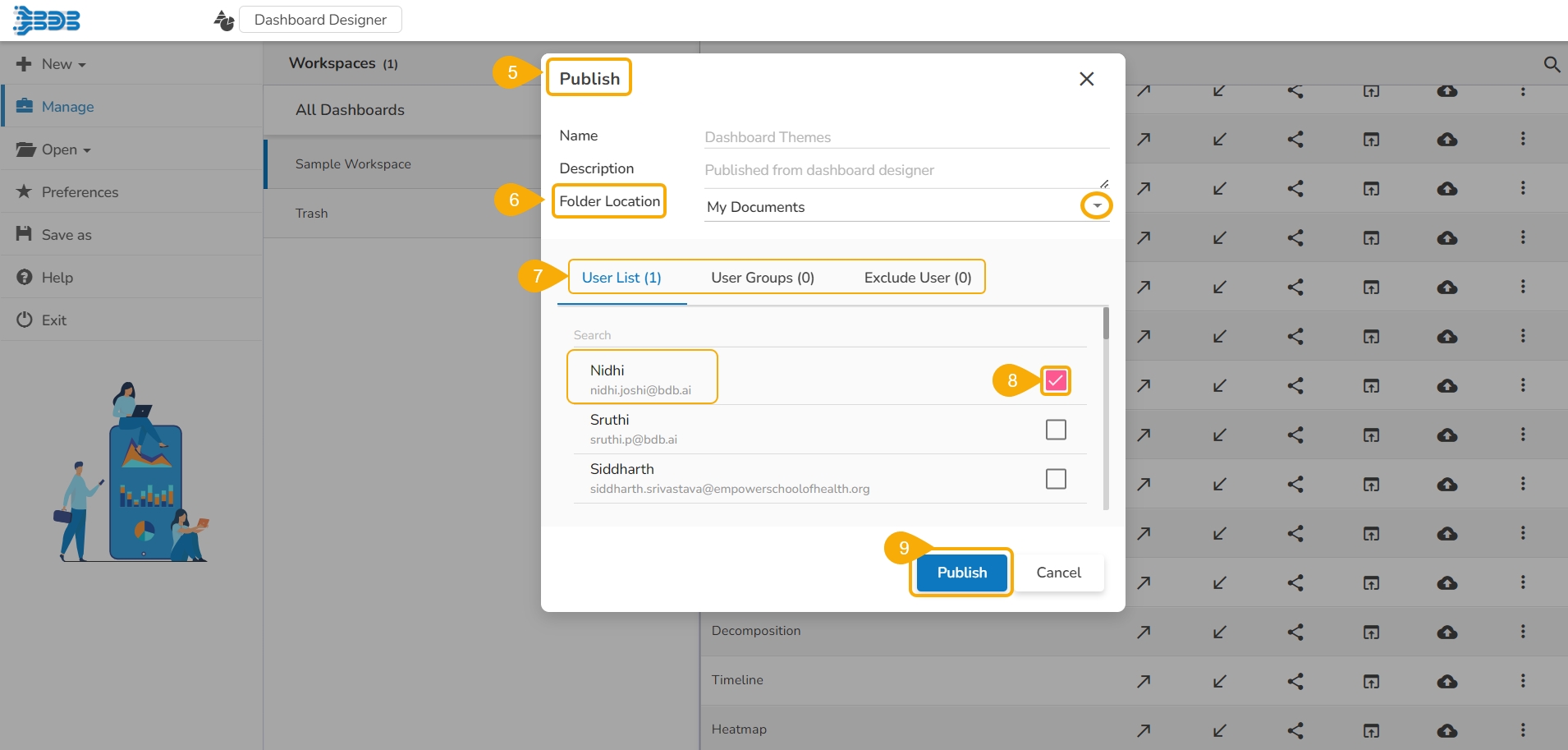
The below-given illustration will help you to understand how to publish a Dashboard.
Dashboards need to be published for end-users to access them. This section explains the steps to publish dashboards.
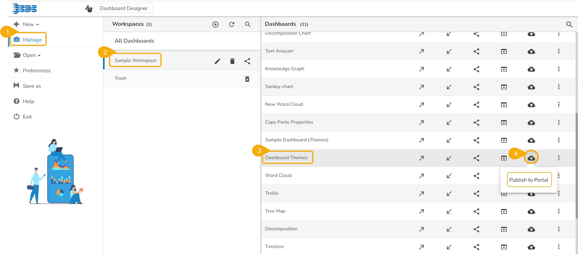
Click the Manage option on the Designer homepage.
Select and click on a workspace from the list of Workspaces.
Select a Dashboard from the list of the saved dashboards under the selected workspace.
Click the Publish to Portal icon.
The Publish dialog box appears to assure the action with the dashboard name and description.
Select Folder Location using the drop-down icon.
The supported folders are My Documents and Public Documents.
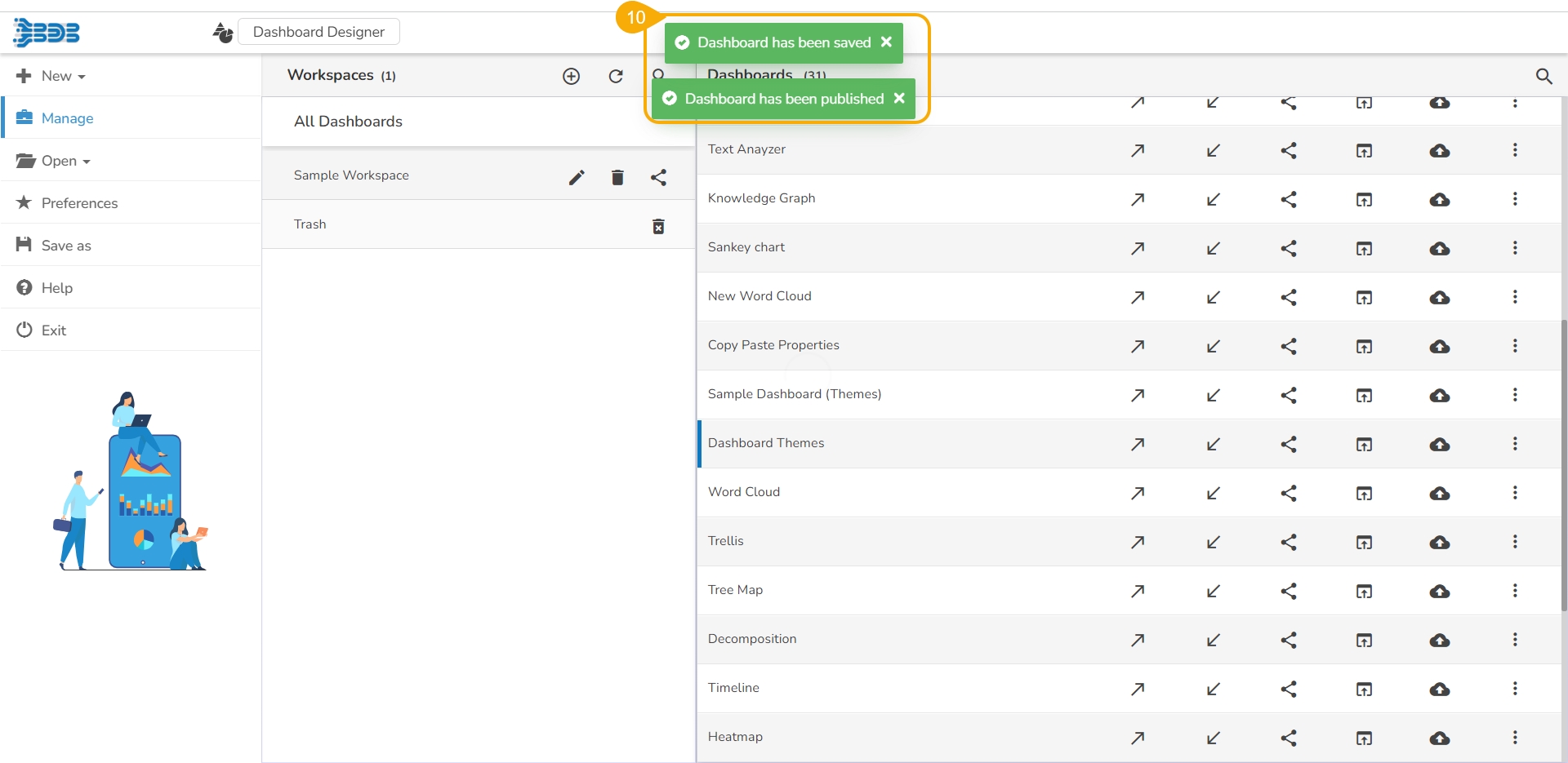
Two consecutive notification messages appear to assure the completion of the action.
The selected dashboard gets published at the desired place.
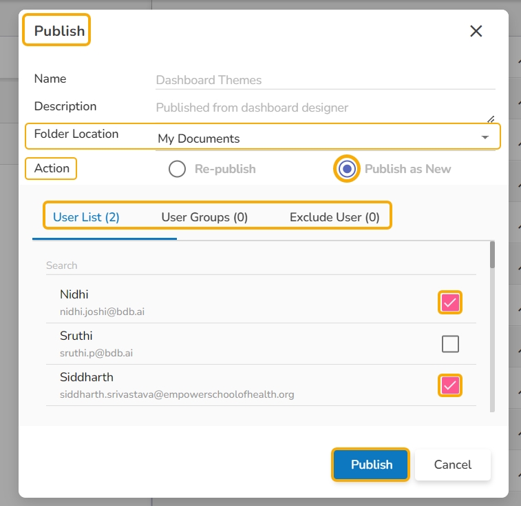
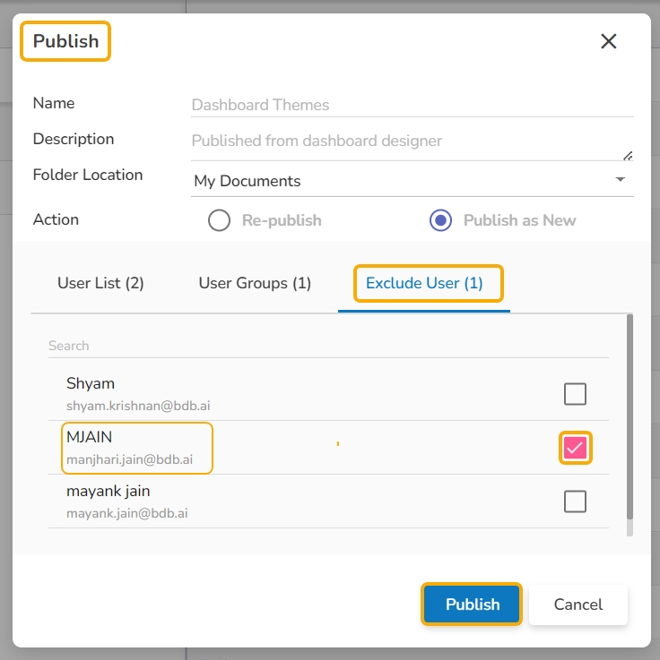
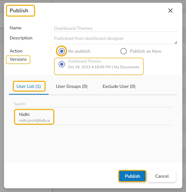
For the published dashboard, the below-given dialog box appears while clicking the Publish to Portal icon.
Select an action option out of Re-Publish or Publish as New.
The Republish option if selected displays the following details:
The Publish as New action allows the user to publish the selected dashboard as new.
Select Use(s) or User Group(s) using either USER LIST or USER GROUPS tab.
Select the desired user(s) or user group(s) using check marks in the given check boxes.
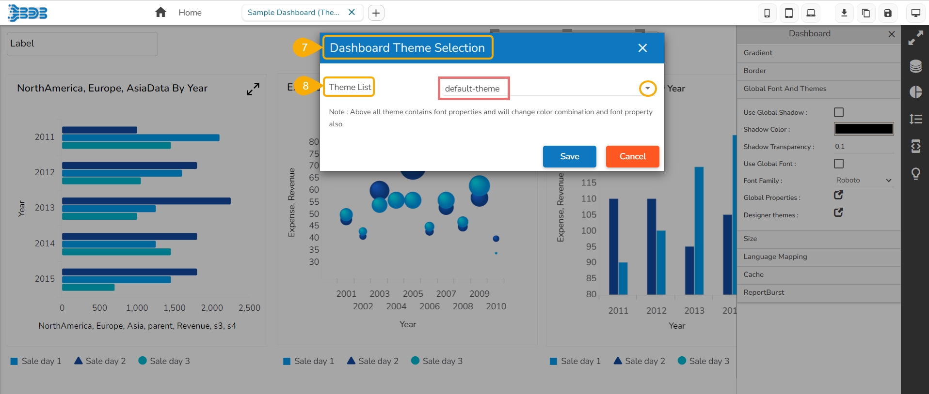
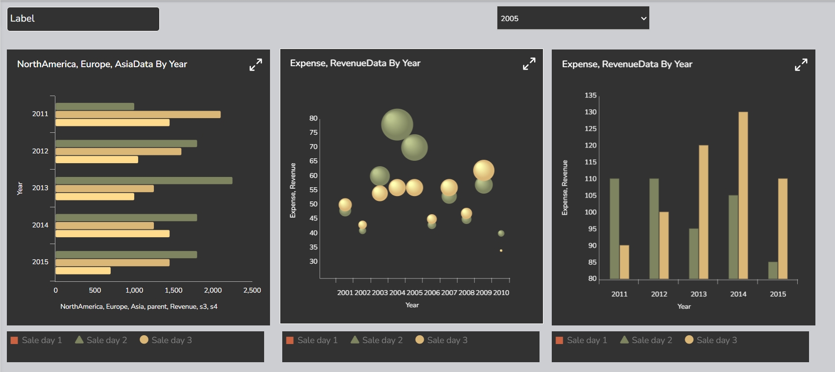
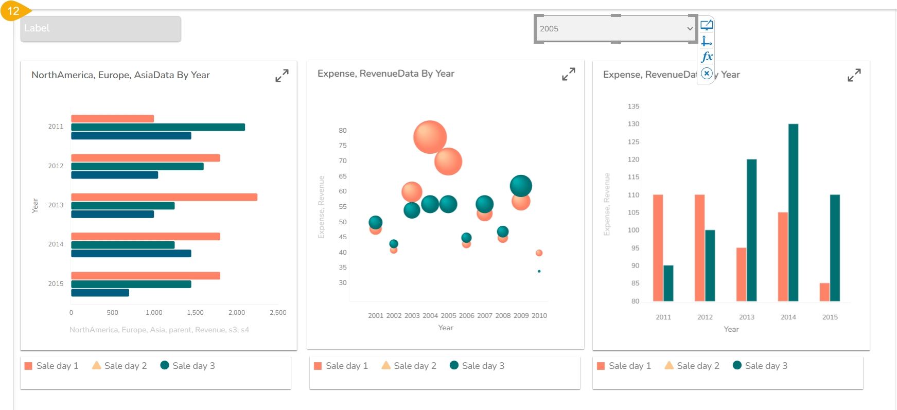
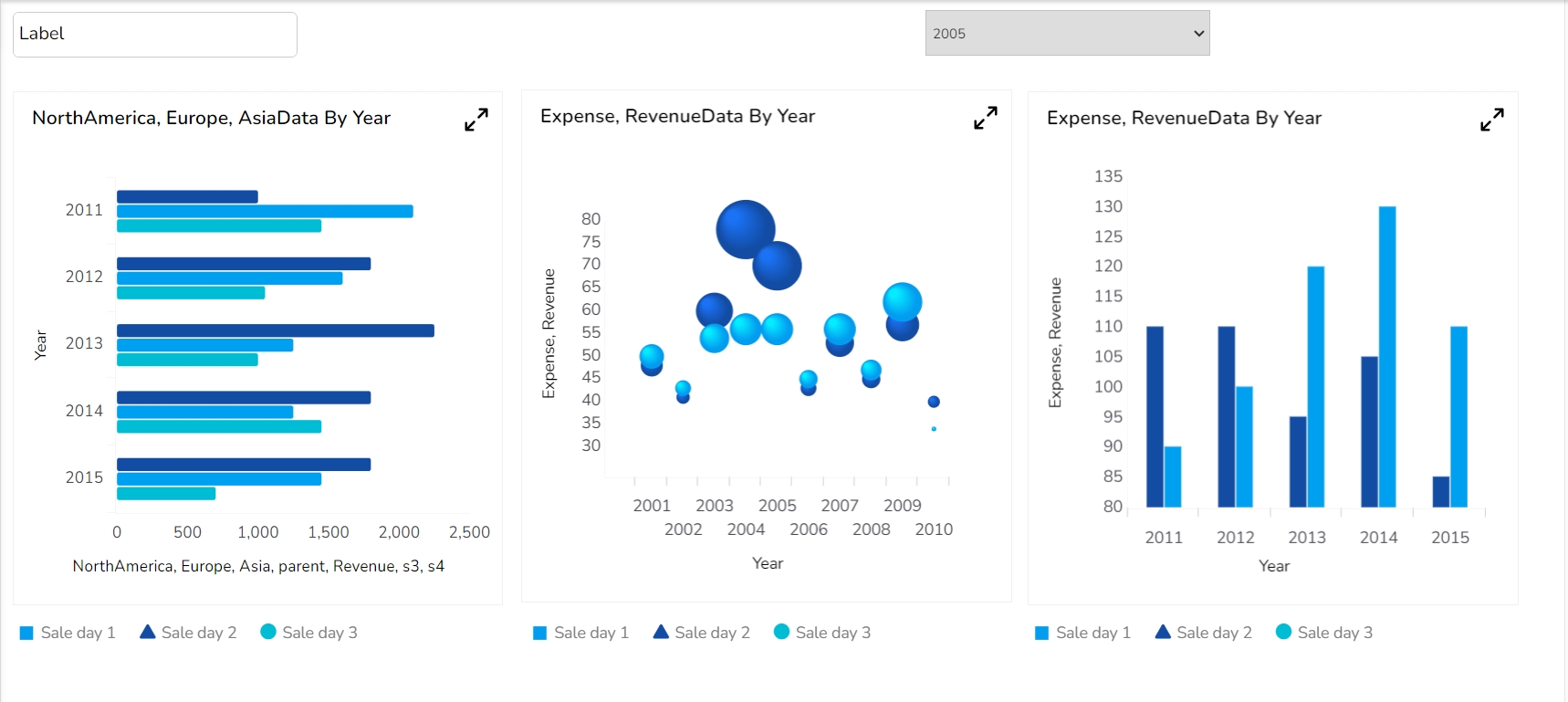
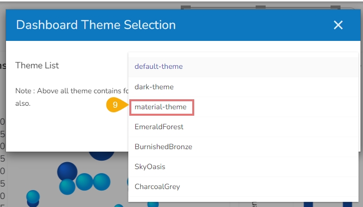
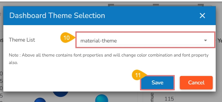
Access the pre-defined dashboard themes to instantly change the visual display of your dashboard.
The Designer module provides visually captivating and appealing themes under the Dashboard Properties, so that the users can effortlessly and instantly transform their dashboard’s appearance. The user can seamlessly switch between different themes with an intuitive drop-down menu.
Navigate to a Dashboard within its canvas framework.
Use right-click to get the Dashboard context menu.
Click the Properties option from the context menu.
The Dashboard Properties gets listed in a context menu.
Select the Global Font and Themes option.
Click the Designer Themes icon.
The Dashboard Theme Selection window opens.
Click the Theme List drop-down option to access the list of all the available dashboard themes.
Select a theme from the drop-down list.
The selected theme appears in the Theme List field.
Click the Save option.
The selected theme gets applied to the dashboard.
The supported themes are as given-below (Click on each tab to open the embedded theme display).
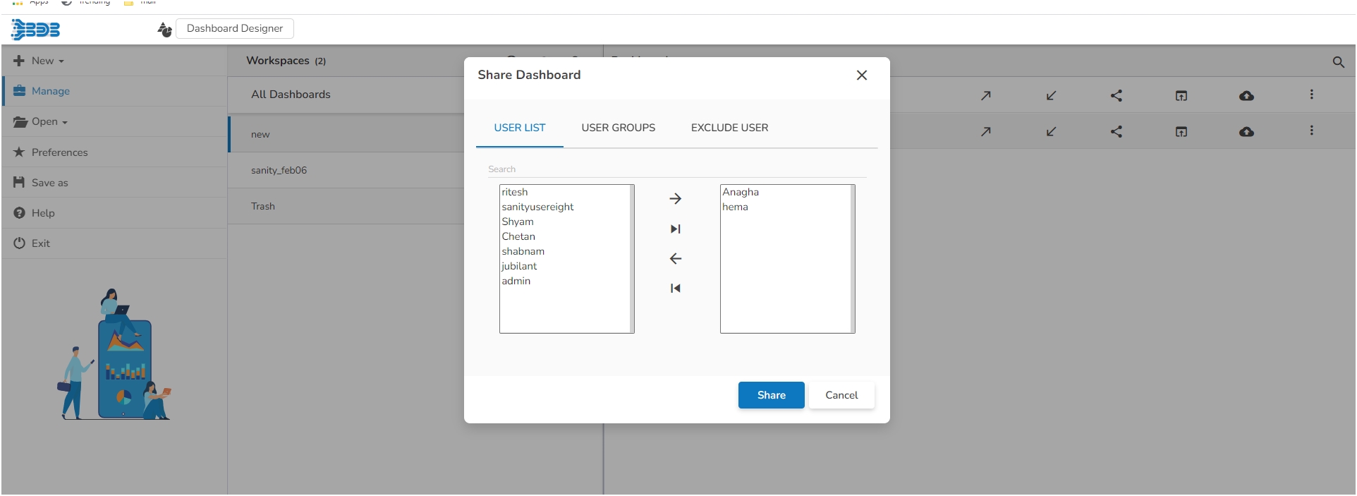
Check out the walk-through on how to share a Dashboard.
Open the Manage option.
Open a Workspace from the list of workspaces.
Select a dashboard from the list of dashboards.
Click the Share Dashboard icon for the selected dashboard.
The Manage Access window opens for the selected dashboard.
Select permissions using the checkboxes provided for the Grant Permissions.
Use the User List or User Groups option to select user(s)/user group(s) to share the dashboard.
Search for the user or user group using the search bar.
Use the checkboxes to select the user(s) or user group(s) you want to share the dashboard.
Click the Share option.
A success message ensures that the dashboard is shared successfully.
Open the Share Dashboard window again for the same dashboard, the user to whom it has been shared will be listed under the Granted Permissions section.
Navigate to the target user's account, and access the Designer module. Open the Manage section. The shared dashboard gets notified by the letter 's' next to the dashboard name. Even the workspace will be notified with 's' next to it indicating that it is a shared workspace.
Check out the illustration on excluding the users while sharing a dashboard with a user group.
Navigate to the Share Dashboard window.
Choose permissions from the Grant Permissions section.
Go to the User Groups tab.
Search for a specific user group using the search bar.
Open the Exclude User tab.
Select users whom you wish to exclude by using the checkboxes.
Click the Share option.
Check out the illustration on revoking the shared dashboard privileges for a user/ user group.
Navigate to the Manage Access window for a shared dashboard.
The user(s)/ user group(s) to whom the dashboard has been shared appears under the Granted Permissions section.
Select a user or user group from the Granted Permissions section.
Click the Revoke icon.
A notification message appears.
The selected user or user group's privileges would be revoked for that dashboard. The selected user or group will be removed from the Granted Permissions section.
This page lists all the enhancements that are released for the Data Sheet.
Please check out the given walk-through to understand the enhancements for Data Sheet.
The following enhancements are provided for Data Sheet as a Data source connection:
Provided the Add Row (+) option to add a new row in the Data Sheet.
The Freeze Column option can be enabled from the Properties tab provided for the Dataset.
Navigate to the Dataset Properties and select a column.
Enable the Frozen Column option from the Properties tab of the Dataset.
The selected column gets frozen and becomes non-editable in the Preview mode.
Add a new row using the Add new Row option, the cell added under the frozen column is editable.
Provided pagination within the General Properties option. By enabling the Pagination option from the General properties, the page number gets displayed on the Data Sheet component.
Introduced the Delete Selected Row option with a confirmation message before a row gets deleted in the Preview mode.
The Save option gets updated in red color when something is edited in the datasheet.


The user needs to specify a user or user group using the following options:
User List: To select a user or multiple users by using a checkmark in the box.
User Groups: To select a user group or multiple user groups by using a checkmark in the box.
Exclude User: To exclude a user or multiple users by using a checkmark in the box.
Click the Publish option.
The available version(s) of the published dashboard. The user can select a version to republish.
The selected user(s) or user group(s) gets appeared in the dialog box.
Each published Dashboard gets a set of options to be performed on it. Refer to Options for a Published Dashboard section provided under the Document Options to get more details on it.
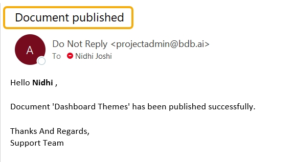
The selected user receives an email from the BDB Support Team after the selected Dashboard gets published to the user.
Select a user group using the checkbox. The user is allowed to select multiple user groups.
Open the Manage Access window again for the same dashboard.
The excluded users will be listed under the Excluded Users section.
The Revoke window appears to confirm the action.
Click the Yes option.


Click the Data Connectors icon.
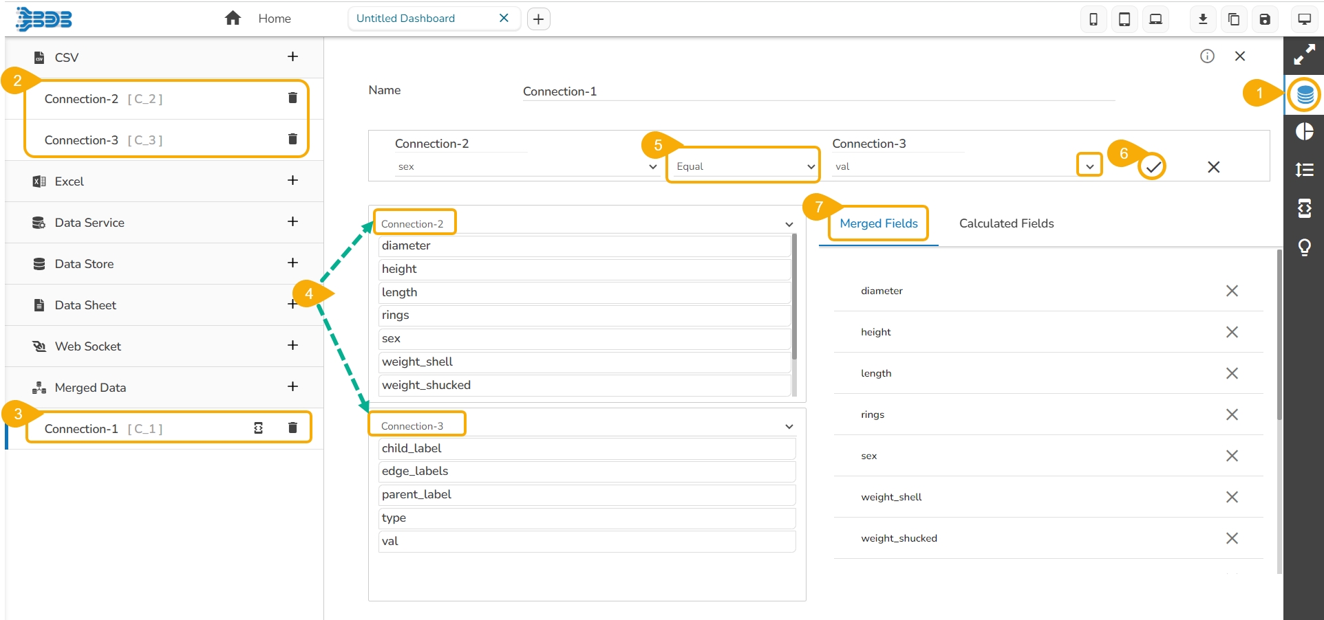
Create new connections using any data connector option (In this case, Excel connections are created. E.g., Connection-1, Connection-2).
Create a connection under the Merged Data connector. (E.g., Connection-3).
Configure the new connection created for Merged data by mapping the created Excel connections.
Define a condition via the drop-down menu in the Criteria space. (E.g. Equal or Not Equal)
Click the Create Criteria icon.
The Merged Fields displays all the data fields from the merged connections.
After clicking the Create Criteria icon, the created criteria get added to space.
Trigger a script to produce some action on the connection part using the Script on Load icon.
The users can remove the fields added to the merged data connection using the Remove icon.
Select the Calculated Fields tab to access Calculated Field Editor and add the calculated fields.
Click the Calculated Fields tab.
Click the Add icon.
The Calculated Field Editor window opens.
Provide a title for the calculated field.
Insert calculation formula inside the Script Editor space.
Click the Create option.
The newly created Calculated field gets added under the Calculated Fields tab.


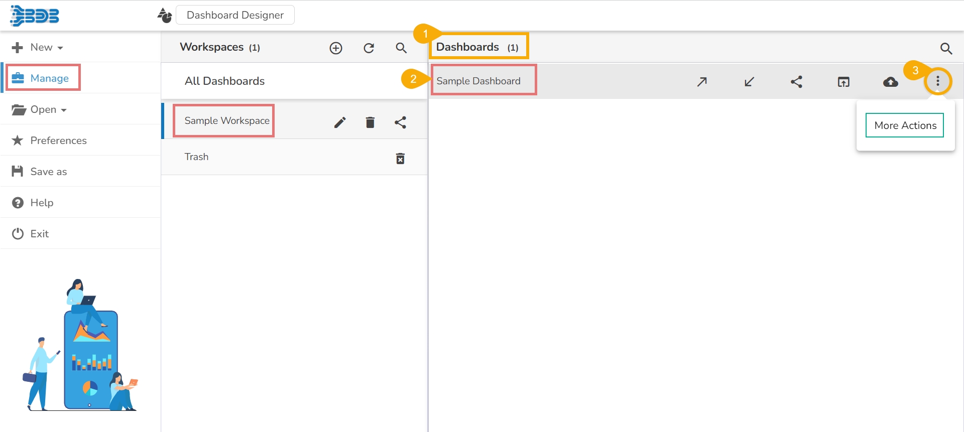
The page focuses on the various options provided for a saved dashboard while using the Manage option.
Manage and share your work with others. This section explains how to edit, save, and publish the dashboards created by users.
Generally created dashboards are saved under a workspace. Based on the requirement, the users can edit the dashboards by adding some modifications and saving them to the disk. This tutorial explains how to edit, open, and save dashboards.
The created and saved dashboards can be shared among the users for a purpose. There are options provided to move and publish dashboards.
The below given description helps you how to access those options in the Designer:
Navigate to the Designer homepage.
Click the Manage option.
A list of Workspaces gets displayed.
Choose a workspace.
A list of all the saved dashboards under the selected workspace gets displayed.
Options provided next to a dashboard name can be used to manage or move that dashboard.
Options provided to a Dashboard:
Options provided under the More Actions:


Steps to develop a data connection based on the CSV file.
Check out the given walk-through on how to create the CSV data connection and associated it with a charting component.


To open a created dashboard in the designer canvas.
Publish to Portal
To publish a created dashboard onto the portal.
More Actions
To provide more actions to be applied to the selected dashboard.
Removes the dashboard
Move To
Moves the dashboard
Option
Name
Description
Push To VCS
To push the dashboard to the git version control
Pull from VCS
To Pull the version dashboard from VCS
Share Dashboard
To share the dashboard file with the other user
Option
Name
Description
Preview
Opens preview for the selected dashboard
Export to Local Disk
Exports the dashboard to a local disk
Rename
Renames the dashboard
Open in Designer
Delete
Click the Data Connectors icon to display all the available data connector types.
Click the Create New Connection icon provided next to the CSV option.
A new connection gets added under the CSV connection type.
Click the connection to display the connection-specific details.
Configure the following information:
Name: Name the connection.
Browse: Click the Browse icon to browse a CSV file.
Load at Start: Enable this option to get the updated data from the data source before loading it into charts.
The Field Set tab displays all the fields after establishing the data connection.
Select the Condition tab.
Provide a condition to be applied as a filter on the selected data by putting a checkmark in the given box.
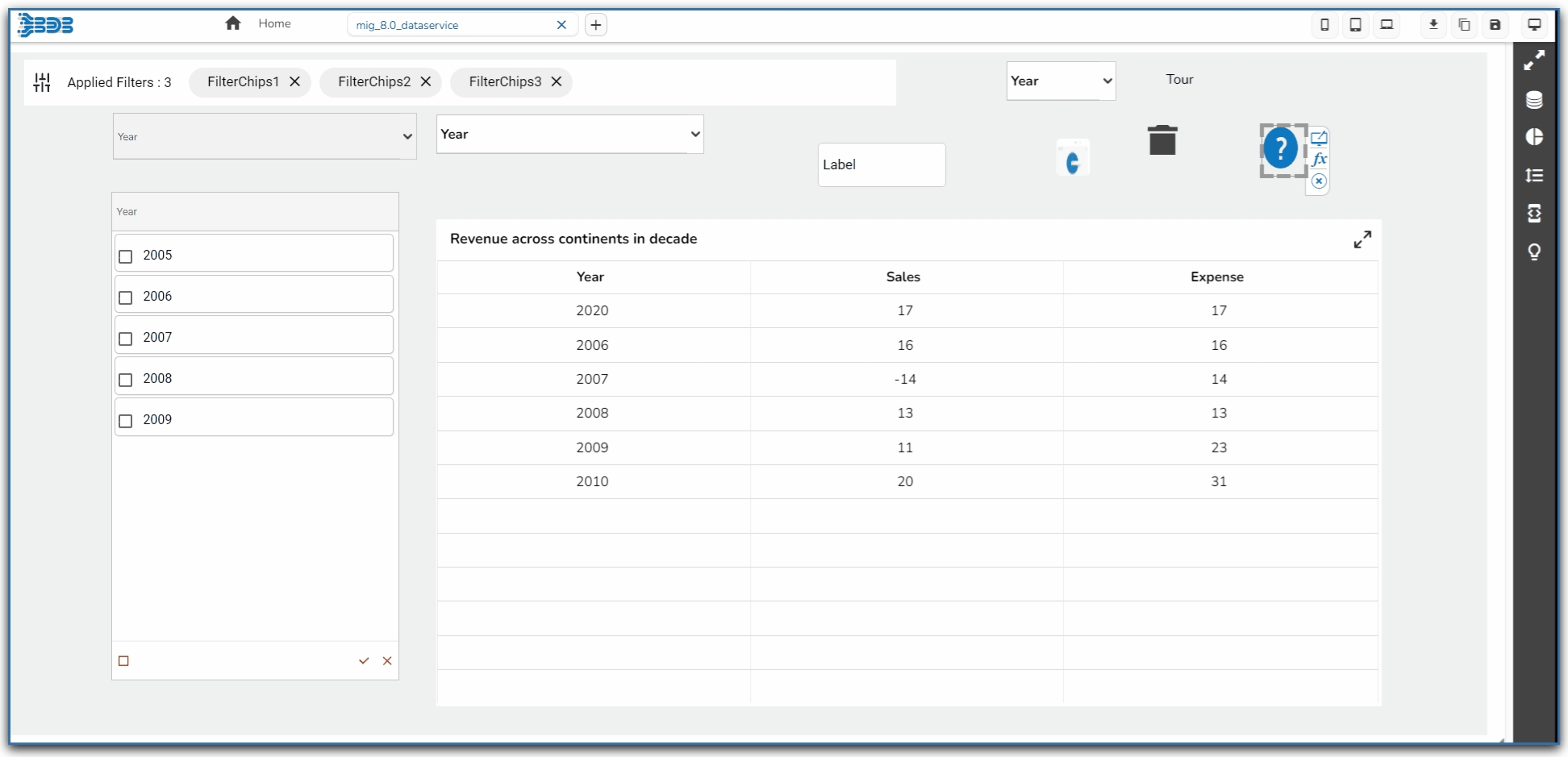
E.g., As displayed in the following image, specific date has been provided under the Conditions column for the Timeline so, data for the given date will be taken.
The users can add a calculated field by using this tab.
Navigate to the Data Connectors page.
Create a connection by selecting a specific Data Connector type.
Connect to the desired data source to access the available fields.
Click the Calculated Fields tab.
The Calculated Field Editor dialog box opens.
Name: Provide a name for the calculated field
Script Editor: Use the Script Editor space to insert the desired calculation formula using the rule given below.
Click the Create option to create the calculated field.
The users can apply their modifications or preferences at the connection level using the Scripting window to get the modified data.
Navigate to the Data Connectors page.
Select a Data Connector type.
Create a new Connection and configure it.
Select the Script on Load icon provided next to the connection.
The Script tab appears to trigger a script to produce some action on the data connection.
The user can also use a script for the Dashboard, which can be accessed via the Components tab.
The user can search the script for the Dashboard, which can be accessed via the Script tab.
Click the Help icon from the Script on the Load page.
The Scripting Help tab opens with some predefined scripts.
Click the Advanced Scripting option to display the chart-wise advanced scripts.


Check out the walk-through on how to use the List filter component in the Designer module.
List is a component used to filter data. All available items are displayed as a list. Users can select multiple items simultaneously by holding the CTRL-key. Select items will determine the data that is displayed in any associated chart(s).
Background Color: Select the desired color for the component's background. This allows you to customize the visual look to match your design preferences.
Opacity: Adjust the transparency of the background color. A lower value makes the background more transparent, while a higher value makes it more opaque.
Shadow: Enable or disable the shadow effect on the component. This adds depth and contrast to the component's appearance.
Component Name: Assign a unique identifier to the component for easy reference within your design or code.
Show Search: Enable this to allow users to search within the list, enhancing usability for long lists.
Left, Top: Specify the position of the component on the screen by setting the Left and Top values.
Height, Width: Define the size dimensions of the component. Adjust these to fit your layout requirements.
Title Box Color: Defines the background color of the title box.
Show Title Box: Toggles the visibility of the title box.
Show Title: Toggles the visibility of the title text.
Title Bar Height: Adjusts the height of the title bar.
The Style properties panel provides various fields to customize the appearance of the component:
Font Color: Sets the color of the text for clarity and aesthetic cohesion.
Font Size: Determines the size of the text, enabling readability adjustments.
Font Style: Offers style options such as italic or normal for text appearance.
Font Weight: Controls the thickness of the text, ranging from light to bold.
Hierarchical Combo Box is similar to Check Box and Combo Box but here the list will be arranged hierarchically and users will be allowed to select multiple items simultaneously.
When users should be given the option to select 1 or more cities that will be used in the table/chart (instead of displaying data for all cities)
Background
The General Properties help tailor the component behavior and appearance to suit specific requirements, improving user interaction and data visibility control.
Component Name: Specifies the identifier for the component, allowing for easy reference.
Left, Top: Sets the position of the component on the chart by adjusting its coordinates.
Height, Width: Determines the size of the component, enabling customization of its dimensions.
Initial Visibility: Controls whether the component is visible at the initial load of the chart.
The Background Properties panel offers options to enhance the visual layout of the component through the following fields:
Shadow: Enables a shadow effect for the component, creating a sense of depth and focus.
Shadow Color: Sets the color of the shadow, allowing for customization to match the overall design theme.
Shadow Transparency: Adjusts the transparency of the shadow, providing control over how prominent or subtle the shadow appears.
The Style properties panel provides various fields to customize the appearance of the component:
Rollover Color: Defines the color that appears when hovering over a cell, enhancing interactive feedback.
Selection Color: Sets the color for highlighting selected cells, making them visually distinct.
Background Color: Allows setting a specific color for the component's background.
Panel Background Color: Customizes the background color of the panel area for a cohesive look.
Check out the below given walk-through on how to use the Radio Button filter component in Designer module.
The Radio Button component helps to filter data on other components.
Component Name: Allows users to set a unique identifier for the radio button component.
Left/Top: Specifies the position of the radio button within the interface, in terms of left and top margins.
Height/Width: Defines the dimensions of the radio button.
Initial Visibility: Toggles the initial display state of the component; if not enabled, it won't appear on the first preview.
Shadow: Enable or disable the shadow effect on the component. This adds depth and contrast to the component's appearance.
Shadow Color: Choose the color for the shadow effect. This can be matched with your design aesthetics or contrast requirements.
Shadow Transparency: Control the transparency level of the shadow. Adjust this to blend the shadow with the background seamlessly or make it more pronounced.


Shadow Transparency: Control the transparency level of the shadow. Adjust this to blend the shadow with the background seamlessly or make it more pronounced.
Initial Visibility: Determine if the component should be visible initially. If disabled, the component will not appear until explicitly shown.
List Swap: Allow users to move items between lists, facilitating better management of selected values.
Multiple Selection: Enable this to allow users to select more than one item from the list at a time.
Row Height: Set the height of individual rows within the list, affecting overall list readability.
Action Bar Height: Define the height of the action bar, which may contain buttons for additional functionality.
Action Icons Color: Customize the color of icons within the action bar to match your design theme.
Selected Index: Specify an index to highlight a particular item by default when the list is initially presented.
Auto Update GV: Automatically update global variables when the list values change, ensuring data consistency.
Notify GV Update: Enable notifications for global variable updates, providing feedback when data changes occur.
Public Filter: Set this feature to allow public access or use of the filter, expanding its availability to multiple users.
Description: Allows for additional text under the title.
Font Color: Changes the color of the title text.
Font Size: Modifies the size of the title text.
Font Style: Sets the style of the title text (e.g., italic).
Font Weight: Controls the thickness of the title text (e.g., bold).
Font Family: Specifies the typeface for the title text.
Align: Adjusts the text alignment (e.g., left, center, right).
Text Decoration: Adds effects like underlining the text.
Font Family: Selects the typeface to align with branding or design preferences.
Chrome Color Opacity: Controls the transparency level of the chrome color, allowing more or less background visibility.
Chrome Color: Sets the color of the browser's interface elements surrounding the component.
Roll Over Color: Defines the color that appears when hovering over elements, enhancing interactive feedback.
Selection Color: Specifies the color used to highlight selected elements, making them visually distinct.
Selection Font Color: Determines the font color of selected text, ensuring readability against the selection color.
Border: Adjusts the thickness and style of the component's border, contributing to its visual outline.
Border Color: Sets the color of the component's border, influencing its contrast and aesthetic appeal.


Hierarchy Level: Allows selection between a Multiple or Single level hierarchy for data display.
Multiple Selection: Enables the capability to select multiple items at once within the component.
Controlled Selection: Manages how selections are controlled within the component, often working with external factors.
Custom Selection: Offers the option to define specific selection criteria or methods beyond default settings.
Selection Limit: Sets the maximum number of items to be selected.
Show Selection Limit: Option to display a notice or indicator when the selection limit is reached.
Auto Update GV: Automatically updates the Global Variable when changes occur within the component.
Notify GV Update: Alerts or indicates when a Global Variable has been updated due to user actions.
Public Filter: Determines whether the filter settings used in the component are accessible publicly or restricted.
Border Radius: Specifies the curvature of the component's corners for a rounded effect.
Panel Border Radius: Adjusts the corner curvature of the panel specifically.
Font Size: Determines the size of the text, enabling readability adjustments.
Font Style: Offers style options such as italic or normal for text appearance.
Font Weight: Controls the thickness of the text, ranging from light to bold.
Font Family: Selects the typeface to align with branding or design preferences.
Font Color: Sets the color of the text for clarity and aesthetic cohesion.
Panel Font Color: Defines the text color specifically within the panel.
Text Decoration: Applies effects like underlines or strikethroughs to the text.
Advance Theme: Enables advanced theming options for comprehensive stylistic control.


View Type: Determines the display style of the radio button, such as the Enhance Button.
Font Color/Size/Style/Weight/Family: Customizes the typography, including color, size, style, weight, and typeface.
Spacing: Adjusts the space between radio buttons to enhance layout clarity.
Border Radius: Rounds the corners of the buttons for a softer look.
Selection Color: Highlights the selected button, providing visual feedback.
Chrome Color: Sets the background color for buttons, with adjustable transparency.
Button Color: Defines the fill color of the radio button.
Circle Color: Sets the color of the circle within the radio button.
Circle Size: Adjusts the size of the circle marker inside the button.
Button Top Spacing: Sets the space above the button to manage layout balance.
Opacity: Controls the transparency level of the radio button for layering effects.
Orientation: Switches the arrangement between horizontal and vertical alignments.
Selected Index: Indicates which button is initially selected.
Auto Update GV: Automatically updates the global variable with the selected value.
Notify GV Update: Alerts the system to update the global variable when selection changes.


The KPI tile charting component displays the sum of quantity for progressive evolution. KPI is a measurable value that demonstrates how effectively a company is achieving key business objectives. The users can get a quick view of prominent trends, indicators, and values based on the various metrics of the business. Proper use of KPI helps in reducing the number of components used in the dashboard for multiple parameters for better performance. It contains the Sparkline component and Trend in build in it.
To provide information about the current performance of a company or organization at a glance
Component Name: Set a unique name to identify the KPI Tile component. This field contains an auto-generated name indicating the sequence of the component in the dashboard.
Left: Determine the horizontal positioning of the chart.
Top: Adjust the vertical positioning of the chart.
Height: Define the height of the chart in pixels.
In the Category section, you can customize the appearance of text using the following fields:
Font Color: Select a color for the text to enhance readability and match the overall theme.
Font Size: Adjust the text size to ensure visibility and cohesiveness with other chart elements.
Font Style: Choose between different styles such as italic or normal to add emphasis or distinction.
Font Weight: Set the weight (thickness) of the font to highlight or deemphasize the text. The supported options are Normal, Bold, 300, 600, and 900.
The user can set and modify the Font Color, Font Size, Font Style, Font Weight, and Font Family for the Primary Series (first series field).
Font Color: Select a color for the text to enhance readability and match the overall theme.
Font Size: Adjust the text size to ensure visibility and cohesiveness with other chart elements.
Font Style: Choose between different styles such as italic or normal to add emphasis or distinction.
Font Weight: Set the weight (thickness) of the font to highlight or deemphasize the text. The supported options are Normal, Bold, 300, 600, and 900.
The user can set and modify the Font Color, Font Size, Font Style, Font Weight, and Font Family ac. for the Secondary Series (second series field).
Font Color: Select a color for the text to enhance readability and match the overall theme.
Font Size: Adjust the text size to ensure visibility and cohesiveness with other chart elements.
Font Style: Choose between different styles such as italic or normal to add emphasis or distinction.
Font Weight: Set the weight (thickness) of the font to highlight or deemphasize the text. The supported options are Normal, Bold, 300, 600, and 900.
Download the given sample data and map it as mentioned below to plot your KPI Tile chart.
Use the Value Field column as the Category field, Primary Series and Secondary Series columns as Series, and Sparkline and Trend columns as Indicator columns to plot data.
Check out the walk-through given below on how to use a Combobox filter component in the Designer.
Combo Box is used to filter data on any associated components. Selecting an item from the drop-down menu will change the data displayed in the associated components.
To filter data on associated components.
To select only a particular item.
The General Properties allow customization of the Combo Box Filter component through various fields:
Component Name: Defines the identifier name for the Combo Box Filter component.
Show Search: Enables or disables the search function, assisting users in finding specific values.
Left, Top: Sets the component position in the user interface by specifying the leftmost and topmost margins.
Height, Width: Adjusts the size dimensions of the Combo Box Filter component.
The Background Properties panel offers options to enhance the visual layout of the component through the following fields:
Shadow: Enables a shadow effect for the component, creating a sense of depth and focus.
Shadow Color: Sets the color of the shadow, allowing for customization to match the overall design theme.
Shadow Transparency: Adjusts the transparency of the shadow, providing control over how prominent or subtle the shadow appears.
Background Color: Defines the main color filling to the component background for aesthetic and branding consistency.
Title Box Color: Sets the background color of the title box for a cohesive look.
Show Title Box: Toggles the visibility of the title box.
Show Title: Allows the title text to be displayed.
Show Only Title: Displays only the title, hiding other elements for a minimalist approach.
Rollover Color: This property changes the background color when a user hovers over an option in the dropdown, enhancing interactivity and user experience.
Selection Color: Defines the background color of a selected option in the dropdown, providing a visual indication of the user's choice.
Background Color: Sets the overall background color of the dropdown menu, contributing to the visual consistency of the design.


The Canvas Properties helps users to configure properties for the entire dashboard.
The Designer canvass is provided with specific properties.
Navigate to the Designer canvas.
Use the Right-click anywhere on the canvas to get the Dashboard properties.
Select the


Width: Set the width of the chart in pixels.
Initial Visibility: Enable this option to make the chart visible during the initial preview.
Tooltip: Enable this field to show the information text that appears when the user hovers over the KPI Tile.
Direction: Choose between horizontal or vertical orientation to display data trends.
No. of Rows/ Columns: Provide a number to define the number of rows and columns.
+ve Trend Color: Set a trend color for the positive value.
-ve Trend Color: Set a trend color for the negative value.
Zero Trend Color: Set a trend color for the Zero value.
SparkLine Color: Select the border color for the Sparkline when this indicator type is chosen.
SparkLine Fill Color: Select the fill color for the Sparkline using this field.
Font Family: Opt for a typeface that aligns with the chart's aesthetic or your branding requirements.
Font Family: Opt for a typeface that aligns with the chart's aesthetic or your branding requirements.
Font Family: Opt for a typeface that aligns with the chart's aesthetic or your branding requirements.

Initial Visibility: Determines whether the filter is visible upon the first preview. If not enabled, the chart won't appear initially.
Font Color, Font Size: Modifies the text color and size within the filter for better visual distinction.
Font Style, Font Weight, Font Family: Customizes the typography, including style (e.g., italic), weight (e.g., bold), and font family for a consistent visual theme.
Font Weight: Set the weight (boldness) of the font. The supported options are Normal, Bold, 300, 600, and 900.
Font Family: Choose the font family for the title text from the given choices.
Selection: Allows choosing between 'Default', 'Single', or 'Multiple' selection modes for item selection flexibility.
Selected Index: Sets a default value that appears initially in the filter; requires enabling 'Notify GV Update' for dynamic changes.
Auto Update GV: Automatically refreshes the filter when changes occur to the governing variables (GV) without manual intervention.
Notify GV Update: Notifies and updates linked variables when a selection is made, keeping data in sync.
Public Filter: Determines if the filter settings should be accessible to other components or users.
Title Bar Height: Adjusts the height of the title bar, impacting the overall layout.
Description: Adds supplementary information beneath the title.
Font Color: Specifies the color of the title text for readability and design alignment.
Font Size: Defines the size of the title text.
Font Style: Choose between normal, italic, or oblique styling for the title text.
Font Weight: Sets the thickness of the title text, offering a range from light to bold.
Font Family: Selects the font family to apply to the title text.
Align: Aligns the title text (left, center, right) within its container.
Text Decoration: Adds text decoration such as underline, overline, or line-through.
Position: Determines the position of the title element within the component.


Various Dashboard level properties get listed in the displayed context menu as shown in the below-given image:
Parameter Name
Description
Background Colors
Users will be directed to select a background color.
Opacity
Set background-color opacity.
Background Rotation
Set the value to rotate the background color accordingly
Parameter Name
Description
Thickness
Set border thickness.
Border Color
Select a border color from the menu.
Parameter Name
Description
Use Global Shadow
Enable this option to display global shadow
Shadow Color
Select a color from using the menu
Shadow Transparency
Set the transparency for the shadow
Use Global Font
Enable this option to use the global font.
Font Family
Select a font type from the drop-down menu.
Select the Global Font And Themes option from the context menu.
Click on the Designer themes icon.
The Size Properties option helps to
Check out the given walk-through on how redraw on resize Property gets applied to the Dashboard.
Parameter Name
Description
Screen Size
Select an option from the drop-down menu.
Width
Increase/decrease the width of the dashboard.
Height
Increase/decrease the height of the dashboard.
Redraw on resize
Redraws the dashboard while resizing it.
Enable Scaling
Enable this option to display scaling.
Click the drop-down icon for the Screen Size field.
A context menu appears displaying various options to set the Screen Size.
Parameter Name
Description
Enable
Enable this option to apply language mapping functionality.
Hide Curly Braces
Enable this option to hide the curly braces.
Select a Mapping
Select a language mapping using the drop-down menu.
Please Note: By clicking on the Select a Mapping icon, the Language Mapping Selection dialog box opens.
Navigate to the Language Mapping Selection dialog box.
Select a language mapping option using the Mapping List drop-down menu.
Click the Save option.
Use a checkmark in the given box to enable the Enable Cache option for the data service. If cache is enabled for a dashboard with a data service as a data source it will do the following tasks:
While loading the dashboard, for the first time data will hit from database.
The same dashboard while loading again it will load the data from the Cache.
Use a checkmark in the given box to Enable Report Burst. By enabling the Report Burst option from the Dashboard properties displays the Report Burst option for a published Dashboard. Refer the Report Burst section from the Options for a Published Dashboard section for more details.


A Sparkline is a small chart that is drawn without axes. It does not contain some chart-specific elements (such as legend, title, etc.). The Sparkline chart can be easily embedded in the text as it performs more like an inline element (rendered inside a span) as opposed to the standard charts, which behave like block elements. The primary purpose attached to the Sparkline Chart is to show a trend of something unique.
The best situation to use the Sparkline chart
To show the data trend.
Component Name: Set a unique name for the component identification. This field contains an auto-generated name indicating the sequence of the component in the dashboard.
Left: Sets the horizontal position of the chart within the workspace.
Top: Sets the vertical position of the chart within the workspace.
Height: Adjusts the vertical size of the chart.
Gradient Rotation: Adjust the angle of the gradient applied to the background, allowing for a dynamic visual transition between colors.
Opacity: Set the transparency level of the background, ranging from fully opaque to completely transparent.
Gradient: Enable or disable gradient colors in the background for depth and visual appeal.
Show Tool Tip: The user can show the series description and get the tooltip by clicking the Show Tool Tip option.
The Tool Tip Configuration window opens.
Select any Tool Tip option. The supported Tool Tip options are None and Default.
When configuring the Line chart in the Sparkline component, various properties can be adjusted to enhance visual representation:
Line Color: Set the color for the line in the chart to make it stand out.
Fill Color: Choose a color to fill the area between the line and the x-axis.
Opacity: Adjust the transparency level of the fill color for clear visibility.
Line Width: Specify the thickness of the line to ensure it is easily visible.
Bar Spacing: Adjust the space between individual bars for better clarity or a compact look.
Zero Axis: Enable or disable the zero-axis line for reference in the bar chart.
Positive Color: Select a color to represent the bars with positive values.
Negative Color: Choose a color for bars indicating negative values.
After selecting the type to Tristate from the General section, the following properties can be adjusted to enhance its visual representation:
Bar Spacing: Modify the space between bars to achieve a more refined or compact layout, allowing for better visual differentiation.
Positive Color: Assign a specific color to bars that represent positive values, aiding quick identification of growth or gains.
Negative Color: Choose a distinct color for bars displaying negative values, highlighting losses or declines effectively.
Zero Color
The Formatter allows users to customize how numerical data is displayed. This includes:
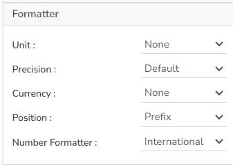
Currency: Select the currency type for financial values. Options include CENT, EURO, INR, POUND, USD, and YEN.
Position: Choose where the currency symbol appears. Use the Prefix position if the currency is in INR format, or the Suffix position for other formats like Pound or USD.
Number Formatter: Set the number format based on your region's convention. You can choose between the Indian and International number formats, affecting how large numbers are grouped and separated.
The following variants can be obtained by changing Spark Line properties:
Sparkline Line
Sparkline Bar
Sparkline Tristate
Download the given sample data and map it as mentioned below to plot your Spark Line chart.
Use the Tristate column as the Category field, and the Trend column as the Series field to plot data.
Pivot grid, also known as Pivot Table is a data summarization tool used in data visualization software. The users can identify and select columns and rows of data in a database or spreadsheet to obtain a desired report using the pivot grid tool. A pivot grid does not change the actual database or spreadsheet but turns the data to be viewed from different perspectives.
When the users want to perform analysis on multi-dimensional data by generating cross-tabular reports.
Component Name: Allows the user to assign a unique identifier to the chart component.
Left: Adjusts the horizontal position of the chart on the page.
Top: Controls the vertical placement of the chart within the display area.
Height: Sets the vertical dimension of the chart.
Gradient Rotation: Modify the angle of the gradient to achieve the desired effect.
Opacity: Set the transparency level to balance visibility and aesthetics.
Gradient: Choose and customize the gradient colors to match your theme.
Click the
Title Box Color: Set the color of the title box to complement your chart's overall design.
Show Title Box: Toggle this option to display or hide the title box around the title text.
Show Title: Enable or disable the title visibility on your chart.
Title Bar Height: Adjust the title bar height to fit your design specifications.
Show Sub Title: Enable or disable the display of the sub-title text.
Description: Add a description text below the sub-title.
Font Color: Select the color of the sub-title text.
Font Size: Specify the size of the sub-title text.
The Header Style section allows for customization of the header in your design. You can modify the following fields:
Header Text Color: Set the color of the header text to align with your theme.
Font Size: Define the text size in the header for visibility and emphasis.
Font Style: Choose a style such as italic or normal to enhance the header's appearance.
Font Weight: Set the weight (boldness) of the font. The supported options are Normal, Bold, 300, 600, and 900.
The user can change the Font color-size-weight-family of the text inside the row. Row height can also be adjusted. Under text decoration, we can provide an underline to the text.
Roll Over Color: Defines the color that will be applied while rolling over the rows.
Text Hover Color: Specifies the color that text changes to when hovered over by the mouse pointer, useful for providing visual feedback.
Selection Color: Determines the color used to highlight selected elements, ensuring that selections are easily distinguishable.
Horizontal Grid Lines:
Enable Context Menu: Activate a right-click context menu for quick access to export options in the preview mode of the chart.
Export Excel: Save the chart data in an Excel file format (.xlsx).
Export CSV: Export the chart data into a CSV file format (.csv).
Export JPEG: Export the chart as a JPEG image (.jpg).
The user can map the dataset as displayed in the images: Row: State & City, Column: Country, Values: Population & Revenue.
The selected Values can be configured by using the Properties.
Check out the given walk-through to understand the Checkbox filter component.
The checkbox is used to filter data on any associated components. Enabling a checkbox will change the data displayed in the associated components.
To filter data displayed in the associated components
To select multiple items at a time
The checkbox component offers a range of customizable properties to tailor its appearance and functionality:
Component Name: Assign a unique name to identify the checkbox component.
Left: Set the left position of the checkbox within its container.
Top: Define the top position of the checkbox within its container.
Height: Specify the height of the checkbox.
The user can provide multiple checkboxes while enabling this property option.
Multiple Checkboxes: Enable the Multiple Checkboxes option from the MultiCheckbox Settings property to add multiple checkboxes with labels.
Toggle Checkboxes: Enable the option to access the new Toggle Switch UI as checkboxes.
Manage Checkbox: Click the Manage Checkbox icon to access the dialog window for managing multiple checkboxes.
The user can add or delete checkboxes.
Provide Label Text, select the default display to be checked or unchecked, and provide value for the checked toggle checkboxes.
Direction: Select an option from the drop-down menu to choose the direction of the checkboxes. It can be Horizontal or Vertical.
The user can style the toggle switch UI using the Toggle Style property option.
The user can modify the Width, Height, and Toggle Switch Shape (Round or Square) from the Toggle Stypes property option.
The user can also define colors for the Toggle Slider, Checked Color, and UnChecked Color.
The user can get the reflection of the chart by enabling the shadow option.
The user can also change the color and increase/decrease the transparency of the shadow.
The following use case explains the steps to connect and use a Checkbox with a Data Grid component.
Drag a Data Grid component to the Designer canvas.
Associate a Data Connection with it.
Drag a Checkbox component from the Filter group to the canvas.
Open the Checkbox Properties, provide the necessary properties, and apply them.
Provide the text for the Label.
Provide the Checked Value.
Keep the Unchecked Value blank.
Configure the Condition tab by providing a field value for the conditions (the field State is chosen in the given image).
Click the Preview icon to preview the Dashboard.
Use a checkmark in the given box to display the Checked Value in the chart.
Uncheck the Check Box to display the Unchecked Value in the chart (In this case, no value has been assigned as Unchecked Value so it will display all the records).
Mito is a very advanced chart that is based on mitochondrial DNA study. The Mito-plot chart shows the basic structure of mitochondrial DNA, as shown in the figure. Mito-Plot chart divided into different segments each segment produces a protein (RNA type) these proteins is essential during the cellular respiration cycle. These segments have been defined through the category, and its color depends on the RNA type what it contains. Mitochondrial DNA has two strands, and that can be differentiated based on their nucleotide content, these two strands are a heavy strand or H-strand and a light strand or L-strand. H-strand is a genuine rich strand and represents through the segment which orientation towards outside. L-strand is a cytosine-rich strand that represents through the segment which orients towards inside.
Check out the below given walk-through on how to use the Mito Plot chart component in Designer module.
Medical experts can use this chart to visualize mitochondrial DNA damage specific to individuals.
The General Properties section allows the user to customize various aspects of the component. Here are the fields you can modify:
Component Name: Set a unique name for the component identification. This field contains an auto-generated name indicating the sequence of the component in the dashboard.
Left & Top: Define the component's position on the screen by setting the left and top margins.
Height & Width: Specify the dimensions to ensure the component fits the desired space.
Initial Visibility
The user who wants to show the series description can use the tooltip by enabling it.
The user can show the series description and get the tooltip by clicking the Show Tool Tip option.
The Tool Tip Configuration window opens.
Select any Tool Tip option. The supported Tool Tip is None and Custom.
Gradient Rotation: Modify the angle of the gradient to achieve the desired effect.
Opacity: Set the transparency level to balance visibility and aesthetics.
Gradient: Choose and customize Click the Gradient icon.
Title Box Color: Choose the background color for the title box.
Show Title Box: Enable or disable the display of the title box on the chart.
Show Title: Enable or disable the display of the title text.
Title Bar Height: Set the height of the title bar.
Show Sub Title: Enable or disable the display of the sub-title text.
Description: Add a description text below the sub-title.
Font Color: Select the color of the sub-title text.
Font Size: Specify the size of the sub-title text.
Enable Context Menu: Activate a right-click context menu for quick access to export options in the preview mode of the chart.
Export Excel: Save the chart data in an Excel file format (.xlsx).
Export CSV: Export the chart data into a CSV file format (.csv).
Export JPEG: Export the chart as a JPEG image (.jpg).
The user can get the Export Context Menu from the preview mode to download the reports in different export formats.
Download the given sample data and map it as mentioned below to plot your Mito chart.
Use the Patient_seq column as Category field, Color_rnaType column as RNA Type, orientation column as Orientation field, start column as Start field, stop column as Stop field, and dataLabel_pos column as Marker field to plot data.
Inverted Funnel charts are a great way to track progress through a workflow with multiple steps. They can highlight how well a process is being followed and easily identify any bottlenecks.
The users can invert the funnel chart to see things from a different point of view. It widens at the bottom and narrows at the top pinpointing the various phases in a classified structure. This chart can be used to see the hierarchical structure of an organization or distribution process of fund/salary/profit etc.
To display hierarchical pattern
Example: To categorize the administrative structure in an organization
Data Sheets are used to capturing various process, mechanical, electrical, technical, and control requirements for equipment and instruments. The sheets incorporate information about the selected components, usually with input from multiple users.
To collect information from various users. To bring the collected information from the various users to one place. To search, filter, and compare the collected data.


Width: Adjusts the horizontal size of the chart.
Initial Visibility: When unchecked, the chart will not be displayed during the first preview.
Type: Allows the selection of the chart type, such as Line, Bar, or Tristate, offering flexibility in data representation.
Click the Add Color option to add multiple colors.
Click the Save option to apply the selected background colors.
Border: Define the width of the border surrounding the pyramid chart.
Border Color: Select the color for the chart's border, enhancing its visibility and aesthetics.
Border Radius: Round the corners of the chart's border for a softer, more modern appearance.
Shadow: Enable a shadow effect for the background to add dimension and focus to the chart.
Shadow Color: Choose the color of the shadow cast by the chart background.
Shadow Transparency: Adjust the transparency level of the shadow to control its prominence and intensity.
Background Color: Set the background color for the tooltip box to enhance readability.
Opacity: Adjust the transparency level of the tooltip background.
Border Color: Define the color of the border surrounding the tooltip box.
Tooltip Font Size: Specify the font size for the text displayed in the tooltip.
Box Width: Determine the width of the tooltip box for optimal presentation.
Precision: Set the number of decimal places to show in the tooltip for numerical values.
Spot Color: Define a color for spots along the line to highlight data points.
Min Spot Color: Set a distinct color for the minimum value spot on the line.
Max Spot Color: Choose a color for highlighting the maximum value spot.
Highlight Spot Color: Specify a color to highlight certain spots for emphasis.
Highlight Line Color: Select a color to emphasize particular lines in the chart.
Spot Radius: Determine the size of the spots displayed on the line.
Min Normal Value: Set the lower bound of the normal value range to indicate on the chart.
Max Normal Value: Define the upper limit of the normal value range.
Normal Color: Choose a color to fill the area within the normal value range.
Min/Max Data Label: Enable this option to display the minimum and maximum values directly on the chart.
Zero Color: Define the color for bars that represent zero values.
Auto Axis: Automatically adjust the axis based on the data range to optimize chart appearance.
Min Y-Axis Range: Set the minimum range for the Y-axis to maintain a consistent scale across charts.


Width: Determines the horizontal dimension of the chart.
Initial Visibility: Determines whether the chart is visible upon the first preview.
Max Button: Enables or disables the option to maximize the chart.
First Column Width: Sets the width of the first column.
Fit Columns: Configures the chart to adjust its columns for the best fit.
Click the Add Color option to add multiple colors.
Click the Save option to apply the selected background colors.
Border: Add a border around the chart for a defined perimeter.
Border Color: Alter the border color to complement or contrast with the chart.
Border Radius: Round the corners of the chart border for a smoother look.
Shadow: Enable shadows to create depth and a 3D-like effect.
Shadow Color: Customize the shadow color to blend naturally with the chart.
Shadow Transparency: Adjust the transparency level to control the intensity of the shadow effect.
Description: Provide an additional description for the chart title to offer more context.
Font Color: Choose the font color for the title to ensure readability and match your theme.
Font Size: Set the title's font size for optimal visibility and aesthetics.
Font Style: Select the font style (e.g., italic, bold) to enhance the title's appearance.
Font Weight: Modify the font weight to make the title text lighter or bolder.
Font Family: Pick a font family that aligns with your design theme for the title.
Align: Align the title text to the left, center, or right according to your layout needs.
Text Decoration: Apply text decorations to the title for emphasis (E.g., Underline).
Show Dataset Description: Enable or disable the dataset description in the title.
Font Style: Choose the font style for the Sub-title (e.g., italic or normal).
Font Weight: Set the weight (boldness) of the font. The supported options are Normal, Bold, 300, 600, and 900.
Font Family: Choose the font family for the sub-title text from the given choices.
Align: Align the sub-title text (e.g., left, center, right).
Text Decoration: Apply text decorations (e.g., underline) to the sub-title text.
Font Family: Select a font family for the header that complements your overall design.
Use Field Color: Enable this option to apply a specific field color to the header background.
Background Color: Change the header's background color to match or contrast with the text.
Text Decoration: Apply decorative elements like Underline to the header text for additional styling.
Horizontal Line Color: Customizes the color of the horizontal grid lines to match the design theme or improve visual clarity.
Vertical Line Color: Adjusts the color of the vertical grid lines, allowing for consistent styling with other elements.
Grid Colors: Allows users to change the row color and alternate row color to create a visually appealing grid layout.
Export PNG: Export the chart as a PNG image (.png).
Export PPT: Export the chart to a PowerPoint presentation (.pptx).
Export PDF: Export the chart as a PDF document (.pdf).
Show Print: Include an option to print the chart directly.
Export Heading: Add a custom heading to the exported file.
Export Sub Heading: Add a custom subheading to the exported file.
Export File Name: Specify the file name for the exported file/dashboard.
Global Export Type: Define the default export format using the drop-down (e.g., Screenshot, Tabular).
Refer to the Alerts in Grids page under the Configurations section to understand how to insert Alerts in a Grid component.


Width: Determine the width of the checkbox.
Initial Visibility: Enable or disable the initial visibility of the checkbox in the preview.
Show Checked: Enable to display a checkmark by default.
Label: Assign a name to the checkbox label, which can be customized.
Font Color: Change the font color of the label.
Font Size: Adjust the size of the label text.
Font Style: Select the style (e.g., italic) for the label font.
Font Weight: Set the weight (e.g., boldness) of the label font.
Font Family: Choose the font family for the label text.
Chrome Color: Set the background color of the checkbox, with adjustable transparency.
Opacity: Modify the transparency level of the checkbox background.
Checked Value: Assign a value that is passed when the checkbox is checked.
Unchecked Value: Specify a value that is passed when the checkbox is unchecked.
Use the component object page to write the required script at the component level.
Max Button: Enable the option to maximize the component, allowing users to expand it for better visibility.
Series Colors: Customize the colors of the series, for the Mito chart to distinguish different segments.
Chart Alignment: Adjust the alignment of the chart within the container, choosing from Center, Right, or Left.
Background Color: Set the tooltip background color to enhance its visibility and appearance.
Opacity: Adjust the transparency level of the tooltip to ensure that the information is visible without obstructing the view of the main chart.
Border Color: Define the color of the tooltip's border to make it stand out against the background.
Tooltip Font Size: Specify the font size within the tooltip for better readability.
Box Width: Set the width of the tooltip box to accommodate the content and maintain a tidy layout.
Precision: Choose the decimal precision to display numerical data accurately in the tooltip, allowing for more precise data representation.
Click the Add Color option to add multiple colors.
Click the Save option to apply the selected background colors.
Border: Add a border around the chart for a defined perimeter.
Border Color: Alter the border color to complement or contrast with the chart.
Border Radius: Round the corners of the chart border for a smoother look.
Shadow: Enable shadows to create depth and a 3D-like effect.
Shadow Color: Customize the shadow color to blend naturally with the chart.
Shadow Transparency: Adjust the transparency level to control the intensity of the shadow effect.
Description: Add a description text below the title.
Font Color: Select the color of the title text.
Font Size: Specify the size of the title text.
Font Style: Choose a Font style using the drop-down menu (e.g., italic or normal).
Font Weight: Set the weight (boldness) of the font. The supported options are Normal, Bold, 300, 600, and 900.
Font Family: Choose the font family for the title text from the given choices.
Align: Align the title text (e.g., left, center, right).
Text Decoration: Apply text decorations (e.g., underline) to the title text.
Show Dataset Description: Enable or disable the dataset description in the title.
Font Style: Choose the font style for the Sub-title (e.g., italic or normal).
Font Weight: Set the weight (boldness) of the font. The supported options are Normal, Bold, 300, 600, and 900.
Font Family: Choose the font family for the sub-title text from the given choices.
Align: Align the sub-title text (e.g., left, center, right).
Text Decoration: Apply text decorations (e.g., underline) to the sub-title text.
Export PNG: Export the chart as a PNG image (.png).
Export PPT: Export the chart to a PowerPoint presentation (.pptx).
Export PDF: Export the chart as a PDF document (.pdf).
Show Print: Include an option to print the chart directly.
Export Heading: Add a custom heading to the exported file.
Export Sub Heading: Add a custom subheading to the exported file.
Export File Name: Specify the file name for the exported file/dashboard.
Global Export Type: Define the default export format using the drop-down (e.g., Screenshot, Tabular).


The user can change the height, width, top, left, chart type, column type & Line form. In this case, we have changed the chart type to Inverted & Identical Stack.
Component Name: Assigns a unique identifier to the inverted funnel chart component. This field contains an auto-generated name indicating the sequence of the component in the dashboard.
Left: Determines the horizontal position of the chart within the container.
Top: Sets the vertical positioning of the chart.
Height: Specifies the height of the funnel chart.
Width: Defines the width of the chart.
Initial Visibility: Controls whether the chart is visible upon initial load.
Max Button: Allows the inclusion of a button to maximize the chart view.
Show Percentage: Enables the display of percentage values on the chart.
Series Colors: Customizes the colors for different series in the funnel chart.
Tooltips enhance user interaction by displaying additional information about chart elements.
Show Tool Tip: Enable this option to display tooltips for the chart series, providing descriptions or data insights.
Click the Show Tool Tip icon to access the Tool Tip Configuration window.
Select the Default option.
Click the Save option to display Tool Tip in the default display.
Background Color: Choose a background color for the tooltip to enhance visibility and match your visual theme.
Opacity: Adjust the tooltip's transparency to ensure it doesn't obstruct important chart elements while remaining readable.
Border Color: Select a border color that complements the tooltip, ensuring clarity and contrast against the chart background.
Tooltip Font Size: Customize the font size to maintain readability, adapting it to the overall chart presentation.
Box Width: Define the width of the tooltip box to ensure it fits the content appropriately and maintains a neat appearance.
Precision: Set the numerical precision for data values displayed in the tooltip, aiding in clearer data interpretation.
Highlighter: Toggle the highlighter to emphasize specific data points on the chart, drawing user attention to crucial information.
Gradient Rotation: Modify the angle of the gradient to achieve the desired effect.
Opacity: Set the transparency level to balance visibility and aesthetics.
Gradient: Choose and customize the gradient colors to match your theme.
Click the Gradient icon to access the Background gradient colors dialog box.
Click the Add Color option to add multiple colors.
Click the Save option to apply the selected background colors.
Border: Add a border around the chart for a defined perimeter.
Border Color: Alter the border color to complement or contrast with the chart.
Border Radius: Round the corners of the chart border for a smoother look.
Shadow: Enable shadows to create depth and a 3D-like effect.
Shadow Color: Customize the shadow color to blend naturally with the chart.
Shadow Transparency: Adjust the transparency level to control the intensity of the shadow effect.
Show Title Box: Enable or disable the display of the title box on the chart.
Title Box Color: Choose the background color for the title box.
Show Title: Enable or disable the display of the title text.
Title Bar Height: Set the height of the title bar.
Description: Add a description text below the title.
Font Color: Select the color of the title text.
Font Size: Specify the size of the title text.
Font Style: Choose a Font style using the drop-down menu (e.g., italic or normal).
Font Weight: Set the weight (boldness) of the font. The supported options are Normal, Bold, 300, 600, and 900.
Font Family: Choose the font family for the title text from the given choices.
Align: Align the title text (e.g., left, center, right).
Text Decoration: Apply text decorations (e.g., underline) to the title text.
Show Dataset Description: Enable or disable the dataset description in the title.
Show Sub Title: Enable or disable the display of the sub-title text.
Description: Add a description text below the sub-title.
Font Color: Select the color of the sub-title text.
Font Size: Specify the size of the sub-title text.
Font Style: Choose the font style for the Sub-title (e.g., italic or normal).
Font Weight: Set the weight (boldness) of the font. The supported options are Normal, Bold, 300, 600, and 900.
Font Family: Choose the font family for the sub-title text from the given choices.
Align: Align the sub-title text (e.g., left, center, right).
Text Decoration: Apply text decorations (e.g., underline) to the sub-title text.
Show Legend: Toggle the visibility of the chart legend.
Font Color: Choose the font color for the legend text.
Font Weight: Determine the weight (boldness) of the legend text.
Font Size: Specify the size of the font for the legend text.
Font Family: Select the font family for the legend text.
Font Style: Choose the font style (e.g., italic) for the legend text.
Text Decoration: Add text decorations (e.g., underline) to the legend text.
Hide on Load: Determine if the legend should be hidden when the chart initially loads.
Unit: Define the unit of measurement for the values displayed in the chart.
Precision: Set the number of decimal places to display for numerical values.
Currency: Format the numbers as a currency with the appropriate symbol.
Position: Determine the position of the formatted value (e.g., before or after the number).
Number Formatter: Apply a specific notation or style to the numbers (e.g., Indian, International).
Enable Context Menu: Activate a right-click context menu for quick access to export options in the preview mode of the chart.
Export Excel: Save the chart data in an Excel file format (.xlsx).
Export CSV: Export the chart data into a CSV file format (.csv).
Export JPEG: Export the chart as a JPEG image (.jpg).
Export PNG: Export the chart as a PNG image (.png).
Export PPT: Export the chart to a PowerPoint presentation (.pptx).
Export PDF: Export the chart as a PDF document (.pdf).
Show Print: Include an option to print the chart directly.
Export Heading: Add a custom heading to the exported file.
Export Sub Heading: Add a custom subheading to the exported file.
Export File Name: Specify the file name for the exported file/dashboard.
Global Export Type: Define the default export format using the drop-down (e.g., Screenshot, Tabular).
The user can get the Export Context Menu from the preview mode to download the reports in different export formats.
Download the given sample data and map it as mentioned below to plot your Inverted Funnel chart.
Use the Stage column as Category field, and Count column as Series to plot data.
Component Name: The unique identifier for the Paging Grid Component.
Left: Determines the horizontal position of the component on the page.
Top: Sets the vertical position of the component within the layout.
Height: Specifies the vertical size of the component.
Width: Defines the horizontal size of the component.
Initial Visibility: Controls whether the component is visible when the page first loads.
Max Button: Allows users to maximize the component to full screen.
Fit Columns: Adjusts the column widths automatically to fit the content or available space.
Editable: Allows users to modify the data within the grid cells directly.
Allow Row Insert: Enables the insertion of new rows, facilitating dynamic data entry.
Quick Cell Save: Provides an option to save changes in a cell immediately after editing, ensuring data is rapidly updated.
Pagination: Controls the division of data into pages, enhancing navigation and performance for large datasets.
No. of Rows: Specifies how many rows are displayed per page, allowing for customization according to user preference or screen size.
Gradient Rotation: Defines the angle at which the gradient is applied across the component.
Opacity: Controls the transparency level of the background, where 0 is completely transparent and 1 is fully opaque.
Gradient: Specifies the transition between colors used in the background.
Border: Determines the presence and thickness of the border surrounding the component.
Border Color: Sets the color of the component’s border.
Border Radius: Rounds the corners of the component’s border.
Shadow: Adds a shadow effect beneath the component.
Shadow Color: Defines the color of the shadow.
Shadow Transparency: Adjusts the visibility of the shadow, affecting how pronounced it appears.
Title Box Color: Set the color of the title box to complement your chart's overall design.
Show Title Box: Toggle this option to display or hide the title box around the title text.
Show Title: Enable or disable the title visibility on your chart.
Title Bar Height: Adjust the title bar height to fit your design specifications.
Description: Provide an additional description for the chart title to offer more context.
Font Color: Choose the font color for the title to ensure readability and match your theme.
Font Size: Set the title's font size for optimal visibility and aesthetics.
Font Style: Select the font style (e.g., italic, bold) to enhance the title's appearance.
Font Weight: Modify the font weight to make the title text lighter or bolder.
Font Family: Pick a font family that aligns with your design theme for the title.
Align: Align the title text to the left, center, or right according to your layout needs.
Text Decoration: Apply text decorations to the title for emphasis (E.g., Underline).
Show Dataset Description: Enable or disable the dataset description in the title.
Show Sub Title: Enable or disable the display of the sub-title text.
Description: Add a description text below the sub-title.
Font Color: Select the color of the sub-title text.
Font Size: Specify the size of the sub-title text.
Font Style: Choose the font style for the Sub-title (e.g., italic or normal).
Font Weight: Set the weight (boldness) of the font. The supported options are Normal, Bold, 300, 600, and 900.
Font Family: Choose the font family for the sub-title text from the given choices.
Align: Align the sub-title text (e.g., left, center, right).
Text Decoration: Apply text decorations (e.g., underline) to the sub-title text.
The Header Style section allows for customization of the header in your design. You can modify the following fields:
Header Text Color: Set the color of the header text to align with your theme.
Font Size: Define the text size in the header for visibility and emphasis.
Font Style: Choose a style such as italic or normal to enhance the header's appearance.
Font Weight: Set the weight (boldness) of the font. The supported options are Normal, Bold, 300, 600, and 900.
Font Family: Select a font family for the header that complements your overall design.
Use Field Color: Enable this option to apply a specific field color to the header background.
Background Color: Change the header's background color to match or contrast with the text.
Text Decoration: Apply decorative elements like Underline to the header text for additional styling.
Font Color: This property allows users to change the color of the text within a row, enabling better visibility and alignment with design aesthetics.
Font Size: Adjusts the size of the text, enhancing readability and fitting within the design requirements.
Font Style: Offers options such as italic or normal, providing stylistic flexibility for the text within the data grid.
Font Weight: Controls the thickness of the text, from normal to bold, helping users emphasize specific data points.
Font Family: Allows selection of different font families, ensuring the grid text aligns with overall design standards.
Text Decoration: Includes options such as underline, overline, or line-through, offering additional stylistic choices for the text.
Text Wrap: Enables text to wrap within the cell, ensuring complete visibility without affecting the row width.
Row Height: Users can increase or decrease the height of rows to accommodate more content or improve the grid's appearance.
Border Color: Set the color of the border for visual separation and clarity in your data grid.
Measure Color: Define the color for measuring indicators, helping in data differentiation.
Target Color: Choose a color for target indicators to enhance the visibility of target values.
Marker Color: Select the color for markers to distinguish data points effectively.
Marker Font Color: Adjust the font color of marker labels for better readability.
Font Color: Allows customization of text color for consistency with design themes.
Actual Meter Size: Specify the size of the actual meter for a clear representation of data.
Target Meter Size: Define the size of the target meter to emphasize target goals.
Font Size: Set the size of the text to ensure readability and emphasis.
Font Family: Choose a font family that aligns with your overall design aesthetics.
This properties option helps to set colors for the rows in the Data Sheet. The user can apply the following steps to set the grid colors for the rows.
Click the Grid Colors icon.
The Grid Colors window opens.
Select a color using the Row Color color pallet option.
Set a color for the alternate rows using the Alternate Row Color option.
Click the Save option.
The selected row colors will be applied to the Data Sheet.
Designer Themes
Select a theme from the drop-down menu.
Scaling View
Select an option from the drop-down menu (Fit to page/Fit to width/Fit to height/Proportional).
Align
Gets aligns based on the selected Align option.


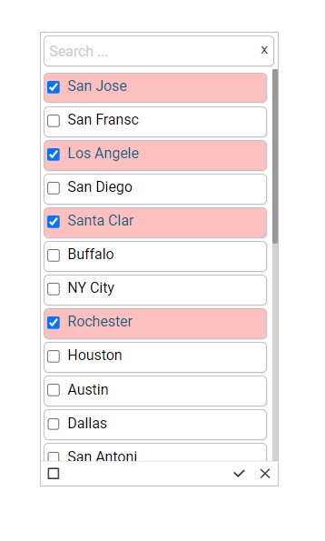
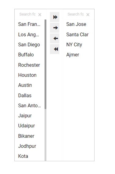


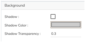
The Funnel chart can represent various stages in a process. As the shape suggests it widens at the top and narrows at the bottom this chart helps to pinpoint a phase where the maximum dropout occurred. This type of chart can describe a progressive reduction of data as it passes from one phase to the other where each phase represents a different percentage of data contributing to the whole.
Funnel charts help to track progress through a workflow with multiple steps. The user can highlight how well a process is being followed and easily identify any bottlenecks.
Funnel charts are suitable for displaying sales conversation data.
Examples:
To evaluate the success of a promotional campaign
To analyze the recruitment process
Default Chart Image
Component Name: Assigns a unique identifier to the funnel chart component. This field contains an auto-generated name indicating the sequence of the component in the dashboard.
Left: Determines the horizontal position of the chart within the container.
Top: Sets the vertical positioning of the chart.
Height: Specifies the height of the funnel chart.
Tooltips enhance user interaction by displaying additional information about chart elements.
Show Tool Tip: Enable this option to display tooltips for the chart series, providing descriptions or data insights.
Click the Show Tool Tip icon to access the Tool Tip Configuration window.
Select the Default option.
Gradient Rotation: Modify the angle of the gradient to achieve the desired effect.
Opacity: Set the transparency level to balance visibility and aesthetics.
Gradient: Choose and customize the gradient colors to match your theme.
Click the
Title Box Color: Choose the background color for the title box.
Show Title Box: Enable or disable the display of the title box on the chart.
Show Title: Enable or disable the display of the title text.
Title Bar Height: Set the height of the title bar.
Show Sub Title: Enable or disable the display of the sub-title text.
Description: Add a description text below the sub-title.
Font Color: Select the color of the sub-title text.
Font Size: Specify the size of the sub-title text.
Show Legend: Toggle the visibility of the chart legend.
Font Color: Choose the font color for the legend text.
Font Weight: Determine the weight (boldness) of the legend text.
Font Size: Specify the size of the font for the legend text.
Unit: Define the unit of measurement for the values displayed in the chart.
Precision: Set the number of decimal places to display for numerical values.
Currency: Format the numbers as a currency with the appropriate symbol.
Position: Determine the position of the formatted value (e.g., before or after the number).
Enable Context Menu: Activate a right-click context menu for quick access to export options in the preview mode of the chart.
Export Excel: Save the chart data in an Excel file format (.xlsx).
Export CSV: Export the chart data into a CSV file format (.csv).
Export JPEG: Export the chart as a JPEG image (.jpg).
The user can get the Export Context Menu from the preview mode to download the reports in different export formats.
Download the given sample data and map it as mentioned below to plot your Funnel chart:
Use the Stage column as a Category field, and the Count column as a Series to plot data.
The Data Grid component is used to represent data in tabular form. Data Grid is also known as 'Grid View' as the data will be displayed within a grid.
To view data in numerical format.
To show alerts.
Component Name: This field allows users to assign a unique name to the data grid component for easy identification and reference.
Left: Sets the horizontal position of the data grid component on the canvas.
Top: Sets the vertical position of the data grid component on the canvas.
Height: Adjusts the height of the data grid to fit the desired display area.
Check out the given illustration on how to use the Column Rearrange property in the Data Grid.
Gradient Rotation: Modify the angle of the gradient to achieve the desired effect.
Opacity: Set the transparency level to balance visibility and aesthetics.
Gradient: Choose and customize the gradient colors to match your theme.
Click the
Title Box Color: Set the color of the title box to complement your chart's overall design.
Show Title Box: Toggle this option to display or hide the title box around the title text.
Show Title: Enable or disable the title visibility on your chart.
Title Bar Height: Adjust the title bar height to fit your design specifications.
Show Sub Title: Enable or disable the display of the sub-title text.
Description: Add a description text below the sub-title.
Font Color: Select the color of the sub-title text.
Font Size: Specify the size of the sub-title text.
The Header Style section allows for customization of the header in your design. You can modify the following fields:
Header Text Color: Set the color of the header text to align with your theme.
Font Size: Define the text size in the header for visibility and emphasis.
Font Style: Choose a style such as italic or normal to enhance the header's appearance.
Font Weight: Set the weight (boldness) of the font. The supported options are Normal, Bold, 300, 600, and 900.
Enable the Show Checkbox property from the General section and provide the "allowmultipleselection = true" in the Dashboard script to avail the checkboxes in the preview mode of the Data Grid.
Check out the given illustration on accessing checkboxes for the multi-selection of the Grid Rows.
Font Color: This property allows users to change the color of the text within a row, enabling better visibility and alignment with design aesthetics.
Font Size: Adjusts the size of the text, enhancing readability and fitting within the design requirements.
Font Style: Offers options such as italic or normal, providing stylistic flexibility for the text within the data grid.
Font Weight
The users can set various display styles for the data grid using these fields.
Roll Over Color: The Roll Over Color property allows customization of the color change when a user hovers over an interface element. This provides visual feedback and helps highlight interactive components.
Selection Color: The Selection Color property determines the color displayed when an element or text is selected. It helps distinguish the selected items from the rest, facilitating easier navigation and interaction.
Horizontal Grid Lines: The Horizontal Grid Lines property allows users to enable or disable horizontal lines across the interface. These lines can aid in aligning and organizing content effectively, and their color can be customized to blend with the overall design.
Enable Context Menu: Activate a right-click context menu for quick access to export options in the preview mode of the chart.
Export Excel: Save the chart data in an Excel file format (.xlsx).
Export CSV: Export the chart data into a CSV file format (.csv).
Export JPEG: Export the chart as a JPEG image (.jpg).
The user can get the Export Context Menu from the preview mode to download the reports in different export formats.
The Data Grid component supports the date columns with the following types of date-time formats:
a. YYYY-MM-DD HH:MM:SS
b. MM/DD/YYYY HH:MM:SS
c. DD-MM-YYYY HH:MM:SS
d. ISO 8601 format (e.g., 2023-08-23T14:30:00Z)
e. Time formats such as 12-hour and 24-hour clocks (HH:MM)
Check out the illustration displaying the support for the various date-time formats inside the Data Grid component.
Check out the walk-through on how to use the Pie chart component in the Designer module.
The most widely used chart to show proportions, percentages, and categories of information. Users can use the Pie charts mainly to compare various categories. It is better to limit the categories up to 6 or fewer while visualizing them through a pie chart. Generally, Pie charts are used when values or the sum of values meet 100%.
Top performers and least performers based on the comparison of categories To illustrate breakdowns within a single dimension To show differences within groups based on one variable.
Pie-Doughnut
Doughnut charts behave like a Pie-chart the user can switch the pie-chart to a doughnut.
Component Name: Set a unique name for the component identification. This field contains an auto-generated name indicating the sequence of the component in the dashboard.
Left/Top: Control the positioning of the chart within its container.
Height/Width: Specify the dimensions of the pie chart to fit your layout needs.
Initial Visibility: Toggle to determine if the chart is visible on the first preview.
The user can show the series description and get the tooltip by clicking the Show Tool Tip option.
The Tool Tip Configuration window opens.
Select any Tool Tip option. The supported Tool Tip is None, Default, Custom.
Background Color: Set the background color for the tooltip box to enhance readability.
Opacity: Adjust the transparency level of the tooltip background.
Border Color: Define the color of the border surrounding the tooltip box.
Tooltip Font Size: Specify the font size for the text displayed in the tooltip.
The user can change the background color of the chart, get the border for the chart, and change the border color. Get the reflection of the chart by enabling the shadow option can also change the color, and increase or decrease the transparency of the shadow.
Gradient Rotation: Modify the angle of the gradient to achieve the desired effect.
Opacity: Set the transparency level to balance visibility and aesthetics.
Gradient: Choose and customize the gradient colors to match your theme.
Click the
Title Box Color: Choose the background color for the title box.
Show Title Box: Enable or disable the display of the title box on the chart.
Show Title: Enable or disable the display of the title text.
Title Bar Height: Set the height of the title bar.
Show Sub Title: Enable or disable the display of the subtitle text.
Description: Add descriptive text below the subtitle.
Font Color: Choose the color for the subtitle text.
Font Size: Set the size of the subtitle text.
Show Legend: Toggle to display or hide the legend on the chart.
Font Color: Select the color for the legend text.
Font Weight: Set the boldness of the legend text, with options like Normal, Bold, 300, 600, and 900.
Font Size: Specify the size of the legend text.
Unit: Specify the unit of measuring currency represented on the chart.
Precision: Define the number of decimal places to be displayed for numerical values to ensure accuracy and consistency.
Currency: Set the currency type for monetary values, allowing for consistent representation of financial data.
Position: Determine the placement of the formatted value about the axis or chart element, such as Prefix or Suffix.
The Export Options section allows users to easily export their chart data in various formats for reporting and presentation purposes. This feature supports seamless integration with common applications and file types.
Enable Context Menu: Activates a context menu on the chart, providing quick access to export functions directly from the chart interface.
Export Excel: Allows the data to be exported as an Excel file, suitable for further analysis or sharing in a tabular format.
Export CSV: Exports data in CSV format, ideal for importing into databases or other data processing tools.
Export JPEG
The user can get the Export Context Menu from the preview mode to download the reports in different export formats.
Doughnut charts behave like a Pie-chart the user can switch the pie-chart to a doughnut.
Download the given sample data and map it as mentioned below to plot your Pie chart.
Use the ExpenseHeads column as a Category field and the DollorInMillion column as a Series to plot data.
The Paging Data Grid is used to represent data in tabular form. Paging Data Grids can be used to filter data using columns, comparison operators, and search options provided.
When end-user need to view data in numerical format.
When alerts need to be shown.
When end-users need to filter, compare, and search for data within the grid.
Add-up Filters: Filter data by selecting any column(s) present in the data grid
Compare Operation: Data can be compared by using comparison operators
Search: Search for a particular value
Component Name: The unique identifier for the Paging Grid Component.
Left: Determines the horizontal position of the component on the page.
Top: Sets the vertical position of the component within the layout.
Height: Specifies the vertical size of the component.
Gradient Rotation: Defines the angle at which the gradient is applied across the component.
Opacity: Controls the transparency level of the background, where 0 is completely transparent and 1 is fully opaque.
Gradient: Specifies the transition between colors used in the background.
Border: Determines the presence and thickness of the border surrounding the component.
Title Box Color: Set the color of the title box to complement your chart's overall design.
Show Title Box: Toggle this option to display or hide the title box around the title text.
Show Title: Enable or disable the title visibility on your chart.
Title Bar Height: Adjust the title bar height to fit your design specifications.
Show Sub Title: Enable or disable the display of the sub-title text.
Description: Add a description text below the sub-title.
Font Color: Select the color of the sub-title text.
Font Size: Specify the size of the sub-title text.
The Header Style section allows for customization of the header in your design. You can modify the following fields:
Header Text Color: Set the color of the header text to align with your theme.
Font Size: Define the text size in the header for visibility and emphasis.
Font Style: Choose a style such as italic or normal to enhance the header's appearance.
Font Weight: Set the weight (boldness) of the font. The supported options are Normal, Bold, 300, 600, and 900.
Font Color: This property allows users to change the color of the text within a row, enabling better visibility and alignment with design aesthetics.
Font Size: Adjusts the size of the text, enhancing readability and fitting within the design requirements.
Font Style: Offers options such as italic or normal, providing stylistic flexibility for the text within the data grid.
Font Weight
The users can set various display styles for the data grid using these fields.
Roll Over Color: The Roll Over Color property allows customization of the color change when a user hovers over an interface element. This provides visual feedback and helps highlight interactive components.
Selection Color: The Selection Color property determines the color displayed when an element or text is selected. It helps distinguish the selected items from the rest, facilitating easier navigation and interaction.
Horizontal Grid Lines: The Horizontal Grid Lines property allows users to enable or disable horizontal lines across the interface. These lines can aid in aligning and organizing content effectively, and their color can be customized to blend with the overall design.
Enable Context Menu: Activate a right-click context menu for quick access to export options in the preview mode of the chart.
Export Excel: Save the chart data in an Excel file format (.xlsx).
Export CSV: Export the chart data into a CSV file format (.csv).
Export JPEG: Export the chart as a JPEG image (.jpg).
The user can enable the Enable Context Menu from the preview section to download the reports in different formats.
Check out the given walk-through on how the Fit Columns field works for the Paging Grid component.
Page Grid without Conditions
Page Grid with Conditions
The Spider chart also known as the 'Radar chart' can plot values of each category along the axis that starts at the center of the chart and extends up to the end of the radius. It is a two-dimensional chart type designed to plot one or more series of values arranged in the form of spokes.
Check out the walk-through on how to use the Spider chart component in the Designer module.
To analyze performance areas in an organization.
To compare allocated values and spending analysis in different departments.
Component Name: Set a unique name for the component identification. This field contains an auto-generated name indicating the sequence of the component in the dashboard.
Left: The horizontal position of the chart on the interface.
Top: The vertical position of the chart on the interface.
Height: The chart's vertical dimension.
Show Tool Tip: The user can show the series description and get the tooltip by clicking the Show Tool Tip option.
The Tool Tip Configuration window opens.
Select any Tool Tip option. The supported Tool Tip options are None and Default.
Background Color: Set the background color for the tooltip box to enhance readability.
Opacity: Adjust the transparency level of the tooltip background.
Border Color: Define the color of the border surrounding the tooltip box.
Tooltip Font Size: Specify the font size for the text displayed in the tooltip.
Gradient Rotation: Adjust the angle of the gradient applied to the background, allowing for a dynamic visual transition between colors.
Opacity: Set the transparency level of the background, ranging from fully opaque to completely transparent.
Gradient: Enable or disable gradient colors in the background for depth and visual appeal.
Title Box Color: Choose the background color for the title box.
Show Title Box: Enable or disable the display of the title box on the chart.
Show Title: Enable or disable the display of the title text.
Title Bar Height: Set the height of the title bar.
The user can customize the Subtitle properties which include:
Show Subtitle: Toggle this option to display or hide the subtitle.
Description: Add a custom description for the subtitle.
Font Color: Change the color of the subtitle text.
Font Size: Adjust the size of the subtitle text.
The users can enable the internal legend if they want to show it and customize the font size, color, style, etc. for the enabled legend.
Show Legend: Toggle the visibility of the chart legend.
Font Color: Choose the font color for the legend text.
Font Weight: Determine the weight (boldness) of the legend text.
Font Size: Specify the size of the font for the legend text.
Unit: Define the unit of measurement for the values displayed in the chart.
Precision: Set the number of decimal places to display for numerical values.
Currency: Format the numbers as a currency with the appropriate symbol.
Position: Determine the position of the formatted value (e.g., Prefix or Suffix).
Font Color: Choose the color for the axis labels to enhance visibility and match the design theme.
Font Size: Set the font size of the axis labels to ensure readability.
Font Style: Select styles like italic or normal to give a distinct appearance to the axis labels.
Font Weight: Adjust the thickness of the text by choosing options like light, regular, or bold for emphasis.
Enable Context Menu: Activate a right-click context menu for quick access to export options in the preview mode of the chart.
Export Excel: Save the chart data in an Excel file format (.xlsx).
Export CSV: Export the chart data into a CSV file format (.csv).
Export JPEG: Export the chart as a JPEG image (.jpg).
The user can get the Export Context Menu from the preview mode to download the reports in different export formats.
Spider chart with Polygon Chart type and Web type Fill
Spider chart with Circle Chart type and Web type Stroke
Download the given sample data and map it as mentioned below to plot your Spider Plot chart.
Select the Department column as a Category field and Allocated_Budget as well as Actual_Spending columns as Series fields to plot the data.
The Circumplex chart, also known as the Polar Area or Nightingale Rose chart, combines the Bar chart and Pie chart. The Circumplex chart can be drawn on a polar coordinate grid. Each category or interval in data is divided into equal segments on the radial chart. As per the denoted values, the distance of each segment from the center depends on a polar axis. Therefore, each ring from the center of the polar grid can be used as a scale to plot the segment size and represent a higher value. Each category can contain multiple sub-categories, with each sub-category represented by some angle of a disc section. The value of the corresponding sub-category is shown through the area. Users can adjust the area of each segment (based on data) by changing the radius in a Circumplex chart.
To display manifold data in the form of a two-dimensional chart of three or more measurable variables represented on axes starting from the same point.
Check out the below given walk-through on how to use the Project Timeline chart component in Designer module.
The Project Timeline is an interactive visualization chart to visualize data in time. The data items can take place on a single date or have a start and end date (a range). Users can easily move and zoom in on the timeline by using the drag-drop and scroll functionalities. The time scale on the axis is adjusted automatically, and it supports scales ranging from milliseconds to hours to days to years. The Project Timeline uses regular HTML DOM to render the timeline and items placed on the timeline. It allows for flexible customization using CSS styling.

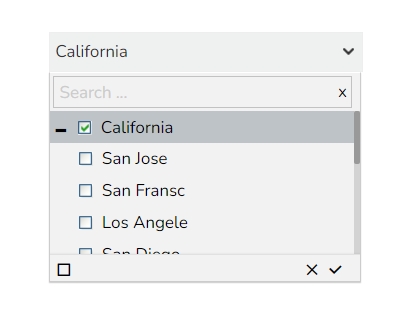


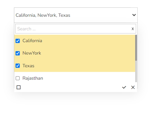


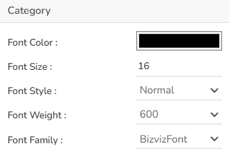
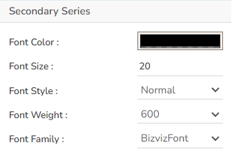
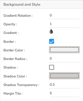
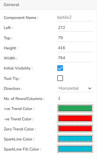


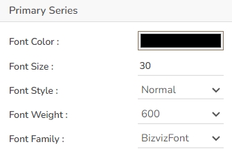


Width: Defines the width of the chart.
Initial Visibility: Controls whether the chart is visible upon initial load.
Max Button: Allows the inclusion of a button to maximize the chart view.
Show Percentage: Enables the display of percentage values on the chart.
Series Colors: Customizes the colors for different series in the funnel chart.
Background Color: Choose a background color for the tooltip to enhance visibility and match your visual theme.
Opacity: Adjust the tooltip's transparency to ensure it doesn't obstruct important chart elements while remaining readable.
Border Color: Select a border color that complements the tooltip, ensuring clarity and contrast against the chart background.
Tooltip Font Size: Customize the font size to maintain readability, adapting it to the overall chart presentation.
Box Width: Define the width of the tooltip box to ensure it fits the content appropriately and maintains a neat appearance.
Precision: Set the numerical precision for data values displayed in the tooltip, aiding in clearer data interpretation.
Highlighter: Toggle the highlighter to emphasize specific data points on the chart, drawing user attention to crucial information.
Click the Add Color option to add multiple colors.
Click the Save option to apply the selected background colors.
Border: Add a border around the chart for a defined perimeter.
Border Color: Alter the border color to complement or contrast with the chart.
Border Radius: Round the corners of the chart border for a smoother look.
Shadow: Enable shadows to create depth and a 3D-like effect.
Shadow Color: Customize the shadow color to blend naturally with the chart.
Shadow Transparency: Adjust the transparency level to control the intensity of the shadow effect.
Description: Add a description text below the title.
Font Color: Select the color of the title text.
Font Size: Specify the size of the title text.
Font Style: Choose a Font style using the drop-down menu (e.g., italic or normal).
Font Weight: Set the weight (boldness) of the font. The supported options are Normal, Bold, 300, 600, and 900.
Font Family: Choose the font family for the title text from the given choices.
Align: Align the title text (e.g., left, center, right).
Text Decoration: Apply text decorations (e.g., underline) to the title text.
Show Dataset Description: Enable or disable the dataset description in the title.
Font Style: Choose the font style for the Sub-title (e.g., italic or normal).
Font Weight: Set the weight (boldness) of the font. The supported options are Normal, Bold, 300, 600, and 900.
Font Family: Choose the font family for the sub-title text from the given choices.
Align: Align the sub-title text (e.g., left, center, right).
Text Decoration: Apply text decorations (e.g., underline) to the sub-title text.
Font Family: Select the font family for the legend text.
Font Style: Choose the font style (e.g., italic) for the legend text.
Text Decoration: Add text decorations (e.g., underline) to the legend text.
Hide on Load: Determine if the legend should be hidden when the chart initially loads.
Number Formatter: Apply a specific notation or style to the numbers (e.g., Indian, International).
Export PNG: Export the chart as a PNG image (.png).
Export PPT: Export the chart to a PowerPoint presentation (.pptx).
Export PDF: Export the chart as a PDF document (.pdf).
Show Print: Include an option to print the chart directly.
Export Heading: Add a custom heading to the exported file.
Export Sub Heading: Add a custom subheading to the exported file.
Export File Name: Specify the file name for the exported file/dashboard.
Global Export Type: Define the default export format using the drop-down (e.g., Screenshot, Tabular).
Width: Adjusts the width of the data grid to fit the desired display area.
Initial Visibility: Enable to ensure the Grid chart appears during the initial preview.
Max Button: Allows users to maximize the data grid view for better visualization and interaction.
Fit Columns: Automatically adjust the column sizes to fit the content by placing a checkmark.
Column Rearrange: Permits rearrangement of columns within the data grid for custom orders as per user preference.
Scroll View: Users can enable or disable this to manage the inclusion of scroll bars; 'Disable' is the default setting.
Click the Add Color option to add multiple colors.
Click the Save option to apply the selected background colors.
Border: Add a border around the chart for a defined perimeter.
Border Color: Alter the border color to complement or contrast with the chart.
Border Radius: Round the corners of the chart border for a smoother look.
Shadow: Enable shadows to create depth and a 3D-like effect.
Shadow Color: Customize the shadow color to blend naturally with the chart.
Shadow Transparency: Adjust the transparency level to control the intensity of the shadow effect.
Description: Provide an additional description for the chart title to offer more context.
Font Color: Choose the font color for the title to ensure readability and match your theme.
Font Size: Set the title's font size for optimal visibility and aesthetics.
Font Style: Select the font style (e.g., italic, bold) to enhance the title's appearance.
Font Weight: Modify the font weight to make the title text lighter or bolder.
Font Family: Pick a font family that aligns with your design theme for the title.
Align: Align the title text to the left, center, or right according to your layout needs.
Text Decoration: Apply text decorations to the title for emphasis (E.g., Underline).
Show Dataset Description: Enable or disable the dataset description in the title.
Font Style: Choose the font style for the Sub-title (e.g., italic or normal).
Font Weight: Set the weight (boldness) of the font. The supported options are Normal, Bold, 300, 600, and 900.
Font Family: Choose the font family for the sub-title text from the given choices.
Align: Align the sub-title text (e.g., left, center, right).
Text Decoration: Apply text decorations (e.g., underline) to the sub-title text.
Font Family: Select a font family for the header that complements your overall design.
Use Field Color: Enable this option to apply a specific field color to the header background.
Background Color: Change the header's background color to match or contrast with the text.
Text Decoration: Apply decorative elements like Underline to the header text for additional styling.
Font Family: Allows selection of different font families, ensuring the grid text aligns with overall design standards.
Text Decoration: Includes options such as underline, overline, or line-through, offering additional stylistic choices for the text.
Text Wrap: Enables text to wrap within the cell, ensuring complete visibility without affecting the row width.
Row Height: Users can increase or decrease the height of rows to accommodate more content or improve the grid's appearance.
Horizontal Line Color: The Horizontal Line Color refers to the color of the horizontal grid lines that can be displayed across the interface. This color can be customized to fit the design palette of the application seamlessly.
Vertical Line Color: The Vertical Line Color is the color assigned to the vertical grid lines. Users can adjust this color to help differentiate vertical separations on the interface, enhancing visual organization.
Grid Colors: Grid Colors encompass horizontal and vertical line colors, offering comprehensive customization options for both components. Adjusting these colors allows users to create a coordinated look that complements the interface design.
Export PNG: Export the chart as a PNG image (.png).
Export PPT: Export the chart to a PowerPoint presentation (.pptx).
Export PDF: Export the chart as a PDF document (.pdf).
Show Print: Include an option to print the chart directly.
Export Heading: Add a custom heading to the exported file.
Export Sub Heading: Add a custom subheading to the exported file.
Export File Name: Specify the file name for the exported file/dashboard.
Global Export Type: Define the default export format using the drop-down (e.g., Screenshot, Tabular).
Refer to the Alerts in Grids page under the Configurations section to understand how to insert Alerts in a Grid component.


Max Button: Enable to allow maximization of the chart independently.
Series Colors: Customize the colors for each slice in the pie chart.
Opacity: Adjust the transparency of the pie chart elements.
Chart Type: Choose between Pie, Doughnut, or Semi Doughnut chart styles.
Show Percentage: Option to display the percentage values on slices.
Animation: Add transitions or animation effects to the pie chart.
Show Limited Slices: Limit the number of slices displayed on the chart.
Maximum Slices: Define the number of slices to be shown when limited.
Doughnut Width: Change the width of the Doughnut-style chart.
Chart Alignment: Align the chart within its space (e.g., center, left, right).
Actions: Access additional actions like 'show data', 'sort data', 'export', and 'chart' in the preview mode.
Box Width: Determine the width of the tooltip box for optimal presentation.
Precision: Set the number of decimal places to show in the tooltip for numerical values.
Click the Add Color option to add multiple colors.
Click the Save option to apply the selected background colors.
Border: Add a border around the chart for a defined perimeter.
Border Color: Alter the border color to complement or contrast with the chart.
Border Radius: Round the corners of the chart border for a smoother look.
Shadow: Enable shadows to create depth and a 3D-like effect.
Shadow Color: Customize the shadow color to blend naturally with the chart.
Shadow Transparency: Adjust the transparency level to control the intensity of the shadow effect.
Description: Add a description text below the title.
Font Color: Select the color of the title text.
Font Size: Specify the size of the title text.
Font Style: Choose the font style (e.g., italic or normal).
Font Weight: Set the weight (boldness) of the font. The supported options are Normal, Bold, 300, 600, and 900.
Font Family: Choose the font family for the title text from the given choices.
Align: Align the title text (e.g., left, center, right).
Text Decoration: Apply text decorations (e.g., underline) to the title text.
Show Dataset Description: Enable or disable the dataset description in the title.
Font Style: Select the style of the subtitle text (e.g., italic or normal).
Font Weight: Define the weight (boldness) of the subtitle font, with options such as Normal, Bold, 300, 600, and 900.
Font Family: Choose the font family for the subtitle text from the available options.
Align: Align the subtitle text (e.g., left, center, right).
Text Decoration: Apply decorations, such as underlining, to the subtitle text.
Font Family: Choose the font family for the legend text from the available options.
Font Style: Choose the style for the legend text, such as italic or normal.
Text Decoration: Apply decorations like underlining to the legend text.
Hide on Load: Determine if the legend should be hidden initially when the chart loads.
Number Formatter: Customize how numbers are displayed (International or Indian).
Export PNG: Similar to JPEG, but offers a lossless export option in PNG format for clearer image quality in visual presentations.
Export PPT: Facilitates exporting the chart directly into a PowerPoint file, streamlining the process of incorporating charts into slideshows.
Export PDF: Enables exporting the chart and its data in PDF format, suitable for creating shareable and print-ready documents.
Show Print: Displays a print button on the chart, allowing users to print the chart directly from the application.
Export Heading: Customizes the heading title for exported files, ensuring clarity and context when distributing chart data.
Export Sub Heading: Adds a secondary title or description to exported files, providing additional context or information.
Export File Name: Allows customization of the file name for the exported data, ensuring easy identification and organization.
Global Export Type: Sets a default export format for all charts, streamlining the export process across multiple datasets.


Width: Defines the horizontal size of the component.
Initial Visibility: Controls whether the component is visible when the page first loads.
Max Button: Allows users to maximize the component to full screen.
Fit Columns: Adjusts the column widths automatically to fit the content or available space.
Border Color: Sets the color of the component’s border.
Border Radius: Rounds the corners of the component’s border.
Shadow: Adds a shadow effect beneath the component.
Shadow Color: Defines the color of the shadow.
Shadow Transparency: Adjusts the visibility of the shadow, affecting how pronounced it appears.
Description: Provide an additional description for the chart title to offer more context.
Font Color: Choose the font color for the title to ensure readability and match your theme.
Font Size: Set the title's font size for optimal visibility and aesthetics.
Font Style: Select the font style (e.g., italic, bold) to enhance the title's appearance.
Font Weight: Modify the font weight to make the title text lighter or bolder.
Font Family: Pick a font family that aligns with your design theme for the title.
Align: Align the title text to the left, center, or right according to your layout needs.
Text Decoration: Apply text decorations to the title for emphasis (E.g., Underline).
Show Dataset Description: Enable or disable the dataset description in the title.
Font Style: Choose the font style for the Sub-title (e.g., italic or normal).
Font Weight: Set the weight (boldness) of the font. The supported options are Normal, Bold, 300, 600, and 900.
Font Family: Choose the font family for the sub-title text from the given choices.
Align: Align the sub-title text (e.g., left, center, right).
Text Decoration: Apply text decorations (e.g., underline) to the sub-title text.
Font Family: Select a font family for the header that complements your overall design.
Use Field Color: Enable this option to apply a specific field color to the header background.
Background Color: Change the header's background color to match or contrast with the text.
Text Decoration: Apply decorative elements like Underline to the header text for additional styling.
Font Family: Allows selection of different font families, ensuring the grid text aligns with overall design standards.
Text Decoration: Includes options such as underline, overline, or line-through, offering additional stylistic choices for the text.
Text Wrap: Enables text to wrap within the cell, ensuring complete visibility without affecting the row width.
Row Height: Users can increase or decrease the height of rows to accommodate more content or improve the grid's appearance.
Horizontal Line Color: The Horizontal Line Color refers to the color of the horizontal grid lines that can be displayed across the interface. This color can be customized to fit the design palette of the application seamlessly.
Vertical Line Color: The Vertical Line Color is the color assigned to the vertical grid lines. Users can adjust this color to help differentiate vertical separations on the interface, enhancing visual organization.
Grid Colors: Grid Colors encompass horizontal and vertical line colors, offering comprehensive customization options for both components. Adjusting these colors allows users to create a coordinated look that complements the interface design.
Pagination Bar Color: The Pagination Bar Color property allows customization of the color of the pagination bar. This feature helps maintain consistency with the application's design by aligning the pagination bar's color with the overall theme.
Pagination Font Color: This setting enables users to change the color of the text displayed on the pagination controls. Adjusting the font color can enhance legibility and ensure it complements the pagination bar color.
Row Count: The Row Count field allows users to specify the number of rows to be displayed per page in the data grid. This feature aids in enhancing data navigation and offers users control over how much data they wish to view at one time.
Export PNG: Export the chart as a PNG image (.png).
Export PPT: Export the chart to a PowerPoint presentation (.pptx).
Export PDF: Export the chart as a PDF document (.pdf).
Show Print: Include an option to print the chart directly.
Export Heading: Add a custom heading to the exported file.
Export Sub Heading: Add a custom subheading to the exported file.
Export File Name: Specify the file name for the exported file/dashboard.
Global Export Type: Define the default export format using the drop-down (e.g., Screenshot, Tabular).
Refer to the Alerts in Grids page under the Configurations section to understand how to insert Alerts in a Grid component.

Width: The chart's horizontal dimension.
Initial Visibility: Determines if the chart is visible upon initial preview.
Max Button: Allows maximization of the chart if enabled.
Color From Drill: Adjusts the color scheme based on drilled data.
Points: Enable this option to plot the data points on the chart.
Chart Type: Choose between a Polygon and a Circle for the shape of the spider chart.
Web Type: Defines the web style between Fill and Stroke.
Axis Color: Sets the color of the chart's axes.
Actions: Custom actions that can be associated with the chart such as sorting, exporting, and displaying data in the tabular format will be listed in the preview mode of the chart.
Animation: Enables animated transitions for the chart.
Box Width: Determine the width of the tooltip box for optimal presentation.
Precision: Set the number of decimal places to show in the tooltip for numerical values.
Highlighter: Toggle the highlighter to emphasize specific data points on the chart, drawing user attention to crucial information.
Click the Add Color option to add multiple colors.
Click the Save option to apply the selected background colors.
Border: Define the width of the border surrounding the pyramid chart.
Border Color: Select the color for the chart's border, enhancing its visibility and aesthetics.
Border Radius: Round the corners of the chart's border for a softer, more modern appearance.
Shadow: Enable a shadow effect for the background to add dimension and focus to the chart.
Shadow Color: Choose the color of the shadow cast by the chart background.
Shadow Transparency: Adjust the transparency level of the shadow to control its prominence and intensity.
Description: Add the title text.
Font Color: Select the color of the title text.
Font Size: Specify the size of the title text.
Font Style: Choose the font style (e.g., italic or normal).
Font Weight: Set the weight (boldness) of the font. The supported options are Normal, Bold, 300, 600, and 900.
Font Family: Choose the font family for the title text from the given choices.
Align: Align the title text (e.g., left, center, right).
Text Decoration: Apply text decorations (e.g., underline) to the title text.
Show Dataset Description: Enable or disable the dataset description in the title.
Font Style: Apply styles such as italics to the subtitle.
Font Weight: Modify the thickness of the subtitle text, e.g., bold.
Font Family: Select the font type for the subtitle.
Align: Align the subtitle text (left, center, or right).
Text Decoration: Add elements like underline or overline to the subtitle text.
Font Family: Select the font family for the legend text.
Font Style: Choose the font style (e.g., italic) for the legend text.
Text Decoration: Add text decorations (e.g., underline) to the legend text.
Hide on Load: Determine if the legend should be hidden when the chart initially loads.
Number Formatter: Apply a specific notation or style to the numbers (e.g., Indian, International).
Font Family: Choose the typeface to maintain consistency with the overall design and branding.
Export PNG: Export the chart as a PNG image (.png).
Export PPT: Export the chart to a PowerPoint presentation (.pptx).
Export PDF: Export the chart as a PDF document (.pdf).
Show Print: Include an option to print the chart directly.
Export Heading: Add a custom heading to the exported file.
Export Sub Heading: Add a custom subheading to the exported file.
Export File Name: Specify the file name for the exported file/dashboard.
Global Export Type: Define the default export format using the drop-down (e.g., Screenshot, Tabular).


Component Name: Sets the unique identifier for the chart component. This field contains an auto-generated name indicating the sequence of the component in the dashboard.
Left: Specifies the horizontal offset of the chart within the display area.
Top: Specifies the vertical offset of the chart within the display area.
Height: Determines the height of the chart in the display.
Width: Determines the width of the chart in the display.
Initial Visibility: Controls whether the chart is visible on the initial load.
Max Button: Enables or disables the button for maximizing the chart.
Color From Drill: Option to use colors derived from drilled-down data.
Use Series Colors: Allows the use of predefined series colors for the chart.
Series Colors: Specifies the color palette for series data representation.
Animation: Configures animation effects for displaying data transitions.
Clock Wise Direction: Sets the direction for chart data to be plotted clockwise.
Chart Type: Defines the type of chart to display (e.g., pie, radar).
Doughnut Width: Determines the width of the doughnut hole in related chart types.
Web Type: Chooses the structure style for web-like visuals.
Web Stroke Color: Specifies the outline color for web-like structures.
Category Stroke Color: Determines the color for category borders.
Tooltips enhance user interaction by displaying additional information about chart elements.
Show Tool Tip: Enable this option to display tooltips for the chart series, providing descriptions or data insights.
Click the Show Tool Tip icon to access the Tool Tip Configuration window.
Select the Default option.
Put a checkmark in the box to enable the component farmatter.
Click the Save option to display Tool Tip in the default display.
Background Color: Choose a background color for the tooltip to enhance visibility and match your visual theme.
Opacity: Adjust the tooltip's transparency to ensure it doesn't obstruct important chart elements while remaining readable.
Border Color: Select a border color that complements the tooltip, ensuring clarity and contrast against the chart background.
Tooltip Font Size: Customize the font size to maintain readability, adapting it to the overall chart presentation.
Box Width: Define the width of the tooltip box to ensure it fits the content appropriately and maintains a neat appearance.
Precision: Set the numerical precision for data values displayed in the tooltip, aiding in clearer data interpretation.
Highlighter: Toggle the highlighter to emphasize specific data points on the chart, drawing user attention to crucial information.
Gradient Rotation: Modify the angle of the gradient to achieve the desired effect.
Opacity: Set the transparency level to balance visibility and aesthetics.
Gradient: Choose and customize the gradient colors to match your theme.
Click the Gradient icon to access the Background gradient colors dialog box.
Click the Add Color option to add multiple colors.
Click the Save option to apply the selected background colors.
Border: Add a border around the chart for a defined perimeter.
Border Color: Alter the border color to complement or contrast with the chart.
Border Radius: Round the corners of the chart border for a smoother look.
Shadow: Enable shadows to create depth and a 3D-like effect.
Shadow Color: Customize the shadow color to blend naturally with the chart.
Shadow Transparency: Adjust the transparency level to control the intensity of the shadow effect.
Title Box Color: Choose the background color for the title box.
Show Title Box: Enable or disable the display of the title box on the chart.
Show Title: Enable or disable the display of the title text.
Title Bar Height: Set the height of the title bar.
Description: Add a description text below the title.
Font Color: Select the color of the title text.
Font Size: Specify the size of the title text.
Font Style: Choose a Font style using the drop-down menu (e.g., italic or normal).
Font Weight: Set the weight (boldness) of the font. The supported options are Normal, Bold, 300, 600, and 900.
Font Family: Choose the font family for the title text from the given choices.
Align: Align the title text (e.g., left, center, right).
Text Decoration: Apply text decorations (e.g., underline) to the title text.
Show Dataset Description: Enable or disable the dataset description in the title.
Show Sub Title: Enable or disable the display of the sub-title text.
Description: Add a description text below the sub-title.
Font Color: Select the color of the sub-title text.
Font Size: Specify the size of the sub-title text.
Font Style: Choose the font style for the Sub-title (e.g., italic or normal).
Font Weight: Set the weight (boldness) of the font. The supported options are Normal, Bold, 300, 600, and 900.
Font Family: Choose the font family for the sub-title text from the given choices.
Align: Align the sub-title text (e.g., left, center, right).
Text Decoration: Apply text decorations (e.g., underline) to the sub-title text.
Show Legend: Toggle the visibility of the chart legend.
Font Color: Choose the font color for the legend text.
Font Weight: Determine the weight (boldness) of the legend text.
Font Size: Specify the size of the font for the legend text.
Font Family: Select the font family for the legend text.
Font Style: Choose the font style (e.g., italic) for the legend text.
Text Decoration: Add text decorations (e.g., underline) to the legend text.
Hide on Load: Determine if the legend should be hidden when the chart initially loads.
Unit: Define the unit of measurement for the values displayed in the chart.
Precision: Set the number of decimal places to display for numerical values.
Currency: Format the numbers as a currency with the appropriate symbol.
Position: Determine the position of the formatted value (e.g., before or after the number).
Number Formatter: Apply a specific notation or style to the numbers (e.g., Indian, International).
Font Color: Choose the color for the text of your axis labels to ensure readability and match the chart's design.
Font Size: Set the size of the font for axis labels to maintain clarity and legibility.
Marker Font Size: Determine the size of the font for any markers on the axis, ensuring they are consistent with the overall font scheme.
Font Style: Select the style of the font (e.g., normal, italic) to align with the design aesthetics.
Font Weight: Adjust the thickness of the font (e.g., normal, bold) to enhance visibility and emphasis.
Font Family: Choose the typeface for the axis labels to maintain consistency with the chart's theme.
Auto Axis Setup: Automatically adjust the axis settings based on the dataset.
Base Zero: Ensure the axis starts at zero for better data comparison.
Min Value: Define the minimum value displayed on the axis.
Max Value: Set the maximum value for the axis range.
Enable Context Menu: Activate a right-click context menu for quick access to export options in the preview mode of the chart.
Export Excel: Save the chart data in an Excel file format (.xlsx).
Export CSV: Export the chart data into a CSV file format (.csv).
Export JPEG: Export the chart as a JPEG image (.jpg).
Export PNG: Export the chart as a PNG image (.png).
Export PPT: Export the chart to a PowerPoint presentation (.pptx).
Export PDF: Export the chart as a PDF document (.pdf).
Show Print: Include an option to print the chart directly.
Export Heading: Add a custom heading to the exported file.
Export Sub Heading: Add a custom subheading to the exported file.
Export File Name: Specify the file name for the exported file/dashboard.
Global Export Type: Define the default export format using the drop-down (e.g., Screenshot, Tabular).
The user can get the Export Context Menu from the preview mode to download the reports in different export formats.
After modifying the chart properties the user can the following variants of the Circumplex chart.
Download the given sample data and map it as mentioned below to plot your Circumplex chart:
Use the Country column as a Category field, Region as a Sub Category, and the other columns as Series to plot data.
To track project deadlines and status with the timeline template. To update status throughout the project
Component Name: Set a unique name for the component identification. This field contains an auto-generated name indicating the sequence of the component in the dashboard.
Left: Defines the horizontal position of the chart from the left margin.
Top: Specifies the vertical position of the chart from the top margin.
Height: Sets the height of the timeline chart.
Width: Determines the width of the timeline chart.
Initial Visibility: Configures the chart's visibility status on the initial load (visible or hidden).
Max Button: Boolean setting to enable or disable the maximize button for the chart view.
Date Formatting: Allows customization of the date display format on the timeline.
Show Tool Tip: The user can show the series description and get the tooltip by clicking the Show Tool Tip option.
The Tool Tip Configuration window opens.
Select any Tool Tip option. The supported Tool Tip options are None and Default.
Click the Save option.
Background Color: Set the background color for the tooltip box to enhance readability.
Opacity: Adjust the transparency level of the tooltip background.
Border Color: Define the color of the border surrounding the tooltip box.
Tooltip Font Size: Specify the font size for the text displayed in the tooltip.
Box Width: Determine the width of the tooltip box for optimal presentation.
Precision: Set the number of decimal places to show in the tooltip for numerical values.
The user can change the background color of the chart, get the border for the chart, and change the border color. Get the reflection of the chart by enabling the shadow option can also change the color, and increase or decrease the transparency of the shadow.
Gradient Rotation: Modify the angle of the gradient to achieve the desired effect.
Opacity: Set the transparency level to balance visibility and aesthetics.
Gradient: Choose and customize the gradient colors to match your theme.
Click the Gradient icon to access the Background gradient colors dialog box.
Click the Add Color option to add multiple colors.
Click the Save option to apply the selected background colors.
Border: Add a border around the chart for a defined perimeter.
Border Color: Alter the border color to complement or contrast with the chart.
Border Radius: Round the corners of the chart border for a smoother look.
Shadow: Enable shadows to create depth and a 3D-like effect.
Shadow Color: Customize the shadow color to blend naturally with the chart.
Shadow Transparency: Adjust the transparency level to control the intensity of the shadow effect.
Timeline Position: Adjust the position of the timeline on the chart for better alignment.
Today Marker Color: Set the color of the marker that indicates the current date.
Today Marker Size: Determine the size of the today marker for better visibility.
Show Major Labels: Display major time labels for clear time segmentation.
Show Minor Labels: Include minor time labels for detailed time navigation.
Marker Border Color: Customize the border color of time markers to highlight them.
Font Color: Change the font color used in timeline labels for readability.
Font Size: Adjust the font size to optimize label visibility and prevent clutter.
Font Weight: Modify the font weight (e.g., bold) to emphasize certain labels.
Font Family: Select the font family to ensure style consistency across the chart.
Font Style: Choose from various font styles (e.g., italics) to align with design preferences.
Milestone: Customize the appearance of milestones on the chart to highlight key events.
Click the Milestone icon.
The Milestone Properties window opens.
Add a new range by clicking the Add Range option.
Choose the color for each range.
Click the Save option.
Border Width: Set the border width of milestones for better definition.
Font Color: Adjust the font color for milestone labels to ensure readability.
Font Size: Change the font size for milestone labels to maintain clarity.
Font Weight: Modify the font weight (e.g., bold) to make milestone labels stand out.
Font Family: Choose a font family for milestone labels that complements the overall design.
Font Style: Select font styles (e.g., italics) for milestone labels to match the aesthetic preferences.
Task: Customize the appearance of task boxes on the chart for improved visual distinction.
Show Overflow Text: Enable or disable text overflow settings to ensure task labels are evident without truncation.
Font Color: Change the font color used in task labels to enhance readability on the chart.
Font Size: Adjust the font size of task labels for clarity and to ensure they are legible at various zoom levels.
Font Weight: Modify the font weight (e.g., bold) to emphasize certain task labels.
Font Family: Select a font family for task labels that complements the overall chart design and maintains consistency.
Font Style: Choose from font styles (e.g., italics) to align task labels with the desired design aesthetic.
Title Box Color: Choose the background color for the title box.
Show Title Box: Enable or disable the display of the title box on the chart.
Show Title: Enable or disable the display of the title text.
Title Bar Height: Set the height of the title bar.
Description: Add a description text below the title.
Font Color: Select the color of the title text.
Font Size: Specify the size of the title text.
Font Style: Choose the font style (e.g., italic or normal).
Font Weight: Set the weight (boldness) of the font. The supported options are Normal, Bold, 300, 600, and 900.
Font Family: Choose the font family for the title text from the given choices.
Align: Align the title text (e.g., left, center, right).
Text Decoration: Apply text decorations (e.g., underline) to the title text.
Show Dataset Description: Enable or disable the dataset description in the title.
The user can customize the Subtitle properties which include:
Show Subtitle: Toggle this option to display or hide the subtitle.
Description: Add a custom description for the subtitle.
Font Color: Change the color of the subtitle text.
Font Size: Adjust the size of the subtitle text.
Font Style: Apply styles such as italics to the subtitle.
Font Weight: Modify the thickness of the subtitle text, e.g., bold.
Font Family: Select the font type for the subtitle.
Align: Align the subtitle text (left, center, or right).
Text Decoration: Add elements like underline or overline to the subtitle text.
The Export Options section allows users to easily export their chart data in various formats for reporting and presentation purposes. This feature supports seamless integration with common applications and file types.
Enable Context Menu: Activates a context menu on the chart, providing quick access to export functions directly from the chart interface.
Export Excel: Allows the data to be exported as an Excel file, suitable for further analysis or sharing in a tabular format.
Export CSV: Exports data in CSV format, ideal for importing into databases or other data processing tools.
Export JPEG: Provides the option to export the chart as a JPEG image, useful for creating static visual representations.
Export PNG: Similar to JPEG, but offers a lossless export option in PNG format for clearer image quality in visual presentations.
Export PPT: Facilitates exporting the chart directly into a PowerPoint file, streamlining the process of incorporating charts into slideshows.
Export PDF: Enables exporting the chart and its data in PDF format, suitable for creating shareable and print-ready documents.
Show Print: Displays a print button on the chart, allowing users to print the chart directly from the application.
Export Heading: Customizes the heading title for exported files, ensuring clarity and context when distributing chart data.
Export Sub Heading: Adds a secondary title or description to exported files, providing additional context or information.
Export File Name: Allows customization of the file name for the exported data, ensuring easy identification and organization.
Global Export Type: Sets a default export format for all charts, streamlining the export process across multiple datasets.
The user can get the Export Context Menu from the preview mode to download the reports in different export formats.
Download the given sample data and map it as mentioned below to plot your Project Timeline chart.
Use the Category column as the Category field, Start Date as the Start Date field, and End Date as the End Date to plot data.
When alerts need to be shown.
When need to display hierarchies in data.
Compare: A ‘Compare Value’ must be given by the user. Alerts are then triggered depending on it the data in the data set is greater, equal, or less than the compare value. (Ex. <50% = Red, 50%= Yellow, >50%= Green)
Range: Alerts can be configured to trigger based on range value(s), (Ex. 0-40%, =Red, 41-50% Yellow, 51-59% Blue, 60-69 Green)
Component Name: Allows the user to assign a unique identifier to the chart component.
Left: Adjusts the horizontal position of the chart on the page.
Top: Controls the vertical placement of the chart within the display area.
Height: Sets the vertical dimension of the chart.
Width: Determines the horizontal dimension of the chart.
Initial Visibility: Determines whether the chart is visible upon the first preview.
Max Button: Enables or disables the option to maximize the chart.
Fit Columns: Configures the chart to adjust its columns for the best fit.
Hierarchy Level: Allows toggling between Multiple and Single hierarchy views.
Tree Field: Defines the field used to structure and organize the hierarchical tree view.
Gradient Rotation: Modify the angle of the gradient to achieve the desired effect.
Opacity: Set the transparency level to balance visibility and aesthetics.
Gradient: Choose and customize the gradient colors to match your theme.
Click the Gradient icon to access the Background gradient colors dialog box.
Click the Add Color option to add multiple colors.
Click the Save option to apply the selected background colors.
Border: Add a border around the chart for a defined perimeter.
Border Color: Alter the border color to complement or contrast with the chart.
Border Radius: Round the corners of the chart border for a smoother look.
Shadow: Enable shadows to create depth and a 3D-like effect.
Shadow Color: Customize the shadow color to blend naturally with the chart.
Shadow Transparency: Adjust the transparency level to control the intensity of the shadow effect.
Title Box Color: Set the color of the title box to complement your chart's overall design.
Show Title Box: Toggle this option to display or hide the title box around the title text.
Show Title: Enable or disable the title visibility on your chart.
Title Bar Height: Adjust the title bar height to fit your design specifications.
Description: Provide an additional description for the chart title to offer more context.
Font Color: Choose the font color for the title to ensure readability and match your theme.
Font Size: Set the title's font size for optimal visibility and aesthetics.
Font Style: Select the font style (e.g., italic, bold) to enhance the title's appearance.
Font Weight: Modify the font weight to make the title text lighter or bolder.
Font Family: Pick a font family that aligns with your design theme for the title.
Align: Align the title text to the left, center, or right according to your layout needs.
Text Decoration: Apply text decorations to the title for emphasis (E.g., Underline).
Show Dataset Description: Enable or disable the dataset description in the title.
Show Sub Title: Enable or disable the display of the sub-title text.
Description: Add a description text below the sub-title.
Font Color: Select the color of the sub-title text.
Font Size: Specify the size of the sub-title text.
Font Style: Choose the font style for the Sub-title (e.g., italic or normal).
Font Weight: Set the weight (boldness) of the font. The supported options are Normal, Bold, 300, 600, and 900.
Font Family: Choose the font family for the sub-title text from the given choices.
Align: Align the sub-title text (e.g., left, center, right).
Text Decoration: Apply text decorations (e.g., underline) to the sub-title text.
The Header Style section allows for customization of the header in your design. You can modify the following fields:
Header Text Color: Set the color of the header text to align with your theme.
Font Size: Define the text size in the header for visibility and emphasis.
Font Style: Choose a style such as italic or normal to enhance the header's appearance.
Font Weight: Set the weight (boldness) of the font. The supported options are Normal, Bold, 300, 600, and 900.
Font Family: Select a font family for the header that complements your overall design.
Use Field Color: Enable this option to apply a specific field color to the header background.
Background Color: Change the header's background color to match or contrast with the text.
Text Decoration: Apply decorative elements like Underline to the header text for additional styling.
Font Color: This property allows users to change the color of the text within a row, enabling better visibility and alignment with design aesthetics.
Font Size: Adjusts the size of the text, enhancing readability and fitting within the design requirements.
Font Style: Offers options such as italic or normal, providing stylistic flexibility for the text within the data grid.
Font Weight: Controls the thickness of the text, from normal to bold, helping users emphasize specific data points.
Font Family: Allows selection of different font families, ensuring the grid text aligns with overall design standards.
Text Decoration: Includes options such as underline, overline, or line-through, offering additional stylistic choices for the text.
Text Wrap: Enables text to wrap within the cell, ensuring complete visibility without affecting the row width.
Row Height: Users can increase or decrease the height of rows to accommodate more content or improve the grid's appearance.
Roll Over Color: Define the background color that appears when the cursor hovers over an element, aiding in interactive feedback.
Selection Color: Set the background color for selected rows or elements, helping users easily identify selected items.
Horizontal Grid Lines: Enable or disable horizontal lines between rows to improve readability within the grid.
Horizontal Line Color: Choose a color for the horizontal grid lines, ensuring they align with the overall design theme.
Vertical Line Color: Set the color for vertical grid lines, allowing for clear separation of columns within the grid.
Grid Colors: Customize color for rows and alternate rows.
Enable Context Menu: Activate a right-click context menu for quick access to export options in the preview mode of the chart.
Export Excel: Save the chart data in an Excel file format (.xlsx).
Export CSV: Export the chart data into a CSV file format (.csv).
Export JPEG: Export the chart as a JPEG image (.jpg).
Export PNG: Export the chart as a PNG image (.png).
Export PPT: Export the chart to a PowerPoint presentation (.pptx).
Export PDF: Export the chart as a PDF document (.pdf).
Show Print: Include an option to print the chart directly.
Export Heading: Add a custom heading to the exported file.
Export Sub Heading: Add a custom subheading to the exported file.
Export File Name: Specify the file name for the exported file/dashboard.
Global Export Type: Define the default export format using the drop-down (e.g., Screenshot, Tabular).
The user needs to set the Hierarchy Type for the category columns. In this case, Country is set as Parent, and the Child hierarchy type is selected for the State and City columns.
The user can also configure the properties for the numerical columns such as the Population column has been configured in the below-given images:


Check out the walk-through on how to use the Pyramid chart component in the Designer module.
Pyramid charts are used when items need to be shown in a hierarchical structure. Generally, the chart will be a triangle sliced into no. of parts. The items and topics will be represented in a progressive order based on quantity and size.
To represent levels of hierarchy in an organization or a process.
Inverted Funnel Chart & Funnel Chart: This is just a reversed format of the Pyramid chart.
Component Name: Set a unique name for the component identification. This field contains an auto-generated name indicating the sequence of the component in the dashboard.
Left: Adjust the horizontal positioning of the chart on the canvas.
Top: Set the vertical positioning of the chart from the top edge.
Height: Determine the height of the chart in the layout.
Gradient Rotation: Adjust the angle of the gradient applied to the background, allowing for a dynamic visual transition between colors.
Opacity: Set the transparency level of the background, ranging from fully opaque to completely transparent.
Gradient: Enable or disable gradient colors in the background for depth and visual appeal.
Show Tool Tip: The user can show the series description and get the tooltip by clicking the Show Tool Tip option.
The Tool Tip Configuration window opens.
Select any Tool Tip option. The supported Tool Tip options are None and Default.
Title Box Color: Choose the background color for the title box.
Show Title Box: Enable or disable the display of the title box on the chart.
Show Title: Enable or disable the display of the title text.
Title Bar Height: Set the height of the title bar.
The user can customize the Subtitle properties which include:
Show Subtitle: Toggle this option to display or hide the subtitle.
Description: Add a custom description for the subtitle.
Font Color: Change the color of the subtitle text.
Font Size: Adjust the size of the subtitle text.
Show Legend: Toggle the visibility of the chart legend.
Font Color: Choose the font color for the legend text.
Font Weight: Determine the weight (boldness) of the legend text.
Font Size: Specify the size of the font for the legend text.
Unit: Specify the unit of measuring currency represented on the chart.
Precision: Define the number of decimal places to be displayed for numerical values to ensure accuracy and consistency.
Currency: Set the currency type for monetary values, allowing for consistent financial data representation.
Position: Determine the placement of the formatted value about the axis or chart element, such as Prefix or Suffix.
The Export Options section allows users to easily export their chart data in various formats for reporting and presentation purposes. This feature supports seamless integration with common applications and file types.
Enable Context Menu: Activates a context menu on the chart, providing quick access to export functions directly from the chart interface.
Export Excel: Allows the data to be exported as an Excel file, suitable for further analysis or sharing in a tabular format.
Export CSV: Exports data in CSV format, ideal for importing into databases or other data processing tools.
Export JPEG
The user can get the Export Context Menu from the preview mode to download the reports in different export formats.
Download the given sample data and map it as mentioned below to plot your Pyramid chart.
Use the Stage column as the Category field, and the Count column as the Series field to plot data.


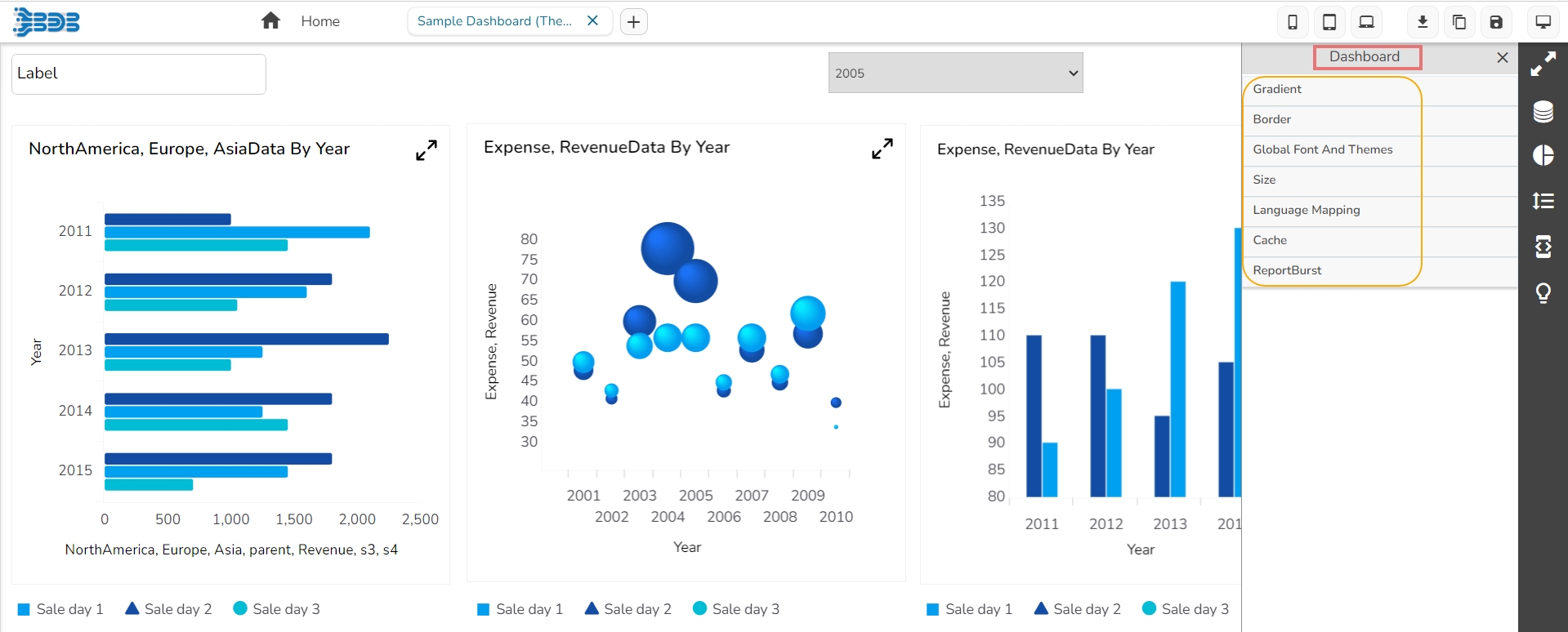

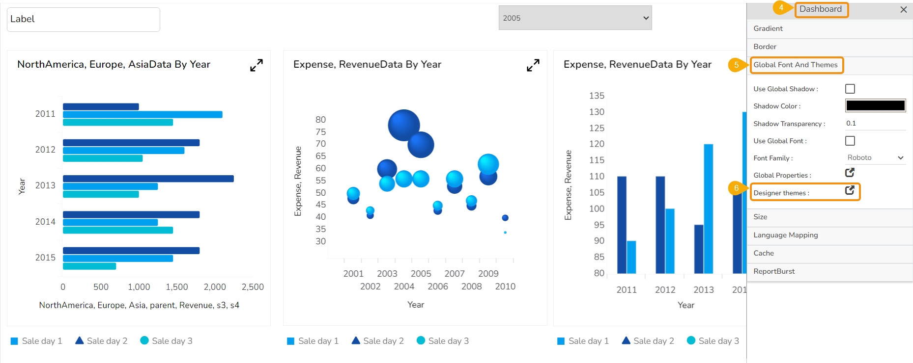
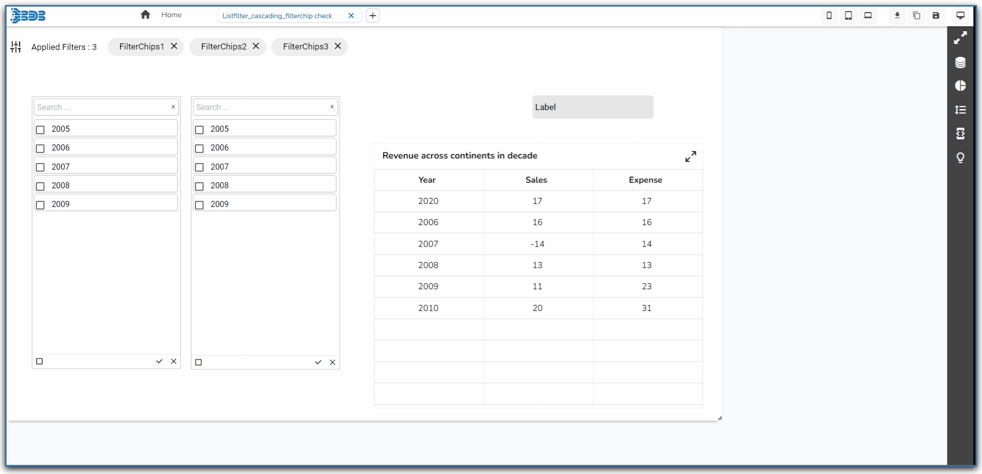
A Waterfall Chart is a form of data visualization that helps in understanding the cumulative effect of sequentially introduced positive or negative values. The waterfall chart is also known as a flying bricks chart or Mario chart due to the apparent suspension of columns (bricks) in mid-air. The Waterfall Chart is used to show how an initial value is increased and decreased by a series of intermediate values, leading to a final value.
To show incremental changes in the values over time.
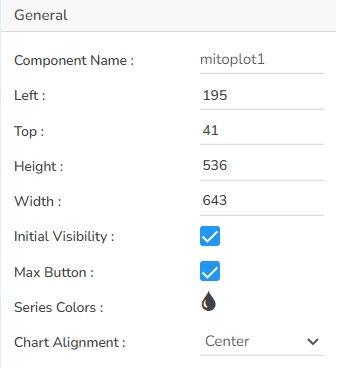


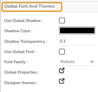
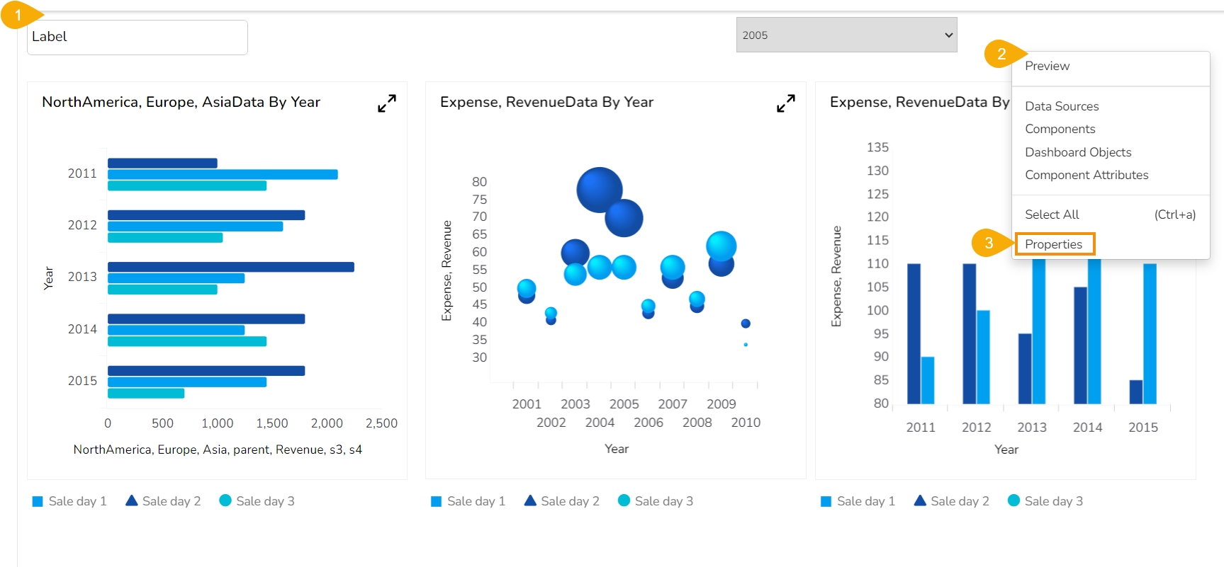
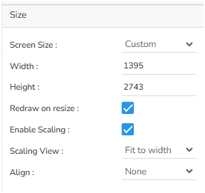


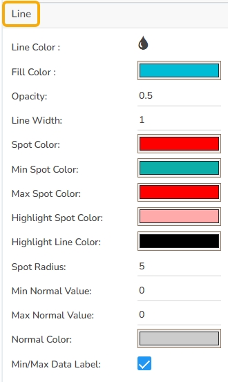
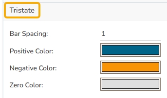
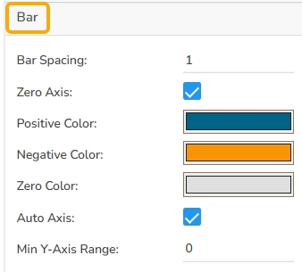

Width: Specify the width of the chart to resize it accordingly.
Initial Visibility: Control whether the chart is visible when the page loads.
Max Button: Enable a button to maximize the chart's view.
Show Percentage: Display the percentage of each segment in the pyramid chart.
Series Colors: Customize the colors used for different series within the chart to enhance visual distinction.
Click the Add Color option to add multiple colors.
Click the Save option to apply the selected background colors.
Border: Define the width of the border surrounding the pyramid chart.
Border Color: Select the color for the chart's border, enhancing its visibility and aesthetics.
Border Radius: Round the corners of the chart's border for a softer, more modern appearance.
Shadow: Enable a shadow effect for the background to add dimension and focus to the chart.
Shadow Color: Choose the color of the shadow cast by the chart background.
Shadow Transparency: Adjust the transparency level of the shadow to control its prominence and intensity.
Click the Save option.
Background Color: Set the background color for the tooltip box to enhance readability.
Opacity: Adjust the transparency level of the tooltip background.
Border Color: Define the color of the border surrounding the tooltip box.
Tooltip Font Size: Specify the font size for the text displayed in the tooltip.
Box Width: Determine the width of the tooltip box for optimal presentation.
Precision: Set the number of decimal places to show in the tooltip for numerical values.
Highlighter: Use color indicators to highlight specific bars or data points within the tooltip, facilitating quick visual recognition.
Description: Add the title text.
Font Color: Select the color of the title text.
Font Size: Specify the size of the title text.
Font Style: Choose the font style (e.g., italic or normal).
Font Weight: Set the weight (boldness) of the font. The supported options are Normal, Bold, 300, 600, and 900.
Font Family: Choose the font family for the title text from the given choices.
Align: Align the title text (e.g., left, center, right).
Text Decoration: Apply text decorations (e.g., underline) to the title text.
Show Dataset Description: Enable or disable the dataset description in the title.
Font Style: Apply styles such as italics to the subtitle.
Font Weight: Modify the thickness of the subtitle text, e.g., bold.
Font Family: Select the font type for the subtitle.
Align: Align the subtitle text (left, center, or right).
Text Decoration: Add elements like underline or overline to the subtitle text.
Font Family: Select the font family for the legend text.
Font Style: Choose the font style (e.g., italic) for the legend text.
Text Decoration: Add text decorations (e.g., underline) to the legend text.
Hide on Load: Determine if the legend should be hidden when the chart initially loads.
Number Formatter: Customize how numbers are displayed (International or Indian).
Export PNG: Similar to JPEG, but offers a lossless export option in PNG format for clearer image quality in visual presentations.
Export PPT: Facilitates exporting the chart directly into a PowerPoint file, streamlining the process of incorporating charts into slideshows.
Export PDF: Enables exporting the chart and its data in PDF format, which is suitable for creating shareable and print-ready documents.
Show Print: Displays a print button on the chart, allowing users to print the chart directly from the application.
Export Heading: Customizes the heading title for exported files, ensuring clarity and context when distributing chart data.
Export Sub Heading: Adds a secondary title or description to exported files, providing additional context or information.
Export File Name: Allows customization of the file name for the exported data, ensuring easy identification and organization.
Global Export Type: Sets a default export format for all charts, streamlining the export process across multiple datasets.


The General Properties panel allows you to modify the core attributes of the Bar chart. Here are the fields available:
Component Name: Set a unique name for the component identification. This field contains an auto-generated name indicating the sequence of the component in the dashboard.
Left: Specify the left position coordinate of the chart component on the canvas.
Top: Indicate the top position coordinate for the chart placement.
Height: Set the height of the chart to determine its vertical size.
Width: Adjust the width of the chart to control its horizontal dimension.
Initial Visibility: Enable to ensure the chart appears during the initial preview.
Max Button: Enable or disable the max button to allow users to maximize the chart for a more detailed view.
Color From Drill: Enable this option to choose whether the colors displayed should derive from drill-down operations.
Base Type: Select the base type for bar categorization in the chart.
Positive Color: Select the color representing positive values in the chart, making it visually distinct and easy to identify growth or profit.
Negative Color: Choose the color for negative values, highlighting losses or decreases consistently.
Total Color: Define the color for the total value, ensuring it stands out distinctly from individual positive or negative values.
Net Column Name: Specify the column name representing the calculated net values, allowing for clear identification and understanding of the presented data.
Bar Size: Configure the size of each bar to adjust spacing and appearance.
Show Tool Tip: The user can show the series description and get the tooltip by clicking the Show Tool Tip option.
The Tool Tip Configuration window opens.
Select any Tool Tip option. The supported Tool Tip options are None and Default.
Click the Save option.
Background Color: Set the background color for the tooltip box to enhance readability.
Opacity: Adjust the transparency level of the tooltip background.
Border Color: Define the color of the border surrounding the tooltip box.
Tooltip Font Size: Specify the font size for the text displayed in the tooltip.
Box Width: Determine the width of the tooltip box for optimal presentation.
Precision: Set the number of decimal places to show in the tooltip for numerical values.
Highlighter: Toggle the highlighter to emphasize specific data points on the chart, drawing user attention to crucial information.
Gradient Rotation: Adjust the angle of the gradient applied to the background, allowing for a dynamic visual transition between colors.
Opacity: Set the transparency level of the background, ranging from fully opaque to completely transparent.
Gradient: Enable or disable gradient colors in the background for depth and visual appeal.
Click the Gradient icon to access the Background gradient colors dialog box.
Click the Add Color option to add multiple colors.
Click the Save option to apply the selected background colors.
Border: Define the width of the border surrounding the pyramid chart.
Border Color: Select the color for the chart's border, enhancing its visibility and aesthetics.
Border Radius: Round the corners of the chart's border for a softer, more modern appearance.
Shadow: Enable a shadow effect for the background to add dimension and focus to the chart.
Shadow Color: Choose the color of the shadow cast.
Shadow Transparency: Adjust the transparency level of the shadow to control its prominence and intensity.
Title Box Color: Choose the background color for the title box.
Show Title Box: Enable or disable the display of the title box on the chart.
Show Title: Enable or disable the display of the title text.
Title Bar Height: Set the height of the title bar.
Description: Add the title text.
Font Color: Select the color of the title text.
Font Size: Specify the size of the title text.
Font Style: Choose the font style (e.g., italic or normal).
Font Weight: Set the weight (boldness) of the font. The supported options are Normal, Bold, 300, 600, and 900.
Font Family: Choose the font family for the title text from the given choices.
Align: Align the title text (e.g., left, center, right).
Text Decoration: Apply text decorations (e.g., underline) to the title text.
Show Dataset Description: Enable or disable the dataset description in the title.
The user can customize the Subtitle properties which include:
Show Subtitle: Toggle this option to display or hide the subtitle.
Description: Add a custom description for the subtitle.
Font Color: Change the color of the subtitle text.
Font Size: Adjust the size of the subtitle text.
Font Style: Apply styles such as italics to the subtitle.
Font Weight: Modify the thickness of the subtitle text, e.g., bold.
Font Family: Select the font type for the subtitle.
Align: Align the subtitle text (left, center, or right).
Text Decoration: Add elements like underline or overline to the subtitle text.
Show X-Axis Line: Toggle the visibility of the x-axis line.
X-Axis Line Color: Select the color for the x-axis line.
Label Font Color: Set the color of the x-axis labels.
Label Font Size: Adjust the font size used for x-axis labels.
Label Font Style: Choose the style (e.g., italic, oblique) for label text.
Label Font Weight: Define the thickness of the label text.
Label Font Family: Select the font type for the labels.
Label Decoration: Add text decorations such as underlining to labels.
Label Rotation: Specify the angle for rotating x-axis labels.
Tilted Label: Enable this to tilt labels for better visibility.
Description: Provide a brief description or title for the x-axis.
Font Color: Pick a color for the x-axis text elements.
Font Size: Change the overall size of text on the x-axis.
Font Style: Set the text style for x-axis elements (e.g., normal, italic).
Font Weight: Modify the boldness of the text on the x-axis.
Font Family: Define the typeface for text along the x-axis.
Text Decoration: Apply decorative styles like underlining to x-axis text.
Category Tick Marks: Control the appearance and frequency of tick marks on the x-axis.
Marker Color: Choose a color for the markers along the x-axis.
Show Dataset Description: Enable or disable the dataset description for the X-Axis.
Show Y-Axis Line: Toggle the visibility of the Y-axis line.
Y-Axis Line Color: Select the color for the Y-axis line.
Label Font Color: Choose the font color for Y-axis labels.
Label Font Size: Specify the size of the font for Y-axis labels.
Label Font Style: Set the style (e.g., italic) for Y-axis labels.
Label Font Weight: Determine the weight (e.g., bold) for Y-axis label fonts.
Label Font Family: Choose the font family for Y-axis labels.
Label Decoration: Add decorations (e.g., underline) to Y-axis labels.
Description: Add a description for the Y-axis.
Font Color: Specify the color of the Y-axis text.
Font Size: Set the font size for the Y-axis text.
Font Style: Choose the font style (e.g., italic) for Y-axis text.
Font Weight: Determine the weight (boldness) of the Y-axis text.
Font Family: Select the font family for the Y-axis text.
Text Decoration: Add text decorations (e.g., underline) to the Y-axis labels.
Show Dataset Description: Enable or disable the dataset description for the Y-Axis.
The users can enable the internal legend if they want to show it and customize the font size, color, style, etc. for the enabled legend.
Show Legend: Toggle the visibility of the chart legend.
Font Color: Choose the font color for the legend text.
Font Weight: Determine the weight (boldness) of the legend text.
Font Size: Specify the size of the font for the legend text.
Font Family: Select the font family for the legend text.
Font Style: Choose the font style (e.g., italic) for the legend text.
Text Decoration: Add text decorations (e.g., underline) to the legend text.
Hide on Load: Determine if the legend should be hidden when the chart initially loads.
Unit: Define the unit of measurement for the values displayed in the chart.
Precision: Set the number of decimal places to display for numerical values.
Currency: Format the numbers as a currency with the appropriate symbol.
Position: Determine the position of the formatted value (e.g., Prefix or Suffix).
Number Formatter: Apply a specific notation or style to the numbers (e.g., Indian, International).
Auto Axis Setup: Automatically adjust the axis settings based on the dataset.
Base Zero: Ensure the axis starts at zero for better data comparison.
Min Value: Define the minimum value displayed on the axis.
Max Value: Set the maximum value for the axis range.
Horizontal Marker Line: Add a horizontal line at a specified value for reference.
Vertical Marker Line: Place a vertical line at a specific point for highlighting.
Zero Marker Line: Include a line at zero to emphasize the baseline.
Zero Marker Color: Customize the color of the zero marker line.
Color: Choose the color for the axis and labels.
Opacity: Adjust the transparency of the axis and markers.
Enable Context Menu: Activate a right-click context menu for quick access to export options in the preview mode of the chart.
Export Excel: Save the chart data in an Excel file format (.xlsx).
Export CSV: Export the chart data into a CSV file format (.csv).
Export JPEG: Export the chart as a JPEG image (.jpg).
Export PNG: Export the chart as a PNG image (.png).
Export PPT: Export the chart to a PowerPoint presentation (.pptx).
Export PDF: Export the chart as a PDF document (.pdf).
Show Print: Include an option to print the chart directly.
Export Heading: Add a custom heading to the exported file.
Export Sub Heading: Add a custom subheading to the exported file.
Export File Name: Specify the file name for the exported file/dashboard.
Global Export Type: Define the default export format using the drop-down (e.g., Screenshot, Tabular).
The user can get the Export Context Menu from the preview mode to download the reports in different export formats.
The users can map a dataset with the dragged Waterfall chart component, and map the data fields as displayed in the given image:
Base Type with Plain
Base Type with Gradient 1
Base Type with Gradient 2
Base Type with Gradient 3
Download the given sample data and map it as mentioned below to plot your Waterfall chart.
Select the Year column as the Category field and the Expense or Revenue column as the Series field to plot the data.


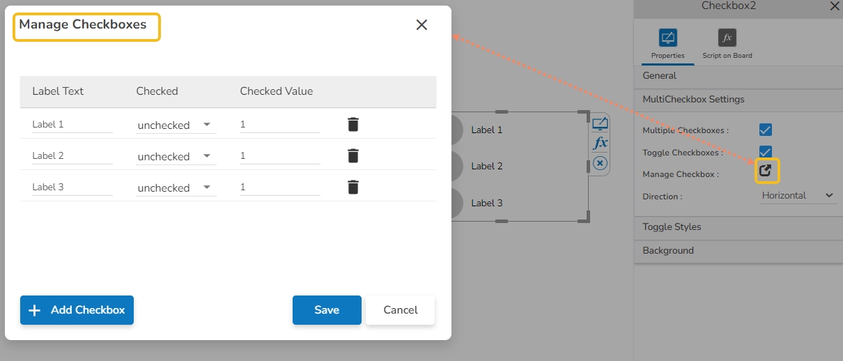


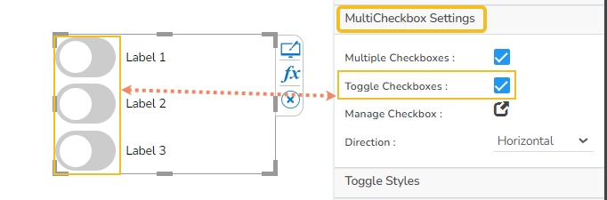

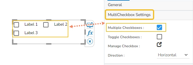

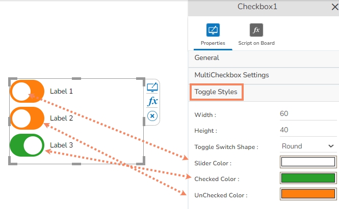

The histogram is similar to a bar chart but it groups the values into continuous ranges. Each bar in the histogram represents the height of the number of values present in that range. The X-Axis remains a continuous scale in the Histogram chart that makes it different from the Vertical Bar Chart. The Histograms make it easy to grasp where most values fall in a measurement scale, and how much variation is there. It is used to summarize a large amount of data or compare process results with specification limits.
To summarize massive data sets graphically
To compare process results with specification limits
To communicate information graphically for the most frequent values
Component Name: Specify a unique identifier for the Column chart component. This field contains an auto-generated name indicating the sequence of the component in the dashboard.
Left: Determine the horizontal positioning of the chart.
Top: Adjust the vertical positioning of the chart.
Height: Define the height of the chart in pixels.
Gradient Rotation: Modify the angle of the gradient to achieve the desired effect.
Opacity: Set the transparency level to balance visibility and aesthetics.
Gradient: Choose and customize the gradient colors to match your theme.
Click the
Show Tool Tip: Enable this option to display tooltips for the chart series, providing descriptions or data insights.
Click the Show Tooltip icon to get the configuration window for the tooltip.
The user can select any tooltip by enabling the checkbox given next to the tooltip.
Title Box Color: Choose the background color for the title box.
Show Title Box: Enable or disable the display of the title box on the chart.
Show Title: Enable or disable the display of the title text.
Title Bar Height: Set the height of the title bar.
Show Sub Title: Enable or disable the display of the sub-title text.
Description: Add a description text below the sub-title.
Font Color: Select the color of the sub-title text.
Font Size: Specify the size of the sub-title text.
Show X-Axis Line: Toggle the visibility of the X-axis line.
X-Axis Line Color: Select the color for the X-axis line.
Label Font Color: Choose the font color for X-axis labels.
Label Font Size: Specify the size of the font for X-axis labels.
Show Y-Axis Line: Toggle the visibility of the Y-axis line.
Y-Axis Line Color: Select the color for the Y-axis line.
Label Font Color: Choose the font color for Y-axis labels.
Label Font Size: Specify the size of the font for Y-axis labels.
Show Legend: Toggle the visibility of the chart legend.
Font Color: Choose the font color for the legend text.
Font Weight: Determine the weight (boldness) of the legend text.
Font Size: Specify the size of the font for the legend text.
Unit: Define the unit of measurement for the values displayed in the chart.
Precision: Set the number of decimal places to display for numerical values.
Currency: Format the numbers as a currency with the appropriate symbol.
Position: Determine the position of the formatted value (e.g., before or after the number).
Auto Axis Setup: Automatically adjust the axis settings based on the dataset.
Base Zero: Ensure the axis starts at zero for better data comparison.
Min Value: Define the minimum value displayed on the axis.
Max Value: Set the maximum value for the axis range.
The Range properties allow you to define the scope of the axis on your chart. You can choose between enabling the Auto Range option or manually setting the range by providing specific values.
Auto Range: When enabled, the chart automatically adjusts the ranges on the X Axis and Y Axis to display pre-defined values, ensuring optimal data visualization without the need for manual configuration.
Range: If the Auto Range is disabled, you can manually specify the numerical range for the axis using the Range field. This option provides more control over the data presentation by allowing you to define custom boundaries.
By enabling the Auto Range option the chart displays pre-defined ranges on the X Axis and Y Axis.
Enable Context Menu: Activate a right-click context menu for quick access to export options in the preview mode of the chart.
Export Excel: Save the chart data in an Excel file format (.xlsx).
Export CSV: Export the chart data into a CSV file format (.csv).
Export JPEG: Export the chart as a JPEG image (.jpg).
The user can get the Export Context Menu from the preview mode to download the reports in different export formats.
Histogram – Gradient 3 Chart
Download the given sample data and map it as mentioned below to plot your Histogram chart:
Use the Sales column as a Category field, and the Profit column as a Series to plot data.

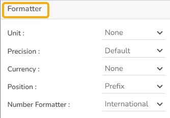
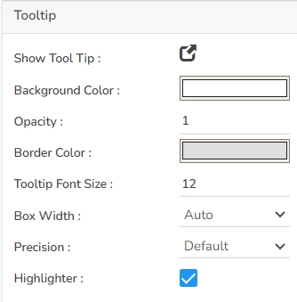


Scatter plots are used to analyze patterns in bivariate data. Data is plotted on the horizontal and vertical axis in an attempt to show how much one variable is related to another. They are the best visualizations that give users a sense of trends, correlations, and outliers from the data.
To find the Relation between different variables


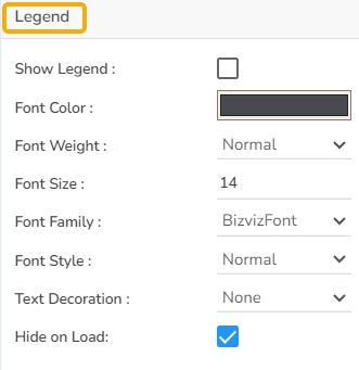
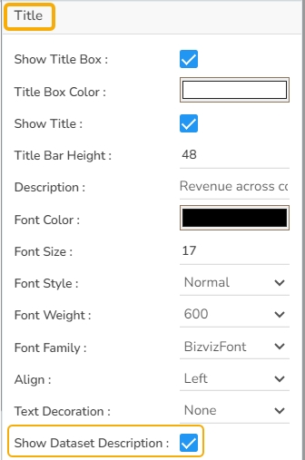


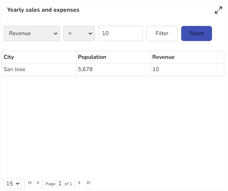

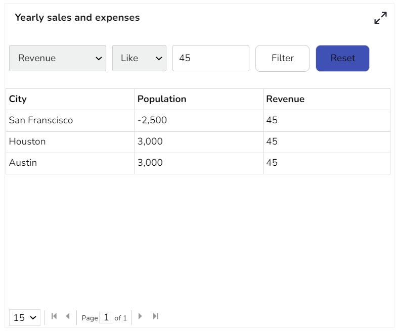


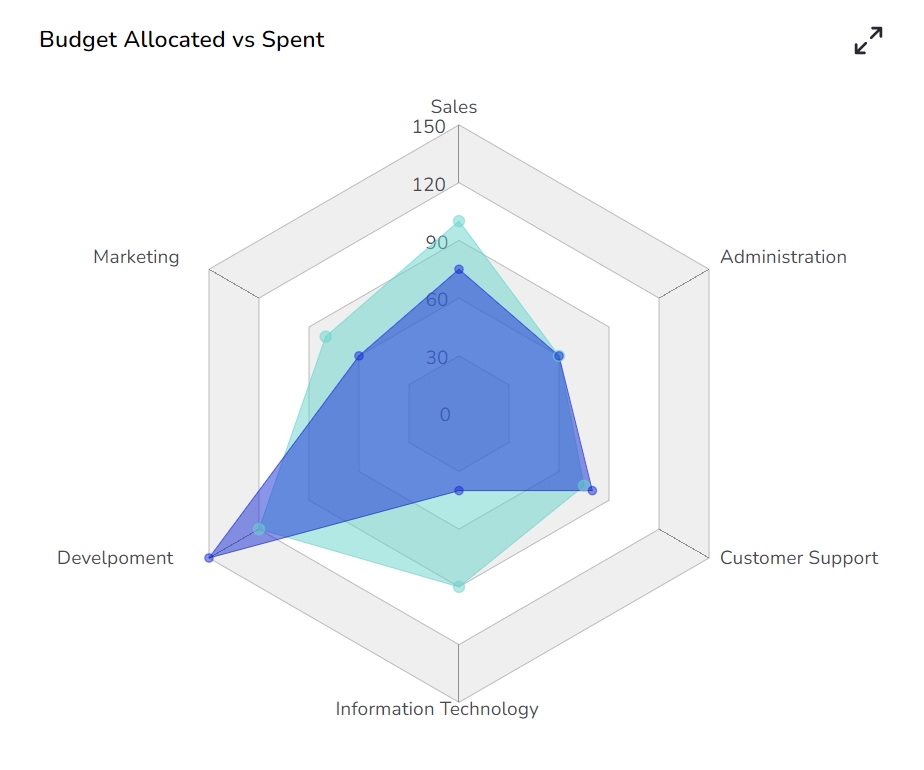
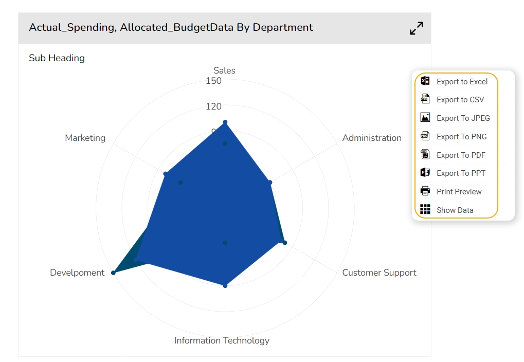
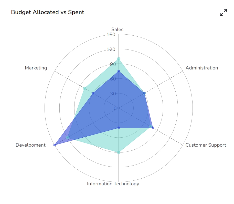
Width: Set the width of the chart in pixels.
Initial Visibility: Check this option to enable the chart's visibility upon the initial load.
Max Button: Enable or disable the maximization button for expanding the chart view.
Color From Drill: Allow the chart to inherit colors from a drill-down operation.
Base Type: Select the base shape of the columns, such as a Rectangle, Cylinder, Plain, Gradient 1, Gradient 2, or Gradient 3.
Border Color: Specify a border color for the chart component using this option.
Click the Add Color option to add multiple colors.
Click the Save option to apply the selected background colors.
Border: Add a border around the chart for a defined perimeter.
Border Color: Alter the border color to complement or contrast with the chart.
Border Radius: Round the corners of the chart border for a smoother look.
Shadow: Enable shadows to create depth and a 3D-like effect.
Shadow Color: Customize the shadow color to blend naturally with the chart.
Shadow Transparency: Adjust the transparency level to control the intensity of the shadow effect.
Background Color: Choose a background color for the tooltip to enhance visibility and match your visual theme.
Opacity: Adjust the tooltip's transparency to ensure it doesn't obstruct important chart elements while remaining readable.
Border Color: Select a border color that complements the tooltip, ensuring clarity and contrast against the chart background.
Tooltip Font Size: Customize the font size to maintain readability, adapting it to the overall chart presentation.
Box Width: Define the width of the tooltip box to ensure it fits the content appropriately and maintains a neat appearance.
Precision: Set the numerical precision for data values displayed in the tooltip, aiding in clearer data interpretation.
Highlighter: Toggle the highlighter to emphasize specific data points on the chart, drawing user attention to crucial information.
Description: Add a description text below the title.
Font Color: Select the color of the title text.
Font Size: Specify the size of the title text.
Font Style: Choose a Font style using the drop-down menu (e.g., italic or normal).
Font Weight: Set the weight (boldness) of the font. The supported options are Normal, Bold, 300, 600, and 900.
Font Family: Choose the font family for the title text from the given choices.
Align: Align the title text (e.g., left, center, right).
Text Decoration: Apply text decorations (e.g., underline) to the title text.
Show Dataset Description: Enable or disable the dataset description in the title.
Font Style: Choose the font style for the Sub-title (e.g., italic or normal).
Font Weight: Set the weight (boldness) of the font. The supported options are Normal, Bold, 300, 600, and 900.
Font Family: Choose the font family for the sub-title text from the given choices.
Align: Align the sub-title text (e.g., left, center, right).
Text Decoration: Apply text decorations (e.g., underline) to the sub-title text.
Label Font Style: Set the style (e.g., italic) for X-axis labels.
Label Font Weight: Determine the weight (e.g., bold) for X-axis label fonts.
Label Font Family: Choose the font family for X-axis labels.
Label Decoration: Add decorations (e.g., underline) to X-axis labels.
Label Rotation: Set the rotation angle for X-axis labels.
Tilted Label: Enable to tilt X-axis labels for better readability.
Description: Add a description for the X-axis.
Font Color: Specify the color of the X-axis text.
Font Size: Set the font size for the X-axis text.
Font Style: Choose the font style (e.g., italic) for X-axis text.
Font Weight: Determine the weight (boldness) of the X-axis text.
Font Family: Select the font family for the X-axis text.
Text Decoration: Add text decorations (e.g., underline) to the X-axis labels.
Category Tick Marks: Activate tick marks for categories on the X-axis.
Marker Color: Choose the color of the markers on the X-axis.
Show Dataset Description: Toggle the visibility of dataset descriptions on the X-axis.
Label Font Style: Set the style (e.g., italic) for Y-axis labels.
Label Font Weight: Determine the weight (e.g., bold) for Y-axis label fonts.
Label Font Family: Choose the font family for Y-axis labels.
Label Decoration: Add decorations (e.g., underline) to Y-axis labels.
Description: Add a description for the Y-axis.
Font Color: Specify the color of the Y-axis text.
Font Size: Set the font size for the Y-axis text.
Font Style: Choose the font style (e.g., italic) for Y-axis text.
Font Weight: Determine the weight (boldness) of the Y-axis text.
Font Family: Select the font family for the Y-axis text.
Text Decoration: Add text decorations (e.g., underline) to the Y-axis labels.
Show Dataset Description: Toggle the visibility of dataset descriptions on the Y-axis.
Font Family: Select the font family for the legend text.
Font Style: Choose the font style (e.g., italic) for the legend text.
Text Decoration: Add text decorations (e.g., underline) to the legend text.
Hide on Load: Determine if the legend should be hidden when the chart initially loads.
Number Formatter: Apply a specific notation or style to the numbers (e.g., Indian, International).
Horizontal Marker Line: Add a horizontal line at a specified value for reference.
Vertical Marker Line: Place a vertical line at a specific point for highlighting.
Zero Marker Line: Include a line at zero to emphasize the baseline.
Zero Marker Color: Customize the color of the zero marker line.
Color: Set a color for the marker line.
Opacity: Adjust the color transparency of the axis marker line.
Export PNG: Export the chart as a PNG image (.png).
Export PPT: Export the chart to a PowerPoint presentation (.pptx).
Export PDF: Export the chart as a PDF document (.pdf).
Show Print: Include an option to print the chart directly.
Export Heading: Add a custom heading to the exported file.
Export Sub Heading: Add a custom subheading to the exported file.
Export File Name: Specify the file name for the exported file/dashboard.
Global Export Type: Define the default export format using the drop-down (e.g., Screenshot, Tabular).

To view the revenue growth of an organization by quarter wise.
In the General properties of the Area Chart, users can customize several aspects:
Component Name: Assign a unique identifier to the chart for easy reference. This field contains an auto-generated name indicating the sequence of the component in the dashboard.
Left & Top: Set the chart's position within the design area by modifying these values.
Height & Width: Adjust the chart's dimensions to fit your layout needs.
Initial Visibility: Enable to ensure the chart appears during the initial preview.
Max Button: Provide a button to maximize the chart for better visibility.
Color From Drill: Utilize colors from drilled data points to enhance visual distinction.
Points: Display data points on the chart for greater detail.
Line Form: Select the form of the line in the chart, such as Segment or Curve.
Chart Type: Choose the chart's style, e.g., Overlaid, Stacked, and Laid to best represent the data.
In the Background properties of the Area Chart, users can enhance the visual appeal by adjusting the following fields:
Gradient Rotation: Modify the angle of the gradient to achieve the desired effect.
Opacity: Set the transparency level to balance visibility and aesthetics.
Gradient: Choose and customize the gradient colors to match your theme.
Click the Gradient icon to access the Background gradient colors dialog box.
Click the Add Color option to add multiple colors.
Click the Save option to apply the selected background colors.
Border: Add a border around the chart for a defined perimeter.
Border Color: Alter the border color to complement or contrast with the chart.
Border Radius: Round the corners of the chart border for a smoother look.
Shadow: Enable shadows to create depth and a 3D-like effect.
Shadow Color: Customize the shadow color to blend naturally with the chart.
Shadow Transparency: Adjust the transparency level to control the intensity of the shadow effect.
Tooltips enhance user interaction by displaying additional information about chart elements.
Show Tool Tip: Enable this option to display tooltips for the chart series, providing descriptions or data insights.
Click the Show Tool Tip icon to access the Tool Tip Configuration window.
Select the Default option.
Put a checkmark in the box to enable the component formatter.
Click the Save option to display Tool Tip in the default display.
Background Color: Choose a background color for the tooltip to enhance visibility and match your visual theme.
Opacity: Adjust the tooltip's transparency to ensure it doesn't obstruct important chart elements while remaining readable.
Border Color: Select a border color that complements the tooltip, ensuring clarity and contrast against the chart background.
Tooltip Font Size: Customize the font size to maintain readability, adapting it to the overall chart presentation.
Box Width: Define the width of the tooltip box to ensure it fits the content appropriately and maintains a neat appearance.
Precision: Set the numerical precision for data values displayed in the tooltip, aiding in clearer data interpretation.
Highlighter: Toggle the highlighter to emphasize specific data points on the chart, drawing user attention to crucial information.
Title Box Color: Choose the background color for the title box.
Show Title Box: Enable or disable the display of the title box on the chart.
Show Title: Enable or disable the display of the title text.
Title Bar Height: Set the height of the title bar.
Description: Add a description text below the title.
Font Color: Select the color of the title text.
Font Size: Specify the size of the title text.
Font Style: Choose a Font style using the drop-down menu (e.g., italic or normal).
Font Weight: Set the weight (boldness) of the font. The supported options are Normal, Bold, 300, 600, and 900.
Font Family: Choose the font family for the title text from the given choices.
Align: Align the title text (e.g., left, center, right).
Text Decoration: Apply text decorations (e.g., underline) to the title text.
Show Dataset Description: Enable or disable the dataset description in the title.
Show Sub Title: Enable or disable the display of the sub-title text.
Description: Add a description text below the sub-title.
Font Color: Select the color of the sub-title text.
Font Size: Specify the size of the sub-title text.
Font Style: Choose the font style for the Sub-title (e.g., italic or normal).
Font Weight: Set the weight (boldness) of the font. The supported options are Normal, Bold, 300, 600, and 900.
Font Family: Choose the font family for the sub-title text from the given choices.
Align: Align the sub-title text (e.g., left, center, right).
Text Decoration: Apply text decorations (e.g., underline) to the sub-title text.
Show X-Axis Line: Toggle the visibility of the X-axis line.
X-Axis Line Color: Select the color for the X-axis line.
Label Font Color: Choose the font color for X-axis labels.
Label Font Size: Specify the size of the font for X-axis labels.
Label Font Style: Set the style (e.g., italic) for X-axis labels.
Label Font Weight: Determine the weight (e.g., bold) for X-axis label fonts.
Label Font Family: Choose the font family for X-axis labels.
Label Decoration: Add decorations (e.g., underline) to X-axis labels.
Label Rotation: Set the rotation angle for X-axis labels.
Tilted Label: Enable to tilt X-axis labels for better readability.
Description: Add a description for the X-axis.
Font Color: Specify the color of the X-axis text.
Font Size: Set the font size for the X-axis text.
Font Style: Choose the font style (e.g., italic) for X-axis text.
Font Weight: Determine the weight (boldness) of the X-axis text.
Font Family: Select the font family for the X-axis text.
Text Decoration: Add text decorations (e.g., underline) to the X-axis labels.
Category Tick Marks: Activate tick marks for categories on the X-axis.
Marker Color: Choose the color of the markers on the X-axis.
Show Dataset Description: Toggle the visibility of dataset descriptions on the X-axis.
Show Y-Axis Line: Toggle the visibility of the Y-axis line.
Y-Axis Line Color: Select the color for the Y-axis line.
Label Font Color: Choose the font color for Y-axis labels.
Label Font Size: Specify the size of the font for Y-axis labels.
Label Font Style: Set the style (e.g., italic) for Y-axis labels.
Label Font Weight: Determine the weight (e.g., bold) for Y-axis label fonts.
Label Font Family: Choose the font family for Y-axis labels.
Label Decoration: Add decorations (e.g., underline) to Y-axis labels.
Description: Add a description for the Y-axis.
Font Color: Specify the color of the Y-axis text.
Font Size: Set the font size for the Y-axis text.
Font Style: Choose the font style (e.g., italic) for Y-axis text.
Font Weight: Determine the weight (boldness) of the Y-axis text.
Font Family: Select the font family for the Y-axis text.
Text Decoration: Add text decorations (e.g., underline) to the Y-axis labels.
Show Dataset Description: Toggle the visibility of dataset descriptions on the Y-axis.
Show Legend: Toggle the visibility of the chart legend.
Font Color: Choose the font color for the legend text.
Font Weight: Determine the weight (boldness) of the legend text.
Font Size: Specify the size of the font for the legend text.
Font Family: Select the font family for the legend text.
Font Style: Choose the font style (e.g., italic) for the legend text.
Text Decoration: Add text decorations (e.g., underline) to the legend text.
Hide on Load: Determine if the legend should be hidden when the chart initially loads.
Unit: Define the unit of measurement for the values displayed in the chart.
Precision: Set the number of decimal places to display for numerical values.
Currency: Format the numbers as a currency with the appropriate symbol.
Position: Determine the position of the formatted value (e.g., before or after the number).
Number Formatter: Apply a specific notation or style to the numbers (e.g., Indian, International).
Auto Axis Setup: Automatically adjust the axis settings based on the dataset.
Base Zero: Ensure the axis starts at zero for better data comparison.
Min Value: Define the minimum value displayed on the axis.
Max Value: Set the maximum value for the axis range.
Horizontal Marker Line: Add a horizontal line at a specified value for reference.
Vertical Marker Line: Place a vertical line at a specific point for highlighting.
Zero Marker Line: Include a line at zero to emphasize the baseline.
Zero Marker Color: Customize the color of the zero marker line.
Color: Set color for the axis marker line.
Opacity: Adjust the color transparency of the axis marker line.
Enable Context Menu: Activate a right-click context menu for quick access to export options in the preview mode of the chart.
Export Excel: Save the chart data in an Excel file format (.xlsx).
Export CSV: Export the chart data to a CSV file format (.csv).
Export JPEG: Export the chart as a JPEG image (.jpg).
Export PNG: Export the chart as a PNG image (.png).
Export PPT: Export the chart to a PowerPoint presentation (.pptx).
Export PDF: Export the chart as a PDF document (.pdf).
Show Print: Include an option to print the chart directly.
Export Heading: Add a custom heading to the exported file.
Export Sub Heading: Add a custom subheading to the exported file.
Export File Name: Specify the file name for the exported file/dashboard.
Global Export Type: Define the default export format using the drop-down (e.g., Screenshot, Tabular).
The user can get the Export Context Menu from the preview mode to download the reports in different export formats.
The user can change the color of each series by selecting any of the series. The user can change the Line type to Dot, Dot-Dash, Straight, or Dash together with the line width, point shape, point radius, and Display Name i.e. it can display a different name while previewing the dashboard if Display Name change is selected. We can enable the Data Label to show the Value of each Year.
It is possible to get the following variants of the Area chart by changing the Properties.
Download the given sample data and map it as mentioned below to plot your Area Plot chart:
Use the Year column as Category field and the other columns as Series to plot data as shown in the given examples below:
To find the potential root cause of a problem
Add-up Filters: Filters like combo boxes can be added to the scatter plot chart to filter data based on a condition.
Differentiate by Type: Data plotted on the charts may contain different categories. These categories can be identified by assigning different shapes.
The user can change the height, width, top, and left. If initial visibility is not enabled, then the chart won’t be available for the first preview. The base type can be adjusted between Gradient and Plain.
Component Name: Set a unique name for the component identification. This field contains an auto-generated name indicating the sequence of the component in the dashboard.
Left: Adjust the horizontal positioning of the chart on the canvas.
Top: Set the vertical positioning of the chart from the top edge.
Height: Determine the height of the chart in the layout.
Width: Specify the width of the chart to resize it accordingly.
Drag and Zoom: Enable or disable the ability for users to drag and zoom into specific areas of the scatter plot for a more detailed view. This can enhance interactivity and user engagement with the data.
Initial Visibility: Control whether the chart is visible when the page loads.
Max Button: Enable a button to maximize the chart's view.
Base Type: Select between Gradient and Plain options to set the foundational style of the scatter plot. Gradient provides a more visually layered effect, whereas Plain offers a straightforward presentation.
Luminance: Adjust the luminance settings to control the brightness or dimness of the chart appearance. This can be used to accommodate different visual requirements or preferences.
Actions: Define custom actions or behaviors when users interact with the scatter plot, such as clicking on a data point or hovering over the chart, to create a dynamic user experience.
Animation: Enable animation effects for transitions within the scatter plot to provide a smooth and visually appealing movement when the chart data updates or loads.
Show Tool Tip: The user can show the series description and get the tooltip by clicking the Show Tool Tip option.
The Tool Tip Configuration window opens.
Select any Tool Tip option. The supported Tool Tip options are None and Default.
Click the Save option.
Background Color: Set the background color for the tooltip box to enhance readability.
Opacity: Adjust the transparency level of the tooltip background.
Border Color: Define the color of the border surrounding the tooltip box.
Tooltip Font Size: Specify the font size for the text displayed in the tooltip.
Box Width: Determine the width of the tooltip box for optimal presentation.
Precision: Set the number of decimal places to show in the tooltip for numerical values.
The users get to set ranges and select colors for the ranges and Range Legends by using this Properties option. It is also possible to use Dynamic Range colors from the Range Properties window.
Click the Properties icon for the Range Indicators.
The Range Properties window opens.
Click the Add Range option to insert a new range.
Once the new Range gets added, the user can modify the Range Name, Range From, Range Up to limits, and Range Color.
The user also gets the option to Delete an existing Range.
Click the Save option to apply the selected Range Properties.
The users can also choose to apply dynamic colors to the bubble by selecting the Dynamic Range option.
After setting the Range colors (manually or dynamically), Enable the Range Color Legend option.
Open the chart in the Preview mode.
Click the Legend icon.
A context menu opens displaying the names and color selection for the inserted ranges.
Gradient Rotation: Adjust the angle of the gradient applied to the background, allowing for a dynamic visual transition between colors.
Opacity: Set the transparency level of the background, ranging from fully opaque to completely transparent.
Gradient: Enable or disable gradient colors in the background for depth and visual appeal.
Click the Gradient icon to access the Background gradient colors dialog box.
Click the Add Color option to add multiple colors.
Click the Save option to apply the selected background colors.
Border: Define the width of the border surrounding the pyramid chart.
Border Color: Select the color for the chart's border, enhancing its visibility and aesthetics.
Border Radius: Round the corners of the chart's border for a softer, more modern appearance.
Shadow: Enable a shadow effect for the background to add dimension and focus to the chart.
Shadow Color: Choose the color of the shadow cast by the chart background.
Shadow Transparency: Adjust the transparency level of the shadow to control its prominence and intensity.
Title Box Color: Set the background color for the title box, enhancing visual distinction and cohesion with your chart theme.
Show Title Box: Enable or disable the display of the title box to frame your chart title appropriately.
Show Title: Toggle the display of the chart's main title, providing context or emphasis as needed.
Title Bar Height: Adjust the height of the title bar to ensure it fits the title content without overlapping chart elements.
Description: Add the title text that you wish to display in the title box.
Font Color: Choose the color for the title text, aligning with visual elements for readability and emphasis.
Font Size: Specify the size of the title font to match the visual hierarchy of the chart presentation.
Font Style: Select the style (e.g., normal, italic) of the title font to differentiate or accentuate the text.
Font Weight: Define the boldness of the title font with options like Normal, Bold, 300, 600, and 900 for varying intensity.
Font Family: Select the font family for stylistic consistency and readability in your chart title.
Align: Set the alignment of the title text (e.g., left, center, right) to position it accurately on the chart.
Text Decoration: Apply decorations (e.g., underline) to the title text for additional emphasis or style.
Show Dataset Description: Enable or disable the dataset description in the title.
Here user can enable the subtitle if the user has any second title and also, the user can change the Name, Font color, size, style, etc.
Show X-Axis Line: Toggle the visibility of the x-axis line.
X-Axis Line Color: Select the color for the x-axis line.
Label Font Color: Set the color of the x-axis labels.
Label Font Size: Adjust the size of the font used for x-axis labels.
Label Font Style: Choose the style (e.g., italic, oblique) for label text.
Label Font Weight: Define the thickness of the label text.
Label Font Family: Select the font type for the labels.
Label Decoration: Add text decorations such as underlining to labels.
Label Rotation: Specify the angle for rotating x-axis labels.
Tilted Label: Enable this to tilt labels for better visibility.
Description: Provide a brief description or title for the x-axis.
Font Color: Pick a color for the x-axis text elements.
Font Size: Change the overall size of text on the x-axis.
Font Style: Set the text style for x-axis elements (e.g., normal, italic).
Font Weight: Modify the boldness of the text on the x-axis.
Font Family: Define the typeface for text along the x-axis.
Text Decoration: Apply decorative styles like underlining to x-axis text.
Category Tick Marks: Control the appearance and frequency of tick marks on the x-axis.
Marker Color: Choose a color for the markers along the x-axis.
Horizontal Auto Axis: Automatically adjusts the scale and range of the x-axis based on data points.
Horizontal Base Zero: Ensures the x-axis starts from zero, maintaining consistent scale.
Horizontal Min Value: Sets the minimum data value to be displayed on the x-axis.
Horizontal Max Value: Sets the maximum data value to be displayed on the x-axis.
Unit: Defines the unit of measurement for the data represented along the x-axis.
Precision: Determines the number of decimal places for the numbers displayed on the x-axis.
Currency: Formats the x-axis labels to represent currency values when applicable.
Position: Sets the position on the x-axis, such as prefix or suffix.
Number Formatter: Applies a specific format to the numerical values on the x-axis like Indian or International.
X-Axis Threshold: Establishes a baseline value, distinguishing above or below threshold data points.
Minimum Threshold: Specifies the lowest allowable value in a range for the x-axis.
Maximum Threshold: Specifies the highest allowable value in a range for the x-axis.
Show Y-Axis Line: Toggle the visibility of the Y-axis line.
Y-Axis Line Color: Select the color for the Y-axis line.
Label Font Color: Choose the font color for Y-axis labels.
Label Font Size: Specify the size of the font for Y-axis labels.
Label Font Style: Set the style (e.g., italic) for Y-axis labels.
Label Font Weight: Determine the weight (e.g., bold) for Y-axis label fonts.
Label Font Family: Choose the font family for Y-axis labels.
Label Decoration: Add decorations (e.g., underline) to Y-axis labels.
Description: Add a description for the Y-axis.
Font Color: Specify the color of the Y-axis text.
Font Size: Set the font size for the Y-axis text.
Font Style: Choose the font style (e.g., italic) for Y-axis text.
Font Weight: Determine the weight (boldness) of the Y-axis text.
Font Family: Select the font family for the Y-axis text.
Text Decoration: Add text decorations (e.g., underline) to the Y-axis labels.
Y-Axis Threshold: This field sets a specific baseline on the Y-axis, helping users visually distinguish data points that are above or below the defined threshold line. It aids in quickly identifying values that meet or exceed certain criteria.
Minimum Threshold: Specifies the lowest permissible value on the Y-axis. Data points below this value may be highlighted or noted for significance, ensuring that users are aware of any entries outside accepted parameters.
Maximum Threshold: This field sets the highest allowable value on the Y-axis. Values exceeding this threshold are easily identifiable, allowing users to focus on data points that might need further analysis due to their exceptional nature.
The user can enable the internal legend if the user wants to show it and customize the font size, color, style, etc. for the enabled legend.
Show Legend: Toggle the visibility of the chart legend.
Font Color: Choose the font color for the legend text.
Font Weight: Determine the weight (boldness) of the legend text.
Font Size: Specify the size of the font for the legend text.
Font Family: Select the font family for the legend text.
Font Style: Choose the font style (e.g., italic) for the legend text.
Text Decoration: Add text decorations (e.g., underline) to the legend text.
Hide on Load: Determine if the legend should be hidden when the chart initially loads.
Unit: Define the unit of measurement for the values displayed in the chart.
Precision: Set the number of decimal places to display for numerical values.
Currency: Format the numbers as a currency with the appropriate symbol.
Position: Determine the position of the formatted value (e.g., Prefix or Suffix).
Number Formatter: Apply a specific notation or style to the numbers (e.g., Indian, International).
Auto Axis Setup: Automatically adjust the axis settings based on the dataset.
Base Zero: Ensure the axis starts at zero for better data comparison.
Min Value: Define the minimum value displayed on the axis.
Max Value: Set the maximum value for the axis range.
Vertical Marker Line: Place a vertical line at a specific point for highlighting.
Horizontal Marker Line: Add a horizontal line at a specified value for reference.
Zero Marker Line: Include a line at zero to emphasize the baseline.
Zero Marker Color: Customize the color of the zero marker line.
Vertical Zero Marker Line: Enable this option to display the zero marker line vertically in the chart.
Vertical Zero Marker Color: Set a color for the vertical zero marker line in the chart.
Color: Choose the color for the axis and labels.
Opacity: Adjust the transparency of the axis and markers.
Enable Context Menu: Activate a right-click context menu for quick access to export options in the preview mode of the chart.
Export Excel: Save the chart data in an Excel file format (.xlsx).
Export CSV: Export the chart data into a CSV file format (.csv).
Export JPEG: Export the chart as a JPEG image (.jpg).
Export PNG: Export the chart as a PNG image (.png).
Export PPT: Export the chart to a PowerPoint presentation (.pptx).
Export PDF: Export the chart as a PDF document (.pdf).
Show Print: Include an option to print the chart directly.
Export Heading: Add a custom heading to the exported file.
Export Sub Heading: Add a custom subheading to the exported file.
Export File Name: Specify the file name for the exported file/dashboard.
Global Export Type: Define the default export format using the drop-down (e.g., Screenshot, Tabular).
The user can get the Export Context Menu from the preview mode to download the reports in different export formats.
Map a dataset to the dragged Scatter plot component and you can drag the given columns under the X Field. After mapping the data, the user gets the Properties and Indicators tab for the Dataset values to be displayed more effectively.
Download the given sample data and map it as mentioned below to plot your Scatter Plot chart.


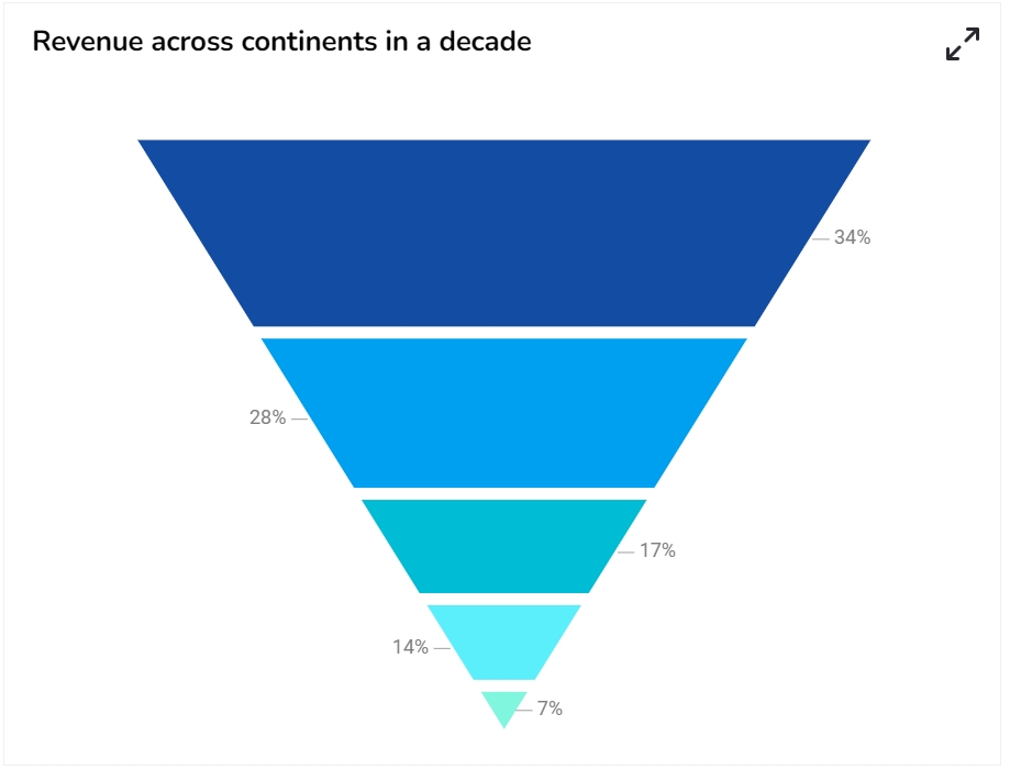
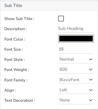
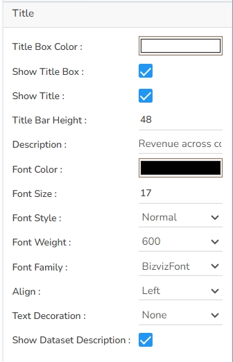
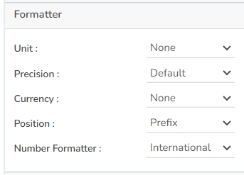


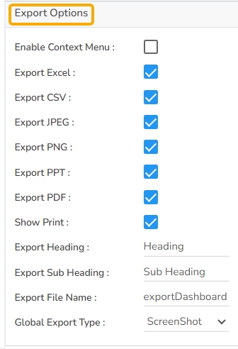
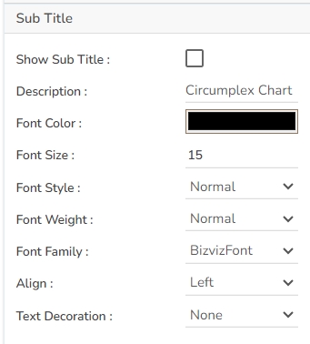
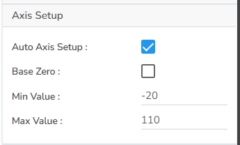
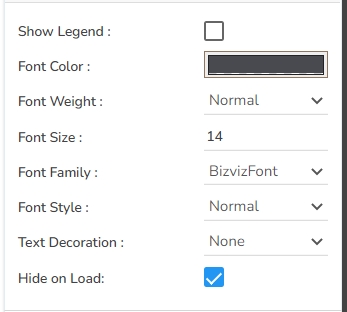

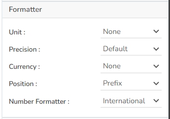

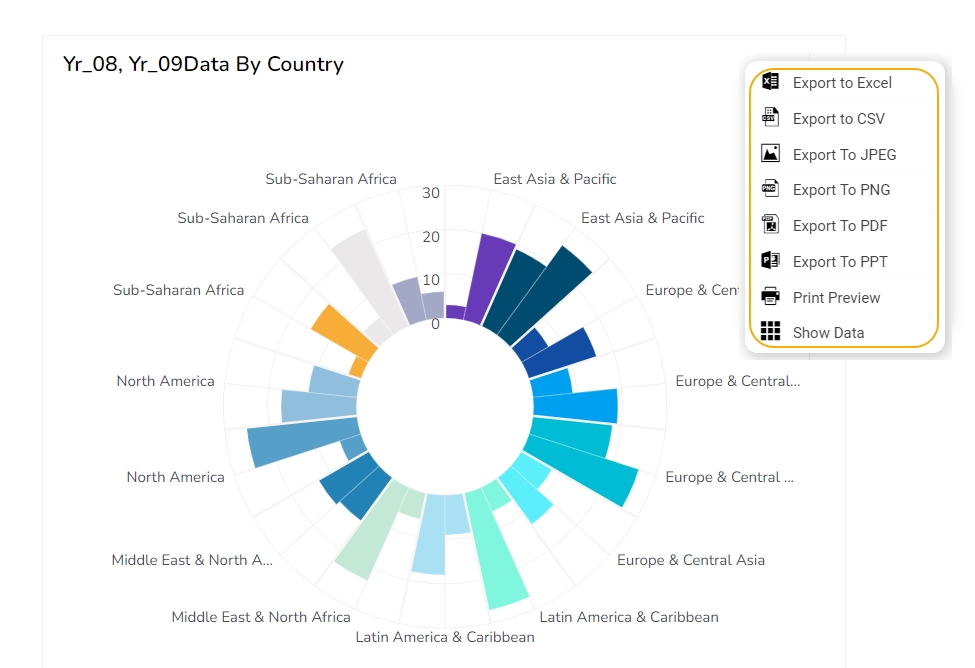

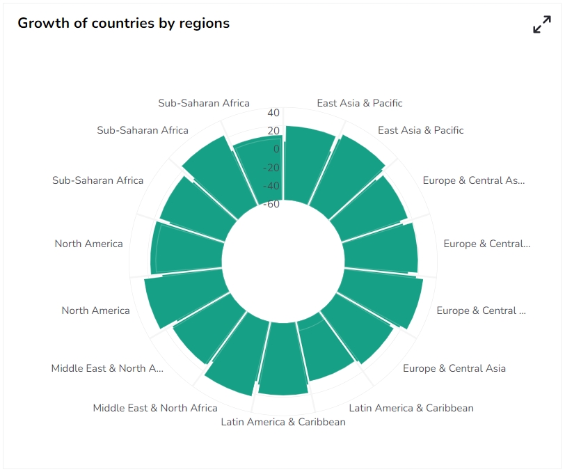


The Map chart is used to position data in a geographical context. Multiple layers are included to cover various information. The users can specify which layer to be marked as an interactive layer as it is the only layer wherein items can be marked.
To display widely spread data or processes in the geographical setup.
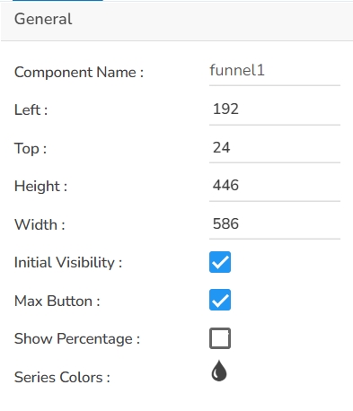
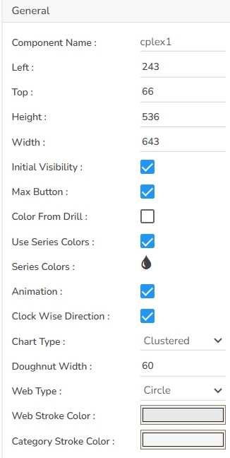
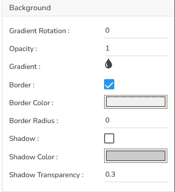

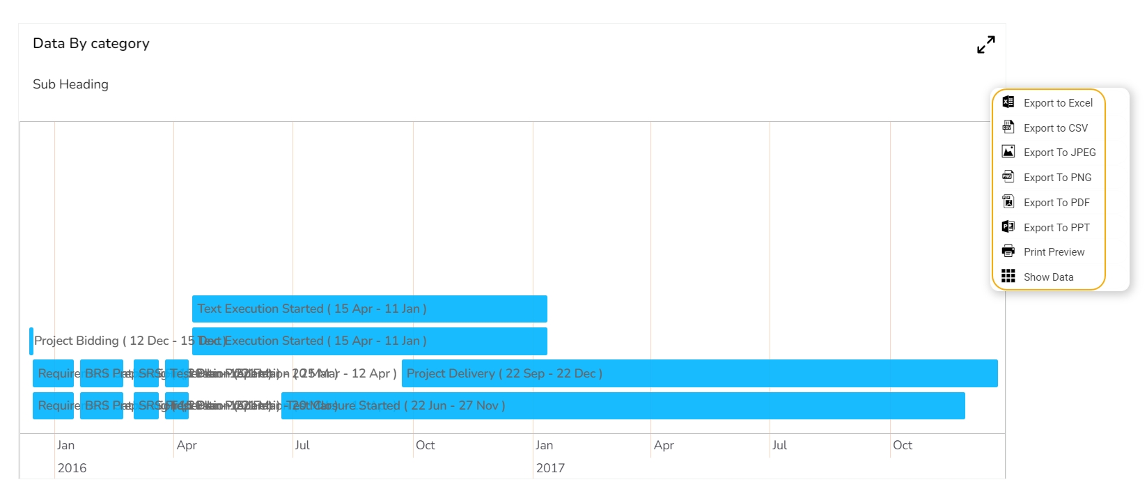


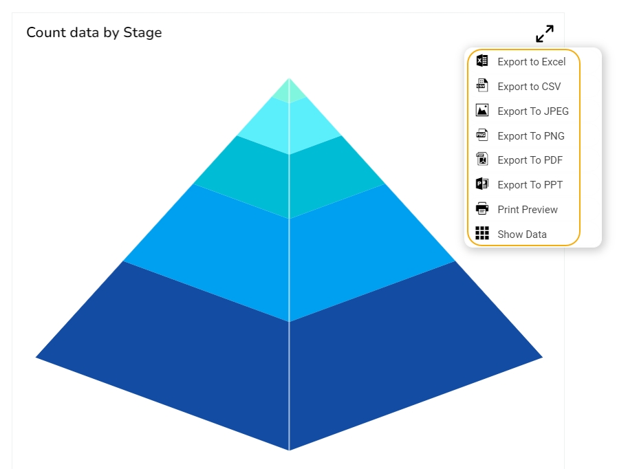
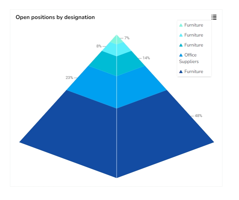


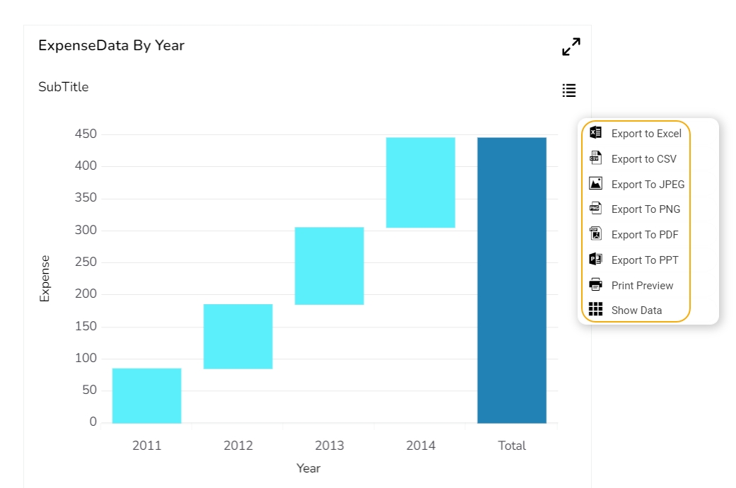
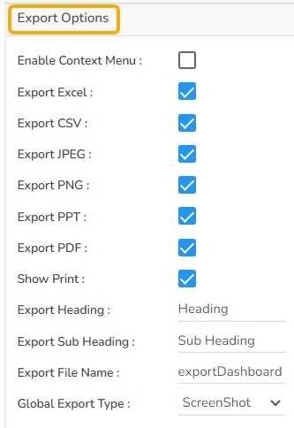

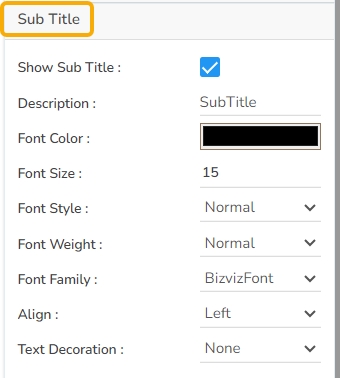
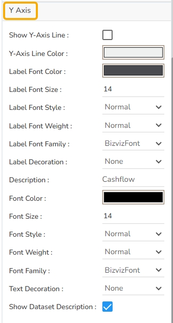
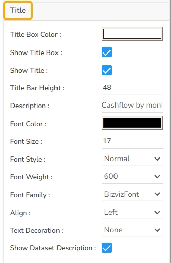

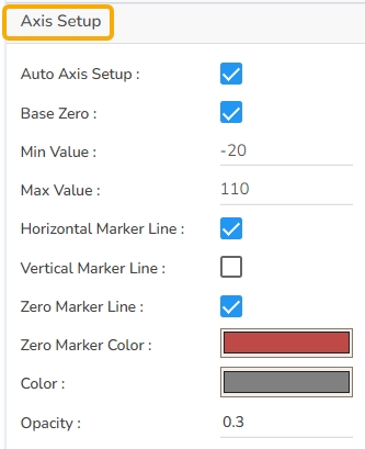
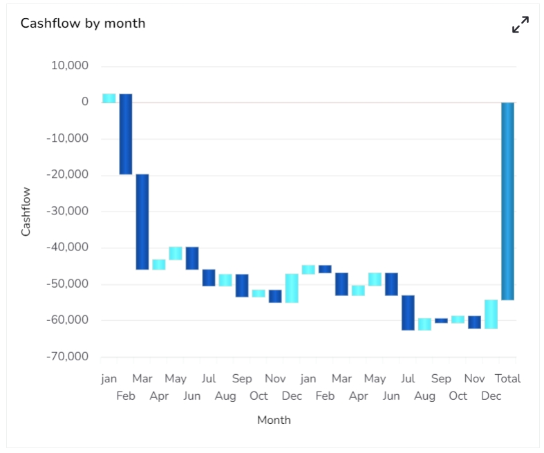

Component Name: Assign a unique name to the map chart component. This field contains an auto-generated name indicating the sequence of the component in the dashboard.
Left & Top: Set the chart's position on the canvas by specifying the left and top margins.
Height & Width: Adjust the chart's dimensions to fit within the desired space on the canvas.
Initial Visibility: Check this option to ensure the chart is visible on the initial view.
Max Button: Use this to maximize the chart view independently.
Map Type: Choose between SVG and Leaflet map types.
Select Map: Pick a specific map, such as a continent like Asia, from the available options.
Geometry Type: Choose from Marker, Line, Polygon, Clustered, Trail, and Trip.
Line Type: Select the form of line representation such as Curve, Segment, Step, Reverse Step, Horizontal, and Vertical.
Line Thickness: Specify the thickness of the line in the chart.
Default Color: Select a default color for the map elements.
Roll Over Color: Define a color change when hovering over map elements.
Outline Color: Set the color for the outline of map areas or lines.
Color Ranges: Apply a range of colors for different values or sections on the map.
Solid Color: Choose a single color to fill specific map regions.
Opacity: Adjust the transparency level of the map elements.
Random Color: Enable random color assignment to map segments for a varied appearance.
Configure the tooltip for enhanced map chart interaction.
Show Tool Tip: Enable this to display tooltips with information upon hovering over map elements. The user can show the series description and get the tooltip by clicking the Show Tool Tip option.
The Tool Tip Configuration window opens.
Select any Tool Tip option. The supported Tool Tip is None, Default, Custom.
Put a checkmark in the given box to enable the component formatter.
Click the Save option.
Background Color: Set the background color for the tooltip box to enhance visibility.
Opacity: Adjust the transparency level of the tooltip for better presentation over the map.
Border Color: Define the color of the tooltip's border to contrast or complement the background.
Tooltip Font Size: Specify the font size for the text within the tooltip to ensure readability.
Box Width: Determine the tooltip box width to fit content appropriately.
Precision: Set the number of decimal places displayed for numeric data within the tooltip.
The user can show the series description and get a tooltip by enabling it.
Open the Tooltip properties.
Click the Show Tool Tip icon.
The Tool Tip Configuration dialog box appears.
Select the Custom option using the checkbox.
Enter the description you want to display for the Tooltip.
Click the Save option.
The customized tooltip appears for the Map chart.
Gradient Rotation: Modify the angle of the gradient to achieve the desired effect.
Opacity: Set the transparency level to balance visibility and aesthetics.
Gradient: Choose and customize the gradient colors to match your theme.
Click the Gradient icon to access the Background gradient colors dialog box.
Click the Add Color option to add multiple colors.
Click the Save option to apply the selected background colors.
Border: Add a border around the chart for a defined perimeter.
Border Color: Alter the border color to complement or contrast with the chart.
Border Radius: Round the corners of the chart border for a smoother look.
Shadow: Enable shadows to create depth and a 3D-like effect.
Shadow Color: Customize the shadow color to blend naturally with the chart.
Shadow Transparency: Adjust the transparency level to control the intensity of the shadow effect.
Title Box Color: Choose the background color for the title box.
Show Title Box: Enable or disable the display of the title box on the chart.
Show Title: Enable or disable the display of the title text.
Title Bar Height: Set the height of the title bar.
Description: Add a description text below the title.
Font Color: Select the color of the title text.
Font Size: Specify the size of the title text.
Font Style: Choose a Font style using the drop-down menu (e.g., italic or normal).
Font Weight: Set the weight (boldness) of the font. The supported options are Normal, Bold, 300, 600, and 900.
Font Family: Choose the font family for the title text from the given choices.
Align: Align the title text (e.g., left, center, right).
Text Decoration: Apply text decorations (e.g., underline) to the title text.
Show Dataset Description: Enable or disable the dataset description in the title.
The Subtitle properties allow customization of the subtitle within the chart. Here's a breakdown of each field:
Show Sub Title: Toggle this option to display or hide the subtitle on the chart.
Description: Enter a desired subtitle text to be displayed when enabled.
Font Color: Choose a color for the subtitle text.
Font Size: Adjust the size of the subtitle text for better readability.
Font Style: Select between normal, or italic font style for the subtitle.
Font Weight: Modify the thickness of the subtitle text, such as Bold or Normal.
Font Family: Pick a font family that suits the design of your chart.
Align: Set the alignment of the subtitle text (left, center, right).
Text Decoration: Apply decoration options (e.g., underline) to the subtitle text.
Enable Context Menu: Toggle this option to provide users with a context menu in the Preview mode, allowing various export functionalities.
Export Excel: Select this option to export the map chart data in Excel format, providing a structured spreadsheet for analysis.
Export CSV: Choose this option to export the map chart data in CSV format, facilitating easy data import and manipulation.
Export File Name: Specify a custom name for the exported file, ensuring it is easily identifiable.
Global Export Type: Define a default export format for all charts to streamline the export process and maintain consistency.
The user can get the Export Context Menu from the preview mode to download the reports in different export formats.
The user can use the Auto-zoom functionality to cover all the markers in the map component. This functionality is available in the zoom-in map (Leaflet) based on the number of markers and their placed positions so that all markers must be visible at that zoom-in level.
The Line Type property is provided in the General tab for the Trip and Trail Geometry type Leaflet maps. The user can show Trip/ Trail map lines in any of the following three categories:
Straight Line
Dotted Line
Dashed Line
The Glyph and Maki marker icons are supported in the Leaflet map type chart. The user needs to set the m_svgicons variable to false using the SDK script. The following three types of icons are supported in the Leaflet map with the Trip Geometry Type:
1. For Markers with custom icons we use Maki Icons. Please click to check out the link https://labs.mapbox.com/maki-icons/
2. For custom markers we can use Glyph Icons. Please click to check out the link https://getbootstrap.com/docs/3.3/components/#glyphicons
3. For custom markers we can also use font icons like bd-filter, bd-
A sample script with m_svgicons variable to false is given below:
The Circle data points in Leaflet charts likely refer to markers displayed on the map in a circle shape. These markers can indicate a specific location or set of coordinates on the map and can be customized in terms of color, size, and other visual properties. BDB Designer draws circles considering the first data point as the center, provided with an option to configure at which data point circle should render.
Add a variable to control geometry type as a circle.
Draw marker for other data points when Geometry type is circle.
By default, it draws a circle considering the first point.
The user can control the circle data point through a script. The script is given below.
The Map chart supports Series Color based on the conditions.
Open the Dataset properties for the Map component.
Select a Series.
Open the Indicator tab.
Click the Add New Condition icon.
The Conditional Color dialog box opens for the selected series field.
Select one option out of the Fixed Value Comparison or SVG.
Complete the required configuration.
Click the Create option.
Open the preview of the Map chart to view the conditional color for the set value.
Download the given sample data and map it as mentioned below to plot your Map chart.
Use the Name column as a Category field, and the Unemployment-rate column as a Series to plot data.


A column chart is used when you want to compare the values of individual data points with another. They help in bringing out the highs and lows of the data set. The Column chart is a data visualization where each category is represented by a rectangle, with the height of the rectangle being proportional to the values being plotted. Column charts are also known as vertical bar charts.
Column charts are suitable for displaying data sets with negative values
Example: To find the best and worst performers in an organization
Variations of this chart Use stacked Column charts: Where multiple categories can be clubbed together on top of each other, which makes addressing multiple questions easier.
Use columns side by side: Where comparison between multiple categories becomes easier instead of toggling between charts.
Add color for quick insight: Displaying the columns with colors will make users pay quick attention to important tasks.
Component Name: Specify a unique identifier for the Column chart component. This field contains an auto-generated name indicating the sequence of the component in the dashboard.
Left: Determine the horizontal positioning of the chart.
Top: Adjust the vertical positioning of the chart.
Height: Define the height of the chart in pixels.
Tooltips enhance user interaction by displaying additional information about chart elements.
Show Tool Tip: Enable this option to display tooltips for the chart series, providing descriptions or data insights.
Click the Show Tool Tip icon to access the Tool Tip Configuration window.
Select the Default option.
Gradient Rotation: Modify the angle of the gradient to achieve the desired effect.
Opacity: Set the transparency level to balance visibility and aesthetics.
Gradient: Choose and customize the gradient colors to match your theme.
Click the
Title Box Color: Choose the background color for the title box.
Show Title Box: Enable or disable the display of the title box on the chart.
Show Title: Enable or disable the display of the title text.
Title Bar Height: Set the height of the title bar.
Show Sub Title: Enable or disable the display of the sub-title text.
Description: Add a description text below the sub-title.
Font Color: Select the color of the sub-title text.
Font Size: Specify the size of the sub-title text.
Show X-Axis Line: Toggle the visibility of the X-axis line.
X-Axis Line Color: Select the color for the X-axis line.
Label Font Color: Choose the font color for X-axis labels.
Label Font Size: Specify the size of the font for X-axis labels.
Show Y-Axis Line: Toggle the visibility of the Y-axis line.
Y-Axis Line Color: Select the color for the Y-axis line.
Label Font Color: Choose the font color for Y-axis labels.
Label Font Size: Specify the size of the font for Y-axis labels.
Show Legend: Toggle the visibility of the chart legend.
Font Color: Choose the font color for the legend text.
Font Weight: Determine the weight (boldness) of the legend text.
Font Size: Specify the size of the font for the legend text.
Unit: Define the unit of measurement for the values displayed in the chart.
Precision: Set the number of decimal places to display for numerical values.
Currency: Format the numbers as a currency with the appropriate symbol.
Position: Determine the position of the formatted value (e.g., before or after the number).
Auto Axis Setup: Automatically adjust the axis settings based on the dataset.
Base Zero: Ensure the axis starts at zero for better data comparison.
Min Value: Define the minimum value displayed on the axis.
Max Value: Set the maximum value for the axis range.
Enable Context Menu: Activate a right-click context menu for quick access to export options in the preview mode of the chart.
Export Excel: Save the chart data in an Excel file format (.xlsx).
Export CSV: Export the chart data into a CSV file format (.csv).
Export JPEG: Export the chart as a JPEG image (.jpg).
The user can get the Export Context Menu from the preview mode to download the reports in different export formats.
The user can change the color of each series by selecting any of the series from the Dataset properties. The user can enable the Data Label to show the value of each selected data field.
The following variants of the Column chart can be seen by changing the chart properties:
Download the given sample data and map it as mentioned below to plot your Column chart:
Use the Year column as Category field, and the other columns as Series to plot data.
A Bubble chart visualizes data set in three of four dimensions where the first two dimensions are used as coordinates like X-Axis and Y-Axis. There remaining two are used to represent the color and size of the bubbles. It is used mostly to Plot financial data.
If the data has three series each containing values, then the user can use a Bubble chart for better representation. Generally, the sizes of the Bubble are determined by the values.
Component Name: Assign a unique identifier to the Bubble chart component for easy reference. This field contains an auto-generated name indicating the sequence of the component in the dashboard.
Left: Set the horizontal position of the chart within the display area.
Top: Define the vertical position of the chart in the display layout.
Height: Specify the height of the chart to ensure it fits within the designated space.
The user can modify the Gradient properties such as Gradient Rotation, Opacity, and Gradient color using these Gradient properties fields.
Gradient Rotation: Modify the angle of the gradient to achieve the desired effect.
Opacity: Set the transparency level to balance visibility and aesthetics.
Gradient: Choose and customize the gradient colors to match your theme.
Click the
The users get to set ranges and select colors for the ranges and Range Legends by using this Properties option. It is also possible to use Dynamic Range colors from the Range Properties window.
Click the Properties icon for Range Indicators.
The Range Properties window opens.
Click the Add Range option to insert a new range.
After setting the Range colors (manually or dynamically), Enable the Range Color Legend option.
Open the chart in the Preview mode.
Click the Legend icon.
A context menu opens displaying the names and color selection for the inserted ranges.
Tooltips enhance user interaction by displaying additional information about chart elements.
Show Tool Tip: Enable this option to display tooltips for the chart series, providing descriptions or data insights.
Click the Show Tool Tip icon to access the Tool Tip Configuration window.
Select the Default option.
Title Box Color: Choose the background color for the title box.
Show Title Box: Enable or disable the display of the title box on the chart.
Show Title: Enable or disable the display of the title text.
Title Bar Height: Set the height of the title bar.
Show Sub Title: Enable or disable the display of the sub-title text.
Description: Add a description text below the sub-title.
Font Color: Select the color of the sub-title text.
Font Size: Specify the size of the sub-title text.
Show X-Axis Line: Toggle the visibility of the X-axis line through this field.
X-Axis Line Color: Select the color for the X-axis line.
Label Font Color: Choose the font color for X-axis labels.
Label Font Size: Specify the size of the font for X-axis labels.
Show Y-Axis Line: Toggle the visibility of the Y-axis line.
Y-Axis Line Color: Select the color for the Y-axis line.
Label Font Color: Choose the font color for Y-axis labels.
Label Font Size: Specify the size of the font for Y-axis labels.
Show Legend: Toggle the visibility of the chart legend.
Font Color: Choose the font color for the legend text.
Font Weight: Determine the weight (boldness) of the legend text.
Font Size: Specify the size of the font for the legend text.
Unit: Define the unit of measurement for the values displayed in the chart.
Precision: Set the number of decimal places to display for numerical values.
Currency: Format the numbers as a currency with the appropriate symbol.
Position: Determine the position of the formatted value (e.g., before or after the number).
Auto Axis Setup: Automatically adjust the axis settings based on the dataset.
Base Zero: Ensure the axis starts at zero for better data comparison.
Min Value: Define the minimum value displayed on the axis.
Max Value: Set the maximum value for the axis range.
The Alerts properties allow the users to enable the color bands by using the checkbox based on the set Band Properties.
Navigate to the Alerts properties.
Click the Band Properties icon.
The Band Colors window opens.
Click the Add Color Band option to insert a new color band to the list.
The user can modify:
The Color Bands get added to the chart based on the set Band properties.
Enable Context Menu: Activate a right-click context menu for quick access to export options in the preview mode of the chart.
Export Excel: Save the chart data in an Excel file format (.xlsx).
Export CSV: Export the chart data into a CSV file format (.csv).
Export JPEG: Export the chart as a JPEG image (.jpg).
The user can get the Export Context Menu from the preview mode to download the reports in different export formats.
The user can change the color of each series by selecting any of the series and also, we can Enable the Data Label which shows the Value of each Revenue & Expense.
It is possible to get the following variants of the Bubble chart by changing the Properties:
Download the given sample data and map it as mentioned below to plot your Bubble chart:
Use the Year column as a Category field and the other columns as Series to plot data.
sdk.getWidget( 'map2').m_drawTripPath = true; // for linesdk.getWidget( 'map2').m_svgicons = false;var comp = sdk.getWidget( 'map2' );comp.m_mapoptions.center = [44.91209,8.60492];comp.m_mapoptions.zoom =50;//for changing start & end markers & its colorcomp.m_markericon.icon="bd-car";comp.m_startcolor = "#21f110";comp.m_endcolor = "#12e925";//for changing path colorcomp.m_pathcolor = "#bf404d";//for changing path markers & its colorcomp.m_pathicon.icon= "bd-location";comp.m_pathicon.color="#d62728";sdk.getWidget(‘map1).m_geometrytype = “circle”sdk.getWidget(‘map1’).m_showmarker = truevasdk.getWidget(‘map1’).m_circleindex = 21;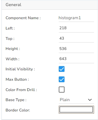
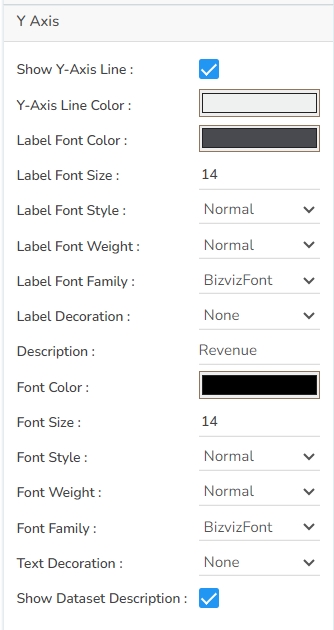
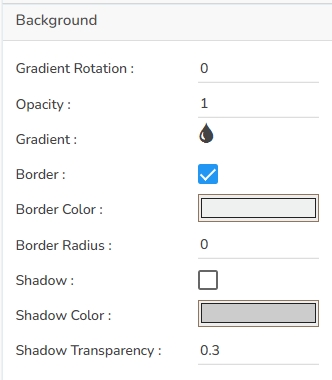
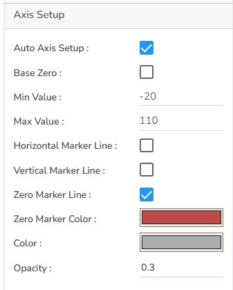

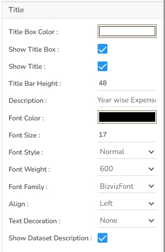
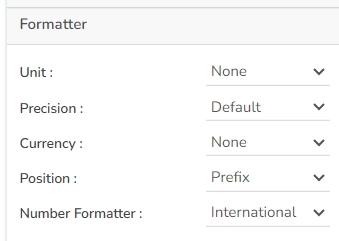
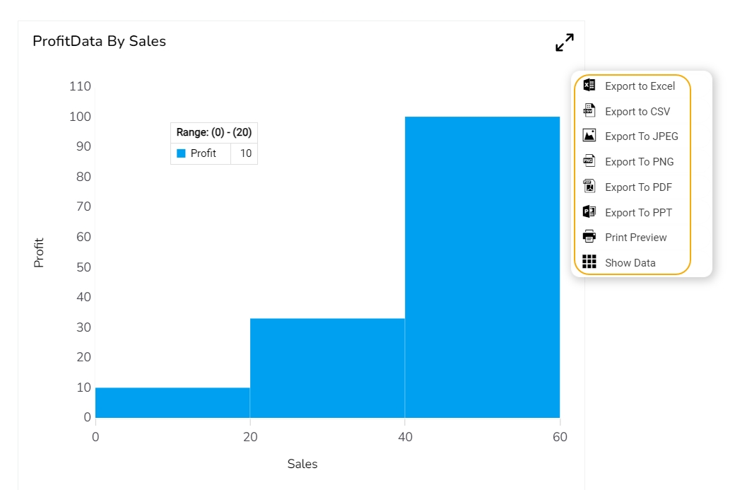


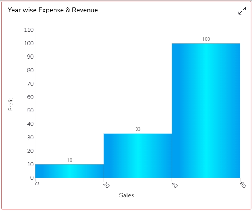

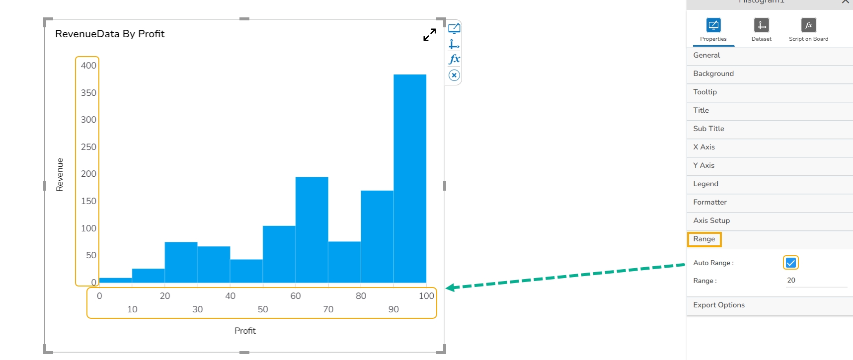

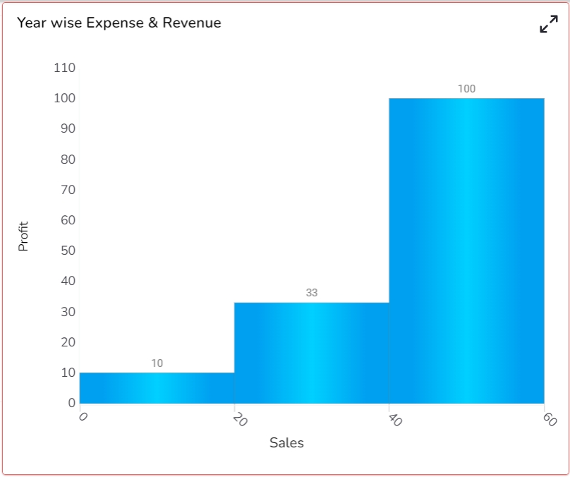
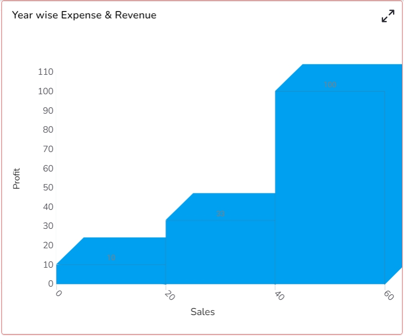
Width: Set the width of the chart in pixels.
Initial Visibility: Check this option to enable the chart's visibility upon the initial load.
Max Button: Enable or disable the maximization button for expanding the chart view.
Color From Drill: Allow the chart to inherit colors from a drill-down operation.
Base Type: Select the base shape of the columns, such as a Rectangle, Cylinder, Plain, Gradient 1, Gradient 2, or Gradient 3.
Chart Type: Choose the chart’s layout, such as Stacked, Clustered, Overlaid, or 100%.
Bar Size: Adjust the width of the bars within the chart.
Click the Save option to display Tool Tip in the default display.
Background Color: Choose a background color for the tooltip to enhance visibility and match your visual theme.
Opacity: Adjust the tooltip's transparency to ensure it doesn't obstruct important chart elements while remaining readable.
Border Color: Select a border color that complements the tooltip, ensuring clarity and contrast against the chart background.
Tooltip Font Size: Customize the font size to maintain readability, adapting it to the overall chart presentation.
Box Width: Define the width of the tooltip box to ensure it fits the content appropriately and maintains a neat appearance.
Precision: Set the numerical precision for data values displayed in the tooltip, aiding in clearer data interpretation.
Highlighter: Toggle the highlighter to emphasize specific data points on the chart, drawing user attention to crucial information.
Click the Add Color option to add multiple colors.
Click the Save option to apply the selected background colors.
Border: Add a border around the chart for a defined perimeter.
Border Color: Alter the border color to complement or contrast with the chart.
Border Radius: Round the corners of the chart border for a smoother look.
Shadow: Enable shadows to create depth and a 3D-like effect.
Shadow Color: Customize the shadow color to blend naturally with the chart.
Shadow Transparency: Adjust the transparency level to control the intensity of the shadow effect.
Description: Add a description text below the title.
Font Color: Select the color of the title text.
Font Size: Specify the size of the title text.
Font Style: Choose a Font style using the drop-down menu (e.g., italic or normal).
Font Weight: Set the weight (boldness) of the font. The supported options are Normal, Bold, 300, 600, and 900.
Font Family: Choose the font family for the title text from the given choices.
Align: Align the title text (e.g., left, center, right).
Text Decoration: Apply text decorations (e.g., underline) to the title text.
Show Dataset Description: Enable or disable the dataset description in the title.
Font Style: Choose the font style for the Sub-title (e.g., italic or normal).
Font Weight: Set the weight (boldness) of the font. The supported options are Normal, Bold, 300, 600, and 900.
Font Family: Choose the font family for the sub-title text from the given choices.
Align: Align the sub-title text (e.g., left, center, right).
Text Decoration: Apply text decorations (e.g., underline) to the sub-title text.
Label Font Style: Set the style (e.g., italic) for X-axis labels.
Label Font Weight: Determine the weight (e.g., bold) for X-axis label fonts.
Label Font Family: Choose the font family for X-axis labels.
Label Decoration: Add decorations (e.g., underline) to X-axis labels.
Label Rotation: Set the rotation angle for X-axis labels.
Tilted Label: Enable to tilt X-axis labels for better readability.
Description: Add a description for the X-axis.
Font Color: Specify the color of the X-axis text.
Font Size: Set the font size for the X-axis text.
Font Style: Choose the font style (e.g., italic) for X-axis text.
Font Weight: Determine the weight (boldness) of the X-axis text.
Font Family: Select the font family for the X-axis text.
Text Decoration: Add text decorations (e.g., underline) to the X-axis labels.
Category Tick Marks: Activate tick marks for categories on the X-axis.
Marker Color: Choose the color of the markers on the X-axis.
Show Dataset Description: Toggle the visibility of dataset descriptions on the X-axis.
Label Font Style: Set the style (e.g., italic) for Y-axis labels.
Label Font Weight: Determine the weight (e.g., bold) for Y-axis label fonts.
Label Font Family: Choose the font family for Y-axis labels.
Label Decoration: Add decorations (e.g., underline) to Y-axis labels.
Description: Add a description for the Y-axis.
Font Color: Specify the color of the Y-axis text.
Font Size: Set the font size for the Y-axis text.
Font Style: Choose the font style (e.g., italic) for Y-axis text.
Font Weight: Determine the weight (boldness) of the Y-axis text.
Font Family: Select the font family for the Y-axis text.
Text Decoration: Add text decorations (e.g., underline) to the Y-axis labels.
Show Dataset Description: Toggle the visibility of dataset descriptions on the Y-axis.
Font Family: Select the font family for the legend text.
Font Style: Choose the font style (e.g., italic) for the legend text.
Text Decoration: Add text decorations (e.g., underline) to the legend text.
Hide on Load: Determine if the legend should be hidden when the chart initially loads.
Number Formatter: Apply a specific notation or style to the numbers (e.g., Indian, International).
Horizontal Marker Line: Add a horizontal line at a specified value for reference.
Vertical Marker Line: Place a vertical line at a specific point for highlighting.
Zero Marker Line: Include a line at zero to emphasize the baseline.
Zero Marker Color: Customize the color of the zero marker line.
Color: Set a color for the marker line.
Opacity: Adjust the color transparency of the axis marker line.
Export PNG: Export the chart as a PNG image (.png).
Export PPT: Export the chart to a PowerPoint presentation (.pptx).
Export PDF: Export the chart as a PDF document (.pdf).
Show Print: Include an option to print the chart directly.
Export Heading: Add a custom heading to the exported file.
Export Sub Heading: Add a custom subheading to the exported file.
Export File Name: Specify the file name for the exported file/dashboard.
Global Export Type: Define the default export format using the drop-down (e.g., Screenshot, Tabular).
Width: Determine the width of the chart to maintain proper aspect ratio and visibility.
Initial Visibility: Choose whether the chart is visible when the dashboard or report initially loads.
Max Button: Enable a button allowing users to maximize the chart for a larger view.
Color From Drill: Use this to apply colors based on the current drill-down state for better data differentiation.
Shadow: Enable and configure the shadow effect to add depth to the chart's appearance.
Base Type: Assign a base data type or category to dictate chart structure and data mapping.
Luminance: Adjust the bubble luminance to impact the visibility and contrast in the chart.
Click the Add Color option to add multiple colors.
Click the Save option to apply the selected background colors.
Border: Add a border around the chart for a defined perimeter.
Border Color: Alter the border color to complement or contrast with the chart.
Border Radius: Round the corners of the chart border for a smoother look.
Shadow: Enable shadows to create depth and a 3D-like effect.
Shadow Color: Customize the shadow color to blend naturally with the chart.
Shadow Transparency: Adjust the transparency level to control the intensity of the shadow effect.
Once the new Range gets added, the user can modify the Range Name, Range From, Range Up to limits, and Range Color.
The user also gets the option to Delete an existing Range.
Click the Save option to apply the selected Range Properties.
The users can also choose to apply dynamic colors to the bubble by selecting the Dynamic Range option.
Click the Save option to display Tool Tip in the default display.
Background Color: Choose a background color for the tooltip to enhance visibility and match your visual theme.
Opacity: Adjust the tooltip's transparency to ensure it doesn't obstruct important chart elements while remaining readable.
Border Color: Select a border color that complements the tooltip, ensuring clarity and contrast against the chart background.
Tooltip Font Size: Customize the font size to maintain readability, adapting it to the overall chart presentation.
Box Width: Define the width of the tooltip box to ensure it fits the content appropriately and maintains a neat appearance.
Precision: Set the numerical precision for data values displayed in the tooltip, aiding in clearer data interpretation.
Highlighter: Toggle the highlighter to emphasize specific data points on the chart, drawing user attention to crucial information.
Description: Add the title text.
Font Color: Select the color of the title text.
Font Size: Specify the size of the title text.
Font Style: Choose the font style (e.g., italic or normal).
Font Weight: Set the weight (boldness) of the font. The supported options are Normal, Bold, 300, 600, and 900.
Font Family: Choose the font family for the title text from the given choices.
Align: Align the title text (e.g., left, center, right).
Text Decoration: Apply text decorations (e.g., underline) to the title text.
Font Style: Choose the font style for the Sub-title (e.g., italic or normal).
Font Weight: Set the weight (boldness) of the font. The supported options are Normal, Bold, 300, 600, and 900.
Font Family: Choose the font family for the sub-title text from the given choices.
Align: Align the sub-title text (e.g., left, center, right).
Text Decoration: Apply text decorations (e.g., underline) to the sub-title text.
Label Font Style: Set the style (e.g., italic) for X-axis labels.
Label Font Weight: Determine the weight (e.g., bold) for X-axis label fonts.
Label Font Family: Choose the font family for X-axis labels.
Label Decoration: Add decorations (e.g., underline) to X-axis labels.
Label Rotation: Set the rotation angle for X-axis labels.
Tilted Label: Enable the X-axis labels to tilt for better readability.
Description: Add a description for the X-axis.
Font Color: Specify the color of the X-axis text.
Font Size: Set the font size for the X-axis text.
Font Style: Choose the font style (e.g., italic) for the X-axis text.
Font Weight: Determine the weight (boldness) of the X-axis text.
Font Family: Select the font family for the X-axis text.
Text Decoration: Add text decorations (e.g., underline) to the X-axis labels.
Category Tick Marks: Activate tick marks for categories on the X-axis.
Marker Color: Choose the color of the markers on the X-axis.
Show Dataset Description: Toggle the visibility of the dataset description on the X-axis.
Label Font Style: Set the style (e.g., italic) for Y-axis labels.
Label Font Weight: Determine the weight (e.g., bold) for Y-axis label fonts.
Label Font Family: Choose the font family for Y-axis labels.
Label Decoration: Add decorations (e.g., underline) to Y-axis labels.
Description: Add a description for the Y-axis.
Font Color: Specify the color of the Y-axis text.
Font Size: Set the font size for the Y-axis text.
Font Style: Choose the font style (e.g., italic) for Y-axis text.
Font Weight: Determine the weight (boldness) of the Y-axis text.
Font Family: Select the font family for the Y-axis text.
Text Decoration: Add text decorations (e.g., underline) to the Y-axis labels.
Font Family: Select the font family for the legend text.
Font Style: Choose the font style (e.g., italic) for the legend text.
Text Decoration: Add text decorations (e.g., underline) to the legend text.
Hide on Load: Determine if the legend should be hidden when the chart initially loads.
Number Formatter: Apply a specific notation or style to the numbers (e.g., Indian, International).
Vertical Marker Line: Place a vertical line at a specific point for highlighting.
Horizontal Marker Line: Add a horizontal line at a specified value for reference.
Zero Marker Line: Include a line at zero to emphasize the baseline.
Zero Marker Color: Customize the color of the zero marker line.
Color: Choose the color for the axis and labels.
Opacity: Adjust the transparency of the axis and markers.
Band Range
Band Color
Opacity
The user also gets an option to Remove the inserted Band details.
Click the Save option to save the details.
Use a checkmark provided for the Enable Color Bands option.
Export PNG: Export the chart as a PNG image (.png).
Export PPT: Export the chart to a PowerPoint presentation (.pptx).
Export PDF: Export the chart as a PDF document (.pdf).
Show Print: Include an option to print the chart directly.
Export Heading: Add a custom heading to the exported file.
Export Sub Heading: Add a custom subheading to the exported file.
Export File Name: Specify the file name for the exported file/dashboard.
Global Export Type: Define the default export format using the drop-down (e.g., Screenshot, Tabular).


Check out the below given walk-through on how to use the Line chart component in Designer module.
A line chart or line plot or line graph or curve chart is a type of chart that displays information as a series of data points called 'markers' connected by straight line segments. It is a basic type of chart common in many fields. The Line charts connect individual numeric data points to create a sequence of values. They are primarily used to display trends over a period.
To view trends in data over a period.
Example: To indicate increasing revenue or varying stock price
Mixed Chart- Combine a line graph with column charts to provide visual cues for further investigation.
Example: A column chart representing the numeric score of students combined with the line chart corresponding proficiency score
Component Name: Specify a unique name for the chart component for easy identification and reference. This field contains an auto-generated name indicating the sequence of the component in the dashboard.
Left: Set the horizontal position of the chart on the canvas.
Top: Set the vertical position of the chart on the canvas.
Height: Adjust the height of the chart for a preferred view.
Steps to configure the Threshold Settings:
Open Threshold Settings: Navigate to the Threshold Settings section within the line chart Properties panel.
Configure Threshold Properties:
Show Threshold Line: Use a checkmark in the given box to display the threshold lines in the chart.
Access the Threshold Settings section using the Line chart properties.
Put a checkmark in the Show Threshold Line option.
Set the Threshold 1 and Threshold 2 values.
Put a checkmark in the given box to Fill the Threshold.
Click the Fill Colors
The Threshold Fill window opens.
You may configure or modify the default information for the following options:
Level
Color
Preview: Check the updated line chart to verify that the threshold lines are correctly displayed. Adjust as necessary.
Check out the illustration on Annotation Settings for the Line chart.
Steps to configure the Annotation Settings:
Pre-requisites: Please create a data connection and map it with the Line chart. To make the data preview easy for the user, a Data Grid component has been mapped with the same data connection.
Open Annotation Settings: Go to the Line chart Properties and locate the Annotation Settings section. Open it with a click.
Configure Annotation: By providing the following information.
Annotations: Put a checkmark in the given checkbox to enable the Annotations.
Preview: Click the Preview icon to ensure the annotation appears correctly.
The user can make any necessary adjustments by re-opening the Annotation Settings.
Select a different color for the annotation lines using the color menu.
Open the preview, the color of the annotation lines will be updated based on your selection in the chart.
The user who wants to show the series description can use the tooltip by enabling it.
The user can show the series description and get the tooltip by clicking the Show Tool Tip option.
The Tool Tip Configuration window opens.
Select any Tool Tip option. The supported Tool Tip is None, Default, Custom.
Background Color: Set the color that fills the tooltip's background to ensure it stands out or blends with your design.
Opacity: Control the transparency level of the tooltip, allowing for better integration with the chart's design and visibility of underlying elements.
Border Color: Define the color of the tooltip's border to highlight or subtly outline the content.
Tooltip Font Size
Gradient Rotation: Modify the angle of the gradient to achieve the desired effect.
Opacity: Set the transparency level to balance visibility and aesthetics.
Gradient: Choose and customize the gradient colors to match your theme.
Click the
Title Box Color: Choose the background color for the title box.
Show Title Box: Enable or disable the display of the title box on the chart.
Show Title: Enable or disable the display of the title text.
Title Bar Height: Set the height of the title bar.
Show Sub Title: Enable or disable the display of the sub-title text.
Description: Add a description text below the sub-title.
Font Color: Select the color of the sub-title text.
Font Size: Specify the size of the sub-title text.
Show X-Axis Line: Toggle the visibility of the X-axis line.
X-Axis Line Color: Select the color for the X-axis line.
Label Font Color: Choose the font color for X-axis labels.
Label Font Size: Specify the size of the font for X-axis labels.
Show Y-Axis Line: Toggle the visibility of the Y-axis line.
Y-Axis Line Color: Select the color for the Y-axis line.
Label Font Color: Choose the font color for Y-axis labels.
Label Font Size: Specify the size of the font for Y-axis labels.
`
Show Legend: Toggle the visibility of the chart legend.
Font Color: Choose the font color for the legend text.
Font Weight: Determine the weight (boldness) of the legend text.
Font Size: Specify the size of the font for the legend text.
Unit: Define the unit of measurement for the values displayed in the chart.
Precision: Set the number of decimal places to display for numerical values.
Currency: Format the numbers as a currency with the appropriate symbol.
Position: Determine the position of the formatted value (e.g., before or after the number).
Auto Axis Setup: Automatically adjust the axis settings based on the dataset.
Base Zero: Ensure the axis starts at zero for better data comparison.
Min Value: Define the minimum value displayed on the axis.
Max Value: Set the maximum value for the axis range.
Enable Context Menu: Activate a right-click context menu for quick access to export options in the preview mode of the chart.
Export Excel: Save the chart data in an Excel file format (.xlsx).
Export CSV: Export the chart data into a CSV file format (.csv).
Export JPEG: Export the chart as a JPEG image (.jpg).
The user can get the Export Context Menu from the preview mode to download the reports in different export formats.
The Repeater properties allow users to create dynamic and repetitive chart displays based on a specified category field. Here's a breakdown of the key fields within the Repeater properties:
Repeater: Enable this option to activate the feature for generating repetitive charts.
Group by Field: Choose the field by which the charts should be grouped. For instance, selecting the "Year" field will produce separate charts for each year.
No. of Columns: Define the number of columns to be used when arranging the repetitive charts.
Row Height: Specify the height of each row for the charts within the repeater.
The chart is displayed grouped by the selected field. In this case, the Year category is selected. Thus, the chart displays yearwise data separately.
The user can change the color of each series by selecting any of the series. The user can enable the Data Label to show the Value of each Revenue & Expense.
Download the given sample data and map it as mentioned below to plot your Line chart.
Use the Year column as Category field, and other columns as Series to plot data.
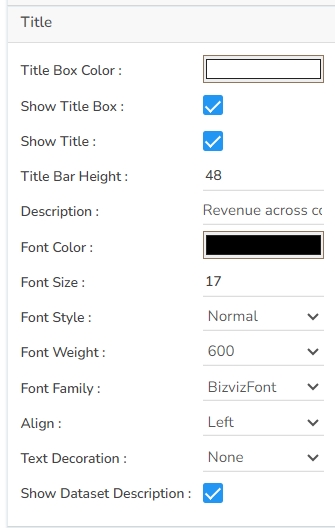
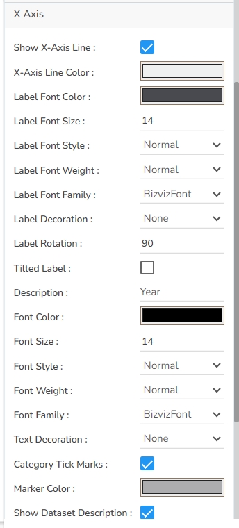
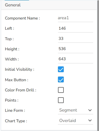

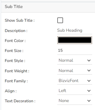
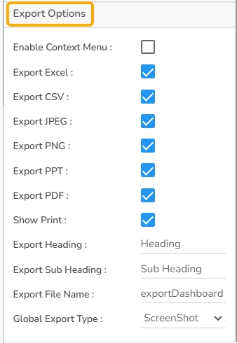


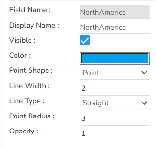
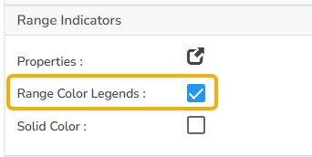


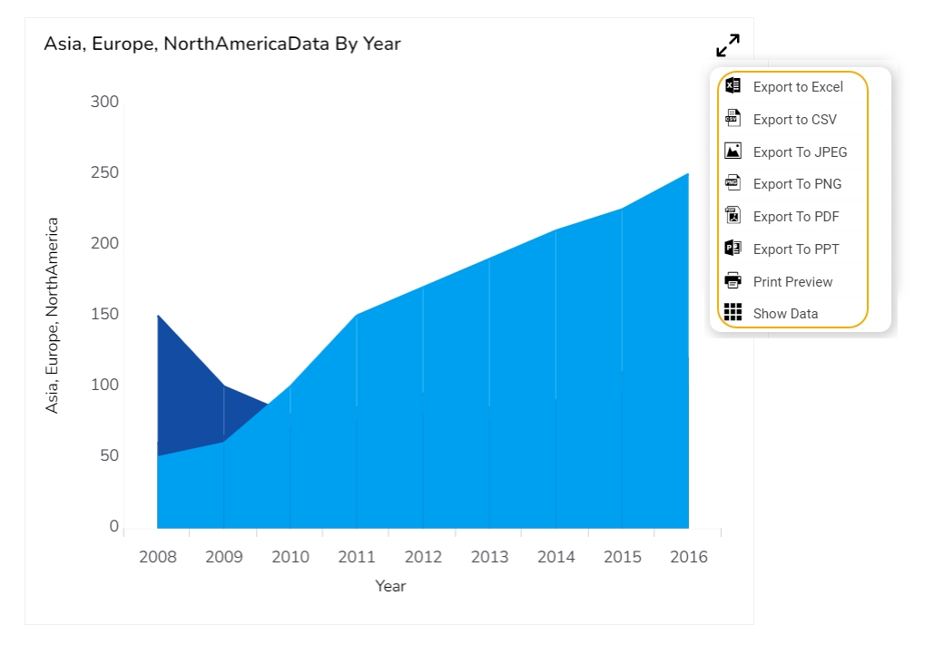


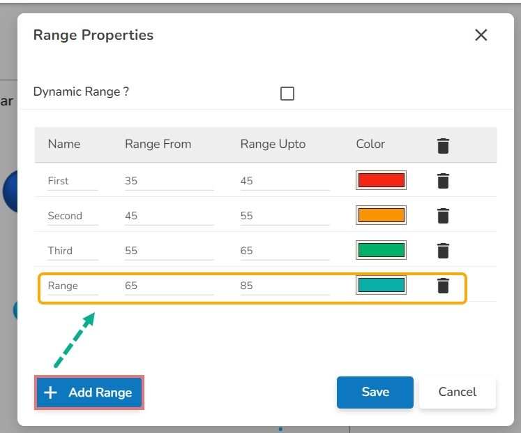
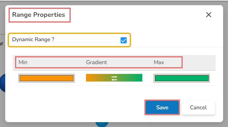
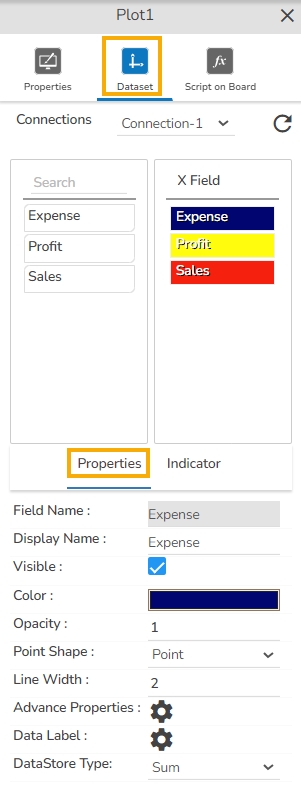


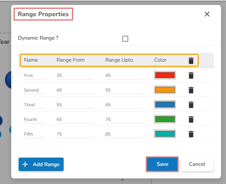
Width: Adjust the width of the chart to fit your layout requirements.
Initial Visibility: Enable this option to ensure the chart is visible upon loading.
Max Button: Use this option to maximize the chart for a detailed view.
Color From Drill: Enable this option to get colors from the source data for consistent display upon drill down.
Points: Select this checkbox by deciding whether to show or hide points on the line.
Line Form: Choose the style of the line (Curve, Segment, Step, Reverse Step, Horizontal, Vertical) from the drop-down menu.
Threshold 2: Set a value for the lower threshold limit.
Fill Threshold: Use a checkmark in the given box to fill the color for the entire space between the threshold values.
Fill Colors: Choose colors for the threshold fill.
Preview: Check the updated line chart to verify that the threshold lines are correctly displayed. Adjust as necessary.
Opacity
Label
Label Color
Click the Save option to save the inserted details.
Manage Annotation: Click the Manage Annotation icon to manage the Annotation Dataset by setting Connection, Label Field, and Annotation Field.
Click the Save option to save the mapped Annotation details.
Click the Reset option to reset the filled information.
Line Color: Select a color for the annotation lines.
Dash Line: Put a checkmark in the checkbox to draw lines with a dash pattern.
Line Width: Set the width of the annotation lines.
Line Opacity: Set the opacity of the annotation lines.
Tooltip Title: Provide a title to be displayed in the tooltip.
Click the Save option.
Box Width: Specify the width of the tooltip box to accommodate content size and maintain a tidy layout.
Precision: Select the number of decimal places to display for numerical values within the tooltip, ensuring clarity and precision.
Highlighter: Use color indicators to highlight specific bars or data points within the tooltip, facilitating quick visual recognition.
To use the Custom option for the Tool Tip configuration, please refer to the Tooltip (Default & Custom) page.
Click the Add Color option to add multiple colors.
Click the Save option to apply the selected background colors.
Border: Add a border around the chart for a defined perimeter.
Border Color: Alter the border color to complement or contrast with the chart.
Border Radius: Round the corners of the chart border for a smoother look.
Shadow: Enable shadows to create depth and a 3D-like effect.
Shadow Color: Customize the shadow color to blend naturally with the chart.
Shadow Transparency: Adjust the transparency level to control the intensity of the shadow effect.
Description: Add a description text below the title.
Font Color: Select the color of the title text.
Font Size: Specify the size of the title text.
Font Style: Choose a Font style using the drop-down menu (e.g., italic or normal).
Font Weight: Set the weight (boldness) of the font. The supported options are Normal, Bold, 300, 600, and 900.
Font Family: Choose the font family for the title text from the given choices.
Align: Align the title text (e.g., left, center, right).
Text Decoration: Apply text decorations (e.g., underline) to the title text.
Show Dataset Description: Enable or disable the dataset description in the title.
Font Style: Choose the font style for the Sub-title (e.g., italic or normal).
Font Weight: Set the weight (boldness) of the font. The supported options are Normal, Bold, 300, 600, and 900.
Font Family: Choose the font family for the sub-title text from the given choices.
Align: Align the sub-title text (e.g., left, center, right).
Text Decoration: Apply text decorations (e.g., underline) to the sub-title text.
Label Font Style: Set the style (e.g., italic) for X-axis labels.
Label Font Weight: Determine the weight (e.g., bold) for X-axis label fonts.
Label Font Family: Choose the font family for X-axis labels.
Label Decoration: Add decorations (e.g., underline) to X-axis labels.
Label Rotation: Set the rotation angle for X-axis labels.
Tilted Label: Enable to tilt X-axis labels for better readability.
Description: Add a description for the X-axis.
Font Color: Specify the color of the X-axis text.
Font Size: Set the font size for the X-axis text.
Font Style: Choose the font style (e.g., italic) for X-axis text.
Font Weight: Determine the weight (boldness) of the X-axis text.
Font Family: Select the font family for the X-axis text.
Text Decoration: Add text decorations (e.g., underline) to the X-axis labels.
Category Tick Marks: Activate tick marks for categories on the X-axis.
Marker Color: Choose the color of the markers on the X-axis.
Show Dataset Description: Toggle the visibility of dataset descriptions on the X-axis.
Label Font Style: Set the style (e.g., italic) for Y-axis labels.
Label Font Weight: Determine the weight (e.g., bold) for Y-axis label fonts.
Label Font Family: Choose the font family for Y-axis labels.
Label Decoration: Add decorations (e.g., underline) to Y-axis labels.
Description: Add a description for the Y-axis.
Font Color: Specify the color of the Y-axis text.
Font Size: Set the font size for the Y-axis text.
Font Style: Choose the font style (e.g., italic) for Y-axis text.
Font Weight: Determine the weight (boldness) of the Y-axis text.
Font Family: Select the font family for the Y-axis text.
Text Decoration: Add text decorations (e.g., underline) to the Y-axis labels.
Show Dataset Description: Toggle the visibility of dataset descriptions on the Y-axis.
Font Family: Select the font family for the legend text.
Font Style: Choose the font style (e.g., italic) for the legend text.
Text Decoration: Add text decorations (e.g., underline) to the legend text.
Hide on Load: Determine if the legend should be hidden when the chart initially loads.
Number Formatter: Apply a specific notation or style to the numbers (e.g., Indian, International).
Horizontal Marker Line: Add a horizontal line at a specified value for reference.
Vertical Marker Line: Place a vertical line at a specific point for highlighting.
Zero Marker Line: Include a line at zero to emphasize the baseline.
Zero Marker Color: Customize the color of the zero marker line.
Color: Set a color for the marker line.
Opacity: Adjust the color transparency of the axis marker line.
Export PNG: Export the chart as a PNG image (.png).
Export PPT: Export the chart to a PowerPoint presentation (.pptx).
Export PDF: Export the chart as a PDF document (.pdf).
Show Print: Include an option to print the chart directly.
Export Heading: Add a custom heading to the exported file.
Export Sub Heading: Add a custom subheading to the exported file.
Export File Name: Specify the file name for the exported file/dashboard.
Global Export Type: Define the default export format using the drop-down (e.g., Screenshot, Tabular).
Column Margin: Set the margin between columns in the repetitive chart layout.
Row Margin: Define the margin between rows to ensure proper spacing between the repetitive charts.


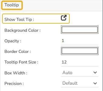


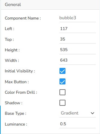
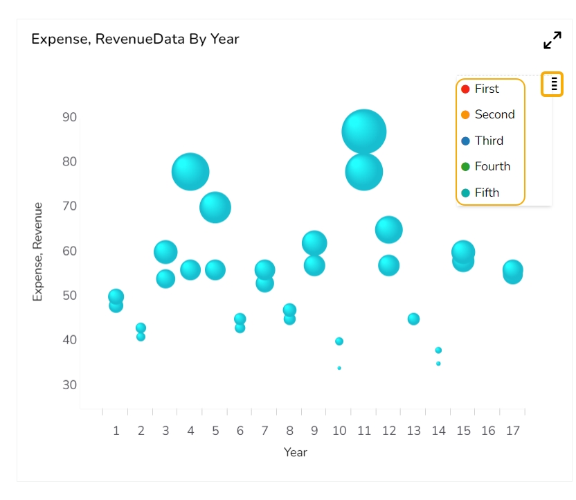
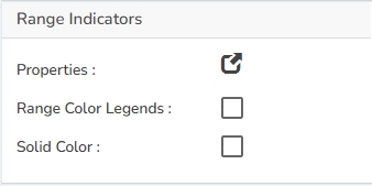


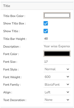


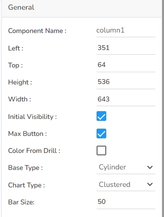
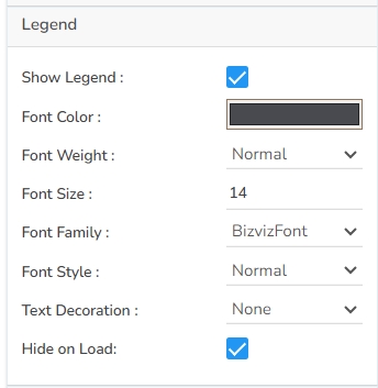
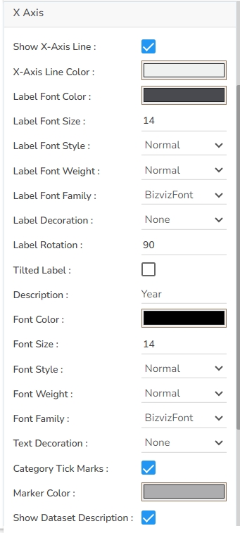
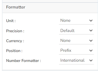

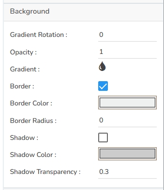

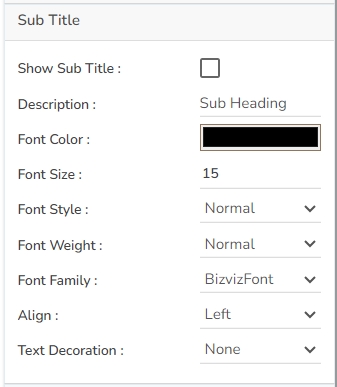
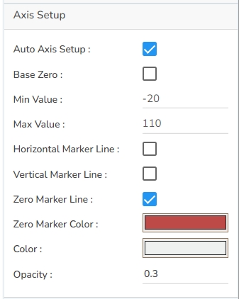


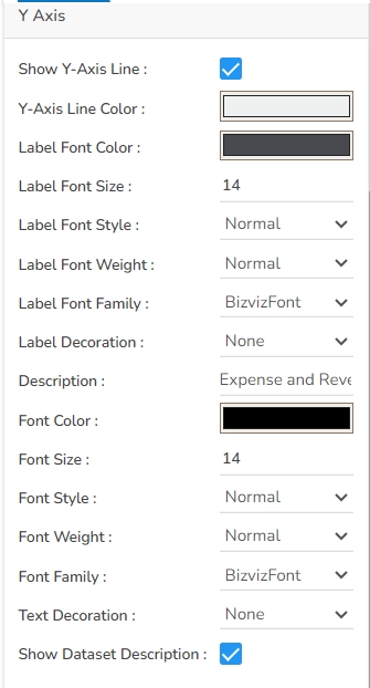


Bar Charts are useful for comparing classes or groups of data. They are one of the most commonly used types of graphs because they are simple to create and very easy to interpret. Several variations are included in the standard bar chart like stacked bar charts, grouped bar charts, and horizontal bar charts.
To interpret small data sets.
Users can perform observations over a period.
Examples: Quarterly sales of an organization, Percentage of change in sales or revenue.
Use stacked bar charts: Where multiple categories can be clubbed together on top of each other, which makes addressing multiple questions easy.
Use bars side by side: Where comparison between multiple categories becomes easier instead of toggling between charts.
Add color for quick insight: Displaying the bars with colors will make users pay quick attention to important tasks.
The General Properties panel allows you to modify the core attributes of the Bar chart. Here are the fields available:
Component Name: Assign a unique identifier to the chart for easy reference. This field contains an auto-generated name indicating the sequence of the component in the dashboard.
Left: Specify the left position coordinate of the chart component on the canvas.
Top: Indicate the top position coordinate for the chart placement.
Height: Set the height of the chart to determine its vertical size.
A slider has been added to the Bar chart to adjust and view a specific subset of data based on the selected range. It enhances data visualization by enabling dynamic control over the displayed data, making analyzing various sections of a Bar chart easy.
The following are the Slider properties provided under the Designer charting properties panel:
Show Slider: Enable or disable the Show Slider option to display or hide the slider on the chart.
Slider Color: Set the slider color to customize the slider’s appearance.
Slider Width Ratio: Adjust the Slider Width Ratio to control the thickness of the slider.
Slider Range
Steps to Configure the Threshold Settings:
Open Threshold Settings: Navigate to the Threshold Settings section within the bar chart Properties panel.
Configure Threshold Properties:
Show Threshold Line: Use a checkmark in the given box to display the threshold lines in the chart.
Access the Threshold Settings section using the Bar chart properties.
Put a checkmark in the Show Threshold Line option.
Set the Threshold 1 and Threshold 2 values.
The Threshold Fill window opens.
You may configure or modify the default information for the following options:
Level
Color
Preview: Check the updated bar chart to verify that the threshold lines are correctly displayed. Adjust as necessary.
Gradient Rotation: Modify the angle of the gradient to achieve the desired effect.
Opacity: Set the transparency level to balance visibility and aesthetics.
Gradient: Choose and customize the gradient colors to match your theme.
Click the
Tooltips enhance user interaction by displaying additional information about chart elements.
Show Tool Tip: Enable this option to display tooltips for the chart series, providing descriptions or data insights.
Click the Show Tool Tip icon to access the Tool Tip Configuration window.
Select the Default option.
Title Box Color: Choose the background color for the title box.
Show Title Box: Enable or disable the display of the title box on the chart.
Show Title: Enable or disable the display of the title text.
Title Bar Height: Set the height of the title bar.
Show Sub Title: Enable or disable the display of the sub-title text.
Description: Add a description text below the sub-title.
Font Color: Select the color of the sub-title text.
Font Size: Specify the size of the sub-title text.
Show X-Axis Line: Toggle the visibility of the X-axis line through this field.
X-Axis Line Color: Select the color for the X-axis line.
Label Font Color: Choose the font color for X-axis labels.
Label Font Size: Specify the size of the font for X-axis labels.
Show Y-Axis Line: Toggle the visibility of the Y-axis line.
Y-Axis Line Color: Select the color for the Y-axis line.
Label Font Color: Choose the font color for Y-axis labels.
Text Wrap: Put a checkmark in the box to wrap the text.
Show Legend: Toggle the visibility of the chart legend.
Font Color: Choose the font color for the legend text.
Font Weight: Determine the weight (boldness) of the legend text.
Font Size: Specify the size of the font for the legend text.
Unit: Define the unit of measurement for the values displayed in the chart.
Precision: Set the number of decimal places to display for numerical values.
Currency: Format the numbers as a currency with the appropriate symbol.
Position: Determine the position of the formatted value (e.g., before or after the number).
Auto Axis Setup: Automatically adjust the axis settings based on the dataset.
Base Zero: Ensure the axis starts at zero for better data comparison.
Min Value: Define the minimum value displayed on the axis.
Max Value: Set the maximum value for the axis range.
Enable Context Menu: Activate a right-click context menu for quick access to export options in the preview mode of the chart.
Export Excel: Save the chart data in an Excel file format (.xlsx).
Export CSV: Export the chart data into a CSV file format (.csv).
Export JPEG: Export the chart as a JPEG image (.jpg).
The user can get the Export Context Menu from the preview mode to download the reports in different export formats.
The user can change the color of each series by selecting any of the series and enabling the Data Label which shows the Value of each Revenue & Expense.
It is possible to get the following variants of the Bar chart by changing the Properties.
Download the given sample data and map it as mentioned below to plot your Bar chart:
Use the Year column as Category field and the other columns as Series to plot data as shown in the given examples below:

Width: Adjust the width of the chart to control its horizontal dimension.
Initial Visibility: Enable to ensure the chart appears during the initial preview.
Max Button: Enable or disable the max button to allow users to maximize the chart for a more detailed view.
Color From Drill: Enable this option to choose whether the colors displayed should derive from drill-down operations.
Base Type: Select the base type for bar categorization in the chart.
Chart Type: Define the overall chart type, such as stacked or side by side, for displaying data.
Bar Size: Configure the size of each bar to adjust spacing and appearance.
Actions: Enable this option to get the actions icon to interact with the chart in the preview mode.
Animation: Enable animations for the chart to enhance visual transitions and user engagement.
Slider Range Value: Use the Slider Range Value to specify the current value within the slider range.
Slider Position: Change the Slider Position to move the slider to a desired location on the chart.
Border Opacity: Control the Border Opacity to adjust the transparency of the slider's border.
Selection Opacity: Adjust the transparency of the selected portion of the slider.
Container Opacity: Control the transparency of the slider's container.
Show Slider Text: Enable or disable the text display on the slider.
Default Slider Size: Set the default size of the slider for the initial display.
Threshold 2: Set a value for the lower threshold limit.
Fill Threshold: Use a checkmark in the given box to fill the color for the entire space between the threshold values.
Fill Color: Choose colors for the threshold fill.
Preview: Check the updated bar chart to verify that the threshold lines are correctly displayed. Adjust as necessary.
Click the Fill Colors icon.
Opacity
Label
Label Color
Click the Save option to save the inserted details.
Click the Add Color option to add multiple colors.
Click the Save option to apply the selected background colors.
Border: Add a border around the chart for a defined perimeter.
Border Color: Alter the border color to complement or contrast with the chart.
Border Radius: Round the corners of the chart border for a smoother look.
Shadow: Enable shadows to create depth and a 3D-like effect.
Shadow Color: Customize the shadow color to blend naturally with the chart.
Shadow Transparency: Adjust the transparency level to control the intensity of the shadow effect.
Stack Border Color: Choose the border color that enhances the visual distinction of the stack within the chart.
Stack Border Width: Define the thickness of the stack border. Adjusting this value can emphasize the stack separation.
Stack Border Radius: Round the edges of the stack border for a softer appearance. This can provide a more polished and cohesive look to the chart elements.
Click the Save option to display Tool Tip in the default display.
Background Color: Choose a background color for the tooltip to enhance visibility and match your visual theme.
Opacity: Adjust the tooltip's transparency to ensure it doesn't obstruct important chart elements while remaining readable.
Border Color: Select a border color that complements the tooltip, ensuring clarity and contrast against the chart background.
Tooltip Font Size: Customize the font size to maintain readability, adapting it to the overall chart presentation.
Box Width: Define the width of the tooltip box to ensure it fits the content appropriately and maintains a neat appearance.
Precision: Set the numerical precision for data values displayed in the tooltip, aiding in clearer data interpretation.
Highlighter: Toggle the highlighter to emphasize specific data points on the chart, drawing user attention to crucial information.
Description: Add a description text below the title.
Font Color: Select the color of the title text.
Font Size: Specify the size of the title text.
Font Style: Choose the font style (e.g., italic or normal).
Font Weight: Set the weight (boldness) of the font. The supported options are Normal, Bold, 300, 600, and 900.
Font Family: Choose the font family for the title text from the given choices.
Align: Align the title text (e.g., left, center, right).
Text Decoration: Apply text decorations (e.g., underline) to the title text.
Show Dataset Description: Enable or disable the dataset description in the title.
Font Style: Choose the font style for the Sub-title (e.g., italic or normal).
Font Weight: Set the weight (boldness) of the font. The supported options are Normal, Bold, 300, 600, and 900.
Font Family: Choose the font family for the sub-title text from the given choices.
Align: Align the sub-title text (e.g., left, center, right).
Text Decoration: Apply text decorations (e.g., underline) to the sub-title text.
Label Font Style: Set the style (e.g., italic) for X-axis labels.
Label Font Weight: Determine the weight (e.g., bold) for X-axis label fonts.
Label Font Family: Choose the font family for X-axis labels.
Label Decoration: Add decorations (e.g., underline) to X-axis labels.
Label Rotation: Set the rotation angle for X-axis labels.
Tilted Label: Enable to tilt X-axis labels for better readability.
Description: Add a description for the X-axis.
Font Color: Specify the color of the X-axis text.
Font Size: Set the font size for the X-axis text.
Font Style: Choose the font style (e.g., italic) for X-axis text.
Font Weight: Determine the weight (boldness) of the X-axis text.
Font Family: Select the font family for the X-axis text.
Text Decoration: Add text decorations (e.g., underline) to the X-axis labels.
Show Dataset Description: Toggle the visibility of dataset descriptions on the X-axis.
Label Font Size: Specify the size of the font for Y-axis labels.
Label Font Style: Set the style (e.g., italic) for Y-axis labels.
Label Font Weight: Determine the weight (e.g., bold) for Y-axis label fonts.
Label Font Family: Choose the font family for Y-axis labels.
Label Decoration: Add decorations (e.g., underline) to Y-axis labels.
Description: Add a description for the Y-axis.
Font Color: Specify the color of the Y-axis text.
Font Size: Set the font size for the Y-axis text.
Font Style: Choose the font style (e.g., italic) for Y-axis text.
Font Weight: Determine the weight (boldness) of the Y-axis text.
Font Family: Select the font family for the Y-axis text.
Text Decoration: Add text decorations (e.g., underline) to the Y-axis labels.
Category Tick Marks: Put a checkmark in the box to enable the category tick marks.
Marker Color: Specify a marker color using the color pallet.
Show Data Set Description: Toggle the visibility of dataset descriptions on the Y-axis.
Font Family: Select the font family for the legend text.
Font Style: Choose the font style (e.g., italic) for the legend text.
Text Decoration: Add text decorations (e.g., underline) to the legend text.
Hide on Load: Determine if the legend should be hidden when the chart initially loads.
Number Formatter: Apply a specific notation or style to the numbers (e.g., Indian, International).
Vertical Marker Line: Place a vertical line at a specific point for highlighting.
Horizontal Marker Line: Add a horizontal line at a specified value for reference.
Zero Marker Line: Include a line at zero to emphasize the baseline.
Zero Marker Color: Customize the color of the zero marker line.
Color: Choose the color for the axis and labels.
Opacity: Adjust the transparency of the axis and markers.
Export PNG: Export the chart as a PNG image (.png).
Export PPT: Export the chart to a PowerPoint presentation (.pptx).
Export PDF: Export the chart as a PDF document (.pdf).
Show Print: Include an option to print the chart directly.
Export Heading: Add a custom heading to the exported file.
Export Sub Heading: Add a custom subheading to the exported file.
Export File Name: Specify the file name for the exported file/dashboard.
Global Export Type: Define the default export format using the drop-down (e.g., Screenshot, Tabular).
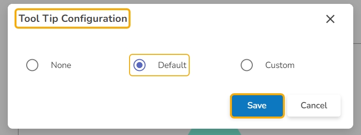


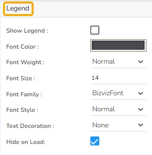


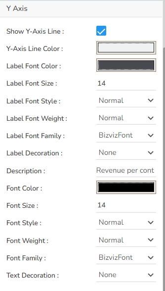
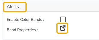
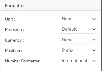
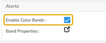
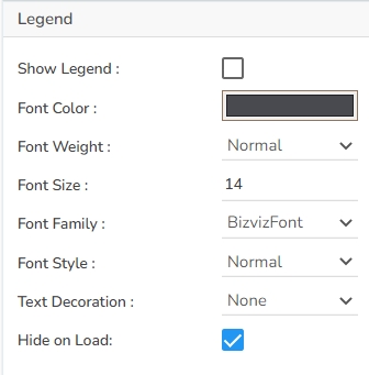
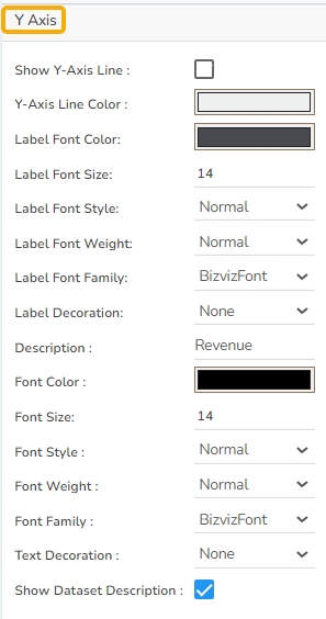
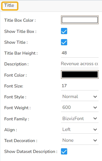
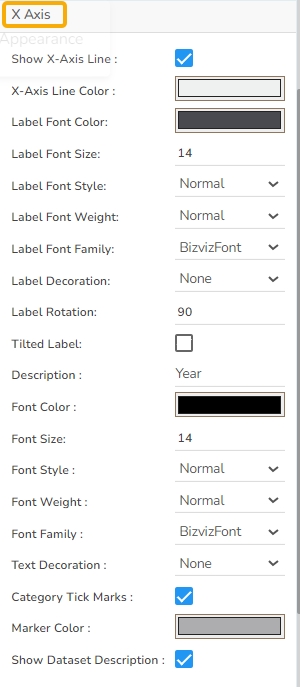


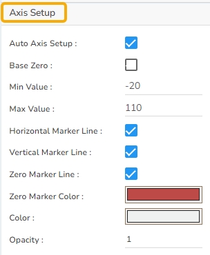
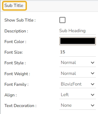


Check out the walk-through on how to use the Mixed chart component in the Designer module.
The mixed chart is a combination of a Line chart and a Column chart. It can plot a 3-series of data on the chart. Mainly used to emphasize a different series of information on the chart.
To compare multiple categories Example: To analyze the company's budget v/s revenue.
Use stacked Column charts: Where multiple categories can be clubbed together on top of each other which makes addressing multiple questions easier.
Use columns side by side: Where comparison between multiple categories becomes easier instead of toggling between charts and data.
Add color for quick insight: Where displaying columns with colors will make users pay quick attention to important tasks.
The Mixed chart offers a versatile way to represent data visually with the following configurable properties:
Component Name: Set a unique name for the component identification. This field contains an auto-generated name indicating the sequence of the component in the dashboard.
Left: Adjust this setting to position the chart horizontally on the canvas, ensuring it fits within your desired layout.
Top: Controls the vertical placement of the chart on the canvas, allowing for precise alignment with other components.
Each of these properties offers a degree of customization, enabling you to tailor the Mixed chart to best fit your presentation needs and aesthetic considerations.
Threshold properties allow users to set visual indicators within the Mixed chart to highlight specific data ranges. By configuring these properties, you can enhance data interpretation and visualization.
Show Threshold Line: Enable this to draw lines at threshold values, helping users identify critical data points at a glance.
Threshold 1: Define the upper-value limit, serving as the maximum critical point in the dataset.
Threshold 2: Specify the lower value limit, indicating the minimum important point for analysis.
Fill Threshold: Opt to fill the area between the threshold lines with color to emphasize this range.
Preview: Click the Preview icon to preview the updated Mixed chart. Check the updated mixed chart to verify that the threshold lines are correctly displayed. Adjust as necessary.
Access the Threshold Settings section using the Mixed chart properties.
Put a checkmark in the Show Threshold Line option.
Set the Threshold 1 and Threshold 2 values.
The Threshold Fill window opens.
You may configure or modify the default information for the following options:
Level
Color
Preview: Click the Preview icon to preview the updated Mixed chart. Check the updated mixed chart to verify that the threshold lines are correctly displayed. Adjust as necessary.
Annotation lines in a chart are used to highlight specific points or thresholds for easier analysis and interpretation. They typically represent key events, milestones, or significant values that help provide context or draw attention to important aspects of the data. Annotation Settings allow users to annotate important dates in a chart.
Steps to configure the Annotation Settings:
Open Annotation Settings: Go to the Mixed Chart Properties and locate the Annotation Settings section. Open it with a click.
Configure Annotation: By providing the following information.
Annotations: Put a checkmark in the given checkbox to enable the Annotations.
The tooltip properties allow customization of the information displayed when hovering over chart elements:
The user can show the series description and get the tooltip by clicking the Show Tool Tip option.
The Tool Tip Configuration window opens.
Select any Tool Tip option. The supported Tool Tip is None, Default, Custom.
The background properties offer customization for the chart's appearance:
Gradient Rotation: Adjust the angle of the gradient color applied to the chart background.
Opacity: Control the overall transparency level of the chart background.
Gradient: Enable or disable the use of gradient colors for the chart background. By clicking the gradient option, a Background gradient colors window opens to add more colors.
Title Box Color: Choose the background color for the title box.
Show Title Box: Enable or disable the display of the title box on the chart.
Show Title: Enable or disable the display of the title text.
Title Bar Height: Set the height of the title bar.
Show Sub Title: Enable or disable the display of the subtitle text.
Description: Add descriptive text below the subtitle.
Font Color: Choose the color for the subtitle text.
Font Size: Set the size of the subtitle text.
Show X-Axis Line: Enable or disable the visibility of the X-Axis line.
X-Axis Line Color: Select the color for the X-Axis line.
Label Font Color: Choose the color for the labels on the X-Axis.
Label Font Size: Set the font size of the X-Axis labels.
Show Y-Axis Line: Enable or disable the visibility of the Y-Axis line.
Y-Axis Line Color: Select the color for the Y-Axis line.
Label Font Color: Choose the color for the labels on the Y-axis.
Label Font Size: Set the font size for the Y-Axis labels.
Show Legend: Toggle the visibility of the legend in the chart.
Font Color: Select the color of the text in the legend.
Font Weight: Determine the boldness of the legend text, offering options such as normal, bold, or numerical values like 300 or 600.
Font Size: Set the size of the text displayed in the legend.
Unit: Specify the unit of measuring currency represented on the chart.
Precision: Define the number of decimal places to be displayed for numerical values to ensure accuracy and consistency.
Currency: Set the currency type for monetary values, allowing for consistent representation of financial data.
Position: Determine the placement of the formatted value about the axis or chart element, such as Prefix or Suffix.
The Second Axis provides enhanced control over your chart's data representation, allowing for dual-axis plotting and refined customization.
Second Axis: Put a checkmark in the box to get the Second Axis.
Unit: Specify the unit of measurement for data values on the second axis, ensuring clarity.
Precision: Set the number of decimal places for values on the second axis to maintain accuracy.
Currency: Define the currency type for monetary values, ensuring consistent financial representation.
The Axis Setup section provides tools for configuring the appearance and functionality of both axes in your chart. This includes options for automatic settings, value range, and marker lines for enhanced data interpretation.
Auto Axis Setup: Automatically configures axis settings to best fit the data, saving time and ensuring optimal display.
Base Zero: Sets the starting point of the axis at zero, which can help in certain visualizations by providing a standard baseline.
Min Value: Allows manual specification of the minimum value displayed on the axis, giving control over the lower limit of the data range.
Max Value
The Export Options section allows users to easily export their chart data in various formats for reporting and presentation purposes. This feature supports seamless integration with common applications and file types.
Enable Context Menu: Activates a context menu on the chart, providing quick access to export functions directly from the chart interface.
Export Excel: Allows the data to be exported as an Excel file, suitable for further analysis or sharing in a tabular format.
Export CSV: Exports data in CSV format, ideal for importing into databases or other data processing tools.
Export JPEG
The user can get the Export Context Menu from the preview mode to download the reports in different export formats.
Users can access a Properties tab under the Dataset pallet. This tab is accessible after mapping a data connection to the chart. Refer to the section for more details.
The Series field in the Dataset palette includes a Properties tab to configure key details like Field Name, Display Name, and Axis, along with options for Color, Chart Type (Line or Column), and Point Shape. If the Line chart type is selected, it also allows setting Line Width and Line Type.
Download the given sample data and map it as mentioned below to plot your Mixed chart.
Use the Year column as Category field, and other columns as Series to plot data.
Width: Modify this property to set the desired width of the chart, accommodating different amounts of data and emphasizing clarity.
Initial Visibility: Toggle this option to define whether the chart should be visible immediately upon display, aiding in managing viewability upon screen load.
Max Button: Includes an option to maximize the chart view, providing users with a focused layout for more detailed analysis.
Color From Drill: Activates color coding when drilling down within the data, offering a visual cue to assist in data navigation.
Points: Enable this feature to display distinct points on the chart's lines, highlighting specific data intervals or events.
Base Type: Choose the foundational chart type around which the mixed chart is built, determining the primary display format.
Chart Type: Select between different chart representations to best portray the data. Choose from Stacked, Clustered, Overlaid, and 100%.
Line Form: Offers a selector to decide on the line type for your chart, with options such as Curve or Segment to match the data trend.
Bar Size: Specify the dimensions of the bars in your chart, balancing between comprehensive display and clarity.
Fill Color: Select the color used for filling the threshold area, ensuring it contrasts well for easy visibility.
Click the Fill Colors icon.
Opacity
Label
Label Color
Click the Save option to save the inserted details.
Manage Annotation: Click the Manage Annotation icon to manage the Annotation Dataset by setting Connection, Label Field, and Annotation Field.
Click the Save option to save the mapped Annotation details.
Click the Reset option to reset the filled information.
Line Color: Select a color for the annotation lines.
Dash Line: Put a checkmark in the checkbox to draw lines with a dash pattern.
Line Width: Set the width of the annotation lines.
Line Opacity: Set the opacity of the annotation lines.
Tooltip Title: Provide a title to be displayed in the tooltip.
Preview: Click the Preview icon to ensure the annotation appears correctly.
The user can make any necessary adjustments by re-opening the Annotation Settings.
Select a color for the annotation lines using the color menu and enable Dashlines.
Open the preview, the color of the annotation lines will be updated based on your selection in the chart.
Click the Save option.
The user can show the series description and get the tooltip by clicking the Show Tool Tip option.
The Tool Tip Configuration window opens.
Select any Tool Tip option. The supported Tool Tip is None, Default, Custom.
Click the Save option.
Background Color: Choose the background color of the tooltip.
Opacity: Adjust the transparency level of the tooltip background.
Border Color: Select the border color for the tooltip box.
Tooltip Font Size: Customize the font size of the tooltip text.
Box Width: Modify the width of the tooltip box.
Precision: Set the number of decimal places shown in the tooltip.
Highlighter: Enable highlighting of data points when hovering over them.
Click the Add Color option to add multiple colors.
Click the Save option to apply the selected background colors.
Border: Add a border around the chart for a defined perimeter.
Border Color: Select the color of the chart border.
Border Radius: Set the roundness of the chart border corners.
Shadow: Enable or disable the drop shadow effect for the chart.
Shadow Color: Choose the color of the shadow effect.
Shadow Transparency: Adjust the transparency level of the shadow effect.
Description: Add a description text below the title.
Font Color: Select the color of the title text.
Font Size: Specify the size of the title text.
Font Style: Choose the font style (e.g., italic or normal).
Font Weight: Set the weight (boldness) of the font. The supported options are Normal, Bold, 300, 600, and 900.
Font Family: Choose the font family for the title text from the given choices.
Align: Align the title text (e.g., left, center, right).
Text Decoration: Apply text decorations (e.g., underline) to the title text.
Show Dataset Description: Enable or disable the dataset description in the title.
Font Style: Select the style of the subtitle text (e.g., italic or normal).
Font Weight: Define the weight (boldness) of the subtitle font, with options such as Normal, Bold, 300, 600, and 900.
Font Family: Choose the font family for the subtitle text from the available options.
Align: Align the subtitle text (e.g., left, center, right).
Text Decoration: Apply decorations, such as underlining, to the subtitle text.
Label Font Style: Choose the style for the label text (e.g., italic or normal) on the X-Axis.
Label Font Weight: Define the boldness of the label text on the X-Axis, with options such as Normal, Bold, 300, 600, and 900.
Label Font Family: Select the font family for the X-Axis labels.
Label Decoration: Apply text decorations, such as underlining, to the X-Axis labels.
Label Rotation: Set the rotation angle for the X-Axis labels.
Tilted Label: Enable or disable tilted label orientation on the X-Axis.
Description: Add descriptive text related to the X-Axis.
Font Color: Choose the color for the additional description text on the X-Axis.
Font: Select the font family for the description text.
Size: Adjust the size of the description text related to the X-Axis.
Font Style: Choose the style for the description text (e.g., italic or normal).
Font Weight: Specify the boldness of the description text, with options such as Normal, Bold, 300, 600, and 900.
Font Family: Choose the font family for the description text on the X-Axis.
Text Decoration: Apply decorations, such as underlining, to the description text.
Category Tick Marks: Define the appearance of tick marks on the X-Axis for categories.
Marker Color: Select the color for markers on the X-Axis.
Show Dataset Description: Enable or disable the display of additional dataset descriptions on the X-Axis.
Label Font Style: Choose the style for the label text (e.g., italic or normal) on the Y-Axis.
Label Font Weight: Define the boldness of the label text on the Y-Axis, with options such as Normal, Bold, 300, 600, and 900.
Label Font Family: Select the font family for the Y-Axis labels.
Label Decoration: Apply text decorations, such as underlining, to the Y-Axis labels.
Description: Provide descriptive text related to the Y-Axis.
Font Color: Choose the color for the additional description text on the Y-Axis.
Font Size: Adjust the size of the description text related to the Y-axis.
Font Style: Choose the style for the description text (e.g., italic or normal).
Font Weight: Specify the boldness of the description text with various options.
Font Family: Choose the font family for the description text on the Y-Axis.
Text Decoration: Apply decorations, such as underlining, to the description text.
Show Dataset Description: Enable or disable the display of dataset descriptions on the Y-axis.
Font Family: Choose the font family for the legend text.
Font Style: Decide the style of the legend text, such as italic or normal.
Text Decoration: Apply text decorations, like underlining, to the legend text.
Hide on Load: Choose whether the legend will be initially hidden upon loading the chart.
Number Formatter: Customize how numbers are displayed (International or Indian).
Position: Choose how the values appear about the axis (as a Prefix or Suffix).
Number Formatter: Decide between International or Indian number formats for consistent display.
Auto Axis Setup: Enable automatic configuration of axis settings for convenience.
Base Zero: Option to start the second axis at zero, useful for certain data visualizations.
Min Value: Manually set the minimum values the second axis should display.
Max Value: Manually set the maximum values the second axis should display.
Second Axis Description: Provide a brief description to label the second axis, improving chart readability.
Font Color: Select the font color for labels and values on the second axis to match your design theme.
Font Size: Adjust the font for better visibility or stylistic purposes.
Font Style: Choose between normal or italicized text styles for axis labels.
Font Weight: Set the font weight (e.g., normal, bold, 300, 600, 900) to emphasize axis text.
Font Family: Choose a specific font family for a consistent look and feel.
Text Decoration: Apply decorations such as underlining for additional styling.
Horizontal Marker Line: Draws a horizontal line across the chart, used to indicate specific values or thresholds along the axis.
Vertical Marker Line: Adds a vertical line on the chart, useful for marking events or specific time points in the data.
Zero Marker Line: Emphasizes the zero value line on the axis, providing a visual reference for positive and negative values.
Zero Marker Color: Customize the color of the zero marker line to match your design theme or to highlight the zero threshold.
Second Axis Zero Marker: Similar to the primary axis zero marker, this is used to highlight the zero line on the secondary axis.
Second Axis Zero Marker Color: Sets the color for the secondary axis zero marker line, allowing differentiation from the primary axis.
Color: Defines the color of axis lines, aiding in visual consistency with the chart's overall theme.
Opacity: Adjusts the transparency of axis lines and markers, offering another layer of visual sophistication and focus.
Export PNG: Similar to JPEG, but offers a lossless export option in PNG format for clearer image quality in visual presentations.
Export PPT: Facilitates exporting the chart directly into a PowerPoint file, streamlining the process of incorporating charts into slideshows.
Export PDF: Enables exporting the chart and its data in PDF format, suitable for creating shareable and print-ready documents.
Show Print: Displays a print button on the chart, allowing users to print the chart directly from the application.
Export Heading: Customizes the heading title for exported files, ensuring clarity and context when distributing chart data.
Export Sub Heading: Adds a secondary title or description to exported files, providing additional context or information.
Export File Name: Allows customization of the file name for the exported data, ensuring easy identification and organization.
Global Export Type: Sets a default export format for all charts, streamlining the export process across multiple datasets.