The user is taken to a dashboard upon clicking Model Explainer to gather insights and explanations about predictions made by the selected AutoML model.
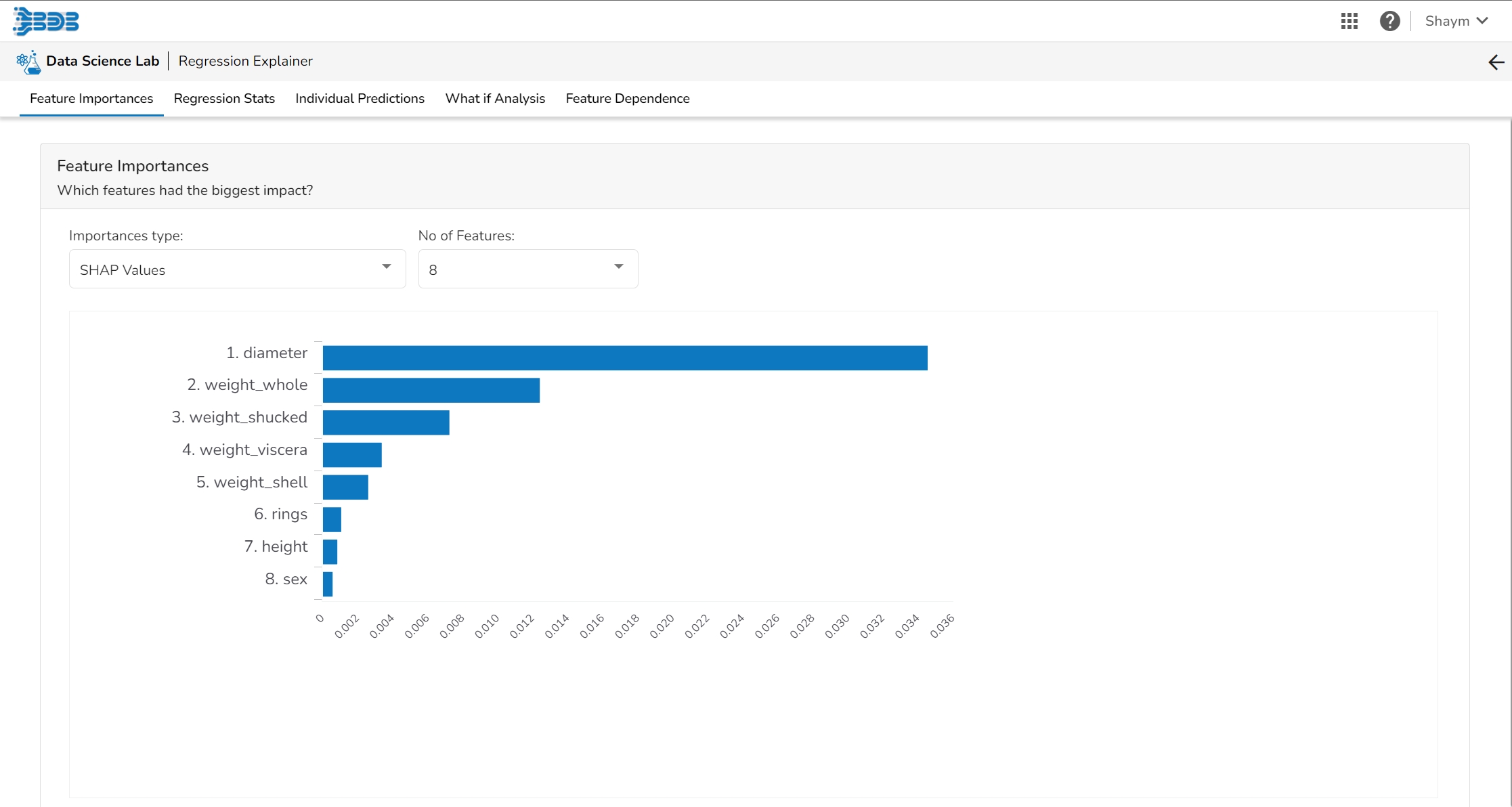
Model interpretation techniques like SHAP values, permutation importance, and partial dependence plots are essential for understanding how a model arrives at its predictions. They shed light on which features are most influential and how they contribute to each prediction, offering transparency and insights into model behavior. These methods also help detect biases and errors, making machine learning models more trustworthy and interpretable to stakeholders. By leveraging model explainers, organizations can ensure that their AI systems are accountable and aligned with their goals and values.
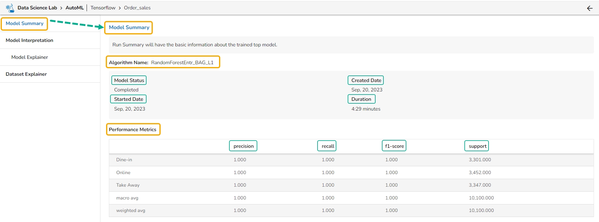
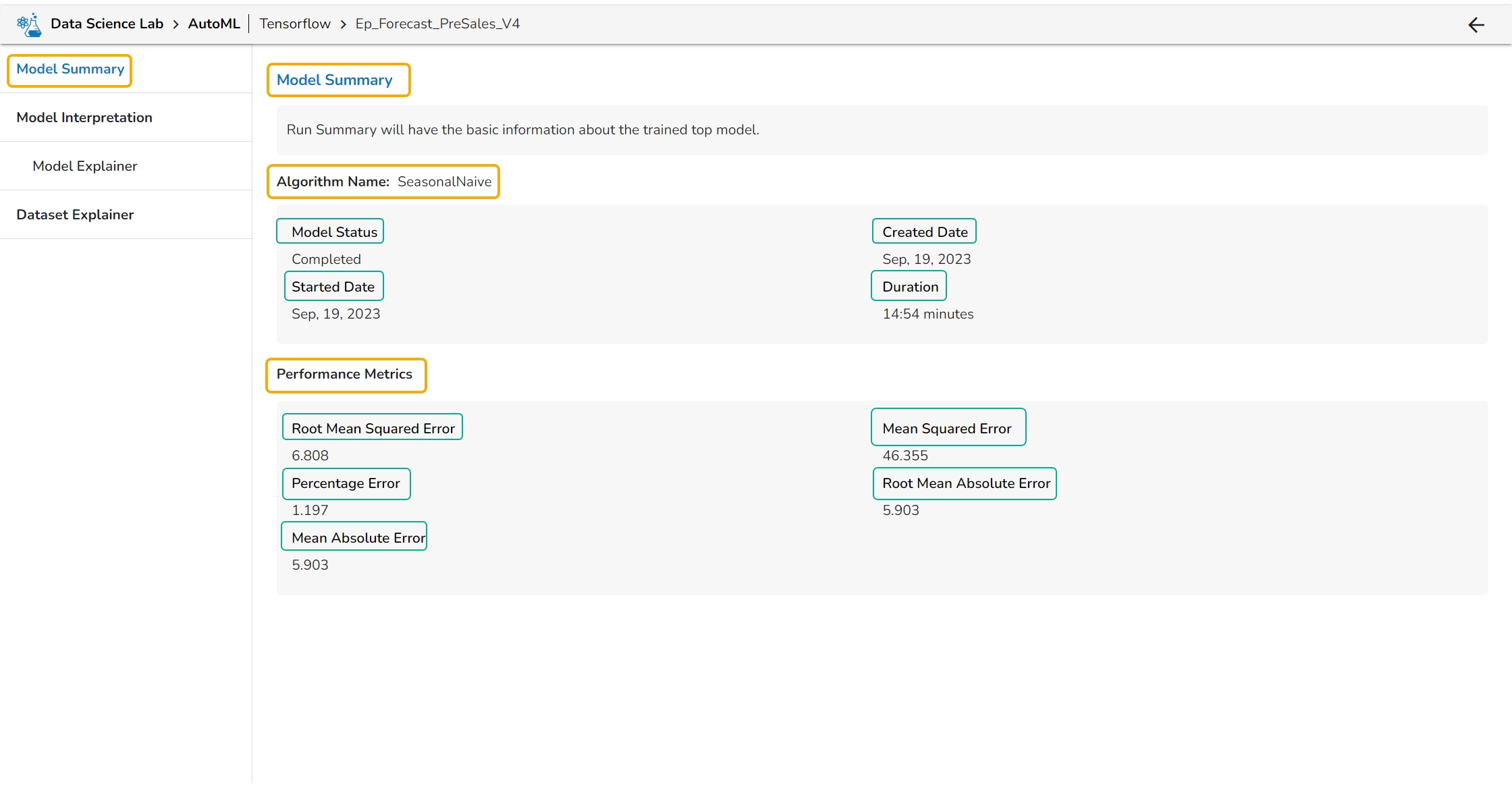
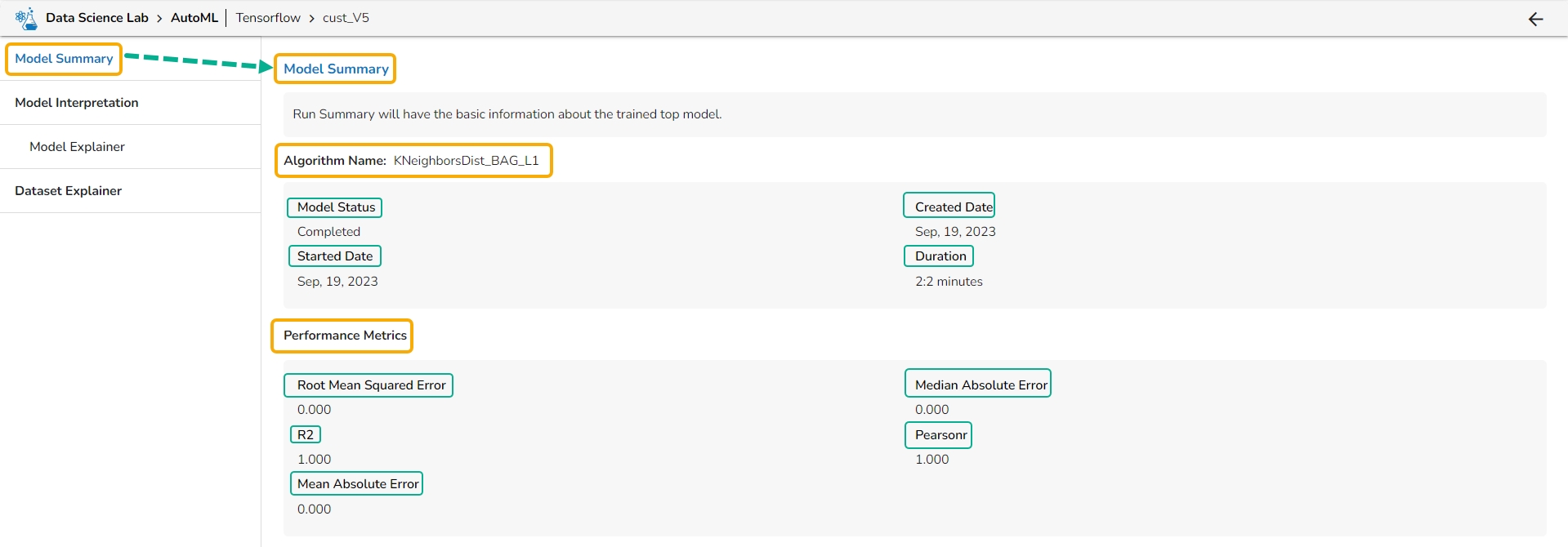
The Model Summary option is displayed by default while clicking the View Explanation option for an Auto ML model.
The Model Summary/ Run Summary displays the basic information about the trained top model.
The Model Summary/ Run Summary will display the basic information about the trained top model. It opens by default by clicking the View Explanation option for the selected model.
The Model Summary page displays the details based on the selected Algorithm types:
Algorithm Name
Model Status
Created Date
Started Date
Duration
Performance Metrics are described by displaying the below-given metrics:
Root Mean Squared Error (RMSE): RMSE is the square root of the mean squared error. It is more interpretable than MSE and is often used to compare models with different units.
Median Absolute Error (MAE): MAE is a performance metric for regression models that measures the median of the absolute differences between the predicted values and the actual values.
Algorithm Name
Model Status
Created Date
Started Date
Algorithm Name
Model Status
Created Date
Started Date
Pearsonr: Pearsonr is a function in the SciPy. Stats module that calculates the Pearson correlation coefficient and its p-value between two arrays of data. The Pearson correlation coefficient is a measure of the linear relationship between two variables.
Mean Absolute Error (MAE): MAE measures the average absolute difference between the predicted values and the actual values in the dataset. It is less sensitive to outliers than MSE and is a popular metric for regression problems.
Duration
Performance Metrics are described by displaying the below-given metrics:
Root Mean Squared Error (RMSE): RMSE is the square root of the mean squared error. It is more interpretable than MSE and is often used to compare models with different units.
Mean Squared Error (MSE): MSE measures the average squared difference between the predicted values and the actual values in the dataset. It is a popular metric for regression problems and is sensitive to outliers.
Percentage Error (PE): PE can provide insight into the relative accuracy of the predictions. It tells the user how much, on average, the predictions deviate from the actual values in percentage terms.
Root Mean Absolute Error: RMSE is the square root of the mean squared error. It is more interpretable than MSE and is often used to compare models with different units.
Mean Absolute Error (MAE): MAE measures the average absolute difference between the predicted values and the actual values in the dataset. It is less sensitive to outliers than MSE and is a popular metric for regression problems.
Duration
Performance Metrics are described by displaying the below-given metrics:
Precision: Precision is the percentage of correctly classified positive instances out of all the instances that were predicted as positive by the model. In other words, it measures how often the model correctly predicts the positive class.
Recall: Recall is the percentage of correctly classified positive instances out of all the actual positive instances in the dataset. In other words, it measures how well the model.
F1-score: The F1-score is the harmonic mean of precision and recall. It is a balance between precision and recall and is a better metric than accuracy when the dataset is imbalanced.
Support: Support is the number of instances in each class in the dataset. It can be used to identify imbalanced datasets where one class has significantly fewer instances than the others.
The View Explanation option will redirect the user to the below given options. Let us see all of them one by one explained as separate topics.
This page provides model explainer dashboards for Forecasting Models.
Check out the given walk-through to understand the Model Explainer dashboard for the Forecasting models.
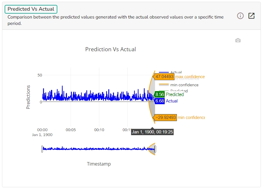
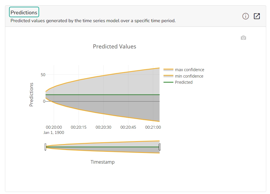
The forecasting model stats get displayed through the Timeseries visualization that presents values generated over based on the selected time.
This chart will display predicted values generated by the timeseries model over a specific time period.
This chart displays a comparison of the predicted values with the actual obsereved vlaues over a specific period of time.
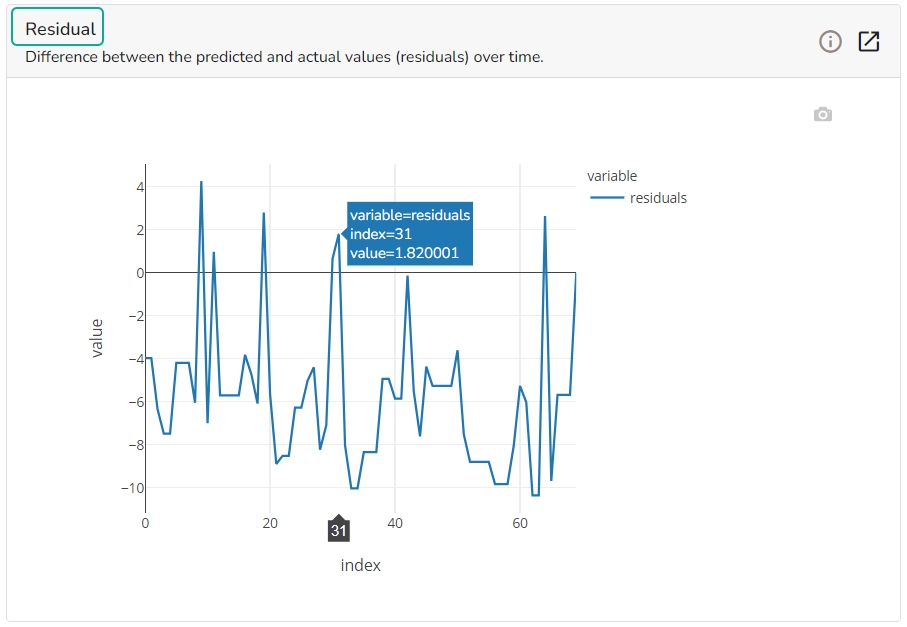
It depicts difference between the predicted and actual (residuals) values over a period of time.
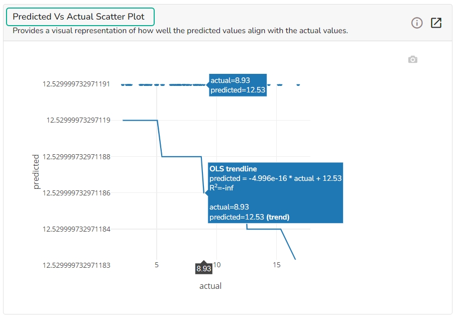
A Scatter Plot chart is displayed depicting how well the predicted values align with the actual values.
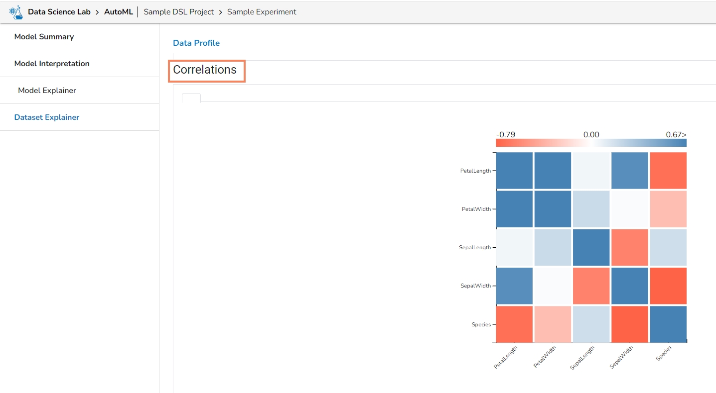
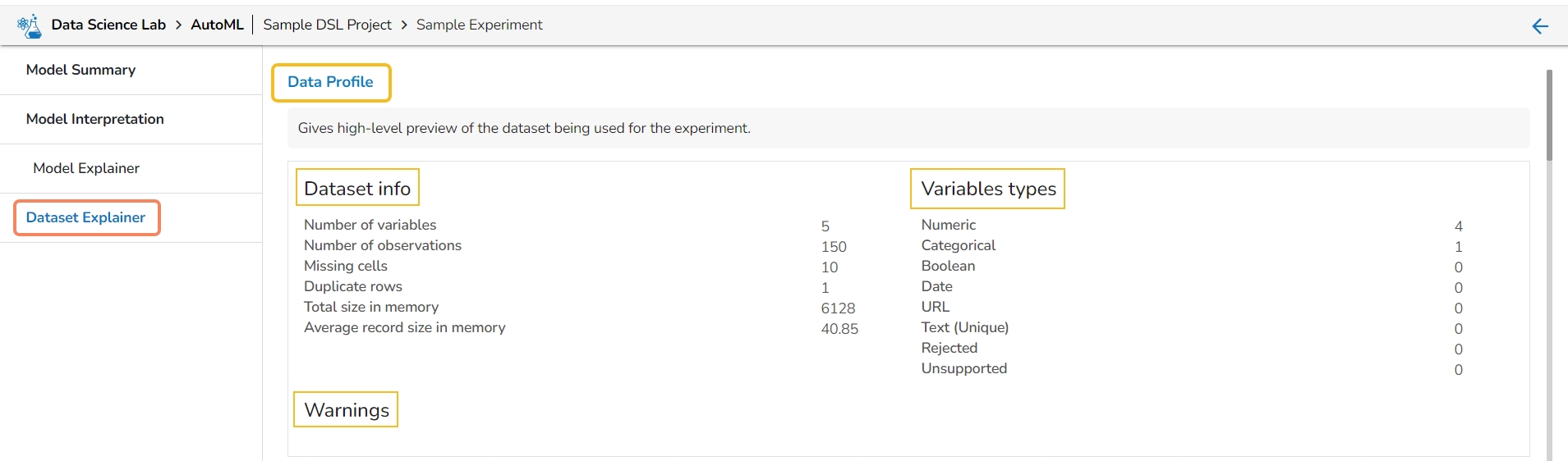
The Dataset Explainer tab provides a high-level preview of the dataset that has been used for the experiment. It redirects the user to the Data Profile page.
The Data Profile is displayed using various sections such as:
Data Set Info
Variable Types
Warnings
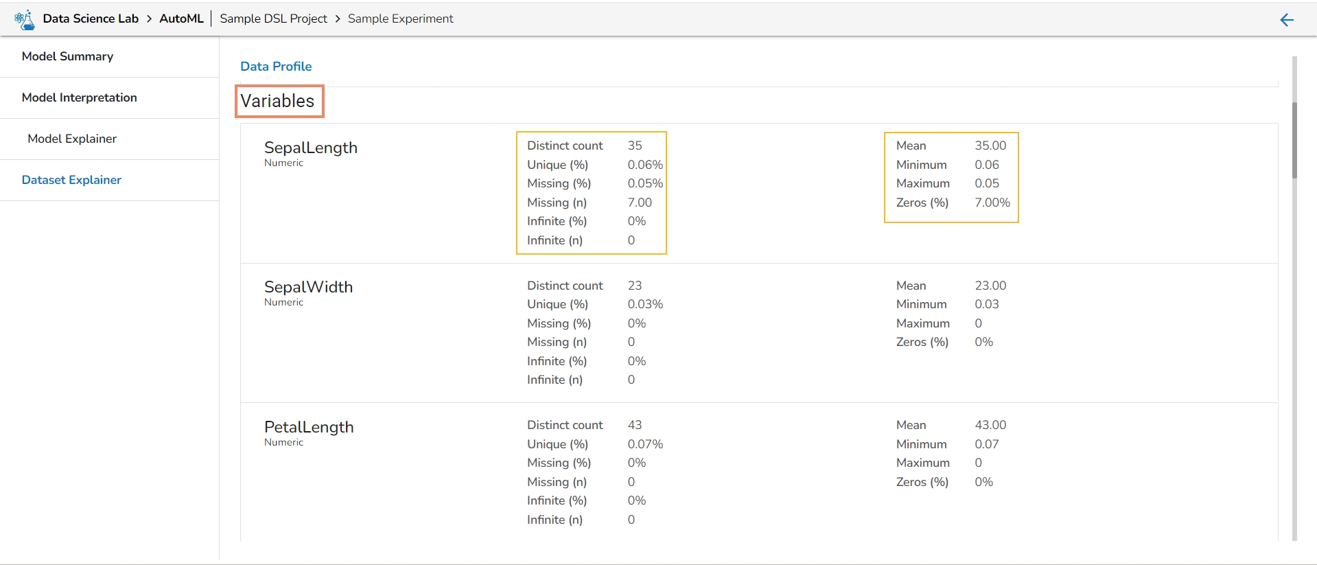
Variables
Correlations
Missing Values
Sample
Let us see each of them one by one.
The Data Profile displayed under the Dataset Explainer section displays the following information for the Dataset.
Numbers of variables
Number of observations
Missing cells
Duplicate rows
This section mentions variable types for the data set variables. The selected Data set contains the following variable types:
Numeric
Categorical
Boolean
Date
This section informs user about the warnings for the selected dataset.
It lists all the variables from the selected Data Set with the following details:
Distinct count
Unique
Missing (in percentage)
Missing (in number)
It displays the variables in the correlation chart by using various popular methods.
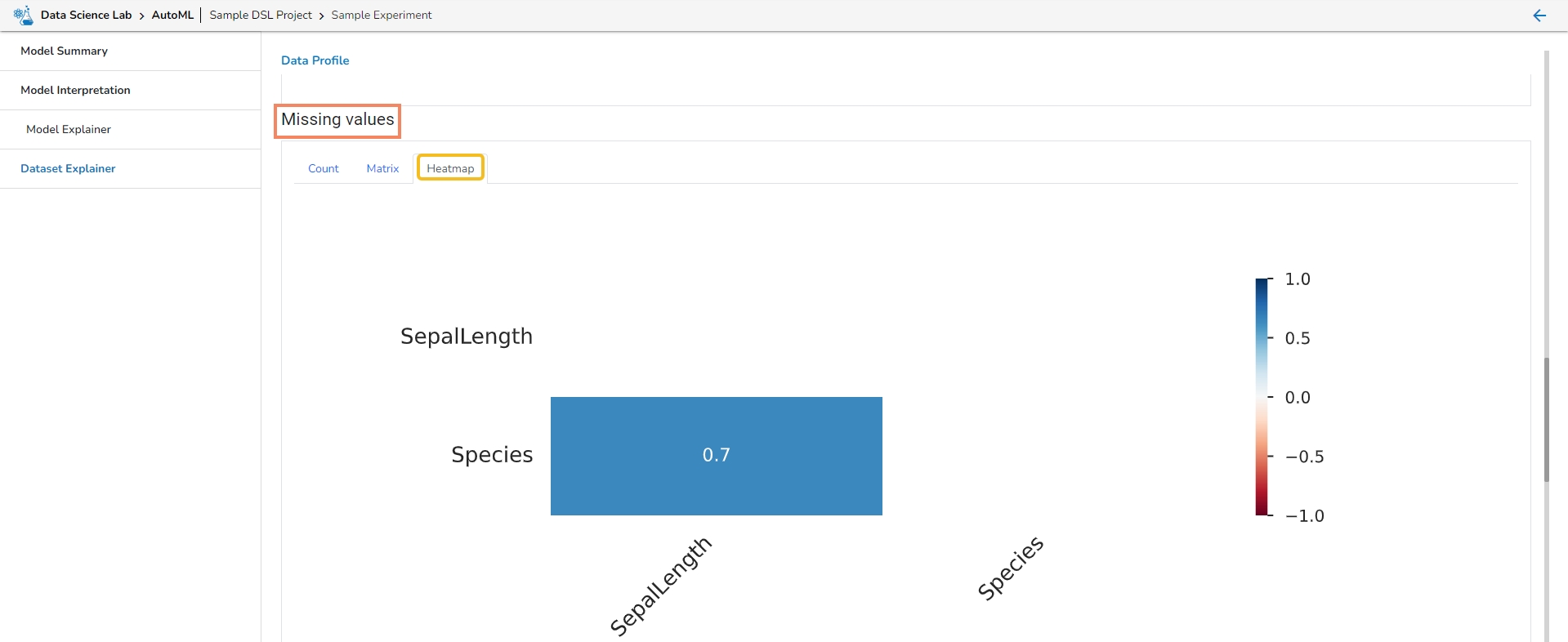
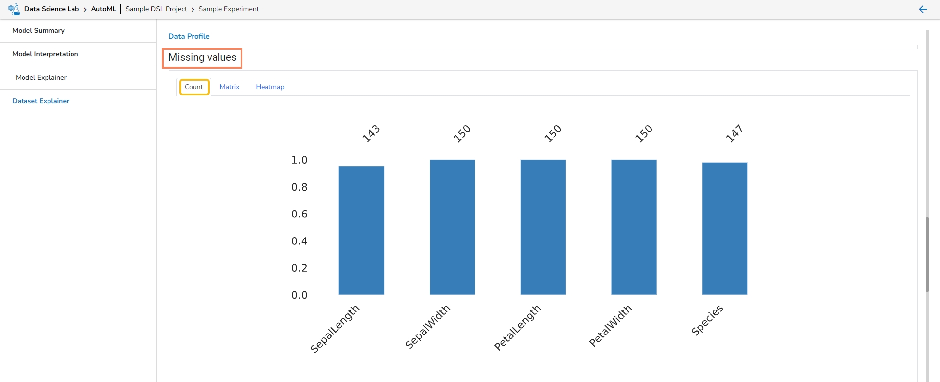
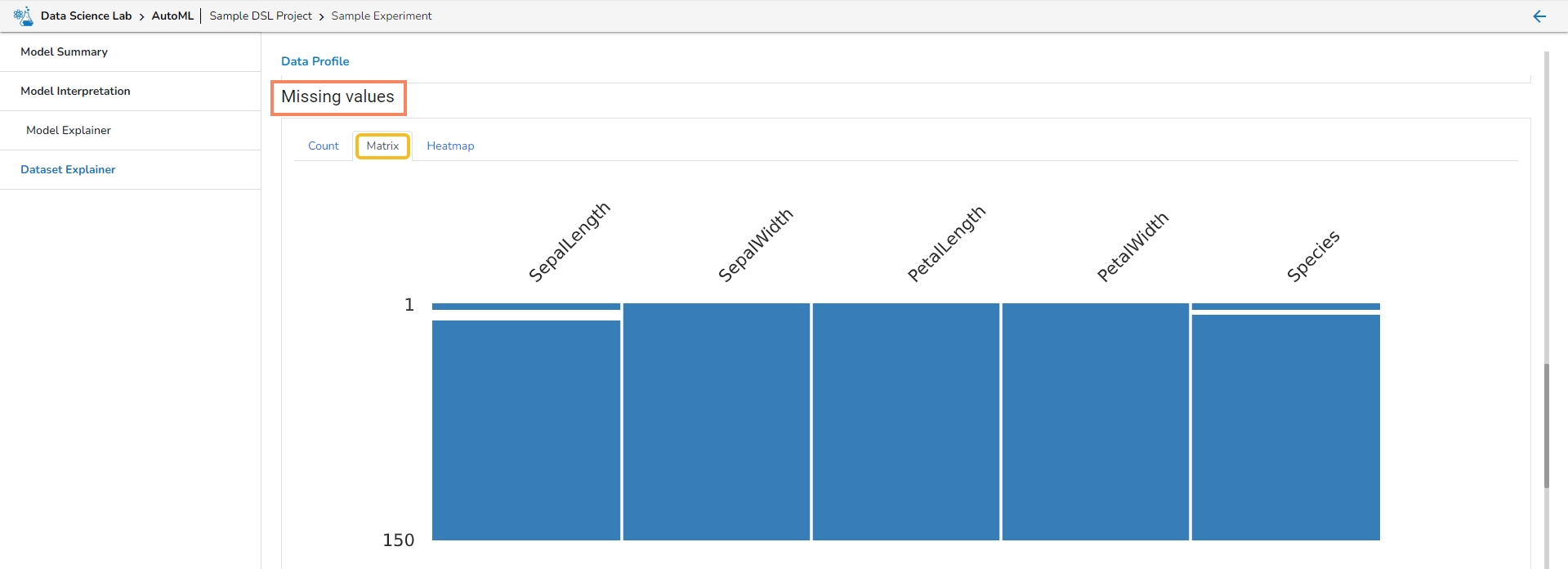
This section provides information on the missing values through Count, Matrix, and Heatmap visualization.
Count: The count of missing values is explained through column chart.
Matrix
Heatmap
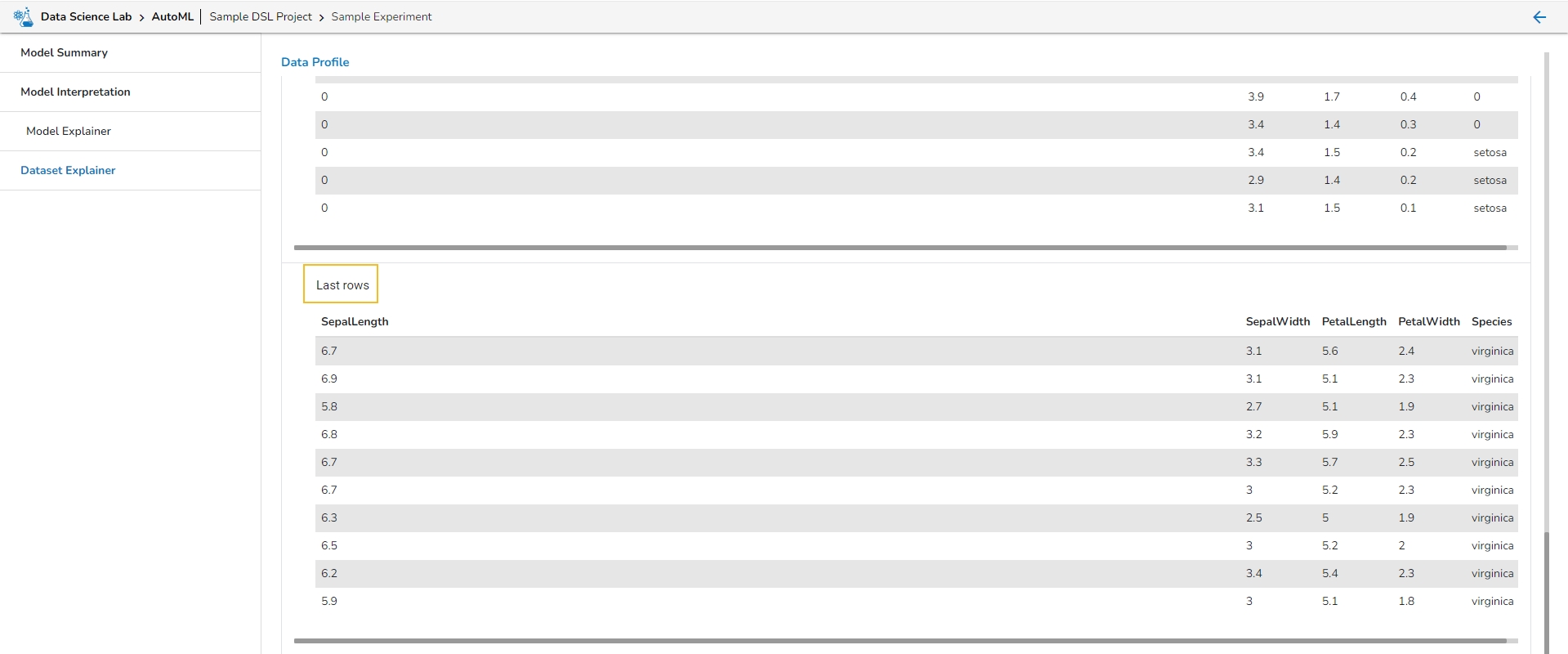
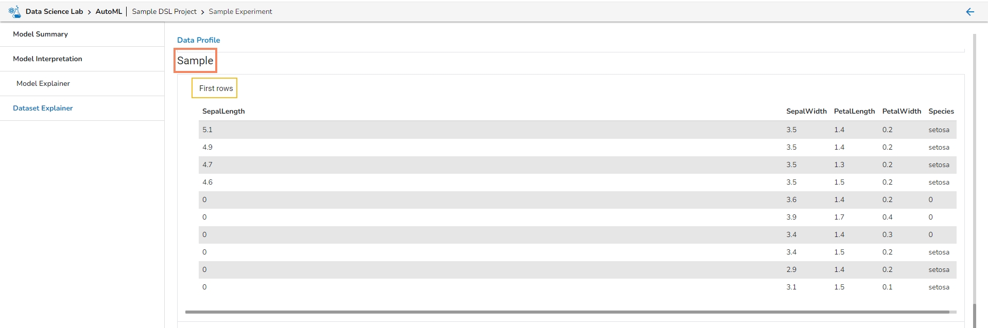
This section describes the first 10 and last 10 rows of the selected dataset as a sample.
Average record size in memory
Text (Unique)
Rejected
Unsupported
Infinite (in number)
Mean
Minimum
Maximum
Zeros (in percentage)
This page provides model explainer dashboards for Classification Models.
Check out the given walk-through to understand the Model Explainer dashboard for the Classification models.
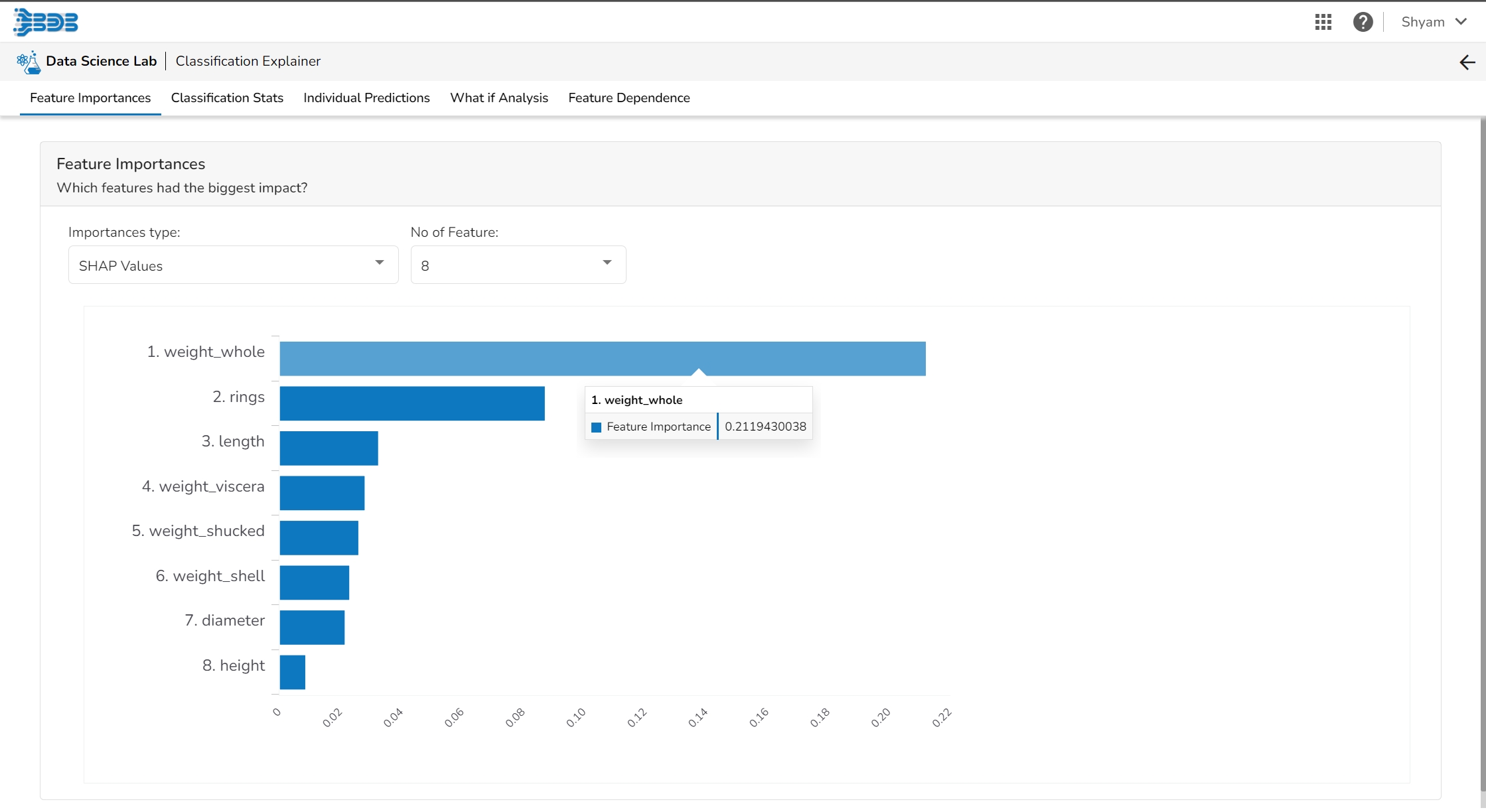
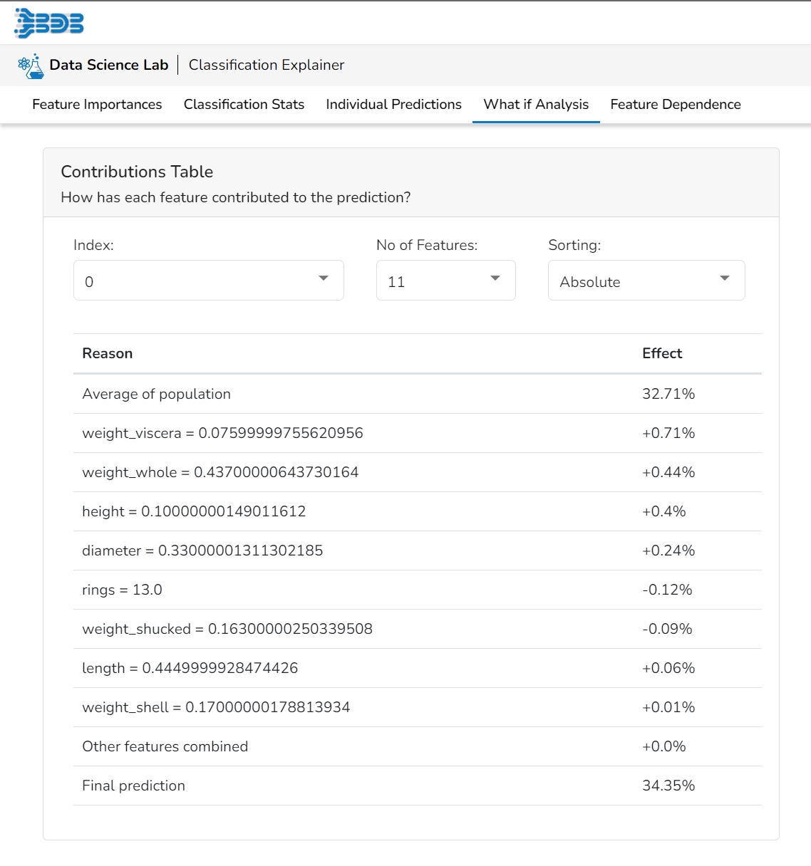
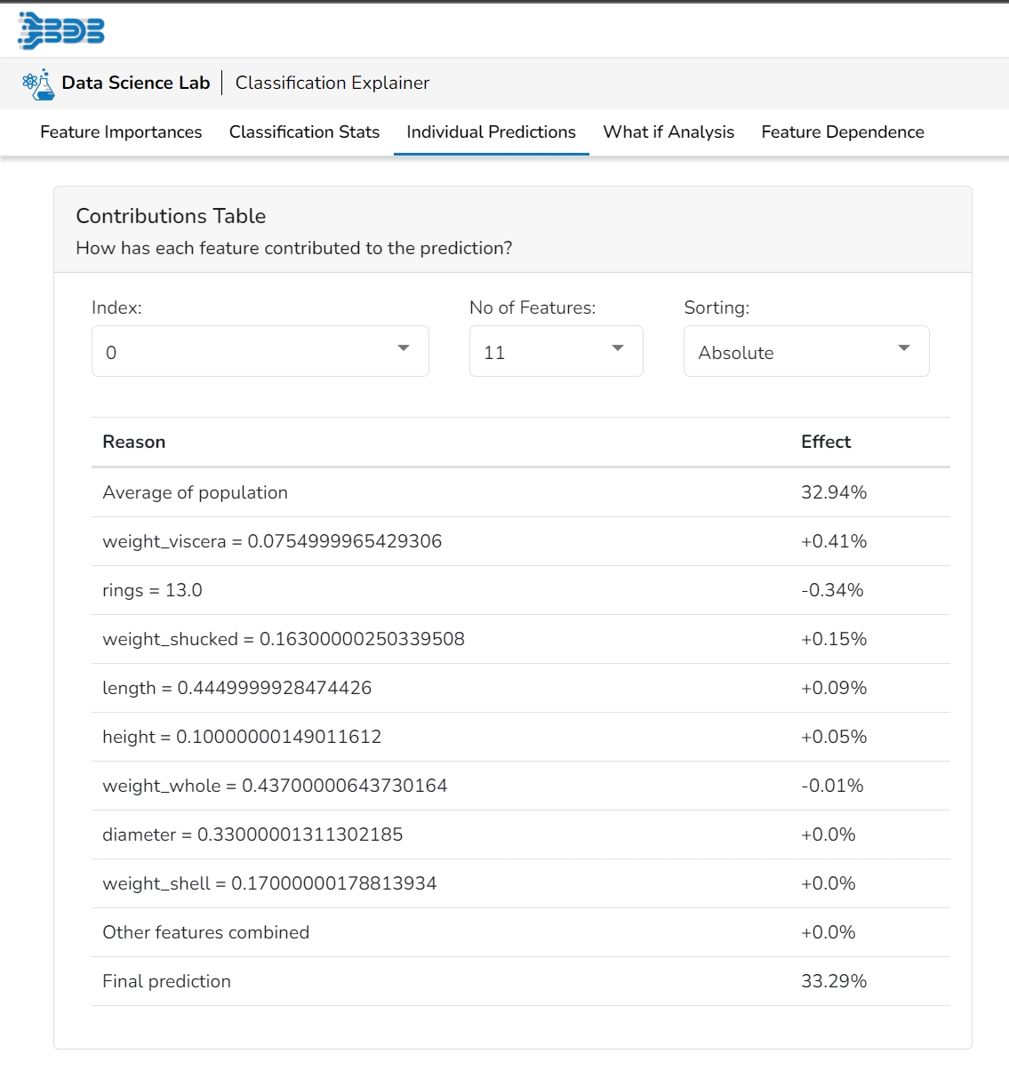
This table shows the contribution each feature has had on prediction for a specific observation. The contributions (starting from the population average) add up to the final prediction. This allows you to explain exactly how each prediction has been built up from all the individual ingredients in the model.
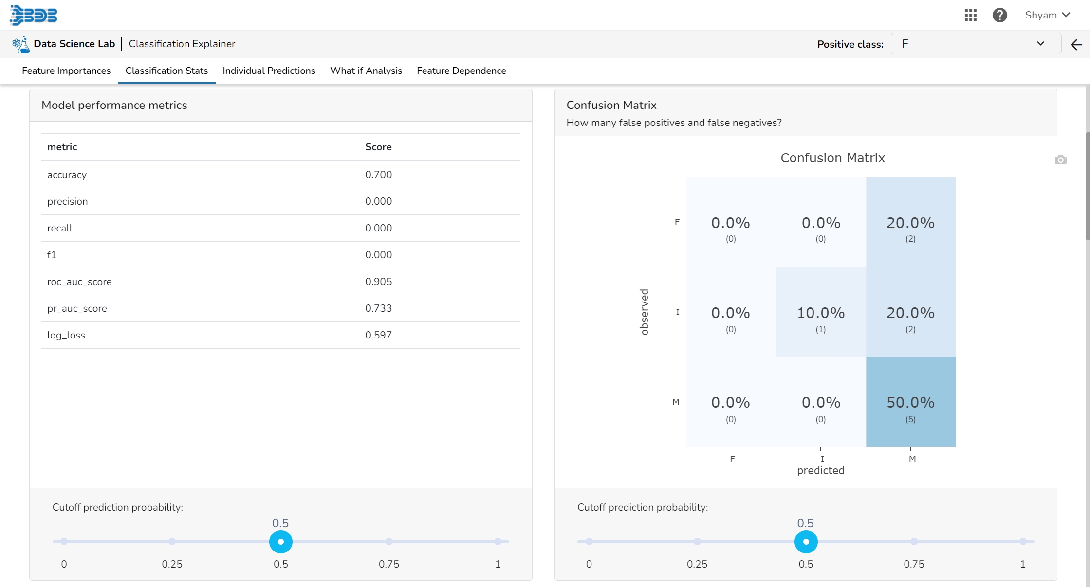
This tab provides various stats regarding the Classification model.
It includes the following information:
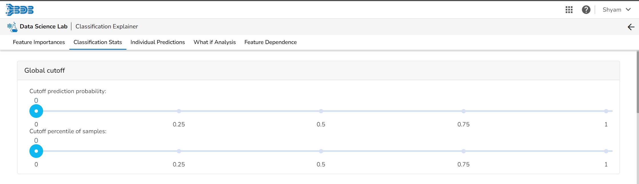
Select a model cutoff such that all predicted probabilities higher than the cutoff will be labeled positive and all predicted probabilities lower than the cutoff will be labeled negative. The user can also set the cutoff as a percentile of all observations. By setting the cutoff it will automatically set the cutoff in the multiple other connected components.
It displays a list of various performance metrics.
The Confusion matrix/ shows the number of true negatives (predicted negative, observed negative), true positives (predicted positive, observed positive), false negatives (predicted negative but observed positive), and false positives (predicted positive but observed negative). The number of false negatives and false positives determine the costs of deploying an imperfect model. For different cut-offs, the user will get a different number of false positives and false negatives. This plot can help you select the optimal cutoff.
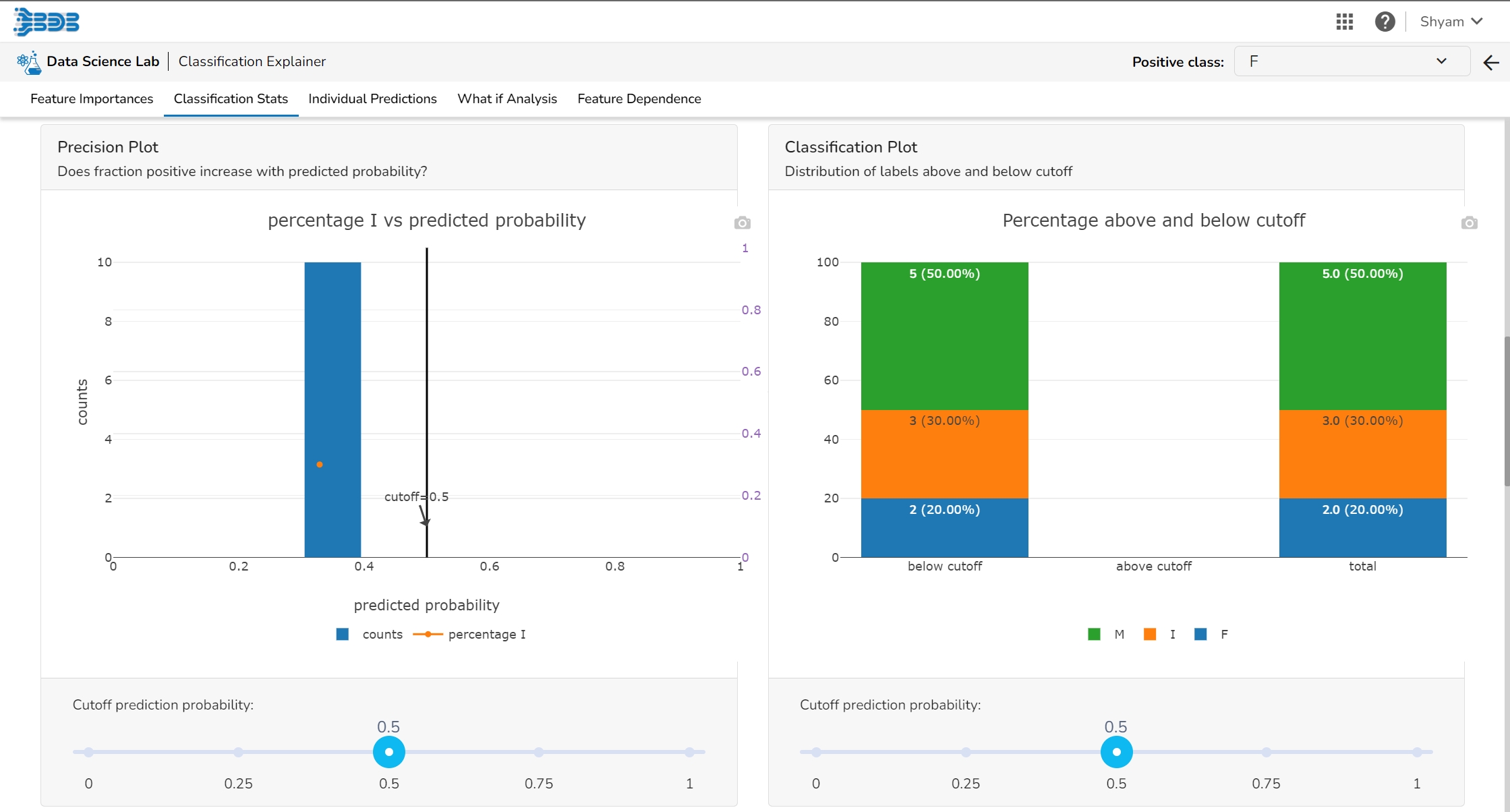
The user can see the relation between the predicted probability that a record belongs to the positive class and the percentage of observed records in the positive class on this plot. The observations get binned together in groups of roughly equal predicted probabilities and the percentage of positives is calculated for each bin. a perfectly calibrated model would show a straight line from the bottom left corner to the top right corner. a strong model would classify most observations correctly and close to 0% or 100% probability.
This plot displays the fraction of each class above and below the cut-off.
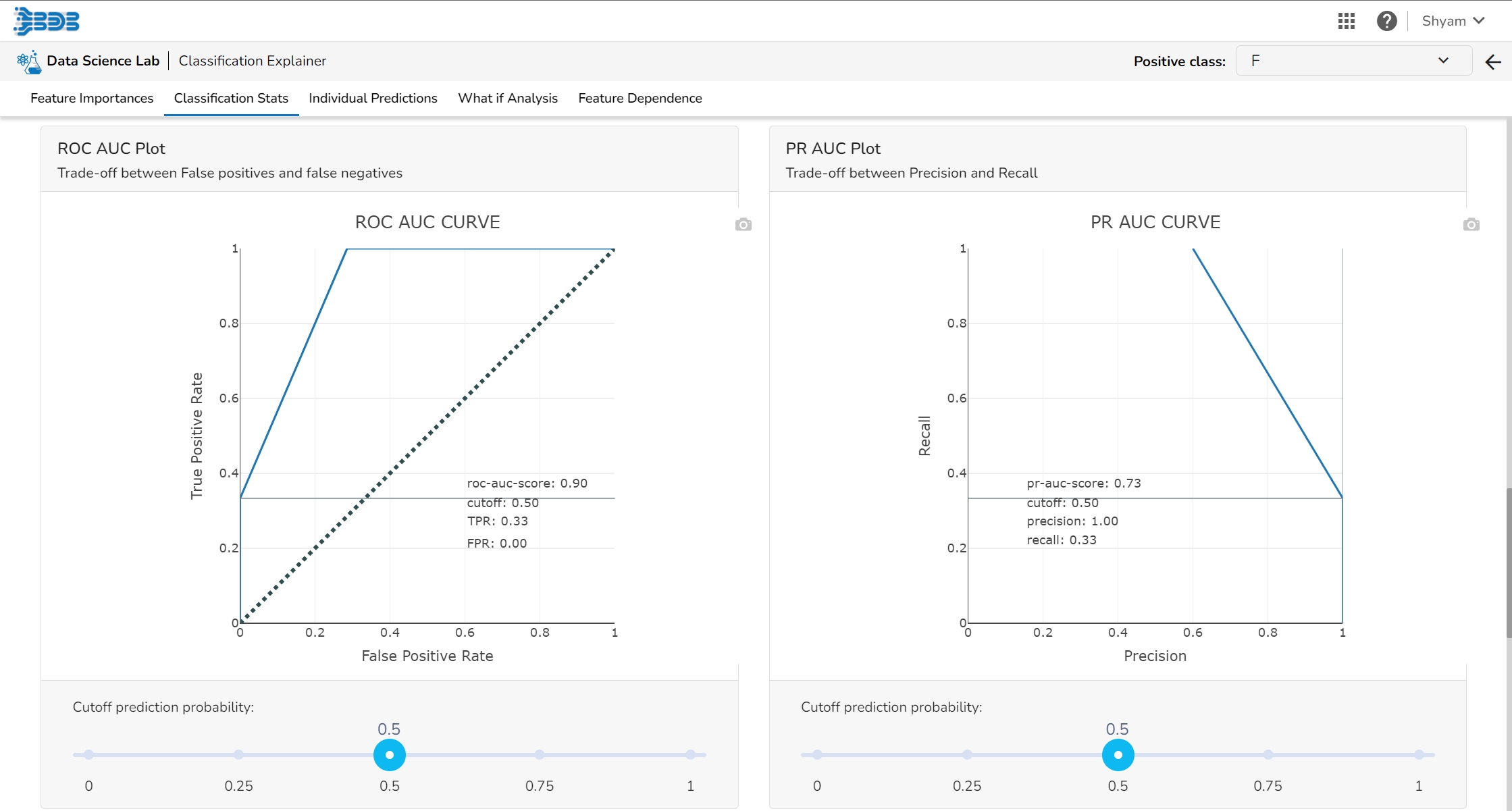
The ROC curve is created by plotting the true positive rate (TPR) against the false positive rate (FPR) at different classification thresholds.
The true positive rate is the proportion of actual positive samples that are correctly identified as positive by the model, i.e., TP / (TP + FN). The false positive rate is the proportion of actual negative samples that are incorrectly identified as positive by the model, i.e., FP / (FP + TN).
It shows the trade-off between Precision and Recall in one plot.
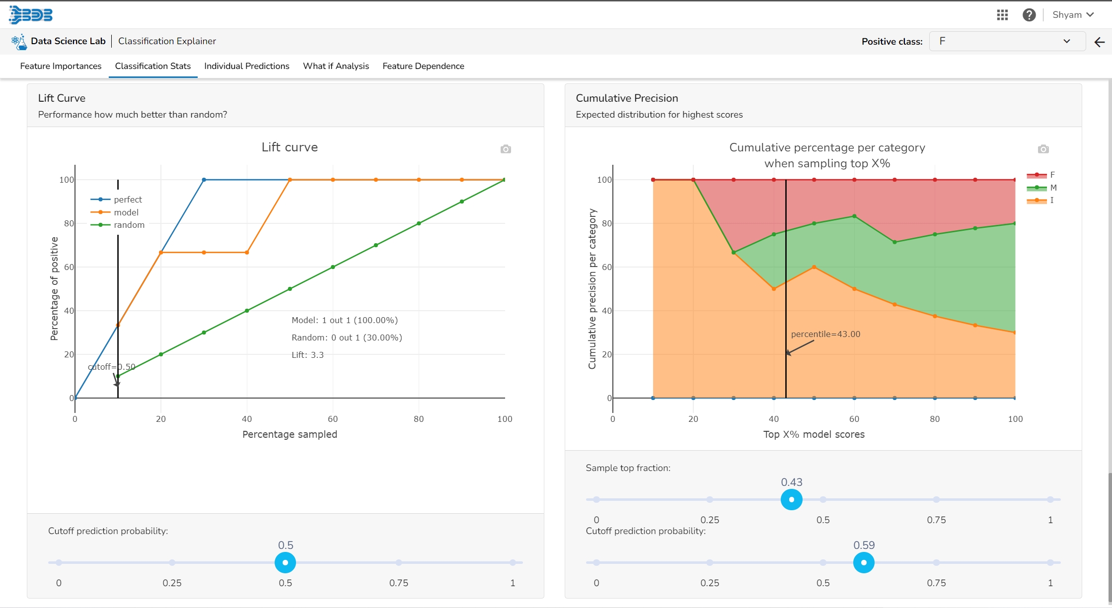
The Lift Curve chart shows you the percentage of positive classes when you only select observations with a score above the cut-off vs selecting observations randomly. This displays to the user how much it is better than the random (the lift).
This plot shows the percentage of each label that you can expect when you only sample the top x% with the highest scores.
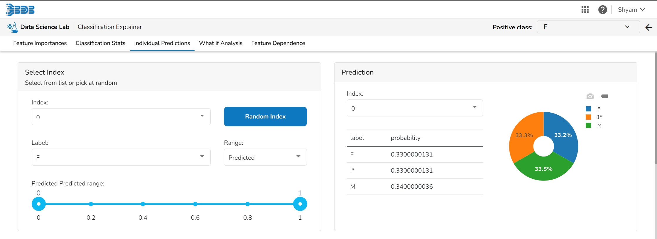
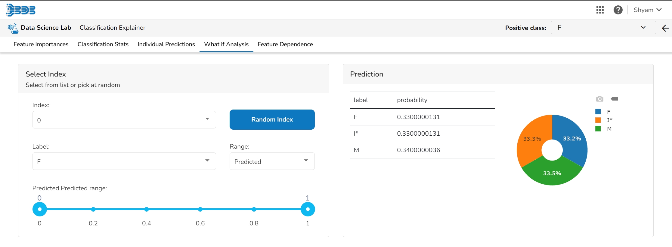
The user can select a record directly by choosing it from the dropdown or hit the Random Index option to randomly select a record that fits the constraints. For example, the user can select a record where the observed target value is negative but the predicted probability of the target being positive is very high. This allows the user to sample only false positives or only false negatives.
It displays the predicted probability for each target label.
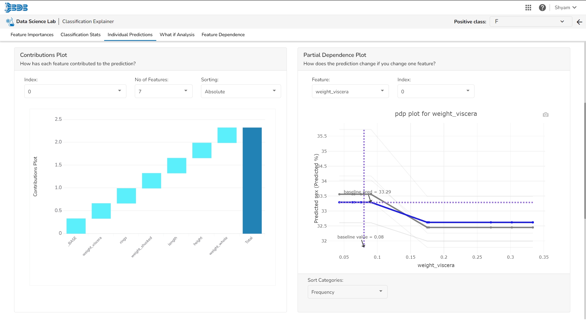
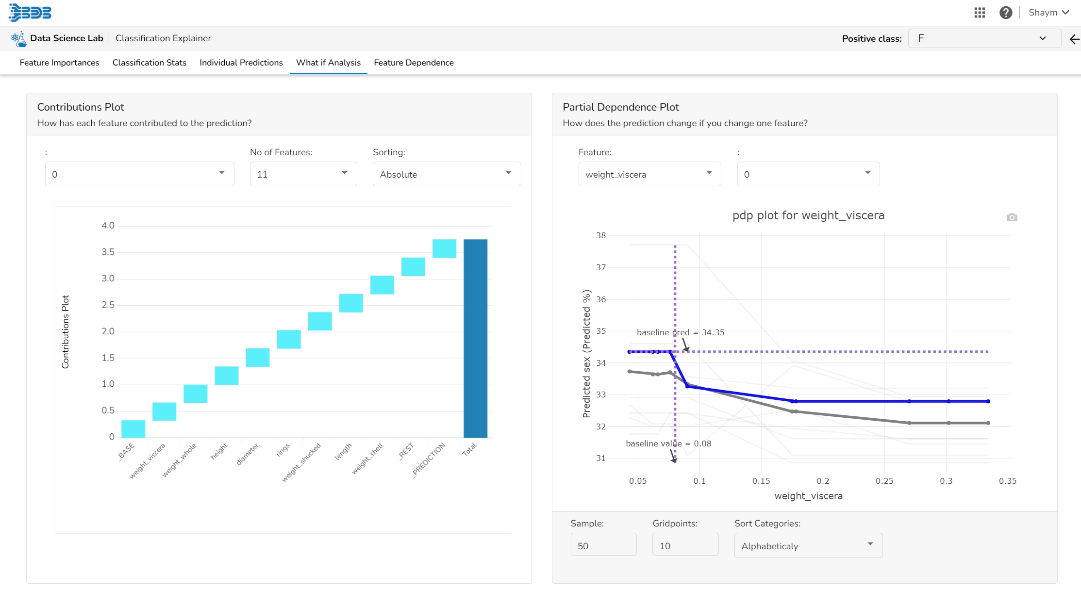
This plot shows the contribution that each feature has provided to the prediction for a specific observation. The contributions (starting from the population average) add up to the final prediction. This helps to explain exactly how each prediction has been built up from all the individual ingredients in the model.
The PDP plot shows how the model prediction would change if you change one particular feature. the plot shows you a sample of observations and how these observations would change with this feature (gridlines). The average effect is shown in grey. The effect of changing the feature for a single record is shown in blue. The user can adjust how many observations to sample for the average, how many gridlines to show, and how many points along the x-axis to calculate model predictions for (grid points).
This table shows the contribution each individual feature has had on the prediction for a specific observation. The contributions (starting from the population average) add up to the final prediction. This allows you to explain exactly how each individual prediction has been built up from all the individual ingredients in the model.
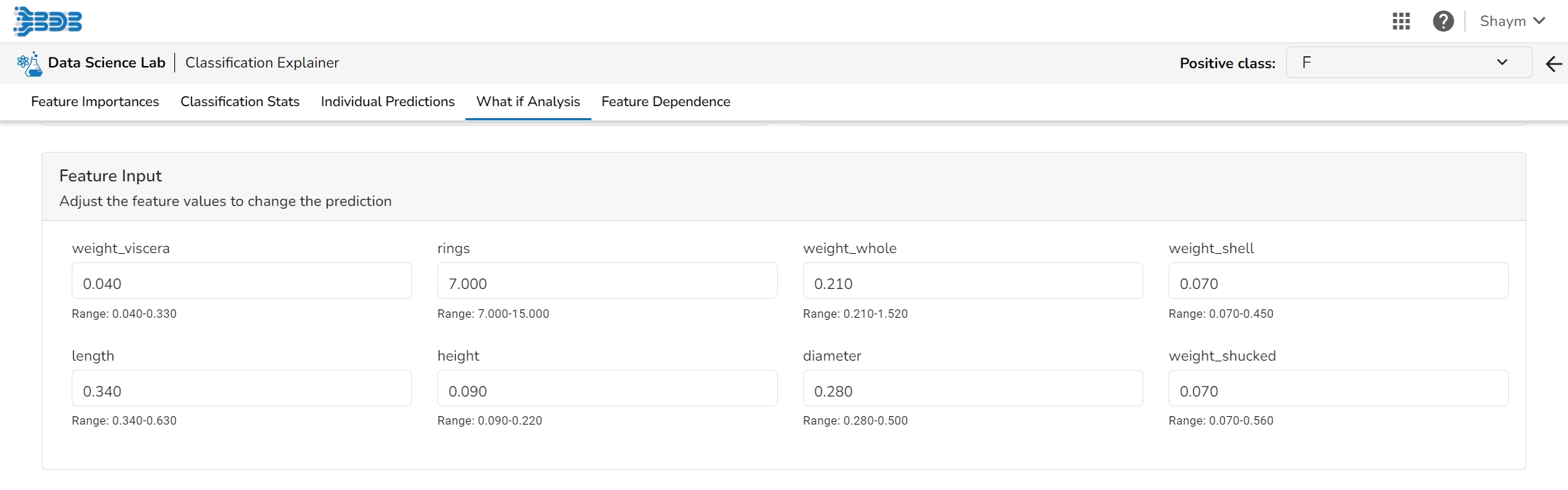
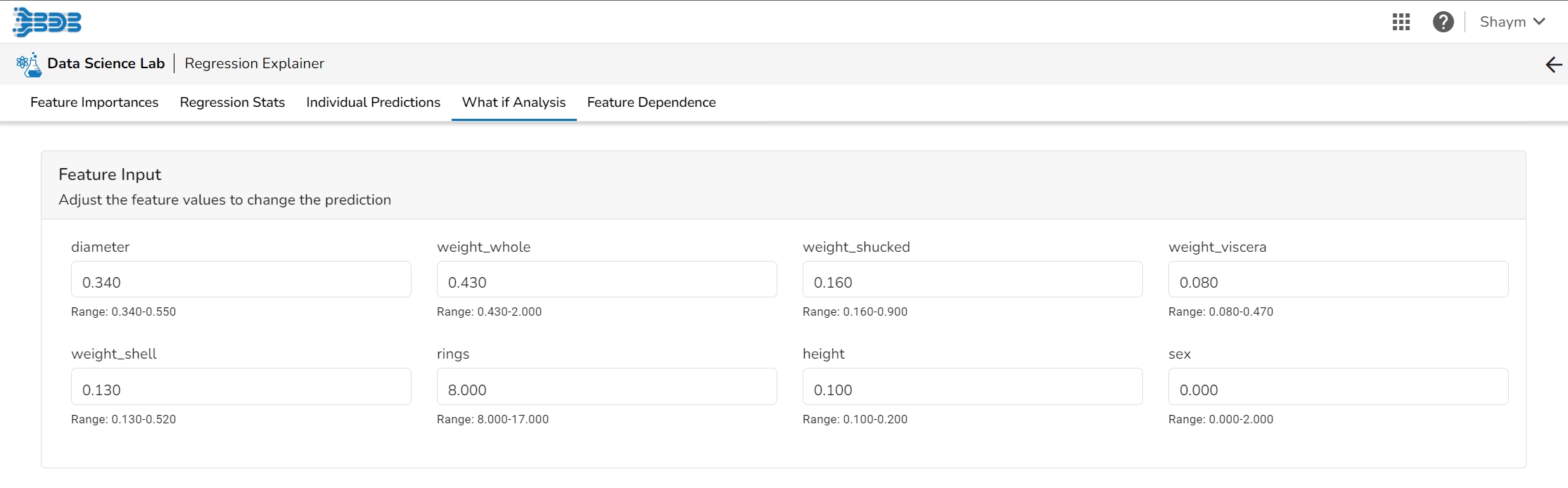
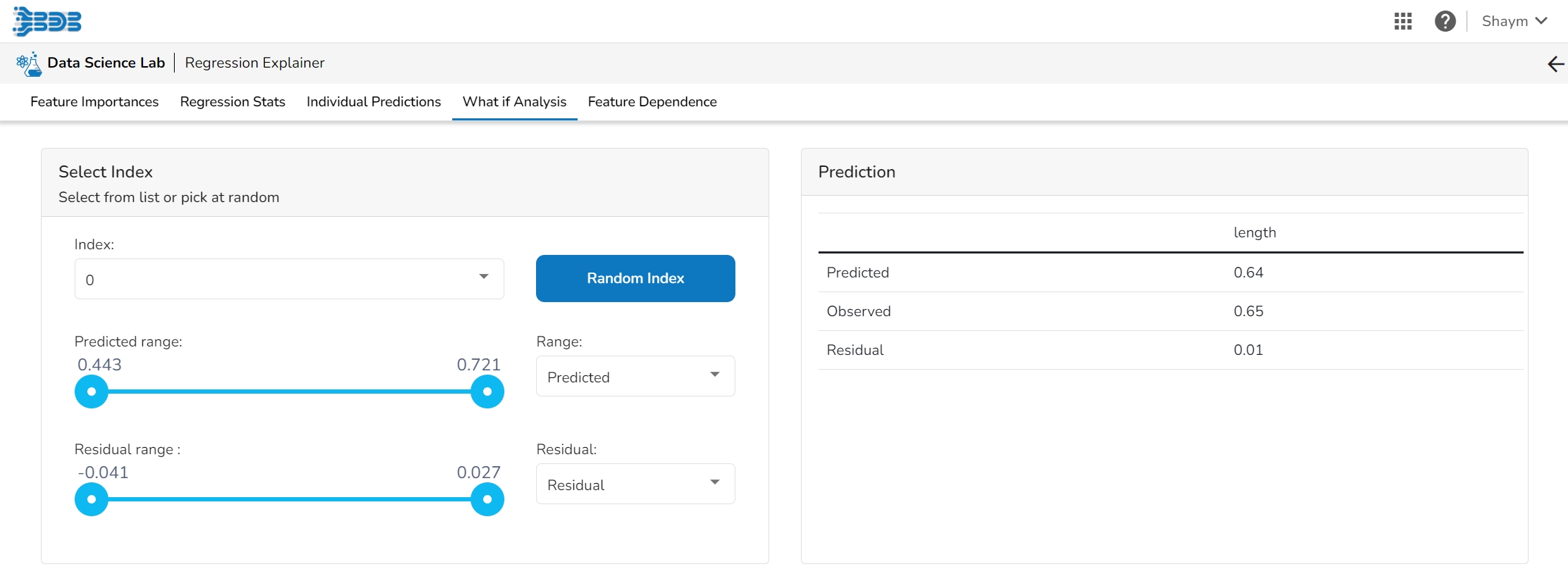
The What If Analysis is often used to help stakeholders understand the potential consequences of different scenarios or decisions. This tab displays how the outcome would change when the values of the selected variables get changed. This allows stakeholders to see how sensitive the outcome is to different inputs and can help them identify which variables are most important to focus on.
What-if analysis charts can be used in a variety of contexts, from financial modeling to marketing analysis to supply chain optimization. They are particularly useful when dealing with complex systems where it is difficult to predict the exact impact of different variables. By exploring a range of scenarios, analysts can gain a better understanding of the potential outcomes and make more informed decisions.
The user can adjust the input values to see predictions for what-if scenarios.
In a What-if analysis chart, analysts typically start by specifying a baseline scenario, which represents the current state of affairs. They then identify one or more variables that are likely to have a significant impact on the outcome of interest, and specify a range of possible values for each of these variables.
This table shows the contribution each individual feature has had on the prediction for a specific observation. The contributions (starting from the population average) add up to the final prediction. This allows you to explain exactly how each individual prediction has been built up from all the individual ingredients in the model.
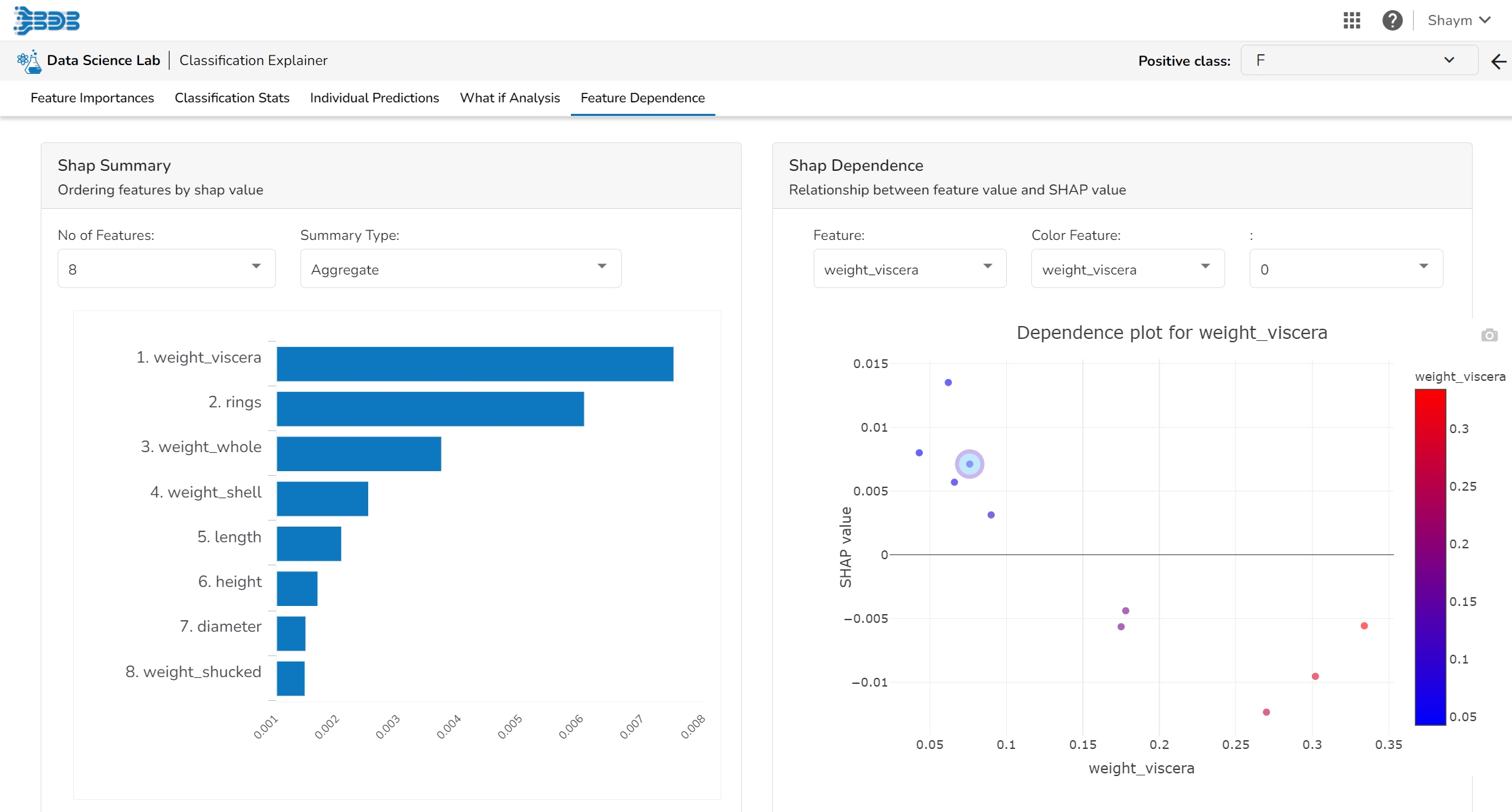
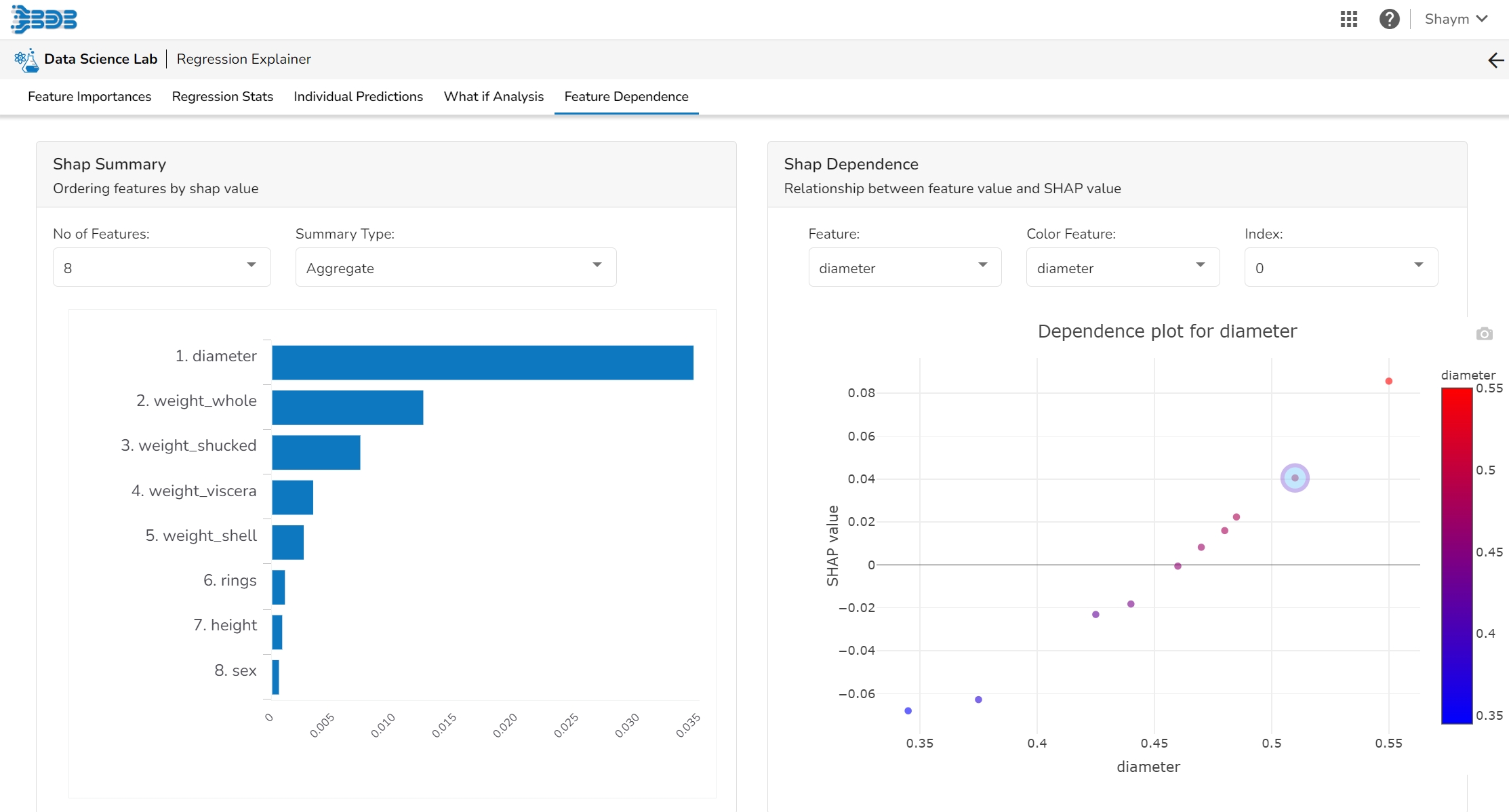
The Shap Summary summarizes the Shap values per feature. The user can either select an aggregate display that shows the mean absolute Shap value per feature or get a more detailed look at the spread of Shap values per feature and how they co-relate the feature value (red is high).
This plot displays the relation between feature values and Shap values. This allows you to investigate the general relationship between feature value and impact on the prediction. The users can check whether the model uses features in line with their intuitions, or use the plots to learn about the relationships that the model has learned between the input features and the predicted outcome.
This page provides model explainer dashboards for Regression Models.
Check out the given walk-through to understand the Model Explainer dashboard for the Regression models.
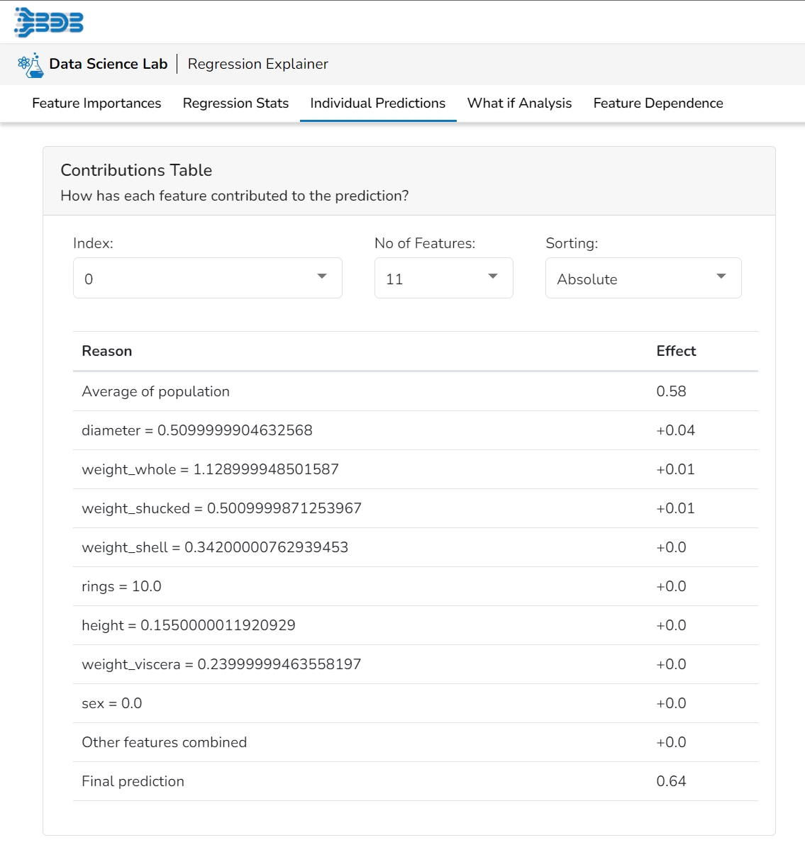
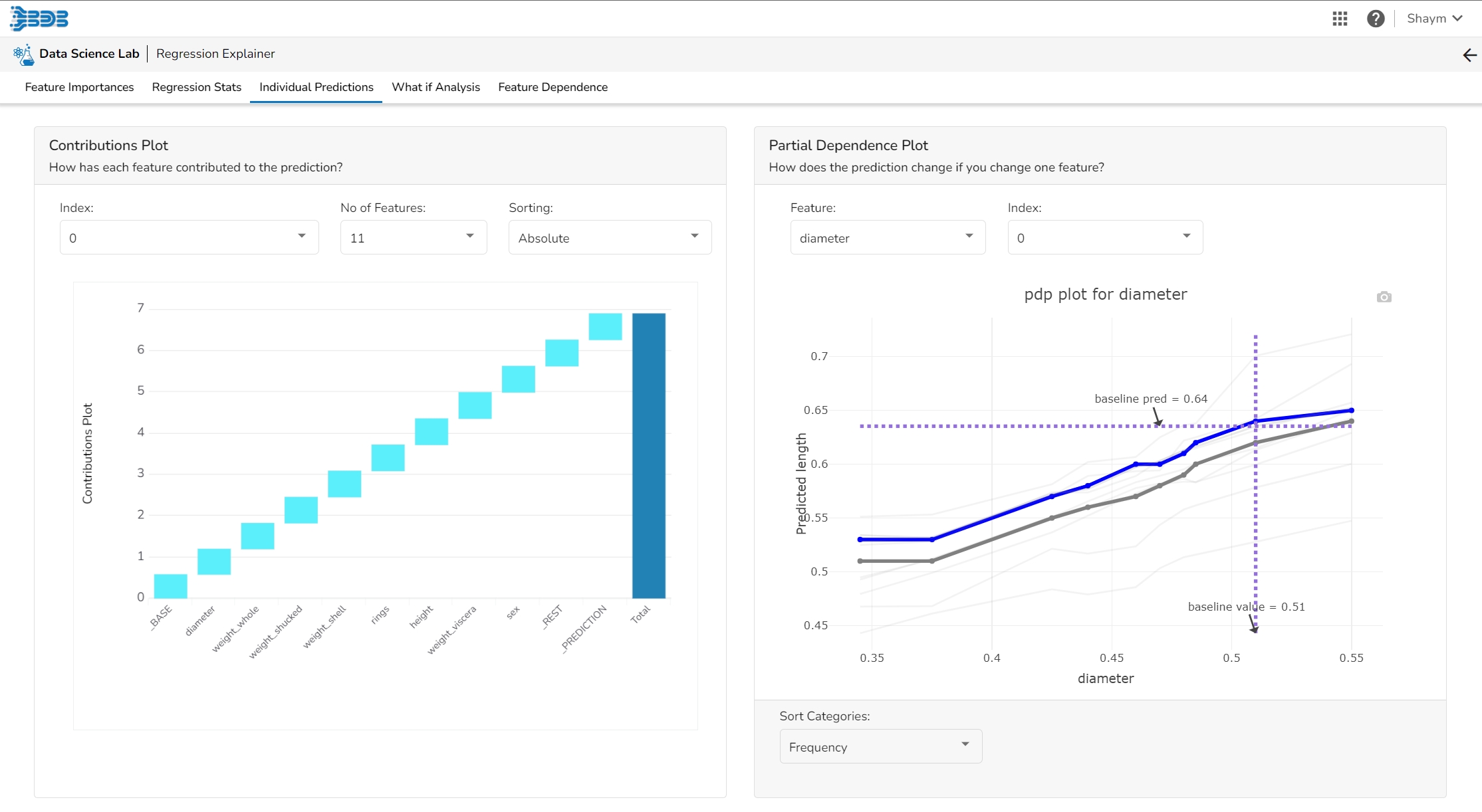
This table shows the contribution each feature has had on prediction for a specific observation. The contributions (starting from the population average) add up to the final prediction. This allows you to explain exactly how each prediction has been built up from all the individual ingredients in the model.
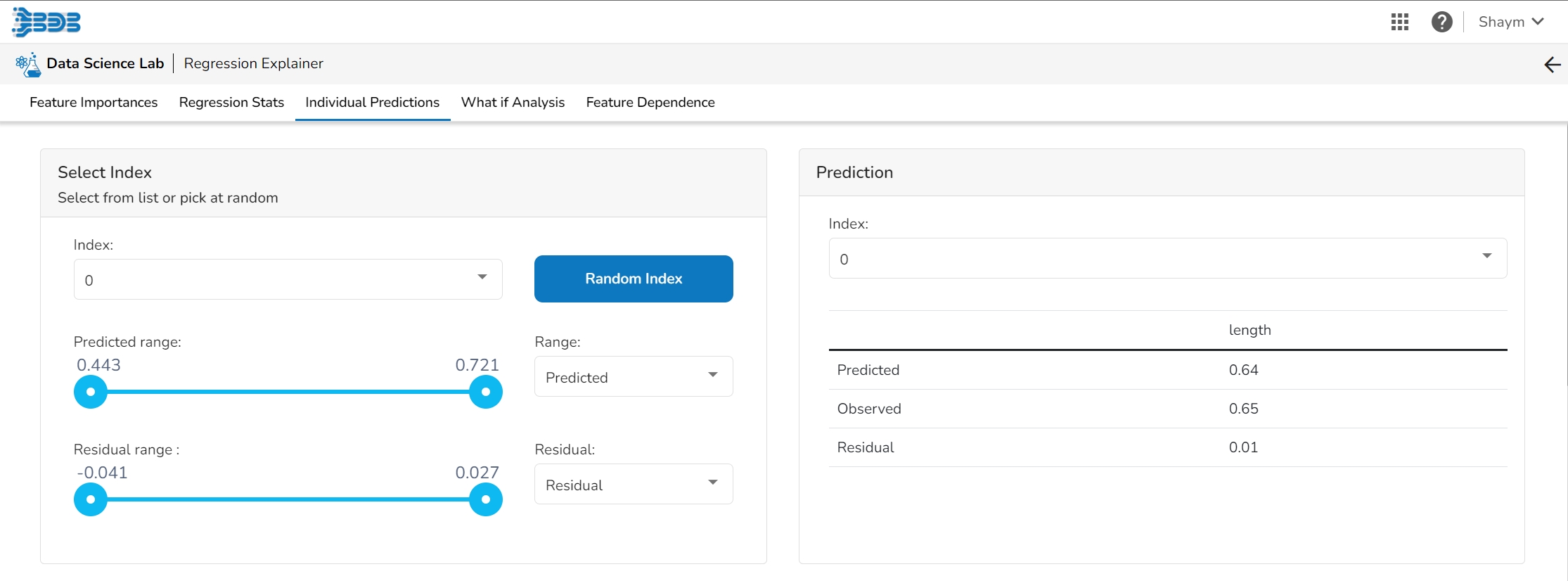
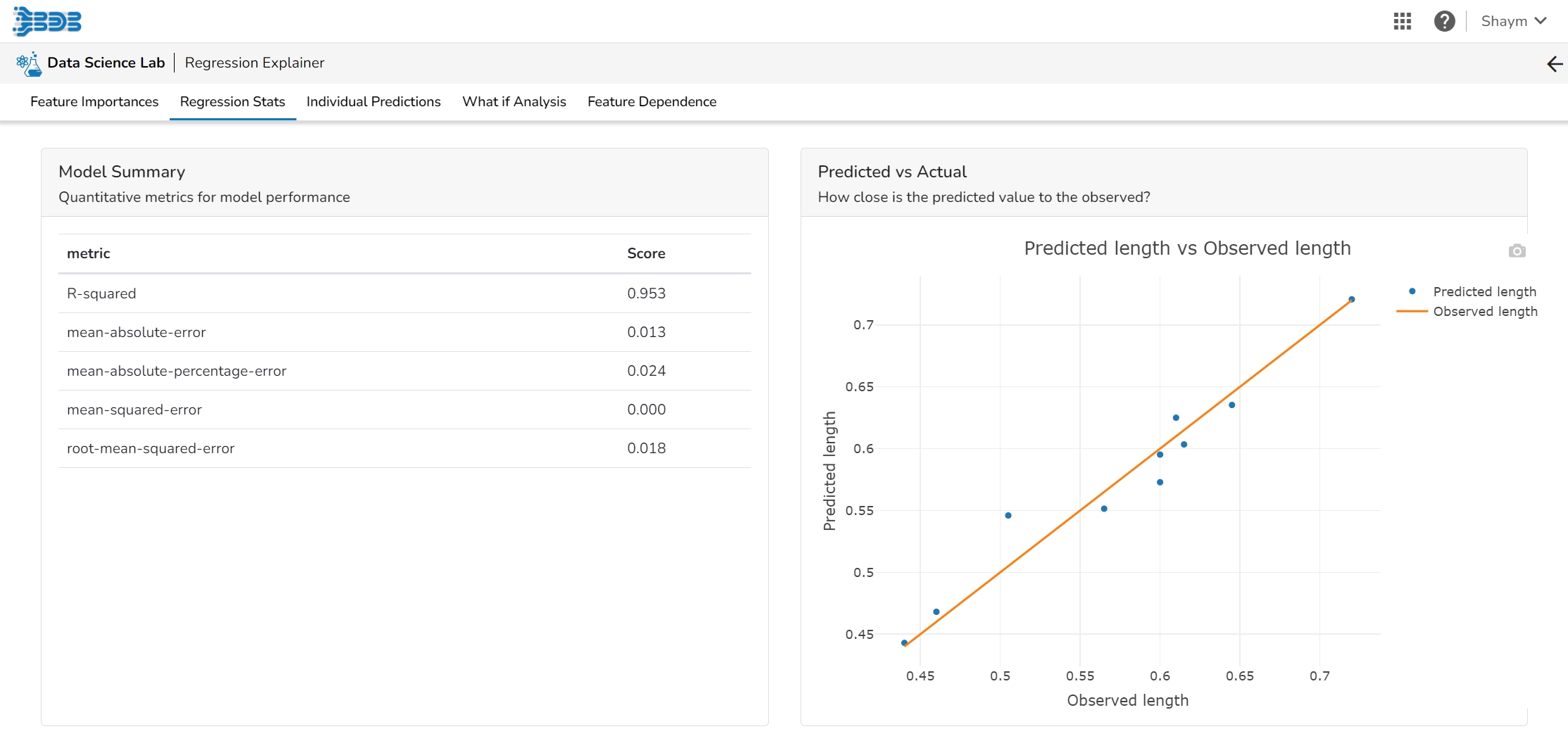
The user can find a number of regression performance metrics in this table that describe how well the model can predict the target column.
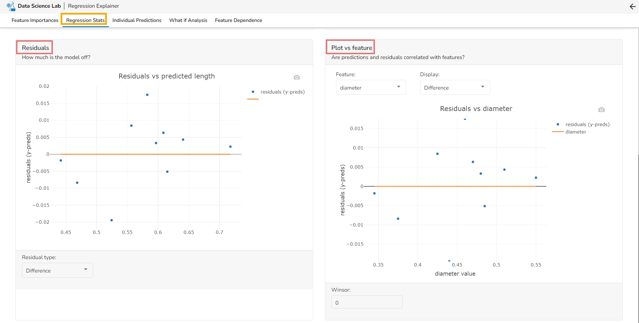
This plot shows the observed value of the target column and the predicted value of the target column. A perfect model would have all the points on the diagonal (predicted matches observed). The further away points are from the diagonal the worse the model is in predicting the target column.
Residuals: The residuals are the difference between the observed target column value and the predicted target column value. in this plot, one can check if the residuals are higher or lower for higher /lower actual /predicted outcomes. So, one can check if the model works better or worse for different target value levels.
Plot vs Features: This plot displays either residuals (difference between observed target value and predicted target value) plotted against the values of different features or the observed or predicted target value. This allows one to inspect whether the model is more inappropriate for a particular range of feature values than others.
The user can select a record directly by choosing it from the dropdown or hit the Random Index option to randomly select a record that fits the constraints. For example, the user can select a record where the observed target value is negative but the predicted probability of the target being positive is very high. This allows the user to sample only false positives or only false negatives.
It displays the predicted probability for each target label.
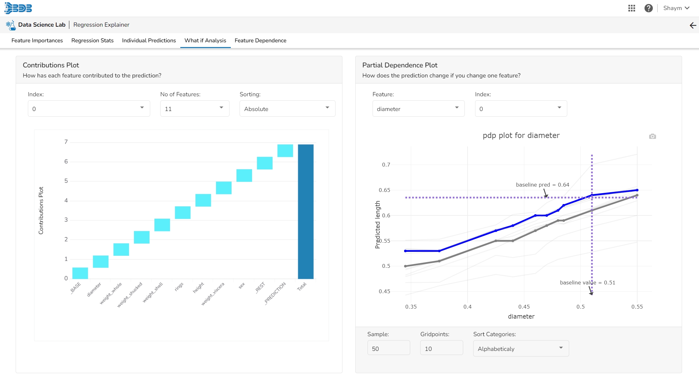
This plot shows the contribution that each feature has provided to the prediction for a specific observation. The contributions (starting from the population average) add up to the final prediction. This helps to explain exactly how each prediction has been built up from all the individual ingredients in the model.
The PDP plot shows how the model prediction would change if you change one particular feature. the plot shows you a sample of observations and how these observations would change with this feature (gridlines). The average effect is shown in grey. The effect of changing the feature for a single record is shown in blue. The user can adjust how many observations to sample for the average, how many gridlines to show, and how many points along the x-axis to calculate model predictions for (grid points).
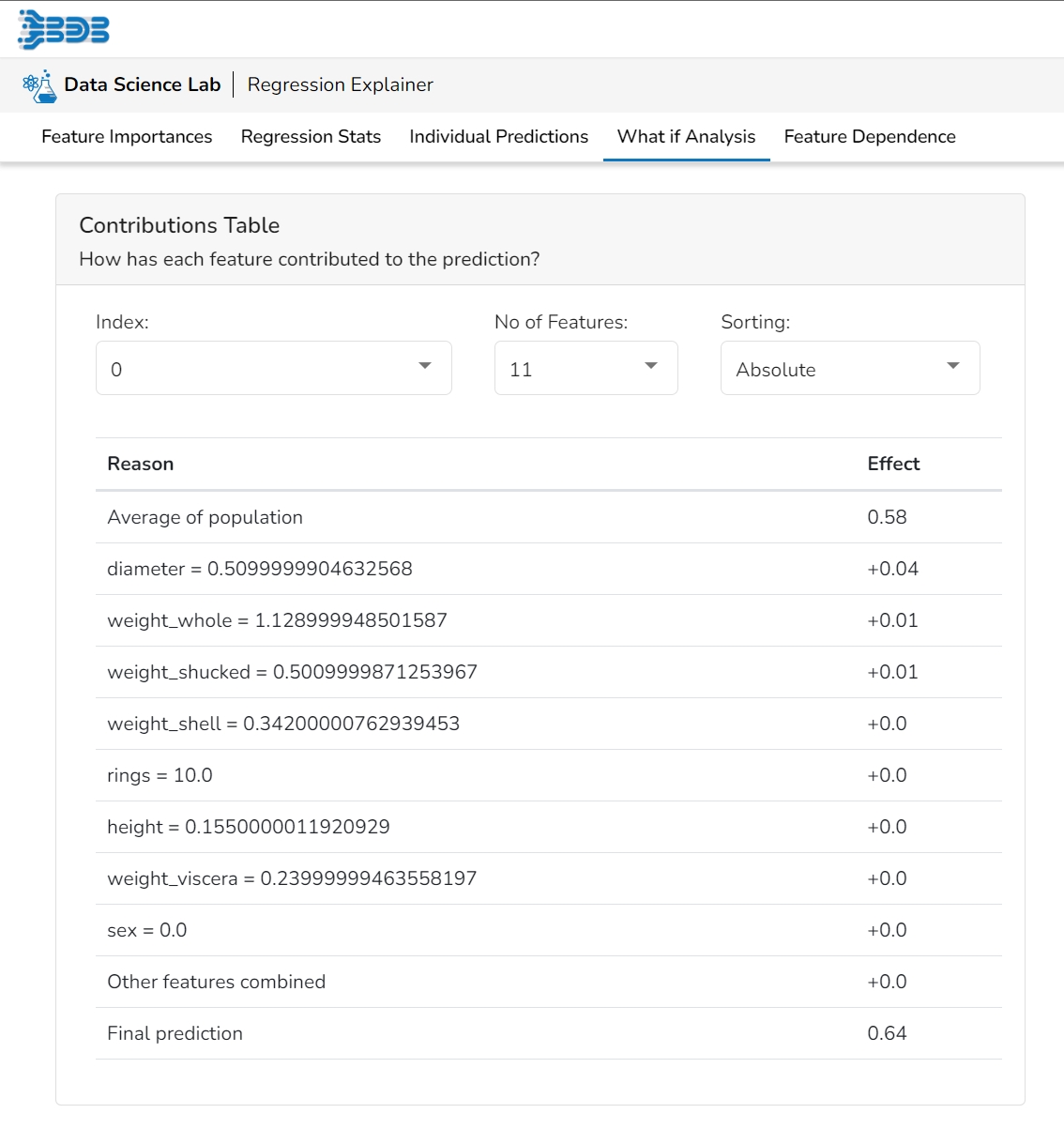
This table shows the contribution each individual feature has had on the prediction for a specific observation. The contributions (starting from the population average) add up to the final prediction. This allows you to explain exactly how each individual prediction has been built up from all the individual ingredients in the model.
The user can select a record directly by choosing it from the dropdown or hit the Random Index option to randomly select a record that fits the constraints. For example, the user can select a record where the observed target value is negative but the predicted probability of the target being positive is very high. This allows the user to sample only false positives or only false negatives.
It displays the predicted probability for each target label.
The user can adjust the input values to see predictions for what-if scenarios.
This table shows the contribution each individual feature has had on the prediction for a specific observation. The contributions (starting from the population average) add up to the final prediction. This allows you to explain exactly how each individual prediction has been built up from all the individual ingredients in the model.
The Shap Summary summarizes the Shap values per feature. The user can either select an aggregate display that shows the mean absolute Shap value per feature or get a more detailed look at the spread of Shap values per feature and how they co-relate the feature value (red is high).
This plot displays the relation between feature values and Shap values. This allows you to investigate the general relationship between feature value and impact on the prediction. The users can check whether the model uses features in line with their intuitions, or use the plots to learn about the relationships that the model has learned between the input features and the predicted outcome.