Loading...
Loading...
Loading...
Loading...
Loading...
Loading...
Loading...
Loading...
This section explains way to begin work with the Workspace tab. The Create and Import options are provided for Repo folders.
Loading...
Loading...
Loading...
Loading...
Loading...
Loading...
Loading...
Loading...
Loading...
Loading...
Loading...
The Model tab includes various models created, saved, or imported using the Data Science Lab module. It broadly list Data Science Models, Imported Models, and Auto ML models.
Loading...
Loading...
Loading...
Loading...
Loading...
Loading...
Loading...
Loading...
Loading...
Loading...
Loading...
The View Explanation option will redirect the user to the below given options. Let us see all of them one by one explained as separate topics.
Loading...
Loading...
Loading...
Loading...
Loading...
Loading...
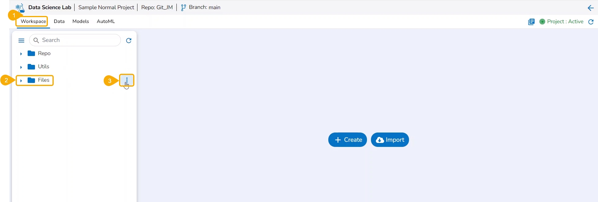
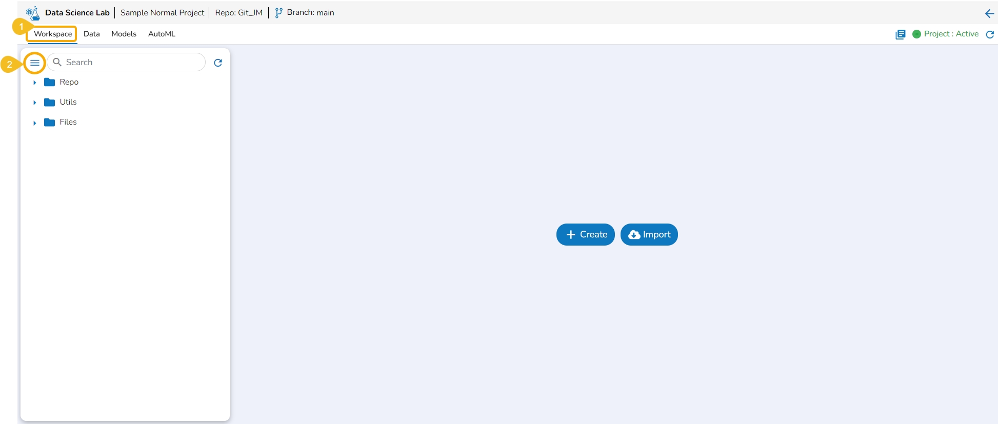
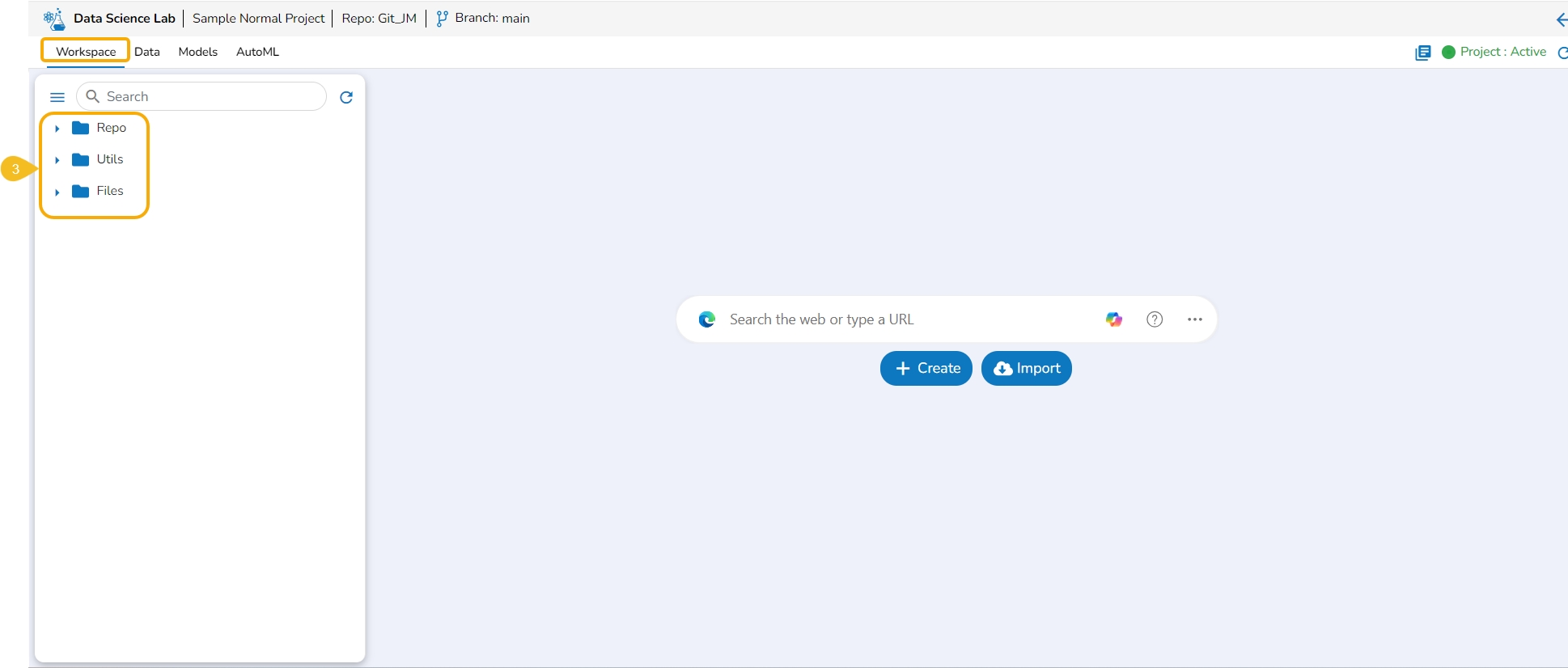
The Workspace tab contains default folders named Repo, Utils, and Files. All the created and saved folders and files will be listed under either of these folders.
Navigate to the Workspace tab (it is a default tab to open for a Project).
The left side panel displays the default Folders.
These folders will save all the created or imported folders/ files by the user.
The Workspace tab also contains a Search bar to search the available Assets.
Please Note: The Workspace will be blank for the user, in case of a new Project until the first Notebook is created. It will contain the default folders named Repo, Utils, and Files.
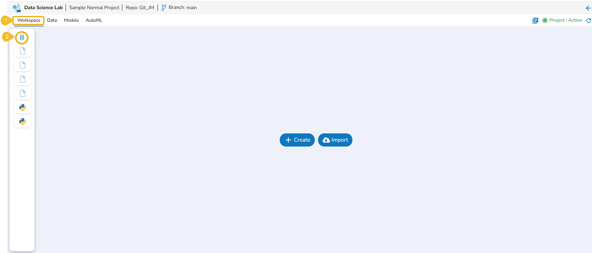
Navigate to the Workspace Assets.
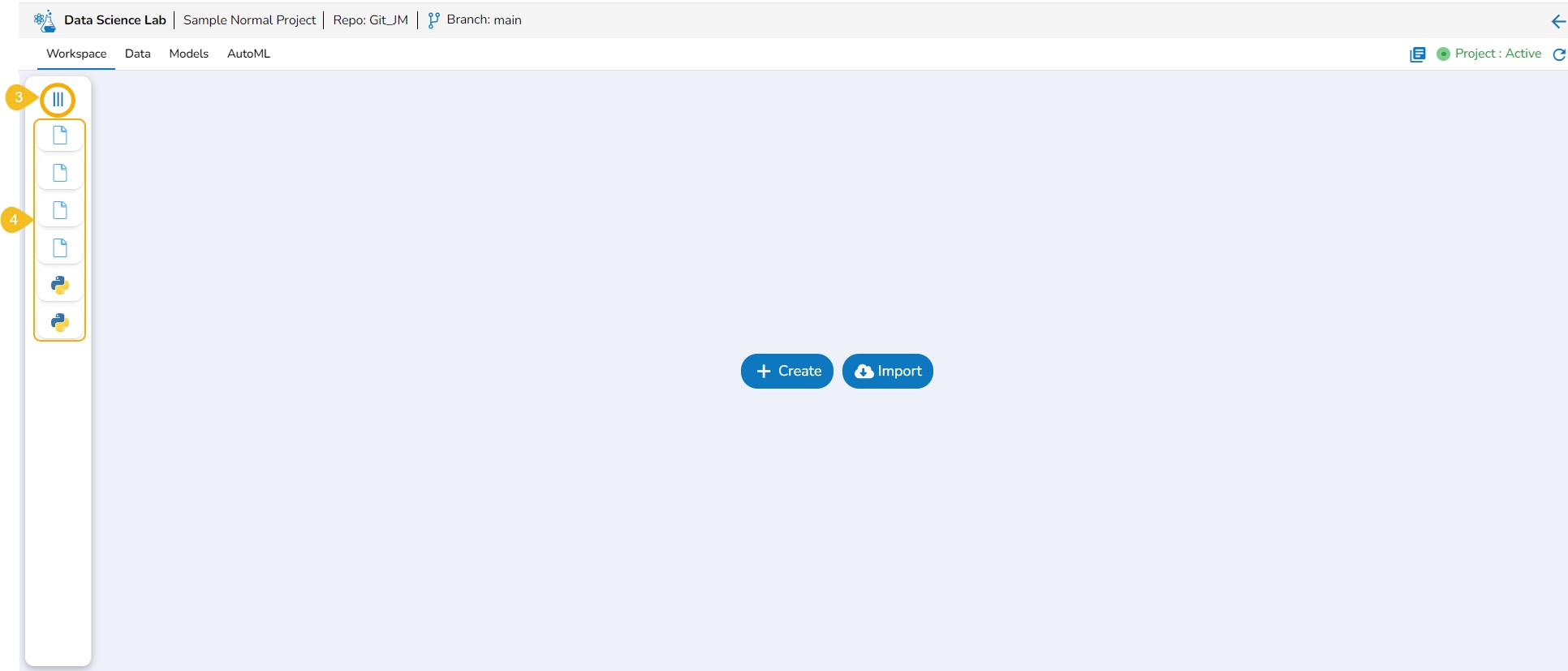
Click the Collapse icon.
The Workspace left-side panel will be collapsed displaying all the created or imported files and folders as icons.
Navigate to the Workspace tab with the collapsed left-side panel.
Click the Expand icon.
The Workspace's left-side panel will be expanded. In the expanded mode of the left-side panel, the default folders of the Workspace tab will be visible in the default view.
Please Note:
The Workspace left side menu appears in the expanded mode by default while opening the Workspace tab.
The Workspace List displays the saved/ created folders and files in the collapsed mode (if any folder or file is created inside that Workspace).
The normal Data Science Project where Git Repository and Git Branch are selected while creating the project, displays the selected branch on the header.
A Repo Sync Project can display the selected branch on the Project header, and the user will be allowed to change the branch using the drop-down menu.
This section explains the attributive action provided for the Utils folder.
The Utilis folder allows the users to import the utility files from their systems and Git repository.
Please Note: The Utils folder will be added by default to only normal Data Science Lab projects.
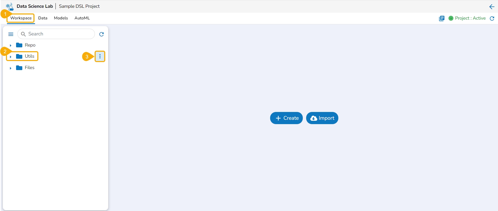
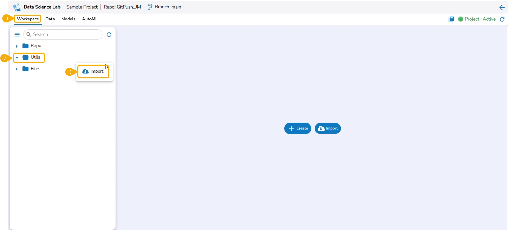
Navigate to the Workspace tab.
Select the Utils folder.
Click the ellipsis icon to open the context menu.
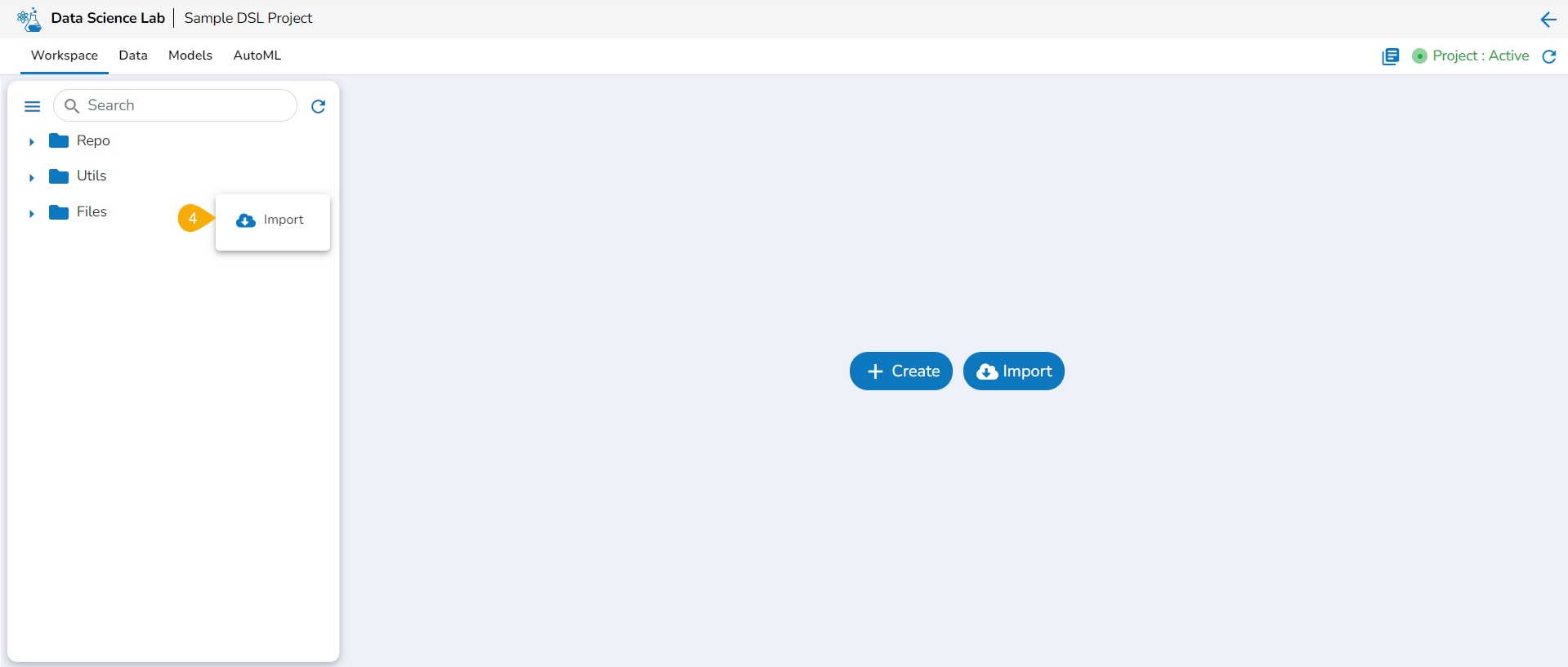
Click the Import option that appears in the context menu.
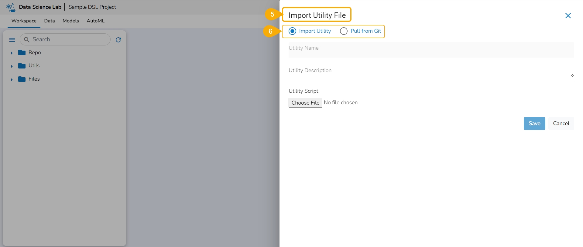
The Import Utility File window opens.
The user can import a utility file using either of the options: Import Utility or Pull from Git.
Check out the walk-through video to understand the Import Utility functionality.
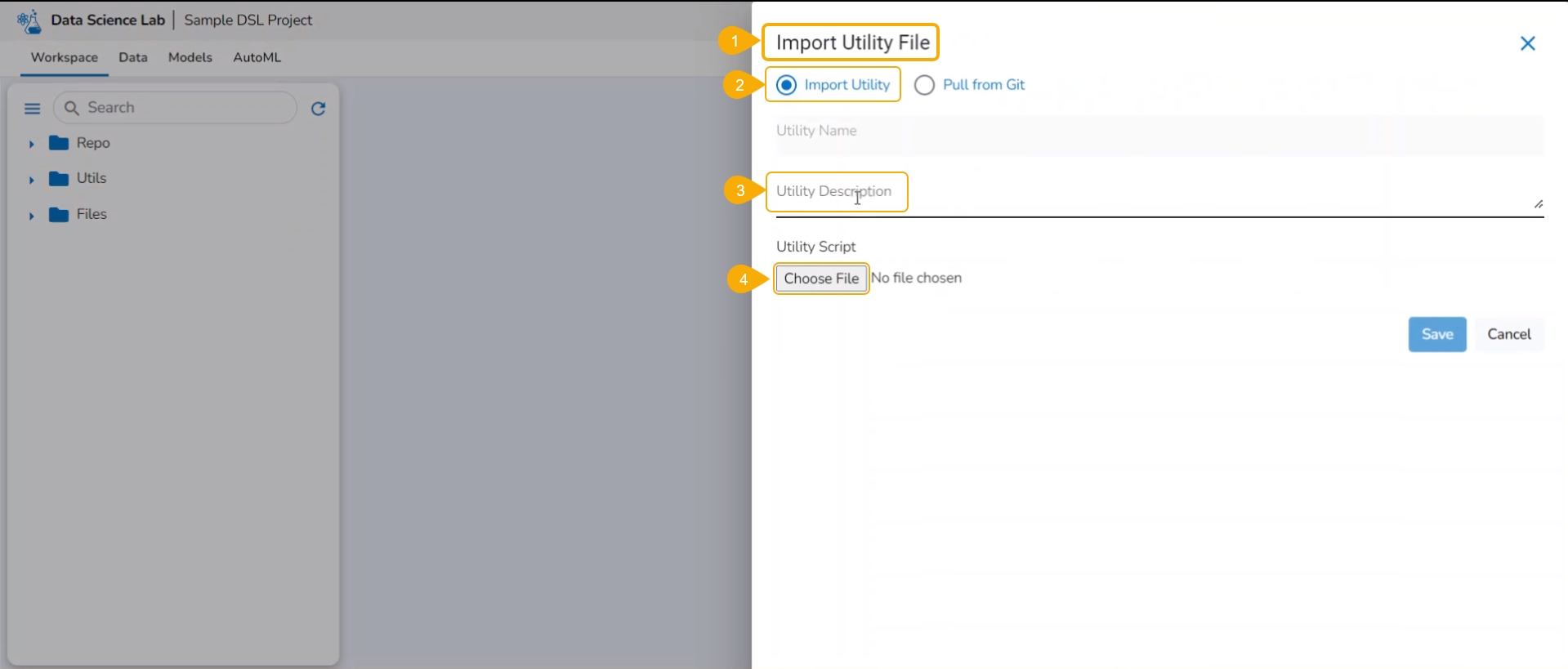
Navigate to the Import Utility File window.
Select the Import Utility option by using the checkbox.
Describe the Utility script using the Utility Description space.
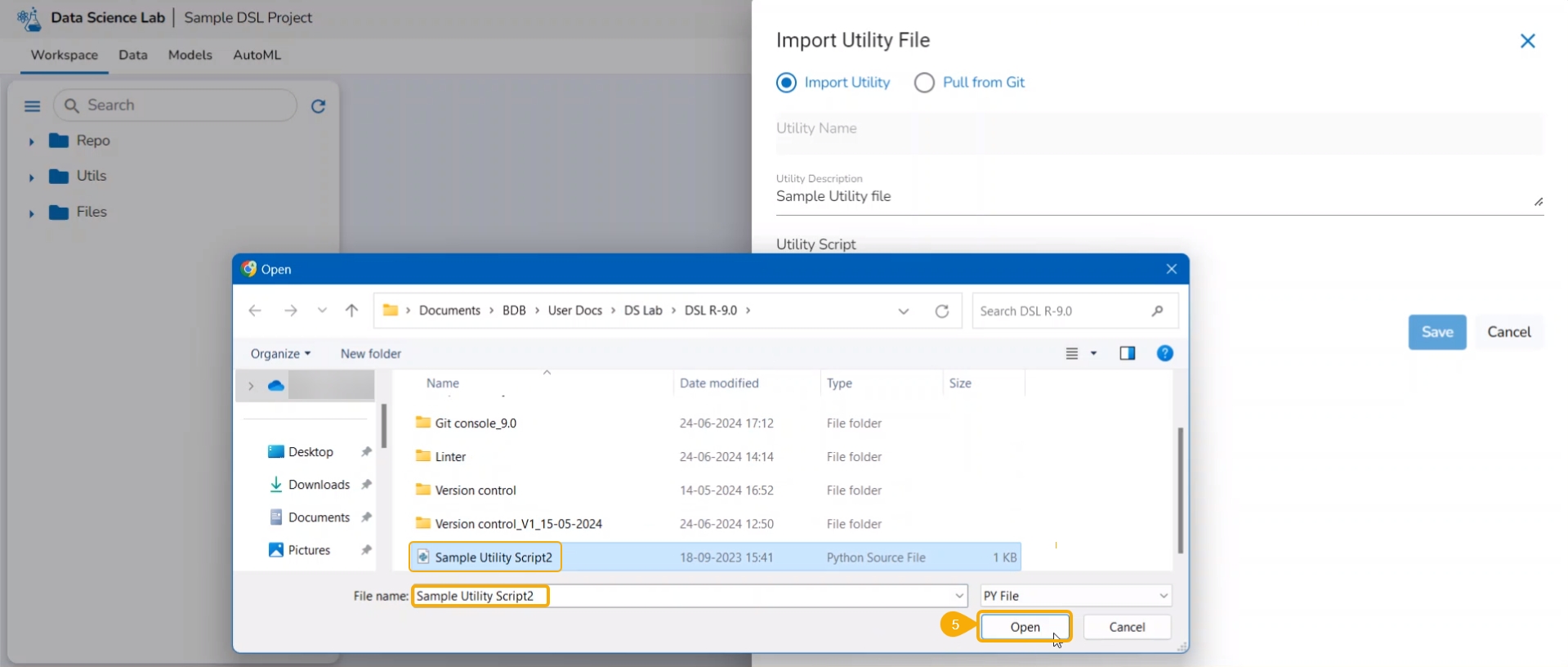
Click the Choose File option to import a utility file.
Search and upload a utility file from the system.
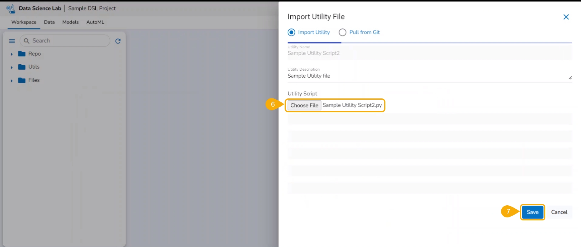
The uploaded utility file title appears next to the Choose File option.
Click the Save option.
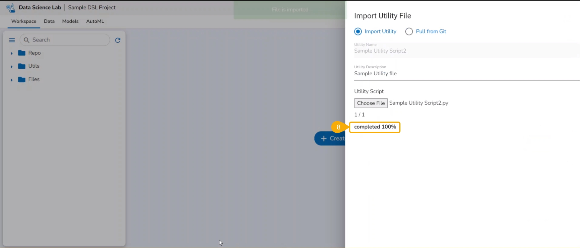
The imported utility file will display completed 100% when imported completely.
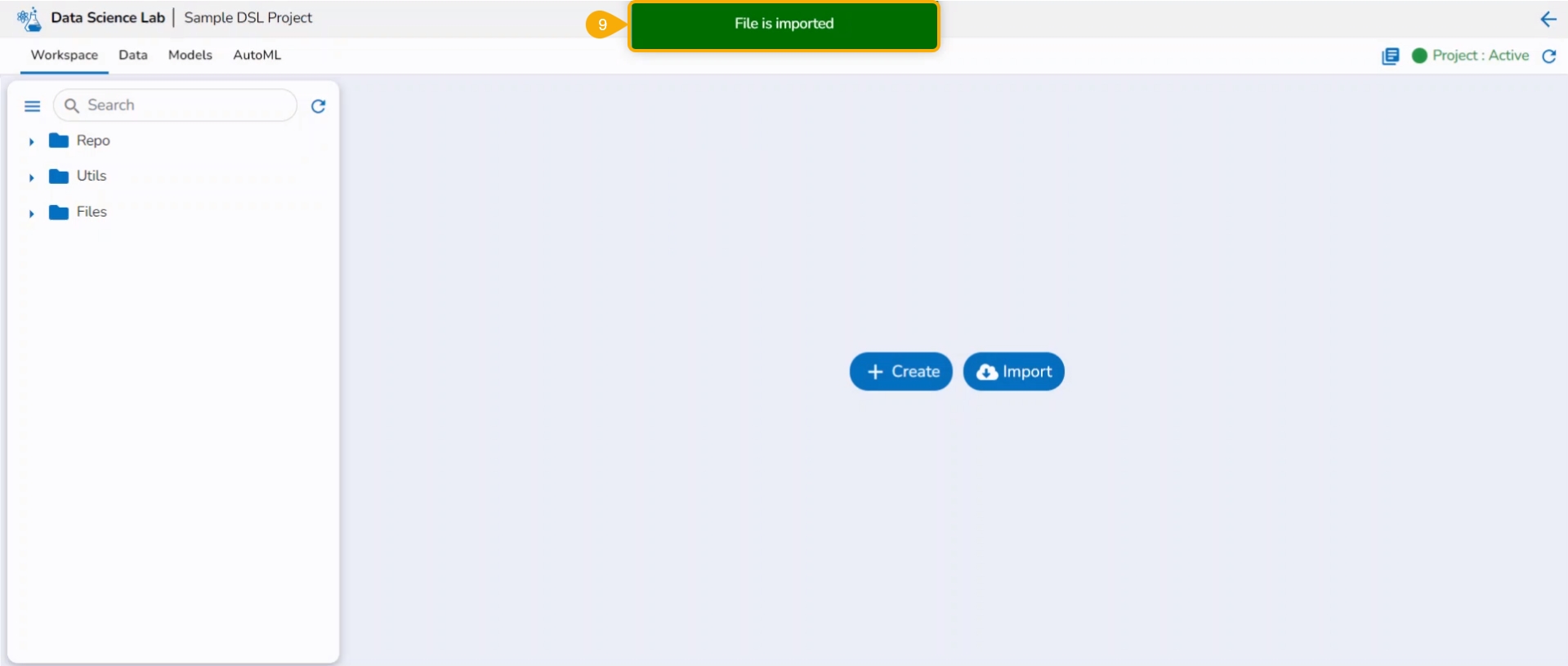
A notification also ensures that the file has been imported.
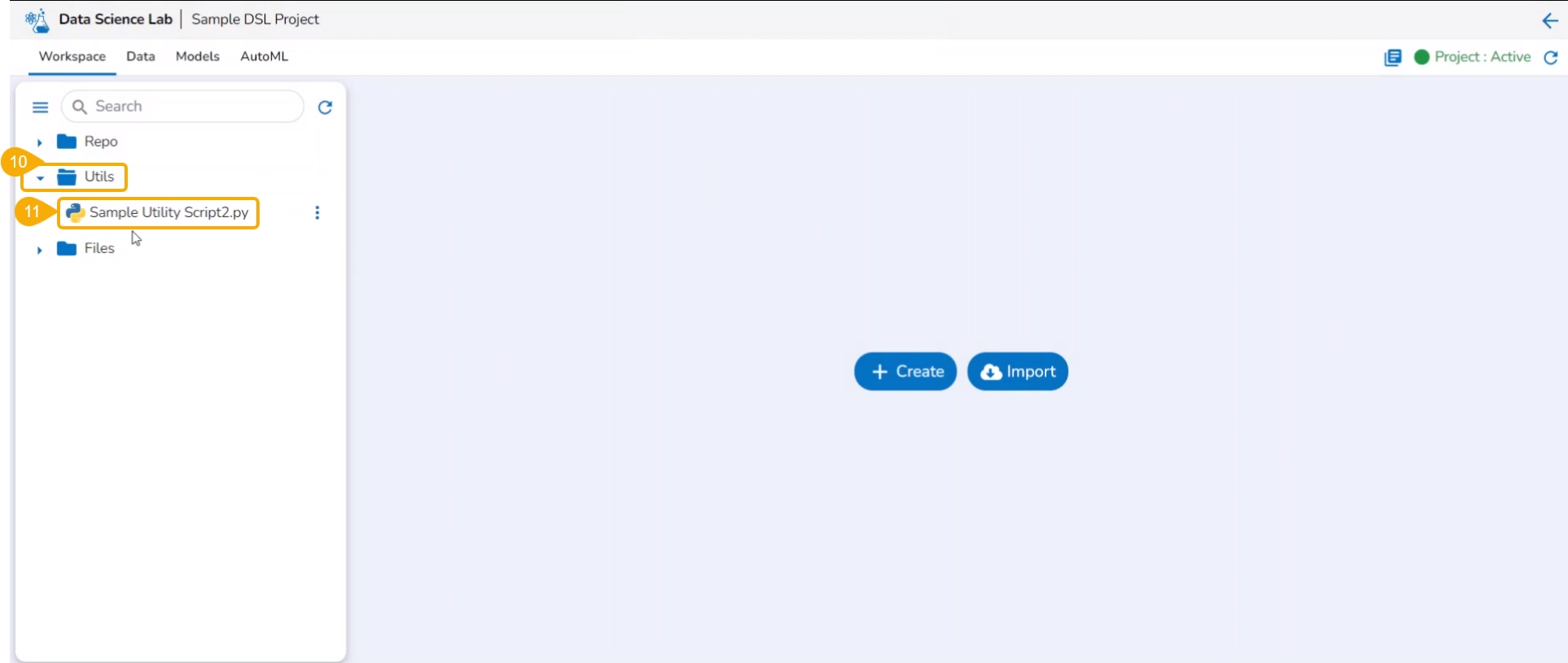
Open the Utils folder provided under the Workspace tab.
The imported utility file appears under the Utils folder.
A DSL project utilizes tabs to structure a data science experiment, enabling the outcome to be readily consumed for further data analytics.
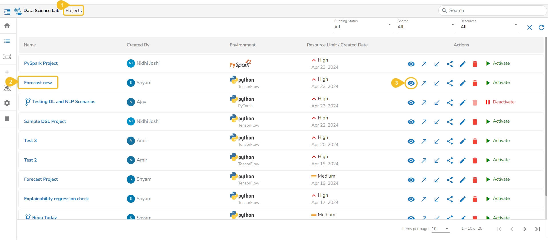
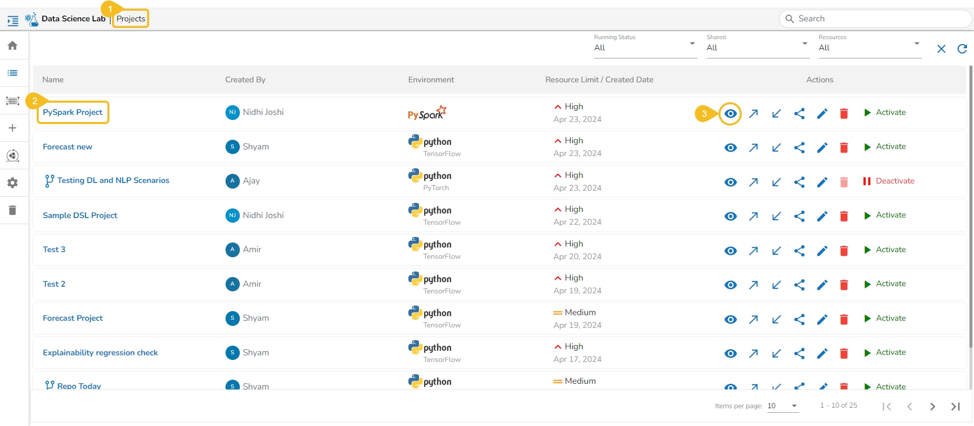
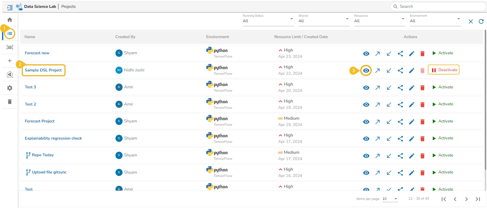
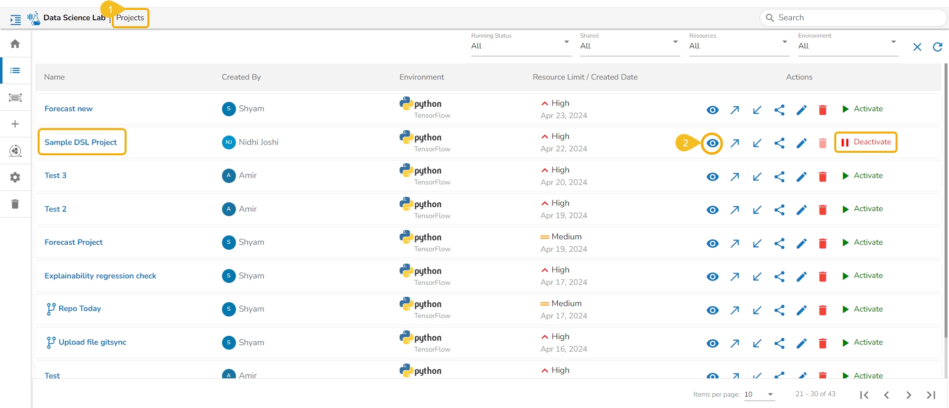
The users can click on the View icon available for a DSL Project, it redirects to a page displaying the various tabs for the selected DSL Project.
Navigate to the Projects page.
Select a DSL project from the list.
Click the View icon.
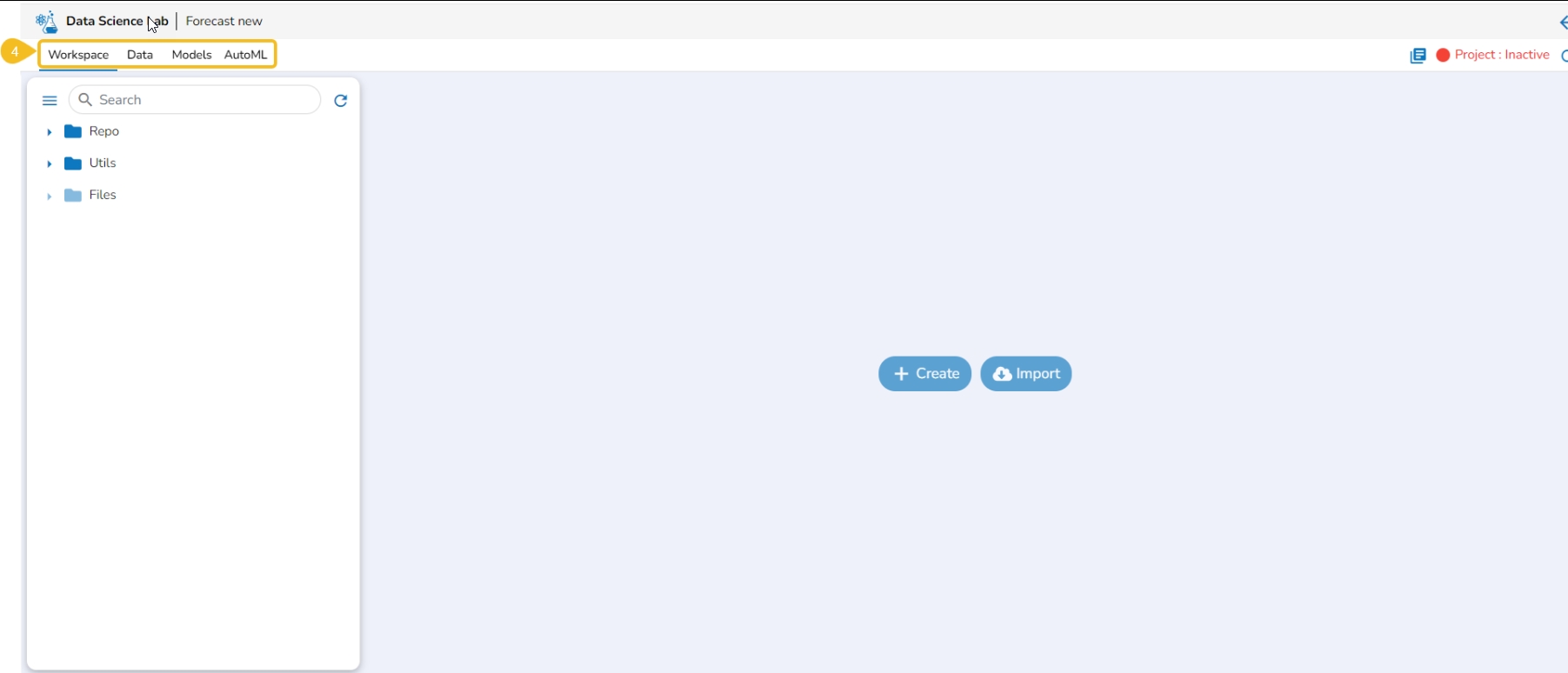
The next page appears with the accessible tabs for the selected Project.
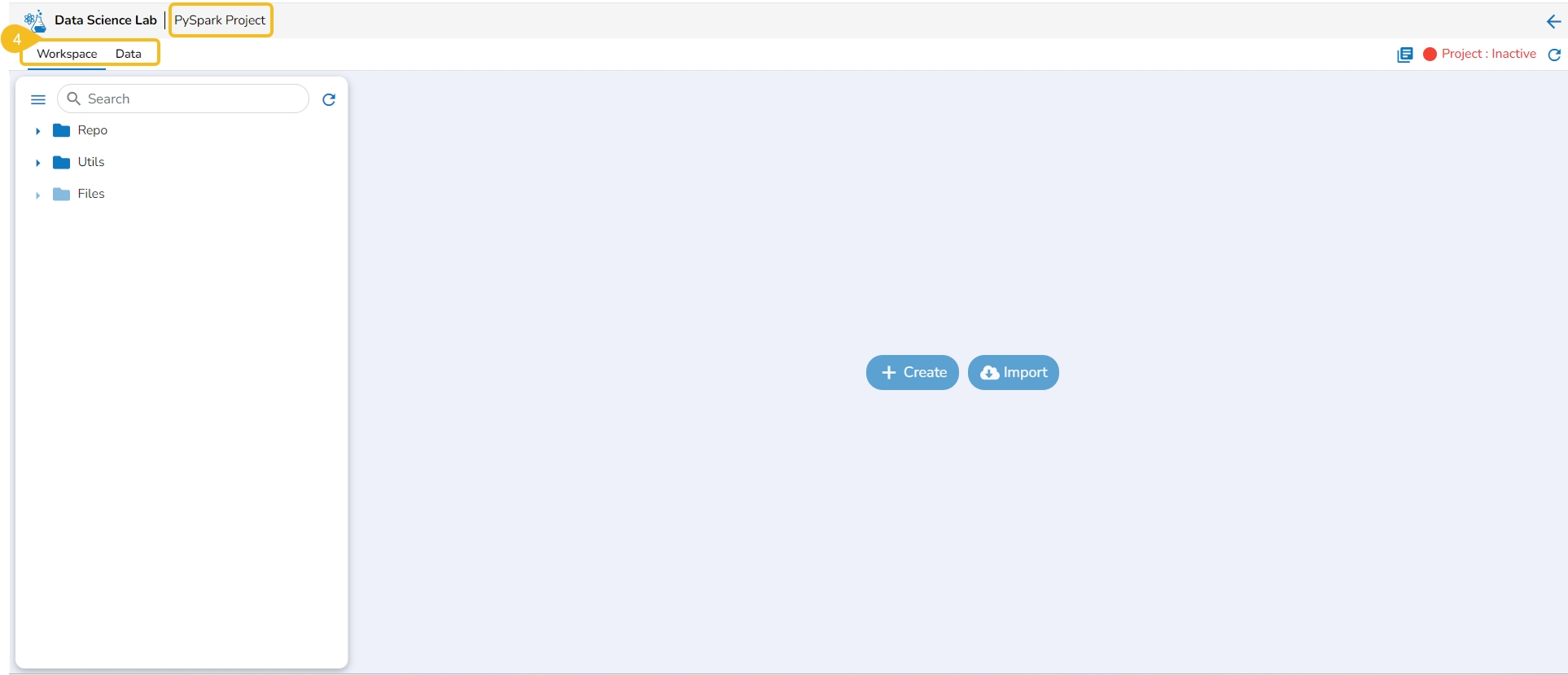
If you select a PySpark project, the following tabs will be available:
The following table provides an outlook of the various tabs provided to a DSL Project:
The Workspace tab inside a Repo Sync Project works like a placeholder to keep all the Git Hub & Git Lab Repository documents (folders and files) of the logged-in user.
The Data section focuses on how to add or upload data to your DSL Projects. This tab lists all the added Datasets, Data Stores, and Feature Stores for a Project.
The Model tab includes various models created, saved, or imported using the Data Science Lab module. It broadly lists Data Science Models, Imported Models, and Auto ML models.
The Auto ML tab allows the users to create various experiments on top of their datasets and list all their created experiments.
Please Note: The allocation of tabs to a DSL project is environment-based.
The DSL Projects created based on Python TensorFlow and Python PyTorch environments will contain all four tabs.
The Create option redirects the user to create a new Notebook under the selected Project.
Check out the illustration on creating a new Notebook inside a DSL Project.
Please Note: The Create option appears for the Repo folder that opens by default under the Workspace tab.
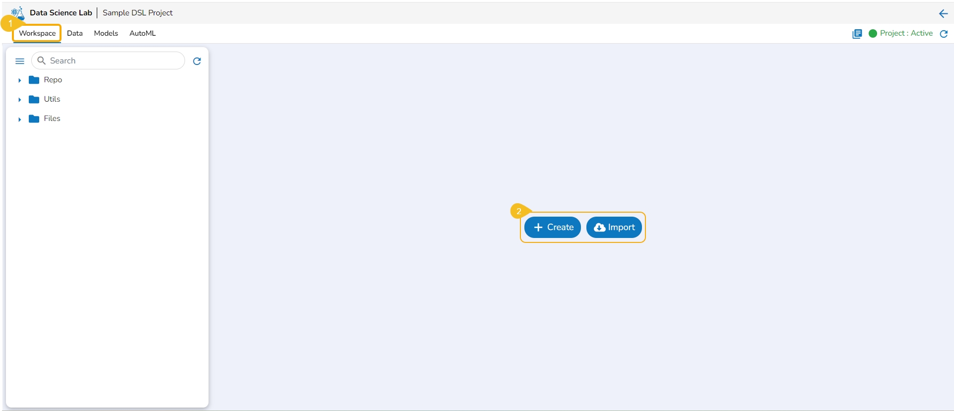
Navigate to the Workspace tab for a Data Science Lab project.
Click the Create option from the Notebook tab.
Please Note: The Create option gets enabled only if the Project status is Active as mentioned in the above-given image.
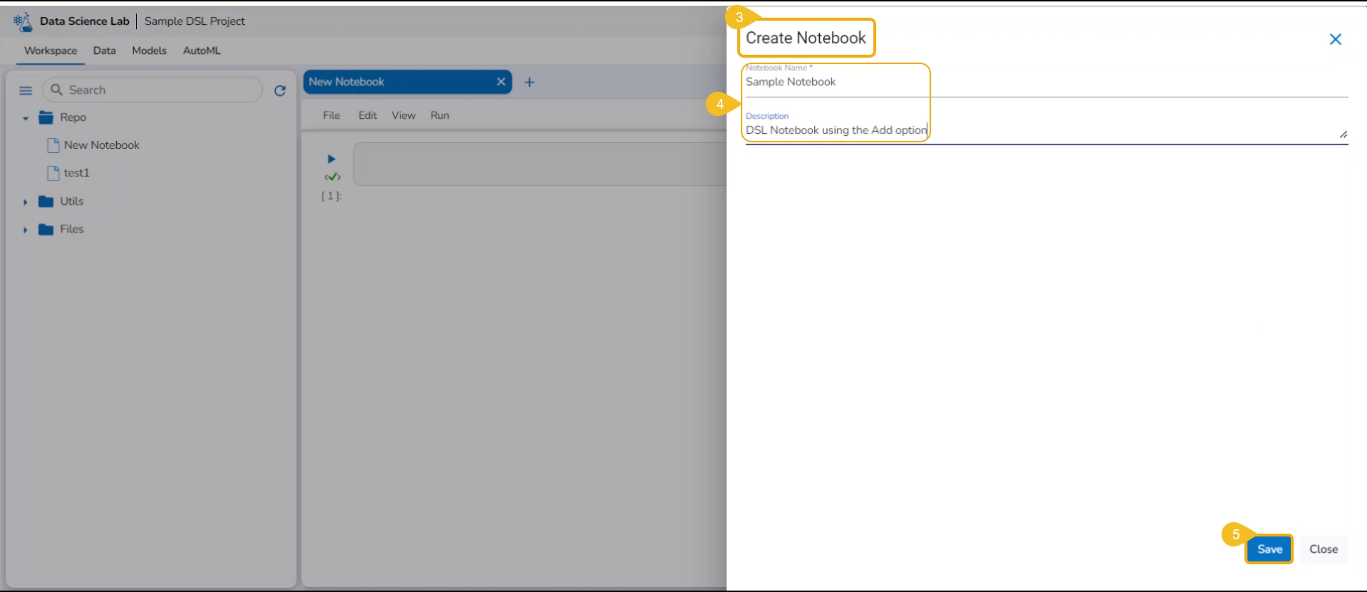
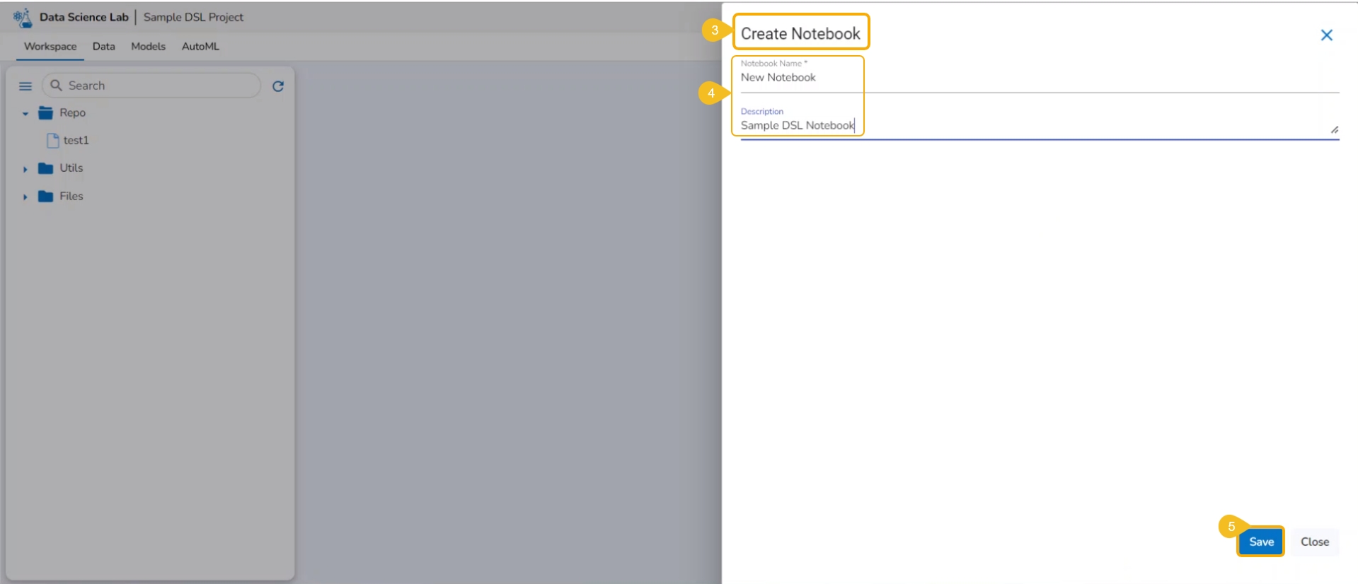
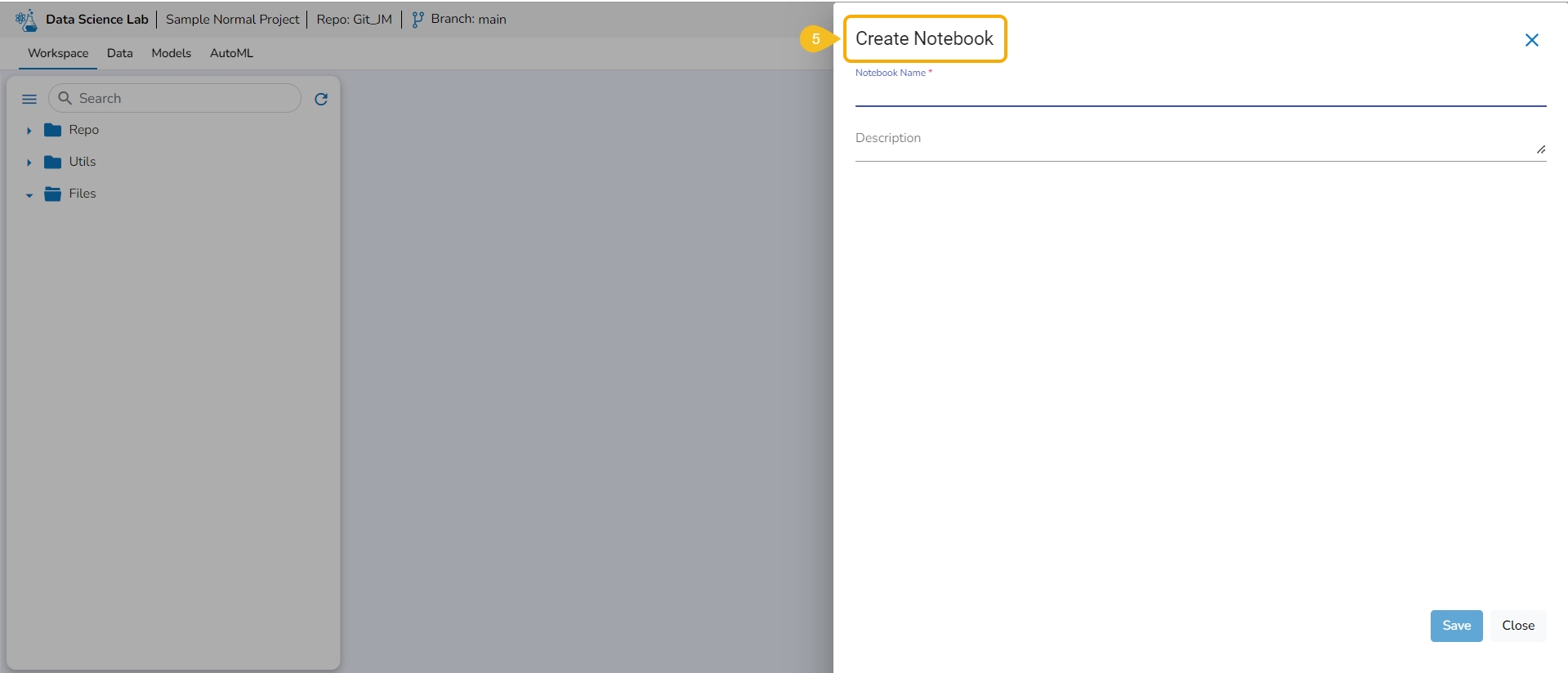
The Create Notebook page opens.
Provide the following information to create a new Notebook:
Notebook Name
Description
Click the Save option.
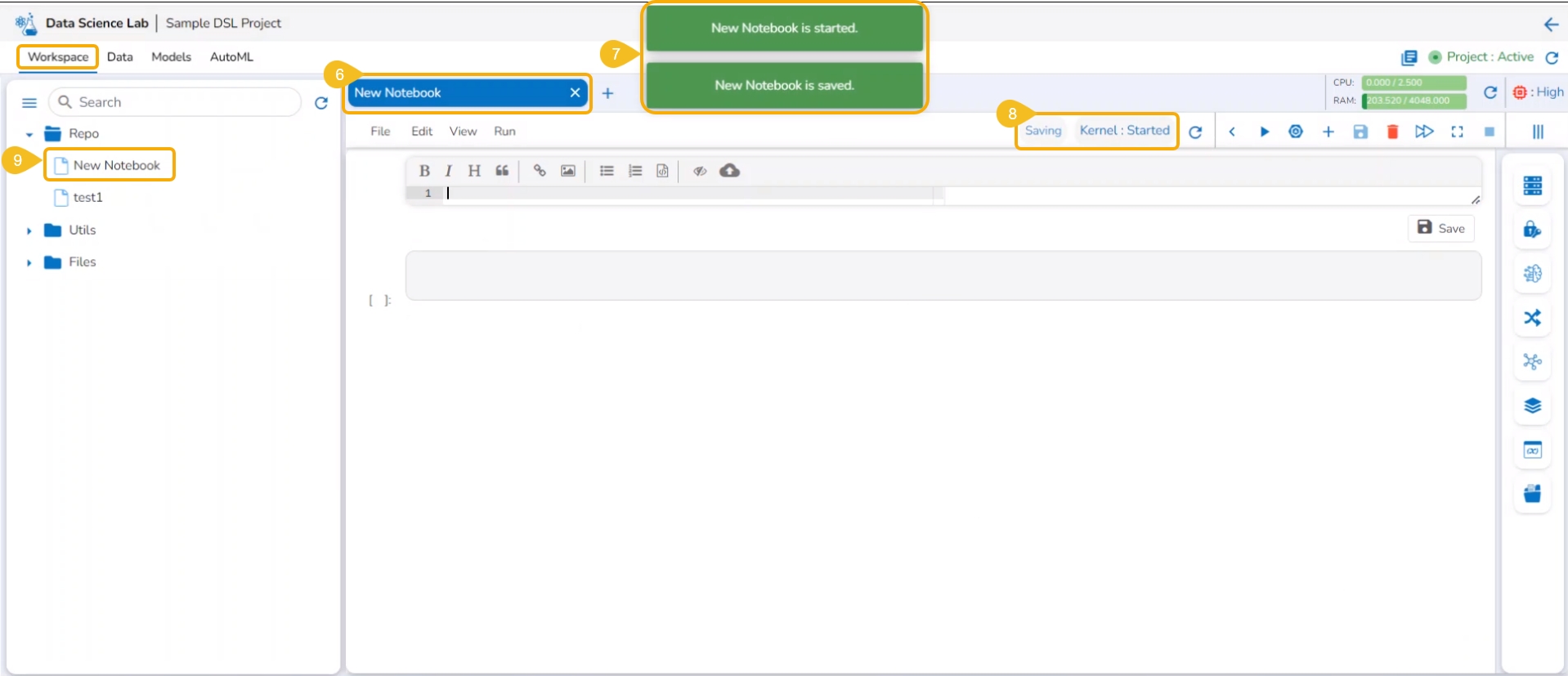
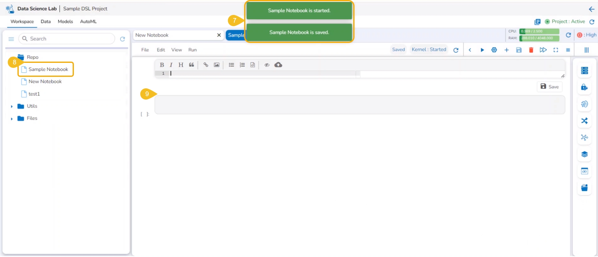
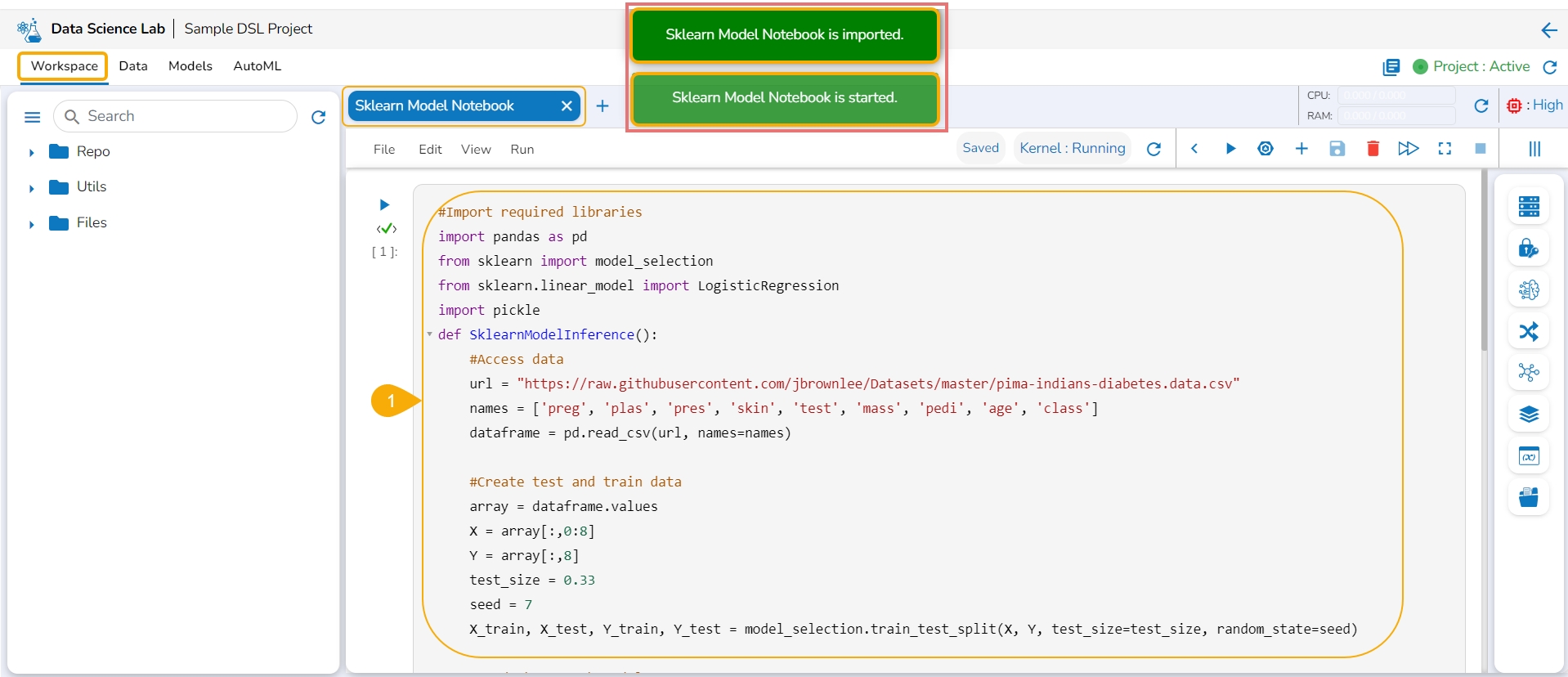
The Notebook gets created with the given name and the Notebook page opens. The Notebook may take a few seconds to save and start the Kernel.
The user will get notifications to ensure the new Notebook has been saved and started.
The same gets notified on the Notebook header (as highlighted in the image).
The newly created Notebook is ready now for the user to commence Data Science experiments. The newly created Notebook is listed on the left side of the Notebook page.
Check out the illustration on adding a new Notebook.
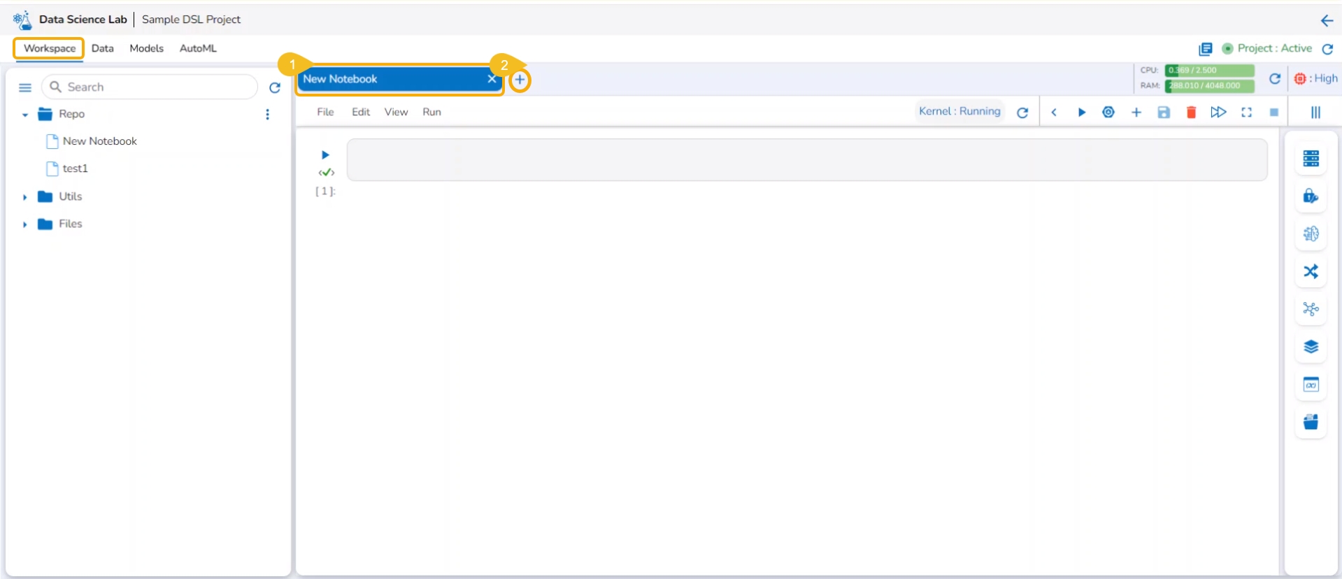
The users also get an Add option to create a new Notebook. This option becomes available to the users only after at least one Notebook is created using the Create option and open it.
Open an existing Notebook from a Project.
The Add icon appears on the header next to the opened Notebook name. Click the Add icon.
The Create Notebook window opens.
Provide the Notebook Name and Description.
Click the Save option.
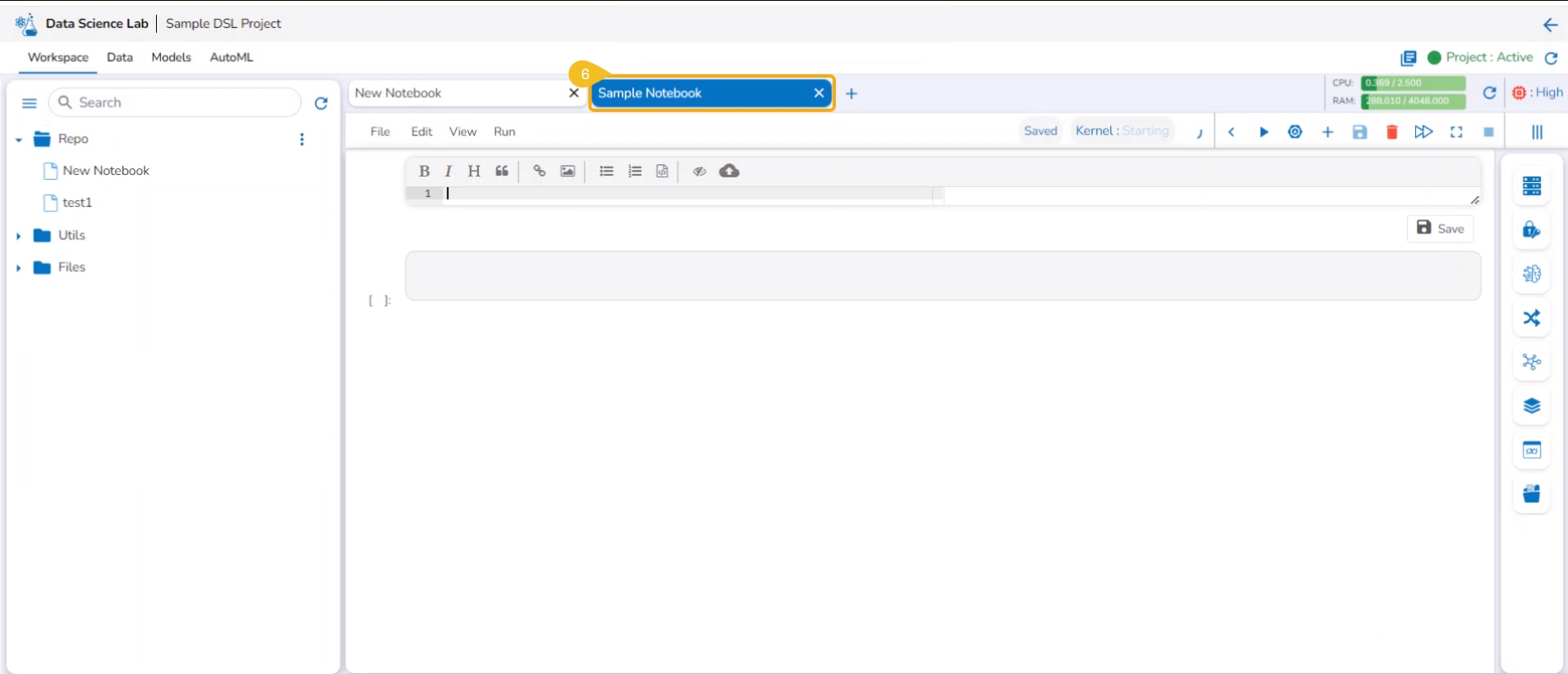
A new Notebook gets created and the user will be redirected to the interphase of the newly created Notebook.
Soon the notification messages assuring the user that the newly created Notebook has been saved and started appear on the screen.
The Notebook gets listed under the Notebook list provided on the left side of the screen.
A code cell gets added by default to the newly created Notebook for the user to begin the data science experiment.
Please Note:
The user can edit the Notebook name by using the Edit Notebook Name icon.
The accessible datasets, models, and artifacts will be listed under the Datasets, Models, and Artifacts menus.
The Find/Replace menu facilitates the user to find and replace a specific text in the notebook code.
The created Notebook (.ipynb file) gets added to the Repo folder. The Notebook Actions are provided to each created and saved Notebook. Refer to the Notebook Actions page to get detailed information.
The Workspace is a placeholder to create and save various data science experiments inside the Data Science Lab modules.
The Workspace is the default tab to open for each Data Science Lab project. Based on the Project types the options to begin working with Workspace may differ.
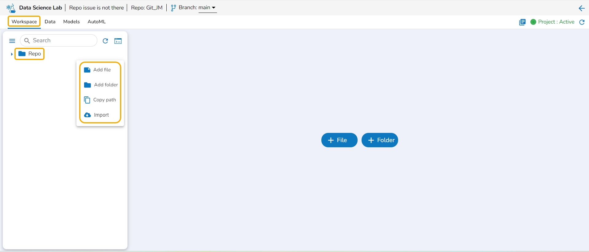
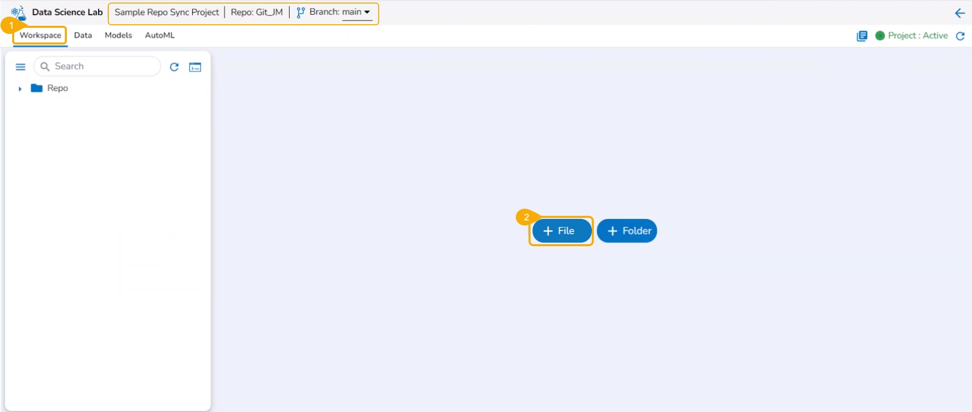
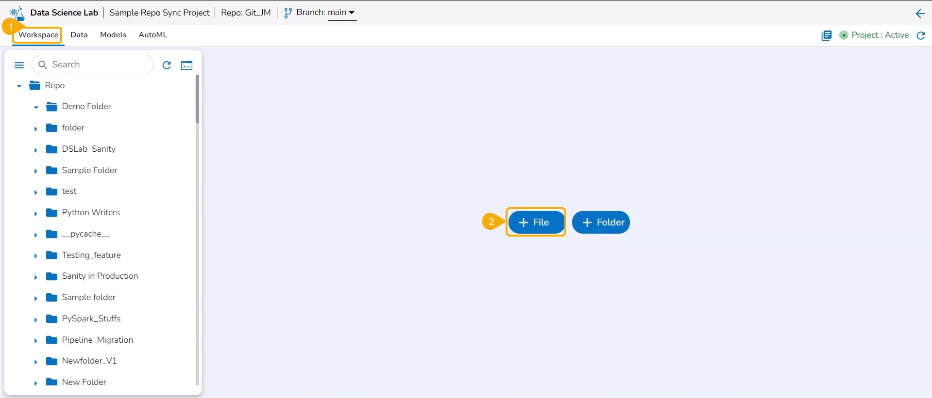
The Repo Sync Projects offer File and Folder options on the default page of the Workspace tab.
The normal Data Science Projects will have Create and Import options under the Workspace landing page.
Navigate to the Projects page.
Select an activated Repo Sync Project from the displayed list.
Click the View icon to open the project.
The Repo Sync project opens displaying the Workspace tab.
A Repo folder gets added to the selected Repo Sync project based on the selected Git repository account (at the user-level settings) under the Notebook tab with Refresh and Git Console icons.
Please Note:
The Repo Sync Project opens with a branch configured at the project level.
A Repo Sync Project contains other than .ipynb files under the Workspace tab.
Navigate to the Projects page.
Select an activated Project from the displayed list.
Click the View icon to open the project.
The Project opens displaying the Workspace tab.
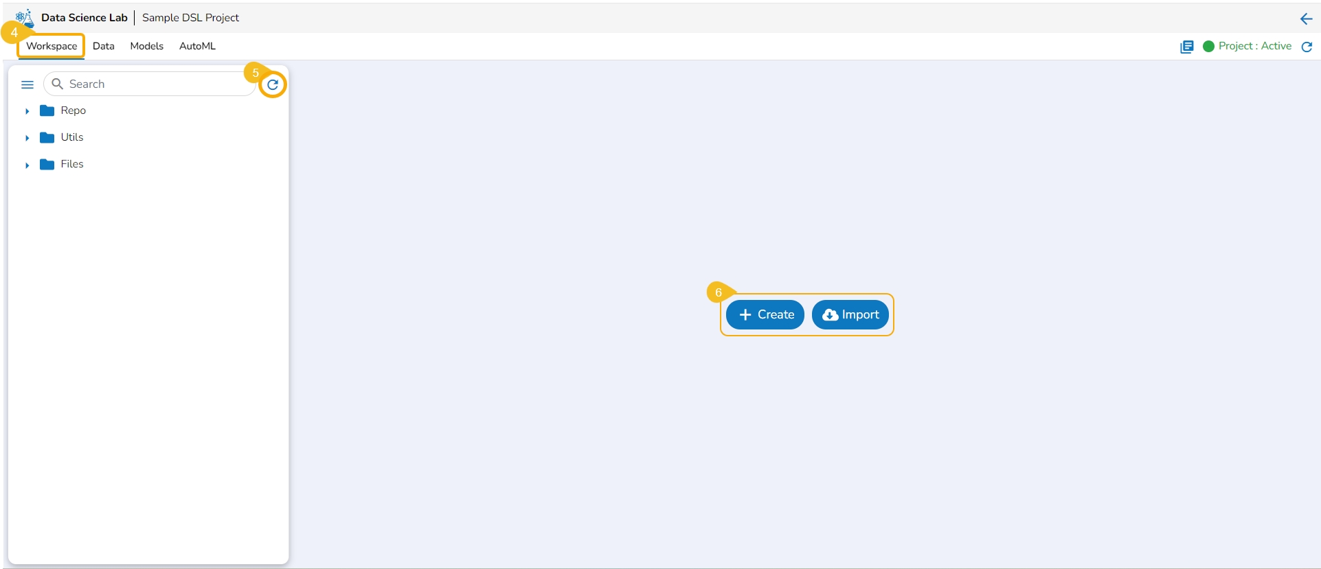
The Repo, Utils, and Files default folders appear under the Workspace tab.
Please Note: If the selected project is a Repo Sync Project, it will only contain a Repo folder under the Workspace tab. Here, the Repo folder will support all file types. Three folders (Repo, Utils, and Files) will be available under the Workspace tab for a normal Data Science Lab project.
A Refresh icon is provided to refresh the data.
The users get two options to start with their data science exploration:
Create - By Creating a new Notebook
Import -By Importing a Notebook
The Libraries icon on the Workspace displays all the installed libraries with version and status.
Navigate to the Workspace tab.
Click the Libraries icon.
The Libraries window opens displaying Versions and Status for all the installed libraries.
Click the Failed status to expand the details of a failed library installation.
You can bring your Python script to the Notebook framework to carry forward your Data Science experiment.
Please Note: The Import option appears for the Repo folder.
The Import functionality contains two ways to import a Notebook.
Import Notebook
The users can seamlessly import Notebooks created using other tools and saved in their systems.
Please Note: The downloaded files in the .ipynb format only are supported by the Upload Notebook option.
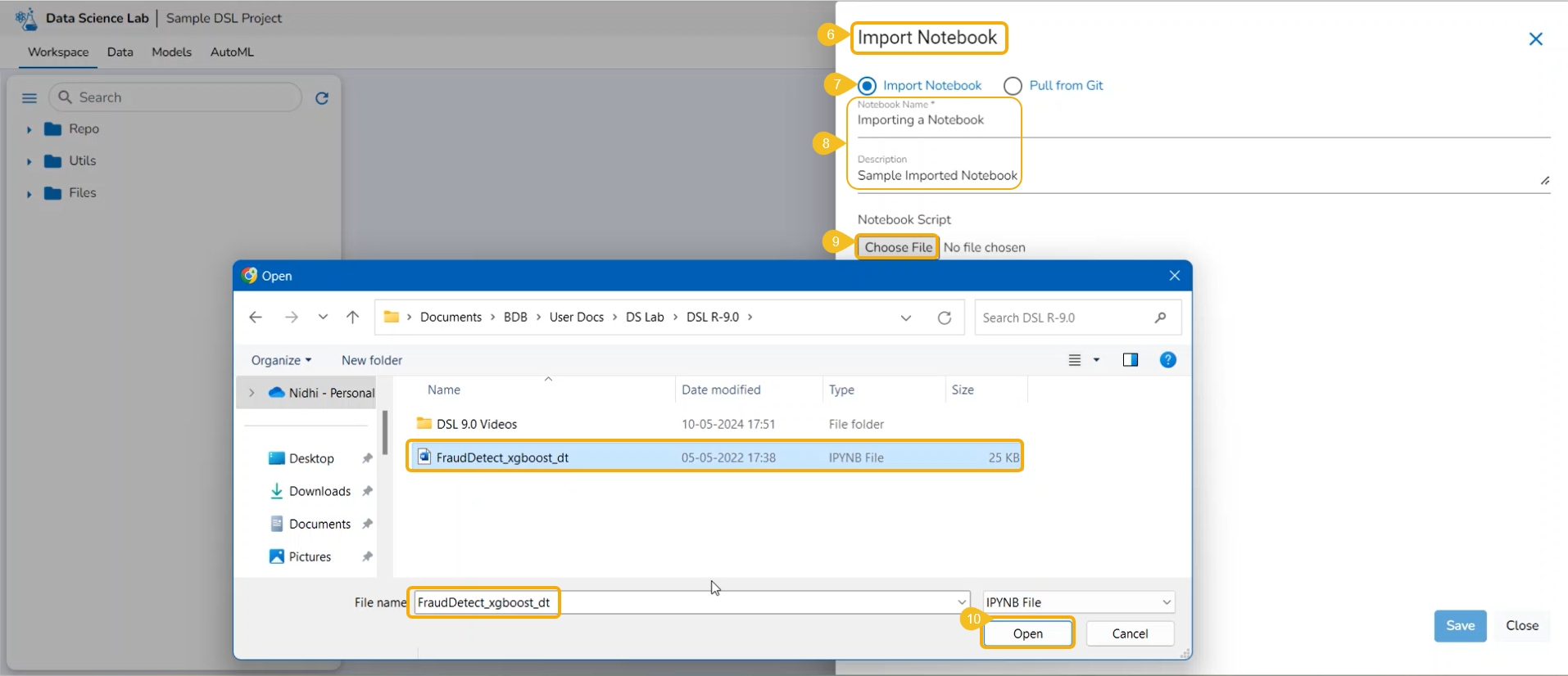
Check out the given illustration on how to import a Notebook.
Navigate to the Projects tab.
Click the View icon for an activated project.
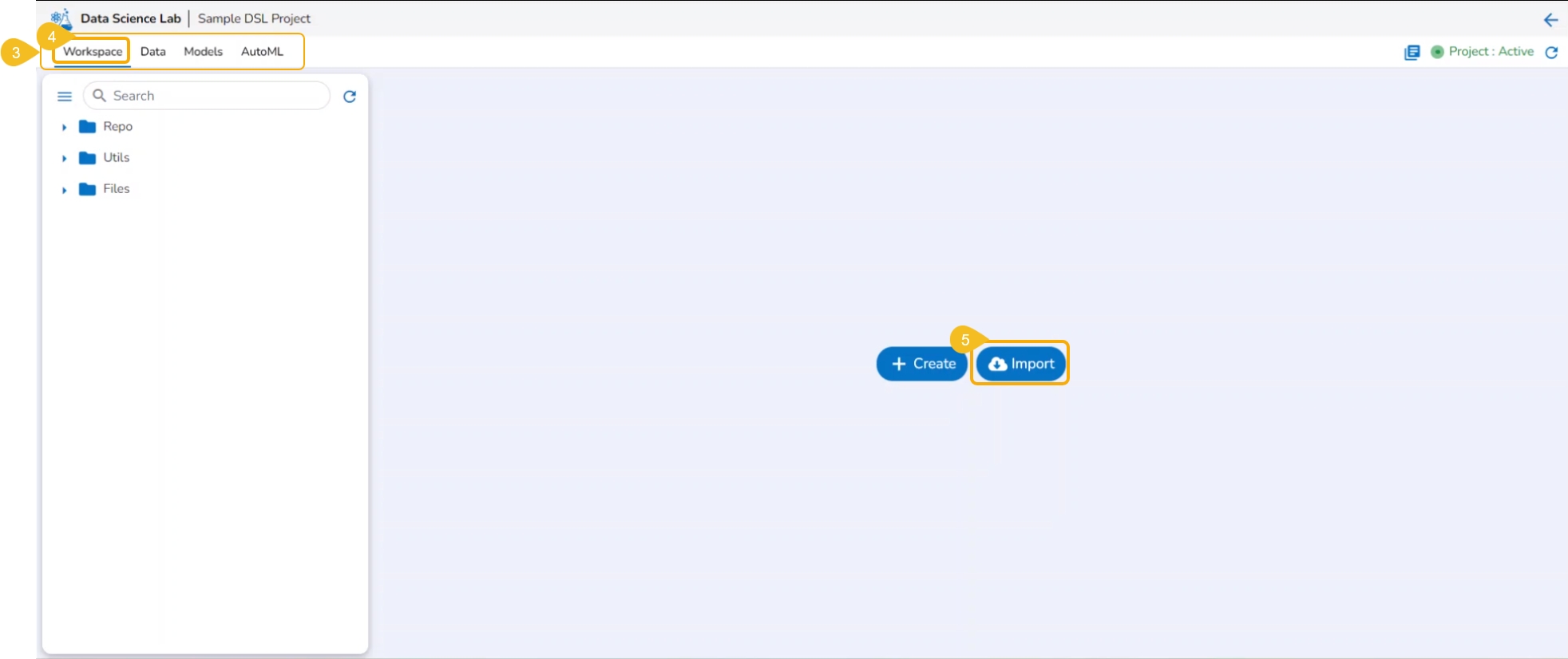
The next page opens displaying all the related tabs.
The Workspace tab opens by default.
Click the Import option from the Workspace tab.
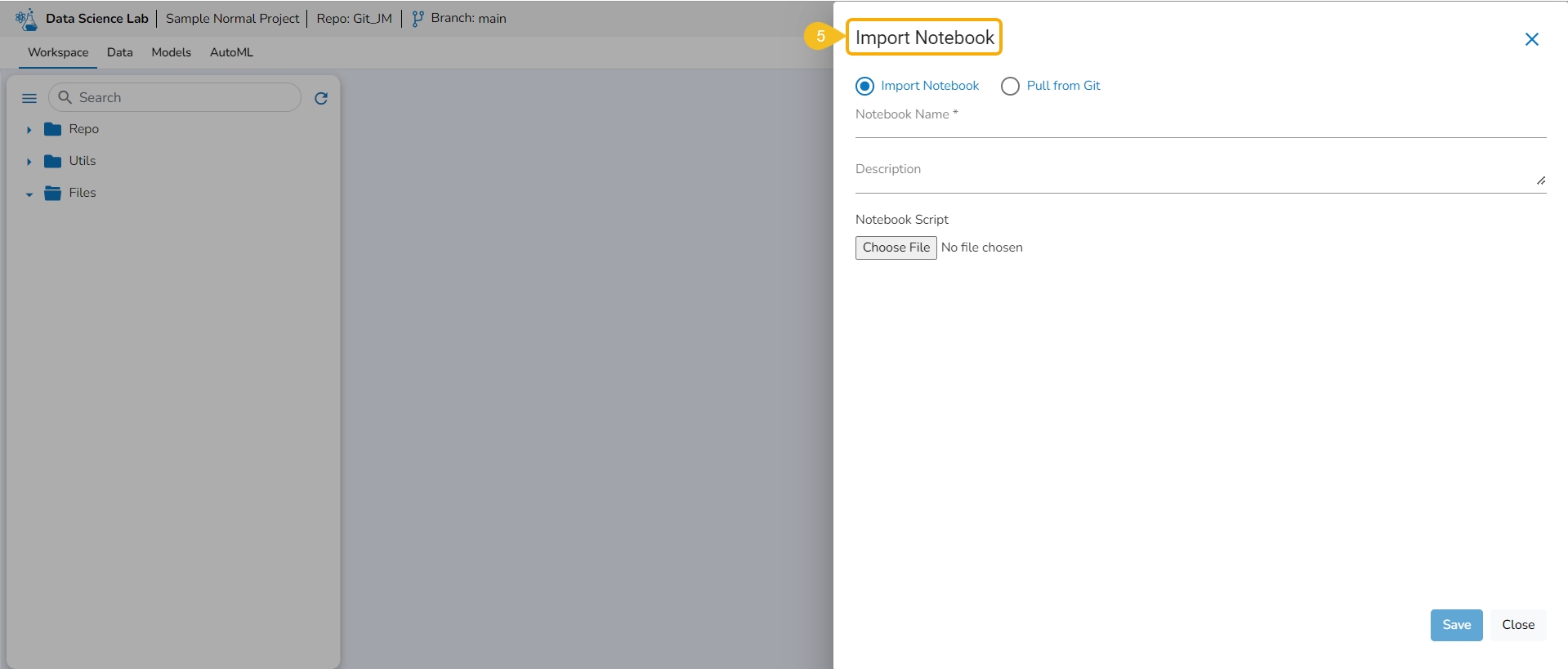
The Import Notebook page opens.
Select the Import Notebook option.
Provide the following information.
Notebook Name
Description (optional)
Click the Choose File option.
Select the IPYNB file from the system and upload it.
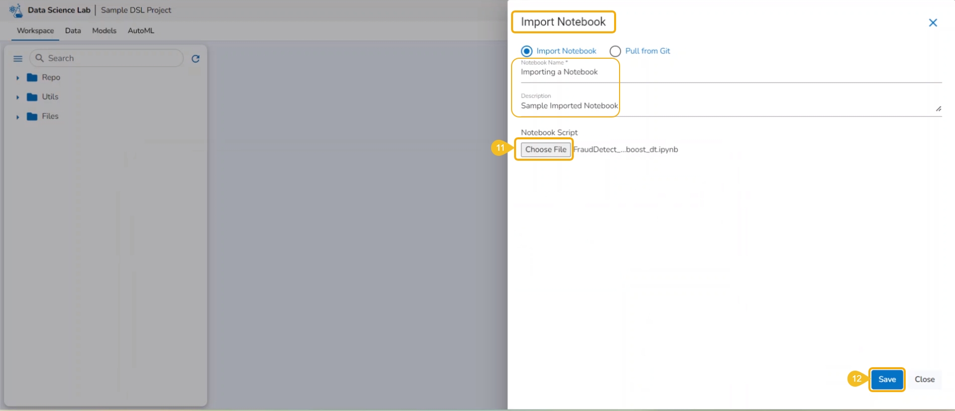
The selected file appears next to the Choose File option.
Click the Save option.
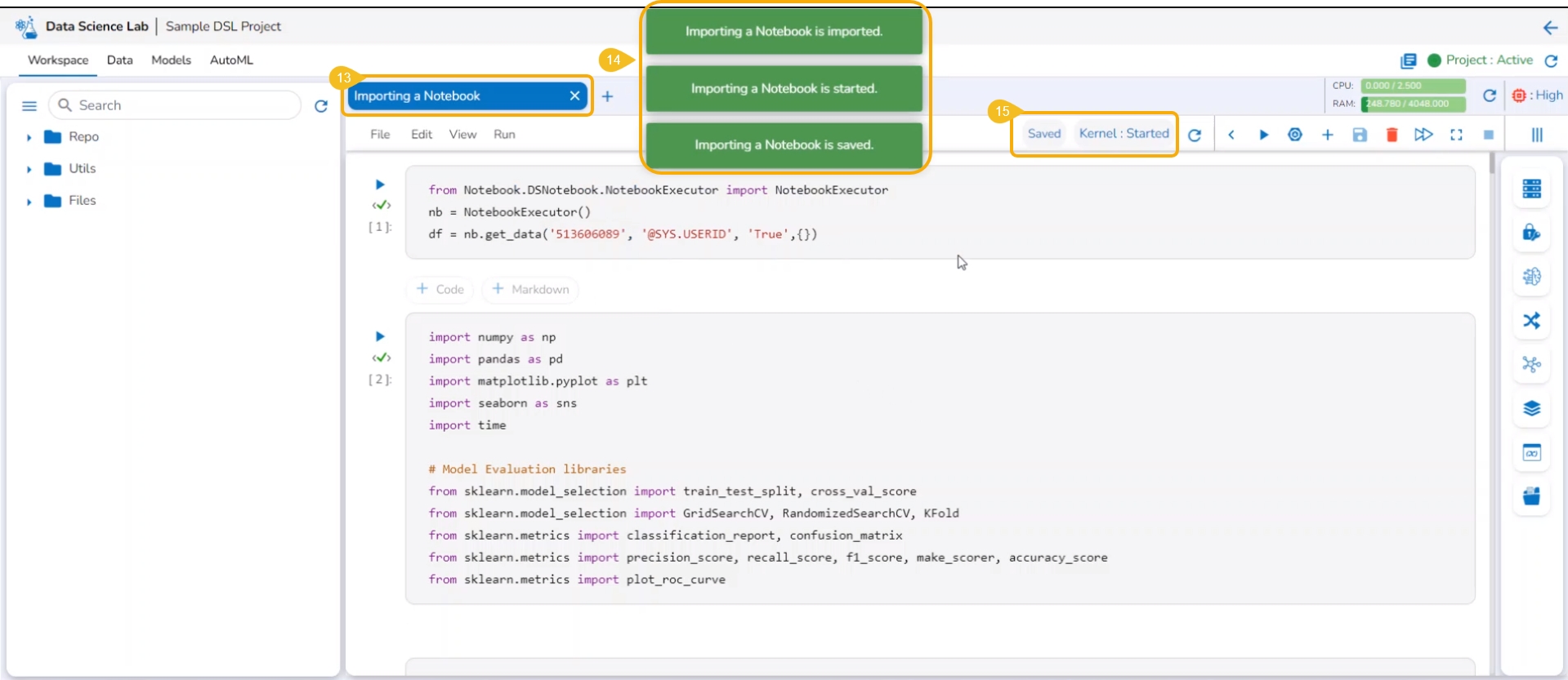
The Notebook infrastructure opens with the given name for the recently uploaded Notebook file. It may take a few seconds to save the uploaded Notebook and start Kernel for the same.
The following consecutive notification messages will appear to ensure the user that the Notebook is saved, uploaded, and started.
The same is mentioned by the status updates on the Notebook header (as highlighted in the given image).
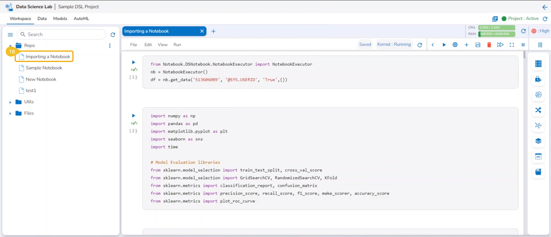
The uploaded Notebook is listed on the left side of the page.
Please Note: The Imported Notebook will be credited with some actions. Refer to the page to know it in detail.

This section describes steps to import a Notebook to a DSL project.
Refresh
Refreshes the data taken from the selected Git Repository.
Git Console
Opens a console page to use Git Commands.
A Repo Sync Project will have only a Repo folder allowing users create various Data Science experiments for the project.
A Repo folder available inside a Repo Sync Project contains the following attributives:
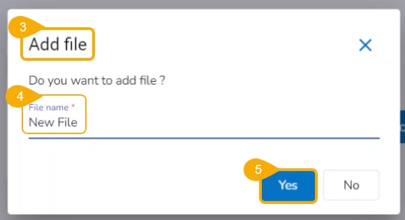
The user can add a file to the Repo folder using the Add File option.
Follow the steps demonstrated in the walk-through to add a file to the Repo Folder of a Repo Sync Project.
The user can create a folder inside the Repo folder of a Repo Sync project using this functionality.
Check out the illustration on the Copy path functionality provided for the Repo folder of a Repo Sync Project.
The import functionality allows the users to import a file from the local directory to the repository.
Check out the illustration on the import functionality provided for the Repo folder of a Repo Sync Project.
Please Note: All the folders or sub-folders created inside the Repo Folder also contain the same set of attributes as explained here for the Repo Folder.
Users can manually adjust the width of the repository panel to sight multiple files and sub-folders.
Users can manually adjust the width of the repository panel in the Workspace tab, allowing for better visibility and organization of multiple sub-folders and files within a project.
Check out the illustration to understand how users can adjust the repository panel inside a DS Project.
Every imported utility script will be credited with some actions to be applied to it. This page aims to describe them all.
Navigate to the Workspace tab for an activated project. Open the Utils folder. Select a Utils file and click on the ellipsis icon to access the Actions context menu for the utility script.
Please Note:
The imported Utility files from the system will not support Push to VCS and Pull from VCS actions.
The same Actions functionality is available for a .py file under a Repo Sync project.
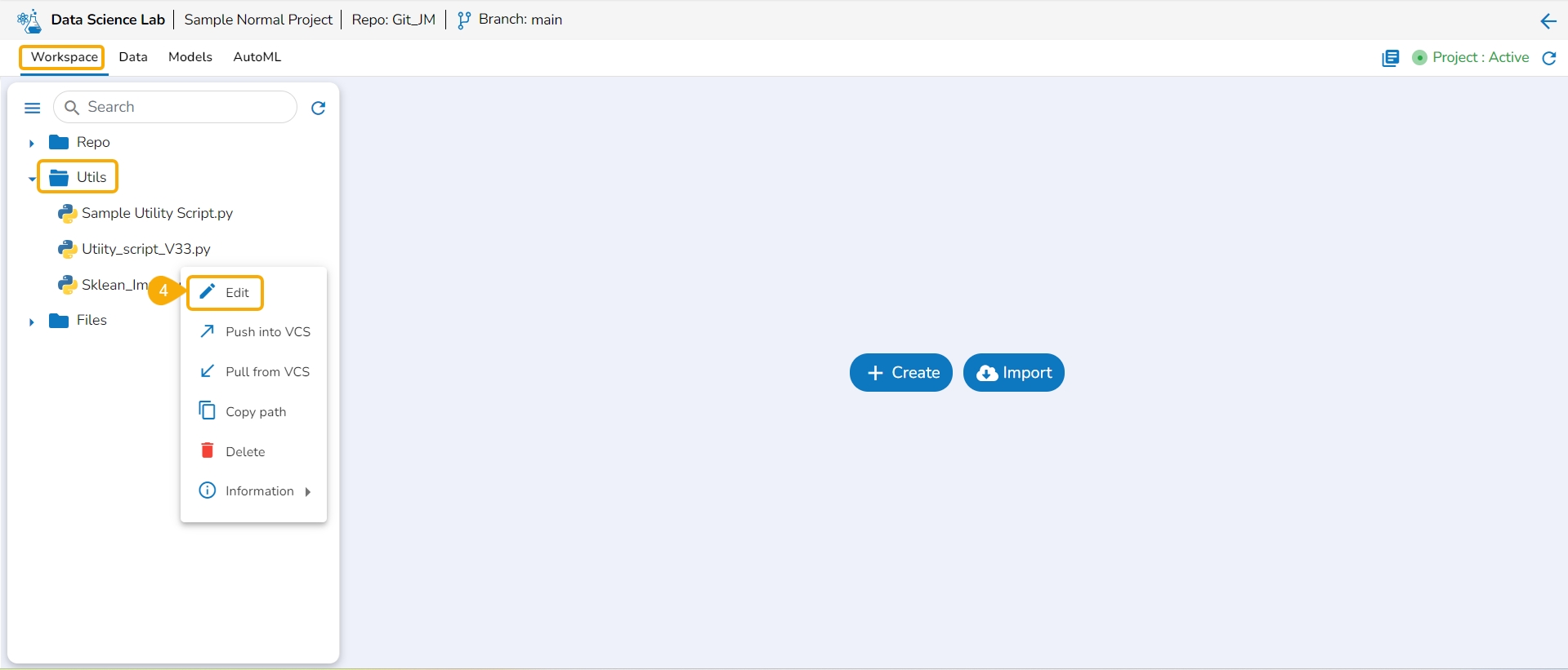
The user can modify the content of a utility script using the Edit option.
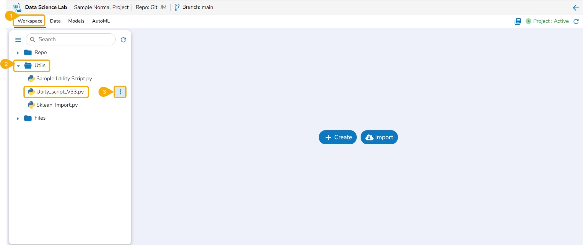
Navigate to the Workspace tab for a normal Data Science Lab project.
Click on the Utils folder.
Select the Ellipsis icon provided for a Utility file.
Select the Edit option from the context menu that opens for a Utility file.
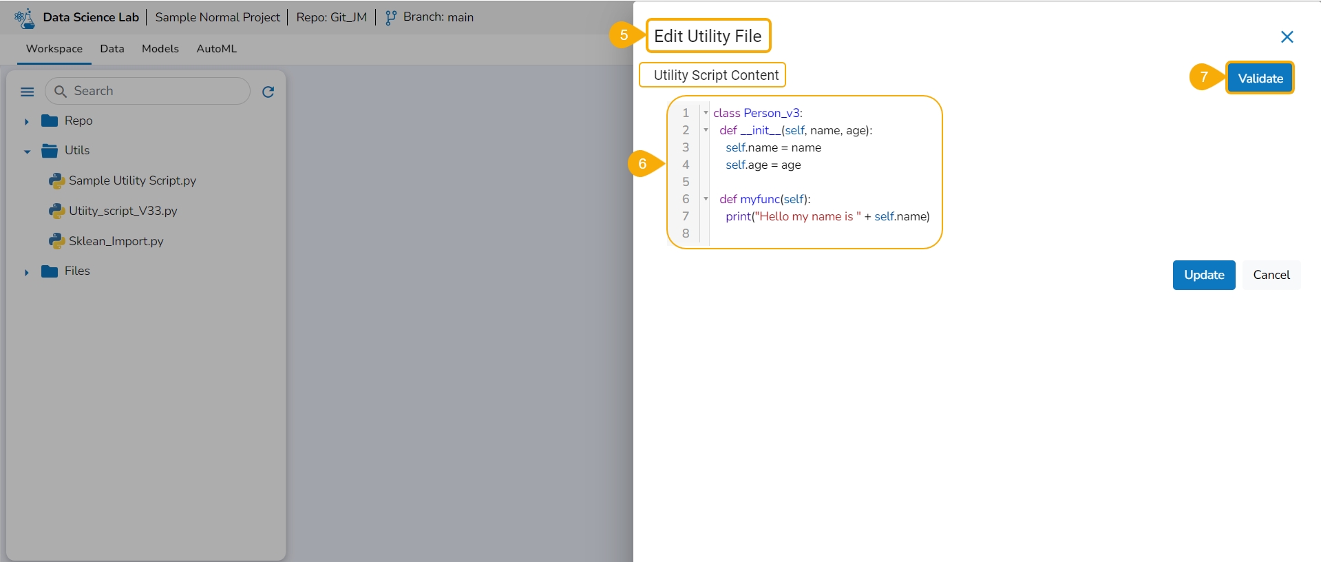
The Edit Utility File window opens displaying the Utility script content.
Modify the script content.
Click the Validate option.
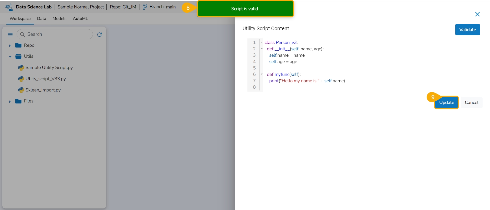
A notification ensures the script is valid post modification in the script content.
Click the Update option.
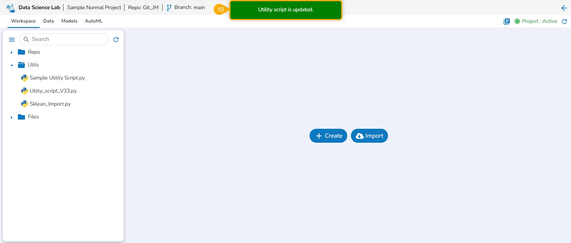
A notification ensures that the utility script is updated.
Pre-requisites:
The user branch should have Developers' + maintainers' permission to push the latest code into the Main branch.
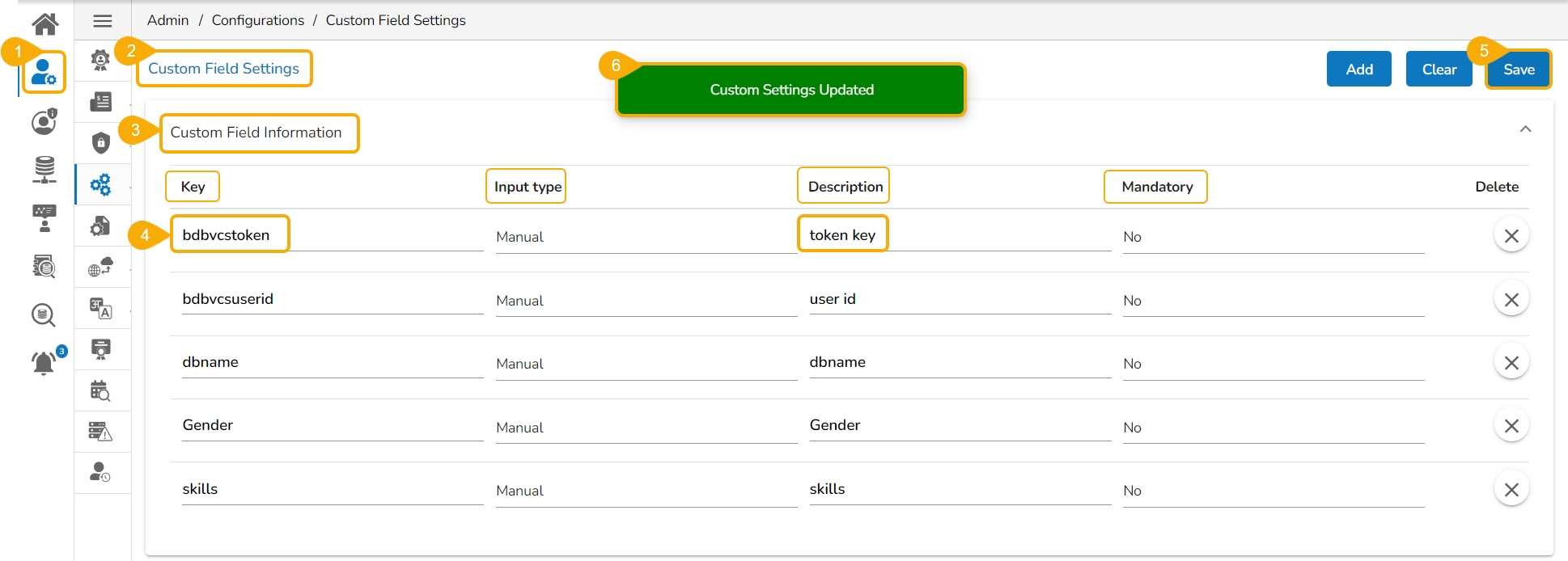
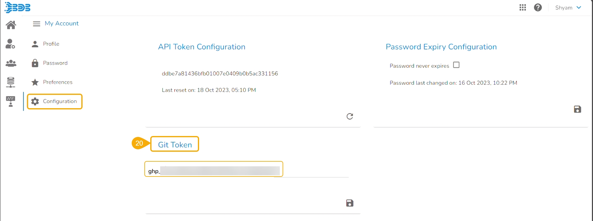
The User token has to be set in the user profile using the Custom Fields setting available at the Admin level.
The user token key name has to be 'bdbvcstoken'.
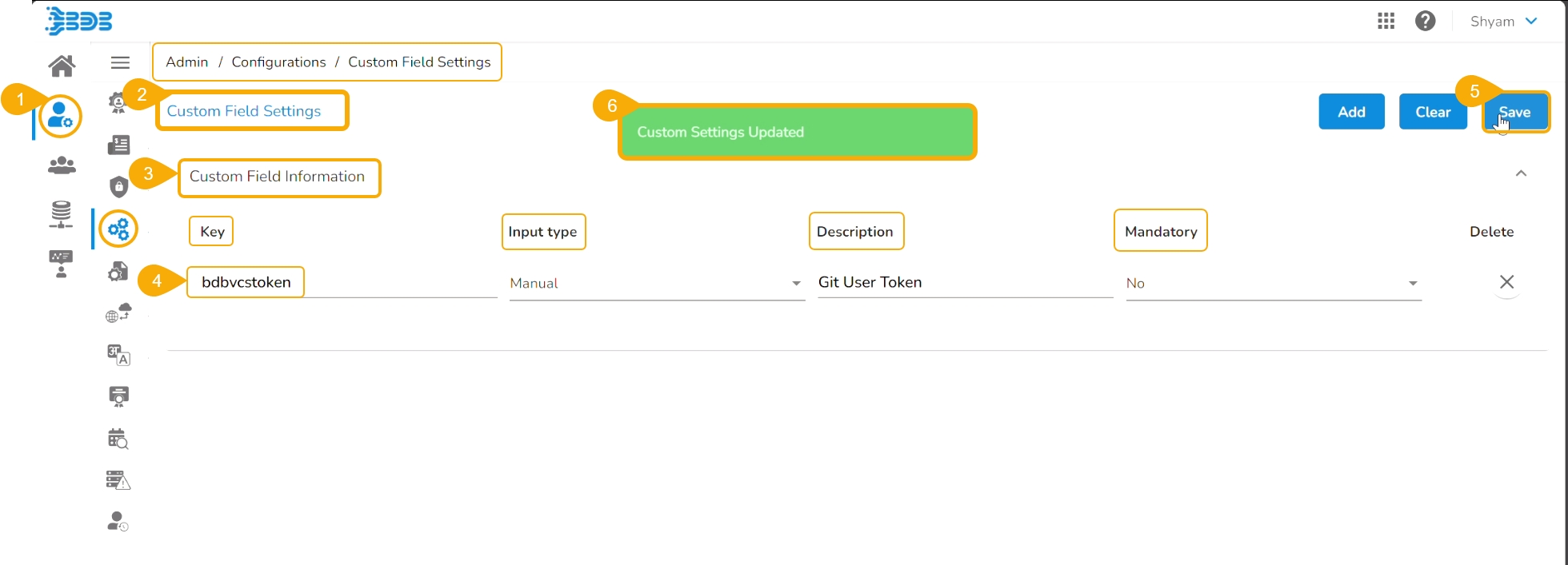
Navigate to the Admin module.
Open the Custom Field Settings under the Configurations option.
The Custom Field Information appears.
Provide the following information for the custom field:
Key- bdbvcstoken
Input type - Manual
Description - Git User Token
Mandatory - No
Click the Save option to save the modified Custom Field Settings.
A notification message informs the user that the custom field settings are updated.
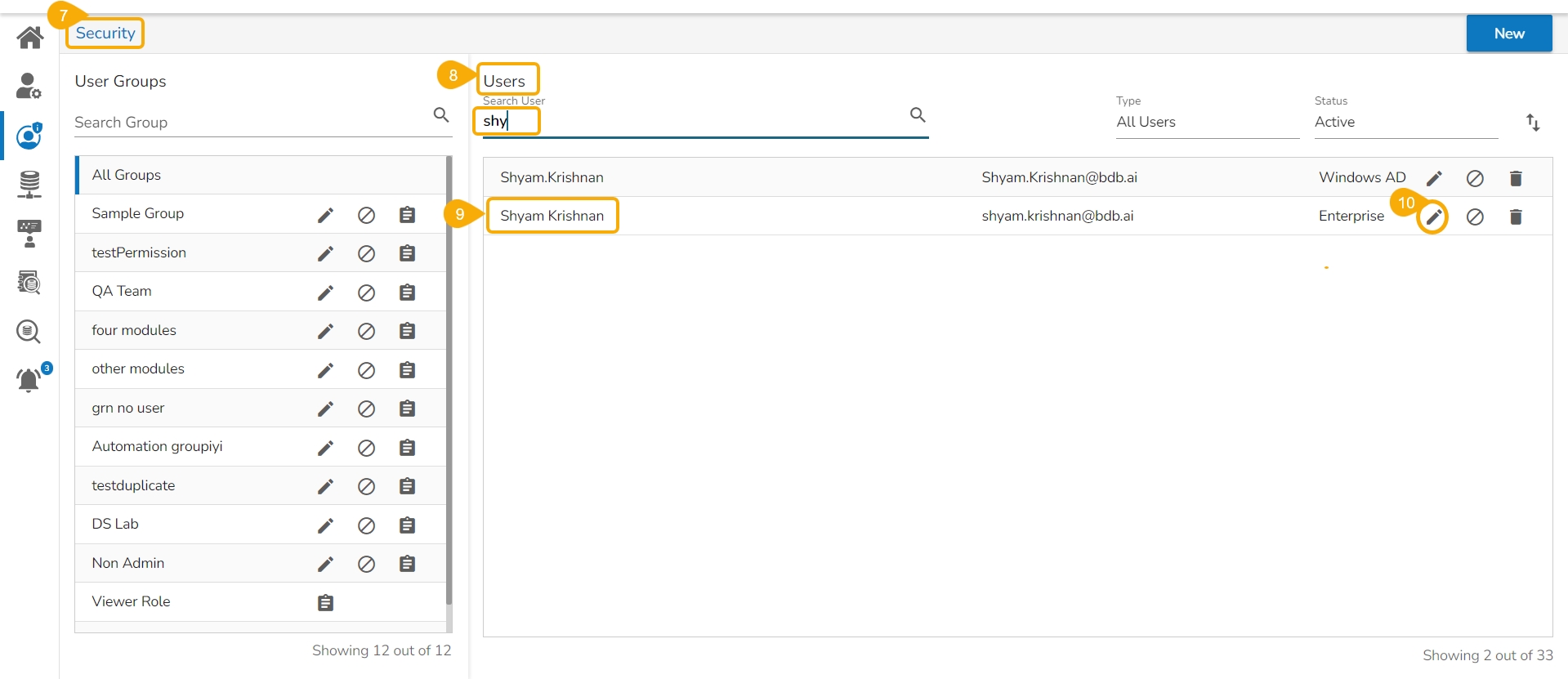
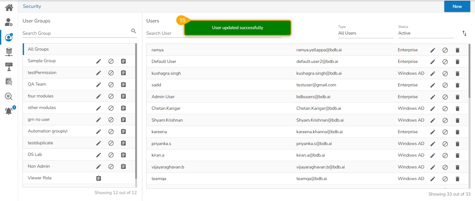
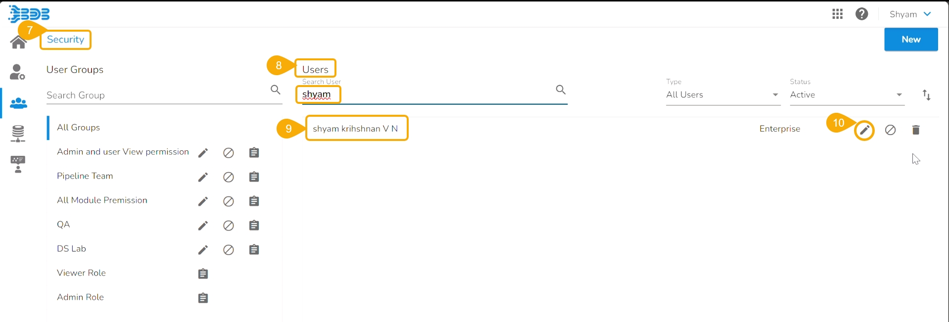
Navigate to the Security module.
Go to the Users list.
Select the user from the list.
Click the Edit icon.
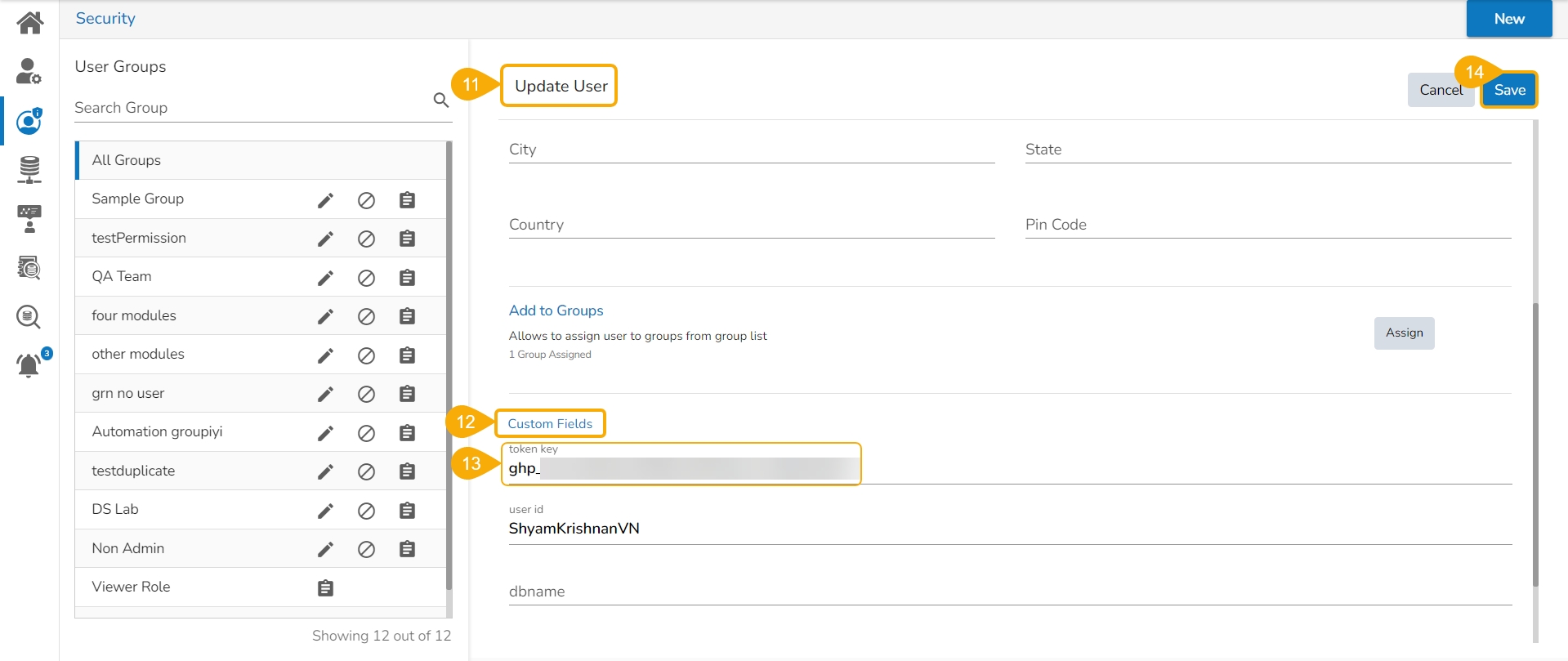
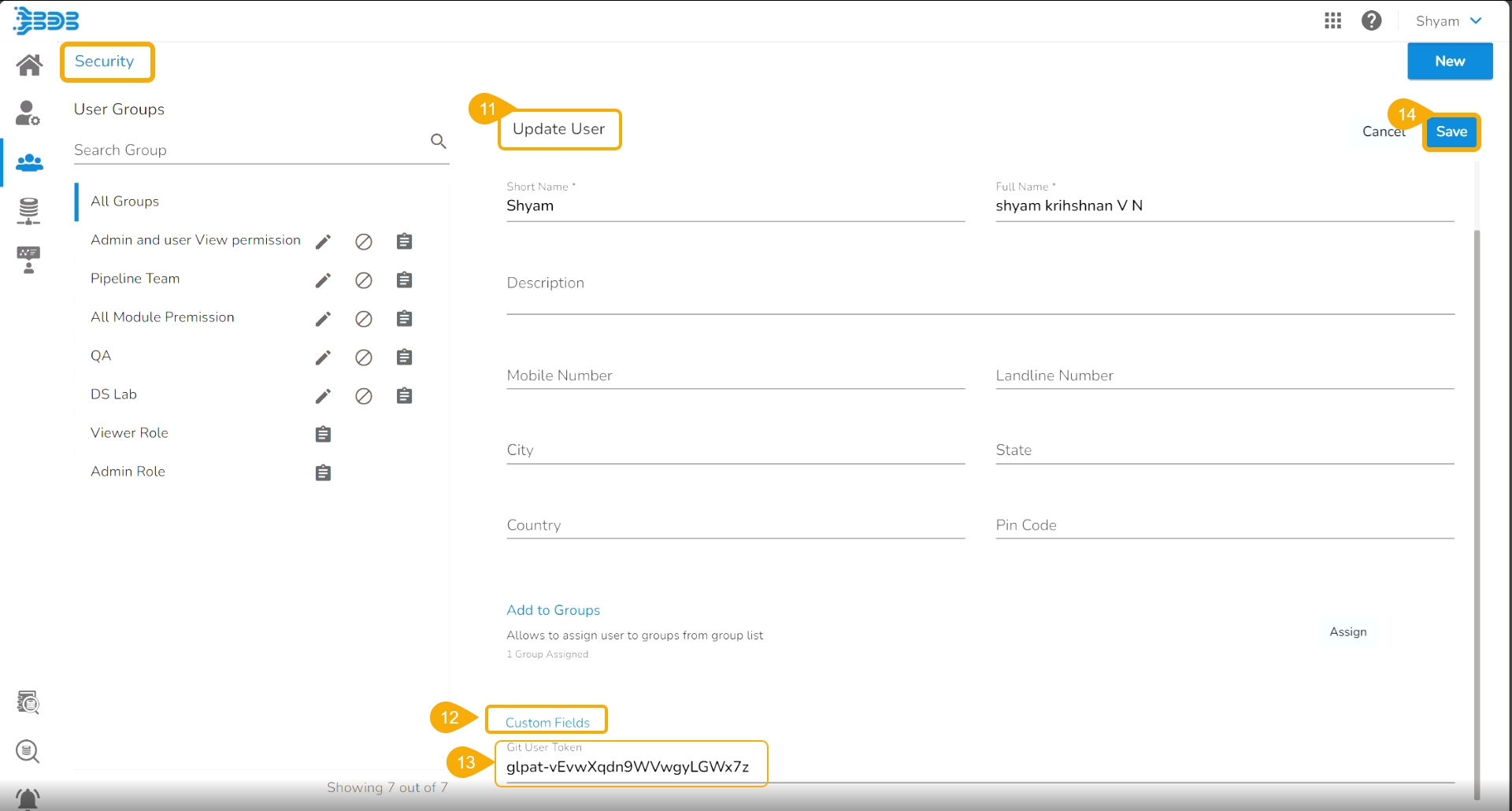
The Update User page opens.
Check out the Custom Fields section.
Validate whether the Git User Token is valid or not. If not provide the valid Git User Token.
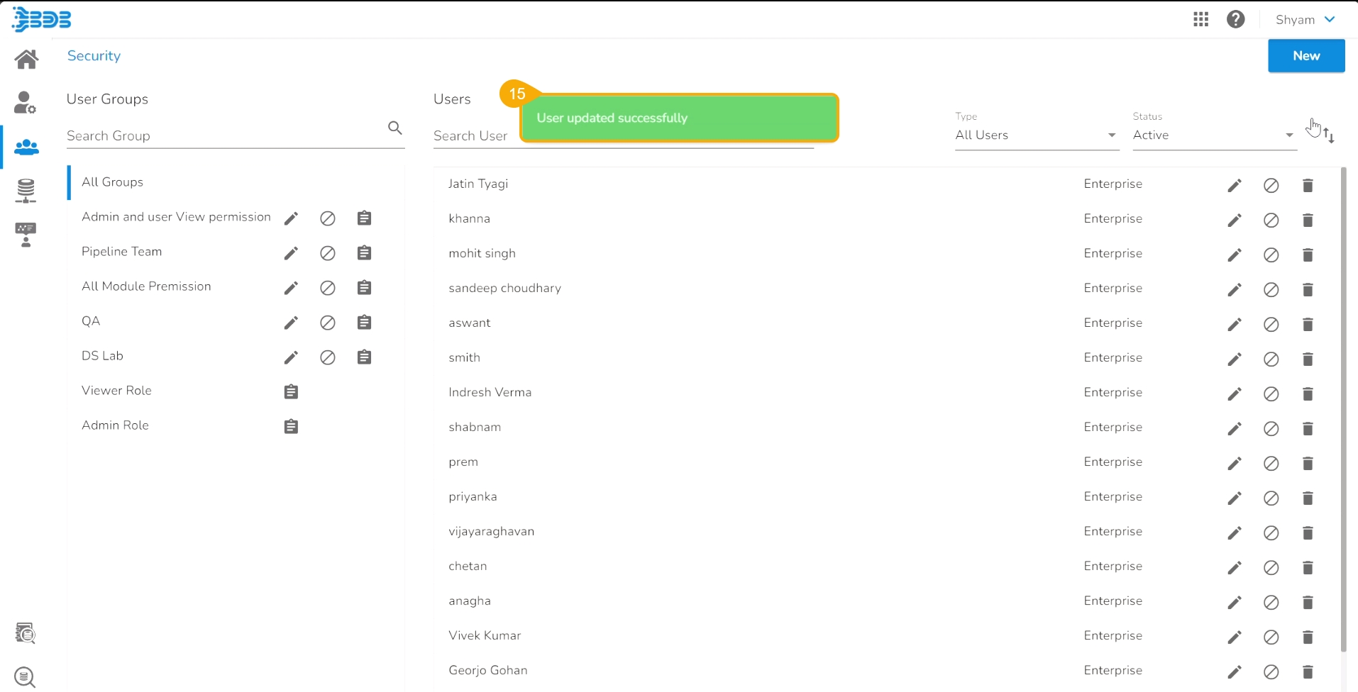
Click the Save option.
A notification message appears to inform that the user is updated successfully.
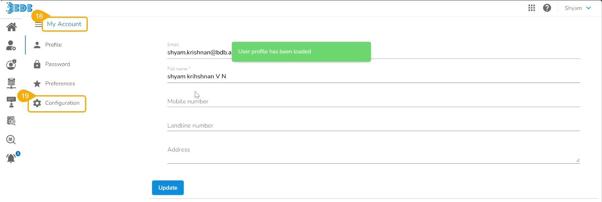
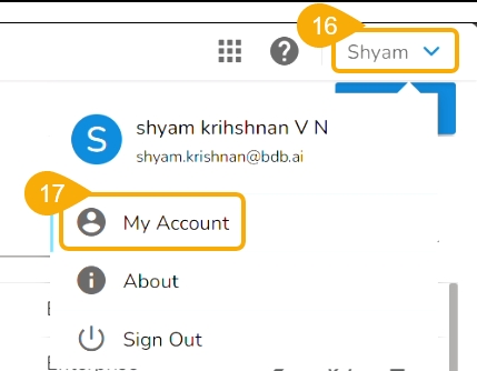
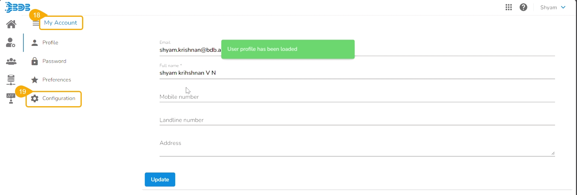
Open the User Profile.
Select the My Account option.
The My Account details are displayed.
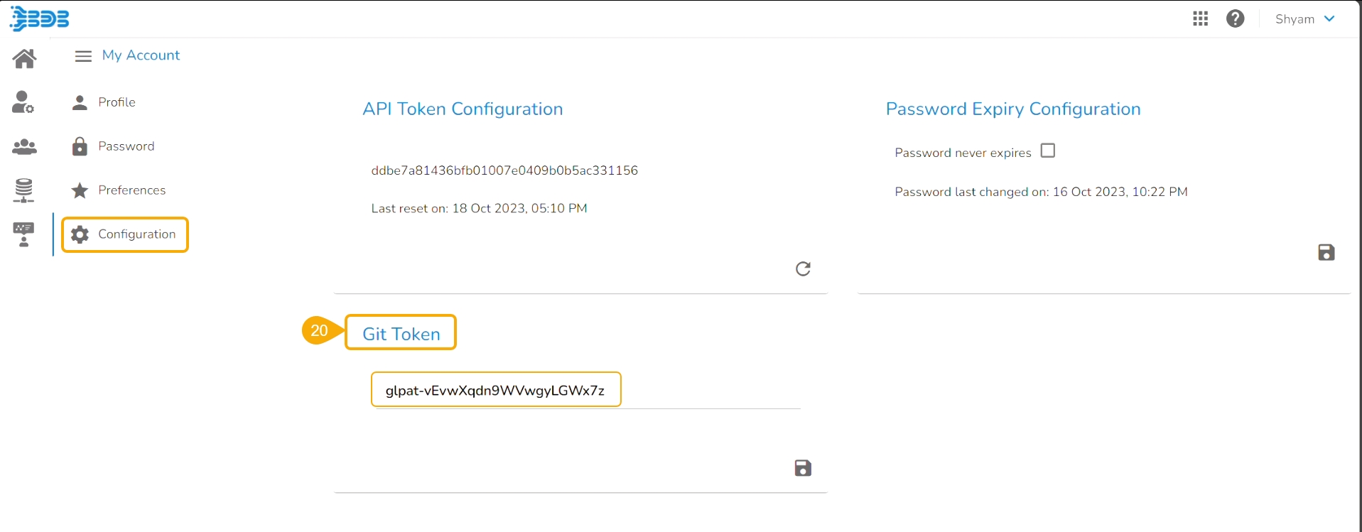
Open the Configuration option.
The same token gets updated as the Git Token section provided under the Configuration section.
The user can also pull a utility script or an updated version of the utility script from the Git Repository.
Pre-requisite:
The user needs to do an Admin configuration with an authentication token.
The user needs to do the Project level- configuration of Git Project and Git branch.
Please Note:
The normal Data Science Project with the Git branch configured to it will support the Pull from Git import functionality for a utility file.
Users can generate an authentication token from their Git Lab or Hub repositories.
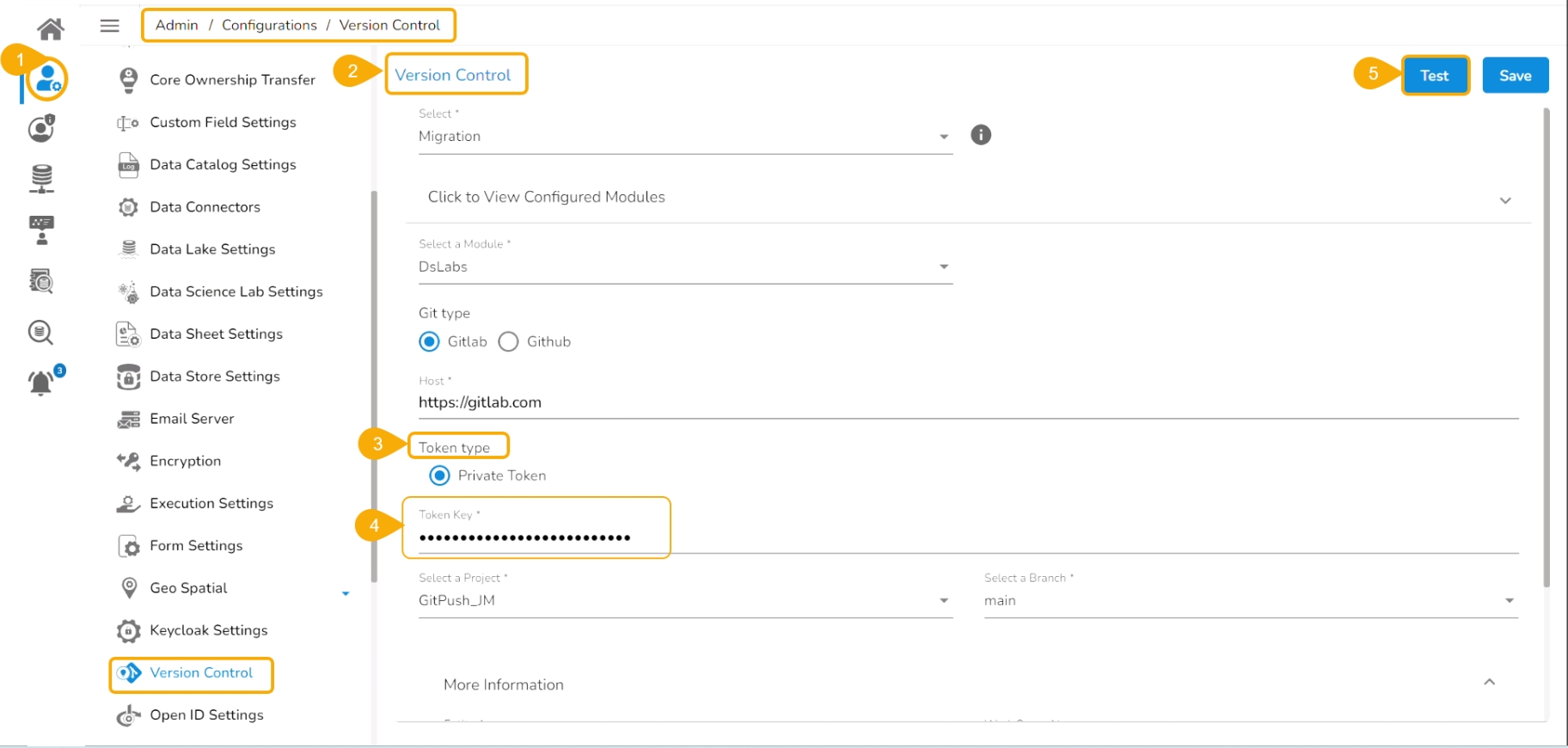
Navigate to the Admin module.
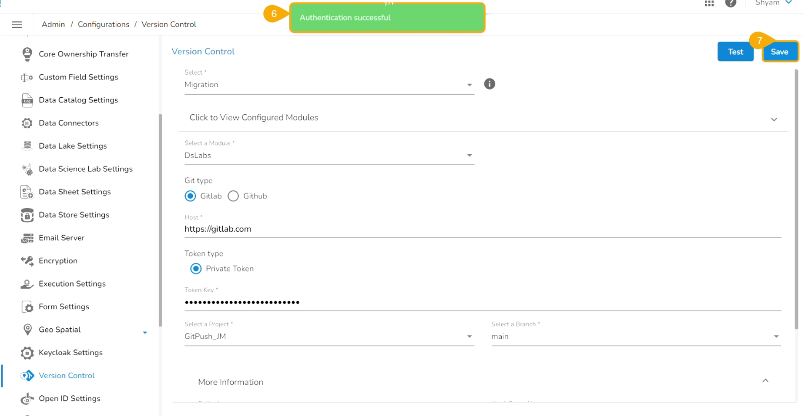
Open the Version Control from the Configuration options.
Select the Token type as a private token.
Provide the authentication token in the given space.
Click the Test option.
A notification message appears to inform the user that authentication has been established.
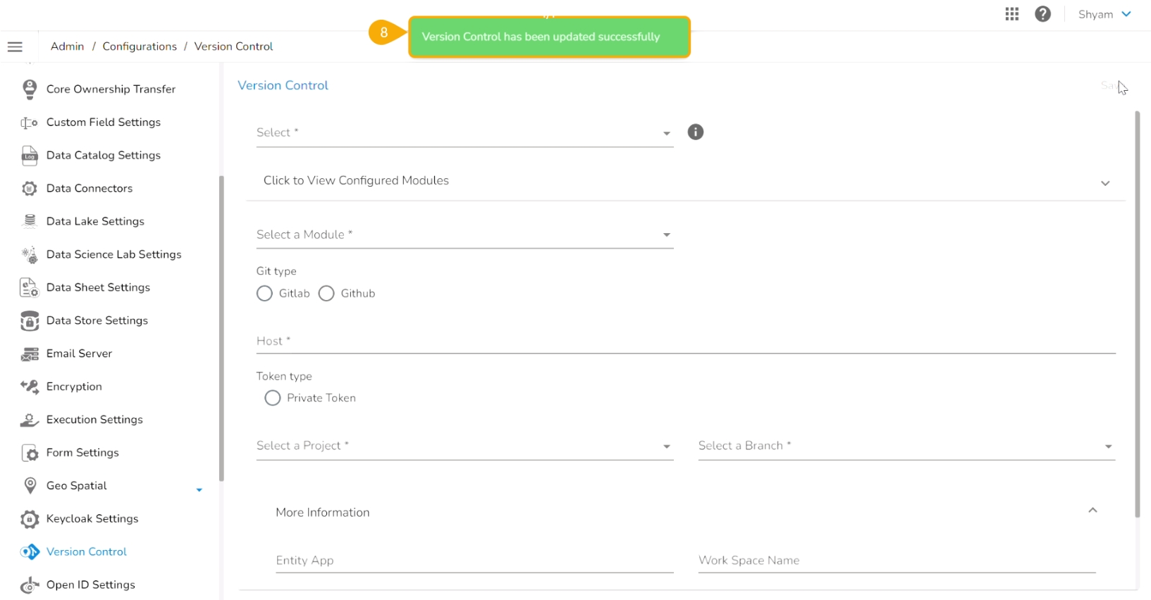
Click the Save option.
A notification message appears to inform that the version control has been updated.
A user can make the changes in the pulled Python file and Push it into Git using the user token set in the user profile.
Please Note: Before using the Push a utility file to Git functionality make sure that the following requirements are fulfilled:
The latest file is pulled into DS Lab before modifying and pushing back to the Git branch.
The user should have access to the Git branch to push a change.
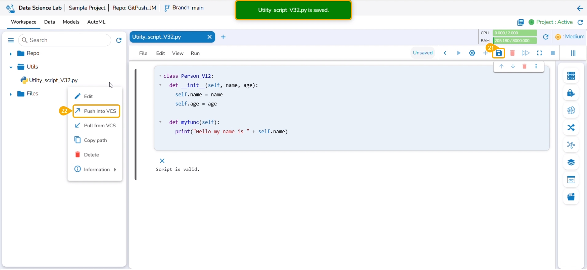
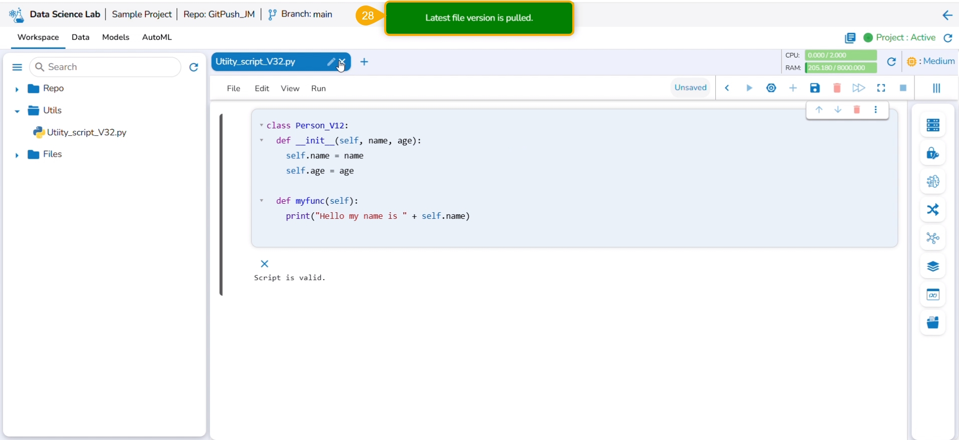
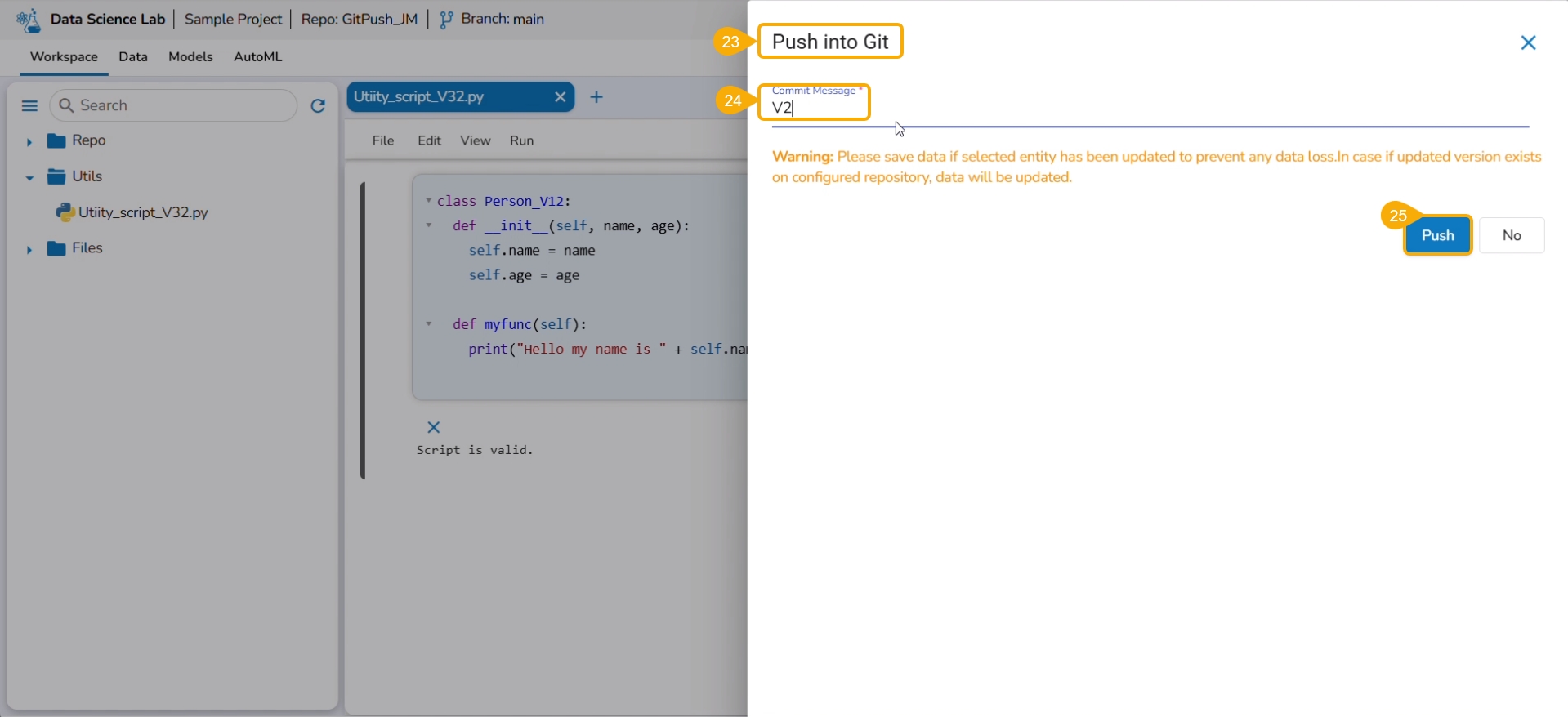
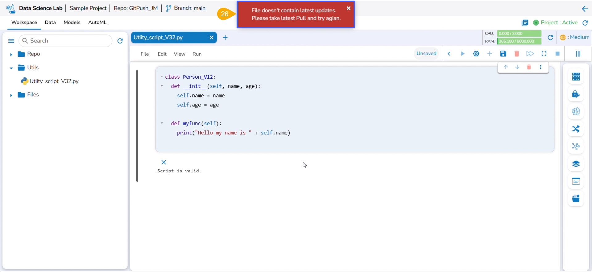
Check out the illustration for a utility script to understand the Pull from VCS and Push into VCS functionalities. It displays how taking each time a pull from VCS is necessary for using the Push to VCS functionality.
Navigate to the Workspace tab for an activated project that has a Git branch configured.
Click the Utils folder to get the Import option.
Click the Import option.
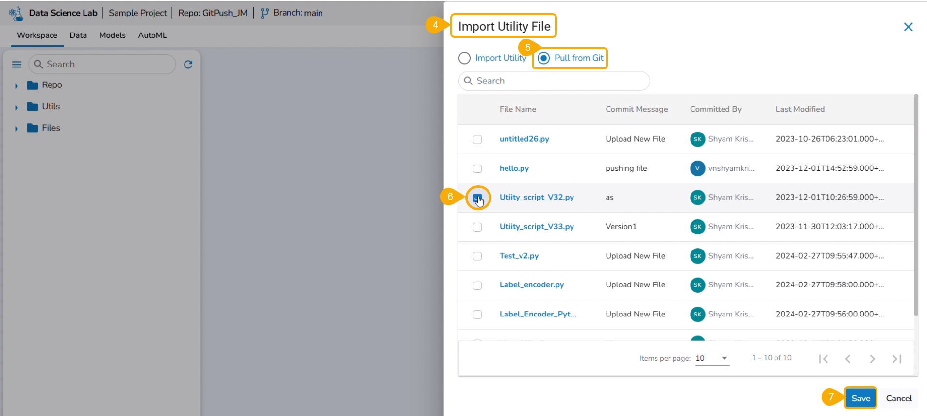
The Import Utility File drawer appears.
Select the Pull from Git option.
Select a file using the checkbox.
Click the Save option.
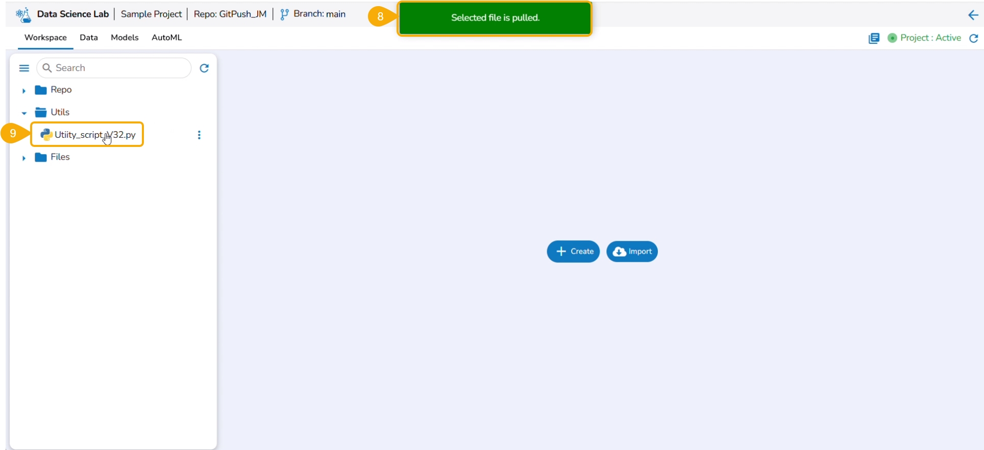
A notification message informs that the selected file is pulled.
The pulled file gets listed under the Utils folder.
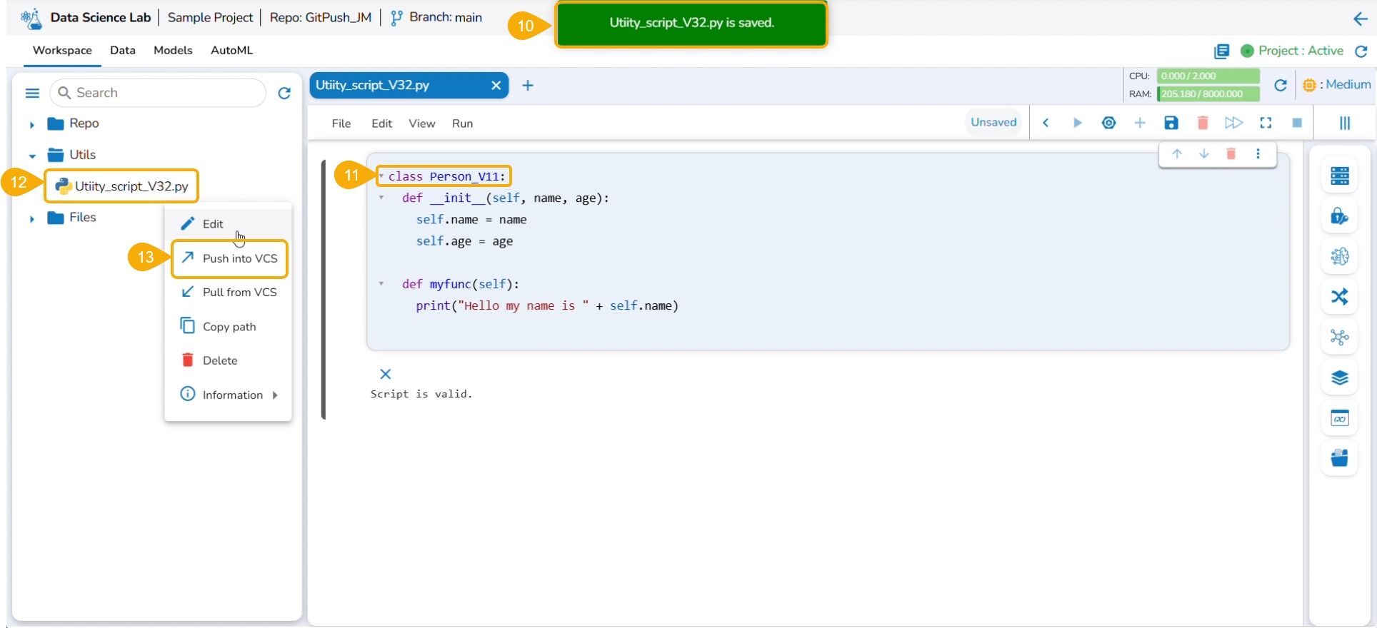
A notification message appears ensuring that the utility file is saved.
Modify the content of the saved Utility file.
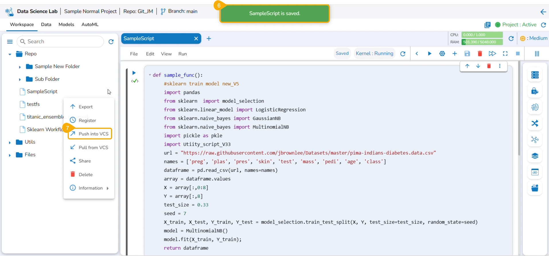
Click the pulled utility file from the Utils folder to open the context menu.
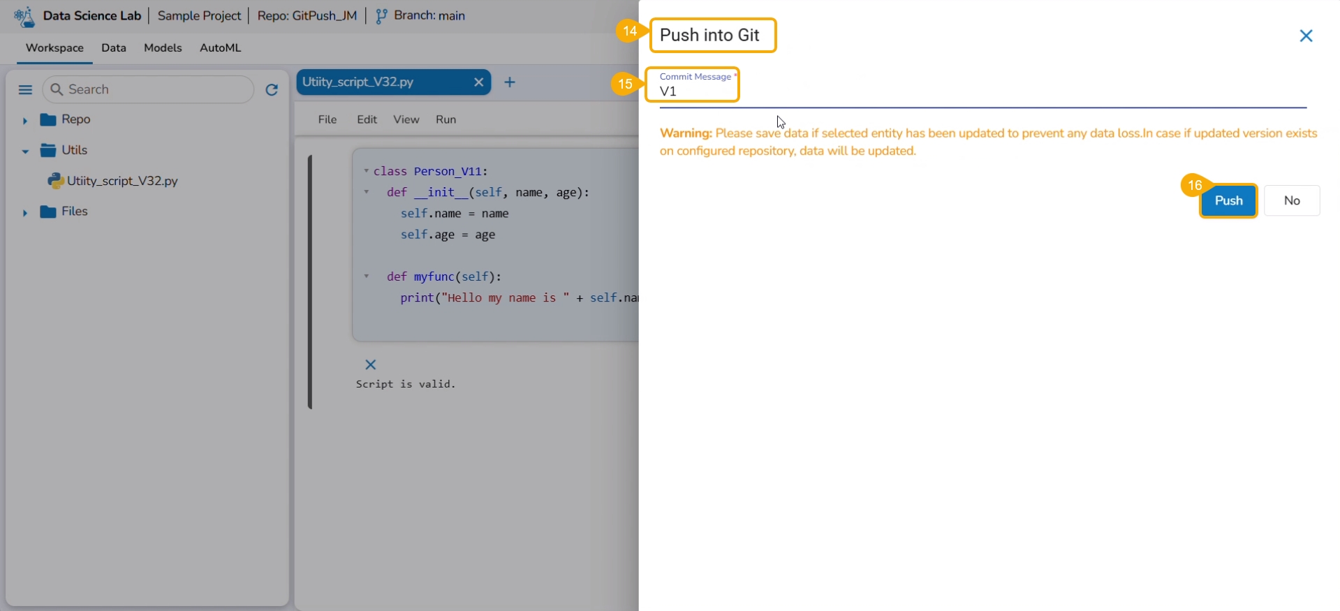
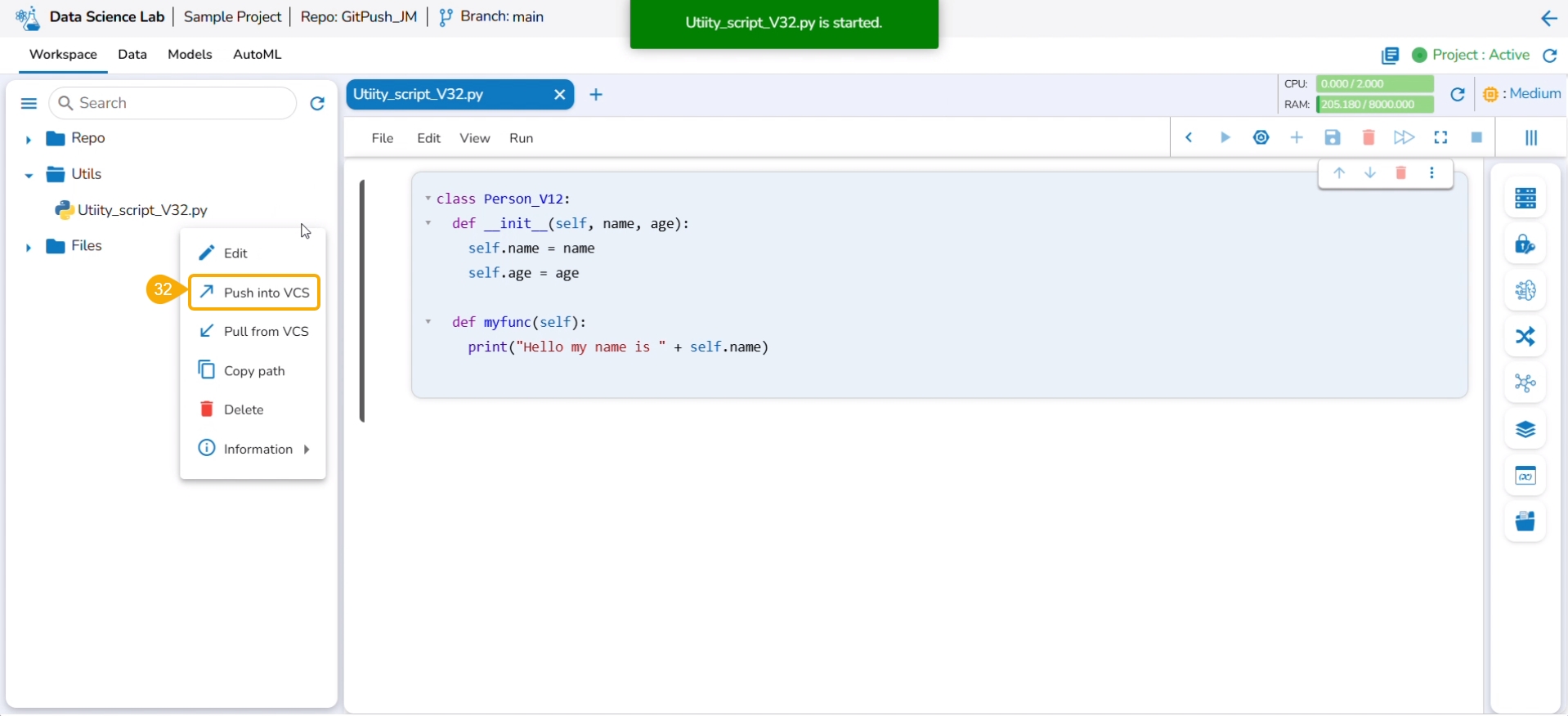
Select the Push into VCS option.
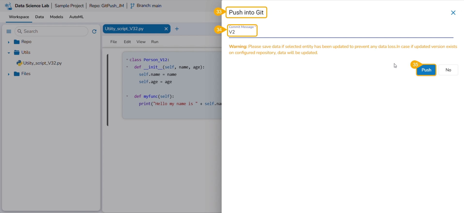
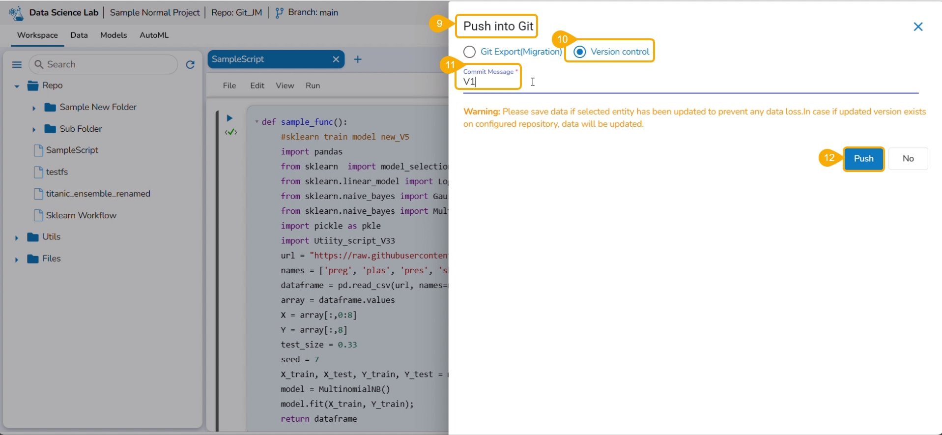
The Push into Git drawer opens.
Provide a commit message.
Click the Push option.
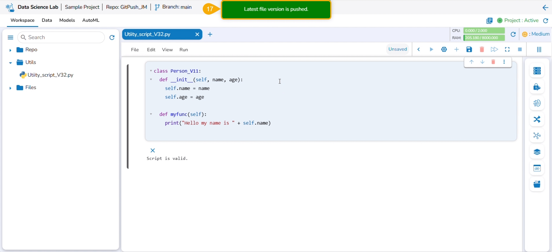
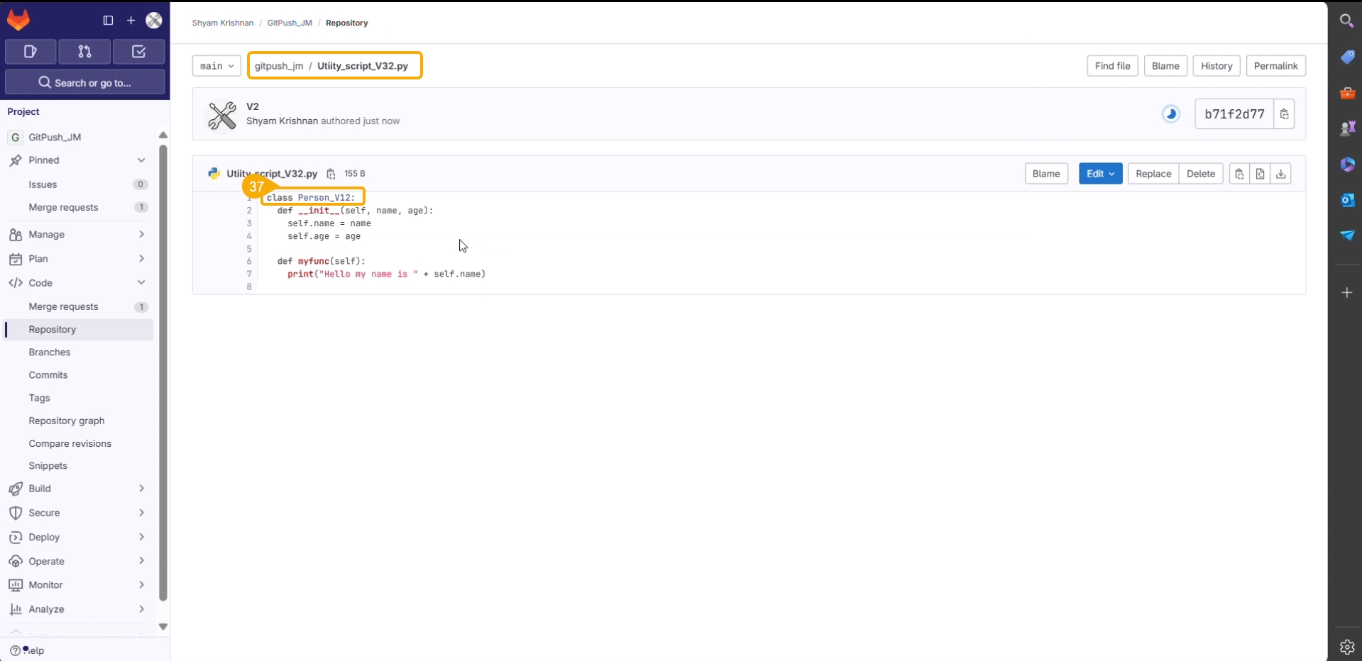
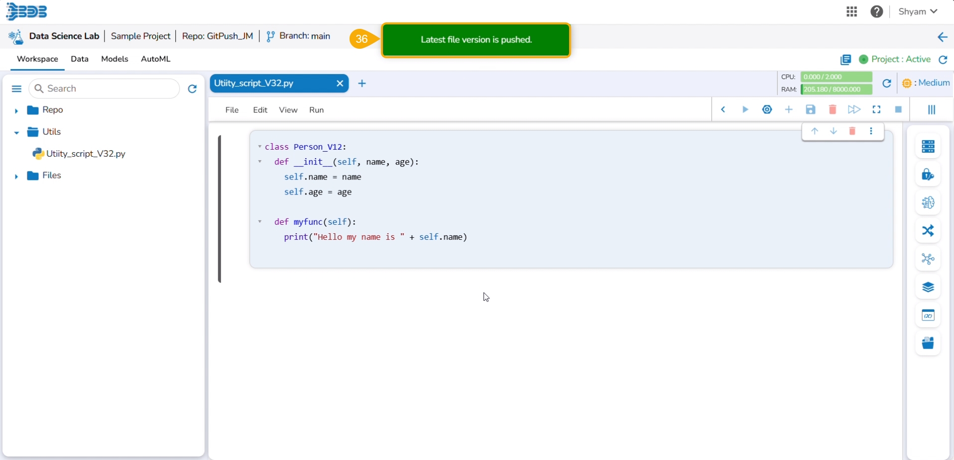
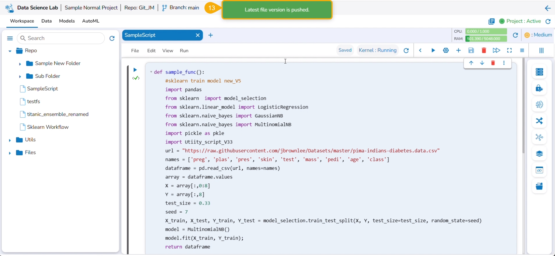
A notification ensures that the latest file version is pushed.
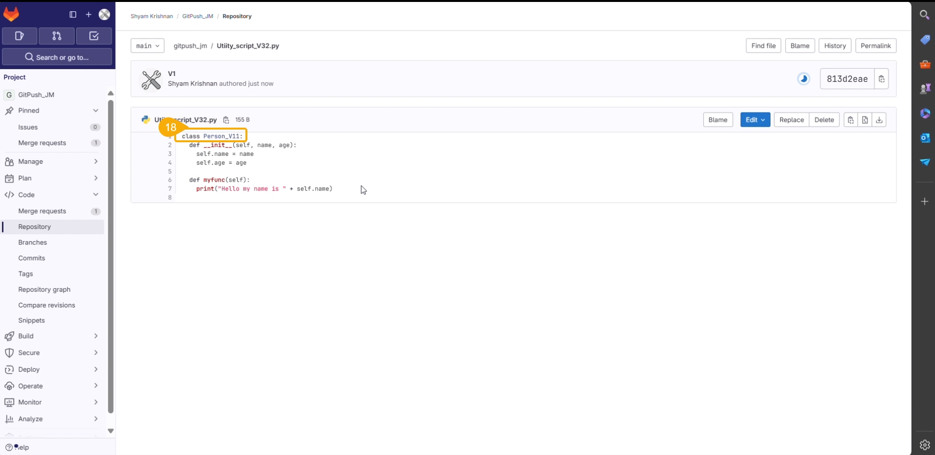
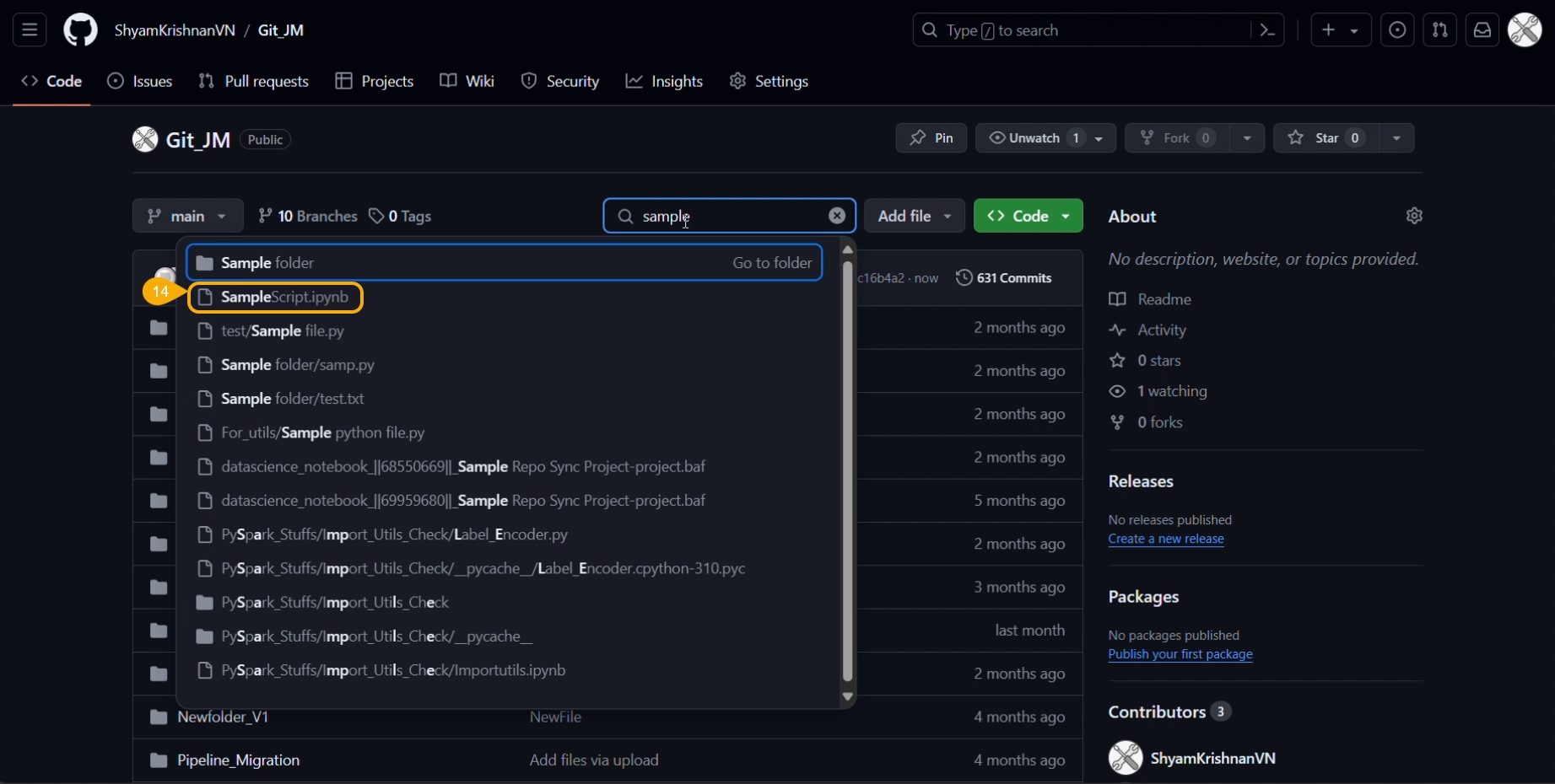
You can open the Git repository and verify the script version.
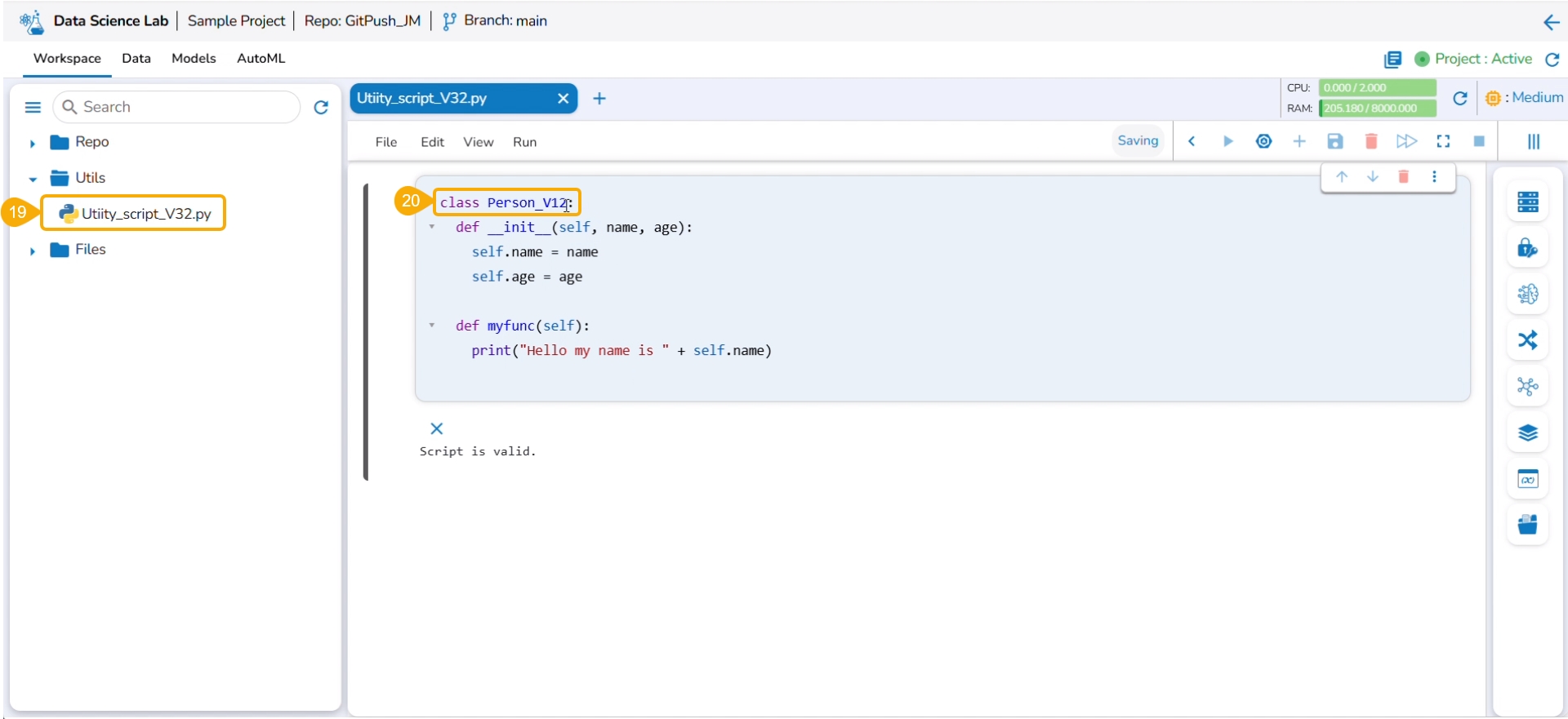
Navigate to the same Utility file.
Modify the script.
Save the script.
Select the Push into VCS option from the Utility action context menu.
The Push into Git drawer opens.
Provide a commit message.
Click the Push option.
An error message states that the current file doesn't contain the latest version, and suggests taking the latest pull.
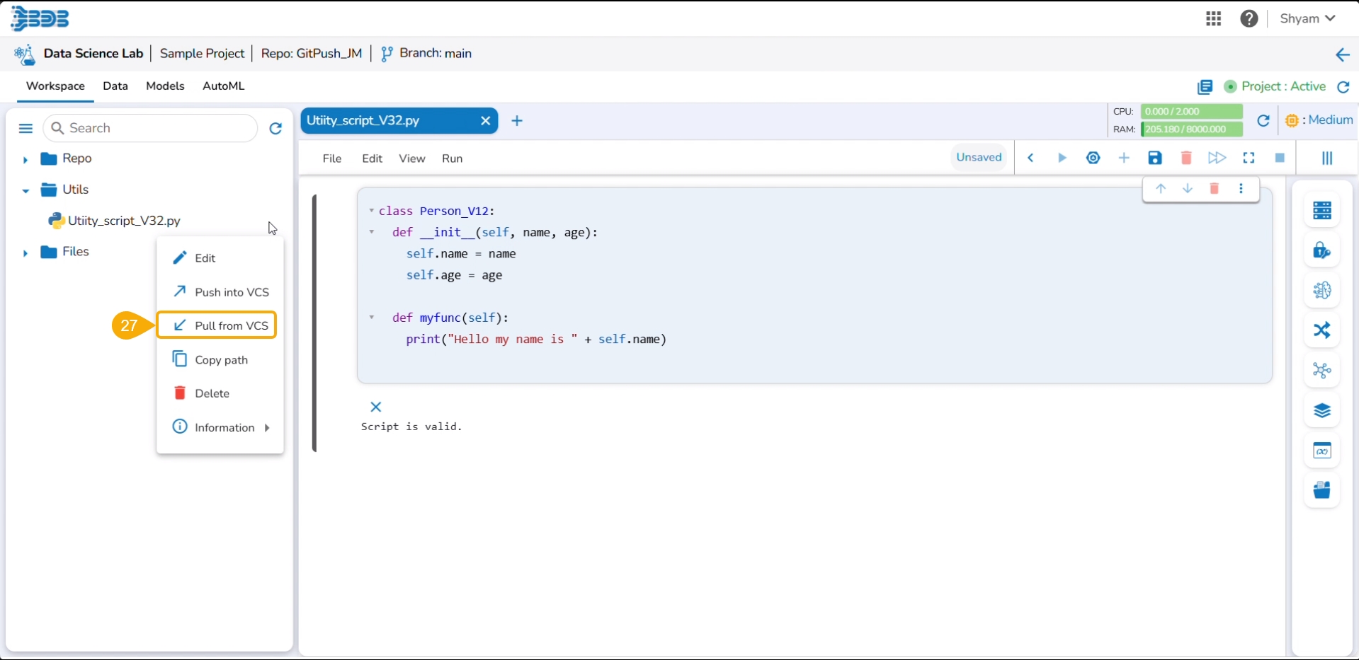
Click the Pull from VCS option for the same utility file.
A notification ensures that the latest file is pulled.
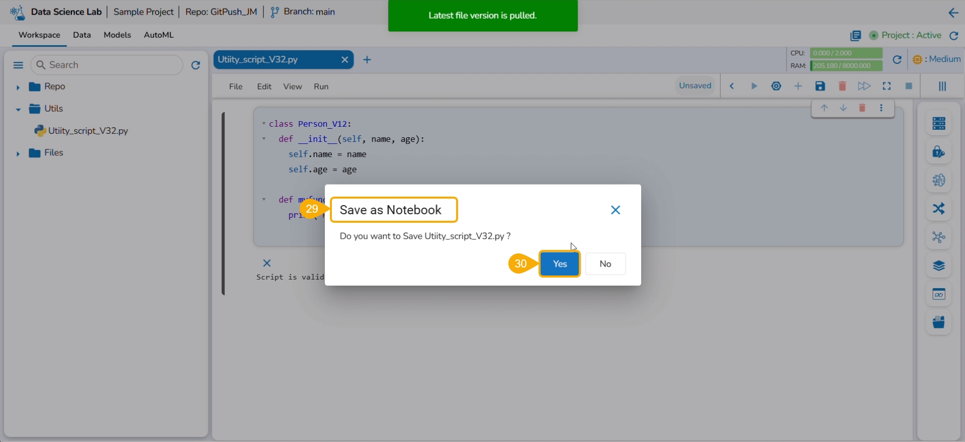
Use the Save as Notebook option to save it.
Click the Yes option.
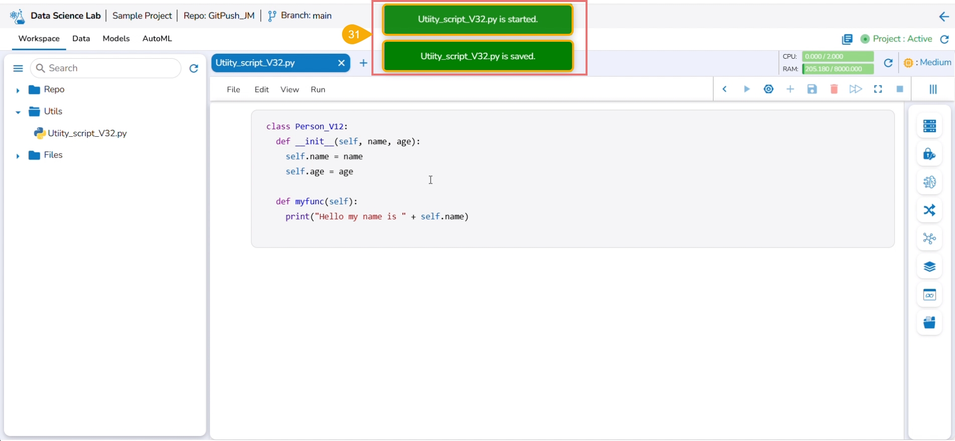
Consecutive success notifications appear to ensure that the file is started and saved.
Click the Push into VCS option for the same utility file.
The Push into Git drawer opens.
Provide the commit message.
Click the Push option.
A notification ensures that the latest file version is pushed.
The same can be verified in the Git repository.
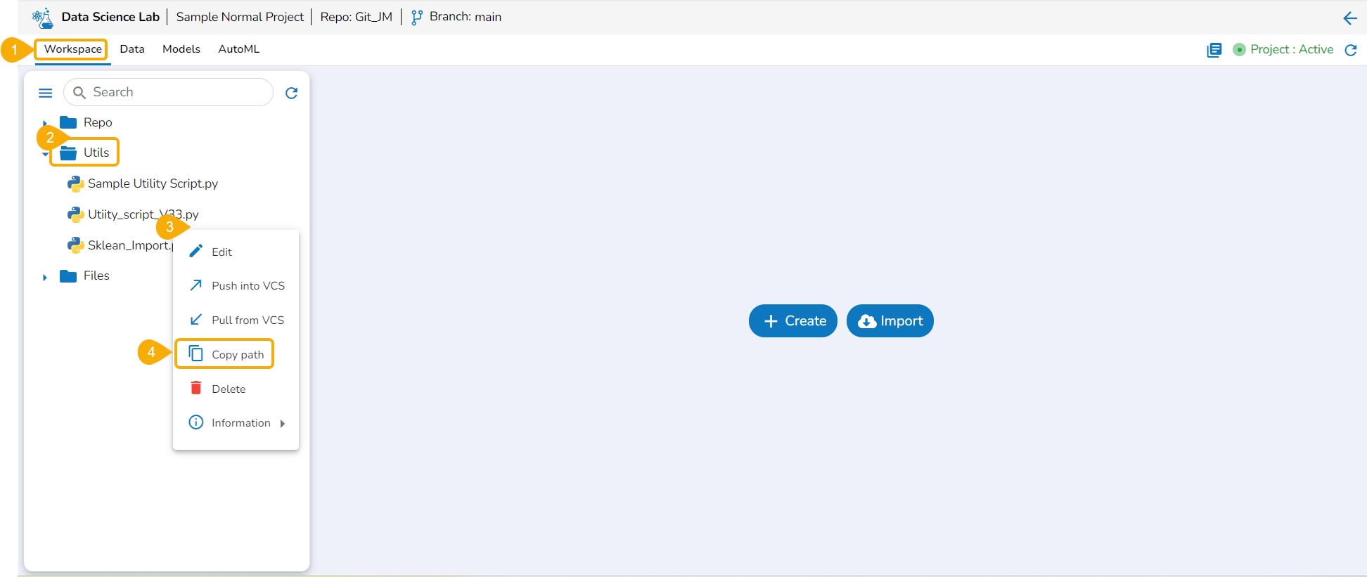
The user can copy the utility file path by using this action option.
Navigate to the Workspace tab for a normal Data Science Project.
Open the Utils folder to get the list of utility files.
Access the Utility Actions context menu.
Click the Copy path option from the Utility Actions context menu.
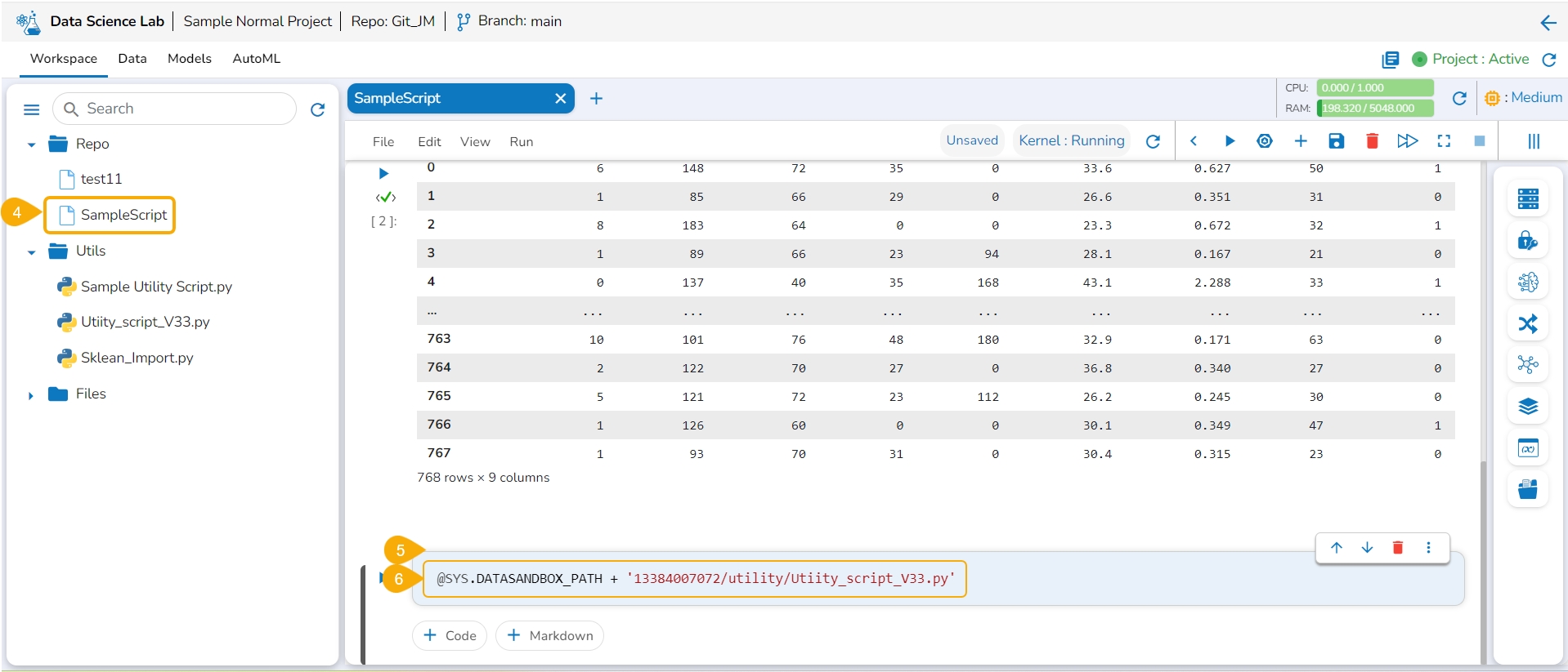
Open a .ipynb file using the Repo folder.
Add a new code cell.
Use the Ctrl+V action to paste the copied path of the utility file in the code cell.
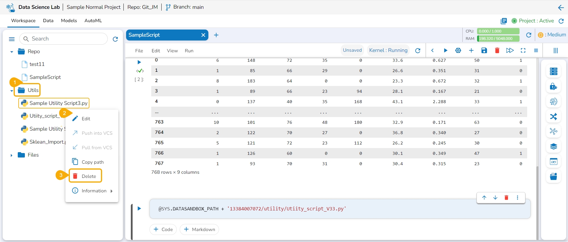
Navigate to the Utils folder for a normal DSL project.
Select a utility file and open the Actions context menu for the selected file.
Click the Delete option from the action context menu.
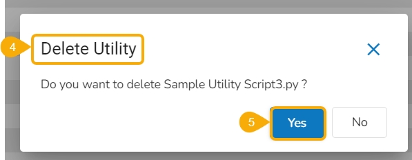
The Delete Utility dialog box appears to confirm the action.
Click the Yes option.
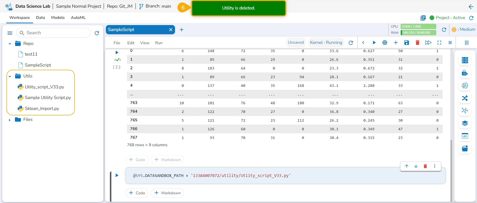
A notification appears to ensure that the selected Utility script is deleted. The utility script gets removed from the list.
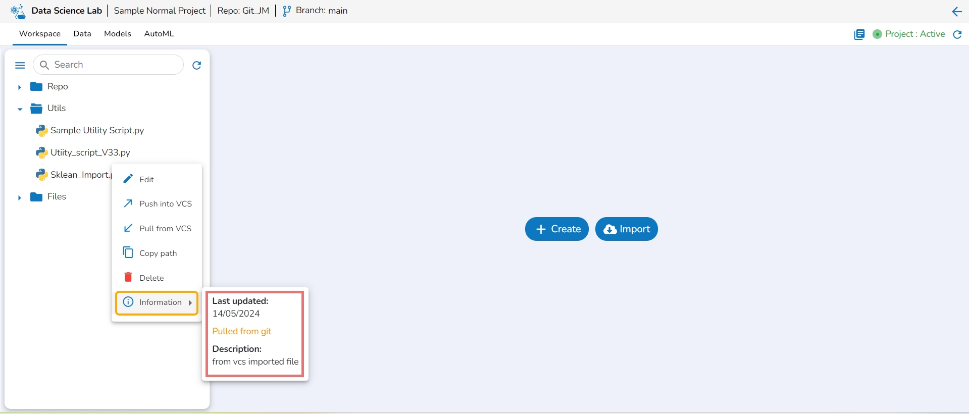
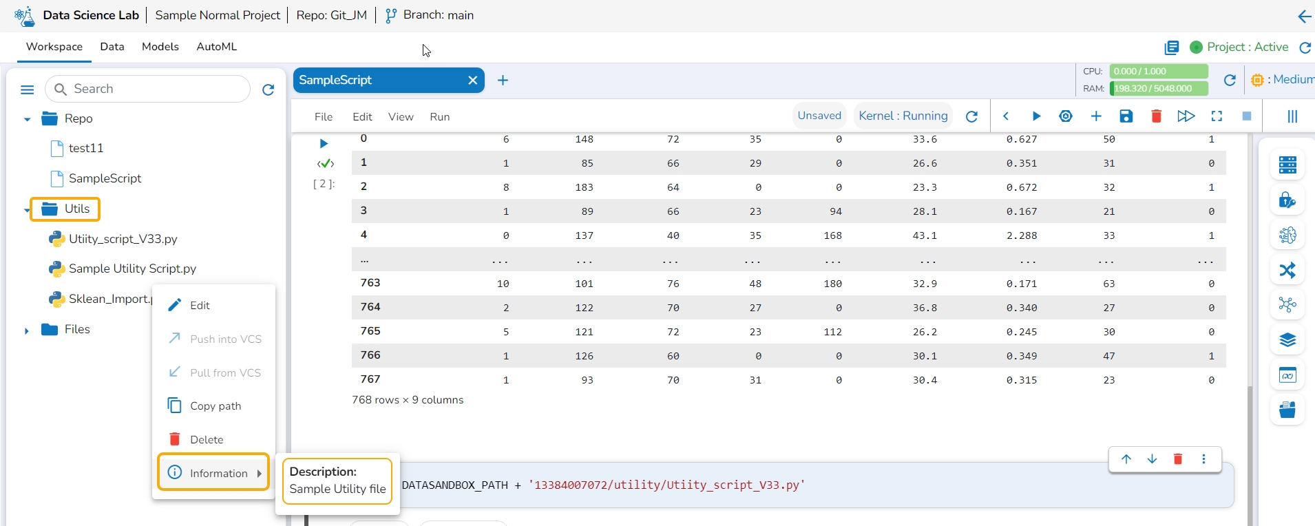
The information action option displays details for the Utility file whether it is imported from the Git of imported from the local system.
Navigate to the Utils folder for a normal DSL project.
Select a utility file and open the Actions context menu for the selected file.
Click the Information option from the action context menu.
Description: The inserted description for the utility file while importing the file gets displayed for the utility files imported from the system.
Last updated & Description: The last updated date and description are displayed for the utility scripts imported from Git.
This page explains how a model explainer can be generated through a job.
The user can generate an explainer dashboard for a specific model using this functionality.
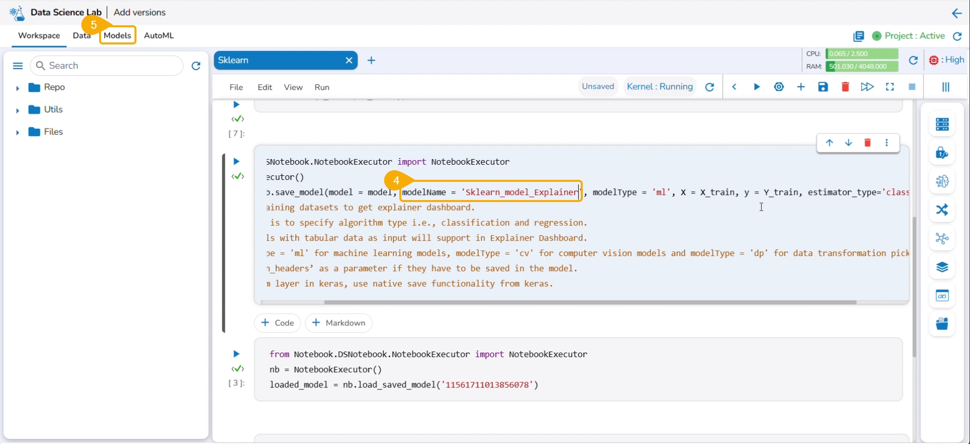
Check out the illustration on Explainer as a Job.
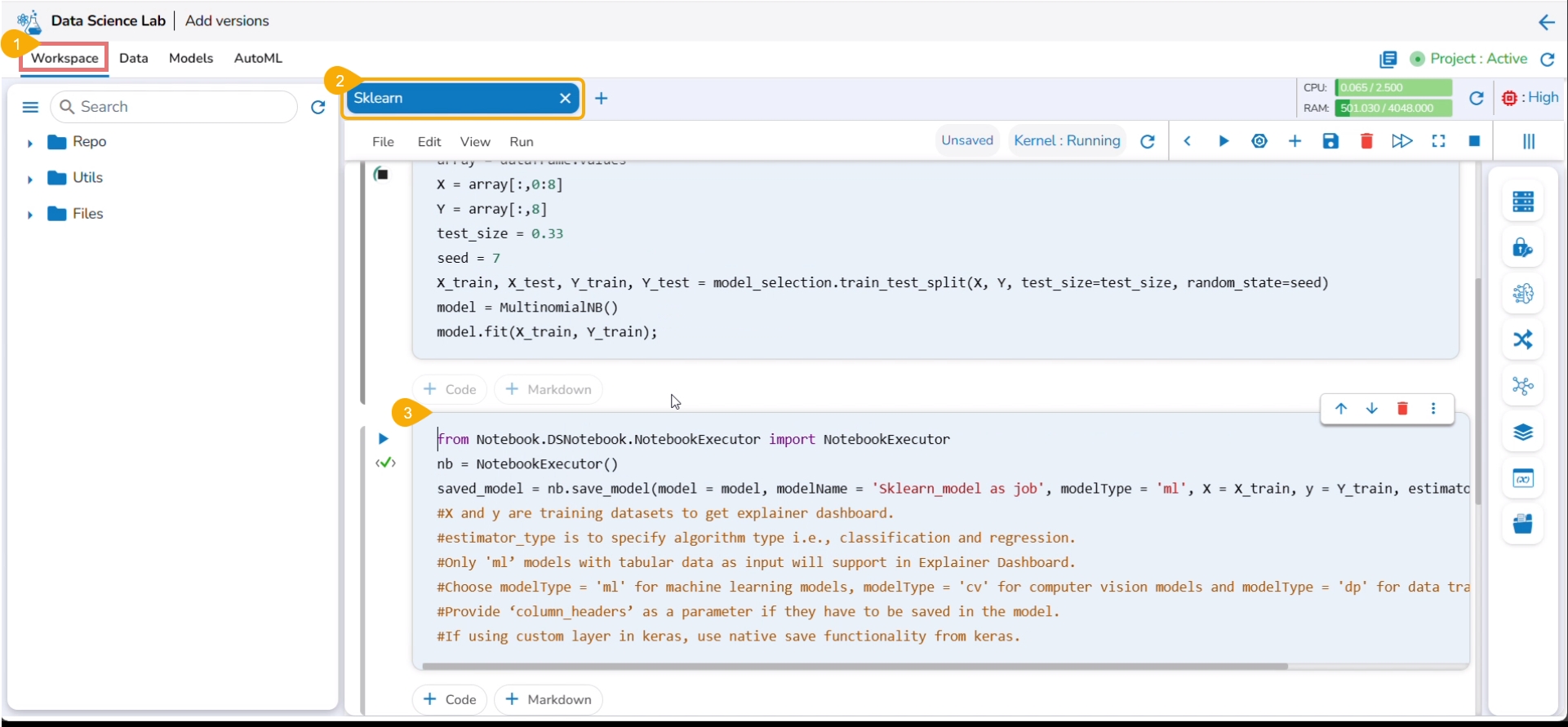
Navigate to the Workspace tab.
Open a Data Science Notebook (.ipynb file) that contains a model.
Navigate to the code cell containing the model script.
Check out the Model name. You may modify it if needed.
Click the Models tab.
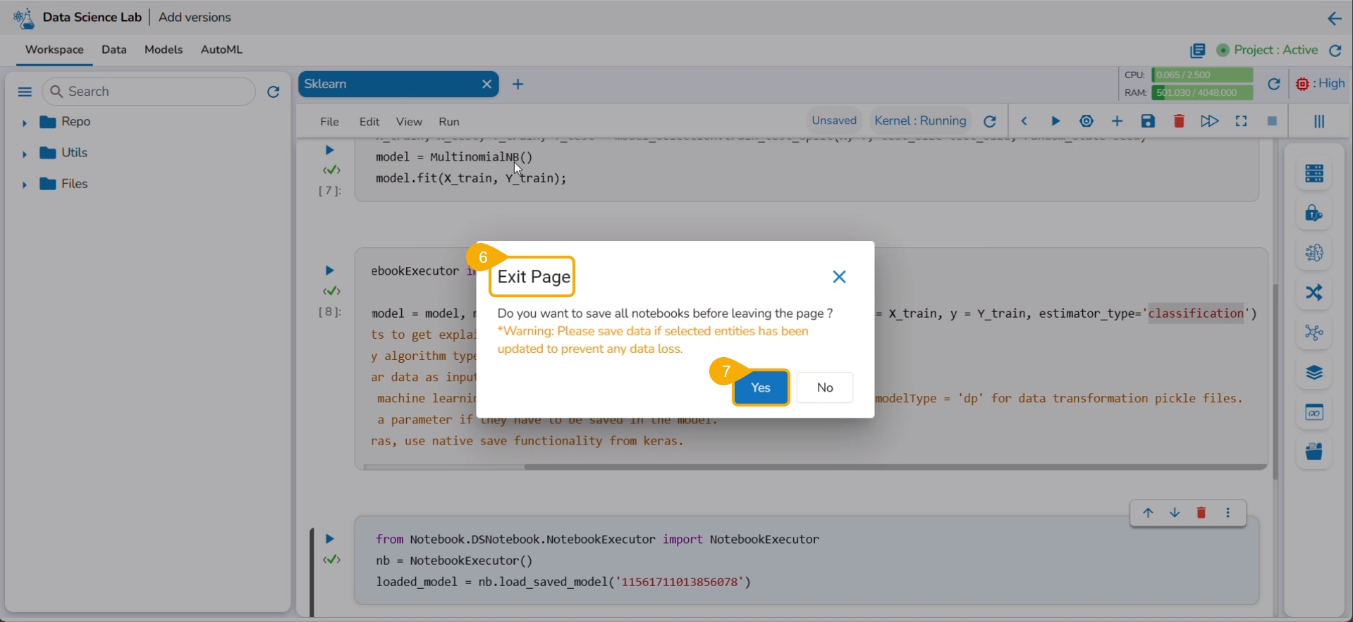
The Exit Page dialog box opens to save the notebook before redirecting the user to the Models tab.
Click the Yes option.
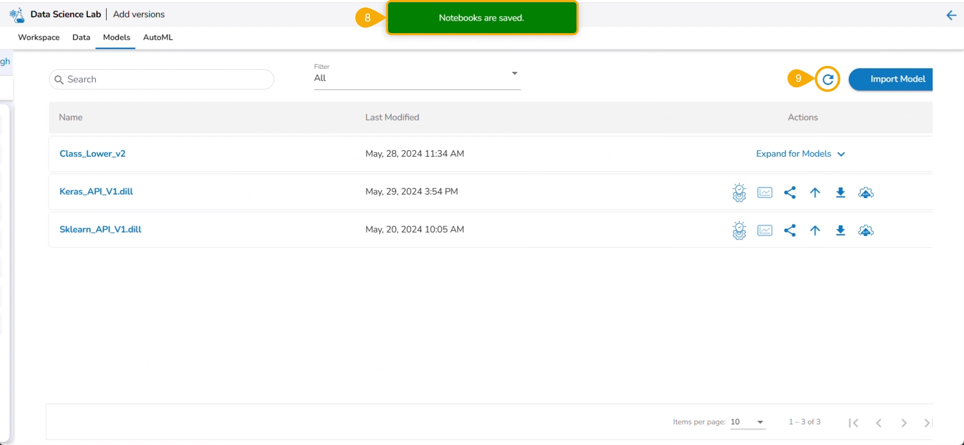
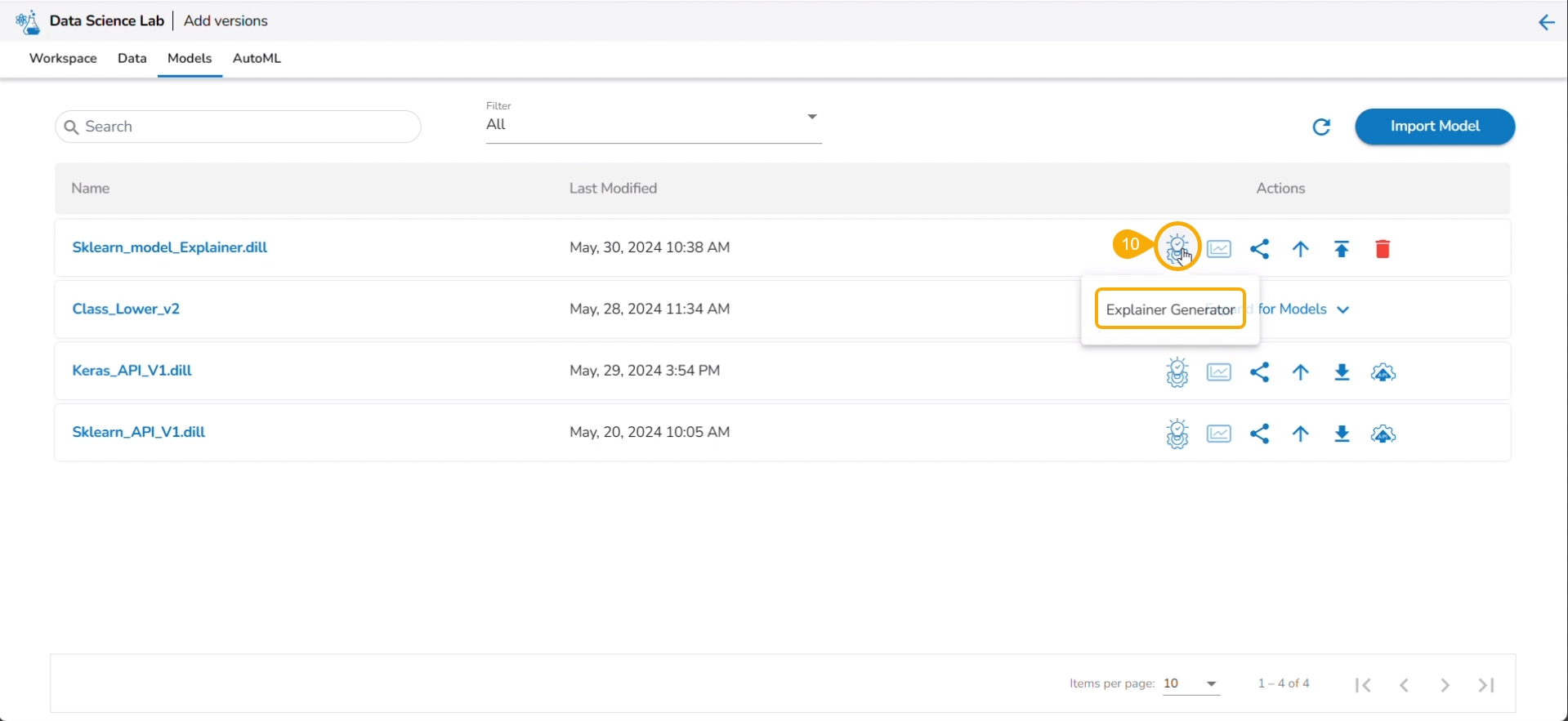
A notification message ensures that the concerned Notebook is saved. The user gets redirected to the Models tab.
Click the Refresh icon to refresh the displayed model list.
The model will be listed at the top of the list. Click the Explainer Creator icon.
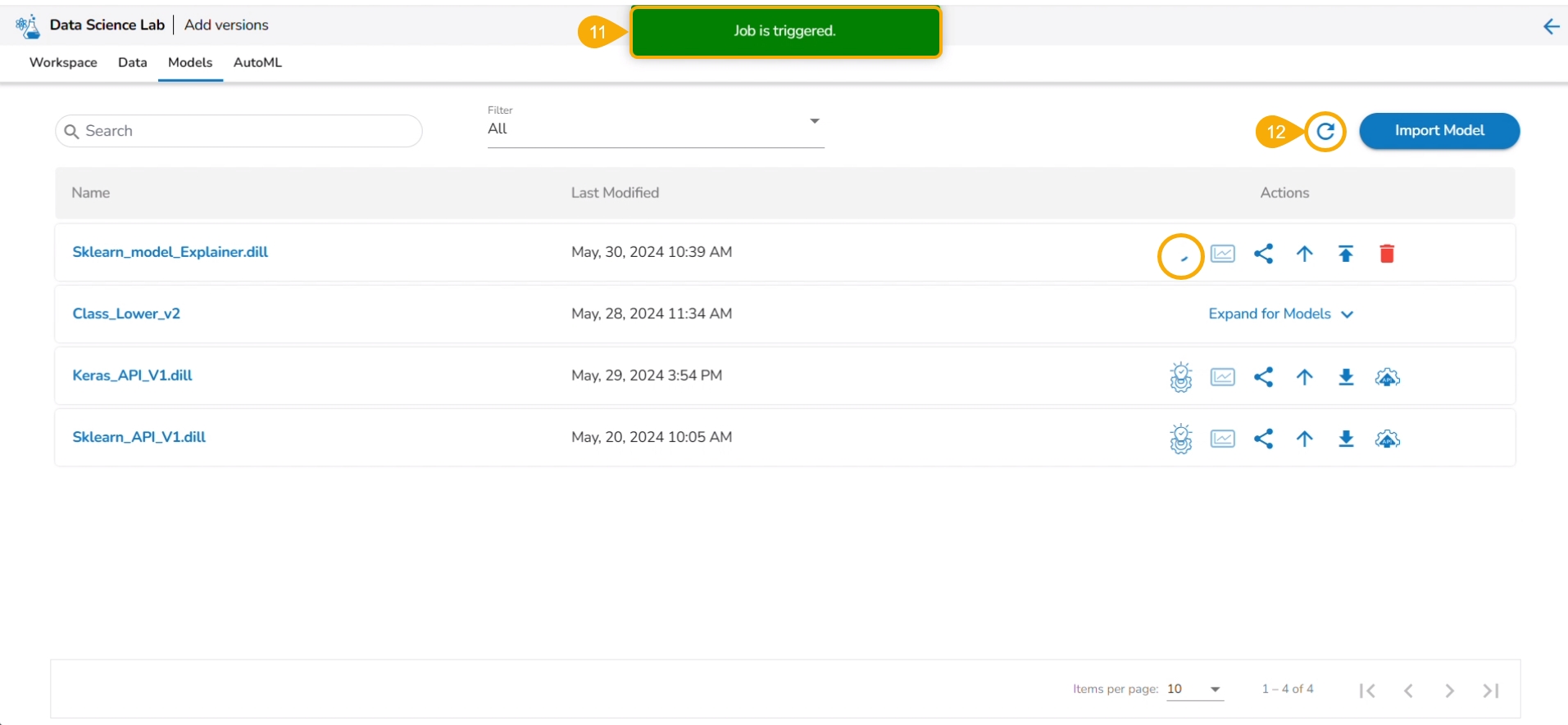
A notification ensures that a job is triggered.
Click the Refresh icon.
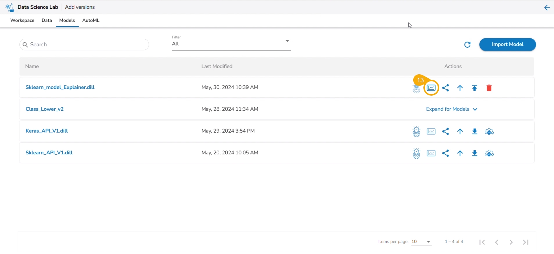
The Explainer icon is enabled for the model. Click the Explainer icon.
The Explainer dashboard for the model opens.
This release provides support from Linter to analyze source code and identify programming errors, bugs, and other potential issues.
The Linter functionality helps developers maintain high code quality by enforcing coding standards and best practices.
A linter helps in data science by:
Improving Code Quality: Enforces coding standards and best practices.
Detecting Errors Early: Identifies syntax errors, logical mistakes, and potential bugs before execution.
Enhancing Maintainability: Catches issues like unused variables, making code easier to maintain.
Facilitating Collaboration: Ensures consistent coding conventions across team members.
Optimizing Performance: Highlights inefficient code patterns for better performance in data processing and analysis.
Please Note: The Linter functionality is available for normal and Repo Sync projects. The Repo Sync Projects display the Git Console as well in the drawer that appears while using the Linter functionality.
Check out the illustration on how Linter functionality works.
These options are provided under the Workspace tab of a repo sync folder.
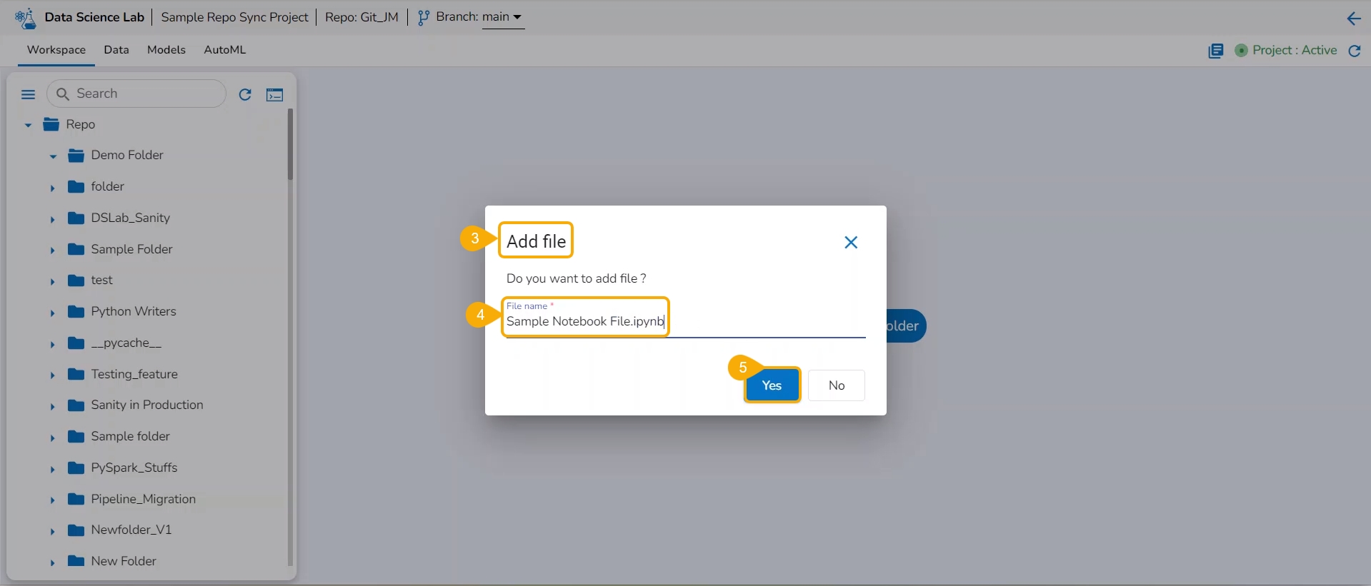
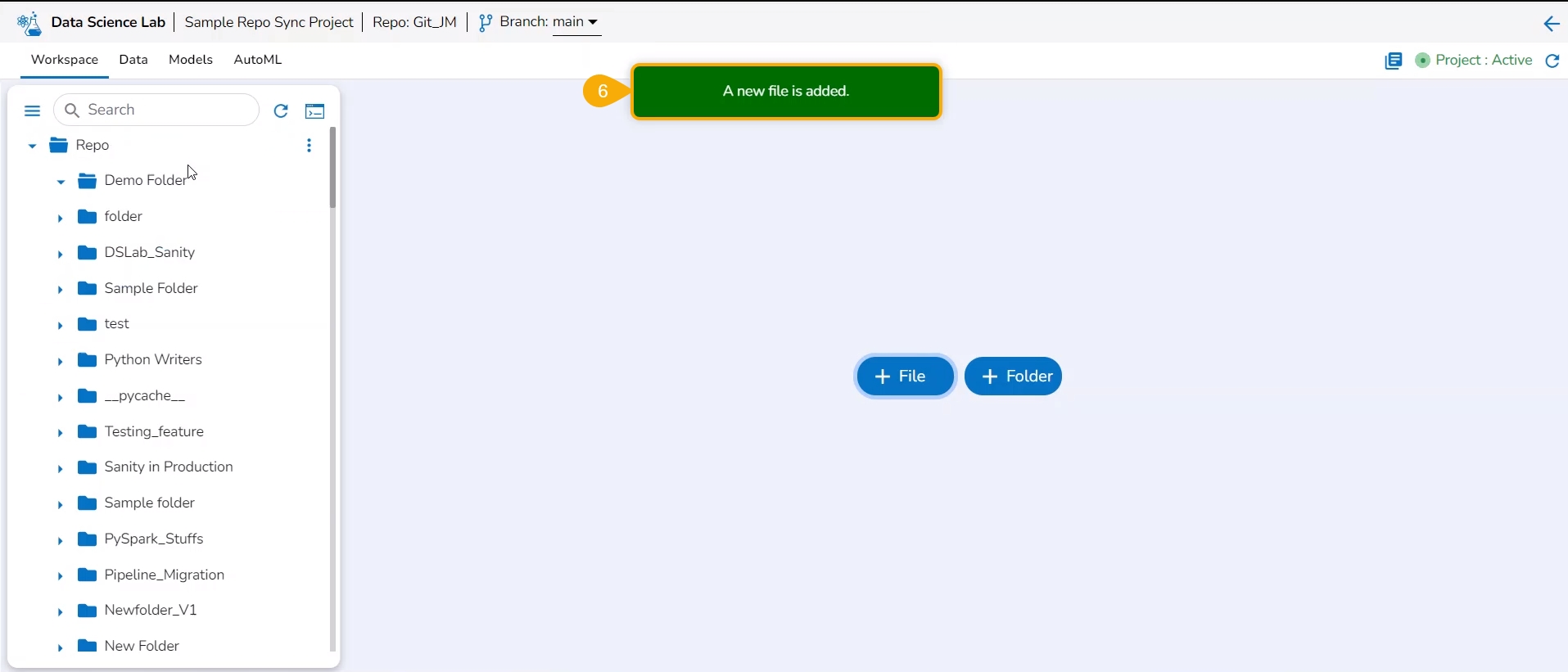
Check out the illustration on how to add a file inside a Repo Sync Project.
Navigate to the Workspace tab of an activated Repo Sync Project.
The Add file window opens.
Provide a File name.
Click the Yes option.
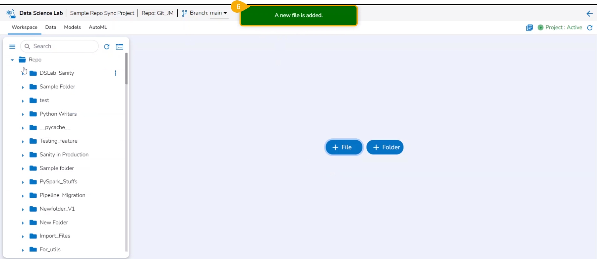
A notification message appears to ensure that the new file has been created.
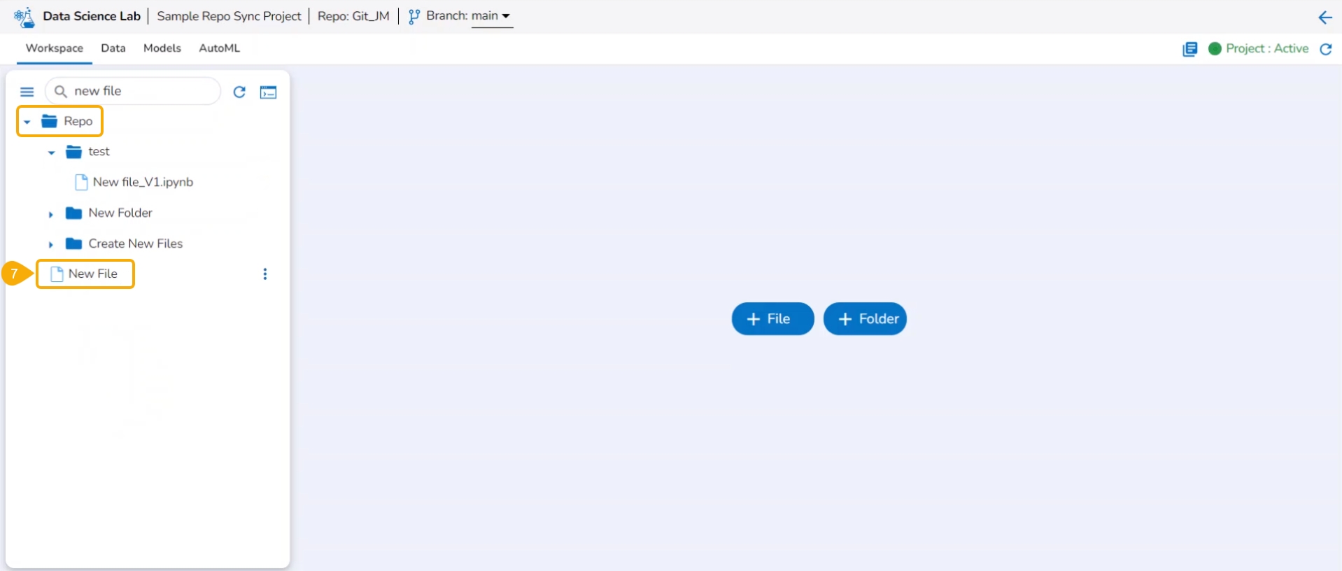
The newly created file gets added to the Repo Sync Project.
The user can insert the file type while adding a file to define the file type.
Check out the illustration on defining a file type while adding a file to the Repo Sync project.
Navigate to the Workspace tab for a repo sync project.
Click the Add File option.
The Add file window opens.
File name: Provide the file type extension while giving it a name.
Click the Yes option.
A notification message appears.
The new file gets added with the provided file extension.
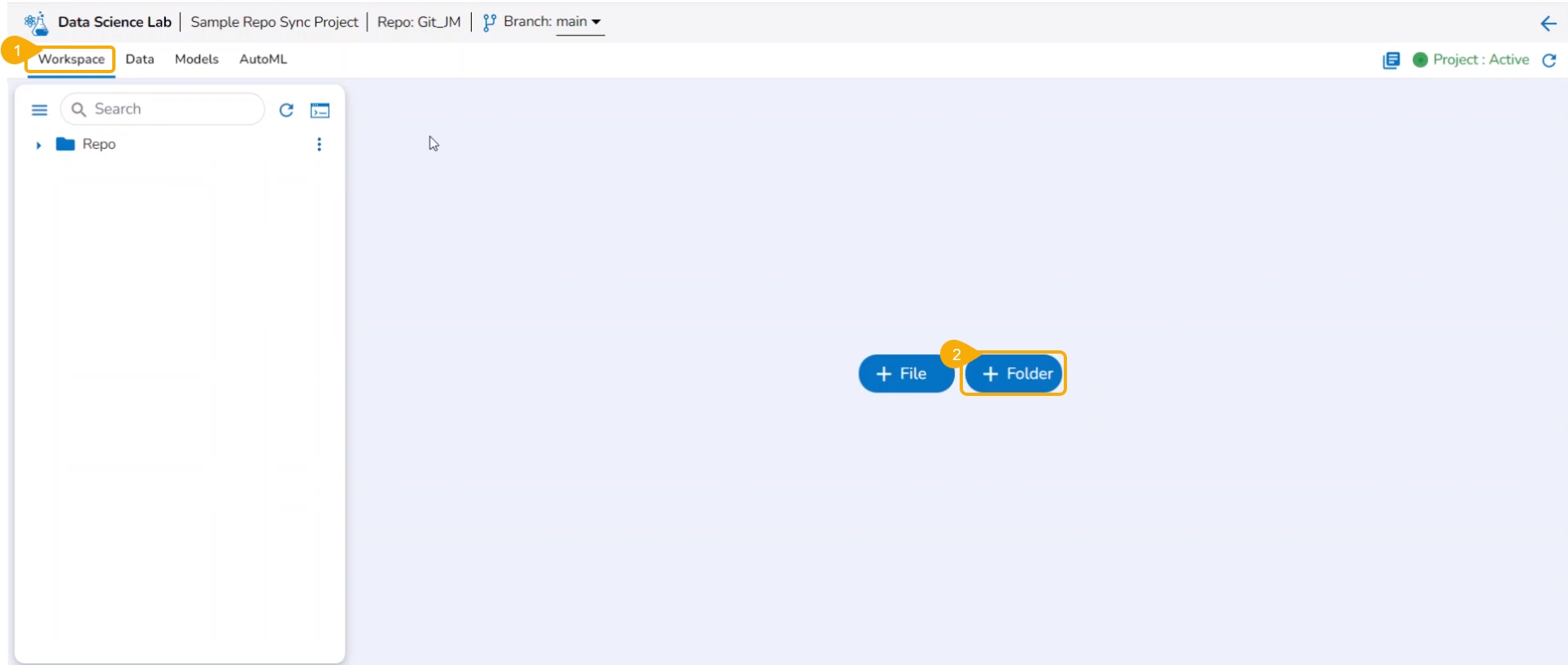
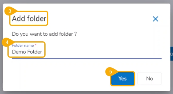
Check out the illustration on how to add a folder inside a Repo Sync Project.
Navigate to the Notebook tab of the Repo Sync Project.
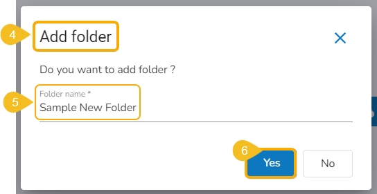
The Add folder window opens.
Provide a Folder name.
Click the Yes option.
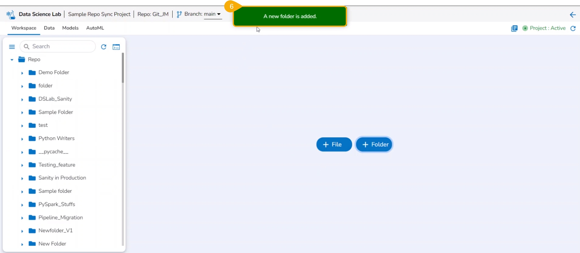
A notification message appears to ensure that the new folder has been created.
The newly created folder gets added to the Repo folder.
You can bring your Python script to the Notebook framework to carry forward your Data Science experiment.
The Import functionality contains two ways to import a Notebook.
Pull from Git
Please Note: Only .ipynb files will be supported.
Pre-requisite:
The user needs to configure the admin-level settings with an authentication token.
The user needs to do Project-level configuration of Git Project and Git branch.
The user needs to Pull a version of the file from Git before using the Pull and Push functionality for the projects where the source files are available in Git Repo.
Please Note: the user can generate an authentication token from their Git Lab or Git Hub repositories.
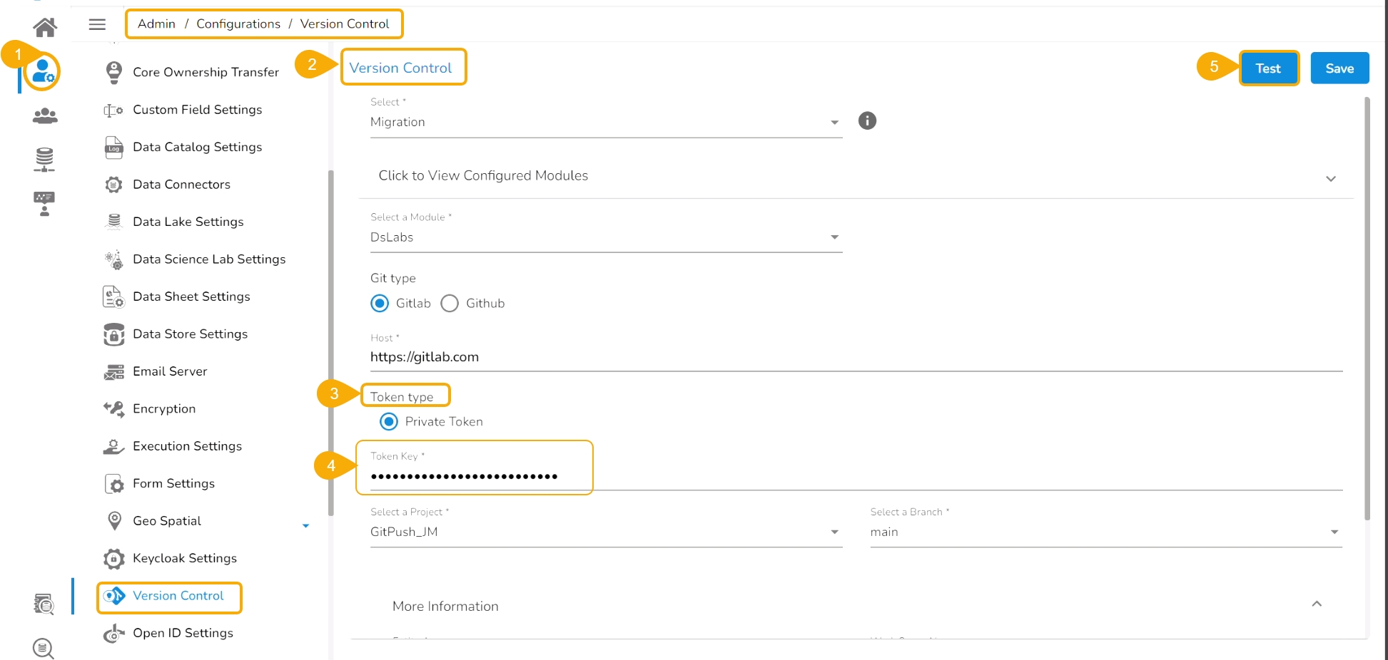
Check out the given illustration to understand the Admin configuration part with the authentication token under the platform.
Navigate to the Admin module.
Open the Version Control from the Configuration options.
Select the Token type as a private token.
Provide the authentication token in the given space.
Click the Test option.
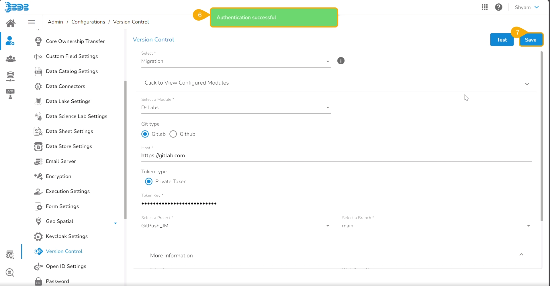
A notification message appears to inform the user that authentication has been established.
Click the Save option.
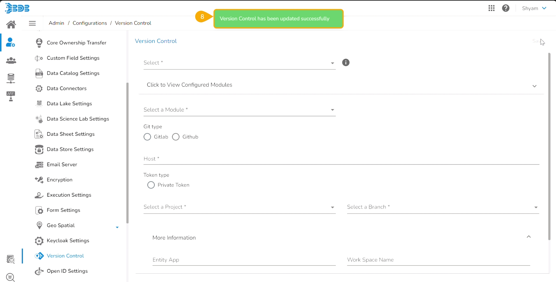
A notification message appears to inform that the version control has been updated.
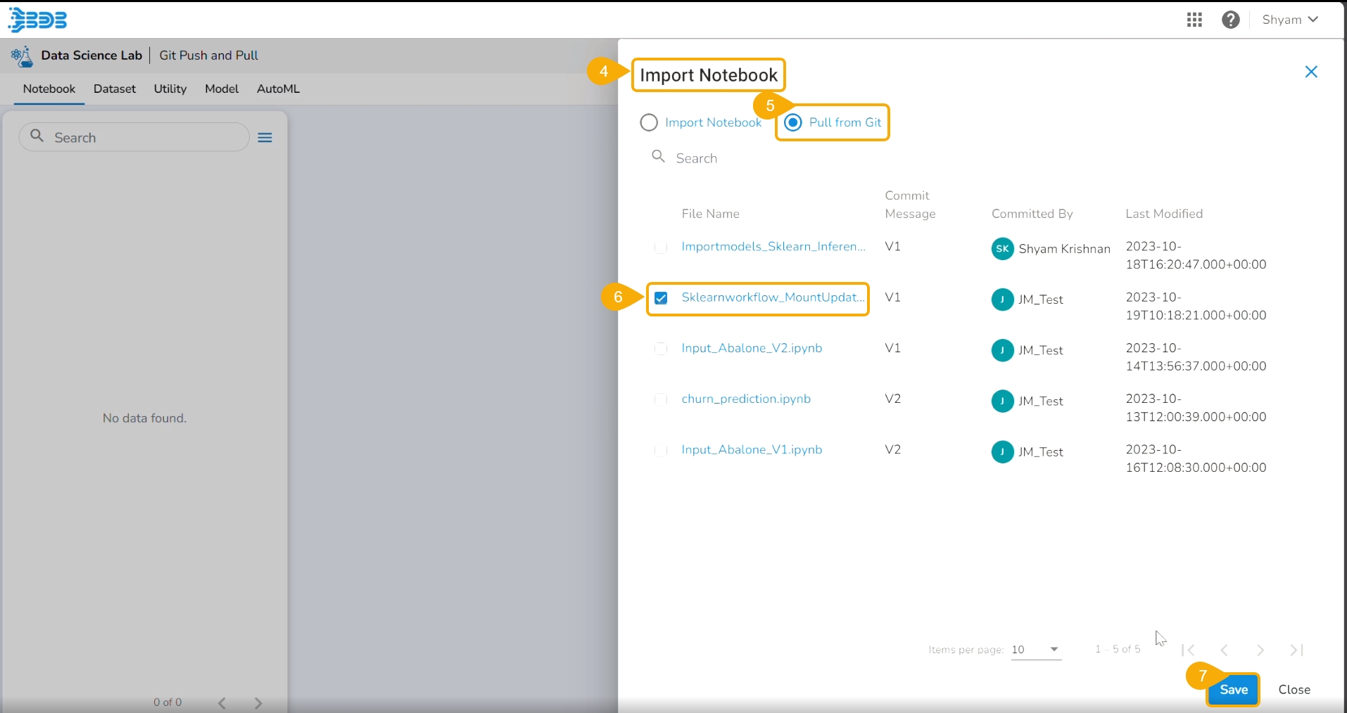
Projects and Branches created in GitLab/GitHub can be accessed using the access token inside the DS Lab and the files (.ipynb) can be pulled using the Pull from Git functionality.
Check out the given illustration to understand the Pull from Git functionality.
Once the initial pull (import) has happened, the user can pull the latest version of the Python file from Git using the Pull from VCS functionality available in the Notebook List.
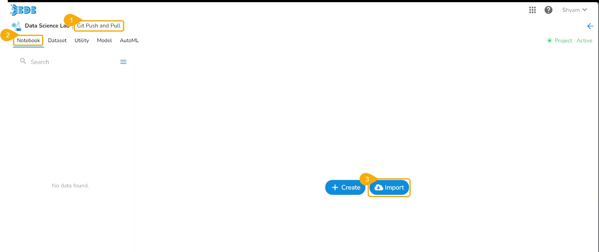
Navigate to an activated Project.
Open the Notebook tab (It opens by default).
Click the Import option.
The Import Notebook page opens.
Select the Pull from Git option.
All the available versions appear.
Click the Save option.
A notification message appears to ensure that the selected file is pulled.
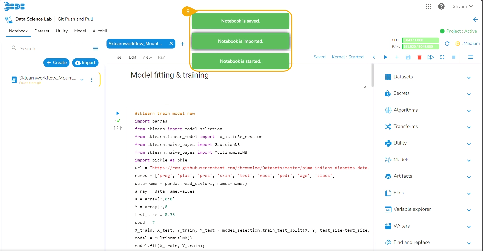
Consecutive notifications ensure that the Notebook is started, imported, and saved.
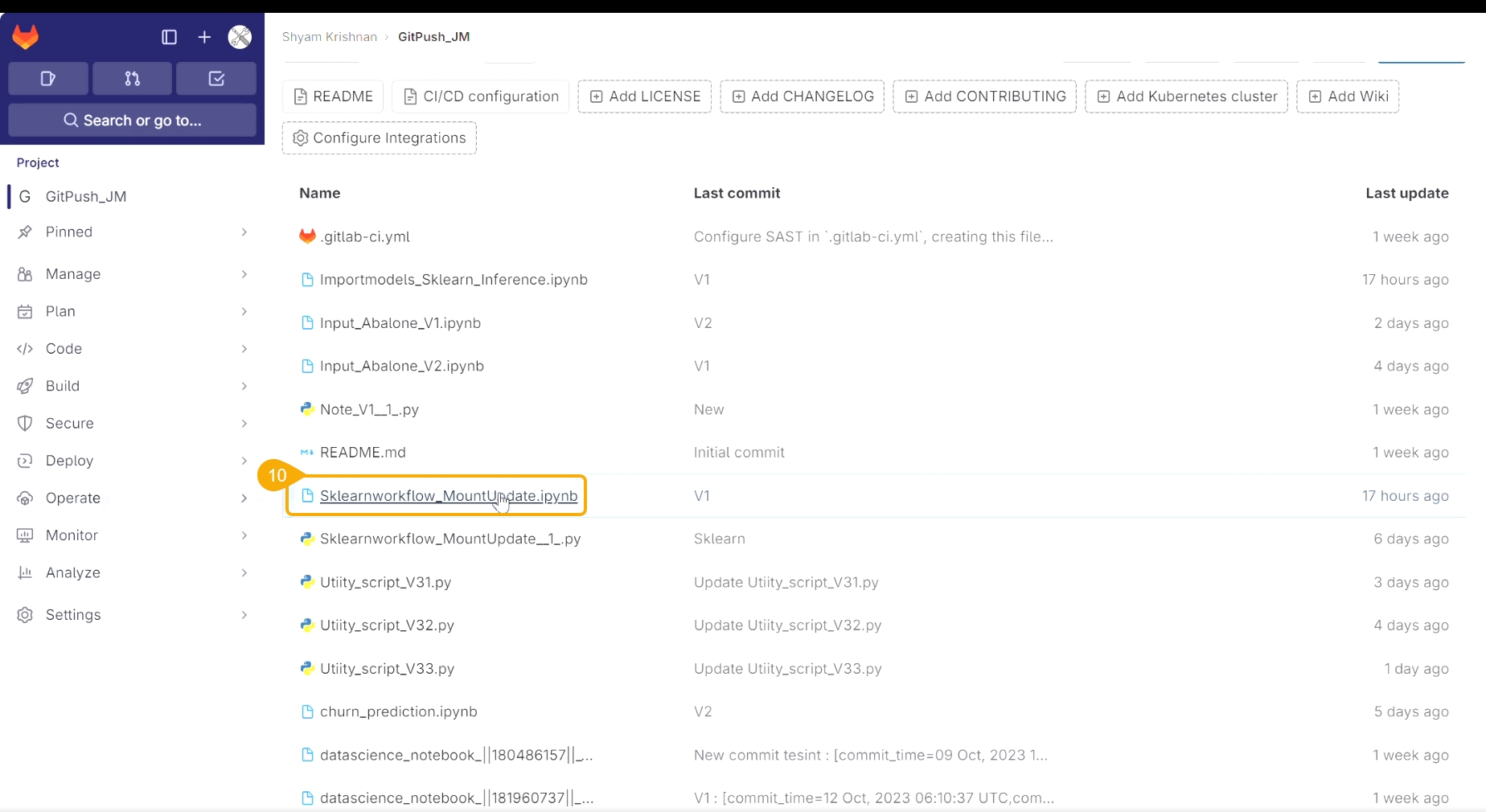
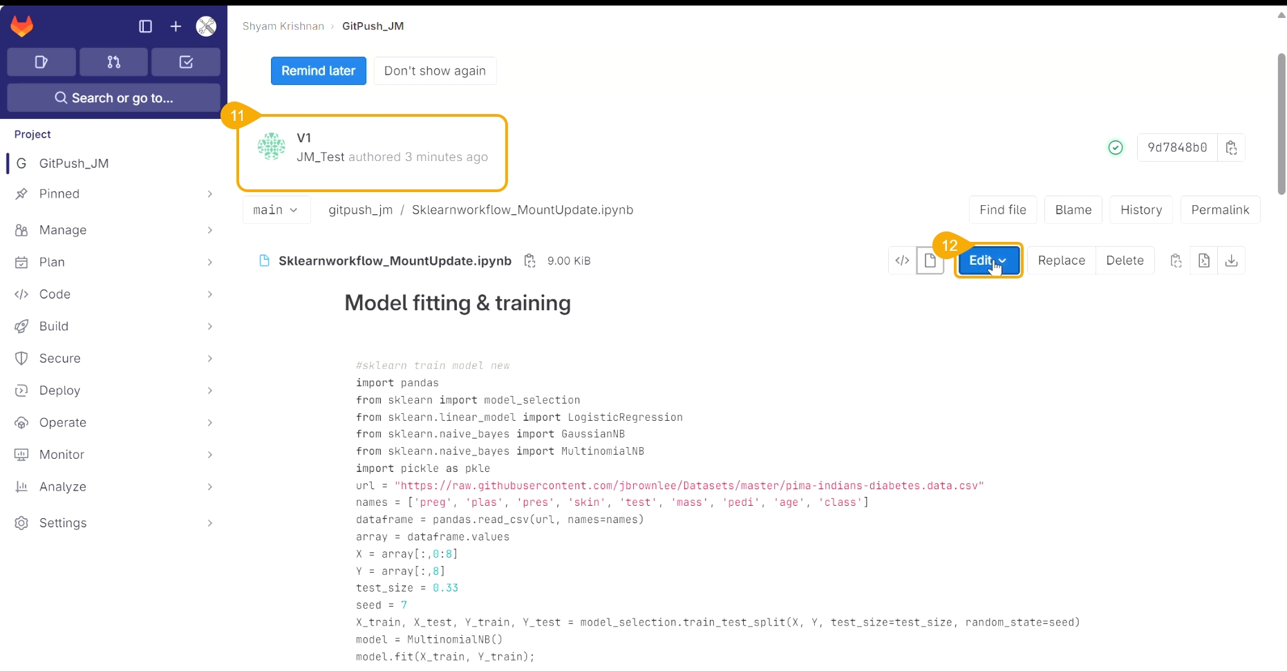
Access the Notebook script from the Git repository.
Open the same script from Git.
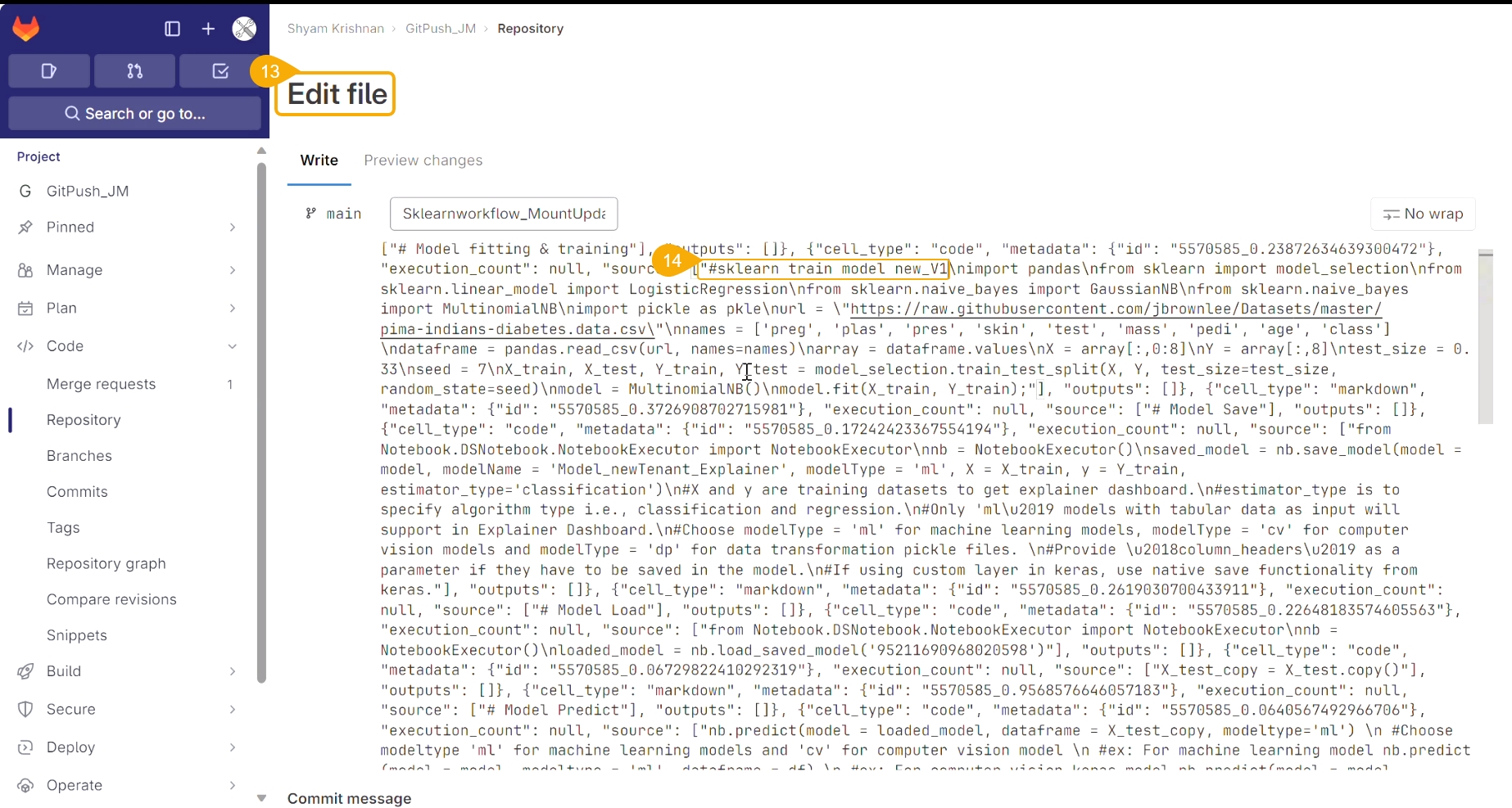
Click the Edit option.
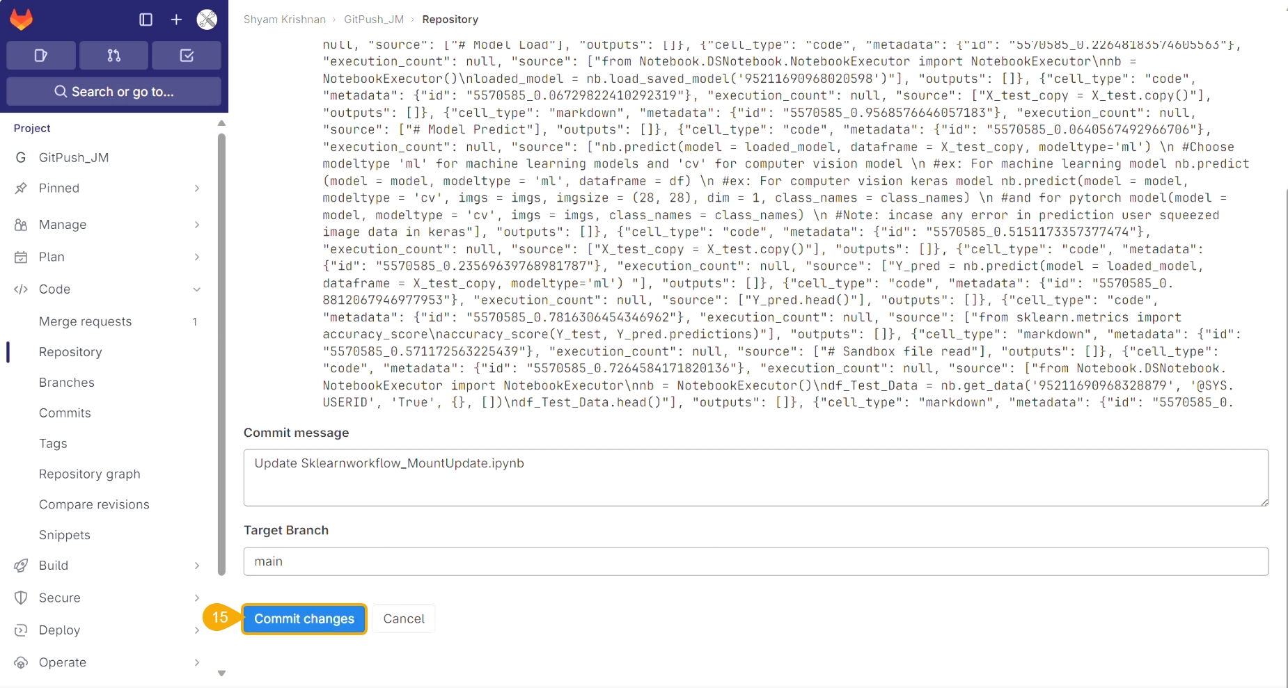
The script opens in Edit file mode.
Modify the script.
Click the Commit changes option.
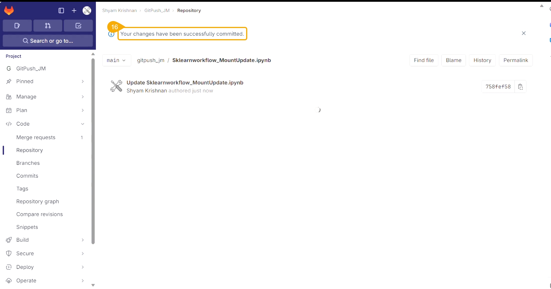
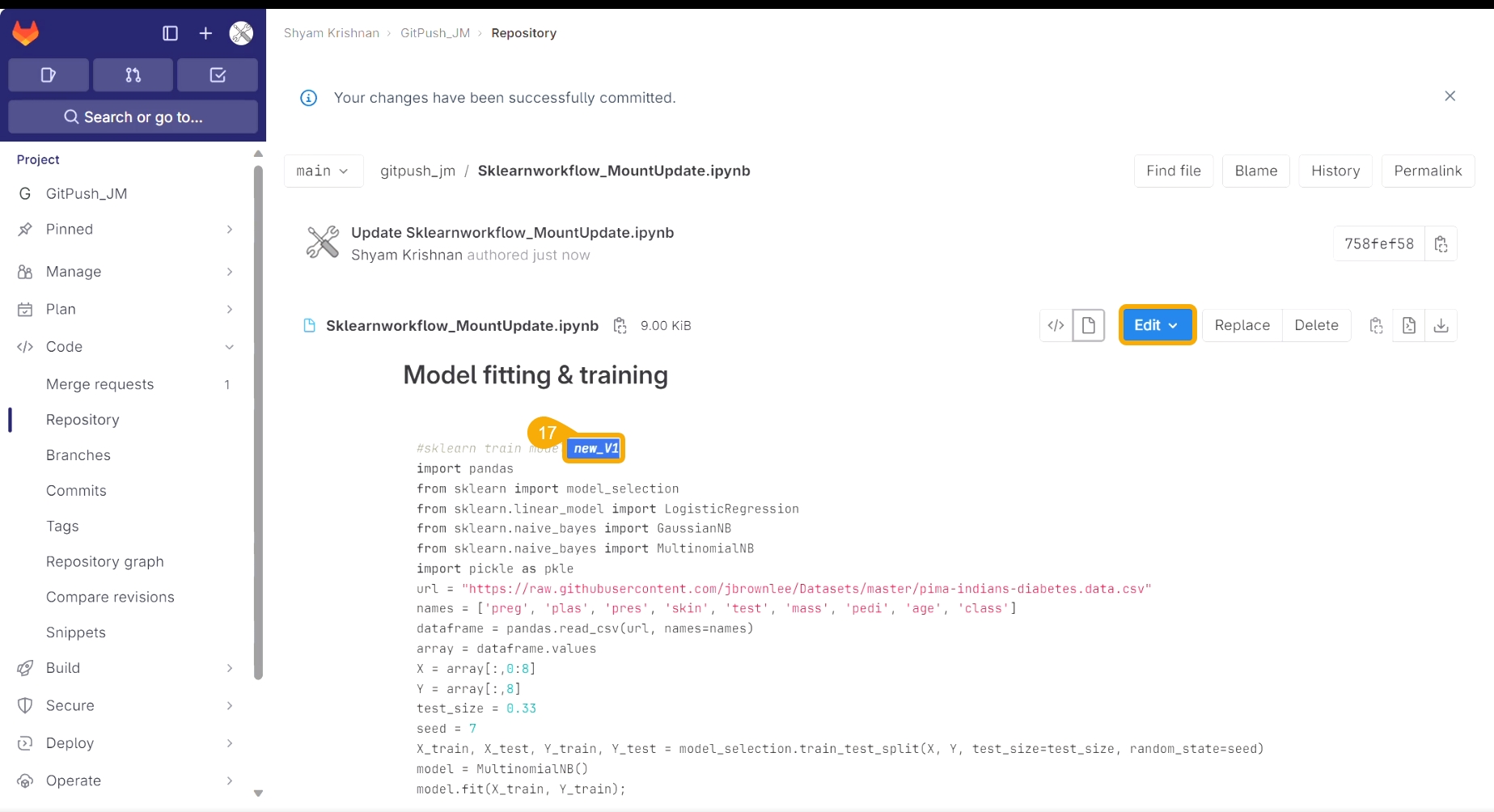
A notification message appears to ensure that the changes are successfully committed.
The modification committed in the script gets saved.
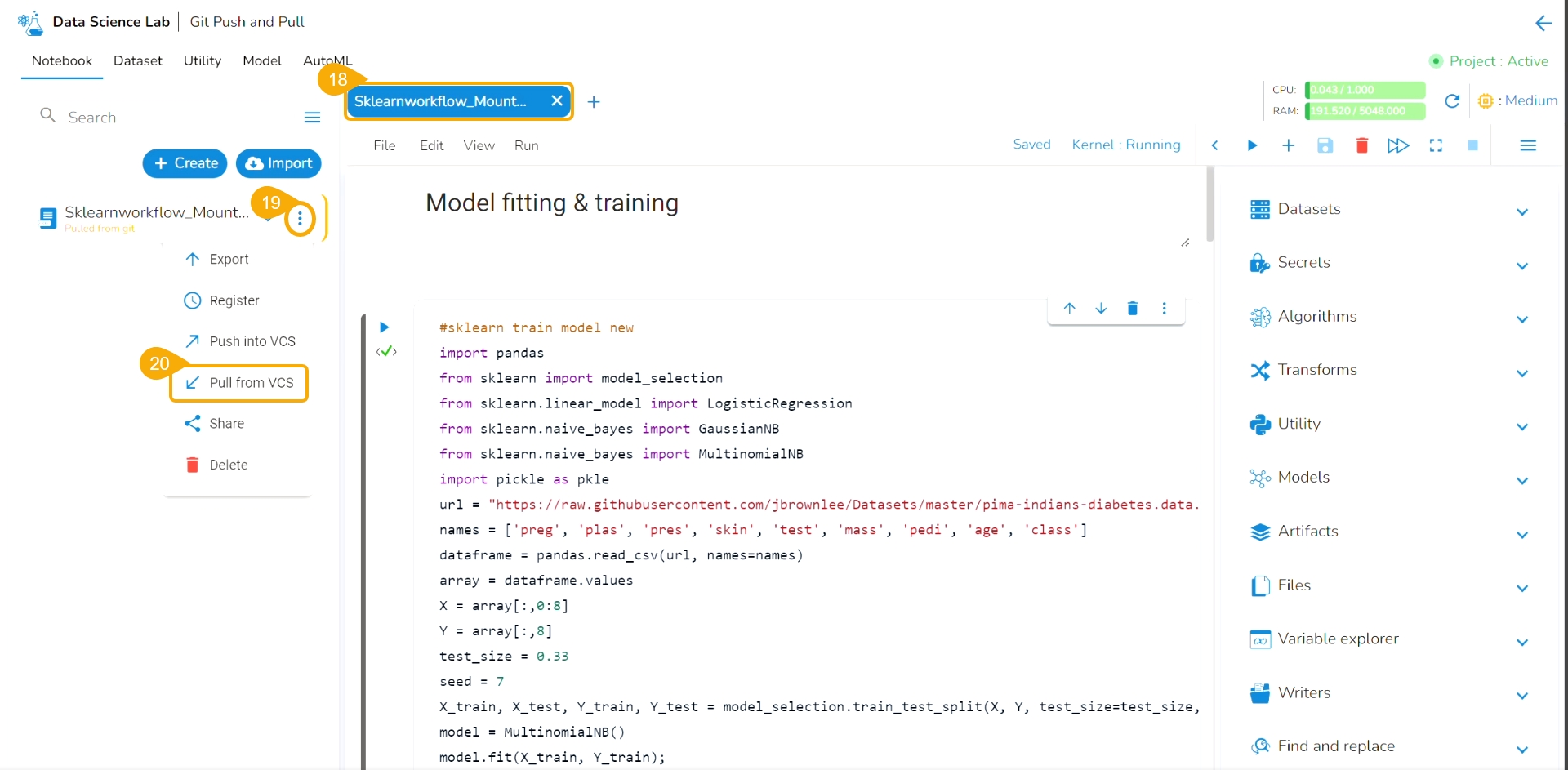
Navigate to the same Notebook.
Click the ellipsis icon to get the Notebook options.
Click the Pull from VCS option.
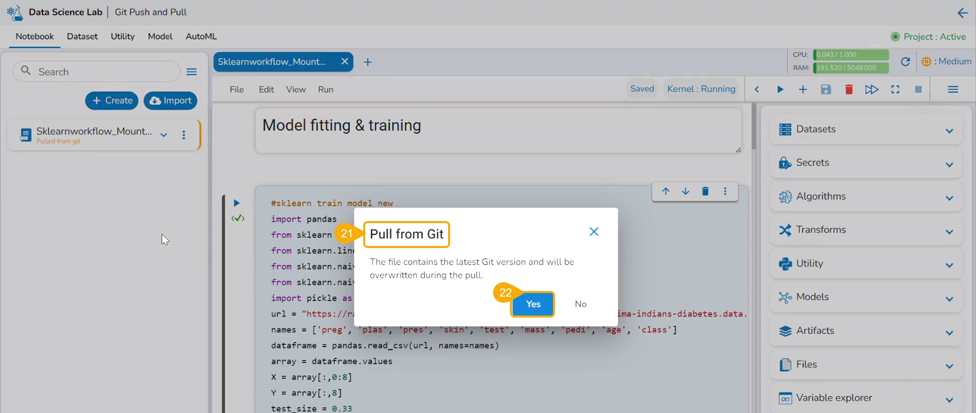
The Pull from Git dialog box opens.
Click the Yes option.
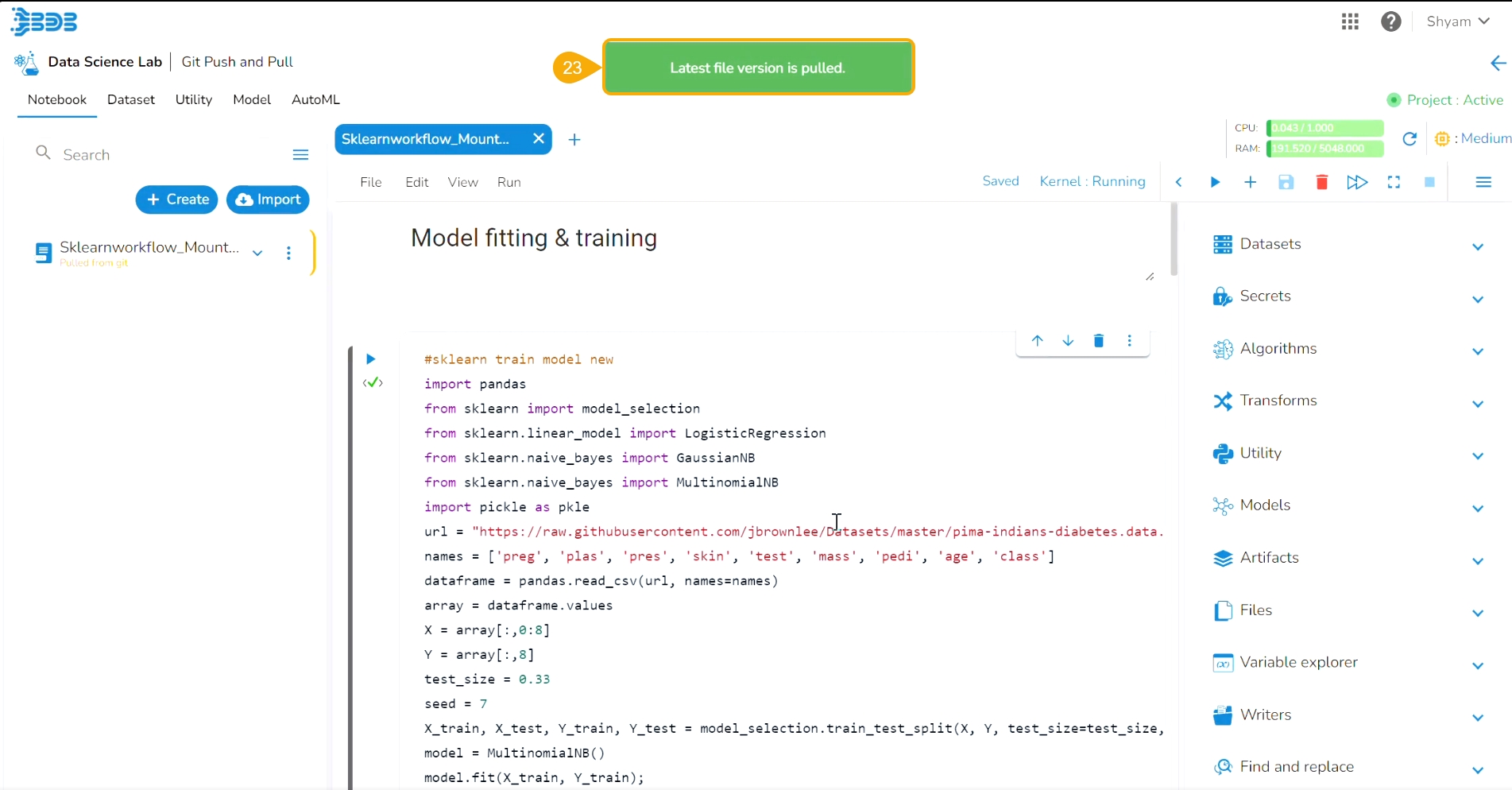
A notification informs the user that the latest file version is pulled.
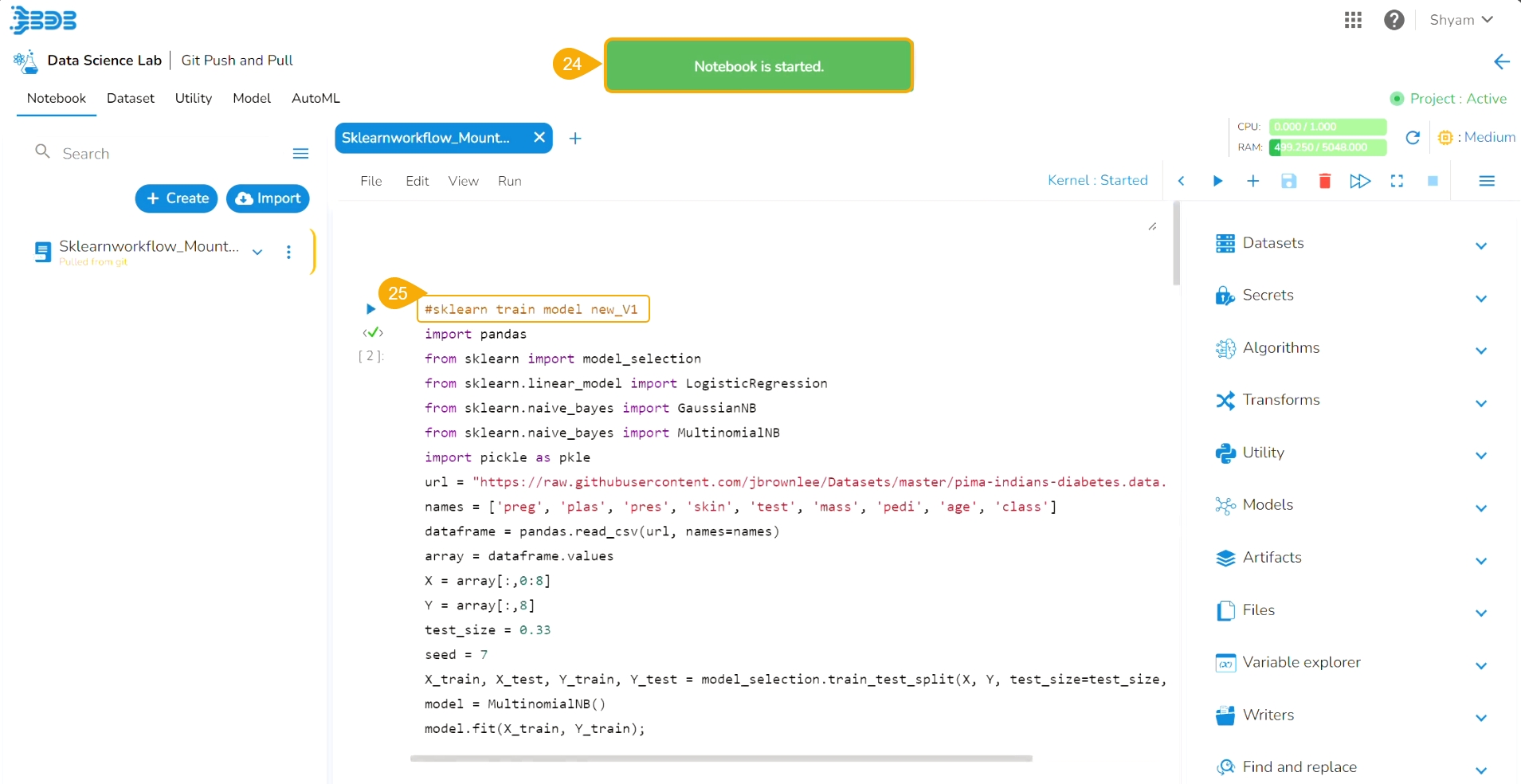
Another notification message informs the user that the pulled Notebook is started.
The latest/ modified script gets updated.
Push pre-requisites:
The user branch should have Developers' and maintainers' permission to push the latest code into the Main branch.
The User token has to be set in the user profile using the Custom Fields setting available at the Admin level.
The user token key name has to be 'bdbvcstoken'.
Navigate to the Admin module.
Open the Custom Field Settings under the Configurations option.
The Custom Field Information appears.
Provide the following information for the custom field:
Key- bdbvcstoken
Input type - Manual
Description - Git User Token
Mandatory - No
Click the Save option to save the modified Custom Field Settings.
A notification message appears to inform the user that the custom field settings are updated.
Navigate to the Security module.
Go to the Users list.
Select the user from the list.
Click the Edit icon.
The Update User page opens.
Check out the Custom Fields section.
Validate whether the Git User Token is valid or not. If not provide the valid Git User Token.
Click the Save option.
A notification message appears to inform that the user is updated successfully.
Open the User Profile.
Select the My Account option.
The My Account details are displayed.
Open the Configuration option.
The same token gets updated under the Git Token section which was provided under the Configuration section.
Please Note: Before using the Push a file to Git functionality make sure that the following requirements are fulfilled:
The latest file is pulled into DS Lab before modifying and pushing back to the Git branch.
The user should have access to the Git branch for pushing a change.
Navigate to the Workspace tab (it opens by default) for an activated project.
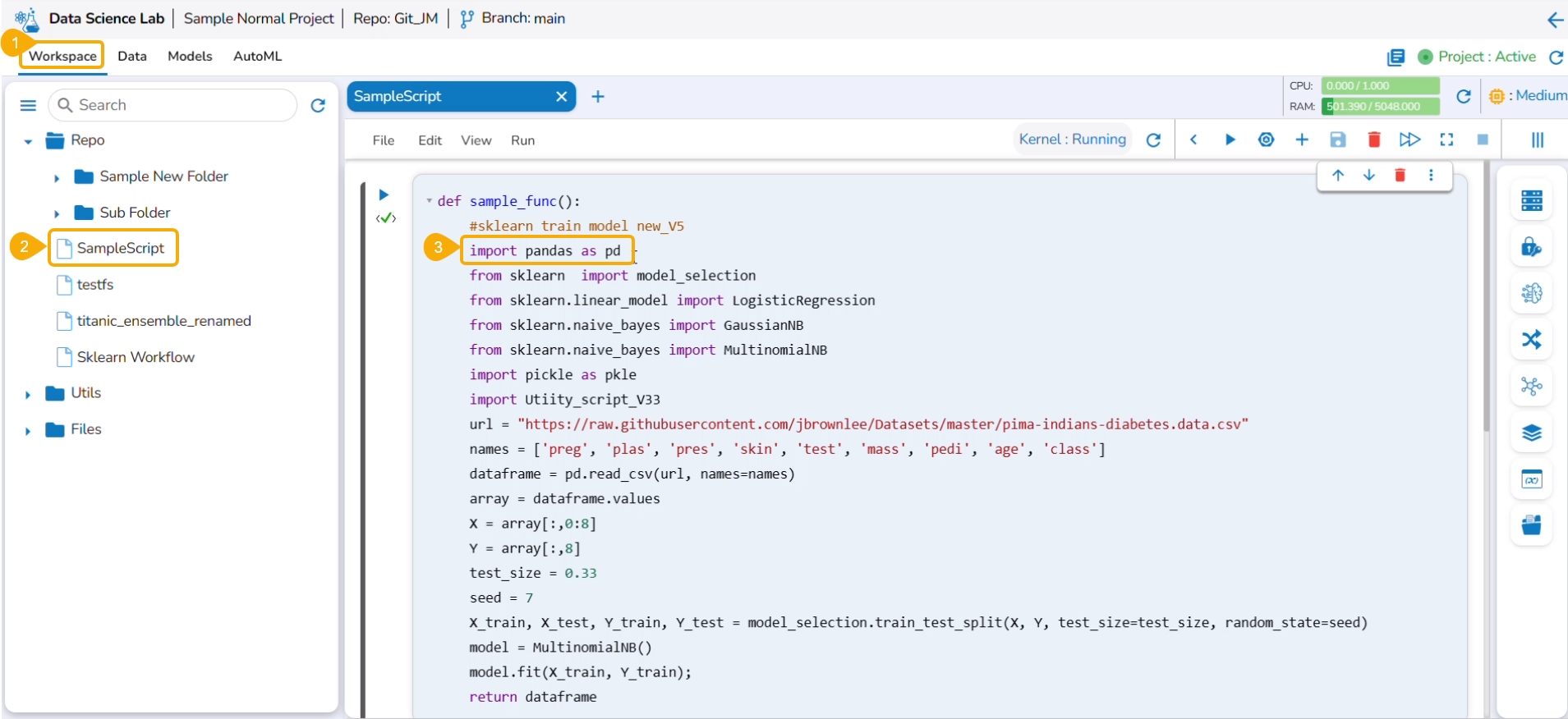
Select a Notebook from the displayed list to open the content/script.
The existing content gets displayed.
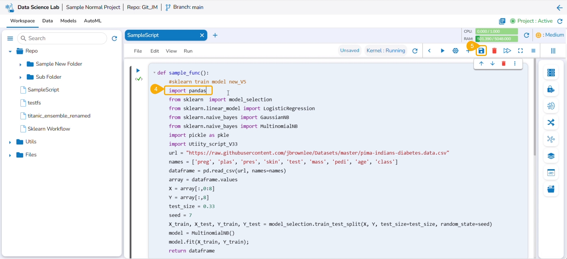
Modify the script to create a new version of the Notebook.
Click the Save icon to save the latest of the Notebook.
A notification ensures that the Notebook is saved.
Click the Push into VCS option from the Notebook options.
The Push into Git drawer opens.
Select the Version control option.
Provide a commit message.
Click the Push option.
A notification message ensures that the latest file version is pushed (to Git).
Navigate to the Git repository and access the pushed version of the Notebook script.
Open the script. The latest changes will be reflected in the script.
Please Note: The Pull from Git functionality supports Git Lab and Git Hub.
Check out the illustration explaining the Pull from Git functionality for a Repo Sync Project.
Check out the illustration explaining the Push into Git functionality for a Repo Sync Project.
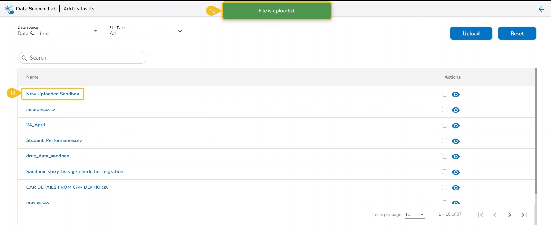
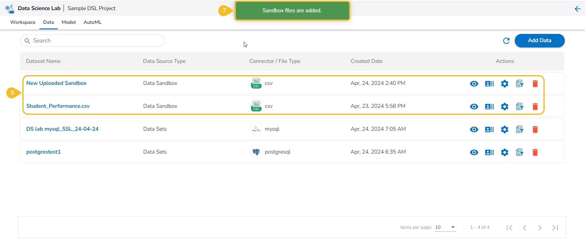
This section focuses on how to add or upload datasets to your DSL Projects. The Dataset tab lists all the added Data to a Project.
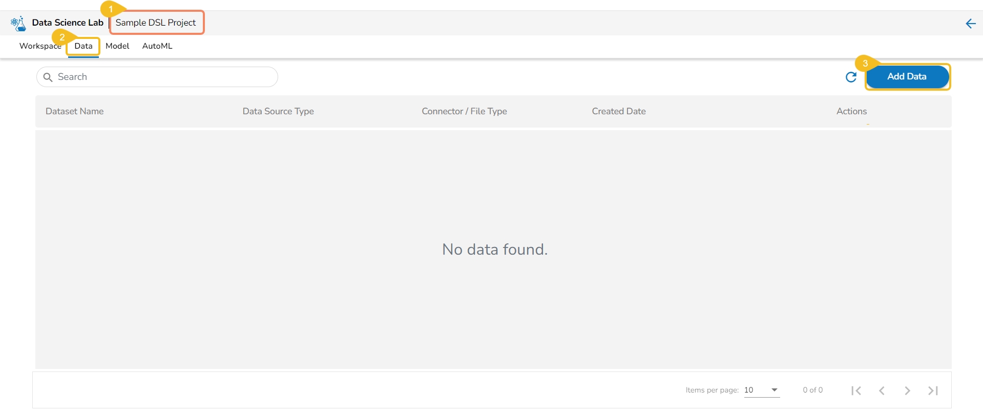
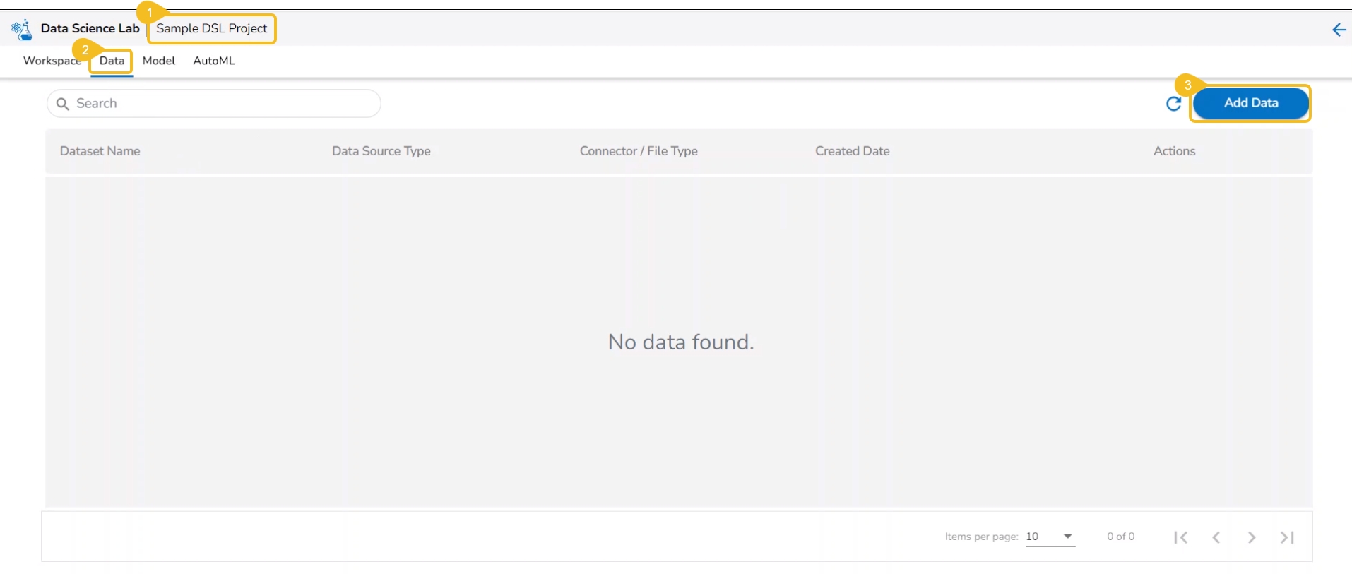
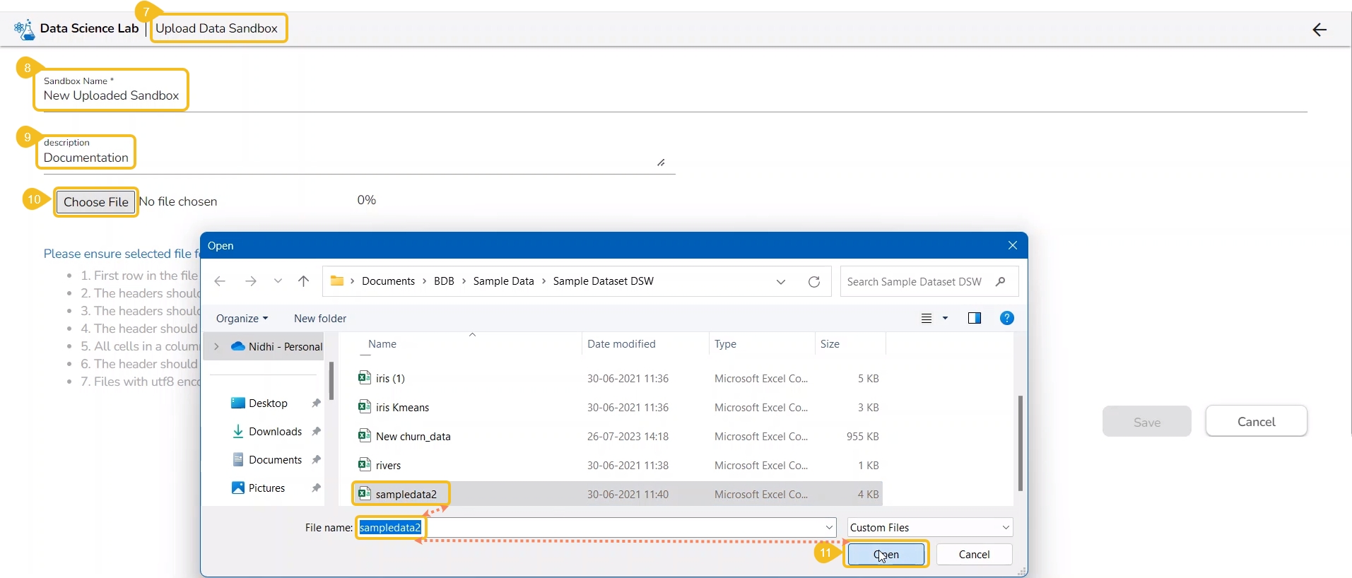
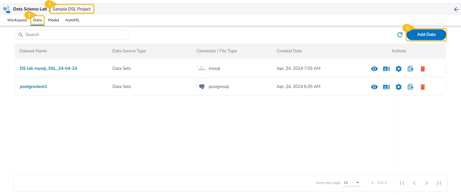
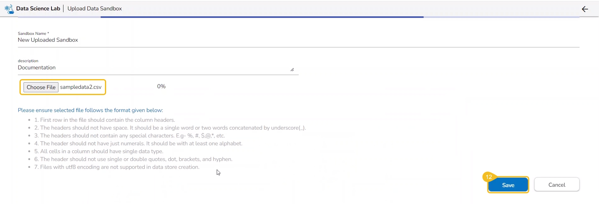
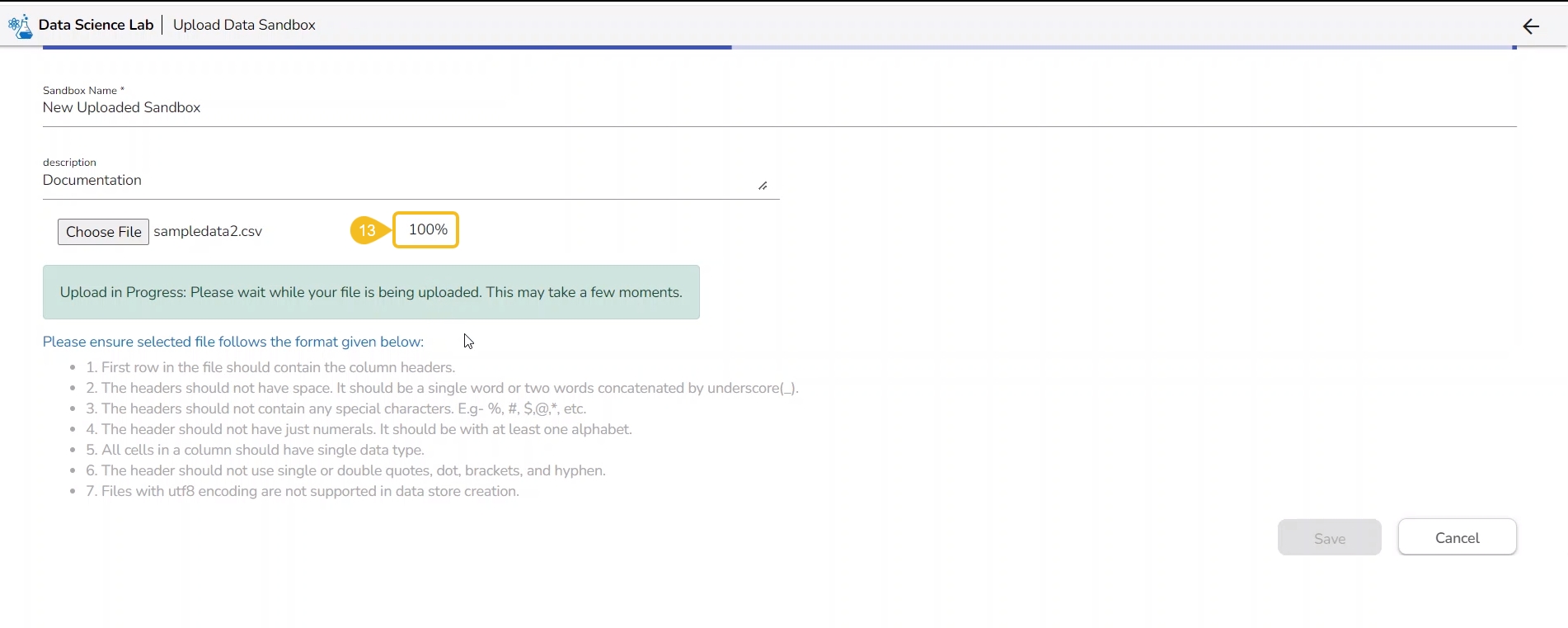
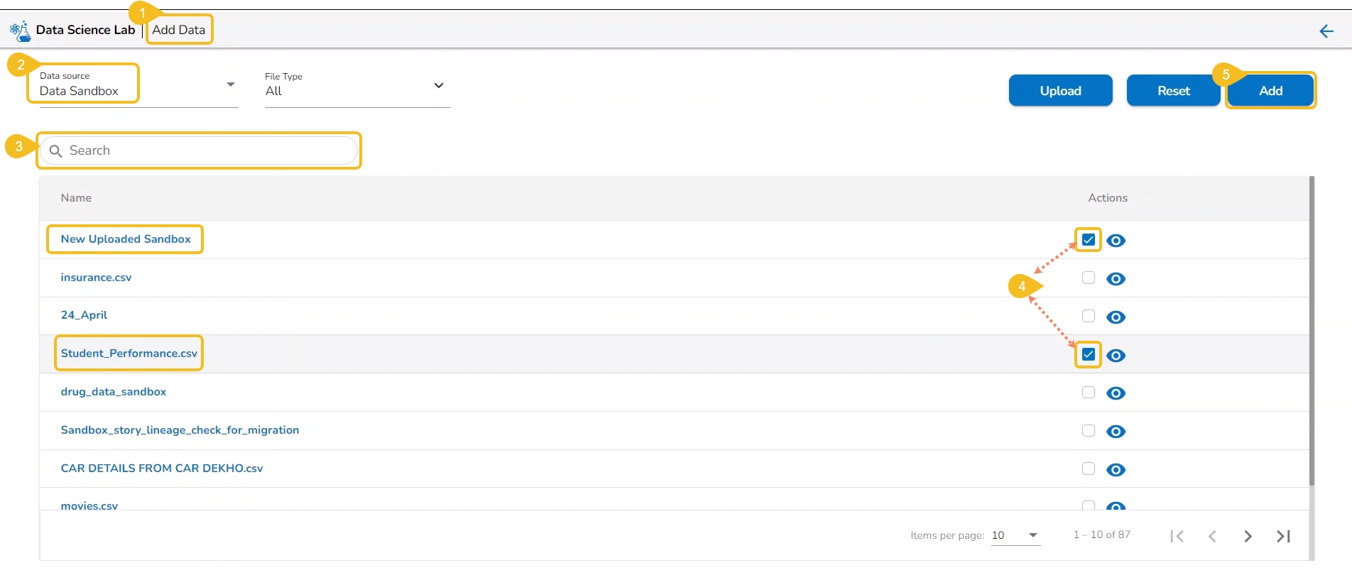
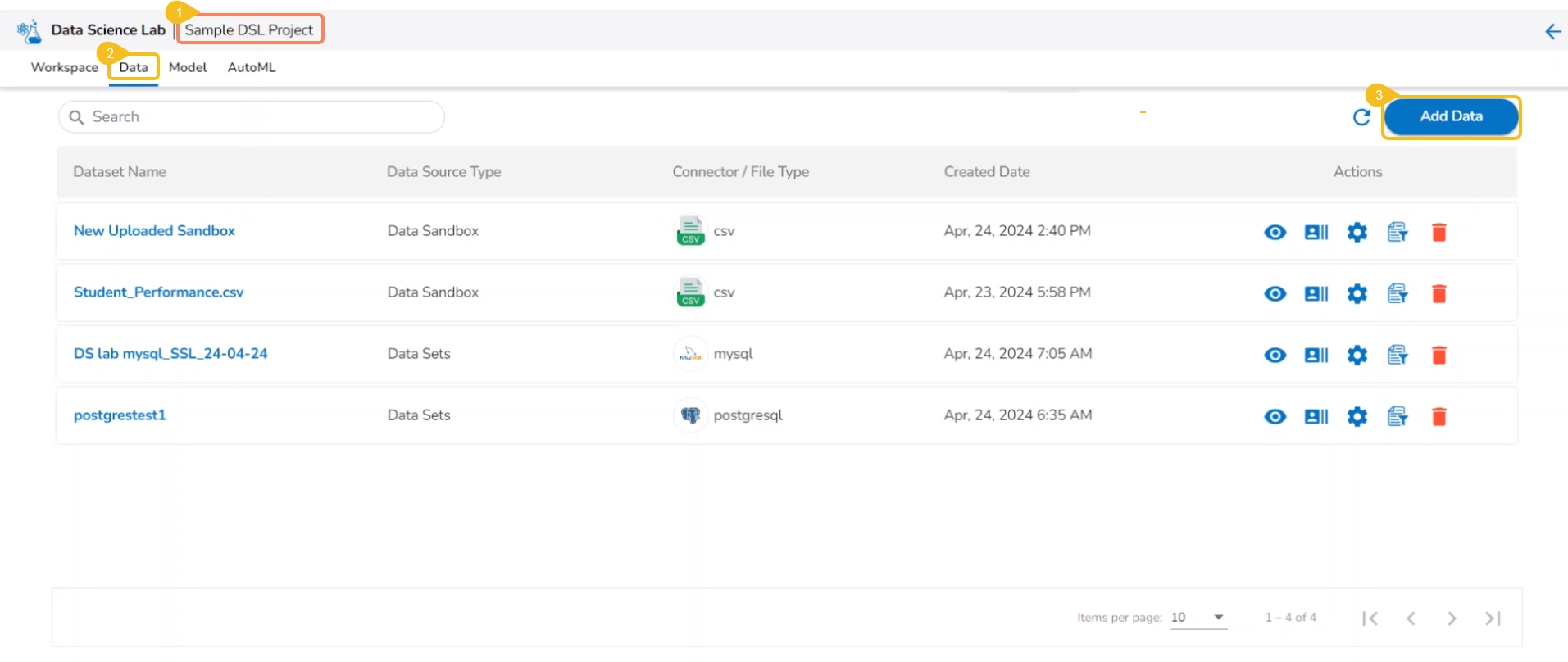
The Add Data option provided under the Data tab redirects the users to add various types of data to a DSL Project. The users can also upload sandbox files or create feature stores using this functionality.
Please Note: Users can add Datasets by using the Data tab or Notebook page provided under the Workspace tab.
Open a Data Science Lab Project.
Click on the Data tab from the opened Project.
The Data tab opens displaying the Add Data option.
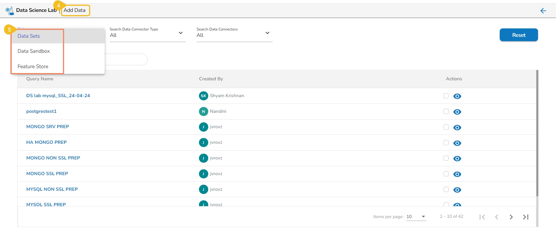
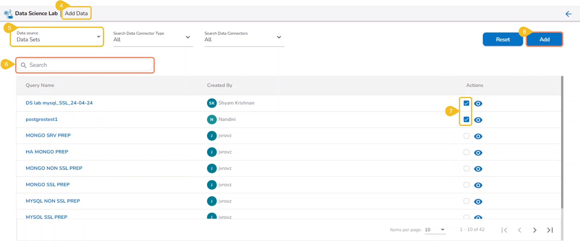
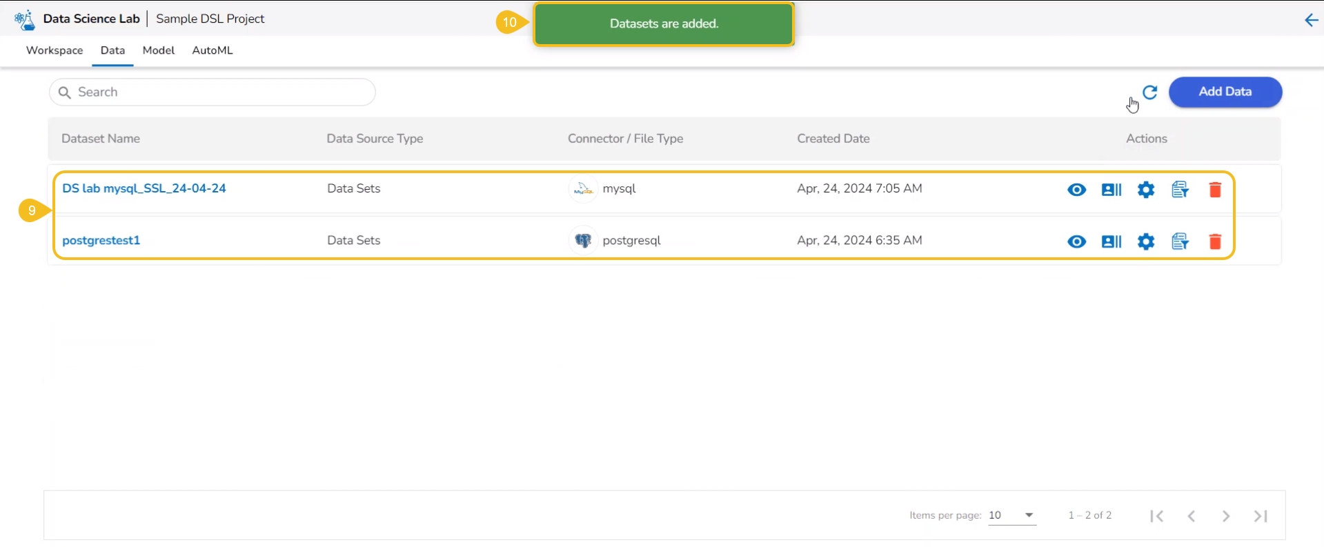
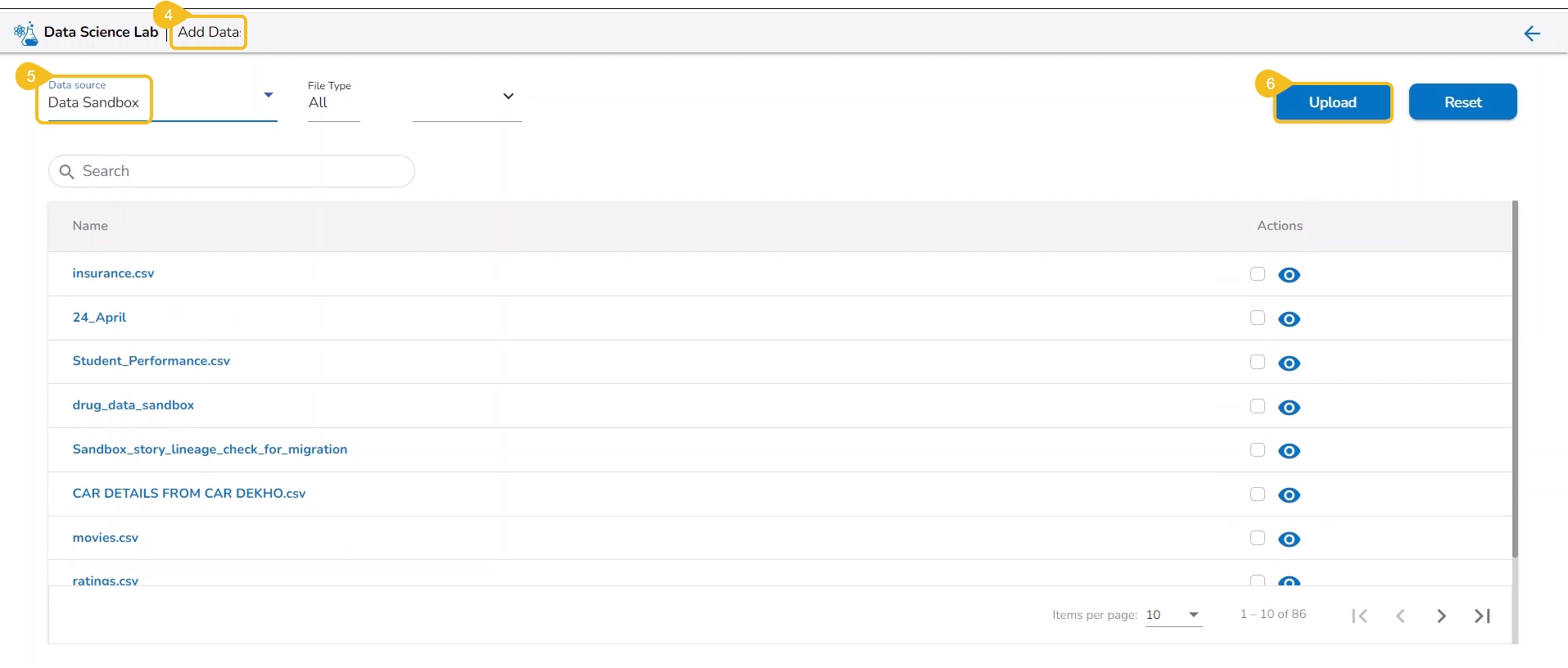
The Add Data page opens the uploaded and added Data Sources for the selected DSL Project.
The Add Data page offers the following Data source options to add as datasets:
Data Sets – These are the uploaded data sets from the Data Center module.
Data Sandbox – This option lists all the available/ uploaded Data Sandbox files.
Feature Store – This option lists all the available Feature Stores under the selected DSL Project.
External models can be imported into the Data Science Lab and experimented inside the Notebooks using the Import Model functionality.
Please Note:
The External models can be registered to the Data Pipeline module and inferred using the Data Science Lab script runner.
Only the Native prediction functionality will work for the External models.
Check out the illustration on importing a model.
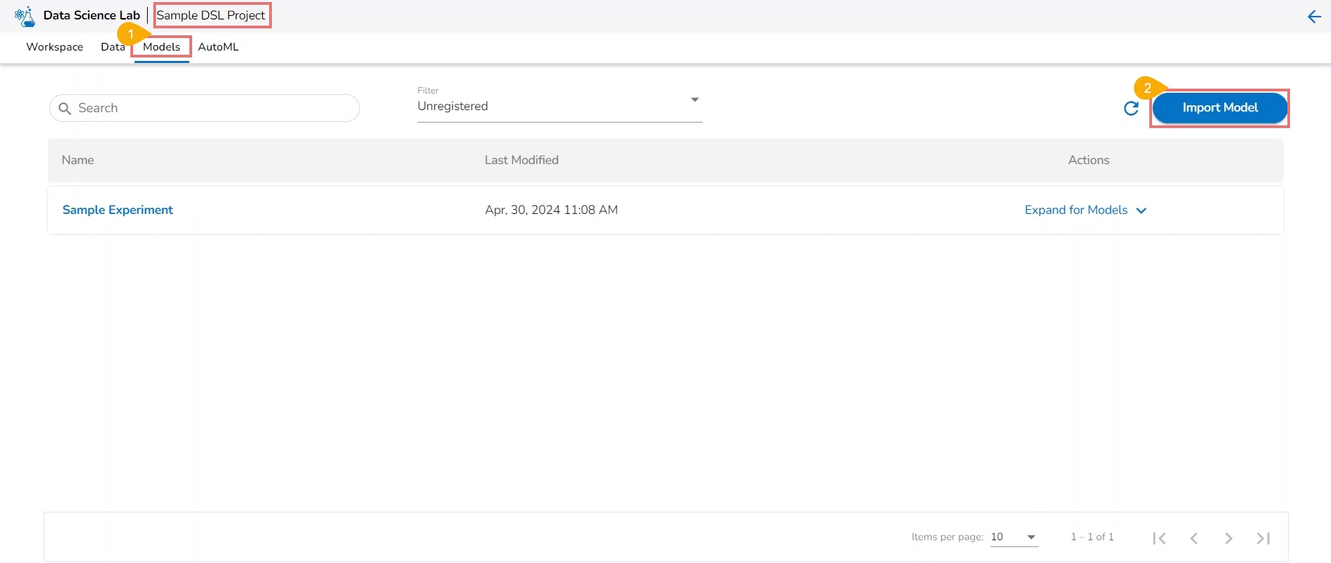
Navigate to the Model tab for a Data Science Project.
Click the Import Model option.
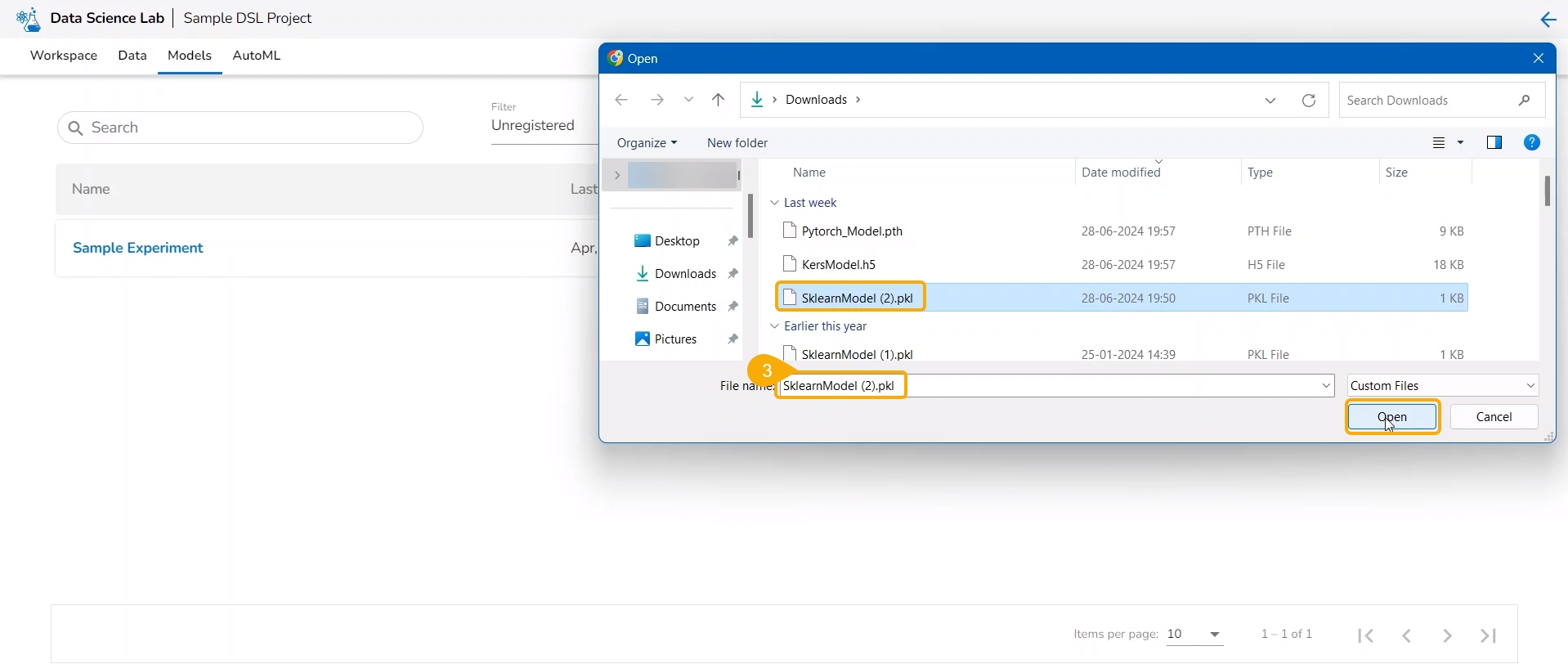
The user gets redirected to upload the model file. Select and upload the file.
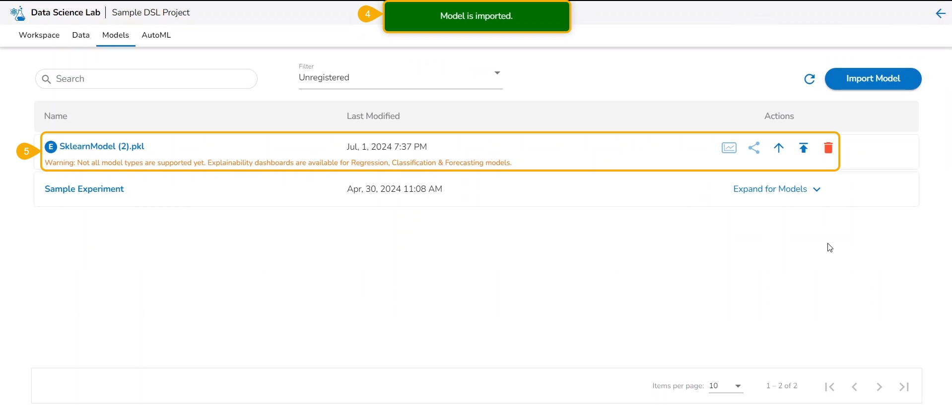
A notification message appears.
The imported model gets added to the model list.
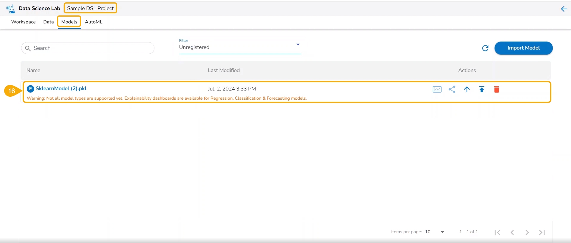
Please Note: The Imported models are referred to as External models in the model list and are marked with a pre-fix to their names (as displayed in the above-given image).
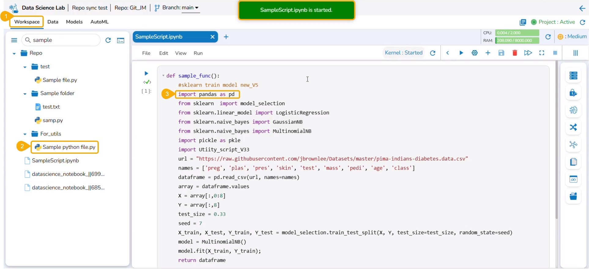
The user needs to start a new .ipynb file with a wrapper function that includes Data, Imported Model, Predict function, and output Dataset with predictions.
Check out the walk-through on Export to Pipeline Functionality for a model.
Navigate to a Data Science Notebook (.ipynb file) from an activated project. In this case, a pipeline has been imported with the wrapper function.
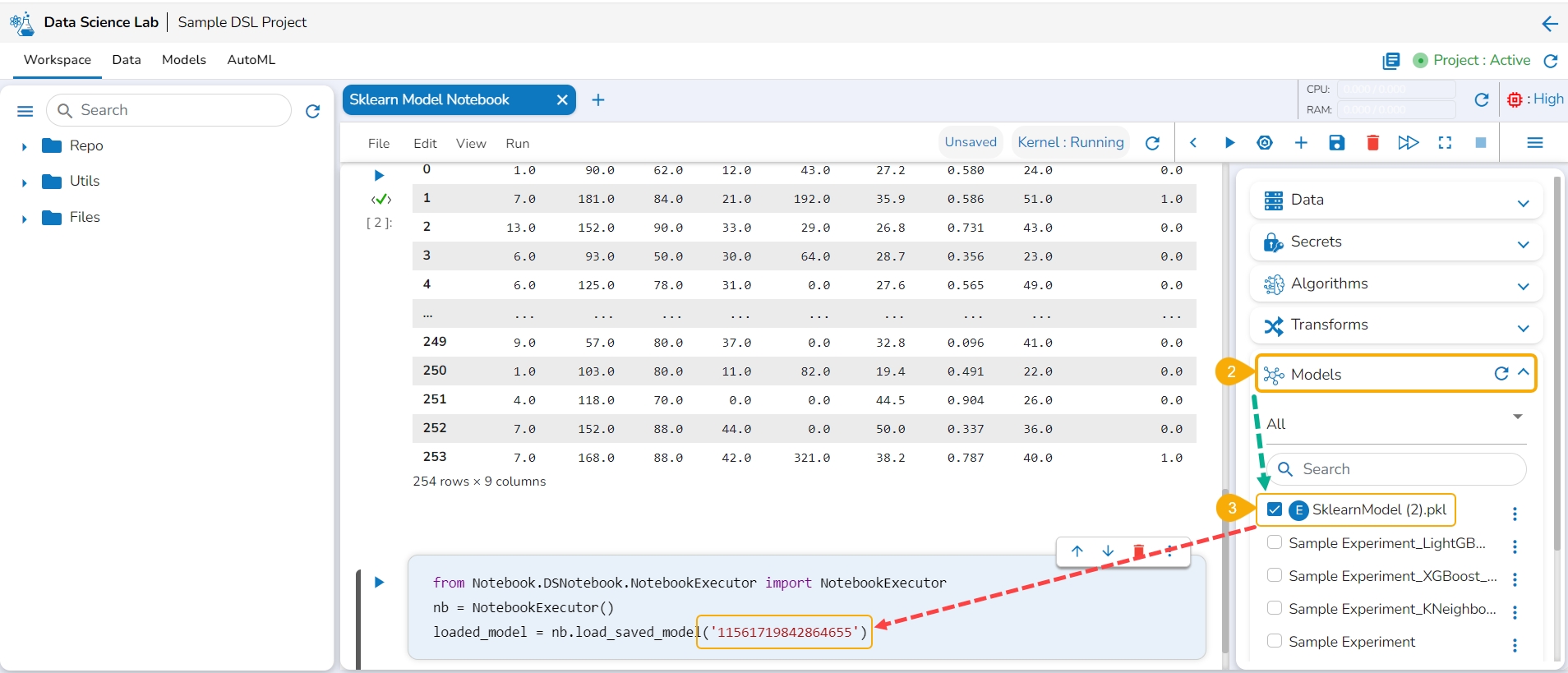
Access the Imported Model inside this .ipynb file.
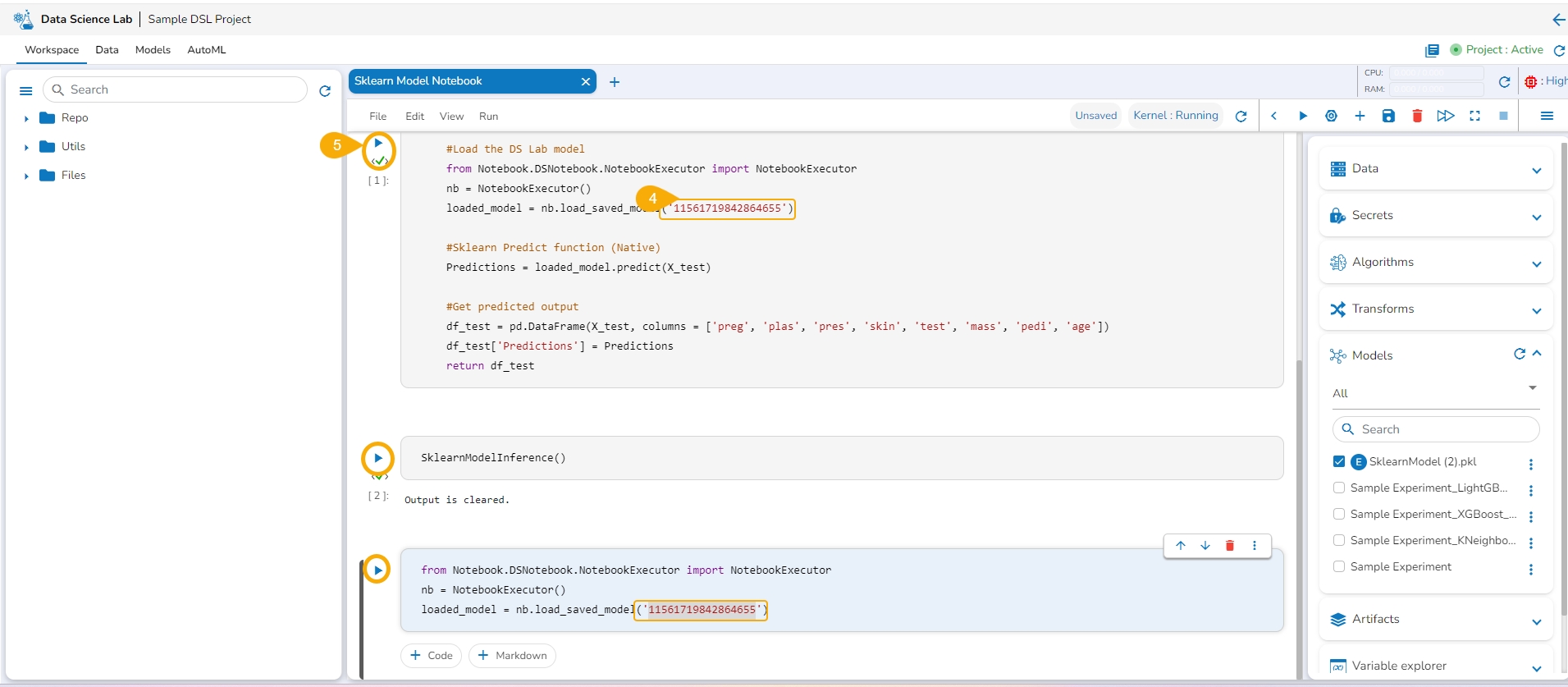
Load the imported model to the Notebook cell.
Mention the Loaded imported model in the inference script.
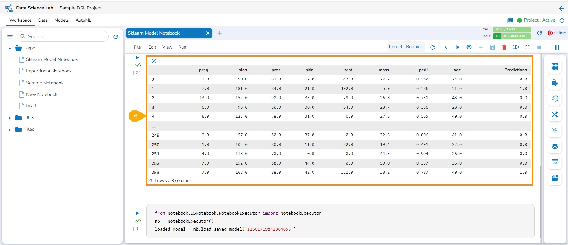
Run the code cell with the inference script.
The Data preview is displayed below.
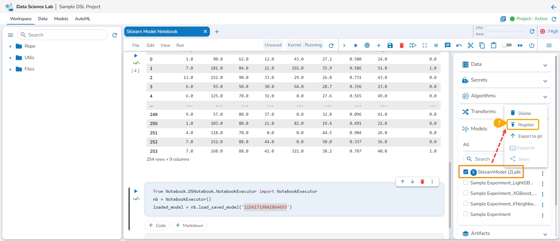
Click the Register option for the imported model from the ellipsis context menu.
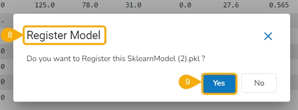
The Register Model dialog box appears to confirm the model registration.
Click the Yes option.
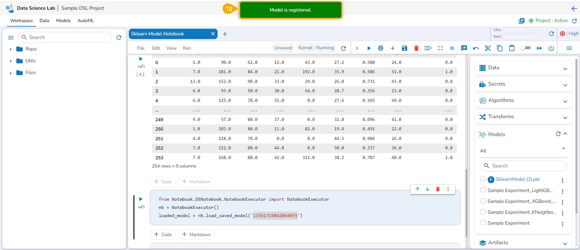
A notification message appears, and the model gets registered.
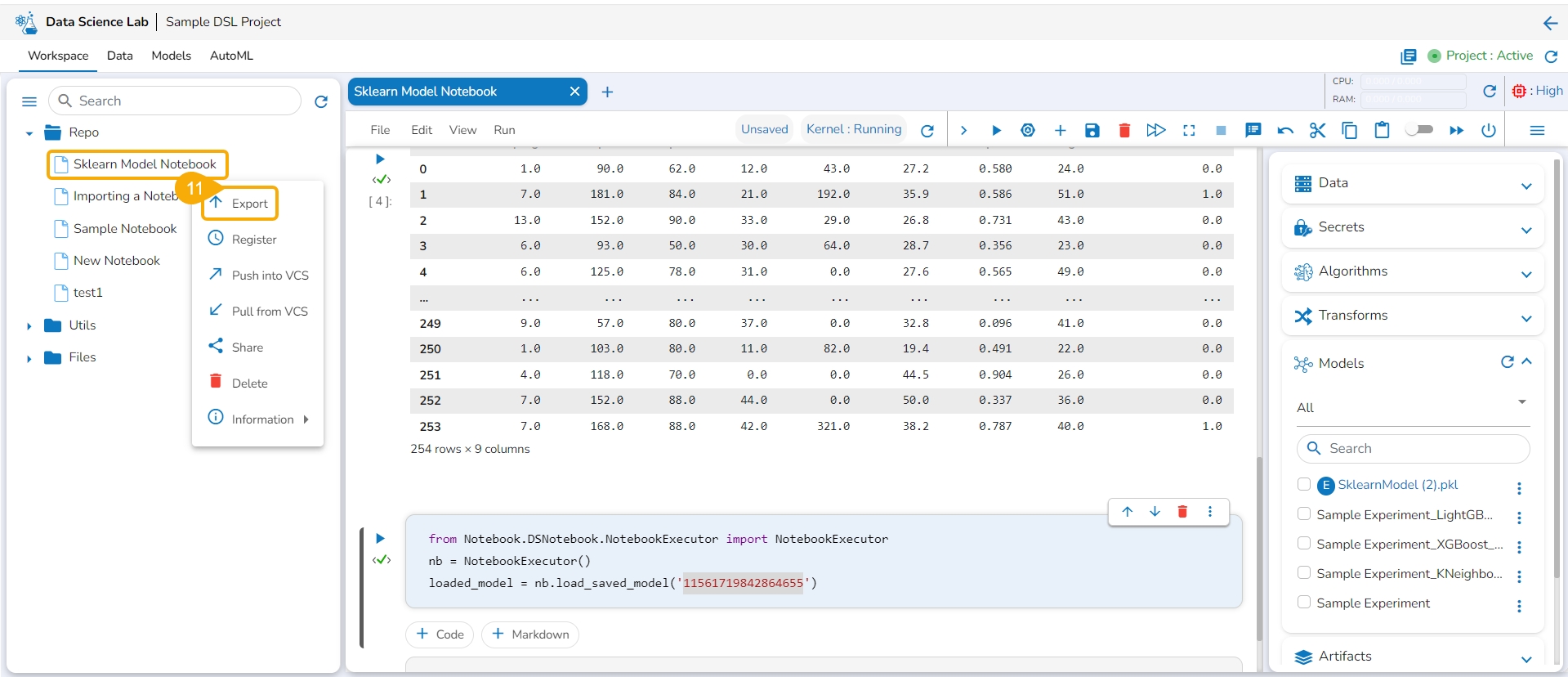
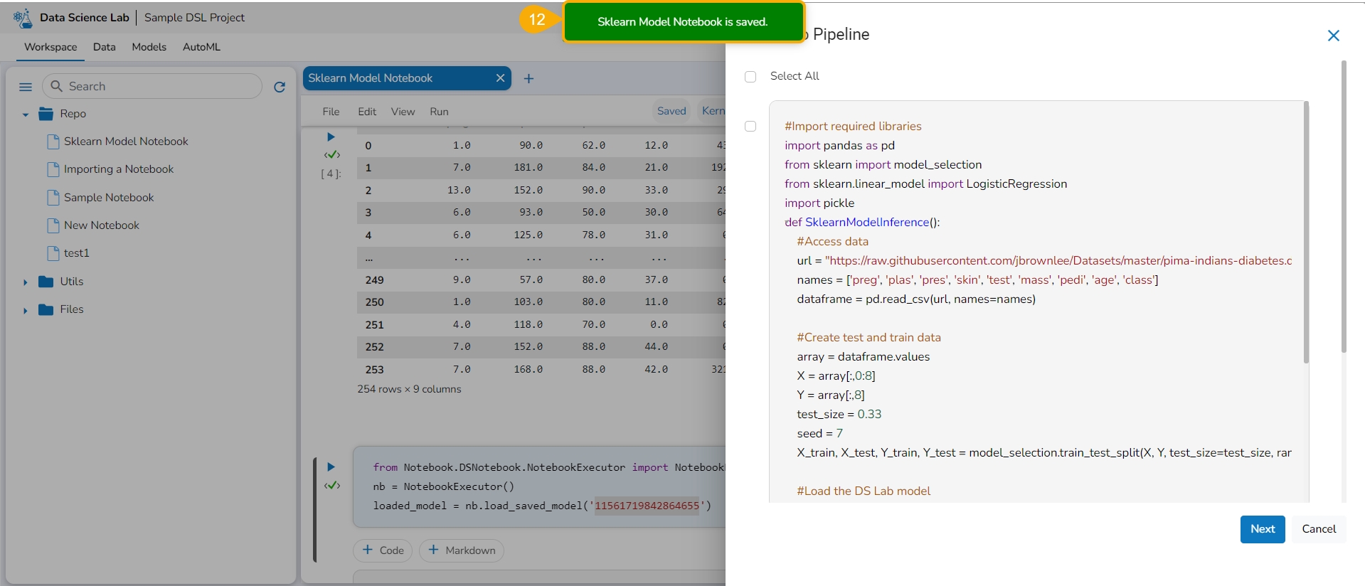
Export the script using the Export functionality provided for the Data Science Notebook (.ipynb file).
Another notification appears to ensure that the Notebook is saved.
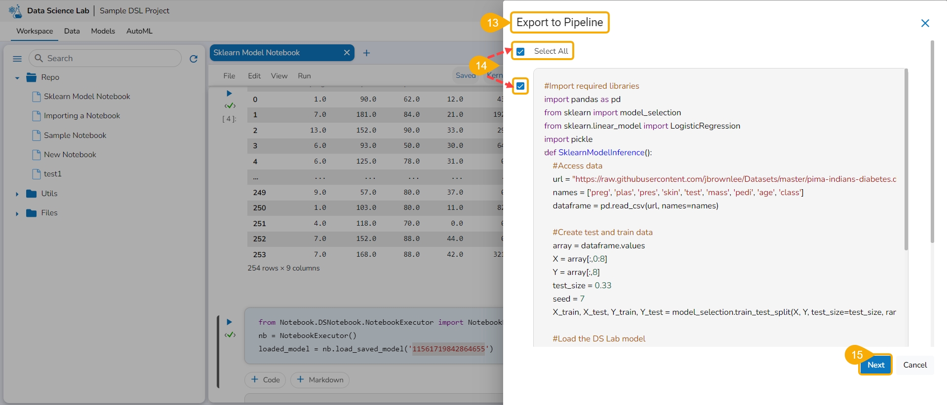
The Export to Pipeline window appears.
Select a specific script from the Notebook. or Choose the Select All option to select the full script.
Select the Next option.
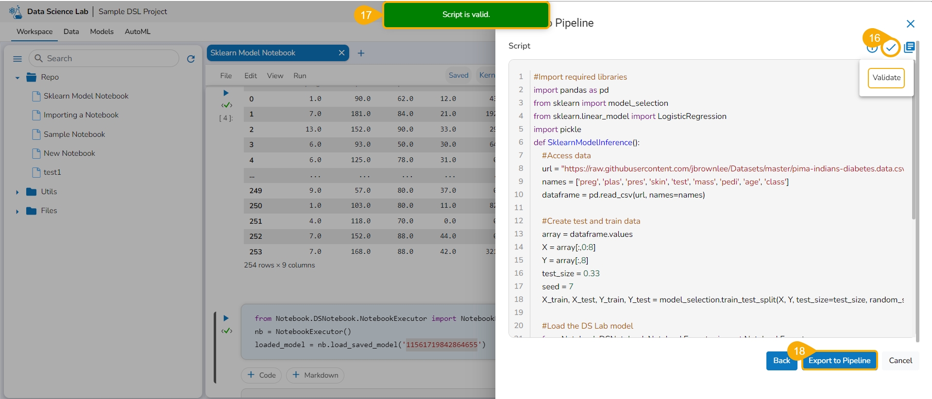
Click the Validate icon to validate the script.
A notification message appears to ensure the validity of the script.
Click the Export to Pipeline option.
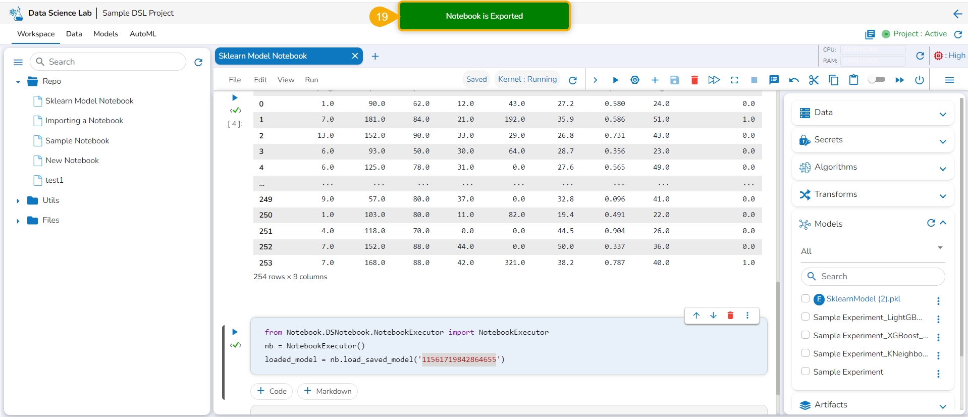
A notification message appears to ensure that the selected Notebook has been exported.
Please Note: The imported model gets registered to the Data Pipeline module as a script.
Navigate to the Data Pipeline Workflow editor.
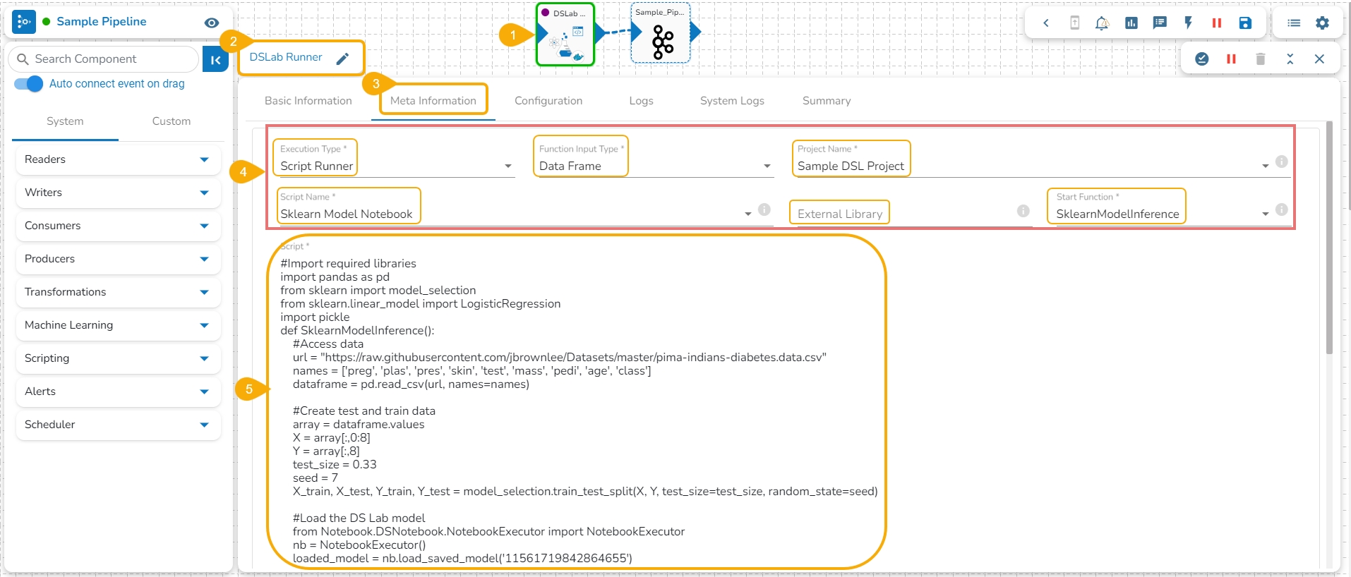
Drag the DS Lab Runner component and configure the Basic Information.
Open the Meta Information tab of the DS Lab Runner component.
Configure the following information for the Meta Information tab.
Select Script Runner as the Execution Type.
Select function input type.
Select the project name.
Select the Script Name from the drop-down option. The same name given to the imported model appears as the script name.
Provide details for the External Library (if applicable).
Select the Start Function from the drop-down menu.
The exported model can be accessed inside the Script section.
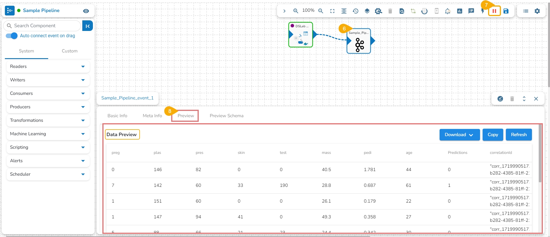
The user can connect the DS Lab Script Runner component to an Input Event.
Run the Pipeline.
The model predictions can be generated in the Preview tab of the connected Input Event.
Please Note:
The Imported Models can be accessed through the Script Runner component inside the Data Pipeline module.
The execution type should be Model Runner inside the Data Pipeline while accessing the other exported Data Science models.
The supported extensions for External models - .pkl, .h5, .pth & .pt
Git Console functionality helps the data scientists apply various Git commands to their Notebook scripts inside the Repo Sync projects.
Check out the illustration on using the Git Console option inside the Data Science Lab repo sync projects.
Navigate to the Workspace tab of an activated Repo Sync Project.
Select a .ipynb file from the Repo Sync Project.
The file content opens.
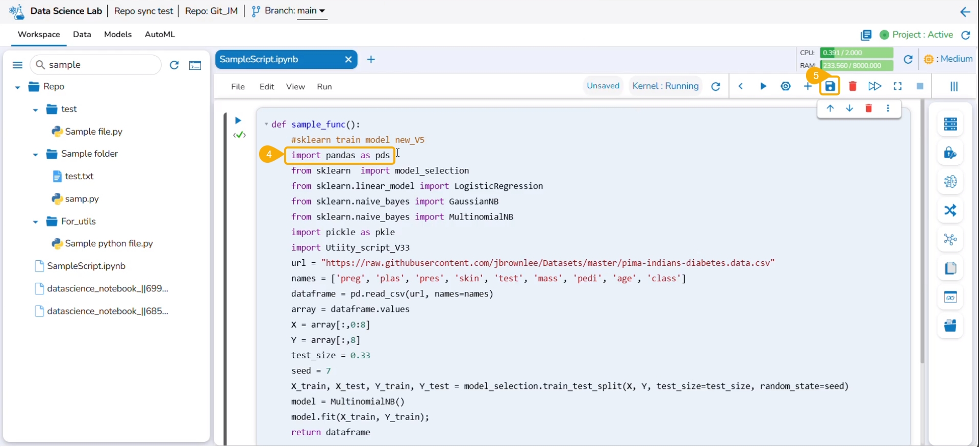
Edit the displayed script.
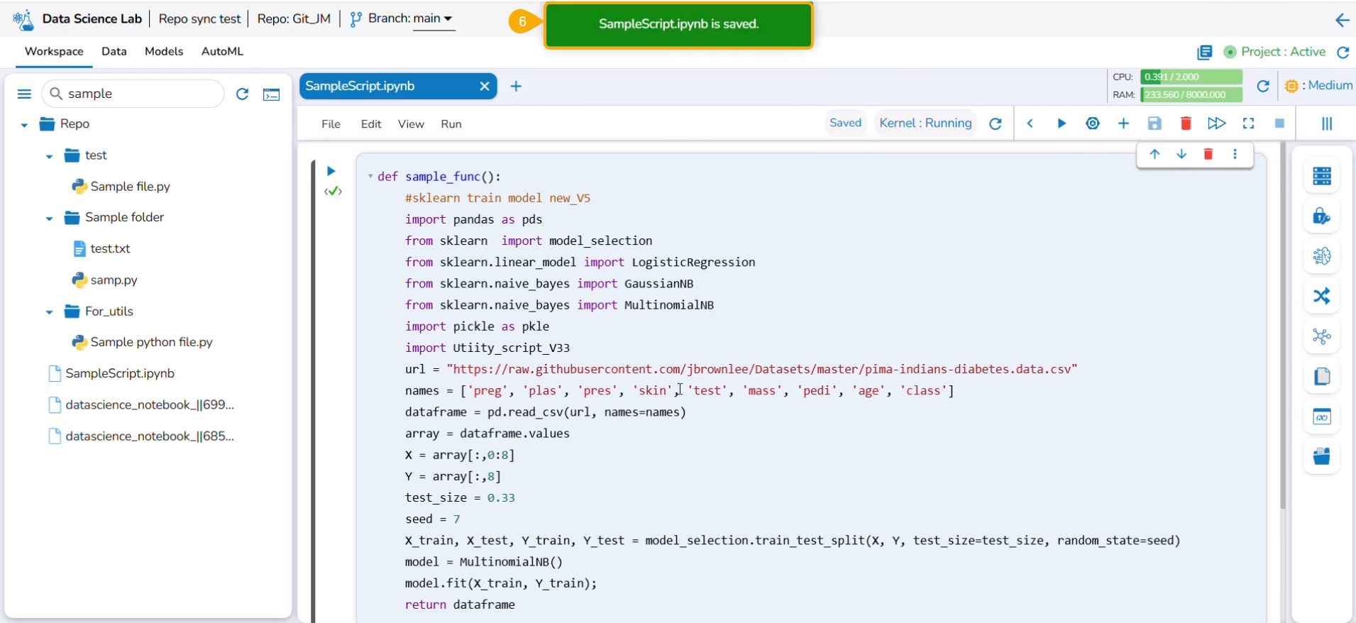
Click the Save icon.
A notification ensures that the script is saved with the recent changes.
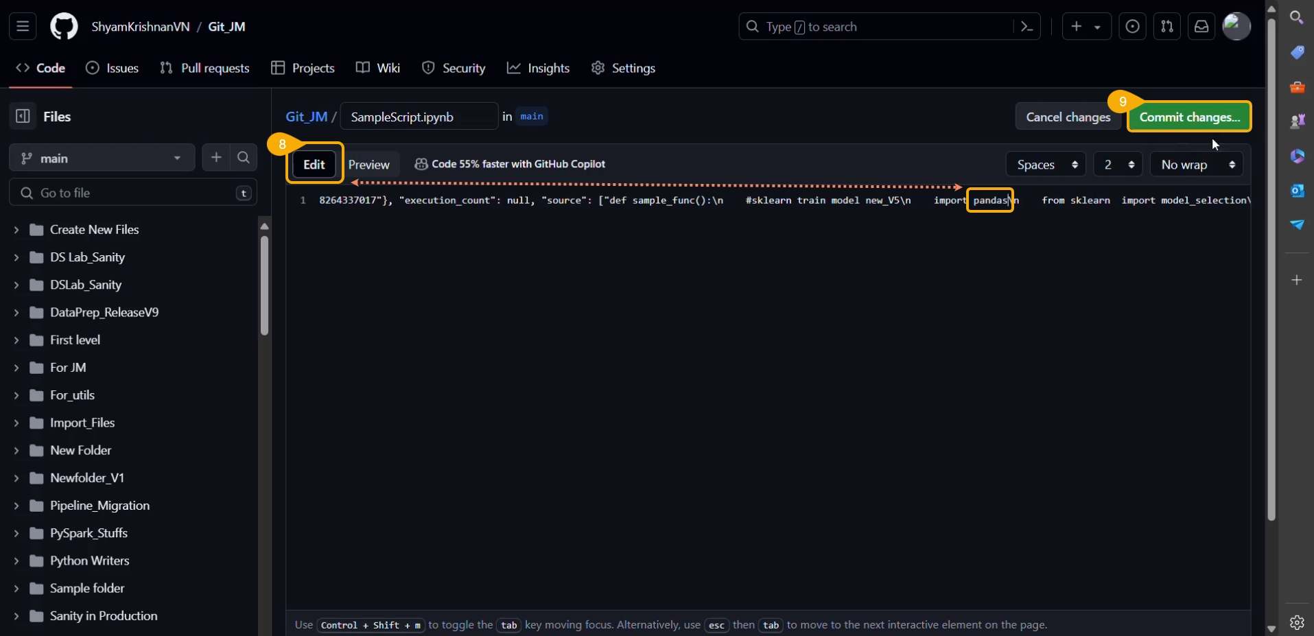
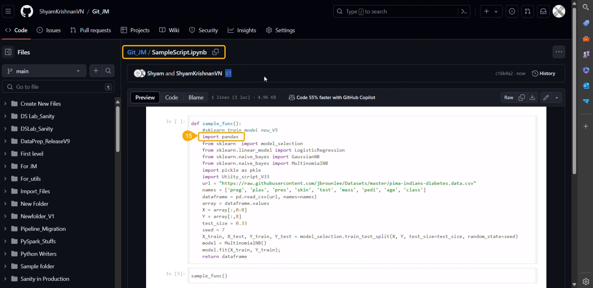
Open the same script in the Git repository.
Click the Edit option and access the script in the editable format.
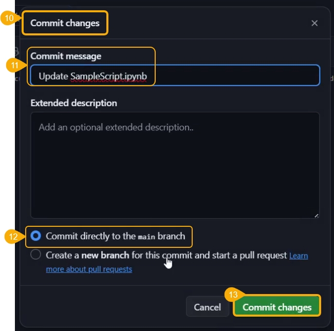
Click the Commit changes option.
The Commit changes dialog box opens.
Provide a commit message.
Choose a checkbox to select how the changes should be committed.
Click the Commit changes option.
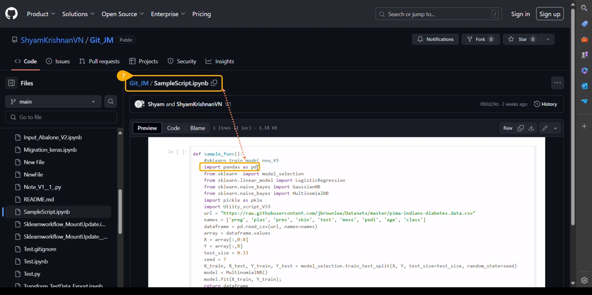
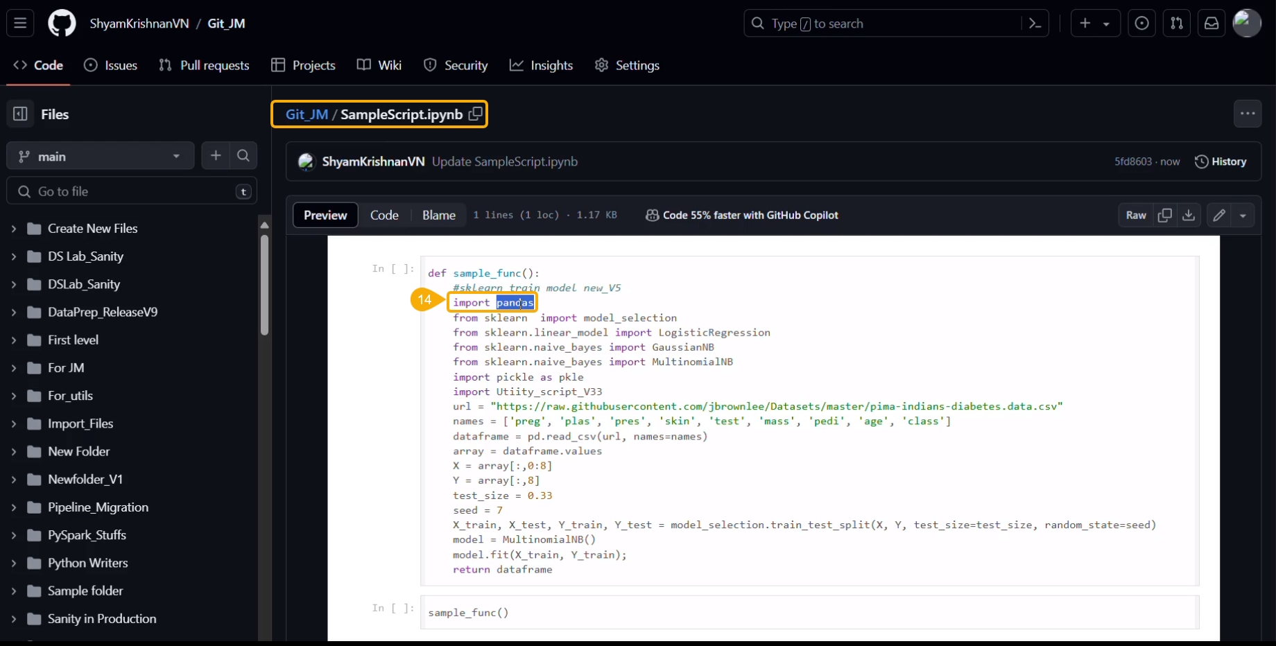
The script in the Git repository will be modified.
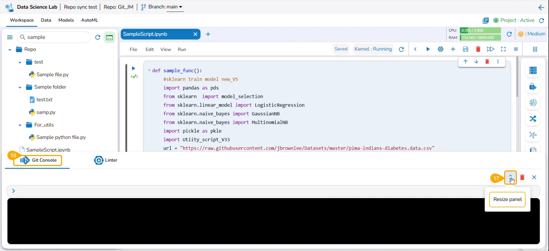
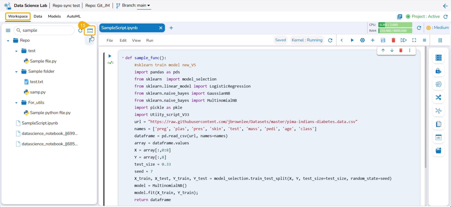
Navigate to the Workspace tab of the Notebook and click the Git Consol icon.
The Git Console panel opens where you can put the Git command to be performed on the selected script.
Use the Resize panel icon to resize the Git Console panel.
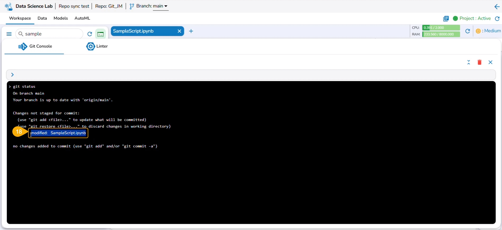
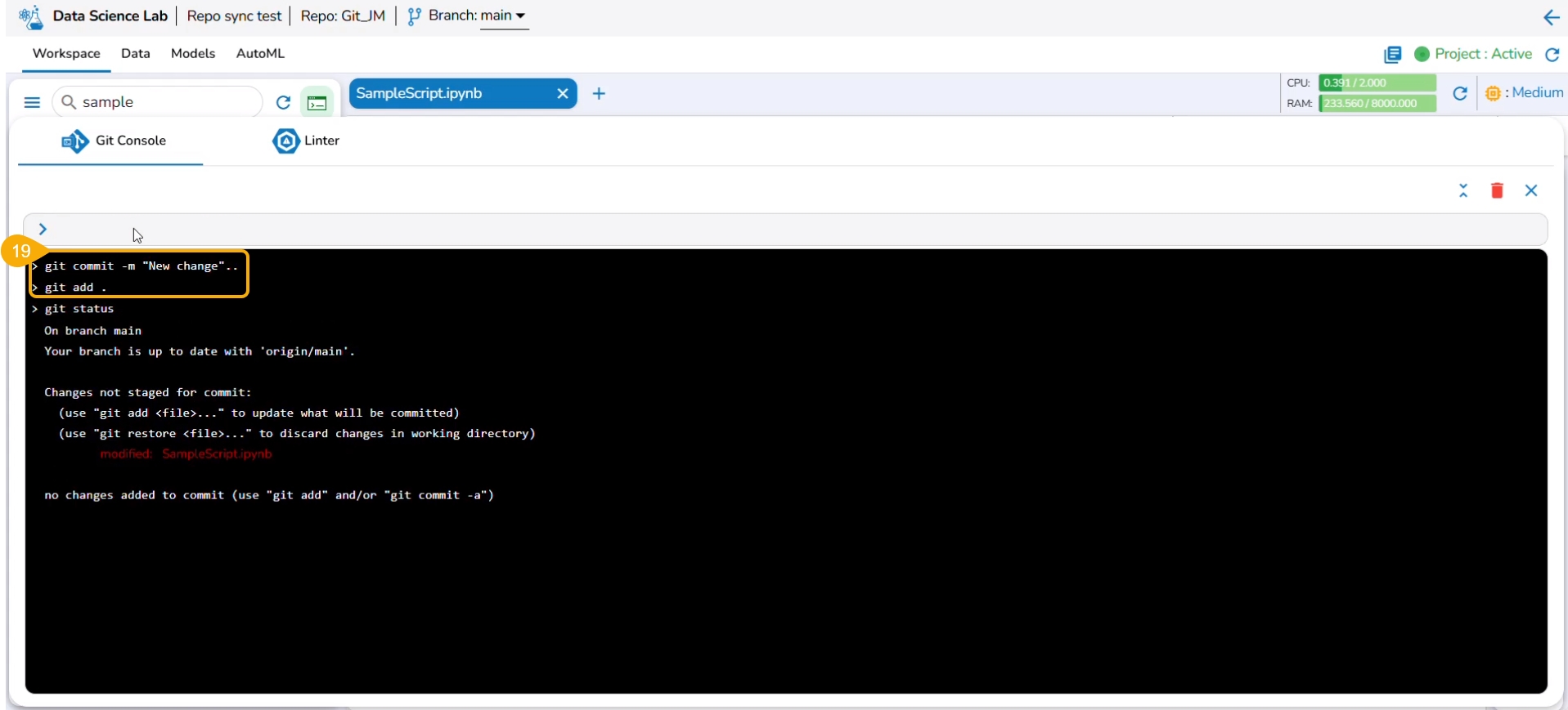
Use git status command to reflect the changes.
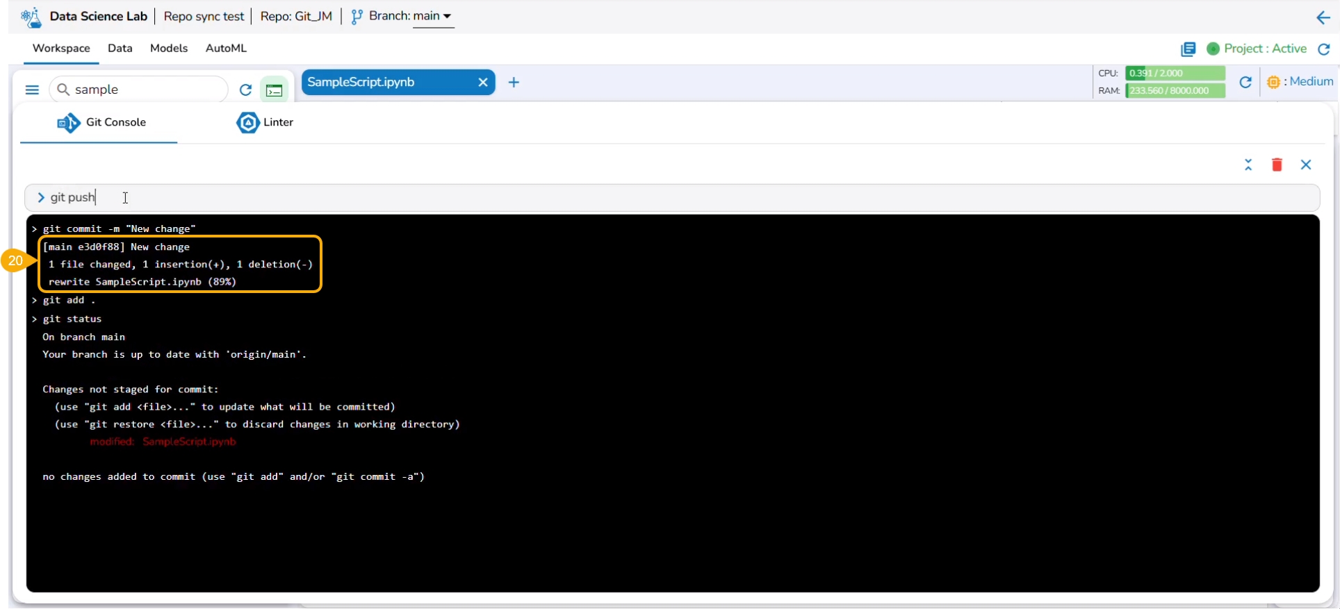
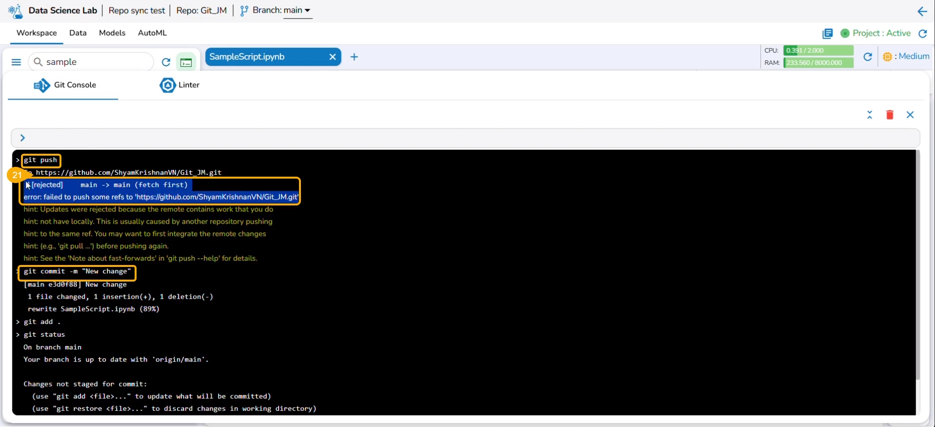
The next commands that can be used are git add and git commit to acknowledge new changes in the file.
The git commit command generates the information inside the panel about the new changes.
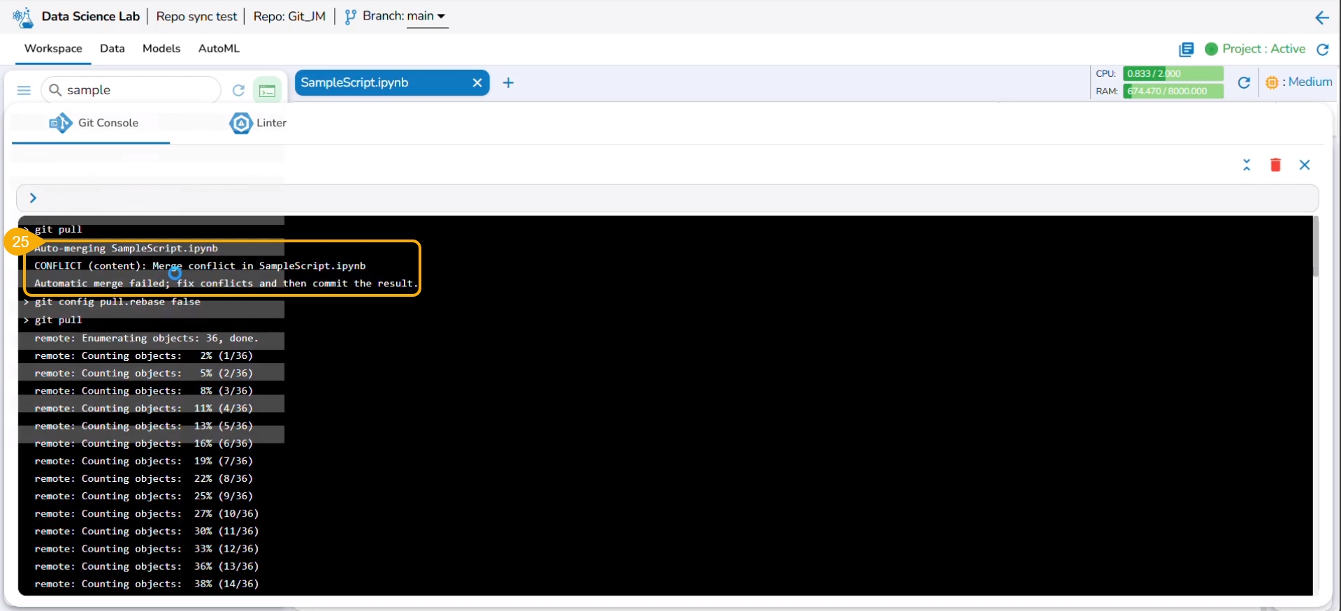
The git push command is used to push the new changes to the Git Repository. The git push command has been rejected since there is a change in the repository version of the same file and the console suggests using the git pull command.
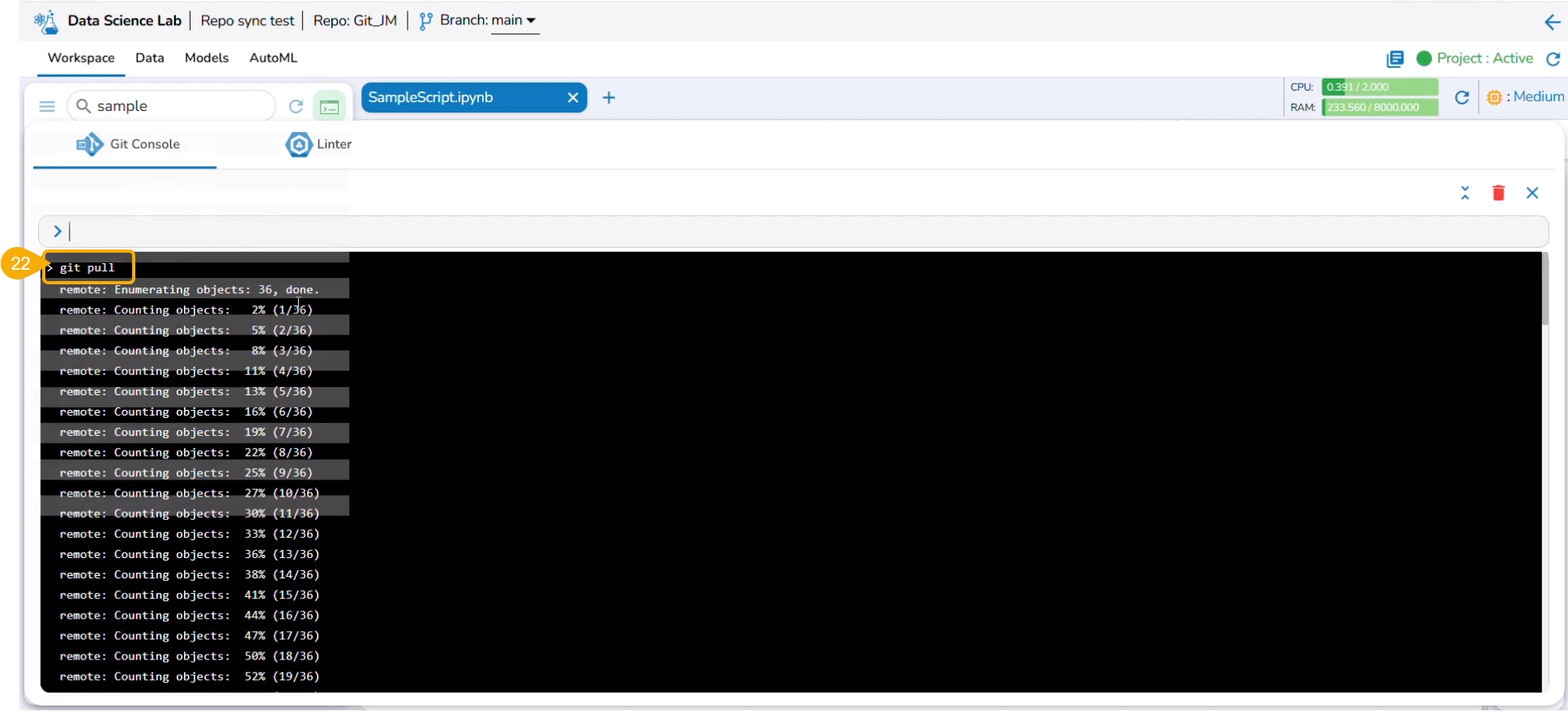
The git pull command has been used to pull the distant changes from the repository.
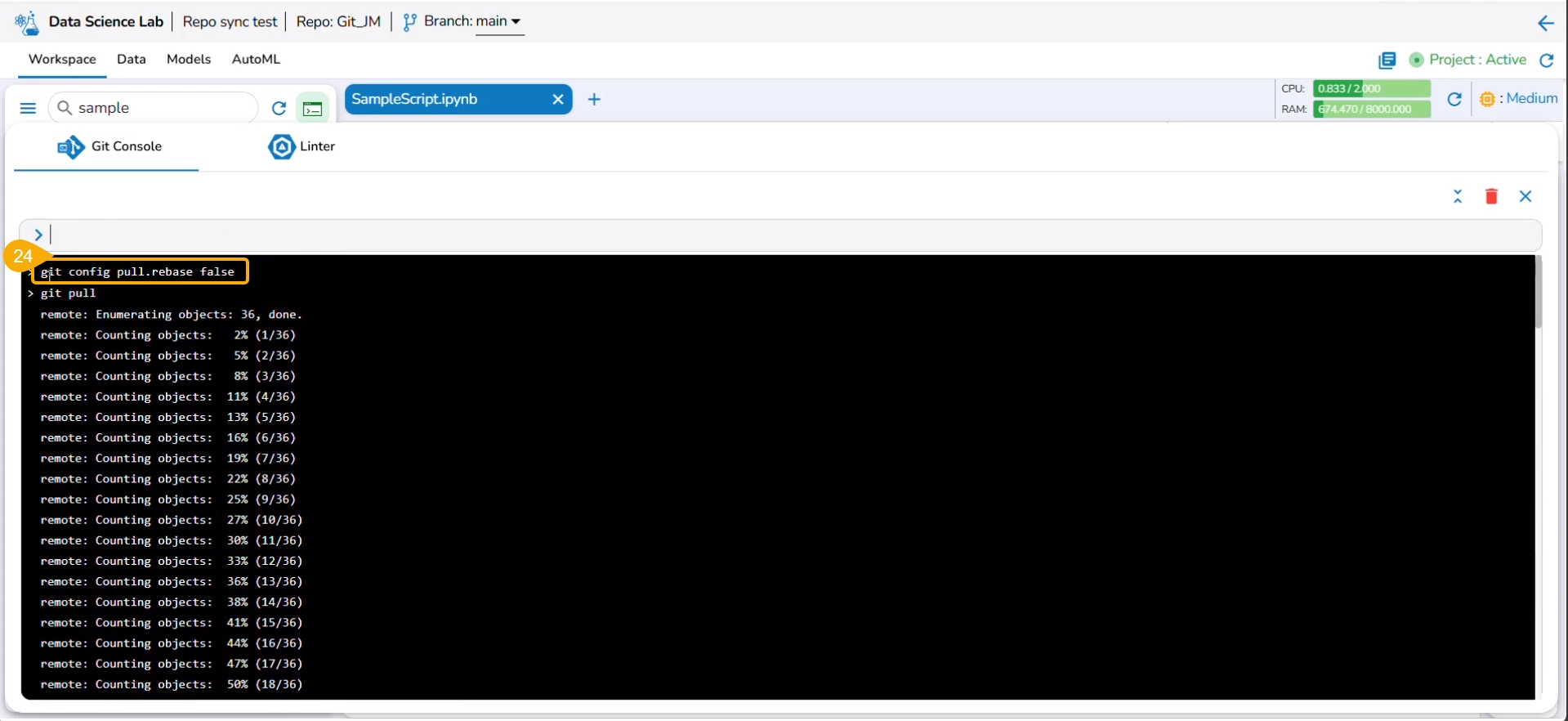
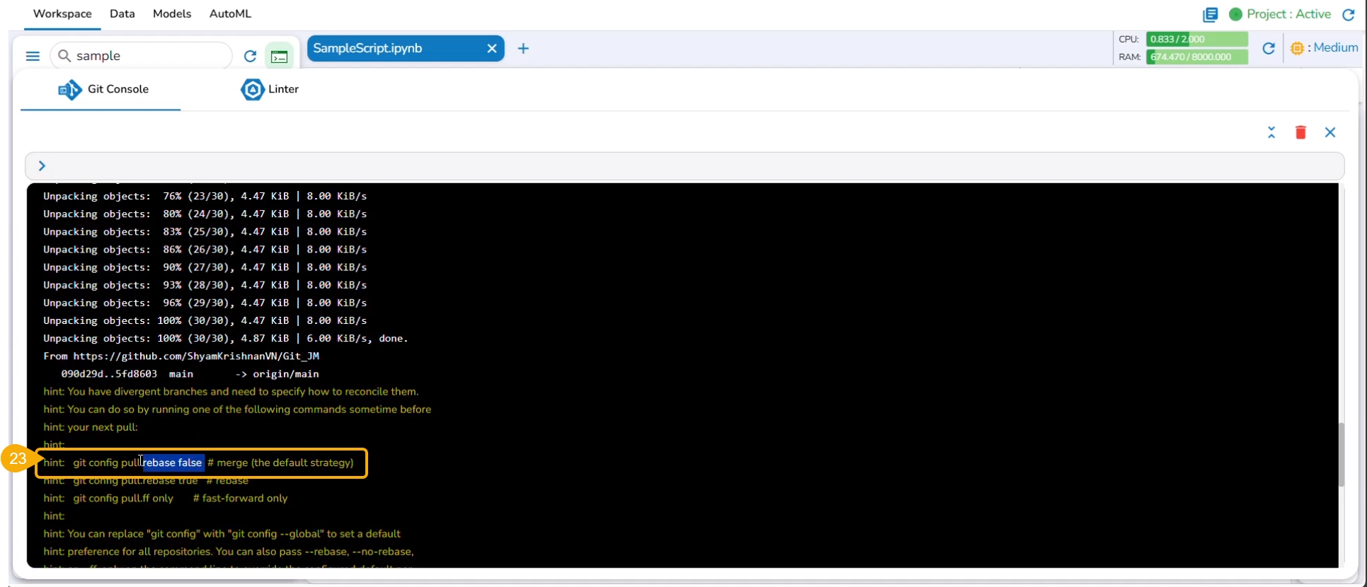
At the end of the git pull command, it is hinted to use git config pull rebase false as a default strategy.
The git config pull rebase false command is committed.
The auto merge failed due to the merge conflict in the selected file.
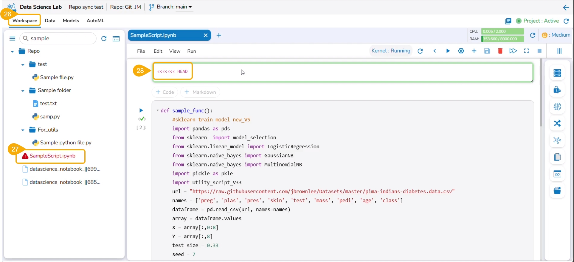
Navigate to the Workspace tab.
The file title appears in red to indicate the conflict.
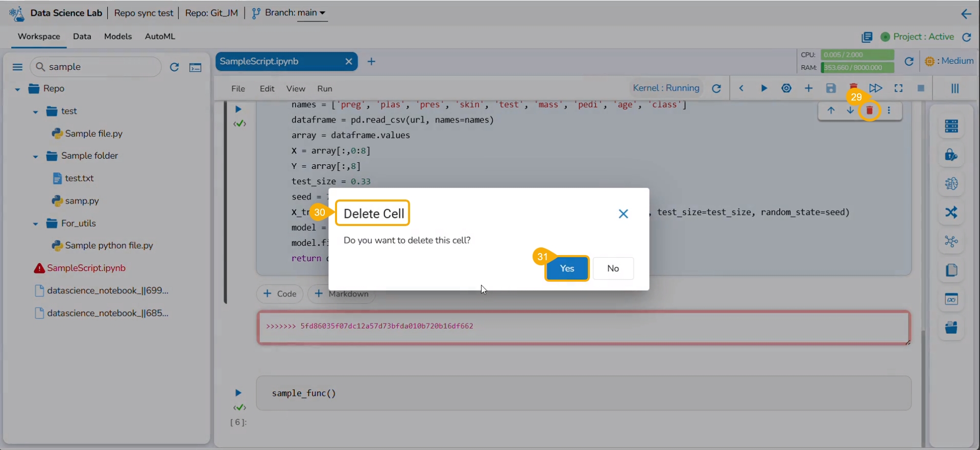
The cells containing conflicted content are highlighted in the script.
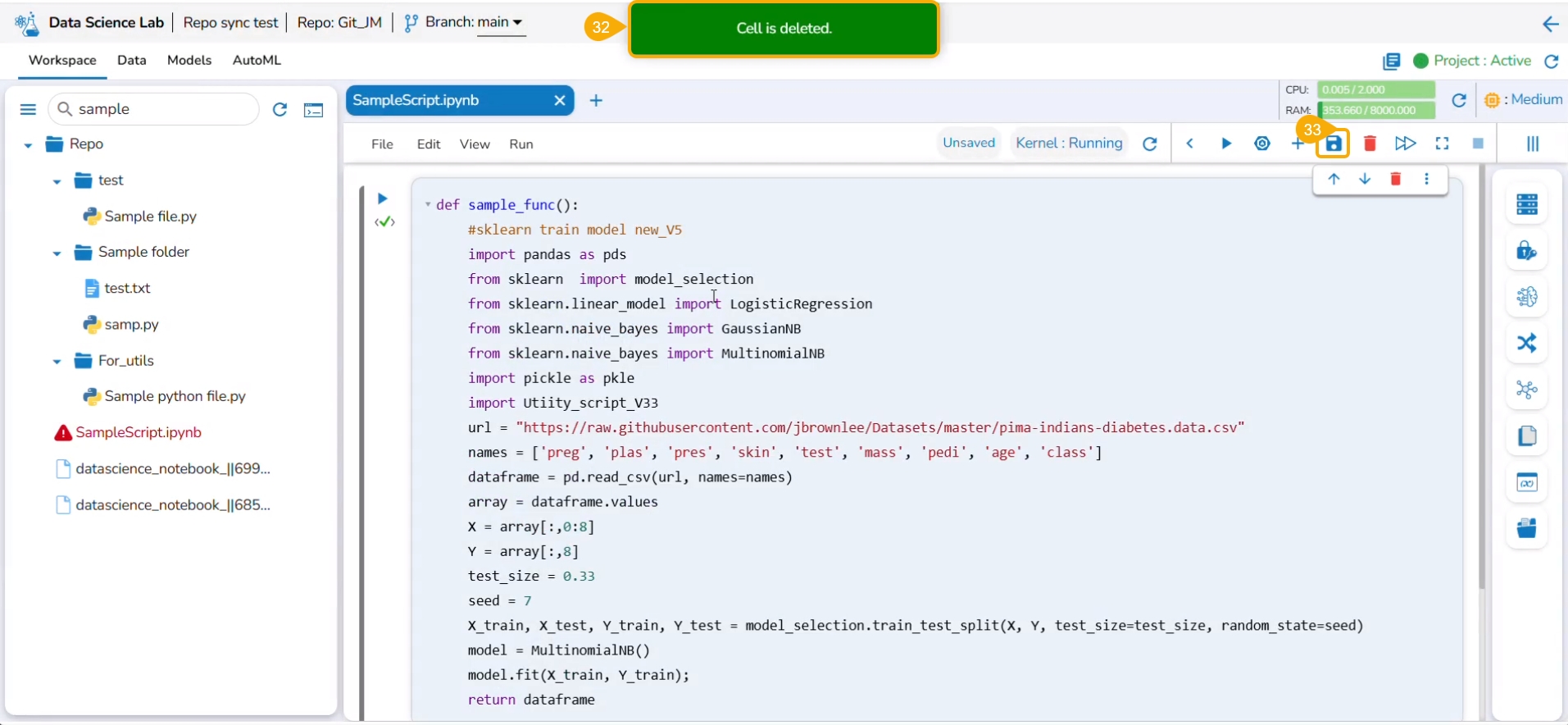
Click the Delete icon for the conflicted cells.
The Delete Cell window appears.
Click the Yes option.
A notification message appears to ensure that the conflicted cell is removed from the script.
Click the Save icon for the script.
Please Note: The user must resolve all the conflicts in the selected file, before saving it.
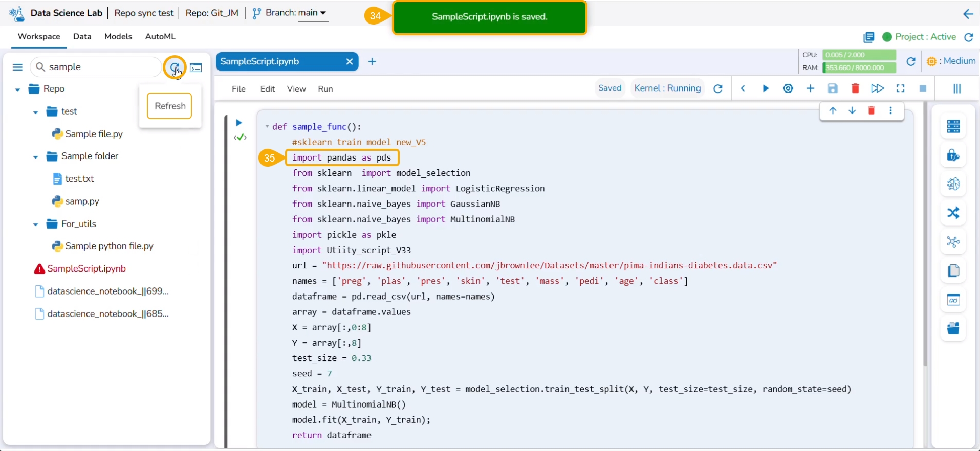
A notification ensures that the script is saved.
The saved script reflects the remote changes.
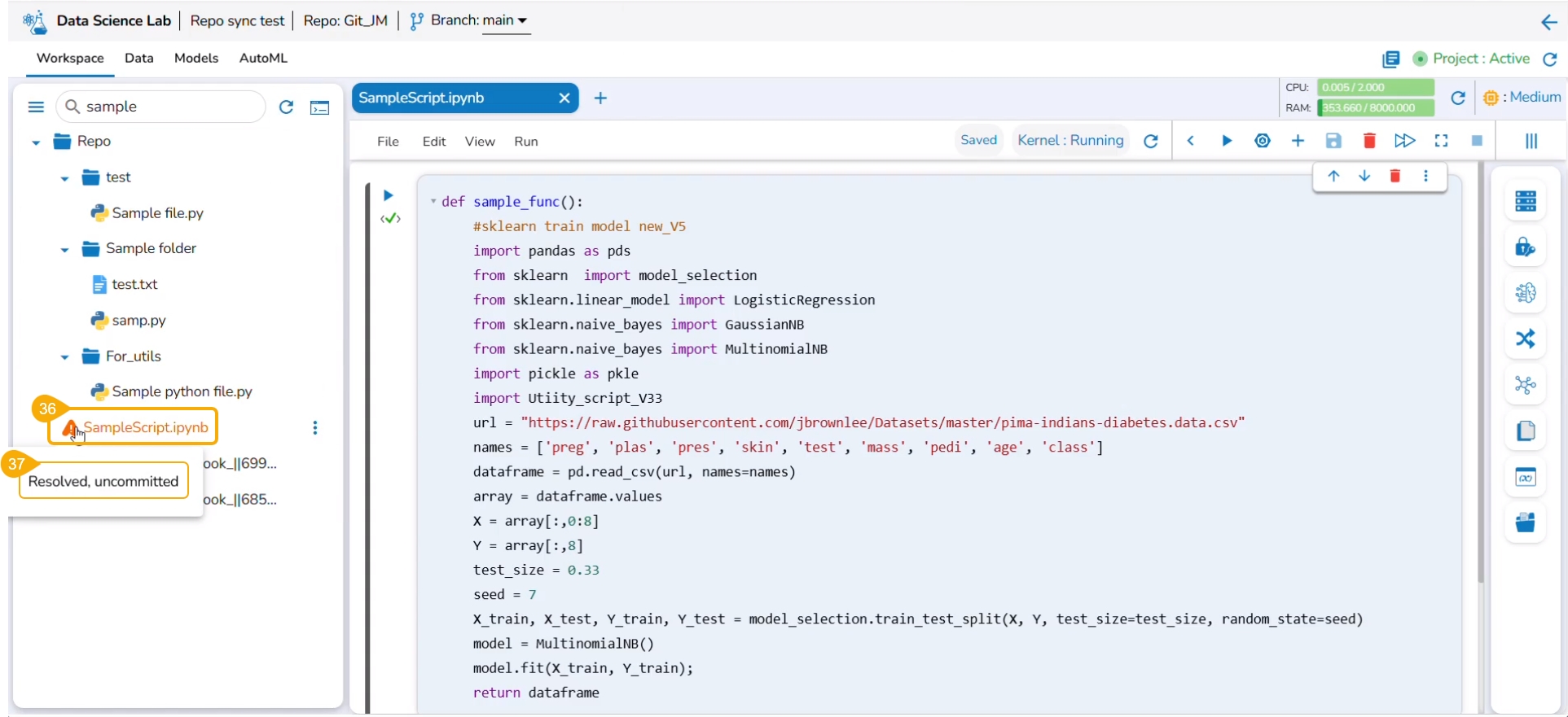
The color of the selected file title also gets changed.
By hovering on the file name, it displays the current status of the file. For example, the given image shows that for the current file conflicts are resolved, but it is in uncommitted status.
Please Note: the user can click the Refresh icon to refresh the status of the file.
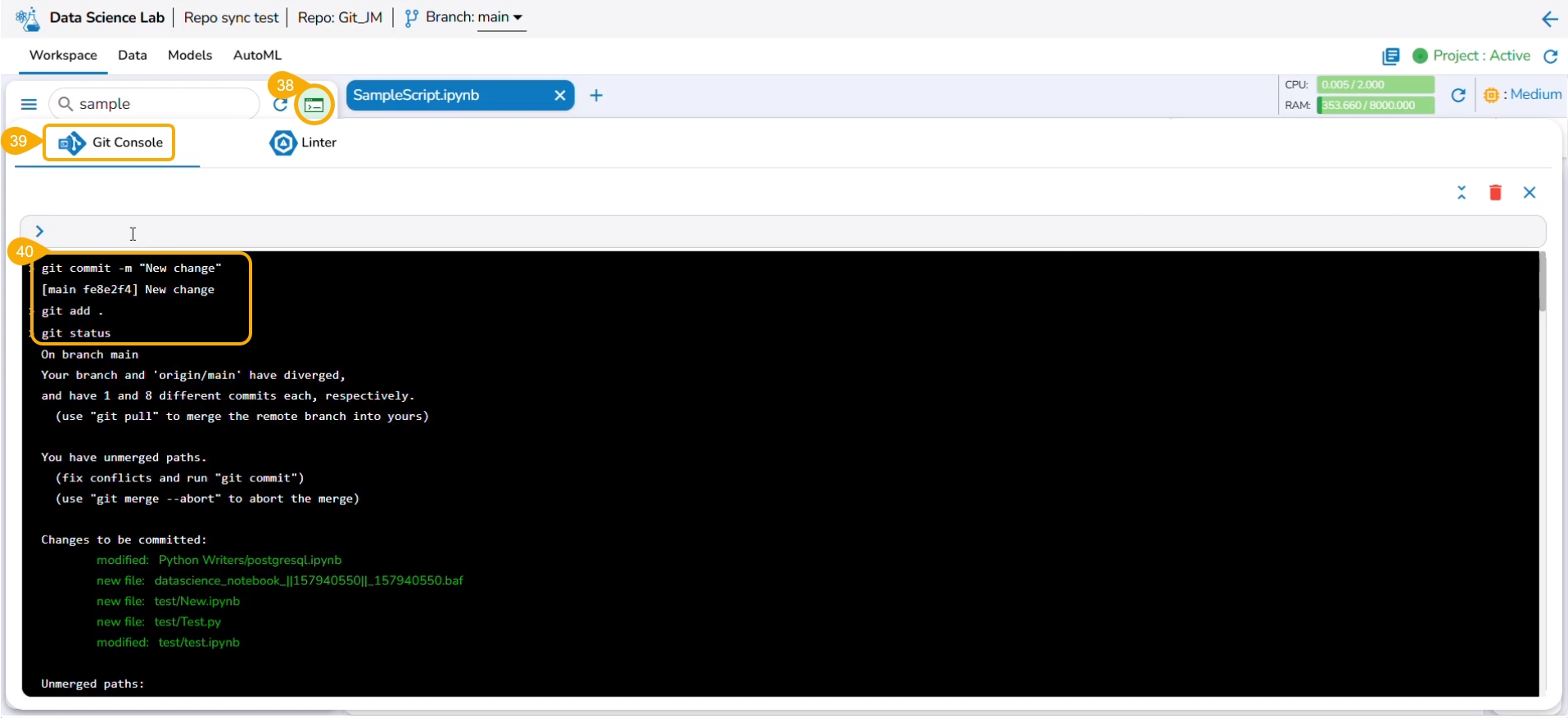
Click the Git Console icon.
The Git Console space gets displayed.
The Git commands used in the example are git add, git commit, and git push.
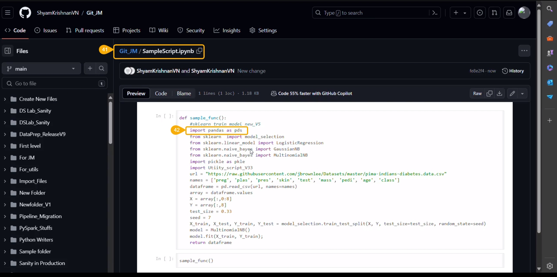
Navigate to the script saved remotely (in the Git repository).
The script displays the recent changes committed using the Git Console space for a Repo Sync Project.
All the Git commands will be supported in the Git Console. Please find some of the commonly used Git commands listed below.
Click the Add File option.
Click the Add Folder option.
The Auto ML tab allows the users to create various experiments on top of their datasets and list all the created experiments.
Automated Machine Learning (AutoML) is a process that involves automating the selection of machine learning models and hyperparameters tuning. It aims to reduce the time and resources required to develop and train accurate models by automating some of the time-consuming and complex tasks.
The Auto ML feature provided under the Data Science Lab is capable of covering all the steps, from starting with a raw data set to creating a ready-to-go machine learning model.
An Auto ML experiment is the application of machine learning algorithms to a dataset.
Please Note:
AutoML functionality is a tool to help speed up the process of developing and training machine learning models. It’s always important to carefully evaluate the performance of a model generated by the AutoML tool.
The Create Experiment option is provided on the Data List page.
The user is taken to a dashboard upon clicking Model Explainer to gather insights and explanations about predictions made by the selected AutoML model.
Model interpretation techniques like SHAP values, permutation importance, and partial dependence plots are essential for understanding how a model arrives at its predictions. They shed light on which features are most influential and how they contribute to each prediction, offering transparency and insights into model behavior. These methods also help detect biases and errors, making machine learning models more trustworthy and interpretable to stakeholders. By leveraging model explainers, organizations can ensure that their AI systems are accountable and aligned with their goals and values.
Please Note: The user can access the Model Explainer Dashboard under the Model Interpretation page only.
The Dataset Explainer tab provides a high-level preview of the dataset that has been used for the experiment. It redirects the user to the Data Profile page.
The Data Profile is displayed using various sections such as:
Data Set Info
Variable Types
Warnings
Variables
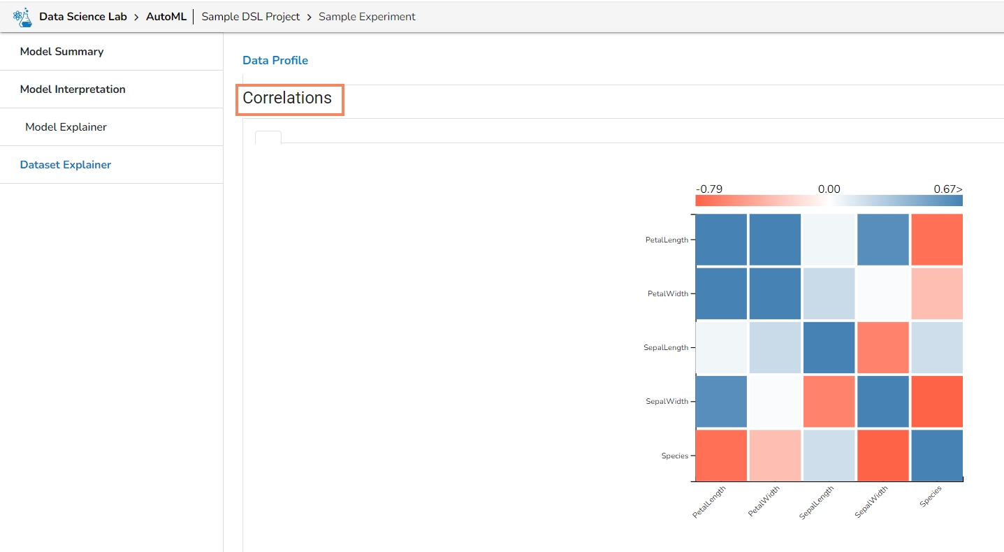
Correlations
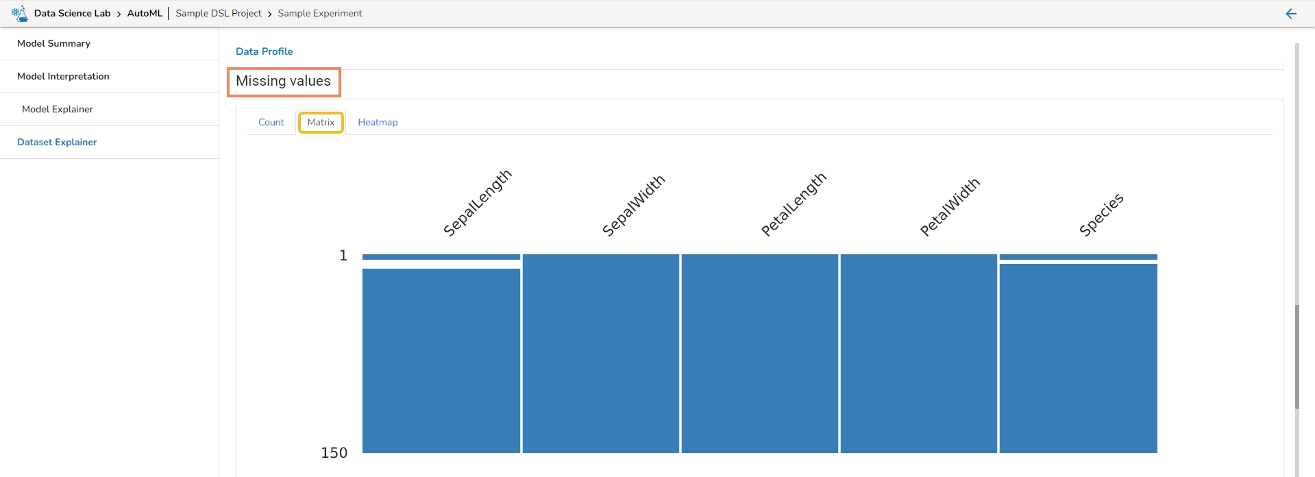
Missing Values
Sample
Let us see each of them one by one.
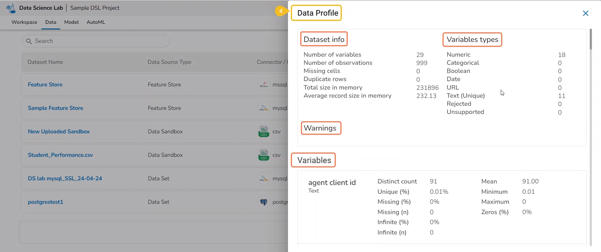
The Data Profile displayed under the Dataset Explainer section displays the following information for the Dataset.
Numbers of variables
Number of observations
Missing cells
Duplicate rows
Total size in memory
Average record size in memory
This section mentions variable types for the data set variables. The selected Data set contains the following variable types:
Numeric
Categorical
Boolean
Date
URL
Text (Unique)
Rejected
Unsupported
This section informs user about the warnings for the selected dataset.
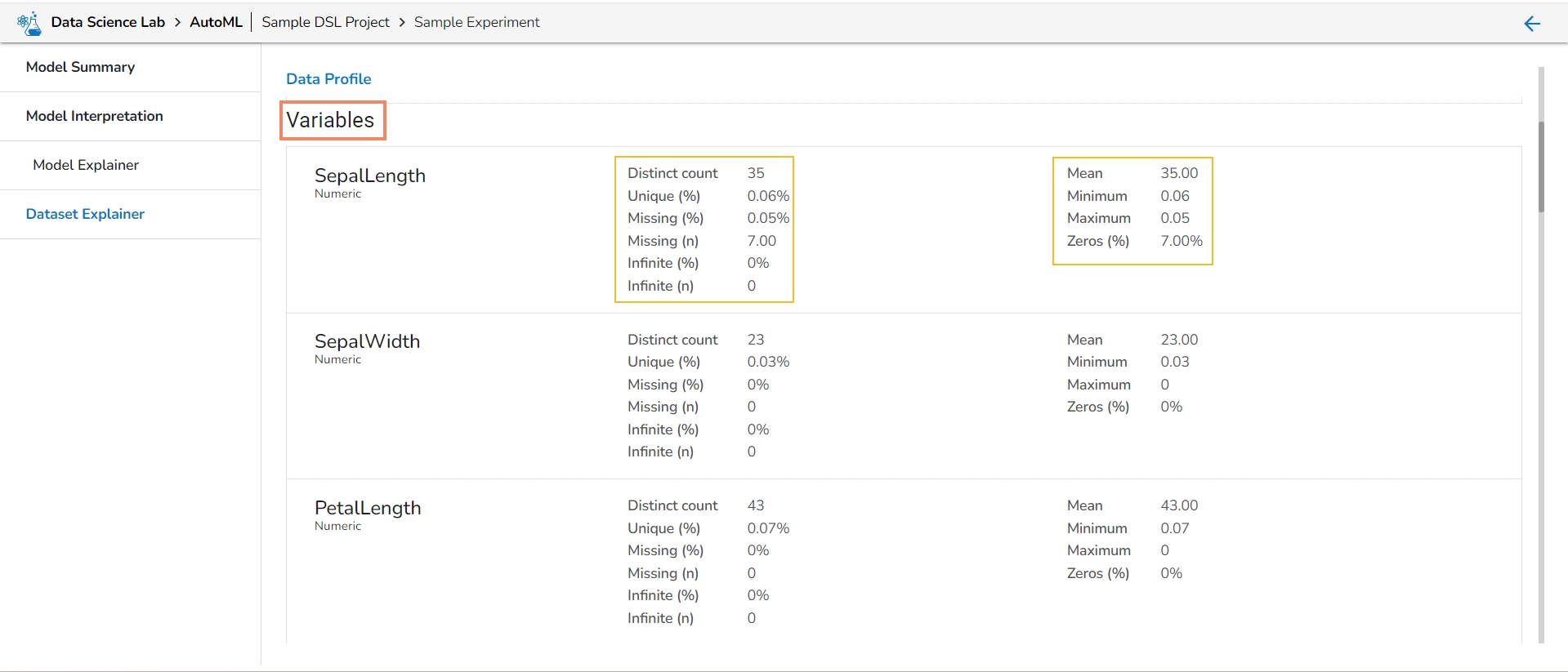
It lists all the variables from the selected Data Set with the following details:
Distinct count
Unique
Missing (in percentage)
Missing (in number)
Infinite (in percentage)
Infinite (in number)
Mean
Minimum
Maximum
Zeros (in percentage)
It displays the variables in the correlation chart by using various popular methods.
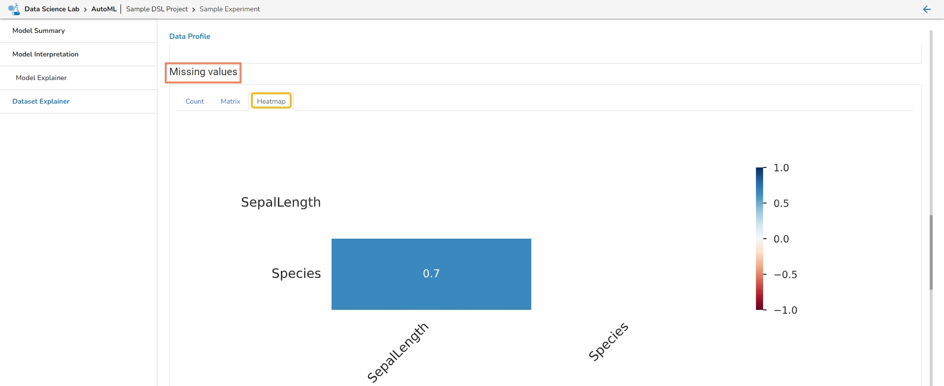
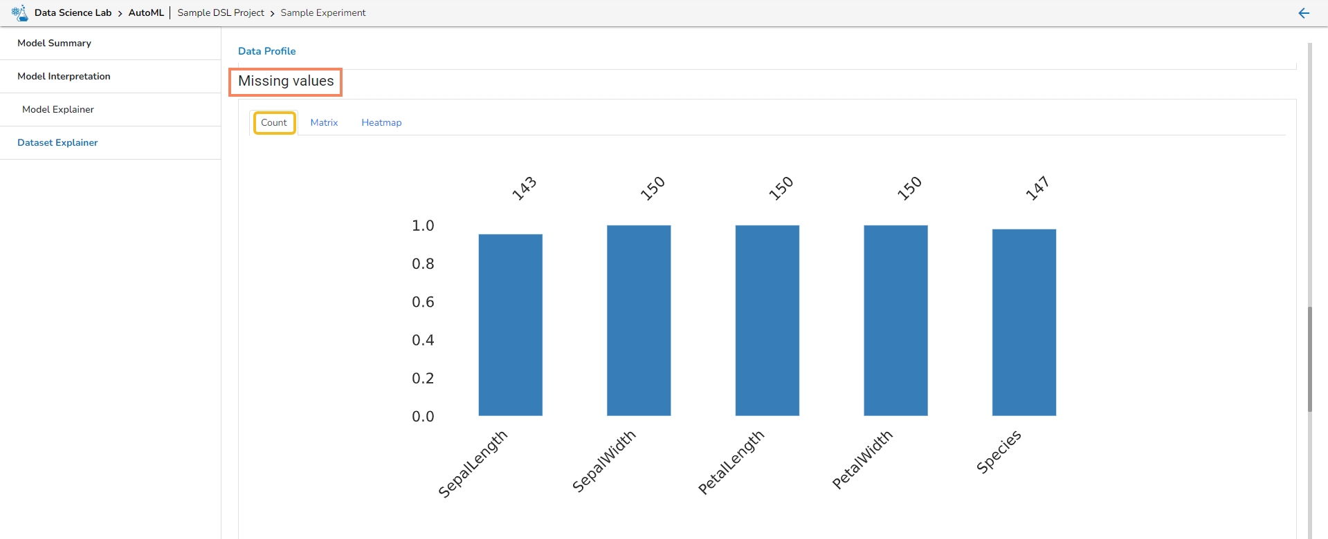
This section provides information on the missing values through Count, Matrix, and Heatmap visualization.
Count: The count of missing values is explained through column chart.
Matrix
Heatmap
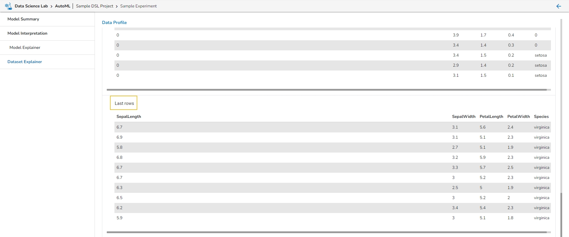
This section describes the first 10 and last 10 rows of the selected dataset as a sample.
This page explains Model migration functionality. You can find steps to Export and Import a model to and from Git repository explained on this page.
Prerequisite: The user must do the required configuration for the DS Lab Migration using the Admin module before migrating a DS Lab script or model.
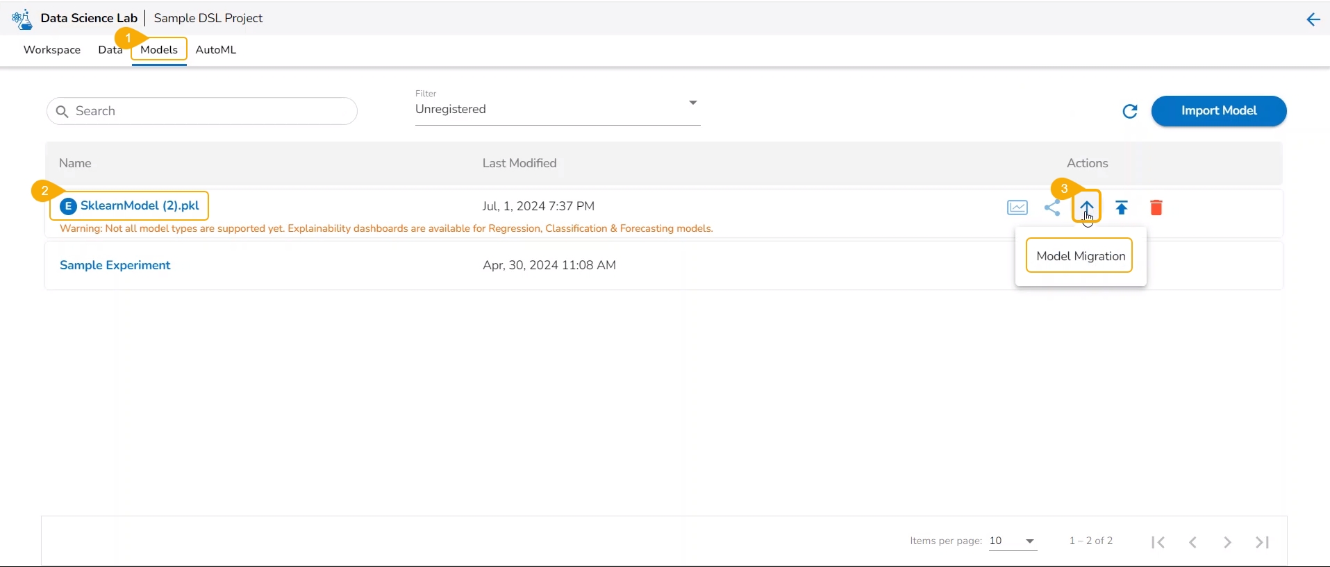
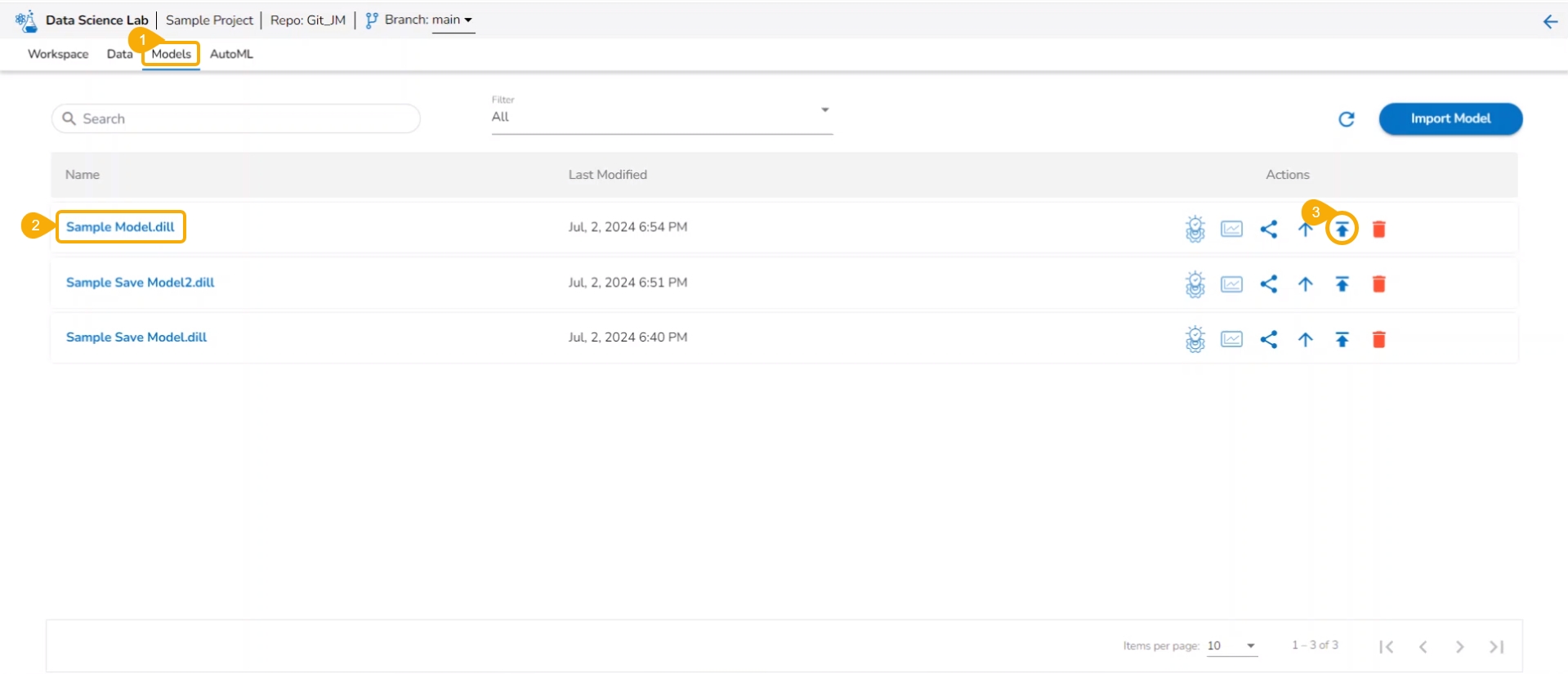
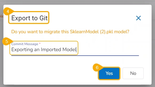
The user can use the Migrate Model icon to export the selected model to the GIT repository.
Check out the illustration on Export to Git functionality.
Navigate to the Models tab.
Select a model from the displayed list
Click the Model Migration icon for a Model.
The Export to GIT dialog box opens.
Provide a Commit Message in the given space.
Click the Yes option.
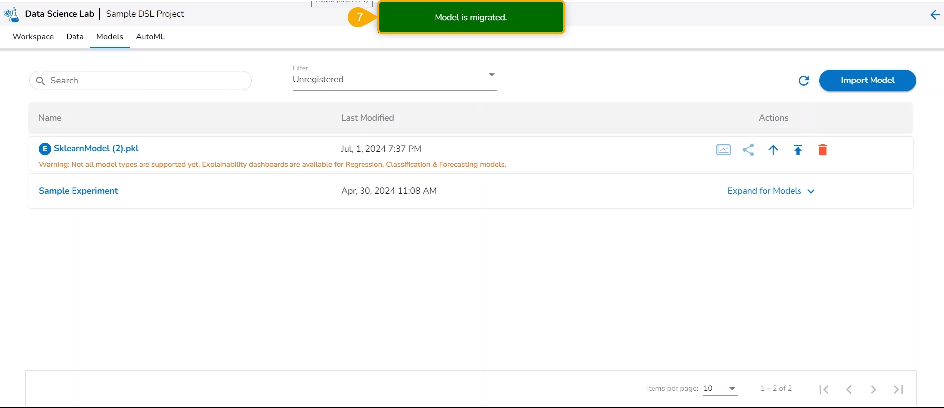
A notification message appears informing that the model is migrated.
Check out the given walk-through to understand the import of a Migrated DSL Model. inside another user under a different space.
Choose a different user or another space for the same user to import the exported model. In this case, the selected space is different from the space from where the model is exported.
Select a different tenant to sign in to the Platform.
Choose a different space while signing into the platform.
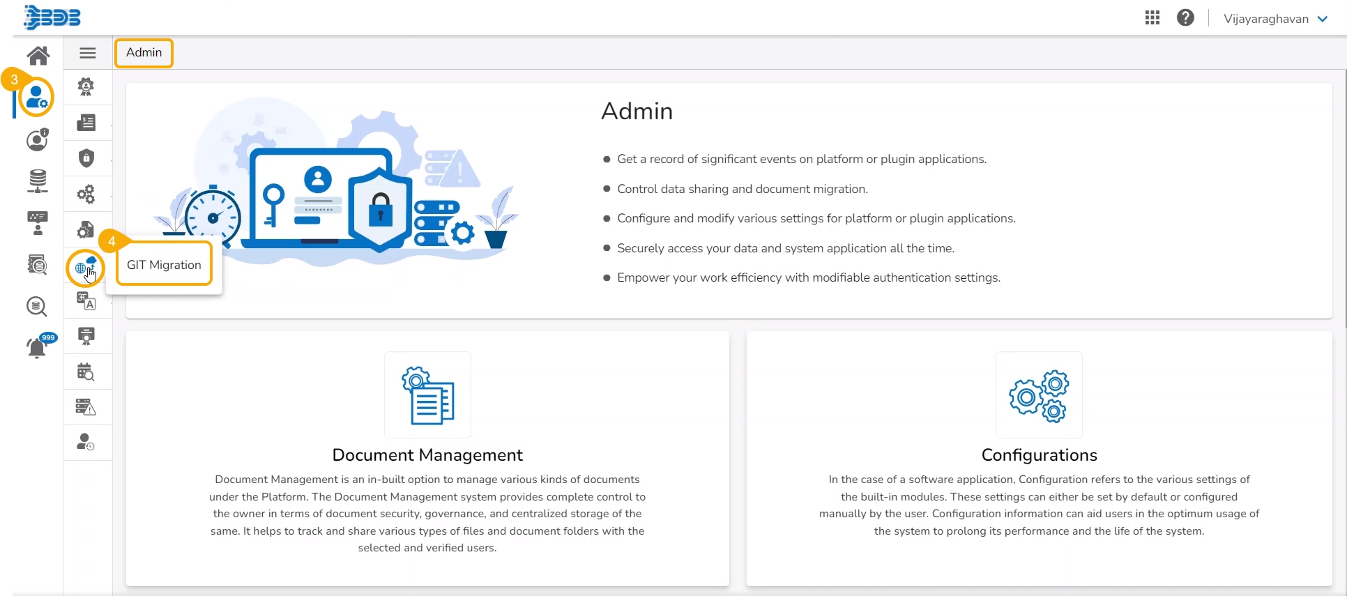
Navigate to the Admin module.
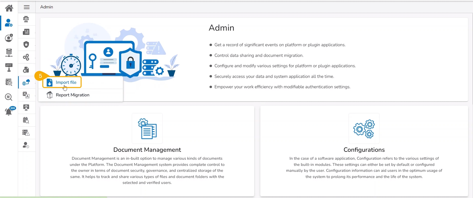
Select the GIT Migration option from the admin menu panel.
Click the Import File option.
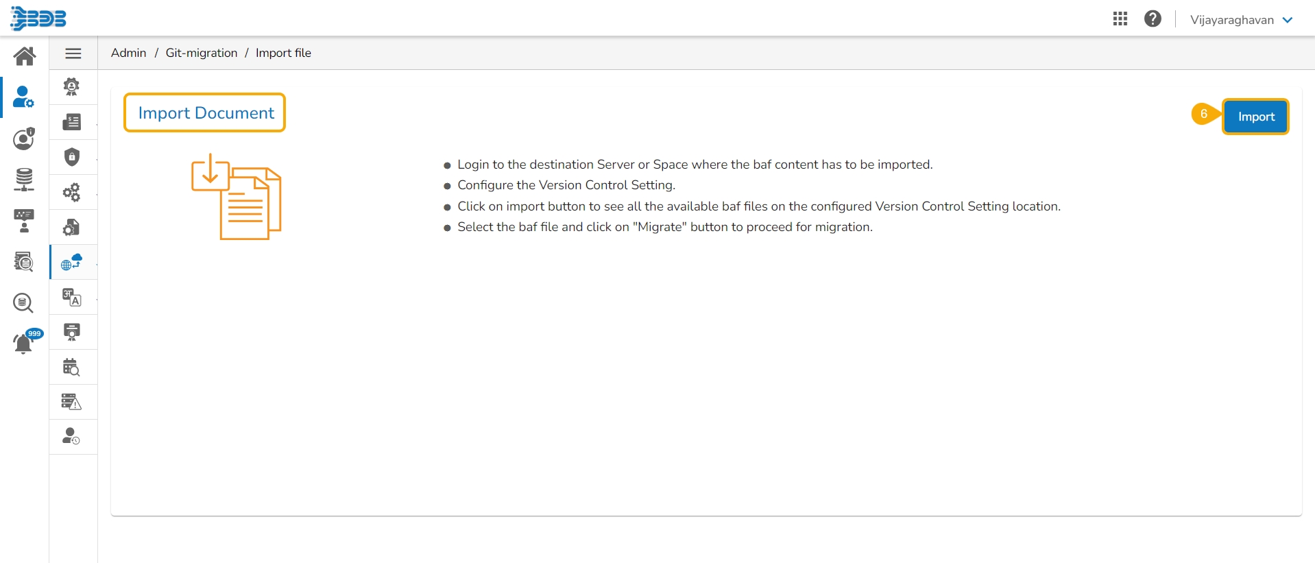
The Import Document page opens, click the Import option.
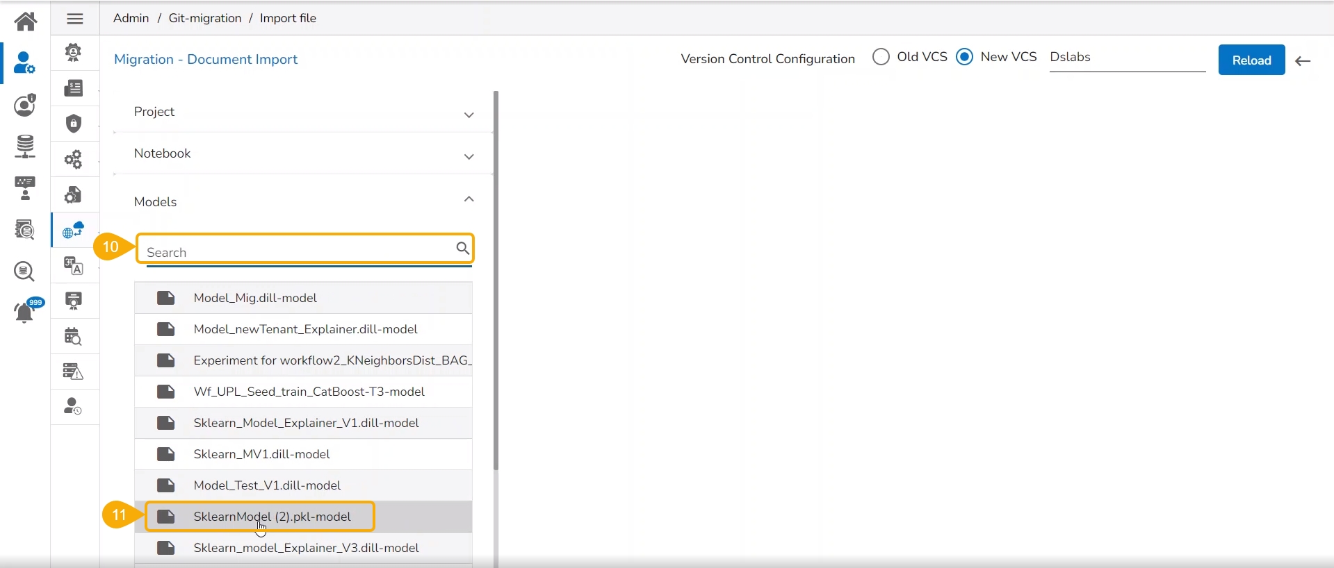
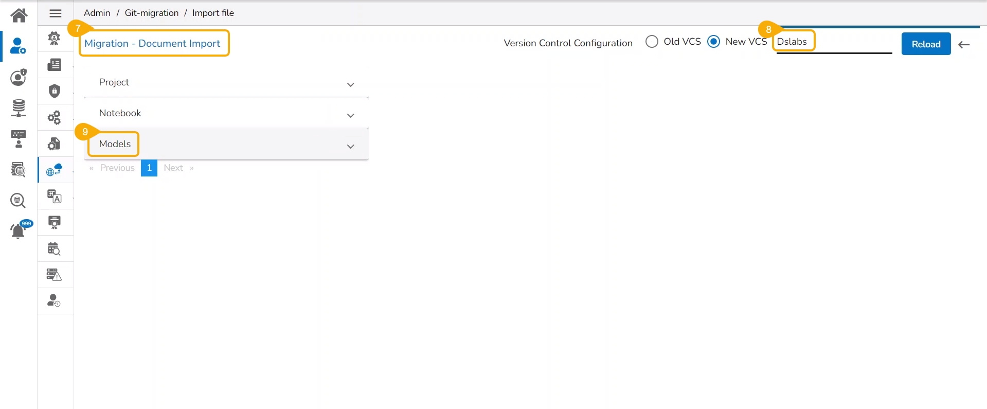
The Migration- Document Import page opens. By default, the New VCS as Version Control Configuration will be selected .
Select the DSLab option from the module drop-down menu.
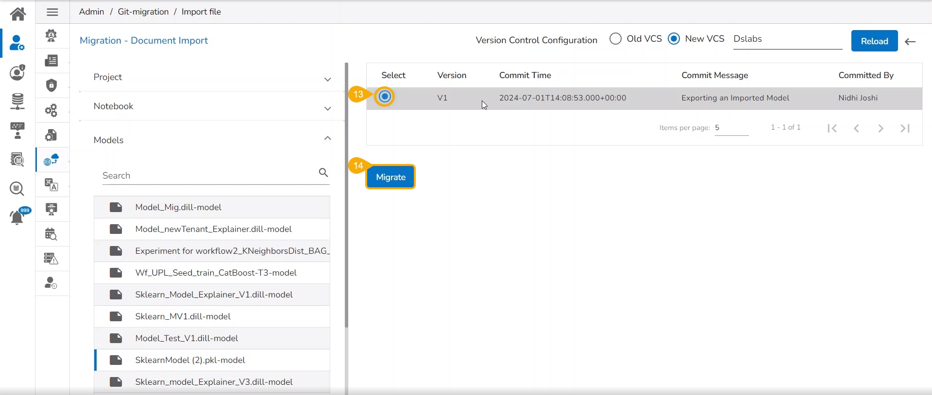
Select the Models option from the left side panel.
Use Search space to search for a specific model name.
All the migrated Models get listed based on your search.
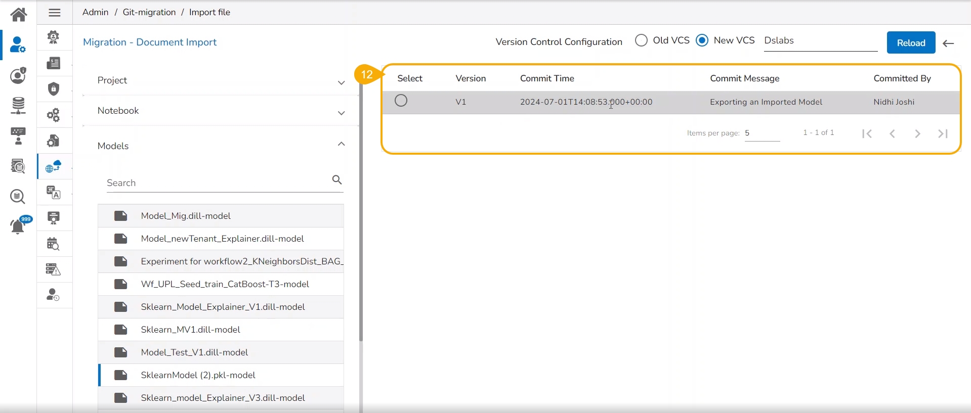
Select a Model from the displayed list to get the available versions of that Model.
Select a Version that you wish to import.
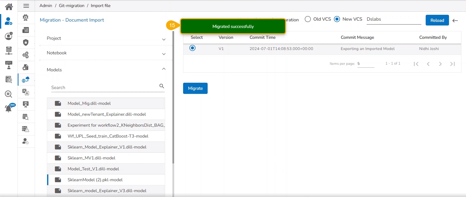
Click the Migrate option.
A notification message appears informing that the file has been migrated.
The migrated model gets imported inside the Models tab of the targeted user.
Please Note: While migrating the Model the concerned Data Science Project also gets migrated to the targeted user's account.
To register a model implies pushing the model into the Pipeline environment where it can be used for inferencing when Production data is read.
Please Note: The currently supported model types are: Sklearn (ML & CV), Keras (ML & CV), and PyTorch (ML).
Check out the walk-through to Register a Data Science model to the Data Pipeline (from the Model tab).
The user can export a saved DSL model to the Data Pipeline module from the Models tab.
Navigate to the Models tab.
Select a model (unregistered model) from the list.
Click the Register icon for the model.
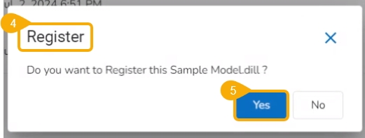
The Register dialog box appears to confirm the action.
Click the Yes option.
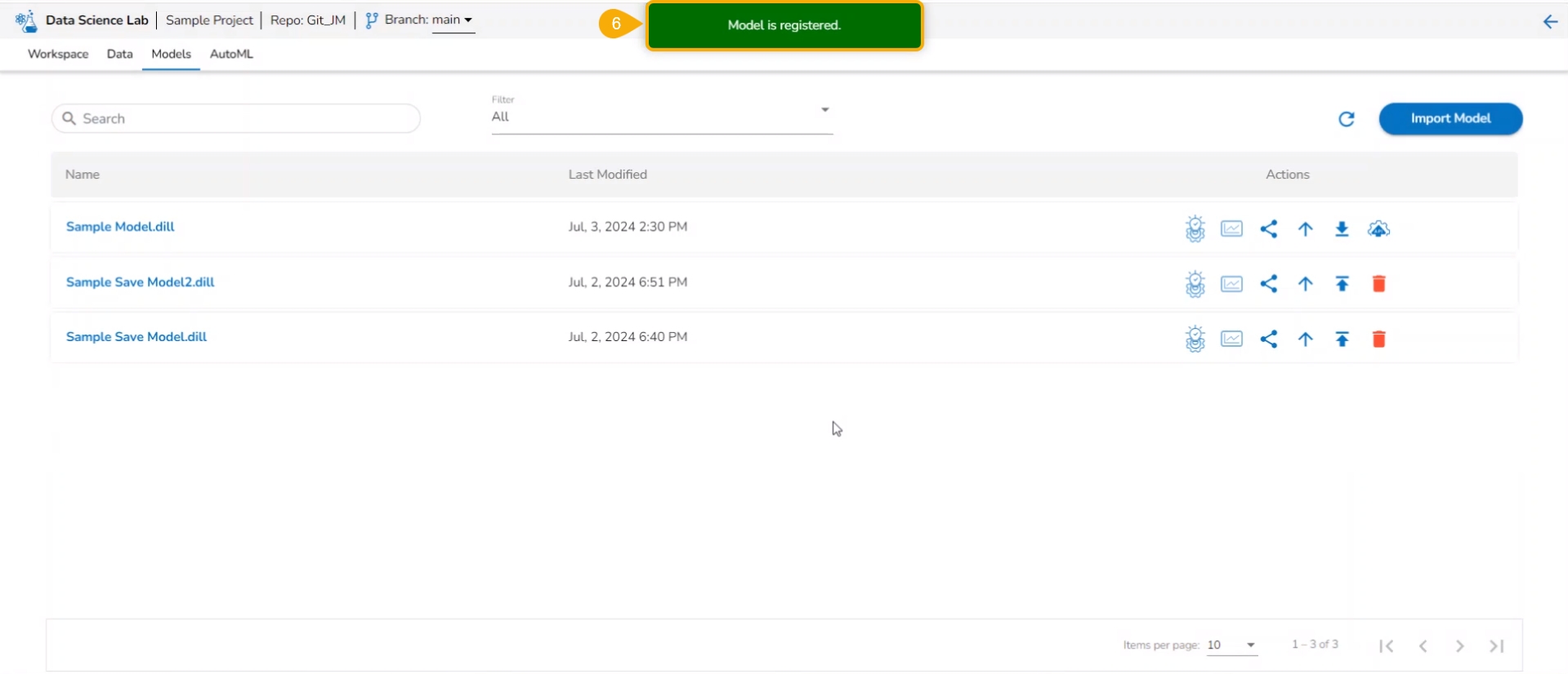
A notification message appears to inform the same.
Please Note: The registered model gets published to the Data Pipeline (it is moved to the Registered list of the models).
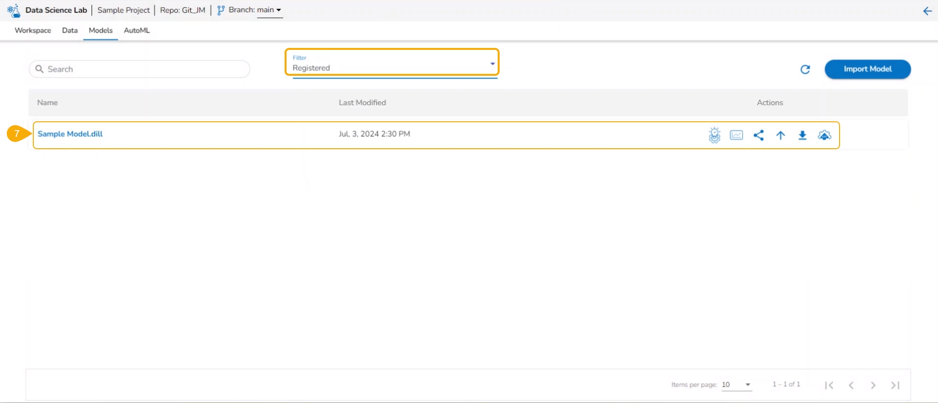
The model gets listed under the Registered model list.
Please Note:
The Register option is also available under the Models section inside a Data Science Notebook.
The Registered Models can be accessed within the DS Lab Model Runner component of the Data Pipeline module.
The share option for a model facilitates the user to share it with other users and user groups. It also helps the user to exclude the privileges of a previously shared model.
Check out the following video for guidance on the Share model functionality.
Navigate to the Models tab where your saved models are listed.
Find the Model you want to share and select it.
Click the Share icon for that model from the Actions column.
The Manage Access page opens for the selected model.
Select permissions using the Grant Permissions checkboxes.
Navigate to the Users or User tab to select user(s) or user group(s).
Use the search function to locate a specific user or user group you want to share the Model with.
Select a user or user group using the checkbox.
Click the Save option.
A notification message appears ensuring that it has been shared.
The selected user/ user group will be listed under the Granted Permissions section.
Log in to the user account where the Model has been shared.
Navigate to the Projects page within the DS Lab module.
The Project where the source model was created will be listed.
Click the View icon to open the shared Project.
Open the Model tab for the project.
Locate the Shared Model, which will be marked as shared, in the Model list.
Please Note: A targeted share user cannot re-share or delete a shared model regardless of the permission level (View/ Edit/Execute).
Check out the illustration on using the Exclude Users functionality.
Check out the illustration for including an excluded user to access a shared model.
Navigate to the Manage Access window for a shared model.
The Excluded Users section will list the excluded users from accessing that model.
Select a user from the list.
Click the Include User icon.
The Include User dialog box opens.
Click the Yes option.
A notification message appears ensuring that the selected user is included.
The user gets removed from the Excluded Users section.
Check out the illustration on revoking privileges for a user.
Navigate to the Manage Access window for a shared model.
The Granted Permissions section will list the shared user(s)/ user group(s).
Select a user/ user group from the list.
Click the Revoke icon.
The Revoke Privileges dialog box opens.
Click the Yes option.
A notification message ensures that shared model privileges are revoked for the selected user/user group. The user/ user group will be removed from the Granted Permissions section.
Please Note: The same set of steps can be followed to revoke privileges for a user group.
This section explains steps involved in registering a Data Science Model as an API Service.
To publish a Model as an API Service, the user needs to follow the three steps given below:
Step-1 Publish a Model as an API
Step-2 Register an API Client
Step-3 Pass the Model values in the Postman
Check out the illustration to understand the Model as API functionality.
Using the Models tab, the user can publish a DSL model as an API. Only the published models get this option.
Navigate to the Models tab.
Filter the model list by using the Registered or All options.
Select a registered model from the list.
Click the Register as API option.
The Update Model page opens.
Provide Max instance limit.
Click the Save and Register option.
Please Note: Use the Save option to save the data which can be published later.
The model gets saved and registered as an API service. A notification message appears to inform the same.
Please Note: The Registered Model as an API can be accessed under the Registered Models & API option in the left menu panel on the Data Science Lab homepage.
Navigate to the Admin module.
Click the API Client Registration option.
The API Client Registration page opens.
Click the New option.
Select the Client type as internal.
Provide the following client-specific information:
Client Name
Client Email
App Name
Request Per Hour
Request Per Day
Select API Type- Select the Model as API option.
Select the Services Entitled -Select the published DSL model from the drop-down menu.
Click the Save option.
A notification message appears to inform the same.
The client details get registered.
Once the client gets registered open the registered client details using the Edit option.
The API Client Registration page opens with the Client ID and Client Secret key.
The user can pass the model values in Postman in the following sequence to get the results.
Check out the illustration on Registering a Model as an API service.
Navigate to the Postman.
Go to the New Collection.
Add a new POST request.
Pass the URL with the model name for the POST request.
Provide required headers under the Headers tab:
Client Id
Client Secret Key
App Name
Put the test data in the JSON list using the Body tab.
Click the Send option to send the request.
Please Note:
A job will get spin-up at the tenant level to process the requests.
The input data (JSON body) will be saved in a Kafka topic as a message, which will be cleared after 4 hours.
The tenant will get a response as below:
Success: the success of the request is identified by getting 'true' here.
Request ID: A Request ID is generated.
Message: Ensures that the service has started running.
Please Note: The Request ID is required to get the status request in the next step.
Pass the URL with the model name for the POST request.
Provide required headers under the Headers tab:
Client Id
Client Secret Key
App Name
Open the Body tab and provide the Request ID.
Click the Send option to send the request.
The response will be received as below:
Success: the success of the request is identified by getting 'true' here.
Request ID: The used Request ID appears.
Status Message: Ensures that the service has been completed.
Pass the URL with the model name for the POST request.
Provide required headers under the Headers tab:
Client Id
Client Secret Key
App Name
Open the Body tab and provide the Request ID.
Click the Send option to send the request.
The model prediction result will be displayed in response.
Please Note: The output data will be stored inside the Sandbox repository in the specific sub-folder of the request under the Model as API folder of the respective DSL Project.
To unregister a model means to remove it from the Data Pipeline environment.
Check out the illustration on unregistering a model functionality using the Models tab.
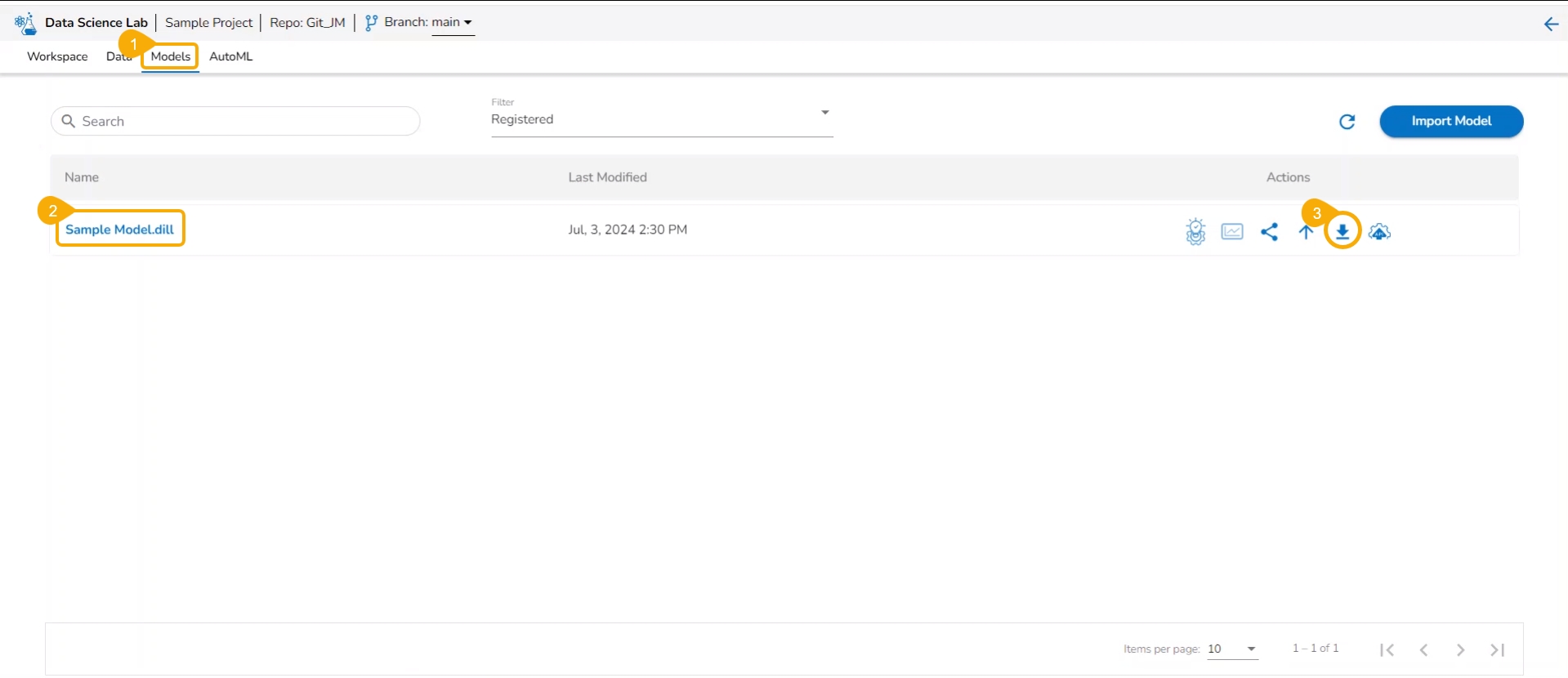
A user can unregister a registered model by using the Models tab.
Navigate to the Models tab.
Select a registered model (use the Registered filter option to access a model).
Click the Unregister icon for the same model.
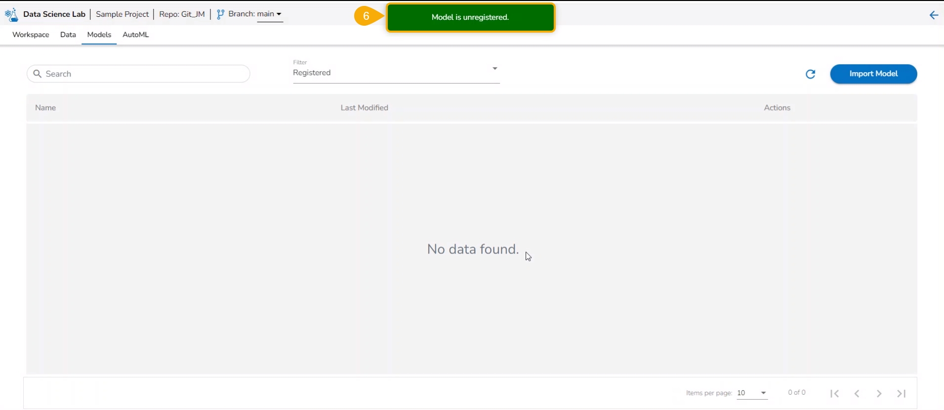
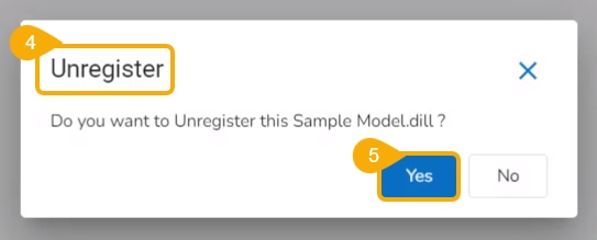
The Unregister dialog box appears to confirm the action.
Click the Yes option.
A notification message appears to inform the same.
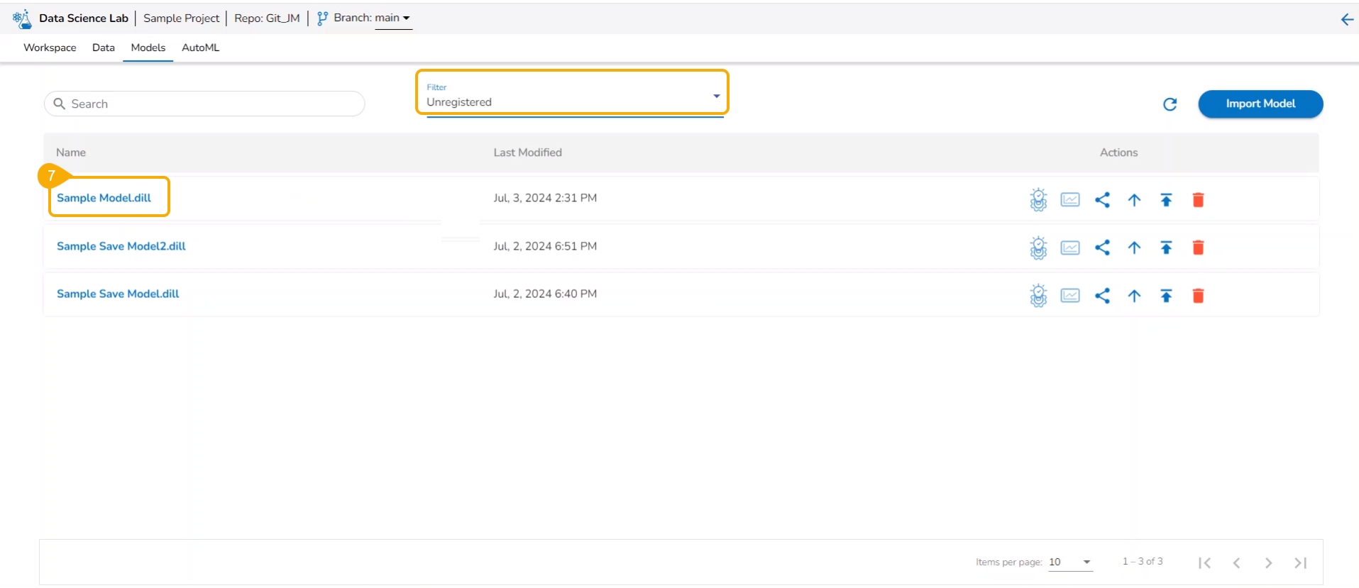
The unregistered model appears under the Unregistered filter of the Models tab.
Please Note:
The Unregister function when applied to a registered model, gets removed from the Data Pipeline module. It also disappears from the Registered list of the models and gets listed under the Unregistered list of models.
This section focuses on how to delete a model using the Models tab.
Users can delete any unregistered model using the delete icon from the Actions panel of the Model list.
Check out the illustration on deleting a model.
Navigate to the Models tab.
Select an unregistered model filter option.
Select a model from the displayed list.
Click the Delete icon.
A confirmation message appears.
Click the Yes option.
A notification message appears.
The selected model gets deleted.
Please Note: The Delete icon appears only for the unregistered models. The registered models will not get the Delete icon.
The Repo folder is a default folder created under the Workspace tab. It opens by default while accessing the Workspace tab.
The user can perform some attributive actions on the Repo folder using the ellipsis icon provided next to it. This page explains all the attributes given to the Repo folder. This folder contains only .ipynb files in it. The actions provided for a .ipynb file (Notebook) are mentioned under the Notebook Actions page.
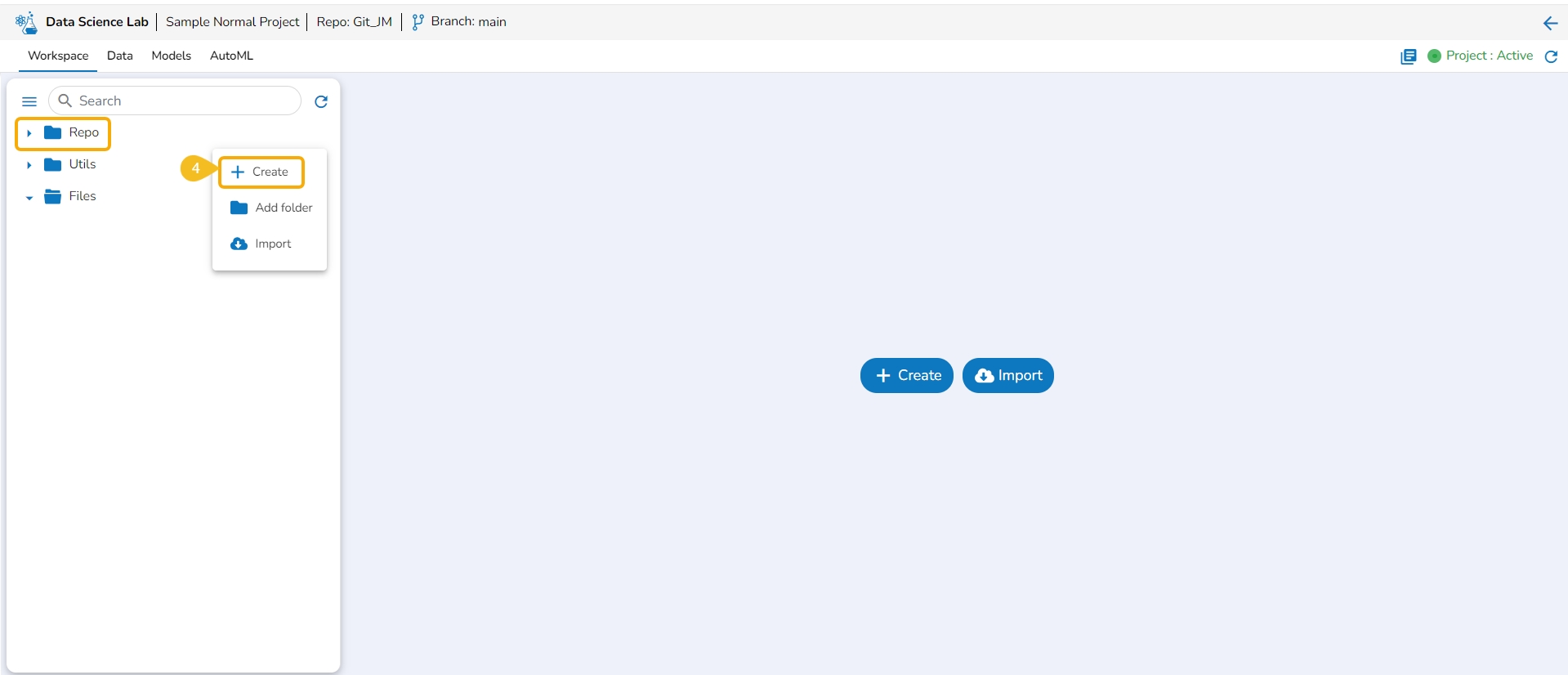
This option redirects the user to the Create Notebook page to create a new Notebook.
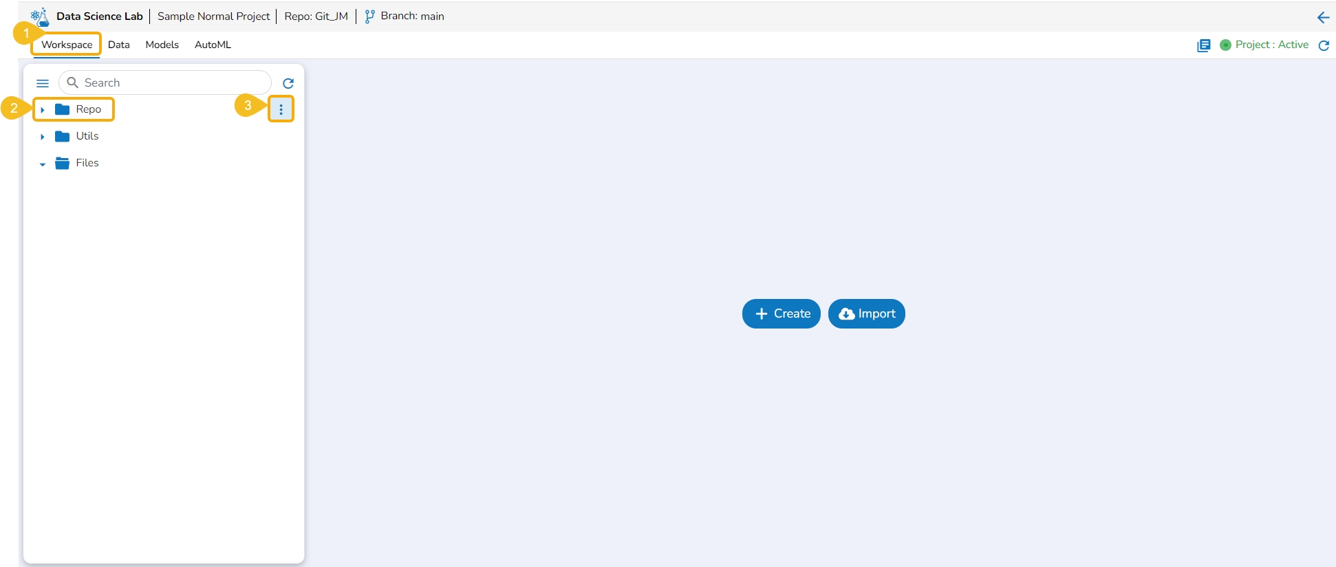
Navigate to the Workspace tab.
Select the Repo folder.
Click the Elipsis icon.
A Context Menu appears. Select the Create option from the Context Menu.
The Create Notebook drawer opens.
Please Note: Refer to the Create page to learn the steps to create a new Notebook.
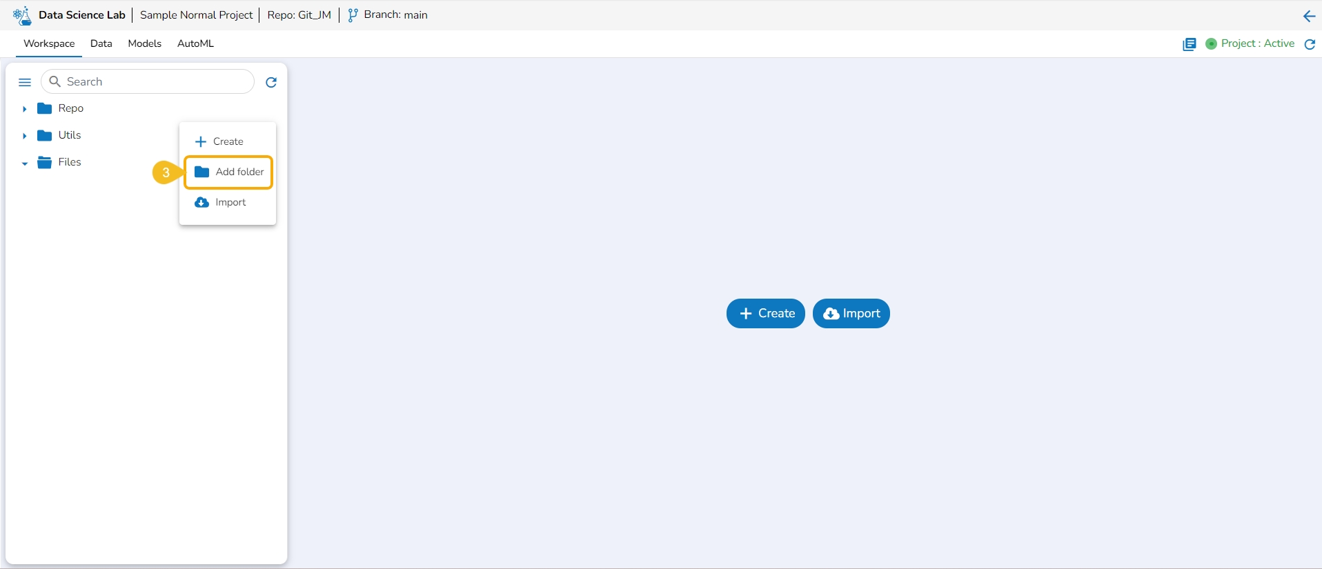
This option allows the user to create folders under the Repo folder.
Navigate to the Workspace tab.
Select the Repo folder.
Click the Elipsis icon.
A Context Menu appears. Select the Add Folder option from the Context Menu.
The Add folder dialog box opens.
Provide a name to the folder.
Click the Yes option.
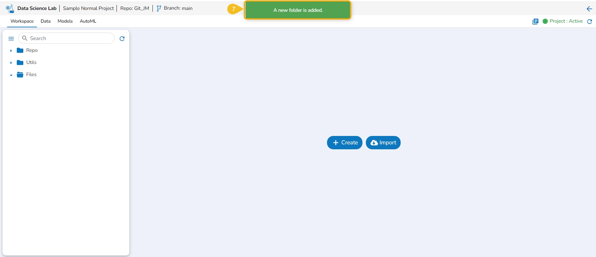
A notification appears to ensure the folder creation.
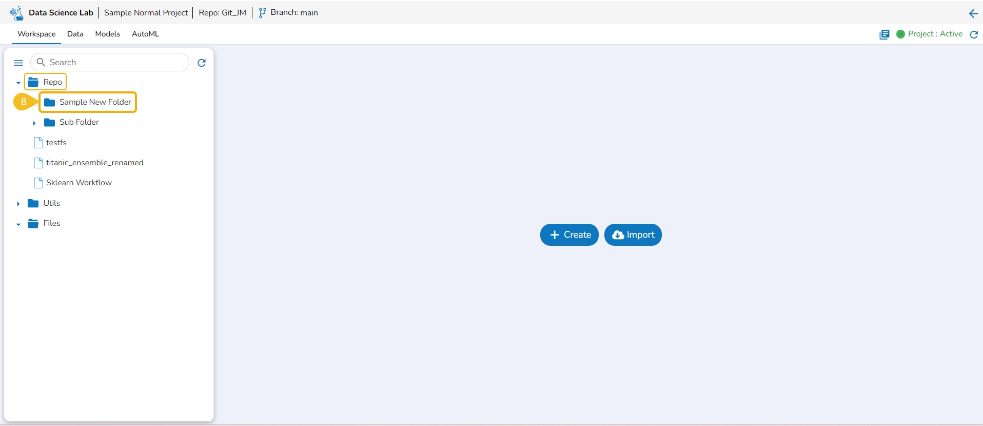
The newly added folder is listed under the Repo folder. Expand the Repo folder to see the newly added folder.
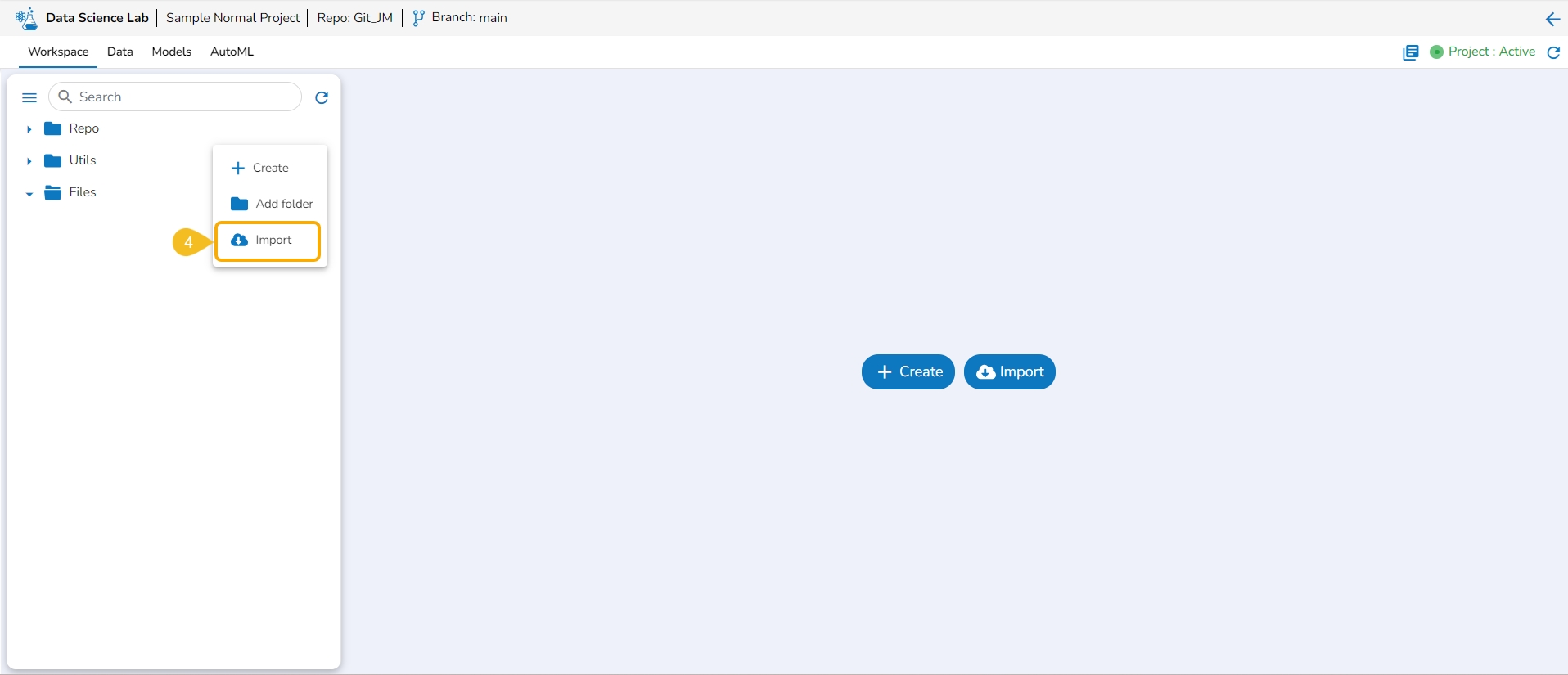
The Import option allows users to import a .ipynb file to the selected Data Science Lab project from their system.
Navigate to the Workspace tab.
Select the Repo folder.
Click the Elipsis icon.
A Context Menu appears. Select the Import option from the Context Menu.
The Import Notebook page opens.
Please Note:
Refer to the Import Notebook page to learn how to import a Notebook.
Created or Imported Notebooks will get some attributed Actions. The Notebook Actions are described under this documentation's Data Science Notebook section.
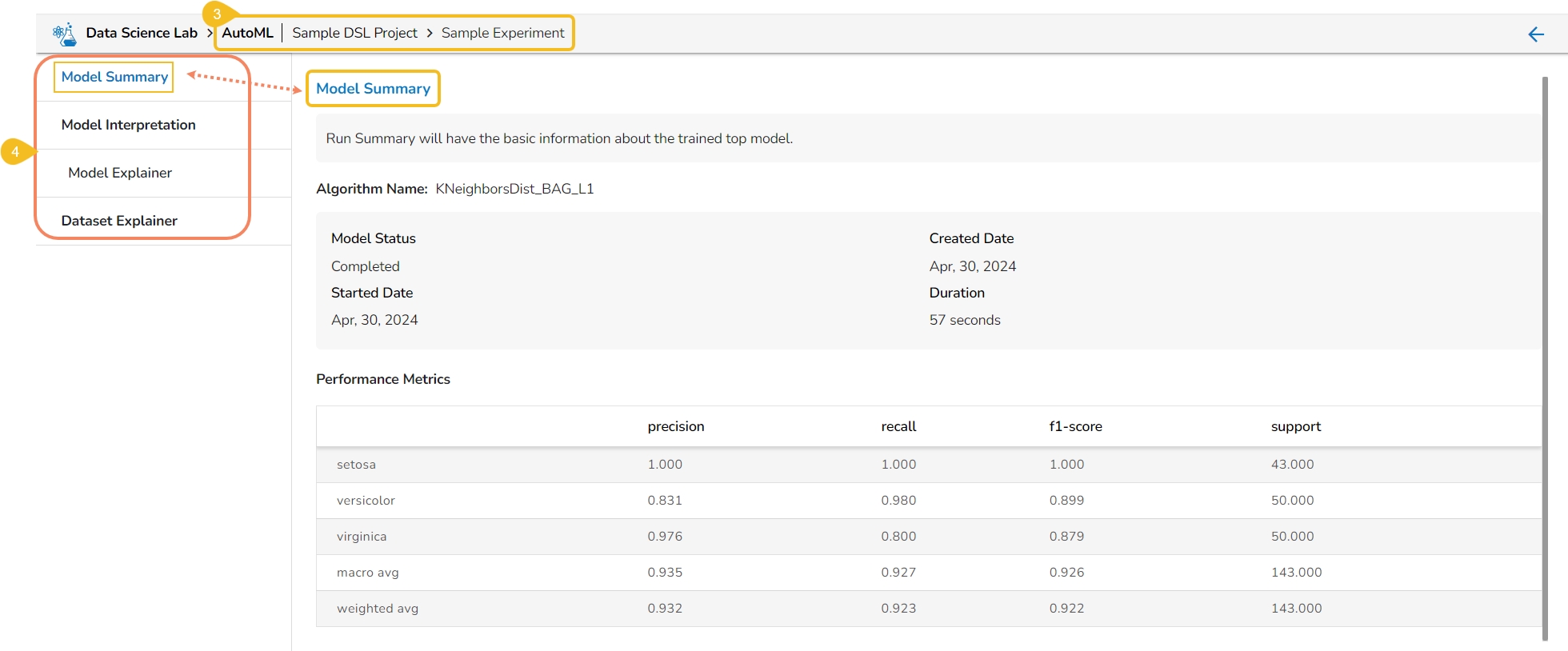
The Model Summary option is displayed by default while clicking the View Explanation option for an Auto ML model.
The Model Summary/ Run Summary displays the basic information about the trained top model.
The Model Summary/ Run Summary will display the basic information about the trained top model. It opens by default by clicking the View Explanation option for the selected model.
The Model Summary page displays the details based on the selected Algorithm types:
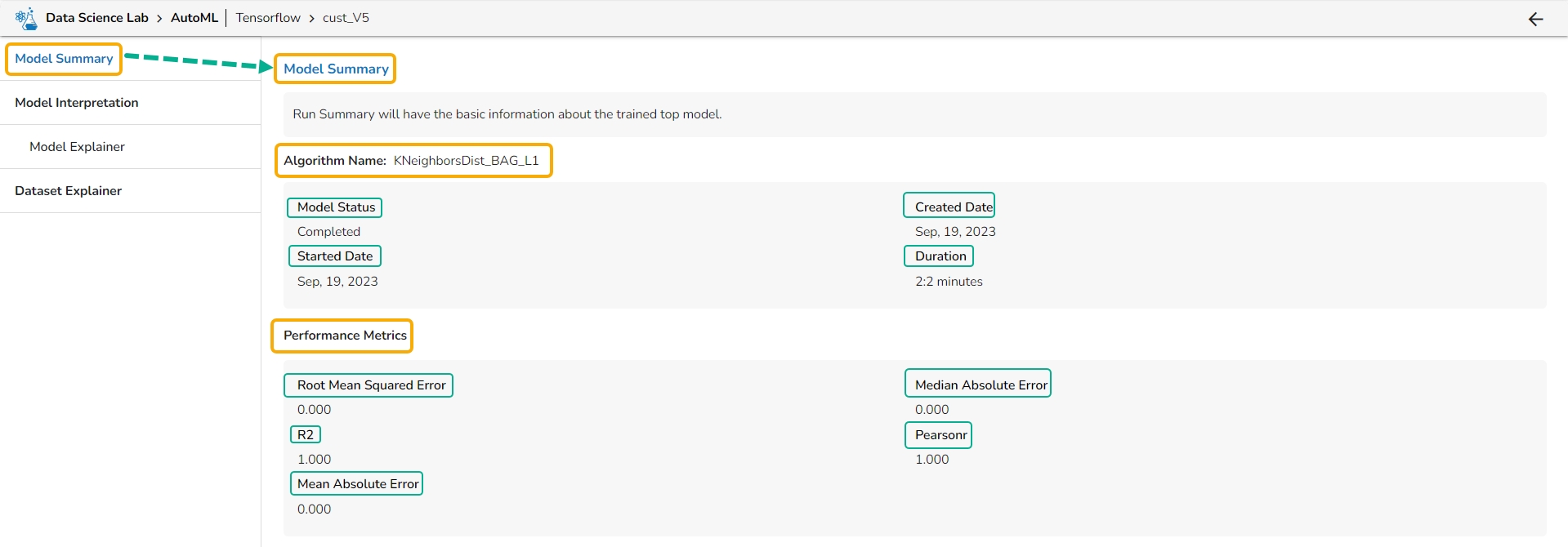
Algorithm Name
Model Status
Created Date
Started Date
Duration
Performance Metrics are described by displaying the below-given metrics:
Root Mean Squared Error (RMSE): RMSE is the square root of the mean squared error. It is more interpretable than MSE and is often used to compare models with different units.
Median Absolute Error (MAE): MAE is a performance metric for regression models that measures the median of the absolute differences between the predicted values and the actual values.
R-squared (R2): R-squared measures the proportion of the variance in the dependent variable that is explained by the independent variables in the model. It is a popular metric for linear regression problems.
Pearsonr: Pearsonr is a function in the SciPy. Stats module that calculates the Pearson correlation coefficient and its p-value between two arrays of data. The Pearson correlation coefficient is a measure of the linear relationship between two variables.
Mean Absolute Error (MAE): MAE measures the average absolute difference between the predicted values and the actual values in the dataset. It is less sensitive to outliers than MSE and is a popular metric for regression problems.
Algorithm Name
Model Status
Created Date
Started Date
Duration
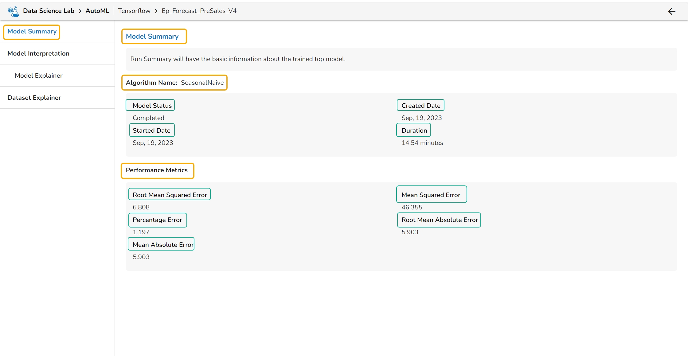
Performance Metrics are described by displaying the below-given metrics:
Root Mean Squared Error (RMSE): RMSE is the square root of the mean squared error. It is more interpretable than MSE and is often used to compare models with different units.
Mean Squared Error (MSE): MSE measures the average squared difference between the predicted values and the actual values in the dataset. It is a popular metric for regression problems and is sensitive to outliers.
Percentage Error (PE): PE can provide insight into the relative accuracy of the predictions. It tells the user how much, on average, the predictions deviate from the actual values in percentage terms.
Root Mean Absolute Error: RMSE is the square root of the mean squared error. It is more interpretable than MSE and is often used to compare models with different units.
Mean Absolute Error (MAE): MAE measures the average absolute difference between the predicted values and the actual values in the dataset. It is less sensitive to outliers than MSE and is a popular metric for regression problems.
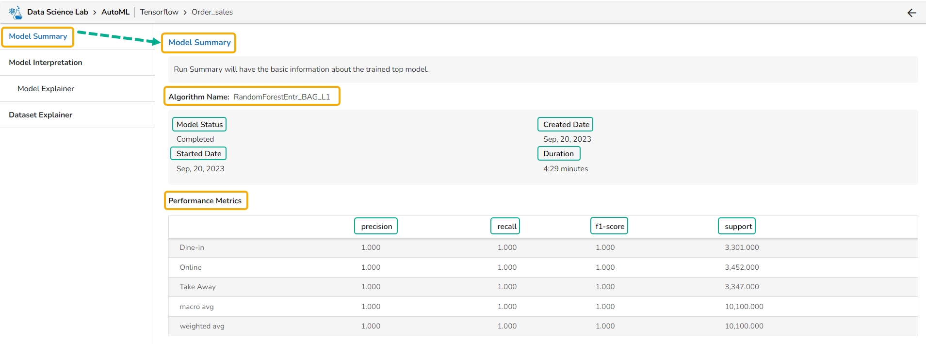
Algorithm Name
Model Status
Created Date
Started Date
Duration
Performance Metrics are described by displaying the below-given metrics:
Precision: Precision is the percentage of correctly classified positive instances out of all the instances that were predicted as positive by the model. In other words, it measures how often the model correctly predicts the positive class.
Recall: Recall is the percentage of correctly classified positive instances out of all the actual positive instances in the dataset. In other words, it measures how well the model.
F1-score: The F1-score is the harmonic mean of precision and recall. It is a balance between precision and recall and is a better metric than accuracy when the dataset is imbalanced.
Support: Support is the number of instances in each class in the dataset. It can be used to identify imbalanced datasets where one class has significantly fewer instances than the others.
A Data Scientist can create various Experiments based on specified algorithms.
There can be different types of Experiments based on the algorithm type specified. In the DS Lab module, we currently support Classification, Regression, and Forecasting.
A Classification experiment can be created for discrete data when the user wants to predict one of the several categories.
A Regression experiment can be created for continuous numeric values.
A Forecasting experiment can be created to predict future values based on historical data.
Please Note:
AutoML experiments are running as Jobs and a new Job will be allocated for each experiment created in the AutoML tab.
Jobs will spin up once the Experiment is created and after models are trained and ready, it will get killed automatically.
Creating an Experiment is a two-step process that involves configuration and selection of the algorithm type as steps.
A user can create a supervised learning (data science) experiment by choosing the Create Experiment option.
Please Note: The Create Experiment icon is provided on the Dataset List page under the Dataset tab of a Repo Sync Data Science Project.
Navigate to the Data List page.
Select a Dataset from the list.
Click the Create Experiment icon.
The Configure tab opens (by default) while selecting the Create Experiment option.
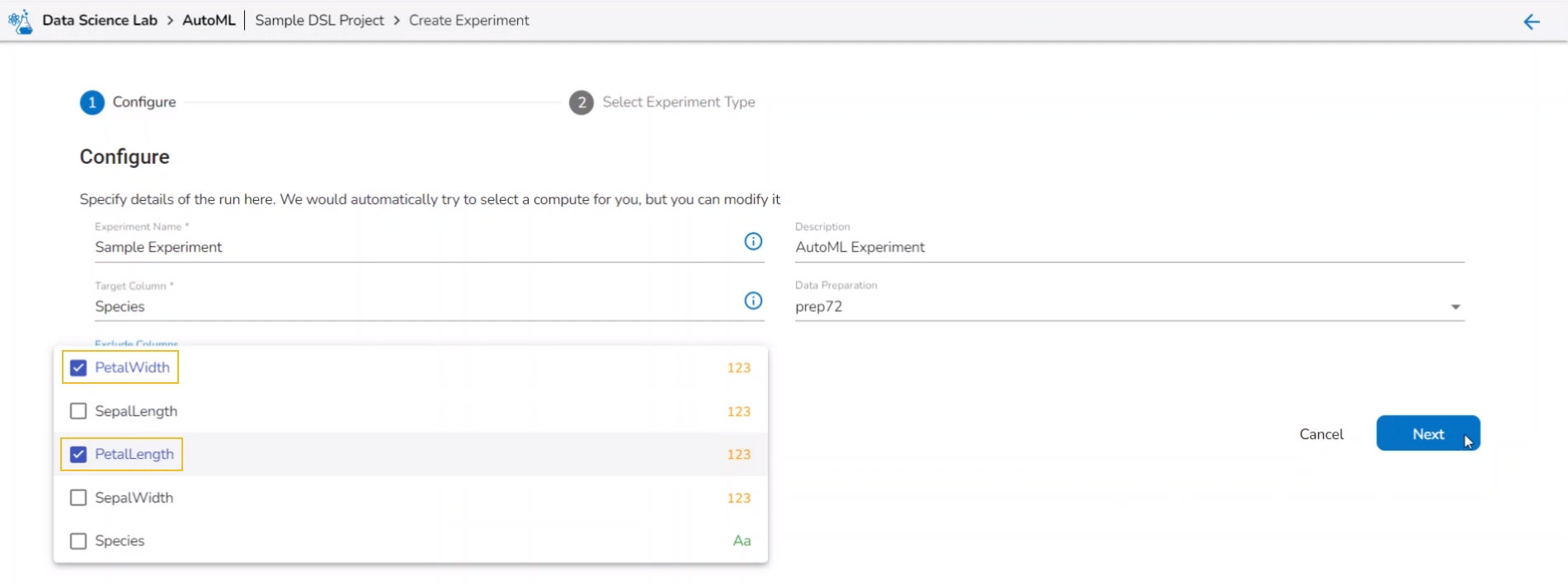
Provide the following information:
Provide a name for the experiment.
Provide Description (optional).
Select a Target Column.
Select a Data Preparation from the drop-down menu.
Use the checkbox to select a Data Preparation from the displayed drop-down.
Select columns that need to be excluded from the experiment.
Use the checkbox to select a field to be excluded from the experiment.
Please Note: The selected fields will not be considered while training the Auto ML model experiment.
Click the Next option.
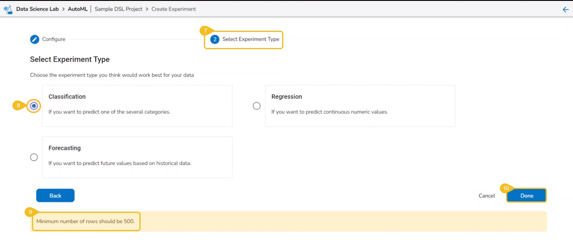
The user gets redirected to the Select Experiment Type tab.
Select a prediction model using the checkbox.
Based on the selected experiment type a validation notification message appears.
Click the Done option.
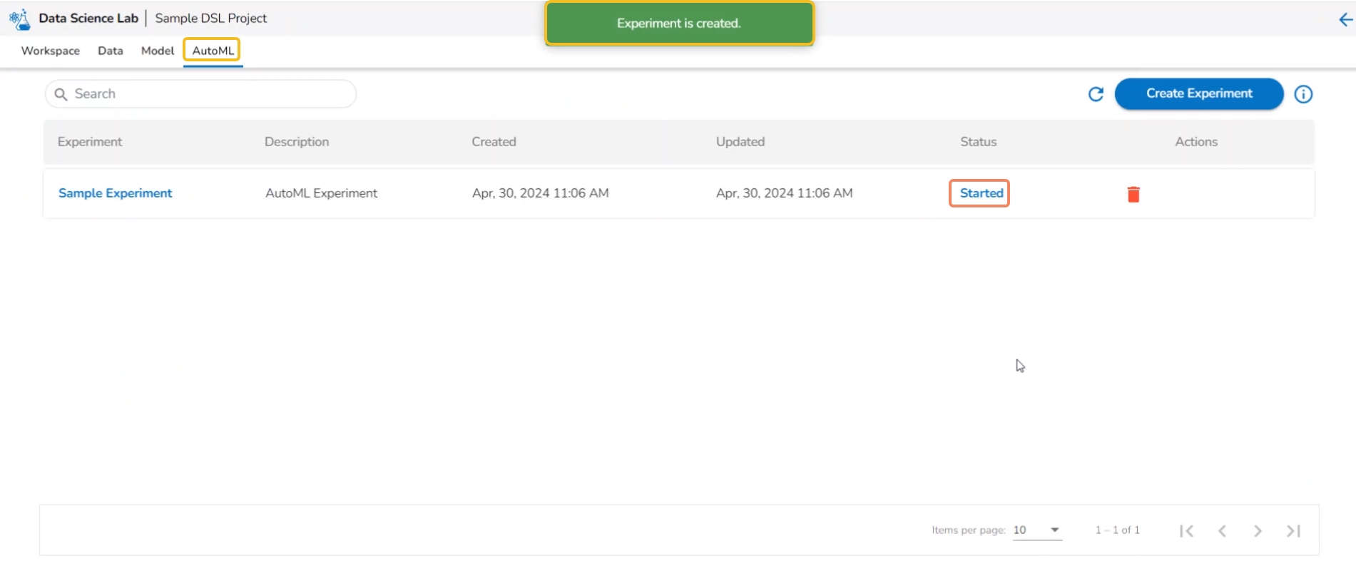
A notification message appears.
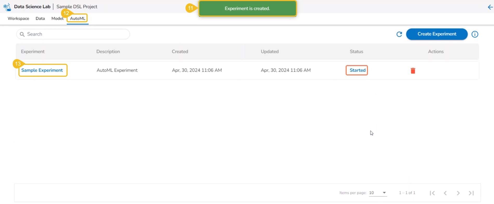
The user is redirected to the AutoML list page.
The newly created experiment gets added to the list with Status mentioned as Started.
The Status tab indicates various phases of the experiments/model training. The different phases for an experiment are as given below:
The newly created experiment gets Started status. It is the first status when a new experiment is created.
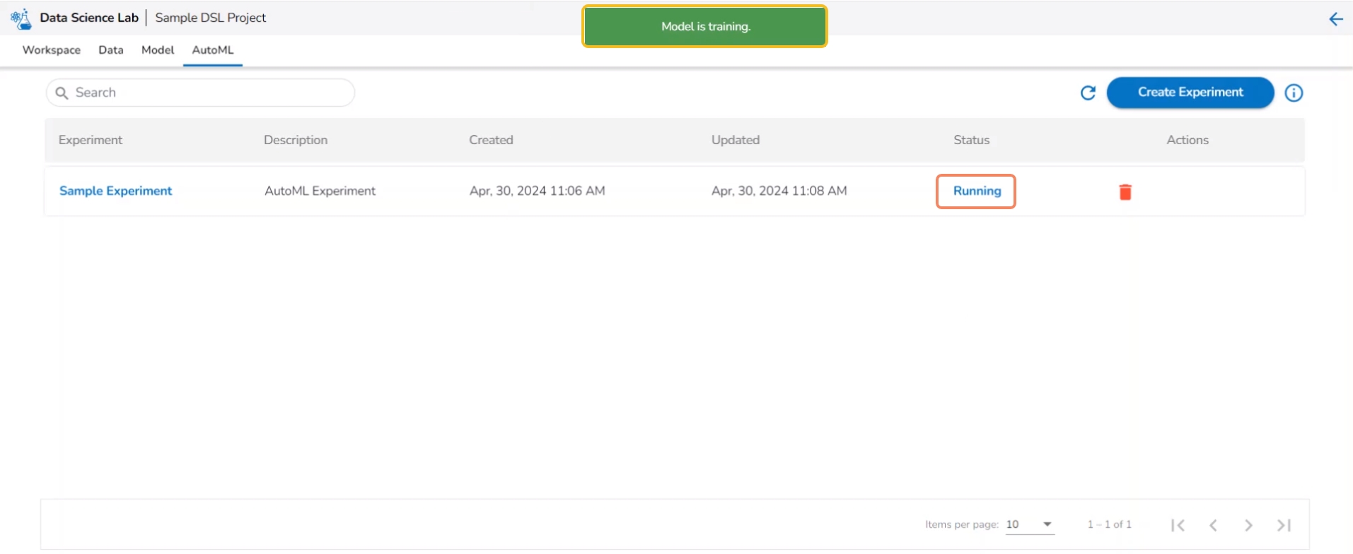
Another notification message appears to inform the user that the model training has started. The same is indicated through the Status column of the model. The Status for such models will be Running.
After the experiment is completed, a notification message appears stating that the model trained. The Status for a trained model will be indicated as Completed.
Please Note: The unsuccessful experiments are indicated as Failed under the status. The View Report is mentioned in red color for the Failed experiments.
This section helps the user to understand the attributes provided to the file folder created inside a normal Data Science Lab project.
Check out the illustration to access the attributes for a File folder.
Navigate to the Workspace tab of a normal Data Science project.
Select the File folder that is created by default.
Click the Ellipsis icon for the File folder.
The credited attributive will be listed in the context menu.
Check out the illustration on adding a file to the File folder of a normal Data Science Project.
Check out the illustration on adding a folder to the File folder of a normal Data Science Project.
Check out the illustration on using the Copy path functionality inside the File folder of a normal Data Science Project.
Check out the illustration on importing a file to the File folder of a normal Data Science Project.
This section of the document describes the actions attributed to the added data inside a Data Science Lab project.
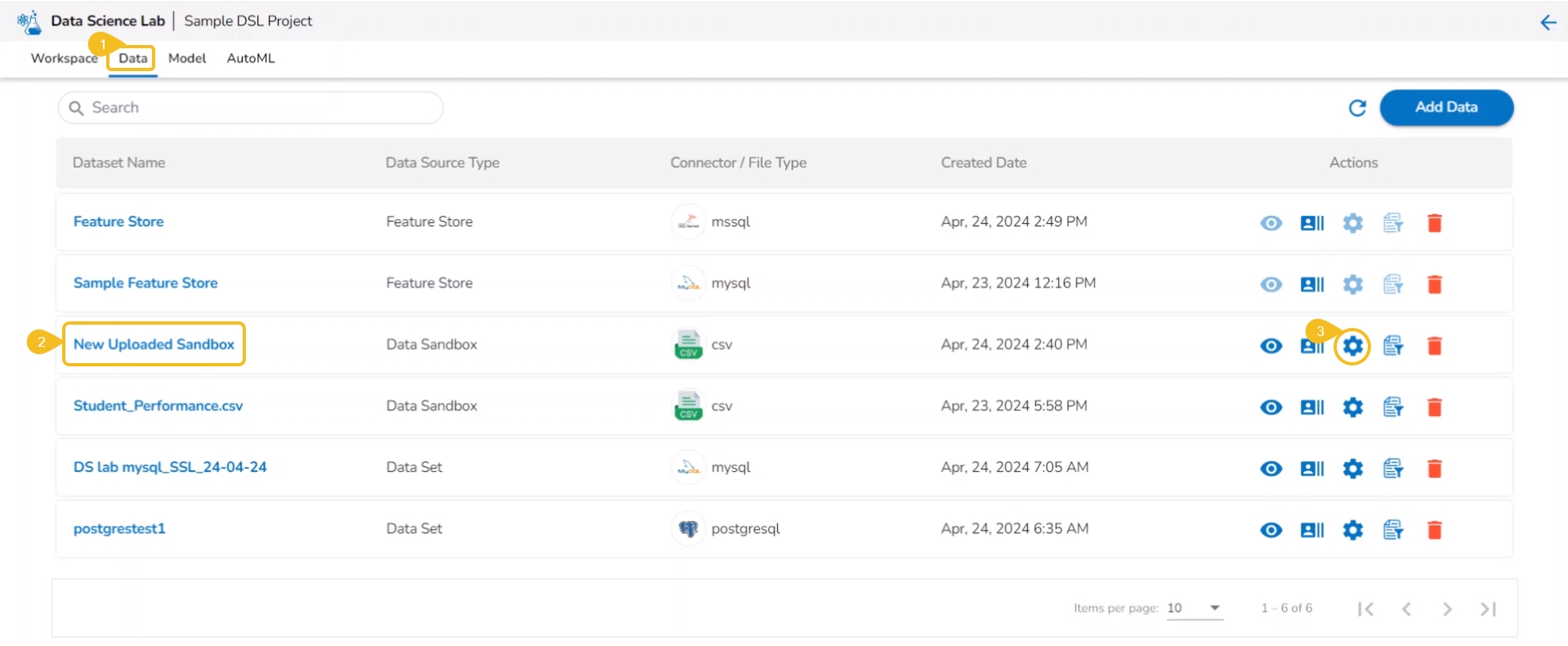
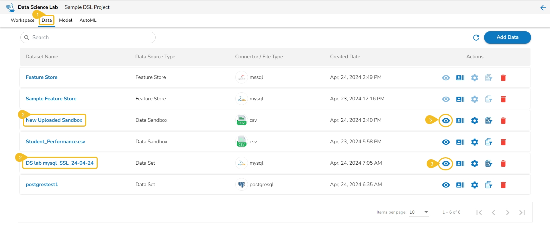
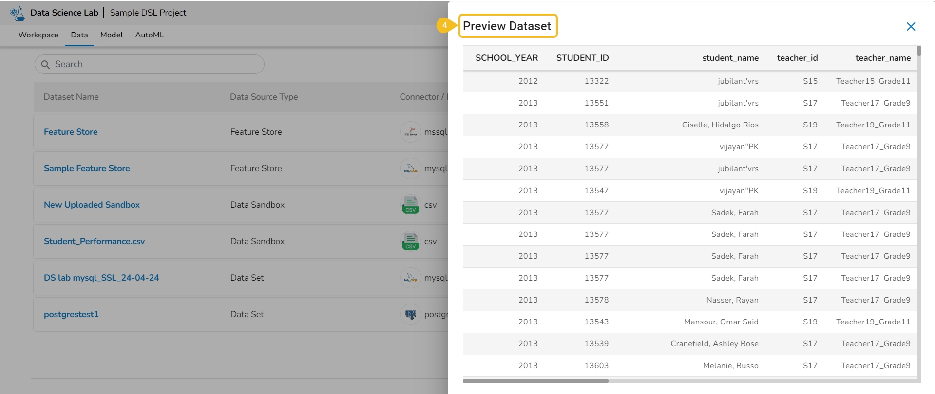
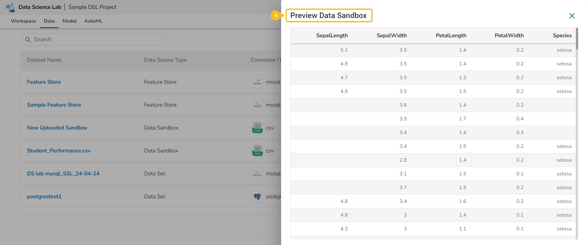
The Data Preview option displays a sample of the actual data for the user to understand the data values in a better way.
Navigate to the Dataset list inside a Project.
Select either a Data Sandbox or Dataset from the displayed list.
Click the Preview icon for the selected data entity.
The Preview Data Sandbox or Preview Dataset page opens based on the selected data.
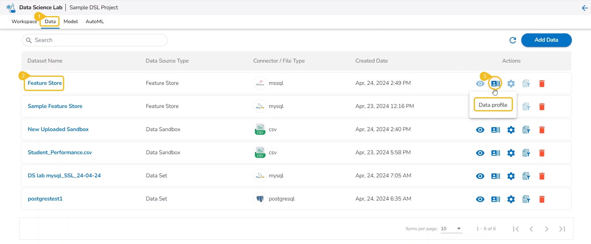
This action helps users to visualize the detailed profile of data to know about data quality, structure, and consistency. A data profile is a summary of the characteristics of a dataset. It is created as a preliminary step in data analysis to better understand the data before performing an in-depth analysis.
Check out the illustration provided at the beginning to get the full view of the Data Profile page.
Navigate to the Data list page.
Select a Dataset from the list. It can be anything from a Dataset, Data Sandbox file, or Feature Store.
Click the Data Profile icon.
The Data Profile drawer opens displaying the Data Set information, Variable Types, Warnings, Variables, Correlation chart, missing values, and sample.
The users can create a supervised learning (Auto ML) experiment using the Create Experiment option.
Check out the illustration to create an auto ML experiment.
Navigate to the Dataset List page.
Select a Dataset from the list.
Click the Create Experiment icon.
Please Note: An experiment contains two steps:
Configure: Enter the Experiment name, Description, and Target column.
Select Experiment Type: Select an algorithm type from the drop-down menu.
A Classification experiment can be created for discrete data when the user wants to predict one of the several categories.
A Regression experiment can be created for continuous numeric values.
A Forecasting experiment can be created to predict future values based on historical data.
The Configure tab opens (by default) while opening the Create Experiment form.
Provide the following information:
Provide a name for the experiment.
Provide Description (optional).
Select a Target Column.
Select a Data Preparation from the drop-down menu.
Use the checkbox to select a Data Preparation from the displayed drop-down.
Select columns that need to be excluded from the experiment.
Use the checkbox to select a field to be excluded from the experiment.
Please Note: The selected fields will not be considered while training the Auto ML model experiment.
Click the Next option.
The user gets redirected to the Select Experiment Type tab.
Select a prediction model using the checkbox.
Based on the selected experiment type a validation notification message appears.
Click the Done option.
A notification message appears.
The user gets redirected to the Auto ML list page.
The newly created experiment gets added to the list with the Status mentioned as Started.
Data Preparation involves gathering, refining, and converting raw data into refined data. It is a critical step in data analysis and machine learning, as the quality and accuracy of the data used directly impact the accuracy and reliability of the results. The data preparation ensures that the data is accurate, complete, consistent, and relevant to the analysis. The data scientist can make more informed decisions, extract valuable insights, and unveil concealed trends and patterns within the raw data with the help of the Data Preparation option.
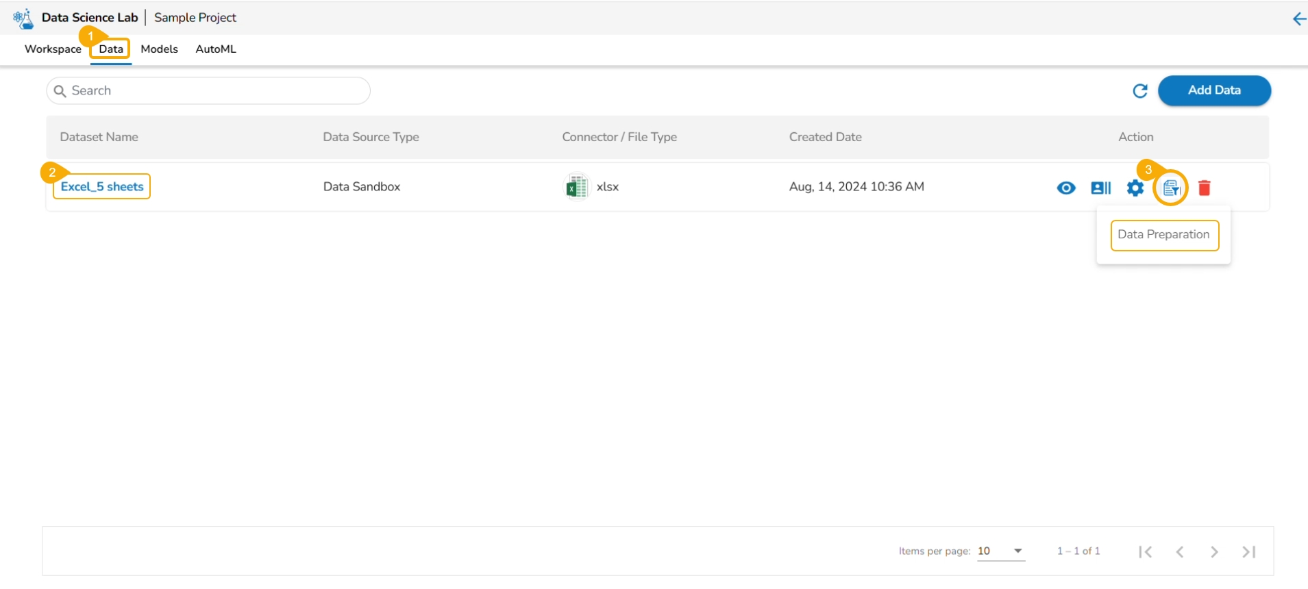
Navigate to the Data tab.
Select a Dataset from the list.
Click the Data Preparation icon.
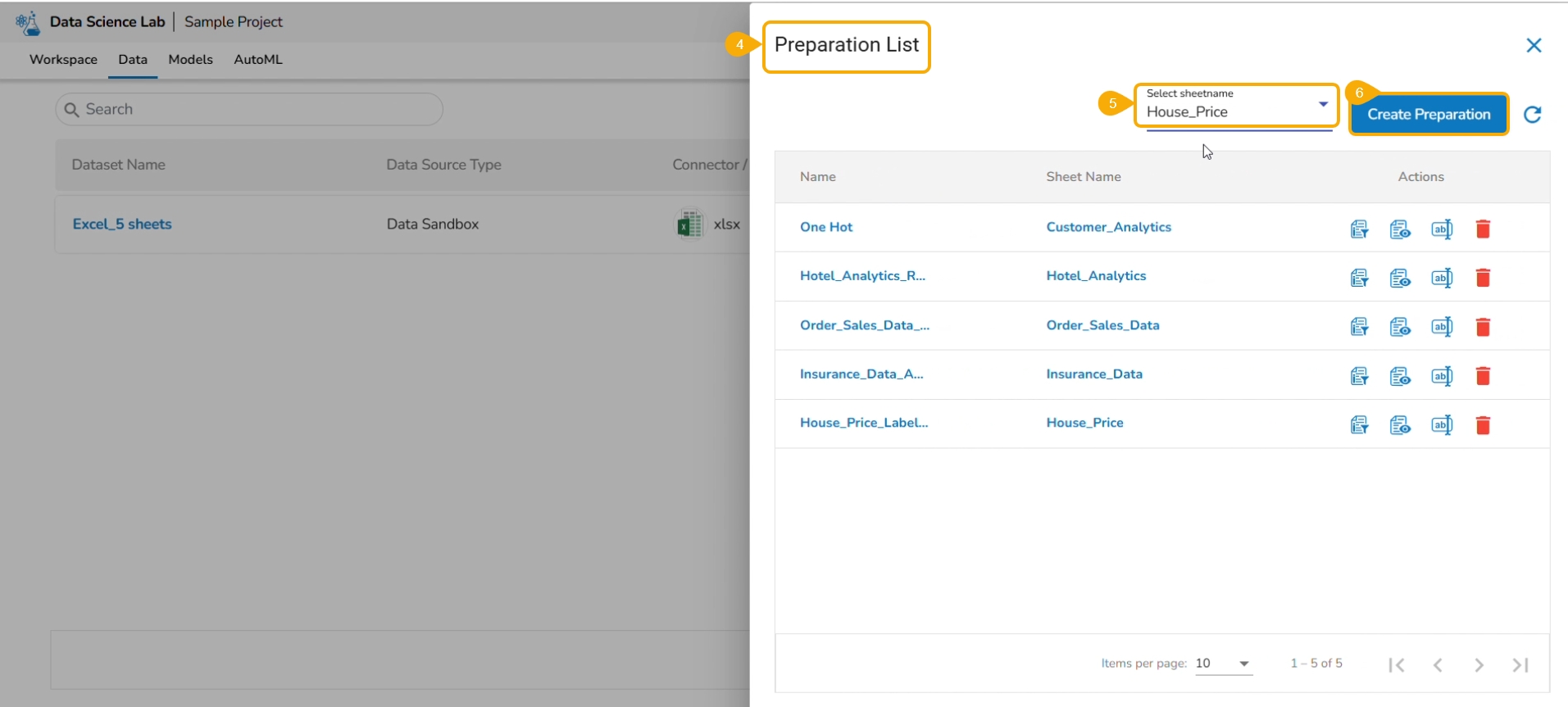
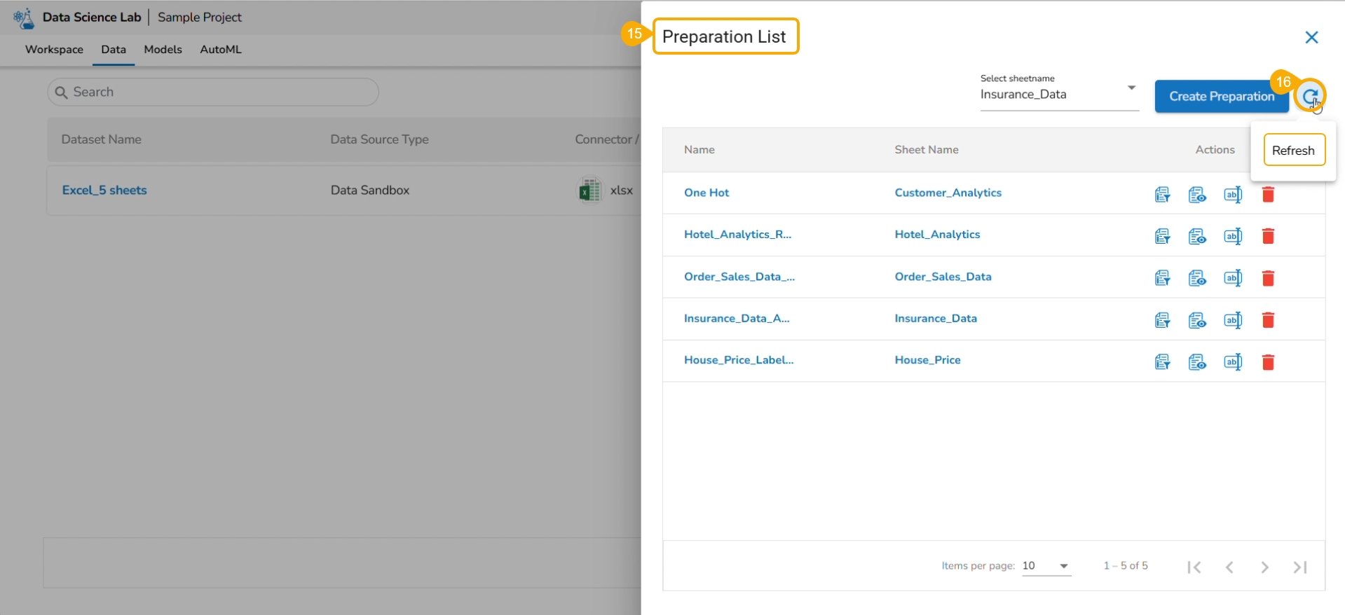
The Preparation List window displays the preparation based on the selected Excel file. The user may use any of the displayed data preparation from the list.
The user can select a sheet name from the given drop-down menu.
Click the Data Preparation option to create a new preparation.
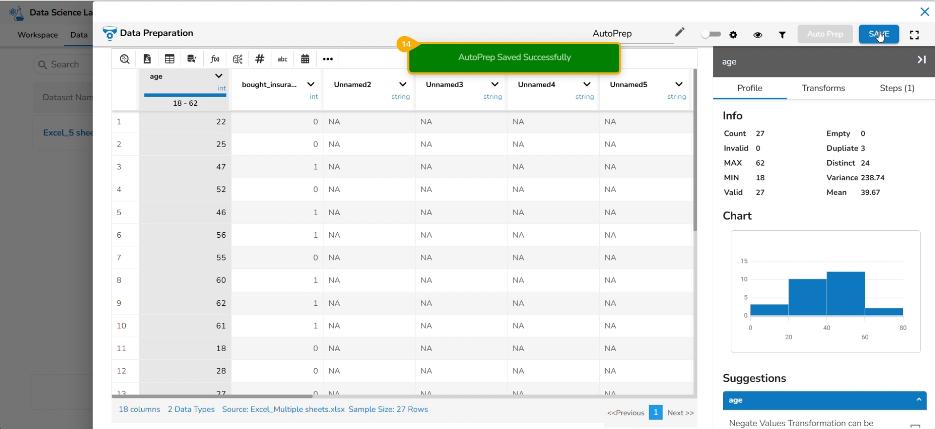
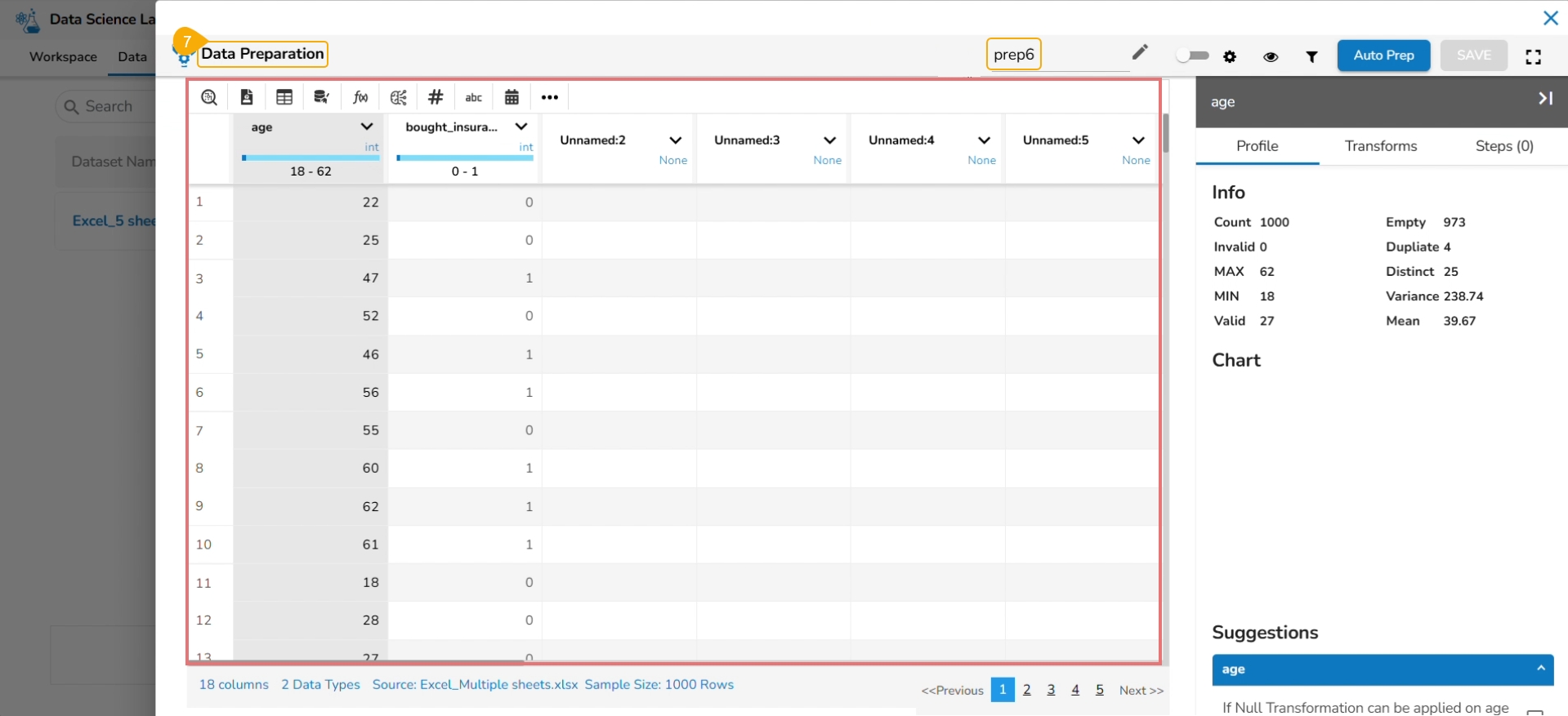
The Data Preparation page opens displaying the dataset in the grid format.
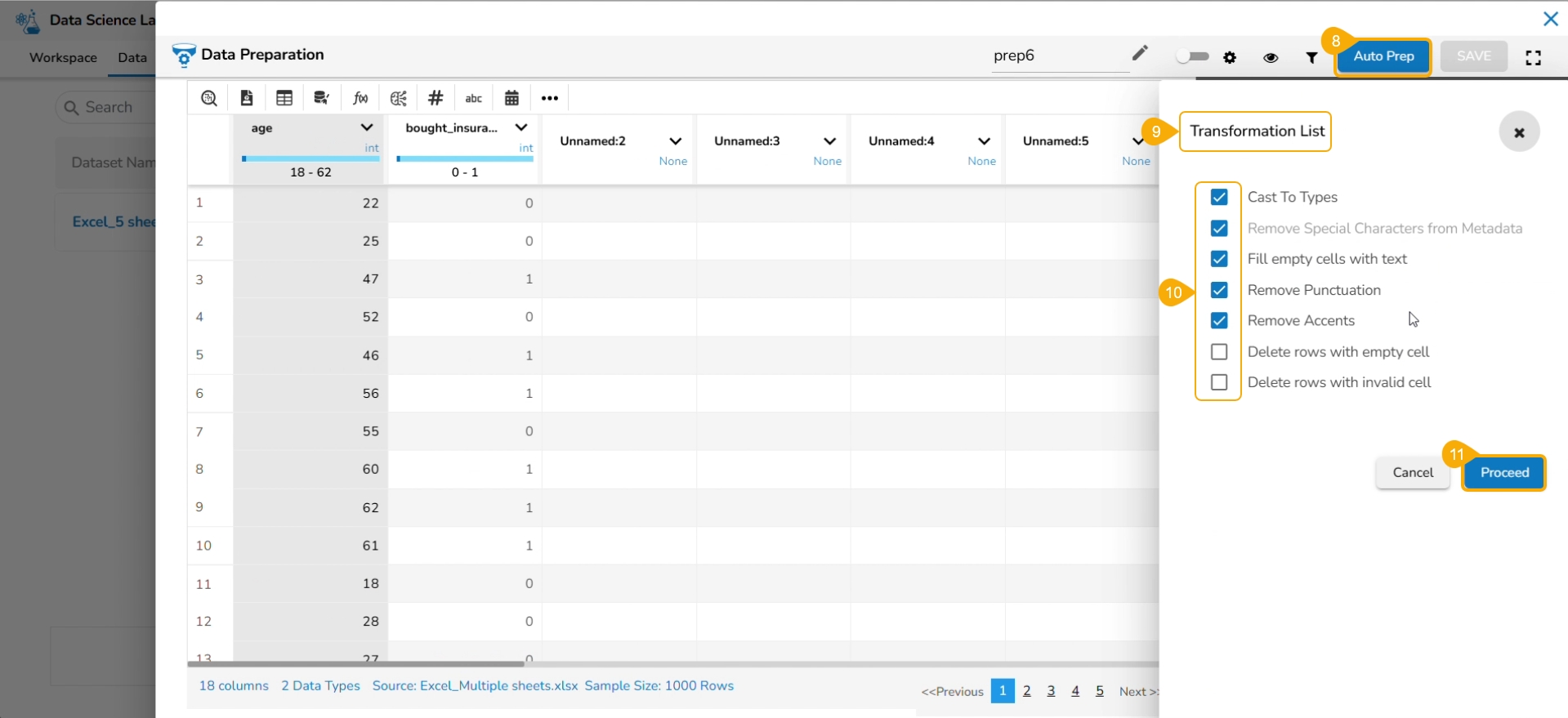
Click the Auto Prep option to apply the default set of transforms under the Auto Prep.
The Transformation List window opens.
Select or dis-select the transforms using the given checkboxes.
Click the Proceed option.
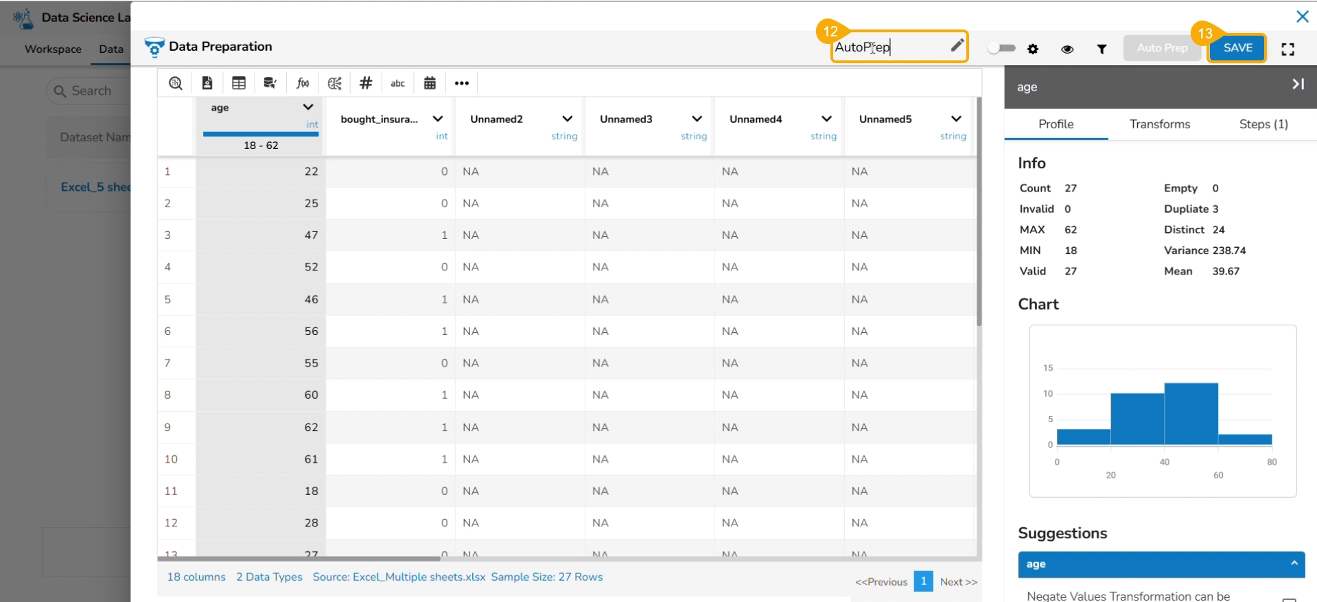
The selected AutoPrep transforms are applied to the dataset. Provide a name for the Data Preparation.
Click the SAVE option.
A notification message informs the users that the data preparation has been saved.
The user gets redirected to the Preparation List window.
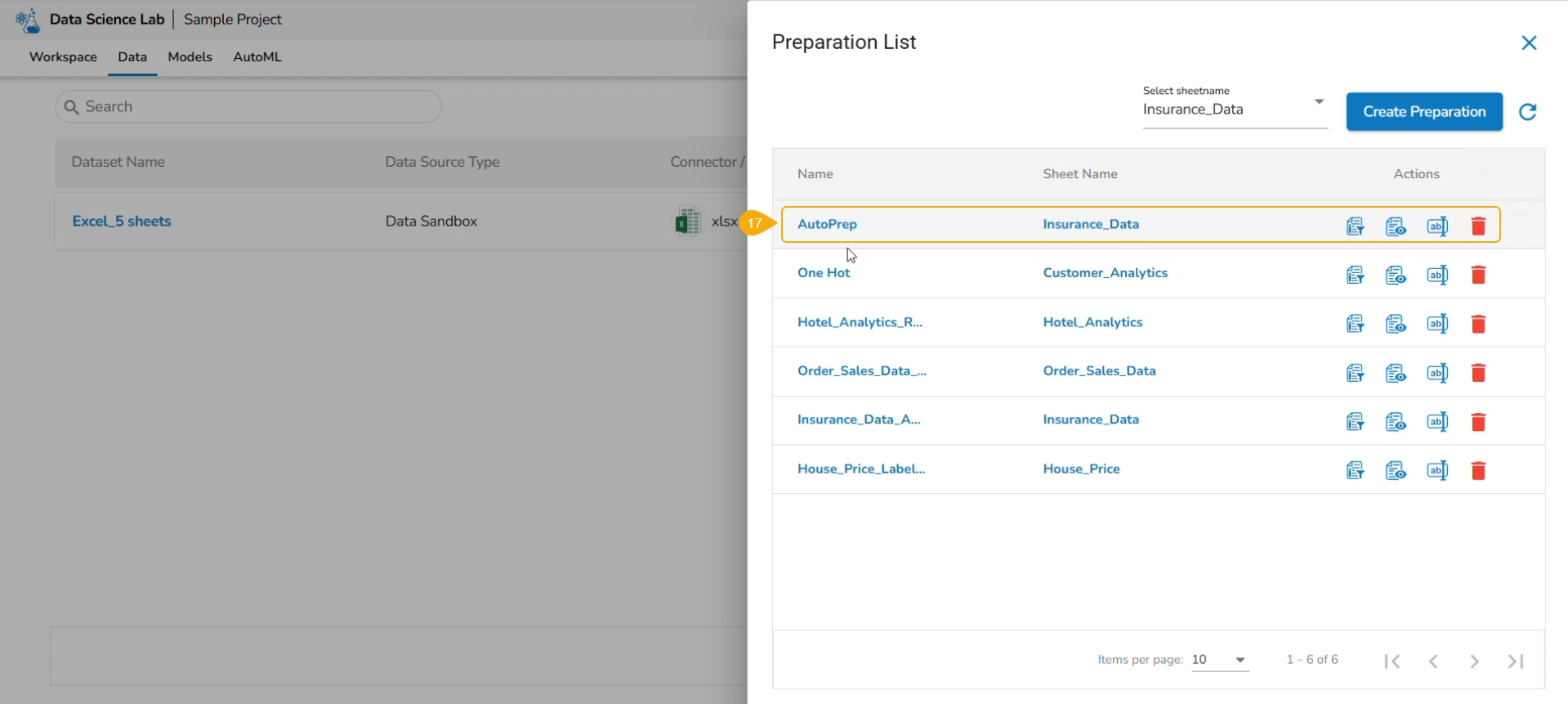
Click the Refresh icon.
The newly created Data Preparation gets added to the Preparation List.
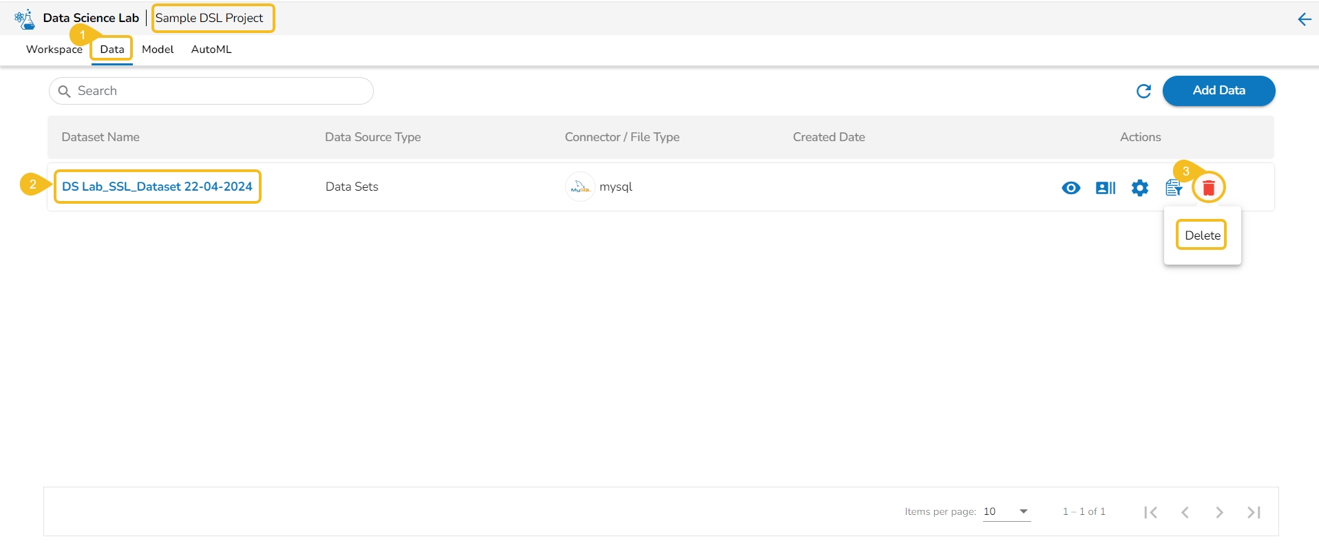
Navigate to the Data tab.
Select a Dataset from the list.
Click the Delete icon.
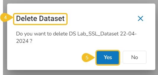
A dialog box opens to ensure the deletion.
Click the Yes option.
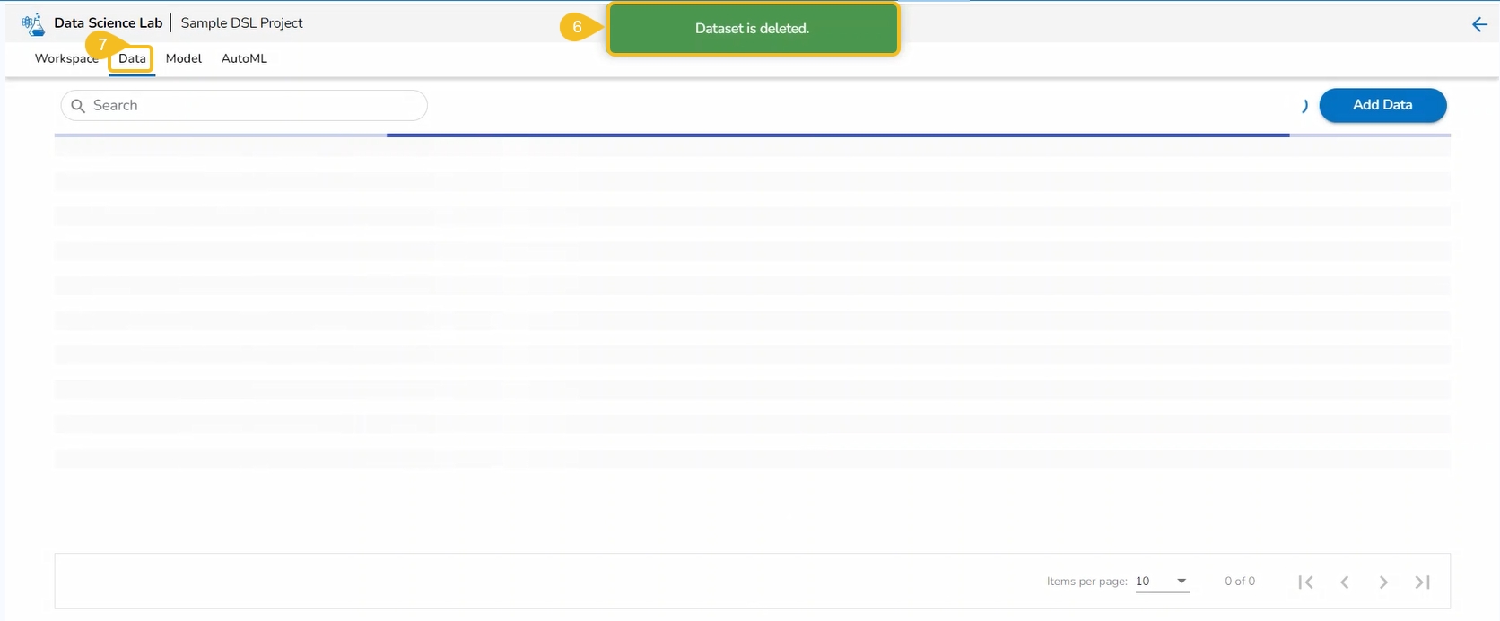
A notification message appears to assure about the completion of the deletion action.
The concerned Data set will be removed from the list.
Please Note: The Preview, Create Experiment, and Data Preparation Actions are not supported for the Datasets based on a Feature Store.
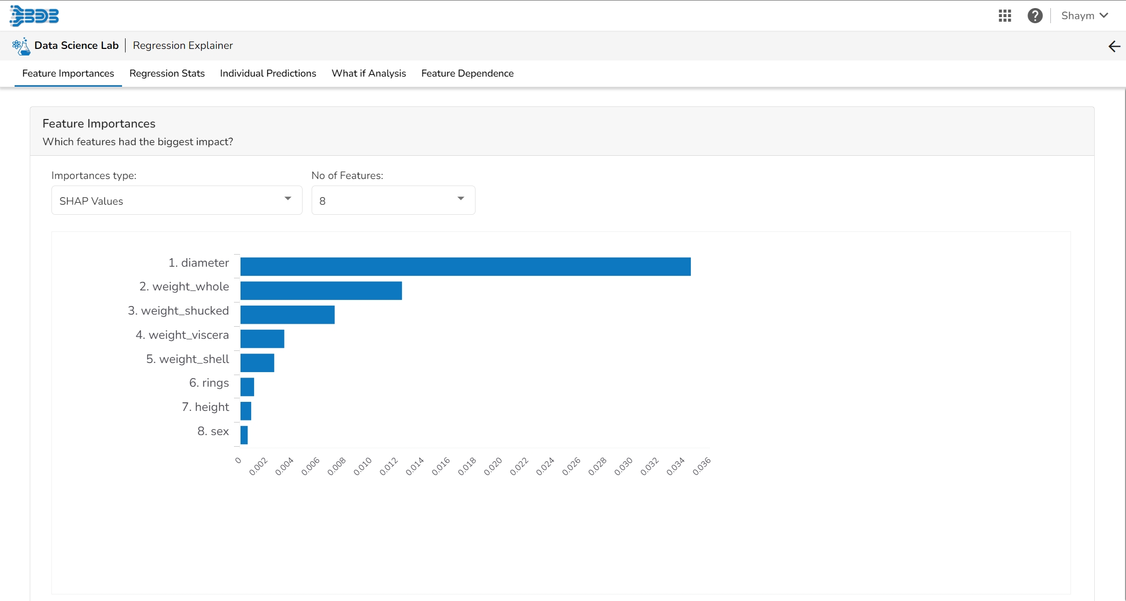
This page provides model explainer dashboards for Regression Models.
Check out the given walk-through to understand the Model Explainer dashboard for the Regression models.
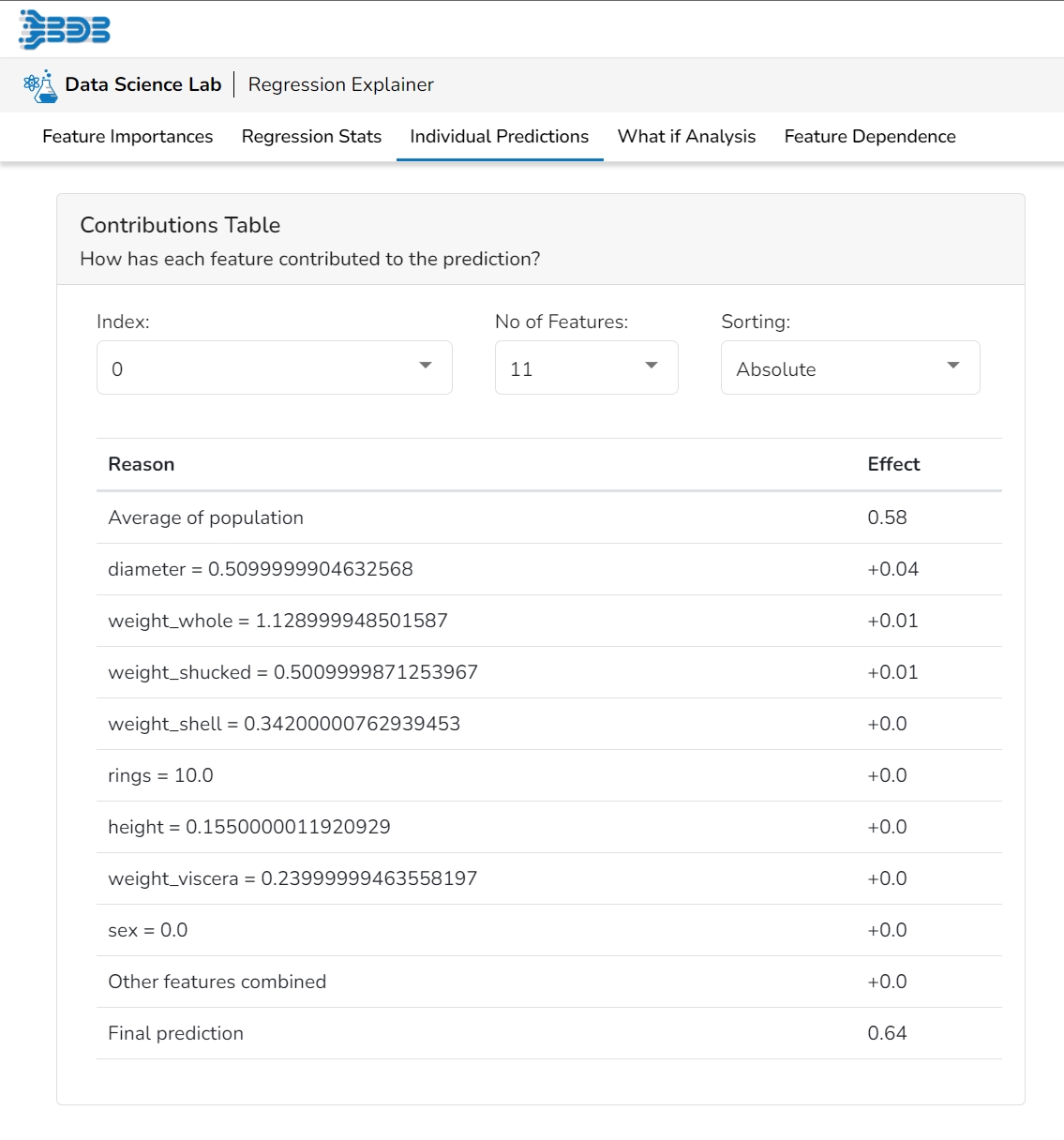
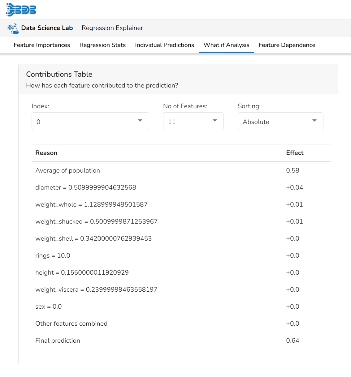
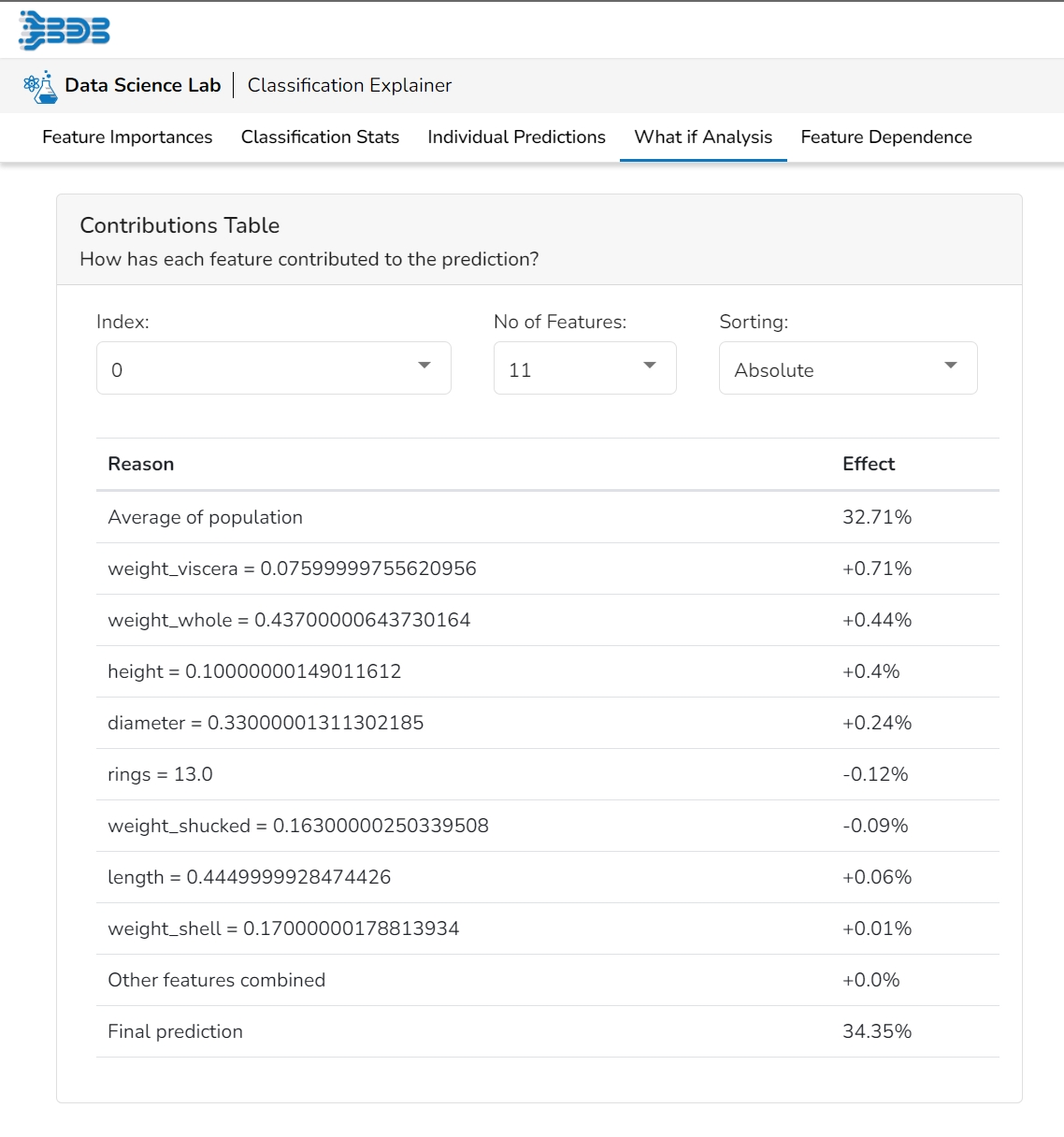
This table shows the contribution each feature has had on prediction for a specific observation. The contributions (starting from the population average) add up to the final prediction. This allows you to explain exactly how each prediction has been built up from all the individual ingredients in the model.
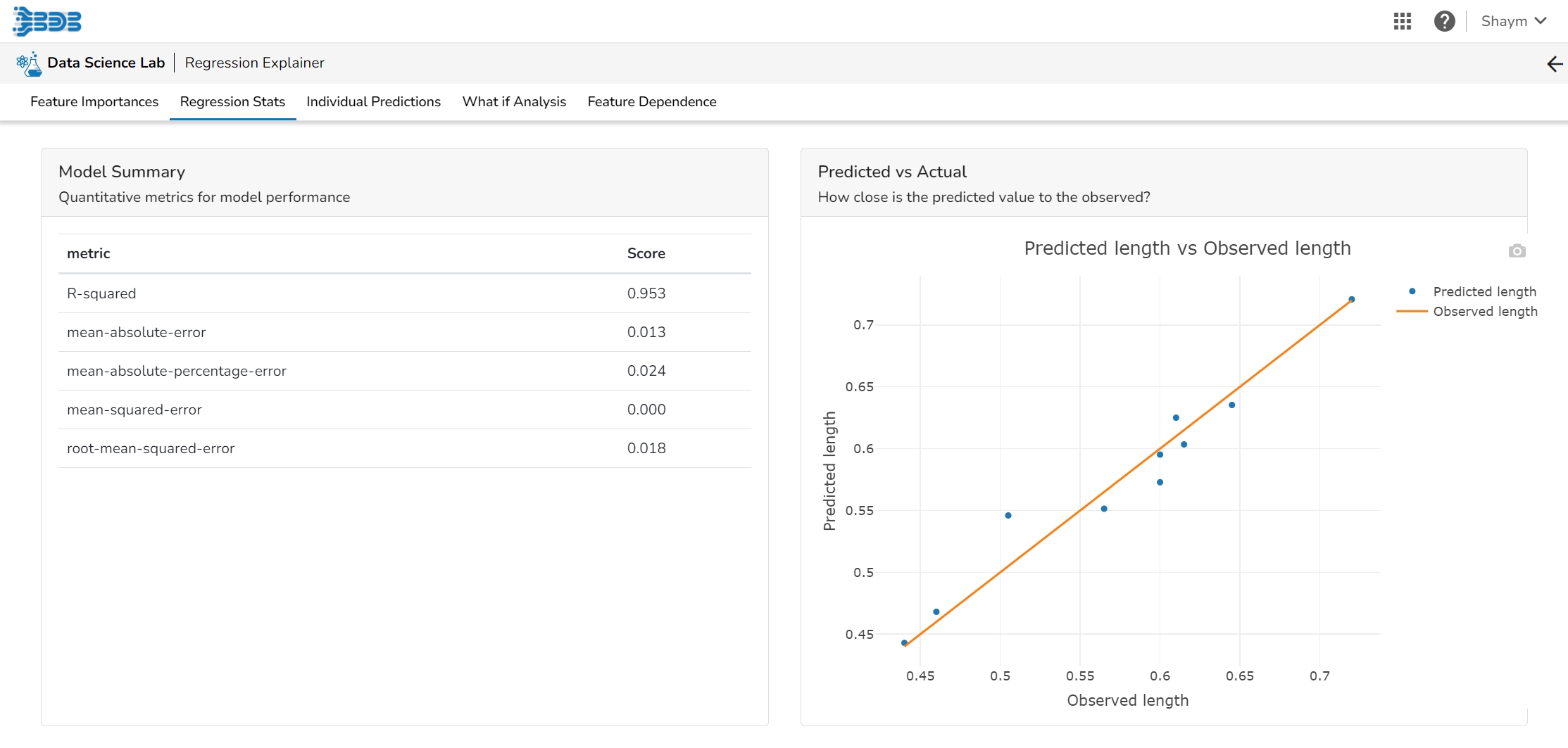
The user can find a number of regression performance metrics in this table that describe how well the model can predict the target column.
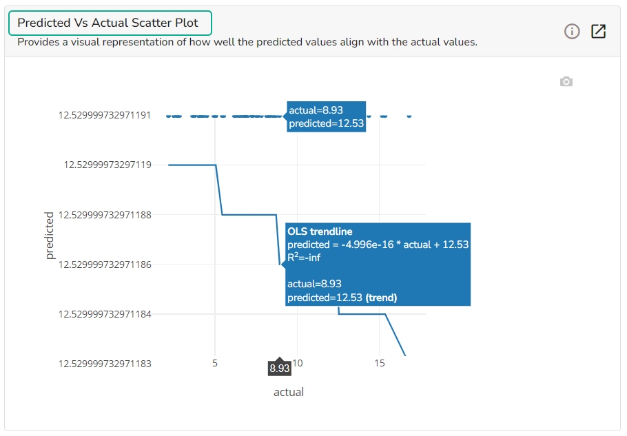
This plot shows the observed value of the target column and the predicted value of the target column. A perfect model would have all the points on the diagonal (predicted matches observed). The further away points are from the diagonal the worse the model is in predicting the target column.
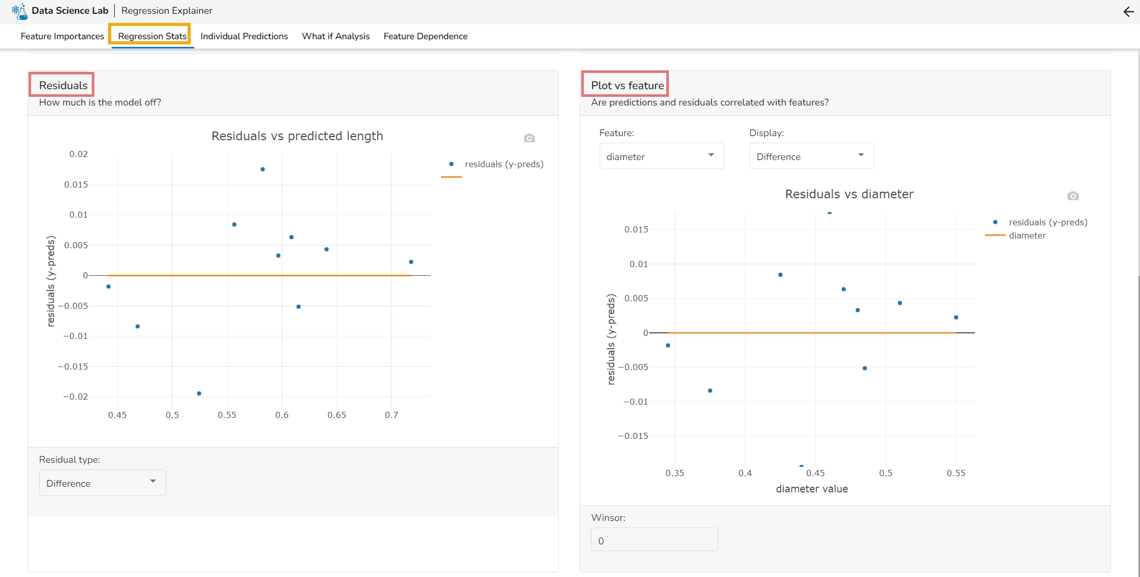
Residuals: The residuals are the difference between the observed target column value and the predicted target column value. in this plot, one can check if the residuals are higher or lower for higher /lower actual /predicted outcomes. So, one can check if the model works better or worse for different target value levels.
Plot vs Features: This plot displays either residuals (difference between observed target value and predicted target value) plotted against the values of different features or the observed or predicted target value. This allows one to inspect whether the model is more inappropriate for a particular range of feature values than others.
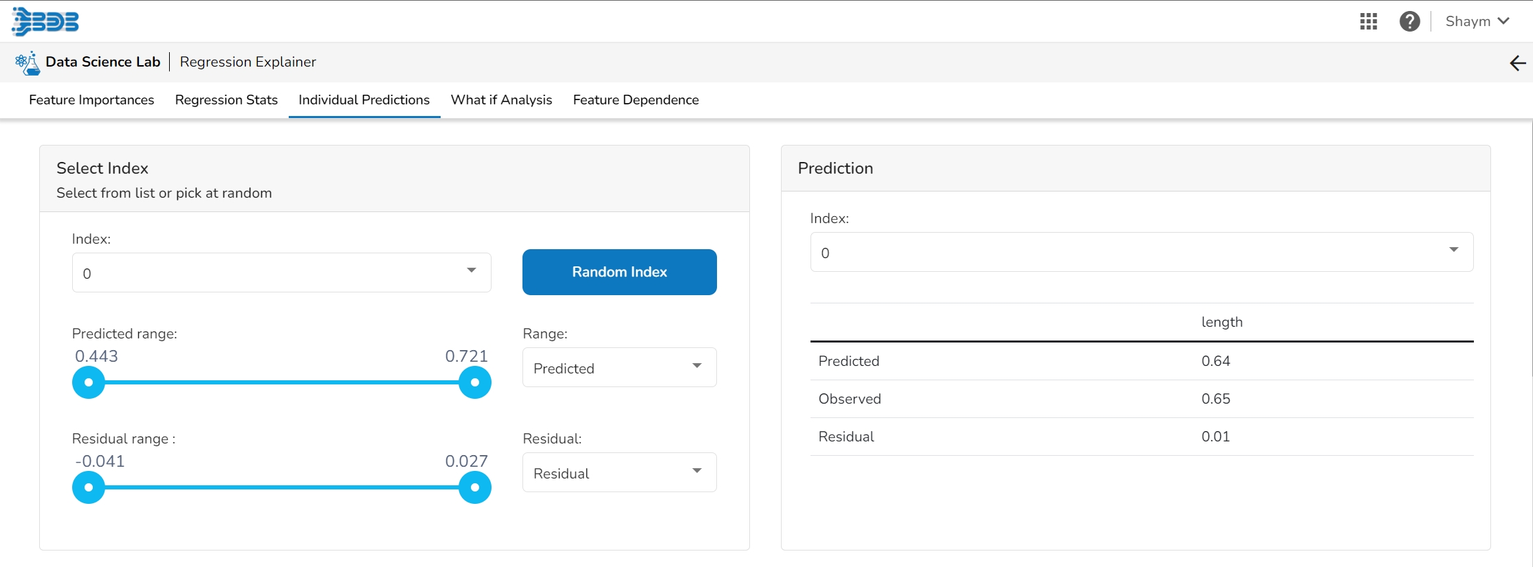
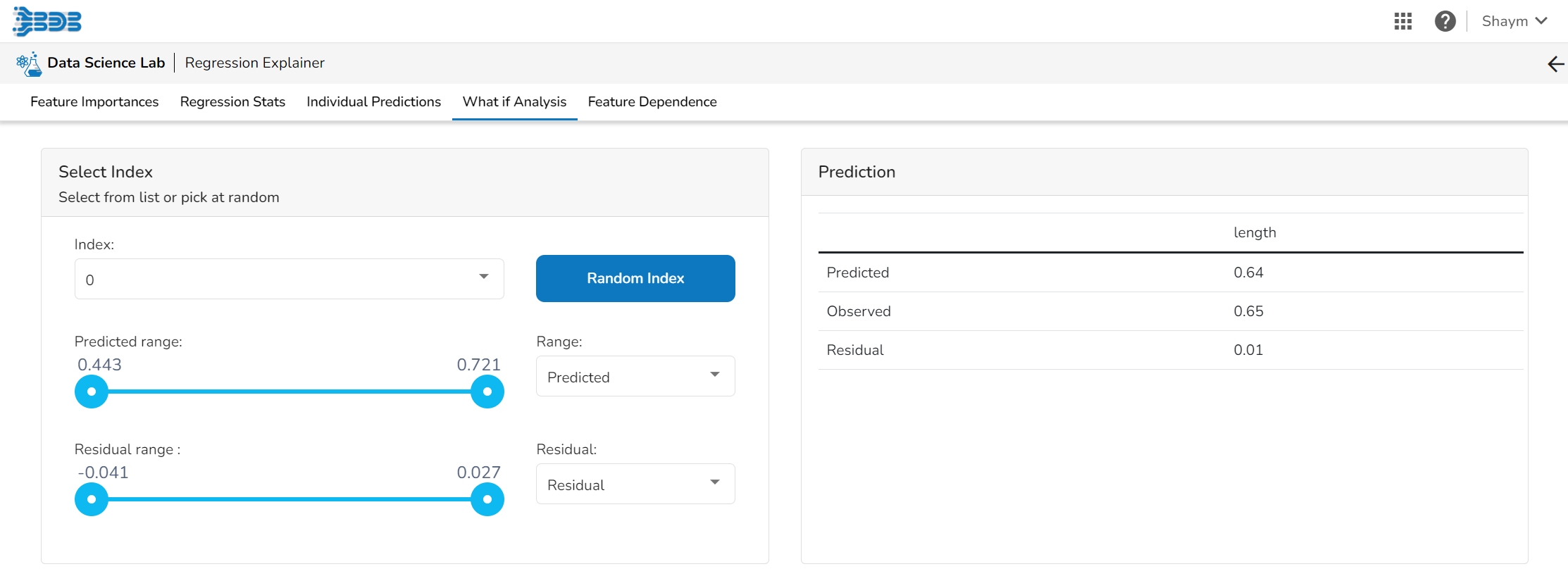
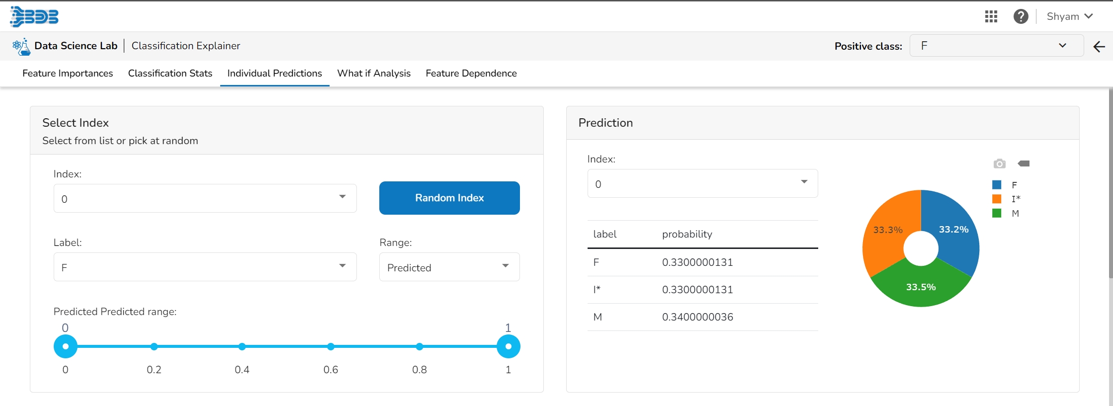
The user can select a record directly by choosing it from the dropdown or hit the Random Index option to randomly select a record that fits the constraints. For example, the user can select a record where the observed target value is negative but the predicted probability of the target being positive is very high. This allows the user to sample only false positives or only false negatives.
It displays the predicted probability for each target label.
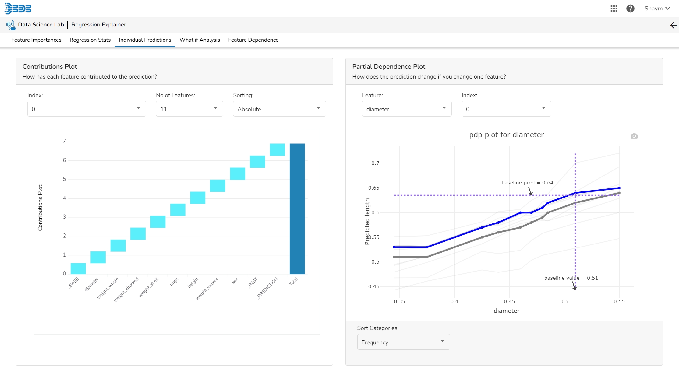
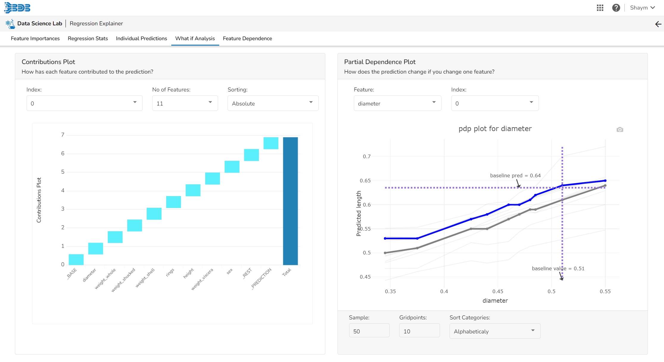
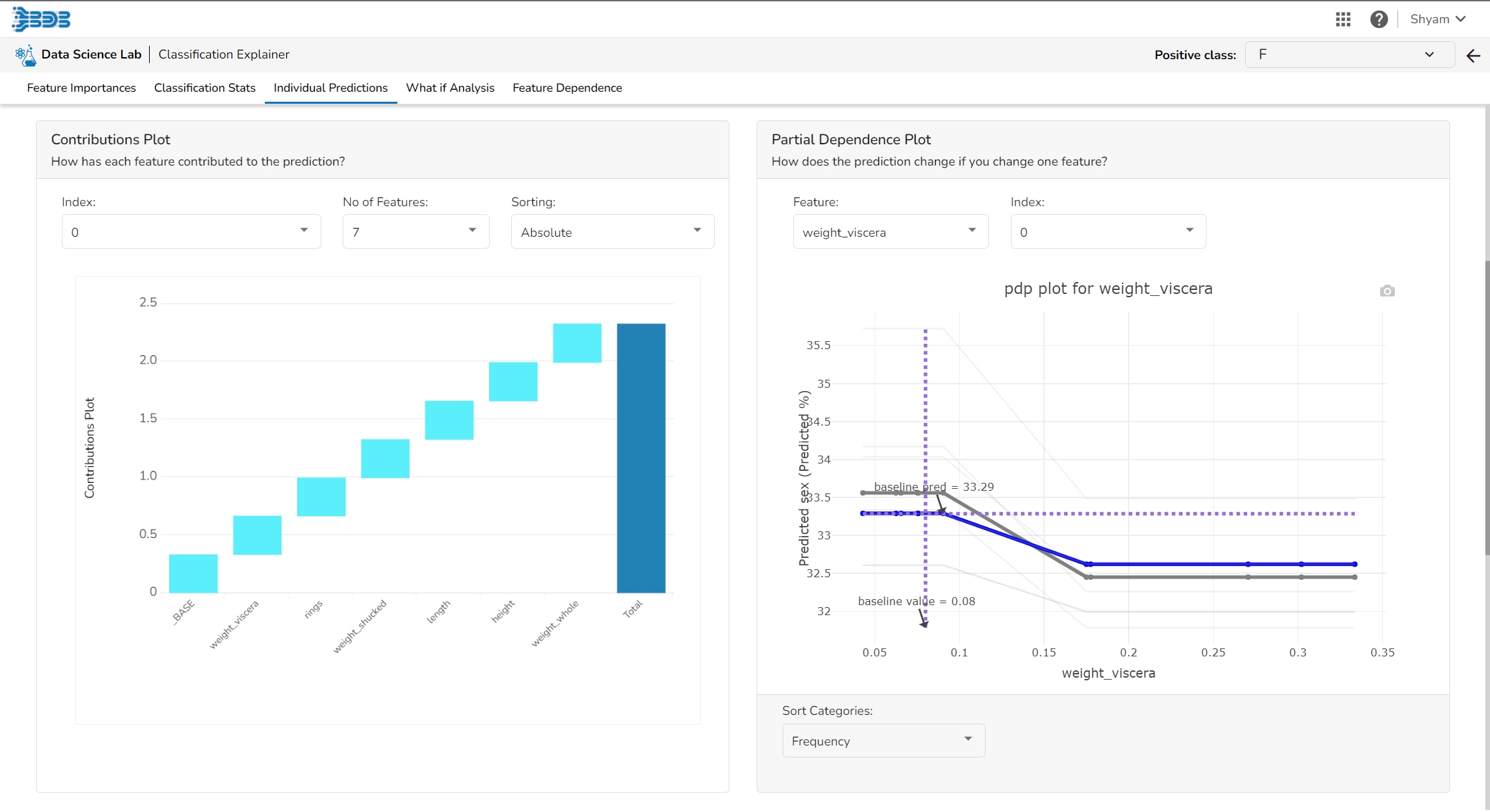
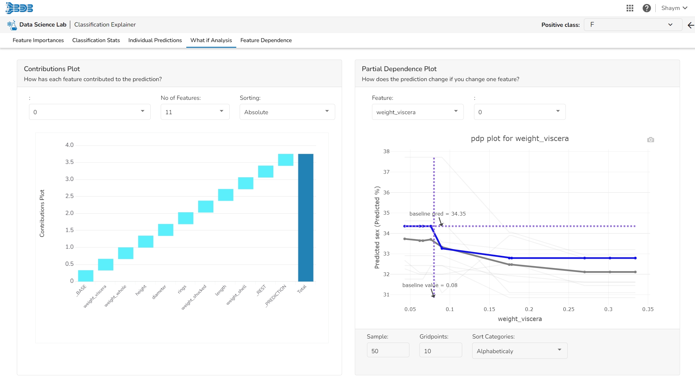
This plot shows the contribution that each feature has provided to the prediction for a specific observation. The contributions (starting from the population average) add up to the final prediction. This helps to explain exactly how each prediction has been built up from all the individual ingredients in the model.
The PDP plot shows how the model prediction would change if you change one particular feature. the plot shows you a sample of observations and how these observations would change with this feature (gridlines). The average effect is shown in grey. The effect of changing the feature for a single record is shown in blue. The user can adjust how many observations to sample for the average, how many gridlines to show, and how many points along the x-axis to calculate model predictions for (grid points).
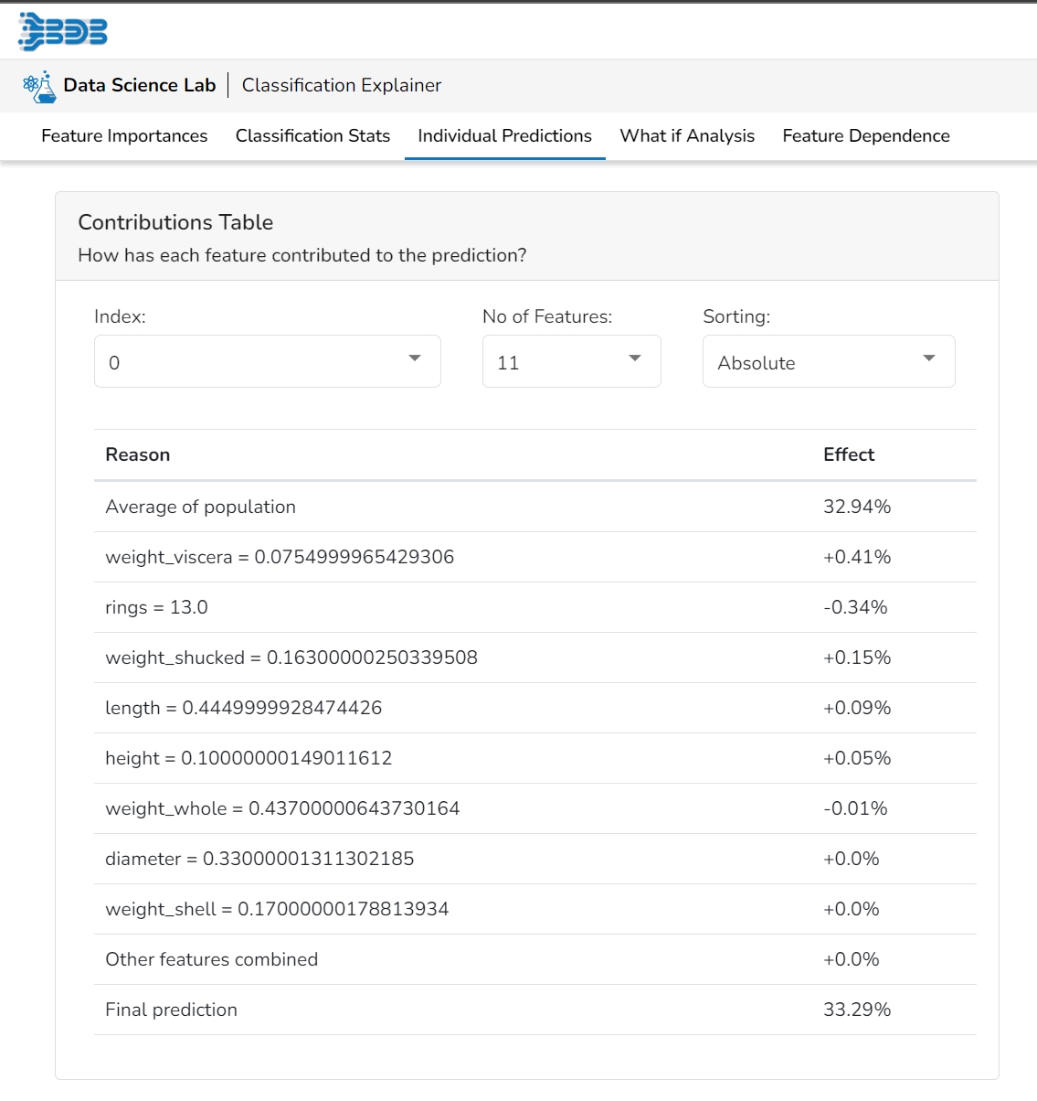
This table shows the contribution each individual feature has had on the prediction for a specific observation. The contributions (starting from the population average) add up to the final prediction. This allows you to explain exactly how each individual prediction has been built up from all the individual ingredients in the model.
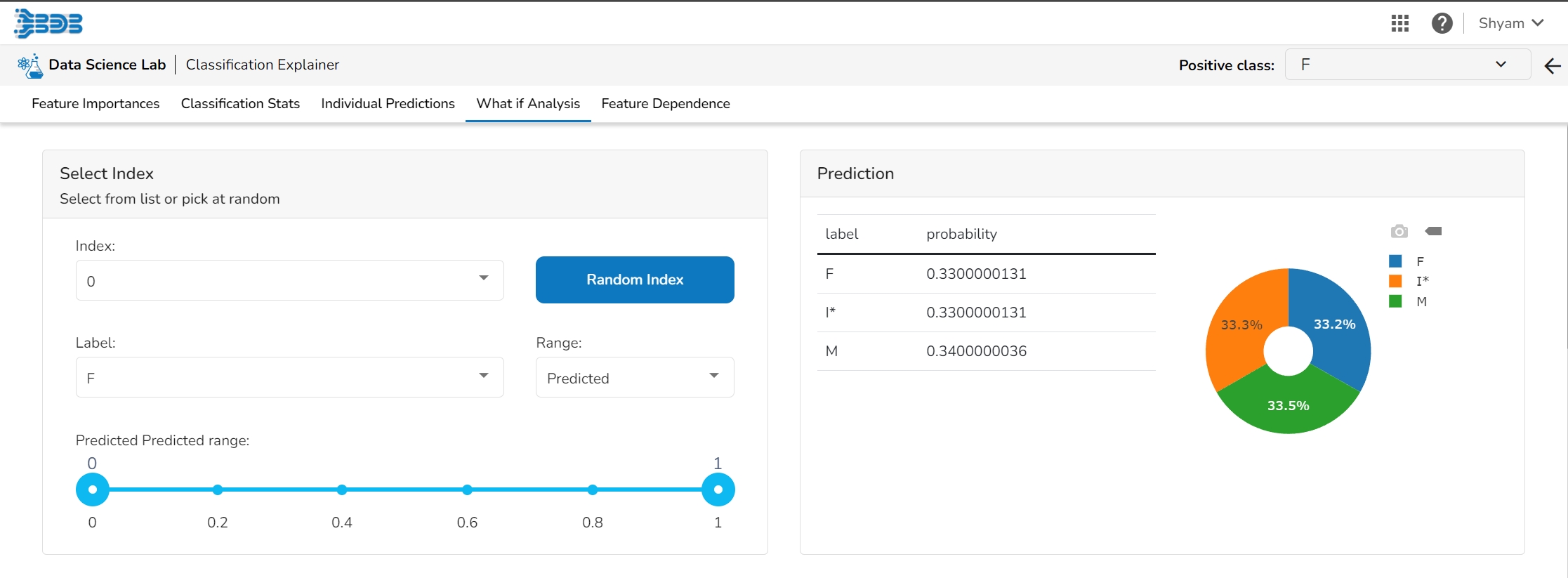
The user can select a record directly by choosing it from the dropdown or hit the Random Index option to randomly select a record that fits the constraints. For example, the user can select a record where the observed target value is negative but the predicted probability of the target being positive is very high. This allows the user to sample only false positives or only false negatives.
It displays the predicted probability for each target label.
The user can adjust the input values to see predictions for what-if scenarios.
This table shows the contribution each individual feature has had on the prediction for a specific observation. The contributions (starting from the population average) add up to the final prediction. This allows you to explain exactly how each individual prediction has been built up from all the individual ingredients in the model.
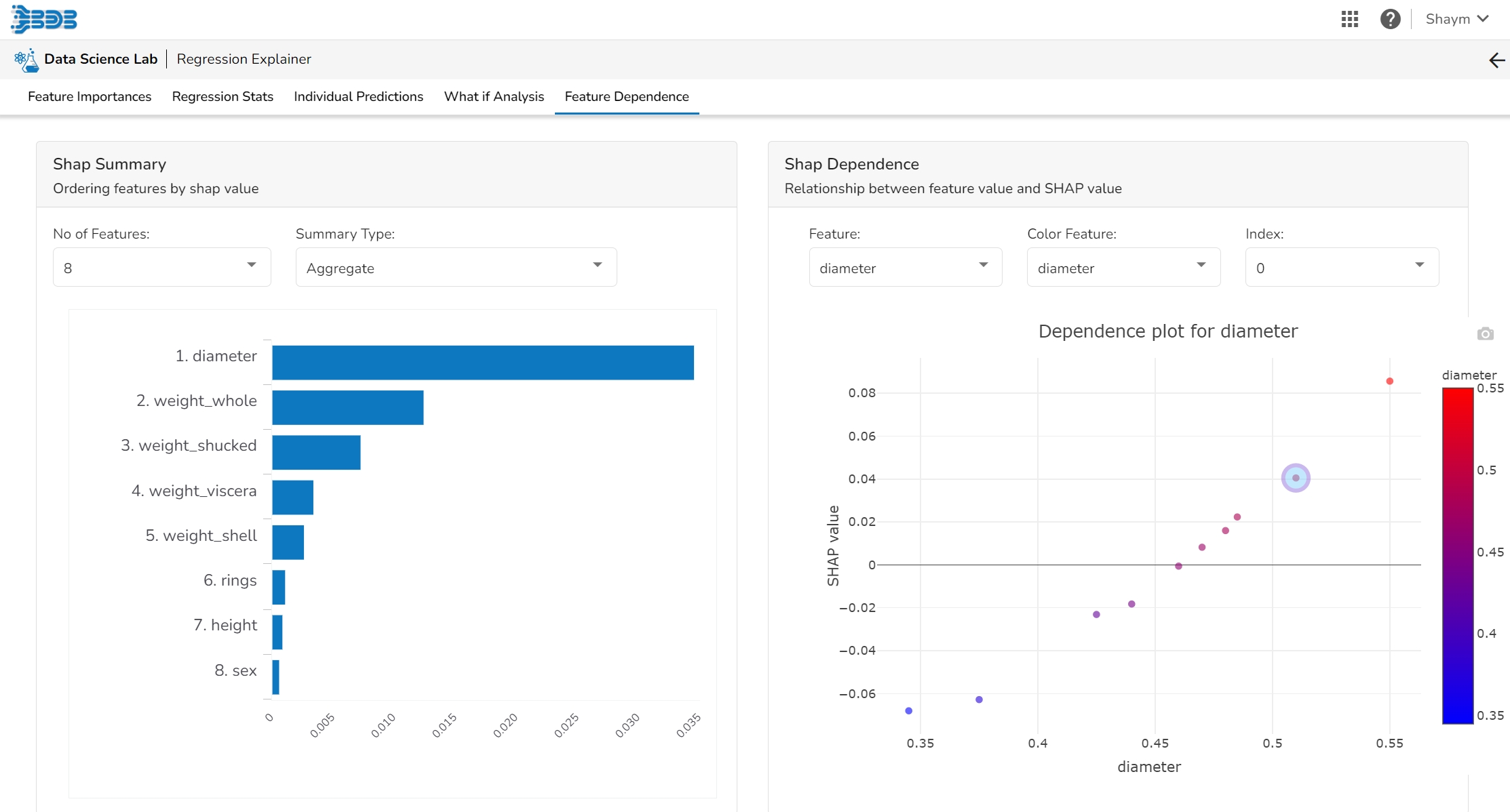
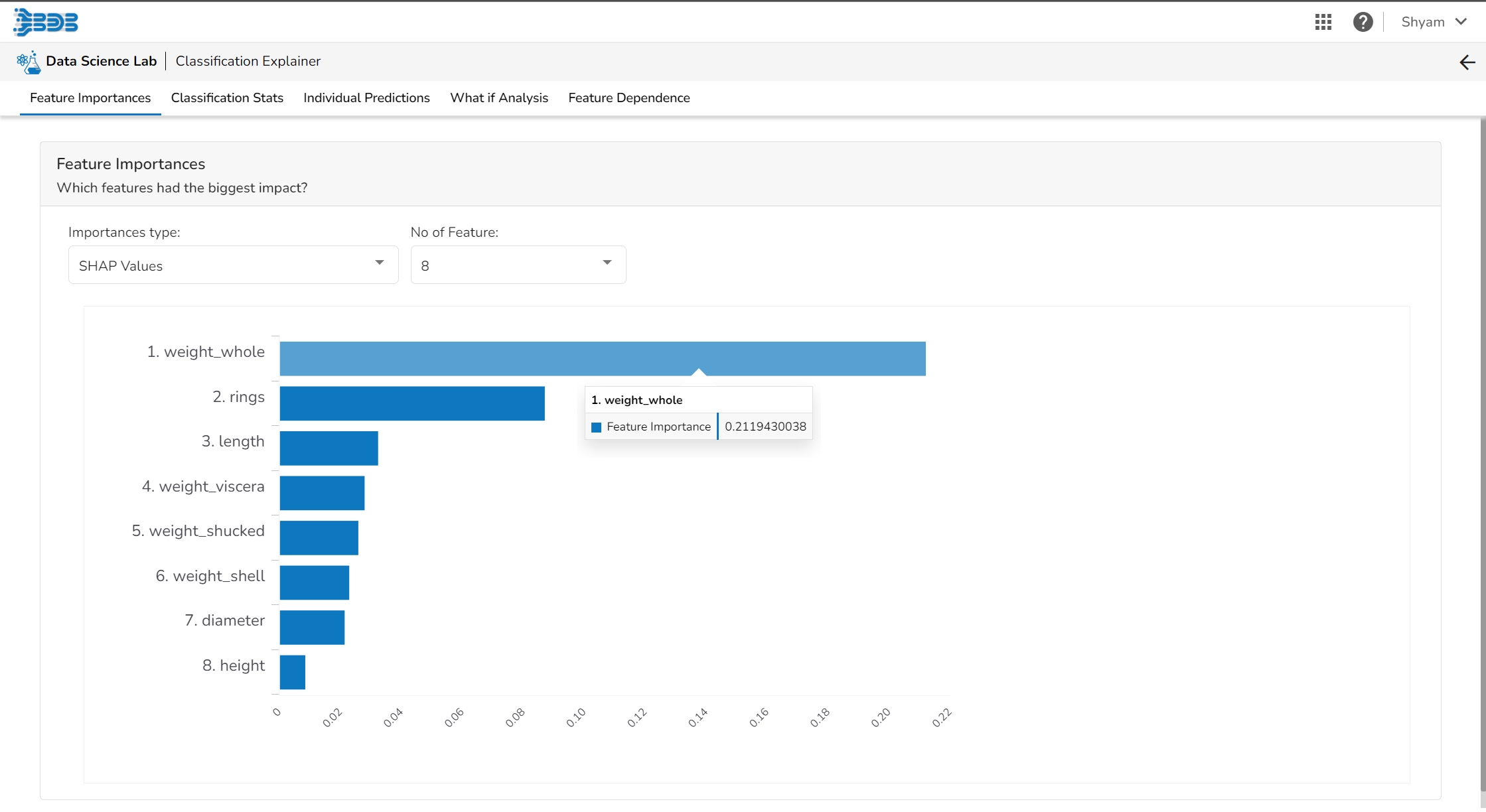
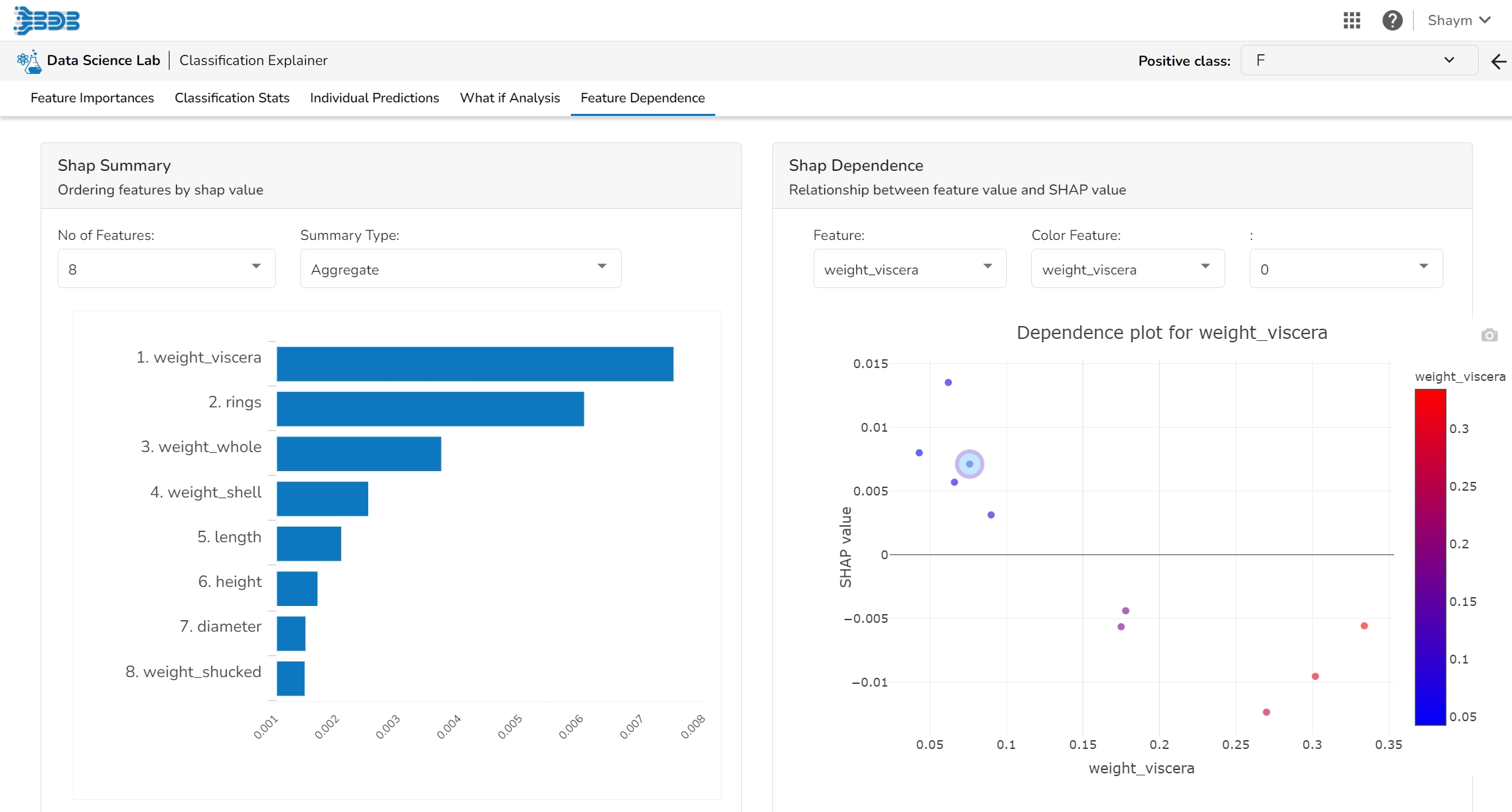
The Shap Summary summarizes the Shap values per feature. The user can either select an aggregate display that shows the mean absolute Shap value per feature or get a more detailed look at the spread of Shap values per feature and how they co-relate the feature value (red is high).
This plot displays the relation between feature values and Shap values. This allows you to investigate the general relationship between feature value and impact on the prediction. The users can check whether the model uses features in line with their intuitions, or use the plots to learn about the relationships that the model has learned between the input features and the predicted outcome.
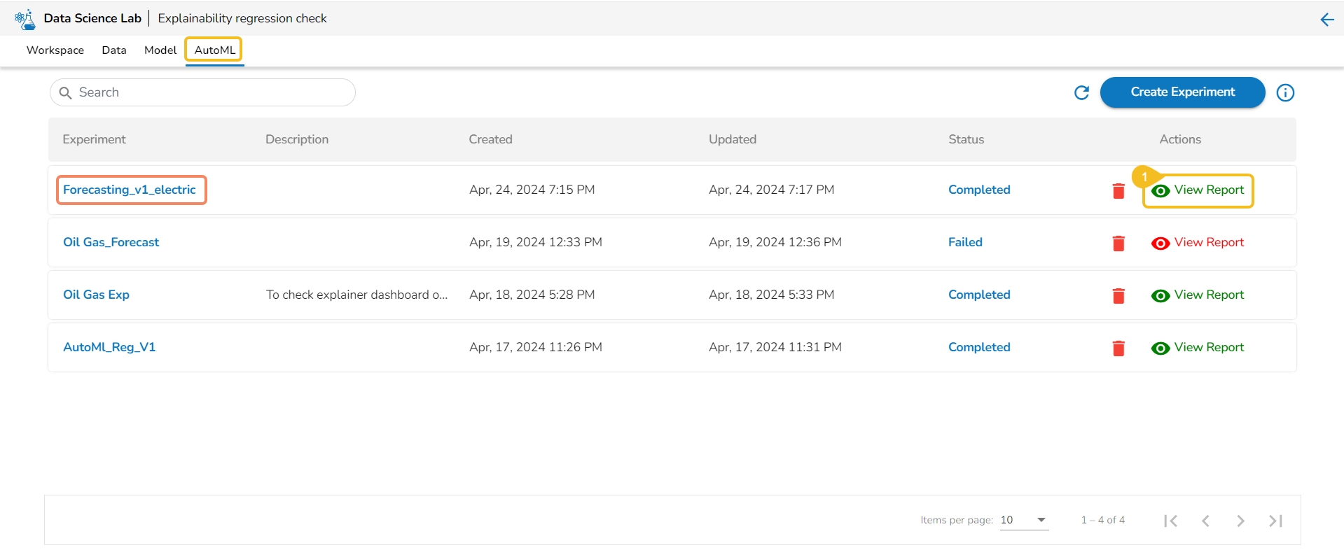
This section describes the Actions provided for the created AutoML experiments on the AutoML List page.
Once the initiated AutoML experiment is completed, it gets two Actions. The allotted Actions for an AutoML Experiment are:
Delete
View Report
It is indicated in Green color for the Completed Experiments (for the successful experiment).
It is indicated in Red color for the Failed Experiments).
This option provides the summary of the experiment (completed or failed) along with the details of the recommended model (in case of a completed experiment).
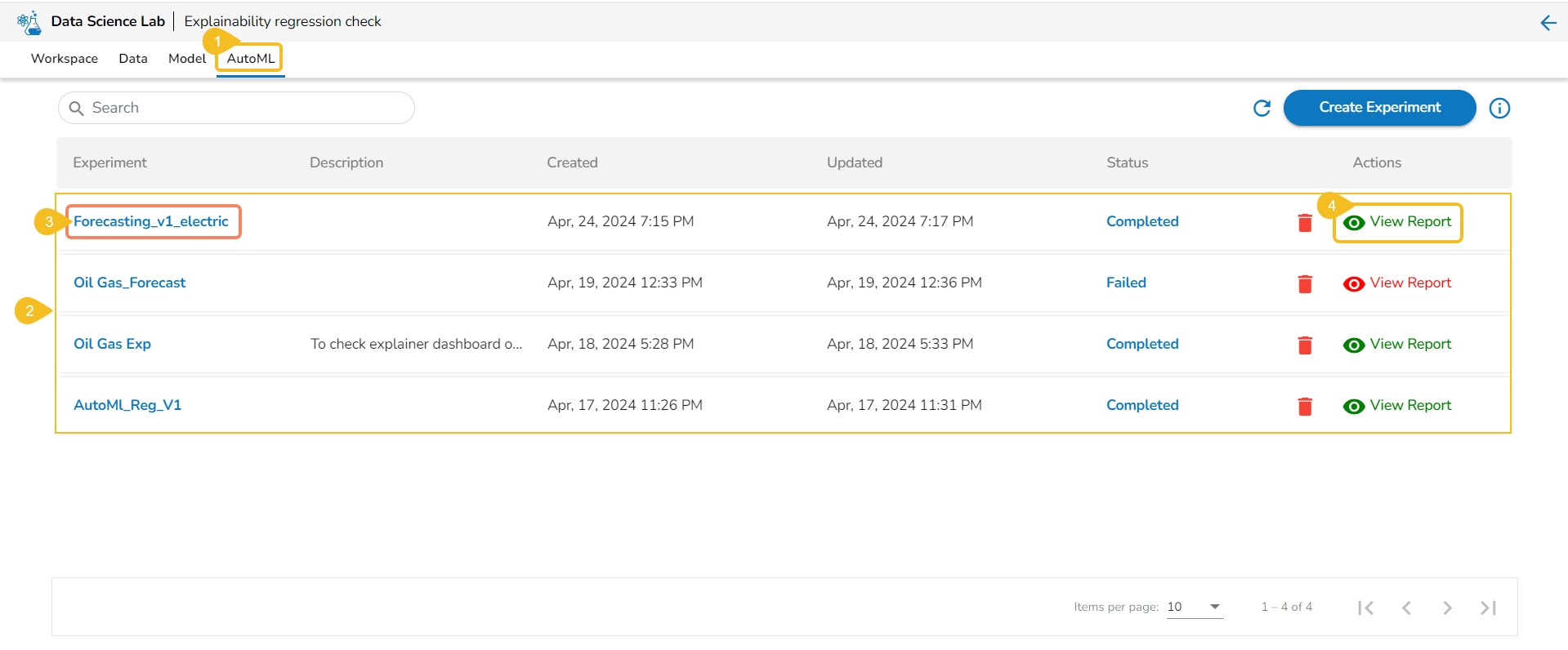
Navigate to the Auto ML tab.
All the created Experiments will be listed.
Select a Completed experiment.
Click the View Report option from the Actions column.
The Details tab opens for the selected completed experiment.
The Details tab opens while clicking the View Report icon for an experiment with Completed status.
Click the View Report option for a completed experiment.
The Details tab opens by default displaying the following details for the model:
Recommended Model: This will be the most suitable model determined based on the metric score of the model.
Model Name: Name of the model
Model Score: Score of the model
Metric Value: On which basis the model was considered
Created On: Date of model creation
Run Summary: This portion will have the basic information about the experiment and trained model.
Task Type: it displays the selected algorithm name to complete the experiment.
Experiment Status: This indicates the status of the AutoML model.
Created By: Name of the creator.
Dataset: mentions the dataset.
Target Column: It indicates the target column.
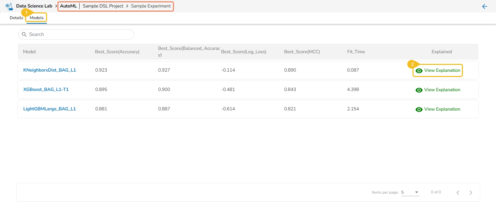
The Models tab lists the top three models based on their metrics score. The user gets the View Explanation option for each of the selected top three models to explain the details of that model.
Navigate to the Models tab of a completed Auto ML experiment.
Select a Model from the displayed list and click the View Explanation option. The View Explanation option allows the users to check details about each of the top 3 models.
A new page opens displaying the various information for the selected Model.
The following options are displayed for a selected model:
Model Summary: This tab displays the model summary for the selected model. It opens by default.
Model Interpretation: This tab contains the Model Explainer dashboard displaying the various details for the model.
Dataset Explainer: This tab displays the Data Profile of the dataset for the selected model.
If the user opens the View Report option for a failed Experiment, it will display the Model Logs and mention the reason for the model's failure.
Navigate to the Auto ML tab.
Select a Failed experiment.
Click the View Report option from the Actions column.
The Logs tab opens for the selected completed experiment.
The Model Logs are displayed with the reason for failure.
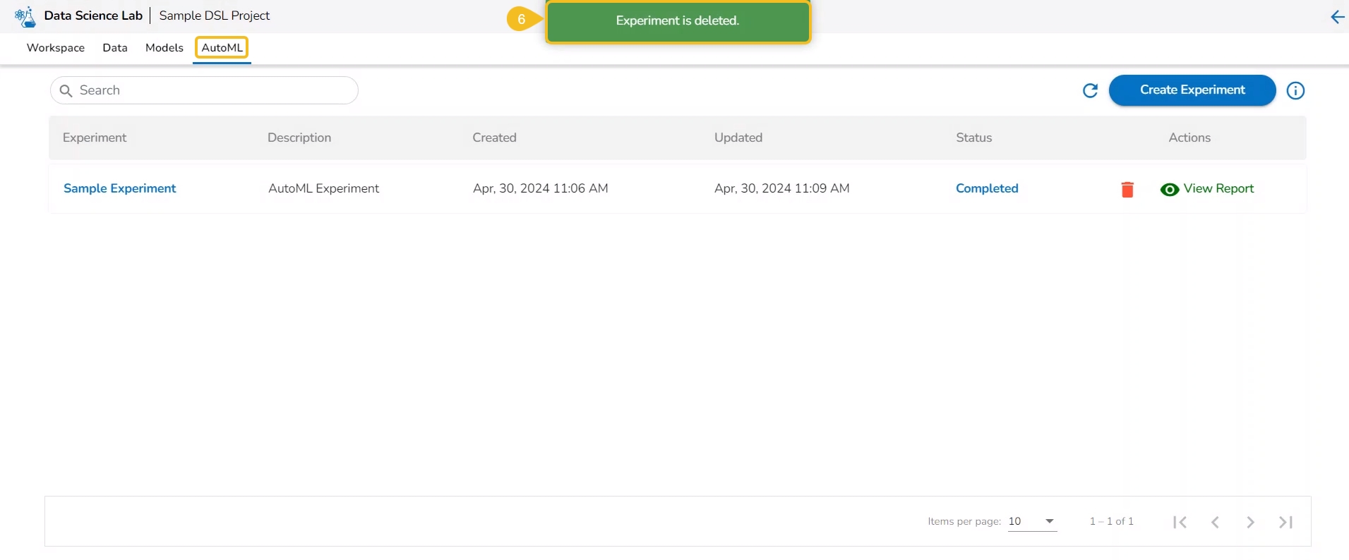
The Delete option helps the user to remove the selected AutoML from the list.
Check out the walk-through to understand the steps to Delete an AutoML.
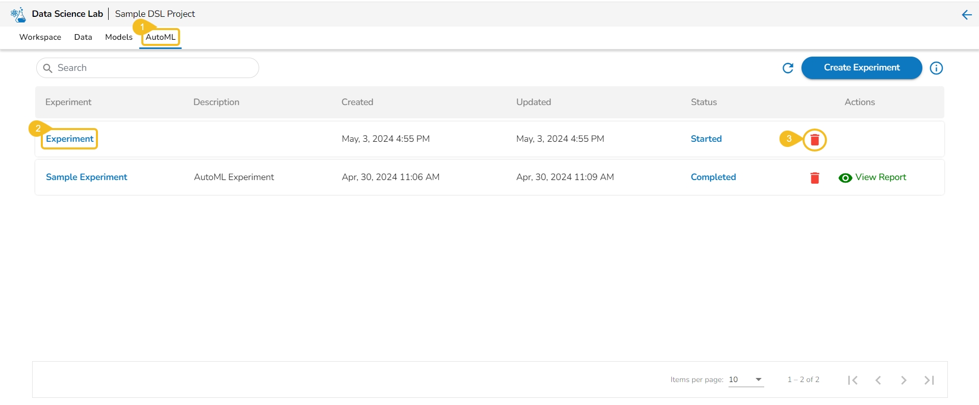
Navigate to the Auto ML list page.
Select a model/experiment from the list. (It can be any experiment irrespective of the Status).
Click the Delete icon for the model.
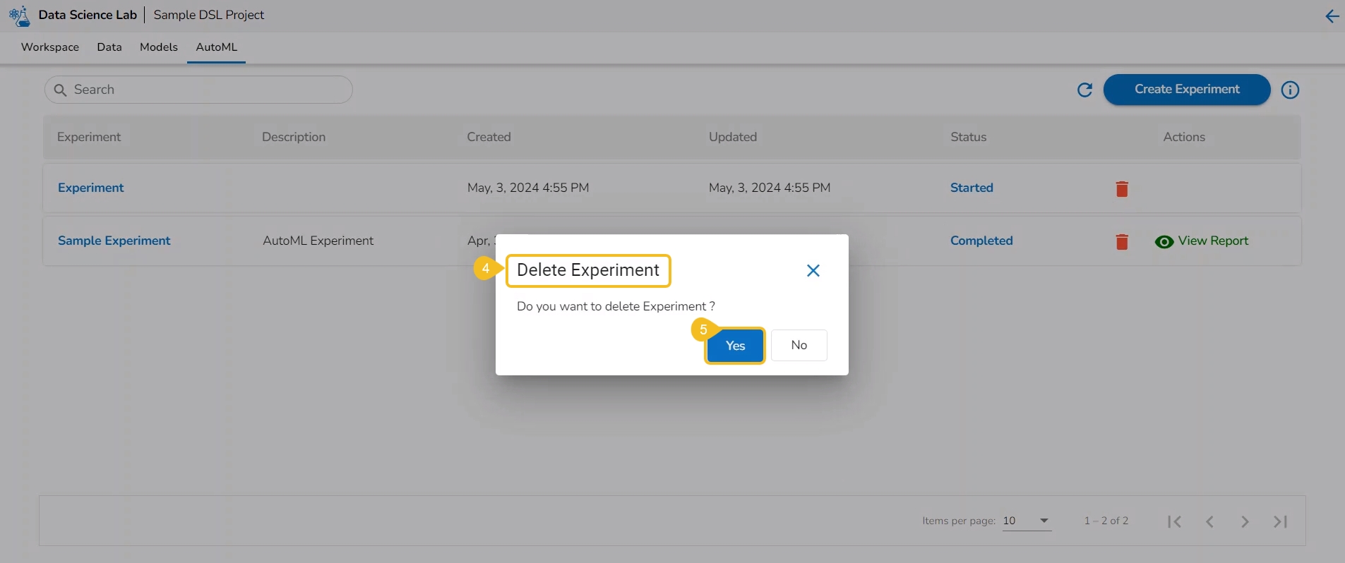
A dialog box opens to ensure the deletion.
Click the Yes option.
The selected experiment gets removed from the list.
Please Note: The user can remove any Auto ML experiment irrespective of its status.
This page provides model explainer dashboards for Forecasting Models.
Check out the given walk-through to understand the Model Explainer dashboard for the Forecasting models.
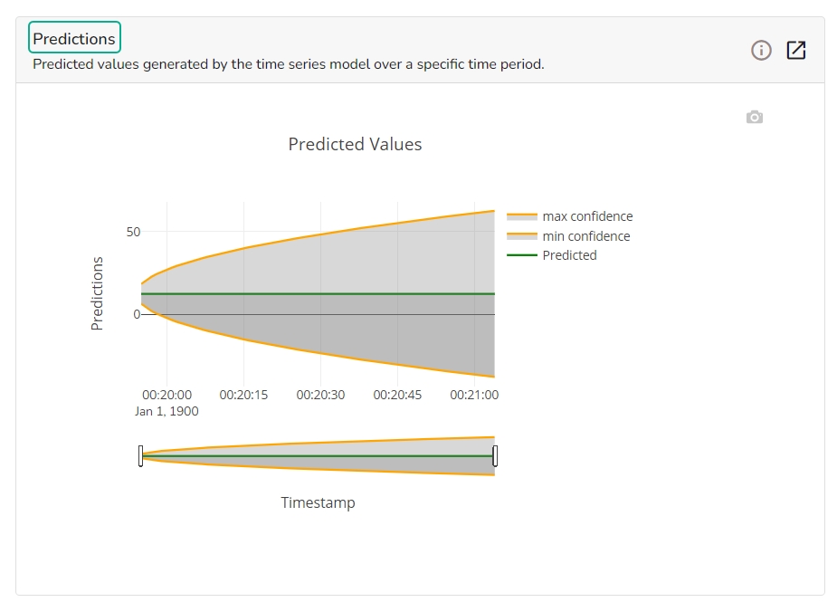
The forecasting model stats get displayed through the Timeseries visualization that presents values generated over based on the selected time.
This chart will display predicted values generated by the timeseries model over a specific time period.
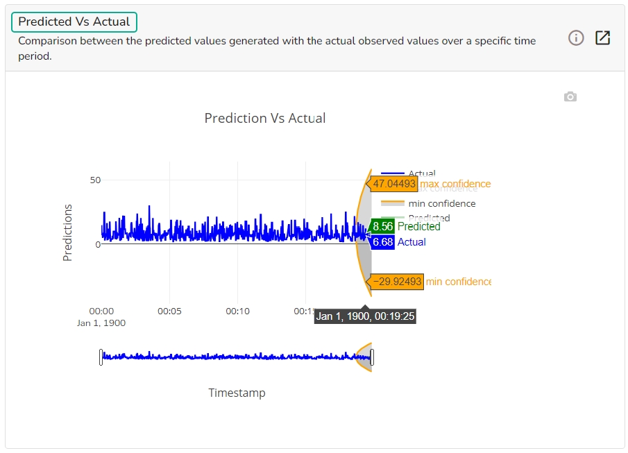
This chart displays a comparison of the predicted values with the actual obsereved vlaues over a specific period of time.
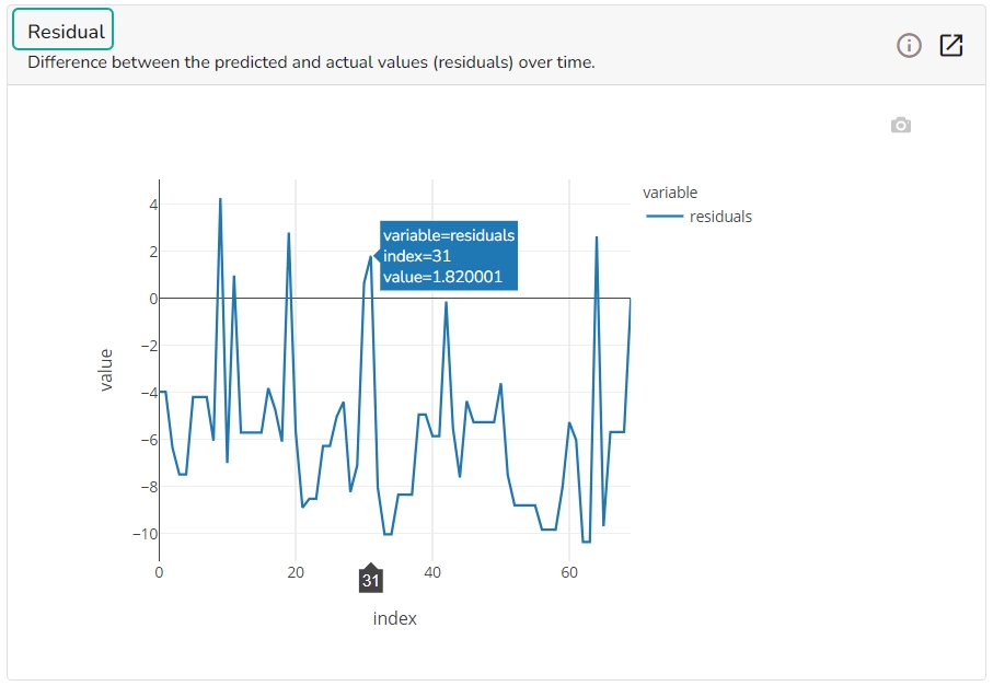
It depicts difference between the predicted and actual (residuals) values over a period of time.
A Scatter Plot chart is displayed depicting how well the predicted values align with the actual values.
This page provides model explainer dashboards for Classification Models.
Check out the given walk-through to understand the Model Explainer dashboard for the Classification models.
This table shows the contribution each feature has had on prediction for a specific observation. The contributions (starting from the population average) add up to the final prediction. This allows you to explain exactly how each prediction has been built up from all the individual ingredients in the model.
This tab provides various stats regarding the Classification model.
It includes the following information:
Select a model cutoff such that all predicted probabilities higher than the cutoff will be labeled positive and all predicted probabilities lower than the cutoff will be labeled negative. The user can also set the cutoff as a percentile of all observations. By setting the cutoff it will automatically set the cutoff in the multiple other connected components.
It displays a list of various performance metrics.
The Confusion matrix/ shows the number of true negatives (predicted negative, observed negative), true positives (predicted positive, observed positive), false negatives (predicted negative but observed positive), and false positives (predicted positive but observed negative). The number of false negatives and false positives determine the costs of deploying an imperfect model. For different cut-offs, the user will get a different number of false positives and false negatives. This plot can help you select the optimal cutoff.
The user can see the relation between the predicted probability that a record belongs to the positive class and the percentage of observed records in the positive class on this plot. The observations get binned together in groups of roughly equal predicted probabilities and the percentage of positives is calculated for each bin. a perfectly calibrated model would show a straight line from the bottom left corner to the top right corner. a strong model would classify most observations correctly and close to 0% or 100% probability.
This plot displays the fraction of each class above and below the cut-off.
The ROC curve is created by plotting the true positive rate (TPR) against the false positive rate (FPR) at different classification thresholds.
The true positive rate is the proportion of actual positive samples that are correctly identified as positive by the model, i.e., TP / (TP + FN). The false positive rate is the proportion of actual negative samples that are incorrectly identified as positive by the model, i.e., FP / (FP + TN).
It shows the trade-off between Precision and Recall in one plot.
The Lift Curve chart shows you the percentage of positive classes when you only select observations with a score above the cut-off vs selecting observations randomly. This displays to the user how much it is better than the random (the lift).
This plot shows the percentage of each label that you can expect when you only sample the top x% with the highest scores.
The user can select a record directly by choosing it from the dropdown or hit the Random Index option to randomly select a record that fits the constraints. For example, the user can select a record where the observed target value is negative but the predicted probability of the target being positive is very high. This allows the user to sample only false positives or only false negatives.
It displays the predicted probability for each target label.
This plot shows the contribution that each feature has provided to the prediction for a specific observation. The contributions (starting from the population average) add up to the final prediction. This helps to explain exactly how each prediction has been built up from all the individual ingredients in the model.
The PDP plot shows how the model prediction would change if you change one particular feature. the plot shows you a sample of observations and how these observations would change with this feature (gridlines). The average effect is shown in grey. The effect of changing the feature for a single record is shown in blue. The user can adjust how many observations to sample for the average, how many gridlines to show, and how many points along the x-axis to calculate model predictions for (grid points).
This table shows the contribution each individual feature has had on the prediction for a specific observation. The contributions (starting from the population average) add up to the final prediction. This allows you to explain exactly how each individual prediction has been built up from all the individual ingredients in the model.
The What If Analysis is often used to help stakeholders understand the potential consequences of different scenarios or decisions. This tab displays how the outcome would change when the values of the selected variables get changed. This allows stakeholders to see how sensitive the outcome is to different inputs and can help them identify which variables are most important to focus on.
What-if analysis charts can be used in a variety of contexts, from financial modeling to marketing analysis to supply chain optimization. They are particularly useful when dealing with complex systems where it is difficult to predict the exact impact of different variables. By exploring a range of scenarios, analysts can gain a better understanding of the potential outcomes and make more informed decisions.
The user can adjust the input values to see predictions for what-if scenarios.
In a What-if analysis chart, analysts typically start by specifying a baseline scenario, which represents the current state of affairs. They then identify one or more variables that are likely to have a significant impact on the outcome of interest, and specify a range of possible values for each of these variables.
This table shows the contribution each individual feature has had on the prediction for a specific observation. The contributions (starting from the population average) add up to the final prediction. This allows you to explain exactly how each individual prediction has been built up from all the individual ingredients in the model.
The Shap Summary summarizes the Shap values per feature. The user can either select an aggregate display that shows the mean absolute Shap value per feature or get a more detailed look at the spread of Shap values per feature and how they co-relate the feature value (red is high).
This plot displays the relation between feature values and Shap values. This allows you to investigate the general relationship between feature value and impact on the prediction. The users can check whether the model uses features in line with their intuitions, or use the plots to learn about the relationships that the model has learned between the input features and the predicted outcome.
This page describes the steps to add data to your DSL project.
Pre-requisites:
The users must have permission to access the Data Center module of the Platform.
The users must have the required data sets listed under the Data Center module.
Check out the illustration to understand the steps for adding Datasets to a DSL Project.
Open a Project.
Click the Data tab to open it.
Click the Add Data option from the Data tab.
The Add Data page opens offering two options to choose data:
Data service (the default selection)
Data Sandbox Files
Feature Stores
Go ahead with the Data Sets option from the Data Source drop-down menu.
Use the Search space to search through the displayed data service list.
Select the required data set(s) using the checkboxes provided next to it.
Click the Add option.
The selected data set(s) gets added to the concerned project.
A notification message appears to inform the same.
Pre-requite: The user must configure the Sandbox Settings to access the Data Sandbox option under the Data Science Lab.
Check out the illustration to understand the steps for uploading and adding Datasandbox to a DSL Project.
Open a DSL Project.
Click on the Data tab.
Click the Add Data option.
The user gets redirected to the Add Data page.
Select the Data Sandbox option from the Data Source drop-down menu.
Click the Upload option to upload a Data Sandbox file.
The user gets redirected to the Upload Data Sandbox page.
Provide a Sandbox Name.
Provide a Description of the Data Sandbox.
Click the Choose File option to select a file.
Choose a file from your system and upload it. The supported files are
Click the Save option to begin the file upload.
Wait till the uploaded file gets loaded 100%.
The uploaded sandbox file gets added under the Add Datasets page.
A notification message appears to indicate that the file has been uploaded.
The user gets redirected to the Add Data page.
Select the Data Sandbox option from the Data Source drop-down menu.
Use the search space to search a specific data sandbox.
Select Data Sandbox files using the checkbox given next to the Sandbox entry (The uploaded Data Sandbox file appears at the top of the list).
Click the Add option that appears after selecting the uploaded Sandbox file.
The user gets redirected to the Dataset tab where the added dataset file gets listed.
A notification message appears to inform that the selected Dataset (in this case, the selected Data Sandbox file) has been updated.
Please Note: The users get a search bar to search across the multiple Datasets options on the Add Datasets page.
Check out the illustration to understand the steps for adding Feature Stores to a DSL Project.
Navigate to a DSL Project.
Click the Data tab to open it.
Click the Add Data option from the Data tab.
The Add Data page opens offering three options to choose data.
Select the Feature Stores option from the Data Source drop-down menu.
Use the Search space to search through the displayed data service list.
Select the required feature store(s) using the checkboxes provided next to it.
Click the Add option.
A notification message appears to inform the same.
The selected feature store(s) gets added to the concerned project.
Check out the illustration to understand adding a Feature Store with Data Preparation.
Navigate to the Data Science Lab module.
Click the Create option provided for the Feature Store.
The Create Feature Store page opens.
Provide a name to the Feature Set.
Select a connector from the drop-down menu.
Select a query from the table info. / Metadata list or write an SQL Query.
Click the Validate option.
A notification message ensures that the query is validated.
The Preview of the data appears below.
Click the Data Prep option.
The user gets redirected to the Data Preparation page.
Navigate to the Transforms tab.
Choose a transform from the list. Here, the Label Encoding transform is selected from the ML category.
A warning appears to remind the users that if the SQL query is changed, the applied data preparations or transformations will be lost.
The Data Prep option will have a green mark suggesting that the Data Preparation is applied to the selected Feature Store.
Click the Create option.
A notification ensures that the Feature store job is initiated.
The user gets redirected to the Feature Stores page.
The newly created feature store gets added at the top of the list.
Open a Project.
The Workspace tab opens by default.
Open the Data tab.
Click the Add Data icon.
The Add Data page opens.
Select Feature Stores as an option using the Data Source filter menu.
The list of the available Feature Stores will be listed.
Select a feature store using the checkbox.
Click the Add option.
A notification appears stating that the feature store has been added.
The recently added feature store appears under the Data section of the selected project.
Add a new code cell and put a checkmark in the given checkbox next to the recently added Feature Store as data for the project.
The Data gets loaded in the code cell.
Run the code cell with the loaded feature store.
The data preview appears below the code cell.
Please Note: Refer to the section of the module for more details.
Please Note: Refer the page to get an overview of the Data Science Lab module in nutshell.
Please Note: Refer to this document's section for more details.
Please Note: Refer the page to get an overview of the Data Science Lab module in nutshell.


