This page provides model explainer dashboards for Forecasting Models.
Check out the given walk-through to understand the Model Explainer dashboard for the Forecasting models.
The forecasting model stats get displayed through the Timeseries visualization that presents values generated over based on the selected time.
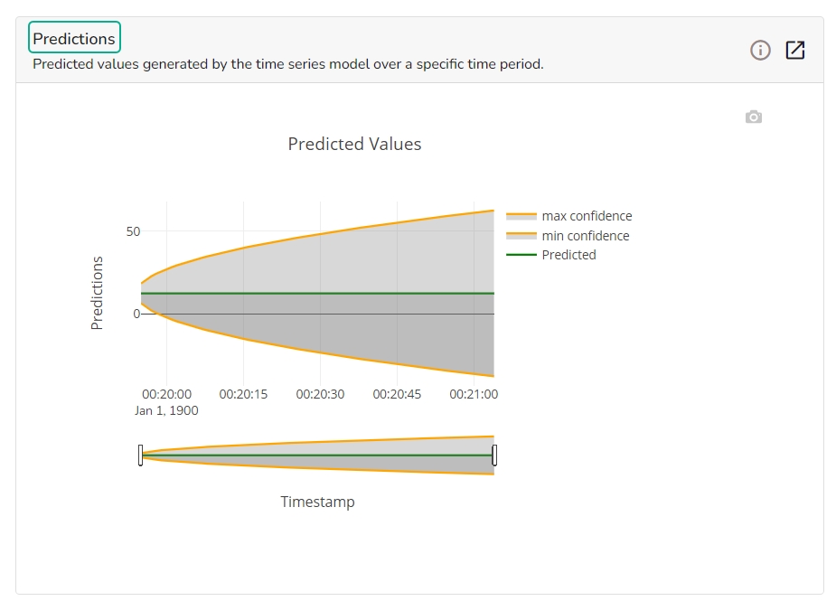
This chart will display predicted values generated by the timeseries model over a specific time period.
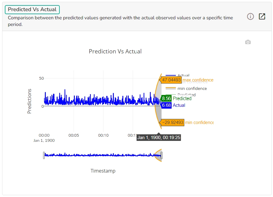
This chart displays a comparison of the predicted values with the actual obsereved vlaues over a specific period of time.
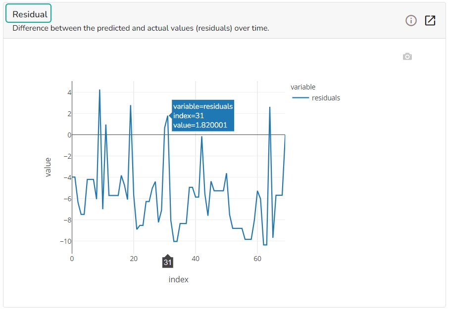
It depicts difference between the predicted and actual (residuals) values over a period of time.
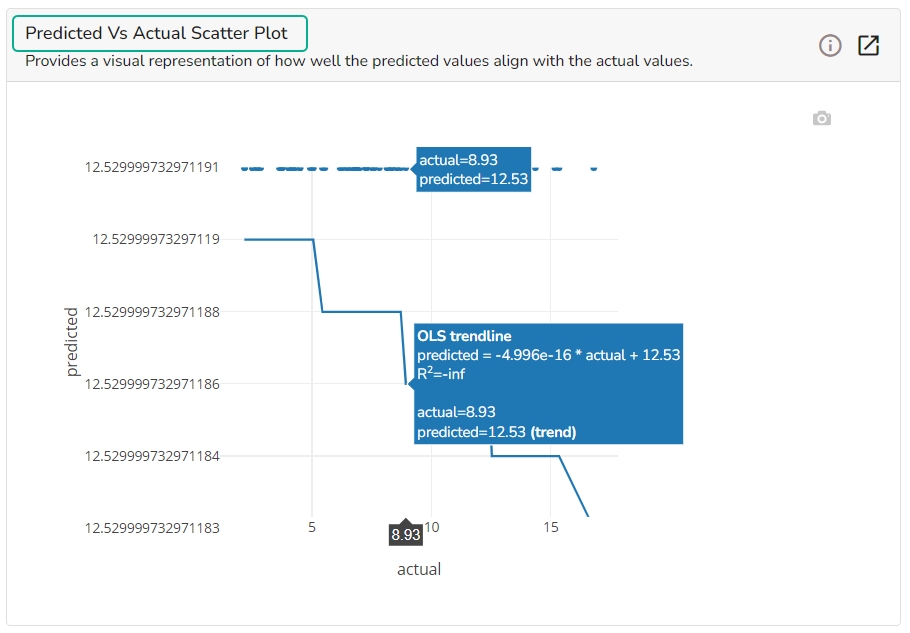
A Scatter Plot chart is displayed depicting how well the predicted values align with the actual values.
Please Note: Refer the Data Science Lab Quick Start Flow page to get an overview of the Data Science Lab module in nutshell.
