Loading...
Loading...
Loading...
Loading...
Loading...
Loading...
Loading...
Loading...
Loading...
Loading...
Loading...
Loading...
Loading...
This section aims to describe the available Data Drill options for a specific report view.
Loading...
Loading...
Loading...
Loading...
Loading...
The Tab UI helps to add more details in tabular format to a Report.
Please Note: By saving the first View to the Report final screen a Tab gets created by default. The user can create up to 5 tabs in a Report.
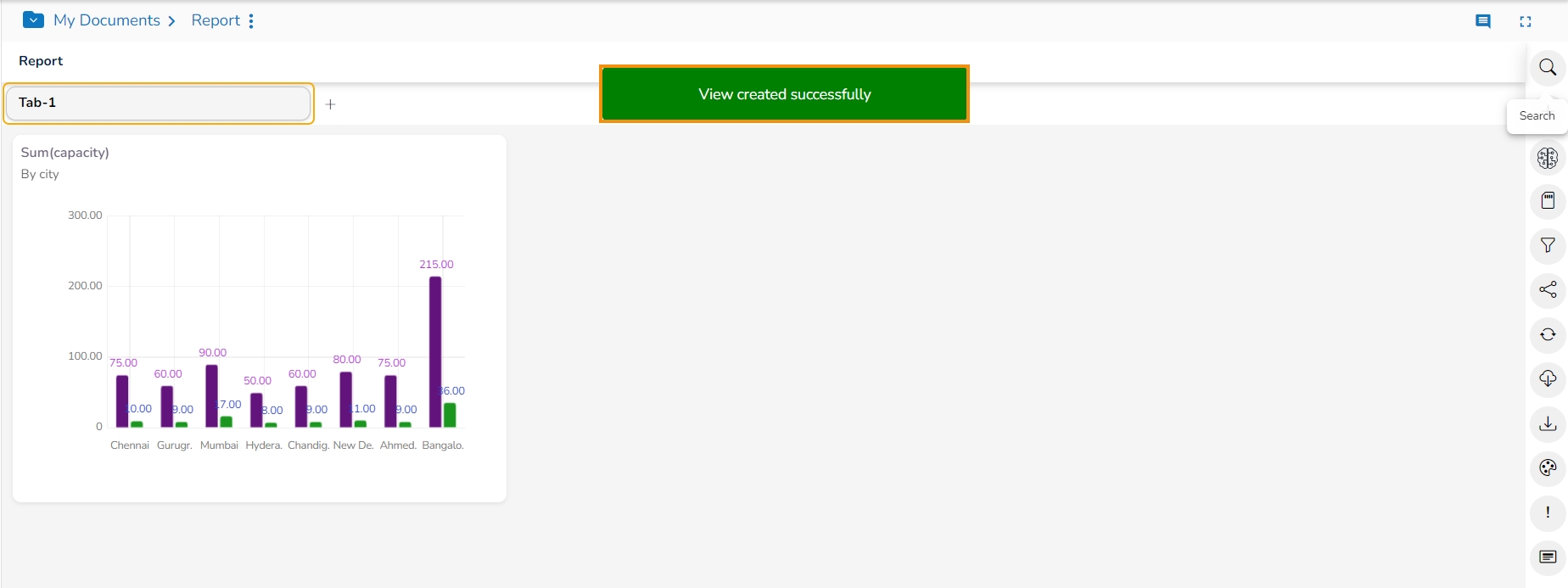
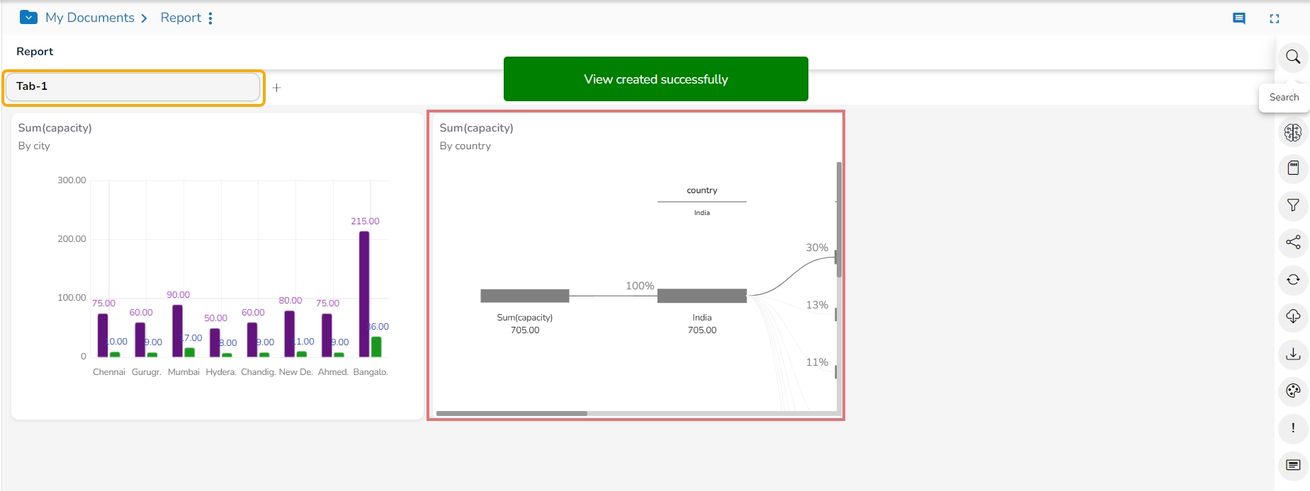
The first Tab gets created by default when the user creates the first View and Saves it.
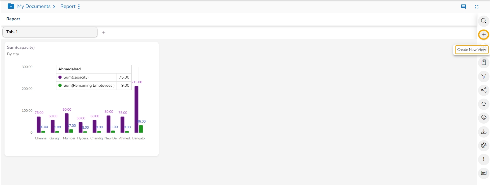
The user can use the Create View icon.
The user will be redirected to the Design Workspace to create another View.
The View will be added to the Tab 1 by default.
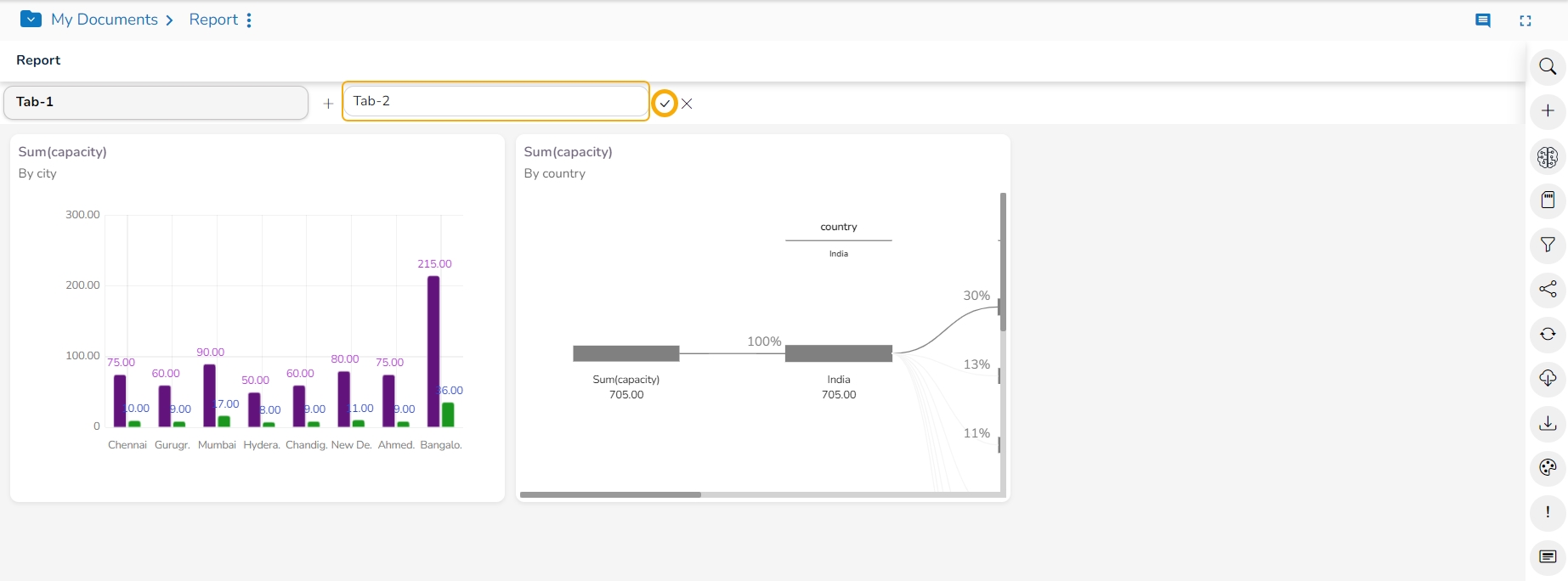
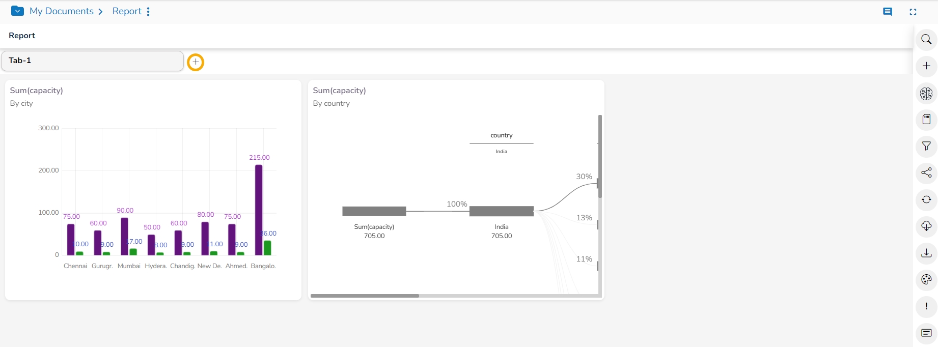
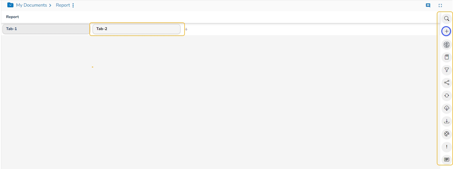
Click the Add icon.
A new tab gets added, provide a name for the newly added tab.
Click the checkmark icon.
The Tab name gets saved.
The user can use a click to open the second tab.
The second tab opens listing all the attributed options.
Click the Create View option to create a View for the second tab.
Please Note: The user can follow the same steps (as mentioned above for the default tab) to insert more Views to the second tab.
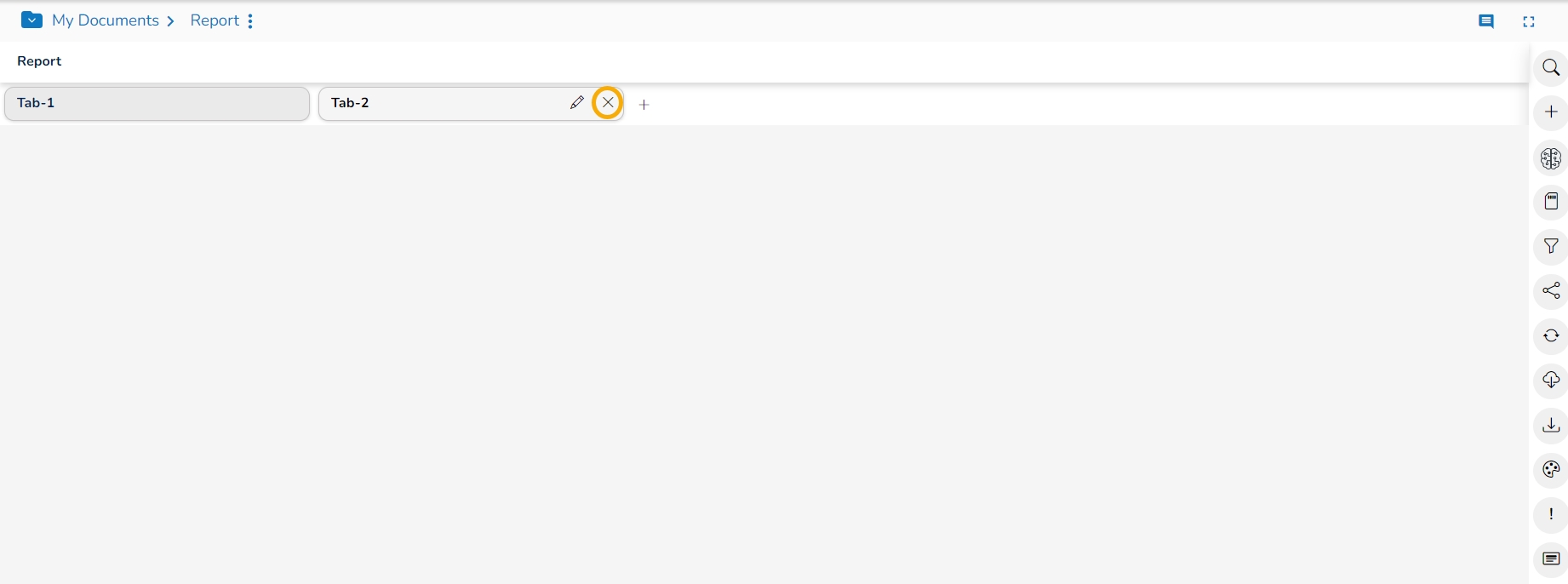
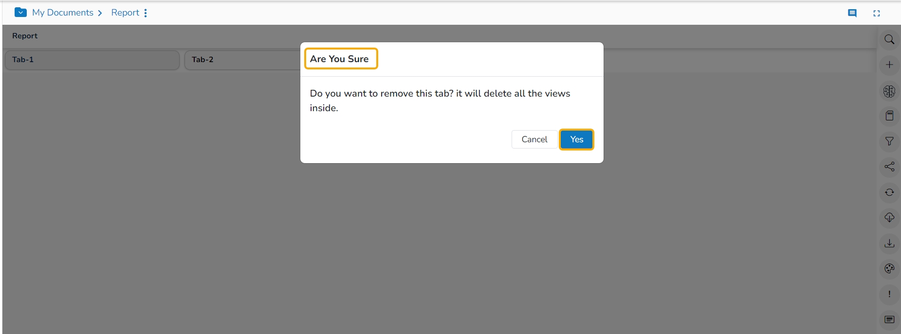
Click the Close icon from the tab to remove it from the Report.
A dialog box opens to ensure the action.
Click the Yes option to remove the concerned tab.
The selected tab will be removed from the Report.
The NLP Search option helps users to quest for specific data all through the selected datastore and instantly displays the query results.
The user can get the Search icon on the Report screen. The users can search any data query for which the Search will instantly display a View as a result save the search result to the current storyboard and repeat the process to build an insightful data story.
Navigate to the Report page.
Click the Search icon.
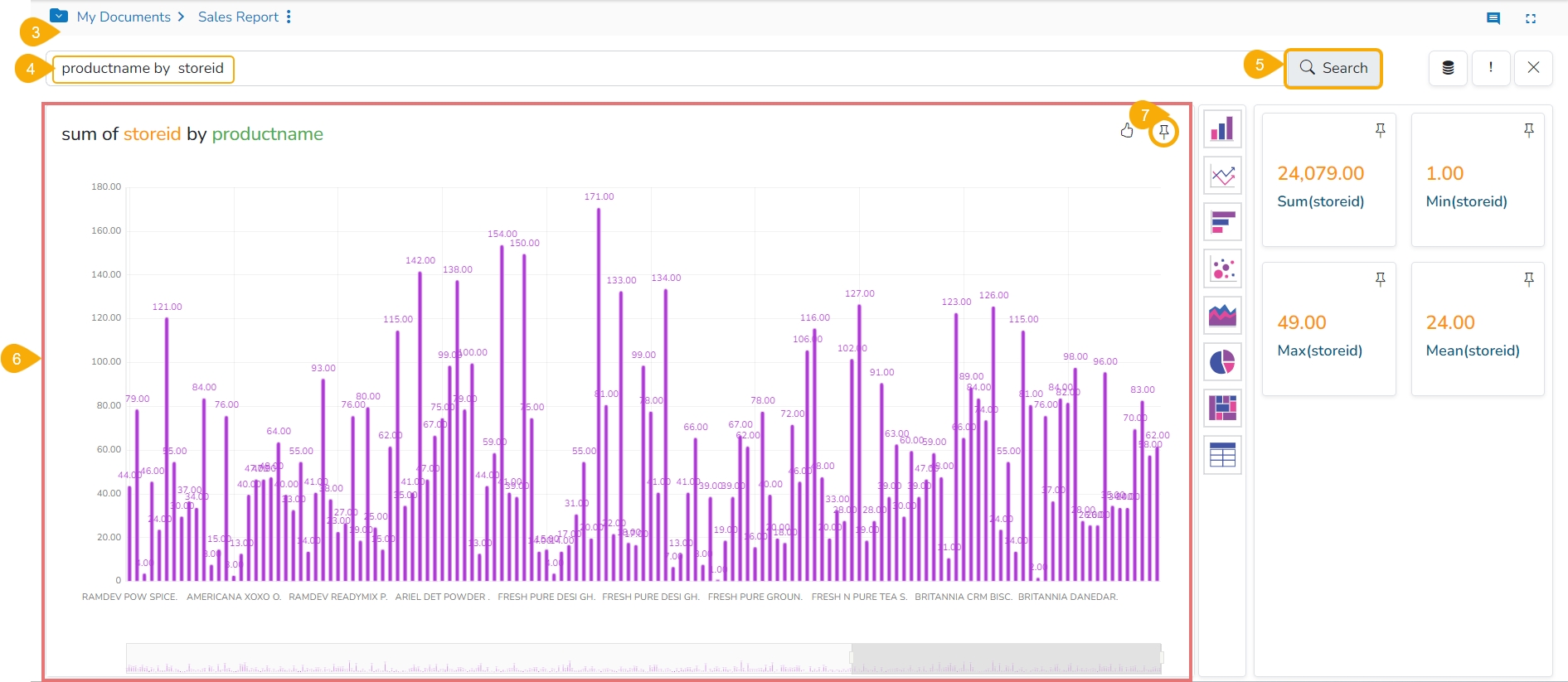
The Data Search page opens.
Type a query in the given space.
After typing a specific query or selecting a search query from the search suggestions, click the Search icon.
The search result instantly reflects beneath the search bar.
Click the Add to story icon.
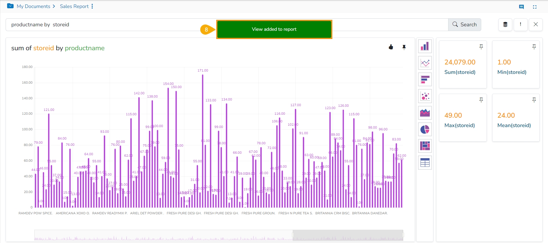
A notification message appears.
The selected View gets added to the final screen of the Report.
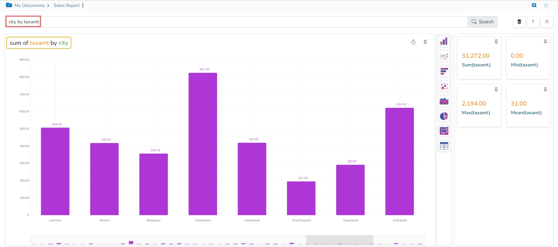
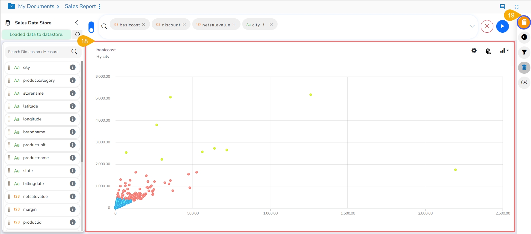
The user can drill deeper into the selected Data Store by using the BDB Search bar with proper data queries. Refer to the following images to see how instantly the searched data gets displayed with more profound queries:
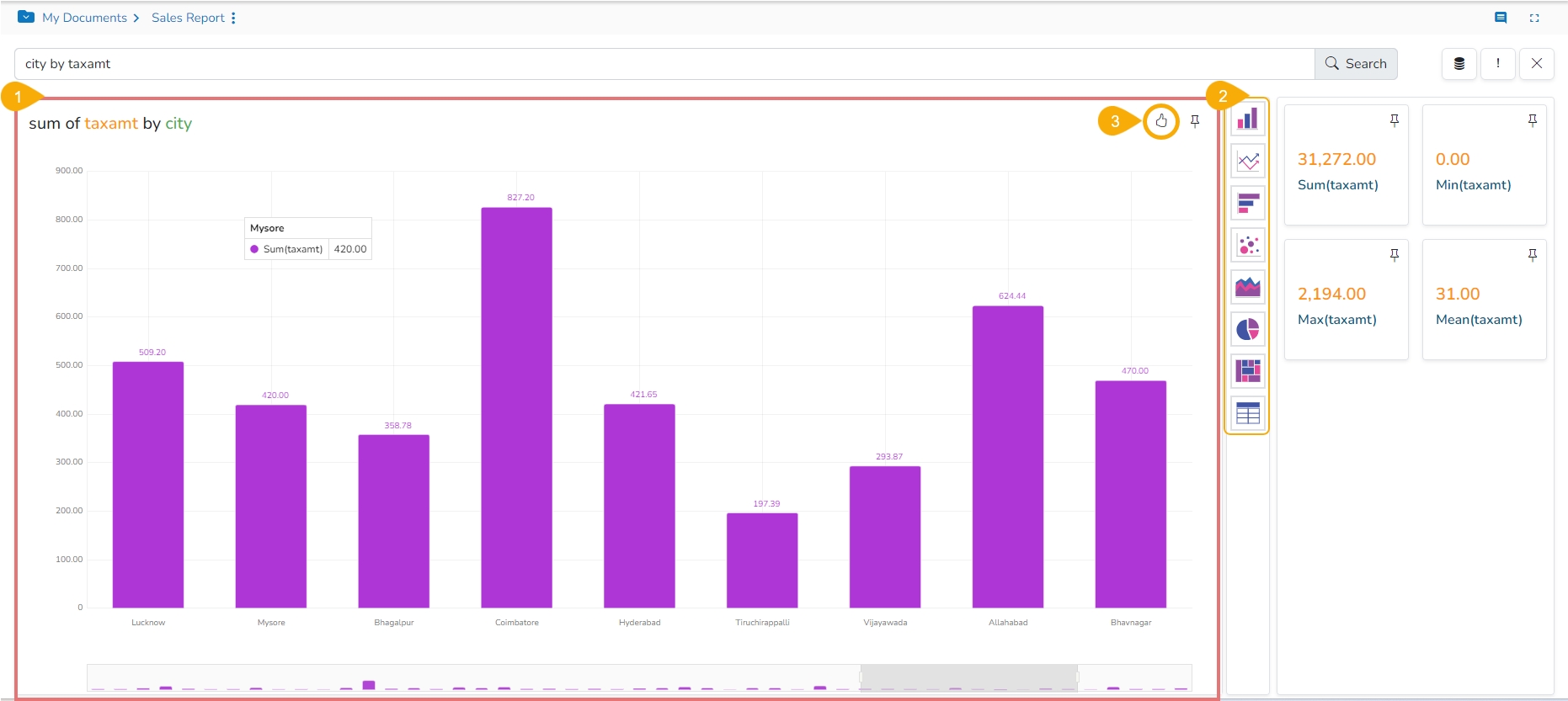
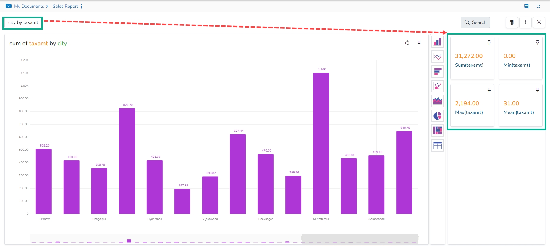
Query 1: city by taxamt - Displays sum of taxamt by city names.
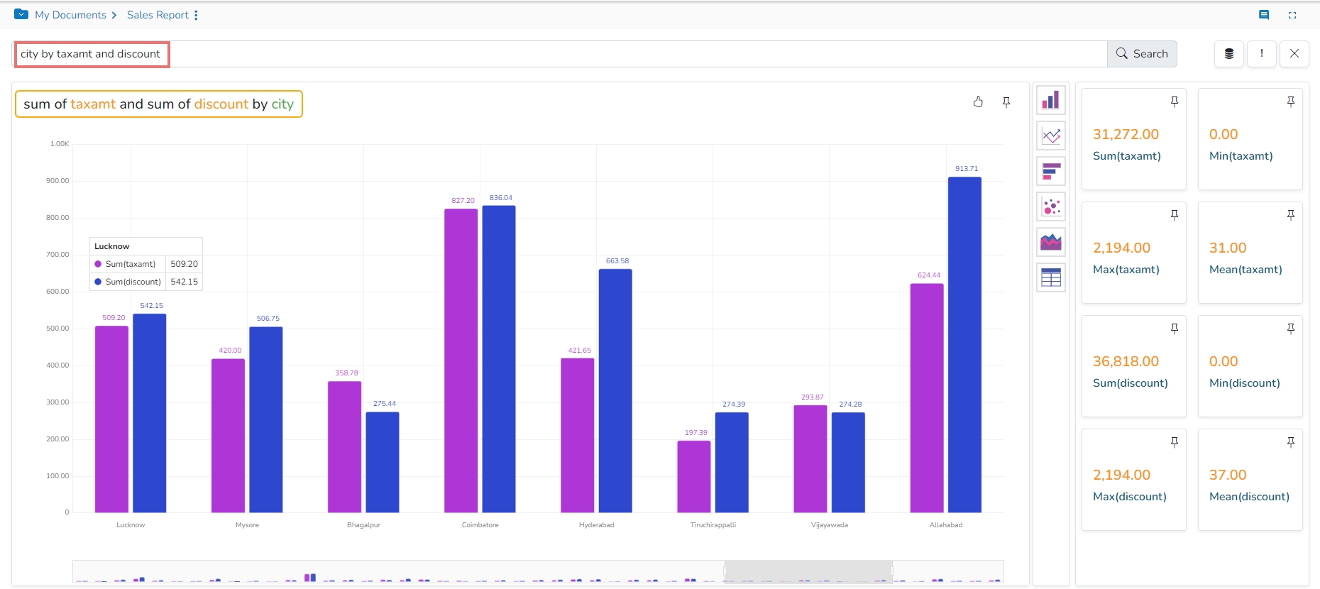
Query 2: city by taxamt and discount - Displays sum of taxamt and discount by city names.
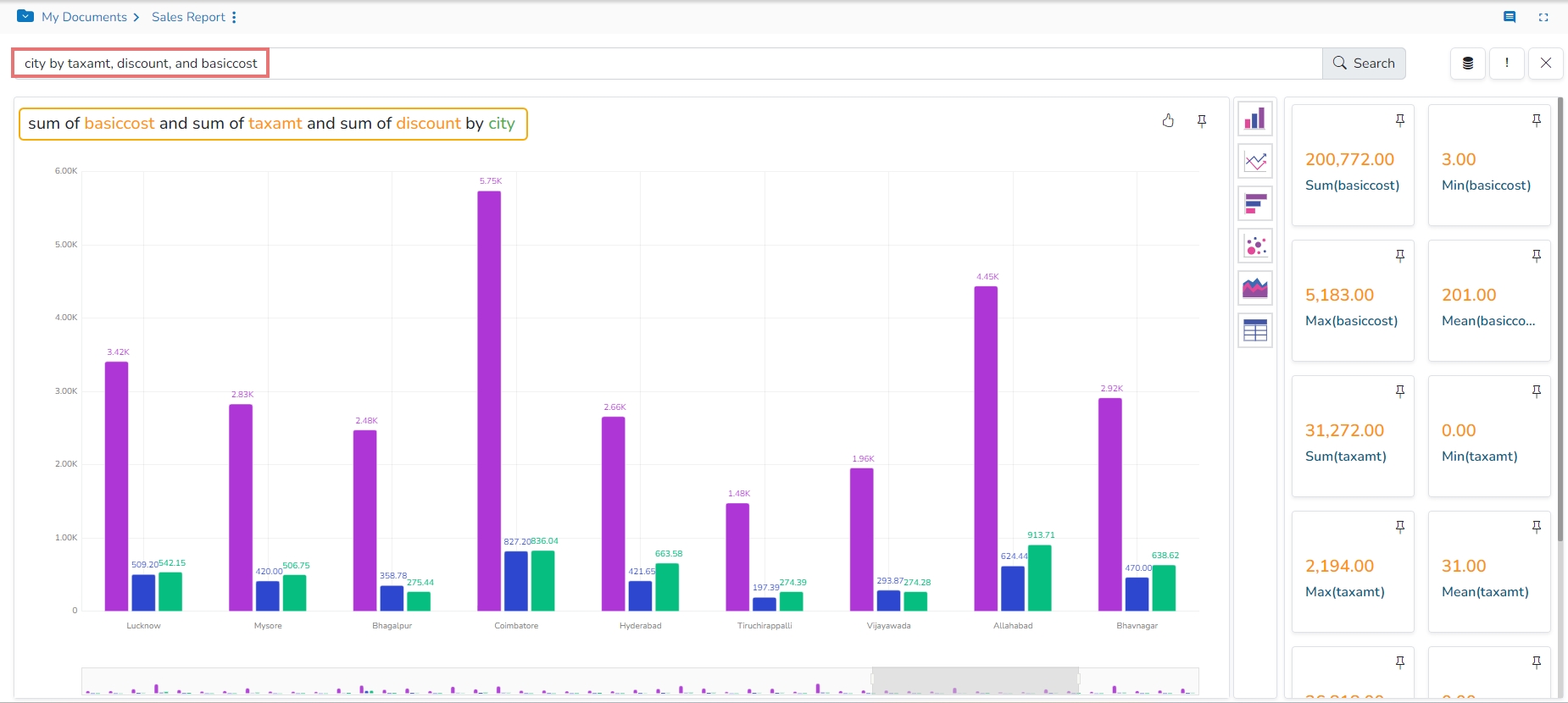
Query 3: city by taxamt, discount, and basiccost - Displays sum of taxamt, discount, and basiccount by city names.
The instantly created View gets displayed in a default charting component based on the inserted search query.
The users can switch to any other visualization option using the charting panel provided on the Search page.
Click the Like icon to save the searched query into the database.
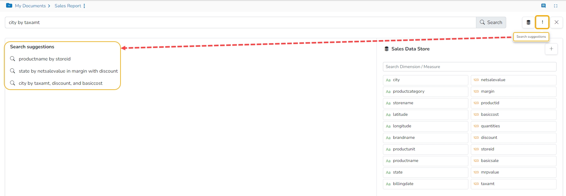
Click the Search suggestions icon to display all the saved search suggestions from the database along with a list of dimensions and Measures from the selected Data Store.
Other Views close to the searched query also get displayed (on the right). The user can add any of the suggested Views to the current storyboard by using the Add to Story icon provided for the view.
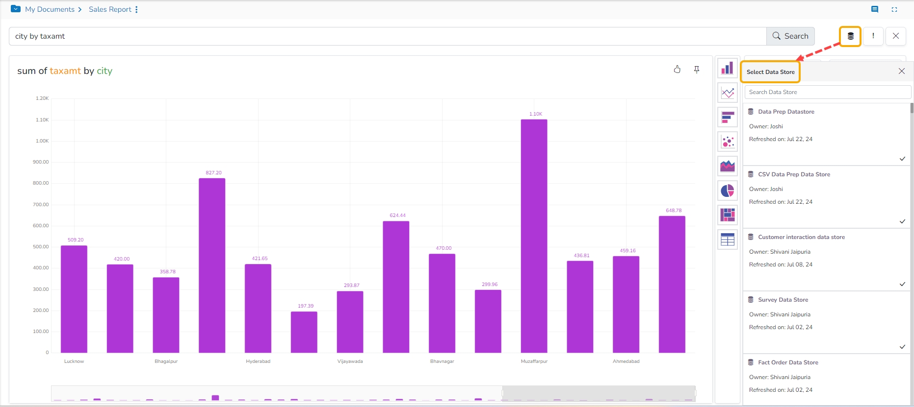
The users can alter the Data Store by using the Select Data Store icon provided on the Search page.
Click on the Select Data Store icon.
Displays the Select Data Store window with all the available Data Stores.
Please Note: The user can use the Search Data Store bar to select a Data Store from the displayed list.
Please Note:
The Search functionality supports search terms like yesterday, the day before yesterday, and two days ago.
Measure filter values with k/M/lakh/million unit for the =is/is equal to and is between operations are supported as search terms.
Icon
Name
Function
Search
Searched the inserted query from the selected Data Store.
Select Data Store
Prompts the users to select Sample Data Store or choose from the list of Data Stores.
Search Suggestions
Displays all the saved search suggestions.
Close Search Dialog
Closes the NLP Data Search window.
This data drill functionality allows the user to drill through a data dimension.
Check out the walk-through on how to Drill through a dimension value.
The Drill Through option allows the users to drill down in the data values of a saved view on the storyboard for the selected story.
Navigate to the final screen of a report.
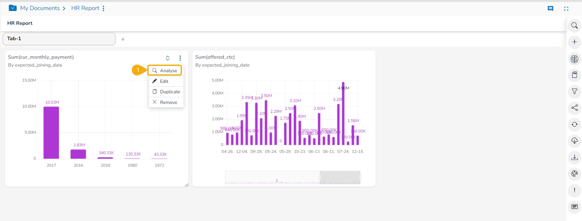
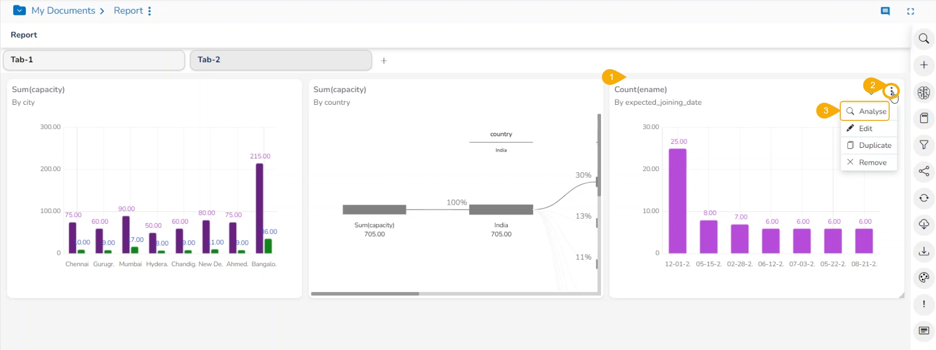
Select a View that has at least one Dimension. Click the ellipsis icon for such a View.
Select the Analyse option for the selected View.
The View opens in the Analyse window.
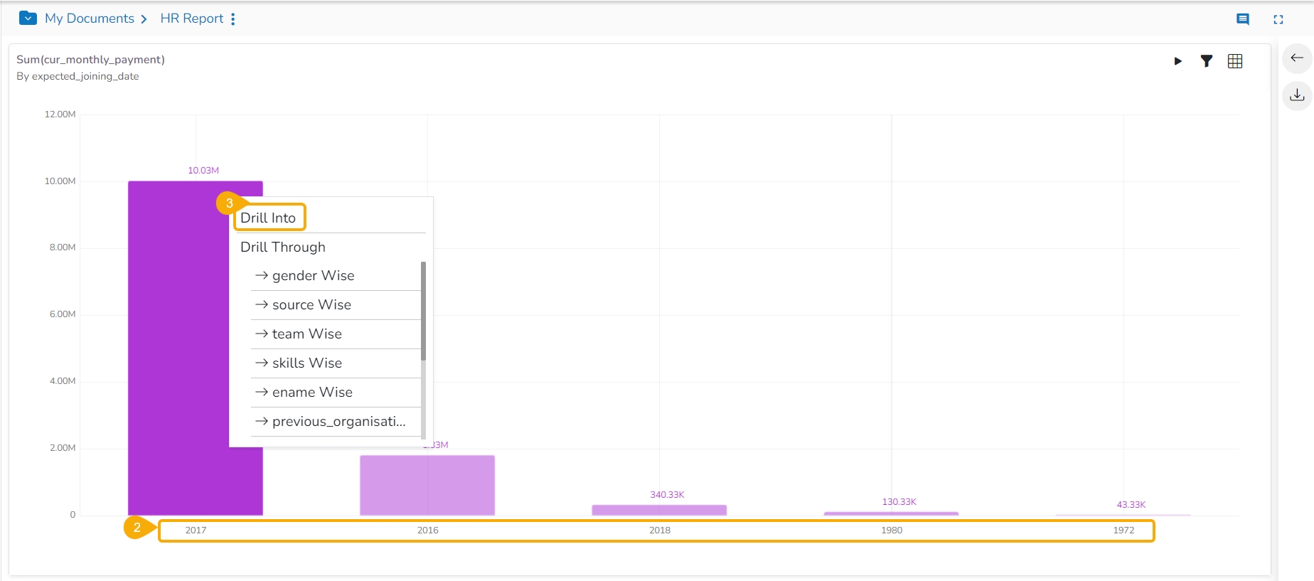
Left-click on a column displaying a data value.
This action opens a context menu.
From the context menu, locate and select the Drill Through option.
A list of related drill-through options will appear. Select the desired option to proceed with the drill-through analysis.
Once a drill-through option is selected, the view dynamically updates to reflect the chosen data perspective. For example, selecting a source-wise drill-through option displays the sum of the USD billing for the selected skills (BizViz, SQL, Algorithms) in a data grid.
Users can refine the displayed data by selecting a different dimension for the drill-through. To do this, use the drop-down menu located next to the currently selected dimension.
Select another Dimension from the displayed context menu to Drill Through the View.
The View gets modified based on the selected Dimension. E.g., the given image displays the Previous organization-wise sum of USD billing for the same set of skills.
Please Note: Click the Close icon next to the selected Drill Through option to be redirected to the original View display.
The Export Properties option helps to insert Header and Footer for the Story while exporting it into PDF.
Navigate to the final screen of a report.
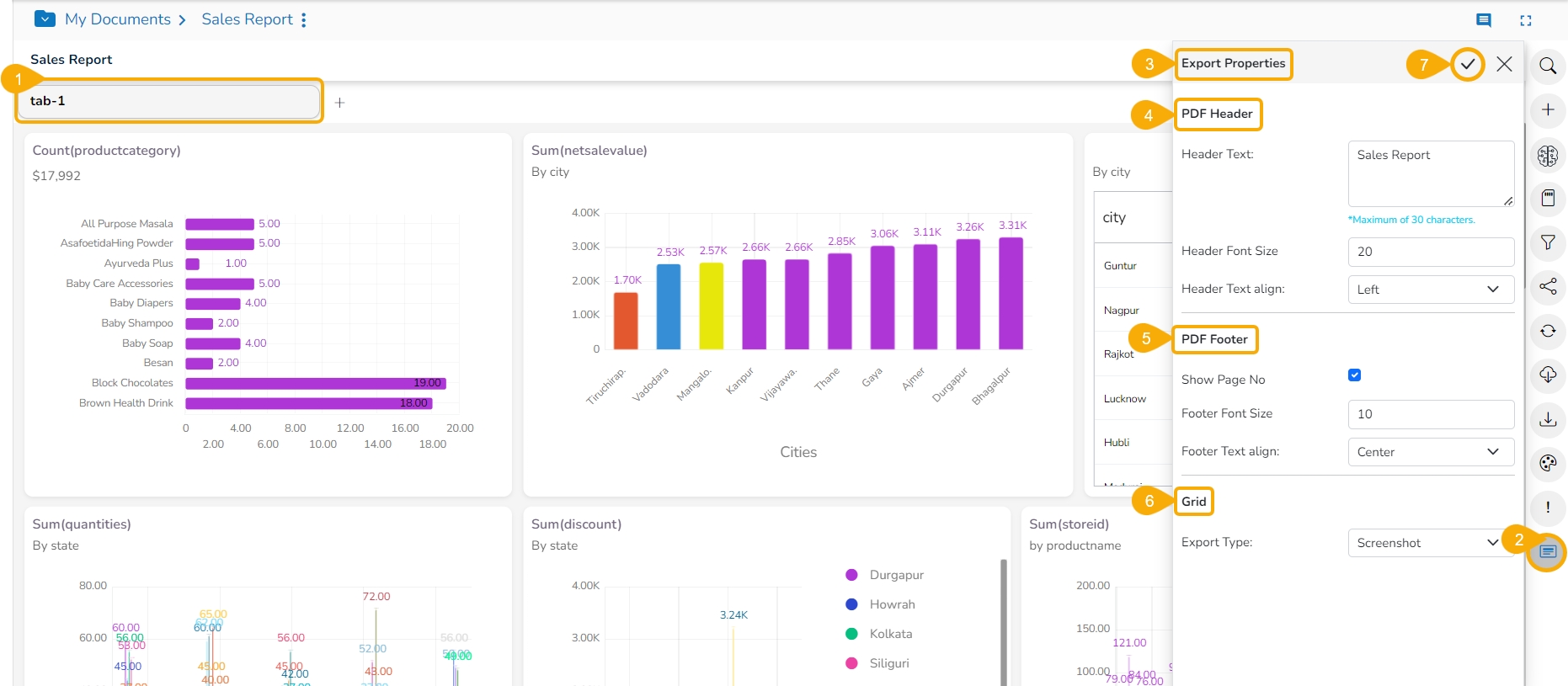
Click the Export Properties icon.
The Export Properties window opens.
Set the PDF Header properties.
Provide Header Text.
Set the Header Font Size.
Select Alignment for the Header Text.
Set the PDF Footer properties.
Use the given checkbox to display the Page number.
Set the Footer Font Size.
Select Alignment for the Footer Text.
Select an option using the Grid section.
The user can select an option using the drop-down menu. The provided choices are Screenshot and Tabular.
Click the Apply icon.
The report gets saved with the configuration.
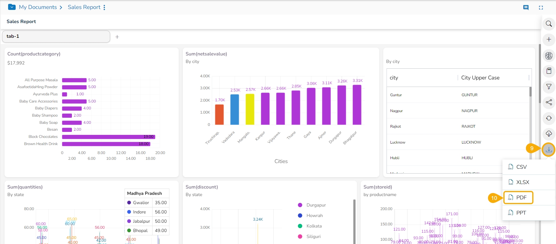
Click the Export icon.
Select the PDF option from the displayed export options.
Open the PDF version of the report after it gets exported into PDF.
The inserted Header and Footer can be seen in the exported PDF version of the report.
Please Note: The inserted page number and the report Header are also displayed in the report's tabular format.
This section of the documentation focus on the options provided to a View.
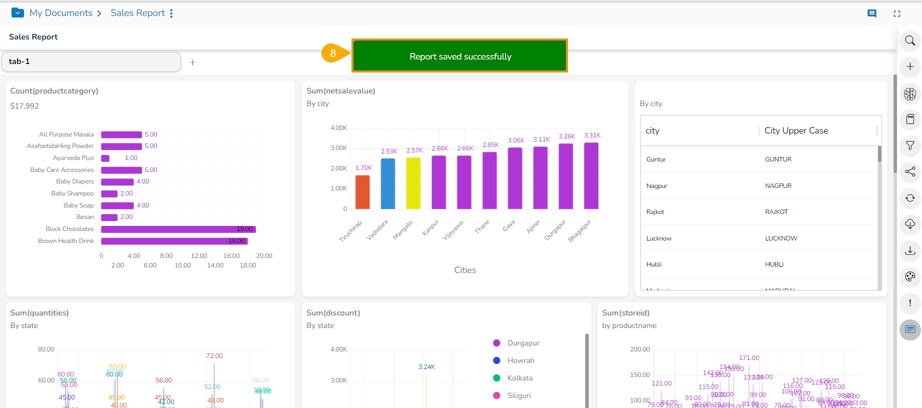
This screen contains multiple saved Views to provide an insightful visual report to the users.
The user can add multiple Views on a single screen signified as a Report. They can add any number of Views based on various data stores to a single Report. The users can create a new View, apply Global Filter, and save an altered View using this page. The user can instantly modify themes, avail data drill, and export a report to the desired format all from this single screen. The user can instantly add a new View using the Search option provided on the vertical panel of this screen.
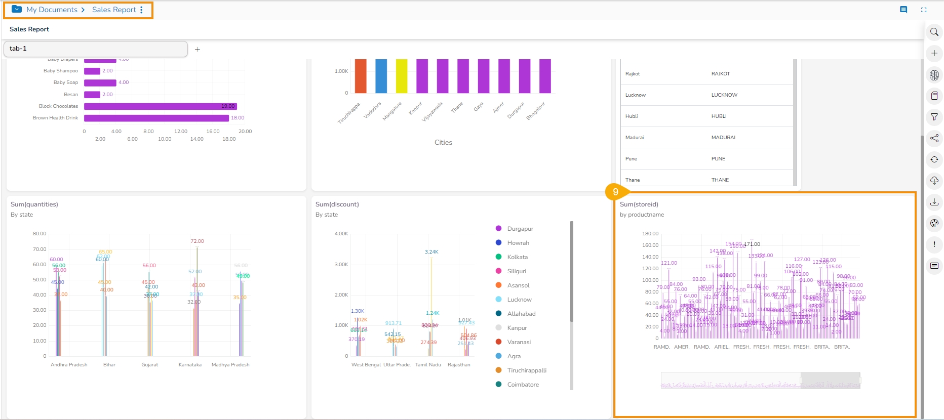
The following image provides an overview of how a Report may look with Views added to it across multiple data sources.
Describing the icons provided on the Report page:
Icon
Name
Description
Data Search Bar
Searches the queried data from the selected Data Store.
Create New View
Redirects users to the Design workspace to design a new View.
Create New ML View
Redirects to the Design workspace to create a new ML View.
Save Report
Saves the report with all the added views.
Global Filter
Filters data from the multiple views saved on the Report board.
Shared Views
Redirects the user to select and add the available shared view(s) to the Report Board.
Refresh Views
Refreshes the Report with all the existing views.
Live Refresh
Opens Websocket window.
Export
Exports the Report in CSV, XLSX, PDF, and PPT format.
Change Theme
Displays various themes to be applied to the Report.
Data Store Information
Opens necessary information for the selected Data Store.
Export Properties
Export Properties window opens.
Comments
Redirects to add a description to the Report.
/
Full Screen/Reduce Size
Displays the full-screen view of the Report Board or reduces the display of the Report Board screen.
This option will help the user to refresh the Story with latest data based on the saved WebSocket configuration.
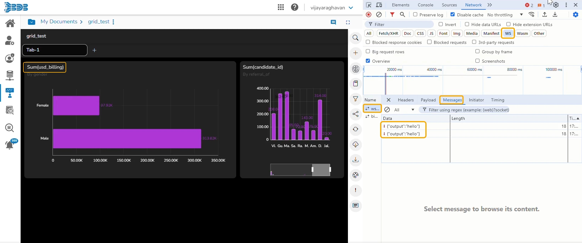
The Web Socket option under the Live Refresh icon is provided to refresh the Story or the selected Views of the Story when an external event occurs.
Check out the given illustration to understand the Live Refresh functionality.
Users can achieve this by configuring a WebSocket. The WebSocket Configuration contains a WebSocket IP and a message. On opening a WebSocket-enabled report, a WebSocket channel is established to receive messages. The Report gets refreshed when Web Socket receives the same message configured from this channel.
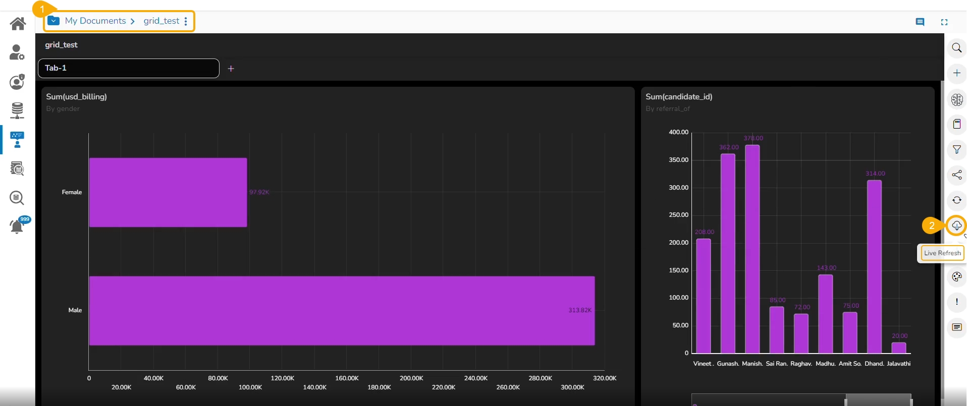
Navigate to a Report's final screen with multiple Views.
Click the Live Refresh icon.
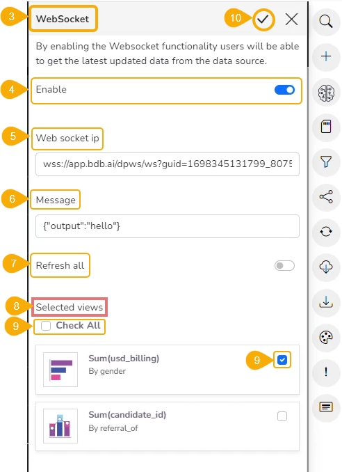
The WebSocket panel opens.
Enable WebSocket functionality.
Provide a WebSocket IP.
Insert a message based on which the selected view(s) get updated.
Either enable the Refresh All option or keep it disabled (based on the requirement).
If it is disabled then select the required Views from the Available Views list as provided under the Selected Views heading.
Use the Check All option to select all the Views.
Select a specific View by using the Checkbox provided next to it.
Click the Apply icon from the above panel.
Please Note: When the event triggers, the refresh gets refreshed data based on the WebSocket settings.
The user can keep track of each trigger under the Developer's tool (as displayed in the following image).
Please Note: The WebSocket IP used for the Live Refresh functionality has been accessed using the WebSocket Producer component provided inside the Data Pipeline module of the Platform.
The user can change the look and feel of the entire story through this option.
Navigate to the final screen of the Report.
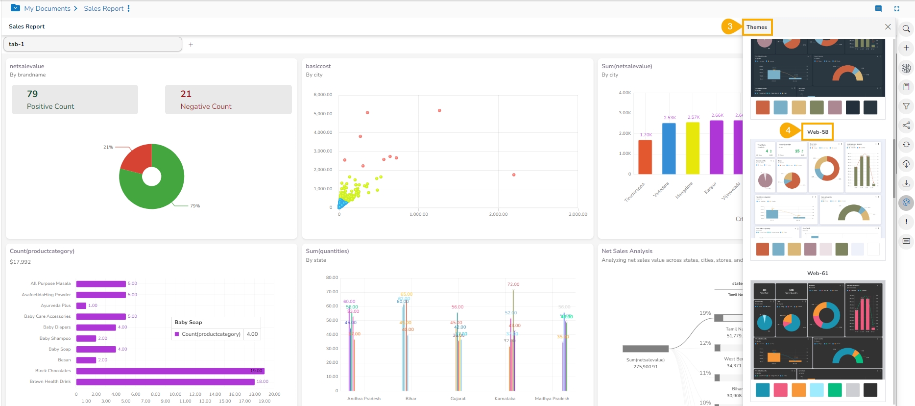
Click the Change Theme icon.
The Themes menu will open.
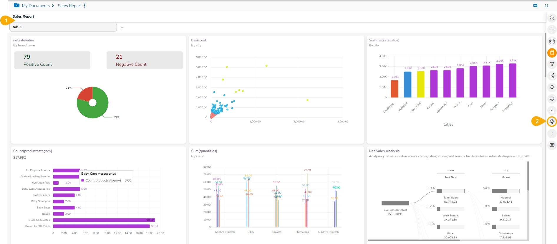
Select a theme from the context menu to change the display of the report. E.g., Web-58 is selected in the following image.
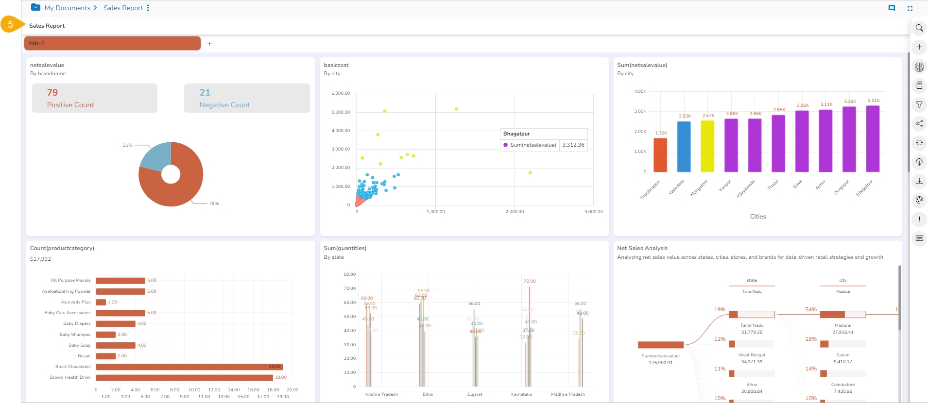
E.g., The following image displays the report in the Web-58 theme:
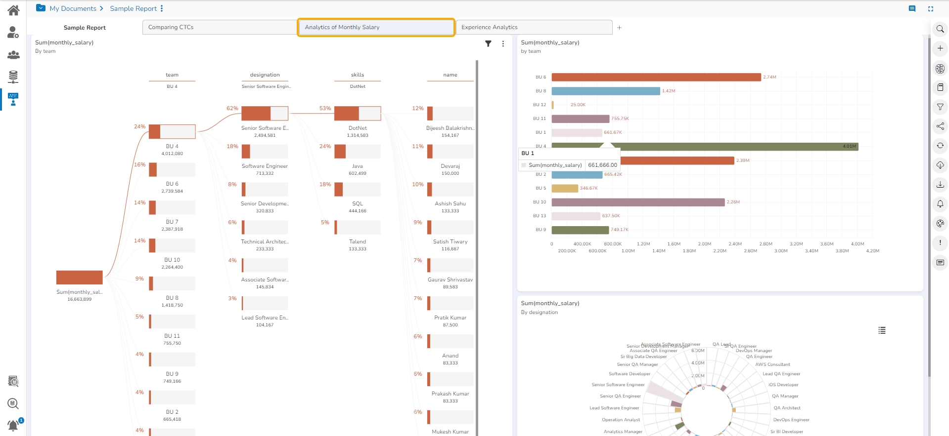
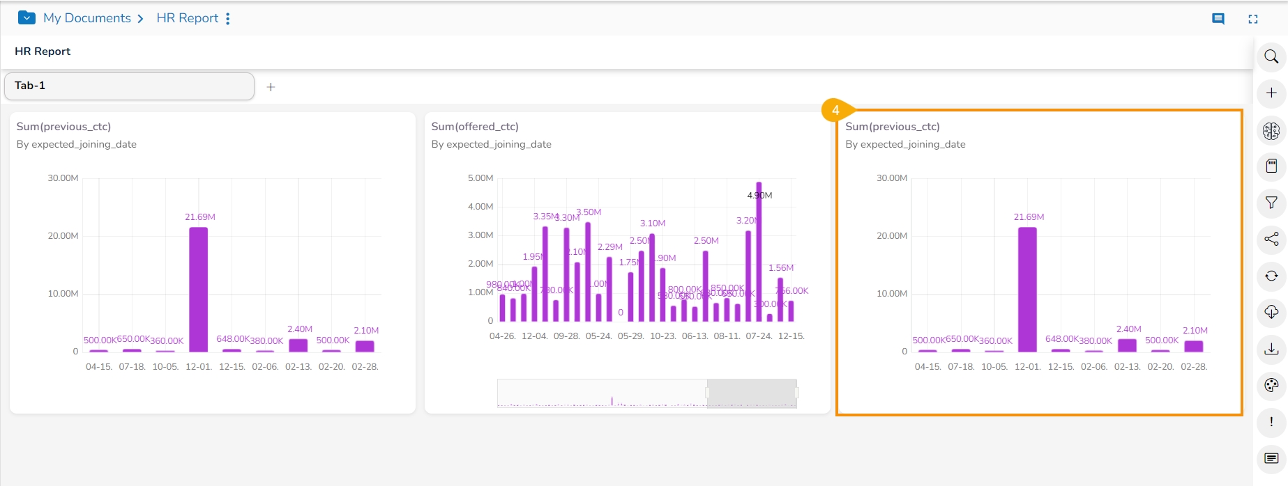
The selected themes also get applied to the various tabs that are part of that report:
Please Note: The various supported Themes for a Report are: Default, Web-53, Web-56, Web-57, Web-58, Web-61, Web-62
Check out the illustration displaying the application of all the available themes to a sample report.
This page explains the Edit functionality provided for a saved View in a Report.
Check out the illustration on editing a saved View in a Report.
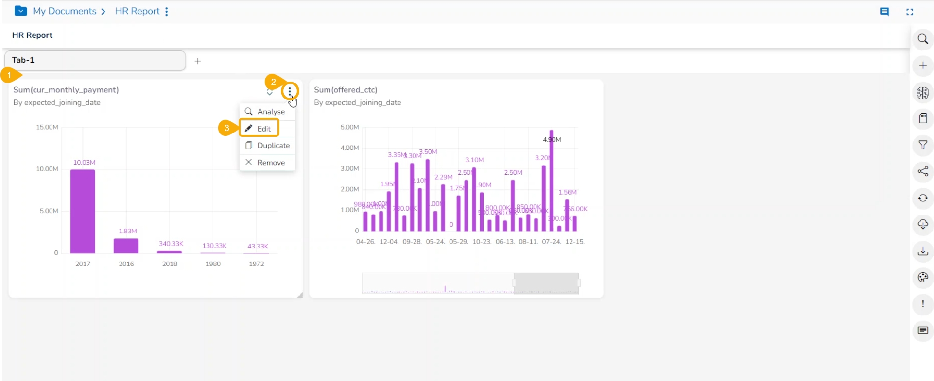
Select a saved View from the Report.
Click the Options icon.
Select the Edit option from the context menu.
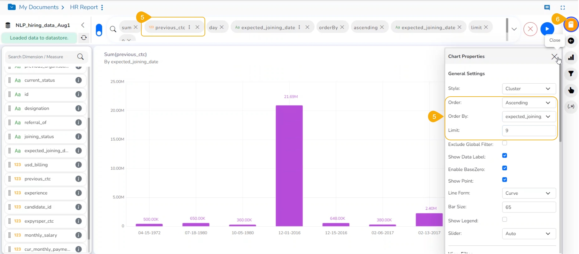
The Design page opens for the selected View.
Edit the required details. Here, the name Dimension and Order By properties are modified.
Click the Save icon.
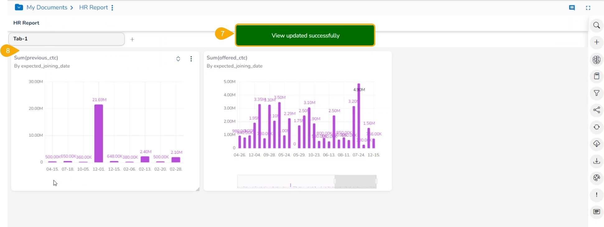
The modified View gets saved successfully to the Storyboard.
A notification appears to ensure the same to the user.
The ML View creation provided under the self-service visualization report helps the user to instantly generate Views based on any ML task. The user needs to provide feature or target column based on the selected ML Task to avail conclusive insights into their chosen dataset.
The supported ML tasks are Segmentation, Anomaly Detection, Time Series, and Sentiment.
Refer the following description to select proper ML task for your dataset:
Segmentation: Explore data intricacies using K-means clustering. Identify hidden patterns and groups within your dataset to pinpoint customer segments, market groups, or other clusters. Tailor strategies to specific audience needs and enhance your understanding of diverse dynamics. Visualize segmentation results through clear graphs in the final Report.
Anomaly Detection: Utilize robust detection methods like Isolation Forest for outlier detection. Identify data errors, deviations, and outliers signaling potential issues or opportunities. Maintain data quality and make informed decisions with a visually summarized presentation of anomalies in the final Report.
Time Series Forecasting: Experience precise forecasting with methods like ARIMA and SARIMA. Uncover short-term and long-term trends in your time-stamped data, offering invaluable foresight for predicting sales figures, stock prices, and more. Make informed decisions based on accurate forecasts, visually summarized in the final Report.
Sentiment Analysis: Leverage natural language processing to discern sentiments in your data, categorizing them into positive or negative tones. Ideal for customer reviews, social media comments, or surveys, this feature provides valuable insights into the subjective nature of your data. Visualize overall sentiments in your data through intuitive graphs in the final Report.
Find the compatible column types for each task described below:
Time Series Forecasting
1 Date/Time column, 1 measure column (e.g., sales, salary)
Predicts future values based on historical trends. Requires equally spaced dates (weekly, monthly, yearly).
Sentiment Analysis
Text/Dimension column required
Analyzes sentiment (positive, negative) using BERT Language Model.
Segmentation
Numerical features and measures
Groups data points based on similarities.
Anomaly Detection
Numerical features and measures
Identifies unusual data points that deviate from patterns.
Navigate to the Report final screen.
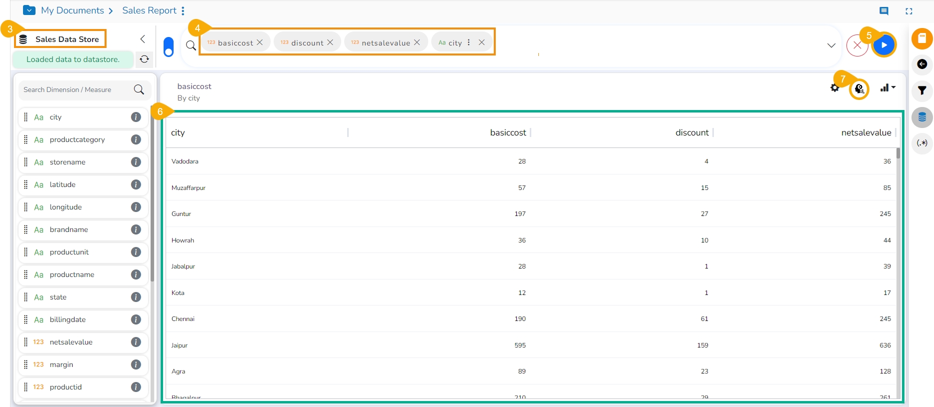
Click the Create New ML View icon.
The Design View canvas opens to design a View.
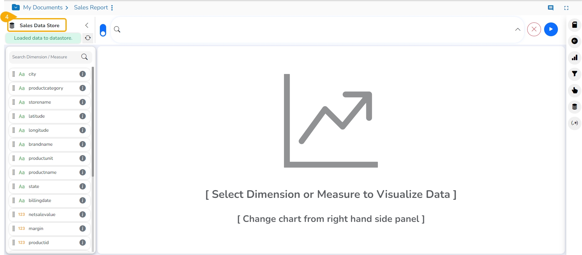
Select or drag-drop required Dimensions and Measures.
Click the GO option to generate the View.
Once the View gets created, the user will get ML Properties icon to perform ML function.
Click the ML Properties icon.
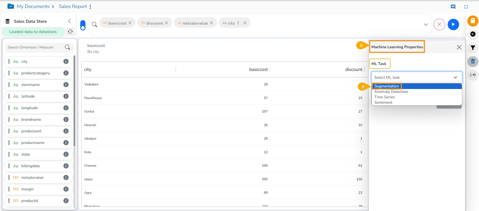
The Machine Learning Properties window appears.
Select an ML Task from the given context menu.
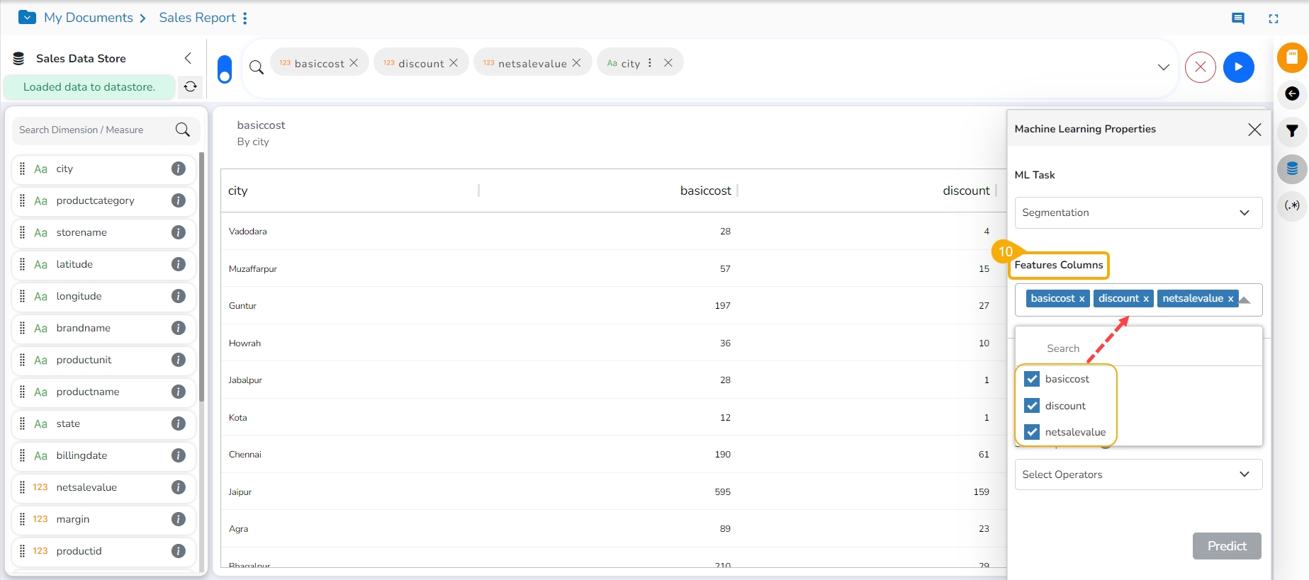
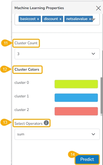
Fields specific to the selected ML Task will appear to apply it. In this case, select the Feature Columns by using the checkboxes.
Provide a number to specify the Cluster Count.
Some Cluster Colors will be provided based on the selected count of the Cluster. The user can modify the pre-selected colors by using the color pallet that appears by clicking the existing cluster color field.
Select Operator using the context menu.
Click the Predict option.
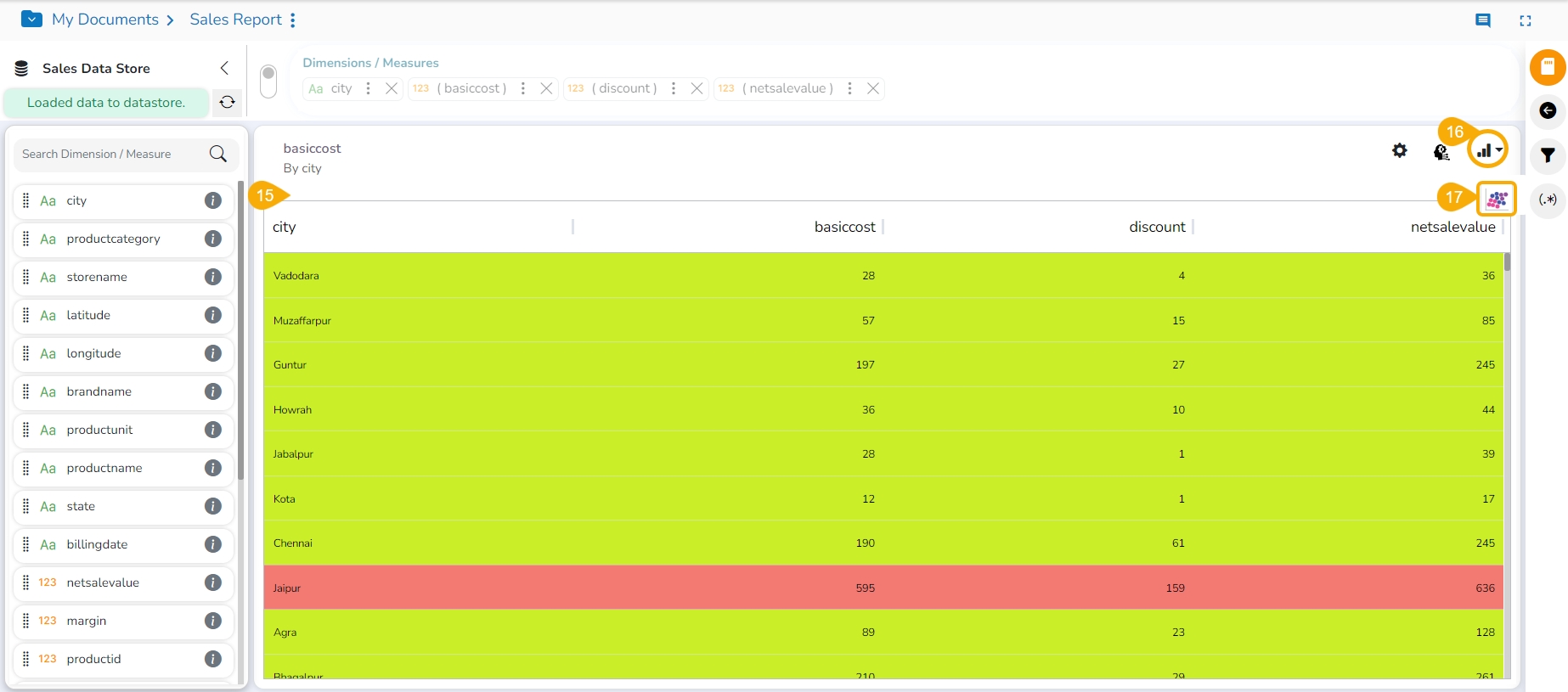
Based on the selected ML task the View gets displayed.
Click the Chart List icon.
Click on the other chart option. In this case, it is scatter plot chart.
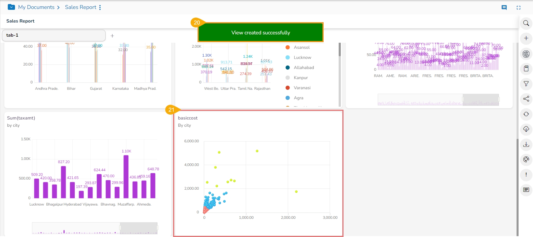
The View appears in the selected (scatter plot) chart option.
Click the Save View icon to save the View to the report.
A notification message appears.
The ML task based View gets added to the final screen of the Report.
Group your data based on similarities in measures and numeric features.
View results:
Table: Up to two measures visualized together for easy comparison.
Scatter Plot (2 measures): Visually explore relationships between two measures for each segment.
Check out the given video to know the details on ML View creation based on the Segmentation Task.
Identify unusual data points that deviate from patterns in your measures.
View results:
Line Chart: Track anomalies highlighted as points diverging from the overall trend.
Table: See individual rows flagged as anomalies, allowing for further investigation.
Check out the given video to learn the details on ML View creation based on the Anomaly Detection Task.
Select the column you want to predict. The Auto-ARIMA model will automatically train and choose the best parameters.
View results:
Table: See predicted values highlighted at the end of the model.
Line chart: Visualize historical data with predicted values as dotted lines.
Check out the given video to learn the details on ML View creation based on the Time Series Forecasting Task.
The analysis will process your text column and analyze sentiment.
The analysis is performed in the browser; the processing time varies based on the availability of client browser resources.
View results:
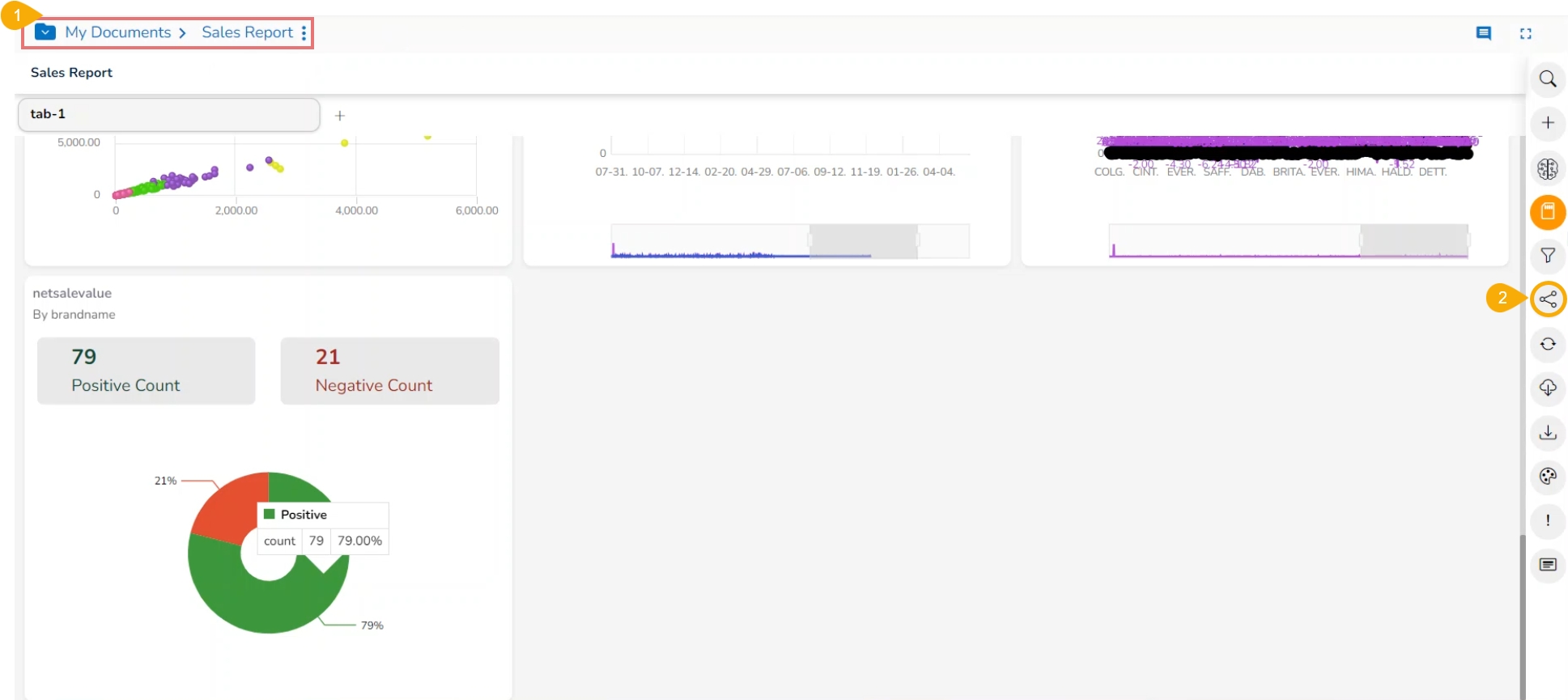
Pie Chart/ Mixed chart: Get a quick overview of overall sentiment distribution (Positive and Negative).
Positive and negative sentiments count will be shown in tiles.
Check out the given video to learn the details on ML View creation based on the Sentiment Analysis Task.
Please Note: The maximum supported word count for Sentiment Analysis is 2000.
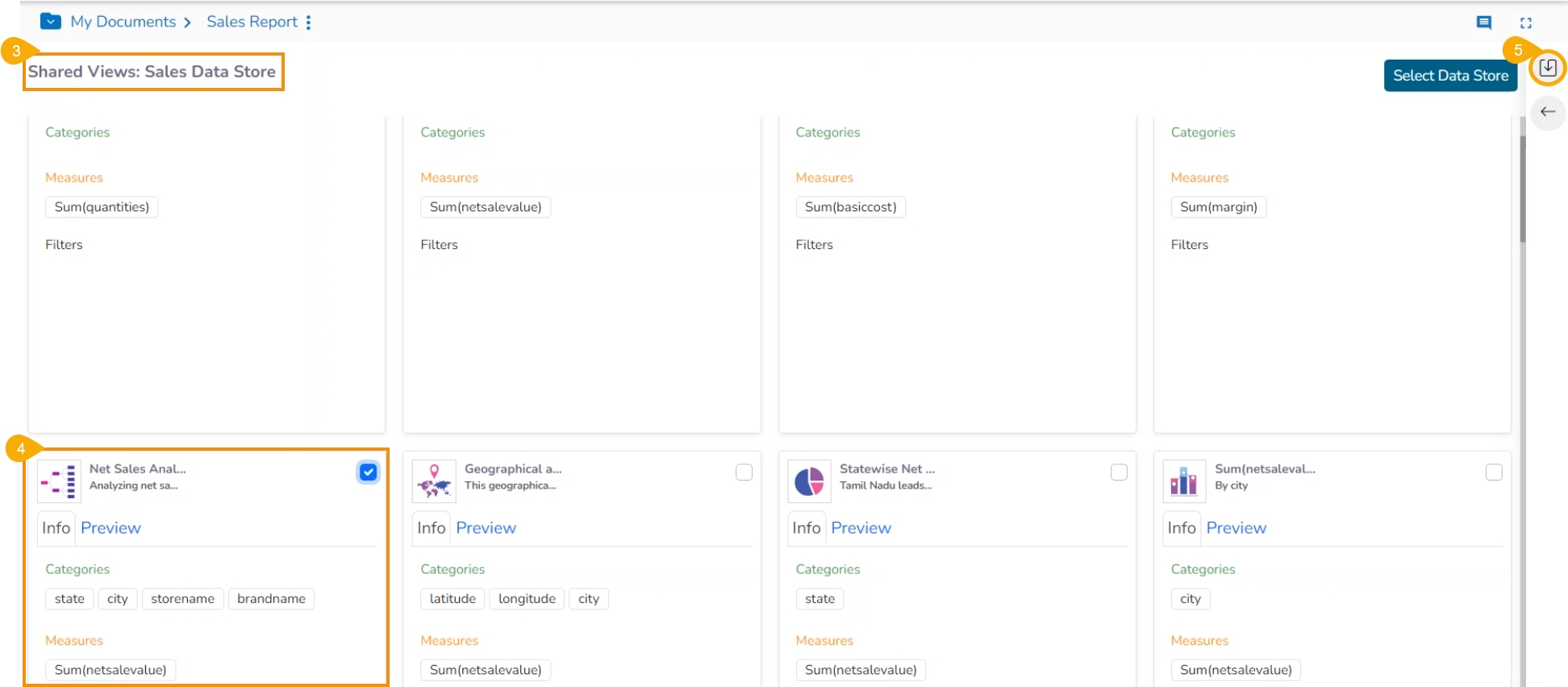
This section provides steps to use shared View in a Report.
Check out the given walk-through on how to use a Shared View.
The users can use already existing views based on a data store using the Shared Views icon.
Navigate to the final page of the Report.
Click the Shared Views icon.
All the available shared views from the selected Data store appear.
Use a checkmark in the box to select a shared view.
Click the Save Views icon.
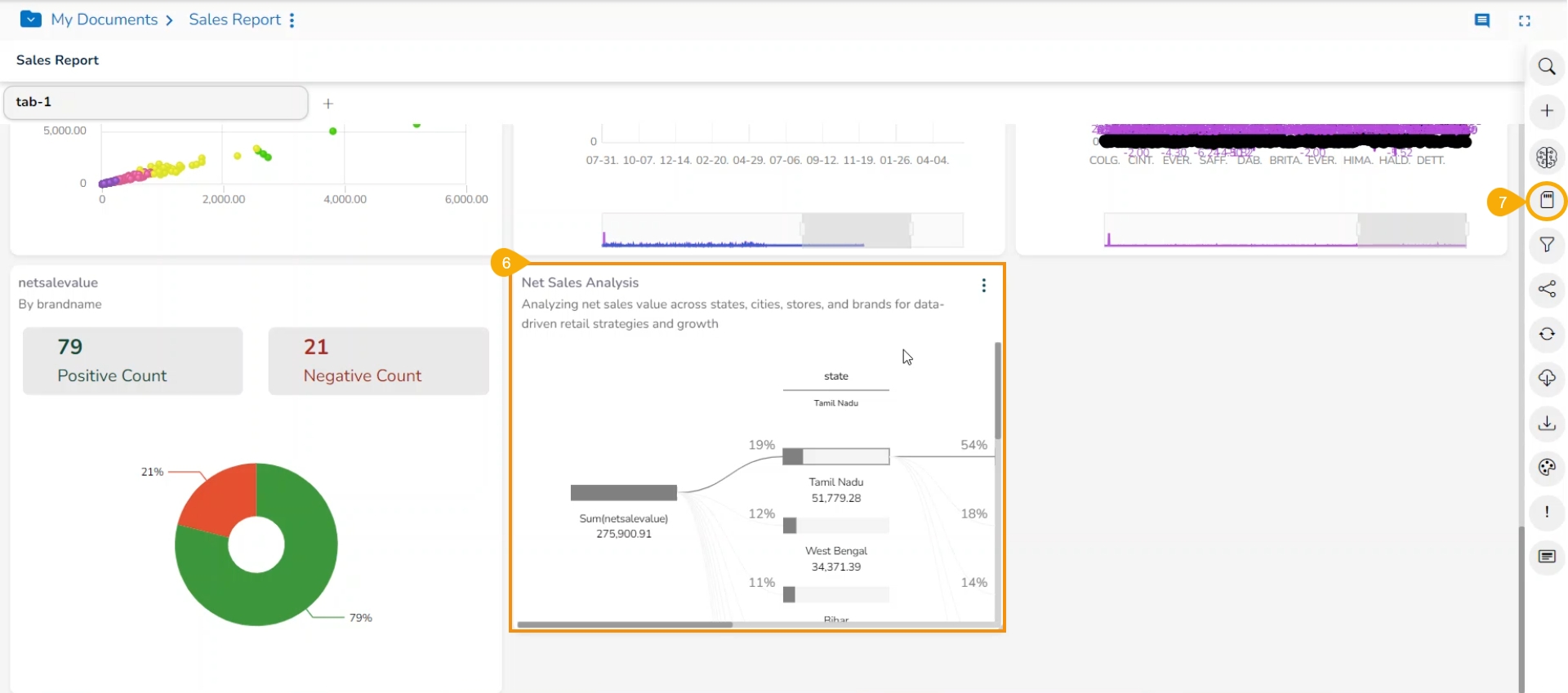
The selected shared view gets added to the report.
Click the Save report icon to save the report.
Please Note: The user can also select multiple Shared Views and insert them to a Report.
This data drill allows the user to penetrate into deeper granularity level of the time dimension.
Check out the given walk-through on the Drill Into functionality.
The Drill Into option allows users to drill down in the time values of a saved View on the selected report.
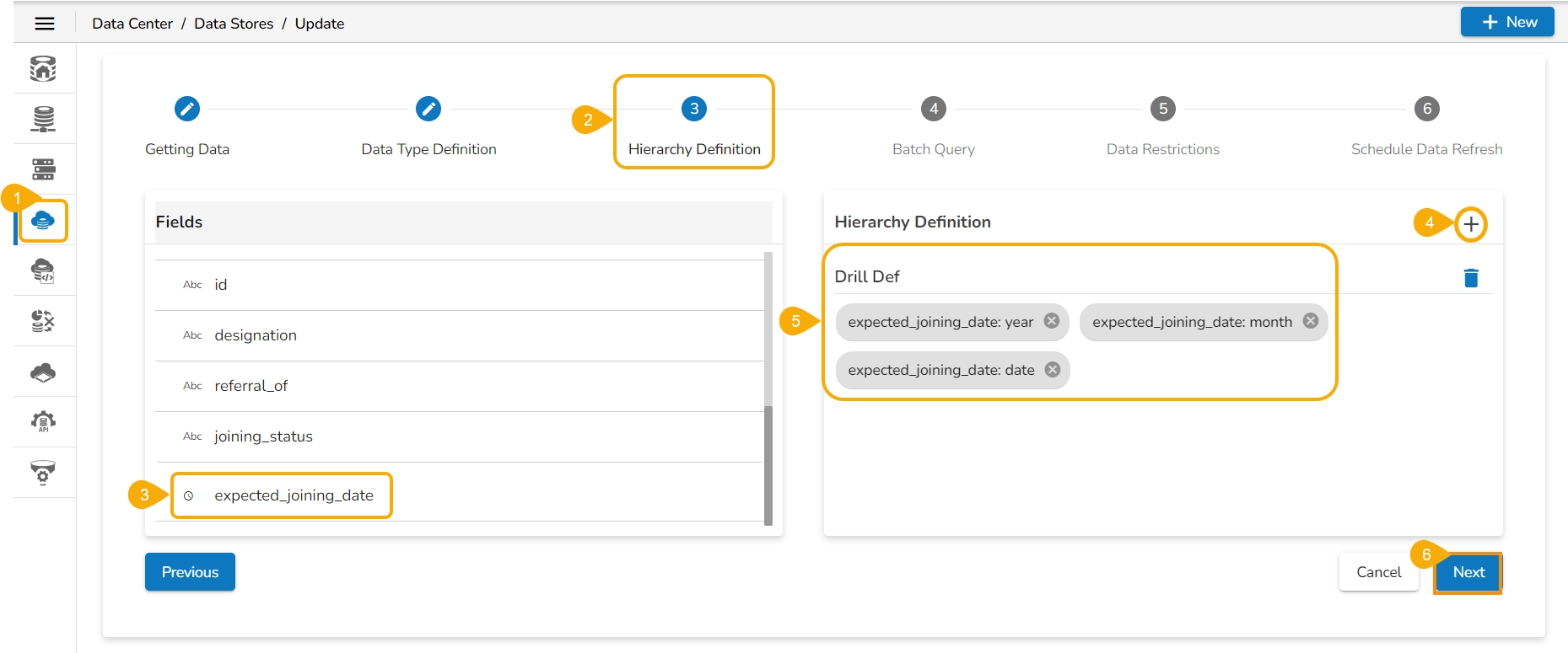
Pre-requisite: The user must define a hierarchical pattern among the date dimensions under the Data Center Module before using the Data Drill/ Drill into functionality in the Report.
Select an existing Data Store (or you can define the hierarchy while creating a new Data Store).
Navigate to the Hierarchy Definition tab.
Select a Date Dimension field.
Click the add icon to add a new Drill Def space.
Drag the selected Data Dimension to the Drill Def space (By default the dragged Date Dimension gets divided into 3 granularity levels).
Click the Next option.
Please Note: To save the Data Store with the defined hierarchy. Please refer to the Data Store section for more details about the Datastore creation process.
Access the saved View from a report. Use the double-clicks to open it in the Analyse mode or Click the Analyse option for the saved View.
The Analyse window opens displaying Year as the highest-level granularity of the date drill.
Select the Drill Into option for drilling down the time dimension.
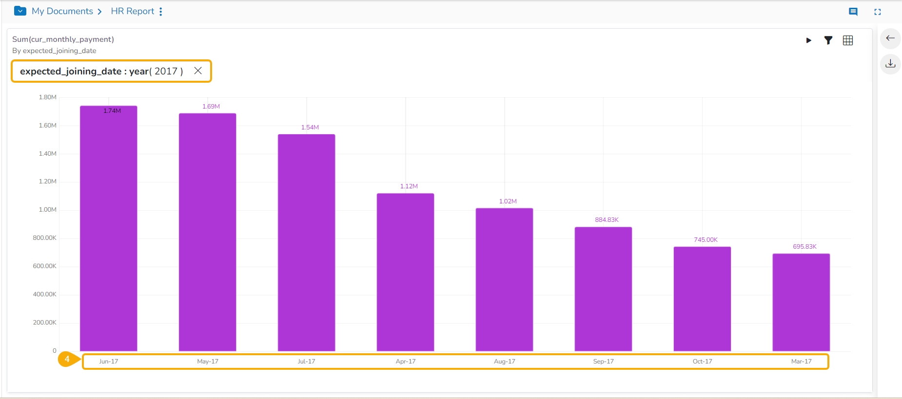
By clicking the Yearly granularity of the time value, the user gets the monthly value displayed in the selected view.
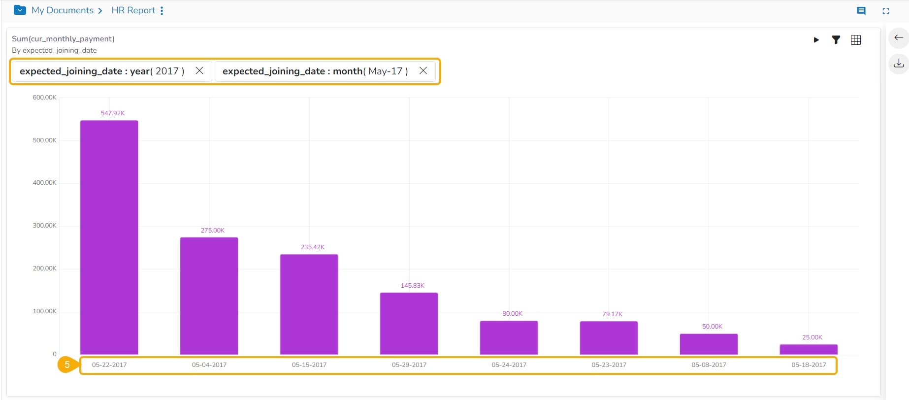
Click on the monthly granularity to display the exact dates of joining.
The user can avail a timeline play for a saved View that contains time value.
The user can access the Timeline play for a saved View from the Report. This feature allows the users to see the data changes over time.
Pre-requisite:
In order to utilize the Timeline Play feature, it's essential to have at least one Time dimension within the chosen Data Store. This time element should be linked to the relevant View during the configuration of Timeline Play.
Check out the below-given walk-through on the Timeline Play functionality.
Steps to apply Timeline Play action:
Navigate to the final screen for a report.
Select a View.
Click the Analyse icon.
The View gets opened in the Analyse mode.
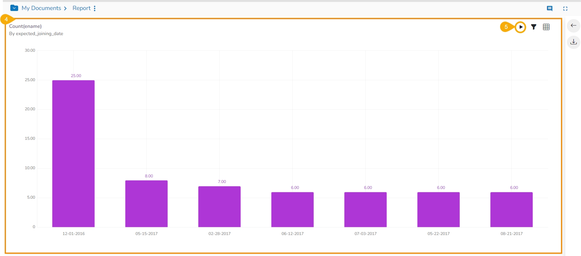
Click the Timeline Play icon.
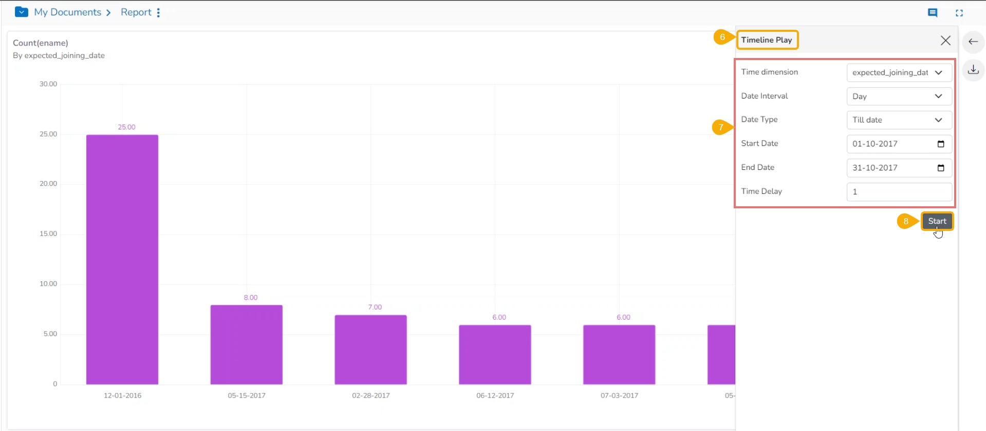
The Timeline Play window opens.
Fill in the required information in the Timeline Play window:
Time Dimension
Date Interval
Date Type
Start Date
End Date
Time Delay
Click the Start option.
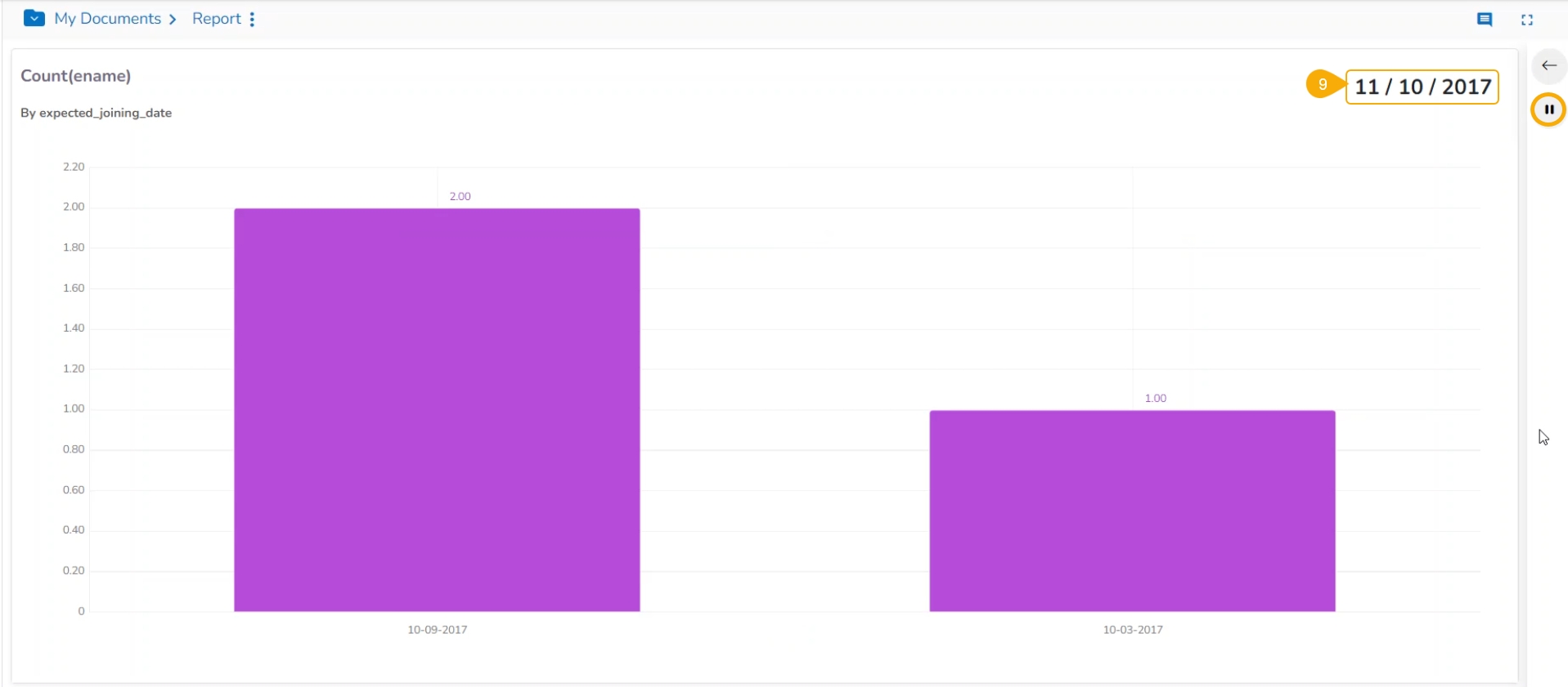
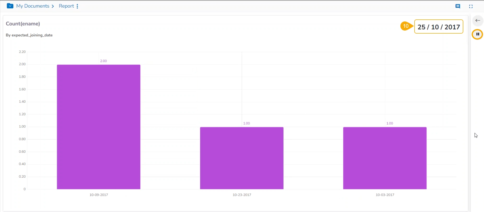
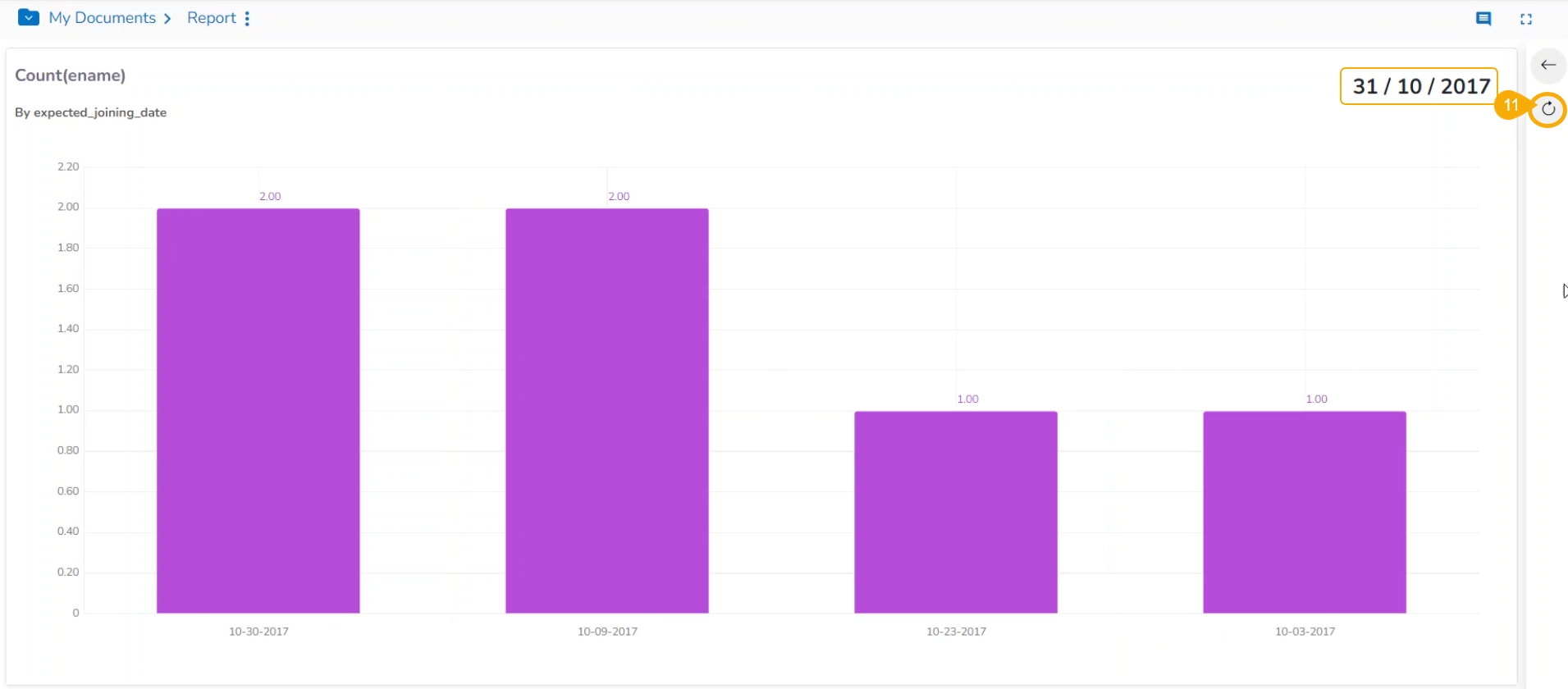
The timeline play is displayed for the selected time. The given images display-wise.
E.g., the below image displays data for the date 11th October 2017.
E.g., the following image displays data for the date 25th October 2017.
After all the selected Timeline values get played, the Resume icon gets changed into Replay.
Please Note:
This page displays the information about the selected Data Stores in context to a report.
The data store information icon helps the user to manage data stores in a report. This icon is accessible from the final screen of the report. By clicking the Data Store Information icon, a new page opens, and the users get some more options to be used on a data store.
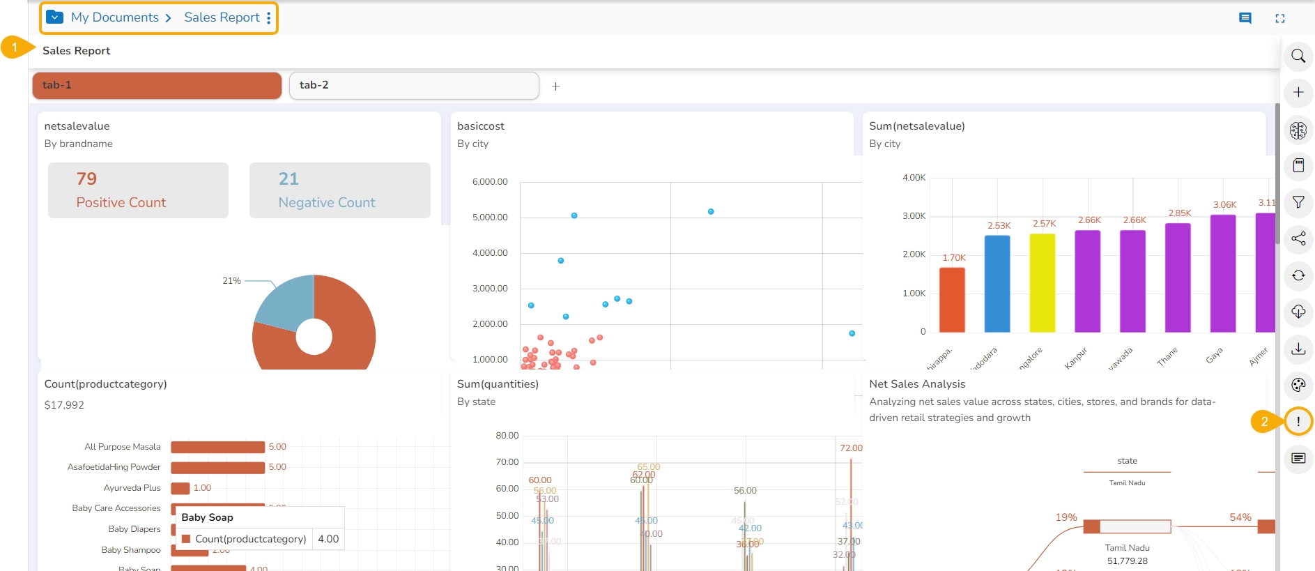
Navigate to the Storyboard of a story.
Click the Data Store Information icon.
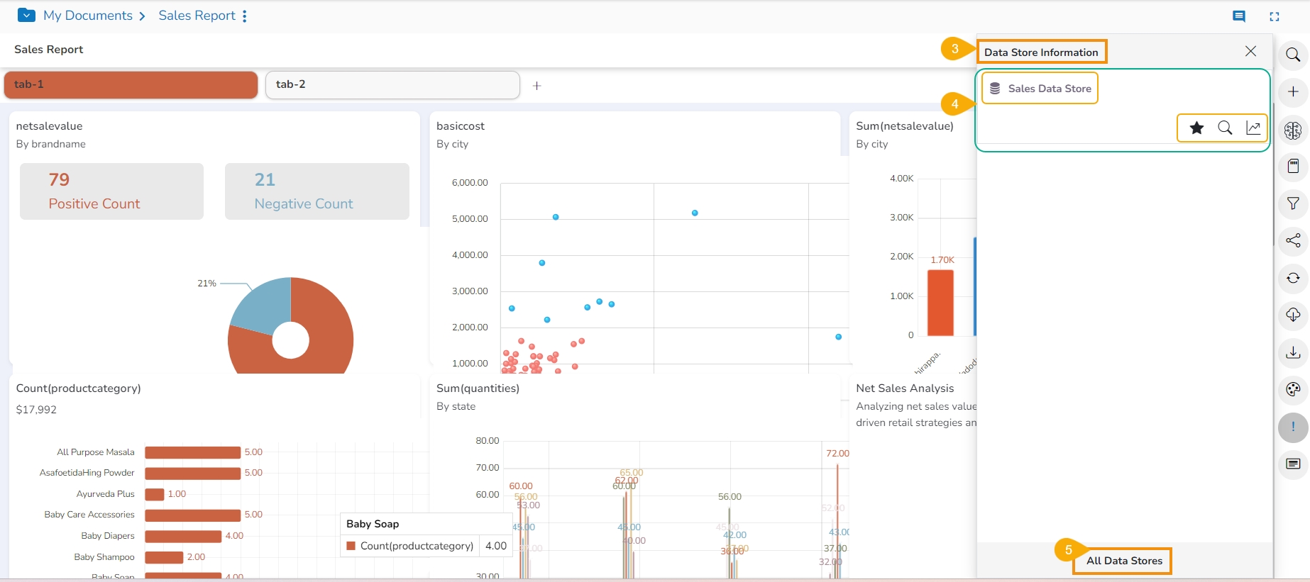
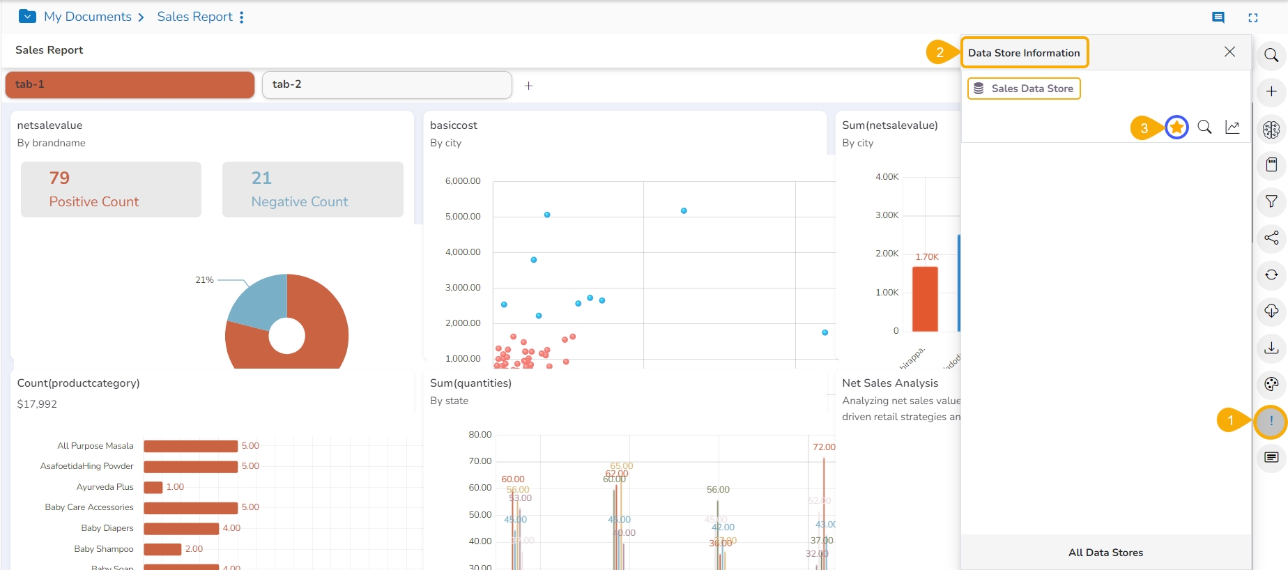
The Data Store Information window opens.
The user can see the current report's selected Data Store(s). The user can perform the following actions by using the various icons provided for a Data Store:
Primary Store: It marks the selected Data Store as a primary Data Store.
Search: It redirects the users to the BDB Search page for the selected Data Store.
View Design: It redirects the users to the Design page for the selected Data Store.
Click the All Data Stores icon.
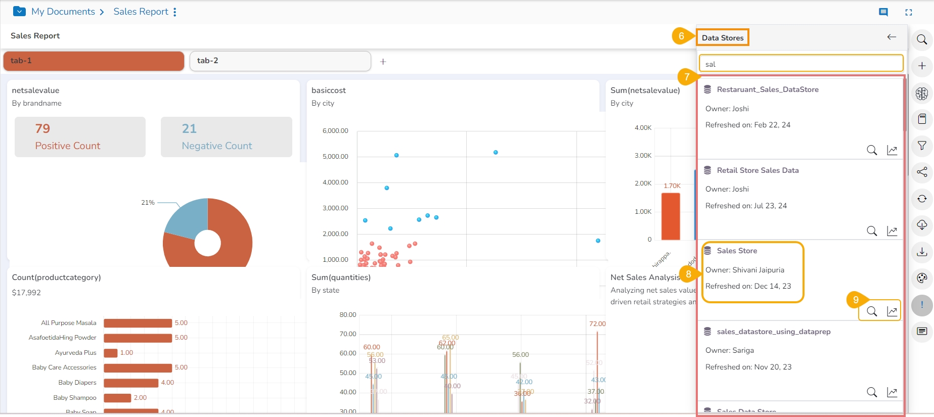
A list of the available Data Stores window is displayed for the users to select another data store.
The Search Data Store space is provided to be selected from this list. Search a specific Data Store through the Search space.
Select a Data Store from the displayed customized Data Store list.
Click the Search or Design icon to start View creation with the selected Data Store.
Please Note: The user will get the next screen based on the selected action for a data store.
Clicking the Search icon redirects the user to the Search page to create a new View for the selected Report.
Clicking the Design icon redirects the user to the Design canvas to create a new View for the selected Report.
The user can select a Data Store from the list of used Data Stores in case of a Story by using the Data Store Information page.
Click on the Data Store Information icon from the final page of report.
The Data Store Information window opens.
Click the Primary Store icon provided next to a listed Data Store.
The selected Data Store becomes the Primary Data Store for that report, which will be selected by default while opening the Design canvas.
The timeline play can be paused by clicking the Stop icon.
The user can resume the stopped timeline play by clicking the Resume icon.
Once the timeline play is over, a Chart icon (Replay) appears using which the users can replay the timeline play.
You can click on the Close Timeline Play icon to close the Timeline play screen.
Please Note: The user gets Search and View Design icons on the Data Store Information window for instant access to those pages.
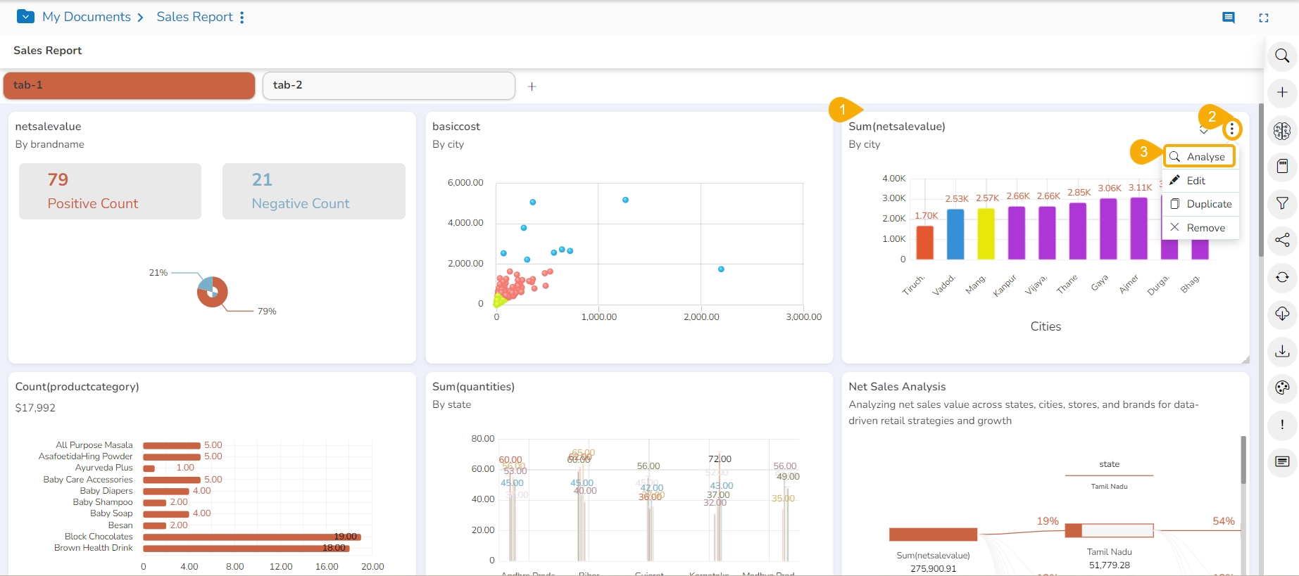
Select a View from the final screen of the Report.
Click the Options icon.
Click the Analyse option from the displayed context menu.
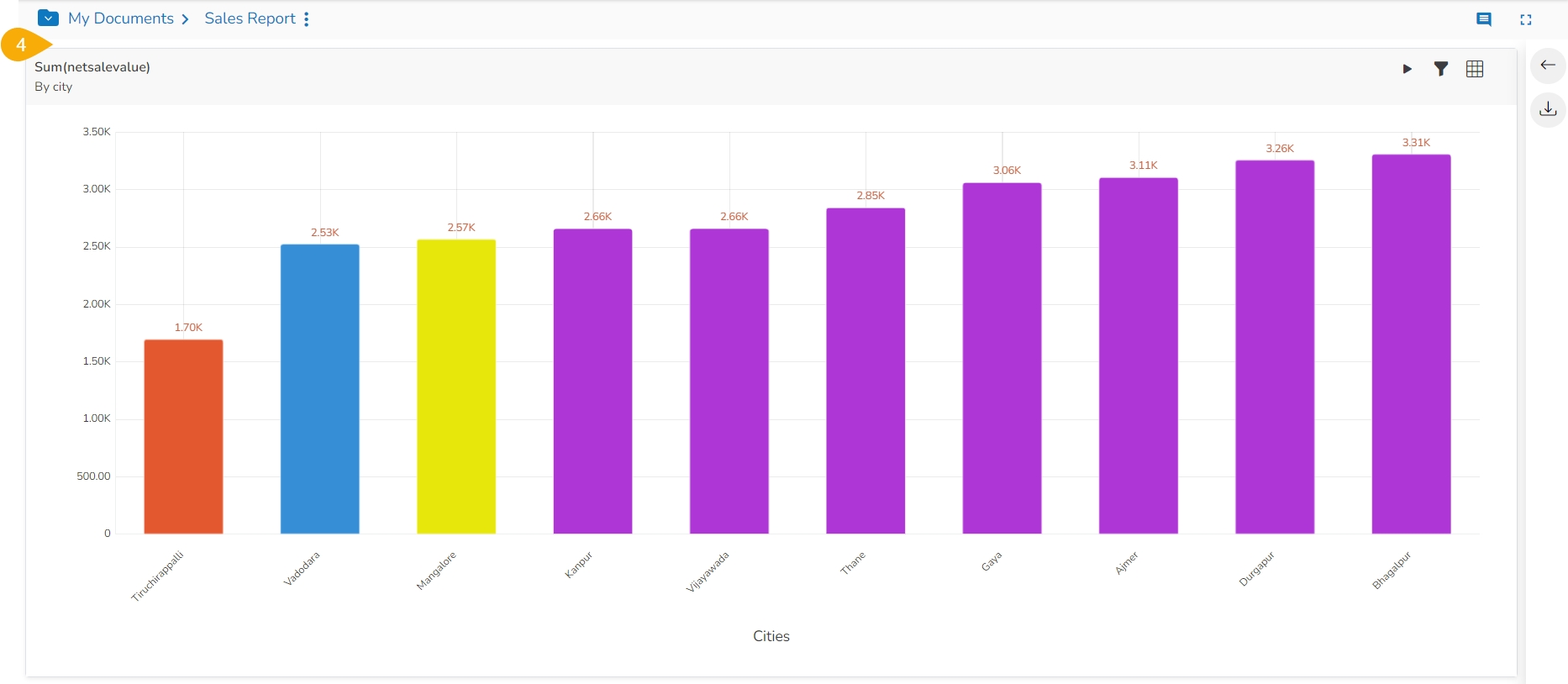
The selected View opens in the analysis mode.
The user can select any of the following options to analyze a saved view:
Icon
Name
Action
Chart
Displays data in the chart format.
Grid
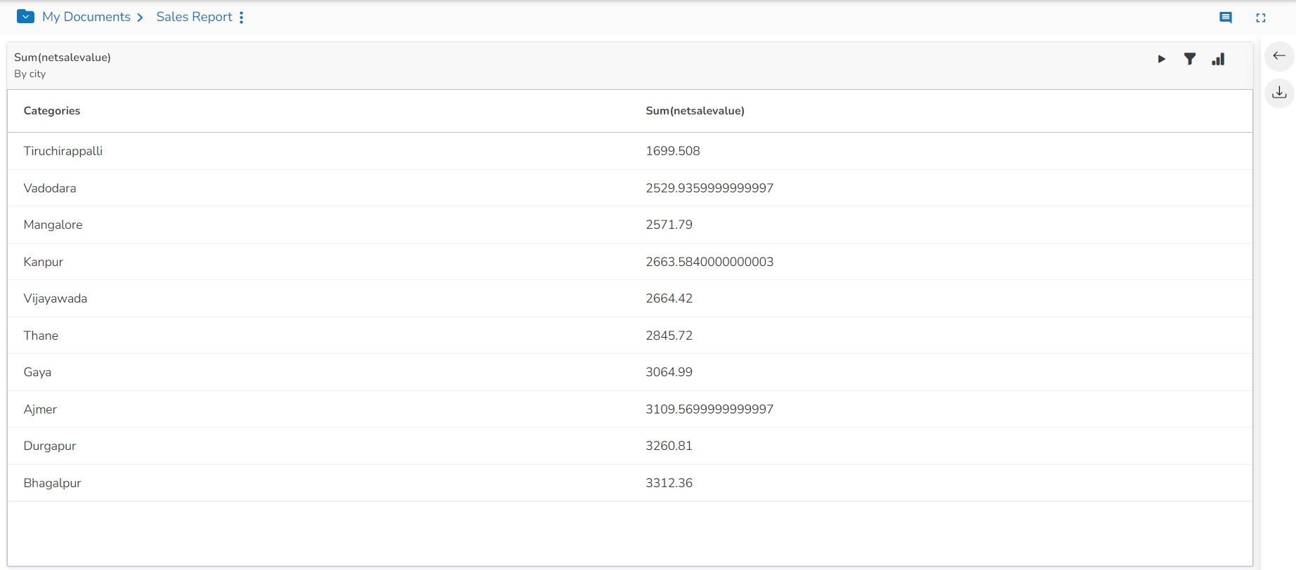
Displays data in the grid format.
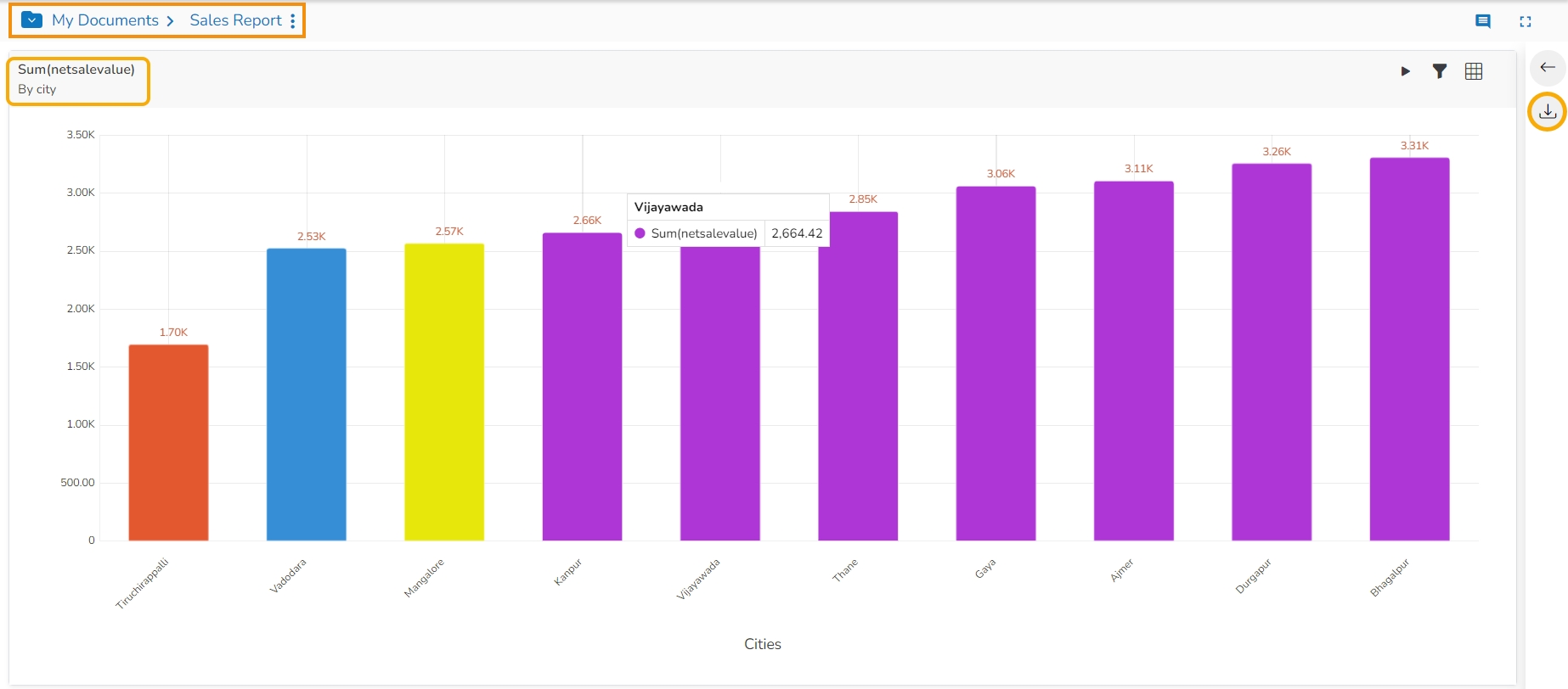
Export
Exports the Story in CSV/XLSX/PDF format.
View Filter
Displays filter panel to apply or edit view-specific filter conditions.
Timeline Play
Displays changes in the selected data over a period.
Back
Redirects back to the storyboard.
Displaying the View Data in the Grid View.
The supported Export option on the Analyze mode for a view is displayed in the following image:
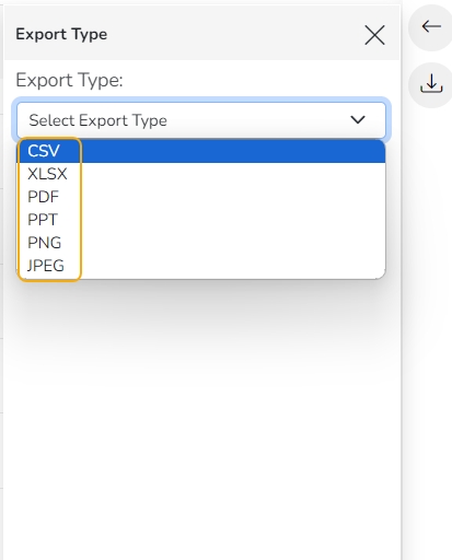
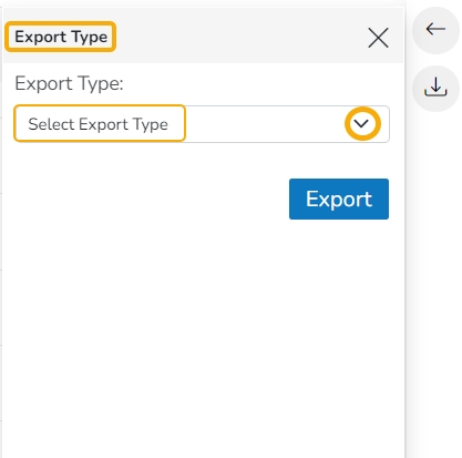
The Export Type window opens. Use the Select Export Type drop-down menu.
The supported Export types for a View are CSV, XLSX, PDF, PPT, PNG, and JPEG.
Please Note:
The Export as JEPG Image and Export as PNG Image options are provided in the Analyze mode for a view.
PDF Export in Tabular Format: The PDF export option for the Data Grid chart now exports the data in a tabular format. This enhancement easily exports and shares their Data Grid chart data in a PDF file.
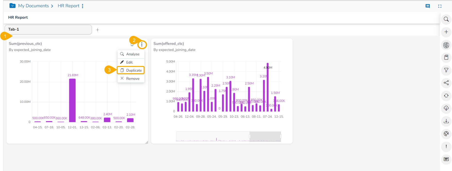
The saved View can be duplicated in a report.
Select a saved View from the Report.
Click the Options icon.
Click the Duplicate option from the Options context menu.
The duplicate version of the selected View gets added to the report.
Export your self-service visualization report in a desired format to consume it the way you like.
The user can export business stories in various formats via the Export option.
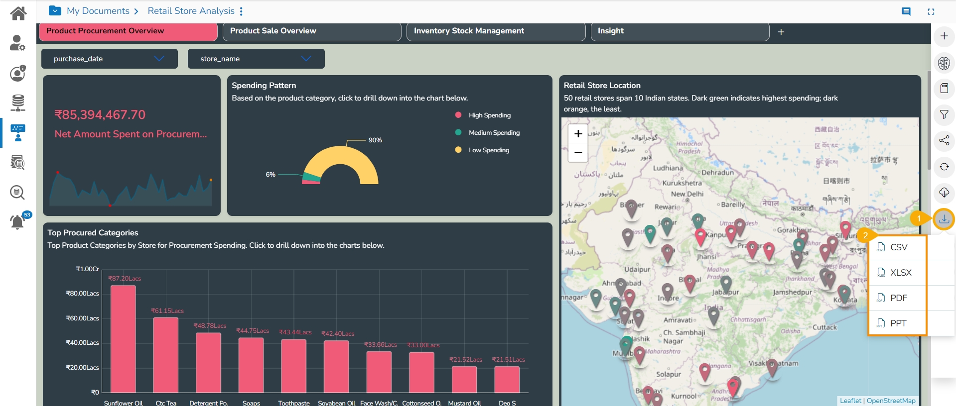
Click the Export icon from the storyboard.
A context menu opens with the available export options.
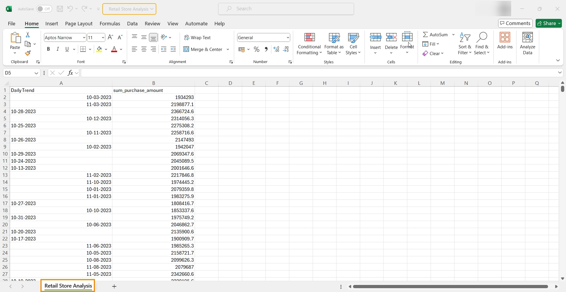
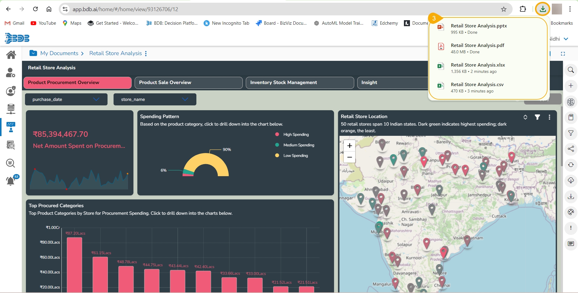
The story gets downloaded in the selected export option as displayed below.
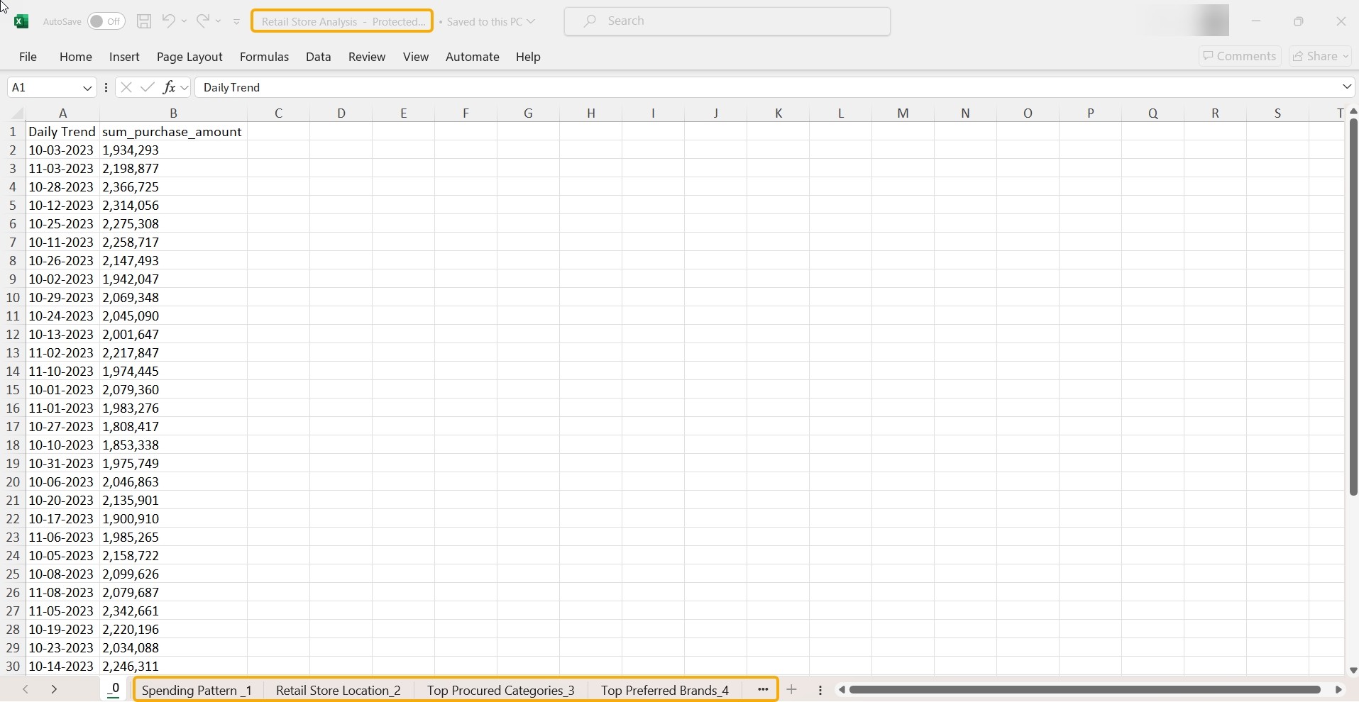
The story data gets saved in the CSV Excel format by clicking the CSV option. The collective data of different Views is displayed on one sheet.
The view-specific data gets saved in separate sheets in the XLSX Excel format by clicking the XLSX option.
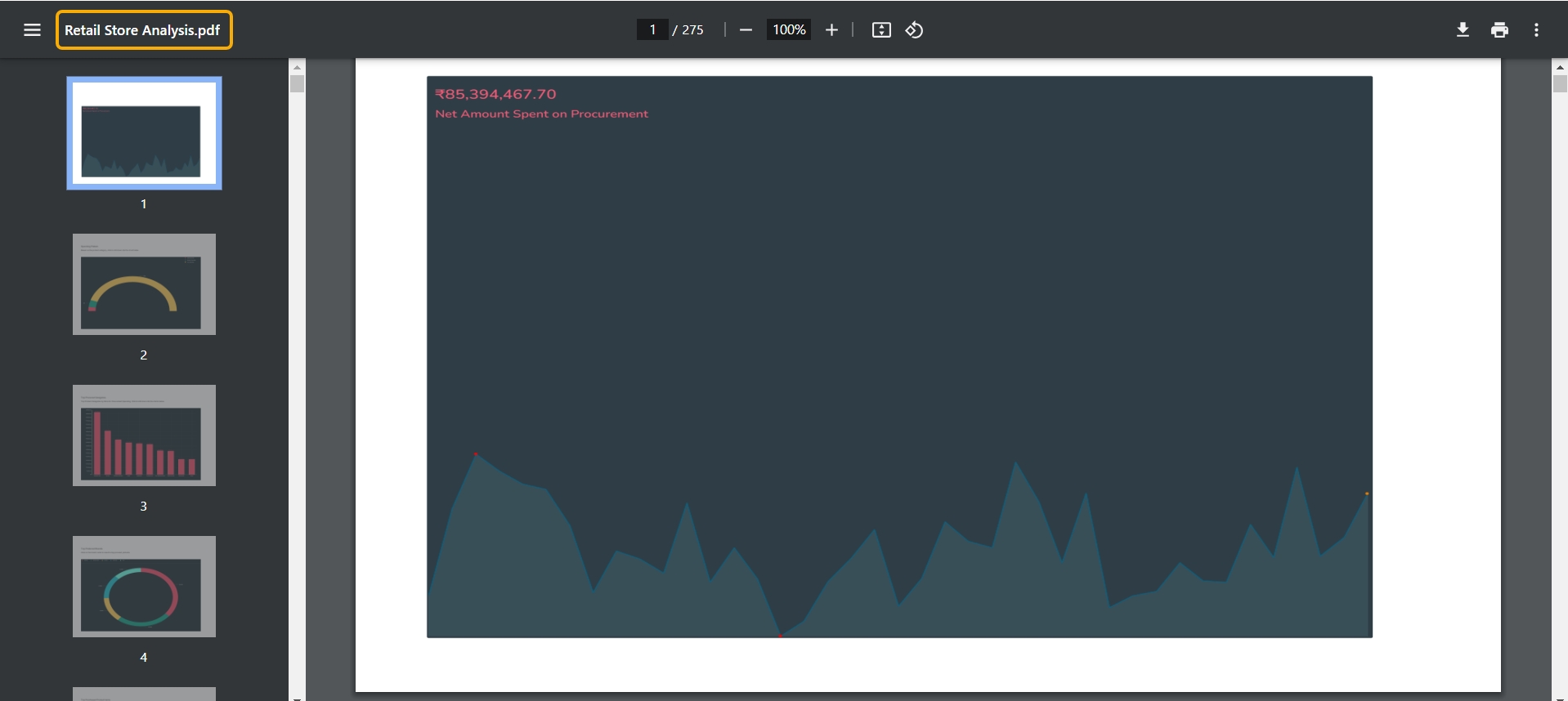
The report Views get saved in PDF format by clicking the PDF option.
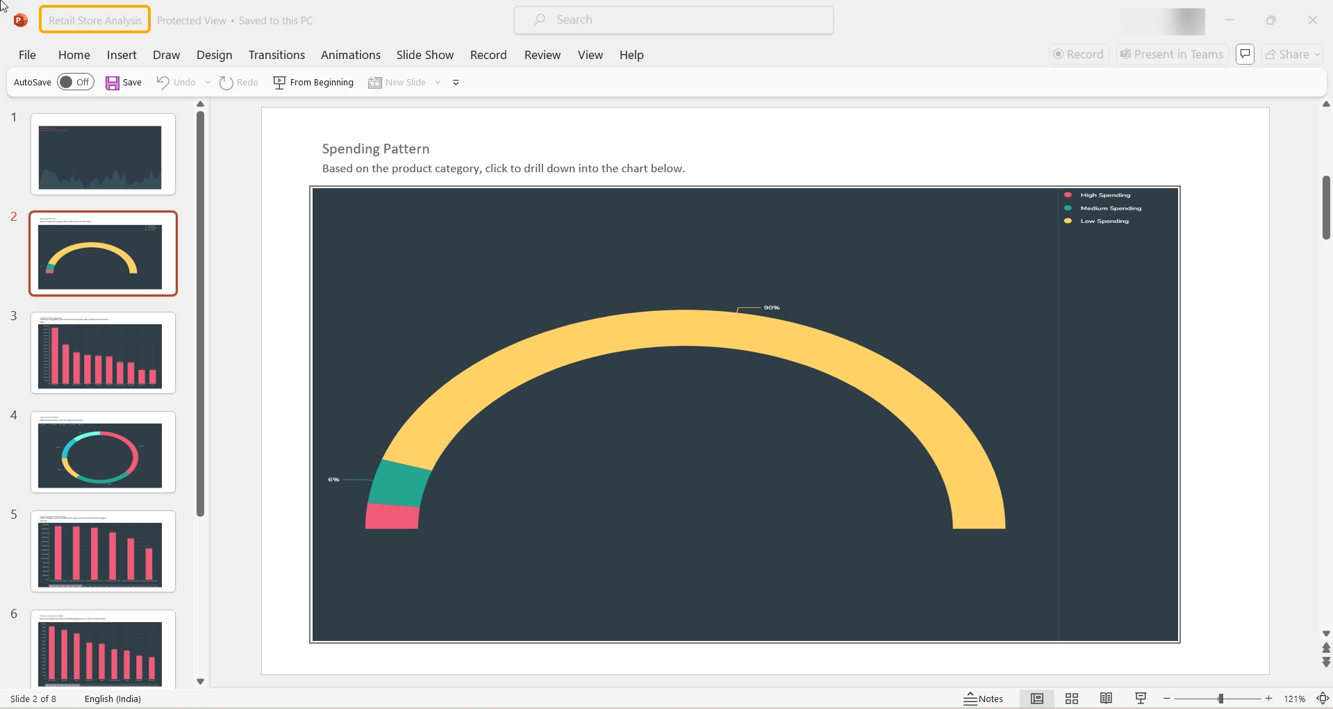
By clicking the PPT option, the report views get saved in the PPT format.
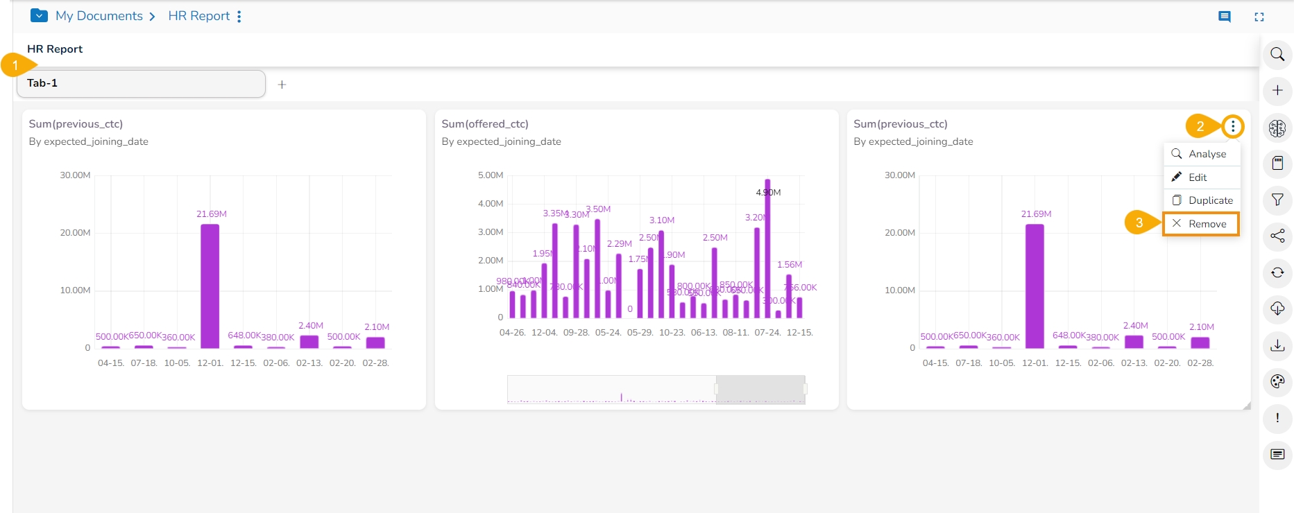
Select a view from the Storyboard.
Click the Remove option from the context menu.
A dialog box appears to confirm the deletion.
Click the Yes option.
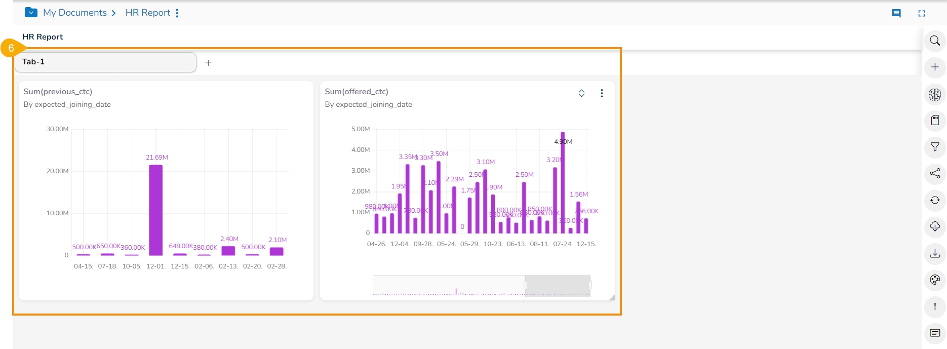
The selected View gets removed from the storyboard.


