Loading...
Loading...
Loading...
Loading...
Loading...
Loading...
Loading...
Loading...
Loading...
Loading...
Loading...
Loading...
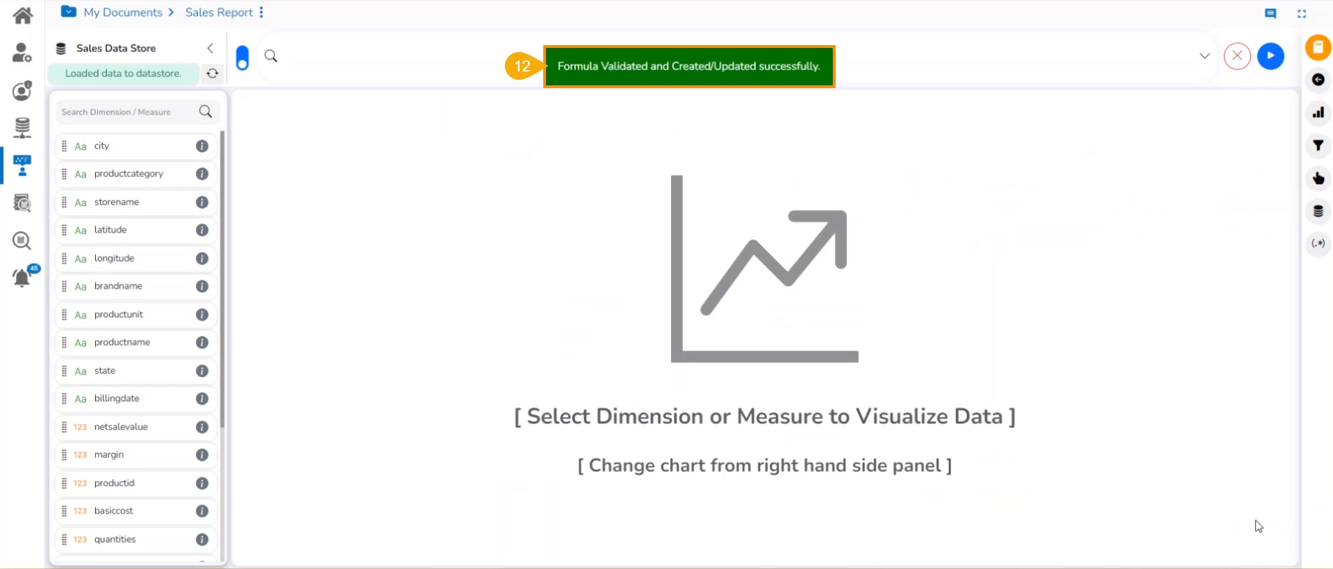
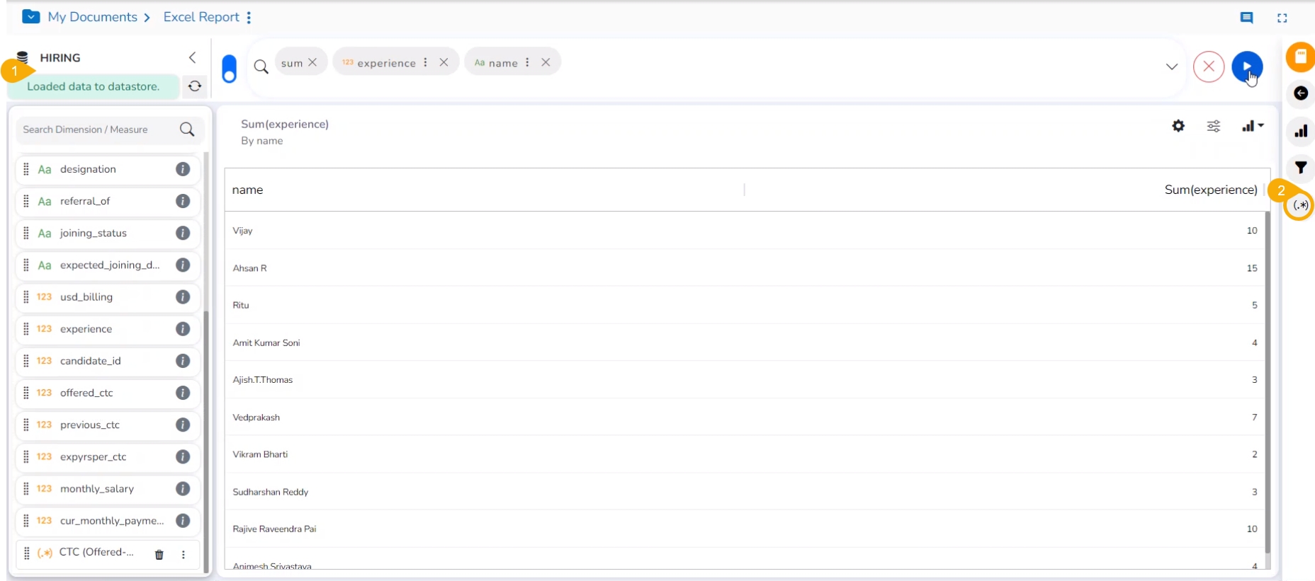
The user can create and add a calculated field in the selected Data Store by using this functionality. This function offers options to create either a Formula or add Range in the selected Data Store.
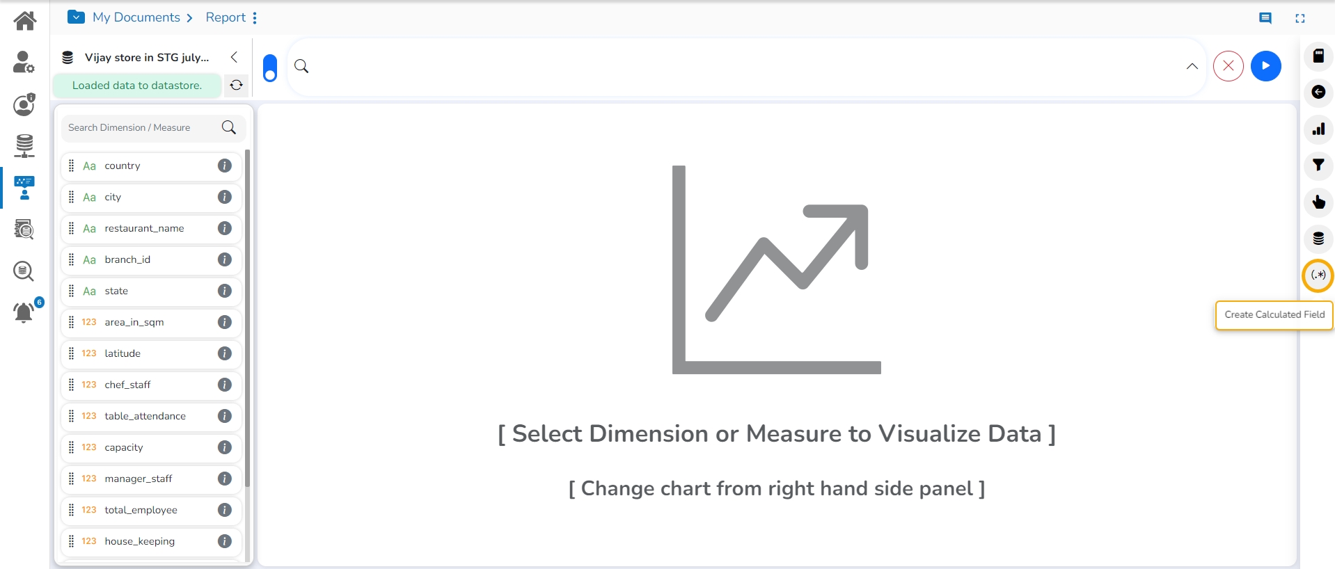
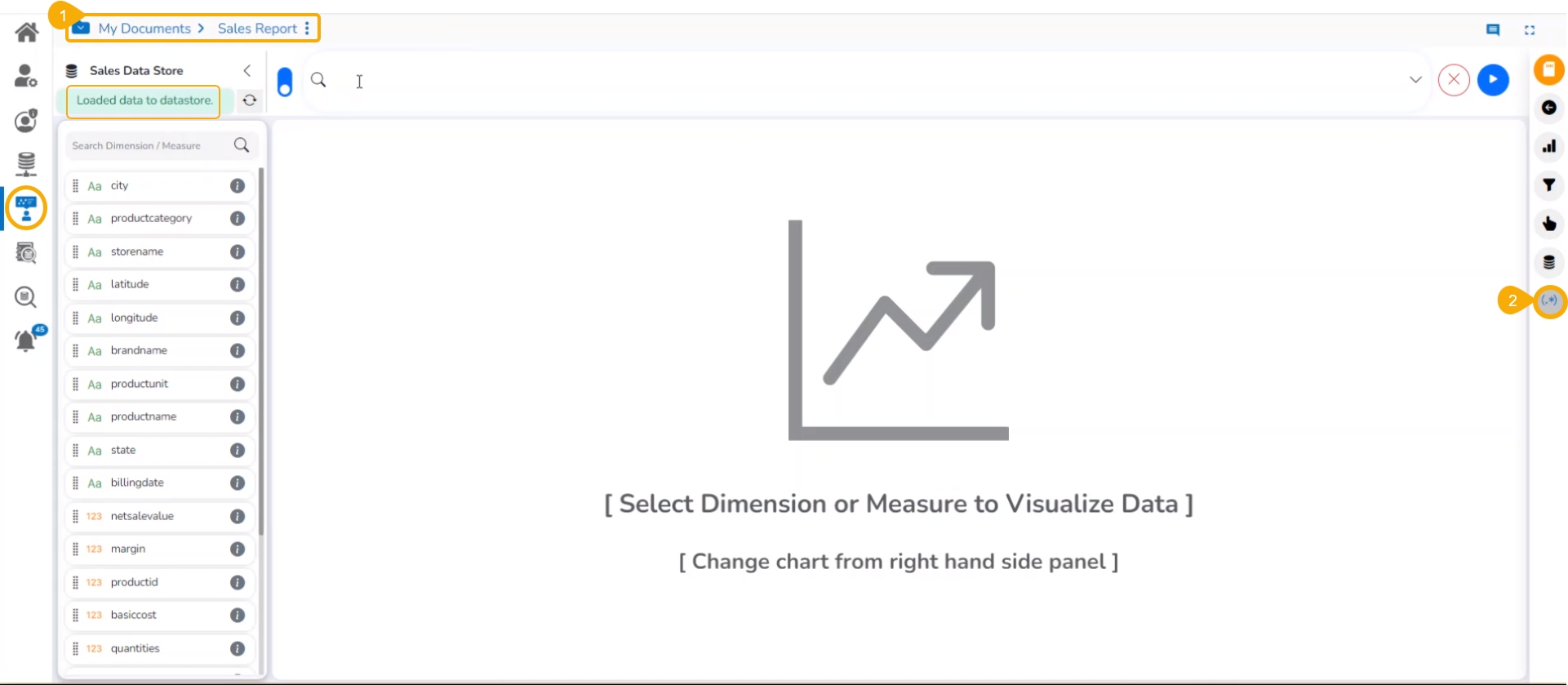
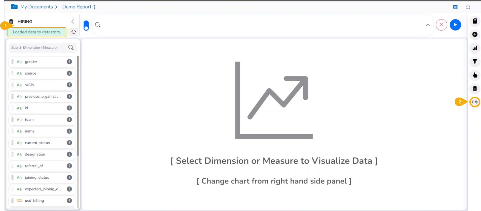
The users can access the Create Calculated Field icon from the right-hand side of the Design page.
This page explains steps to access and apply View Summary to a View.
Check out the walk-through on how to show Measure Summary for a View.
The users can access summary properties by clicking on the Summary option on the Design New page.
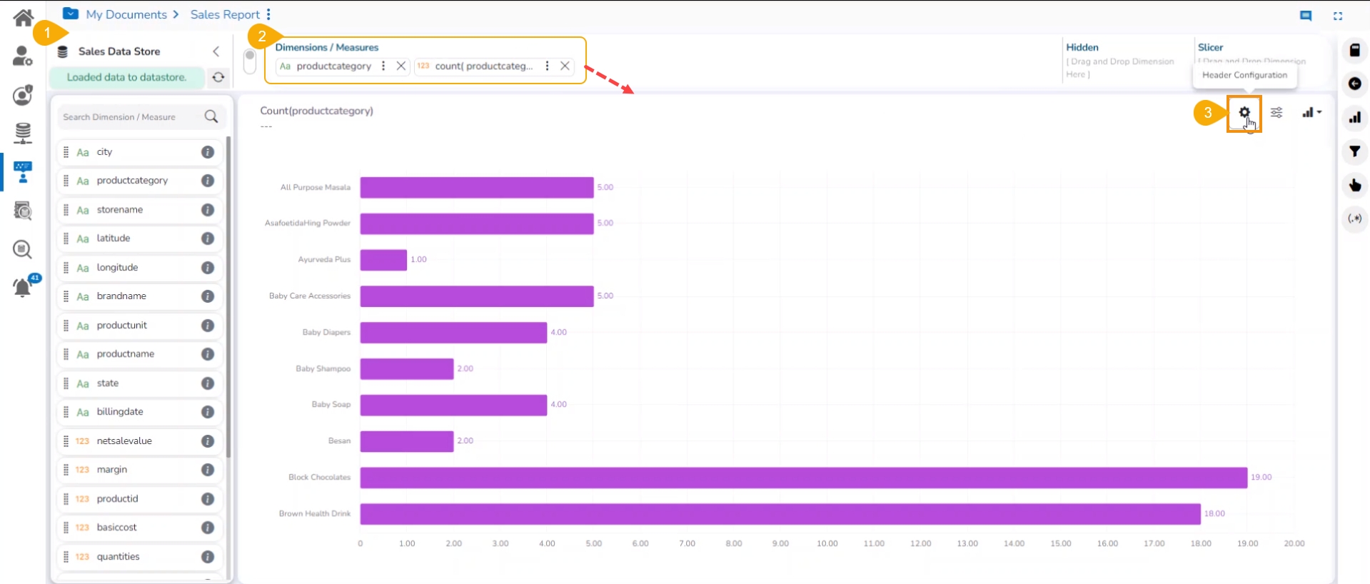
Navigate to the Design page to create a new View.
Drag and drop the required dimensions and measures to create a View.
Click the Header Configuration icon.
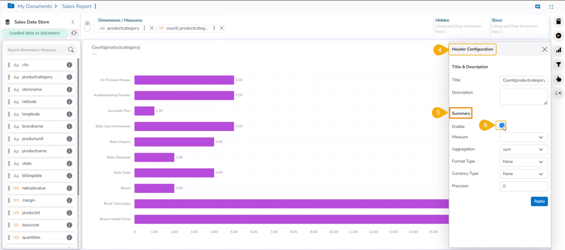
The Header Configuration dialog box appears.
Navigate to the Summary section.
Enable Summary.
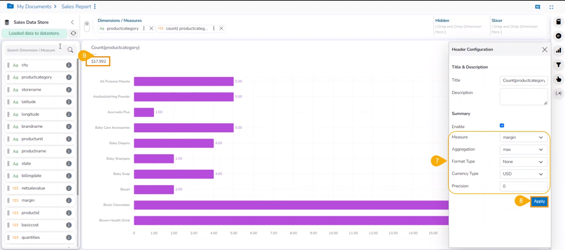
Set the following details:
Enable: Check in the Enable option for creating a summary.
Measure: Select a measure from the drop-down menu.
Aggregation: Select an aggregation type from the drop-down menu.
Format Type: Select a format type from the drop-down menu.
Currency Type: Select a currency symbol from the available choices.
Precision: Select a number up to what the precision value can be displayed.
Click the Apply option.
The measure summary value is displayed on the Design canvas page by clicking the Apply button.
This functionality has been introduced to provide users with some more insights into a dimension.
Check out the walk-through on Dimension Profiling.
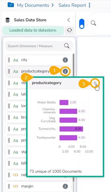
Select the Information icon from the list of displayed Dimensions on the Design page.
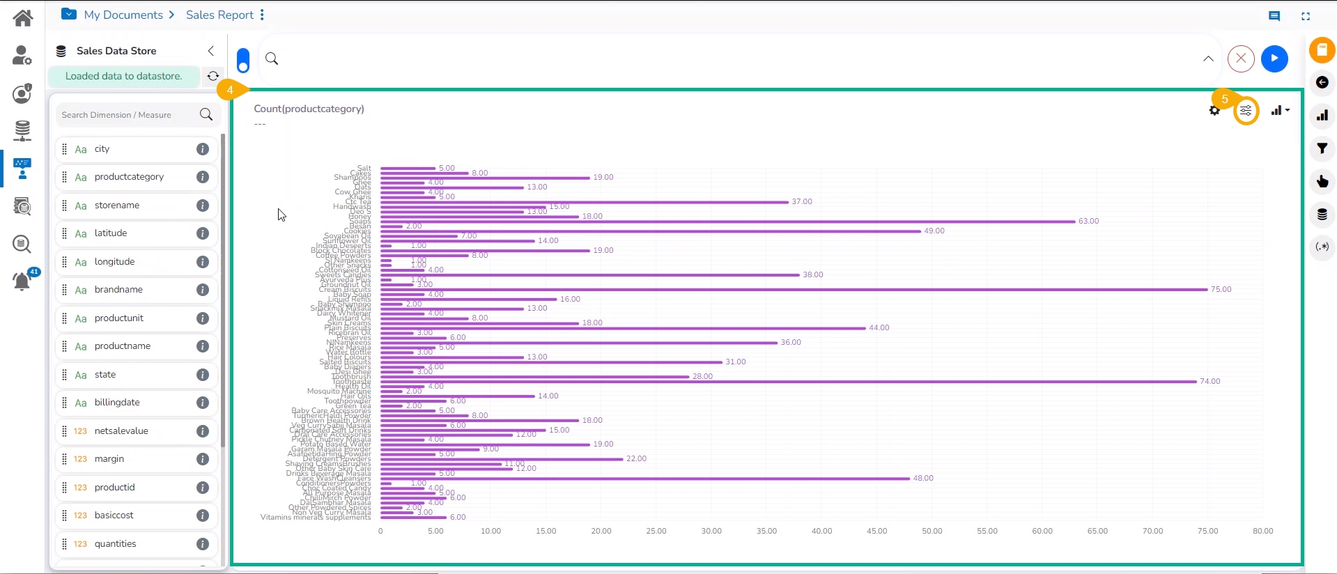
A new window opens with the Data Profile information displaying the count of the selected dimension value.
Click the MOVE TO DESIGN option.
The data profile chart gets added to the design canvas.
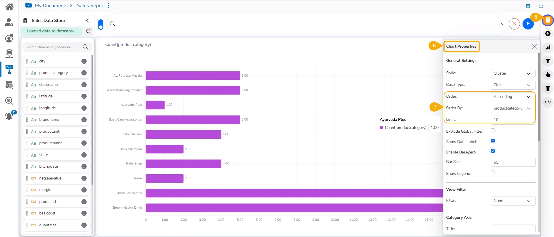
Click the Chart Properties icon.
The Chart Properties window opens.
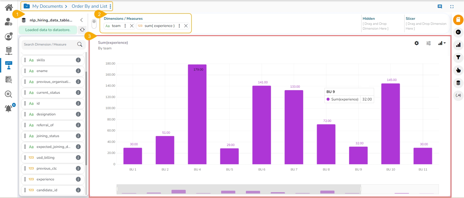
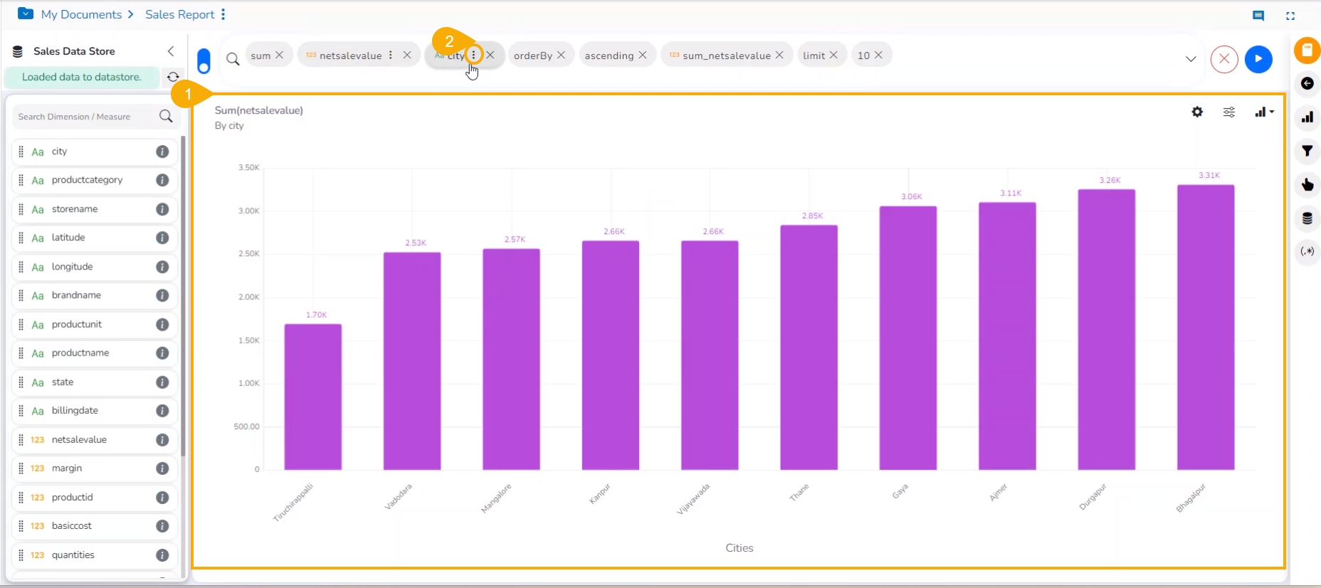
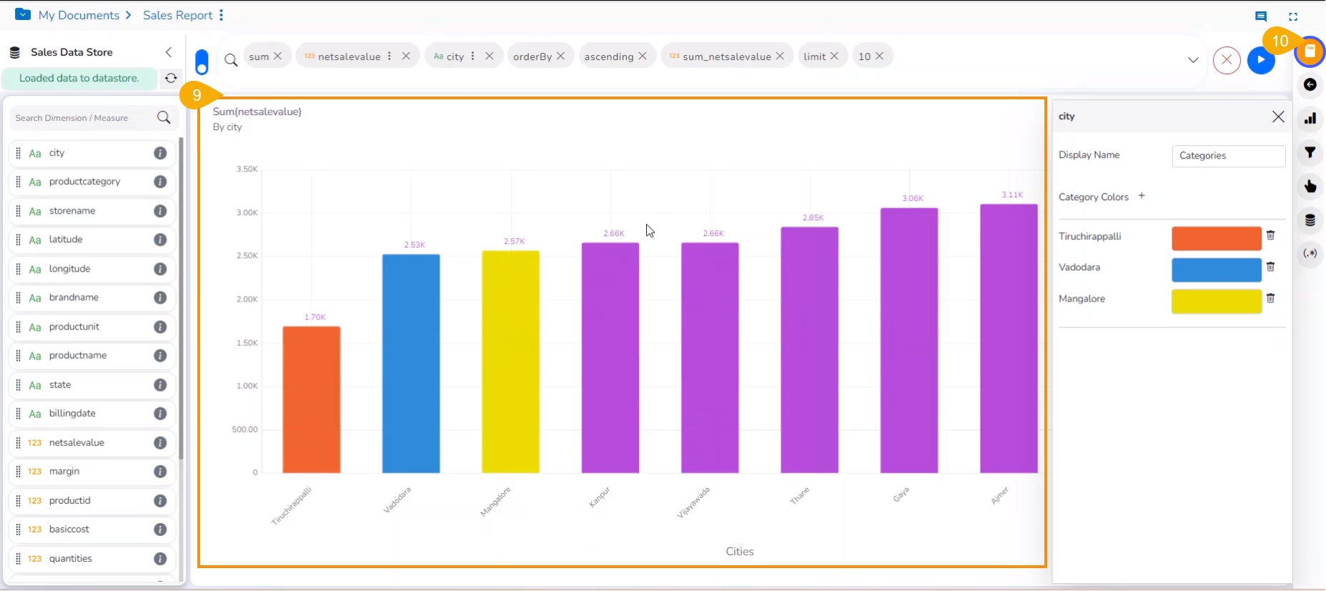
The user can apply the various modification options to the View from the Design page (E.g., The below-given image displays the View after applying for the ascending order, order by option, and limiting the display to 10 records).
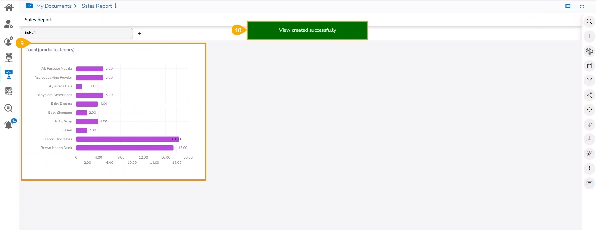
Click the Save View option to save it to the report.
The user gets redirected to the final report screen, the selected View gets saved to the final Report screen.
A notification message appears to convey that the View has been saved to the report.
The Series Properties option allows the users to setup or modify the display of the Measure in the selected View.
Check out the walk-through on configuring the Series Properties for a selected measure in a View.
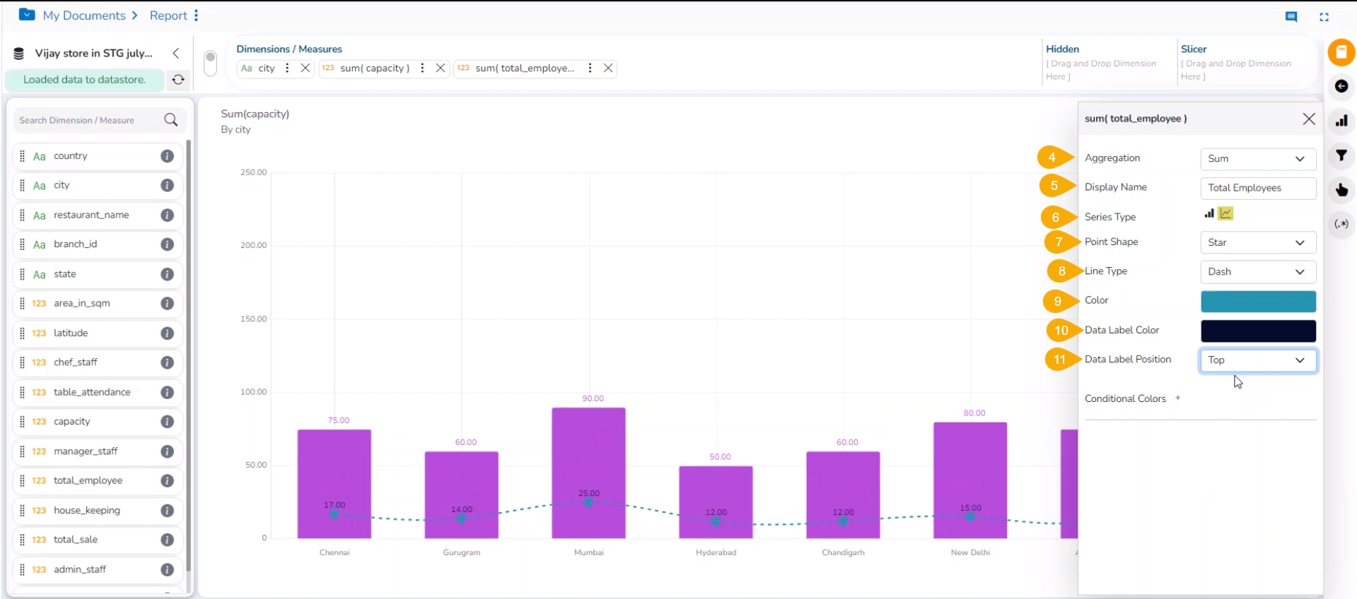
The users can configure and modify various measure-related properties through the Series Properties window.
Navigate to the Design page for a view with one or more selected measure values.
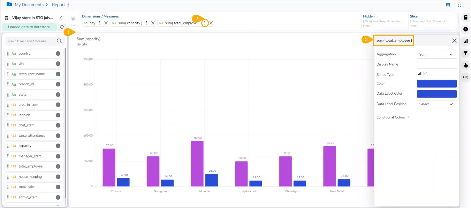
Click the Series Properties option provided next to a dragged measure.
A tab opens by the default name of the selected measure.
The users can set the following properties from a pop-up window for a mixed chart with two measures dragged on the workspace:
Aggregation: Select an aggregation option from the drop-down menu (the given choices are: Sum, Min, Max, Variance, Mean, Standard Deviation, and Cumulative Sum)
Display Name: Enter the title for the measure to be displayed in the data label
Series Type: Choose a series-type format for the selected measure
Point Shape: Select a point shape from the drop-down menu. (the given choices are: Cross, Cube, Hexagon, Point, Quad, Star, and Triangle)
Line Type: Select a line type from the drop-down menu (the given choices are: Straight, Dot, Dash, Dash1)
Axis: Select an axis out of the given choices (the users need to enable the Secondary Value Axis to get the Axis option in the Series Properties window)
Color: Select the color of the chart presentation from the given menu
Data Label Color: Choose a color for the data label from the given menu
Data Label Position: Select a position to display the data label (the given choices are: Top, Middle, Bottom)
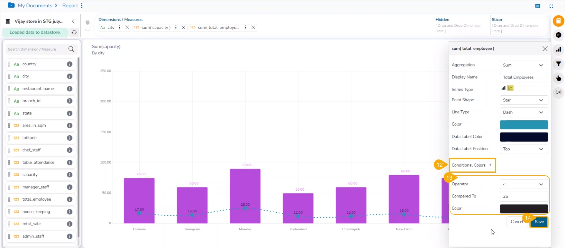
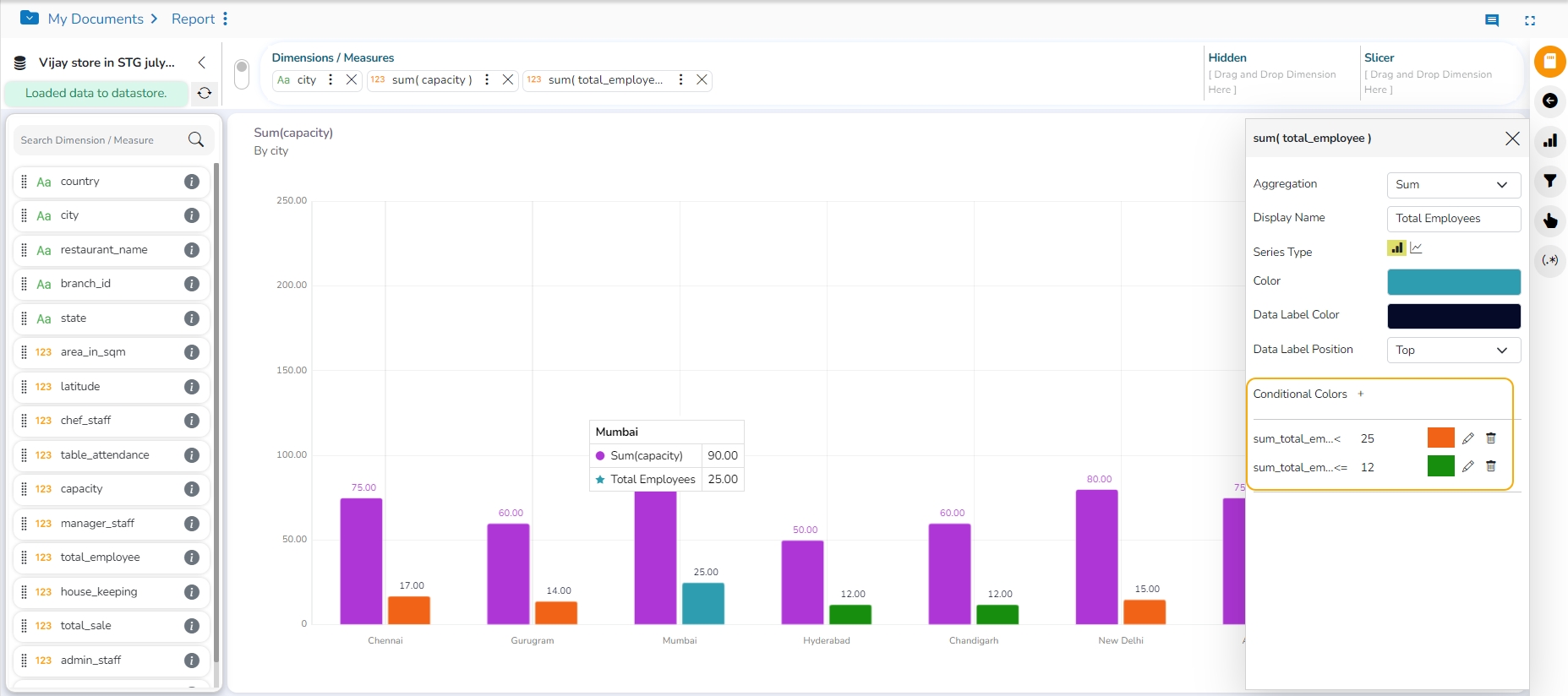
Conditional Colors: Click the Conditional Colors icon to insert a new condition.
Configure the below-given fields to apply a new condition on the selected measure.
Operator- Select an operator from the drop-down menu (the supported operations are <, <=, >, >=, ==, !=).
Compared To - Set a value to which the operator can be applied.
Color- Choose a color to be applied when the set condition is met.
Click the Save option.
The user can provide multiple conditions for a single measure column.
Please Note:
The Series Properties may differ as per the selected chart components.
Users must enable the Secondary Value Axis from the Properties tab to get the Axis field in the Series Properties.
Users can change or modify the View title by clicking on the edit options next to the View name.
Click the Edit icon > Modify/change the title for the selected measure or dimension > click the Checkmark icon to save the change and the Close mark icon for not to save the change.
This section explains formula field creation at both record and summary levels.
Please Note: The 'if-else' function does not support other functions in the Formula Expression.
This section aims at explaining the details about creating a View. The users can get acquainted to the various options that are accessible on the Design Canvas.
This page describes Record Level Formula field as Dimension and Measure in a Report.
Please Note: The user can set the database settings using the Data Store Settings option provided under the Configuration part of the Administration module.
Check out the given walk-through on creating a formula field at the record level.
Navigate to the Design tab after selecting a Data Store to design a new view.
Click the Create Calculated field icon.
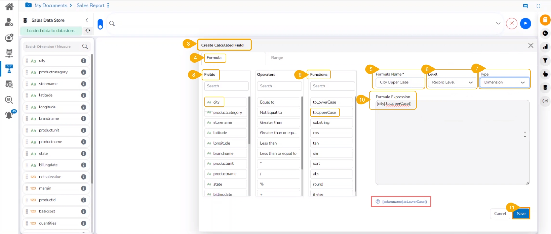
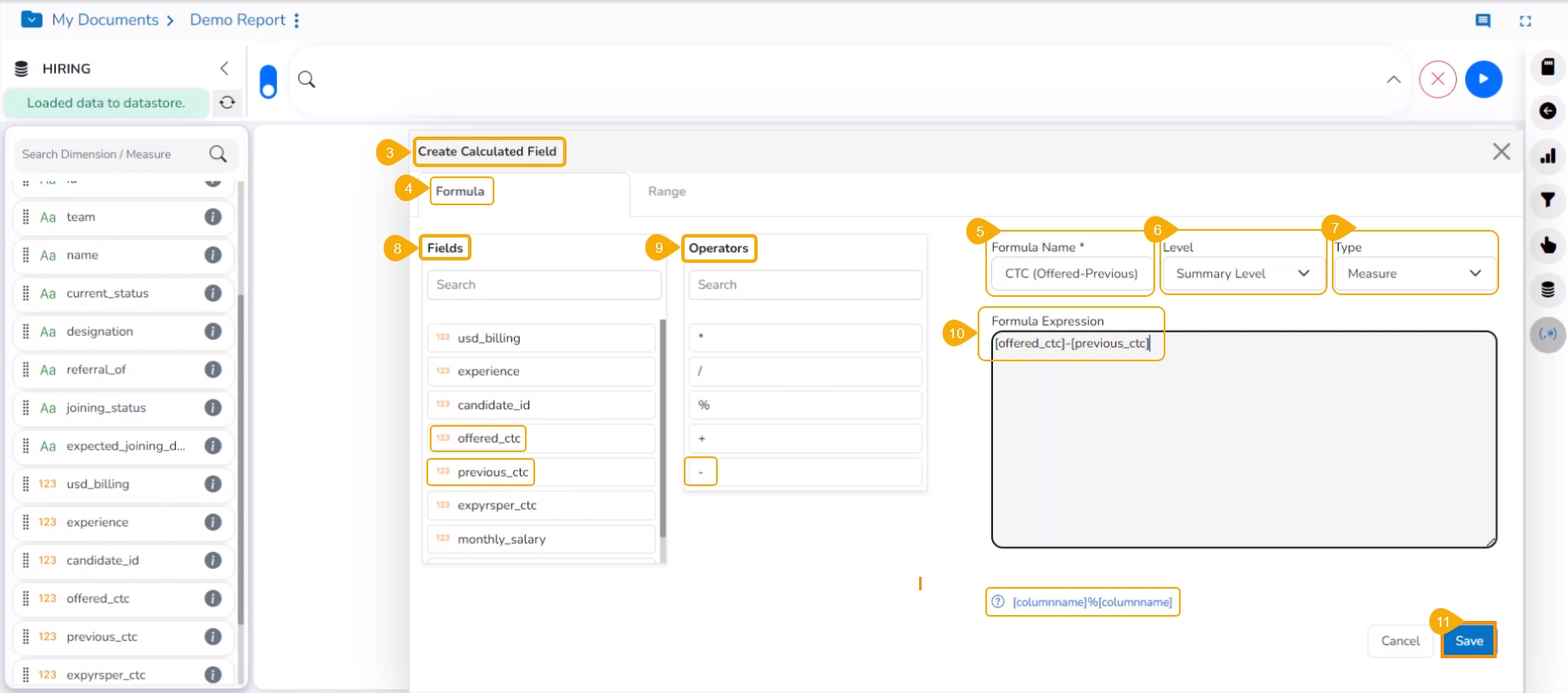
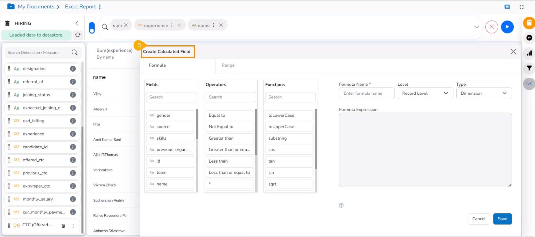
The user gets redirected to the Create Calculated Field window.
Please navigate to the FORMULA tab (It opens by default).
Formula Name: Give a title to the formula field.
Level: The user can create the calculated field at two levels.
Record Level
Summary Level
Type: Select an option from the drop-down menu to decide the kind of the Formula Field.
Dimension
Measure
Fields: All fields from the selected Data Store list are in this window. The users can select the required fields by tapping on them.
Functions: All the available functions are listed in this window. The users can select the required functions to apply them to the chosen field.
Formula Expression: Based on the selected combination of Fields with Operators or Functions the Formula Expression is entered in this space.
Click the Save option to save the formula field or calculated field.
Please Note: The users can select the required operator to add and complete the formula for a Measure column.
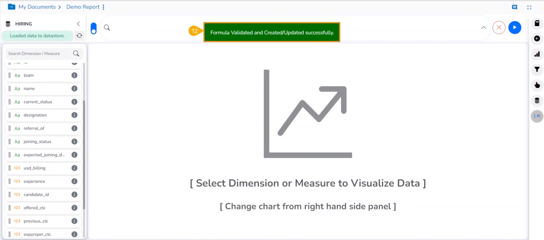
A notification message appears to ensure that the Formula Field gets created.
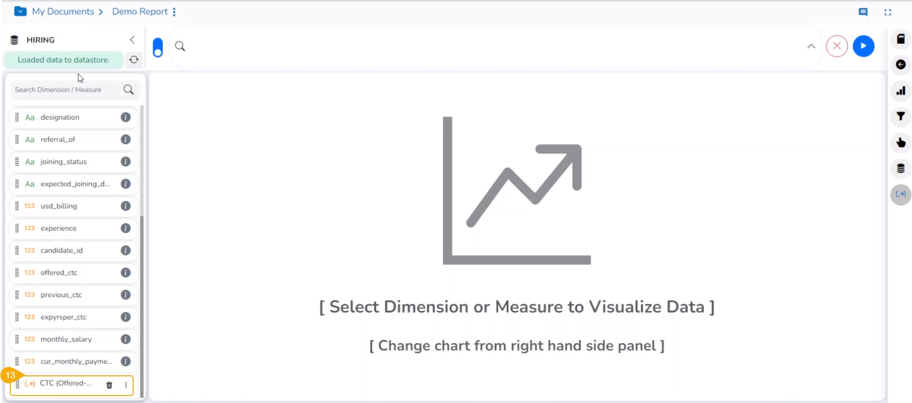
The newly created formula field gets added to the selected Data Store.
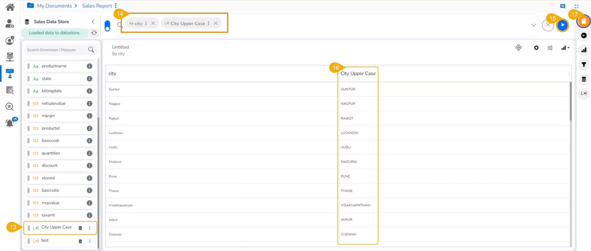
Select the formula column name to get it in the top panel.
Click the GO option.
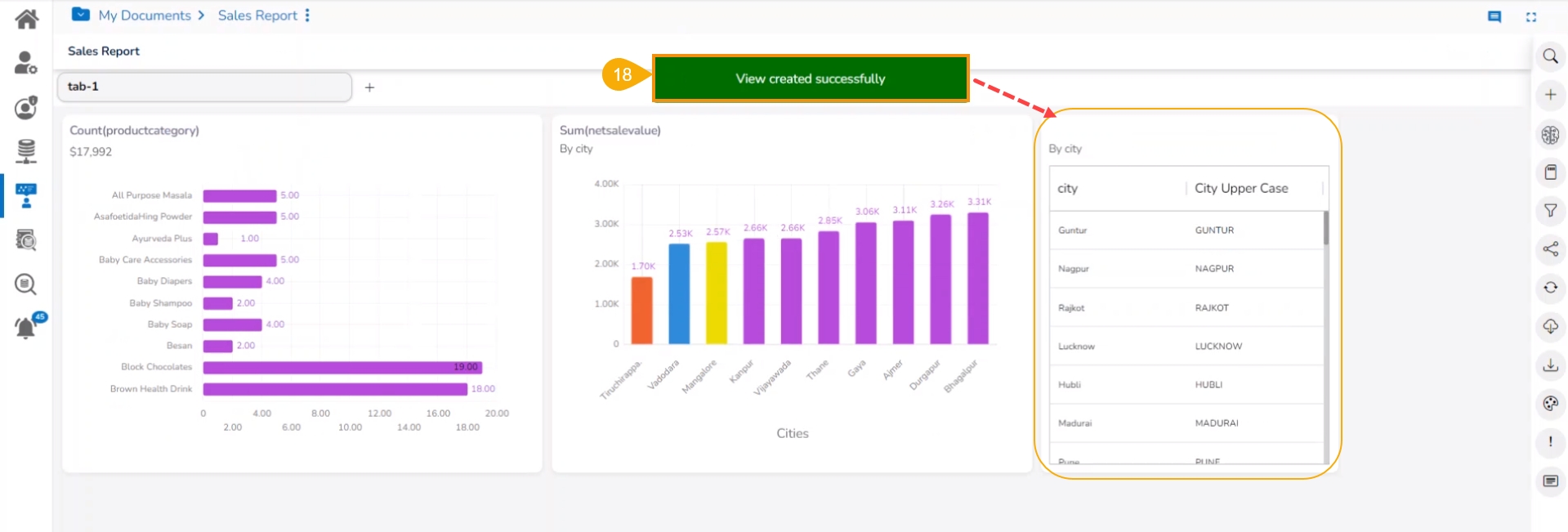
The column data is displayed in the Upper case.
Click the Save View icon to save the View to the Report.
A notification appears and the user gets redirected to the final screen of the Report with the View added to it.
Please Note:
The Formula Fields created with the Record Level option can be saved as either Dimension or Measure. Based on the selected option for the Type, the displayed Fields may vary in the right-side panel.
Double click on the Functions or Operators from the Formula Field Editor where the MongoDB server is configured in the Admin Settings as it generates one expression. The tan function does not support the MongoDB server.
This section describes Summary Level Formula field.
Check out the illustration on creating a Formula Field at the Summary level.
The user can also create a formula field choosing the Summary Level as a level option from the Formula field editor window.
Navigate to the Design page of the report.
Click the Create Calculated Field icon.
The Create Calculated Field window appears.
Navigate to the Formula tab (It is the default tab).
Give a name to the new field.
Choose Summary Level from the Level drop-down menu.
Select a Save as option (It allows only Measure as the Save As option).
Select fields using the Fields tab.
Select an Operator from the Operators column.
Enter a Formula Expression using the Fields and Operators.
Click the Save option.
A notification message ensures that the Formula field is created.
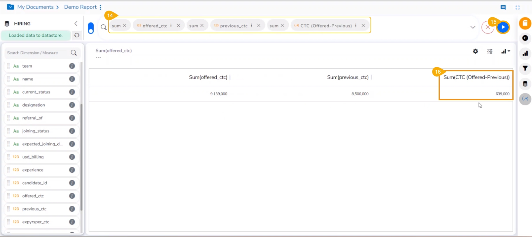
A new Formula Field gets created and added to the list of dimensions and measures.
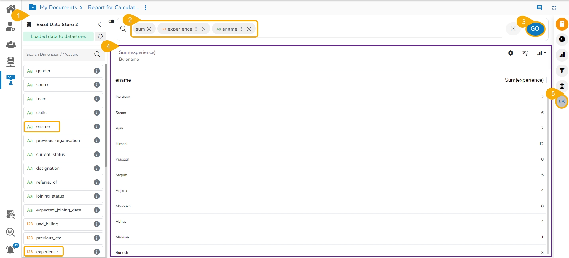
Add the newly created Formula Field to the top bar together with the earlier existing columns taken to create the new column.
Click the GO option.
The Formula Field data gets displayed in the current View for the users to validate the Formula.
Please Note:
The Summary level Formula Field only gets saved as a Measure. It can't be saved as a Dimension to the Data Store.
Summary Level will not be listed for the space where the MongoDB server is configured in the Admin Settings.
This section provides steps to create a range using the calculated field option.
Check out the walk-through on creating a Range using the Create Formula window.
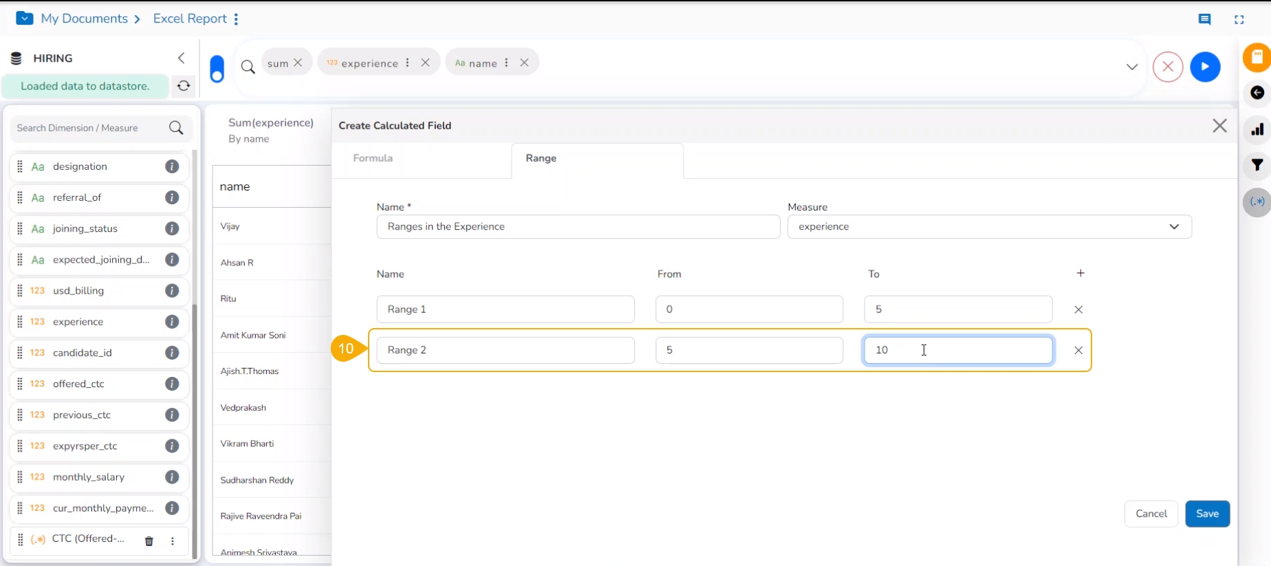
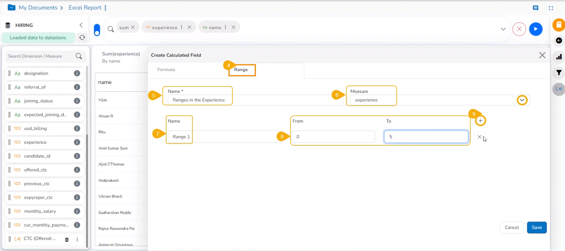
The user can create a new calculated field in the selected data store using the Range tab.
Navigate to the Design Workspace.
Click the Formula Field Editor icon.
The Create Calculated Field window opens.
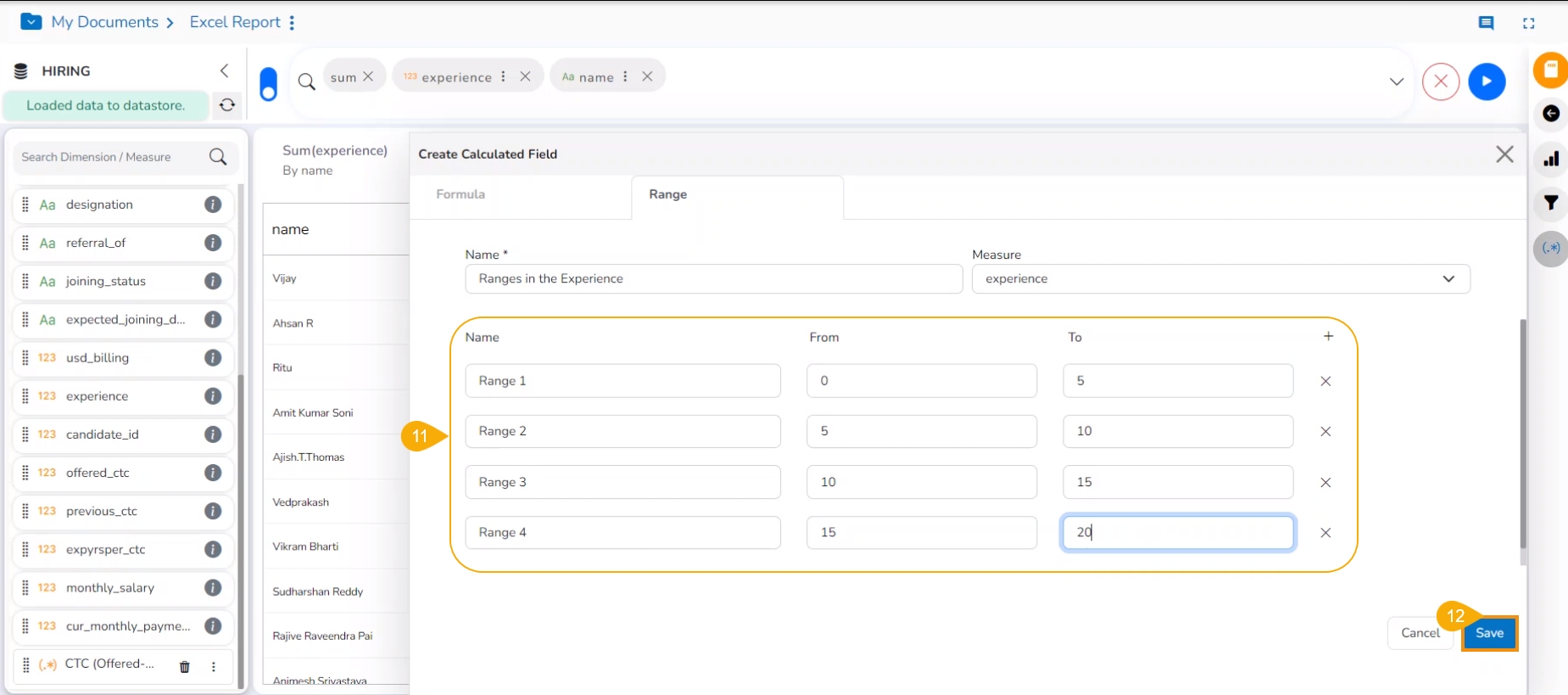
Select the Range tab.
Name: Provide a title for the formula field.
Measure: Select a Measure field using the drop-down menu.
Click the ADD ROW option.
Provide the following information to create a range:
Name: Provide a name for the defined range.
From: Set a minimum value to define a specific range.
To: Set a maximum value to define a range.
Click the Add icon.
A new field gets added to create a new Range.
You may insert multiple ranges and define them.
Click the Save option.
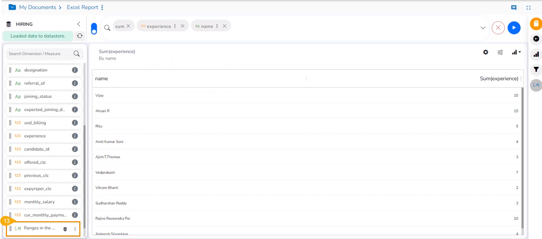
A new calculated field gets added to the selected Data Store.
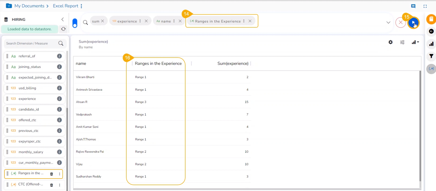
Select the newly created calculated field and add it to the top menu bar.
Click the GO option.
The calculated field will display the range based on the experience value.
Please Note:
The Range option will not be listed for the space where the MongoDB server is configured in the Admin Settings. The Range functionality is available only if the Elastic Search configuration is done from the Admin Settings.
The Calculated Field with various ranges gets added a Dimension by default.
Get slices inside a View based on the selected dimension.
Check out the walk-through given below on how to add a slicer.
Navigate to the Design canvas.
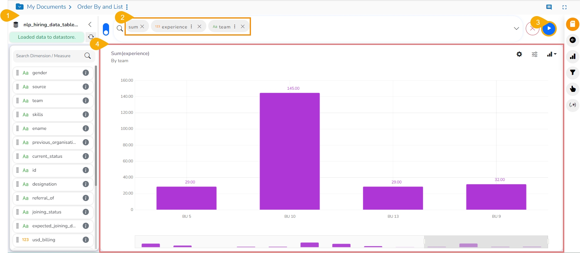
Select the dimension and one measure to the Dimensions/ Measures column using the clicks at the top bar.
Click the GO option.
A View is displayed based on the selected combination of the Dimension and Measure.
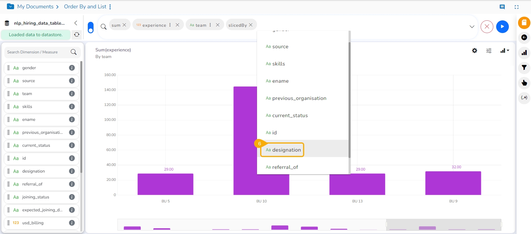
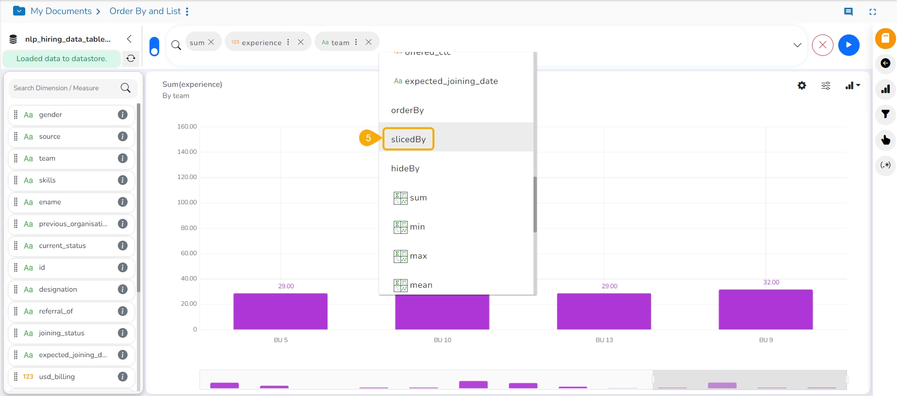
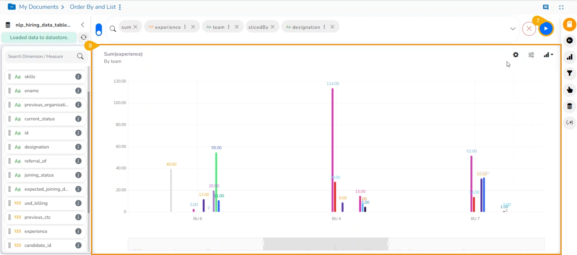
Select the sliceBy option by the next click.
Select another Dimension by using the next click.
Click the GO option.
The View is displayed based on the selected slicer dimension value.
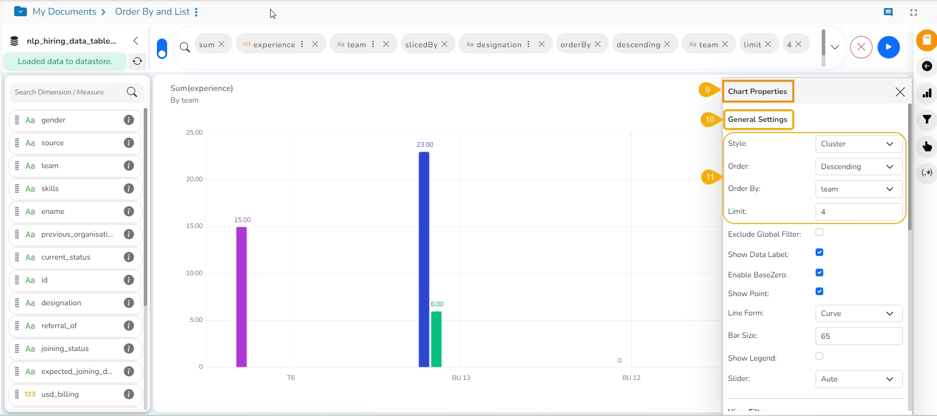
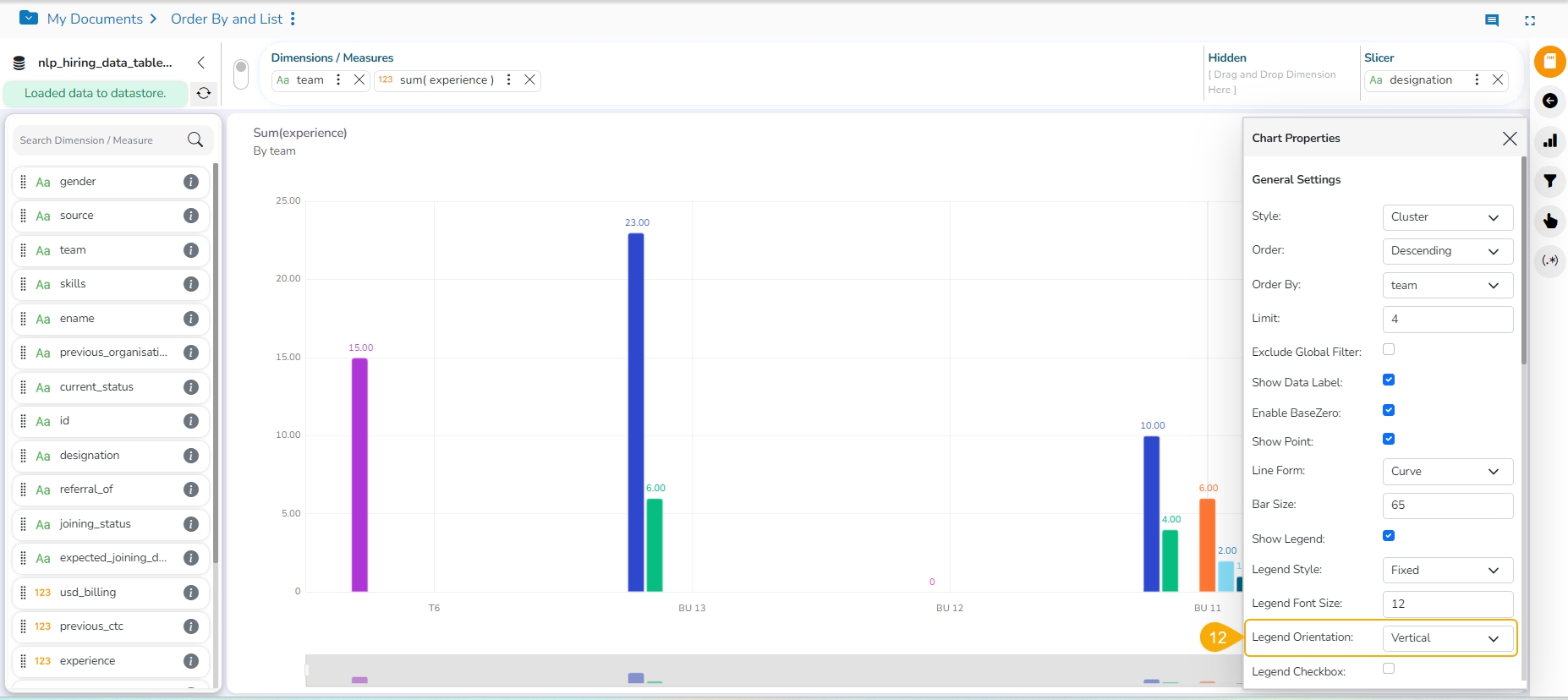
Open the Chart Properties window.
Navigate to the General Settings.
Provide the Order, Order By, and Limit fields.
Select the Horizontal option for the Legend Orientation.
The View gets modified based on the selected slicer and order option.
The users can add a further dimension to the created view using the Slicer option.
Check out the illustration on how to use Slicer in the Old UI of the Design Canvas.
Navigate to the Design canvas.
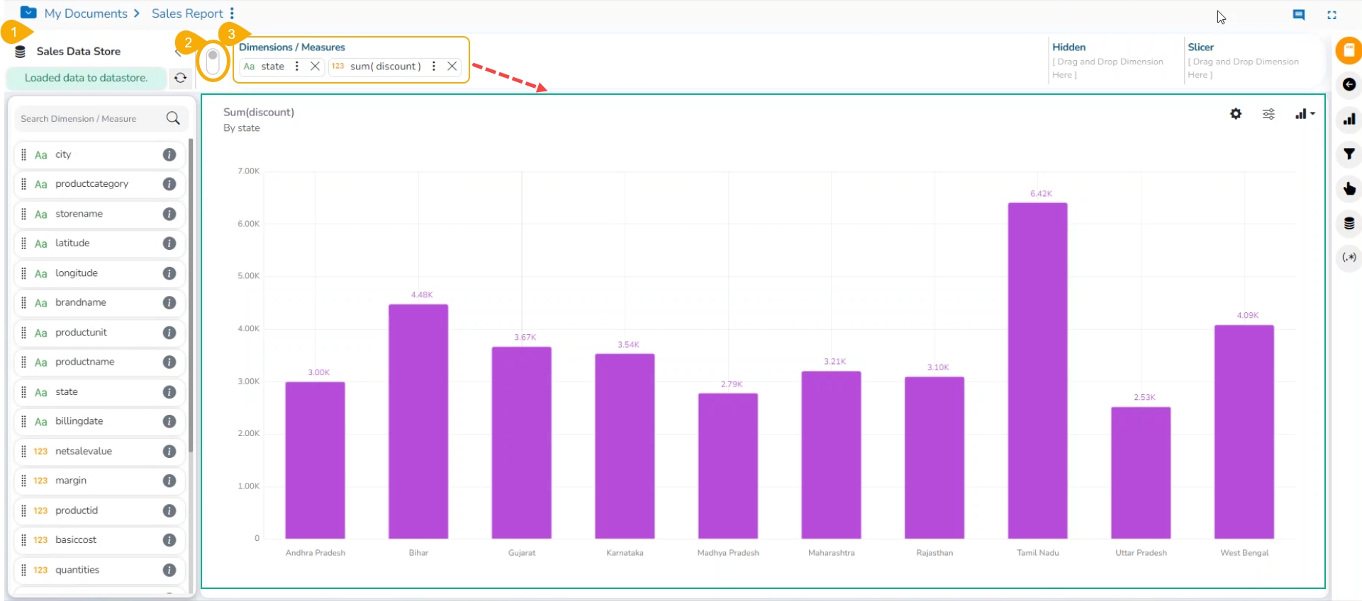
Use the Switch UI icon to access the old UI.
Drag and drop one dimension and one measure to the Dimensions/ Measures column using the Design canvas.
The View gets displayed based on the selected dimension and measure. Here, Mixed chart has been selected to plot the selected dragged dimensions and measures as it supports a slicer.
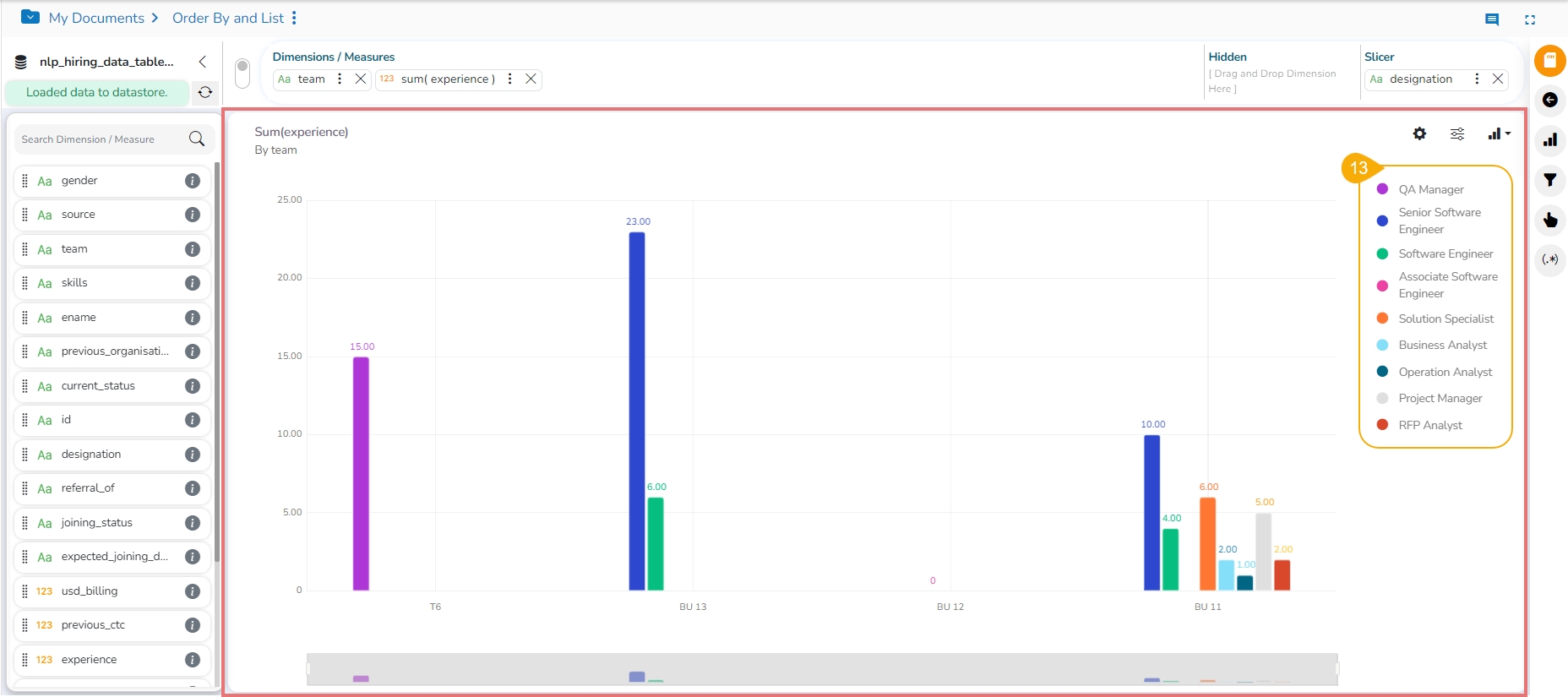
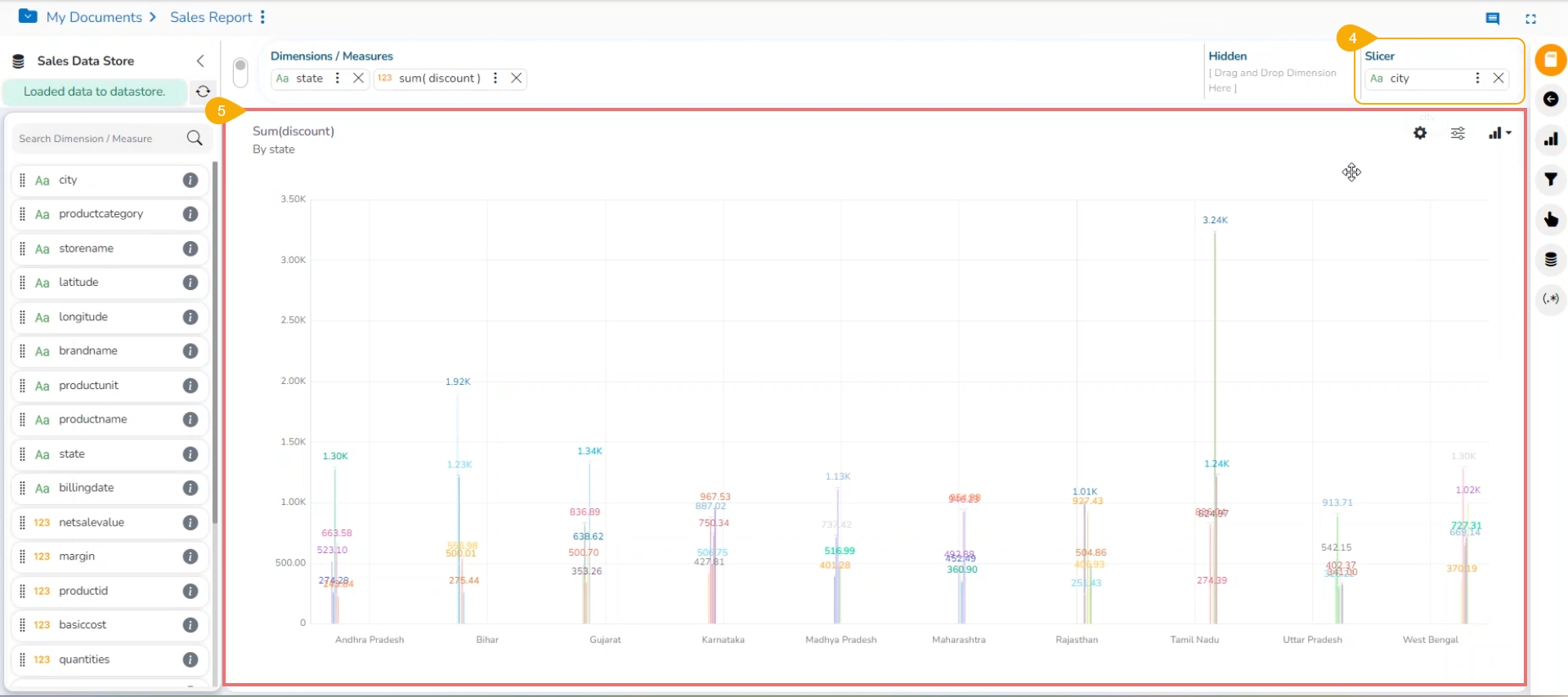
Drag and drop another dimension to the Slicer section (E.g., City is used as a slicer over here).
The slices are displayed in the created View based on the dimension value selected as slicer for the View.
Open the Chart Properties window.
Navigate to the General Settings option.
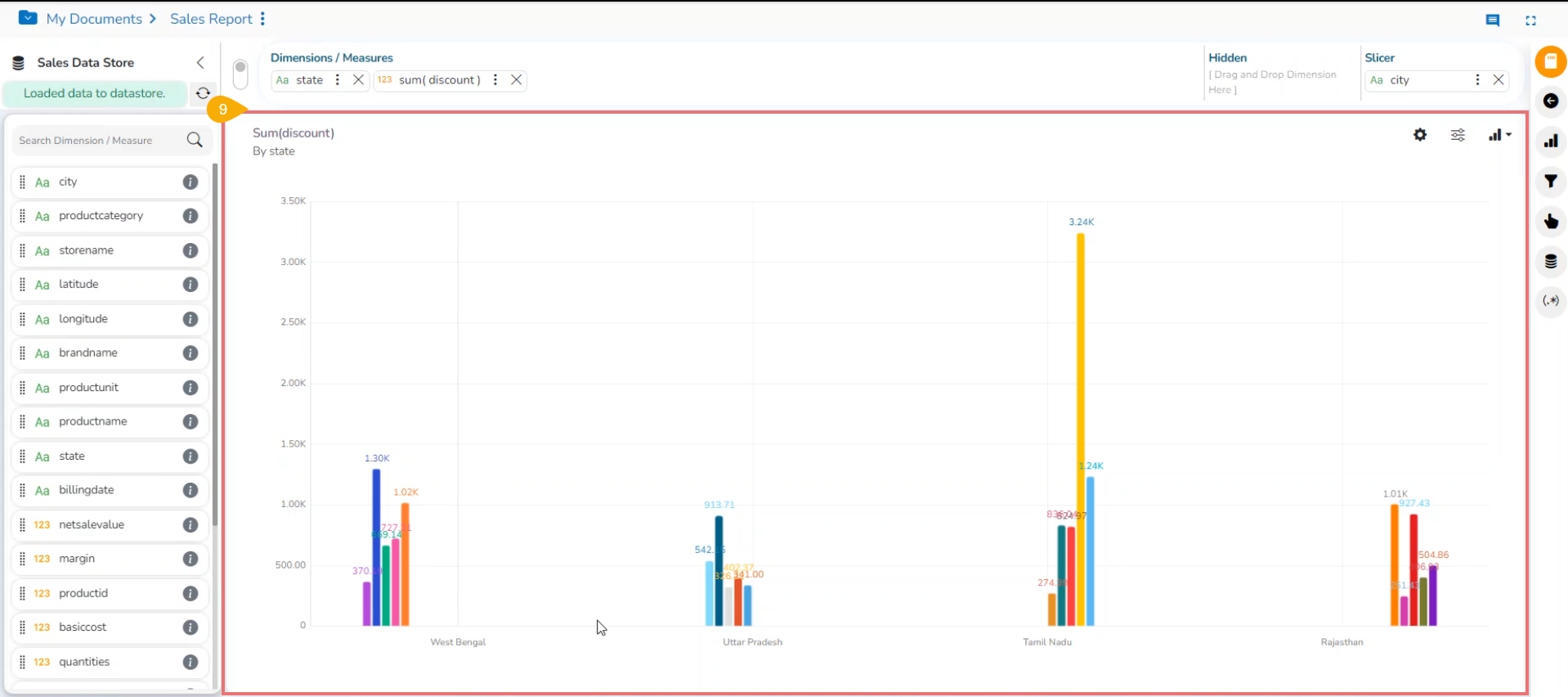
Order the displayed data by sorting it with a specific limit and order. You can also select a Style to display the data differently.
The View displays sliced data in the set order and limit.
We have introduced the ability to customize slice colors in our Stories. This functionality empowers users to assign specific colors to individual slices, providing greater control over the visual representation of data.
Check out the given illustration to understand the customized slice color functionality in the Story module.
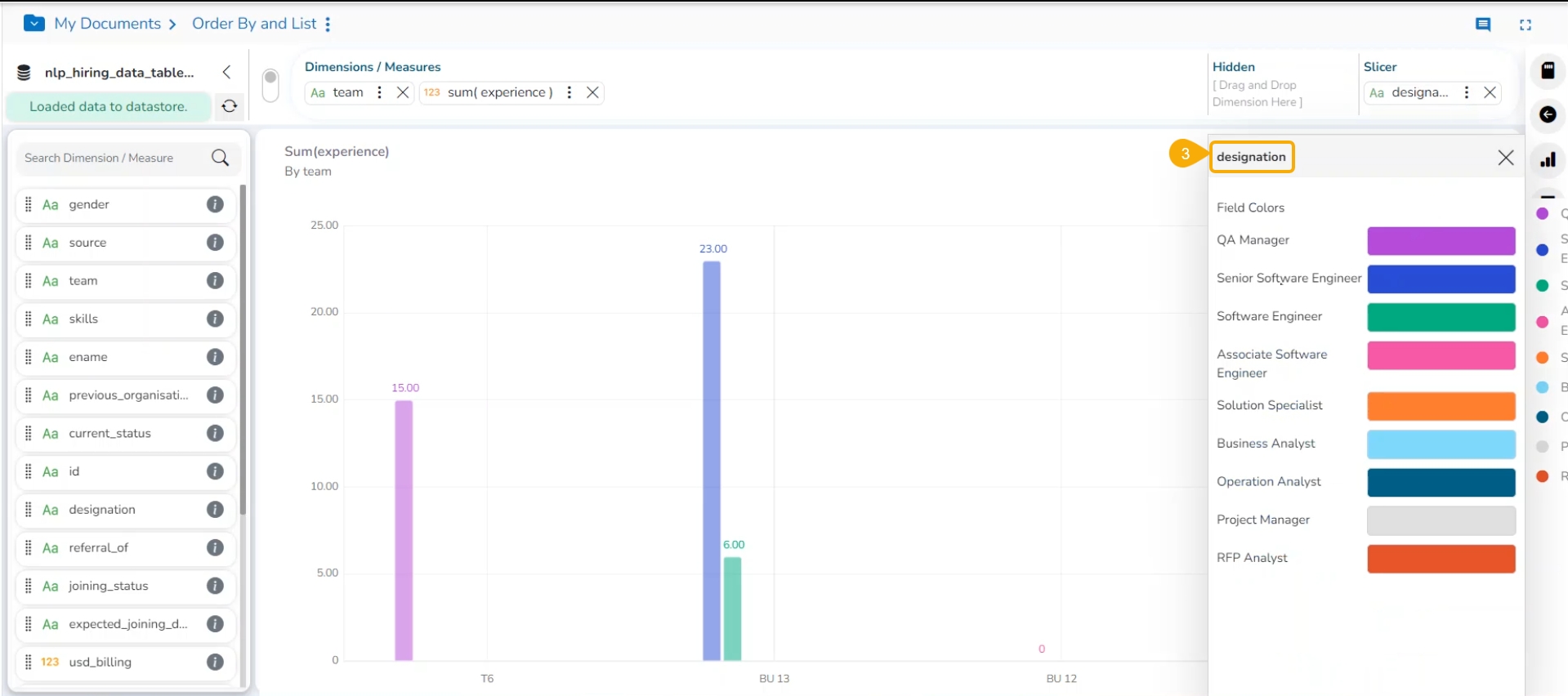
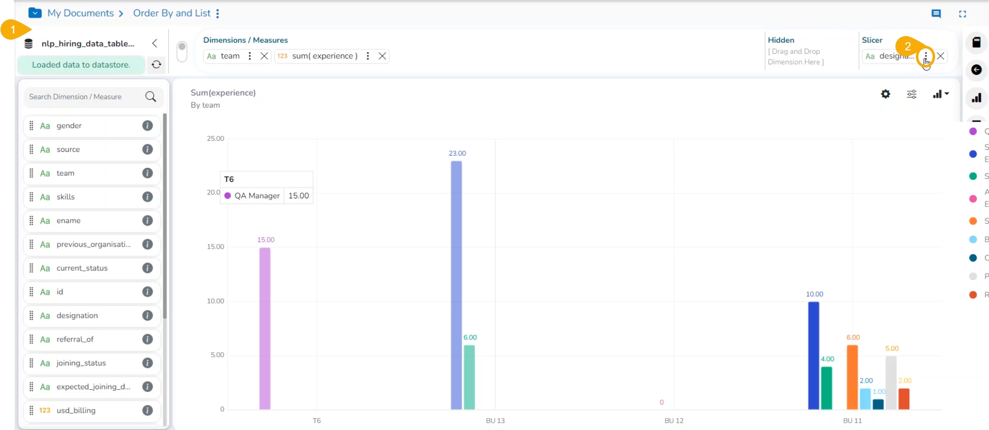
Open a View in the Design canvas with slicer.
Click on the ellipsis icon provided for the slicer Dimension.
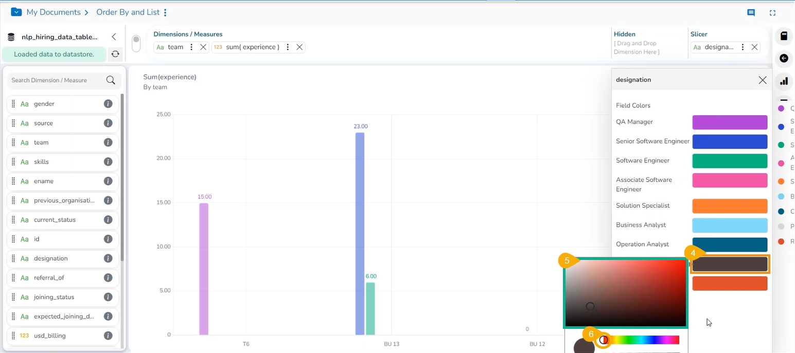
The dimension window opens displaying all the Field Colors.
Click on the default color.
A menu opens to choose a new color for the field.
Select a new color.
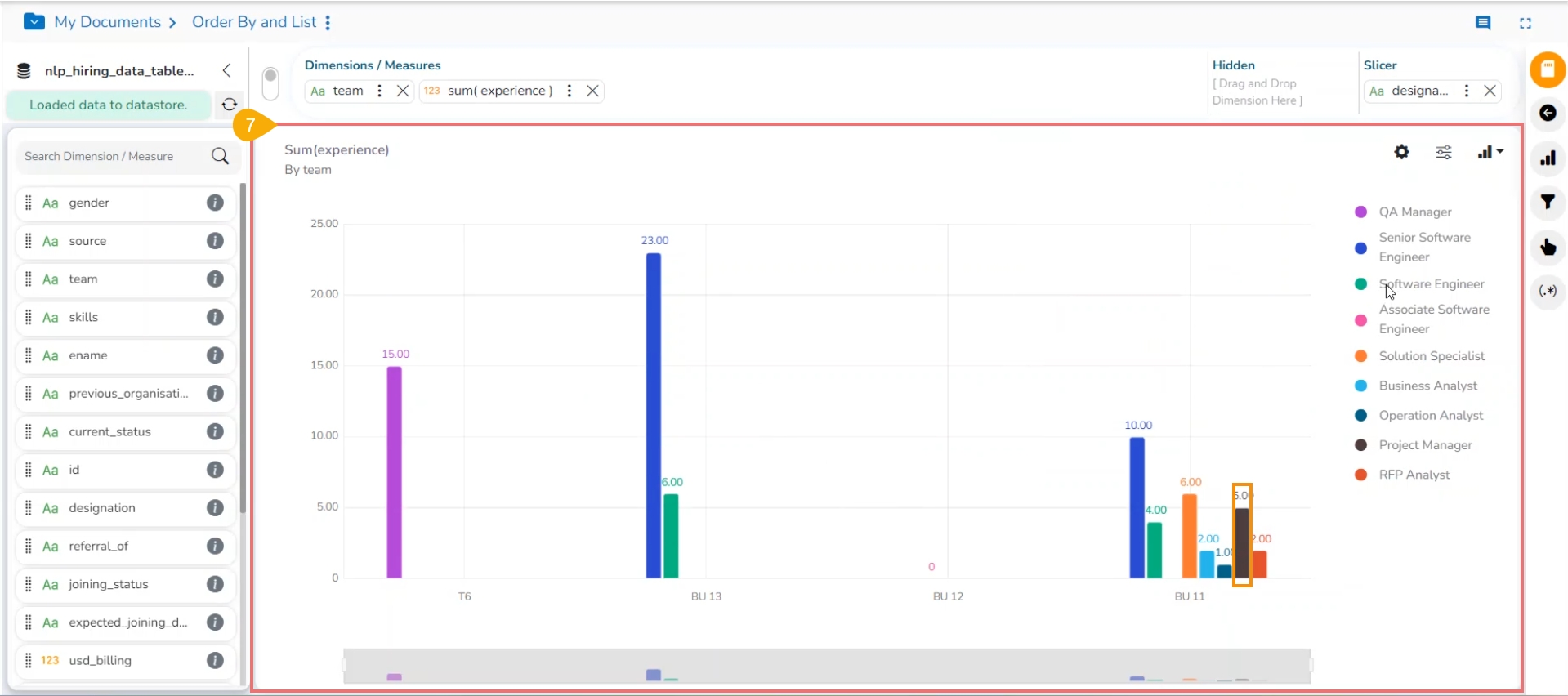
The provided color(s) will be applied to a field value.
Please Note:
The Slicer supports the selection of only one dimension and one measure in the Dimensions/Measures space. Another dimension should be added to the Slicer space.
The Manual Sort order option does not get supported by the Slicer functionality.
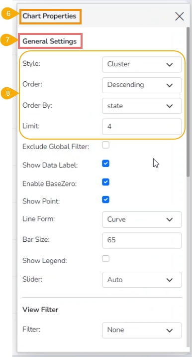
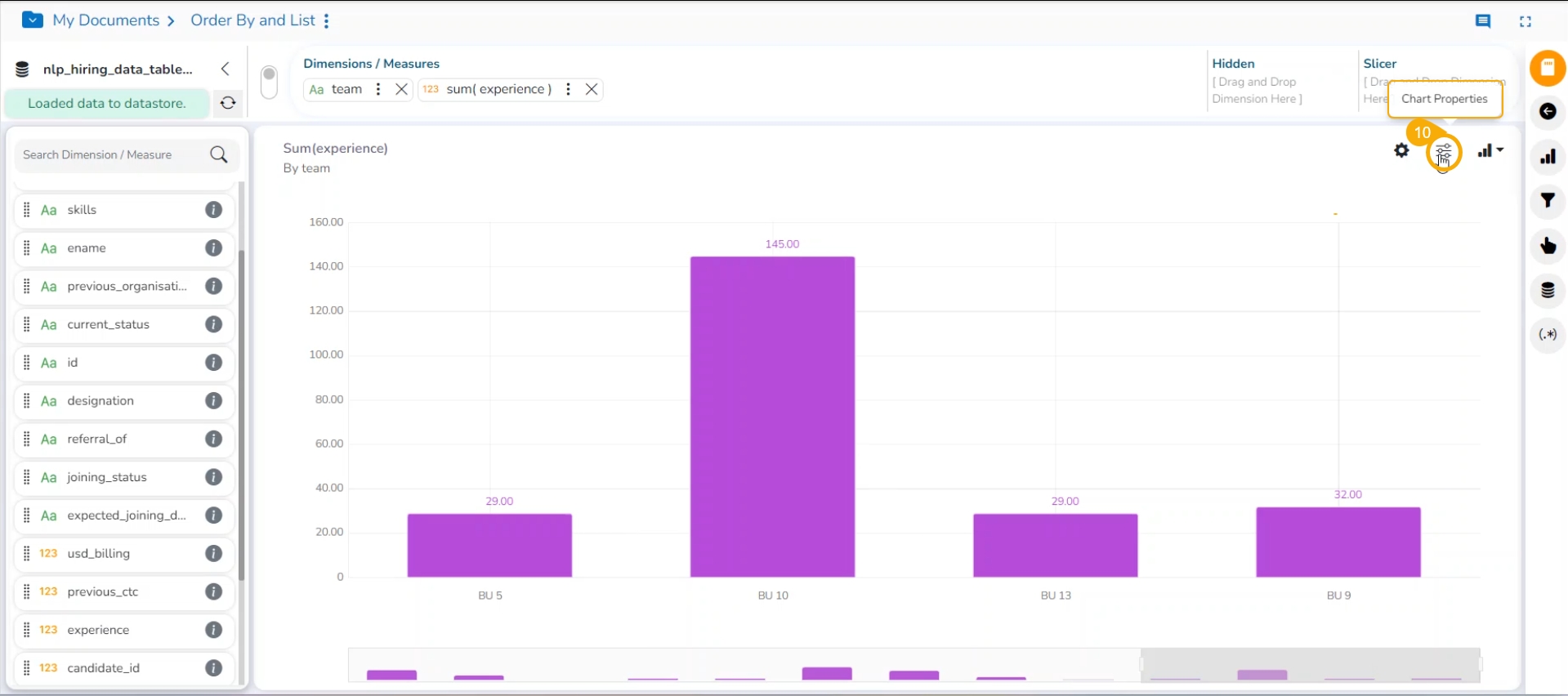
Click the Chart Properties icon to open the Chart Properties window.
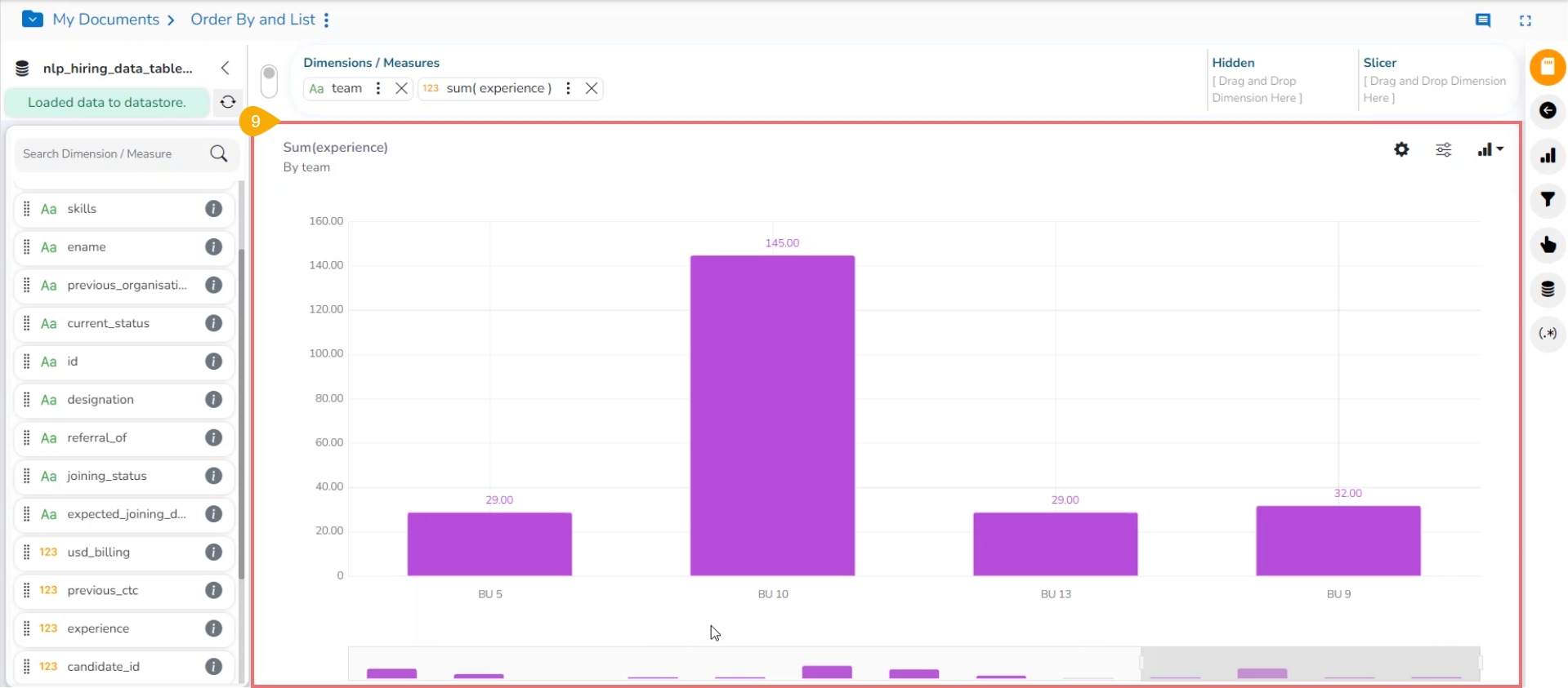
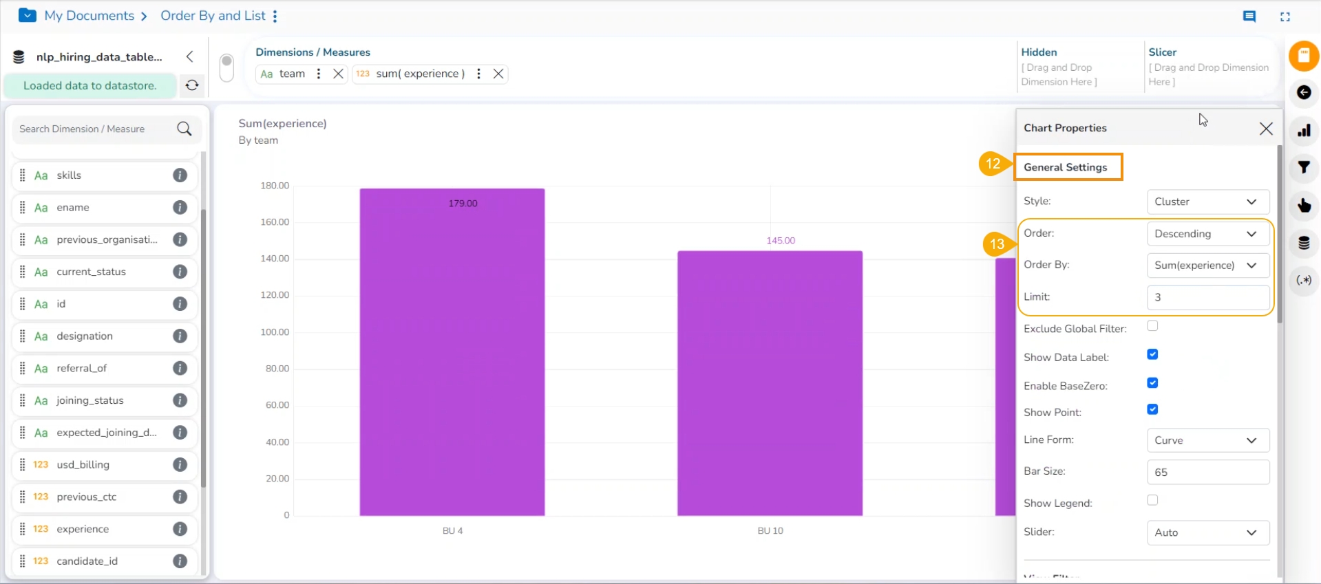
The Order by and Limit functionality presents your View in Ascending or Descending order and with the selected no. of limit for it.
Check out the given walk-through to understand the Order by and Limit functions for a View.
Navigate to the Design page. By default, the New UI gets selected.
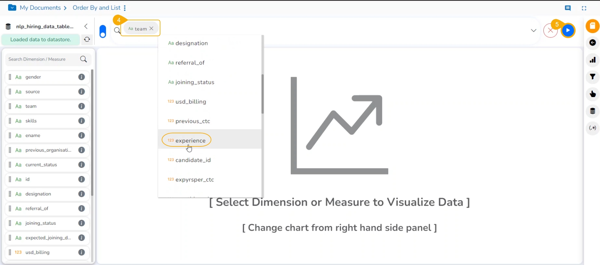
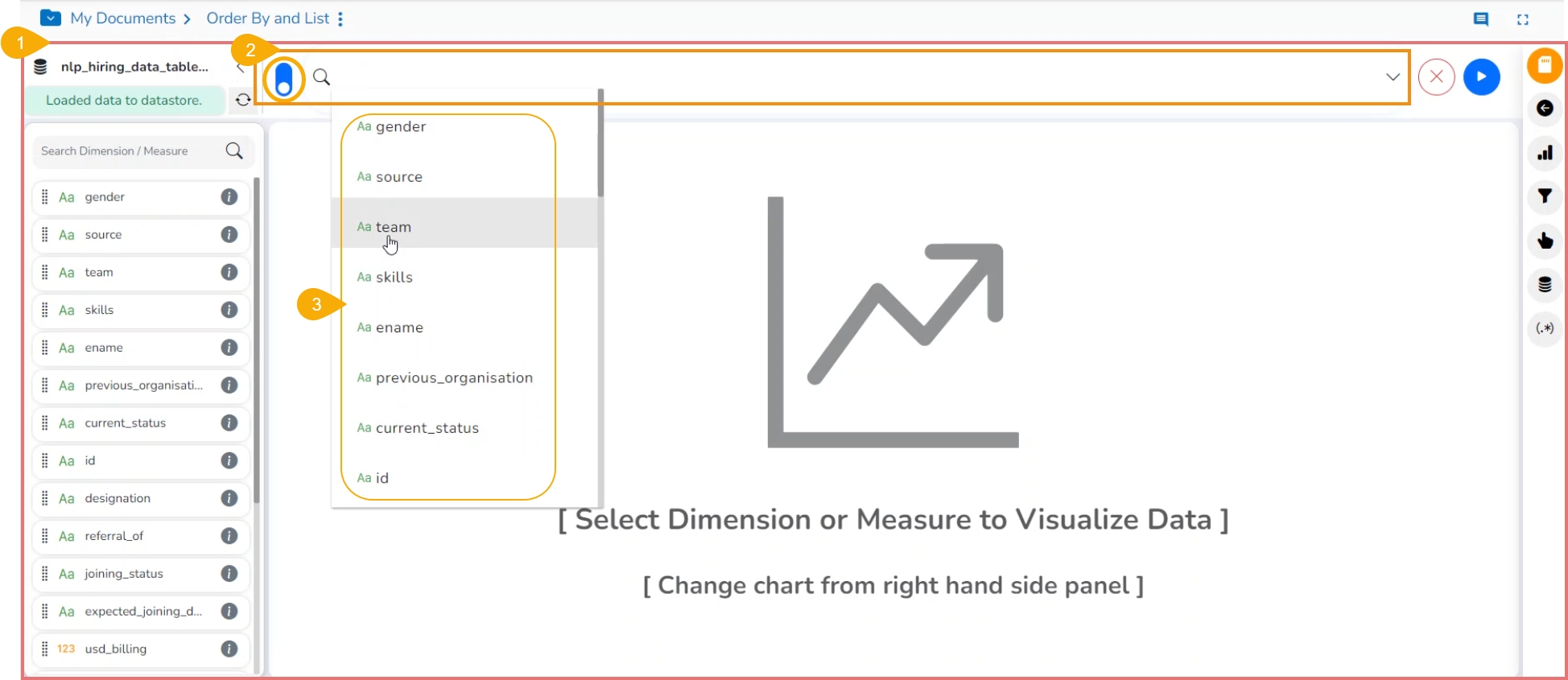
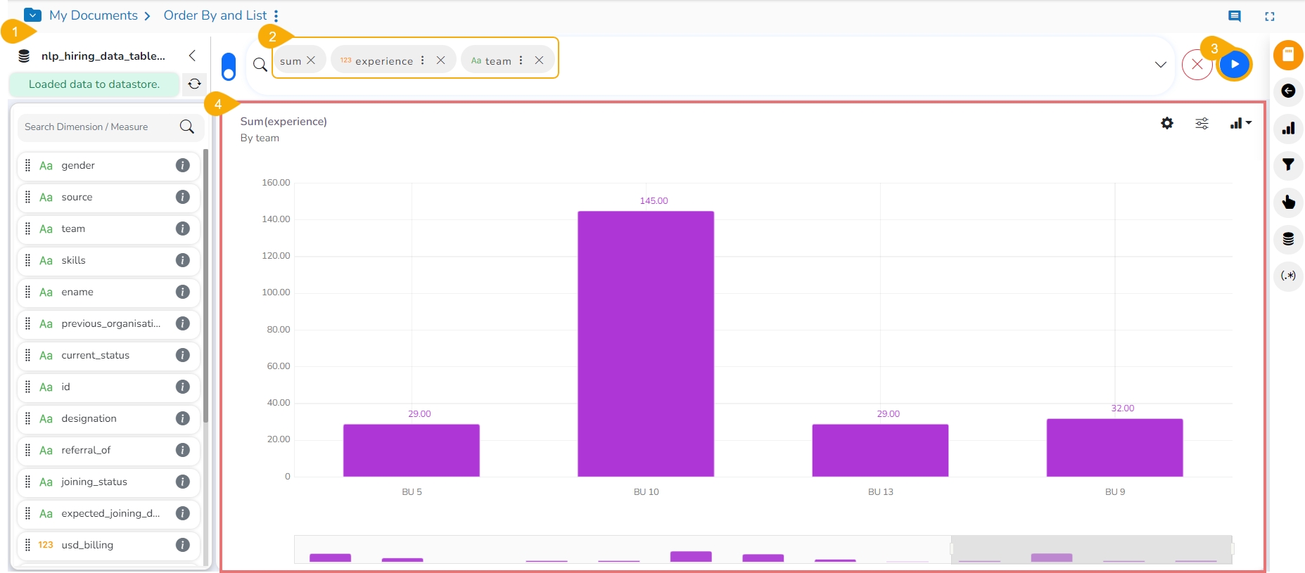
Use left-click on the search bar.
A context menu appears.
Select the desired dimensions and measures from the context menu.
Click the Go option to plot the View.
The Mixed chart gets selected by default to present the dragged data values.
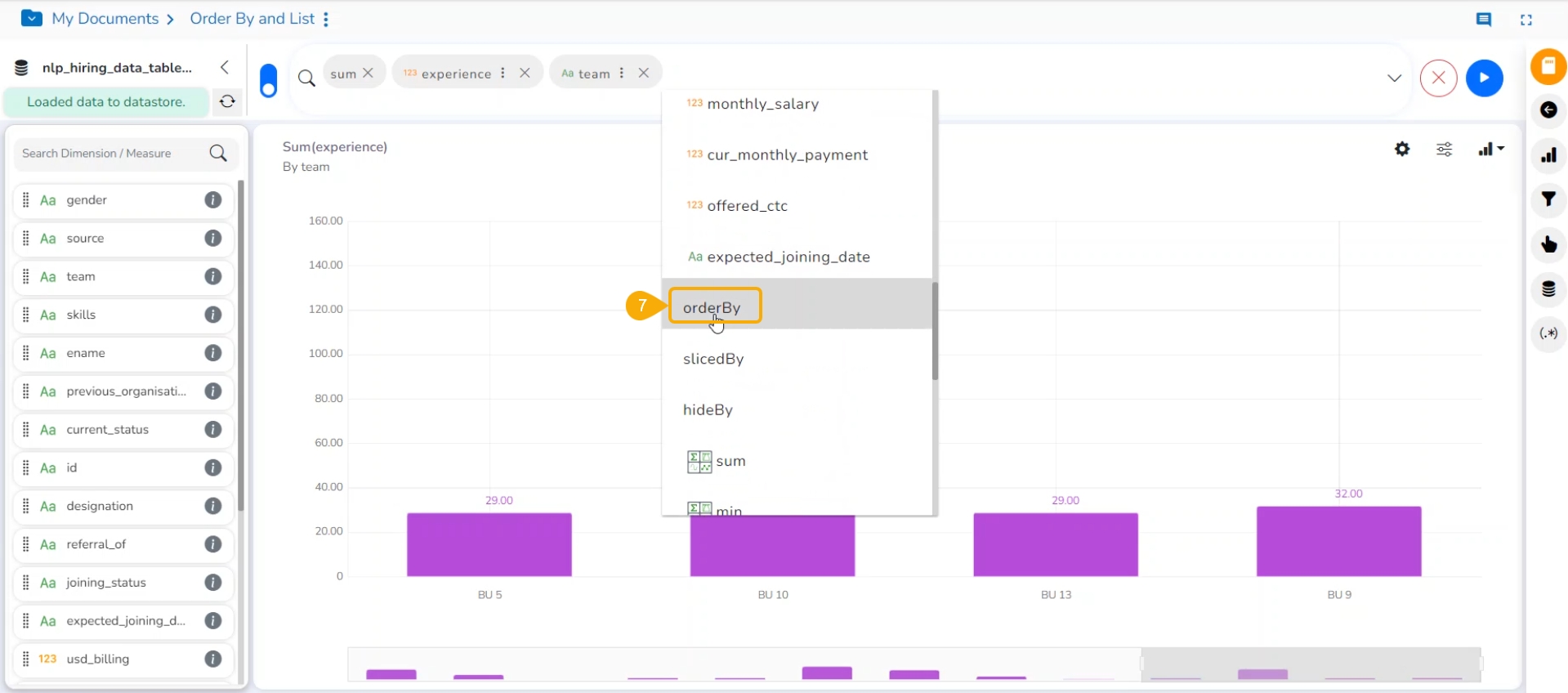
Select the Order By option from the context menu.
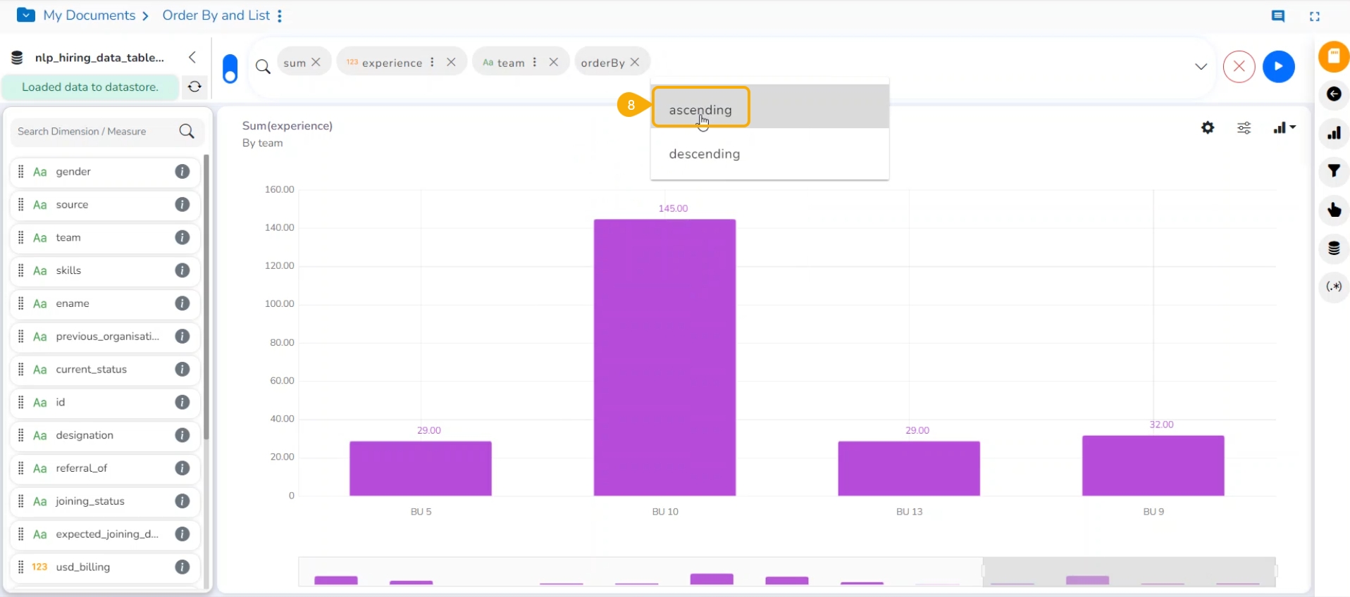
Select Ascending or Descending order from the context menu with the next click.
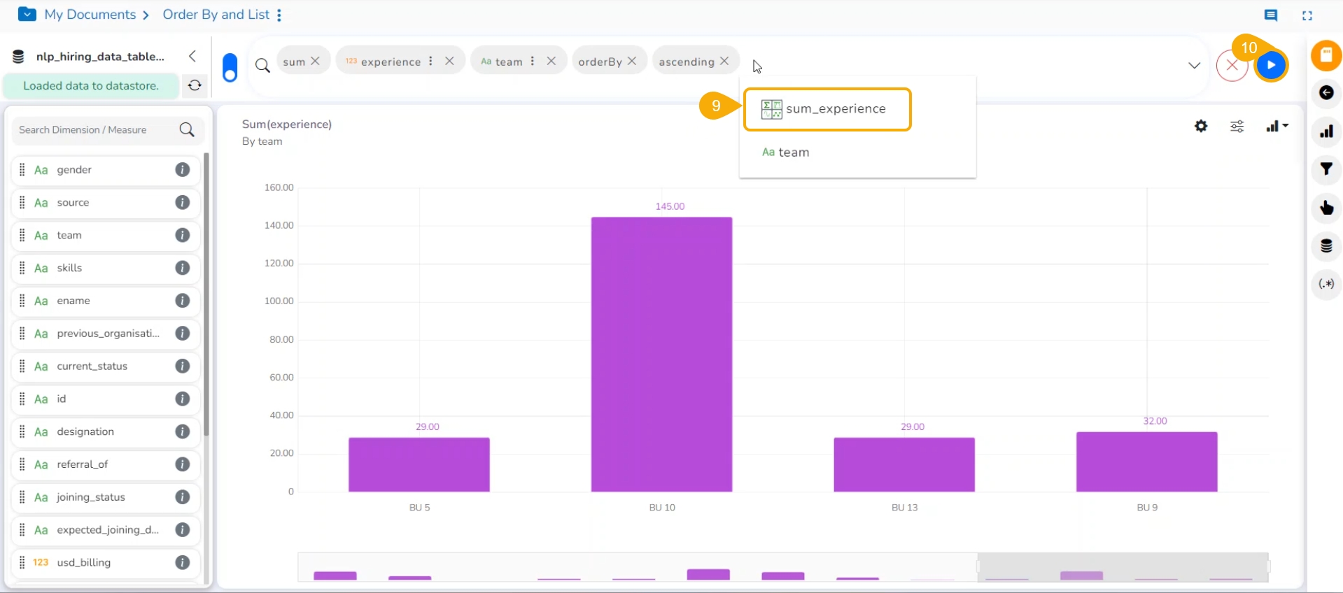
Select a measure or dimension value that appears in the context menu on the next click.
Click the Go option to create an instant View.
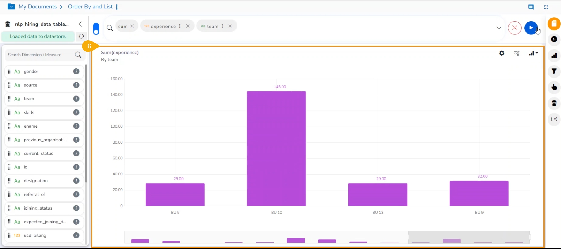
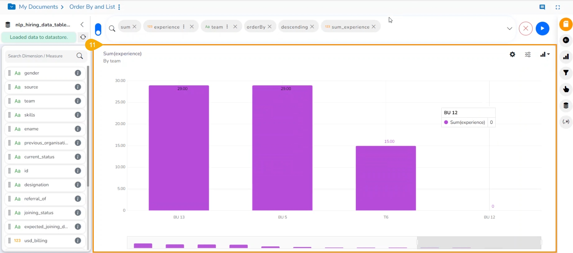
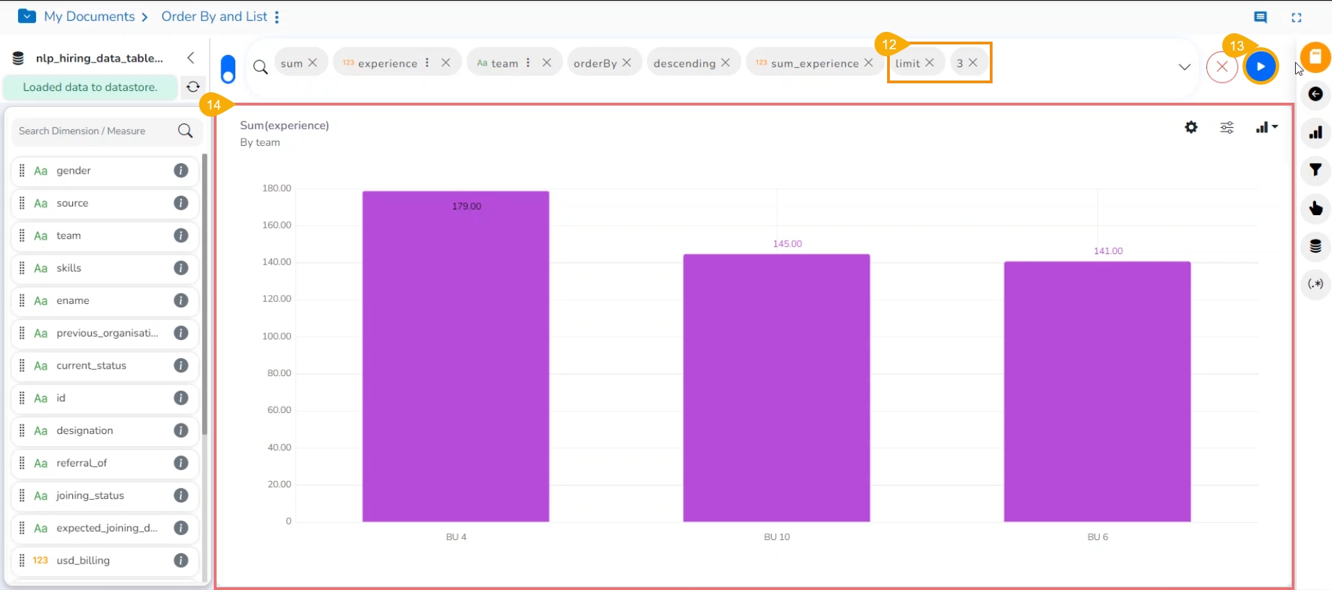
The View is displayed in the selected order. Here, the selected order is Descending.
Select the Limit option from the context menu and choose a number to limit the View.
Click the Go option.
The View is displayed in the selected order and limit.
Navigate to the Design page.
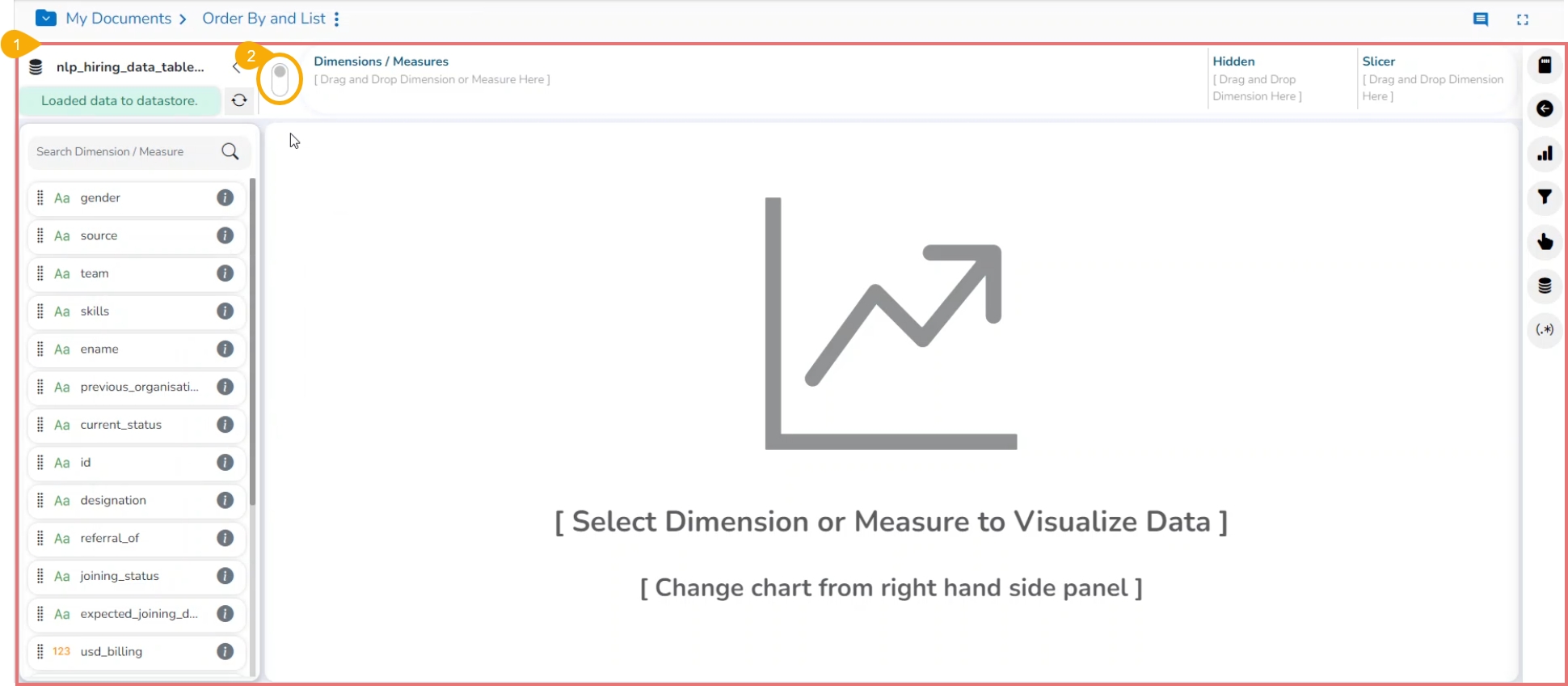
Click the Switch UI icon to select the old UI option to generate a new View.
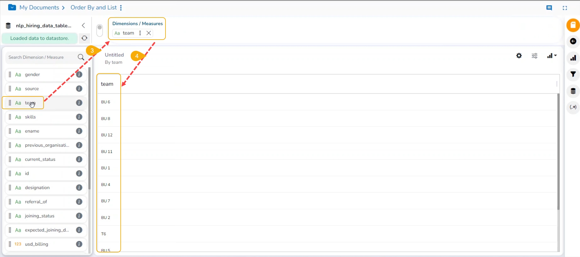
Drag and drop a dimension. You may also click twice on Dimensions or Measures to select them.
The selected dimension is displayed in the grid format.
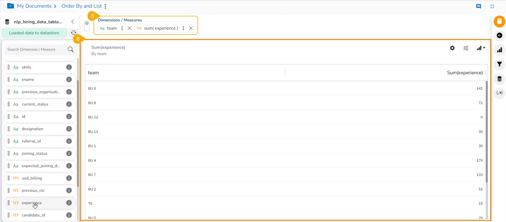
Drag and drop another dimension or measure as per the requirement of the View.
The selected value is displayed in the grid format.
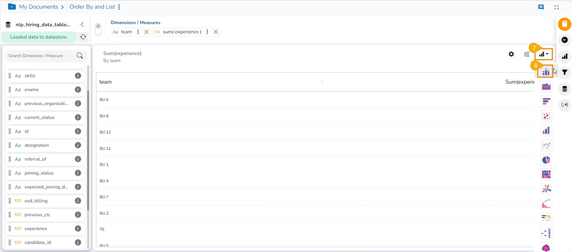
Click the Charts icon to open the chart's context.
Select the Mixed chart icon.
The View will be displayed in the Mixed chart.
Click the Chart Properties icon.
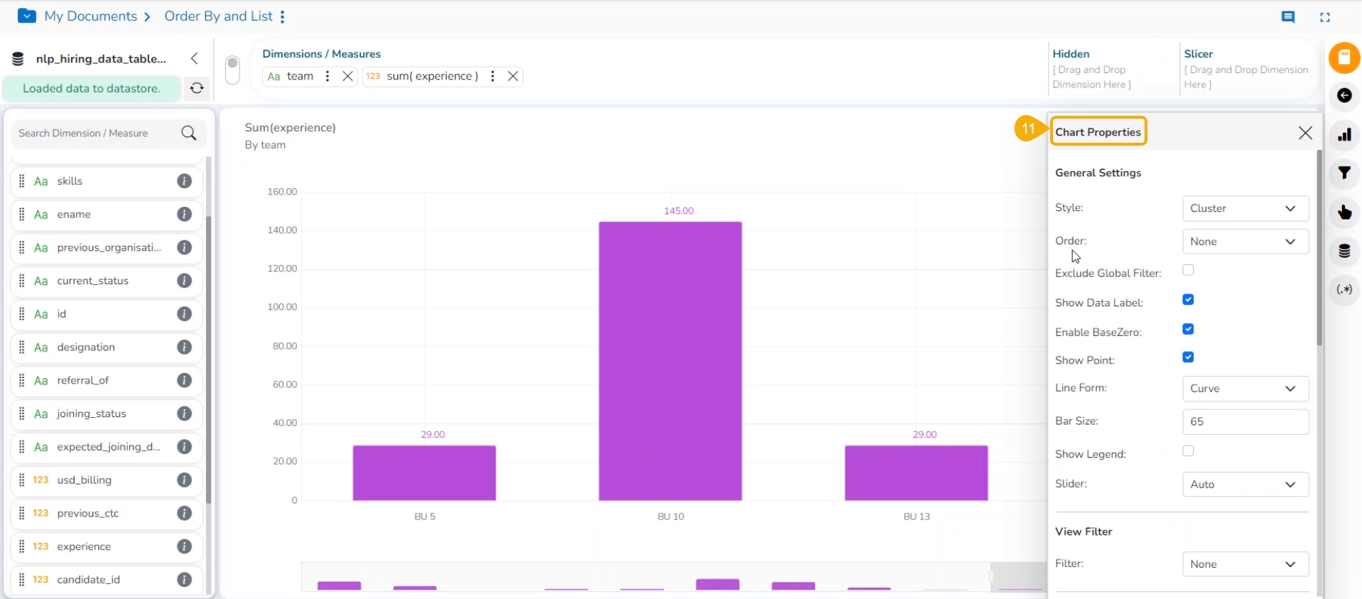
The Chart Properties window opens.
Navigate to the General Settings properties.
Configure the following fields:
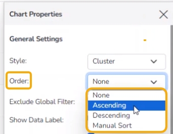
Order: Select an option to select the order for the View data. The user gets the following options to display the selected data in an order:
None
Ascending
Descending
Manual Sort
Order By: Choose a dragged dimension or measure using the drop-down.
Limit: Provide a number to define the limit for the View.
The View will be displayed in the selected order and limit.
Please Note:
This feature does not work for KPI tiles, Semi Gauge, Maps, Treemap charts, and Metric Summary.
The user can click the Save View icon to save the Views with order and limit to the desired report.
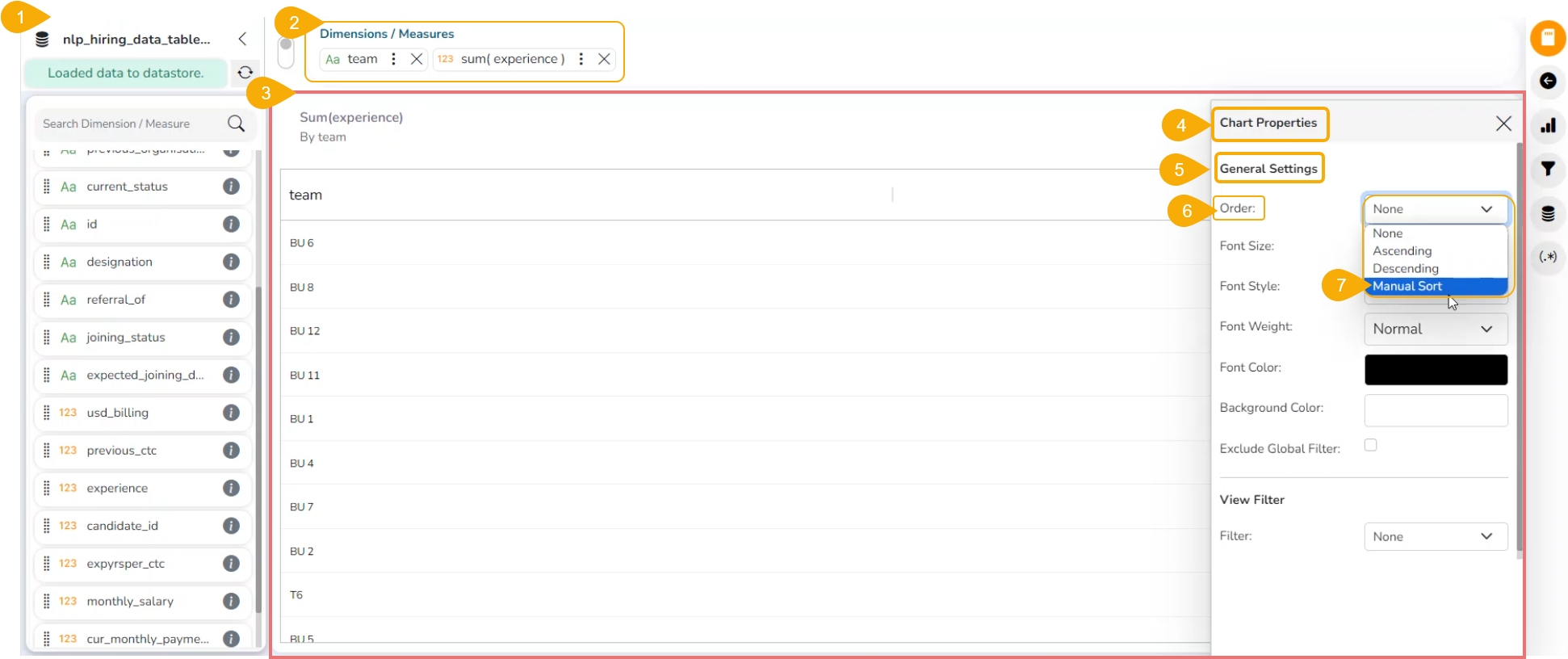
Check out the illustration on using the Manual Sort functionality.
Please Note: The Manual Sort functionality is available under the Old UI interface.
The users can manually sort a view by choosing the customized order they require. They can save the customized order and reuse it whenever needed.
Navigate to the Design Workspace/ Design Canvas.
Choose any combination of one Dimension and Measure to get a graphical display of the View.
By default, the View is displayed in grid format.
Open the Chart Properties window.
Open General Settings fields open.
Navigate to the Order field. By default, the None order option gets selected).
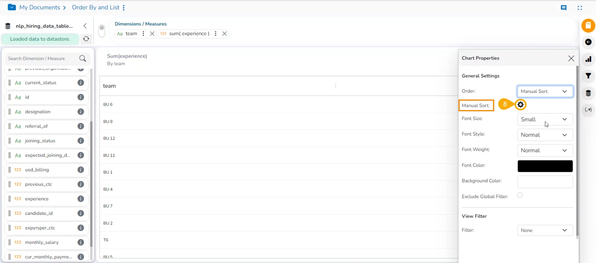
Select the Manual Sort option from the Order drop-down menu.
Click the Manual Sort icon.
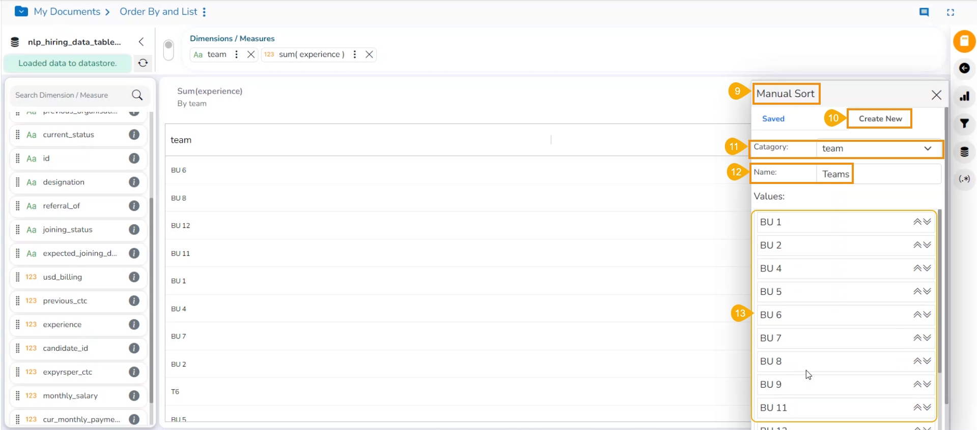
The Manual Sort window opens.
Select the Create New tab.
Choose a Category from the drop-down menu. Selected Dimension appears here to be selected again.
Enter a title for the Order Name.
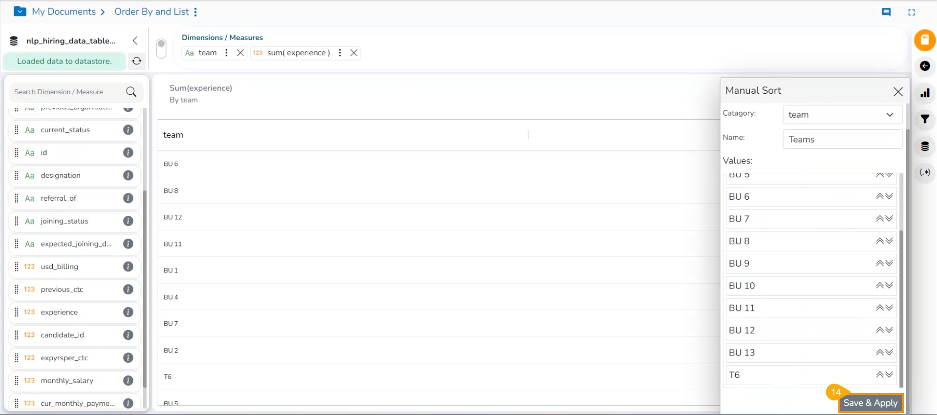
Arrange the Values by dragging them up or down to arrange them in the required order. Use the arrows given next to the selected Value to put them at the top or bottom of the list.
Click the Save & Apply option after arranging the fields in the desired order.
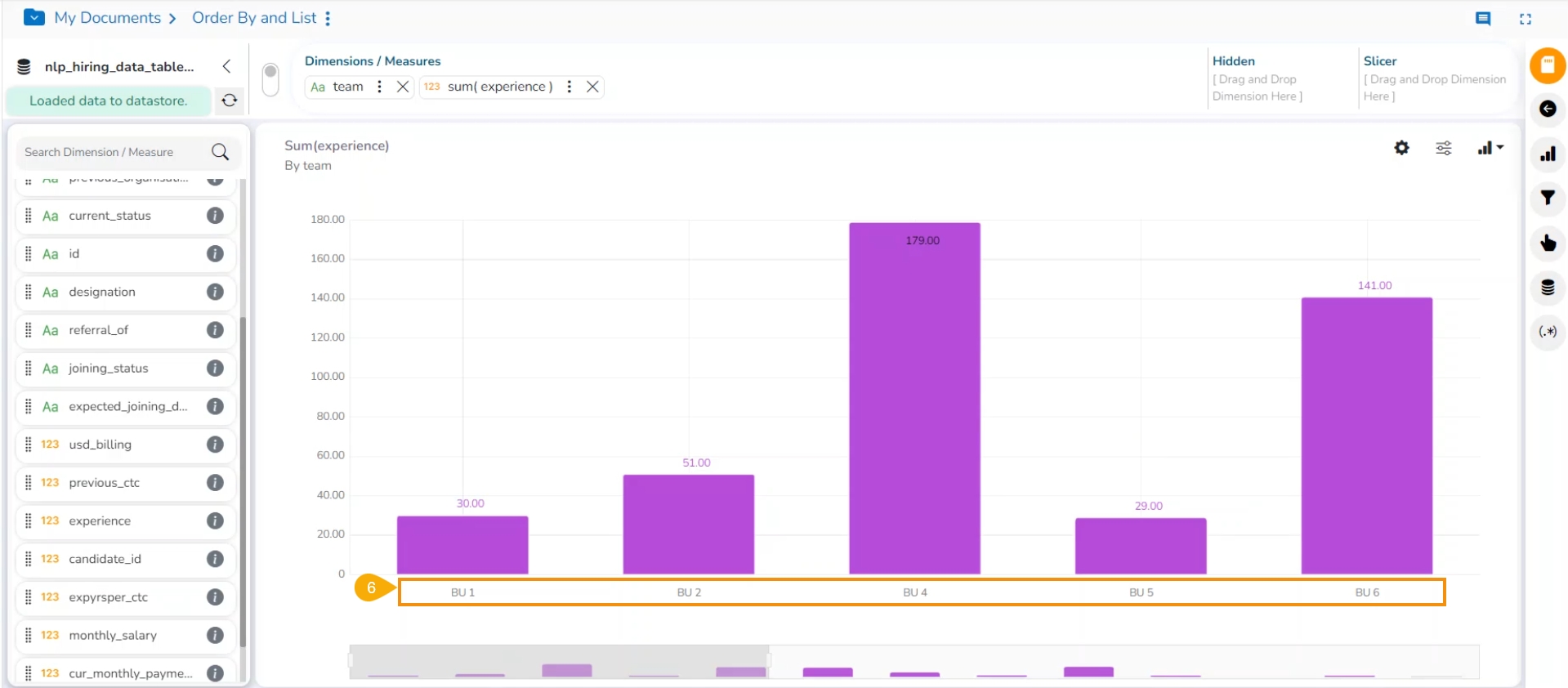
The View columns are displayed in the selected Manual Sort order.
The created Manual Order gets added to the Saved tab.
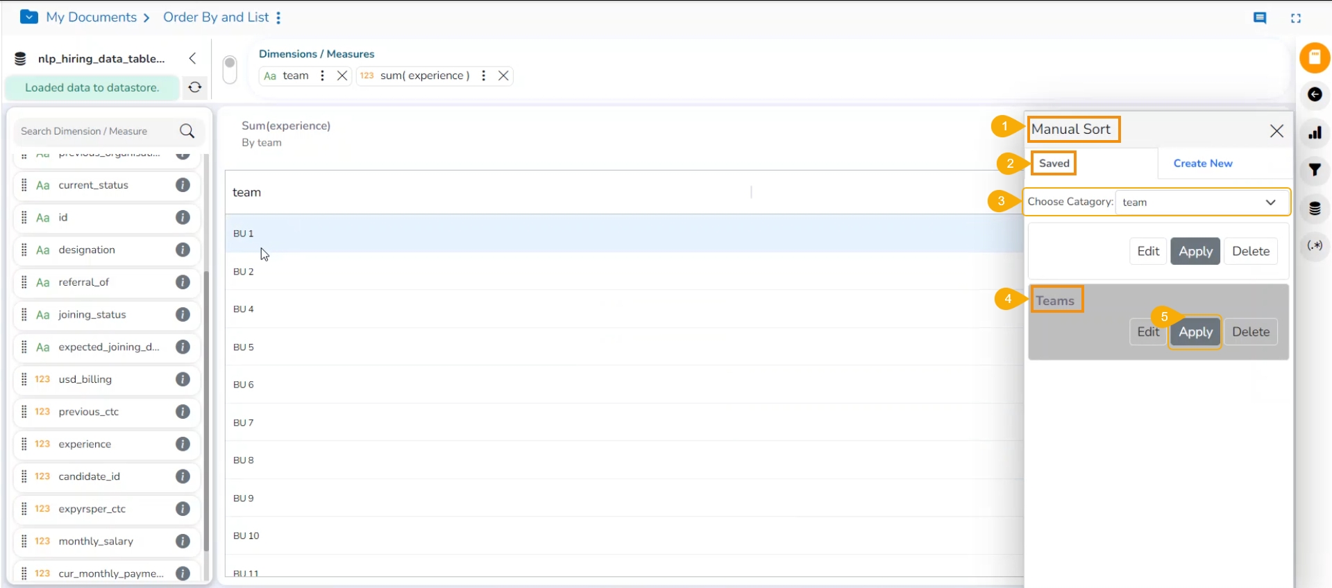
Please Note: The Saved tab lists all the saved Orders by the user. Follow the below-given steps to use a saved order.
Navigate to the Manual Sort window.
Open the Saved tab.
The dragged Dimension appears in the drop-down menu.
Select a saved order out of the displayed options.
Click the Apply option.
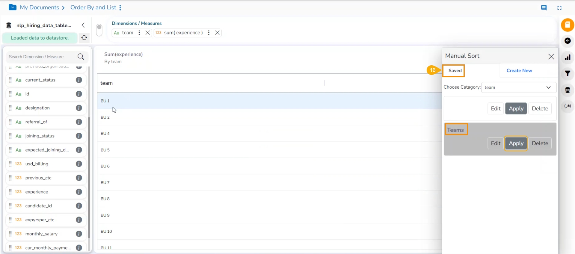
Please Note: The users also have the option to edit the saved Manual Sort by clicking on the Edit option under the Saved tab.
The selected saved manual sort gets applied to the current view.
The user can apply the Order By option based on a hidden Dimension.
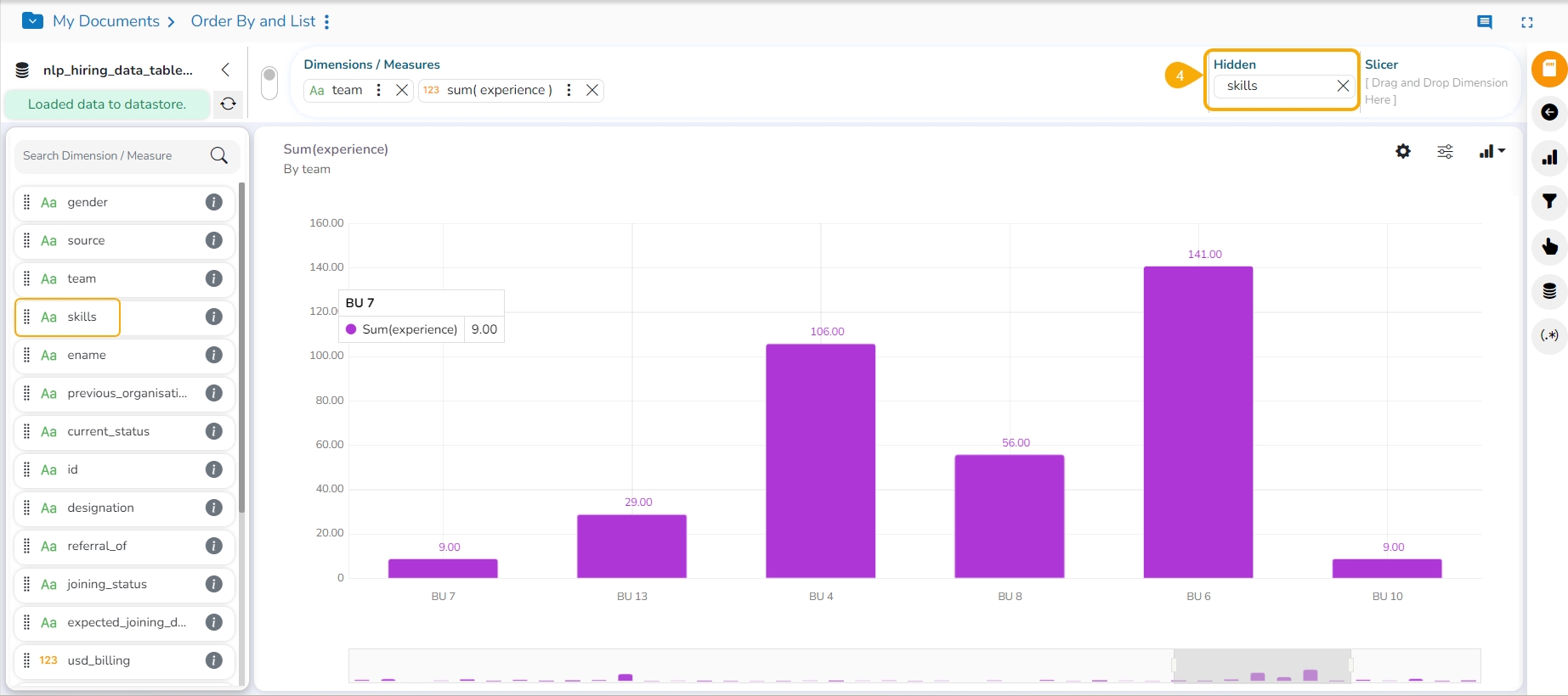
The user can use the old UI and drag a dimension value to the specified place for the Hidden dimension.
Navigate to the Design canvas.
Select a combination of dimensions and measures from the context menu.
A View appears based on the selected Dimension and Measure.
Select a Dimension from the displayed list of dimensions and measures and drag it to the Hide.
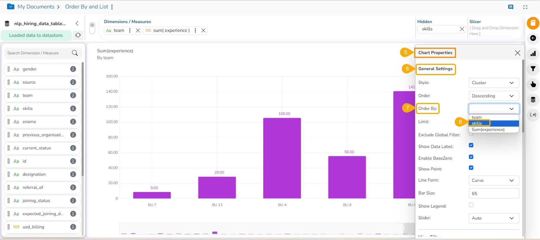
Open the Chart Properties window.
Navigate to the General Settings tab.
Open the Order By options by using the drop-down option.
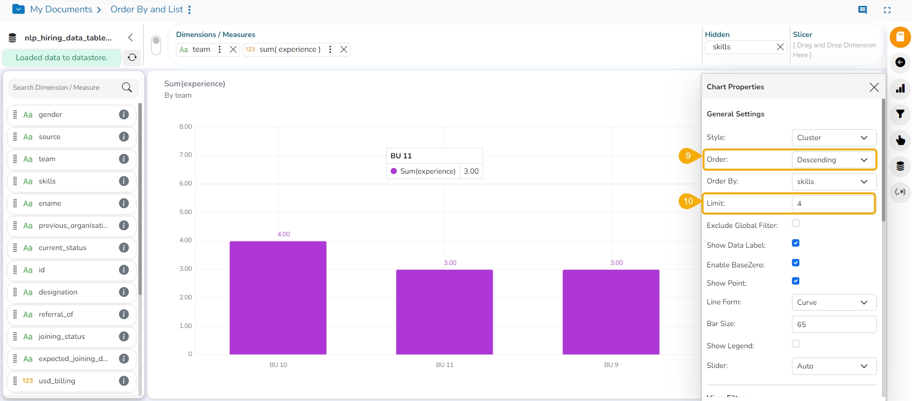
The selected Hidden dimension appeared in the context menu. E.g., In the following image, the skills option is selected as an Order By option.
Select an order (Ascending or Descending) by using the Order field. the selected option in the following image is Descending.
Select a limit by using the Limit field.
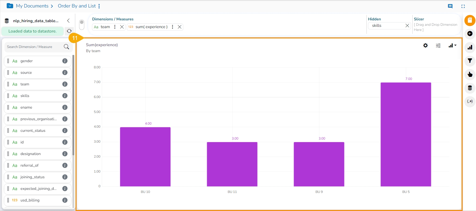
The View gets displayed based on the applied hidden dimension in the set order and limit.
The user can use the next click after selecting a Dimension and Measure combination to create an instant View.
Navigate to the Design canvas.
Select a combination of dimensions and measures from the context menu.
Click the GO option.
A View appears based on the selected Dimension and Measure.
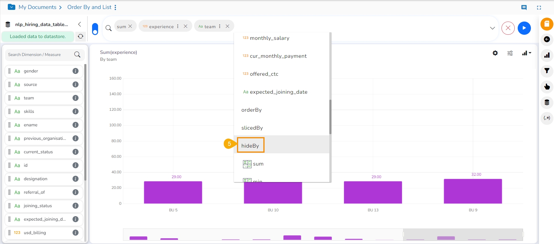
Use the next click to avail of the hideBy option in the context menu.
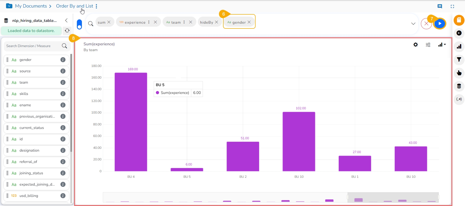
Use the next click to select the dimension that is to be used as hidden.
Click the GO option.
The View will get ordered by the selected Dimension.
This feature allows users to customize dimension color.
Check out the illustration to understand how to customize the category values in a View.
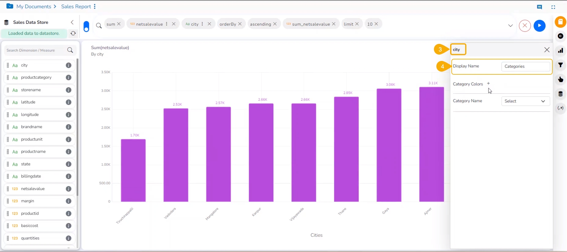
The users can customize a category color and apply it to a specific category using the Category Colors window. The users can assign specific colors to different categories within their data, facilitating easier identification and differentiation of data points or groups while designing a View.
Select a Chart plotted with a Categorical column (Dimension Column) & Measure column.
Click on the ellipsis icon of the dragged Categorical Column (Dimension).
A window opens on the right side with the name of the selected category.
Users can provide a Display name.
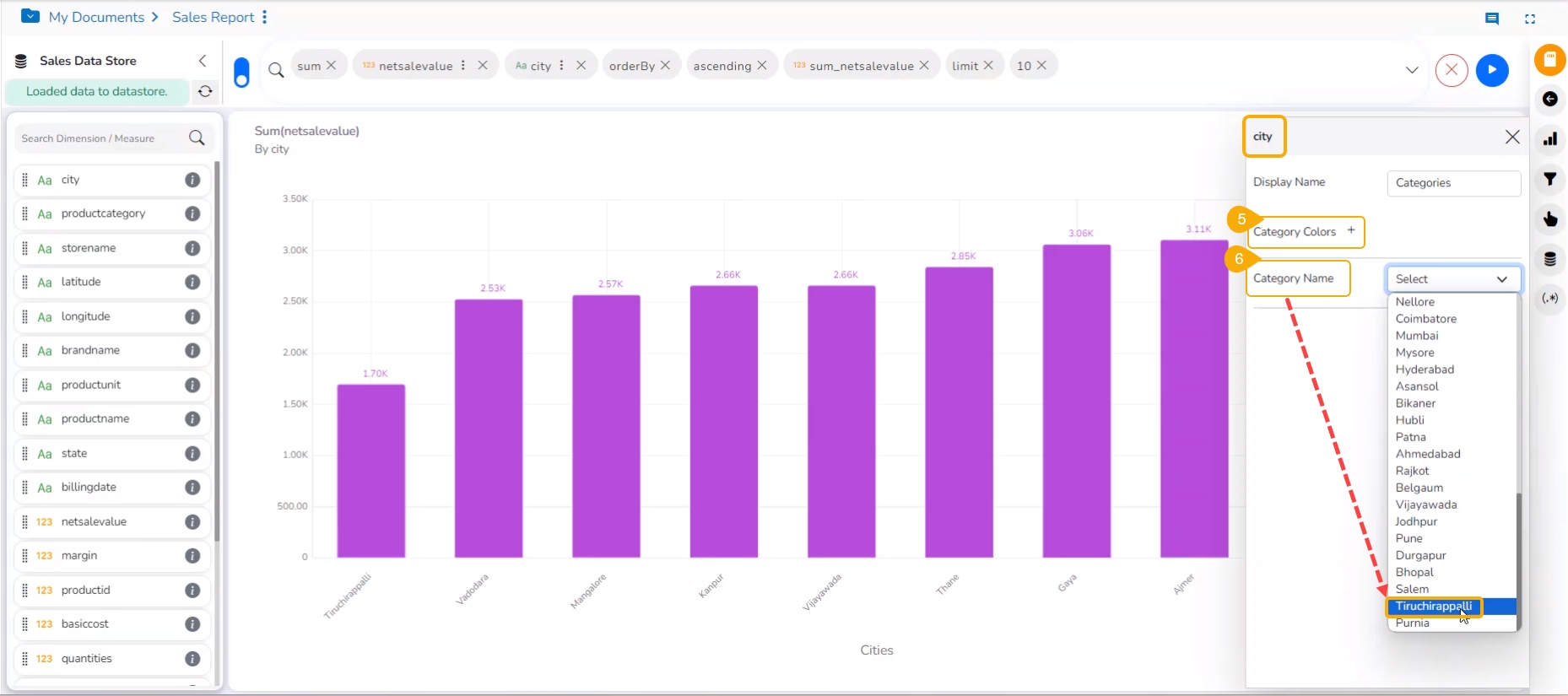
Click the Category Color icon provided next to the Category Colors.
Select the Category Name from the list.
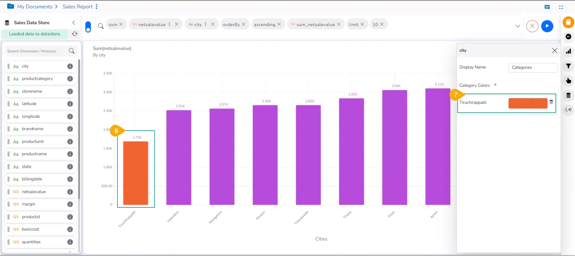
A different color gets auto-selected for the selected category name.
The same color gets applied to that Category column in the View.
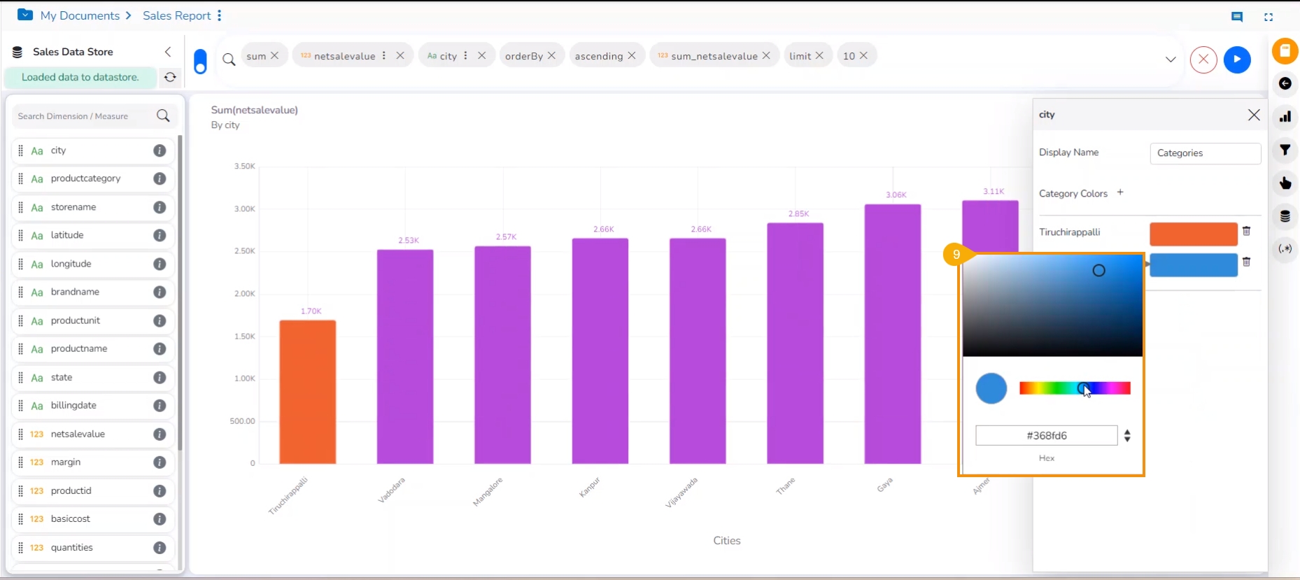
The users can select a color manually by choosing a color from the color pallet.
Different colors can be selected and saved for multiple categories, with values available for one category in the View.
Click the Save icon to save the View to the Report.
Please Note:
For a single category column, multiple conditions can be provided.
Category Color has high priority compared to Conditional & Slicer color properties. If user tries to apply both category & conditional color then the color will be applied based on the category condition.
