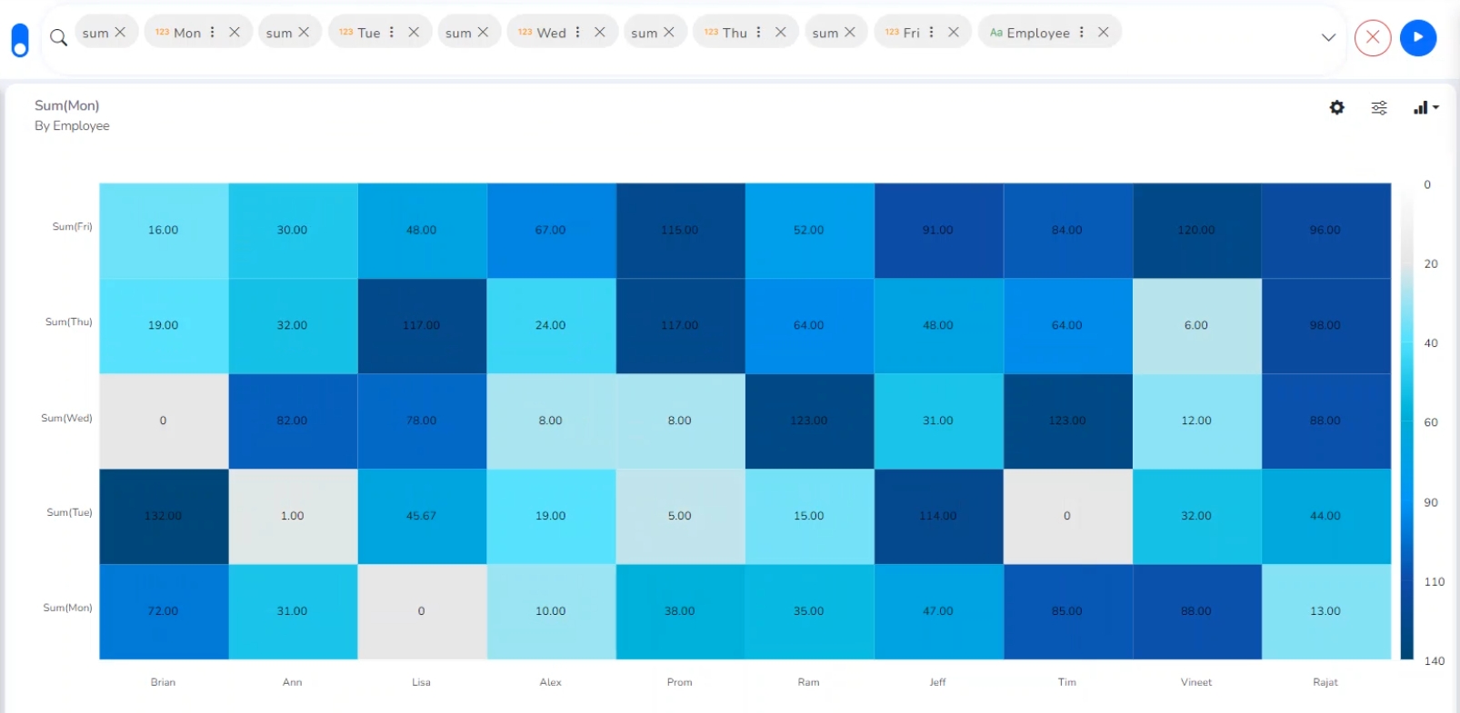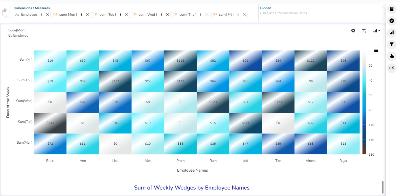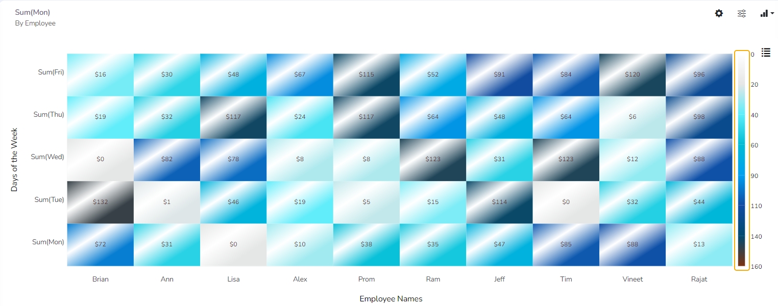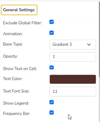
Check out the given illustration on Heat Map Properties.
Heat Map Chart, or Heatmap is a two-dimensional visual representation of data, where values are encoded in colors, delivering a convenient, insightful view of information.
Essentially, this chart type is a data table with rows and columns denoting different sets of categories. Each cell in the table can contain a numerical or logical value that determines the cell color based on a given color palette.
Best Situations to Use a Heat Map chart:
Funnel charts are suitable for displaying sales conversation data.
Examples:
To evaluate the success of a promotional campaign
To analyze the recruitment process
Exclude Global Filter: The view gets excluded from the Global Filter condition by putting a checkmark in the box.
Animation: Chart animation is a technique used to enhance the visual appeal of a chart by adding movement and transition effects.
Base Type: This option will give the visual appeal of a chart by adding some color gradients to the cells.
Plain
Gradient 1
Gradient 2
Gradient 3
Opacity: Opacity is a property of an object's style that determines its level of transparency. It is typically represented as a value between 0 and 1, with 0 being completely transparent and 1 being completely opaque.
Show Text on Cell: The data label gets displayed by using a checkmark in the given box, It always shows in the cell.
Text Color: Select the text color.
Text Font Size: Set the Font Size of the text displayed in the cell.
Show Legend: By enabling this option Legend gets displayed.
Frequency Bar: By enabling this option the Frequency Bar gets displayed on the right side of the chart.
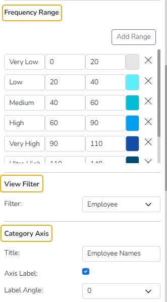
Use the Add Range option to add a new range in the Heat Map chart.
Pre-selected to and from limits will be also added to the newly added range.
Filter: Select a filter value from the drop-down menu.
Title: Provide a title for the X-axis.
Axis Label: Enable the Category Axis label by putting a checkmark in the box.
Label Angle: Select a display angle for the axis label.
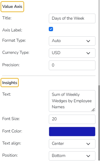
Title: Provide a title for the Primary Value Axis.
Axis Label: Enable the Primary Value Axis label by putting a checkmark in the box.
Format Type: Select a desired format type from the drop-down menu (the provided options for this field are: None, Auto, Percent, Thousand, Lacs, Crore, Million, Billion, Trillion, Quadrillion).
Currency Type: Select a currency symbol to be displayed in the view (the provided options for this field are: None, Rupees, Euro, Pound, USD, Yen, Cent).
Precision: Set the after-decimal value (It displays up to 5 precision)
Text: Provide any information regarding the chart. If any digit or character is required to be highlighted, put it inside two asterisks. (E.g., *70%* or *skills*).
Font Size: Set/modify the Font Size of the Insights text.
Font Color: Select a Font color for the Insights Text.
Text align: There are three alignments to align the text.
Left
Right
Centre
Position: There are two options to position the text.
Bottom
Right
