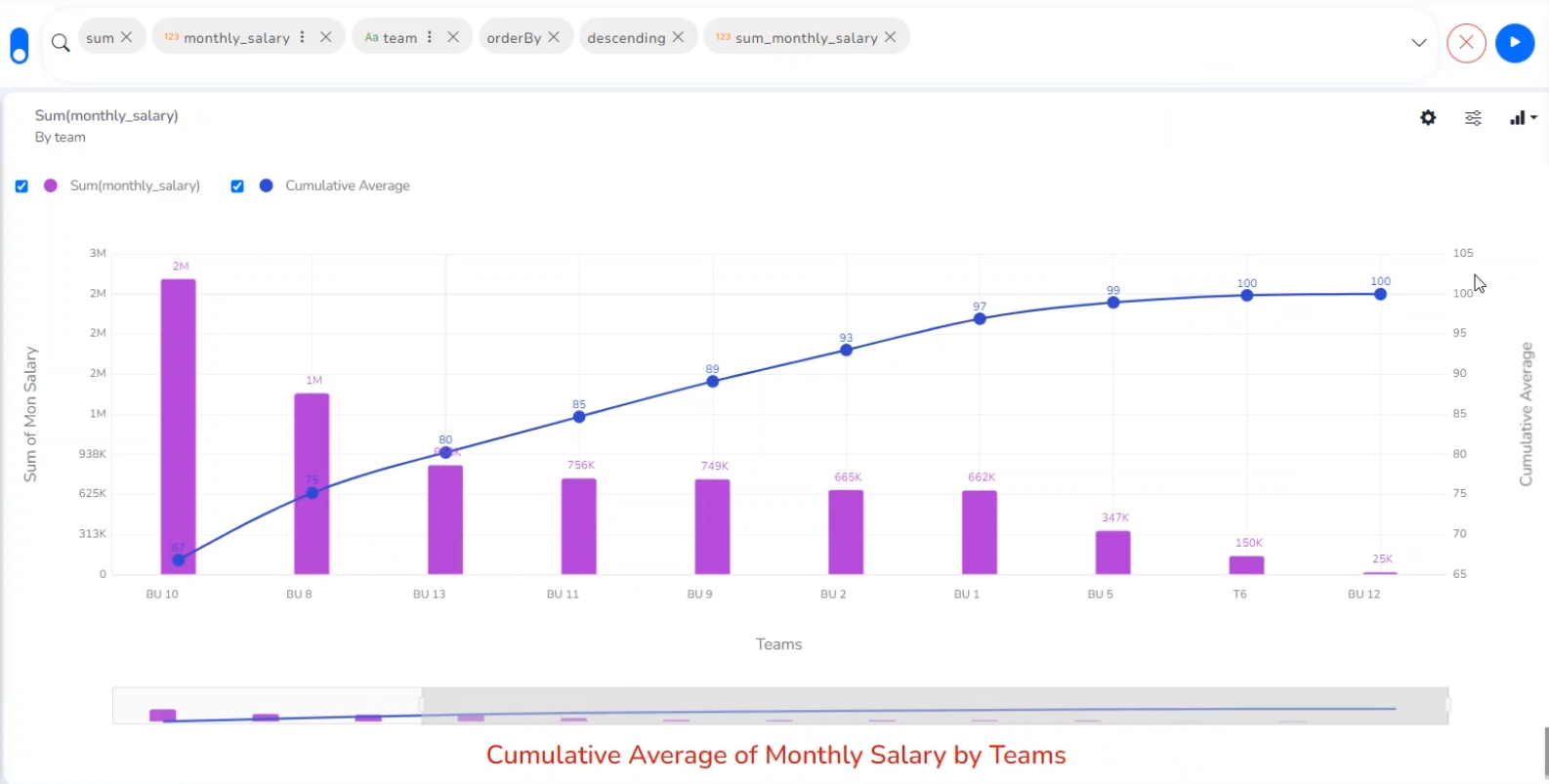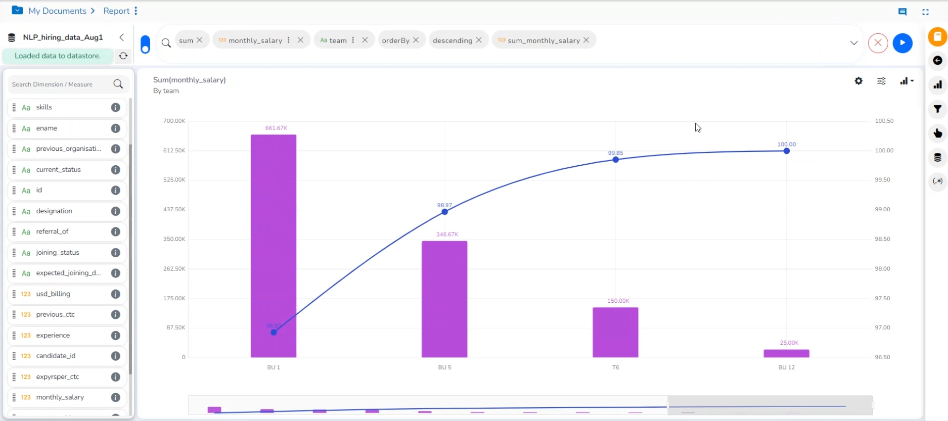
A Pareto chart is a type of chart that contains both bars and a line graph, where individual values are represented in descending order by bars, and the line represents the cumulative average.
Check out the illustration on the Pareto chart properties.
Best Situation to Use a Pareto Chart: To identify the most frequent defects, complaints, or any other factor that the users can count and categorize to focus on where improvement efforts make the most impact.
Variation of this Chart: Pareto Pyramid, Paired Pareto chart
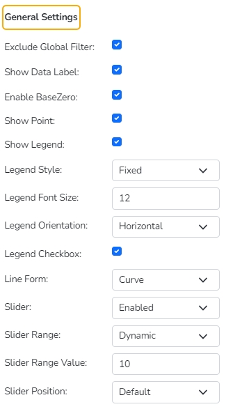
Exclude Global Filter: The view gets excluded from the Global Filter condition by putting a checkmark in the box.
Show Data Label: The data label is displayed using a checkmark in the given box.
Enable Base Zero: Base gets presented from Zero using a checkmark in the provided box.
Slicer: the slicer is displayed by enabling a checkmark in the given box.
Show Point: Select show point for the line chart using the drop-down menu.
Show Legend: Use checkmark in the box to the display Legend
Legend Style: Select a style to display Legend.
Legend Font Size: Set the font size of the Legend.
Legend Orientation: Select a legend orientation option from the drop-down.
Legend Checkbox: Provide checkboxes to select and dis-select the Legend values.
Line Form: Select a line form using the drop-down menu.
Slider: Select an option to enable or disable slider.
Slider Range: Select a range type from the drop-down if the slider is enabled.
Slider Range Value: Set the range value for the slider.
Slider Position: Select an option from the drop-down menu to display the Slider position (Default, Left, Right).
Fixed Slider Range: Enable a checkmark in the given box to get a fixed slider range. After setting these properties, the user can't be able to scroll the slider.
Filter: Select a filter condition using the drop-down menu.
Title: Provide a title for the axis.
Axis Label: Enable the category axis label using a checkmark in the box.
Label Angle: Select a display angle for the axis label.
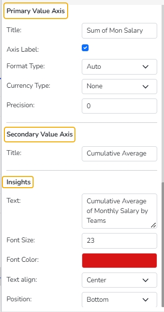
Title: Provide a title for the Primary Value Axis
Axis Label: Enable the Primary Value Axis label using a checkmark in the box.
Format Type: Select a desired format type from the drop-down menu (the provided options for this field are: None, Auto, Percent, Thousand, Lacs, Crore, Million, Billion, Trillion, Quadrillion).
Currency Type: Select a currency symbol to be displayed in the view (the provided options for this field are: None, Rupees, Euro, Pound, USD, Yen, Cent).
Precision: Set the after-decimal value (It displays up to 5 precision).
Title: Provide a title for the Secondary Value Axis (by default it displays the cumulative average of the selected measure in the ascending order).
Text: Provide any information regarding the chart. If any digit or character is required to be highlighted, put it inside two asterisks. (E.g., *70%* or *skills*).
Font Size: Set/modify the Font Size of the Insights text.
Font Color: Select a Font color for the Insights Text.
Text align: There are three alignments to align the text.
Left
Right
Centre
Position: There are two options to position the text.
Bottom
Right
Please Note: The look and feel of the chart can be modified from the series properties.
