# Tooltip(Default & Custom)
{% hint style="success" %}
*Check out the walk-through given below on how to Tooltip are configured in the Designer charting components.*
{% endhint %}
* The Tooltip property block is available under the component property section.
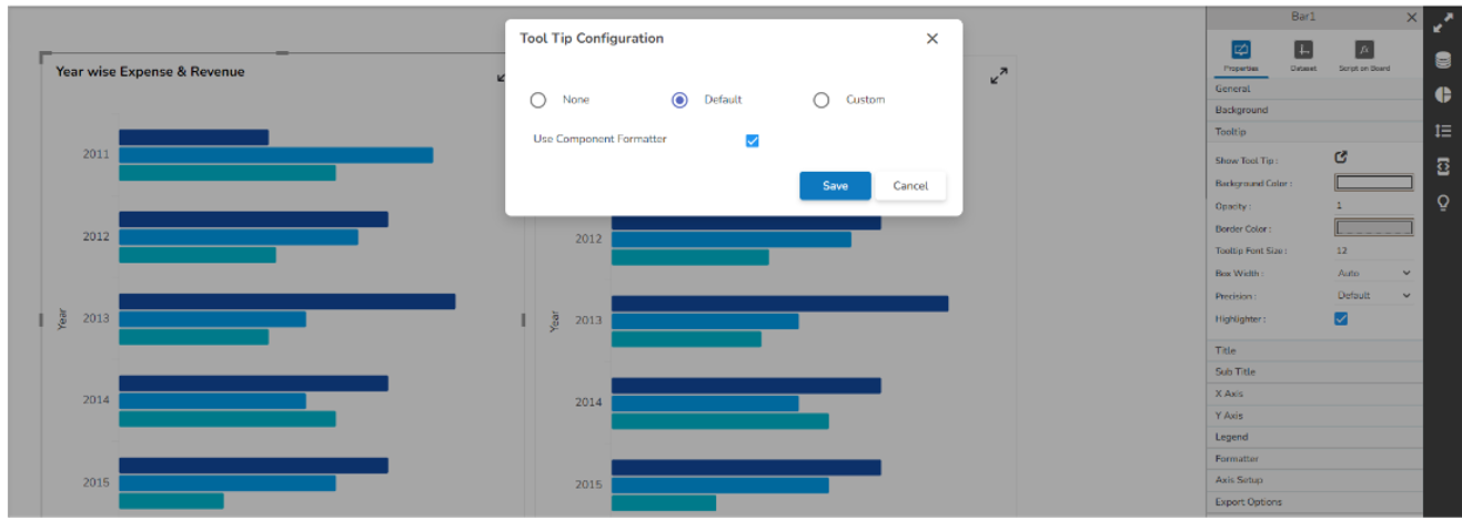
* Tooltip block contains ‘Show Tool Tip ’, ‘Background Color ’, ‘Opacity ’, ‘Border Color ’, ‘Box Width ’, ‘Precision ’ & ‘Highlighter ’.
* Show Tool Tip: Configures tooltip as Default, Custom, or None.
* Background Color: Configures tooltip background color.
* Opacity: Configures tooltip background color opacity.
* Border Color: Configures the border color of the tooltip.
* Box Width: Configures the width of the tooltip box it contains a select box from where width can assign to the tooltip box.
* Precision: Configures the tooltip display data precision.
* Highlighter: By enabling this property through the checkbox tooltip highlighted field background color change.
* Show Tool Tip: By clicking this a model box opens which contains three radio buttons, its default selection is ‘Default ’
* None: On selection of None, the tooltip doesn't be shown on the selected component.
* Default: It's by default a selected tooltip, that displays the default configuration of the selected component.
* Custom: On selection of Custom, tooltip content can be configured.
* Custom Tool Tip: On selection of Custom, an editable text box opens.
* Editable text box contains property buttons on top, a select box that contains all the fields of the data set, and a save and cancel button.
* Editable text box contains selected fields of data set by default.

* Custom Tooltip configuration
* Additional fields can be selected from the select box.

* Display name then field name inside the bracket, field data replaces brackets.
* After selection of the content font properties like font color, font size, font family, etc can be changed from property buttons.

* **\\**: With the help of this tag, any HTML content can be passed directly into tooltip.
* Video and image can be displayed in the tooltip through this HTML tag.
* The field which contains video links that name would be written in the brackets after "scr=" for example src=\[Field Name]. For displaying a single video or image the only link to that particular video or image need to give under "src=" for example src=""
* Font Color property does not support Internet Explorer.
* For changing the field data font property, you need to select the entire bracket otherwise value won’t be displayed in the tooltip.
## **Mobile Tooltip configuration**
* For Timeline, Bar, Heatmap & Pie mobile specific Tooltip is available.
* This Tooltip works only when the component is in maximized state.
* Default Tooltip can be enabled through this script-->
```javascript
// SSDK.getWidget( 'ComponentID').m_mobiletooltipstyle = "default";ome code
```

---
# Agent Instructions: Querying This Documentation
If you need additional information that is not directly available in this page, you can query the documentation dynamically by asking a question.
Perform an HTTP GET request on the current page URL with the `ask` query parameter:
```
GET https://docs.bdb.ai/governed-dashboards/configurations/tooltip-default-and-custom.md?ask=
```
The question should be specific, self-contained, and written in natural language.
The response will contain a direct answer to the question and relevant excerpts and sources from the documentation.
Use this mechanism when the answer is not explicitly present in the current page, you need clarification or additional context, or you want to retrieve related documentation sections.