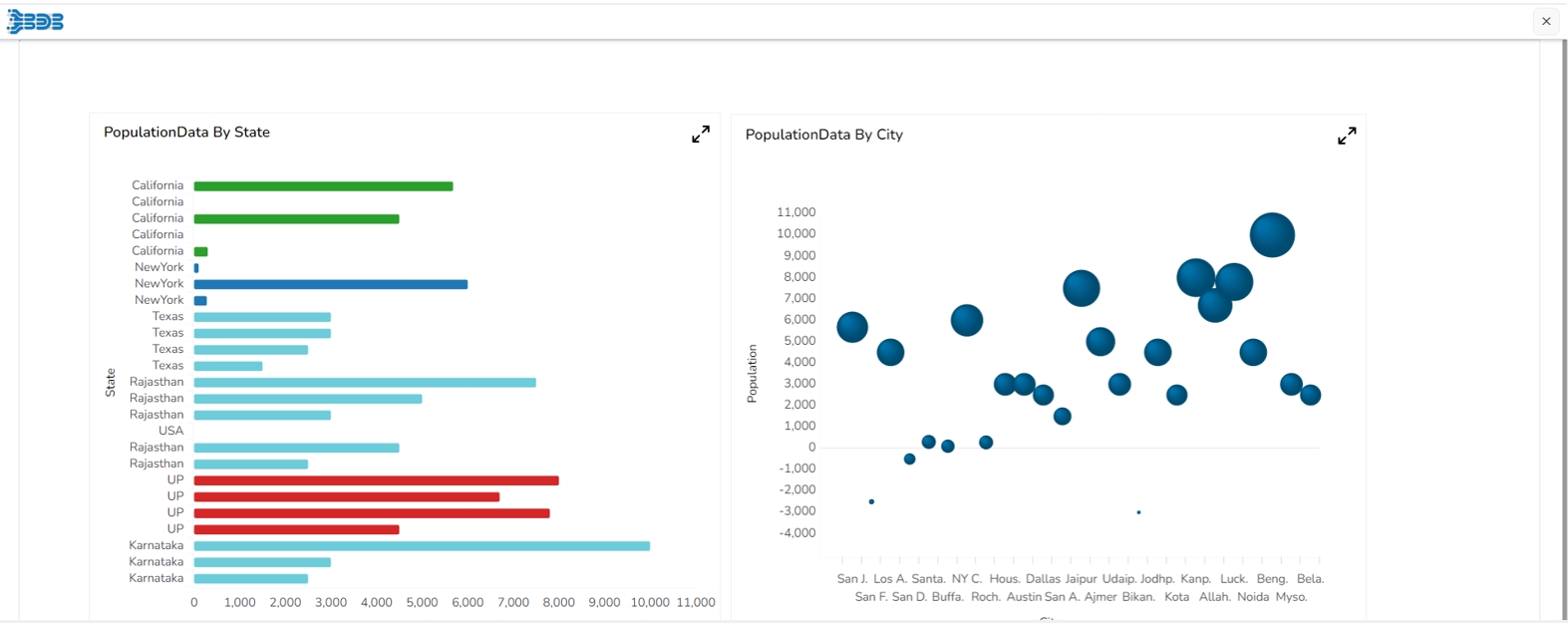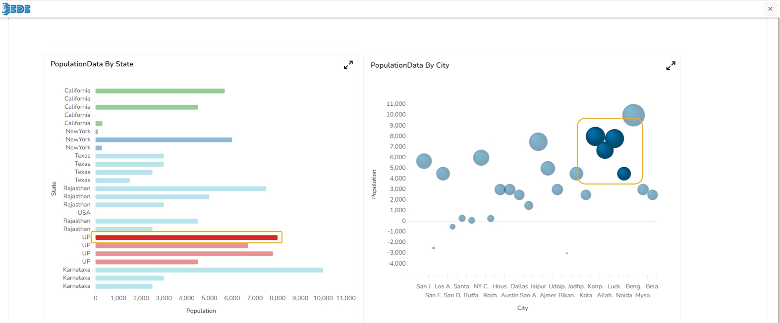
The Drill Highlighter feature in a dashboard helps to focus on specific data points or insights by drilling down into the data and highlighting relevant information. As the dashboard drills down to more granular data, the Drill Highlighter feature emphasizes the selected data point or elements by highlighting them. This makes it easier for users to focus on the relevant information and understand how their selection affects the overall data.
Please Note: This feature is available for Bar, Timeline, Bubble, Group Bar, Group Column, Mixed, Scatterplot, Line, and Column charting components.
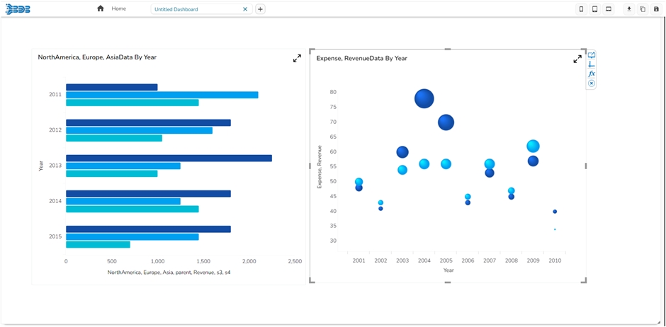
Drag & drop Bar & Bubble chart into canvas and assign data to it.
Navigate to dashboard script area, and write the script to enable drill highlighter (the script used has been provided in the code block).
Go to source component script area .ex, Go to bar chart script area & write a script to enable drill (the script used has been provided in the code block).
Preview the dashboard.
Click on a bar from the Bar chart, the drill will get applied in the associated chart. The drill highlighter will be applied to both the charts.
Check out the walk-through given below on how to configure the Drill Through functionality among the multiple charting components in the Designer.
Click on the Data source icon provided on the right side of the canvas, and view the data connectivity options (ex: CSV, Excel, etc.,) for a dashboard.
Click on the icon to create a new connection. E.g., Excel Data Connection.
Please Note: Since we wish to perform drill-down analysis where we can select a piece of the Pie chart and the column chart will change to reflect that, we need to create two data sources (i.e. Bar and Column)
Fill in the following details:
Name: Name the connection
Browse: Navigate to the Excel file that you wish to use as a data source.
Sheet Name: Select the sheet you wish to use from the Excel file you have selected.
Load at Start: Enabling this option refreshes the data source before opening the charts.
Click on the Charts icon provided on the right side of the canvas. A list of available components will be displayed. Drag and drop the Column chart component onto the canvas.
Connect the Column chart component to an existing data connection:
Click on the Dataset at appears next to the chart.
Select a connection from the Available Connections dropdown menu (ex: Column)
Drag and drop the fields to their respective series and categories.
Connect the Bar chart to an existing data connection:
Click on the Dataset at appears next to the chart.
Select a connection from the Available Connections dropdown (E.g., Bar)
Drag and drop the fields to their respective series and categories.
Apply the following actions:
Click on the Script on Load tab.
Apply the Auto Reload function.
Click on the Data Connectors icon provided on the right side of the canvas. Select the Column data source which is listed under the Excel data source. Select the Condition tab and in the Conditions text area, type the field name which you wish to use to filter data.
Select the condition from the dropdown list and enable the Action checkbox (as shown in the above image).
Click on the Preview button to perform a drill-down analysis.


