Check out the below given walk-through on how to use the Time Series (Timeline) chart component in Designer module.
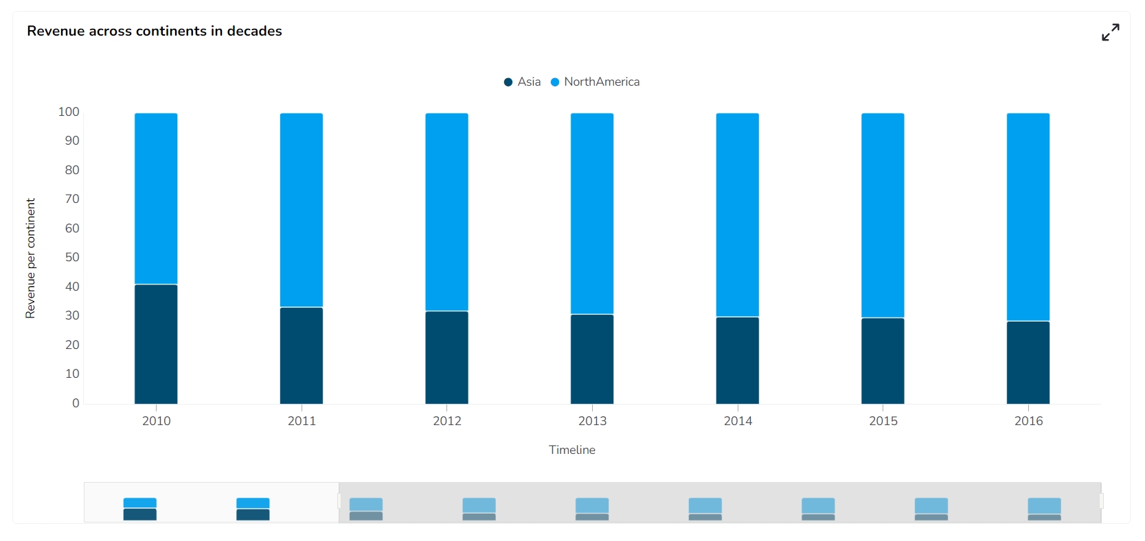
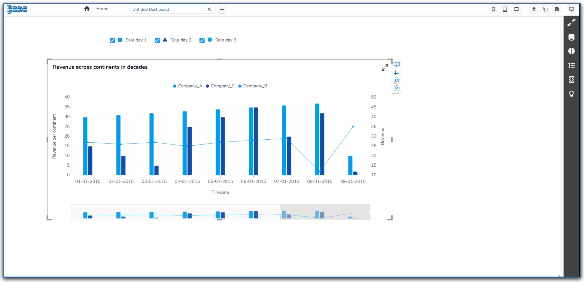
Timeline chart can be used to evaluate patterns and behavior in data over time. Also called 'Time Series' graphs. They show how values change over a time. Timeline charts display observations on the Y-axis against equally spaced time intervals on the X-axis.
When comparing data patterns of different groups
When examining daily, weekly, and annual variations of a product or an entity
Component Name: The unique identifier for the Time Series chart.
Left: The position of the chart from the left edge of the containing element.
Top: The position of the chart from the top edge of the containing element.
Height: The vertical dimension of the chart.
Width: The horizontal dimension of the chart.
Initial Visibility: Whether the chart is visible when initially rendered.
Max Button: Indicates if a button is available to maximize the chart.
Color From Drill: This option allows for dynamic color changes in the chart based on drill-down events.
Points: Toggle the visibility of data points on the chart line.
Fill Area: Enable to fill the area under the chart line with color for better visualization.
Fixed Range: Set a static range for the chart to prevent auto-scaling based on data.
Animation: Add transitions or animations to enhance visual appeal when the chart loads or updates.
Chart Type: Choose between Time Series, Advanced Line, or Fan chart for your data representation.
Date Formatting: Customize how date values are displayed on the chart's axis.
Column Type: Select between Stacked, Clustered, Overlaid, or 100% for distinct data representation methods.
Line Form: Opt for a Curved or Segment line style for your charts.
Bar Size: Adjust the width of bars in bar charts for clear data differentiation.
Actions: Define interactions or events triggered by user interactions with the chart.
Enabling the Actions option will add an icon in the chart preview.
It will allow the display of the data in a grid or some selected chart formats, Sort the data, and export the chart in the supported options suggested under this icon.
Check out the illustration using the Actions option for a Time Series chart.
Steps to configure the Threshold Settings:
Open Threshold Settings: Navigate to the Threshold Settings section within the Timeseries chart Properties panel.
Configure Threshold Properties:
Show Threshold Line: Use a checkmark in the given box to display the threshold lines in the chart.
Threshold 1: Set a value for the upper threshold limit.
Threshold 2: Set a value for the lower threshold limit.
Fill Threshold: Use a checkmark in the given box to fill the color for the entire space between the threshold values.
Fill Color: Choose colors for the threshold fill.
Preview: Check the updated line chart to verify that the threshold lines are correctly displayed. Adjust as necessary.
Put a checkmark in the Show Threshold Line option.
Set the Threshold 1 and Threshold 2 values.
Put a checkmark in the given box to Fill the Threshold.
Click the Fill Colors icon.
The Threshold Fill window opens.
You may configure or modify the default information for the following options:
Level
Color
Opacity
Label
Label Color
Click the Save option to save the inserted details.
Preview: Check the updated line chart to verify that the threshold lines are correctly displayed. Adjust as necessary.
Please Note: Click the Cancel option to remove the inserted details.
Open Annotation Settings: Go to the Timeseries chart Properties and locate the Annotation Settings section. Open it with a click.
Configure Annotation: By providing the following information.
Annotations: Put a checkmark in the given checkbox to enable the Annotations.
Click the Save option to save the mapped Annotation details.
Click the Reset option to reset the filled information.
Line Color: Select a color for the annotation lines.
Dash Line: Put a checkmark in the checkbox to draw lines with a dash pattern.
Line Width: Set the width of the Annotation line.
Line Opacity: Set the opacity of the Annotation line.
Tooltip Title: Provide a title to be displayed in the tooltip.
Preview: Click the Preview icon to ensure the annotation appears correctly.
The user can make any necessary adjustments by re-opening the Annotation Settings.
Open the preview, the color of the annotation lines will be updated based on your selection in the chart.
Please Note: Annotation mapping can be done with only CSV and Excel data.
Show Tool Tip: Enable or disable the display of tooltips on the chart.
Click the Show Tool Tip icon to access the Tool Tip Configuration window.
Select the Default option.
Click the Save option to display Tool Tip in the default display.
Background Color: Choose the background color of the tooltip.
Opacity: The transparency level of the tooltip's background.
Border Color: Choose the color of the border around the tooltip.
Tooltip Font Size: Set the font size of the displayed text within the tooltip.
Box Width: Select an option from the drop-down to display the width of the tooltip box.
Precision: Set the number of decimal places shown in the tooltip values.
Show Slider: Toggle to enable or disable the slider on the chart.
Slider Color: Select the color for the slider using the color picker.
Slider Height Ratio: Adjust the height of the slider concerning the chart's size.
Slider Range: Define the range of values the slider covers.
Slider Range Value: Set the initial value range for the slider.
Slider Position: Choose the position of the slider on the chart.
Border Opacity: Adjust the opacity level of the slider's border.
Container Opacity: Set the opacity for the slider's container area.
Show Range Selector: Enable or disable the range selector functionality for the slider.
Range Selector Opacity: Adjust the transparency of the range selector.
Show Slider Text: Display text indicating the current value range on the slider.
Gradient Rotation: Adjust the angle at which the background gradient is applied.
Opacity: Set the transparency level of the background.
Gradient: Choose the colors to create a gradient effect for the background.
Border: Enable or disable the border around the chart.
Border Color: Select the color of the border.
Border Radius: Define the curvature of the border edges.
Shadow: Enable or disable the shadow effect around the chart.
Shadow Color: Choose the color of the shadow.
Shadow Transparency: Set the transparency of the shadow effect.
Stack Border Color: Define the border color around stacked elements within the chart.
Stack Border Width: Set the width of the border for stacked elements.
Title Box Color: Choose the background color for the title box.
Show Title Box: Enable or disable the display of the title box on the chart.
Show Title: Enable or disable the display of the title text.
Title Bar Height: Specify the height of the title bar area.
Description: Add a description text below the title.
Font Color: Select the color of the title text.
Font Size: Specify the size of the title text.
Font Style: Choose a font style (e.g., italic or normal).
Font Weight: Set the weight (boldness) of the font. The supported options are Normal, Bold, 300, 600, and 900.
Font Family: Choose the font family for the title text from the given choices.
Align: Align the title text (e.g., left, center, right).
Text Decoration: Apply text decorations (e.g., underline) to the title text.
Please Note: By enabling the Show Dataset Description option the Title will get added from the mapped dataset.
Show Subtitle: Enable or disable the display of the subtitle in the chart.
Description: Add descriptive text or additional information below the subtitle.
Font Color: Select the color for the subtitle text.
Font Size: Specify the size of the subtitle text.
Font Style: Choose a font style for the subtitle, such as italic or normal.
Font Weight: Set the weight (boldness) of the subtitle font. Options include Normal, Bold, 300, 600, and 900.
Font Family: Choose the font family for the subtitle text from the available options.
Align: Align the subtitle text to the left, center, or right.
Show X-Axis Line: Toggle the visibility of the X-axis line.
X-Axis Line Color: Select the color for the X-axis line.
Label Font Color: Choose the font color for X-axis labels.
Label Font Size: Specify the size of the font for X-axis labels.
Label Font Style: Set the style (e.g., italic) for X-axis labels.
Label Font Weight: Determine the weight (e.g., bold) for X-axis label fonts.
Label Font Family: Choose the font family for X-axis labels.
Label Decoration: Add decorations (e.g., underline) to X-axis labels.
Label Rotation: Set the rotation angle for X-axis labels.
Tilted Label: Enable to tilt X-axis labels for better readability.
Description: Add a description for the X-axis.
Font Color: Specify the color of the X-axis text.
Font Size: Set the font size for the X-axis text.
Font Style: Choose the font style (e.g., italic) for X-axis text.
Font Weight: Determine the weight (boldness) of the X-axis text.
Font Family: Select the font family for the X-axis text.
Text Decoration: Add text decorations (e.g., underline) to the X-axis labels.
Category Tick Marks: Activate tick marks for categories on the X-axis.
Marker Color: Choose the color of the markers on the X-axis.
Show Y-Axis Line: Toggle the visibility of the Y-axis line.
Y-Axis Line Color: Select the color for the Y-axis line.
Label Font Color: Choose the font color for Y-axis labels.
Label Font Size: Specify the size of the font for Y-axis labels.
Label Font Style: Set the style (e.g., italic) for Y-axis labels.
Label Font Weight: Determine the weight (e.g., bold) for Y-axis label fonts.
Label Font Family: Choose the font family for Y-axis labels.
Label Decoration: Add decorations (e.g., underline) to Y-axis labels.
Description: Add a description for the Y-axis.
Font Color: Specify the color of the Y-axis text.
Font Size: Set the font size for the Y-axis text.
Font Style: Choose the font style (e.g., italic) for Y-axis text.
Font Weight: Determine the weight (boldness) of the Y-axis text.
Font Family: Select the font family for the Y-axis text.
Text Decoration: Add text decorations (e.g., underline) to the Y-axis labels.
Show Legend: Toggle the visibility of the chart legend.
Fixed Legend: Enable to keep the legend position fixed on the chart.
Position: Set the legend position on the chart (e.g., top, bottom, left, right).
Background Color: Select the background color for the legend area.
Background Opacity: Adjust the opacity level of the legend background to achieve the desired transparency effect.
Font Color: Choose the font color for the legend text.
Font Weight: Determine the weight (boldness) of the legend text.
Font Size: Specify the size of the font for the legend text.
Font Family: Select the font family for the legend text.
Font Style: Choose the font style (e.g., italic) for the legend text.
Text Decoration: Add text decorations (e.g., underline) to the legend text.
Unit: Define the unit of measurement for the values displayed in the chart.
Precision: Set the number of decimal places to display for numerical values.
Currency: Format the numbers as a currency with the appropriate symbol.
Position: Determine the position of the formatted value (e.g., before or after the number).
Number Formatter: Apply a specific notation or style to the numbers (e.g., Indian, International).
Show Axis Line: Toggle the visibility of the axis line for the second axis.
Axis Line Color: Choose the color of the second axis line.
Second Axis: Enable to display a secondary axis on the chart.
Label Font Color: Select the color for the labels on the second axis.
Label Font Size: Specify the font size for the labels on the second axis.
Label Font Style: Choose the font style (e.g., italic) for the second axis labels.
Label Font Weight: Determine the weight (boldness) of the second axis label text.
Label Font Family: Select the font family for the second axis labels.
Label Decoration: Add text decorations (e.g., underline) to the second axis labels.
Unit: Define the unit of measurement for values displayed on the second axis.
Precision: Set the number of decimal places for numerical values on the second axis.
Currency: Format the numbers on the second axis as a currency with the appropriate symbol.
Position: Determine the position of formatted values (e.g., before or after the number) on the second axis.
Number Formatter: Apply a specific notation or style to the numbers on the second axis.
Auto Axis Setup: Enable automatic configuration of the second axis settings.
Base Zero: Choose whether to start the second axis at zero.
Min Value: Set the minimum value for the scale of the second axis.
Max Value: Set the maximum value for the scale of the second axis.
Second Axis Desc: Describe the second axis.
Font Color: Choose the font color for the second axis description.
Font Size: Specify the font size for the second axis description text.
Font Style: Select the font style for the second axis description.
Font Weight: Determine the weight (boldness) of the second axis description text.
Font Family: Choose the font family for the second axis description text.
Auto Axis Setup: Automatically configures axis settings based on the dataset.
Base Zero: Determines if the axis scale starts at zero.
Min Value: Sets the minimum value for the axis scale.
Max Value: Sets the maximum value for the axis scale.
Horizontal Marker Line: Adds a horizontal line on the axis for reference.
Vertical Marker Line: Adds a vertical line on the axis for reference.
Zero Marker Line: Displays a line at zero on the axis.
Zero Marker Color: Choose the color for the zero marker line.
Second Axis Zero Marker: Adds a zero marker line on the second axis.
Second Axis Zero Marker Color: Choose the color for the second axis zero marker line.
Color: Sets the color for the axis line and labels.
Opacity: Adjusts the transparency of the axis line and labels.
Enable Context Menu: Activate a right-click context menu for quick access to export options in the preview mode of the chart.
Export Excel: Save the chart data in an Excel file format (.xlsx).
Export CSV: Export the chart data to a CSV file format (.csv).
Export JPEG: Export the chart as a JPEG image (.jpg).
Export PNG: Export the chart as a PNG image (.png).
Export PPT: Export the chart to a PowerPoint presentation (.pptx).
Export PDF: Export the chart as a PDF document (.pdf).
Show Print: Include an option to print the chart directly.
Export Heading: Add a custom heading to the exported file.
Export Sub Heading: Add a custom subheading to the exported file.
Export File Name: Specify the file name for the exported file/dashboard.
Global Export Type: Define the default export format using the drop-down (e.g., Screenshot, Tabular).
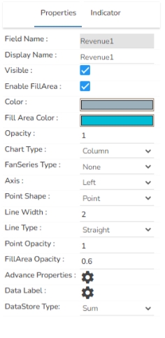
The user can change the color of each bar by selecting any of the series. There is an option to change the column type as well. Select either Line or Column options.
Download the given sample data and map it as mentioned below to plot your Time Series chart
Select the Timeline column as Category, and the other columns as Series.
Access the Threshold Settings section using the Time Series chart properties.
Manage Annotation: Click the Manage Annotation icon to manage the Annotation Dataset by setting Connection, Label Field, and Annotation Field.
Select a different color for the annotation lines using the color menu.
Highlighter: Enable or disable the Highlighter for the Tooltip.
Default Slider Size: Set the initial size of the slider by default.
Stack Border Radius: Determine the curvature of the border around stacked elements.
Show Dataset Description: Enable or disable the dataset description in the title.
Text Decoration: Apply decorations like underlining to the subtitle text.
Show Dataset Description: Toggle the visibility of dataset descriptions on the X-axis.
Show Data Set Description: Toggle the visibility of dataset descriptions on the Y-axis.
Hide on Load: Determine if the legend should be hidden when the chart initially loads.


