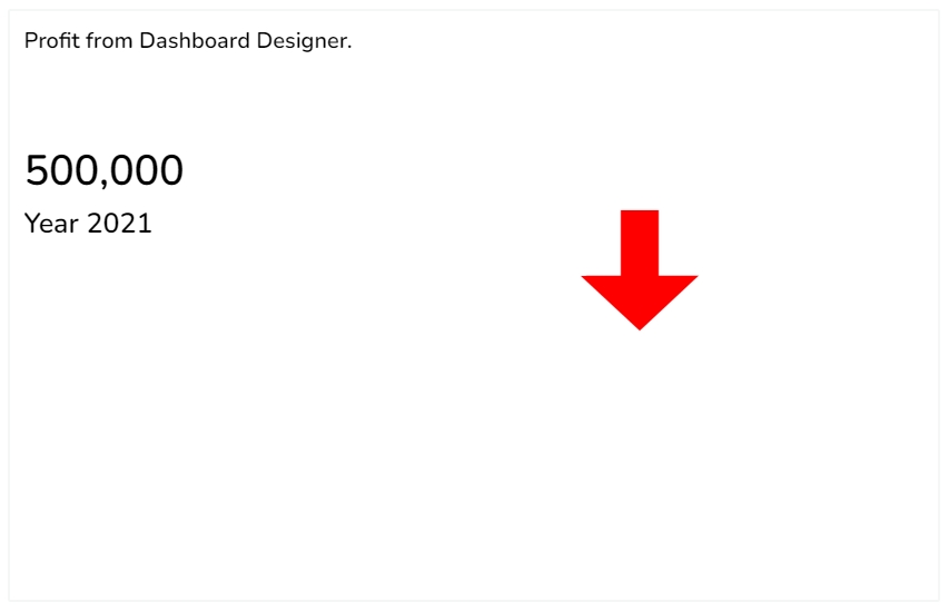
The KPI tile charting component displays the sum of quantity for progressive evolution. KPI is a measurable value that demonstrates how effectively a company is achieving key business objectives. The users can get a quick view of prominent trends, indicators, and values based on the various metrics of the business. Proper use of KPI helps in reducing the number of components used in the dashboard for multiple parameters for better performance. It contains the Sparkline component and Trend in build in it.
To provide information about the current performance of a company or organization at a glance
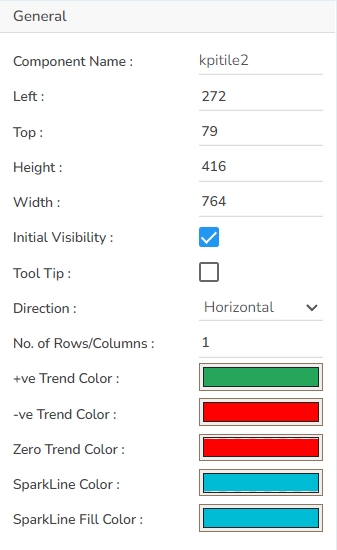
Component Name: Set a unique name to identify the KPI Tile component. This field contains an auto-generated name indicating the sequence of the component in the dashboard.
Left: Determine the horizontal positioning of the chart.
Top: Adjust the vertical positioning of the chart.
Height: Define the height of the chart in pixels.
Width: Set the width of the chart in pixels.
Initial Visibility: Enable this option to make the chart visible during the initial preview.
Tooltip: Enable this field to show the information text that appears when the user hovers over the KPI Tile.
Direction: Choose between horizontal or vertical orientation to display data trends.
No. of Rows/ Columns: Provide a number to define the number of rows and columns.
+ve Trend Color: Set a trend color for the positive value.
-ve Trend Color: Set a trend color for the negative value.
Zero Trend Color: Set a trend color for the Zero value.
SparkLine Color: Select the border color for the Sparkline when this indicator type is chosen.
SparkLine Fill Color: Select the fill color for the Sparkline using this field.
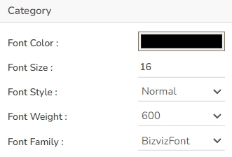
In the Category section, you can customize the appearance of text using the following fields:
Font Color: Select a color for the text to enhance readability and match the overall theme.
Font Size: Adjust the text size to ensure visibility and cohesiveness with other chart elements.
Font Style: Choose between different styles such as italic or normal to add emphasis or distinction.
Font Weight: Set the weight (thickness) of the font to highlight or deemphasize the text. The supported options are Normal, Bold, 300, 600, and 900.
Font Family: Opt for a typeface that aligns with the chart's aesthetic or your branding requirements.
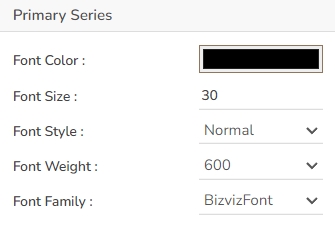
The user can set and modify the Font Color, Font Size, Font Style, Font Weight, and Font Family for the Primary Series (first series field).
Font Color: Select a color for the text to enhance readability and match the overall theme.
Font Size: Adjust the text size to ensure visibility and cohesiveness with other chart elements.
Font Style: Choose between different styles such as italic or normal to add emphasis or distinction.
Font Weight: Set the weight (thickness) of the font to highlight or deemphasize the text. The supported options are Normal, Bold, 300, 600, and 900.
Font Family: Opt for a typeface that aligns with the chart's aesthetic or your branding requirements.
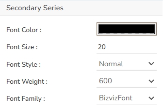
The user can set and modify the Font Color, Font Size, Font Style, Font Weight, and Font Family ac. for the Secondary Series (second series field).
Font Color: Select a color for the text to enhance readability and match the overall theme.
Font Size: Adjust the text size to ensure visibility and cohesiveness with other chart elements.
Font Style: Choose between different styles such as italic or normal to add emphasis or distinction.
Font Weight: Set the weight (thickness) of the font to highlight or deemphasize the text. The supported options are Normal, Bold, 300, 600, and 900.
Font Family: Opt for a typeface that aligns with the chart's aesthetic or your branding requirements.
Download the given sample data and map it as mentioned below to plot your KPI Tile chart.
Use the Value Field column as the Category field, Primary Series and Secondary Series columns as Series, and Sparkline and Trend columns as Indicator columns to plot data.
Please Note: The user also needs to set the No. of rows/ columns from the General Properties fields to plot the sample data as displayed in the above-given image. E.g., the current image displays a chart with 5 sets as the No. of rows/ columns.


