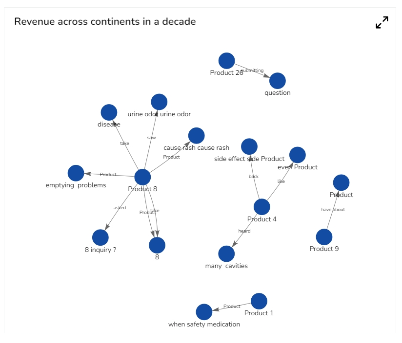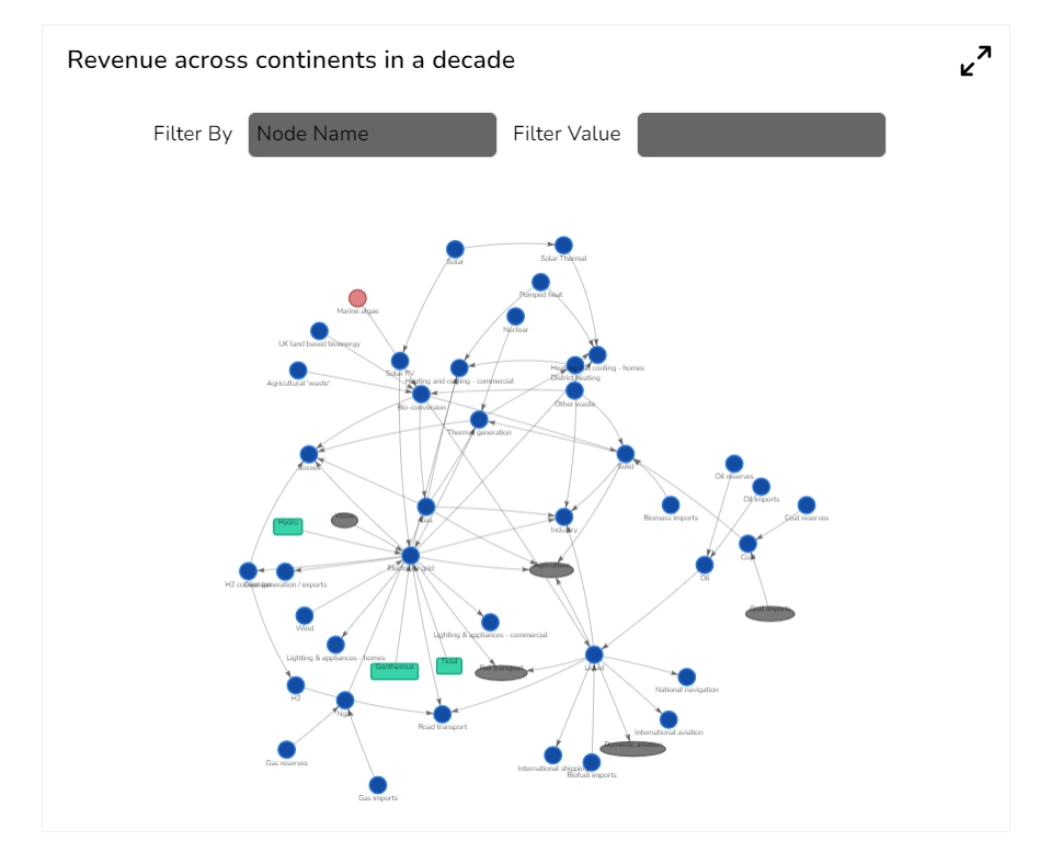
A network graph, also referred to as a network diagram or node-link diagram, is an effective visual tool for illustrating connections between various entities or nodes. This visualization method is valuable for depicting intricate relationships within a system involving multiple interconnected components. It proves especially useful for analyzing intricate systems characterized by numerous interdependent elements.
When the user needs to visualize and understand the relationships between different entities or nodes in a system.
E.g., To analyze transportation planning, where a network graph can visualize the connections between different modes of transportation.
To visualize the connections between different individuals and identify key influencers or social clusters within the social network.
Network Knowledge Graph: In this chart, nodes represent individual pieces of information or concepts, and the connections between nodes indicate relationships. It's useful for illustrating complex interconnections and dependencies within a dataset.
Concept Map: A concept map is a visual representation that links ideas or concepts using lines and connecting phrases. It's suitable for illustrating relationships between various concepts and how they relate to a central theme.
Hierarchical Knowledge Graph: This type of chart represents information in a hierarchical structure, where each level showcases different levels of detail. It's great for showing parent-child relationships and organizing concepts from broad to specific.
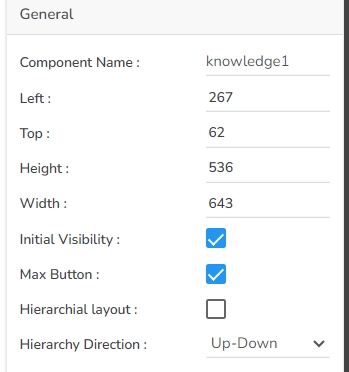
The knowledge graph chart contains the following general properties.
Component Name: Specify a unique name for the component for easy identification.
Left & Top: Determine the position of the component within the container by setting the left and top offsets.
Height & Width: Adjust the size of the component to fit your design requirements.
Initial Visibility: Check this option to make the component visible on the first preview. Uncheck it if you want it hidden initially.
Max Button: Allows users to minimize or maximize the chart as needed for better visualization.
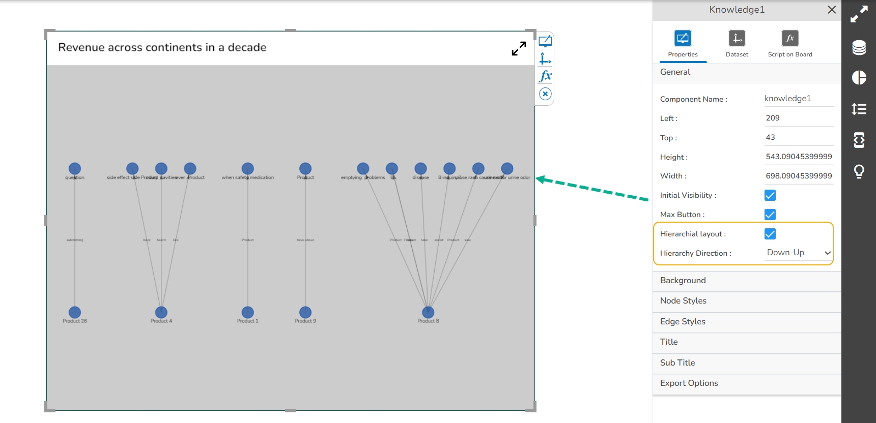
Hierarchical Layout: Enable this option to structure your chart hierarchically for better clarity.
Hierarchy Direction: Select the desired direction for the hierarchy (e.g., top-down, bottom-up) to suit your visualization needs.
The user can enable the hierarchy layout by using the check box and selecting the suitable Hierarchy direction as well.
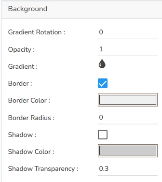
To customize the appearance of the Knowledge chart, users can configure the following background properties:
Gradient Rotation: Adjust the angle of the gradient fill to create smooth transitions between colors.
Opacity: Set the transparency level of the background, allowing for varying degrees of visibility.
Gradient: Choose and customize a gradient fill, which includes selecting multiple colors and blending them seamlessly.
Border: Define the thickness and style of the border surrounding the chart.
Border Color: Select a specific color for the chart border to make it stand out or blend in with the background.
Border Radius: Round the corners of the chart border to achieve a softer and more modern look.
Shadow: Add a shadow effect to the chart to create depth and emphasize its placement.
Shadow Color: Customize the color of the shadow to complement the overall design of the chart.
Shadow Transparency: Control how transparent the shadow is, affecting the subtlety of the shadow effect.
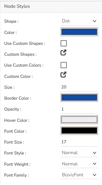
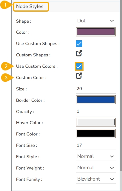
Users can configure various properties to enhance the visual representation of nodes. These properties include:
Shape: Choose a predefined shape for the nodes or use custom shapes.
Color: Select a primary color for the nodes or enable custom colors for more specific customization.
Use Custom Shapes: Toggle the option to activate custom shapes.
Custom Shapes: Define the specific shapes when custom shapes are enabled.
Use Custom Colors: Enable this option to apply custom color configurations.
Custom Color: Specify the exact color code or node selection when custom colors are used.
Size: Adjust the diameter or overall size of the nodes to fit the layout requirements.
Border Color: Choose a color to define the border of the nodes, enhancing their visibility.
Opacity: Set the transparency level of each node, impacting its visibility against the background.
Hover Color: Determine the color change that occurs when hovering over a node, often used to highlight interaction.
Font Color: Decide on the color of the text displayed within the nodes for clear readability.
Font Size: Adjust the size of the text within nodes, ensuring it is visible at different zoom levels.
Font Style: Select the styling of the font, such as italic or normal.
Font Weight: Choose the thickness or boldness of the text within the node for emphasis.
Font Family: Specify the typeface for the text to align with branding or design preferences.
Users can customize the appearance of Edges using the following properties:
Color Inherit: Allows the edge to inherit color properties from the connected Node or a custom setting.
Color: Sets the color of the edge line, enabling users to visually differentiate connections.
Font Color: Determines the color of any edge labels, ensuring readability against the edge line.
Font Size: Specifies the size of the text for any labels on the edge, which can help in maintaining clarity and emphasis.
Font Style: Allows users to choose the style of the font, such as italic or normal, for edge label text.
Font Weight: Defines the thickness of the font used in edge labels, ranging from light to bold.
Font Family: Sets the typeface for any text on the edge, allowing users to maintain consistency with other textual elements.
Align: Positions text labels on the edge, such as left, center, or right-aligned, ensuring optimal viewing and understanding.
Padding: Adds space around the text labels on the edge, improving visual separation and legibility.
Arrows: Users can choose the shape and presence of arrows at one of the ends of the edge, indicating the direction or flow of data.
Dashes: Allows the edge lines to be styled with dashes, providing an option to distinguish the edge type or status using a non-solid line pattern.
The Tooltip properties allow you to customize the informational pop-ups in the Knowledge Graph chart. Here are some key properties you can adjust:
Show Tooltip: Toggle this option to display or hide the tooltip.
Background Color: Set the tooltip background color for better visibility and aesthetic alignment.
Opacity: Adjust the transparency level of the tooltip background.
Border Color: Define the color of the tooltip border for better distinction.
Tooltip Font Size: Specify the font size for the text inside the tooltip for readability.
Box Width: Control the width of the tooltip box to accommodate the content.
Precision: Set the number of decimal places for numerical data displayed in the tooltip.
Highlighter: Add emphasis to specific data points in the tooltip using the highlighter feature.
The Title properties provide various customization options for enhancing the presentation of the title box within your project. These include:
Title Box Color: Sets the background color of the title box for visual distinction.
Show Title Box: Toggles the visibility of the title box, allowing it to be hidden or displayed as needed.
Show Title: Controls the visibility of the title text within the title box.
Title Bar Height: Adjusts the height of the title bar, enabling better visual balance and space management.
Description: Allows for adding descriptive text that complements the main title, offering additional context.
Font Color: Sets the color for the title text, ensuring clarity and readability.
Font Size: Specifies the size of the title text, aiding in achieving visual hierarchy.
Font Style: Enables the selection of the title's font style, such as italic or normal, to convey emphasis.
Font Weight: Defines the thickness of the title text, ranging from light to bold, for added visual impact.
Font Family: Sets the typeface of the title text to maintain consistency with other elements.
Align: Aligns the title text within the title box, with options like left, center, or right for optimal layout.
Text Decoration: Applies additional styling, such as underlines or strikethrough, to the title text for emphasis.
The Sub Title properties allow users to customize the appearance and functionality of the subtitle in their design. Here are the key fields available:
Show Subtitle: Enable or disable the display of the subtitle in the chart.
Description: Add descriptive text or additional information below the subtitle.
Font Color: Select the color for the subtitle text.
Font Size: Specify the size of the subtitle text.
Font Style: Choose a font style for the subtitle, such as italic or normal.
Font Weight: Set the weight (boldness) of the subtitle font. Options include Normal, Bold, 300, 600, and 900.
Font Family: Choose the font family for the subtitle text from the available options.
Align: Align the subtitle text to the left, center, or right.
Users can select various Export options, headings, sub-headings, Name of the exported file, and Global export type using the Export Options properties.
Enable Context Menu: Toggle to allow users to access export options through a right-click context menu.
Export Excel: Option to export data to an Excel file.
Export CSV: Option to export data as a CSV file for spreadsheet applications.
Export JPEG: Export outputs as JPEG image files.
Export PNG: Export outputs as PNG image files.
Export PPT: Generate a PowerPoint presentation from the content.
Export PDF: Create a PDF document from the current content.
Show Print: Allow users to print the data directly.
Export Heading: Define the main heading for the export.
Export Sub Heading: Specify the sub-heading for additional context.
Export File Name: Set a default name for the exported file.
Global Export Type: Export the dashboard data in either Snapshot or Tabular export types.
Check out the given walk-through on how to set custom node shapes.
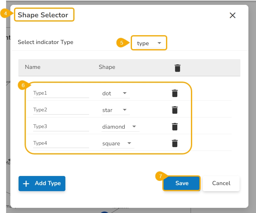
Navigate to the Node Styles section given under the appearance properties of the Knowledge chart.
Enable the checkbox given for Use Custom Shapes.
Click the Custom Shapes icon.
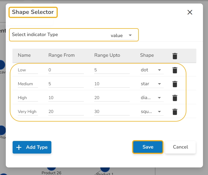
The Shape Selector window opens.
Select the Indicator Type using the drop-down menu. It can be based on Type or Value.
Select various Shapes for the range of types.
Click the Save option.
The user needs to provide the Range From and Range Up to limit while using the Value option as an indicator type.
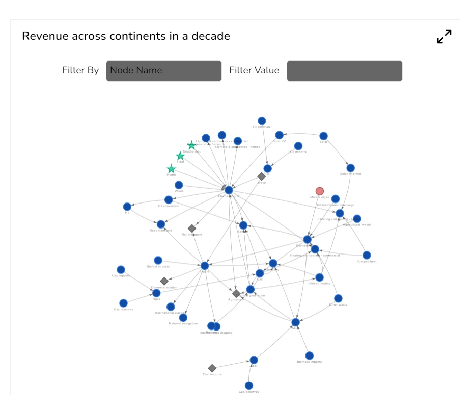
The customized node shapes get added to the chart. The user may see it in the preview mode.
Check out the given walk-through on how to set Custom Node Colors in the knowledge Graph chart.
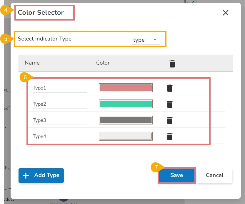
Navigate to the Node Styles section given under the appearance properties of the Knowledge chart.
Enable the checkbox given for Use Custom Colors.
Click the Custom Color icon.
The Color Selector window opens.
Select the Indicator Type using the drop-down menu. It can be either Type or Value.
Select various Colors for the range of types. By clicking the Add Type option the new type gets added to the list with a unique color for it.
Click the Save option.
Please Note: The user needs to provide Range From and Range Up to limit while using Value as the Indicator Type option.
The customized node colors get added to the chart. The user can see the changes in the Preview mode.
Download the given sample data and map it as mentioned below to plot your Knowledge Graph chart:
Select the parent_label column as Source, child_label as Target, and edge_label as Edge field. Drop the value and type fields respectively under the Value and Type headings given below to plot the size of the nodes.
Text Decoration: Apply decorations like underlining to the subtitle text.


