Loading...
Loading...
Loading...
Loading...
Loading...
Loading...
Loading...
Loading...
Loading...
Loading...
Loading...
Loading...
Loading...
Loading...
Loading...
Loading...
Loading...
Loading...
Loading...
Check out the walk-through on how to use the Candle Stick chart component in the Designer module.
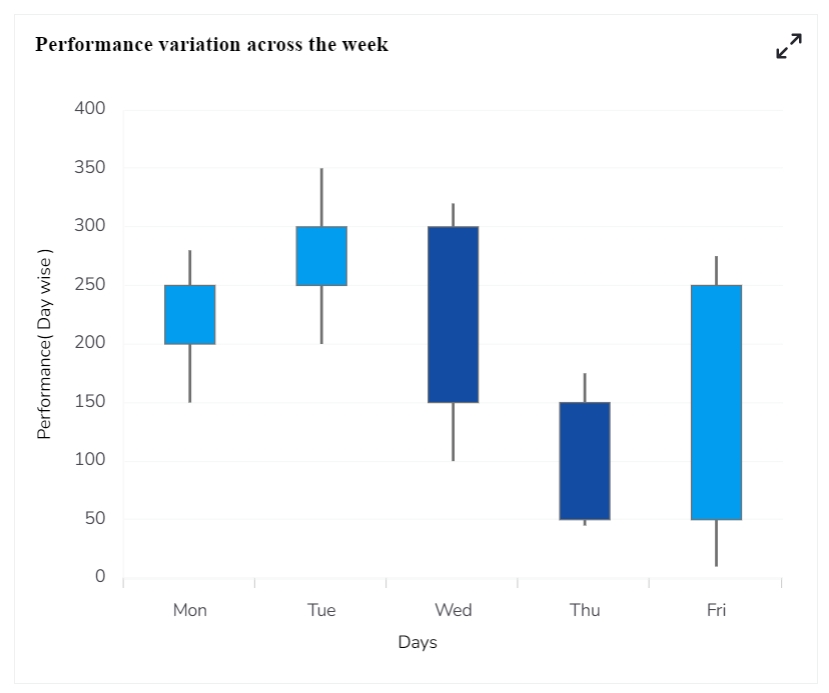
Candlestick chart is a popular way of representing price fluctuations like opening, closing, high, and low prices for a given period. The candle chart has shadows at the end representing the high and low prices for the weekdays. The candles are colored white when the prices increase and black when the prices decrease.
Mainly used to perform technical analysis in financial markets.
Component Name: The unique identifier for the Candle Stick chart.
Left: The position of the chart from the left edge of the containing element.
Top: The position of the chart from the top edge of the containing element.
Height: The vertical dimension of the chart.
Width: The horizontal dimension of the chart.
Initial Visibility: Whether the chart is visible when initially rendered.
Max Button: Indicates if a button is available to maximize the chart.
Fill Colors: The background or fill colors used within the chart.
Show Tool Tip: Enable or disable the display of tooltips on the chart.
Click the Show Tool Tip icon to access the Tool Tip Configuration window.
Select the Default option.
Click the Save option to display Tool Tip in the default display.
Background Color: Choose the background color of the tooltip.
Opacity: The transparency level of the tooltip's background.
Border Color: Choose the color of the border around the tooltip.
Tooltip Font Size: Set the font size of the displayed text within the tooltip.
Box Width: Select an option from the drop-down to display the width of the tooltip box.
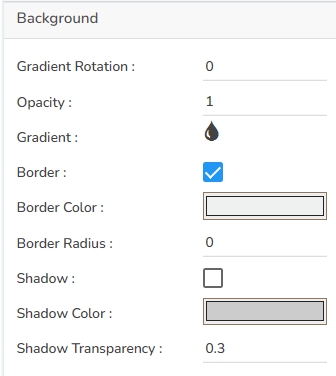
Gradient Rotation: The angle at which the gradient background is applied to the chart.
Opacity: The transparency level of the chart's background.
Gradient: The type and direction of the gradient fill used in the background.
Click the Gradient icon to access the Background gradient colors window.
Click the Add Color option to insert multiple colors.
Border: The style or type of border surrounding the chart.
Border Color: The color of the border surrounding the chart.
Border Radius: The curvature of the chart's corners.
Shadow: Enable the shadow effect on the chart by marking the given checkbox.
Shadow Color: The color of the shadow effect.
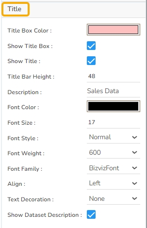
Title Box Color: Choose the background color for the title box.
Show Title Box: Enable or disable the display of the title box on the chart.
Show Title: Enable or disable the display of the title text.
Title Bar Height: Set the height of the title bar.
Description: Add a description text below the title.
Font Color: Select the color of the title text.
Font Size: Specify the size of the title text.
Font Style: Choose the font style (e.g., italic or normal).
Font Weight: Set the weight (boldness) of the font. The supported options are Normal, Bold, 300, 600, and 900.
Font Family: Choose the font family for the title text from the given choices.
Align: Align the title text (e.g., left, center, right).
Text Decoration: Apply text decorations (e.g., underline) to the title text.
Please Note: By enabling the Show Dataset Description option the Title will get added from the mapped dataset.
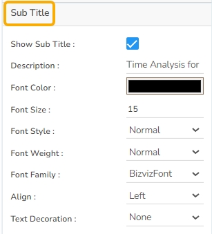
Show Sub Title: Enable or disable the display of the sub-title text.
Description: Add a description text below the sub-title.
Font Color: Select the color of the sub-title text.
Font Size: Specify the size of the sub-title text.
Font Style: Choose the font style for the Sub-title (e.g., italic or normal).
Font Weight: Set the weight (boldness) of the font. The supported options are Normal, Bold, 300, 600, and 900.
Font Family: Choose the font family for the sub-title text from the given choices.
Align: Align the sub-title text (e.g., left, center, right).
Show X-Axis Line: Toggle the visibility of the X-axis line.
X-Axis Line Color: Select the color for the X-axis line.
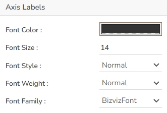
Label Font Color: Choose the font color for X-axis labels.
Label Font Size: Specify the size of the font for X-axis labels.
Label Font Style: Set the style (e.g., italic) for X-axis labels.
Label Font Weight: Determine the weight (e.g., bold) for X-axis label fonts.
Label Font Family: Choose the font family for X-axis labels.
Label Decoration: Add decorations (e.g., underline) to X-axis labels.
Label Rotation: Set the rotation angle for X-axis labels.
Tilted Label: Enable to tilt X-axis labels for better readability.
Description: Add a description for the X-axis.
Font Color: Specify the color of the X-axis text.
Font Size: Set the font size for the X-axis text.
Font Style: Choose the font style (e.g., italic) for X-axis text.
Font Weight: Determine the weight (boldness) of the X-axis text.
Font Family: Select the font family for the X-axis text.
Text Decoration: Add text decorations (e.g., underline) to the X-axis labels.
Category Tick Marks: Activate tick marks for categories on the X-axis.
Marker Color: Choose the color of the markers on the X-axis.
Show Y-Axis Line: Toggle the visibility of the Y-axis line.
Y-Axis Line Color: Select the color for the Y-axis line.
Label Font Color: Choose the font color for Y-axis labels.
Label Font Size: Specify the size of the font for Y-axis labels.
Label Font Style: Set the style (e.g., italic) for Y-axis labels.
Label Font Weight: Determine the weight (e.g., bold) for Y-axis label fonts.
Label Font Family: Choose the font family for Y-axis labels.
Label Decoration: Add decorations (e.g., underline) to Y-axis labels.
Description: Add a description for the Y-axis.
Font Color: Specify the color of the Y-axis text.
Font Size: Set the font size for the Y-axis text.
Font Style: Choose the font style (e.g., italic) for Y-axis text.
Font Weight: Determine the weight (boldness) of the Y-axis text.
Font Family: Select the font family for the Y-axis text.
Text Decoration: Add text decorations (e.g., underline) to the Y-axis labels.
Show Legend: Toggle the visibility of the chart legend.
Font Color: Choose the font color for the legend text.
Font Weight: Determine the weight (boldness) of the legend text.
Font Size: Specify the size of the font for the legend text.
Font Family: Select the font family for the legend text.
Font Style: Choose the font style (e.g., italic) for the legend text.
Text Decoration: Add text decorations (e.g., underline) to the legend text.
Unit: Define the unit of measurement for the values displayed in the chart.
Precision: Set the number of decimal places to display for numerical values.
Currency: Format the numbers as a currency with the appropriate symbol.
Position: Determine the position of the formatted value (e.g., before or after the number).
Auto Axis Setup: Automatically adjust the axis settings based on the dataset.
Base Zero: Ensure the axis starts at zero for better data comparison.
Min Value: Define the minimum value displayed on the axis.
Max Value: Set the maximum value for the axis range.
Horizontal Marker Line: Add a horizontal line at a specified value for reference.
Vertical Marker Line: Place a vertical line at a specific point for highlighting.
Zero Marker Line: Include a line at zero to emphasize the baseline.
Zero Marker Color: Customize the color of the zero marker line.
Color: Choose the color for the axis and labels.
Opacity: Adjust the transparency of the axis and markers.
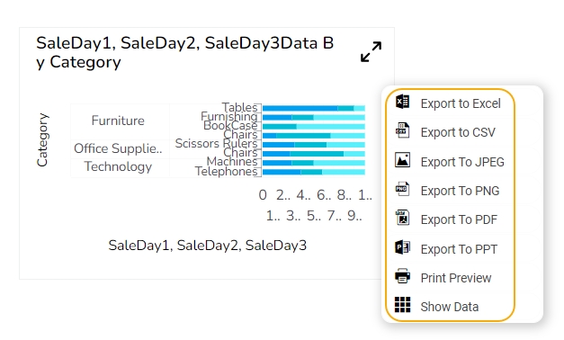
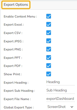
Enable Context Menu: Activate a right-click context menu for quick access to export options in the preview mode of the chart.
Export Excel: Save the chart data in an Excel file format (.xlsx).
Export CSV: Export the chart data to a CSV file format (.csv).
Export JPEG: Export the chart as a JPEG image (.jpg).
Export PNG: Export the chart as a PNG image (.png).
Export PPT: Export the chart to a PowerPoint presentation (.pptx).
Export PDF: Export the chart as a PDF document (.pdf).
Show Print: Include an option to print the chart directly.
Export Heading: Add a custom heading to the exported file.
Export Sub Heading: Add a custom subheading to the exported file.
Export File Name: Specify the file name for the exported file/dashboard.
Global Export Type: Define the default export format using the drop-down (e.g., Screenshot, Tabular).
Download the given sample data and map it as mentioned below to plot your Candle Stick chart:
Select the Day column as Category. Select the rest of the columns based on their names, such as the High column under the High field and the Low column under the Low field.
Check out the given walk-through on how to use the Box Plot chart component in the Designer module.
A box plot or whisker plot chart uses boxes and lines to depict the distributions of one or more groups of numeric data.
Box limits indicate the range of the central 50% of the data, with a central line marking the median value.
Lines extend from each box to capture the range of the remaining data, with dots placed past the line edges to indicate outliers.
The Box Plot chart helps to visualize the dataset in 5 number summaries (Min-Max-Q1-Q3-Median) along with the outliers.
To show distributions of numeric data values
To compare multiple groups.
Consider the order of the groups.
Letter-Value Plots: It is an extension of the standard box plot. Letter-value plots use multiple boxes to enclose increasingly larger proportions of the dataset.
Violin Plot: It is another alternative to the Box Plot wherein each group's distribution is indicated by a density curve.
Component Name: The unique identifier for the Box Plot chart.
Left: The position of the chart from the left edge of the containing element.
Top: The position of the chart from the top edge of the containing element.
Height: The vertical dimension of the chart.
Width: The horizontal dimension of the chart.
Initial Visibility: Whether the chart is visible when initially rendered.
Max Button: Indicates if a button is available to maximize the chart.
Fill Colors: The background or fill colors used within the chart.
Gradient Rotation: The angle at which the gradient background is applied to the chart.
Opacity: The transparency level of the chart's background.
Gradient: The type and direction of the gradient fill used in the background.
Click the Gradient icon to access the Background gradient colors window for selecting background gradient colors.
Click the Add Color option to insert more colors.
Border: The style or type of border surrounding the chart.
Border Color: The color of the border surrounding the chart.
Border Radius: The curvature of the chart's corners.
Shadow: Enable the shadow effect on the chart by marking the given checkbox.
Shadow Color: The color of the shadow effect.
Show Tool Tip: Enable or disable the display of tooltips on the chart.
Click the Show Tool Tip icon to access the Tool Tip Configuration window.
Select the Default option.
Click the Save option to display Tool Tip in the default display.
Background Color: Choose the background color of the tooltip.
Opacity: The transparency level of the tooltip's background.
Border Color: Choose the color of the border around the tooltip.
Tooltip Font Size: Set the font size of the displayed text within the tooltip.
Box Width: Select an option from the drop-down to display the width of the tooltip box.
Title Box Color: Choose the background color for the title box.
Show Title Box: Enable or disable the display of the title box on the chart.
Show Title: Enable or disable the display of the title text.
Title Bar Height: Set the height of the title bar.
Description: Add a description text below the title.
Font Color: Select the color of the title text.
Font Size: Specify the size of the title text.
Font Style: Choose the style of the font (e.g., italic or normal).
Font Weight: Set the weight (boldness) of the font. The supported options are Normal, Bold, 300, 600, and 900.
Font Family: Choose the font family for the title text from the given choices.
Align: Align the title text (e.g., left, center, right).
Text Decoration: Apply text decorations (e.g., underline) to the title text.
Please Note: By enabling the Show Dataset Description option the Title will get added from the mapped dataset.
Show Sub Title: Enable or disable the display of the sub-title text.
Description: Add a description text below the sub-title.
Font Color: Select the color of the sub-title text.
Font Size: Specify the size of the sub-title text.
Font Style: Choose the font style for the Sub-title (e.g., italic or normal).
Font Weight: Set the weight (boldness) of the font. The supported options are Normal, Bold, 300, 600, and 900.
Font Family: Choose the font family for the sub-title text from the given choices.
Align: Align the sub-title text (e.g., left, center, right).
Show X-Axis Line: Toggle the visibility of the X-axis line.
X-Axis Line Color: Select the color for the X-axis line.
Label Font Color: Choose the font color for X-axis labels.
Label Font Size: Specify the size of the font for X-axis labels.
Label Font Style: Set the style (e.g., italic) for X-axis labels.
Label Font Weight: Determine the weight (e.g., bold) for X-axis label fonts.
Label Font Family: Choose the font family for X-axis labels.
Label Decoration: Add decorations (e.g., underline) to X-axis labels.
Label Rotation: Set the rotation angle for X-axis labels.
Tilted Label: Enable to tilt X-axis labels for better readability.
Description: Add a description for the X-axis.
Font Color: Specify the color of the X-axis text.
Font Size: Set the font size for the X-axis text.
Font Style: Choose the font style (e.g., italic) for X-axis text.
Font Weight: Determine the weight (boldness) of the X-axis text.
Font Family: Select the font family for the X-axis text.
Text Decoration: Add text decorations (e.g., underline) to the X-axis labels.
Category Tick Marks: Activate tick marks for categories on the X-axis.
Marker Color: Choose the color of the markers on the X-axis.
Show Y-Axis Line: Toggle the visibility of the Y-axis line.
Y-Axis Line Color: Select the color for the Y-axis line.
Label Font Color: Choose the font color for Y-axis labels.
Label Font Size: Specify the size of the font for Y-axis labels.
Label Font Style: Set the style (e.g., italic) for Y-axis labels.
Label Font Weight: Determine the weight (e.g., bold) for Y-axis label fonts.
Label Font Family: Choose the font family for Y-axis labels.
Label Decoration: Add decorations (e.g., underline) to Y-axis labels.
Description: Add a description for the Y-axis.
Font Color: Specify the color of the Y-axis text.
Font Size: Set the font size for the Y-axis text.
Font Style: Choose the font style (e.g., italic) for Y-axis text.
Font Weight: Determine the weight (boldness) of the Y-axis text.
Font Family: Select the font family for the Y-axis text.
Text Decoration: Add text decorations (e.g., underline) to the Y-axis labels.
Show Legend: Toggle the visibility of the chart legend.
Font Color: Choose the font color for the legend text.
Font Weight: Determine the weight (boldness) of the legend text.
Font Size: Specify the size of the font for the legend text.
Font Family: Select the font family for the legend text.
Font Style: Choose the font style (e.g., italics) for the legend text.
Text Decoration: Add text decorations (e.g., underline) to the legend text.
Unit: Define the unit of measurement for the values displayed in the chart.
Precision: Set the number of decimal places to display for numerical values.
Currency: Format the numbers as a currency with the appropriate symbol.
Position: Determine the position of the formatted value (e.g., before or after the number).
Auto Axis Setup: Automatically adjust the axis settings based on the dataset.
Base Zero: Ensure the axis starts at zero for better data comparison.
Min Value: Define the minimum value displayed on the axis.
Max Value: Set the maximum value for the axis range.
Horizontal Marker Line: Add a horizontal line at a specified value for reference.
Vertical Marker Line: Place a vertical line at a specific point for highlighting.
Zero Marker Line: Include a line at zero to emphasize the baseline.
Zero Marker Color: Customize the color of the zero marker line.
Color: Choose the color for the axis and labels.
Enable Context Menu: Activate a right-click context menu for quick access to export options in the preview mode of the chart.
Export Excel: Save the chart data in an Excel file format (.xlsx).
Export CSV: Export the chart data to a CSV file format (.csv).
Export JPEG: Export the chart as a JPEG image (.jpg).
Export PNG: Export the chart as a PNG image (.png).
Export PPT: Export the chart to a PowerPoint presentation (.pptx).
Export PDF: Export the chart as a PDF document (.pdf).
Show Print: Include an option to print the chart directly.
Export Heading: Add a custom heading to the exported file.
Export Sub Heading: Add a custom subheading to the exported file.
Export File Name: Specify the file name for the exported file/dashboard.
Global Export Type: Define the default export format using the drop-down (e.g., Screenshot, Tabular).
Download the given sample data and map it as mentioned below to plot your Box Plot chart:
Select the Gender column as Category, and the Grade column as Subcategory. Select the rest of the columns based on their names such as choosing the Min column under the Min field, and the Max column under the Max field.
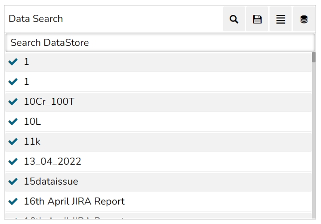
The Data Search can use this to search for particular data. The user can also search for Chart, Query & Data Store.
The user can change the height, width, top, and left. If initial visibility is not enabled, the chart won’t be available for the first preview.
Component Name: The unique identifier for the Data Search chart.
Left: The position of the chart from the left edge of the containing element.
Top: The position of the chart from the top edge of the containing element.
Width: The horizontal dimension of the chart.
Height: The vertical dimension of the chart.
Initial Visibility: Whether the chart is visible when initially rendered.
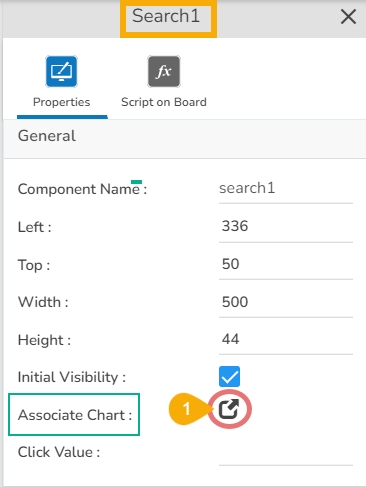
Associate Chart: Redirects the user to the associate chart to establish a connection between the data search and the component.
The user can get the reflection of the chart by enabling the shadow option from the Background properties.
Shadow: Enable the shadow effect on the chart by marking the given checkbox.
Shadow Color: The color of the shadow effect.
The User can set or customize the style for the Data Search component.
Background Color: Set the background color of the chart or component.
Opacity: Control the transparency level of the background color.
Border Radius: Define the curvature of the borders.
Font Color: Choose a color for the text.
Font Size: Specify the size of the font.
Font Style: Apply styles like italics to the text.
Font Weight: Adjust the thickness (boldness) of the text.
Font Family: Select a font type for the text.
Text Decoration: Add decorations like underlining to the text.
Icon Font Size: Set the size of icons within the component.
Panel Height: Define the height of the panel.
It is possible to associate multiple charting components with the Data Search component. The user gets the Associate Chart option under the General properties.
The Associated chart dialog box appears as displayed below:
The user can use the given check box to select the dragged chart component.
The below-given image displays the auto-generated suggestions to provide a text query in the Data Search bar:
Check out the walk-through on how to use the Chevron chart component in the Designer module.
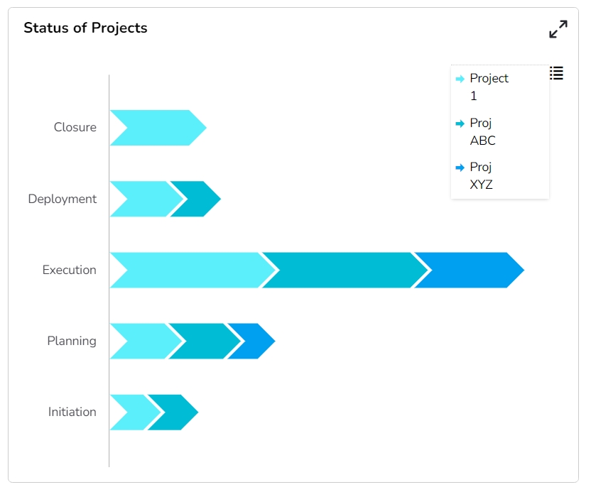
Chevron charts represent the process flow or steps involved in the life cycle of any activity. The arrows are used in the Chevron chart to represent the flow or steps.
A combination of phases defines a project's lifecycle. The chevron provides users with detailed information on each phase involved in the project and its status.
Component Name: The unique identifier for the Chevron chart.
Left: The position of the chart from the left edge of the containing element.
Top: The position of the chart from the top edge of the containing element.
Height: The vertical dimension of the chart.
Width: The horizontal dimension of the chart.
Initial Visibility: Whether the chart is visible when initially rendered.
Max Button: Indicates if a button is available to maximize the chart.
Show Y-Axis Line: Enable the option to display Y-Axis.
Y-Axis Line Color: Choose a color for the Y-Axis.
Date Formatting: Select a date format using the drop-down menu.
Current Phase Color: Specify a color for the Current Phase in the chart.
Series Colors: Select colors for the displayed series of the chevron chart.
Click the Series Colors icon to access a new window for selecting multiple series colors. Use the Add Color option to insert more colors. Click the Save option to save the updates.
Gradient Rotation: The angle at which the gradient background is applied to the chart.
Opacity: The transparency level of the chart's background.
Gradient: The type and direction of the gradient fill used in the background.
Click the Gradient icon to open the Background gradient colors.
Click the Add Color option to insert multiple colors.
Click the Save option to save the modified background.
Border: The style or type of border surrounding the chart.
Border Color: The color of the border surrounding the chart.
Border Radius: The curvature of the chart's corners.
Shadow: Enable the shadow effect on the chart by marking the given checkbox.
Shadow Color: The color of the shadow effect.
Show Tool Tip: Enable or disable the display of tooltips on the chart.
Click the Show Tool Tip icon to access the Tool Tip Configuration window.
Select the Default option.
Click the Save option to display Tool Tip in the default display.
Background Color: Choose the background color of the tooltip.
Opacity: The transparency level of the tooltip's background.
Border Color: Choose the color of the border around the tooltip.
Tooltip Font Size: Set the font size of the displayed text within the tooltip.
Box Width: Select an option from the drop-down to display the width of the tooltip box.
Title Box Color: Choose the background color for the title box.
Show Title Box: Enable or disable the display of the title box on the chart.
Show Title: Enable or disable the display of the title text.
Title Bar Height: Set the height of the title bar.
Description: Add a description text below the title.
Font Color: Select the color of the title text.
Font Size: Specify the size of the title text.
Font Style: Choose the font style (e.g., italic or normal).
Font Weight: Set the weight (boldness) of the font. The supported options are Normal, Bold, 300, 600, and 900.
Font Family: Choose the font family for the title text from the given choices.
Align: Align the title text (e.g., left, center, right).
Text Decoration: Apply text decorations (e.g., underline) to the title text.
Please Note: By enabling the Show Dataset Description option the Title will get added from the mapped dataset.
Show Sub Title: Enable or disable the display of the sub-title text.
Description: Add a description text below the sub-title.
Font Color: Select the color of the sub-title text.
Font Size: Specify the size of the sub-title text.
Font Style: Choose the font style for the Sub-title (e.g., italic or normal).
Font Weight: Set the weight (boldness) of the font. The supported options are Normal, Bold, 300, 600, and 900.
Font Family: Choose the font family for the sub-title text from the given choices.
Align: Align the sub-title text (e.g., left, center, right).
Show X-Axis Line: Toggle the visibility of the X-axis line.
X-Axis Line Color: Select the color for the X-axis line.
Label Font Color: Choose the font color for X-axis labels.
Label Font Size: Specify the size of the font for X-axis labels.
Label Font Style: Set the style (e.g., italic) for X-axis labels.
Label Font Weight: Determine the weight (e.g., bold) for X-axis label fonts.
Label Font Family: Choose the font family for X-axis labels.
Label Decoration: Add decorations (e.g., underline) to X-axis labels.
Label Rotation: Set the rotation angle for X-axis labels.
Tilted Label: Enable to tilt X-axis labels for better readability.
Description: Add a description for the X-axis.
Font Color: Specify the color of the X-axis text.
Font Size: Set the font size for the X-axis text.
Font Style: Choose the font style (e.g., italic) for X-axis text.
Font Weight: Determine the weight (boldness) of the X-axis text.
Font Family: Select the font family for the X-axis text.
Text Decoration: Add text decorations (e.g., underline) to the X-axis labels.
Category Tick Marks: Activate tick marks for categories on the X-axis.
Marker Color: Choose the color of the markers on the X-axis.
Show Y-Axis Line: Toggle the visibility of the Y-axis line.
Y-Axis Line Color: Select the color for the Y-axis line.
Label Font Color: Choose the font color for Y-axis labels.
Label Font Size: Specify the size of the font for Y-axis labels.
Label Font Style: Set the style (e.g., italic) for Y-axis labels.
Label Font Weight: Determine the weight (e.g., bold) for Y-axis label fonts.
Label Font Family: Choose the font family for Y-axis labels.
Label Decoration: Add decorations (e.g., underline) to Y-axis labels.
Description: Add a description for the Y-axis.
Font Color: Specify the color of the Y-axis text.
Font Size: Set the font size for the Y-axis text.
Font Style: Choose the font style (e.g., italic) for Y-axis text.
Font Weight: Determine the weight (boldness) of the Y-axis text.
Font Family: Select the font family for the Y-axis text.
Text Decoration: Add text decorations (e.g., underline) to the Y-axis labels.
Show Legend: Toggle the visibility of the chart legend.
Font Color: Choose the font color for the legend text.
Font Weight: Determine the weight (boldness) of the legend text.
Font Size: Specify the size of the font for the legend text.
Font Family: Select the font family for the legend text.
Font Style: Choose the font style (e.g., italic) for the legend text.
Text Decoration: Add text decorations (e.g., underline) to the legend text.
Enable Context Menu: Activate a right-click context menu for quick access to export options in the preview mode of the chart.
Export Excel: Save the chart data in an Excel file format (.xlsx).
Export CSV: Export the chart data to a CSV file format (.csv).
Export JPEG: Export the chart as a JPEG image (.jpg).
Export PNG: Export the chart as a PNG image (.png).
Export PPT: Export the chart to a PowerPoint presentation (.pptx).
Export PDF: Export the chart as a PDF document (.pdf).
Show Print: Include an option to print the chart directly.
Export Heading: Add a custom heading to the exported file.
Export Sub Heading: Add a custom subheading to the exported file.
Export File Name: Specify the file name for the exported file/dashboard.
Global Export Type: Define the default export format using the drop-down (e.g., Screenshot, Tabular).
Please Note: The PhaseName column has been selected in the below-given chart as Category and the ProjectName column has been selected as Series.
Download the given sample data and map it as mentioned below to plot your Chevron chart:
Select the ProjectName column as Category, and select PhaseName as Series. Select the rest of the columns based on their names such as choosing the PhaseStartDate column under the Start Date field, and the PhaseEnd Date column under the End Date field.
Click the Fill Colors icon to access the Box Fill Color Properties. Set colors for the lower and upper boxes using this window. Click the Save option to save the changes.
Stroke Color: The color used for the outline or borders of the chart elements.
Precision: Set the number of decimal places shown in the tooltip values.
Click the Save option to save your specified background properties.
Shadow Transparency: Set the transparency level of the shadow effect.
Show Dataset Description: Enable or disable the dataset description in the title.
Text Decoration: Apply text decorations (e.g., underline) to the sub-title text.
Show Data Set Description: Toggle the visibility of dataset descriptions on the X-axis.
Show Data Set Description: Toggle the visibility of dataset descriptions on the Y-axis.
Hide on Load: Determine if the legend should be hidden when the chart initially loads.
Number Formatter: Apply a specific notation or style to the numbers (e.g., Indian, International).
Click the Fill Colors icon to access the Box Fill Color Properties. Set colors for the lower and upper boxes using this window. Click the Save option to save the changes.
Stroke Color: The color used for the outline or borders of the chart elements.
Shadow Transparency: Set the transparency level of the shadow effect.
Precision: Set the number of decimal places shown in the tooltip values.
Show Dataset Description: Enable or disable the dataset description in the title.
Text Decoration: Apply text decorations (e.g., underline) to the sub-title text.
Show Dataset Description: Toggle the visibility of dataset descriptions on the X-axis.
Show Data Set Description: Toggle the visibility of dataset descriptions on the Y-axis.
Hide on Load: Determine if the legend should be hidden when the chart initially loads.
Number Formatter: Apply a specific notation or style to the numbers (e.g., Indian, International).
Opacity: Adjust the transparency of the axis and markers.
Click Value: The value a user types in the Click Value field is passed to the backend.
Shadow Transparency: Set the transparency level of the shadow effect.
Click the Associate Chart iconfrom the General Properties of the Search component.
Click the Save to associate the selected charting component with the Data Search option.
The following image displays the Data Search component in the preview mode:
Shadow Transparency: Set the transparency level of the shadow effect.
Precision: Set the number of decimal places shown in the tooltip values.
Show Dataset Description: Enable or disable the dataset description in the title.
Text Decoration: Apply text decorations (e.g., underline) to the sub-title text.
Hide on Load: Determine if the legend should be hidden when the chart initially loads.
Check out the walk-through to use the Decision Tree chart component in the Designer module.
A Decision Tree chart that helps determine a course of action or show a statistical probability. The chart is called a decision tree due to its resemblance to the namesake plant, usually outlined as an upright or a horizontal diagram that branches out.
The Decision Tree chart is made up of various nodes. It contains three types of nodes: Decision nodes, chance nodes, and outcome nodes. Starting from the Decision node, each branch of the Decision Tree represents a possible decision, outcome, or reaction. The furthest branches on the tree represent the results of a certain decision pathway and are called the "leaves".
To classify the data based on a condition
To display continuous nodes as endpoints in a Regression Tree
Some examples where Decision Tree may be used:
To predict the Customer's action/reaction
To forecast Stock market movements
Component Name: The unique identifier for the Decision Tree chart.
Left: The position of the chart from the left edge of the containing element.
Top: The position of the chart from the top edge of the containing element.
Height: The vertical dimension of the chart.
Width: The horizontal dimension of the chart.
Initial Visibility: Whether the chart is visible when initially rendered.
Max Button: Indicates if a button is available to maximize the chart.
Show Tool Tip: Enable or disable the display of tooltips on the chart.
Click the Show Tool Tip icon to access the Tool Tip Configuration window.
Select the Default option.
Click the Save option to display Tool Tip in the default display.
Background Color: Choose the background color of the tooltip.
Opacity: The transparency level of the tooltip's background.
Border Color: Choose the color of the border around the tooltip.
Tooltip Font Size: Set the font size of the displayed text within the tooltip.
Gradient Rotation: The angle at which the gradient background is applied to the chart.
Opacity: The transparency level of the chart's background.
Gradient: The type and direction of the gradient fill used in the background.
Click the Gradient icon to access the Background gradient colors window for selecting background gradient colors.
Click the Add Color option to insert more colors.
Click the Save option to save the selected background colors.
Border: The style or type of border surrounding the chart.
Border Color: The color of the border surrounding the chart.
Border Radius: The curvature of the chart's corners.
Shadow: Enable the shadow effect on the chart by marking the given checkbox.
Shadow Color: The color of the shadow effect.
Enable Context Menu: Activate a right-click context menu for quick access to export options in the preview mode of the chart.
Export Excel: Save the chart data in an Excel file format (.xlsx).
Export CSV: Export the chart data to a CSV file format (.csv).
Export JPEG: Export the chart as a JPEG image (.jpg).
Export PNG: Export the chart as a PNG image (.png).
Export PPT: Export the chart to a PowerPoint presentation (.pptx).
Export PDF: Export the chart as a PDF document (.pdf).
Show Print: Include an option to print the chart directly.
Export Heading: Add a custom heading to the exported file.
Export Sub Heading: Add a custom subheading to the exported file.
Export File Name: Specify the file name for the exported file/dashboard.
Global Export Type: Define the default export format using the drop-down (e.g., Screenshot, Tabular).
Use the Styling Properties to customize the look and feel of the Decision Tree chart. Here are some key properties you can adjust:
Node Color: Change the color of the notes in the chart.
Node Transparency: Adjust the transparency level of the nodes.
Node Border Color: Set the color of the borders around each node.
Node Opacity: Control the opacity of the nodes.
Percent Box Color: Define the color for the percentage boxes.
Percent Box Opacity: Adjust the opacity of the percentage boxes.
Percent Border Opacity: Set the opacity for the borders of the percentage boxes.
Line Color: Change the color of the lines connecting nodes.
Line Opacity: Adjust the opacity of the connecting lines.
Font Color: Customize the color of the text.
Font Family: Set the font style for the chart text.
Download the given sample data and map it as mentioned below to plot your Decision chart:
The Data has been selected for specific fields based on their names
Benchmarking analysis is a systematic process used to compare and evaluate an organization's performance against industry standards or best practices. It involves identifying areas for improvement, selecting benchmarking partners, collecting and analyzing relevant data, and implementing improvements based on the findings.
For example, a retail company can compare its customer satisfaction scores with industry benchmarks to identify areas where it needs to enhance its service quality.
Benchmarking analysis allows businesses to identify performance gaps by comparing their performance against industry leaders or competitors. This helps to understand areas where the company is falling behind and needs improvement.
Performance Tracking: By comparing the actual data against the set or Historical benchmarks. E.g., Sales Performance, Employee Performance.
Financial Analysis: Budget vs. Actual Expenditures, Profit Margins against industry benchmarks to evaluate financial competitiveness.
Operational Efficiency: Monitoring actual production metrics against targets or actual industry benchmarks.
Component Name: The unique identifier for the Benchmark Analysis chart.
Left: The position of the chart from the left edge of the containing element.
Top: The position of the chart from the top edge of the containing element.
Height: The vertical dimension of the chart.
Width: The horizontal dimension of the chart.
Initial Visibility: Whether the chart is visible when initially rendered.
Max Button: Indicates if a button is available to maximize the chart.
Fill Colors: The background or fill colors used within the chart.
Gradient Rotation: The angle at which the gradient background is applied to the chart.
Opacity: The transparency level of the chart's background.
Gradient: The type and direction of the gradient fill used in the background.
Border: The style or type of border surrounding the chart.
Border Color: The color of the border surrounding the chart.
Border Radius: The curvature of the chart's corners.
Shadow: Enable the shadow effect on the chart by marking the given checkbox.
Shadow Color: The color of the shadow effect.
Show Tool Tip: Enable or disable the display of tooltips on the chart.
Click the Show Tool Tip icon to access the Tool Tip Configuration window.
Select the Default option.
Click the Save option to display Tool Tip in the default display.
Background Color: Choose the background color of the tooltip.
Opacity: The transparency level of the tooltip's background.
Border Color: Choose the color of the border around the tooltip.
Tooltip Font Size: Set the font size of the displayed text within the tooltip.
Box Width: Select an option from the drop-down to display the width of the tooltip box.
Title Box Color: Choose the background color for the title box.
Show Title Box: Enable or disable the display of the title box on the chart.
Show Title: Enable or disable the display of the title text.
Title Bar Height: Set the height of the title bar.
Description: Add a description text below the title.
Font Color: Select the color of the title text.
Font Size: Specify the size of the title text.
Font Style: Choose a Font style using the drop-down menu (e.g., italic or normal).
Font Weight: Set the weight (boldness) of the font. The supported options are Normal, Bold, 300, 600, and 900.
Font Family: Choose the font family for the title text from the given choices.
Align: Align the title text (e.g., left, center, right).
Text Decoration: Apply text decorations (e.g., underline) to the title text.
Please Note: By enabling the Show Dataset Description option the Title will get added from the mapped dataset.
Show Sub Title: Enable or disable the display of the sub-title text.
Description: Add a description text below the sub-title.
Font Color: Select the color of the sub-title text.
Font Size: Specify the size of the sub-title text.
Font Style: Choose the font style for the Sub-title (e.g., italic or normal).
Font Weight: Set the weight (boldness) of the font. The supported options are Normal, Bold, 300, 600, and 900.
Font Family: Choose the font family for the sub-title text from the given choices.
Align: Align the sub-title text (e.g., left, center, right).
Header Text Color: Select the color of the header text.
Header Font Size: Specify the font size of the header text.
Font Weight: Set the weight (boldness) of the font. The supported options are Normal, Bold, 300, 600, and 900.
Row Font Color: Select the color of the row text.
Row Font Size: Specify the font size of the row text.
Font Weight: Set the weight (boldness) of the font for the rows. The supported options are Normal, Bold, 300, 600, and 900.
Fit Columns: Enable this option to auto-adjust column widths to fit the content.
Text Wrap: Activate this option to wrap row text within the cells.
Show X-Axis Line: Toggle the visibility of the X-axis line.
X-Axis Line Color: Select the color for the X-axis line.
Label Font Color: Choose the font color for X-axis labels.
Label Font Size: Specify the size of the font for X-axis labels.
Label Font Style: Set the style (e.g., italic) for X-axis labels.
Label Font Weight: Determine the weight (e.g., bold) for X-axis label fonts.
Label Font Family: Choose the font family for X-axis labels.
Label Decoration: Add decorations (e.g., underline) to X-axis labels.
Label Rotation: Set the rotation angle for X-axis labels.
Tilted Label: Enable to tilt X-axis labels for better readability.
Description: Add a description for the X-axis.
Font Color: Specify the color of the X-axis text.
Font Size: Set the font size for the X-axis text.
Font Style: Choose the font style (e.g., italic) for X-axis text.
Font Weight: Determine the weight (boldness) of the X-axis text.
Font Family: Select the font family for the X-axis text.
Text Decoration: Add text decorations (e.g., underline) to the X-axis labels.
Category Tick Marks: Activate tick marks for categories on the X-axis.
Marker Color: Choose the color of the markers on the X-axis.
Show Y-Axis Line: Toggle the visibility of the Y-axis line.
Y-Axis Line Color: Select the color for the Y-axis line.
Label Font Color: Choose the font color for Y-axis labels.
Label Font Size: Specify the size of the font for Y-axis labels.
Label Font Style: Set the style (e.g., italic) for Y-axis labels.
Label Font Weight: Determine the weight (e.g., bold) for Y-axis label fonts.
Label Font Family: Choose the font family for Y-axis labels.
Label Decoration: Add decorations (e.g., underline) to Y-axis labels.
Description: Add a description for the Y-axis.
Font Color: Specify the color of the Y-axis text.
Font Size: Set the font size for the Y-axis text.
Font Style: Choose the font style (e.g., italic) for Y-axis text.
Font Weight: Determine the weight (boldness) of the Y-axis text.
Font Family: Select the font family for the Y-axis text.
Text Decoration: Add text decorations (e.g., underline) to the Y-axis labels.
Show Legend: Toggle the visibility of the chart legend.
Font Color: Choose the font color for the legend text.
Font Weight: Determine the weight (boldness) of the legend text.
Font Size: Specify the size of the font for the legend text.
Font Family: Select the font family for the legend text.
Font Style: Choose the font style (e.g., italic) for the legend text.
Text Decoration: Add text decorations (e.g., underline) to the legend text.
Unit: Define the unit of measurement for the values displayed in the chart.
Precision: Set the number of decimal places to display for numerical values.
Currency: Format the numbers as a currency with the appropriate symbol.
Position: Determine the position of the formatted value (e.g., before or after the number).
Number Formatter: Apply a specific notation or style to the numbers (e.g., Indian, International).
Auto Axis Setup: Automatically adjust the axis settings based on the dataset.
Base Zero: Ensure the axis starts at zero for better data comparison.
Min Value: Define the minimum value displayed on the axis.
Max Value: Set the maximum value for the axis range.
Horizontal Marker Line: Add a horizontal line at a specified value for reference.
Vertical Marker Line: Place a vertical line at a specific point for highlighting.
Zero Marker Line: Include a line at zero to emphasize the baseline.
Zero Marker Color: Customize the color of the zero marker line.
Color: Choose the color for the axis and labels.
Opacity: Adjust the transparency of the axis and markers.
Enable Context Menu: Activate a right-click context menu for quick access to export options in the preview mode of the chart.
Export Excel: Save the chart data in an Excel file format (.xlsx).
Export CSV: Export the chart data to a CSV file format (.csv).
Export JPEG: Export the chart as a JPEG image (.jpg).
Export PNG: Export the chart as a PNG image (.png).
Export PPT: Export the chart to a PowerPoint presentation (.pptx).
Export PDF: Export the chart as a PDF document (.pdf).
Show Print: Include an option to print the chart directly.
Export Heading: Add a custom heading to the exported file.
Export Sub Heading: Add a custom subheading to the exported file.
Export File Name: Specify the file name for the exported file/dashboard.
Global Export Type: Define the default export format using the drop-down (e.g., Screenshot, Tabular).
Download the given sample data and map it as mentioned below to plot your Benchmark Analysis chart:
Select the Gender column as Category, and the Grade column as Subcategory. Select the rest of the columns based on their names such as choosing the Min column under the Min field, and the Max column under the Max field.
Check out the walk-through on how to use the Heat Map chart component in the Designer module.
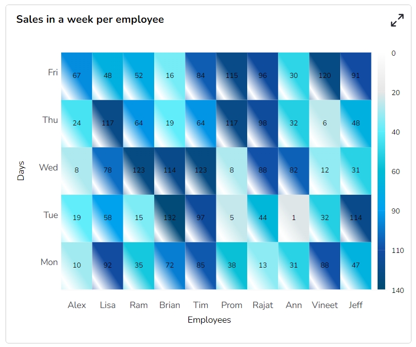
A Heat Map visualizes data in a two-dimensional image where it uses colors to represent data values. Heat Maps allow users to understand complex data sets easily as they are represented in different color ranges. They provide an immediate visual summary of information.
To show the relationship between two factors
Geographic Type Heat Maps: For instance, To analyze the Election result, a geographical heat map with the colors red and blue will quickly inform the user which state each candidate has won.
Component Name: The unique identifier for the Heat Map chart.
Left: The position of the chart from the left edge of the containing element.
Top: The position of the chart from the top edge of the containing element.
Height: The vertical dimension of the chart.
Width: The horizontal dimension of the chart.
Initial Visibility: Whether the chart is visible when initially rendered.
Max Button: Indicates if a button is available to maximize the chart.
Actions: Provides an icon to access chart-related Actions in the Preview mode.
Access the chart preview.
Click the Actions icon.
A context menu appears with the supported actions.
The user can show the series description and get the tooltip by enabling it from the chart properties.
Show Tool Tip: Enable or disable the display of tooltips on the chart.
Click the Show Tool Tip icon to access the Tool Tip Configuration window.
Select the Default option.
Use the Use Component Formatter option by putting a checkmark in the box.
Background Color: Choose the background color of the tooltip.
Opacity: The transparency level of the tooltip's background.
Border Color: Choose the color of the border around the tooltip.
Tooltip Font Size: Set the font size of the displayed text within the tooltip.
Box Width: Select an option from the drop-down to display the width of the tooltip box.
Precision: Set the number of decimal places shown in the tooltip values.
Gradient Rotation: The angle at which the gradient background is applied to the chart.
Opacity: The transparency level of the chart's background.
Gradient: The type and direction of the gradient fill used in the background.
Click the Gradient icon to access the Background gradient colors window for selecting background gradient colors.
Click the Add Color option to insert more colors.
Border: The style or type of border surrounding the chart.
Border Color: The color of the border surrounding the chart.
Border Radius: The curvature of the chart's corners.
Shadow: Enable the shadow effect on the chart by marking the given checkbox.
Shadow Color: The color of the shadow effect.
Shadow Transparency: Set the transparency level of the shadow effect.
The user can change the cell color, give the range color, show the frequency bar, change font size, style, etc. using the Cell Styles properties.
Range Colors: The user can apply a range of colors to the cells based on their values.
Solid Color: The user can set a single solid color for all cells.
Opacity: Adjusts the transparency level of the cell colors.
High Values Are Good: Highlights higher values with a different style to emphasize their importance.
Base Type: Defines the base color type for the cell styles.
Show Frequency Bar: Displays a frequency bar within the cell to represent its value visually.
Show Text On Cell: Enables or disables text display within the cell.
Text Color: Allows customization of the text color inside the cells.
Text Font Size: Adjusts the text font size within the cells.
Text Font Style: Allows changing the text font style (e.g., italic).
Text Font Weight: Enables modification of the text weight (e.g., bold).
Text Font Family: Let the user select the font family for the text within the cells.
Title Box Color: Choose the background color for the title box.
Show Title Box: Enable or disable the display of the title box on the chart.
Show Title: Enable or disable the display of the title text.
Title Bar Height: Set the height of the title bar.
Description: Add a description text below the title.
Font Color: Select the color of the title text.
Font Size: Specify the size of the title text.
Font Style: Choose the font style (e.g., italic or normal).
Font Weight: Set the weight (boldness) of the font. The supported options are Normal, Bold, 300, 600, and 900.
Font Family: Choose the font family for the title text from the given choices.
Align: Align the title text (e.g., left, center, right).
Text Decoration: Apply text decorations (e.g., underline) to the title text.
Please Note: By enabling the Show Dataset Description option the Title will get added from the mapped dataset.
Show Sub Title: Enable or disable the display of the sub-title text.
Description: Add a description text below the sub-title.
Font Color: Select the color of the sub-title text.
Font Size: Specify the size of the sub-title text.
Font Style: Choose the font style for the Sub-title (e.g., italic or normal).
Font Weight: Set the weight (boldness) of the font. The supported options are Normal, Bold, 300, 600, and 900.
Font Family: Choose the font family for the sub-title text from the given choices.
Align: Align the sub-title text (e.g., left, center, right).
The user can change the axis name, Font color, and Font size and enable the axis line, axis label, axis color, etc. for the X-Axis.
Show X-Axis Line: Toggle the visibility of the X-axis line.
X-Axis Line Color: Select the color for the X-axis line.
Category Text Wrap: Enabling this option allows wrapping text for the category.
Label Font Color: Choose the font color for X-axis labels.
Label Font Size: Specify the size of the font for X-axis labels.
Sub Category Font Size: Set font size for sub-category.
Sub Category Text Wrap: Wrap text for sub-category.
Label Font Style: Set the style (e.g., italic) for X-axis labels.
Label Rotation: Set the rotation angle for X-axis labels.
Label Font Weight: Determine the weight (e.g., bold) for X-axis label fonts.
Label Font Family: Choose the font family for X-axis labels.
Label Decoration: Add decorations (e.g., underline) to X-axis labels.
Label Rotation: Set
Tilted Label: Put a checkmark in the box to allow the tilt label functionality.
Description: Add a description for the X-axis.
Font Color: Specify the color of the X-axis text.
Font Size: Set the font size for the X-axis text.
Font Style: Choose the font style (e.g., italic) for X-axis text.
Font Weight: Determine the weight (boldness) of the X-axis text.
Font Family: Select the font family for the X-axis text.
Text Decoration: Add text decorations (e.g., underline) to the X-axis labels.
Please Note: If the Show Dataset Description option is enabled, the X-Axis description will be displayed based on the Dataset. In this scenario, the description provided by the user won't reflect in the chart.
The user can configure various properties regarding the Y-Axis using this chart properties field.
Show Y-Axis Line: Toggle the visibility of the Y-axis line.
Y-Axis Line Color: Select the color for the Y-axis line.
Label Font Color: Choose the font color for Y-axis labels.
Label Font Size: Specify the size of the font for Y-axis labels.
Label Font Style: Set the style (e.g., italic) for Y-axis labels.
Label Font Weight: Determine the weight (e.g., bold) for Y-axis label fonts.
Label Font Family: Choose the font family for Y-axis labels.
Label Decoration: Add decorations (e.g., underline) to Y-axis labels.
Description: Add a description for the Y-axis.
Font Color: Specify the color of the Y-axis text.
Font Size: Set the font size for the Y-axis text.
Font Style: Choose the font style (e.g., italic) for Y-axis text.
Font Weight: Determine the weight (boldness) of the Y-axis text.
Font Family: Select the font family for the Y-axis text.
Text Decoration: Add text decorations (e.g., underline) to the Y-axis labels.
Please Note: If the Show Dataset Description option is enabled, the Y-Axis description will be displayed based on the Dataset. In this scenario, the description provided by the user won't reflect in the chart.
Show Legend: Toggle the visibility of the chart legend.
Font Color: Choose the font color for the legend text.
Font Weight: Determine the weight (boldness) of the legend text.
Font Size: Specify the size of the font for the legend text.
Font Family: Select the font family for the legend text.
Font Style: Choose the font style (e.g., italics) for the legend text.
Text Decoration: Add text decorations (e.g., underline) to the legend text.
Unit: Define the unit of measurement for the values displayed in the chart.
Precision: Set the number of decimal places to display for numerical values.
Currency: Format the numbers as a currency with the appropriate symbol.
Position: Determine the position of the formatted value (e.g., before or after the number).
The Export Options also helps to provide a heading, subheading, and file name. The user can also select an option for Global Export Type.
Enable Context Menu: Activate a right-click context menu for quick access to export options in the preview mode of the chart.
Export Excel: Save the chart data in an Excel file format (.xlsx).
Export CSV: Export the chart data to a CSV file format (.csv).
Export JPEG: Export the chart as a JPEG image (.jpg).
Export PNG: Export the chart as a PNG image (.png).
Export PPT: Export the chart to a PowerPoint presentation (.pptx).
Export PDF: Export the chart as a PDF document (.pdf).
Show Print: Include an option to print the chart directly.
Export Heading: Add a custom heading to the exported file.
Export Sub Heading: Add a custom subheading to the exported file.
Export File Name: Specify the file name for the exported file/dashboard.
Global Export Type: Define the default export format using the drop-down (e.g., Screenshot, Tabular).
Download the given sample data and map it as mentioned below to plot your Heat Map chart:
Select the Employee column as Category field and the Days columns as Series fields.
Check out the below given walk-through on how to use the Group Column chart component in Designer module.
A group column chart (clustered column chart, stacked column chart) extends the column chart, plotting numeric values for levels of two categorical variables instead of one. Columns are grouped by position for levels of one categorical variable, with color indicating the secondary category level within each group.
To compare various relative values based on a common parameter
If you want to compare your region-wise sales for 2012. A Column chart can easily facilitate that comparison. The Stacked/group chart is beneficial as it can facilitate both comparisons as well as part-to-whole relationship.
Component Name: The unique identifier for the Group column chart.
Left: The position of the chart from the left edge of the containing element.
Top: The position of the chart from the top edge of the containing element.
Height: The vertical dimension of the chart.
Width: The horizontal dimension of the chart.
Initial Visibility: Whether the chart is visible when initially rendered.
Max Button: Indicates if a button is available to maximize the chart.
Base Type: The fundamental style or template of the chart, such as plain or styled.
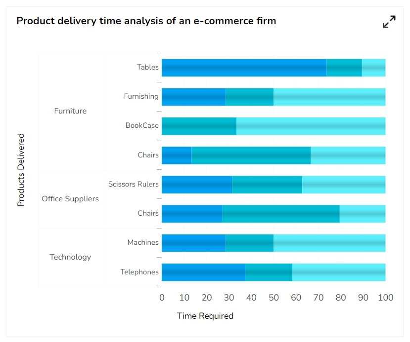
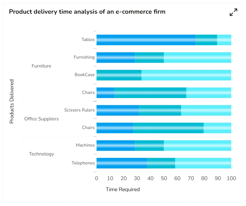
Chart Type: Specifies the overall design of the chart, e.g., 100% stacked bar.
Merge Sub Category: Option to combine sub-categories into a single group for a simplified view.
Bar Size: The thickness of the bars in the chart.
The user can show the series description and get the tooltip by enabling it from the chart properties.
Show Tool Tip: Enable or disable the display of tooltips on the chart.
Click the Show Tool Tip icon to access the Tool Tip Configuration window.
Select the Default option.
Use the Use Component Formatter option by putting a checkmark in the box.
Background Color: Choose the background color of the tooltip.
Opacity: The transparency level of the tooltip's background.
Border Color: Choose the color of the border around the tooltip.
Tooltip Font Size: Set the font size of the displayed text within the tooltip.
Box Width: Select an option from the drop-down to display the width of the tooltip box.
Precision: Set the number of decimal places shown in the tooltip values.
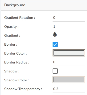
Gradient Rotation: The angle at which the gradient background is applied to the chart.
Opacity: The transparency level of the chart's background.
Gradient: The type and direction of the gradient fill used in the background.
Click the Gradient icon to access the Background gradient colors window for selecting background gradient colors.
Click the Add Color option to insert more colors.
Border: The style or type of border surrounding the chart.
Border Color: The color of the border surrounding the chart.
Border Radius: The curvature of the chart's corners.
Shadow: Enable the shadow effect on the chart by marking the given checkbox.
Shadow Color: The color of the shadow effect.
Shadow Transparency: Set the transparency level of the shadow effect.
Stack Border Color: Choose a color for the Stack border.
Stack Border Width: Set the Border width for the stacks.
Title Box Color: Choose the background color for the title box.
Show Title Box: Enable or disable the display of the title box on the chart.
Show Title: Enable or disable the display of the title text.
Title Bar Height: Set the height of the title bar.
Description: Add a description text below the title.
Font Color: Select the color of the title text.
Font Size: Specify the size of the title text.
Font Style: Choose the font style (e.g., italic or normal).
Font Weight: Set the weight (boldness) of the font. The supported options are Normal, Bold, 300, 600, and 900.
Font Family: Choose the font family for the title text from the given choices.
Align: Align the title text (e.g., left, center, right).
Text Decoration: Apply text decorations (e.g., underline) to the title text.
Please Note: By enabling the Show Dataset Description option the Title will get added from the mapped dataset.
Show Sub Title: Enable or disable the display of the sub-title text.
Description: Add a description text below the sub-title.
Font Color: Select the color of the sub-title text.
Font Size: Specify the size of the sub-title text.
Font Style: Choose the font style for the Sub-title (e.g., italic or normal).
Font Weight: Set the weight (boldness) of the font. The supported options are Normal, Bold, 300, 600, and 900.
Font Family: Choose the font family for the sub-title text from the given choices.
Align: Align the sub-title text (e.g., left, center, right).
The user can change the axis name, Font color, and Font size and enable the axis line, axis label, axis color, etc. for the X-Axis.
Show X-Axis Line: Toggle the visibility of the X-axis line.
X-Axis Line Color: Select the color for the X-axis line.
Category Text Wrap: Enabling this option allows wrapping text for the category.
Label Font Color: Choose the font color for X-axis labels.
Label Font Size: Specify the size of the font for X-axis labels.
Sub-Category Font Size: Set font size for sub-category.
Sub-Category Text Wrap: Wrap text for sub-category.
Label Font Style: Set the style (e.g., italic) for X-axis labels.
Label Rotation: Set the rotation angle for X-axis labels.
Label Font Weight: Determine the weight (e.g., bold) for X-axis label fonts.
Label Font Family: Choose the font family for X-axis labels.
Label Decoration: Add decorations (e.g., underline) to X-axis labels.
Description: Add a description for the X-axis.
Font Color: Specify the color of the X-axis text.
Font Size: Set the font size for the X-axis text.
Font Style: Choose the font style (e.g., italic) for X-axis text.
Font Weight: Determine the weight (boldness) of the X-axis text.
Font Family: Select the font family for the X-axis text.
Text Decoration: Add text decorations (e.g., underline) to the X-axis labels.
Please Note: If the Show Dataset Description option is enabled, the X-Axis description will be displayed based on the Dataset. In this scenario, the description provided by the user won't reflect in the chart.
The user can configure various properties regarding the Y-Axis using this chart properties field.
Show Y-Axis Line: Toggle the visibility of the Y-axis line.
Y-Axis Line Color: Select the color for the Y-axis line.
Label Font Color: Choose the font color for Y-axis labels.
Label Font Size: Specify the size of the font for Y-axis labels.
Label Font Style: Set the style (e.g., italic) for Y-axis labels.
Label Font Weight: Determine the weight (e.g., bold) for Y-axis label fonts.
Label Font Family: Choose the font family for Y-axis labels.
Label Decoration: Add decorations (e.g., underline) to Y-axis labels.
Tilted Label: Enable this option to tilt the label text.
Description: Add a description for the Y-axis.
Font Color: Specify the color of the Y-axis text.
Font Size: Set the font size for the Y-axis text.
Font Style: Choose the font style (e.g., italic) for Y-axis text.
Font Weight: Determine the weight (boldness) of the Y-axis text.
Font Family: Select the font family for the Y-axis text.
Text Decoration: Add text decorations (e.g., underline) to the Y-axis labels.
Please Note: If the Show Dataset Description option is enabled, the Y-Axis description will be displayed based on the Dataset. In this scenario, the description provided by the user won't reflect in the chart.
Show Legend: Toggle the visibility of the chart legend.
Font Color: Choose the font color for the legend text.
Font Weight: Determine the weight (boldness) of the legend text.
Font Size: Specify the size of the font for the legend text.
Font Family: Select the font family for the legend text.
Font Style: Choose the font style (e.g., italics) for the legend text.
Text Decoration: Add text decorations (e.g., underline) to the legend text.
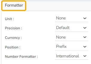
Unit: Define the unit of measurement for the values displayed in the chart.
Precision: Set the number of decimal places to display for numerical values.
Currency: Format the numbers as a currency with the appropriate symbol.
Position: Determine the position of the formatted value (e.g., before or after the number).
Auto Axis Setup: Automatically adjust the axis settings based on the dataset.
Base Zero: Ensure the axis starts at zero for better data comparison.
Min Value: Define the minimum value displayed on the axis.
Max Value: Set the maximum value for the axis range.
Horizontal Marker Line: Add a horizontal line at a specified value for reference.
Vertical Marker Line: Place a vertical line at a specific point for highlighting.
Zero Marker Line: Include a line at zero to emphasize the baseline.
Zero Marker Color: Customize the color of the zero marker line.
Color: Choose the color for the axis and labels.
The Export Options also helps to provide a heading, subheading, and file name. The user can also select an option for Global Export Type.
Enable Context Menu: Activate a right-click context menu for quick access to export options in the preview mode of the chart.
Export Excel: Save the chart data in an Excel file format (.xlsx).
Export CSV: Export the chart data to a CSV file format (.csv).
Export JPEG: Export the chart as a JPEG image (.jpg).
Export PNG: Export the chart as a PNG image (.png).
Export PPT: Export the chart to a PowerPoint presentation (.pptx).
Export PDF: Export the chart as a PDF document (.pdf).
Show Print: Include an option to print the chart directly.
Export Heading: Add a custom heading to the exported file.
Export Sub Heading: Add a custom subheading to the exported file.
Export File Name: Specify the file name for the exported file/dashboard.
Global Export Type: Define the default export format using the drop-down (e.g., Screenshot, Tabular).
These Properties will work when we have a category field and that category value should display in a different chart. For Example: If we have a Year for each year, it will generate a different chart.
Repeater: Use a checkmark in the box to allow multiple charts based on category values.
Group By Field: Select the category field to group the data and generate separate charts for each unique value in that field.
No. of Columns: Specify the number of columns to display the repeated charts.
Row Height: Set the height for each row containing a repeated chart.
Column Margin: Adjust the margin between the columns of the repeated charts.
The user can change the color of each bar by selecting any of the series. There is an option to change the column type as well. Select either Line or Column options.
Download the given sample data and map it as mentioned below to plot your Group Column chart:
Use the Category column as Category field, Items as Sub-category field, and other columns as Series fields.
Check out the walk-through to use the Group Bar chart component in the Designer module.
The Group Bar chart shows different sub-categories of the main categories. Each sub-group is represented by a separate bar. Generally, the bars are colored or shaded differently to distinguish between them. Usually, a legend or key is provided to indicate what sub-group is represented through the selected range of shadings/colors. The Group Bar chart can be drawn horizontally or vertically depending on the data to be presented.
To display data sets containing negative values and multiple sub-categories.
Component Name: The unique identifier for the Group Bar chart.
Left: The position of the chart from the left edge of the containing element.
Top: The position of the chart from the top edge of the containing element.
Height: The vertical dimension of the chart.
Width: The horizontal dimension of the chart.
Initial Visibility: Whether the chart is visible when initially rendered.
Max Button: Indicates if a button is available to maximize the chart.
Base Type: The fundamental style or template of the chart, such as plain or styled.
Chart Type: Specifies the overall design of the chart, e.g., 100% stacked bar.
Sub-Category Orientation: The orientation of sub-categories within the bar, either left or right.
Merge Sub Category: Option to combine sub-categories into a single group for a simplified view.
Bar Size: The thickness of the bars in the chart.
The user can show the series description and use the tooltip by enabling it.
Show Tool Tip: Enable or disable the display of tooltips on the chart.
Click the Show Tool Tip icon to access the Tool Tip Configuration window.
Select the Default option.
Use the Use Component Formatter option by putting a checkmark in the box.
Background Color: Choose the background color of the tooltip.
Opacity: The transparency level of the tooltip's background.
Border Color: Choose the color of the border around the tooltip.
Tooltip Font Size: Set the font size of the displayed text within the tooltip.
Box Width: Select an option from the drop-down to display the width of the tooltip box.
Precision: Set the number of decimal places shown in the tooltip values.
Highlighter: Enable the checkbox to apply a highlighter for the tooltip.
Gradient Rotation: The angle at which the gradient background is applied to the chart.
Opacity: The transparency level of the chart's background.
Gradient: The type and direction of the gradient fill used in the background.
Click the Gradient icon to access the Background gradient colors window for selecting background gradient colors.
Click the Add Color option to insert more colors.
Click the Save option to save the added background gradient colors.
Border: The style or type of border surrounding the chart.
Border Color: The color of the border surrounding the chart.
Border Radius: The curvature of the chart's corners.
Shadow: Enable the shadow effect on the chart by marking the given checkbox.
Shadow Color: The color of the shadow effect.
Shadow Transparency: Set the transparency level of the shadow effect.
Stack Border Color: Choose a color for the Stack border.
Stack Border Width: Set the Border width for the stacks.
Title Box Color: Choose the background color for the title box.
Show Title Box: Enable or disable the display of the title box on the chart.
Show Title: Enable or disable the display of the title text.
Title Bar Height: Set the height of the title bar.
Description: Add a description text below the title.
Font Color: Select the color of the title text.
Font Size: Specify the size of the title text.
Font Style: Choose the font style (e.g., italic or normal).
Font Weight: Set the weight (boldness) of the font. The supported options are Normal, Bold, 300, 600, and 900.
Font Family: Choose the font family for the title text from the given choices.
Align: Align the title text (e.g., left, center, right).
Text Decoration: Apply text decorations (e.g., underline) to the title text.
Show Dataset Description: Enable or disable the dataset description in the title.
Please Note: By enabling the Show Dataset Description option the Title will get added from the mapped dataset.
Show Sub Title: Enable or disable the display of the sub-title text.
Description: Add a description text below the sub-title.
Font Color: Select the color of the sub-title text.
Font Size: Specify the size of the sub-title text.
Font Style: Choose the font style for the Sub-title (e.g., italic or normal).
Font Weight: Set the weight (boldness) of the font. The supported options are Normal, Bold, 300, 600, and 900.
Font Family: Choose the font family for the sub-title text from the given choices.
Align: Align the sub-title text (e.g., left, center, right).
Text Decoration: Apply text decorations (e.g., underline) to the sub-title text.
The user can change the axis name, Font color, and Font size and enable the axis line, axis label, axis color, etc. for the X-Axis.
Show X-Axis Line: Toggle the visibility of the X-axis line.
X-Axis Line Color: Select the color for the X-axis line.
Label Font Color: Choose the font color for X-axis labels.
Label Font Size: Specify the size of the font for X-axis labels.
Label Font Style: Set the style (e.g., italic) for X-axis labels.
Label Font Weight: Determine the weight (e.g., bold) for X-axis label fonts.
Label Font Family: Choose the font family for X-axis labels.
Label Decoration: Add decorations (e.g., underline) to X-axis labels.
Label Rotation: Set the rotation angle for X-axis labels.
Tilted Label: Enable to tilt X-axis labels for better readability.
Description: Add a description for the X-axis.
Font Color: Specify the color of the X-axis text.
Font Size: Set the font size for the X-axis text.
Font Style: Choose the font style (e.g., italic) for X-axis text.
Font Weight: Determine the weight (boldness) of the X-axis text.
Font Family: Select the font family for the X-axis text.
Text Decoration: Add text decorations (e.g., underline) to the X-axis labels.
Show Dataset Description: Toggle the visibility of dataset descriptions on the X-axis.
Please Note: If the Show Dataset Description option is enabled, the X-Axis description will be displayed based on the Dataset. In this scenario, the description provided by the user won't reflect in the chart.
The user can configure various properties regarding the Y-Axis using this chart properties field.
Show Y-Axis Line: Toggle the visibility of the Y-axis line.
Y-Axis Line Color: Select the color for the Y-axis line.
Category Text Wrap: Enabling this option will wrap the category text.
Label Font Color: Choose the font color for Y-axis labels.
Label Font Size: Specify the size of the font for Y-axis labels.
Label Font Style: Set the style (e.g., italic) for Y-axis labels.
Label Font Weight: Determine the weight (e.g., bold) for Y-axis label fonts.
Label Font Family: Choose the font family for Y-axis labels.
Label Decoration: Add decorations (e.g., underline) to Y-axis labels.
Sub-Category Text Wrap: Enable this option to wrap the sub-category text.
Sub-Category Font Size: Set the font size for the sub-category.
Description: Add a description for the Y-axis.
Font Color: Specify the color of the Y-axis text.
Font Size: Set the font size for the Y-axis text.
Font Style: Choose the font style (e.g., italic) for Y-axis text.
Font Weight: Determine the weight (boldness) of the Y-axis text.
Font Family: Select the font family for the Y-axis text.
Text Decoration: Add text decorations (e.g., underline) to the Y-axis labels.
Show Dataset Description: Toggle the visibility of dataset descriptions on the Y-axis.
Please Note: If the Show Dataset Description option is enabled, the Y-Axis description will be displayed based on the Dataset. In this scenario, the description provided by the user won't reflect in the chart.
Show Legend: Toggle the visibility of the chart legend.
Font Color: Choose the font color for the legend text.
Font Weight: Determine the weight (boldness) of the legend text.
Font Size: Specify the size of the font for the legend text.
Font Family: Select the font family for the legend text.
Font Style: Choose the font style (e.g., italics) for the legend text.
Text Decoration: Add text decorations (e.g., underline) to the legend text.
Unit: Define the unit of measurement for the values displayed in the chart.
Precision: Set the number of decimal places to display for numerical values.
Currency: Format the numbers as a currency with the appropriate symbol.
Position: Determine the position of the formatted value (e.g., before or after the number).
Auto Axis Setup: Automatically adjust the axis settings based on the dataset.
Base Zero: Ensure the axis starts at zero for better data comparison.
Min Value: Define the minimum value displayed on the axis.
Max Value: Set the maximum value for the axis range.
Horizontal Marker Line: Add a horizontal line at a specified value for reference.
Vertical Marker Line: Place a vertical line at a specific point for highlighting.
Zero Marker Line: Include a line at zero to emphasize the baseline.
Zero Marker Color: Customize the color of the zero marker line.
Color: Choose the color for the axis and labels.
The Export Options also helps to provide a heading, subheading, and file name. The user can also select an option for Global Export Type.
Enable Context Menu: Activate a right-click context menu for quick access to export options in the preview mode of the chart.
Export Excel: Save the chart data in an Excel file format (.xlsx).
Export CSV: Export the chart data to a CSV file format (.csv).
Export JPEG: Export the chart as a JPEG image (.jpg).
Export PNG: Export the chart as a PNG image (.png).
Export PPT: Export the chart to a PowerPoint presentation (.pptx).
Export PDF: Export the chart as a PDF document (.pdf).
Show Print: Include an option to print the chart directly.
Export Heading: Add a custom heading to the exported file.
Export Sub Heading: Add a custom subheading to the exported file.
Export File Name: Specify the file name for the exported file/dashboard.
Global Export Type: Define the default export format using the drop-down (e.g., Screenshot, Tabular).
This Properties will work when we have a category field and that category value should display in different chart. For Example: If we have a Year for each year, it will generate a different chart.
Repeater: Use a checkmark in the box to allow multiple charts based on category values.
Group By Field: Select the category field to group the data and generate separate charts for each unique value in that field.
No. of Columns: Specify the number of columns to display the repeated charts.
Row Height: Set the height for each row containing a repeated chart.
Column Margin: Adjust the margin between the columns of the repeated charts.
Row Margin: Adjust the margin between the rows of the repeated charts.
The user can change the color of each bar by selecting any of the series. There is an option to change the column type as well. Select either Line or Column options.
Download the given sample data and map it as mentioned below to plot your Group Bar chart:
Use the Category column as Category field, Items as Sub-category field, and other columns as Series fields.
Box Width: Select an option from the drop-down to display the width of the tooltip box.
Shadow Transparency: Set the transparency level of the shadow effect.
Click the Fill Colors icon to access the Box Fill Color Properties. Set colors for the lower and upper boxes using this window. Click the Save option to save the changes.
Stroke Color: The color used for the outline or borders of the chart elements.
Shadow Transparency: Set the transparency level of the shadow effect.
Precision: Set the number of decimal places shown in the tooltip values.
Show Dataset Description: Enable or disable the dataset description in the title.
Text Decoration: Apply text decorations (e.g., underline) to the sub-title text.
Header Background Color: Choose a background color for the header.
Show Data Set Description: Toggle the visibility of dataset descriptions on the X-axis.
Show Data Set Description: Toggle the visibility of dataset descriptions on the Y-axis.
Hide on Load: Determine if the legend should be hidden when the chart initially loads.
The Actions icon is added to the chart if the Actions option has been enabled.
Animation: Whether the chart includes animation effects when rendered or interacted with.
Click the Save option to display Tool Tip in the default display.
Please Note: To use the Custom option for the Tool Tip configuration, please refer to the page.
Highlighter: Enable the checkbox to apply a highlighter for the tooltip.
Click the Save option to save the added background gradient colors.
Show Dataset Description: Enable or disable the dataset description in the title.
Text Decoration: Apply text decorations (e.g., underline) to the sub-title text.
Show Dataset Description: Toggle the visibility of dataset descriptions on the X-axis.
Show Dataset Description: Toggle the visibility of dataset descriptions on the Y-axis.
Hide on Load: Determine if the legend should be hidden when the chart initially loads.
Number Formatter: Apply a specific notation or style to the numbers (e.g., Indian, International).
Animation: Whether the chart includes animation effects when rendered or interacted with.
Click the Save option to display Tool Tip in the default display.
Please Note: To use the Custom option for the Tool Tip configuration, please refer to the page.
Highlighter: Enable the checkbox to apply a highlighter for the tooltip.
Click the Save option to save the added background gradient colors.
Stack Border Radius: Set the Border radius for the stacks of the group bar chart.
Show Dataset Description: Enable or disable the dataset description in the title.
Text Decoration: Apply text decorations (e.g., underline) to the sub-title text.
Show Dataset Description: Toggle the visibility of dataset descriptions on the X-axis.
Show Dataset Description: Toggle the visibility of dataset descriptions on the Y-axis.
Hide on Load: Determine if the legend should be hidden when the chart initially loads.
Number Formatter: Apply a specific notation or style to the numbers (e.g., Indian, International).
Opacity: Adjust the transparency of the axis and markers.
Row Margin: Adjust the margin between the rows of the repeated charts.
Animation: Whether the chart includes animation effects when rendered or interacted with.
Click the Save option to display Tool Tip in the default display.
Please Note: To use the Custom option for the Tool Tip configuration, please refer to the page.
Stack Border Radius: Set the Border radius for the stacks of the group bar chart.
Hide on Load: Determine if the legend should be hidden when the chart initially loads.
Number Formatter: Apply a specific notation or style to the numbers (e.g., Indian, International).
Opacity: Adjust the transparency of the axis and markers.
A Sankey chart is a type of flow diagram that represents the flow of data or resources between different nodes or stages of a process. It is a visual tool used to illustrate complex systems or processes and show how different components are interconnected. The chart uses the thickness of arrows or lines to represent the quantity or flow of a variable. The width of each arrow corresponds to the relative size of the flow, making it easier to understand the proportions and relationships between different elements.
When you need to visualize the flow of data or resources between different components of a system or process.
To illustrate the flow of energy, materials, money, or customer journey mapping through a system by identifying the areas of inefficiency or waste. E.g., If an energy analyst wants to identify the areas of energy waste in a manufacturing plant, A Sankey chart can help here to visualize the flow of energy through the different components of the plant, this can help you to build a strategy for improving efficiency by identifying areas where energy is being wasted.
There are following variations of the Sankey chart available to use this chart effectively.
Multi-level Sankey chart: A Multi-Level Sankey chart extends the traditional Sankey chart by allowing multiple layers or levels of nodes. This grants for a more detailed representation of complex systems with subcategories or sub-processes.
Circular Sankey chart: The Circular Sankey chart places the nodes and flows in a circular layout, making it easier to visualize cyclic or feedback processes. It is particularly useful when there are interconnected loops in the flow data.
Marimekko (Mekko) chart: The Marimekko chart, also known as the Mekko chart or Variable Width Bar chart, is a combination of a bar chart and a Sankey chart. Instead of flowing lines, it uses varying width bars to represent the flow between different entities or categories.
Interactive Sankey chart: Interactive Sankey charts allow users to explore the data by interactively filtering or highlighting specific flows or nodes. This enhances the user experience and provides a more engaging visualization.
Stacked Sankey chart: The Stacked Sankey chart displays multiple flows within a single node, showing the distribution of different sub-flows coming from or going to the same entity.
Component Name: The unique identifier for the Group column chart.
Left: The position of the chart from the left edge of the containing element.
Top: The position of the chart from the top edge of the containing element.
Height: The vertical dimension of the chart.
Width: The horizontal dimension of the chart.
Initial Visibility: Whether the chart is visible when initially rendered.
Max Button: Indicates if a button is available to maximize the chart.
Animation: Whether the chart includes animation effects when rendered or interacted with.
Edge Color Style: Choose a color style option to represent the edge inside the chart (e.g., Gradient, Source, Target).
Highlight Path Style: Choose an option from the drop-down menu to highlight the path style in the chart (e.g., Adjacent, Trajectory).
The user can show the description of the series and can use the tooltip by enabling it.
Gradient Rotation: The angle at which the gradient background is applied to the chart.
Opacity: The transparency level of the chart's background.
Gradient: The type and direction of the gradient fill used in the background.
Click the Gradient icon to access the Background gradient colors window for selecting background gradient colors.
Click the Add Color option to insert more colors.
Border: The style or type of border surrounding the chart.
Border Color: The color of the border surrounding the chart.
Border Radius: The curvature of the chart's corners.
Shadow: Enable the shadow effect on the chart by marking the given checkbox.
Shadow Color: The color of the shadow effect.
Shadow Transparency: Set the transparency level of the shadow effect.
The user can enable and select various Node-specific properties for the Sankey chart by using the Node Style properties fields.
Random Node Color: Assigns random colors to each node.
Label Font Color: Sets the color of the node labels.
Label Font Size: Specifies the size of the font for the node labels.
Label Font Style: Defines the style (e.g., italic) of the node label fonts.
Label Font Weight: Determines the thickness (e.g., bold) of the node label fonts.
Label Font Family: Select the font family for the node labels.
Level Colors: Colors each level of nodes differently.
The Level Colors window opens.
Use the Add Level option to add new colors.
Click the Save option to save the colors.
Line Opacity: Adjusts the transparency of the node connector lines.
Node Gap: Sets the gap between the nodes.
Show Percent Value: Toggles the display of percentage values within nodes.
The user can show the series description and get the tooltip by enabling it from the chart properties.
Show Tool Tip: Enable or disable the display of tooltips on the chart.
Click the Show Tool Tip icon to access the Tool Tip Configuration window.
Select the Default option.
Background Color: Choose the background color of the tooltip.
Border Color: Choose the color of the border around the tooltip.
Tooltip Font Size: Set the font size of the displayed text within the tooltip.
Tooltip Font Style: Choose a font style for the tooltip (e.g., Normal, Italic).
Tooltip Font Weight: Choose an option to set the boldness of the tooltip fonts (e.g., Normal, Bold, 300, 600, 900).
Tooltip Font Family: Choose a font type from the available list of fonts.
Tooltip Font Color: Choose a color for the tooltip fonts.
Box Width: Select an option from the drop-down to display the width of the tooltip box.
Title Box Color: Choose the background color for the title box.
Show Title Box: Enable or disable the display of the title box on the chart.
Show Title: Enable or disable the display of the title text.
Title Bar Height: Set the height of the title bar.
Description: Add a description text below the title.
Font Color: Select the color of the title text.
Font Size: Specify the size of the title text.
Font Style: Choose the font style (e.g., italic or normal).
Font Weight: Set the weight (boldness) of the font. The supported options are Normal, Bold, 300, 600, and 900.
Font Family: Choose the font family for the title text from the given choices.
Align: Align the title text (e.g., left, center, right).
Text Decoration: Apply text decorations (e.g., underline) to the title text.
Please Note: By enabling the Show Dataset Description option the Title will get added from the mapped dataset.
Show Sub Title: Enable or disable the display of the sub-title text.
Description: Add a description text below the sub-title.
Font Color: Select the color of the sub-title text.
Font Size: Specify the size of the sub-title text.
Font Style: Choose the font style for the Sub-title (e.g., italic or normal).
Font Weight: Set the weight (boldness) of the font. The supported options are Normal, Bold, 300, 600, and 900.
Font Family: Choose the font family for the sub-title text from the given choices.
Align: Align the sub-title text (e.g., left, center, right).
Unit: Define the unit of measurement for the values displayed in the chart.
Precision: Set the number of decimal places to display for numerical values.
Currency: Format the numbers as a currency with the appropriate symbol.
Position: Determine the position of the formatted value (e.g., before or after the number).
Number Formatter: Apply a specific notation or style to the numbers (e.g., Indian, International).
The Export Options also helps to provide a heading, subheading, and file name. The user can also select an option for Global Export Type.
Enable Context Menu: Activate a right-click context menu for quick access to export options in the preview mode of the chart.
Export Excel: Save the chart data in an Excel file format (.xlsx).
Export CSV: Export the chart data to a CSV file format (.csv).
Export JPEG: Export the chart as a JPEG image (.jpg).
Export PNG: Export the chart as a PNG image (.png).
Export PPT: Export the chart to a PowerPoint presentation (.pptx).
Export PDF: Export the chart as a PDF document (.pdf).
Show Print: Include an option to print the chart directly.
Export Heading: Add a custom heading to the exported file.
Export Sub Heading: Add a custom subheading to the exported file.
Export File Name: Specify the file name for the exported file/dashboard.
Global Export Type: Define the default export format using the drop-down (e.g., Screenshot, Tabular).
Navigate to the appearance properties of the Sankey chart.
Open the Node Style properties.
Click the Level Colors icon.
The Level Colors window opens.
Set various colors for the different levels.
Click the Save option.
The level colors get changed accordingly in the preview mode of the chart.
The user can provide color based on the Categories of the Source field and Sub-Categories of the Target field using the Indicators tab. Based on the inserted names the colors get reflected in the preview mode.
Check out the illustration to understand how to provide colors for the source categories and access them in preview mode.
The user can also define Conditional Colors for the value field using the Indicator tab.
Download the given sample data and map it as mentioned below to plot your Sankey chart:
Select the Source column as Source, Target column as Target, and Value column as Value fields to plot the above-mentioned data.
The decomposition tree provides a powerful tool for visualizing data across various dimensions. It allows a detailed data analysis by drilling down into the hierarchical structure. It splits core metrics and identifies key factors that affect these metrics. With the help of artificial intelligence (AI), the decomposition tree can even identify the next data dimension to explore based on predefined criteria.
When the user has a time series data set with a clear trend and seasonality patterns, a decomposition tree chart can help break down the time series into its components and make it easier to analyze.
To identify underlying trends and seasonality in your business data.
E.g., a Decomposition chart can help a retailer to accurately forecast sales for a particular product and adjust inventory and marketing strategies accordingly.
Drag and drop the decomposition chart from the component library. The chart looks as given in the below image on the Designer canvas page:
Associate a valid dataset. The sample Dataset used to generate a model chart is given below:
Consider the Series field as Population and visualize population data in a hierarchical order according to categories such as Country, State, and City.
The total population per country, state, and city is displayed in each node while opening the Preview of the Dashboard.
While clicking on one node, other nodes of the particular hierarchy get closed, and all the sub-categories/ children nodes are displayed. E.g., the sub-categories of the USA are displayed in the below-given image:
Users can change the height, width, top, and left. If the 'Initial Visibility' field is unchecked, the component won’t be visible at the first preview. Users can manage the max button to minimize and maximize the chart.
Component Name: Specify a unique name for the decomposition chart component. The default component name appears based on the component's dragging sequence for a dashboard.
Left & Top: Set the positioning of the chart on the display using these fields.
Height & Width: Adjust the chart dimensions to fit your layout requirements.
Initial Visibility: Determine whether the chart is visible upon the initial preview. If unchecked, it remains hidden.
Max Button: Allows users to minimize or maximize the chart as needed, providing flexibility in viewing.
Enable Context Levels: Select this to activate additional hierarchy levels, offering detailed insights by drilling into the data.
Show Percentage: Toggle this option to display percentage values alongside numerical data in the chart.
Aggregation Type: Choose the method for data aggregation (e.g., sum, average) to affect how data is presented.
Maximum Nodes: Define the limit for the number of nodes displayed, controlling chart complexity.
When configuring the Decomposition chart, you can customize the appearance using the following background properties:
Gradient Rotation: Adjust the angle of the background gradient to create the desired effect.
Opacity: Control the transparency level of the background, where 0 is fully transparent and 1 is fully opaque.
Gradient: Choose a color gradient for the background to enhance visual aesthetics.
Click the Gradient icon using the Background properties.
The Background gradient colors dialog window opens.
Use the Add Color option.
Click the Save option.
The selected gradient colors will be applied to the chart background.
Border: Define the thickness of the border surrounding the chart.
Border Color: Select the color of the chart's border to match your theme.
Border Radius: Set the curvature of the chart's corners for a smoother look. A higher value results in more rounded corners, providing a softer appearance, while a lower value keeps the edges more angular.
Shadow: Enable or adjust the shadow effect to give depth to the chart.
Shadow Color: Specify the color of the shadow to complement the chart's design.
Shadow Transparency: Control the visibility of the shadow, where 0 means completely invisible and 1 means fully visible.
Provide Node Style for styling the nodes and their default values.
Node Height: This option defines the vertical size of the nodes, allowing you to control how tall each node appears.
Node Color: This option determines the node's background color, affecting how nodes are visually distinguished.
Fill Color: This option adjusts the internal color filling the node, offering a layer of customization for node appearance.
Stroke Color: This option sets the color of the node's border, providing contrast and definition to the node's edge.
Label Font Color: This option specifies the color used for text on the node, enhancing readability by contrasting with the background.
Label Font Size: This option alters the size of the text label on the node, affecting text prominence and readability.
Label Font Style: This option allows font style selection options (e.g., italic, normal) from a menu to style the text appearance.
Label Font Weight: Provides options to adjust the thickness of the text used for labels, enhancing emphasis.
Label Font Family: Offers a selection of font families, enabling consistency with design guidelines.
Label Value Font Color: Sets the color of the values displayed on the node, ensuring clarity of numerical data.
Label Value Font Size: This determines the size of the values' font which impacts how numerical data is perceived.
Label Value Font Style: This lets you select font style options (e.g., italic, normal) for value text, giving flexibility in presentation.
Label Value Font Weight: It controls the boldness of value text, accentuating important data points.
Label Value Font Family: This option enables font family selection for node values, maintaining uniformity with other text elements.
The following image displays a customized Decomposition chart.
The Tooltip properties allow you to customize the informational pop-ups in the Decomposition chart. Here are some key properties you can adjust:
Show Tooltip: Toggle this option to display or hide the tooltip.
Background Color: Set the tooltip background color for better visibility and aesthetic alignment.
Opacity: Adjust the transparency level of the tooltip background.
Border Color: Define the color of the tooltip border for better distinction.
Tooltip Font Size: Specify the font size for the text inside the tooltip for readability.
Box Width: Control the width of the tooltip box to accommodate the content.
Precision: Set the number of decimal places for numerical data displayed in the tooltip.
Highlighter: Add emphasis to specific data points in the tooltip using the highlighter feature.
The Tooltip appears for the chart as shown below:
Title Box Color: Choose the background color for the title box.
Show Title Box: Enable or disable the display of the title box on the chart.
Show Title: Enable or disable the display of the title text.
Title Bar Height: Specify the height of the title bar area.
Description: Add a description text below the title.
Font Color: Select the color of the title text.
Font Size: Specify the size of the title text.
Font Style: Choose a font style (e.g., italic or normal).
Font Weight: Set the weight (boldness) of the font. The supported options are Normal, Bold, 300, 600, and 900.
Font Family: Choose the font family for the title text from the given choices.
Align: Align the title text (e.g., left, center, right).
Text Decoration: Apply text decorations (e.g., underline) to the title text.
Show Dataset Description: Enable or disable the dataset description in the title.
Please Note: By enabling the Show Dataset Description option the Title will get added from the mapped dataset.
Show Subtitle: Enable or disable the display of the subtitle in the chart.
Description: Add descriptive text or additional information below the subtitle.
Font Color: Select the color for the subtitle text.
Font Size: Specify the size of the subtitle text.
Font Style: Choose a font style for the subtitle, such as italic or normal.
Font Weight: Set the weight (boldness) of the subtitle font. Options include Normal, Bold, 300, 600, and 900.
Font Family: Choose the font family for the subtitle text from the available options.
Align: Align the subtitle text to the left, center, or right.
Text Decoration: Apply decorations like underlining to the subtitle text.
Use the Formatter property fields to format the default Decomposition.
The Formatter properties allow customization of the chart's appearance through various field options:
Unit: Specify the measurement unit (e.g., percentage, currency) for the data values.
Precision: Define the number of decimal places to display, ensuring values are presented with the desired level of detail.
Currency: Designate a currency format for monetary values, allowing for consistent representation in financial data.
Position: Set the placement of labels or annotations on the chart for optimal readability and presentation.
Number Formatter: Apply specific number formatting rules selecting from Indian or International.
The default chart gets formatted as shown below:
Select the Enable Context Levels field using a checkmark in the checkbox. Users can select the next hierarchy levels as required.
Use a right-click on the node to select the next level.
Use a checkmark for the Enable Show percentage field. Users can identify the Node percentage.
The Aggregation type property displays the value of the node based on the selected aggregation.
When the selected aggregation type is sum.
When the selected aggregation type is Mean.
When the selected aggregation type is Percentage.
When the selected aggregation type is Count.
Another property called Maximum Nodes has been provided to control the number of nodes in each hierarchy.
The set value for the Maximum Node field is 10 so if a particular node contains more than 10 children nodes, only 9 children nodes with comparatively more values get displayed as visible nodes, and the remaining children nodes with less value are shown as others.
E.g., In the given Decomposition chart the Maximum Nodes are set as 3
The number of Maximum Nodes gets limited to 3 and the nodes with fewer values get clubbed as Others as displayed in the image:
Users can provide conditional colors using the Indicators tab from the Dataset mapping panel for a charting component.
Open the Dataset panel.
Select a dragged category field.
Navigate to the Indicator tab for the same.
Click the Add new condition icon using the Conditions option.
The Conditional Color dialog window opens.
Select a color for the field.
Click the Create option.
Provide an option to close a particular hierarchy from the header when the Context Level is enabled.
The selected hierarchy gets closed.
The Decomposition chart can highlight the selected node of each hierarchy and display the selected node name below the hierarchy text.
The user gets a loader while expanding the nodes for a category.
Check out the illustration of how a loader appears in the preview of a Decomposition chart.
Download the given sample data and map it as mentioned below to plot your Decomposition chart.
Select the Population column as Series, and the other columns as Category.
Check out the walk-through on how to use the Text Analyzer chart component in the Designer module.
The Text Analyzer chart is handy for plotting the popularity and sentiment graphs of various products and identifying their relationships to the actual sales of these products. It provides visualizations based on 20 emotional properties embodied in text, with their measure of confidence, which we call 'Sentiment'.
To identify customers' opinions
To observe Churn Indicators
To analyze customer Satisfaction and Segmentation
To analyze social media data
The user can change the font size, color, style, etc.
Component Name: Unique identifier for the chart component.
Left: Specifies the left side positioning of the chart in the dashboard.
Top: Specifies the top position of the component on the screen.
Height: Set the height dimension of the component.
Width: Set the width dimension of the component.
Initial Visibility: Determines if the component is visible on load.
Max Button: Enables maximization functionality for the component.
Range Bar: Displays or configures the range selection bar.
Axis Color: Sets the color for the chart axes.
Emoticon Size: Adjusts the size of emoticons, if used within the chart.
Emoticon Opacity: Modifies the transparency level of emoticons.
Gradient Rotation: The user can set the angle at which the background gradient is displayed.
Opacity: Adjusts the transparency level of the background, with lower values indicating higher transparency.
Gradient: Applies a color gradient to the background, enhancing visual appeal.
Click the Gradient icon to access the Background gradient colors window for selecting background gradient colors.
Click the Add Color option to insert more colors.
Click the Add Color option to insert more colors.
Click the Save option to save the added background gradient colors.
Border: Enables or disables the border surrounding the chart.
Border Color: Sets the color of the chart's border, enabling customization to match design themes.
Border Radius: Rounds the corners of the chart border, allowing for smoother edges.
Shadow: Enables a shadow effect for the chart, providing depth and dimension.
Shadow Color: Defines the color of the shadow, which can affect the mood and tone of the visualization.
Shadow Transparency: Adjusts the transparency level of the shadow, allowing it to be subtle or pronounced.
The user can show the series description and use the tooltip by enabling it.
Show Tooltip: This enables the tooltip to be displayed when the user hovers over chart elements.
Background Color: Sets the background color allowing customization to enhance visibility and match design themes.
Opacity: Adjusts the transparency level of the tooltip background, with lower values indicating higher transparency.
Border Color: Defines the color of the tooltip border, creating a distinct separation between the tooltip and the chart.
Tooltip Font Size: Adjusts the text size within the tooltip for improved readability.
Box Width: Determines the width of the tooltip box, providing ample space for displaying content.
Precision: Configures the level of numerical precision displayed within the tooltip, enhancing data accuracy.
The Title properties help the user to set Title-related properties for the component.
Title Box Color: Choose the background color for the title box.
Show Title Box: Enable or disable the display of the title box on the chart.
Show Title: Enable or disable the display of the title text.
Title Bar Height: Set the height of the title bar.
Description: Add a description text below the title.
Font Color: Select the color of the title text.
Font Size: Specify the size of the title text.
Font Style: Choose the font style (e.g., italic or normal).
Font Weight: Set the weight (boldness) of the font. The supported options are Normal, Bold, 300, 600, and 900.
Font Family: Choose the font family for the title text from the given choices.
Align: Align the title text (e.g., left, center, right).
The Axis Labels properties allow customization to enhance chart readability and presentation. Users can adjust various font attributes:
Font Color: Change the color of the axis labels to align with the overall theme or improve contrast.
Font Size: Increase or decrease the size of the axis labels to ensure they are legible or fit the design aesthetic.
Font Style: Apply italic or normal styles to the axis labels for emphasis or stylistic purposes.
Font Weight: Adjust the thickness of the axis label text to a lighter or bolder weight depending on the visual requirement.
Font Family: Select from various font families to match the desired typographic style and enhance the chart's look and feel.
Enable Context Menu: Activate a right-click context menu for quick access to export options in the preview mode of the chart.
Export Excel: Save the chart data in an Excel file format (.xlsx).
Export CSV: Export the chart data to a CSV file format (.csv).
Export JPEG: Export the chart as a JPEG image (.jpg).
Export PNG: Export the chart as a PNG image (.png).
Export PPT: Export the chart to a PowerPoint presentation (.pptx).
Export PDF: Export the chart as a PDF document (.pdf).
Show Print: Include an option to print the chart directly.
Export Heading: Add a custom heading to the exported file.
Export Sub Heading: Add a custom subheading to the exported file.
Export File Name: Specify the file name for the exported file/dashboard.
Global Export Type: Define the default export format using the drop-down (e.g., Screenshot, Tabular).
The user needs to configure the Dataset properties for the Text Analyzer to plot the data in the Text Analyzer component:
Drag the X-field under the X Field heading.
Open the Dataset field properties for the dragged field as mentioned below:
Y Field: Select Y-field from the drop-down menu.
Radius Field: Select the Radius field from the drop-down.
Color Field: Select the Color field from the drop-down.
Tool Tip Field: Provide the name of the dragged field for the Tool Tip Field.
Please Note: The user must configure the required data fields as explained under the Dataset Properties to plot data.
Download the given sample data and map it as mentioned below to plot your Text Analyzer chart:
Drag the X-field as X Field and map the other fields under the Dataset Properties (as explained above).
A network graph, also referred to as a network diagram or node-link diagram, is an effective visual tool for illustrating connections between various entities or nodes. This visualization method is valuable for depicting intricate relationships within a system involving multiple interconnected components. It proves especially useful for analyzing intricate systems characterized by numerous interdependent elements.
When the user needs to visualize and understand the relationships between different entities or nodes in a system.
E.g., To analyze transportation planning, where a network graph can visualize the connections between different modes of transportation.
To visualize the connections between different individuals and identify key influencers or social clusters within the social network.
Network Knowledge Graph: In this chart, nodes represent individual pieces of information or concepts, and the connections between nodes indicate relationships. It's useful for illustrating complex interconnections and dependencies within a dataset.
Concept Map: A concept map is a visual representation that links ideas or concepts using lines and connecting phrases. It's suitable for illustrating relationships between various concepts and how they relate to a central theme.
Hierarchical Knowledge Graph: This type of chart represents information in a hierarchical structure, where each level showcases different levels of detail. It's great for showing parent-child relationships and organizing concepts from broad to specific.
The knowledge graph chart contains the following general properties.
Component Name: Specify a unique name for the component for easy identification.
Left & Top: Determine the position of the component within the container by setting the left and top offsets.
Height & Width: Adjust the size of the component to fit your design requirements.
Initial Visibility: Check this option to make the component visible on the first preview. Uncheck it if you want it hidden initially.
Max Button: Allows users to minimize or maximize the chart as needed for better visualization.
Hierarchical Layout: Enable this option to structure your chart hierarchically for better clarity.
Hierarchy Direction: Select the desired direction for the hierarchy (e.g., top-down, bottom-up) to suit your visualization needs.
The user can enable the hierarchy layout by using the check box and selecting the suitable Hierarchy direction as well.
To customize the appearance of the Knowledge chart, users can configure the following background properties:
Gradient Rotation: Adjust the angle of the gradient fill to create smooth transitions between colors.
Opacity: Set the transparency level of the background, allowing for varying degrees of visibility.
Gradient: Choose and customize a gradient fill, which includes selecting multiple colors and blending them seamlessly.
Border: Define the thickness and style of the border surrounding the chart.
Border Color: Select a specific color for the chart border to make it stand out or blend in with the background.
Border Radius: Round the corners of the chart border to achieve a softer and more modern look.
Shadow: Add a shadow effect to the chart to create depth and emphasize its placement.
Shadow Color: Customize the color of the shadow to complement the overall design of the chart.
Shadow Transparency: Control how transparent the shadow is, affecting the subtlety of the shadow effect.
Users can configure various properties to enhance the visual representation of nodes. These properties include:
Shape: Choose a predefined shape for the nodes or use custom shapes.
Color: Select a primary color for the nodes or enable custom colors for more specific customization.
Use Custom Shapes: Toggle the option to activate custom shapes.
Custom Shapes: Define the specific shapes when custom shapes are enabled.
Use Custom Colors: Enable this option to apply custom color configurations.
Custom Color: Specify the exact color code or node selection when custom colors are used.
Size: Adjust the diameter or overall size of the nodes to fit the layout requirements.
Border Color: Choose a color to define the border of the nodes, enhancing their visibility.
Opacity: Set the transparency level of each node, impacting its visibility against the background.
Hover Color: Determine the color change that occurs when hovering over a node, often used to highlight interaction.
Font Color: Decide on the color of the text displayed within the nodes for clear readability.
Font Size: Adjust the size of the text within nodes, ensuring it is visible at different zoom levels.
Font Style: Select the styling of the font, such as italic or normal.
Font Weight: Choose the thickness or boldness of the text within the node for emphasis.
Font Family: Specify the typeface for the text to align with branding or design preferences.
Users can customize the appearance of Edges using the following properties:
Color Inherit: Allows the edge to inherit color properties from the connected Node or a custom setting.
Color: Sets the color of the edge line, enabling users to visually differentiate connections.
Font Color: Determines the color of any edge labels, ensuring readability against the edge line.
Font Size: Specifies the size of the text for any labels on the edge, which can help in maintaining clarity and emphasis.
Font Style: Allows users to choose the style of the font, such as italic or normal, for edge label text.
Font Weight: Defines the thickness of the font used in edge labels, ranging from light to bold.
Font Family: Sets the typeface for any text on the edge, allowing users to maintain consistency with other textual elements.
Align: Positions text labels on the edge, such as left, center, or right-aligned, ensuring optimal viewing and understanding.
Padding: Adds space around the text labels on the edge, improving visual separation and legibility.
Arrows: Users can choose the shape and presence of arrows at one of the ends of the edge, indicating the direction or flow of data.
Dashes: Allows the edge lines to be styled with dashes, providing an option to distinguish the edge type or status using a non-solid line pattern.
The Tooltip properties allow you to customize the informational pop-ups in the Knowledge Graph chart. Here are some key properties you can adjust:
Show Tooltip: Toggle this option to display or hide the tooltip.
Background Color: Set the tooltip background color for better visibility and aesthetic alignment.
Opacity: Adjust the transparency level of the tooltip background.
Border Color: Define the color of the tooltip border for better distinction.
Tooltip Font Size: Specify the font size for the text inside the tooltip for readability.
Box Width: Control the width of the tooltip box to accommodate the content.
Precision: Set the number of decimal places for numerical data displayed in the tooltip.
Highlighter: Add emphasis to specific data points in the tooltip using the highlighter feature.
The Title properties provide various customization options for enhancing the presentation of the title box within your project. These include:
Title Box Color: Sets the background color of the title box for visual distinction.
Show Title Box: Toggles the visibility of the title box, allowing it to be hidden or displayed as needed.
Show Title: Controls the visibility of the title text within the title box.
Title Bar Height: Adjusts the height of the title bar, enabling better visual balance and space management.
Description: Allows for adding descriptive text that complements the main title, offering additional context.
Font Color: Sets the color for the title text, ensuring clarity and readability.
Font Size: Specifies the size of the title text, aiding in achieving visual hierarchy.
Font Style: Enables the selection of the title's font style, such as italic or normal, to convey emphasis.
Font Weight: Defines the thickness of the title text, ranging from light to bold, for added visual impact.
Font Family: Sets the typeface of the title text to maintain consistency with other elements.
Align: Aligns the title text within the title box, with options like left, center, or right for optimal layout.
Text Decoration: Applies additional styling, such as underlines or strikethrough, to the title text for emphasis.
The Sub Title properties allow users to customize the appearance and functionality of the subtitle in their design. Here are the key fields available:
Show Subtitle: Enable or disable the display of the subtitle in the chart.
Description: Add descriptive text or additional information below the subtitle.
Font Color: Select the color for the subtitle text.
Font Size: Specify the size of the subtitle text.
Font Style: Choose a font style for the subtitle, such as italic or normal.
Font Weight: Set the weight (boldness) of the subtitle font. Options include Normal, Bold, 300, 600, and 900.
Font Family: Choose the font family for the subtitle text from the available options.
Align: Align the subtitle text to the left, center, or right.
Users can select various Export options, headings, sub-headings, Name of the exported file, and Global export type using the Export Options properties.
Enable Context Menu: Toggle to allow users to access export options through a right-click context menu.
Export Excel: Option to export data to an Excel file.
Export CSV: Option to export data as a CSV file for spreadsheet applications.
Export JPEG: Export outputs as JPEG image files.
Export PNG: Export outputs as PNG image files.
Export PPT: Generate a PowerPoint presentation from the content.
Export PDF: Create a PDF document from the current content.
Show Print: Allow users to print the data directly.
Export Heading: Define the main heading for the export.
Export Sub Heading: Specify the sub-heading for additional context.
Export File Name: Set a default name for the exported file.
Global Export Type: Export the dashboard data in either Snapshot or Tabular export types.
Check out the given walk-through on how to set custom node shapes.
Navigate to the Node Styles section given under the appearance properties of the Knowledge chart.
Enable the checkbox given for Use Custom Shapes.
Click the Custom Shapes icon.
The Shape Selector window opens.
Select the Indicator Type using the drop-down menu. It can be based on Type or Value.
Select various Shapes for the range of types.
Click the Save option.
The user needs to provide the Range From and Range Up to limit while using the Value option as an indicator type.
The customized node shapes get added to the chart. The user may see it in the preview mode.
Check out the given walk-through on how to set Custom Node Colors in the knowledge Graph chart.
Navigate to the Node Styles section given under the appearance properties of the Knowledge chart.
Enable the checkbox given for Use Custom Colors.
Click the Custom Color icon.
The Color Selector window opens.
Select the Indicator Type using the drop-down menu. It can be either Type or Value.
Select various Colors for the range of types. By clicking the Add Type option the new type gets added to the list with a unique color for it.
Click the Save option.
Please Note: The user needs to provide Range From and Range Up to limit while using Value as the Indicator Type option.
The customized node colors get added to the chart. The user can see the changes in the Preview mode.
Download the given sample data and map it as mentioned below to plot your Knowledge Graph chart:
Select the parent_label column as Source, child_label as Target, and edge_label as Edge field. Drop the value and type fields respectively under the Value and Type headings given below to plot the size of the nodes.
Check out the below given walk-through on how to use the Time Series (Timeline) chart component in Designer module.
Timeline chart can be used to evaluate patterns and behavior in data over time. Also called 'Time Series' graphs. They show how values change over a time. Timeline charts display observations on the Y-axis against equally spaced time intervals on the X-axis.
When comparing data patterns of different groups
When examining daily, weekly, and annual variations of a product or an entity
Component Name: The unique identifier for the Time Series chart.
Left: The position of the chart from the left edge of the containing element.
Top: The position of the chart from the top edge of the containing element.
Height: The vertical dimension of the chart.
Width: The horizontal dimension of the chart.
Initial Visibility: Whether the chart is visible when initially rendered.
Max Button: Indicates if a button is available to maximize the chart.
Color From Drill: This option allows for dynamic color changes in the chart based on drill-down events.
Points: Toggle the visibility of data points on the chart line.
Fill Area: Enable to fill the area under the chart line with color for better visualization.
Fixed Range: Set a static range for the chart to prevent auto-scaling based on data.
Animation: Add transitions or animations to enhance visual appeal when the chart loads or updates.
Chart Type: Choose between Time Series, Advanced Line, or Fan chart for your data representation.
Date Formatting: Customize how date values are displayed on the chart's axis.
Column Type: Select between Stacked, Clustered, Overlaid, or 100% for distinct data representation methods.
Line Form: Opt for a Curved or Segment line style for your charts.
Bar Size: Adjust the width of bars in bar charts for clear data differentiation.
Actions: Define interactions or events triggered by user interactions with the chart.
Enabling the Actions option will add an icon in the chart preview.
It will allow the display of the data in a grid or some selected chart formats, Sort the data, and export the chart in the supported options suggested under this icon.
Check out the illustration using the Actions option for a Time Series chart.
Steps to configure the Threshold Settings:
Open Threshold Settings: Navigate to the Threshold Settings section within the Timeseries chart Properties panel.
Configure Threshold Properties:
Show Threshold Line: Use a checkmark in the given box to display the threshold lines in the chart.
Threshold 1: Set a value for the upper threshold limit.
Threshold 2: Set a value for the lower threshold limit.
Fill Threshold: Use a checkmark in the given box to fill the color for the entire space between the threshold values.
Fill Color: Choose colors for the threshold fill.
Preview: Check the updated line chart to verify that the threshold lines are correctly displayed. Adjust as necessary.
Put a checkmark in the Show Threshold Line option.
Set the Threshold 1 and Threshold 2 values.
Put a checkmark in the given box to Fill the Threshold.
Click the Fill Colors icon.
The Threshold Fill window opens.
You may configure or modify the default information for the following options:
Level
Color
Opacity
Label
Label Color
Click the Save option to save the inserted details.
Preview: Check the updated line chart to verify that the threshold lines are correctly displayed. Adjust as necessary.
Please Note: Click the Cancel option to remove the inserted details.
Open Annotation Settings: Go to the Timeseries chart Properties and locate the Annotation Settings section. Open it with a click.
Configure Annotation: By providing the following information.
Annotations: Put a checkmark in the given checkbox to enable the Annotations.
Click the Save option to save the mapped Annotation details.
Click the Reset option to reset the filled information.
Line Color: Select a color for the annotation lines.
Dash Line: Put a checkmark in the checkbox to draw lines with a dash pattern.
Line Width: Set the width of the Annotation line.
Line Opacity: Set the opacity of the Annotation line.
Tooltip Title: Provide a title to be displayed in the tooltip.
Preview: Click the Preview icon to ensure the annotation appears correctly.
The user can make any necessary adjustments by re-opening the Annotation Settings.
Open the preview, the color of the annotation lines will be updated based on your selection in the chart.
Please Note: Annotation mapping can be done with only CSV and Excel data.
Show Tool Tip: Enable or disable the display of tooltips on the chart.
Click the Show Tool Tip icon to access the Tool Tip Configuration window.
Select the Default option.
Click the Save option to display Tool Tip in the default display.
Background Color: Choose the background color of the tooltip.
Opacity: The transparency level of the tooltip's background.
Border Color: Choose the color of the border around the tooltip.
Tooltip Font Size: Set the font size of the displayed text within the tooltip.
Box Width: Select an option from the drop-down to display the width of the tooltip box.
Precision: Set the number of decimal places shown in the tooltip values.
Show Slider: Toggle to enable or disable the slider on the chart.
Slider Color: Select the color for the slider using the color picker.
Slider Height Ratio: Adjust the height of the slider concerning the chart's size.
Slider Range: Define the range of values the slider covers.
Slider Range Value: Set the initial value range for the slider.
Slider Position: Choose the position of the slider on the chart.
Border Opacity: Adjust the opacity level of the slider's border.
Container Opacity: Set the opacity for the slider's container area.
Show Range Selector: Enable or disable the range selector functionality for the slider.
Range Selector Opacity: Adjust the transparency of the range selector.
Show Slider Text: Display text indicating the current value range on the slider.
Gradient Rotation: Adjust the angle at which the background gradient is applied.
Opacity: Set the transparency level of the background.
Gradient: Choose the colors to create a gradient effect for the background.
Border: Enable or disable the border around the chart.
Border Color: Select the color of the border.
Border Radius: Define the curvature of the border edges.
Shadow: Enable or disable the shadow effect around the chart.
Shadow Color: Choose the color of the shadow.
Shadow Transparency: Set the transparency of the shadow effect.
Stack Border Color: Define the border color around stacked elements within the chart.
Stack Border Width: Set the width of the border for stacked elements.
Title Box Color: Choose the background color for the title box.
Show Title Box: Enable or disable the display of the title box on the chart.
Show Title: Enable or disable the display of the title text.
Title Bar Height: Specify the height of the title bar area.
Description: Add a description text below the title.
Font Color: Select the color of the title text.
Font Size: Specify the size of the title text.
Font Style: Choose a font style (e.g., italic or normal).
Font Weight: Set the weight (boldness) of the font. The supported options are Normal, Bold, 300, 600, and 900.
Font Family: Choose the font family for the title text from the given choices.
Align: Align the title text (e.g., left, center, right).
Text Decoration: Apply text decorations (e.g., underline) to the title text.
Please Note: By enabling the Show Dataset Description option the Title will get added from the mapped dataset.
Show Subtitle: Enable or disable the display of the subtitle in the chart.
Description: Add descriptive text or additional information below the subtitle.
Font Color: Select the color for the subtitle text.
Font Size: Specify the size of the subtitle text.
Font Style: Choose a font style for the subtitle, such as italic or normal.
Font Weight: Set the weight (boldness) of the subtitle font. Options include Normal, Bold, 300, 600, and 900.
Font Family: Choose the font family for the subtitle text from the available options.
Align: Align the subtitle text to the left, center, or right.
Show X-Axis Line: Toggle the visibility of the X-axis line.
X-Axis Line Color: Select the color for the X-axis line.
Label Font Color: Choose the font color for X-axis labels.
Label Font Size: Specify the size of the font for X-axis labels.
Label Font Style: Set the style (e.g., italic) for X-axis labels.
Label Font Weight: Determine the weight (e.g., bold) for X-axis label fonts.
Label Font Family: Choose the font family for X-axis labels.
Label Decoration: Add decorations (e.g., underline) to X-axis labels.
Label Rotation: Set the rotation angle for X-axis labels.
Tilted Label: Enable to tilt X-axis labels for better readability.
Description: Add a description for the X-axis.
Font Color: Specify the color of the X-axis text.
Font Size: Set the font size for the X-axis text.
Font Style: Choose the font style (e.g., italic) for X-axis text.
Font Weight: Determine the weight (boldness) of the X-axis text.
Font Family: Select the font family for the X-axis text.
Text Decoration: Add text decorations (e.g., underline) to the X-axis labels.
Category Tick Marks: Activate tick marks for categories on the X-axis.
Marker Color: Choose the color of the markers on the X-axis.
Show Y-Axis Line: Toggle the visibility of the Y-axis line.
Y-Axis Line Color: Select the color for the Y-axis line.
Label Font Color: Choose the font color for Y-axis labels.
Label Font Size: Specify the size of the font for Y-axis labels.
Label Font Style: Set the style (e.g., italic) for Y-axis labels.
Label Font Weight: Determine the weight (e.g., bold) for Y-axis label fonts.
Label Font Family: Choose the font family for Y-axis labels.
Label Decoration: Add decorations (e.g., underline) to Y-axis labels.
Description: Add a description for the Y-axis.
Font Color: Specify the color of the Y-axis text.
Font Size: Set the font size for the Y-axis text.
Font Style: Choose the font style (e.g., italic) for Y-axis text.
Font Weight: Determine the weight (boldness) of the Y-axis text.
Font Family: Select the font family for the Y-axis text.
Text Decoration: Add text decorations (e.g., underline) to the Y-axis labels.
Show Legend: Toggle the visibility of the chart legend.
Fixed Legend: Enable to keep the legend position fixed on the chart.
Position: Set the legend position on the chart (e.g., top, bottom, left, right).
Background Color: Select the background color for the legend area.
Background Opacity: Adjust the opacity level of the legend background to achieve the desired transparency effect.
Font Color: Choose the font color for the legend text.
Font Weight: Determine the weight (boldness) of the legend text.
Font Size: Specify the size of the font for the legend text.
Font Family: Select the font family for the legend text.
Font Style: Choose the font style (e.g., italic) for the legend text.
Text Decoration: Add text decorations (e.g., underline) to the legend text.
Unit: Define the unit of measurement for the values displayed in the chart.
Precision: Set the number of decimal places to display for numerical values.
Currency: Format the numbers as a currency with the appropriate symbol.
Position: Determine the position of the formatted value (e.g., before or after the number).
Number Formatter: Apply a specific notation or style to the numbers (e.g., Indian, International).
Show Axis Line: Toggle the visibility of the axis line for the second axis.
Axis Line Color: Choose the color of the second axis line.
Second Axis: Enable to display a secondary axis on the chart.
Label Font Color: Select the color for the labels on the second axis.
Label Font Size: Specify the font size for the labels on the second axis.
Label Font Style: Choose the font style (e.g., italic) for the second axis labels.
Label Font Weight: Determine the weight (boldness) of the second axis label text.
Label Font Family: Select the font family for the second axis labels.
Label Decoration: Add text decorations (e.g., underline) to the second axis labels.
Unit: Define the unit of measurement for values displayed on the second axis.
Precision: Set the number of decimal places for numerical values on the second axis.
Currency: Format the numbers on the second axis as a currency with the appropriate symbol.
Position: Determine the position of formatted values (e.g., before or after the number) on the second axis.
Number Formatter: Apply a specific notation or style to the numbers on the second axis.
Auto Axis Setup: Enable automatic configuration of the second axis settings.
Base Zero: Choose whether to start the second axis at zero.
Min Value: Set the minimum value for the scale of the second axis.
Max Value: Set the maximum value for the scale of the second axis.
Second Axis Desc: Describe the second axis.
Font Color: Choose the font color for the second axis description.
Font Size: Specify the font size for the second axis description text.
Font Style: Select the font style for the second axis description.
Font Weight: Determine the weight (boldness) of the second axis description text.
Font Family: Choose the font family for the second axis description text.
Auto Axis Setup: Automatically configures axis settings based on the dataset.
Base Zero: Determines if the axis scale starts at zero.
Min Value: Sets the minimum value for the axis scale.
Max Value: Sets the maximum value for the axis scale.
Horizontal Marker Line: Adds a horizontal line on the axis for reference.
Vertical Marker Line: Adds a vertical line on the axis for reference.
Zero Marker Line: Displays a line at zero on the axis.
Zero Marker Color: Choose the color for the zero marker line.
Second Axis Zero Marker: Adds a zero marker line on the second axis.
Second Axis Zero Marker Color: Choose the color for the second axis zero marker line.
Color: Sets the color for the axis line and labels.
Opacity: Adjusts the transparency of the axis line and labels.
Enable Context Menu: Activate a right-click context menu for quick access to export options in the preview mode of the chart.
Export Excel: Save the chart data in an Excel file format (.xlsx).
Export CSV: Export the chart data to a CSV file format (.csv).
Export JPEG: Export the chart as a JPEG image (.jpg).
Export PNG: Export the chart as a PNG image (.png).
Export PPT: Export the chart to a PowerPoint presentation (.pptx).
Export PDF: Export the chart as a PDF document (.pdf).
Show Print: Include an option to print the chart directly.
Export Heading: Add a custom heading to the exported file.
Export Sub Heading: Add a custom subheading to the exported file.
Export File Name: Specify the file name for the exported file/dashboard.
Global Export Type: Define the default export format using the drop-down (e.g., Screenshot, Tabular).
The user can change the color of each bar by selecting any of the series. There is an option to change the column type as well. Select either Line or Column options.
Download the given sample data and map it as mentioned below to plot your Time Series chart
Select the Timeline column as Category, and the other columns as Series.
Click the Save option to save the added background gradient colors.
Click the Level Colors icon from the Sankey chart properties.
Text Align: Aligns the text within the nodes (left, top, right, bottom).
Click the Save option to display Tool Tip in the default display.
Please Note: To use the Custom option for the Tool Tip configuration, please refer to the page.
Precision: Set the number of decimal places shown in the tooltip values.
Show Dataset Description: Enable or disable the dataset description in the title.
Text Decoration: Apply text decorations (e.g., underline) to the sub-title text.
Animation: Enable animations to enhance visual transitions when interacting with the chart.
The newly created condition will be added under the Conditions option.
Base Type: Defines the base type or class for the chart component.
Click the Save option to save the added background gradient colors.
Text Decoration: Apply text decorations (e.g., underline) to the title text.
Text Decoration: Apply decorations like underlining to the subtitle text.
Access the Threshold Settings section using the Time Series chart properties.
Manage Annotation: Click the Manage Annotation icon to manage the Annotation Dataset by setting Connection, Label Field, and Annotation Field.
Select a different color for the annotation lines using the color menu.
Highlighter: Enable or disable the Highlighter for the Tooltip.
Default Slider Size: Set the initial size of the slider by default.
Stack Border Radius: Determine the curvature of the border around stacked elements.
Show Dataset Description: Enable or disable the dataset description in the title.
Text Decoration: Apply decorations like underlining to the subtitle text.
Show Dataset Description: Toggle the visibility of dataset descriptions on the X-axis.
Show Data Set Description: Toggle the visibility of dataset descriptions on the Y-axis.
Hide on Load: Determine if the legend should be hidden when the chart initially loads.
Tree Map charts are used to display large amounts of hierarchical data. When users want to view all of their hierarchical data at one time, treemaps can be used. Each rectangle represents a branch in a tree and it also shows how much data it comprises. The size and position of the rectangles are based on the quantitative variable used for the chart. Patterns across the data can be identified using the size and color of the rectangles.
When users want to view all their hierarchical data at one time.
Each rectangle can be colored in a different color so users can understand how the hierarchical data is structured at a glance.
Component Name: Specify a unique name for the component for easy identification.
Left & Top: Determine the position of the component within the container by setting the left and top offsets.
Height & Width: Adjust the size of the component to fit your design requirements.
Initial Visibility: Check this option to make the component visible on the first preview. Uncheck it if you want it hidden initially.
Max Button: Allows users to minimize or maximize the chart as needed for better visualization.
Range Colors: Define a gradient color range for cells to visually represent different data values.
Header BG Color: Set the background color of the header cells in the chart.
Stroke Color: Choose the color for the borders surrounding each cell.
Stroke Line Width: Specify the width of the lines forming the cell borders.
Opacity: Adjust the transparency level of cell colors for visual layering effects.
Show Text On Leaf: Enable or disable the display of text labels on leaf nodes of the tree map.
Show Text on Headers: Toggle text visibility on header cells to display labels.
Text Color: Select the color for the text appearing within the chart cells.
Text Font Size: Determine the size of the text, ensuring readability.
Text Font Style: Choose the font style (e.g., italic) for the cell text for design consistency.
Text Font Weight: Set the thickness of the text font (e.g., bold) to highlight text.
Text Font Family: Select the font family to use for the cell text to match the overall design.
Position: Decide the alignment of text within the cells, such as centered or left-aligned.
To customize the appearance of the Knowledge chart, users can configure the following background properties:
Gradient Rotation: Adjust the angle of the gradient fill to create smooth transitions between colors.
Opacity: Set the transparency level of the background, allowing for varying degrees of visibility.
Gradient: Choose and customize a gradient fill, which includes selecting multiple colors and blending them seamlessly.
Border: Define the thickness and style of the border surrounding the chart.
Border Color: Select a specific color for the chart border to make it stand out or blend in with the background.
Border Radius: Round the corners of the chart border to achieve a softer and more modern look.
Shadow: Add a shadow effect to the chart to create depth and emphasize its placement.
Shadow Color: Customize the color of the shadow to complement the overall design of the chart.
Shadow Transparency: Control how transparent the shadow is, affecting the subtlety of the shadow effect.
The Tooltip properties allow you to customize the informational pop-ups in the Treemap chart. Here are some key properties you can adjust:
Show Tooltip: Toggle this option to display or hide the tooltip.
Click the Show Tool Tip icon.
The Tool Tip Configuration window.
Select the Default option.
Put a checkmark for the Use Component Formatter option by putting a checkmark in the box.
Background Color: Set the tooltip background color for better visibility and aesthetic alignment.
Opacity: Adjust the transparency level of the tooltip background.
Border Color: Define the color of the tooltip border for better distinction.
Tooltip Font Size: Specify the font size for the text inside the tooltip for readability.
Box Width: Control the width of the tooltip box to accommodate the content.
Precision: Set the number of decimal places for numerical data displayed in the tooltip.
The Title properties provide various customization options for enhancing the presentation of the title box within your project. These include:
Title Box Color: Set the background color of the title box for visual distinction.
Show Title Box: Toggle the visibility of the title box, allowing it to be hidden or displayed as needed.
Show Title: Control the visibility of the title text within the title box.
Title Bar Height: Adjust the height of the title bar, enabling better visual balance and space management.
Description: Allow for adding descriptive text that complements the main title, offering additional context.
Font Color: Set the color for the title text, ensuring clarity and readability.
Font Size: Specify the size of the title text, aiding in achieving visual hierarchy.
Font Style: Enable the selection of the title's font style, such as italic or normal, to convey emphasis.
Font Weight: Define the thickness of the title text, ranging from light to bold, for added visual impact.
Font Family: Set the typeface of the title text to maintain consistency with other elements.
Align: Align the title text within the title box, with options like left, center, or right for optimal layout.
Text Decoration: Appliy additional stylings, such as underlines to the title text for emphasis.
Show Dataset Description: Enable or disable the dataset description in the title.
Please Note: By enabling the Show Dataset Description option the Title will get added from the mapped dataset.
Show Subtitle: Enable or disable the display of the subtitle in the chart.
Description: Add descriptive text or additional information below the subtitle.
Font Color: Select the color for the subtitle text.
Font Size: Specify the size of the subtitle text.
Font Style: Choose a font style for the subtitle, such as italic or normal.
Font Weight: Set the weight (boldness) of the subtitle font. Options include Normal, Bold, 300, 600, and 900.
Font Family: Choose the font family for the subtitle text from the available options.
Align: Align the subtitle text to the left, center, or right.
Unit: Define the unit of measurement for the values displayed in the chart.
Precision: Set the number of decimal places to display for numerical values.
Currency: Format the numbers as a currency with the appropriate symbol.
Position: Determine the position of the formatted value (e.g., before or after the number).
Number Formatter: Apply a specific notation or style to the numbers (e.g., Indian, International).
Enable Context Menu: Activate a right-click context menu for quick access to export options in the preview mode of the chart.
Export Excel: Save the chart data in an Excel file format (.xlsx).
Export CSV: Export the chart data to a CSV file format (.csv).
Export JPEG: Export the chart as a JPEG image (.jpg).
Export PNG: Export the chart as a PNG image (.png).
Export PPT: Export the chart to a PowerPoint presentation (.pptx).
Export PDF: Export the chart as a PDF document (.pdf).
Show Print: Include an option to print the chart directly.
Export Heading: Add a custom heading to the exported file.
Export Sub Heading: Add a custom subheading to the exported file.
Export File Name: Specify the file name for the exported file/dashboard.
Global Export Type: Define the default export format using the drop-down (e.g., Screenshot, Tabular).
Download the given sample data and map it as mentioned below to plot your Tree Map chart:
Use Population as the first field with the None option set as Hierarchy. Then use the Country column as Parent hierarchy and State & City as Child to the Country column.
Check out the walk-through on how to use the Word Cloud chart component in the Designer module.
Word Cloud is a visual representation of text data where the font size of a word depicts the frequency of this word in a set of text data. Even though Word clouds are not a perfect tool for data analysis and business data visualizations, they have their place in infographics. Word clouds can also reveal patterns in your responses that may guide future analysis.
To analyze text data
To identify trends and patterns that would otherwise be unclear or difficult to see in a tabular format
Component Name: The unique identifier for the Wordcloud chart.
Left: The position of the chart from the left edge of the containing element.
Top: The position of the chart from the top edge of the containing element.
Height: The vertical dimension of the chart.
Width: The horizontal dimension of the chart.
Initial Visibility: Whether the chart is visible when initially rendered.
Max Button: Indicates if a button is available to maximize the chart.
Range Bar Width: Specify the width of the range bar.
Show Tool Tip: Enable or disable the display of tooltips on the chart.
Click the Show Tool Tip icon to access the Tool Tip Configuration window.
Select the Default option.
Click the Save option to display Tool Tip in the default display.
Tooltip Font Size: Set the font size of the displayed text within the tooltip.
Text Opacity: Adjust the transparency level of the text in the word cloud.
Font Family: Choose the font style for the words displayed in the word cloud.
Layout Shape: Define the shape or layout structure of the word cloud (e.g., circular, rectangular).
Max Font Size: Set the maximum font size for the largest word in the word cloud.
Min Font Size: Set the minimum font size for the smallest word in the word cloud.
Fill With Random Colors: Enable or disable the option to fill words with random colors.
Highlight Color: Select a color to highlight specific words within the word cloud.
Highlight Font Size: Set the font size for the highlighted words in the word cloud.
Random Colors: Enable to use a random color palette for the words. Click the Random Colors icon.
Range Colors: Define ranges of colors for the words by providing a limit in the word cloud. Click the Range Colors icon.
Gradient Rotation: The angle at which the gradient background is applied to the chart.
Opacity: The transparency level of the chart's background.
Gradient: The type and direction of the gradient fill used in the background.
Click the Gradient icon.
The Background gradient colors window opens.
Click the Add Color option.
Click the Save option.
Border: The style or type of border surrounding the chart.
Border Color: The color of the border surrounding the chart.
Border Radius: The curvature of the chart's corners.
Shadow: Enable the shadow effect on the chart by marking the given checkbox.
Shadow Color: The color of the shadow effect.
Title Box Color: Choose the background color for the title box.
Show Title Box: Enable or disable the display of the title box on the chart.
Show Title: Enable or disable the display of the title text.
Title Bar Height: Set the height of the title bar.
Description: Add a description text below the title.
Font Color: Select the color of the title text.
Font Size: Specify the size of the title text.
Font Style: Choose a font style from the available choices (e.g., italic or normal).
Font Weight: Set the weight (boldness) of the font. The supported options are Normal, Bold, 300, 600, and 900.
Font Family: Choose the font family for the title text from the given choices.
Align: Align the title text (e.g., left, center, right).
Text Decoration: Apply text decorations (e.g., underline) to the title text.
Please Note: By enabling the Show Dataset Description option the Title will get added from the mapped dataset.
Show Sub Title: Enable or disable the display of the sub-title text.
Description: Add a description text below the sub-title.
Font Color: Select the color of the sub-title text.
Font Size: Specify the size of the sub-title text.
Font Style: Choose the font style for the Sub-title (e.g., italic or normal).
Font Weight: Set the weight (boldness) of the font. The supported options are Normal, Bold, 300, 600, and 900.
Font Family: Choose the font family for the sub-title text from the given choices.
Align: Align the sub-title text (e.g., left, center, right).
Enable Context Menu: Activate a right-click context menu for quick access to export options in the preview mode of the chart.
Export Excel: Save the chart data in an Excel file format (.xlsx).
Export CSV: Export the chart data to a CSV file format (.csv).
Export JPEG: Export the chart as a JPEG image (.jpg).
Export PNG: Export the chart as a PNG image (.png).
Export PPT: Export the chart to a PowerPoint presentation (.pptx).
Export PDF: Export the chart as a PDF document (.pdf).
Show Print: Include an option to print the chart directly.
Export Heading: Add a custom heading to the exported file.
Export Sub Heading: Add a custom subheading to the exported file.
Export File Name: Specify the file name for the exported file/dashboard.
Global Export Type: Define the default export format using the drop-down (e.g., Screenshot, Tabular).
Download the given sample data and map it as mentioned below to plot your Word Cloud chart:
Select the Word column as Rules, Color_Confidence column as Confidence, and Frequency_Lift column as Lift.
The Trellis chart is a network of small charts. It is a repetition of a chart across a grid. Generally, a minimum of two dimensions are used, one for the grid variable and another for the x-axis within each small chart. Users can analyze the metrics within each chart without a query (a selection) and compare with the rest of the group at the same time via a trellis chart. A chart will be shared on the same Y-axis, so it becomes easier for users to identify irregular behavior among the variables by accurately comparing the metrics across the grid.
Analyze text data
Identify trends and patterns that would otherwise be unclear or difficult to see in a tabular format.
Component Name: The identifier for the chart component within the application.
Left: Specifies the horizontal position of the chart on the display area.
Top: Defines the vertical position of the chart within the layout.
Height: Determines the vertical size of the chart.
Width: Sets the horizontal size of the chart.
Initial Visibility: Controls whether the chart is visible when first rendered.
Max Button: An option to enable or disable the maximize button to expand the chart view.
Base Type: Defines the fundamental configuration or type of the chart. The available options for Base type are Plain, Rectangle, Gradient 1, Gradient 2, and Gradient 3.
Row Height: Specifies the height for each row within the chart structure.
Parent Aggregation: Establishes the main aggregation procedure applied to the chart's data.
Aggregation Type: Sets the method of data aggregation to be applied, such as sum or average.
Drawing Mode: Indicates the mode or style used for rendering the chart.
First Column Width: Determines the width of the first column, setting the layout for subsequent columns.
The Merge Series properties allow users to configure and customize the merging of data series in the chart. The following fields are available for configuration:
Enable Merge Series: Toggle this option to activate or deactivate the merging of series within the chart. When enabled, multiple data series are combined into a single visualization.
Chart Type: Select the type of chart to be used when series are merged. This determines how the combined data will be presented visually within the chart.
Field Title: Specify a title for the merged data field. This title is displayed in the chart to identify the collective data representation.
Column Width: Adjust the width of the column that represents the merged series in the chart, allowing for customization of the visual layout.
Column Type: Choose the type of column used in the chart, which affects how the merged series is structured and displayed within the chart view.
To customize the appearance of the Knowledge chart, users can configure the following background properties:
Gradient Rotation: Adjust the angle of the gradient fill to create smooth transitions between colors.
Opacity: Set the transparency level of the background, allowing for varying degrees of visibility.
Gradient: Choose and customize a gradient fill, which includes selecting multiple colors and blending them seamlessly.
Click the Gradient icon to access the Background gradient colors window for selecting background gradient colors.
The Background gradient Colors dialog window opens.
Click the Add Color option to insert more colors.
Border: Define the thickness and style of the border surrounding the chart.
Border Color: Select a specific color for the chart border to make it stand out or blend in with the background.
Border Radius: Round the corners of the chart border to achieve a softer and more modern look.
Shadow: Add a shadow effect to the chart to create depth and emphasize its placement.
Shadow Color: Customize the color of the shadow to complement the overall design of the chart.
Shadow Transparency: Control how transparent the shadow is, affecting the subtlety of the shadow effect.
The Title properties provide various customization options for enhancing the presentation of the title box within your project. These include:
Title Box Color: Set the background color of the title box for visual distinction.
Show Title Box: Toggle the visibility of the title box, allowing it to be hidden or displayed as needed.
Show Title: Control the visibility of the title text within the title box.
Title Bar Height: Adjust the height of the title bar, enabling better visual balance and space management.
Description: Allow for adding descriptive text that complements the main title, offering additional context.
Font Color: Set the color for the title text, ensuring clarity and readability.
Font Size: Specify the size of the title text, aiding in achieving visual hierarchy.
Font Style: Enable the selection of the title's font style, such as italic or normal, to convey emphasis.
Font Weight: Define the thickness of the title text, ranging from light to bold, for added visual impact.
Font Family: Set the typeface of the title text to maintain consistency with other elements.
Align: Align the title text within the title box, with options like left, center, or right for optimal layout.
Text Decoration: Appliy additional stylings, such as underlines to the title text for emphasis.
Show Dataset Description: Enable or disable the dataset description in the title.
Please Note: By enabling the Show Dataset Description option the Title will get added from the mapped dataset.
Show Subtitle: Enable or disable the display of the subtitle in the chart.
Description: Add descriptive text or additional information below the subtitle.
Font Color: Select the color for the subtitle text.
Font Size: Specify the size of the subtitle text.
Font Style: Choose a font style for the subtitle, such as italic or normal.
Font Weight: Set the weight (boldness) of the subtitle font. Options include Normal, Bold, 300, 600, and 900.
Font Family: Choose the font family for the subtitle text from the available options.
Align: Align the subtitle text to the left, center, or right.
Text Decoration: Apply decorations like underlining to the subtitle text.
Unit: Define the unit of measurement for the values displayed in the chart.
Precision: Set the number of decimal places to display for numerical values.
Currency: Format the numbers as a currency with the appropriate symbol.
Position: Determine the position of the formatted value (e.g., before or after the number).
Number Formatter: Apply a specific notation or style to the numbers (e.g., Indian, International).
Enable Context Menu: Activate a right-click context menu for quick access to export options in the preview mode of the chart.
Export Excel: Save the chart data in an Excel file format (.xlsx).
Export CSV: Export the chart data to a CSV file format (.csv).
Export JPEG: Export the chart as a JPEG image (.jpg).
Export PNG: Export the chart as a PNG image (.png).
Export PPT: Export the chart to a PowerPoint presentation (.pptx).
Export PDF: Export the chart as a PDF document (.pdf).
Show Print: Include an option to print the chart directly.
Export Heading: Add a custom heading to the exported file.
Export Sub Heading: Add a custom subheading to the exported file.
Export File Name: Specify the file name for the exported file/dashboard.
Global Export Type: Define the default export format using the drop-down (e.g., Screenshot, Tabular).
The Styles properties allow users to customize various aspects of the chart's appearance:
Horizontal Grid Lines: Enable or disable horizontal grid lines in the chart.
Horizontal Line Color: Select the color for horizontal lines.
Vertical Line Color: Choose the color for vertical lines.
Header BG Color: Set the background color for the header of the chart.
Font Color: Adjust the color of the text displayed in the chart.
Font Size: Change the size of the text for clarity and emphasis.
Font Style: Select font styles such as normal, italic, or oblique.
Font Weight: Define the thickness of the text, e.g., normal, bold.
Font Family: Choose the typeface for the chart text.
Text Align: Align text to the left, right, center, or justify it.
Trellis with Line chart
Download the given sample data and map it as mentioned below to plot your Trellis chart:
Use the Year column as Row, Subject column as Column, t1 and t3 columns as Series, and category column as Category to plot the chart as given below:
Word Cloud is a visual representation of text data where the font size of a word depicts the frequency of this word in a set of text data. Even though Word clouds are not a perfect tool for data analysis and business data visualizations, they have their place in infographics. Word clouds can also reveal patterns in your responses that may guide future analysis.
To analyze text data
To identify trends and patterns that would otherwise be unclear or difficult to see in a tabular format
Component Name: The unique identifier for the Wordcloud chart.
Left: The position of the chart from the left edge of the containing element.
Top: The position of the chart from the top edge of the containing element.
Height: The vertical dimension of the chart.
Width: The horizontal dimension of the chart.
Initial Visibility: Whether the chart is visible when initially rendered.
Show Tool Tip: Enable or disable the display of tooltips on the chart.
Click the Show Tool Tip icon to access the Tool Tip Configuration window.
Select the Default option.
Click the Save option to display Tool Tip in the default display.
Tooltip Font Size: Set the font size of the displayed text within the tooltip.
Text Opacity: Adjust the transparency level of the text in the word cloud.
Font Family: Choose the font style for the words displayed in the word cloud.
Layout Shape: Define the shape or layout structure of the word cloud (e.g., circular, rectangular).
Max Font Size: Set the maximum font size for the largest word in the word cloud.
Min Font Size: Set the minimum font size for the smallest word in the word cloud.
Fill With Random Colors: Enable or disable the option to fill words with random colors.
Highlight Color: Select a color to highlight specific words within the word cloud.
Highlight Font Size: Set the font size for the highlighted words in the word cloud.
Random Colors: Enable to use a random color palette for the words. Click the Random Colors icon.
Dataset Type: Choose the format or structure of the input data for generating the word cloud (e.g., Paragraph, word).
Shuffle Text: Enable or disable the option to shuffle the words within the word cloud, providing a randomized display.
Layout Animation: Enable animation to transition words smoothly within the word cloud layout when the data changes.
Shrink to Fit: Adjust the word sizes to fit within the defined layout boundaries without overflowing.
Show Limited Words: Limit the words displayed in the word cloud based on frequency or other criteria.
No. of Words to Show: Set the specific number of words displayed in the word cloud.
Word Gap: Define the spacing between words in the word cloud for better visualization and readability.
Rotation Start: Set the initial angle for word rotation in the word cloud layout.
Rotation End: Set the final angle for word rotation, determining the range of rotation for words.
Rotation Step: Define the increments in the rotation angle for words within the specified range.
Exclude Pronouns: Enable this option to exclude common pronouns from appearing in the word cloud.
Words To Exclude: Specify a list of words to exclude from the word cloud to filter out unwanted terms.
Convert To Case: Choose between converting words to Upper Case, Lower Case, Title Caer, or maintaining their original case for uniformity.
Gradient Rotation: The angle at which the gradient background is applied to the chart.
Opacity: The transparency level of the chart's background.
Gradient: The type and direction of the gradient fill used in the background.
Click the Gradient icon.
The Background gradient colors window opens. Select a color from the pallet.
The user may select multiple colors and click the Save option to save all the selected background gradient colors.
Border: The style or type of border surrounding the chart.
Border Color: The color of the border surrounding the chart.
Border Radius: The curvature of the chart's corners.
Shadow: Enable the shadow effect on the chart by marking the given checkbox.
Shadow Color: The color of the shadow effect.
Shadow Transparency: Set the transparency level of the shadow effect.
Title Box Color: Choose the background color for the title box.
Show Title Box: Enable or disable the display of the title box on the chart.
Show Title: Enable or disable the display of the title text.
Title Bar Height: Set the height of the title bar.
Description: Add a description text below the title.
Font Color: Select the color of the title text.
Font Size: Specify the size of the title text.
Font Style: Choose a font style from the available choices (e.g., italic or normal).
Font Weight: Set the weight (boldness) of the font. The supported options are Normal, Bold, 300, 600, and 900.
Font Family: Choose the font family for the title text from the given choices.
Align: Align the title text (e.g., left, center, right).
Text Decoration: Apply text decorations (e.g., underline) to the title text.
Please Note: By enabling the Show Dataset Description option the Title will get added from the mapped dataset.
Show Sub Title: Enable or disable the display of the sub-title text.
Description: Add a description text below the sub-title.
Font Color: Select the color of the sub-title text.
Font Size: Specify the size of the sub-title text.
Font Style: Choose the font style for the Sub-title (e.g., italic or normal).
Font Weight: Set the weight (boldness) of the font. The supported options are Normal, Bold, 300, 600, and 900.
Font Family: Choose the font family for the sub-title text from the given choices.
Align: Align the sub-title text (e.g., left, center, right).
Unit: Define the unit of measurement for the values displayed in the chart.
Precision: Set the number of decimal places to display for numerical values.
Currency: Format the numbers as a currency with the appropriate symbol.
Position: Determine the position of the formatted value (e.g., before or after the number).
Enable Context Menu: Activate a right-click context menu for quick access to export options in the preview mode of the chart.
Export Excel: Save the chart data in an Excel file format (.xlsx).
Export CSV: Export the chart data to a CSV file format (.csv).
Export JPEG: Export the chart as a JPEG image (.jpg).
Export PNG: Export the chart as a PNG image (.png).
Export PPT: Export the chart to a PowerPoint presentation (.pptx).
Export PDF: Export the chart as a PDF document (.pdf).
Show Print: Include an option to print the chart directly.
Export Heading: Add a custom heading to the exported file.
Export Sub Heading: Add a custom subheading to the exported file.
Export File Name: Specify the file name for the exported file/dashboard.
Global Export Type: Define the default export format using the drop-down (e.g., Screenshot, Tabular).
The following image displays the New Wordcloud chart component in preview mode after applying various chart properties:
Download the given sample data and map it as mentioned below to plot your New Word Cloud chart:
Select the Word column as Rules, Color_Confidence column as Confidence, and Frequency_Lift column as Lift.
The Wordcloud chart component also supports a text paragraph as a dataset to plot data.
Access a Wordcloud charting component on the Designer canvas.
Click the Properties icon from the chart.
Open the Word Settings properties field.
Select the Paragraph option using the drop-down menu.
Click the Dataset icon from the dragged chart component.
The Dataset panel opens.
Use the Connections drop-down to select a connection containing a text paragraph.
The selected connection will be reflected on the left side of the panel.
Drag and drop the reflected content from the connection under the Word/ Para field on the right side.
Click the Preview icon.
The Wordcloud component reflects content from the selected text paragraph dataset connection.
Please Note: The above-given image displays the text paragraph in a Grid component to help the user verify the used content.
Click the Save option to display Tool Tip in the default display.
Please Note: To use the Custom option for the Tool Tip configuration, please refer to the page.
Text Decoration: Apply decorations like underlining to the subtitle text.
Precision: Set the number of decimal places shown in the tooltip values.
Shadow Transparency: Set the transparency level of the shadow effect.
Show Dataset Description: Enable or disable the dataset description in the title.
Text Decoration: Apply text decorations (e.g., underline) to the sub-title text.
Click the Save option to save the selected background colors.
Text Decoration: Add text decorations like underline or overline.
Max Button: Indicates if a button is available to maximize the chart.
Precision: Set the number of decimal places shown in the tooltip values.
Range Colors: Define ranges of colors for the words by providing a limit in the word cloud.
Click the Save icon to save the ranges created by you.
Click the Add Color option to add a selected color as a background gradient.
Show Dataset Description: Enable or disable the dataset description in the title.
Text Decoration: Apply text decorations (e.g., underline) to the sub-title text.
Number Formatter: Apply a specific notation or style to the numbers (e.g., Indian, International).


