Loading...
Loading...
Loading...
Loading...
Loading...
Loading...
Loading...
Loading...
Loading...
Loading...
Loading...
Loading...
Check out the walk-through given below on how to configure the Drill Through functionality among the multiple charting components in the Designer.
Click on the Data source icon provided on the right side of the canvas, and view the data connectivity options (ex: CSV, Excel, etc.,) for a dashboard.
Click on the icon to create a new connection. E.g., Excel Data Connection.
Please Note: Since we wish to perform drill-down analysis where we can select a piece of the Pie chart and the column chart will change to reflect that, we need to create two data sources (i.e. Bar and Column)
Fill in the following details:
Name: Name the connection
Browse: Navigate to the Excel file that you wish to use as a data source.
Sheet Name: Select the sheet you wish to use from the Excel file you have selected.
Load at Start: Enabling this option refreshes the data source before opening the charts.
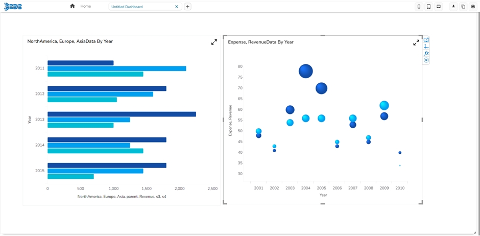
Click on the Charts icon provided on the right side of the canvas. A list of available components will be displayed. Drag and drop the Column chart component onto the canvas.
Connect the Column chart component to an existing data connection:
Click on the Dataset at appears next to the chart.
Select a connection from the Available Connections dropdown menu (ex: Column)
Drag and drop the fields to their respective series and categories.
Connect the Bar chart to an existing data connection:
Click on the Dataset at appears next to the chart.
Select a connection from the Available Connections dropdown (E.g., Bar)
Drag and drop the fields to their respective series and categories.
Apply the following actions:
Click on the Script on Load tab.
Apply the Auto Reload function.
Click on the Data Connectors icon provided on the right side of the canvas. Select the Column data source which is listed under the Excel data source. Select the Condition tab and in the Conditions text area, type the field name which you wish to use to filter data.
Select the condition from the dropdown list and enable the Action checkbox (as shown in the above image).
Click on the Preview button to perform a drill-down analysis.
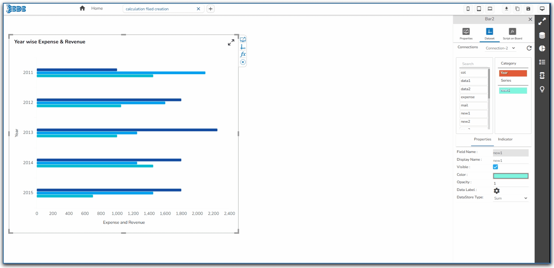
The Dataset tab is the window that can be used to configure the dataset fields of a component. Each field has several properties that can be set using the Properties tab that appears at the end of this window.
Map a data connection using the drop-down menu. (Ref. Connecting to a Data Source section).
Drag and drop the required fields as described below:
Category: It takes the fields selected as dimensions for the component.
Series: It takes the fields selected as measures for the component.
Configure the Properties displayed at the bottom of the window.
The Properties tab will display the following information for the selected data field:
The following properties information will appear for the Category data field.
Field Name: It will display the default name of the field.
Display Name: Provide a display name for the data field.
Visible: Enable or disable the visibility of the field.
Color: Set color for the selected data field.
Data Store Date: Select any one date format for the Data Store to display the Date values.
The following properties information will appear for the Series data fields.
Field Name: It is the default name for the selected data field.
Display Name: Provide a display name to the selected data field.
Visible: enable or disable this option to allow the visibility of the selected data field.
Color: Set color of the selected data field.
Opacity: Set the opacity for the selected data field.
Data Label: This option redirects to set the Data Label Properties for the selected data field.
Data Store Type: Select any one option out of the given arithmetic operations as Data Store Type.
The Data Grid components contain some more properties under the Properties tab of the Dataset.
The following fields are available under the Properties tab.
Field Name: It is the default name for the selected data field.
Display Name: Provide a display name to the selected data field.
Visible: Enable or disable this option to allow or restrict visibility of the selected data field.
Frozen Column: Enable or disable Frozen column option for the selected data field.
Width: Set the desired width for the selected data field by using the stepper option.
Color: Select a color using this option for the selected data field.
Text Align: Select an alignment option for the Column text display. The supported options are Left, Center, and Right.
Unit: Select a currency unit option using the drop-down option. The supported unit options are None, Auto, %, K, M, B, T, Q, Lacs, and Cr.
Precision: Select a precision option to be shown on the selected data field (up to 8 precision places are supported).
Currency: Select a currency None, CENT, EURO, INR, POUND, USD, and YEN.
Position: Select a position option from the drop-down option. The supported options are Prefix and Suffix.
Row Aggregation: Select an aggregation option using the drop-down option. The supported options are None, Sum, Average, Count, Minimum, and Maximum.
Show Tooltip: Enable or disable the tooltip by using the given checkbox option.
Tooltip Field: This option allows the user to provide tooltip for the selected column.
Column Type: Select a column type option using the drop-down option. The supported Column types are None, Numeric, Hyperlink, Image, Bullet, Progress Bar, Sparkline, Pie.
Number Formatter: Select a number formatter option using the drop-down option. The supported choices are None, Indian, and international.
Sorting: Enable or disable sorting option by using the given checkbox.
Data Store Type: Select a Data Store Type option from the supported options.
Data Store Date: Select a date format to reflect the date columns in the dashboard.
Column Style: Enable or disable the column style option by using the checkbox.
Font Color: Select the font color.
Font Size: Set a font size using the given stepper button to increase or decrease the font size.
Font Style: Select a Font Style using the drop-down menu. The supported options are Normal and Italic.
Font Weight: Select a font weight option using the drop-down option. the supported choices are Normal, Bold, 300, 600, and 900.
Font Family: Select a font type using the drop-down option. The supported fonts are Arial, BizVizFont, BizvizFontRegular, Cambria, Helvetica, Lucida Bright, Monotype Corsiva, Papyrus, Raleway, Roboto, Times New Roman, Ubuntu, Verdana.
Please Note: The supported Data Store options are Sum/Mean/Count/Min/Max/Variance/Standard Deviation.
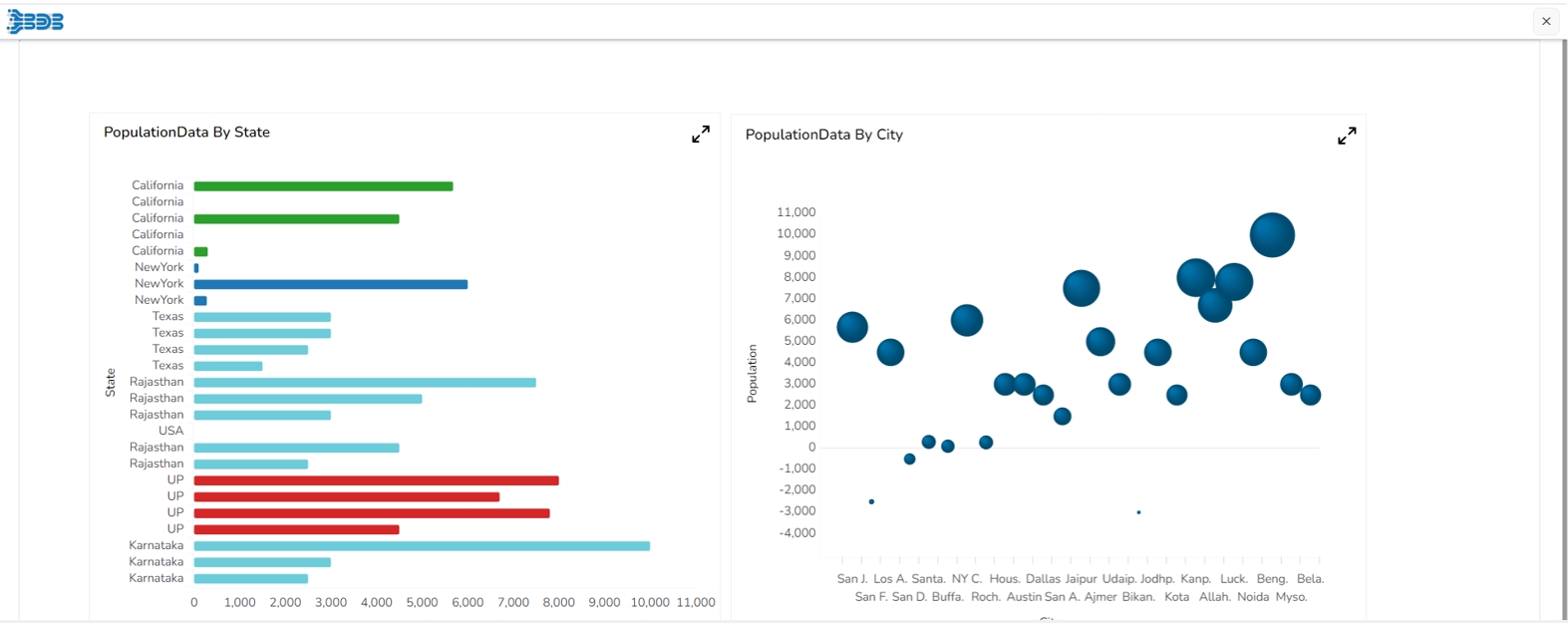
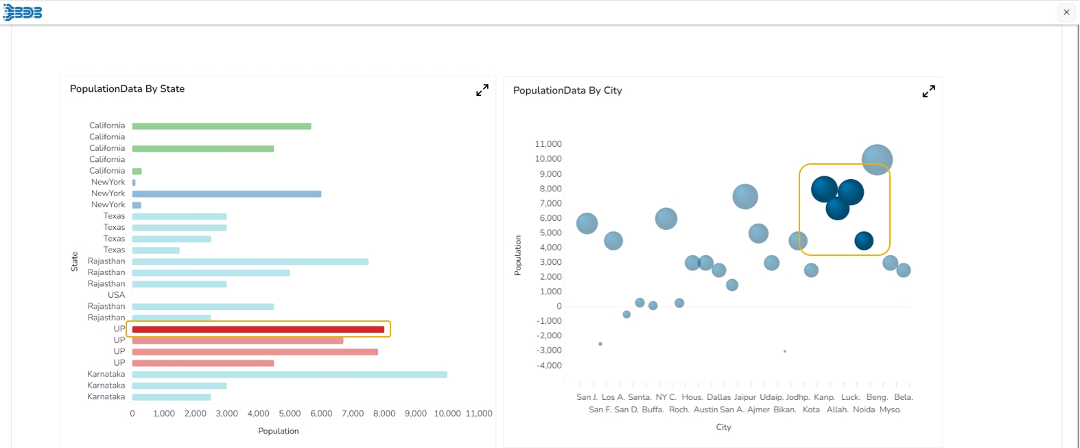
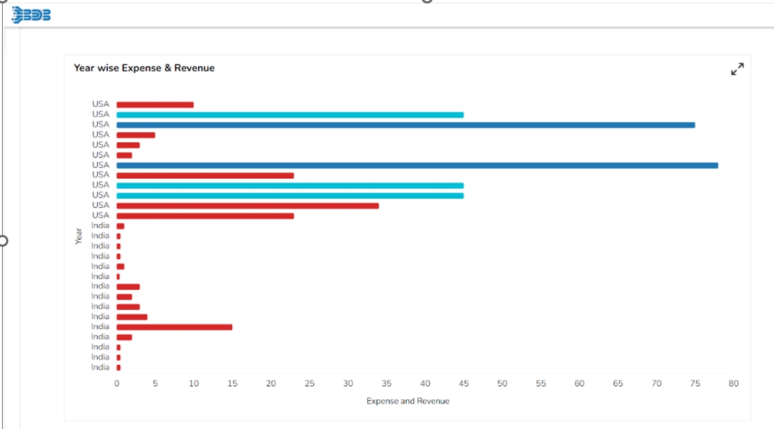
The Drill Highlighter feature in a dashboard helps to focus on specific data points or insights by drilling down into the data and highlighting relevant information. As the dashboard drills down to more granular data, the Drill Highlighter feature emphasizes the selected data point or elements by highlighting them. This makes it easier for users to focus on the relevant information and understand how their selection affects the overall data.
Please Note: This feature is available for Bar, Timeline, Bubble, Group Bar, Group Column, Mixed, Scatterplot, Line, and Column charting components.
Drag & drop Bar & Bubble chart into canvas and assign data to it.
Navigate to dashboard script area, and write the script to enable drill highlighter (the script used has been provided in the code block).
Go to source component script area .ex, Go to bar chart script area & write a script to enable drill (the script used has been provided in the code block).
Preview the dashboard.
Click on a bar from the Bar chart, the drill will get applied in the associated chart. The drill highlighter will be applied to both the charts.
Navigate to the Designer Canvas page.
Drag a chart together with a filter component to the canvas.
Create two data connections.
Associate one data connection with the chart and the other with the filter.
Add a filter parameter to the chart connection condition.
Navigate to the Script on load page of the filter component.
Add the sdk.reload( [ 'ConnectionID_1' ] ); to filter the chart data.
Please Note: The ConnectionID_1 should be chart connection.
Check out the walk-through given below on how to Tooltip are configured in the Designer charting components.
The Tooltip property block is available under the component property section.
Tooltip block contains ‘Show Tool Tip ’, ‘Background Color ’, ‘Opacity ’, ‘Border Color ’, ‘Box Width ’, ‘Precision ’ & ‘Highlighter ’.
Show Tool Tip: Configures tooltip as Default, Custom, or None.
Background Color: Configures tooltip background color.
Opacity: Configures tooltip background color opacity.
Border Color: Configures the border color of the tooltip.
Box Width: Configures the width of the tooltip box it contains a select box from where width can assign to the tooltip box.
Precision: Configures the tooltip display data precision.
Highlighter: By enabling this property through the checkbox tooltip highlighted field background color change.
Show Tool Tip: By clicking this a model box opens which contains three radio buttons, its default selection is ‘Default ’
None: On selection of None, the tooltip doesn't be shown on the selected component.
Default: It's by default a selected tooltip, that displays the default configuration of the selected component.
Custom: On selection of Custom, tooltip content can be configured.
Custom Tool Tip: On selection of Custom, an editable text box opens.
Editable text box contains property buttons on top, a select box that contains all the fields of the data set, and a save and cancel button.
Editable text box contains selected fields of data set by default.
Custom Tooltip configuration
Additional fields can be selected from the select box.
Display name then field name inside the bracket, field data replaces brackets.
After selection of the content font properties like font color, font size, font family, etc can be changed from property buttons.
<htmlTag></htmlTag>: With the help of this tag, any HTML content can be passed directly into tooltip.
Video and image can be displayed in the tooltip through this HTML tag.
The field which contains video links that name would be written in the brackets after "scr=" for example src=[Field Name]. For displaying a single video or image the only link to that particular video or image need to give under "src=" for example src="https://www.bdbizviz.com/resources/images/BDB_logo.png"
Font Color property does not support Internet Explorer.
For changing the field data font property, you need to select the entire bracket otherwise value won’t be displayed in the tooltip.
For Timeline, Bar, Heatmap & Pie mobile specific Tooltip is available.
This Tooltip works only when the component is in maximized state.
Default Tooltip can be enabled through this script-->
Check out the walk-through given below on how to apply an Indictor to a charting component in the Designer.
Drag and drop chart component.
Associate category and series fields to the chart component.
There are two types of indicators in the chart component:
Category Indicator
Series Indicator
Select the category field & navigate to the indicator tab.
Click on the “+” icon to create a new indicator.
Add the Category value and change the color based on the required conditions.
The created Category Indicator gets displayed in the preview mode as shown below:
Select the series field & navigate to the indicator tab.
Click on the “+” icon to create a new indicator.
An indicator dialog box appears with the required conditions.
Operator: Multiple comparators are available for choosing the comparison process.
Fixed Value Comparison: By enabling this, we can compare a Compared Field against static values given in the Compare to text area.
Fixed Value Comparison: By disabling this, we can compare a Compared Field against field values given in the Compare to field.
The created Indicator conditions get added.
The applied series Indicators appears in the preview mode of a Bar chart as given below:
Please Note: If the Category indicator is applied, the series indicator is not considered.

Check out the walk-through given below on how to configure Data Label in the charting components in the Designer.
Drag and drop a chart component (as Column chart has been displayed in the given image).
Associate category and series fields to the chart.
Select a field from the Series section.
Navigate to the Properties of the selected series field.
Select the Data label icon.
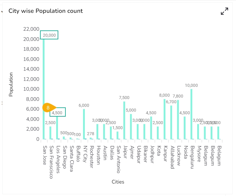
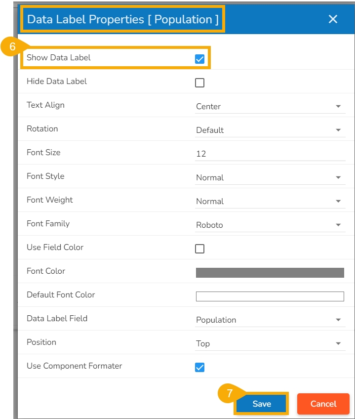
Enable the Show Data label from the Data Label Properties dialog box.
Click the Save option.
The configured Data Label properties will be displayed.
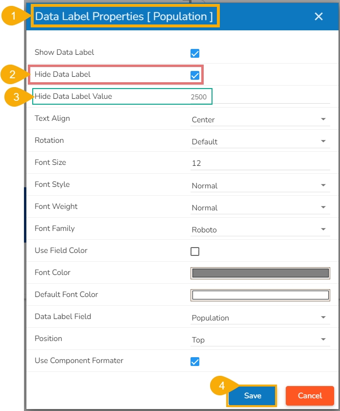
The user can enable the Hide Data Label option from the Dataset Properties.
Access the Data Label properties fields.
Enable the Hide Data Label field.
Provide a specific value for which the Data Label should be hidden.
Click the Save option.
The Data Label gets hidden for the selected value in the chart preview.
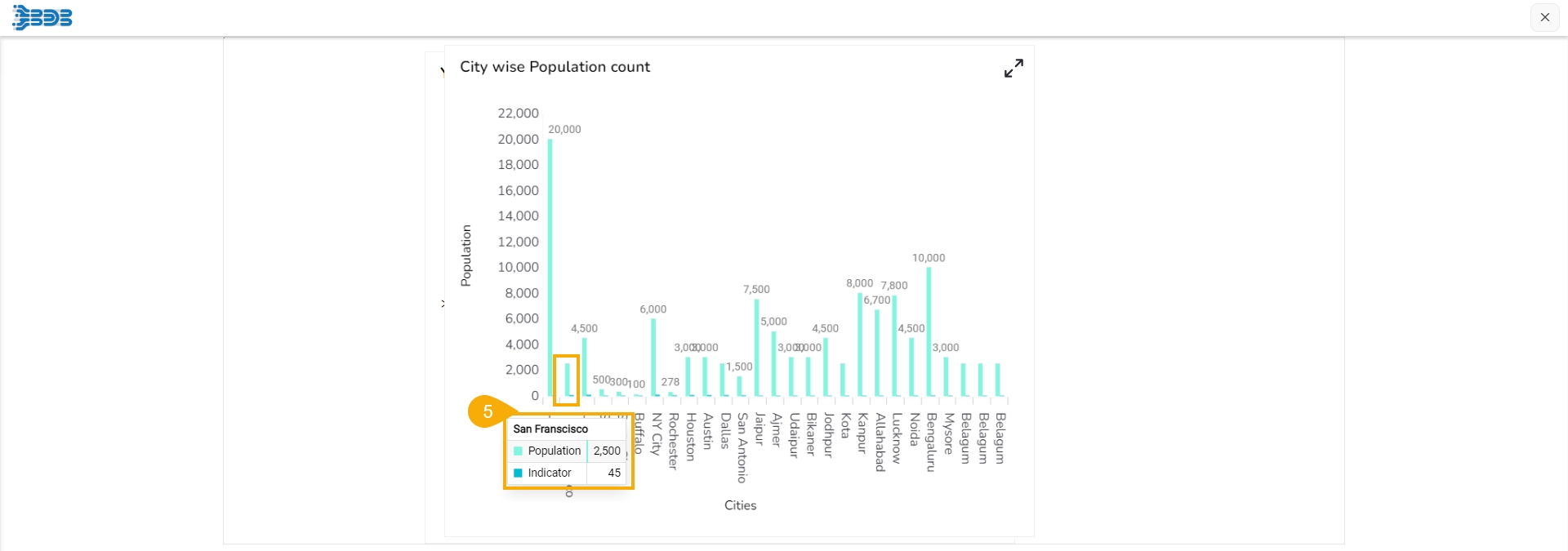
E.g., No Data Label appears for the column displaying 2500 value as displayed in the given image.
Please Note: The Hide Data Label field has been provided to hide the data label when the values are not needed to be shown (i.e., as the value 2 is hidden in the given walk-through).
Check out the walk-through given below on how to map a Legend with a charting component in the Designer.
Click the Component Library icon from the right edge of the window.
Select and drag a chart component on the canvas.
Create a data connection.
Associate data connection with the chart.
Select and drag the Legend component from the Other tab of the component library.
Navigate to the Legend component properties.
Go to the General properties.
Click on the Associate Chart and select the required chart.
The Associated Chart wizard opens.
Select the dragged chart from the Search available components section.
Select the fields that you wish to associate by using the checkmarks given next to the fields from the Search available fields section.
Click the Save option.
The Legend gets mapped to the chart.
Pre-requisite: Please configure the Geo Shape settings for Polygone and Line Geometry type before using them inside the Map chart component of the Designer.
Check out the walk-through given below on how to map the Polygone Geometry type with Leaflet Map charting component in the Designer.
Drag and drop the Map Chart component.
Create a connection for associating with a chart.
Navigate to the General properties
Change the Map Type to Leaflet.
There are following geometry types under the Leaflet map for which the user needs to perform the following steps:
Line
Polygone
Navigate to the Geometry Type and select the Line.
Associate category and series fields to the chart.
Use SDK method in dashboard script pane to fetch the Line shape file JSON which is configured in Admin Module.
Preview the Dashboard to view line-type geometry.
Navigate to Geometry Type and select Polygon.
Associate category and series fields to the chart.
Use an SDK method in dashboard script pane to fetch the Line shape file JSON which is configured in the Admin Module.
Preview the dashboard to view the polygon-type geometry.
Check out the walk-through given below on how to display Alerts in the Grid charting component.
Drag and drop the grid component.
Assign a data connection to it.
Select the field.
Change the Column Type for that field to Numeric to which indicator has to be applied.
Click on the Indicator tab to configure alert settings.
Configure the following Alert properties:
Show Alert: Enable this option to view the alerts on scorecards
Alert Column: The column on which alerts should be applied.
Alert by: There are 3 options to view alerts:
Comparison: To compare a column against the value given in the Compare Value box.
Range: To set the color based on where the column’s value falls within a given range.
Static Comparison: Used to compare a column against static values given in the Value text area.
Custom Properties: Configuration for Comparison and Alert options are given here.
Click the Save option to save the alert configuration for the selected field value.
Show Data: Enable this option to view the data.
Click on the Preview icon to view the applied alerts in the Grid.


Pre-requisite: The user must configure the part using the Admin module of the Platform, before accessing the Language Mapping functionality for a Dashboard.
Check out the given walk-through on how to map multiple languages with Designer.
Select a saved dashboard using the Designer plugin.
Access the Title properties of the dashboard and make sure that the title description is provided in the “{}” brackets (if not then modify it accordingly)
Please Note:
a. Use “{}” brackets for all the descriptive text that you want to translate by the newly created Language Mapping. E.g., Tooltip, Description of X and Y-Axis, etc.
b. Use the Data Set Properties to Configure the Categories and Series description for the language mapping, as shown below:
Open the Dashboard Properties Panel and configure the Language Properties, as shown below:
Enable the Language Mapping by using a checkmark in the given box.
Use a checkmark in the given box to Hide the Curly Braces.
Click on the icon to select a mapping option.
The Language Mapping Selection window opens.
Select a language using the Mapping List drop-down menu.
Click the Save option.
Open the Script window for Component.
Make sure that the desired language’s name is mentioned in the script.
Click the Preview icon.
The dashboard title and other descriptions get translated into the selected language.
Please Note:
The old dashboards do not open while using the Mapping option. The users need to create a new dashboard to access this functionality.
The users can use the Language Settings functionality for the below-given dashboard charting components:
Title and Subtitle description
X-axis and Y-axis description (second Axis description)
Inbuilt Legends, Timeline Legends.
Legend component and static legends
Title of filters
Header name of Grids
Pie chart without a category: Legends
Tooltips and custom tooltip
Export, Filter Saver, URL button, Bullet, Gauge, Semi gauge titles


