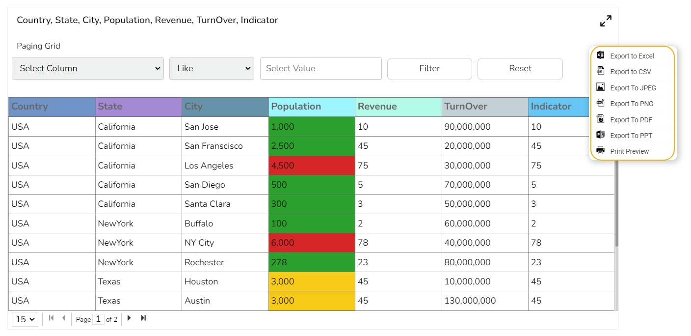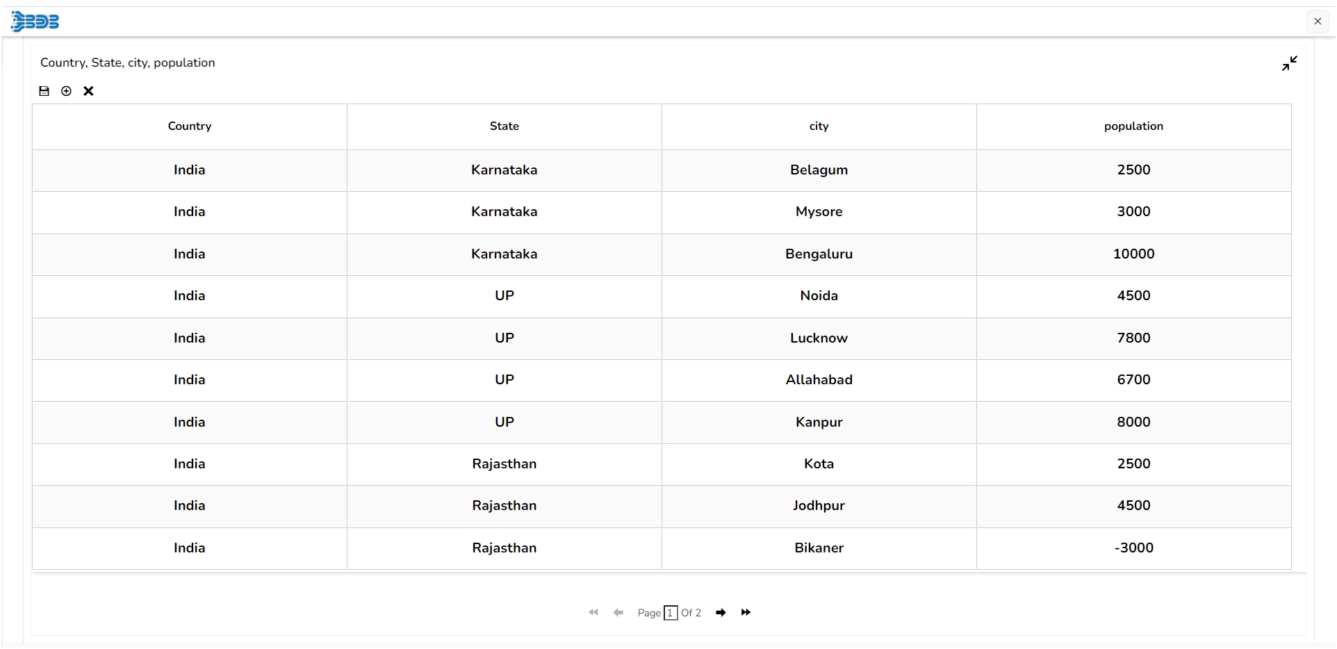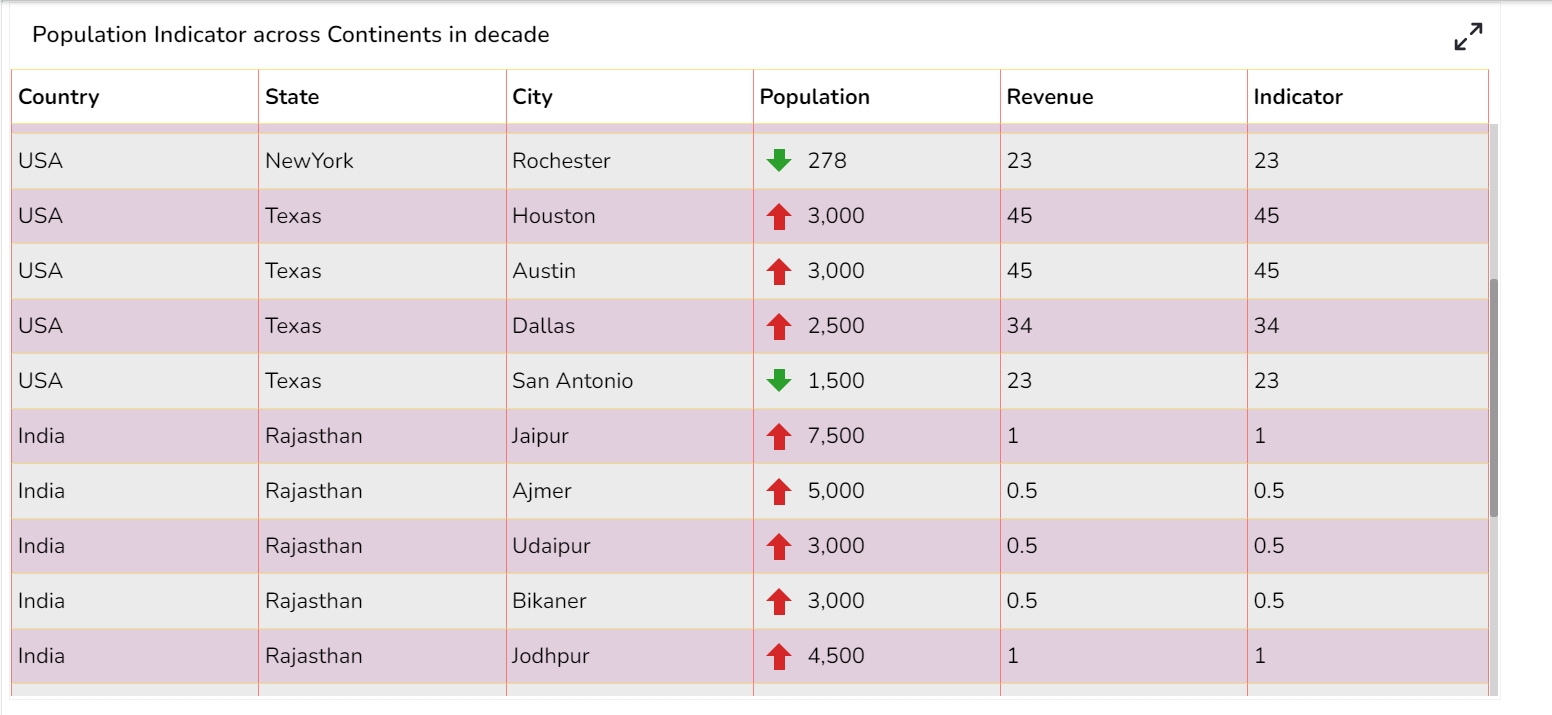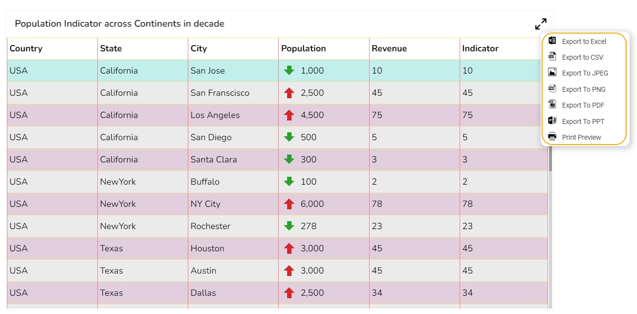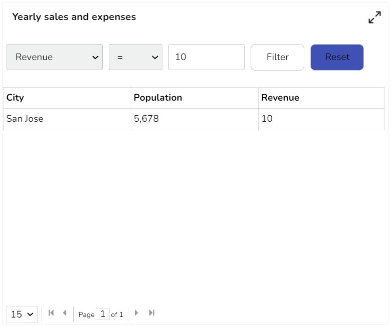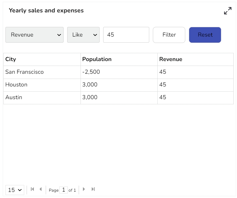
The Paging Data Grid is used to represent data in tabular form. Paging Data Grids can be used to filter data using columns, comparison operators, and search options provided.
When end-user need to view data in numerical format.
When alerts need to be shown.
When end-users need to filter, compare, and search for data within the grid.
Add-up Filters: Filter data by selecting any column(s) present in the data grid
Compare Operation: Data can be compared by using comparison operators
Search: Search for a particular value
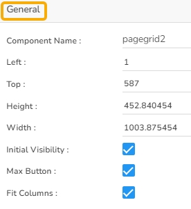
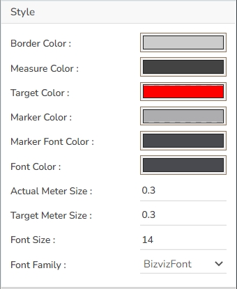
The user can change the height, width, top, left, chart type, column type & Line form. In this case, we have changed the scroll view to disable.
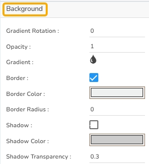
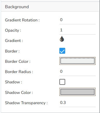
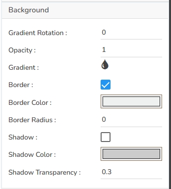
The user can change the background color of the chart, can get the border for the chart and can change the border color, can get the reflection of the chart by enabling the shadow option can also change the color and increase & decrease the transparency of the shadow.
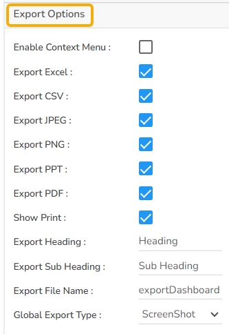
The Export Options also helps to provide heading, subheading, file name. The user can also select an option for Global Export Type.
The user can enable the Enable Context Menu from the preview section to download the reports in different formats.
Check out the given walk-through on how the Fit Columns field works for the Paging Grid component.
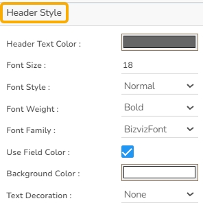
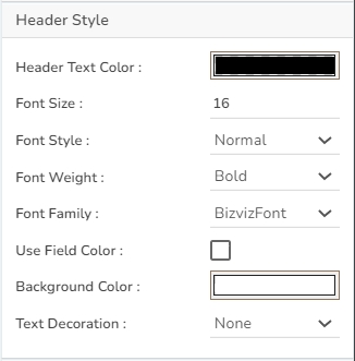
Header Style The user can change the header text color, font size, font style, and background color.
Row Style
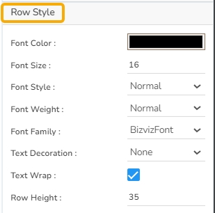
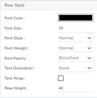
The user can change the font size, font color, text decoration, can enable the text wrap, Also the user can increase the row height.
Styles
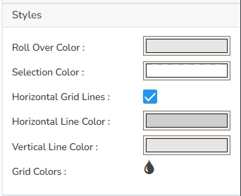
The user can change the background color, rollover color, selection color, user can enable horizontal grid lines also can change the color for horizontal & vertical lines.
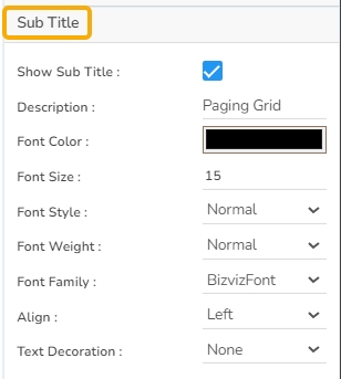
Subtitle The user can enable the subtitle to display the second title. The user can change the Name, Font color, size, style for the subtitle.
Title
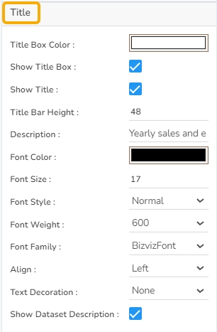
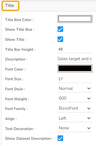
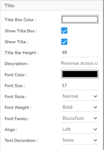
The user can change Title Name, Font color, Font size, Font style, etc.
Page Grid without Conditions
Page Grid with Conditions
Please Note:
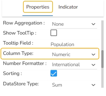
The user needs to select the Column Type as Numeric for the selected Data Grid fields using the Properties tab provided for the Dataset, so they become responsive to the changes that the user set using the Indicator tab.
Refer the Alerts in Grids page provided under Configurations section to understand how to insert Alerts in a Grid component.
Data Sheets are used to capturing various process, mechanical, electrical, technical, and control requirements for equipment and instruments. The sheets incorporate information about the selected components, usually with input from multiple users.
To collect information from various users. To bring the collected information from the various users to one place. To search, filter, and compare the collected data.
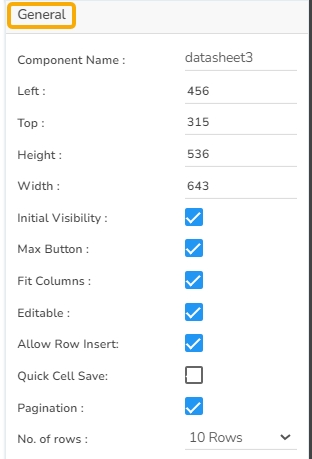
The user can change the height, width, top, left.
The user can change the background color of the chart, can get the border for the chart and can change the border color, can get the reflection of the chart by enabling the shadow option can also change the color and increase & decrease the transparency of the shadow
The user can change Title Name, Font color, Font size, Font style, etc.
The user can enable the subtitle to display the second title. The user can change the Name, Font color, Font size, Font style for the subtitle.
The user can change the header text color, font size, font style, and background color.
The user can change the font size, font color, text decoration, enable the text wrap, and increase the row height.
The user can change the grid colors.
Please Note:
The user needs to select the Column Type as Numeric for the selected Data Grid fields using the Properties tab provided for the Dataset, so they become responsive to the changes that the user set using the Indicator tab.
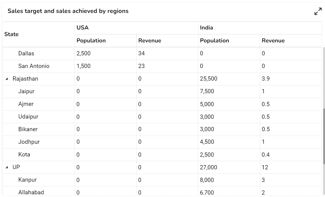
Pivot grid, also known as Pivot Table is a data summarization tool used in data visualization software. The users can identify and select columns and rows of data in a database or spreadsheet to obtain a desired report using the pivot grid tool. A pivot grid does not change the actual database or spreadsheet but turns the data in such a way that it can be viewed from different perspectives.
When the users want to perform analysis on multi-dimensional data by generating cross-tabular reports.
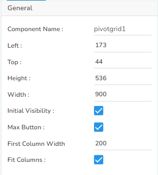
The user can change the height, width, top, left. If initial visibility is not enabled, then the chart won’t be available for the first preview. If the Max button is not enabled then we can’t maximize the individual chart.
The user can change the background color of the chart, can get the border for the chart and can change the border color, can get the reflection of the chart by enabling the shadow option can also change the color and increase & decrease the transparency of the shadow.
The user can change Title Name, Font color, size, style, etc.
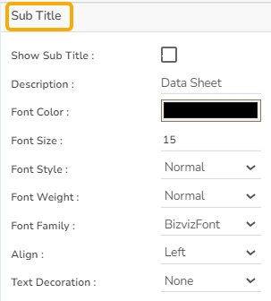
The user can enable the subtitle to display the second title. The user can change the Name, Font color, size, style for the subtitle.
Here user can change the Header Text Color, font size-style-weight-family, etc. Either the user can give a background color or they can go for Use Field Colour option and set those colors in the dataset section.
The user can change the Font color-size-weight-family of the text inside the row. Row height can also be adjusted. Under text decoration, we can provide an underline to the text.
User can change Roll Over Color, Selection Color, etc. If Horizontal Gridlines between the rows are needed, they can enable them and give color. Also, Vertical grid line color can also be changed. Under Grid Colors, we can change the row color and alternate row color.
The user can enable the “Enable Context Menu”, then it is possible to download the reports in different formats if we click on the chart from the preview section. The heading and subheading of that downloaded chart and the name of the downloaded file can be changed from this section.
Please Note:
The user needs to select the Column Type as Numeric for the selected Data Grid fields using the Properties tab provided for the Dataset, so they become responsive to the changes that the user set using the Indicator tab.
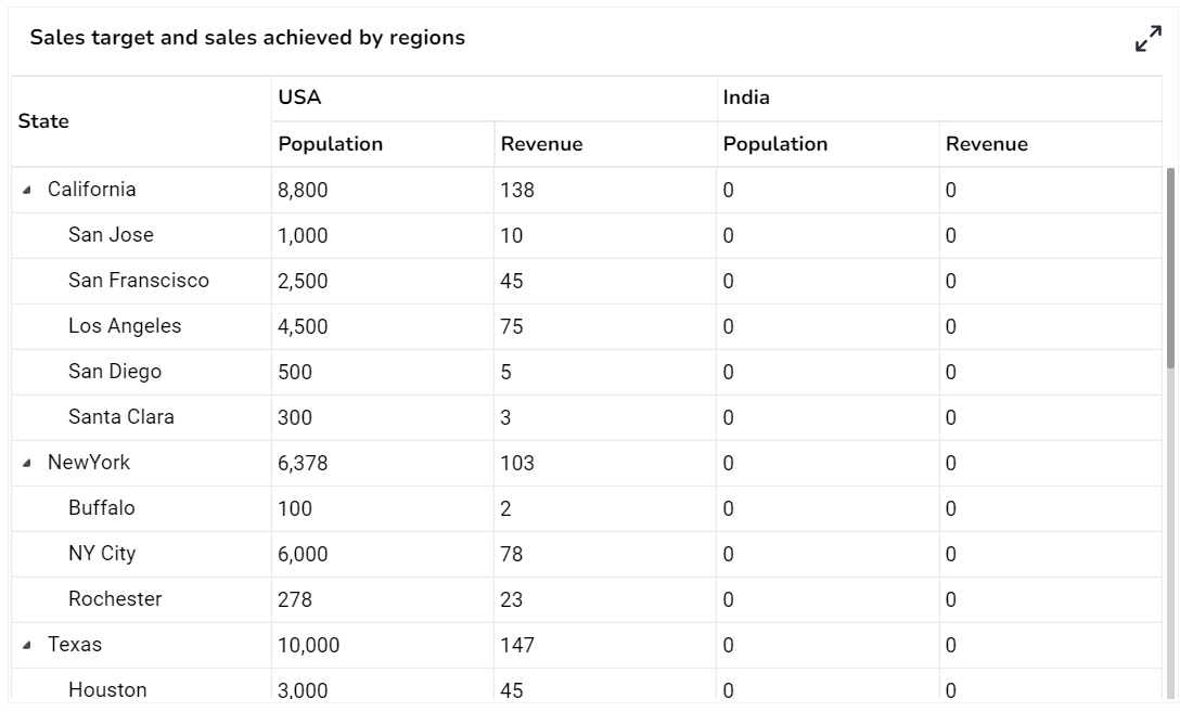
The Data Grid component is used to represent data in tabular form. Data Grid is also known as 'Grid View' as the data will be displayed within a grid.
To view data in numerical format.
To show alerts.
Users can also change the height, width, top, left, points, and chart type.
The user needs to put a checkmark for the Initial Visibility option to avail of the preview for the first time.
Use a checkmark in the Fit Columns to auto-fit the size of the columns.
Check out the given illustration on how to use the Column Rearrange property in the Data Grid.
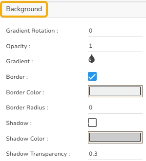
The user can change the background color of the chart, can get the border for the chart and can change the border color, can get the reflection of the chart by enabling the shadow option can also change the color and increase & decrease the transparency of the shadow.
The user can change Title Name, Font color, size, style, etc.
The user can enable the subtitle to display the second title. The user can change the Name, Font color, size, style for the subtitle.
The user can change the header text color, font size, font style, and background color.
Enable the Show Checkbox property from the General section and provide the "allowmultipleselection = true" in the Dashboard script to avail the checkboxes in the preview mode of the Data Grid.
Check out the given illustration on accessing checkboxes for the multi-selection of the Grid Rows.
The user can change the font size, font color, text decoration, and enable the text wrap. The user can also increase the row height.
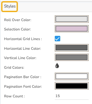
The users can set various display styles for the data grid using these fields.
Roll Over Color: The Roll Over Color property allows customization of the color change when a user hovers over an interface element. This provides visual feedback and helps in highlighting interactive components.
Selection Color: The Selection Color property determines the color displayed when an element or text is selected. It helps distinguish the selected items from the rest, facilitating easier navigation and interaction.
Horizontal Grid Lines: The Horizontal Grid Lines property allows users to enable or disable horizontal lines across the interface. These lines can aid in aligning and organizing content effectively, and their color can be customized to blend with the overall design.
Horizontal Line Color: The Horizontal Line Color refers to the color of the horizontal grid lines that can be displayed across the interface. This color can be customized to fit the design palette of the application seamlessly.
Vertical Line Color: The Vertical Line Color is the color assigned to the vertical grid lines. Users can adjust this color to help differentiate vertical separations on the interface, enhancing visual organization.
Grid Colors: Grid Colors encompass horizontal and vertical line colors, offering comprehensive customization options for both components. Adjusting these colors allows users to create a coordinated look that complements the interface design.
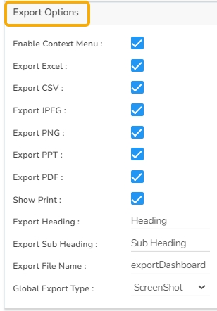
The Export Options also helps to provide heading, subheading, file name. The user can also select an option for Global Export Type.
The user can enable the Enable Context Menu from the preview section to download the reports in downloaded chart and the name of the downloaded file can be changed from this section.
The Data Grid component supports the date columns with the following types of date-time formats:
a. YYYY-MM-DD HH:MM:SS
b. MM/DD/YYYY HH:MM:SS
c. DD-MM-YYYY HH:MM:SS
d. ISO 8601 format (e.g., 2023-08-23T14:30:00Z)
e. Time formats such as 12-hour and 24-hour clocks (HH:MM)
Check out the illustration displaying the support for the various date-time formats inside the Data Grid component.
Please Note:
The user needs to select the Column Type as Numeric for the selected Data Grid fields using the Properties tab provided for the Dataset, to make it responsive to the changes that the user sets using the Indicator tab.
Refer the page provided under section to understand how to insert Alerts in a Grid component.
Refer the page provided under section to understand how to insert Alerts in a Grid component.
The user can also enable or disable Scroll View. In this case, the selected scroll view is 'Disable'.
Refer to the page under the section to understand how to insert Alerts in a Grid component.


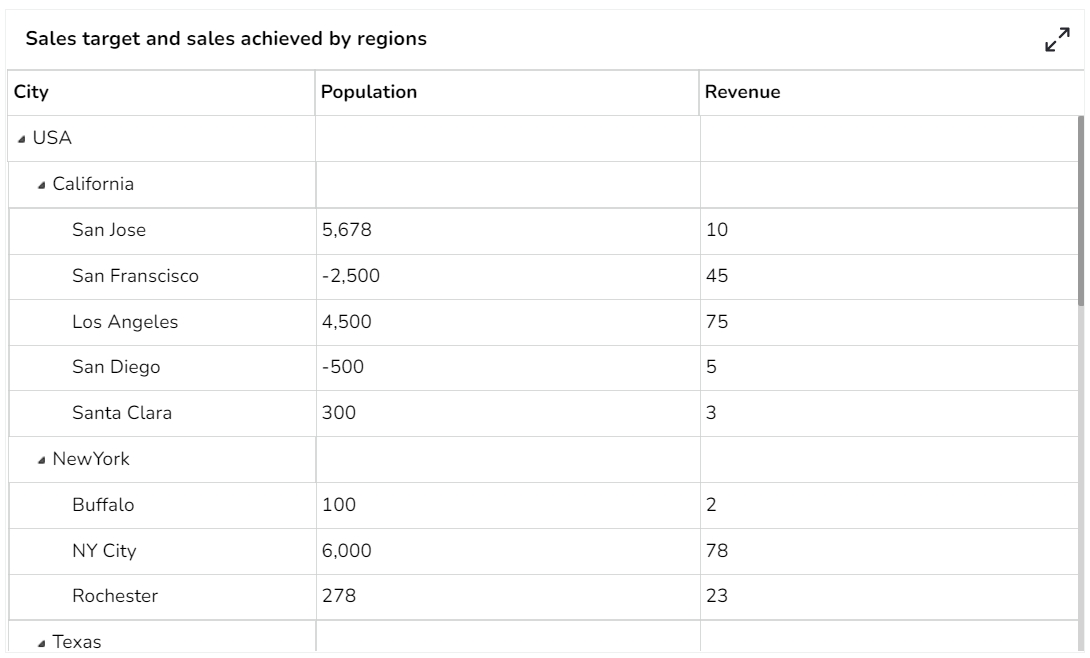
They are similar to the Data Grid, where data can be displayed in the hierarchical format, and alerts can be set.
When end-users need to view data in numerical format
When alerts need to be shown.
When need to display hierarchies in data.
Compare: A ‘Compare Value’ must be given by the user. Alerts are then triggered depending on it the data in the data set is greater, equal, or less than the compare value. (Ex. <50% = Red, 50%= Yellow, >50%= Green)
Range: Alerts can be configured to trigger based on range value(s), (Ex. 0-40%, =Red,
The user can change the height, width, top, and left values. If initial visibility is not enabled, then the chart won’t be available for the first preview. If the Max button is not enabled, then the user can’t maximize the individual chart. Hierarchy can be changed between Multiple and Single.
The user can change the background color of the chart, can get the border for the chart and can change the border color, can get the reflection of the chart by enabling the shadow option can also change the color and increase & decrease the transparency of the shadow.
The user can change the Font color-size-weight-family of the text inside the row. Row height can also be adjusted. Under text decoration, we can provide an underline to the text.
The user can change Roll Over Color, Selection Color, etc. If Horizontal Gridlines between the rows are needed, we can enable them and give color. Also, Vertical grid line color can also be changed. Under the Grid Color, we can change the row color and alternate row color.
The user can change Title Name, Font color, size, style, etc.
The user can enable the subtitle to display the second title. The user can change the Name, Font color, size, style for the subtitle.
The user can change the Header Text Color, font size-style-weight-family, etc. Either the user can give a background color or we can go for Use Field Colour option and set those colors in the dataset section.
The user can change the Font color-size-weight-family of the text inside the row. Row height can also be adjusted. Under text decoration, we can provide an underline to the text.
The user can change Roll Over Color, Selection Color, etc. If Horizontal Gridlines between the rows are needed, we can enable them and give color. Also, Vertical grid line color can also be changed. Under the Grid Color, we can change the row color and alternate row color.
The user can enable the ‘Enable Context Menu’ to download the reports in different formats if we click on the chart from the preview section. The heading and sub-heading of that downloaded chart and the name of the downloaded file can be changed from this section.
Please Note:
The user needs to select the Column Type as Numeric for the selected Data Grid fields using the Properties tab provided for the Dataset, so they become responsive to the changes that the user set using the Indicator tab.
Refer the Alerts in Grids page provided under Configurations section to understand how to insert Alerts in a Grid component.


