Check out the walk-through on how to use the List filter component in the Designer module.
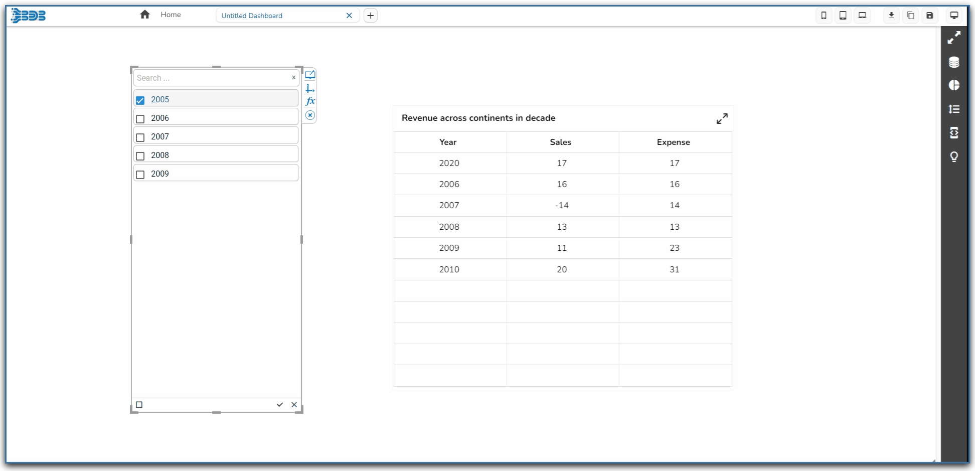
List is a component used to filter data. All available items are displayed as a list. Users can select multiple items simultaneously by holding the CTRL-key. Select items will determine the data that is displayed in any associated chart(s).
Background Color: Select the desired color for the component's background. This allows you to customize the visual look to match your design preferences.
Opacity: Adjust the transparency of the background color. A lower value makes the background more transparent, while a higher value makes it more opaque.
Shadow: Enable or disable the shadow effect on the component. This adds depth and contrast to the component's appearance.
Shadow Color: Choose the color for the shadow effect. This can be matched with your design aesthetics or contrast requirements.
Component Name: Assign a unique identifier to the component for easy reference within your design or code.
Show Search: Enable this to allow users to search within the list, enhancing usability for long lists.
Left, Top: Specify the position of the component on the screen by setting the Left and Top values.
Height, Width: Define the size dimensions of the component. Adjust these to fit your layout requirements.
Initial Visibility: Determine if the component should be visible initially. If disabled, the component will not appear until explicitly shown.
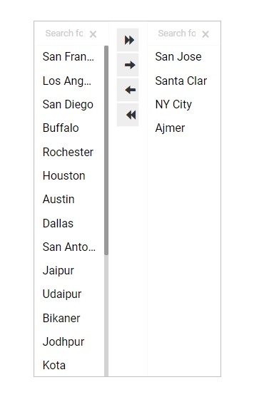
List Swap: Allow users to move items between lists, facilitating better management of selected values.
Multiple Selection: Enable this to allow users to select more than one item from the list at a time.
Row Height: Set the height of individual rows within the list, affecting overall list readability.
Action Bar Height: Define the height of the action bar, which may contain buttons for additional functionality.
Action Icons Color: Customize the color of icons within the action bar to match your design theme.
Selected Index: Specify an index to highlight a particular item by default when the list is initially presented.
Auto Update GV: Automatically update global variables when the list values change, ensuring data consistency.
Notify GV Update: Enable notifications for global variable updates, providing feedback when data changes occur.
Public Filter: Set this feature to allow public access or use of the filter, expanding its availability to multiple users.
Title Box Color: Defines the background color of the title box.
Show Title Box: Toggles the visibility of the title box.
Show Title: Toggles the visibility of the title text.
Title Bar Height: Adjusts the height of the title bar.
Description: Allows for additional text under the title.
Font Color: Changes the color of the title text.
Font Size: Modifies the size of the title text.
Font Style: Sets the style of the title text (e.g., italic).
Font Weight: Controls the thickness of the title text (e.g., bold).
Font Family: Specifies the typeface for the title text.
Align: Adjusts the text alignment (e.g., left, center, right).
Text Decoration: Adds effects like underlining the text.
The Style properties panel provides various fields to customize the appearance of the component:
Font Color: Sets the color of the text for clarity and aesthetic cohesion.
Font Size: Determines the size of the text, enabling readability adjustments.
Font Style: Offers style options such as italic or normal for text appearance.
Font Weight: Controls the thickness of the text, ranging from light to bold.
Font Family: Selects the typeface to align with branding or design preferences.
Chrome Color Opacity: Controls the transparency level of the chrome color, allowing more or less background visibility.
Chrome Color: Sets the color of the browser's interface elements surrounding the component.
Roll Over Color: Defines the color that appears when hovering over elements, enhancing interactive feedback.
Selection Color: Specifies the color used to highlight selected elements, making them visually distinct.
Selection Font Color: Determines the font color of selected text, ensuring readability against the selection color.
Border: Adjusts the thickness and style of the component's border, contributing to its visual outline.
Border Color: Sets the color of the component's border, influencing its contrast and aesthetic appeal.
Shadow Transparency: Control the transparency level of the shadow. Adjust this to blend the shadow with the background seamlessly or make it more pronounced.
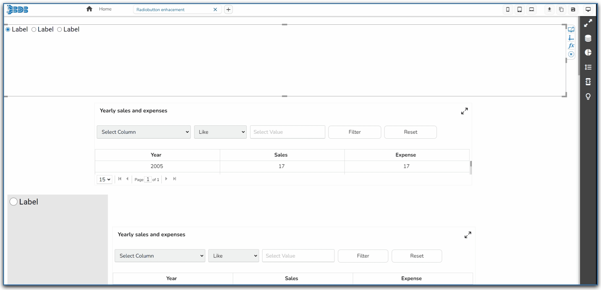
Check out the below given walk-through on how to use the Radio Button filter component in Designer module.
The Radio Button component helps to filter data on other components.
Component Name: Allows users to set a unique identifier for the radio button component.
Left/Top: Specifies the position of the radio button within the interface, in terms of left and top margins.
Height/Width: Defines the dimensions of the radio button.
Initial Visibility: Toggles the initial display state of the component; if not enabled, it won't appear on the first preview.
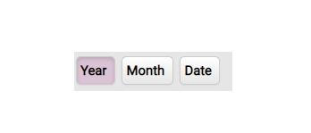
View Type: Determines the display style of the radio button, such as the Enhance Button.
Font Color/Size/Style/Weight/Family: Customizes the typography, including color, size, style, weight, and typeface.
Spacing: Adjusts the space between radio buttons to enhance layout clarity.
Border Radius: Rounds the corners of the buttons for a softer look.
Selection Color: Highlights the selected button, providing visual feedback.
Chrome Color: Sets the background color for buttons, with adjustable transparency.
Button Color: Defines the fill color of the radio button.
Circle Color: Sets the color of the circle within the radio button.
Circle Size: Adjusts the size of the circle marker inside the button.
Button Top Spacing: Sets the space above the button to manage layout balance.
Opacity: Controls the transparency level of the radio button for layering effects.
Orientation: Switches the arrangement between horizontal and vertical alignments.
Selected Index: Indicates which button is initially selected.
Auto Update GV: Automatically updates the global variable with the selected value.
Shadow: Enable or disable the shadow effect on the component. This adds depth and contrast to the component's appearance.
Shadow Color: Choose the color for the shadow effect. This can be matched with your design aesthetics or contrast requirements.
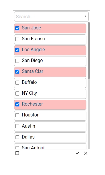
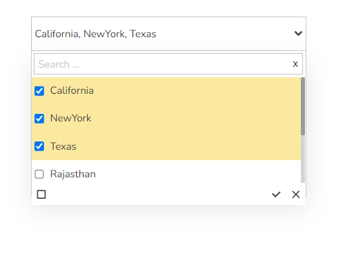
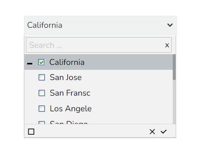
Hierarchical Combo Box is similar to Check Box and Combo Box but here the list will be arranged hierarchically and users will be allowed to select multiple items simultaneously.
When users should be given the option to select 1 or more cities that will be used in the table/chart (instead of displaying data for all cities)
Background
The General Properties help tailor the component behavior and appearance to suit specific requirements, improving user interaction and data visibility control.
Component Name: Specifies the identifier for the component, allowing for easy reference.
Left, Top: Sets the position of the component on the chart by adjusting its coordinates.
Height, Width: Determines the size of the component, enabling customization of its dimensions.
Initial Visibility: Controls whether the component is visible at the initial load of the chart.
Hierarchy Level: Allows selection between a Multiple or Single level hierarchy for data display.
Multiple Selection: Enables the capability to select multiple items at once within the component.
Controlled Selection: Manages how selections are controlled within the component, often working with external factors.
Custom Selection: Offers the option to define specific selection criteria or methods beyond default settings.
Selection Limit: Sets the maximum number of items to be selected.
Show Selection Limit: Option to display a notice or indicator when the selection limit is reached.
Auto Update GV: Automatically updates the Global Variable when changes occur within the component.
Notify GV Update: Alerts or indicates when a Global Variable has been updated due to user actions.
Public Filter: Determines whether the filter settings used in the component are accessible publicly or restricted.
The Background Properties panel offers options to enhance the visual layout of the component through the following fields:
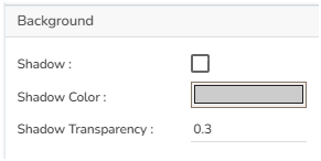
Shadow: Enables a shadow effect for the component, creating a sense of depth and focus.
Shadow Color: Sets the color of the shadow, allowing for customization to match the overall design theme.
Shadow Transparency: Adjusts the transparency of the shadow, providing control over how prominent or subtle the shadow appears.
The Style properties panel provides various fields to customize the appearance of the component:
Rollover Color: Defines the color that appears when hovering over a cell, enhancing interactive feedback.
Selection Color: Sets the color for highlighting selected cells, making them visually distinct.
Background Color: Allows setting a specific color for the component's background.
Panel Background Color: Customizes the background color of the panel area for a cohesive look.
Border Radius: Specifies the curvature of the component's corners for a rounded effect.
Panel Border Radius: Adjusts the corner curvature of the panel specifically.
Font Size: Determines the size of the text, enabling readability adjustments.
Font Style: Offers style options such as italic or normal for text appearance.
Font Weight: Controls the thickness of the text, ranging from light to bold.
Font Family: Selects the typeface to align with branding or design preferences.
Font Color: Sets the color of the text for clarity and aesthetic cohesion.
Panel Font Color: Defines the text color specifically within the panel.
Text Decoration: Applies effects like underlines or strikethroughs to the text.
Advance Theme: Enables advanced theming options for comprehensive stylistic control.
Check out the walk-through given below on how to use a Combobox filter component in the Designer.
Combo Box is used to filter data on any associated components. Selecting an item from the drop-down menu will change the data displayed in the associated components.
To filter data on associated components.
To select only a particular item.
The General Properties allow customization of the Combo Box Filter component through various fields:
Component Name: Defines the identifier name for the Combo Box Filter component.
Show Search: Enables or disables the search function, assisting users in finding specific values.
Left, Top: Sets the component position in the user interface by specifying the leftmost and topmost margins.
Height, Width: Adjusts the size dimensions of the Combo Box Filter component.
Initial Visibility: Determines whether the filter is visible upon the first preview. If not enabled, the chart won't appear initially.
Font Color, Font Size: Modifies the text color and size within the filter for better visual distinction.
Font Style, Font Weight, Font Family: Customizes the typography, including style (e.g., italic), weight (e.g., bold), and font family for a consistent visual theme.
Font Weight: Set the weight (boldness) of the font. The supported options are Normal, Bold, 300, 600, and 900.
Font Family: Choose the font family for the title text from the given choices.
Selection: Allows choosing between 'Default', 'Single', or 'Multiple' selection modes for item selection flexibility.
Selected Index: Sets a default value that appears initially in the filter; requires enabling 'Notify GV Update' for dynamic changes.
Auto Update GV: Automatically refreshes the filter when changes occur to the governing variables (GV) without manual intervention.
Notify GV Update: Notifies and updates linked variables when a selection is made, keeping data in sync.
The Background Properties panel offers options to enhance the visual layout of the component through the following fields:
Shadow: Enables a shadow effect for the component, creating a sense of depth and focus.
Shadow Color: Sets the color of the shadow, allowing for customization to match the overall design theme.
Shadow Transparency: Adjusts the transparency of the shadow, providing control over how prominent or subtle the shadow appears.
Background Color: Defines the main color filling to the component background for aesthetic and branding consistency.
Title Box Color: Sets the background color of the title box for a cohesive look.
Show Title Box: Toggles the visibility of the title box.
Show Title: Allows the title text to be displayed.
Show Only Title: Displays only the title, hiding other elements for a minimalist approach.
Title Bar Height: Adjusts the height of the title bar, impacting the overall layout.
Description: Adds supplementary information beneath the title.
Font Color: Specifies the color of the title text for readability and design alignment.
Font Size: Defines the size of the title text.
Font Style: Choose between normal, italic, or oblique styling for the title text.
Font Weight: Sets the thickness of the title text, offering a range from light to bold.
Font Family: Selects the font family to apply to the title text.
Align: Aligns the title text (left, center, right) within its container.
Text Decoration: Adds text decoration such as underline, overline, or line-through.
Rollover Color: This property changes the background color when a user hovers over an option in the dropdown, enhancing interactivity and user experience.
Selection Color: Defines the background color of a selected option in the dropdown, providing a visual indication of the user's choice.
Background Color: Sets the overall background color of the dropdown menu, contributing to the visual consistency of the design.
Notify GV Update: Alerts the system to update the global variable when selection changes.
Shadow Transparency: Control the transparency level of the shadow. Adjust this to blend the shadow with the background seamlessly or make it more pronounced.
Public Filter: Determines if the filter settings should be accessible to other components or users.
Position: Determines the position of the title element within the component.


Check out the given walk-through to understand the Checkbox filter component.
The checkbox is used to filter data on any associated components. Enabling a checkbox will change the data displayed in the associated components.
To filter data displayed in the associated components
To select multiple items at a time
The checkbox component offers a range of customizable properties to tailor its appearance and functionality:
Component Name: Assign a unique name to identify the checkbox component.
Left: Set the left position of the checkbox within its container.
Top: Define the top position of the checkbox within its container.
Height: Specify the height of the checkbox.
Width: Determine the width of the checkbox.
Initial Visibility: Enable or disable the initial visibility of the checkbox in the preview.
Show Checked: Enable to display a checkmark by default.
Label: Assign a name to the checkbox label, which can be customized.
Font Color: Change the font color of the label.
Font Size: Adjust the size of the label text.
Font Style: Select the style (e.g., italic) for the label font.
Font Weight: Set the weight (e.g., boldness) of the label font.
Font Family: Choose the font family for the label text.
Chrome Color: Set the background color of the checkbox, with adjustable transparency.
Opacity: Modify the transparency level of the checkbox background.
Checked Value: Assign a value that is passed when the checkbox is checked.
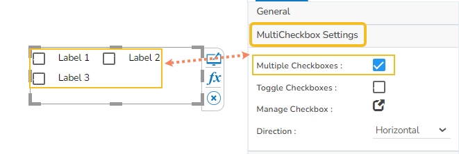
The user can provide multiple checkboxes while enabling this property option.
Multiple Checkboxes: Enable the Multiple Checkboxes option from the MultiCheckbox Settings property to add multiple checkboxes with labels.
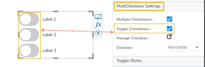
Toggle Checkboxes: Enable the option to access the new Toggle Switch UI as checkboxes.
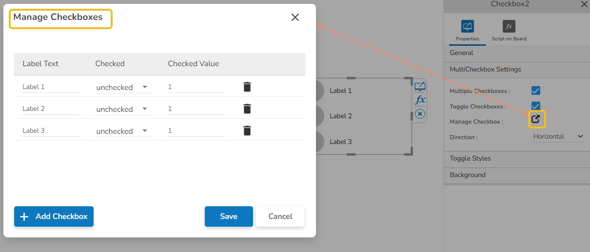
Manage Checkbox: Click the Manage Checkbox icon to access the dialog window for managing multiple checkboxes.
The user can add or delete checkboxes.
Provide Label Text, select the default display to be checked or unchecked, and provide value for the checked toggle checkboxes.
Direction: Select an option from the drop-down menu to choose the direction of the checkboxes. It can be Horizontal or Vertical.
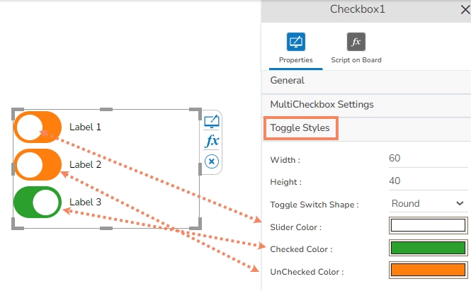
The user can style the toggle switch UI using the Toggle Style property option.
The user can modify the Width, Height, and Toggle Switch Shape (Round or Square) from the Toggle Stypes property option.
The user can also define colors for the Toggle Slider, Checked Color, and UnChecked Color.
The user can get the reflection of the chart by enabling the shadow option.
The user can also change the color and increase/decrease the transparency of the shadow.
The following use case explains the steps to connect and use a Checkbox with a Data Grid component.
Drag a Data Grid component to the Designer canvas.
Associate a Data Connection with it.
Drag a Checkbox component from the Filter group to the canvas.
Open the Checkbox Properties, provide the necessary properties, and apply them.
Provide the text for the Label.
Provide the Checked Value.
Keep the Unchecked Value blank.
Use the component object page to write the required script at the component level.
Configure the Condition tab by providing a field value for the conditions (the field State is chosen in the given image).
Click the Preview icon to preview the Dashboard.
Use a checkmark in the given box to display the Checked Value in the chart.
Uncheck the Check Box to display the Unchecked Value in the chart (In this case, no value has been assigned as Unchecked Value so it will display all the records).
Unchecked Value: Specify a value that is passed when the checkbox is unchecked.