Align appearance of various dashboard components from one place by using the Global level properties for a dashboard.
The Global Properties feature in the Dashboard canvas empowers users to apply appearance properties at the dashboard level. These properties facilitate the seamless alignment of various dashboard components, ensuring a consistent and visually harmonious display.
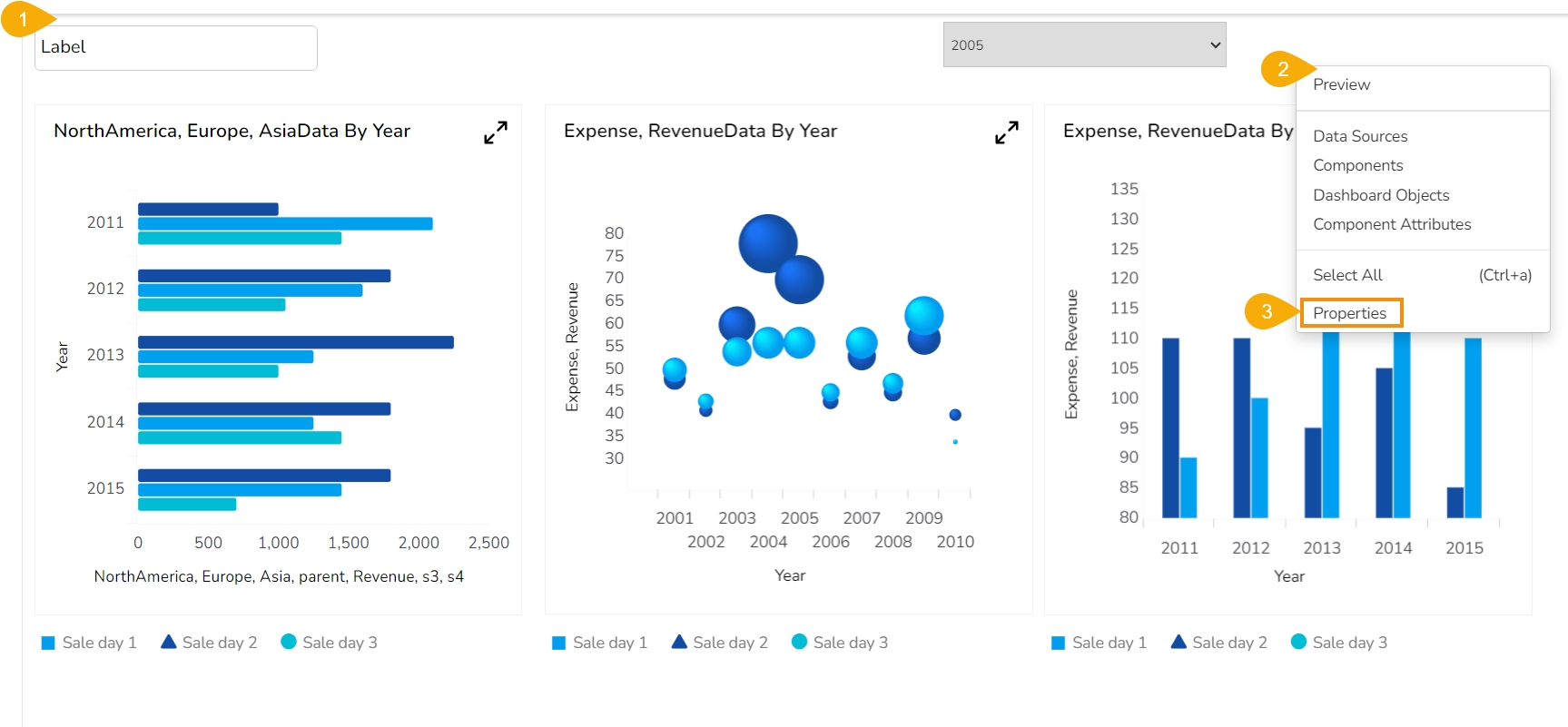
Navigate to a Dashboard within its canvas framework.
Use right-click to get the Dashboard context menu.
Click the Properties option from the context menu.
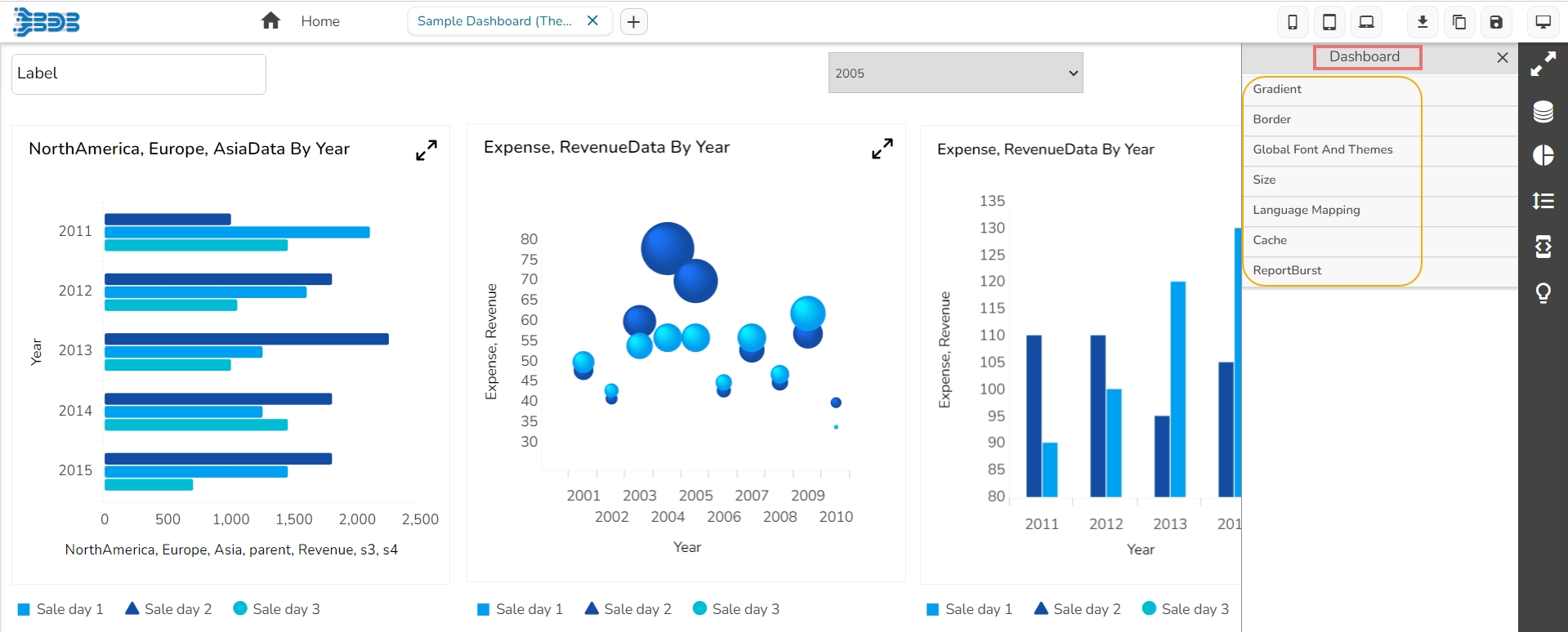
The Dashboard Properties gets listed in a context menu.
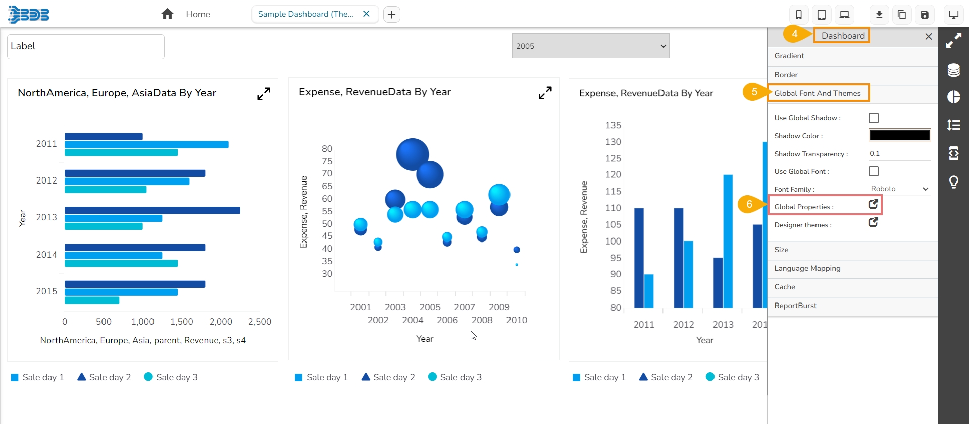
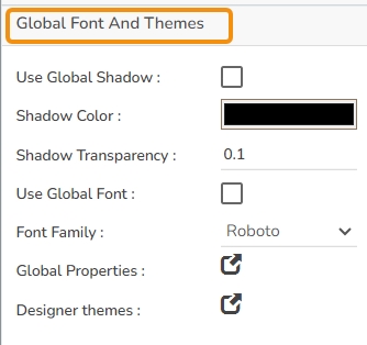
Select the Global Font and Themes option.
The Global Properties icon can be accessed within it.
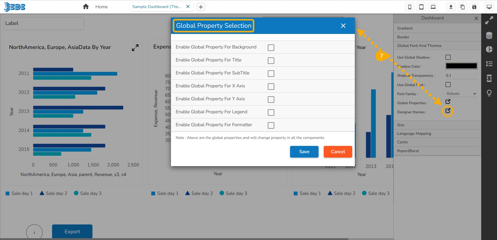
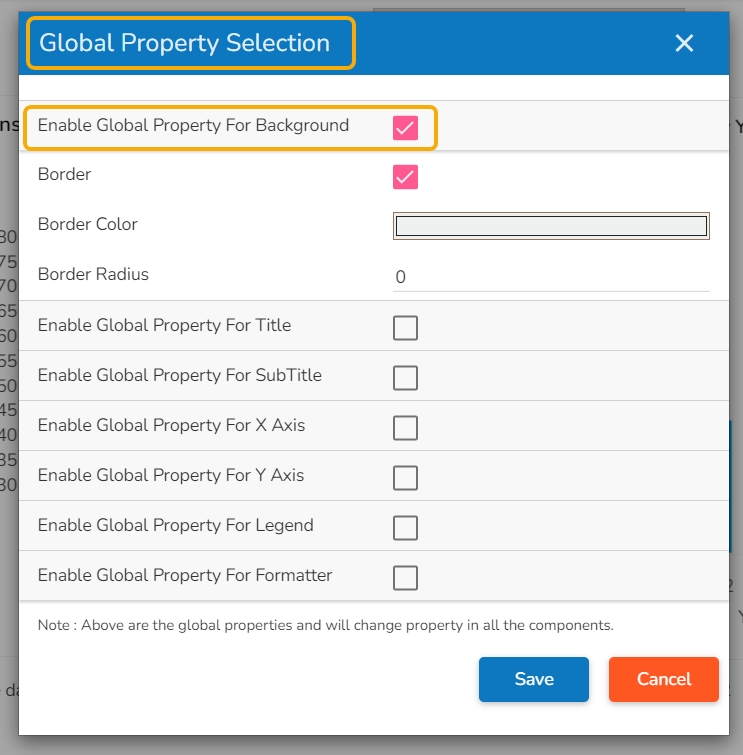
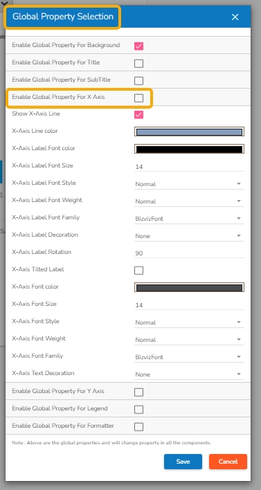
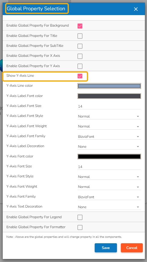
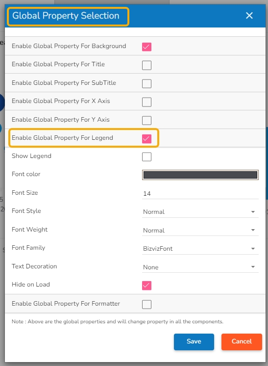
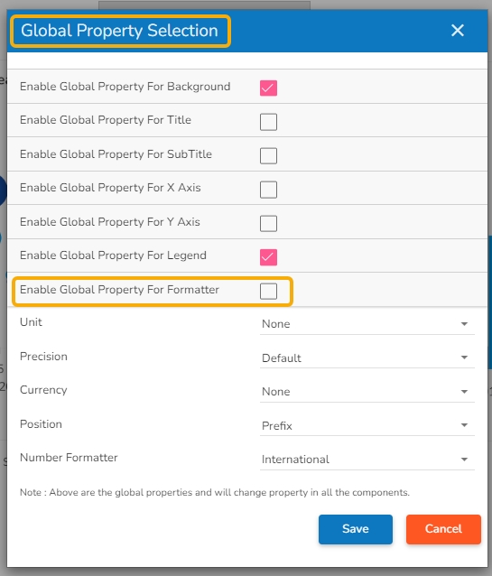
By clicking on the Global Properties icon, the Global Properties Selection window opens displaying a list of the Global Properties that can be set or modified at the dashboard level.
The Global Properties feature streamlines the design process and saves time by providing a single point to manage appearance settings for the entire dashboard.
A dashboard is provided with the below-given Global Properties:
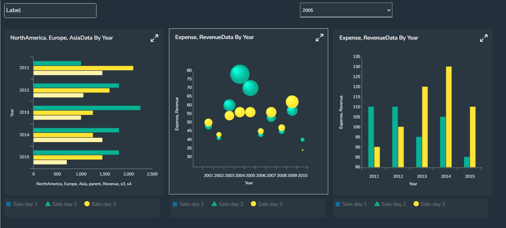
Apply a border for all the dashboard components and set color and radius of the border for all components enabling the Global Property for Background.
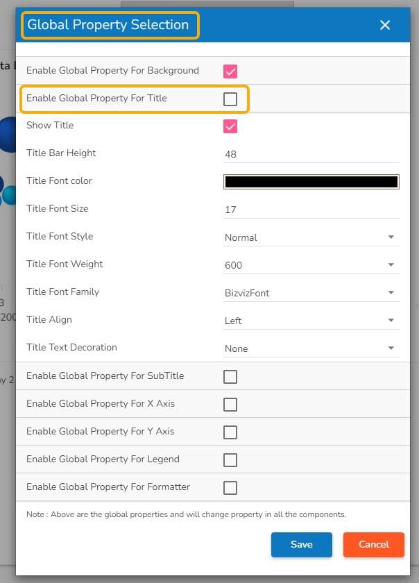
The Global Properties for the dashboard title ensure consistent branding and visual coherence throughout the entire dashboard. It helps the user to effectively convey the purpose behind the selected dashboard by aligning the Title display together with Title Bar height, Font color, Font Size, Font Style, font Weight, and Font family. It also allows to enable decoration for the inserted Title text.
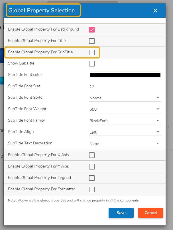
The Global Sub-title Properties feature in the Dashboard application enables users to apply appearance properties at the dashboard level for sub-titles. By utilizing Global Sub-title Properties, users can ensure consistency and visual harmony across all sub-titles in the dashboard.
By utilizing Global Properties for the X-axis, users can ensure consistency and visual coherence across all charts and graphs in the dashboard that use the X-axis. It helps to bring in uniformity for all the dashboard components containing X-Axis in terms of Label appearance and readability.
Ensure consistency and visual coherence across all the charts in the dashboard by utilizing Global Properties for the Y-axis. It helps to standardize all the dashboard components containing Y-Axis in terms of Label appearance, readability, and text decoration.
The Global Properties for Legend allows the user to customize the appearance properties of the legend to align with your design preferences.
The Global Properties for Formatter allows the user to standardize various formatter related properties .
The user must click the Save option after setting or modifying the desired set of Global Properties to apply them on the selected dashboard.
Please Note:
While Global Properties offer convenience, users can still override specific properties for individual components if required.
It is recommended to define Global Properties at the beginning of the dashboard design process to establish a consistent visual identity from the outset.
The Canvas Properties helps users to configure properties for the entire dashboard.
The Designer canvass is provided with specific properties.
Navigate to the Designer canvas.
Use the Right-click anywhere on the canvas to get the Dashboard properties.
Select the Properties option from the context menu.
Various Dashboard level properties get listed in the displayed context menu as shown in the below-given image:
Parameter Name
Description
Background Colors
Users will be directed to select a background color.
Opacity
Set background-color opacity.
Background Rotation
Set the value to rotate the background color accordingly
Please Note: By clicking the Background Colors icon, a new window opens with a menu to select a color for the Background (as displayed in the below-given image) gradient colors. The users can select a color using the menu and click the Save option to apply the selected background gradient color. The colors pallet to set background gradient color is given below:
Parameter Name
Description
Thickness
Set border thickness.
Border Color
Select a border color from the menu.
Parameter Name
Description
Use Global Shadow
Enable this option to display global shadow
Shadow Color
Select a color from using the menu
Shadow Transparency
Set the transparency for the shadow
Use Global Font
Enable this option to use the global font.
Font Family
Select a font type from the drop-down menu.
Designer Themes
Select a theme from the drop-down menu.
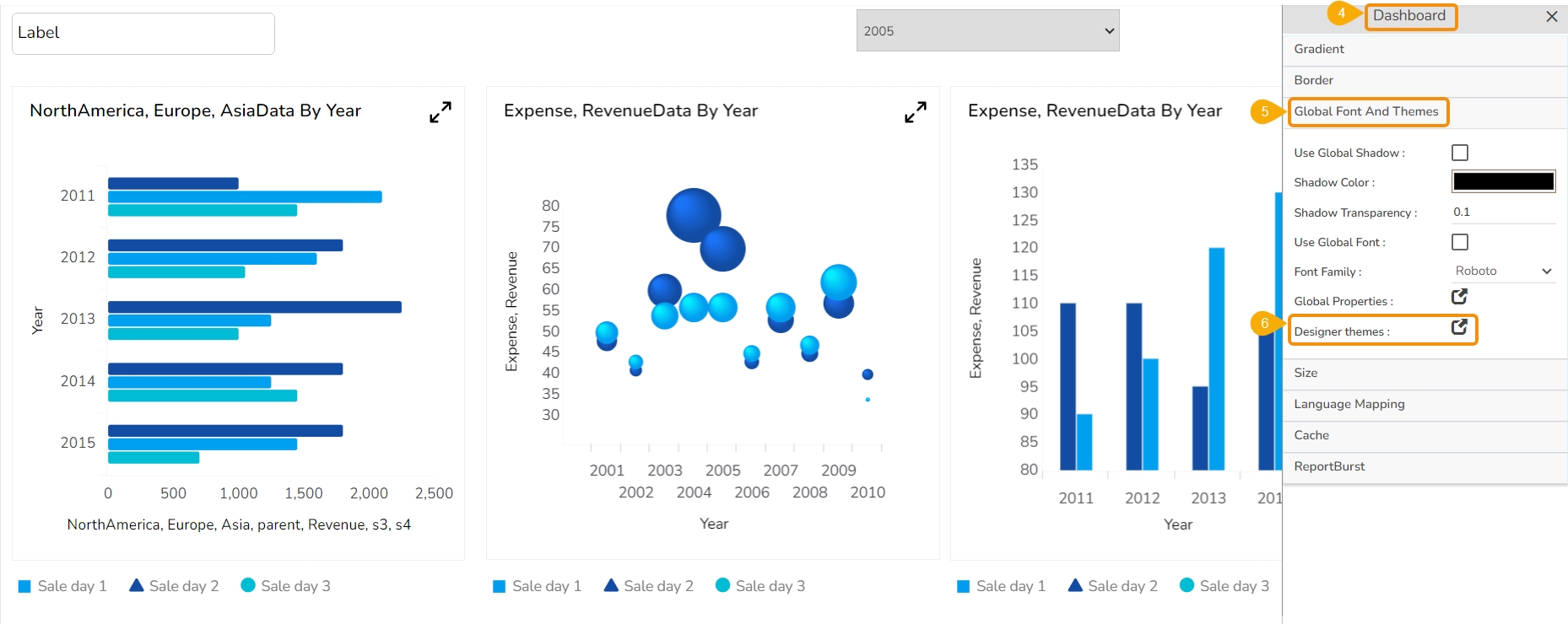
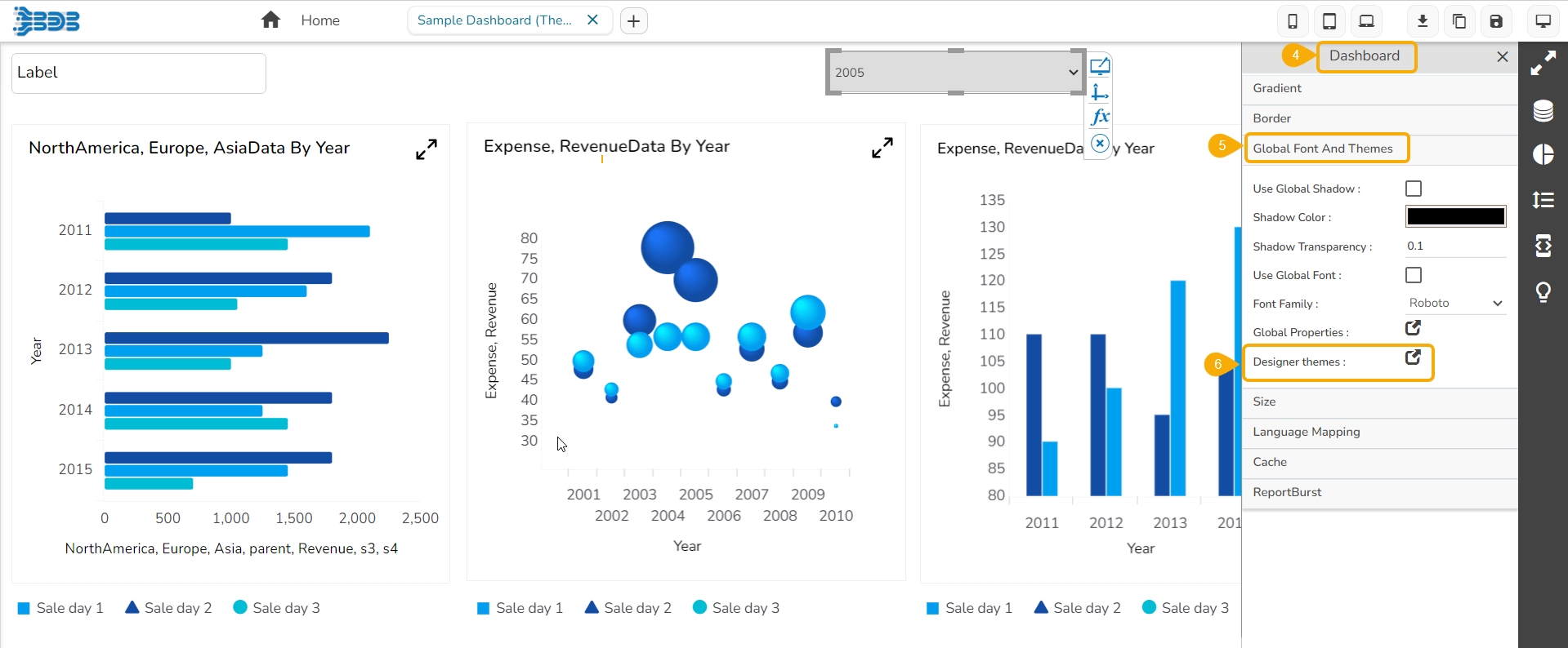
Select the Global Font And Themes option from the context menu.
Click on the Designer themes icon.
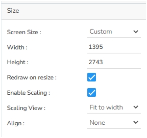
The Size Properties option helps to
Check out the given walk-through on how redraw on resize Property gets applied to the Dashboard.
Parameter Name
Description
Screen Size
Select an option from the drop-down menu.
Width
Increase/decrease the width of the dashboard.
Height
Increase/decrease the height of the dashboard.
Redraw on resize
Redraws the dashboard while resizing it.
Enable Scaling
Enable this option to display scaling.
Scaling View
Select an option from the drop-down menu (Fit to page/Fit to width/Fit to height/Proportional).
Align
Gets aligns based on the selected Align option.
Please Note: The Dashboard screen size can be scaled based on display devices (E.g., Mobile, iPad, and PC).
Click the drop-down icon for the Screen Size field.
A context menu appears displaying various options to set the Screen Size.
Parameter Name
Description
Enable
Enable this option to apply language mapping functionality.
Hide Curly Braces
Enable this option to hide the curly braces.
Select a Mapping
Select a language mapping using the drop-down menu.
Please Note: By clicking on the Select a Mapping icon, the Language Mapping Selection dialog box opens.
Navigate to the Language Mapping Selection dialog box.
Select a language mapping option using the Mapping List drop-down menu.
Click the Save option.
Use a checkmark in the given box to enable the Enable Cache option for the data service. If cache is enabled for a dashboard with a data service as a data source it will do the following tasks:
While loading the dashboard, for the first time data will hit from database.
The same dashboard while loading again it will load the data from the Cache.
Use a checkmark in the given box to Enable Report Burst. By enabling the Report Burst option from the Dashboard properties displays the Report Burst option for a published Dashboard. Refer the Report Burst section from the Options for a Published Dashboard section for more details.
Please Note: The Report Burst option comes pre-selected in all the new dashboards.
Access the pre-defined dashboard themes to instantly change the visual display of your dashboard.
The Designer module provides visually captivating and appealing themes under the Dashboard Properties, so that the users can effortlessly and instantly transform their dashboard’s appearance. The user can seamlessly switch between different themes with an intuitive drop-down menu.
Navigate to a Dashboard within its canvas framework.
Use right-click to get the Dashboard context menu.
Click the Properties option from the context menu.
The Dashboard Properties gets listed in a context menu.
Select the Global Font and Themes option.
Click the Designer Themes icon.
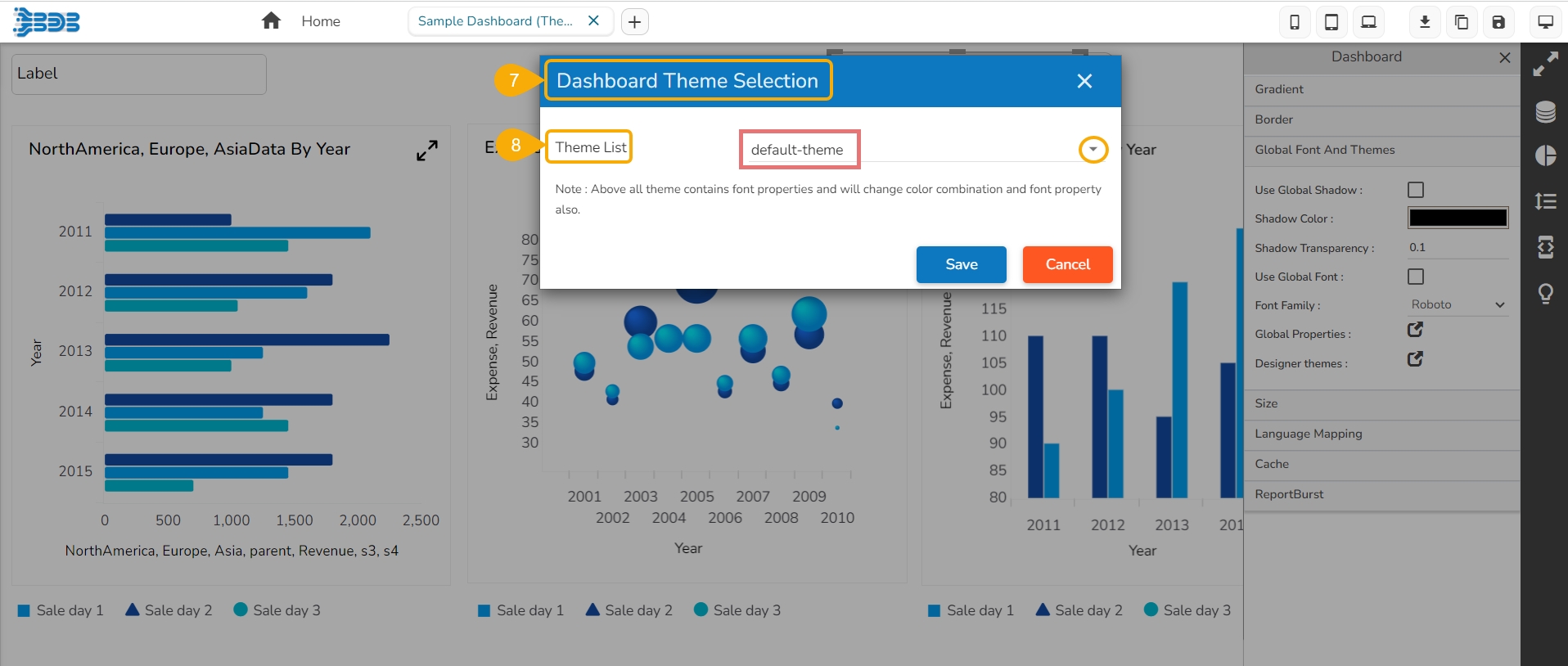
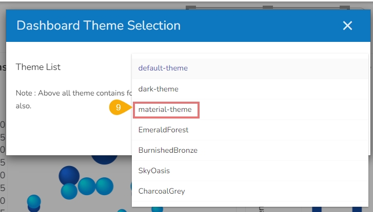
The Dashboard Theme Selection window opens.
Click the Theme List drop-down option to access the list of all the available dashboard themes.
Select a theme from the drop-down list.
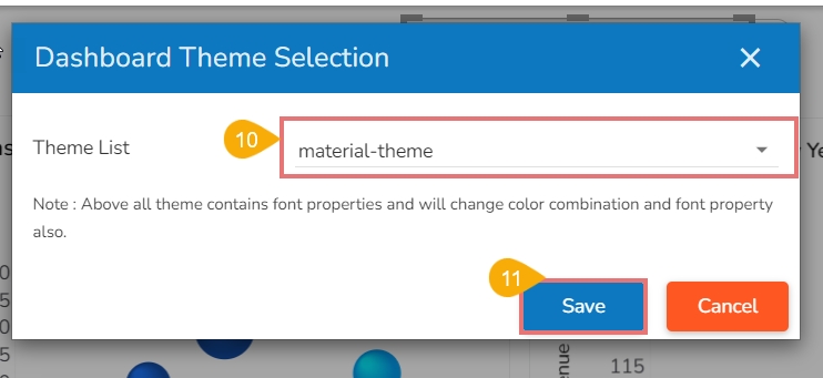
The selected theme appears in the Theme List field.
Click the Save option.
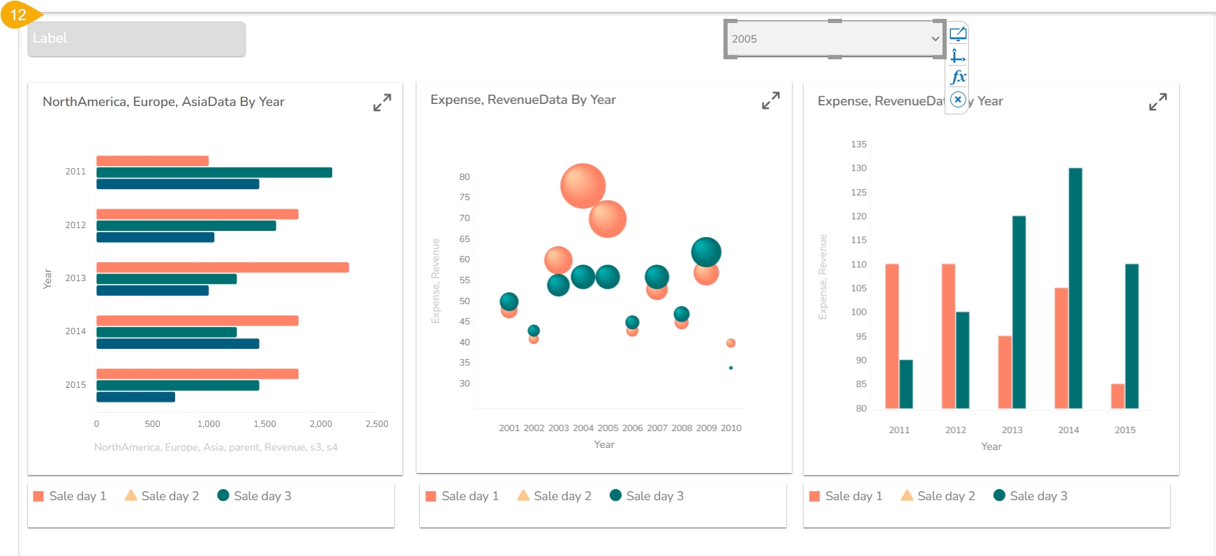
The selected theme gets applied to the dashboard.
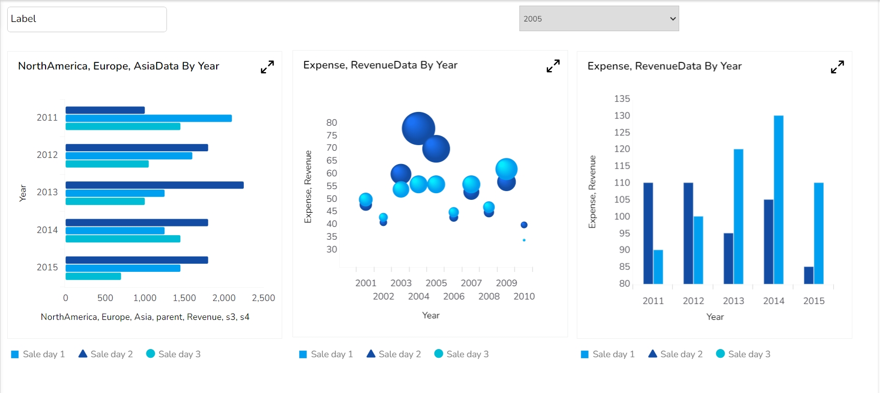
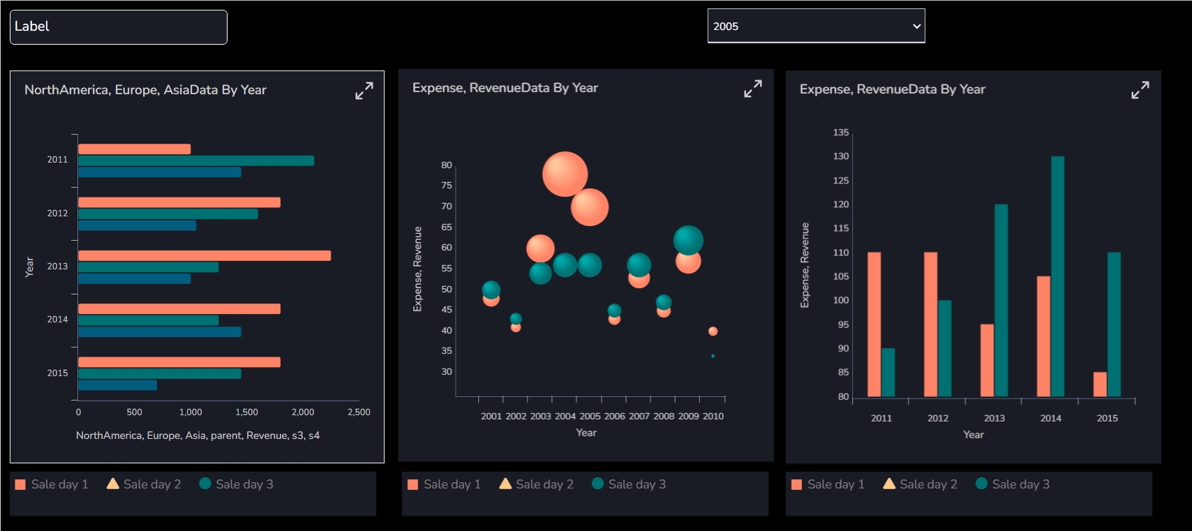
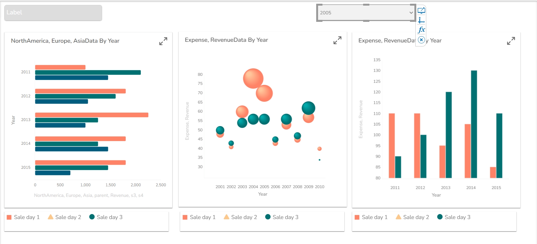
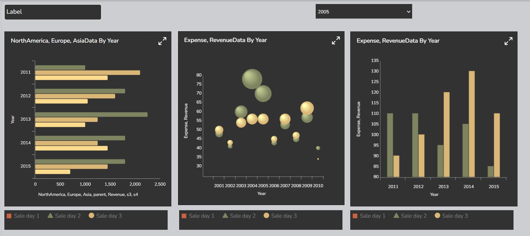
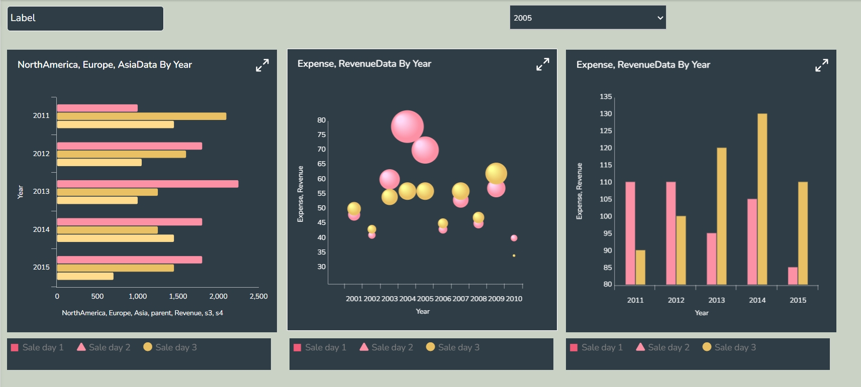
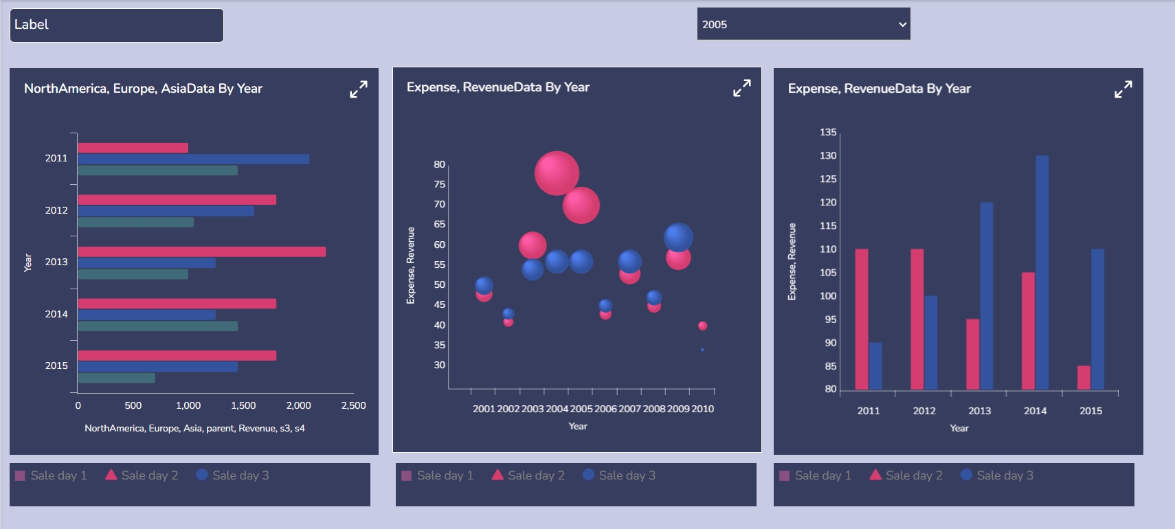
The supported themes are as given-below (Click on each tab to open the embedded theme display).


