Loading...
Loading...
Loading...
Loading...
Loading...
Loading...
Loading...
Loading...
Loading...
Loading...
Loading...
Loading...
Loading...
Loading...
Loading...
Loading...
Loading...
Loading...
Loading...
Loading...
Loading...
This page provides an overview of all the components used in the pipeline in a single place.
The Pipeline Overview feature enables users to view and download comprehensive information about all the components used in the selected pipeline on a single page. Users can access meta information, resource configuration, and other details directly from the pipeline overview page, streamlining the process of understanding and managing the components associated with the pipeline.
Check out the given demonstration to understand the Pipeline Overview page.
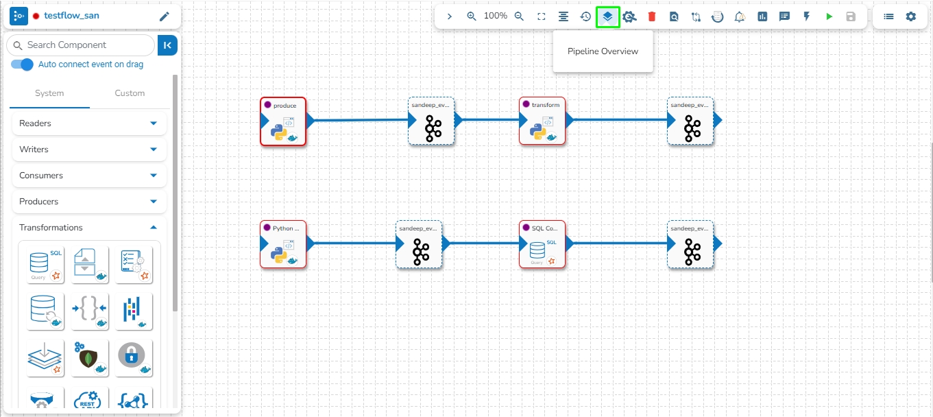
The user can access the Pipeline Overview page by clicking the Pipeline Overview icon as shown in the below given image:
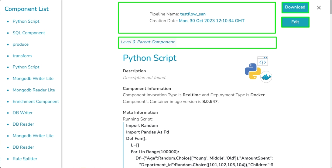
Component List: All the components used in the pipeline will be listed here.
Creation Date: Date and time when the pipeline created.
Download: The Download option enables users to download all the information related to the pipeline. This comprehensive download includes details such as all components used in the pipeline, meta information, resource configuration, component deployment type, and more.
Edit: The Edit option allows users to customize the downloaded information by excluding specific components as needed.
In the pipeline overview page, components are listed based on their hierarchical level, denoted by Levels 0 and 1. A component at level 1 indicates a dependency on the data from the preceding component, where the previous component serves as the Parent Component. For components without dependencies, designated as Level 0, their Parent Component is set to None, signifying no connection to any previous component in the pipeline.
The Pipeline Workflow Editor contains Toolbar, Component Panel, and the Right-side Panel together with the Design Canvas for the user to create a pipeline flow.
The Pipeline Workflow consists of three main elements:
Please Note: Please find the basic Workflow to ingest data using the Pipeline given below:
The above-given workflow shows the basic workflow to ingest data into a database using the Data Pipeline. It can be seen in the above workflow that data is read from a source using a reader component (DB Reader) and is then written to a destination location using a writer component (DB Writer).
In the successive slides, the user can find the detailed working of pipeline workflow design and the several pipeline components.
The Pipeline Editor contains a Toolbar at the top right side of the page with various options to be applied to a Pipeline workflow.
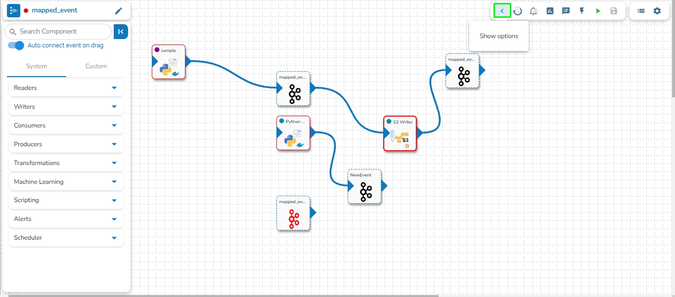
The Toolbar can be expanded or some of the options can be hidden by using the Show Options or Hide Options icons.
Hide Options: By clicking this icon some of the Toolbar icons get hidden.
Show Options: By clicking this icon all the Toolbar icons get listed.
Opens Pipeline Overview page.
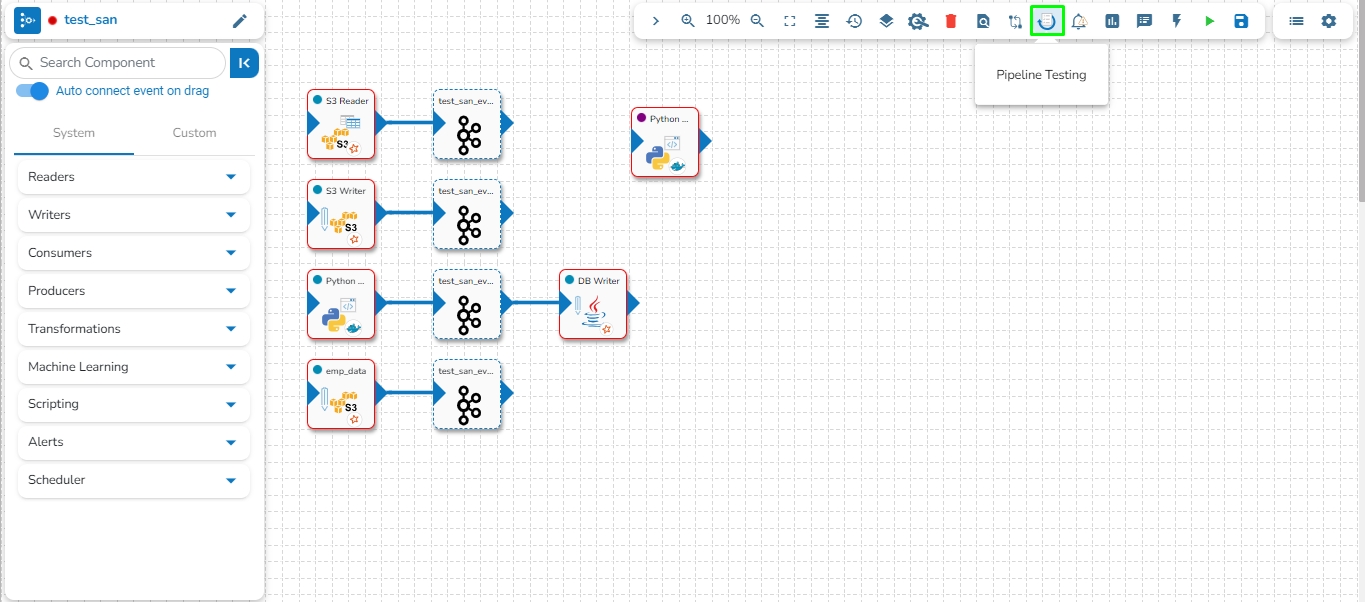
Redirects to the Pipeline testing page
Update the version of the components.
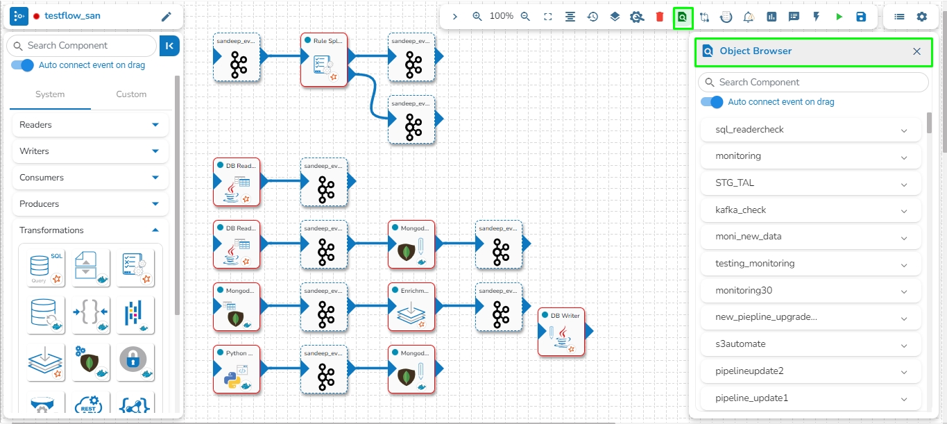
Helps to search component across Pipelines through the Object Browser panel.
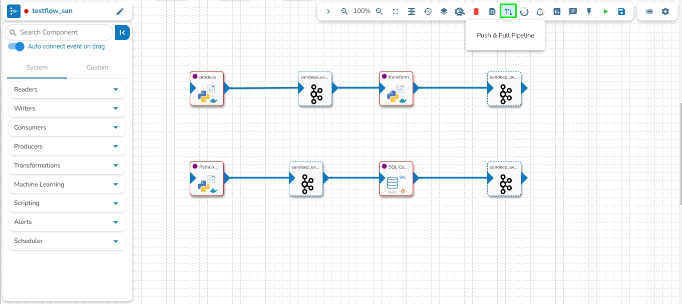
Allows to push & pull the pipeline to VCS or GIT.
Opens the Pipeline in Full screen
Opens or closes the log panel
Opens or closes Event panel
Activates or deactivates the Pipeline
Updates the Pipeline
Redirects to the Failure Analysis page
Redirects to the Pipeline Monitoring page
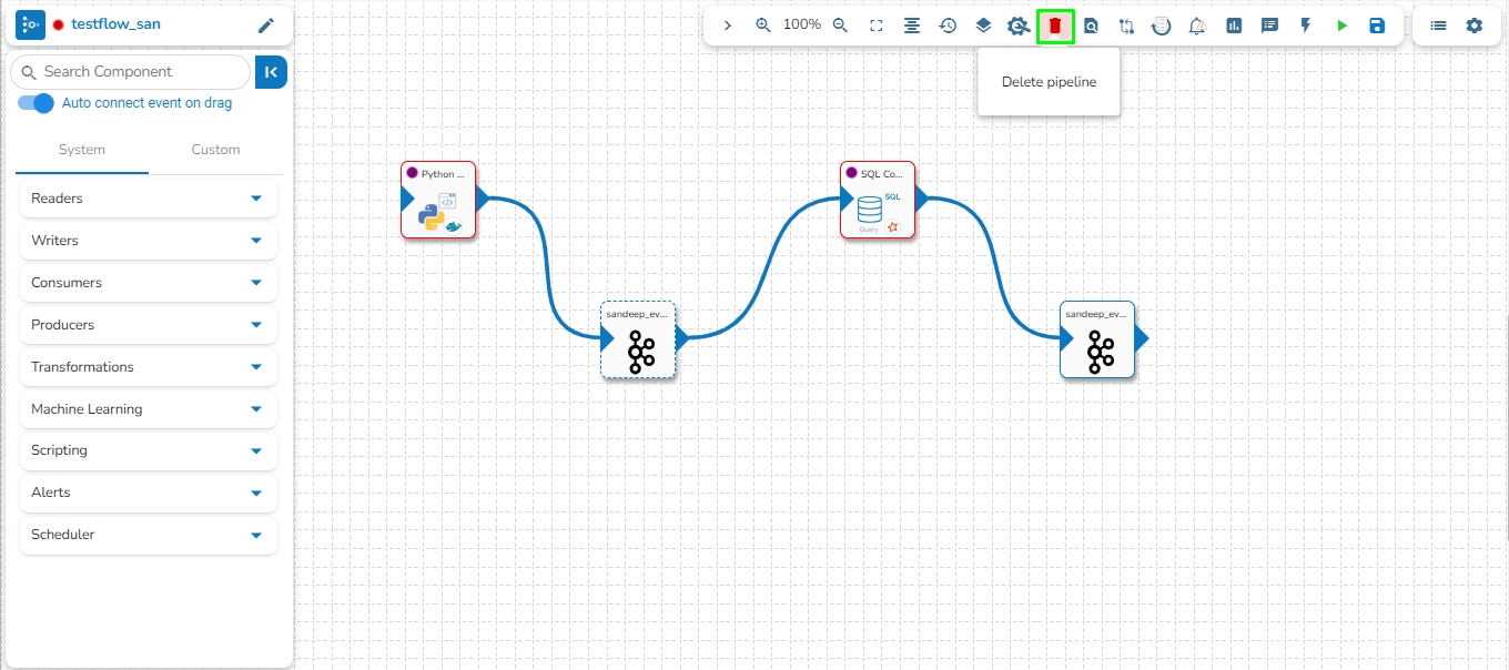
Deletes the Pipeline and moves it to Trash folder.
Redirects to the Pipeline List page.
Redirects to the Settings page.
Redirects to Pipeline Component Configuration page.
Redirects user to failure alert history window.
Format the pipeline components in arranged manner.
Zoom in the pipeline workspace.
Zoom out the pipeline workspace.
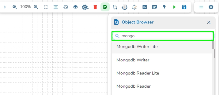
This feature helps the user to search a specific component across all the existing pipelines. The user can drag the required components to the pipeline editor to create a new pipeline workflow.
Click the Search Component in pipelines icon from the header panel of the Pipeline Editor.
The Object Browser window opens displaying all the existing pipeline workflows.
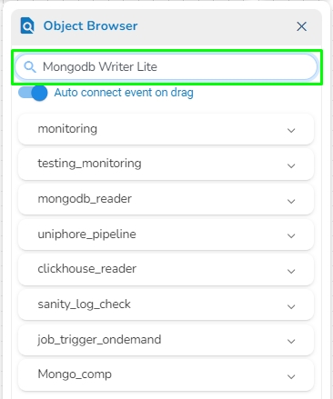
The user can search a component using the Search Component space.
The user gets prompt suggestions while searching for a component.
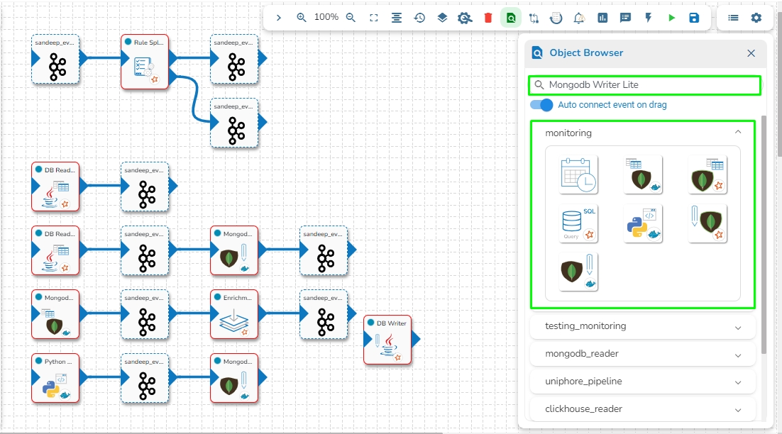
Once the component name is entered, the pipeline workflows containing the searched component get listed below.
The user can click the expand/ collapse icon to expand the component panel for the selected pipeline.
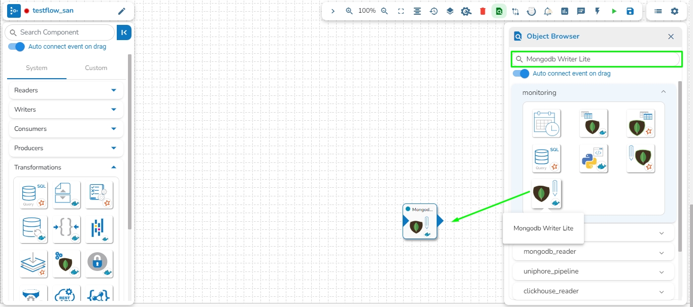
The user can drag a searched component from the Object Browser and drop to the Pipeline Editor canvass.
The Test suite module helps the developers to create a unit test for every component on the pipeline. We can upload input data and expected output data for every test case this will be then compared with the actual output generated by the component.
Check out the below-given walk through to understand the Pipeline Testing functionality.
The Test suite provides the following comparisons:
Compare no. of rows generated with the given output.
Compare no. of columns with the given output
Compare actual data with the given output
Schema validation with given schema.
Navigate to the Pipeline toolbar.
Click on Pipeline Testing.
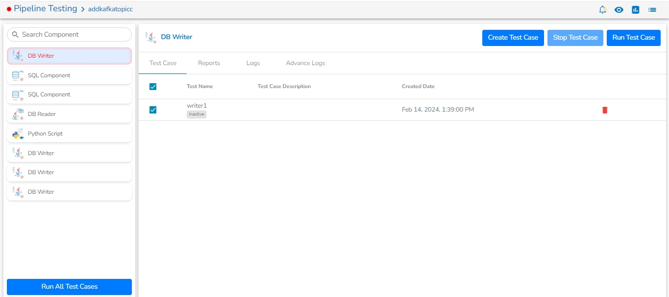
The Test Framework page opens displaying details of the selected pipeline.
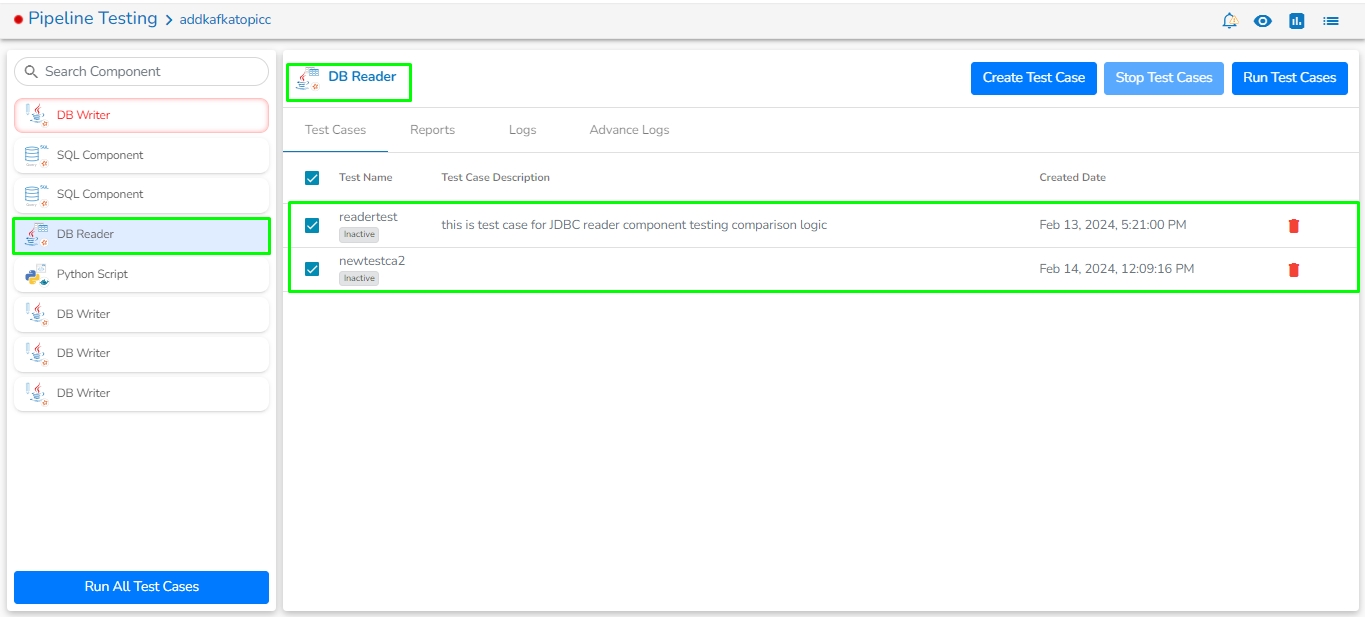
Search Component: A Search bar is provided to search all components associated with that pipeline. It helps to find a specific component by inserting the name in the Search Bar.
Component Panel: It displays all the components associated with that pipeline.
Create Test Case: By clicking on the Create Test Case icon.
Click the Create Test Case icon.
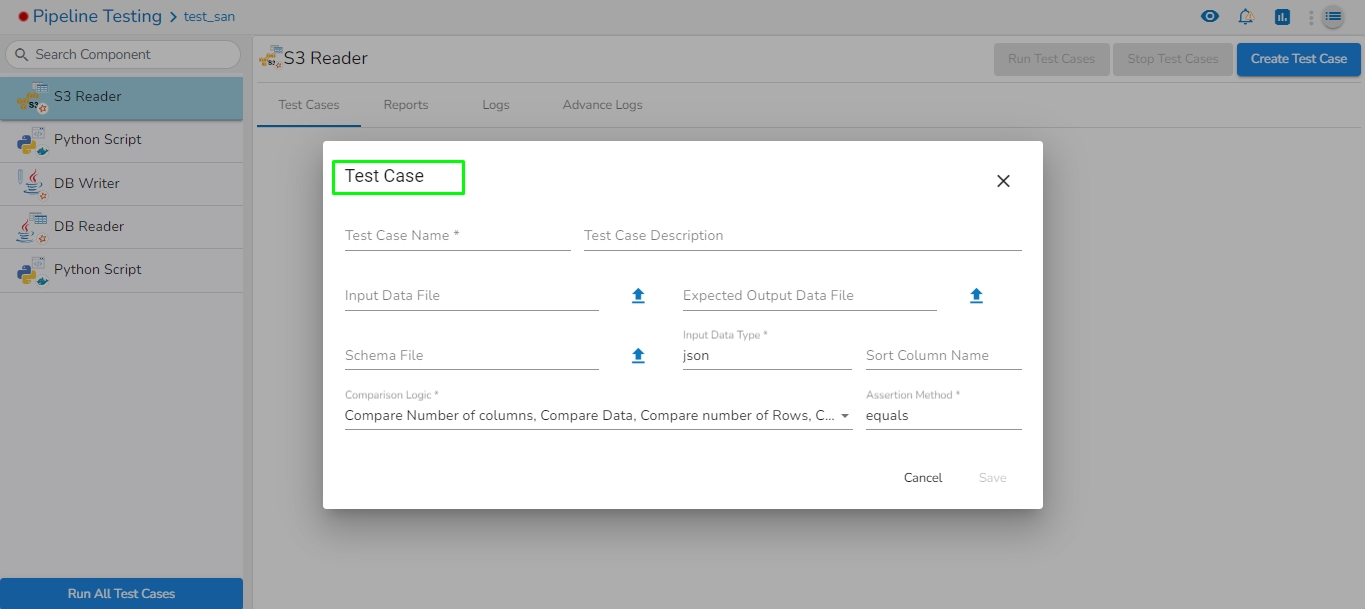
The Test Case opens. Here, the user can create a new test case for the selected component from the component panel.
Test Name: Enter the test case name.
Test Description: Enter the description of the test case.
Input Data File: Upload the input data file. It is required for transformations and writer’s components.
Output Data File: Upload the expected output data file.
Schema File: Upload the schema of expected output data.
Input Data Type: It supports the JSON type.
Assertion Method: It supports the equals assertion method.
Sort: It orders the column values in Actual Output. A User can sort the string and integer column values.
Comparison Logic: It contains four type of comparison logic:
Compare Number of Columns: It compares input data columns with output data columns.
Compare Data: It compares input data with output data.
Compare Number of Rows: It compares input data rows with output data rows.
Check Data Matches Schema: It checks the uploaded schema with expected output data.
Please Note:
Cross: This icon will close the create test case pop-up.
Cancel: This button will close the create test case pop-up.
Save: This button will save the test case and the test case will list in the Test Case list.
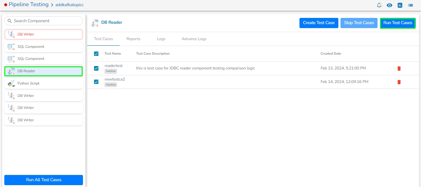
Run Test Cases: It will run single and multiple test cases for the selected component by clicking on the Run Test Cases button.
Test Cases: It displays the created test cases list for the selected component.
It displays the following the details:
Checkbox: The User can select multiple or single test cases while running the test cases.
Test Name: It displays name of the test case.
Test Case Description: It displays description of the test case.
Created Date: It displays the created date of the test case.
Delete Icon: The User can remove the test case by clicking on the delete icon.
The user can update the test case details under this tab.
Test Case Name: The User can change the test case name.
Test Description: The User can change the description of the test case.
Output Schema File: A User can change the schema of expected output data by clicking on the upload icon, view the schema by clicking on the view icon, remove the schema by clicking on cross icon.
Sort Column Name: A User can change the sorting column name.
Update: By clicking on the Update button user can update the test case details.
Last Updated Date: It displays the last updated date of the test case.
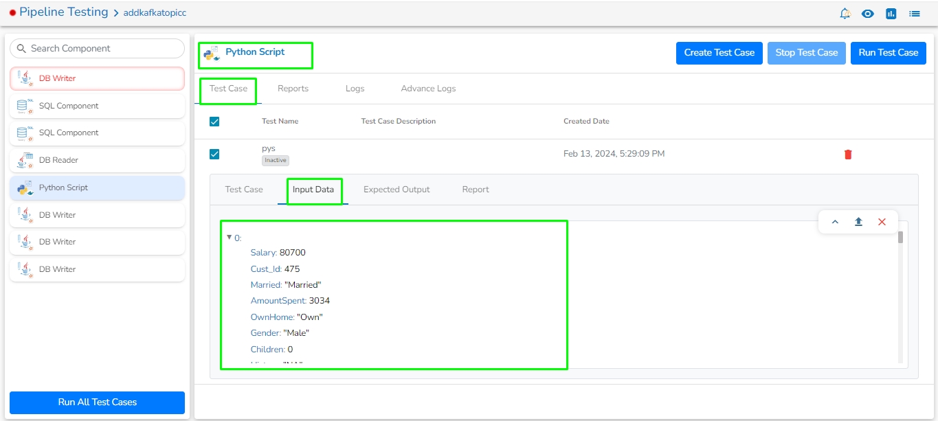
The user can check the existing input data by clicking on this tab. It contains Shrink, Expand, Upload, Remove icon.
Shrink: It Shrink the input data rows.
Expand: It expand the input data rows.
Upload: User can upload input data file by clicking on upload button.
Remove: User can remove input data file by clicking on remove button.
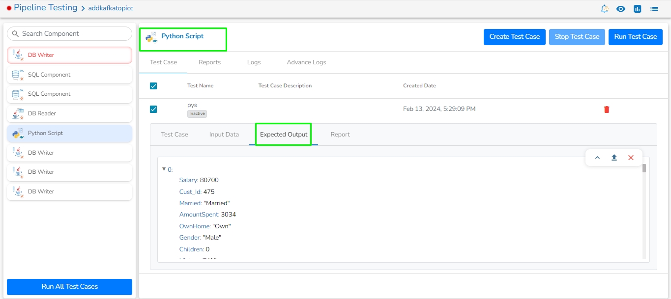
The user can check existing expected output data. It contains Shrink, Expand, Upload, Remove icon.
Shrink: It Shrink the expected output data rows.
Expand: It expand the expected output data rows.
Upload: User can upload expected output data file by clicking on upload button.
Remove: User can remove expected output data file by clicking on remove button.
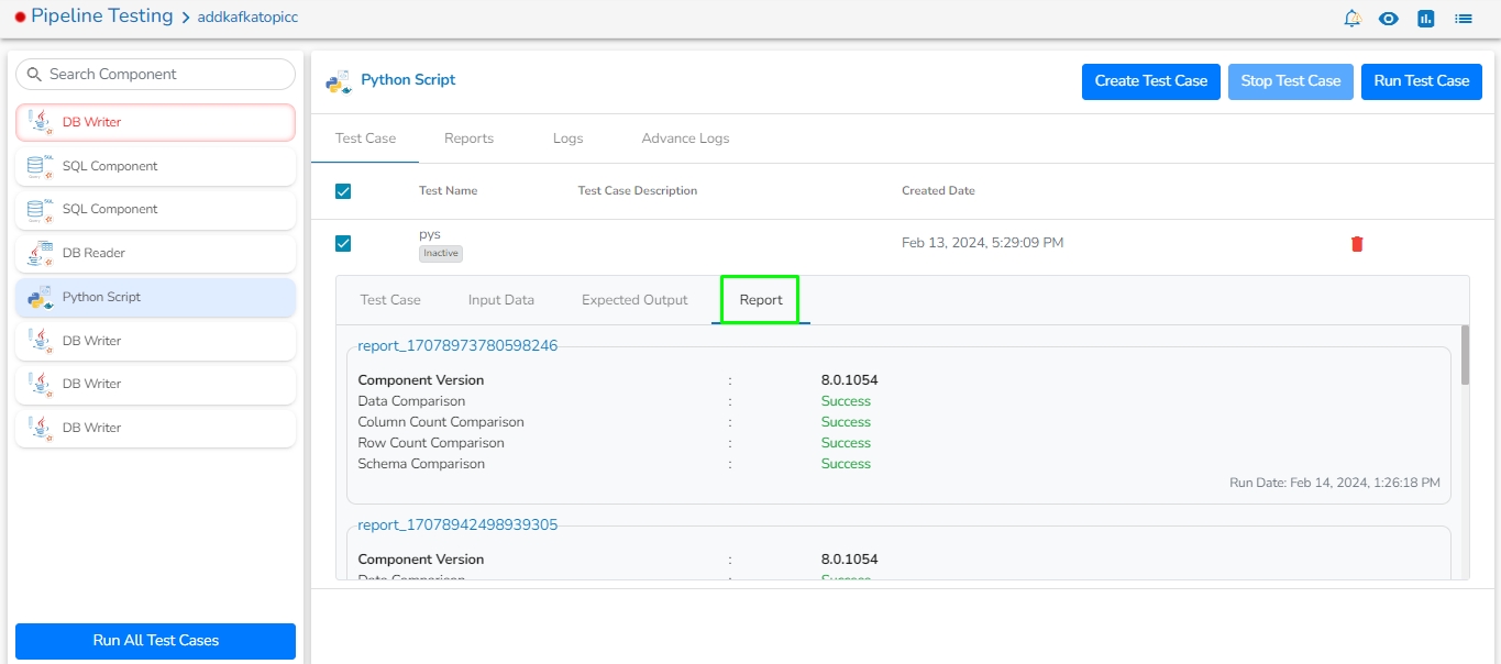
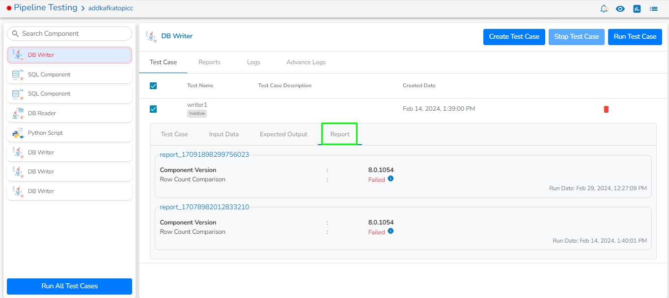
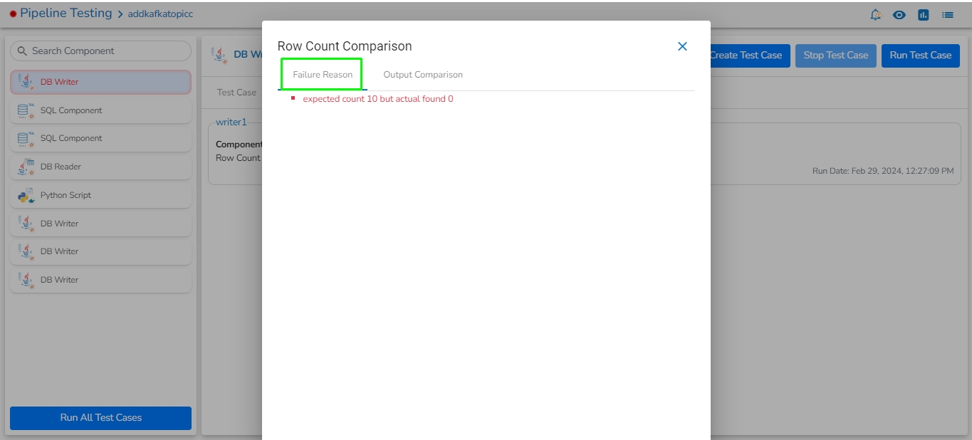
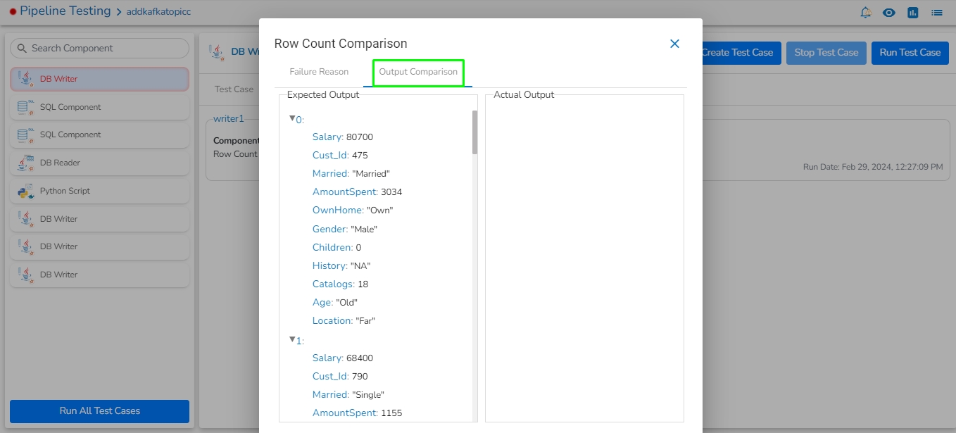
It displays the selected latest and previous test case reports.
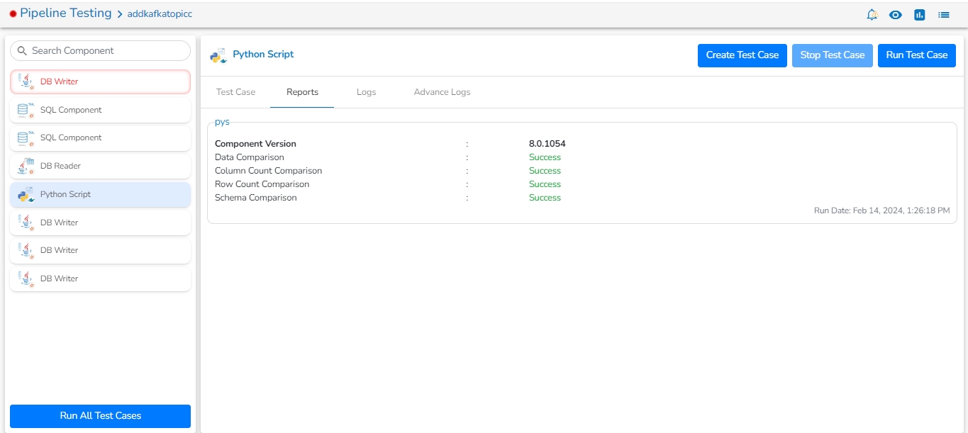
Reports: It displays the latest report of each test cases for selected component. It displays each Test case name, Component Version, Comparison Logics and Run date.
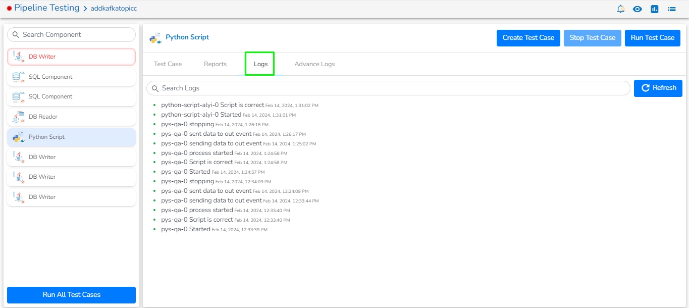
It displays the log details of the component.
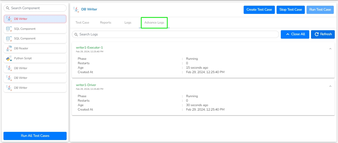
It displays the component pods, if user run test case.
The Version Control feature has been provided for the user to maintain a version of the pipeline while the same pipeline undergoes further development and different enhancements.
The Push & Pull Pipeline from GIT feature are present on the and pages.
Navigate to the Pipeline Editor page for a Pipeline.
Click the Push & Pipeline icon for the selected data pipeline.
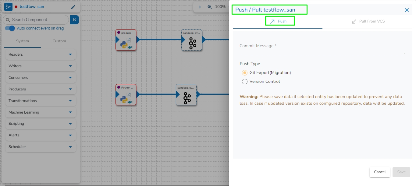
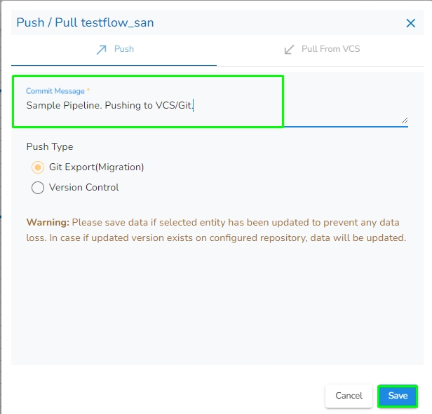
The Push/Pull dialog box appears.
Provide a Commit Message (required) for the data pipeline version.
Select a Push Type out of the below-given choices to push the pipeline:
1.Version Control: For versioning of the pipeline in the same environment.
2.GIT Export (Migration): This is for pipeline migration. The pushed pipeline can be migrated to the destination environment from the migration window in Admin Module.
Click the Save option.
A notification message appears to confirm the completion of the action.
Please Note:
The user also gets an option to Push the pipeline to GIT. This action will be considered as Pipeline Migration.
This feature is for pulling the previously moved versions of a pipeline that are committed by the user. This can help a user significantly to recover the lost pipelines or avoid unwanted modifications made to the pipeline.
Navigate to the Pipeline Editor page.
Select a data pipeline from the displayed list.
Click the Push & Pipeline icon for the selected data pipeline.
Select Pull From VCS option.
The Push/Pull dialog box appears.
Select the data pipeline version by marking the given checkbox.
Click the Save option.
A confirmation message appears to assure the users that the concerned pipeline workflow has been imported.
Another confirmation message appears to assure the user that the concerned pipeline workflow has been pulled.
Please Note:
The pipeline that you pull will be changed to the selected version. Please make sure to manage the versions of the pipeline properly.
The Toggle Log Panel displays the Logs and Component Status tabs for the Pipeline/Job Workflows.
Navigate to the Pipeline Editor page.
Make sure the Pipeline is in the active state (Activate the Pipeline).
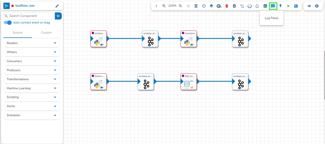
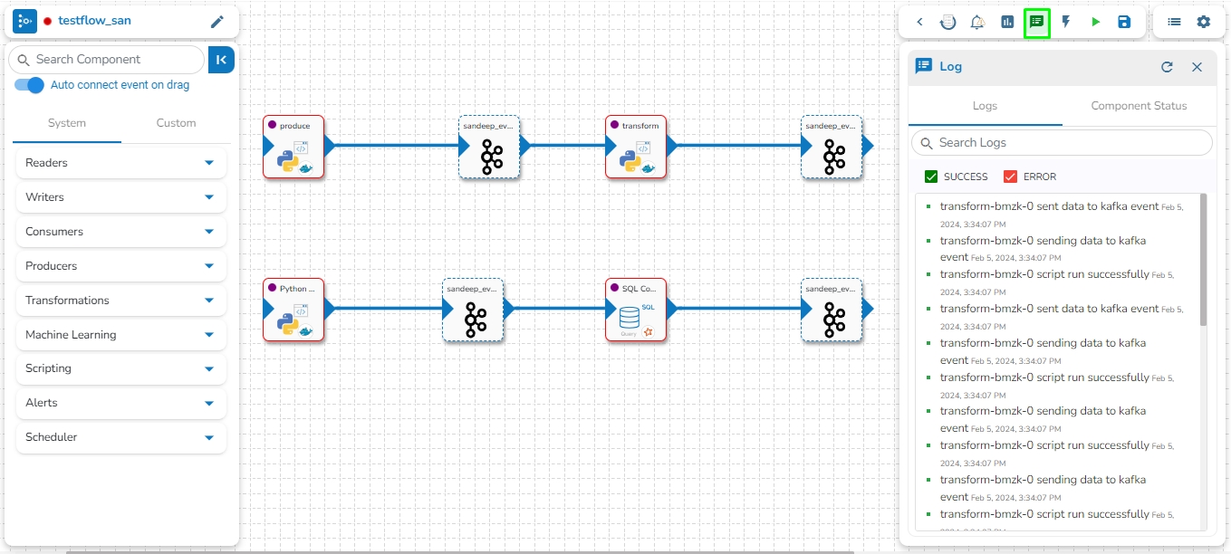
Click the Log Panel icon on the Pipeline.
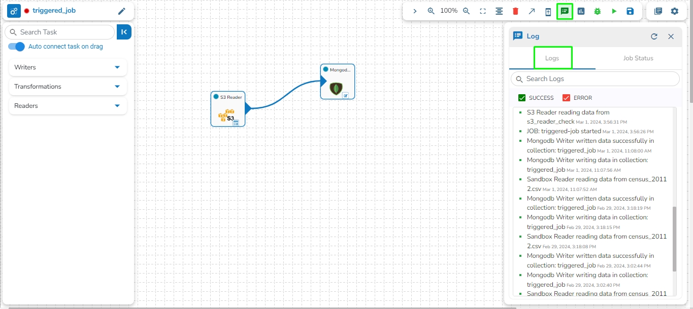
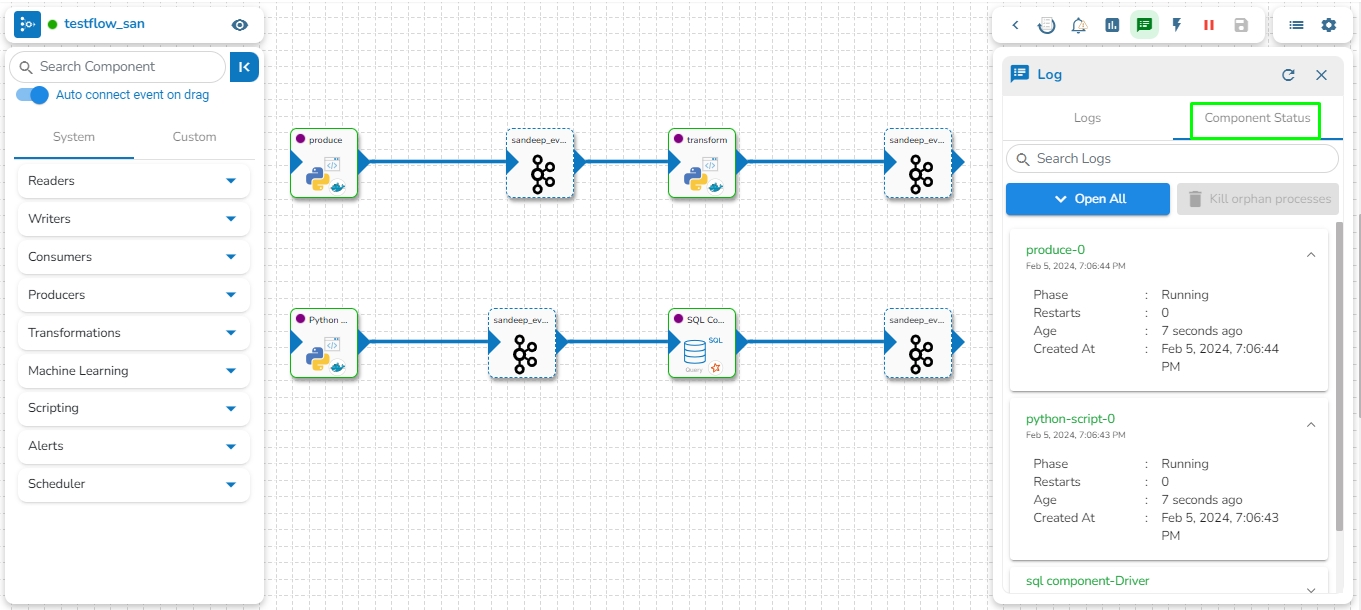
A Log panel toggles displaying the collective component logs of the pipeline/Job under the Logs tab.
Select the Component Status tab from the Log panel to display the status of the component containers. By selecting the Open All option, it will list all the components.
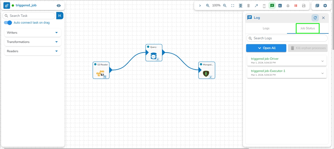
Select the Job Status tab from the Log panel to display the status of the pod of the selected Job.
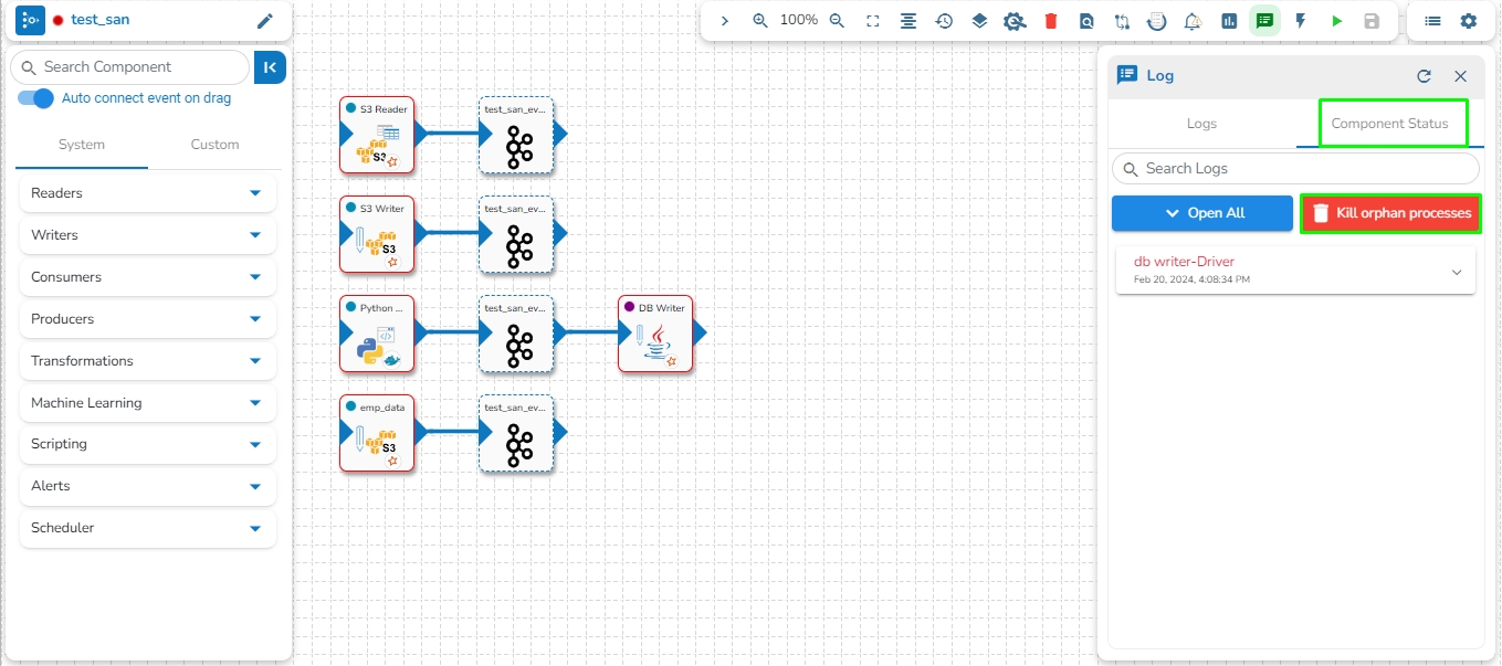
This feature provides the capability to kill all Orphan Pods associated with any component in the pipeline/Jobs if they persist after deactivation. Orphan Processes are the processes that remain active in the backend even after deactivating the pipeline.
The user can access the Kill Orphan Processes option under the Component Status tab of the Log Panel.
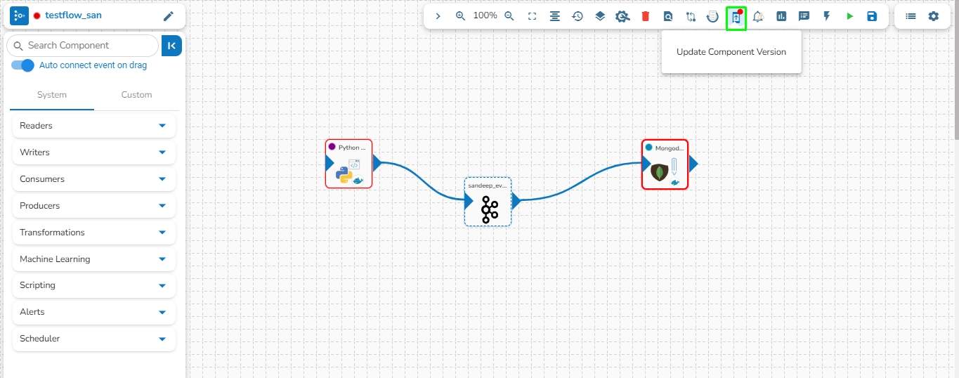
Users can update the version of the used pipeline components through this icon.
This option allows us to update the Pipeline components to their latest versions.
Navigate to the Pipeline Editor page.
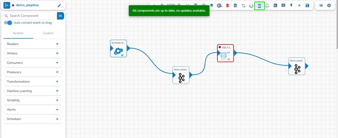
Click the Update Component Version icon. The icon will display a red dot indicating that an updated component version is available for the selected pipeline workflow.
A confirmation dialog box appears.
Click the YES option.
A notification message appears to confirm that the component version is updated.
The Update Component Version gets disabled to indicate that all the pipeline components are up to date.
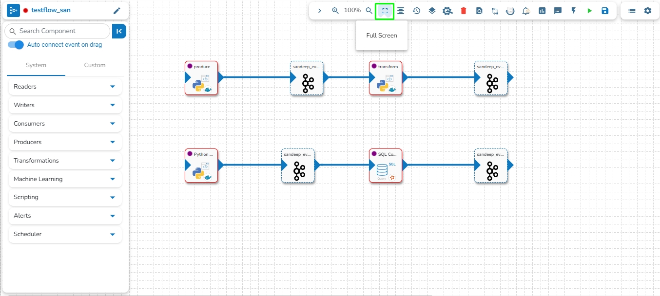
The Full Screen icon presents the Pipeline Editor page in the full screen.
Navigate to the Pipeline Workflow Editor page.
Click the Full Screenicon from the toolbar.
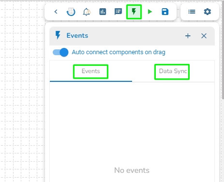
The user can access the Event Panel to create a new Event. We have two options in the Toggle Event Panel:
Private (Event/ Kafka Topic)
Data Sync
The user can create an Event (Kafka Topic) that can be used to connect two pipeline components.
Navigate to the Pipeline Editor page.
Click the Event Panel icon.
The Event panel opens.
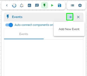
Click the Add New Event icon.
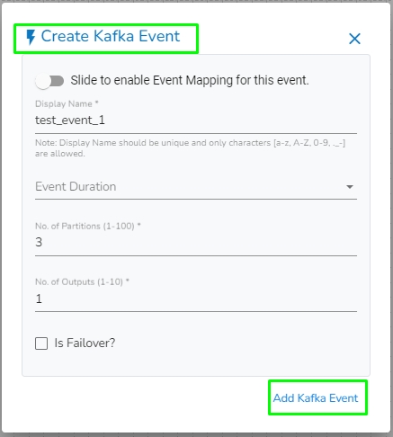
The New Event dialog box opens.
Enable the Event Mapping option to map the Event.
Provide the required information.
Slide the given button to enable the event mapping.
Provide a display name for the event (A default name based on the pipeline name appears for the Event).
Select the Event Duration from the drop-down menu (It can be set from 4 to 168 hours as per the given options).
Number of partitions (You can choose out of 1 to 50).
Number of outputs (You can choose out of 1-3) (The maximum number of outputs must not exceed the no. of Partition).
Enable the Is Failover? option if you wish to create a failover Event.
Click the Add Event option to save the new Event.
A confirmation message appears.
The new Event gets created and added to the Event Panel.
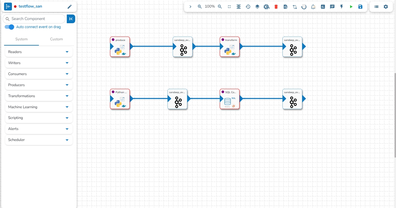
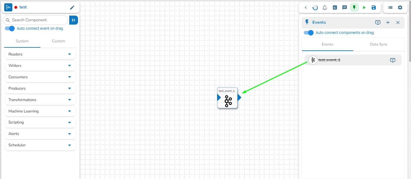
Drag and drop the Event from the Event Panel to the workflow editor.
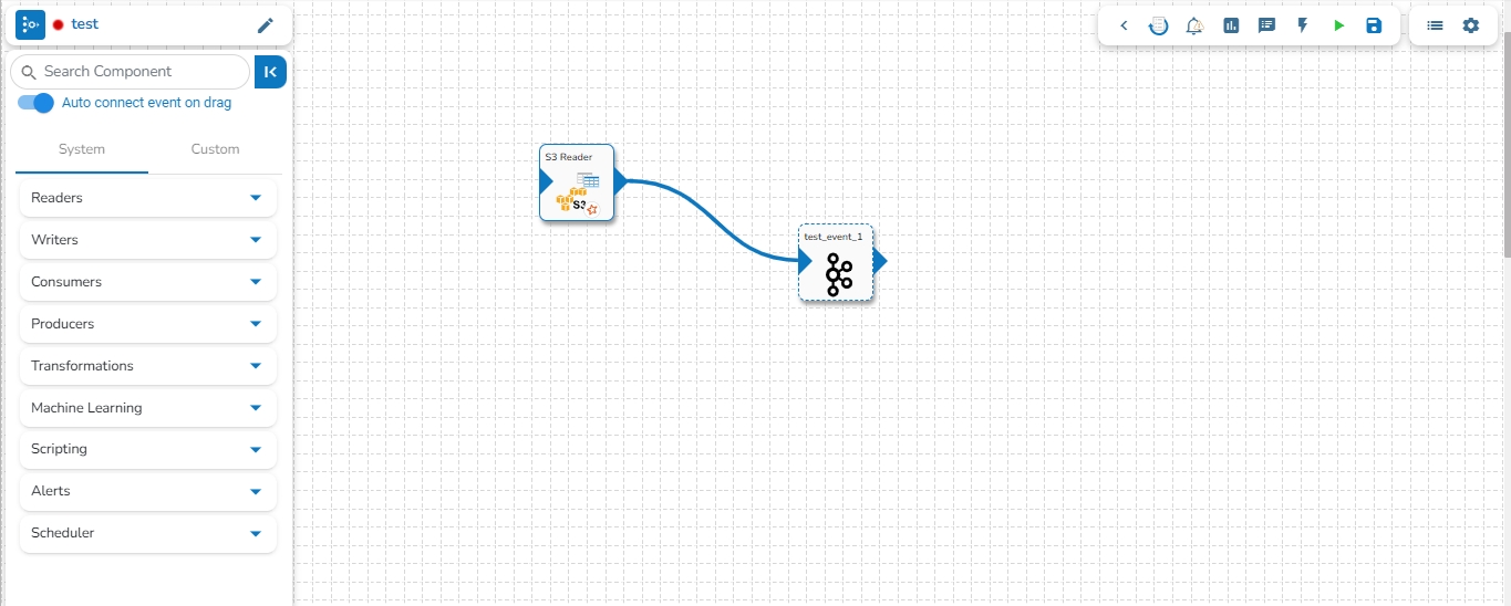
Connect the dragged component to the dragged Event to create a pipeline flow of data.
The user can directly read the data with the reader and write to a Data Sync.
The user can add a new Data Sync from the toggle event panel to the workflow editor by clicking on ‘+’ icon.
Specify the display name and connection id and click on save.
Drag and drop the Data Sync from event panel to workflow editor.
/
/
/
/
The pipeline pushed to the VCS using the Version Control option, can be pulled directly from the Pull Pipeline from GIT icon.
Refer Migrating Pipeline described as a part of the (under the Administration section) on how to pull an exported/migrated Pipeline version from the GIT.
The Pipeline Workflow Editor opens in full screen and the icon changes toicon.
You can drag a pipeline component from the
Please Note: Refer the for more details on the DB Sync topic provided under the Connection Components section of this document.
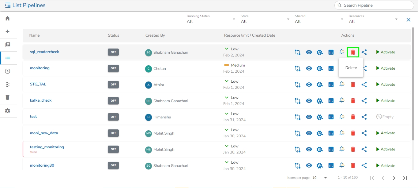
The user can delete their pipeline using this feature, accessible from either the List Pipelines page or the Pipeline Workflow Editor page.
Navigate to the Pipeline Workflow Editor page.
Click the Delete icon.
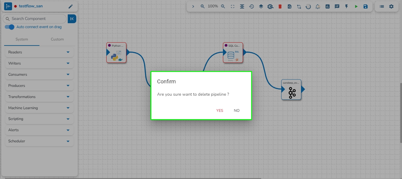
A dialog box opens to assure the deletion.
Select the YES option.
A notification message appears.
The user gets redirected to the Pipeline List page and the selected Pipeline gets removed from the Pipeline List.
Please Note: All the Pipelines that are deleted from the Pipeline Editor page get listed on the Trash page.
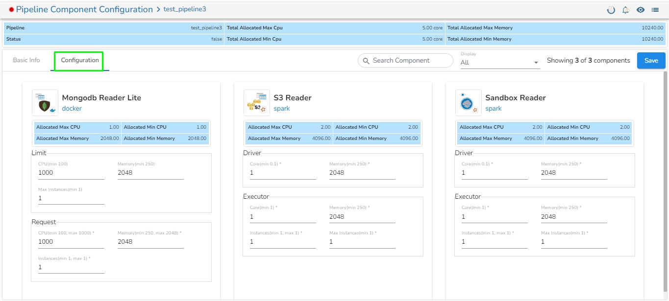
The feature that allows users to configure all the components of a pipeline on a single page is available on the list pipeline page. With this feature, users no longer have to click on each individual component to configure it. By having all the relevant configuration options on a single page, this feature reduces the time and number of clicks required to configure the pipeline components.
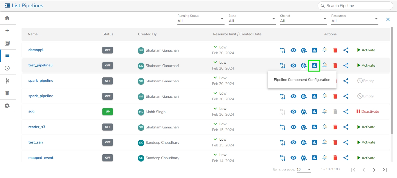
Click the Pipeline Component Configuration icon from the header panel of the Pipeline Editor. The user can either access this option form the pipeline tool or from the list pipeline page.
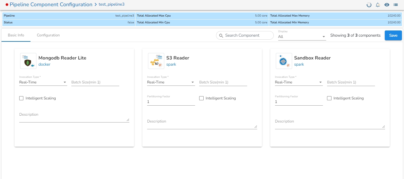
All the components used in the selected pipeline will be listed on the configuration page.
There will the following information displayed at the top of Pipeline Component Configuration page.
Pipeline: Name of the pipeline.
Status: It indicates the running status of the pipeline. 'True' indicates the Pipeline is active, while 'False' indicates inactivity.
Total Allocated Max CPU: Maximum allocated CPU in cores.
Total Allocated Min CPU: Minimum allocated CPU in cores.
Total Allocated Max Memory: Maximum allocated Memory in MB.
Total Allocated Min Memory: Minimum allocated Memory in MB.
The user will find two tabs on the Configuration Page:
Basic Info
Configuration
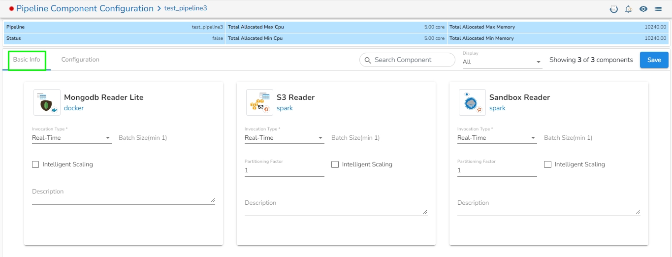
In the Basic Info tab, the user can configure basic information for the components such as invocation type, batch size, description, or intelligent scaling.
On the Configuration tab, the user can provide resources such as Memory and CPU to the components, as well as set the number of minimum and maximum instances for the components.
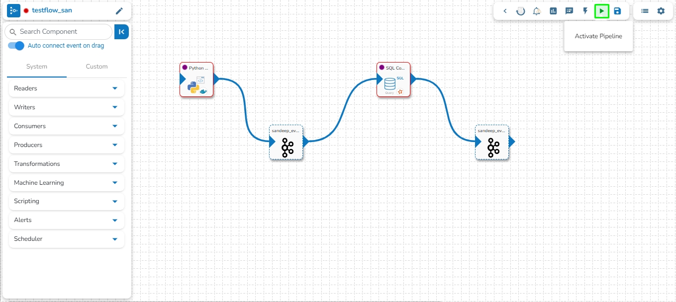
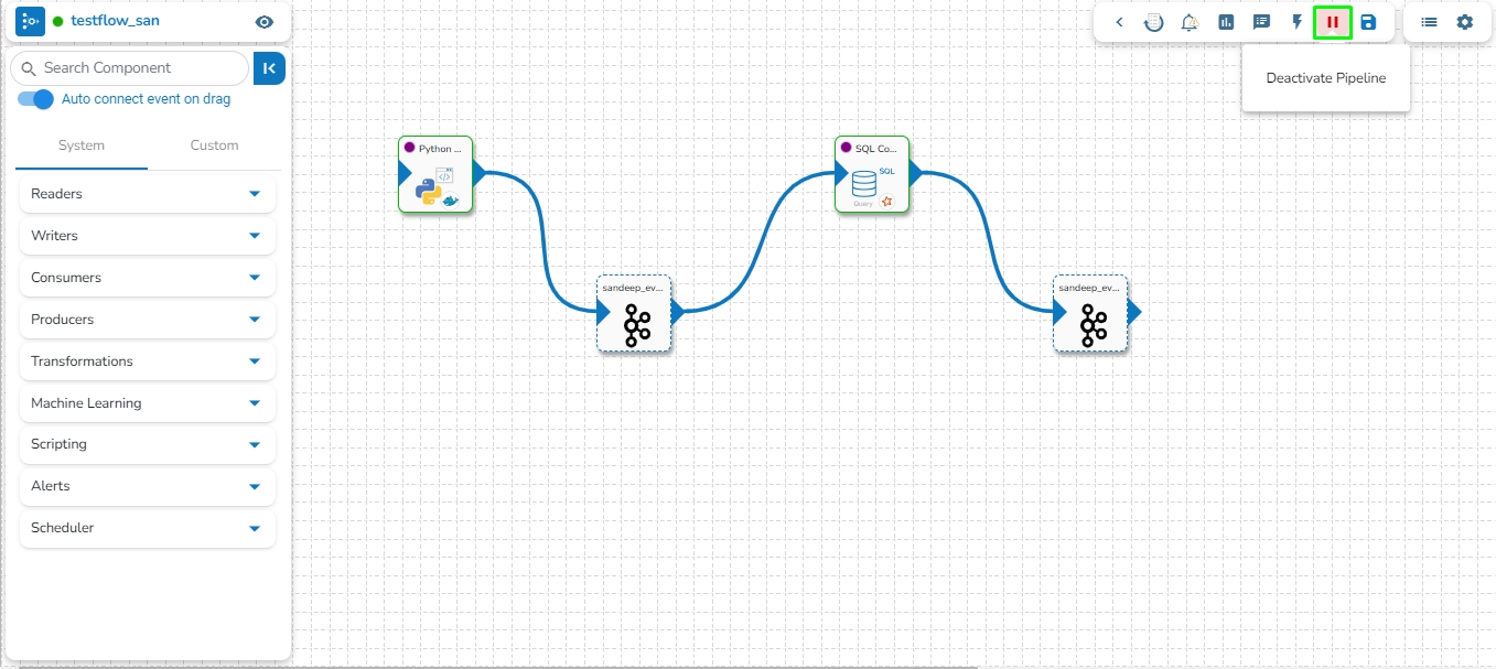
The user can activate/deactivate the pipeline by clicking on the/icon as shown in the image below:
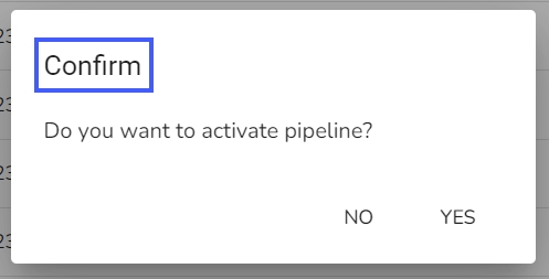
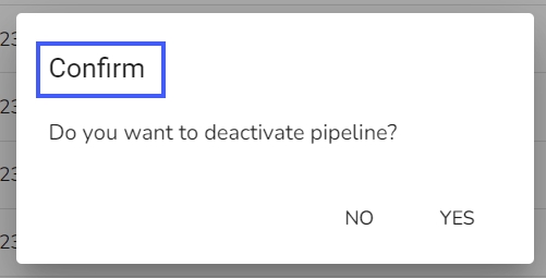
Activation will deploy all the components based on their respective invocation types. When the pipeline is deactivated all the components go down and will halt the process.
Please Note:
The user will get confirmation messages while clicking the Activate and Deactivate icon respectively.
The user can get the Activate and Deactivate options on the Pipeline List page as well.
Clicking on the Update icon allows users to save the pipeline. It is recommended to update the pipeline every time you make changes in the workflow editor.
On a successful update of the pipeline, you get a notification as given below:
Please Note: On any Failures the users get a notification through the below-given error message.
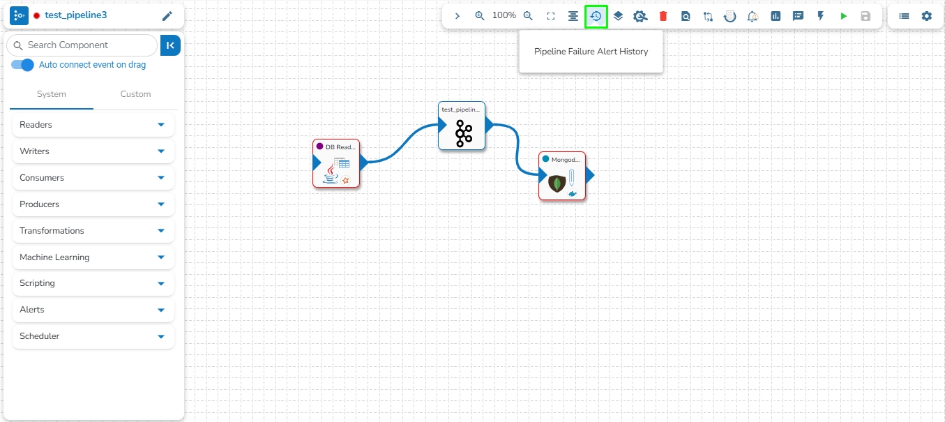
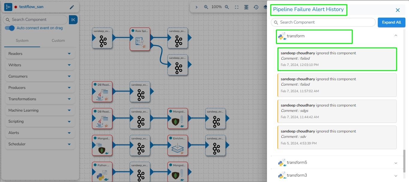
This feature will display the failure history of all the components used in the pipeline.
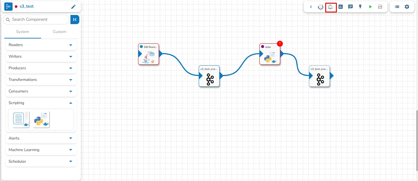
Click the Pipeline Failure Alert History icon from the header panel of the Pipeline Editor.
A panel window will open from the right side, displaying the failure history of the components used in the pipeline.
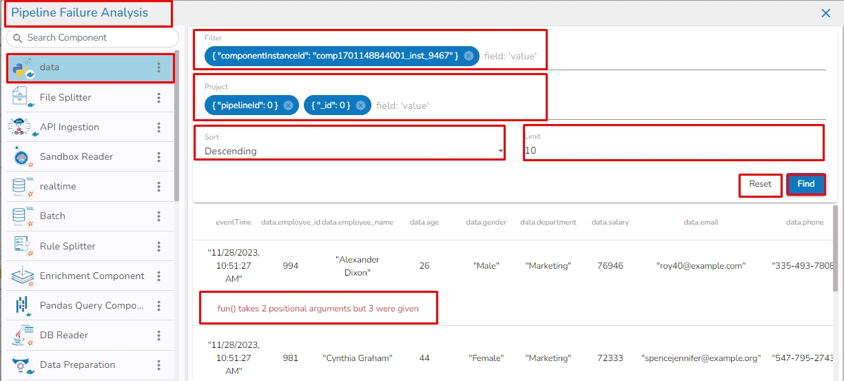
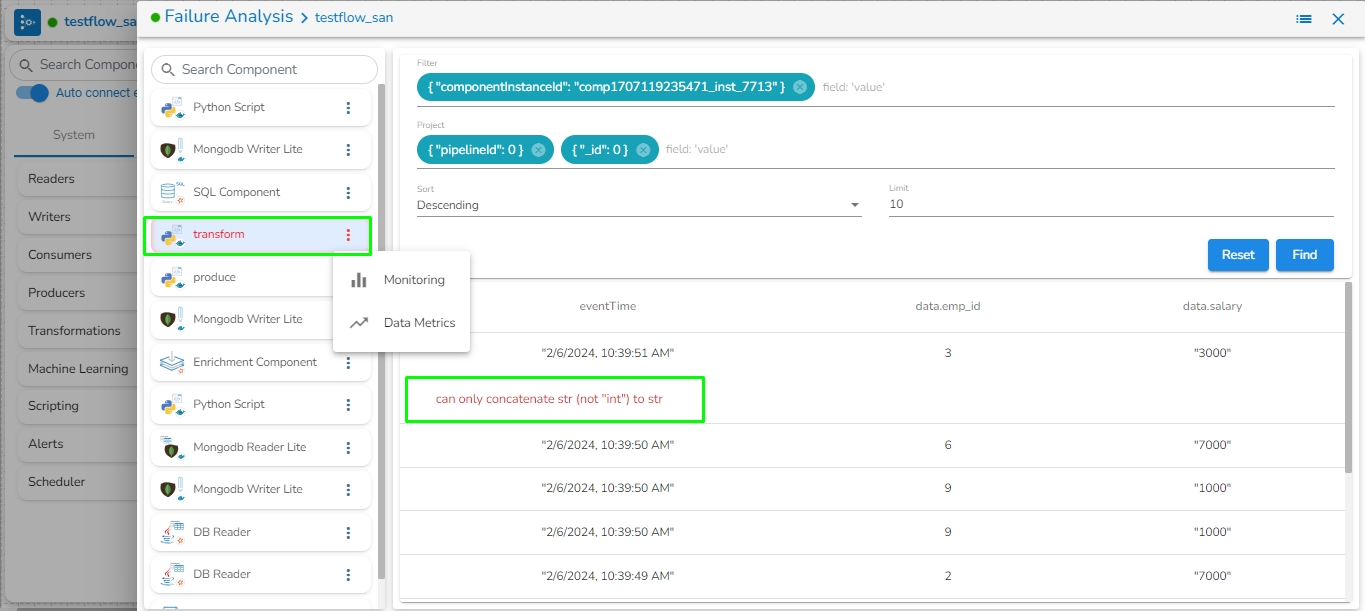
The Failure Analysis page allows users to analyze the reasons for the failure of the component used in the pipeline.
Check out the below given walk-through for failure analysis in the Pipeline Workflow editor canvas.
Navigate to the Pipeline Editor page.
Click the Failure Analysis icon.
The Failure Analysis page opens.
Search Component: A Search bar is provided to search all components associated with that pipeline. It helps to find a specific component by inserting the name in the Search Bar.
Component Panel: It displays all the components associated with that pipeline.
Filter: By default, the selected component instance Id will be displayed in the filter field. Records will be displayed based on the instance id of the selected component. It filters the failure data based on the applied filter.
Please Note the Filter Format of some of the field types.
Field Value Type
Filter Format
String
data.data_desc:” "ignition"
Integer
data.data_id:35
Float
data.lng:95.83467601
Boolean
data.isActive:true
Project: By default, the pipeline_Id and _id are selected from the records. If the user does not want to select and select any field then that field will be set with 0/1 (0 to exclude and 1 to include), displaying the selected column.
Please Note: data.data_id:0, data.data_desc:1
Sort: By default, records are displayed in descending order based on the “_id” field. Users can change ascending order by choosing Ascending option.
Limit: By default, 10 records are displayed. Users can modify the records limit according to the requirement. The maximum limit is 1000.
Find: It filters/sorts/limits the records and projects the fields by clicking on the find button.
Reset: If the user clicks on the Reset button, then all the fields must be reset with a default value.
Cause: The cause of the failure gets displayed by a click on any failed data.
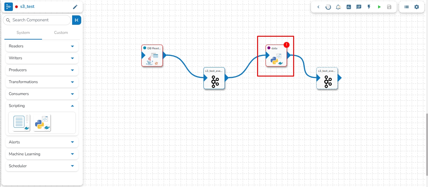
The component failure is indicated by a red color flag in the Pipeline Workflow. The user gets redirected to the Failure Analysis page by clicking on the red flag.
Navigate to any Pipeline Editor page.
Create or access a Pipeline workflow and run it.
If any component fails while running the Pipeline workflow, a red color flag pops-up on the top right side of the component.
Click the red flag to open the Failure Analysis page.
By clicking the ellipsis icon for the failed component from the Failure Analysis page, the user gets options to open Monitoring or Data Metrics page for the component.
The cause of the failure also gets highlighted in the log.
The right-side panel on the Pipeline Editor page gets displayed for some of the Pipeline Toolbar options.
The options for which a panel gets appeared on the right-side of the Pipeline Workflow Editor page are as listed below:
Arrange the components used in the Pipeline/Job Workflow.
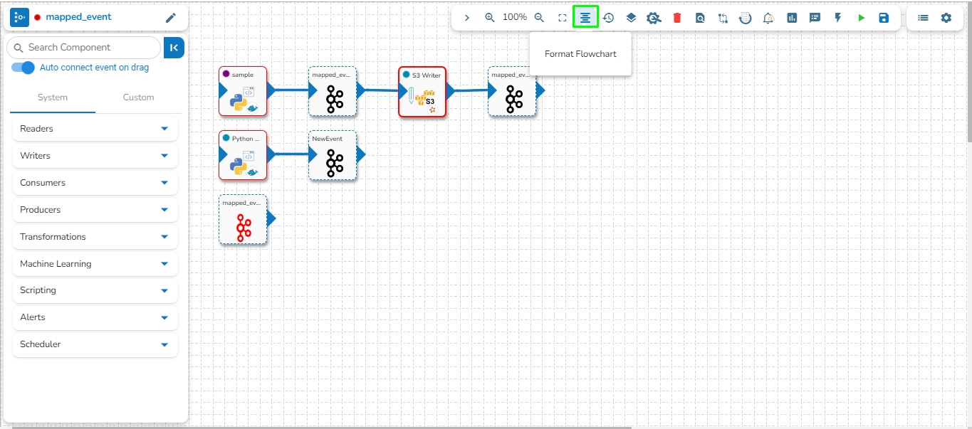
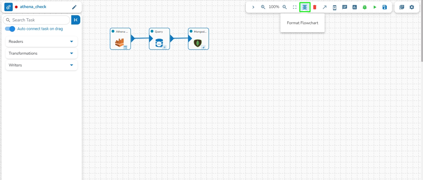
This feature enables users to arrange the components/tasks used in the Pipeline/Job in a formatted manner.
Please see the given video to understand the Format Flowchart option.
Follow these steps to format flowchart in the pipeline:
Go to the pipeline toolbar and click on Show Options to expand the toolbar.
Click on the Format Flowchart option to arrange the pipeline in the formatted way.
The Zoom In/Zoom Out feature enables users to adjust the pipeline workflow editor according to their comfort, providing the flexibility to zoom in or zoom out as needed.
Please go through the below given walk through for Zoom In/Zoom Out feature.
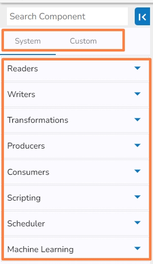
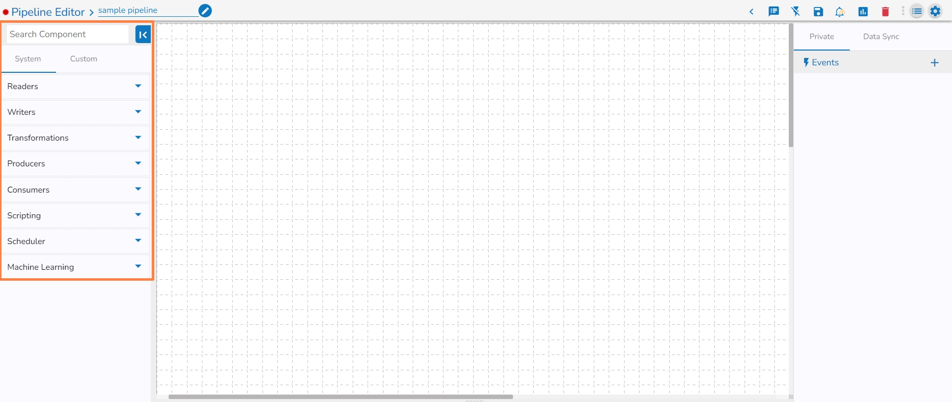
The Pipeline Workflow Editor page of the Data Pipeline contains a Component Panel on the left side of the page. The Component Panel lists System and Custom components of the Data Pipeline.
The Component Panel displays categorized list of all the pipeline components. The Components are majorly divided into two groups:
System
Custom
System Components- The pre-designed pipeline components are listed under the System tab.
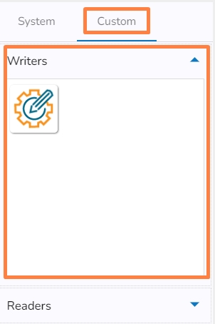
Custom Components- The Custom tab lists all the customized pipeline components created by the user.
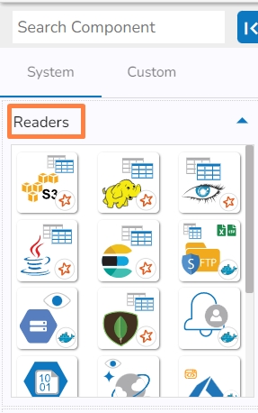
The Component gets grouped based on the Component type. E.g., All the reader components are provided under the Reader menu tab of the Component Pallet.
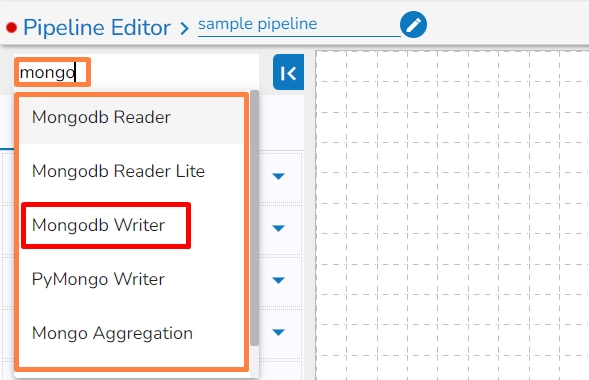
A search bar is provided to search across the 50+ components. It helps to find a specific component by inserting the name in the Search Bar.
Navigate to the Search bar provided in the Component Pallet.
Type in the given search bar.
The user gets prompt suggestions for the searched components. E.g., While searching hd, it lists HDFS Reader and HDFS Writer components.
Select an option from the prompted choices.
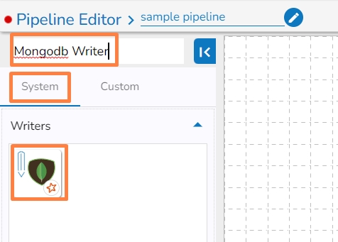
The searched component appears under the System tab. (E.g., HDFS Writer component as displayed in the below image).
This feature allows users to update the older version of the component with the latest version in the pipeline.
Follow the below given steps to update the component version in the pipeline:
Navigate to the pipeline toolbar panel.
Click on the Update Component Version option.
After clicking on the option, all components with older versions in the pipeline will be updated to the latest version. A success message will appear stating, "Components Version Updated Successfully".
A message will appear stating, "All components are up to date, no updates available" if all components already have the latest version.


