A survey is a method of data collection that involves gathering information from a sample of individuals or entities in order to gather insights, opinions, or factual data on a specific topic or issue. Surveys are commonly used in research, market research, social science, and various fields to collect data for analysis and decision-making purposes.
Digital surveys offer several advantages over traditional paper-based surveys, including faster data collection, automated data entry, and real-time data analysis. They also allow for greater flexibility in terms of sample size, geographic reach, and targeting specific populations. Additionally, digital surveys can provide enhanced data quality through built-in validation checks, skip patterns, and randomization features.
BDB Survey
BDB Survey module helps the users to quickly create, customize, and distribute digital Surveys with the targeted group of people to collect responses and analyze them.
Respondents can access and complete digital surveys using their computers, tablets, or smartphones, typically through web browsers or dedicated survey apps. BDB surveys can include various types of questions, such as multiple-choice, rating scales, open-ended, or multimedia-based questions that can include images, videos, or audio.
Creating a Survey
This section describes how to design or build a Survey. Creating Survey is a simple and intuitive process with BDB Survey. It enables any user to create effective and flawless surveys in no time.
This segment creates, develops, and maintains a questionnaire for a survey. It describes all the supported features and steps to design a survey.
Navigate to the Survey landing page.
Click the Create Survey option.
A new page opens displaying the following options:
Please Note: Based on the selected option to Create a new Survey the next page appears for the user.
Select the Deleteicon provided next to the benchmark goal name (on the left pane of the page).
A dialog window appears to confirm the action of deletion.
Click the OK option.
The selected benchmark goal will get deleted.
Saving a Survey
Click on the Save option from the Menu Row to save the changes or modifications.
A message appears to confirm the action of saving the updates.
After all the modifications are successfully saved, the Questions option will open by default.
Notification message while saving a Survey
Please Note:While inserting questions to a survey, it will save only those questions that are inserted before clicking the Save option. The user needs to click the Save option again if there is any modification in the same Survey after saving it once.
Confirmation message while Deleting a Benchmark Goal
Copying a Survey
This option is provided to reuse an existing survey with required modification to collect responses.
Navigate to the Survey home page.
Click the More Optionsicon.
Select the Copy Survey option from the menu.
A message appears to notify that the selected survey has been copied successfully.
A new survey gets added to the survey list.
The name of the copied survey gets displayed as Copy_of_name of the original SurveyE.g., a copy of the Mobile Trends Survey gets renamed as Copy_of_Mobile Trends Survey.
Survey Template
This option allows users to reuse surveys. Users can even modify the survey questions if needed.
Click the menu icon on the top right corner.
A context menu opens.
Select the Survey Templatesoption.
The Survey Templatespage opens.
Click the Preview option.
The preview of the selected Survey Template opens.
Click the Use This Template option.
To create/modify a survey based on the selected survey template in the current user account.
Please Note: By clicking the Use This Template option, the users can edit or modify the given questions in the selected Survey Template.
Please Note:
The copied survey does not have any recorded responses in it.
The user can insert new questions or modify the existing questions for the copied survey.
Editing Collector(s)
Editing Collector Settings
Navigate to the Publish Your Survey list.
Click the Editicon provided for a survey collector.
The Edit Collector option appears on the right pane of the screen.
The following information can be edited for a collector:
Collector Name
Close Collector Message
Click the Editoption provided at the end to save the updates.
Navigate to the Edit Collector Screen.
Select the BizViz Analytics for End User option by check-marking the box.
Carefully select the following details:
Select the ACTIVE option to enable the link.
The Public URL link will be displayed below the Public Link Status (If the ACTIVE option is selected).
Select the IN-ACTIVE option to disable the link.
choose either of the choices out of Yes or No options.
Selecting the Yes optionwill display the result to the end-user, even if the collector is closed or publish has been expired.
Choose either of the choices out of Yes or No options
Selecting the Yesoption will display the applied filters to the end-user
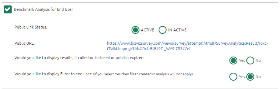
Select the Benchmark Analysis for End User option by check-marking the box.
Carefully select below mentioned details:
Select the ACTIVE option to enable the link.
Select theIN-ACTIVEoption to disable the link.
Choose either of the choices out of Yes or No options
Selecting the Yesoption will display the result to the end-user, even if the collector is closed or publish has been expired.
Choose either of the choices out of Yes or No options.
Selecting the Yes will display the applied filters to the end-user.
Implementing Scheduler for Datamart
Navigate to the Manage Datamart of Your Survey page.
The DataMart details will be displayed.
Click the Update Settingsicon.
The Scheduler View window opens.
Click the Create Scheduler option.
The users get directed to a new screen.
Complete the following configurations:
Select a time range option
A success message appears, and the scheduler is created successfully, the screen will display the Edit Scheduler and Stop Scheduler options.
Click the Edit Scheduler on the Create Scheduler screen.
Edit information as needed.
Click the Update Scheduler option.
The scheduler information gets updated successfully.
Click the Stop Scheduler option.
The scheduler gets stopped.
A message appears to notify that the scheduler is stopped.
Click the Restart Scheduler to resume the scheduler.
A message appears to notify that the scheduler is restarted.
Collector Settings
Please Note: Collector settings include BizViz Analytics for End User and Benchmark Analysis for End User.
Editing BizViz Analytics for End-User
Public Link Status
Display Result Option
Display Filter Option
Editing Benchmark Analysis for End-User
Public Link Status
Please Note:The Public URL link will be displayed below the Public Link Status, (If the ACTIVE option is selected).
Display Result Option
Display Filter Option
Please Note:The same set of steps can be followed to editCollector Settings for Weblink and Email collectors.
Enter start date
Select any one option to schedule refresh:
Every
At
Enter an end date.
Click the Save option.
Editing the Scheduler
Stopping a Scheduler
Managing Datamart
Datamart option is provided to write the survey data inside a database. This function can help the user to store the collected responses of a survey and update them.
Editing an Existing Page
Select any one page from the All Pages drop-down menu.
Click on the Page option from the Menu Row.
Properties of the page will open on the left side of the screen.
The Page Properties display the following options:
Page Title
Page Description
Page Logic
The user can modify all the properties of the selected page.
Available Question Types
The page lists out all the available question types under the BDB Survey.
BDB Survey provides with various question types to build a survey.
This type of question is an essential question to restrict respondents to a single option from all the provided options. Selecting a choice out of all the offered options will often classify them as members of a group. Example, selecting age group, religion, or gender.
Respondents can select one or more options from a list of answers to express their opinion. Multiple choice question type can be used, when there is a fixed number of options available for a question.
Use this type of question when you want respondents to select only one picture from a list of picture choices.
Survey Options
The survey option enables the user to insert a Survey Logo and edit/modify the Create Survey screen.
Click on the Survey option from the Menu Row.
It will launch the Choose File option.
Publishing a Survey
Analyzing Result for a Survey
Use this type of question when you want respondents to select more than one picture from a list of picture choices.
Multiple AnswerPicture Question Format
Use ‘Yes/ No’ when there are only two possible options for answering the question. This type of question can also be used as an end survey question. ‘Required’ validation can be applied to this question.
Yes/ No Question Format
Use this kind of question, if you want respondents to apply the same measurement while answering several related questions. It allows only one answer per row. You also have the option to turn the matrix question into a rating scale when you want to assign weights to each answer choice.
Matrix-Single Answer Question Format
Use a Matrix-Multiple Answer question type, if you want respondents to evaluate one or more row items using the same set of column choices. You can set this type of matrix question to collect multiple answers.
Matrix-Multiple Answer Question Format
Questions formed under this type are generally to measure the opinions or attitudes of the desired audience. It is to rate a single aspect or thing alongside a spread-out range of possible choices/options. The rating scale is used to assign weights to respondents’ answers. Rating is predefined for these questions. E.g., Customer satisfaction surveyquestions
Rating Scale Question Format
Numerical short responses can be collected by using this question type. The alphabetical keyboard is disabled to restrict the respondents to use only numbers.
Numerical Text Box Question Format
To collect single short text or numerical responses from the respondents the single Text Box can be used. It can be validated to turn it into a compulsory question. E.g., Pin Code, Designation.
Text Box Question Format
It is difficult to provide specific pre-set answer options to open-ended survey questions; therefore, respondents are required to type their responses into a comment box. Respondents are free to choose the wording and length of responses. Collected responses can then be viewed separately or through some text analysis tools. Questions falling under this type are often not mandatory to respond.
Comment Question Format
This question type is used to collect multiple short responses for a single question. It includes both, numerical and textual responses. The user can specify the answer length and ‘Required’ validation can be applied to this question type.
Multiple Textbox Question Format
Use this question type to collect basic contact details from the respondents. There are ten predefined fields given under this question which can be enabled or disabled as per the need of the survey.
Contact Details Question Format
Use ‘Dropdown’ when you want respondents to select only one answer from a list of answer choices. Inserted details for the ‘Question Text’ and ‘Select Option’ title for the dropdown menu will be displayed on the workspace (as shown below).
Dropdown Question Format
Use ‘Dropdown Multiple Selection’ when you want respondents to select multiple answers from a list of answer choices.
Dropdown Multiple Selection Question Format
Use ‘Multiple Dropdown-Same Option’ when you want respondents to answer multiple questions using the same drop-down options from a list of option choices.
Multiple Dropdown-Same Option Question Format
Use the Multiple Dropdown-Same Option question type when you want respondents to answer multiple questions using the different drop-down options from a list of option choices.
Multiple Dropdown-Different Option Question Format
Use this question type when you want respondents to select an option from matrix drop-down and collect multiple answers for the chosen column. The category of the columns and options provided for drop-down remains the same for all the responses.
Matrix Dropdown-Same Option Question Format
Use this question type when you want respondents to select an option from matrix drop-down and collect multiple answers for the chosen columns. The category of the columns and options provided for drop-down can be different.
Matrix Dropdown-Different Option Question Format
Use the ‘Ranking’ type of question when you want to rank different options. The chosen options will be ranked out of the total number of available choices.
Ranking Question Format
Use ‘Net Promoter Score’ when you want respondents to give a specific score out of 10 for the chosen option.
Net Promoter Score Question Format
Use ‘Slider’ when you want respondents to give a specific score between selected Minimum and Maximum value. The value is given to each step, Minimum value, and Maximum value should be preselected.
Slider Question Format
Use this option when you want respondents to give their digital signature. Respondents can provide a digital signature through curser by holding the left click. The respondent can use the left click of the cursor to provide a digital signature in the given space.
Digital Signature Question Format
Use this option when you want respondents to upload a file. It supports PDF, document, Spread-Sheet, and Image to be uploaded. The file size should not exceed 500 KB. The user can upload the file from the preview page or attempt page.
File Upload Question Format
Use this option when you want respondents to provide date and time. The user can access this feature from the survey designer page, preview screen, and attempt page. By clicking on the space given for date and time, the user will get a calendar to provide a date. Time will be taken based on the system clock. The user can change the inserted date and time manually.
Date/ Time Question Format
Insert an image into your survey by uploading an image file or specifying the URL of an image on the web. The chosen image should not exceed the size limit of 1 MB. This type of question can be associated with descriptive, text box, numerical text box, or comment to get a meaningful outcome.
Image Question Format
Use this question type when you want to show a brief description of different sections at any place in the survey. It supports smiles and HTML in the body.
Descriptive Question Format
Single Answer
Multiple Answer
Single Answer Picture
Multiple Answer Picture
Single Answer Question Format
Multiple Answer Question Format
Single AnswerPicture Question Format
Yes/ No
Matrix-Single Answer
Matrix-Multiple Answer
Rating Scale
Numerical Text Box
Text Box
Comment
Multiple Textbox
Contact Details
Dropdown
Dropdown Multiple Selection
Multiple Dropdown-Same Option
Multiple Dropdown-Different Option
Matrix Dropdown-Same Option
Matrix Dropdown-Different Option
Please Note:
The user can use the left side panel of the screen to insert options for the drop-down menu. (as shown below):
Ranking
Net Promoter Score
Slider
Digital Signature
File Upload
Date/ Time
Image
Descriptive
Click on the
Choose File
option.
Select an image or logo you desire to upload from the current system.
Click on Open to upload the image/ logo.
The uploaded image or logo will be added to all pages of the survey.
Click on the Delete option provided next to the Choose File option to remove the Survey Logo.
Click on the Survey option from the Menu Row
The following details of the Create Survey page get displayed on the left side of the screen below the Survey Logo.
Survey Title
Survey Description
Welcome Message
The user can edit the Survey Logo and the above-mentioned survey details using the Surveyoption.
Adding a Survey Logo
Please Note: The survey logo can be replaced if desired.
Editing the Create Survey Screen from Survey Option
Collectors
The user does not get the drop-down options from the workspace. The options for the drop-down question appears only on the Preview page or while attempting the survey.
If the head value is kept blank, then it displays the first option provided for the drop-down menu by default as the head value.
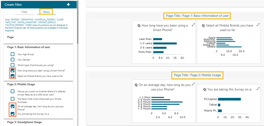
Filter Rule in the Analyze Result
The admin will see all the responses on the Analyze Result page. To see a specific response, the admin will need to apply filters. Filter Rule has been introduced to customize the Analytic display.
Benchmark
Benchmark is a point of reference for evaluating performance/ level of quality. It is required to set goals, before using Benchmark as logic or point of reference to derive at the desired comparison.
Questions for Benchmark Goals
This section describes how to insert a question to a Benchmark Goal, view it, and delete it.
Creating New Contacts
This section explains steps on how to create contacts manually or update the contacts from a CSV file.
Show/Hide Rules for Page/Questions
Show Rule will display only the results of the selected questions or specific pages from the Survey.
Navigate to the Create Filter panel on the Analyze Result page.
Select the Show tab.
All the Survey questions get listed.
Select questions by marking the checkboxes provided next to the questions.
Click the Update Show option.
Creating a New Survey using Template
Navigate to the Survey Templates page.
Choose the Create New Survey from Template option to create a new survey using any of the given templates.
Click on a
Adding a Goal to Benchmark
Navigate to the benchmark page.
Click the Add New Goal icon on the left pane of the page.
The users get redirected to the Create Benchmark Goal
Uploading Contacts from a CSV file
Select the Upload Contacts from CSV option that has been displayed by default after creating a contact group.
OR
Select the Upload Contacts from CSV option from the Settings drop-down menu provided next to the Contact Name.
Creating a New Survey
Click the Create New Survey option.
Fill in the following information:
Survey Title
Page
This section provides all the needed information on the Survey pages.
The results for the selected questions get displayed on the analysis result page.
Please Note:Only one Show rule can be active at a time.
Survey template
category.
The available templates appear below the category titles.
All the available survey templates will be listed with the following details:
Preview-Select this option to get a preview of the selected Template
Use This Template- Select an existing template to create a new Survey
Click the Use This Template option.
The user is redirected to the survey design page.
The user can modify the survey information or questionnaire.
Click the Save option to save the survey.
The newly created Survey gets added to the Survey List on the Survey Landing Page.
A new Survey gets added to the Survey List
Preview Survey
By clicking the Preview option, the user can view the survey's preview page.
The user can preview the survey in Desktop, iPad, and Mobile display modes.
Please note: A new survey, regardless of which creation method you use, will be added to the Survey List on the Survey Landing page.
page.
Fill in the following information:
Goal Name
Goal Description
Upper Threshold
Lower Threshold
Operation on Goal Question Values: Select an option from the drop-down menu.
Is High Value True: Select an option from the drop-down menu.
Click the Save option.
A Benchmark goal gets added to the benchmark.
Please Note:
The Benchmark name displays by default.
The fields with the validation symbols are mandatory.
The user gets redirected on the Create Contacts panel.
Click the Browse File option.
The contact details get displayed on the screen from the CSV file.
Select the Update option.
Select contact details by tick marking the boxes.
Click the Submit option.
The selected contacts get uploaded to the contact list.
A message appears to inform the same.
Please Note: The users can select all the contacts from the list by tick marking the box provided next to the heading Mobile No.
Survey Description
Welcome Message
Click the Save option.
Configuration form to Create a New Survey
A new page opens to design a questionnaire for the created Survey.
The page contains a menu row of which the Questions tab opens by default.
Default Survey Page
A newly created Survey gets added to the Survey List provided on the Survey Landing page.
A new Survey gets added to the Survey List
Creating an Email Collector
Click the Email Collector or Add Email Collector option.
The Create Email Collector opens.
Enter a name for the collector (Maximum limit given is of 50 characters).
Click the Create option.
A message appears to inform about the creation of an email collector.
A window opens asking to add a recipient for email collector.
The Email Collector will be successfully created and added to the Publish Your Surveylist.
Publish Survey Information
After the designing part of a survey gets over, it can be published via Weblink or email to collect responses.
Navigate to the survey list.
Click the Publishoption.
Adding Questions to a Benchmark Goal
Each Goal requires set of questions to explain the goals.
By clicking the Save option from the Create Benchmark Goalthe users get directed to the Add Questions for Goal page.
The Survey Name, Benchmark name, Goal Name get displayed.
Creating New Contacts (Manually)
Select the Create New Contacts option that has been displayed by default after creating a contact group.
Or
Select the Create New Contacts option from the More Options context menu provided next to the Contact Name.
Deleting a Question
Each added question type in the Survey gets the Delete icon to delete the question once you add it to the survey.
Navigate to the Survey questions in edit or design mode.
Select a question that you wish to delete.
Deleting a Survey
Navigate to the survey home page.
Click the More Optionsicon provided next to a Survey Name.
A drop-down menu will be displayed.
Creating a New View in the Analyze Result
Users can create a new view and implement it in the Analyze Result tab.
Click the Add symbol on the Saved View row.
Enter a View name in the pop-up window.
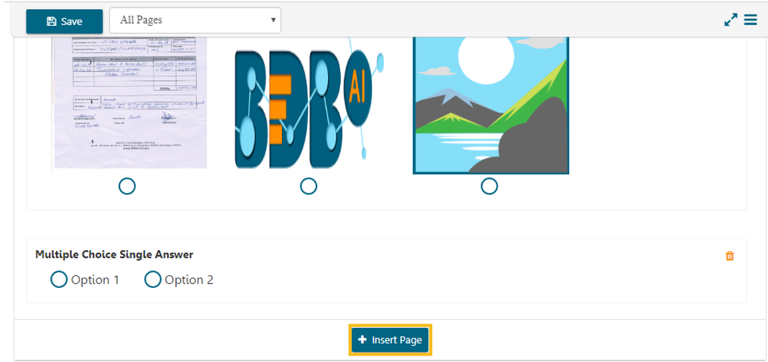
Inserting a New Page
The user gets two options to insert a new page in the Survey.
Click on the + Insert Page option from the Menu Row.
A new page will be inserted before the existing page.
Viewing a Goal Question
Navigate to the benchmark goal page.
Click the View Goal Questionicon.
A list view of all the added questions will be displayed as per:
Editing a Benchmark Goal
Click the Edit icon provided next to a Benchmark goal name (on the left pane of the page).
The users get redirected to the Edit Benchmark Goal page (on the right pane of the page).
Edit the below mentioned details (if desired):
Listing a Contact
Click the More Optionsicon on the Contacts page.
A context menu opens.
Select the
Deleting a Goal Question
Navigate to the question list for a benchmark goal.
Click the Delete icon provided under the Actions.
Inserting a Question
Navigate to the menu row.
The Questions tab opens by default.
Various question-types get displayed on the left pane of the page.
Deleting a Contact Group
Click Settings icon on the Contacts page.
A context menu opens.
Select the Delete Contact Group
Editing a Benchmark
Select a survey from the Survey list.
Click the More Options icon provided next to a survey name.
Select the Benchmark option from the menu list.
Creating a Contact Group
Click the Menu icon on the top right corner.
A context menu opens.
Select the Contacts option from the context menu.
Preview Survey
Navigate to the survey list.
Click the Settings icon for options
Select the Preview Survey option.
It is advisable to select the True option for the Is High-ValueTrue field.
Users will be redirected to the
Publish Survey
page.
Fill in the following information:
Publish Name
Start Date
Expiry Date
Expiry Date Message
Click the Create option.
A message appears to inform that the publisher has been created.
The Survey gets added to the Publish Your Survey list page. The user gets two options to publish the survey either by using Weblink Collector or Email Collector.
Confirmation message after the Publish gets created for a Survey
Options
Task Assigned
Add Web Link Collector
Add Email Collector
Edit Publish
Providing Information for Publish Survey
Other Related Options
Select a Question using the drop-down menu.
The users get redirected to the Enter Question Rule Value for Goal window.
Set value for each answer option.
Select an Operation to be performed on the answer options (if asked based on the question type).
Three options get listed under the Operation drop-down menu:
Addition
Multiplication
Average
Click the Done option.
Enter Question Rule Value for the Benchmark Goal
The users get directed back to the Add Questions for Goal page.
Click the Save option.
Sample Page for entering a Question
The selected question gets added to the Benchmark Goal. A message appears to assure the same.
Confirmation message while adding a Question
Please Note:
The users cannot exceed the set threshold limits while entering question rule value for a goal or selecting an operation.
Click the
Two ways to access the Create New Contacts
The user gets redirected on the Create Contacts panel.
Enter the following information manually:
First Name
Last Name
Email
Mobile No.
Click the Create option.
Manually entering the Contact details
The manually added contact gets created and added to the Contacts List.
A message appears to display the same.
Notification message after adding a Survey Contact manually
Navigate to the Contacts page.
Click the Add option multiple time to add multiple contacts fields.
Enter the required contact details and click the Create option to create the multiple contacts.
Add option to add multiple contact details
Add Multiple Contact (Manually)
Click the Deleteicon provided for that question.
Delete icon provided for a question
A message window appears to assure the action of deletion.
Click the OK option.
The selected question gets deleted from the survey.
Select the Delete Surveyoption from the drop-down menu.
A new window will pop-up to confirm the deletion.
Click the OK option.
The selected survey gets deleted.
Please Note: The users can also get the various options to deal with a Survey under the More Options icon provided on each page of the Survey.
Click the Create option.
A new view will be created and added to the Saved View list.
Click the radio button to enable the new view in the Select View drop-down menu.
Please Note:The user can create a list of filters using each created view.
Click on the + Insert Page option from the bottom of the screen.
A new page will be inserted afterthe existing page.
The Insert Page option at the Bottom of the screen
Insert Page Option at the top of the screen
Insert Page Option at the bottom of the screen
The Insert Page option at the Top of the screen
Please Note:
The newly added page will open with a message that no question has yet been added to that page.
The user can delete a page by clicking on the
Associated Questions
Question Type
Calculated Value
Actions
Please Note:Click the Edit Question icon provided under the Actions to edit the entered question rule value for a goal or chosen operation.
Goal Name
Goal Description
Upper Threshold
Lower Threshold
Operation on Goal Question Values: select an option from the drop-down menu
Is High Value True: Select an option from the drop-down menu
Click the Update Goal option.
The edited goal information gets saved.
List Contacts
option.
The existing contacts get listed with the added contact details for the contacts.
Please Note:
Click the Delete icon to remove a contact from the contact list.
A dialog window appears to confirm the deletion.
Click the OK option.
The selected question gets removed from the benchmark goal.
Delete icon for a Benchmark Goal Question
Page 1 opens as the Default Page.
Use drag and drop feature or Click on a question type to add it on the right pane of the page.
Adding a question to the Survey page
Edit the Question text and other required aspects of the question to add a desired question into the Survey using the Properties tab (The Properties tab opens by default when we add a question).
Editing Question Text using the properties tab
option.
A dialog window opens to confirm the deletion.
Click the OK option.
The selected contact group gets deleted.
The Edit Benchmark page opens.
A new Benchmark gets created and it gets the name from the survey title. E.g.,The Mobile Trend Survey gets a benchmark entitled Benchmark forMobile Trend Survey by default.
Users can edit the below mentioned fields (if desired). Such as:
Benchmark Title
Benchmark Mission
Benchmark Vision
Click the Save option.
The modified information gets saved. The same gets notified by a message.
The Contactspage opens with the Create New Contact Group.
Enter the Group Name in the given field to create a new contact group.
Click the Create New option.
A new contact group gets created and added on the left side of the screen pane.
A message appears to inform the same.
The user gets two ways to create Contact
Upload Contacts from CSV
Create New Contacts (manually create contacts)
Please Note:The user can add multiple contact groups by clicking the Add Contact Group icon.
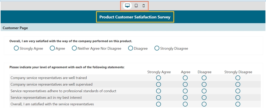
The Preview of the selected survey opens.
Select one display option from the top of the page.
The Survey questions get displayed in the selected preview mode.
Click the Closeoption (provided for the preview page) to close the preview.
Please Note: By default, the Desktop preview will open.
Related Options
Other Options
Update Now
Click the Update Now icon on the Manage DataMart for Your Surveyscreen.
A window will be displayed, allowing the user to update the scheduler manually.
Click the Update Now option.
The scheduler gets updated.
Users can edit or reset DataMart information by using the Edit DataMart icon.
Click the Edit DataMarticon.
DataMart details for the selected survey will be displayed
Click the Edit DataMart Detail option.
Edit information for the DataMart as needed.
Click the Update DataMart icon.
The DataMart details get updated successfully.
Creating a Datamart
Navigate to the Survey list.
Click the More Options icon provided next to a survey name.
Select the Manage Datamartoption from the context menu.
A new screen gets launched to create/ update Datamart.
Fill the following information:
Datamart Status: It will show that no Datamart has been created.
OR
Click the Resetoption to reset the details (if required).
The users get directed to a new page (if a Datamart is created successfully) and the Datamart Status gets displayed on that page to confirm the successful creation of a Datamart.
Click the Refresh icon.
The created Datamart gets displayed on the page.
Click the Datamart name to open the Datamart details.
Survey Builder: Designing a Survey
This section focuses on how to Design a Survey. The designing part includes setting appropriate questions, No. of Pages and Page alignments, Properties together with Save and Insert Page options.
The users get various options on the header bar of the Survey builder to create and modify a survey. This section aims to explain them all in detail.
or
Navigate to the survey list.
Click the Design icon.
The design page opens with various options to develop the survey questionnaire.
Questions
Page
Creating Filter Rule
Navigate to the Analyze Result page.
The Create Filter window displays on the left side of the page.
The Filter tab opens by default.
Benchmark Goals
Database Type: Currently MySQL database is supported.
Database Name: Enter the name of the database where you want to write the survey data.
URL: Enter the proper IP link or data address.
Port: Provide the port number.
Username: Provide the username.
Password: Provide a password.
Datamart Description: Enter a description of the Datamart (It is an optional field).
Click the Create/ Update Datamart option to create a Datamart.
Survey
Properties
Save
Insert Page
Please Note:
The Question tab opens by default.
The BDB logo on the left side works as the Back option. The user can access the Survey Landing page by clicking the BDB logo.
Accessing the Design icon for Survey
Show Help?
option to display an example to be followed for the question rule value.
Delete Page
option provided at the top right side of each page.
Click the Edit icon to edit the contact details for the selected contact.
Fill in the following information:
Filter Name: Enter a title for the filter.
Select View: Select a view using the drop-down menu.
Select Filter Type: Select a filter type using the drop-down menu.
The user needs to provide filter type related information as per the given instruction for each selected filter type.
Click the Create Filter icon.
The newly created filter gets listed under the Saved Viewwindow.
A message appears to inform the same.
The following table displays all the required options to manage the created filter:
/
Applied/ Apply button
Activates or deactivates the applied filter rules.
Edit
Modifies or changes the filter name, filter view, and choices for the filter types.
Delete
A single filter rule uses OR logic within the filter.
E.g., the filtering rule By Question and Answer, when applied to a question with two possible answers can show respondents who choose either of the answer options.
When Multiple Filter rules are applied simultaneously, they will be combined using the AND logic. Only results that meet both the selected Filter Rules are shown—a response must meet the criteria of all filters to be included in the filtered dataset.
Creating a Filter
Manage a Created Filter
Filter Logic
Delete Publish
Edit DataMart
Please Note:
Changes to DataMart details may require the DataMart to be recreated at the given IP address.
To update a record in DataMart, use the Update Record icon.
To get the latest status of DataMart, use the Refresh icon.
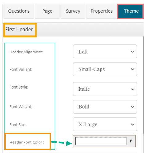
Theme
The Theme option allows the change Themes of the First Header, Second Header, and the Survey body.
Navigate to the Survey Builder page.
Click the Theme tab.
Creating a Weblink Collector
Click the Weblink Collector or Add Web Link Collector option.
The Create Weblink Collector page opens.
Enter a name for the collector (Maximum limit given is of 50 characters).
Deleting Collector(s)
Navigate to the Publish Your Survey list.
Click the Deleteicon provided next to a collector name.
A pop-up window will appear to confirm the deletion.
Survey Summary
This feature displays design and response summaries for the selected survey.
Navigate to the Survey home page.
Click the More Options icon.
The Survey theme can be modified for the following Survey portions:
First Header
Second Header
Survey Body
The following themes can be modified for the First Header of the Survey:
Header Alignment: The supported options are Left, Right, and Center
Font Variant: The supported options are Normal and Small-Caps
Font Style: The supported options are Normal and Italic
Font Weight: The supported options are Normal and Bold
Font Size: The supported Font sizes are X-Large, Large, Medium, Larger, Smaller, Small, X-Small
Header Font Color: Select a color for the Header Font by using the given drop-down pallet.
The user can display the Sub Header and modify the default themes by using this option. The Second Header theme includes the following options:
Display Sub Header: By selecting the True option for this field, the Sub Header gets displayed.
Display Page Title Only: By selecting the True option for this field, only the Page Title gets displayed.
Page Title Alignment: The supported options are Left, Right, and Center.
Font Variant: The supported options are Normal and Small-Caps
Font Style: The supported options are Normal and Italic
Font Weight: The supported options are Normal and Bold
Font Size: The supported Font sizes are X-Large, Large, Medium, Larger, Smaller, Small, X-Small
Sub-header Font Color: Change colors of the fonts.
The user can apply or modify a specific theme to the Survey Body by using this option. The following things can be modified by the Survey Body theme fields:
Question Font Variant: The supported options are Normal and Small Caps.
Question Font Style: The supported options are Normal and Italic.
Question Font Weight: The supported options are Normal and Bold
Question Font Size: The supported Font sizes are X-Large, Large, Medium, Larger, Smaller, Small, X-Small
Question Font Color: Change the color of the question by using the color menu.
First Header Themes
Second Header Themes
Survey Body
Click the Create option.
The Create Weblink Collector Wizard
A message appears to inform that the survey creation of the Web Link Collector.
The Web Link Collector gets created and appears below the message.
Confirmation message with the generated Weblink URL for the Survey
The Web Link Collector gets added to the Publish Your Surveylist.
Related Options
Click the OK option.
Wizard to confirm collector deletion
The selected collector gets deleted.
Please Note:Thesame set of steps can be followed to delete the Weblink and Email collector.
A drop-down menu gets displayed.
Select the Survey Summaryoption from the drop-down menu.
A new page appears containing the detailed survey summary.
Removes the selected filter.
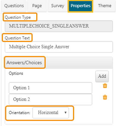
Properties
All the details-related to the question properties are covered under this section. It consists of various types of logic and question validation option.
Question Specific Properties
Click on the inserted Survey Question.
Select a Question Type from the Questions menu.
The Properties tab gets displayed with the following question specific properties:
Question Type: Question type is pre-selected.
Question Text: Question Text can be inserted or modified.
Answers/Choices: Options can be added, modified, and deleted.
The other question specific Properties options mentioned under the Properties tab are as explained below:
The Features optionincludes various options to be applied to a selected question.
It restricts skipping of the questions by the recipients while taking a survey. Recipients must attend all the validated questions to move ahead in the Survey. The application of the validation option can be determined by the survey goal and pattern. Validation can be provided to all the available question types under the BDB Survey App.
Click the Features provided on the left side of the Properties page.
The Validation option opens.
Select Required from the drop-down menu.
All the validated Questions will appear with the Validation symbol provided next to a question.
A Comment Box is an optional feature provided under the Properties tab.
Click Features provided on the left side of the Properties page.
Select Show Comment Box option by check-marking the box
Fill in the following information:
A Comment Box will be added below the selected question
Logic aims to guide the respondents on a specific path for the successful completion of the survey. It also helps in getting the desired responses from the selected group of participants.
Click Features provided on the left side of the Properties screen.
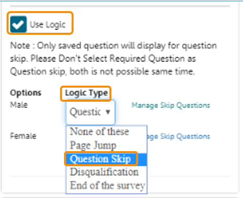
Select the Use Logic option by check-marking the box.
Options and Logic Type will be displayed.
The Survey uses below mentioned logic types:
Page Jump: It is applied to a page. It enables all the respondents to access the immediate next page in the survey. Irrespective of the answers chosen by the respondents, they will be taken to the next page of the survey.
Question Skip: It enables the respondents to proceed on the next question or page based on the answer selected by them. This logic is applied directly to the quest
Disqualification: Essentially, this logic is applied to multiple-choice questions to disqualify the respondents who fail to meet the required criteria for continuing the survey. A disqualification message will be shown to them restricting their further progress in the survey
Use the below-listed properties to set question display:
Component Width: Set the required width number using the Stepper button
Font Variant: Select an option from the drop-down menu
Normal
Users can move a question to any of the survey pages by applying this option
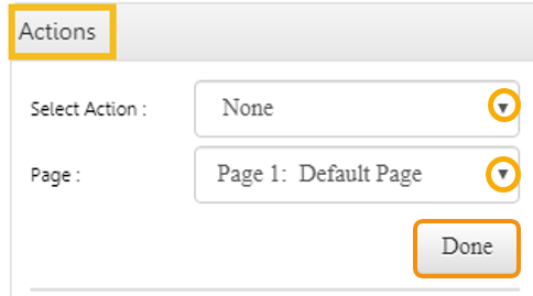
Click Actions provided on the left side of the Properties screen.
Select Action and Page options will be displayed.
Select Move option from the Select Action
The question will be moved on the selected page.
Accessing Survey Module
This section covers the steps to access the survey module.
Navigate to the BDB Platform homepage.
Open the Apps menu.
The Survey module is listed in the Apps menu. Click the Survey module.
The landing page of the Survey module opens with the following options:
Create Survey option
List of the created Surveys
Other options provided on the Survey landing page are as mentioned below:
Orientation: Horizontalor Vertical orientation can be selected from the drop-down menu.
Question specific Validation message will appear in the below given box.
Number of Rows: Set rows by using the Stepperbutton
Text Limit: Set text limit using the Stepperbutton
Text limit message: Enter a message to display when the text limit is exceeded
Comment Head: Enter a heading for the inserted
Select a logic from the drop-down menu.
Selecting a logic will display the Select drop-down menu.
Select Check All option from the Select drop-down menu.
The selected logic will be applied to the desired option.
End of the Survey: This logic is generally used after the last question given for the survey to generate a Survey completion message for the recipients. It can be applied to a specific question, from where the organizer wants certain respondents to end the survey process.
Small-Caps
Font Style: Select an option from the drop-down menu
Normal
Italic
Font Weight: Select an option from the drop-down menu
Normal
Bold
Font Size: Select an option from the drop-down menu (X-Large, Large, Medium, Larger, Smaller, Small and X-Small options are supported)
Option Font Color: Set font color using the available color menu
Radio Background: Set background color for radio buttons using the available color menu
Radio Border: Set border color for radio buttons using the available color menu
drop-down menu.
Select a page from the Page drop-down menu.
Click on the Doneoption.
Features
Validation
Show Comment Box
Use Logic
Supported Logic Types
Question Design
Actions
Comment Box inserted for a Survey question
Publish
Redirects to Publish the selected Survey
Analyze Result
Redirects to the Analyze page of the selected Survey
More Options
Opens a Context menu with the following options:
Preview Survey Benchmark
Manage Datamart
Survey Summary
Icon
Name
Task
Content Menu icon
Provides the following options: 1. Contacts 2. Survey Templates
Design
Please Note: The Mobile Trends Survey and Customer Feedback surveys are displayed by default on the Survey Landing page.
Accessing the Survey module from the Apps Menu
Default Survey Landing Page.
Redirects to the Design page of the selected Survey
Copy Survey
Delete Survey
Editing a Contact Group
Click the Settings icon on the Contacts page.
A context menu opens.
Select the Edit Contact Group option.
The users get redirected to edit the contact group details.
Edit the Group Name.
Click the Edit option.
The desired information in the contact group gets edited.
Contacts
The Contacts section helps to create various contact groups and add recipients to maintain an address book for sharing a survey.
Accessing the Collector Options
The collector is an integral part of the Publish Survey. The collector is an online link that can be sent to the end-users. Collectors are used for gathering collected responses from the recipients that can then be used for in-depth analysis.
Please Note: A single survey can have many collectors to compare the responses collected at a different period.
The BDB Survey module provides two ways to access Collector options:
Redirecting Links for Collectors
Click the Create option offered at the end of the Publish Survey information.
The following options will be displayed to create a collector:
The user can select any one option by a click on it.
Navigate to the Publish Your Survey list.
Four options will be provided next to the published name of a survey.
The first two options (and) can be used to create a new collector.
Collector Icons
Adding Recipient to an Email Collector
Click the Create option provided on the Create Email Collector page.
The Add Recipient for Collector page will be displayed with the pre-defined collector name
Fill in the following information:
Add Recipients: Add names of the recipients either from the Contact Groupsor insert manually and click the Add Recipients option.
Email Subject: Enter a Subject
Body of Email: It displays a prewritten message. This message can be modified.
Click on the Add Link option to add the collector link.
A mail gets sent to the added recipient(s).
Navigate to the Add Recipients for Collector page.
Select the From Contacts option.
Click the Add Recipients option provided below the box.
The Contact Groups windowopens listing all the existing Contact groups.
Select the contact group(s) from where you wish to get the contacts by marking the checkbox.
Click the Done option.
The contacts from the selected Contact Group(s) get added as recipients.
Navigate to the Add Recipients for Collector page.
Select Add Manuallyoption.
Manually add recipients’ details into the given space.
Click on the Create & Send Mail option.
Follow the below mentioned format to add the recipient's name:
Please Note:TheCollector name that gets displayed on the Add Recipients for Collector page cannot be changed.
The users can check the response of a specific collector by applying this filter.
Create the filter by following the given steps:
Open the Filter tab (It opens by default).
Provide the Filter Name.
Select a View.
Select the Filter by Collectoroption from the drop-down.
Select Collector to filter response by marking in the checkbox.
Click the Create Filteroption.
Multiple collector filters can be selected at a time.
Open the Filter tab (It opens by default).
Provide the Filter Name.
Select a View.
The collected responses can be filtered based on the respondents’ metadata.
Currently, four types of metadata details are included:
IP Address
The time of response is captured when a response is saved.
Select a specific time by providing a start date and end date to filter responses.
This option can be used to view all the questions where the respondent has not attempted an answer.
The survey administrator can select a question as the filter.
This filter option is based on the various question types provided for Survey.
This option contains mainly 2 question types:
Closed-ended Questions
This section describes how the input has been taken for the following question types to filter responses.
Responses can be filtered by matching the entered text from Users’ comments for this question type.
In the case of extensive comments, it depends upon row and column size and text limitation.
Admin can filter some selected text from users’ comments as a response on any chosen level.
Responses can be filtered by matching the entered text from Users’ comments for this question type.
This question type is mainly used for small comments.
Admin can filter some selected text from users’ comments as a response on any chosen level.
Responses can be filtered by matching the entered text from Users’ comments for this question type.
This question type is the same as Textbox, but users can choose multiple answer choices that will be determined through the row.
Admin can filter some selected text from users’ comments for only one row of the question and one matching level at a time.
Responses can be filtered by matching the entered text from Users’ responses to this question type.
It is the same as Textbox, but the rows will be provided with the fixed description in this type of question.
Admin can filter some selected text from users’ information for only one row of the question and one matching level at a time.
Responses can be filtered by matching the entered number from Users’ responses.
Responses can be filtered by a given number in the filter with all responses to this question.
Constraints on which this filter will be applied are:
Responses can be filtered by matching the entered number from Users’ responses.
This question type is the same as Numerical type, but users can have the option to select a value in each range only.
Responses can be filtered by a given number in the filter with all responses to this question.
Responses can be filtered by matching the entered date from Users’ responses.
This question type is the same as Numerical type, but users can have the option to select a value in each range only.
Responses can be filtered by a given date with constraints of matching level in the filter with all responses to this question.
Responses can be filtered by matching the selected option from the Users’ response.
The users can select only one option to filter the responses. The selected option will be reflected in all the tabs on the right panel.
Responses can be filtered by matching the selected option.
E.g., select either Yes or No option from Users’ response.
The users can select only one option to filter the responses. The selected option will be reflected in all the tabs on the right panel.
Responses can be filtered by matching the selected option from the Users’ response.
Users can select only one option to filter the responses. The selected option will be reflected in all the tabs on the right panel.
Users are provided with extra information.
Responses can be filtered by matching the selected option from the Users’ response.
Users can select multiple options to filter the responses. Apply ‘OR’ logic on the selected options.
Responses can be filtered by matching the selected option from the Users’ response.
The users can select multiple options to filter the responses. Apply ‘OR’ logic on the selected options.
Responses can be filtered by matching the selected option from the Users’ response.
The users can select multiple options to filter the responses. Apply ‘OR’ logic on the selected options.
Responses can be filtered by matching the selected option from the Users’ response.
The users can select any row value from the drop-down menu.
Select a column or multiple columns using the radio box.
Responses can be filtered by matching the selected option from the Users’ response.
Users can select a row value from the drop-down menu and anyone-column from the radio box. Based on this selection response will be filtered.
Each selection is mandatory.
Responses can be filtered by matching the selected option from the Users’ response.
The users can select a row value from the drop-down menu and a column from the checkbox. Based on this selection response will be filtered.
Each selection is mandatory.
Responses can be filtered by matching the selected option from the Users’ response.
The users can select a row value from the drop-down menu and one column from the radio box as rank. Based on this selection response will be filtered.
Each selection is mandatory.
Responses can be filtered by matching the selected option from the Users’ response.
The users can select only one option to filter the responses. The chosen option will be reflected on all the tabs on the right panel.
Responses can be filtered by matching the selected option from the Users’ response.
Users can select multiple options to filter the responses. Apply OR logic on the selected options. The selected options will be reflected on all the tabs on the right panel.
Responses can be filtered by matching the selected option from the Users’ response.
The users can select a row value from the drop-down (i.e., ‘drop-down head’) one column from the radio box to filter responses. Based on this selection response will be filtered.
Each selection is mandatory.
Responses can be filtered by matching the selected options from Users’ responses.
The users can select a row value, one column value from the drop-down menu, and one option from the radio box. Based on this selection response will be filtered.
Each selection is mandatory.
Responses can be filtered by matching the selected options from Users’ responses.
The users can select a row value, one column value from the drop-down menu, and one option from the radio box. Based on this selection response will be filtered.
Each selection is mandatory.
Responses can be filtered by matching the selected options from Users’ responses.
Users can select a row value, one column value from the drop-down menu, and one option from the radio box. Based on this selection response will be filtered.
Each selection is mandatory.
Responses can be filtered by matching the selected options from Users’ responses.
Users must select any one option from the First Level drop-down menu and one option from the Second Level drop-down menu. Based on this selection response will be filtered.
Each selection is mandatory.
Responses can be filtered by matching the selected options from Users’ responses.
Users must select one option from the First Level drop-down menu, one option from the Second Level drop-down menu, and one option from the Third Level radio box. Based on this selection response will be filtered.
Each selection is mandatory.
It filters responses by their status.
The responses can be divided into four sections, based on their status:
Completed Responses
Not Completed
Attempted Responses
Disqualified Responses
Click the Create Filter option.
Email Address
First Name
Last Name
The collected responses can be filtered based on anyone's metadata criteria.
Open-ended Questions
Levels on which the text has been matched are:
All Words
Any Word
Exact Phrase
Levels on which the text has been matched are:
All Words
Any Word
Exact Phrase
Levels on which the text has been matched are:
All Words
Any Word
Exact Phrase
Levels on which the text has been matched are:
All Words
Any Word
Exact Phrase
Greater than
Less than
Equal to (default option)
The constraints on which this filter will be applied are:
Greater than
Less than
Equal to
The constraints on which this filter will be applied are:
Exactly
Before
After
The constraints mentioned above apply to the selected date.
E.g., An image gets provided with each option to express the option very clearly.
Based on the above selection response gets filtered.
Please Note: By default, data collected from all the collectors get displayed.
Filter by Completeness
Please Note: The user can select the multiple response status to filter the responses.
Filter by Respondent Metadata
Filter by Time
Filter by Skipped Questions
Filter by Question and Answer
Closed-ended Questions
Questions with defined answer choices (E.g., Multiple Choice, Matrix, Drop-down).
Open-ended Questions
Questions with undefined answer choices (E.g., Textbox, Comment).
Please Note: Refer to the Question-Answer Filter applied to the Various Open-ended Question formats section for more details.
Question-Answer Filter applied to the Various Open-ended Question formats
Comment
Textbox
Multiple Textbox
Contact Details
Numerical Textbox
Slider
Date and Time
Multiple Choice Single Answer
Yes/No
Single Answer Picture
Multiple Answer Picture
Net Promoter Score
Multiple Choice Multiple Answer
Rating Scale
Matrix Single Answer Per Row
Matrix Multiple Answer Per Row
Ranking
Dropdown
Dropdown Multiple Selection
Multiple Dropdown Same Option
Multiple Dropdown Different Option
Matrix of Dropdown Same Option
Matrix of Dropdown Different Option
Parent-Child Drop-down for Level 2
Parent-Child Drop-down for Level 3
Please Note:
Some Question types are not added in this filter type such as Signature, File Upload, Image, Descriptive.
After clicking the Create Filter option a success message should appear for all the filter types to assure that the filter has been created.


