Chart Gallery
This section aims to explain each chart and related properties provided under the Story module.
Mixed chart
Check out the below-given walk-through on how to use Mixed chart in the Self-service visualization.
The Mixed Chart combines a line chart and a column chart. It can plot 3-series of data on the graph. It is primarily used to emphasize a different series of information.
The best situation to use a Mixed Chart: To compare multiple categories
Example: To analyze a company's budget v/s revenue.
Variations of this chart-The following are the variations for this chart:
Use stacked Column charts: Multiple categories can be clubbed together on top of each other, which makes addressing multiple questions easier.
Use columns side by side: Comparison between multiple categories becomes easier instead of toggling between charts and data.
Add color for quick insight: Where displaying columns with colors allows users to pay immediate attention to the essential tasks.
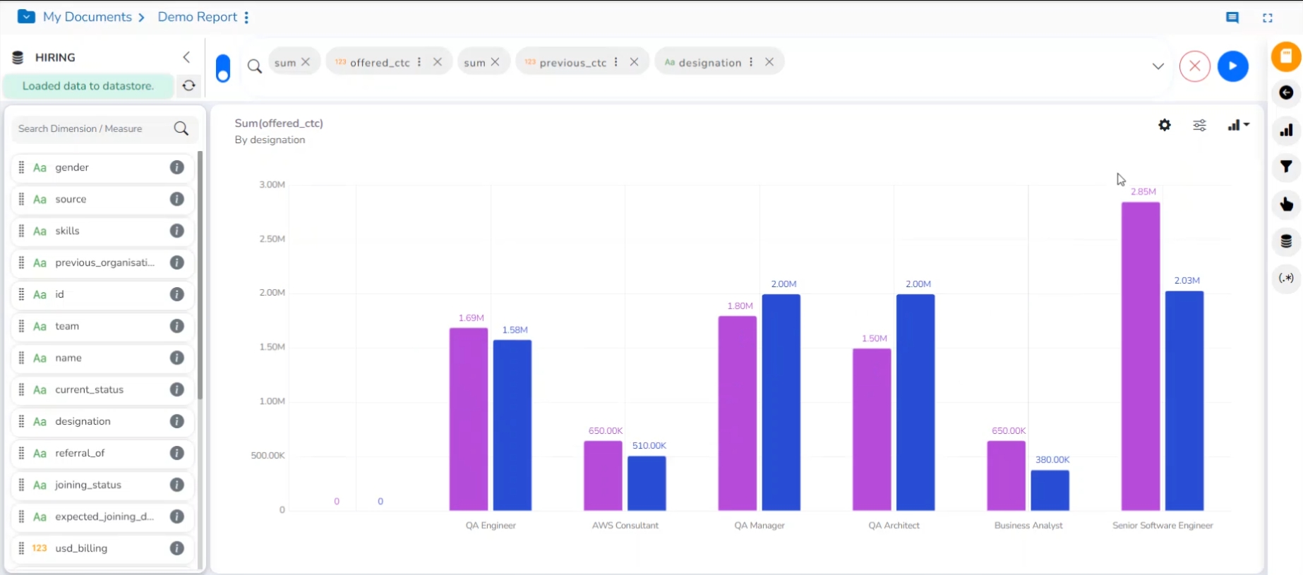
Properties
You can access the chart-specific properties from the Design page. Click the Chart Properties  icon to display the Chart Properties tab on the right-side panel.
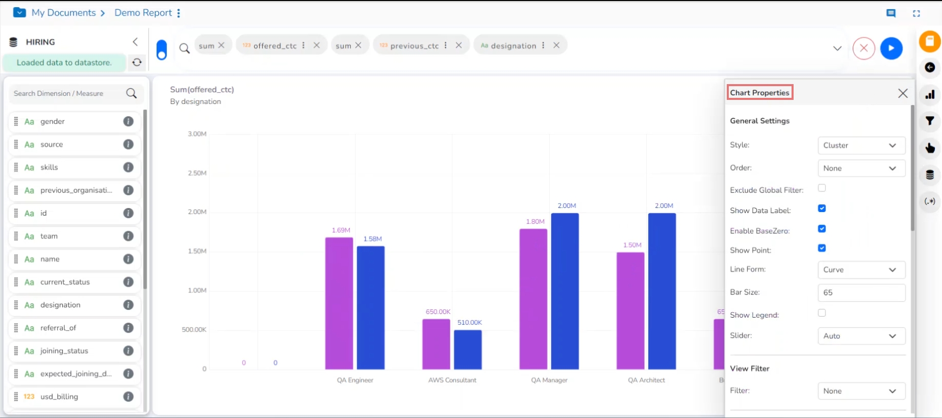
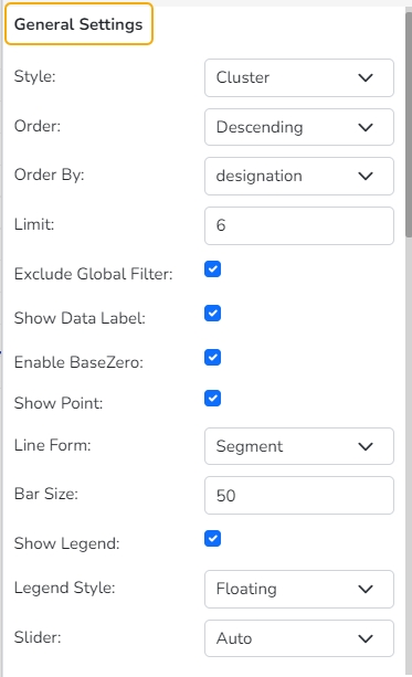
General Settings
Style: Select a style to display the data (the provided choices for this field are Cluster, Stack, Stack Percentage, Stack Overlaid
Order: Select a sequence for displaying information
None
Ascending
Descending
Manual Sort: The user needs to manually sort the dimensions by using the indicator signs. By selecting an order (ascending or descending), the user needs to configure the following fields:
Order By- Select a value option from the drop-down menu to order the sequence of the data.
Limit- Set a number to display the requested data by this limit.
Exclude Global Filter: The view gets excluded from the Global Filter condition by putting a checkmark in the box.
Show Data Label: The data label is displayed using a checkmark in the given box.
Enable Base Zero: Base value gets presented from Zero by providing a checkmark in the box.
Show Point: Enable the Show Point option using a checkmark in the given box.
Line Form: Select a line format from the drop-down menu (the provided choices for this field are Curve and Segment).
Bar Size: This option helps to set a size for the bars that appear in the Mixed chart.
Show Legend: Provide a checkmark in the box to display Legend. After enabling ‘Show Legend,’ users need to select the following information:
Legend Style: Select one of the following options using the drop-down menu.
Fixed
Floating
The following fields appear only when the selected Legend Style option is Fixed.
Legend Font Size: This option helps to adjust the size of the Legend if the Legend Style is Fixed.
Legend Orientation: This option appears when the Show Legend option is enabled, and the selected Legend Style is Fixed. Users can choose an option from the given choices using the drop-down menu.
Vertical
Horizontal
Legend Checkbox: Enable this option using a checkmark to add the checkbox beside the Legend.

Slider: Provide a checkmark in the box to enable the slider. If the Disabled option is selected for the slider, then the slider disappears from the View display.
Fixed Slider Range: Enable a checkmark in the given box to get a fixed slider range.
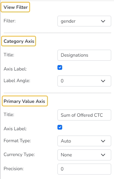
View Filter
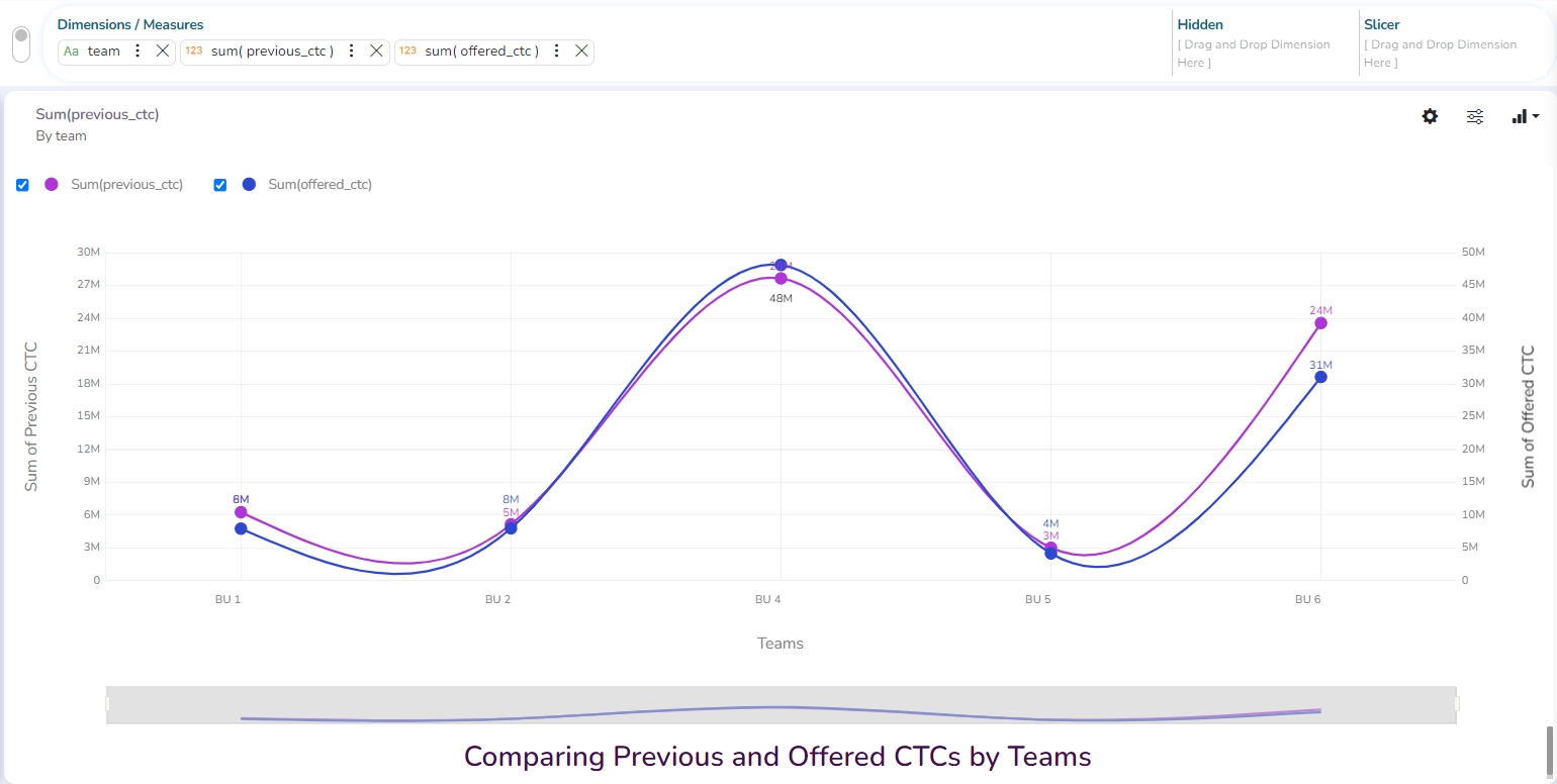
Filter: Select a filter condition using the drop-down menu (E.g., ‘Source’ is the selected filter condition in the following image).
Category Axis
Title: Provide a title for the axis.
Axis Label: Enable the Category Axis label by putting a checkmark in the box.
Label Angle: Select a display angle for the axis label.
Primary Value Axis
Title: Provide a title for the Primary Value Axis.
Axis Label: Enable the Primary Value Axis label by putting a checkmark in the box.
Format Type: Select a desired format type from the drop-down menu (the provided options for this field are: None, Auto, Percent, Thousand, Lacs, Crore, Million, Billion, Trillion, Quadrillion).
Currency Type: Select a currency symbol to be displayed in the view (the provided options for this field are: None, Rupees, Euro, Pound, USD, Yen, Cent).
Precision: Set the after-decimal value (It displays up to 5 precision).
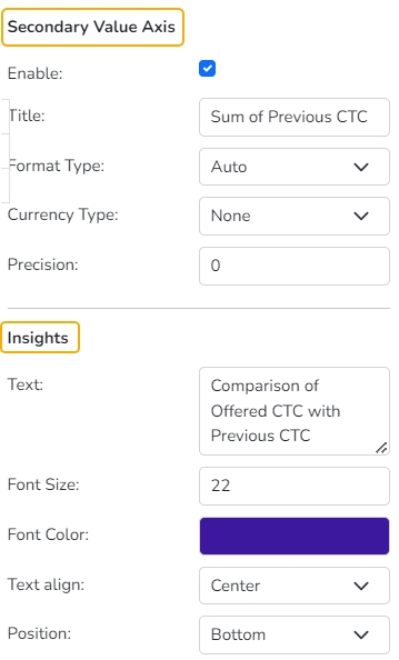
Secondary Value Axis
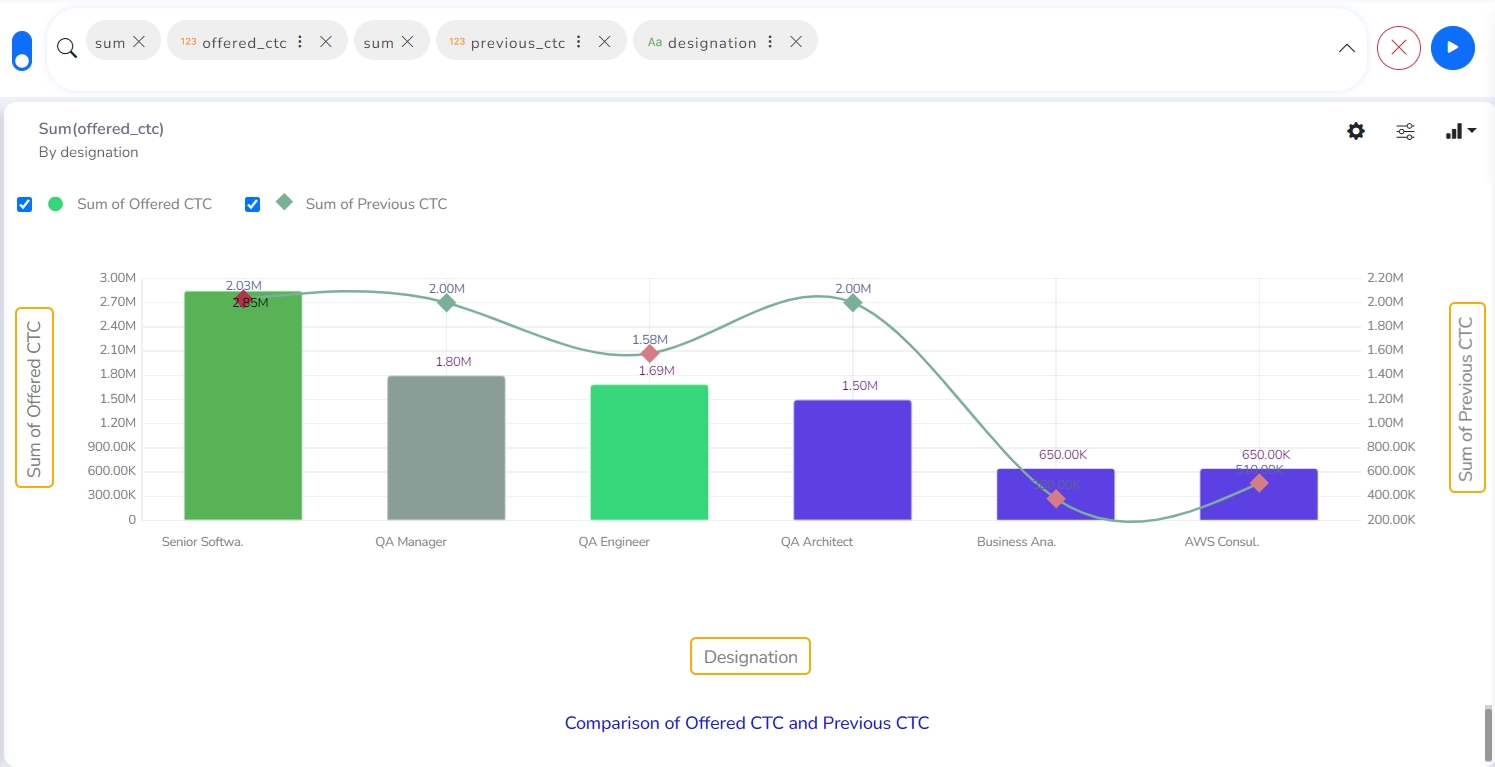
Properties for the Secondary Value Axis are displayed when two measures are dragged on the canvas.
Enable: Put a checkmark in the box to enable the Secondary Value Axis.
Title: Provide a title for the Secondary Value Axis.
Format Type: Select a desired format type from the drop-down menu (the provided options for this field are: None, Auto, Percent, Thousand, Lacs, Crore, Million, Billion, Trillion, Quadrillion).
Currency Type: Select a currency symbol to be displayed in the view (the provided options for this field are: None, Rupees, Euro, Pound, USD, Yen, Cent).
Precision: Set the after-decimal value (It displays up to 5 precision).
Insights
Text: Provide any information regarding the chart. If any digit or character is required to be highlighted, put it inside two asterisks. (E.g., *70%* or *skills*).
Font Size: Set/modify the Font Size of the Insights text.
Font Color: Select a Font color for the Insights Text.
Text align: There are three alignments to align the text.
Left
Right
Centre
Position: There are two options to position the text.
Bottom
Right
Series Properties
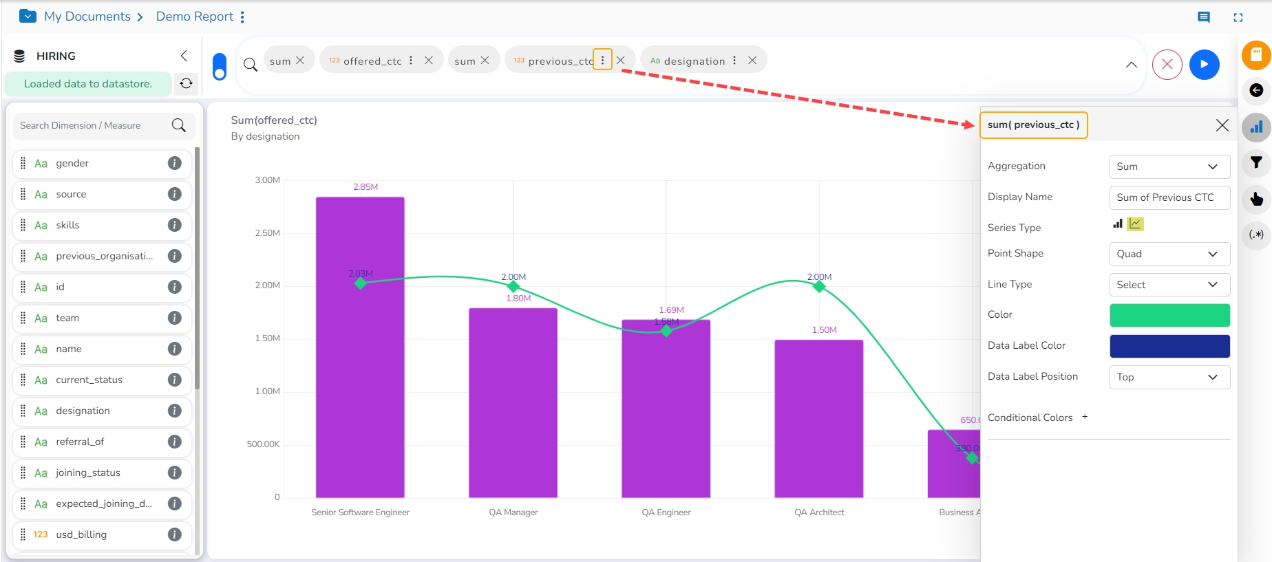
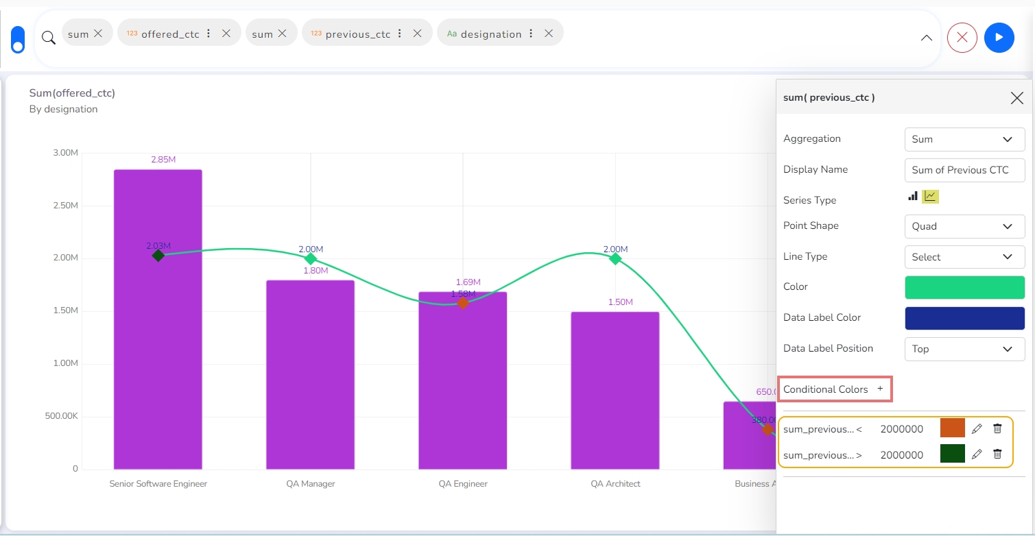
The Series Properties can be configured to access the description and modified display of the Secondary Value Axis. Users can set and modify various aspects of the primary value axis through the Series Properties.
Access the Secondary Value Axis using the Properties tab and enable it.
Click the Series Properties provided next to the measure name.
A new window opens with the name of the selected dimension/series.
Configure the required details:
Aggregation-Select an aggregation using the drop-down menu (By default, it displays the second aggregation type which is Sum)
Display Name- Provide a name to be displayed in the legend.
Series Type- Select a series type to display the secondary value.
Point Shape: Select a point shape using the drop-down menu.
Line Type: Select a line type using the drop-down menu.
Color- Select a color for the series.
Data Label Color-Select a color for the Data Label.
Data Label Position: Select an option using the drop-down icon.
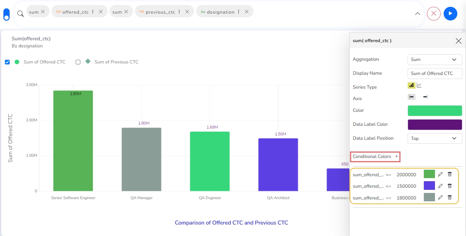
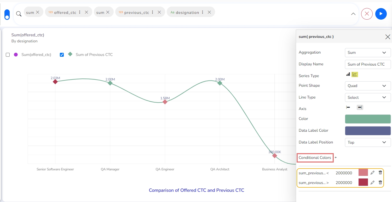
Conditional Colors
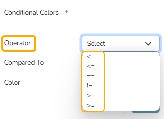
Select an Operator from the drop-down. The supported operators are displayed in the following image:
Provide a number for the comparison as per the set operator.
Select a color using the color pallet for the set condition.
Annotation Settings
Annotation lines in a chart are used to highlight specific points or thresholds for easier analysis and interpretation. They typically represent key events, milestones, or significant values that help provide context or draw attention to important aspects of the data.
Check out the illustration to get annotation lines in a Mixed chart.
Navigate to the dimension and measure panel on the Design page.
Select the required dimensions and measures for the given space.
Click the Play button.
A View will be plotted based on the selected dimensions and measures.

Click the ellipsis for the dragged Dimension that contains the Date values.
A window for the dimension will open on the right side of the page.
The user can set or modify the dimension's Display Name, Date Interval, and Date Format.

Open the Chart Properties.
Go to the Annotation Property section.
Click the Select Annotation Type option to get the drop-down menu.
Select an option from the drop-down. The supported Annotation Types are File Upload and Data Sheet.
By selecting the File Upload option, the user will be redirected to upload a file.

Click the Choose File option.

Select a file from the system and upload it.

The file name of the uploaded file will appear next to the Choose File option.
Configure the Annotation Property by adjusting the following fields:
Select Sheet: Choose the specific sheet to annotate from the drop-down menu.
Label Field: Specify which field will be used as the label for your annotations.
Annotation Field: Define the field that contains the annotation data.
Line Color: Select the color for annotation lines to ensure visibility and distinction.
Tooltip Title: Set a custom title for the tooltip that appears on hover.
Line Width: Determine the thickness of the annotation lines to suit your preferences.
Line Opacity: Adjust the transparency level of the lines for better visual integration with the chart.
Click the Show Annotation button.
Enable the Annotation checkbox.

The Annotation line will appear in the View.

The user can access the tooltip by hovering the cursor on the annotation line.
All the dates for a common year will be plotted together in a column. All the dates for a common year will be plotted together in a column.

Threshold Settings
Show Threshold Line: Use a checkmark in the given box to display the Threshold lines.
Threshold 1: Set a value for the first threshold line.


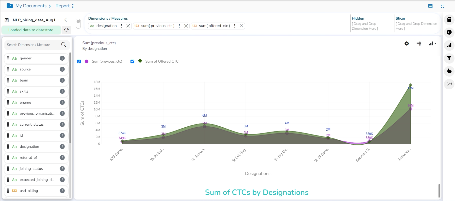
Area chart
An area chart or area graph displays graphically quantitative data. It is based on the line chart. The primary use of area charts is to show trends over a period.
Check out the illustration to understand Area Chart properties.
The best situation to use an Area Chart: To showcase data that depicts a time-series relationship
Examples:
To view the sales of a manufacturer over a period.
To display the quarter-wise revenue growth of an organization.
Variations of this chart: Group and Stacked Area graphs.
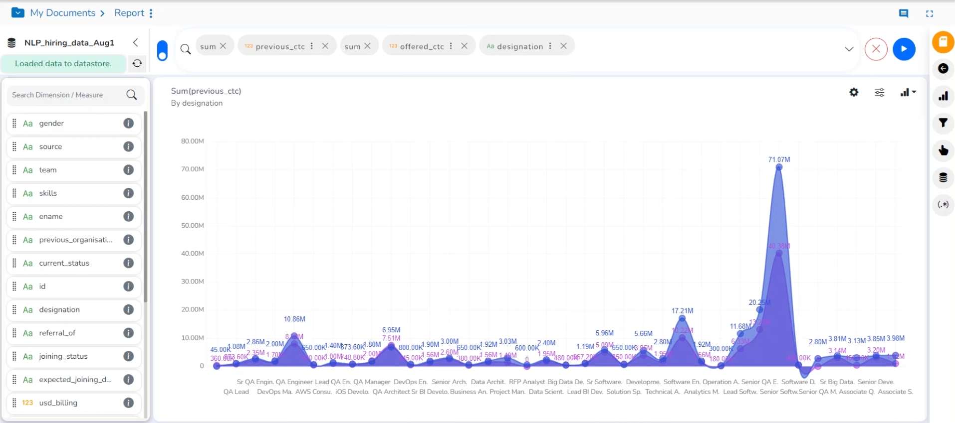
Properties
General Settings
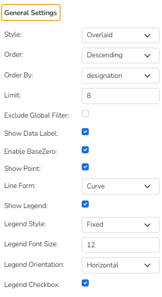
Style: Select a style to display the data (the provided choices for this field are: Overlaid, Stacked, 100%)
Order: Select a sequence for displaying information
None
Ascending
Descending
Manual Sort (Users can manually sort the dimensions by using the indicator signs)
By selecting an order (ascending or descending, users will be required to configure the following fields:
Order By- Select a value option from the drop-down menu to order the sequence of the data.
Limit- Set a number to display the requested data by this limit.
Exclude Global Filter: The view will be excluded from the Global Filter condition by putting a checkmark in the box.
Show Data Label: The data label is displayed using a checkmark in the given box.
Enable Base Zero: Base value gets presented from Zero using a checkmark in the given box.
Show Point: Enable the Show Point option using a checkmark in the given box.
Line Form: Select a line format from the drop-down menu (the provided choices for this field are Curve and Segment)
Show Legend: Displays legend by turning on the radio button. After enabling ‘Show Legend’, users need to select the following information:
Legend Style: Select one of the following options using the drop-down menu.
Fixed
Floating
The following fields appear when the selected Legend Style option is Fixed.
Legend Font Size: This option allows to increase or decrease the font size of the legend.
Legend Orientation: This option will be provided when the Show Legend option is enabled, and the selected Legend Style is Fixed. The users can choose an option from the given choices using the drop-down menu.
Vertical
Horizontal
Legend Checkbox: Enable this option by a checkmark to add the checkbox beside the Legend. It helps the users to customize the display of the data (The data for a legend value appears if a checkmark is used in the given checkbox. The data for the unchecked checkbox does not appear).
View Filter
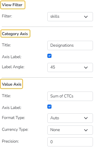
Filter: Select a filter condition using the drop-down menu.
Category Axis
Title: Provide a title for the axis.
Axis Label: Enable the category axis label by using a checkmark in the box.
Label Angle: Select a display angle for the axis label.
Value Axis
The Area chart contains only one Value Axis to be configured.
Title: Provide a title for the Primary Value Axis
Axis Label: Enable the Primary Value Axis label by using a checkmark in the box
Format Type: Select a desired format type from the drop-down menu (the provided options for this field are: None, Auto, Percent, Thousand, Lacs, Crore, Million, Billion, Trillion, Quadrillion).
Currency Type: Select a currency symbol to be displayed in the view (the provided options for this field are: None, Rupees, Euro, Pound, USD, Yen, Cent).
Precision: Set the after-decimal value (It displays up to 5 precision)
Insights
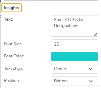
Text: Provide any information regarding the chart. If any digit or character is required to be highlighted, put it inside two asterisks. (E.g., *70%* or *skills*).
Font Size: Set/modify the Font Size of the Insights text.
Font Color: Select a Font color for the Insights Text.
Text align: There are three alignments to align the text.
Left
Right
Centre
Position: There are two options to position the text.
Bottom
Right
Bar chart
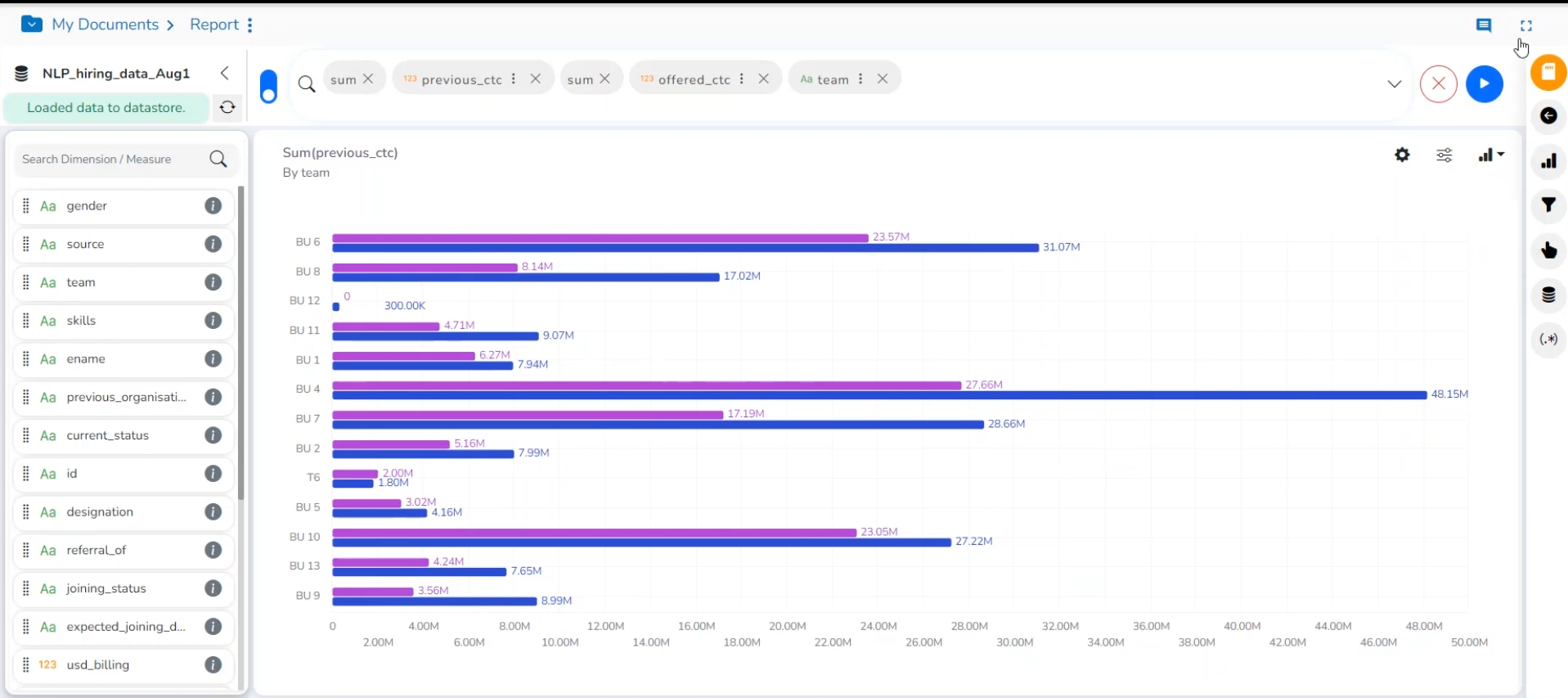
Bar Charts are useful for comparing classes, categories, or groups of data. They are one of the most commonly used chart types because they are simple to create and very easy to interpret.
Check out the illustration describing Bar chart properties.
The best situation to use a bar chart: When the data set is small, it would be more accessible to the end-user to interpret data. Observations can be performed over a period.
Examples:
Quarterly sales of an organization
The percentage of change in sales or revenue can be indicated
Variations of this chart:
Add color for quick insight: Displaying the bars with colors helps users pay immediate attention to the essential tasks.
Use bars side by side: Where comparison between multiple categories becomes easier instead of toggling between charts.
Properties
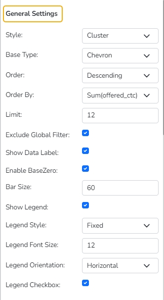
General Settings
Style: Select a style to display the data (the provided choices for this field are Cluster, Stack, Stack Percentage, Stack Overlaid)
Base Type: Select a base type of option from the drop-down (the provided choices for this field are: Plain, Rectangle, Chevron)
Order: Select a sequence for displaying information using the drop-down
None
Ascending
Descending
Manual Sort (The users need to sort the dimensions by using the indicator signs manually)
By selecting an order (ascending or descending, the user needs to configure the following fields:
Order By- Select a value option from the drop-down menu to order the sequence of the data.
Limit- Set a number to display the requested data by this limit.
Exclude Global Filter: The view gets excluded from the Global Filter condition by putting a checkmark in the box.
Show Data Label: The data label is displayed using a checkmark in the given box.
Enable Base Zero: Base value gets presented from Zero using a checkmark in the given box.
Show Legend: Displays legend by turning on the radio button. After enabling ‘Show Legend,’ users need to select the following information:
Legend Style: Select one of the following options using the drop-down menu.
Fixed
Floating
The following fields appear when the selected Legend Style option is Fixed.
Legend Font Size: This option allows to increase or decrease the font size of the legend.
Legend Orientation: This option will be provided when the Show Legend option is enabled, and the selected Legend Style is Fixed. The users can choose an option from the given choices using the drop-down menu.
Vertical
Horizontal
Legend Checkbox: Enable this option with a checkmark to add the checkbox beside the Legend. It helps the users to customize the display of the data (The data for a legend value appears if a checkmark is used in the given checkbox. The data for the unchecked checkbox does not appear).
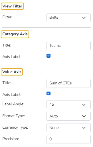
View Filter
Filter: Select a filter condition using the drop-down menu.
Category Axis
Title: Provide a title for the axis.
Axis Label: Enable the category axis label by turning the radio button on.
Value Axis
Title: Provide a title for the Primary Value Axis.
Axis Label: Enable the Primary Value Axis label using the radio button.
Format Type: Select a desired format type from the drop-down menu (the provided options for this field are: None, Auto, Percent, Thousand, Lacs, Crore, Million, Billion, Trillion, Quadrillion).
Currency Type: Select a currency symbol to be displayed in the view (the provided options for this field are: None, Rupees, Euro, Pound, USD, Yen, Cent).
Precision: Set the after-decimal value (It displays up to 5 precision).
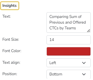
Insights
Text: Provide any information regarding the chart. If any digit or character is required to be highlighted, put it inside two asterisks. (E.g., *70%* or *skills*).
Font Size: Set/modify the Font Size of the Insights text.
Font Color: Select a Font color for the Insights Text.
Text align: There are three alignments to align the text.
Left
Right
Centre
Position: There are two options to position the text.
Bottom
Right
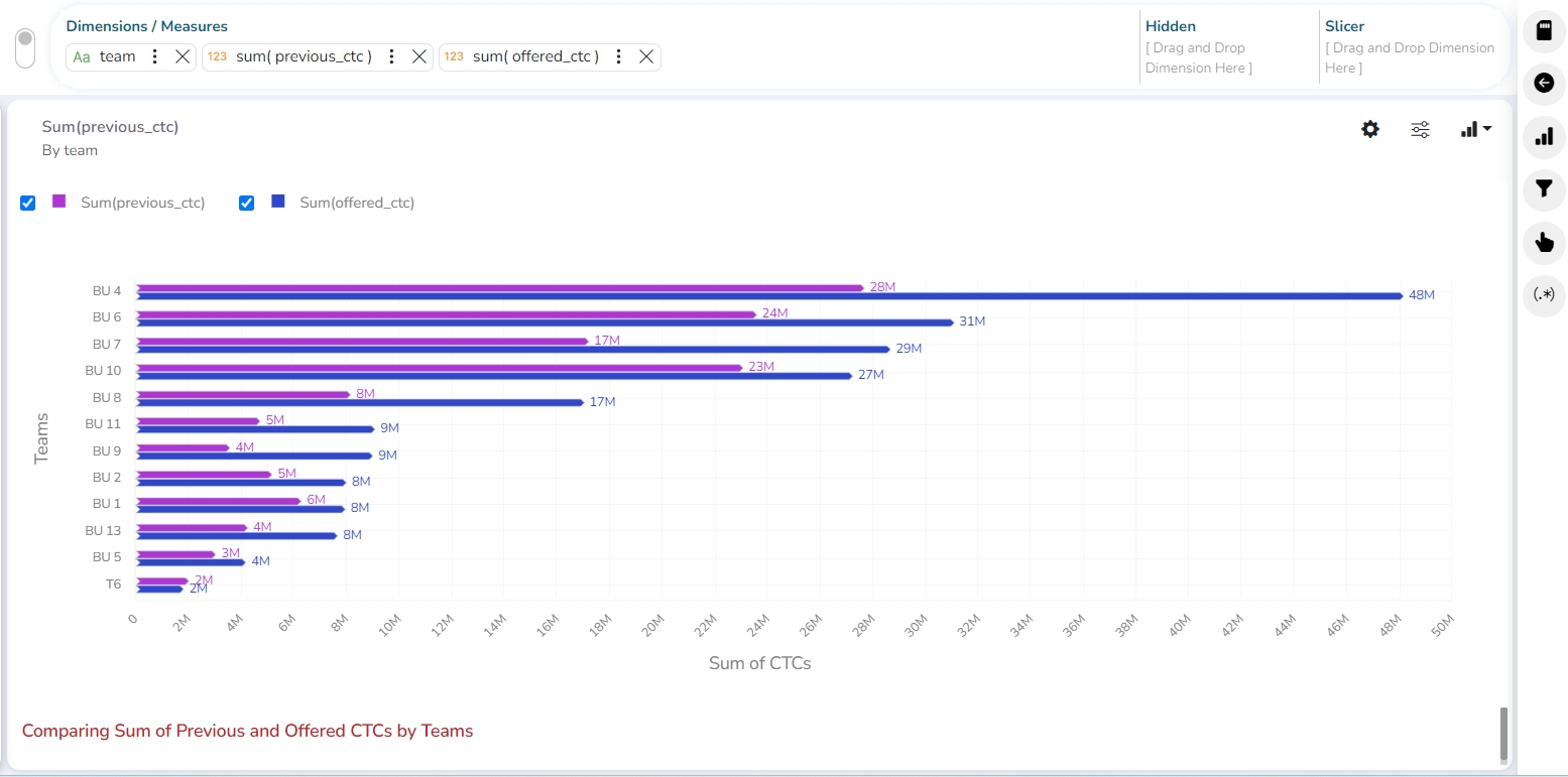
Modified View applying Bar chart properties
Bubble chart
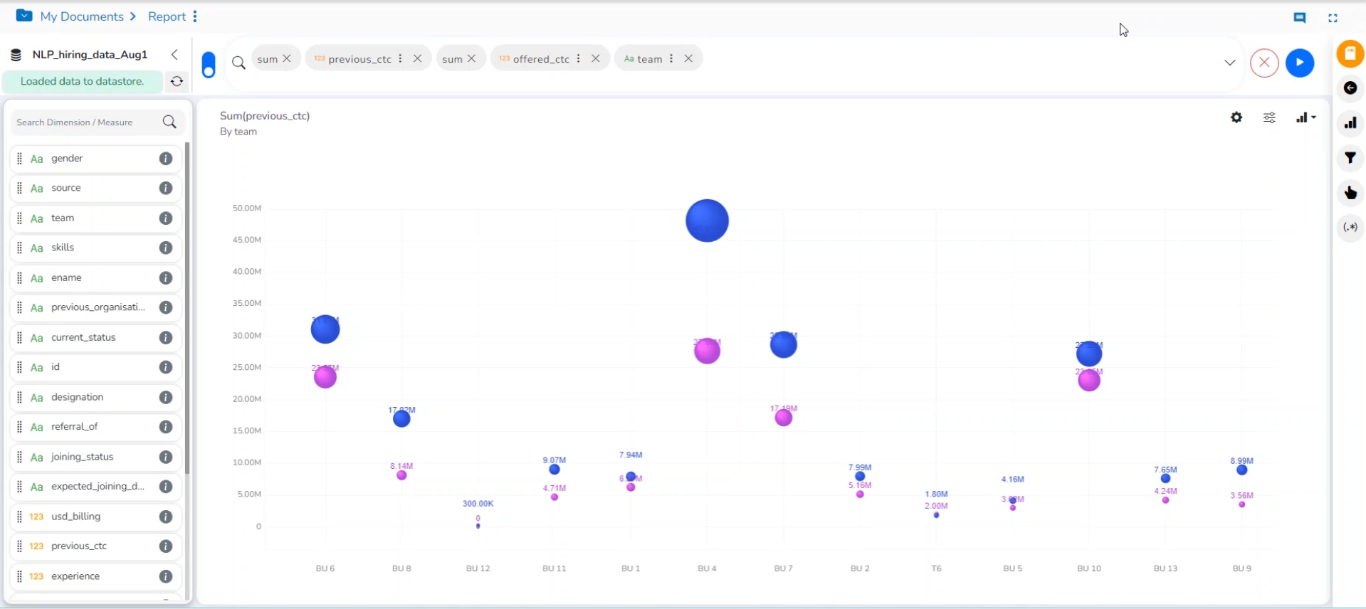
A Bubble chart visualizes the data set in three of four dimensions. The first two aspects are used as coordinates like the x-axis and y-axis. The remaining two are used to represent the color and size of the bubbles. Mostly used to plot financial data.
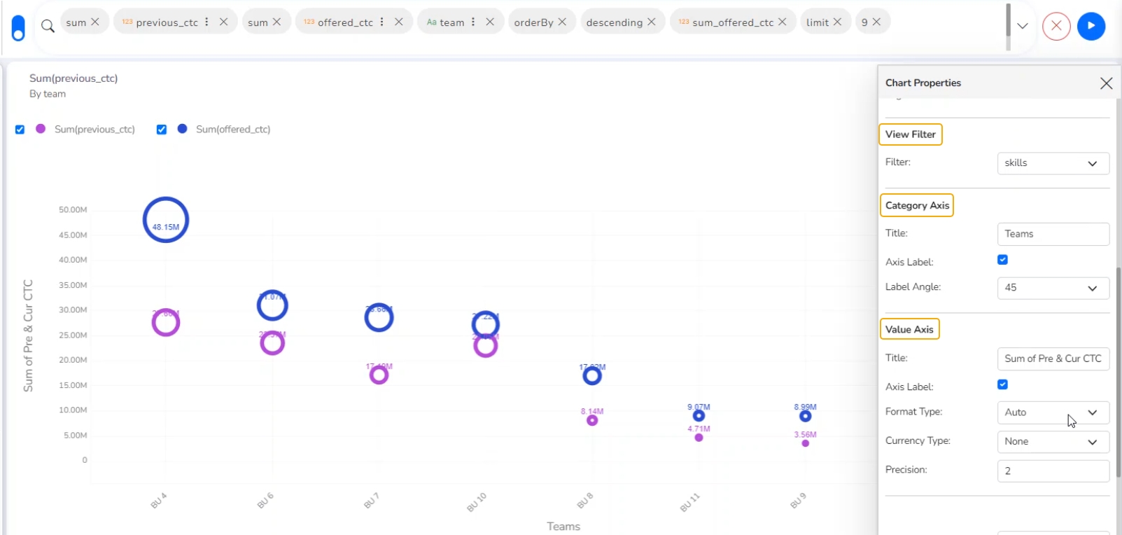
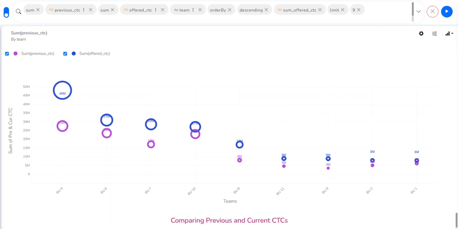
Check out the illustration on applying various Bubble chart properties to a View.
The best situation to use a Bubble Chart:
Three Data Series: Use a bubble chart for better representation when the data has three series each containing values. The values determine the sizes of the bubbles.
Properties
General Settings
Base Type: Select a base type to display the data (the provided choices for this field are: Plain, Gradient, and Ring)
Order: Select a sequence for displaying information
None
Ascending
Descending
Manual Sort (Users can manually sort the dimensions by using the indicator signs)
By selecting an order(ascending or descending, the user needs to configure the following fields:
Order By- Select a value option from the drop-down menu to order the sequence of the data.
Limit- Set a number to display the requested data by this limit.
Exclude Global Filter: The view gets excluded from the Global Filter condition by putting a checkmark in the box.
Show Data Label: The data label is displayed using a checkmark in the given box.
Enable Base Zero: Base value gets presented from Zero using a checkmark in the given box.
Show Legend: Displays legend by turning on the radio button. After enabling the Show Legend option, the users need to select the following information:
Legend Style: Select one of the following options using the drop-down menu.
Fixed
Floating
The following fields appear when the selected Legend Style option is Fixed.
Legend Font Size: This option allows to increase or decrease the font size of the legend.
Legend Orientation: This option appears when ‘Show Legend’ is enabled, and the selected ‘Legend Style’ is ‘Fixed.’ Users can choose an option from the given choices using the drop-down menu.
Vertical
Horizontal
Legend Checkbox: Enable this option using a checkmark to add the checkbox beside the Legend.

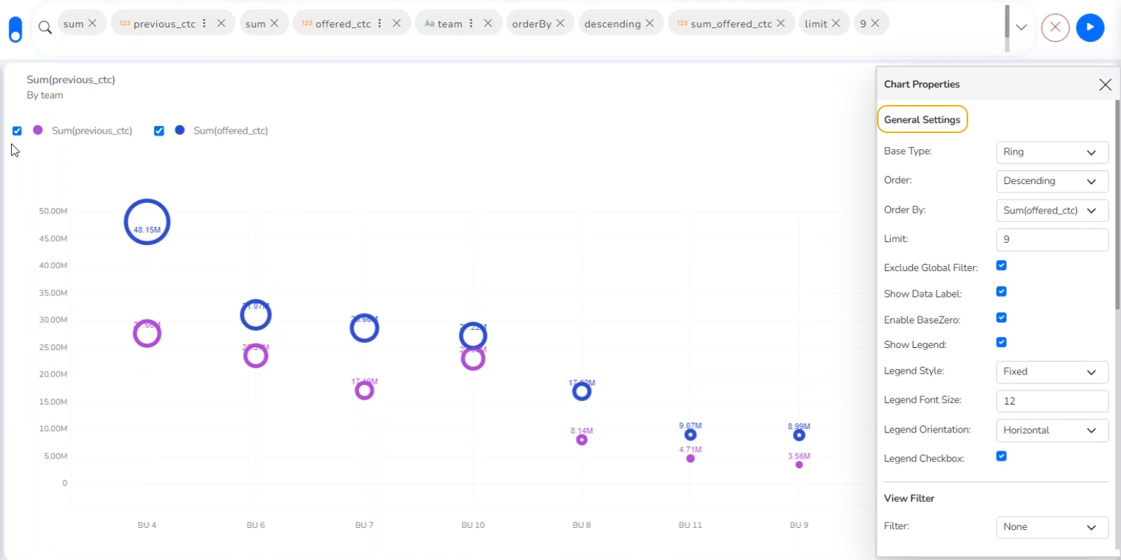
Appying General Settings
View Filter
Filter: Select a filter condition using the drop-down menu.
Category Axis
Title: Provide a title for the axis
Axis Label: Enable the category axis label using a checkmark in the box.
Label Angle: Select a display angle for the axis label.
Value Axis
Title: Provide a title for the Primary Value Axis.
Axis Label: Enable the Primary Value Axis label using a checkmark in the box.
Format Type: Select a desired format type from the drop-down menu (the provided options for this field are: None, Auto, Percent, Thousand, Lacs, Crore, Million, Billion, Trillion, Quadrillion).
Currency Type: Select a currency symbol to be displayed in the view (the provided options for this field are: None, Rupees, Euro, Pound, USD, Yen, Cent).
Precision: Set the after-decimal value (It displays up to 5 precision).
Insights
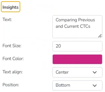
Text: Provide any information regarding the chart. If any digit or character is required to be highlighted, put it inside two asterisks. (E.g., *70%* or *skills*).
Font Size: Set/modify the Font Size of the Insights text.
Font Color: Select a Font color for the Insights Text.
Text align: There are three alignments to align the text.
Left
Right
Centre
Position: There are two options to position the text.
Bottom
Right
Column Stack chart
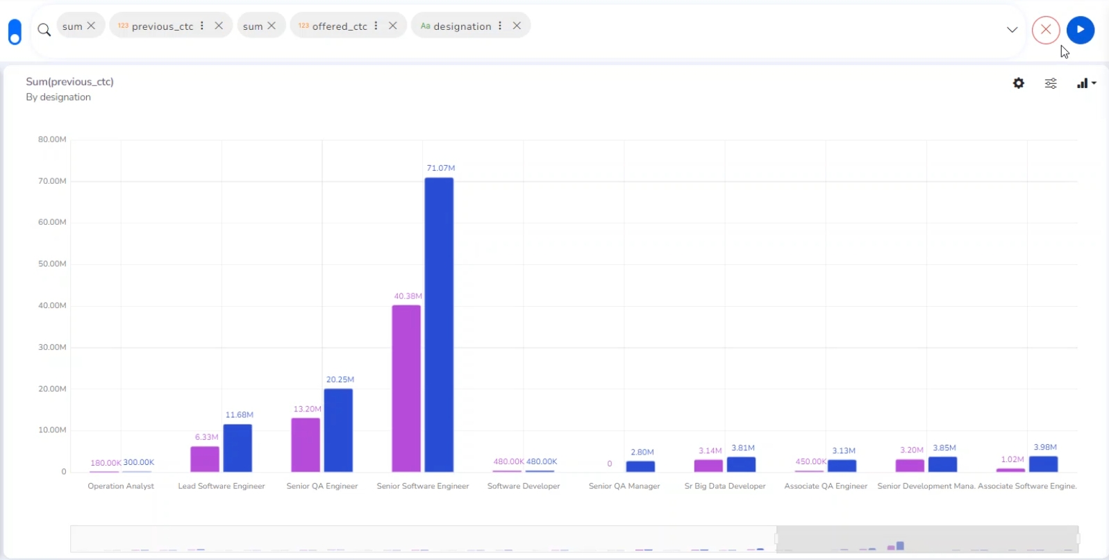
Column charts are used when users want to compare the values of individual data points with another. They help in bringing out the highs and lows of the data set.
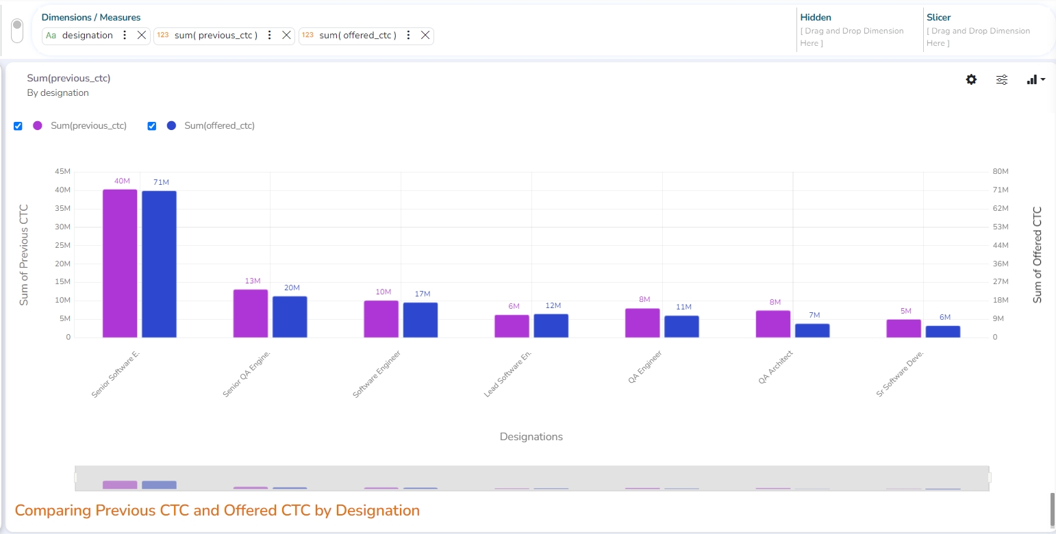
Check out the illustration on applying various Column Stack chart properties to a View.
Best Situation to use Column charts: Column charts are suitable for displaying data sets with negative values
Example: To find the best and worst performers in an organization
Variations of this chart
Use stacked Column charts: Where multiple categories can be clubbed together on top of each other, which makes addressing numerous questions easier.
Use columns side by side: Where comparison between multiple categories becomes easier instead of toggling between charts.
Add color for quick insight: Displaying the columns with colors help users pay immediate attention to the essential tasks.
Properties
General Settings
Style: Select a style to display the data (the provided choices for this field are: Cluster, Stack, Stack Percentage, Stack Overlaid)
Order: Select a sequence for displaying information
None
Ascending
Descending
Manual Sort (Users need to sort the dimensions by using the indicator signs manually)
By selecting an order (ascending or descending), the user needs to configure the following fields:
Order By- Select a value option from the drop-down menu to order the data sequence.
Limit- Set a number to display the requested data by this limit.
Exclude Global Filter: The view gets excluded from the Global Filter condition by putting a checkmark in the box.
Show Data Label: The data label is displayed using a checkmark in the given box.
Enable Base Zero: Base value gets presented from Zero by putting a checkmark in the given box.
Show Legend: Displays legend by turning on the radio button. After enabling ‘Show Legend,’ users need to select the following information:
Legend Style: Select one of the following options using the drop-down menu.
Fixed
Floating
The following fields appear when the selected Legend Style option is Fixed.
Legend Font Size: This option allows to increase or decrease the font size of the legend.
Legend Orientation: This option appears when ‘Show Legend’ is enabled, and the selected ‘Legend Style’ is Fixed. Users need to select an option from the given choices using the drop-down menu.
Vertical
Horizontal
Legend Checkbox: Enable this option with a checkmark to add the checkbox beside the Legend.

Slider: Provide a checkmark in the box to enable the Slider.
Fixed Slider Range: Enable this option to fix the slider range.
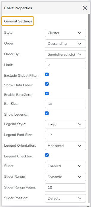
General Settiengs Properties
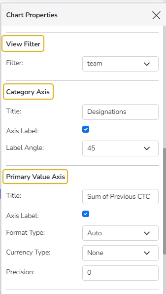
View Filter
Filter: Select a filter condition using the drop-down menu (E.g., the ‘team’ option is selected as a filter condition in the following image).
Category Axis
Title: Provide a title for the axis. (E.g., ‘Designation’ is the title for the category axis displayed in the following view).
Axis Label: Enable the category axis label by putting a checkmark in the box.
Label Angle: Select a display angle for the axis label. (the provided choices for this field are: 0, 45, and 90 angles).
Primary Value Axis
Title: Provide a title for the Primary Value Axis.
Axis Label: Enable the Primary Value Axis label by turning on the radio button.
Format Type: Select a desired format type from the drop-down menu (the provided options for this field are: None, Auto, Percent, Thousand, Lacs, Crore, Million, Billion, Trillion, Quadrillion).
Currency Type: Select a currency symbol to be displayed in the view (the provided options for this field are: None, Rupees, Euro, Pound, USD, Yen, Cent).
Precision: Set the after-decimal value (It displays up to 5 precision).
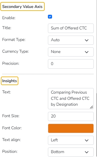
Secondary Value Axis
Properties for the Secondary Value Axis are displayed when two measures are dragged on the canvas.
Enable: Put a checkmark in the box to enable the Secondary Value Axis.
Title: Provide a title for the Secondary Value Axis.
Format Type: Select a desired format type from the drop-down menu (the provided options for this field are: None, Auto, Percent, Thousand, Lacs, Crore, Million, Billion, Trillion, Quadrillion).
Currency Type: Select a currency symbol to be displayed in the view (the provided options for this field are: None, Rupees, Euro, Pound, USD, Yen, Cent).
Insights
Text: Provide any information regarding the chart. If any digit or character is required to be highlighted, put it inside two asterisks. (E.g., *70%* or *skills*).
Font Size: Set/modify the Font Size of the Insights text.
Font Color: Select a Font color for the Insights Text.
Text align: There are three alignments to align the text.
Left
Right
Centre
Position: There are two options to position the text.
Bottom
Right
Line chart
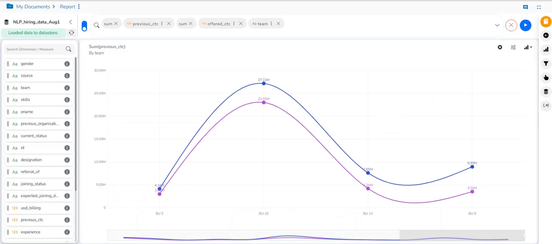
The line chart connects individual numeric data points to create a sequence of values. They are primarily used to display trends over a period.
Check out the illustration on applying Line chart properties to View.
Best Situation to use Line Charts: View trends in data over a period
Examples: To indicate increasing revenue or varying stock price
Variations of this chart
Mixed Chart- Combine a line graph with column charts to provide visual cues for further investigation
Example: A column chart representing the numeric score of students combined with the line chart corresponding proficiency score.
Properties
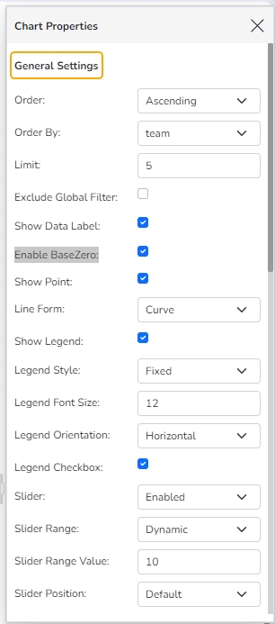
General Settings
Style: Select a style to display the data (the provided choices for this field are Cluster, Stack, Stack Percentage, Stack Overlaid)
Order: Select a sequence for displaying information
None (default option)
Ascending
Descending
Manual Sort (Users need to sort the dimensions by using the indicator signs manually)
(If the user selects the Manual Sort as the ordering option, they get an icon clicking which the Manual Sort window appears)
By selecting an order (ascending or descending), the user needs to configure the following fields:
Order By- Select a value option from the drop-down menu to order the sequence of the data.
Limit- Set a number to display the requested data by this limit.
Exclude Global Filter: The view gets excluded from the Global Filter condition by putting a checkmark in the box.
Show Data Label: The data label is displayed using a checkmark in the given box.
Enable Base Zero: Base value gets presented from Zero using a checkmark in the given box.
Show Point: Enable the Show Point option using a checkmark in the given box.
Line Form: Select a line format from the drop-down menu (the provided choices for this field are Curve and Segment)
Show Legend: Displays legend by turning on the radio button. After enabling ‘Show Legend,’ users need to select the following information:
Legend Style: Select one of the following options using the drop-down menu.
Fixed
Floating
The following fields appear when the selected Legend Style option is Fixed.
Legend Font Size: This option allows to increase or decrease the font size of the legend.
Legend Orientation: This option appears when ‘Show Legend’ is enabled, and the selected ‘Legend Style’ is ‘Fixed.’ Users need to select an option out of the given choices using the drop-down menu.
Vertical
Horizontal
Legend Checkbox: Enable this option with a checkmark to add the checkbox beside the Legend.
Slider: The slider is displayed by putting a checkmark in the box.
Slider Range: Select an option from Fixed or Dynamic
Slider Position: Select the slider position from the choices such as Default, left, central, and right.
General Settings
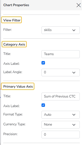
View Filter
Filter: Select a filter condition using the drop-down menu.
Category Axis
Title: Provide a title for the axis.
Axis Label: Enable the category axis label by using a checkmark in the box.
Label Angle: Select a display angle for the axis label.
Primary Value Axis
Title: Provide a title for the Primary Value Axis.
Axis Label: Enable the Primary Value Axis label by using a checkmark in the box.
Format Type: Select a desired format type from the drop-down menu (the provided options for this field are: None, Auto, Percent, Thousand, Lacs, Crore, Million, Billion, Trillion, Quadrillion).
Currency Type: Select a currency symbol to be displayed in the view (the provided options for this field are: None, Rupees, Euro, Pound, USD, Yen, Cent).
Precision: Set the after-decimal value (It displays up to 5 precision).
Secondary Value Axis
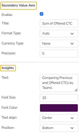
Properties for the Secondary Value Axis are displayed when two measures are dragged on the canvas.
Enable: Put a checkmark in the box to enable the Secondary Value Axis.
Title: Provide a title for the Secondary Value Axis.
Format Type: Select a desired format type from the drop-down menu (the provided options for this field are: None, Auto, Percent, Thousand, Lacs, Crore, Million, Billion, Trillion, Quadrillion).
Currency Type: Select a currency symbol to be displayed in the view (the provided options for this field are: None, Rupees, Euro, Pound, USD, Yen, Cent).
Precision: Set the after-decimal value (It displays up to 5 precision).
Insights
Text: Provide any information regarding the chart. If any digit or character is required to be highlighted, put it inside two asterisks. (E.g., *70%* or *skills*).
Font Size: Set/modify the Font Size of the Insights text.
Font Color: Select a Font color for the Insights Text.
Text align: There are three alignments to align the text.
Left
Right
Centre
Position: There are two options to position the text.
Bottom
Right
Secondary Value Axis & Insights
Annotation Settings
Annotation lines in a chart are used to highlight specific points or thresholds for easier analysis and interpretation. They typically represent key events, milestones, or significant values that help provide context or draw attention to important aspects of the data.
Check out the illustration on getting Annotation lines in the Line chart.
Navigate to the dimension and measure panel on the Design page.
Select the required dimensions and measures for the given space.
Click the Play button.

A View will be plotted based on the selected dimensions and measures.

Click the ellipsis for the dragged Dimension that contains the Date values.
A window for the dimension will open on the right side of the page.
The user can set or modify the dimension's Display Name, Date Interval, and Date Format.

Open the Chart Properties.
Go to the Annotation Property section.
Click the Select Annotation Type option to get the drop-down menu.
Select an option from the drop-down. The supported Annotation Types are File Upload and Data Sheet.
By selecting the File Upload option, the user will be redirected to upload a file.

Click the Choose File option.

Choose a file from the system and upload it.

The file name of the uploaded file will appear next to the Choose File option.
Configure the Annotation Property by adjusting the following fields:
Select Sheet: Choose the specific sheet to annotate from the drop-down menu.
Label Field: Specify which field will be used as the label for your annotations.
Annotation Field: Define the field that contains the annotation data.
Line Color: Select the color for annotation lines to ensure visibility and distinction.
Tooltip Title: Set a custom title for the tooltip that appears on hover.
Line Width: Determine the thickness of the annotation lines to suit your preferences.
Line Opacity: Adjust the transparency level of the lines for better visual integration with the chart.
Click the Show Annotation button.
Click the Annotation checkbox.
The Annotation line(s) will appear in the View.
The user can access the tooltip by hovering the cursor on the annotation line.

The user can access the tooltip by hovering the cursor on the annotation line.
All the dates for a common year will be plotted together in a column. All the dates for a common year will be plotted together in a column.

Threshold Settings
Show Threshold Line: Put the checkmark in the given box to display the Threshold line on the chart.
Threshold 1: Set a value to draw the first threshold line.


Pie chart
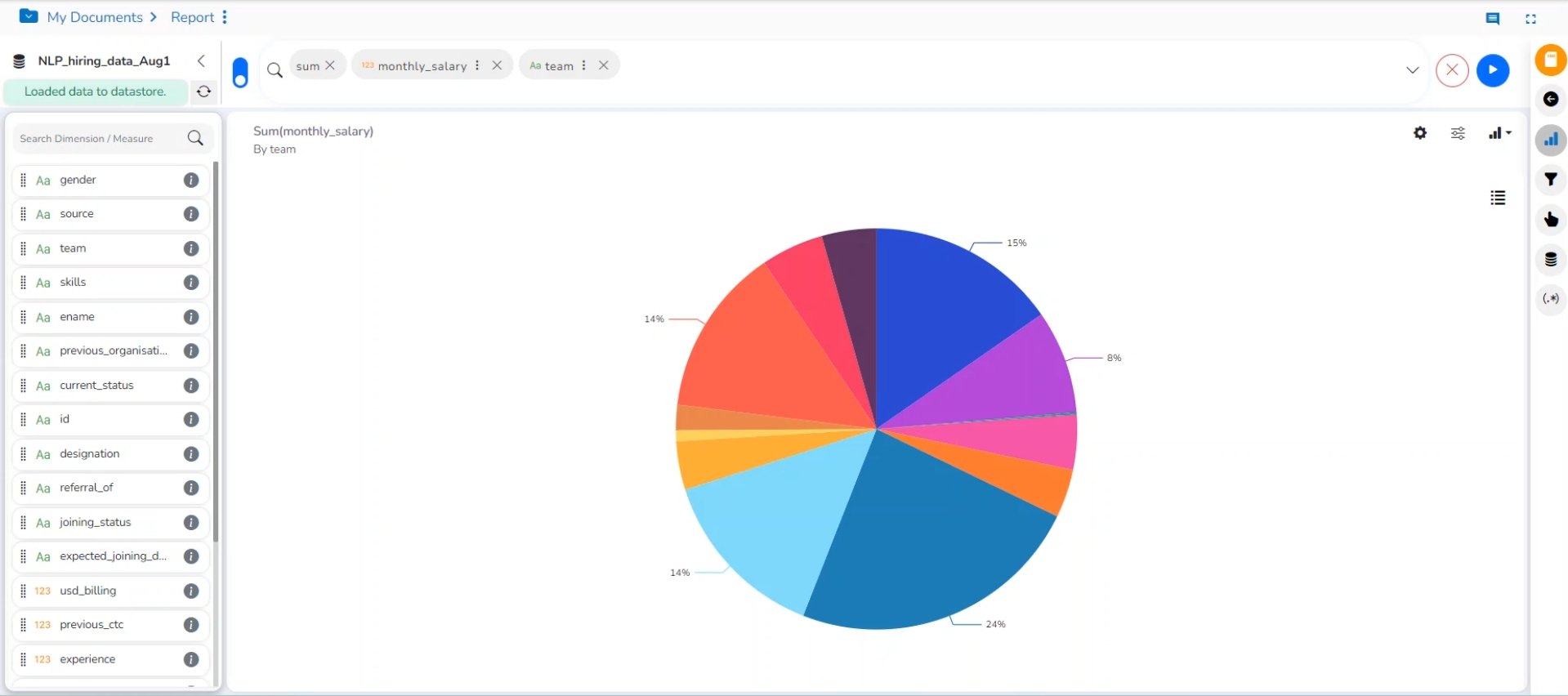
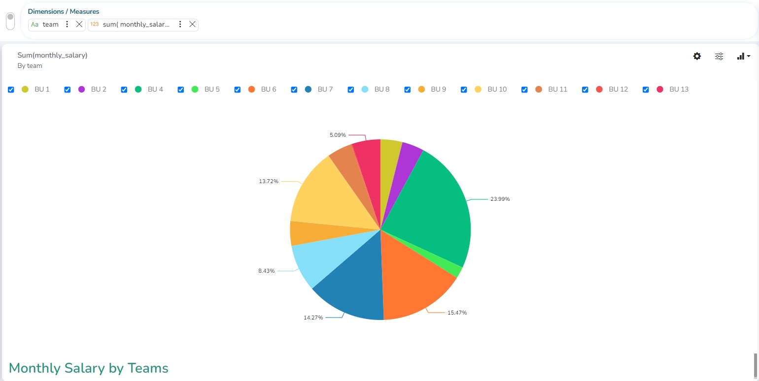
The most widely used chart to show proportions, percentages, and categorize information is the Pie Chart. It is mainly used for comparison where the users can quickly determine which category is most popular, and which is least.
Check out the illustration on PIe chart properties.
The best situation to use a Pie Chart: Mainly to compare categories available on the pie to find out top performers, and least performers. It is better for viewing if the category is limited to 6 or fewer.
Variations of this chart:
Pie-Doughnut: Doughnut charts are like Pie-chart if wished the user can switch from a pie chart to a doughnut chart.
Properties
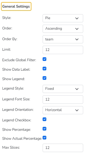
General Settings
Style: Select a style to display data
Pie
Doughnut
Semi Doughnut
Doughnut width: Set the width of the doughnut using this property field.
Order: Select a sequence for displaying data
None
Ascending
Descending
Manual Sort
By selecting an order (ascending or descending, users will be required to configure the following fields:
Order By- Select a value option from the drop-down menu to order the data sequence.
Limit- Set a number to display the requested data by this limit.
Exclude from Global Filter: The view will be excluded from the Global Filter condition by putting a checkmark in the box.
Show Data Label: The data label will be displayed using the radio button.
Show Actual Values: This option displays the actual values on the chart.
Show Legend: Displays legend by turning on the radio button. After enabling ‘Show Legend,’ users need to select the following information:
Legend Style: Select one of the following options using the drop-down menu.
Fixed
Floating
The following fields appear when the selected Legend Style option is Fixed.
Legend Font Size: This option allows to increase or decrease the font size of the legend.
Legend Orientation: This option appears when ‘Show Legend’ is enabled, and the selected ‘Legend Style’ is ‘Fixed.’ Users must choose an option from the given choices using the drop-down menu.
Vertical
Horizontal
Legend Checkbox: The user can enable or disable the display of a particular series in the Pie chart using the Legend Checkbox.
Use the following options to display the percentage for the series data.
Show Percentage
Show Actual Percentage
Max Slices: Set a number to limit the maximum displayed slices in the chart.
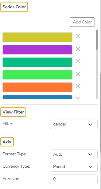
Series Color
The user can add a series color and modify the existing series color using this properties option.
View Filter
Filter: Select a filter condition using the drop-down menu.
Axis
Format Type: Select a desired format type from the drop-down menu (the provided options for this field are: None, Auto, Percent, Thousand, Lacs, Crore, Million, Billion, Trillion, Quadrillion).
Currency Type: Select a currency symbol to be displayed in the view (the provided options for this field are: None, Rupees, Euro, Pound, USD, Yen, Cent).
Precision: Set the after-decimal value (It will show up to 5 precision).
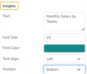
Insights
Text: Provide any information regarding the chart. If any digit or character is required to be highlighted, put it inside two asterisks. (E.g., *70%* or *skills*).
Font Size: Set/modify the Font Size of the Insights text.
Font Color: Select a Font color for the Insights Text.
Text align: There are three alignments to align the text.
Left
Right
Centre
Position: There are two options to position the text.
Bottom
Right
Scattered Plot chart
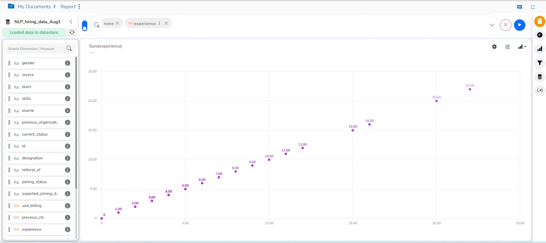
A Scatter plot is a two-dimensional data visualization that uses dots to represent the values obtained for two different variables - one plotted along the x-axis and the other plotted along the y-axis.
Check out the illustration on Scatter plot chart properties.
Best Situation to use Scatter Plot Chart: Scatter plots display a correlation between two variables (x and y-axis) to compare large numbers of data points without regard to time.
Variations of this Chart: Bubble Plot chart (3D), Density Plot (2D)
Properties
General Settings
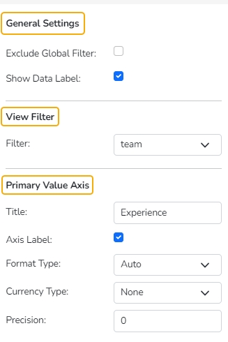
Exclude Global Filter: The view gets excluded from the Global Filter condition by putting a checkmark in the box.
Show Data Label: The data label is displayed using a checkmark in the given box.
View Filter
Filter: Select a filter condition using the drop-down menu.
Primary Value Axis
Title: Provide a title for the Primary Value Axis.
Axis Label: Enable the Primary Value Axis label using a checkmark in the box.
Format Type: Select a desired format type from the drop-down menu (the provided options for this field are: None, Auto, Percent, Thousand, Lacs, Crore, Million, Billion, Trillion, Quadrillion).
Currency Type: Select a currency symbol to be displayed in the view (the provided options for this field are: None, Rupees, Euro, Pound, USD, Yen, Cent).
Precision: Set the after-decimal value (It displays up to 5 precision).
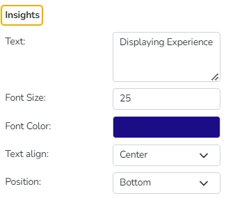
Insights
Text: Provide any information regarding the chart. If any digit or character is required to be highlighted, put it inside two asterisks. (E.g., *70%* or *skills*).
Font Size: Set/modify the Font Size of the Insights text.
Font Color: Select a Font color for the Insights Text.
Text align: There are three alignments to align the text.
Left
Right
Centre
Position: There are two options to position the text.
Bottom
Right
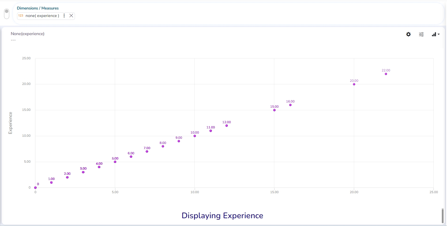
Modified Scatter Plot chart after applying various Insights
TreeMap chart
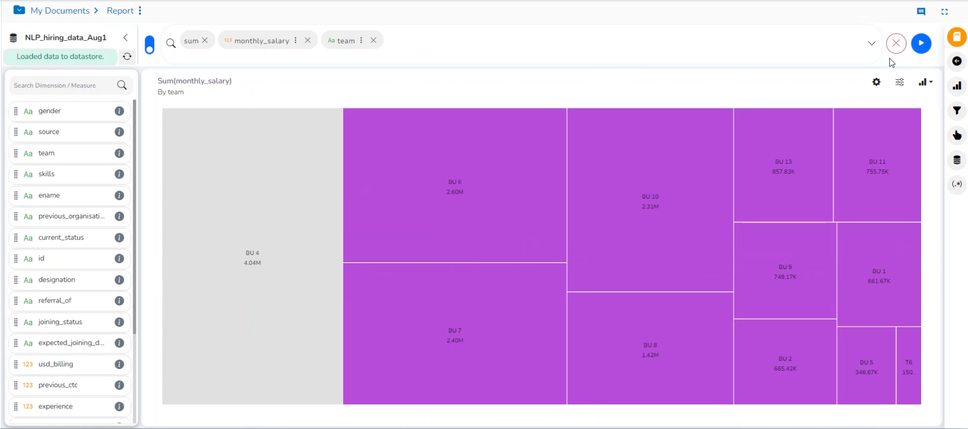
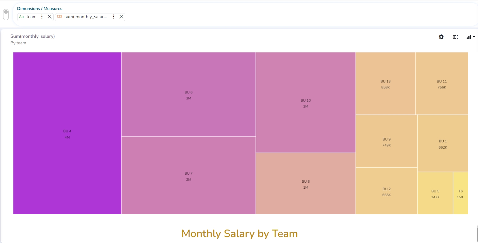
The Tree Map charts are mainly used to demonstrate vast amounts of classified data. It can be the best choice when users want to view all their hierarchical data at one time. Each rectangle represents a branch in a tree, and it shows how much data it comprises. The size and position of the boxes are based on the quantitative variable used for the chart. Patterns across the data can be identified using the size and color of the boxes.
Check out the illustration on TreeMap chart properties.
The best situation to use TreeMap: To view all the hierarchical data at one time.
Variations of this chart: Each rectangle can be colored differently so the user can understand by a glance how the hierarchical data is structured.
Properties
General Settings
Order: Select a sequence for displaying data
None
Ascending
Descending
Manual Sort
By selecting an order (ascending or descending), users will be required to configure the following fields:
Order By- Select a value option from the drop-down menu to order the sequence of the data
Limit- Set a number to display the requested data by this limit
Exclude Global Filter: The view gets excluded from the Global Filter condition by turning on the radio button
Show Data Label: The data label is displayed by turning on the radio button
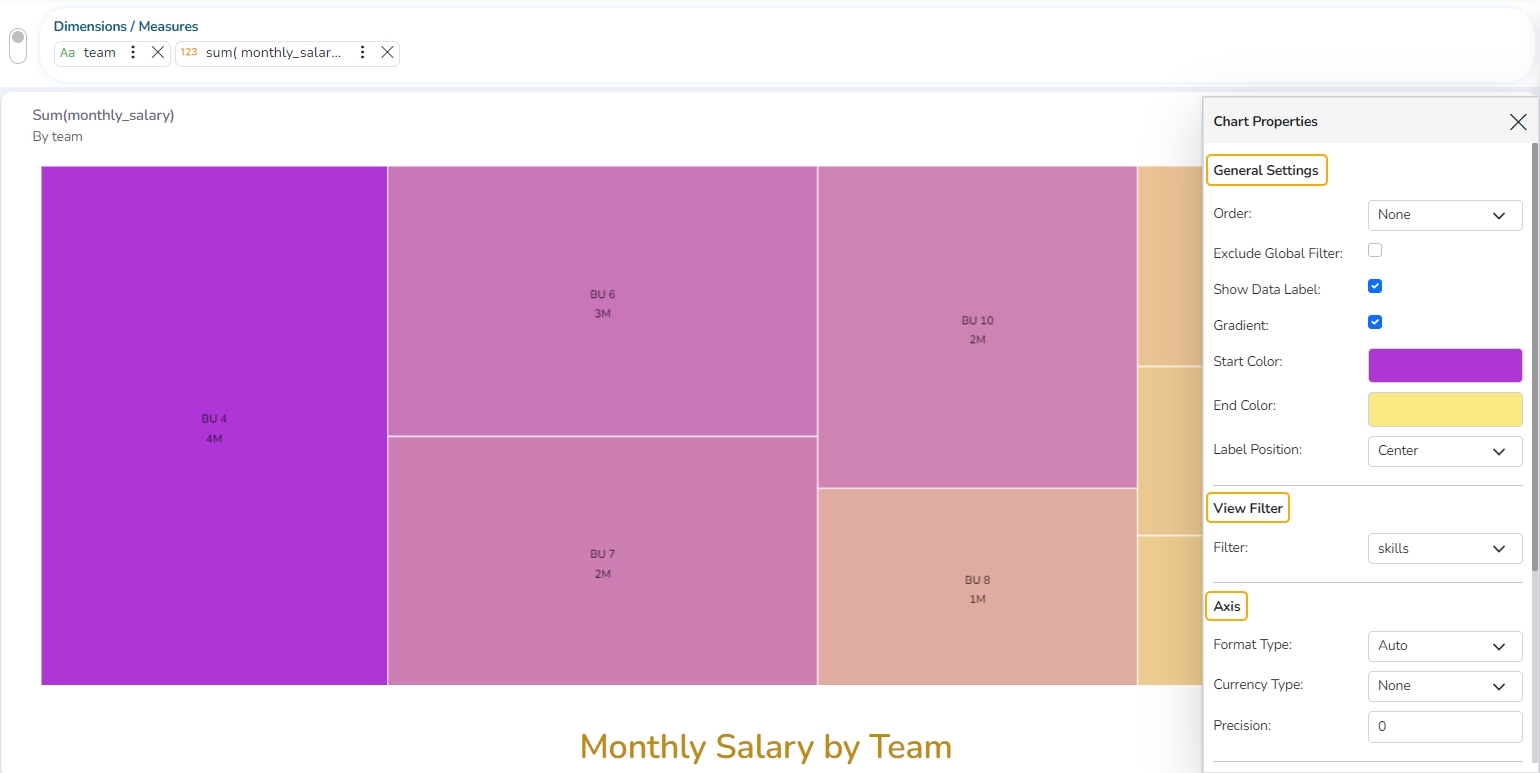
Gradient: Enable or disable the color gradient effect on the chart using the checkmark in the box.
By enabling the Gradient option, the user gets redirected to select Start Color and End Color from the respective menus.
The user gets redirected to select Color for the TreeMap sections by disabling the Gradient option.
View Filter
Filter: Select a filter condition using the drop-down menu (E.g., ‘Source’ is the selected filter condition in the following image).
Axis
Format Type: Select a desired format type from the drop-down menu (the provided options for this field are: None, Auto, Percent, Thousand, Lacs, Crore, Million, Billion, Trillion, Quadrillion).
Currency Type: Select a currency symbol to be displayed in the view (the provided options for this field are: None, Rupees, Euro, Pound, USD, Yen, Cent).
Precision: Set the after-decimal value (It displays up to 5 precision).
E.g., The image displays the Sum of Experience sliced based on Team.
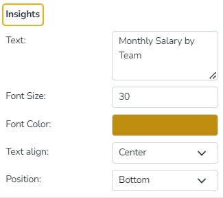
Insights
Text: Provide any information regarding the chart. If any digit or character is required to be highlighted, put it inside two asterisks. (E.g., *70%* or *skills*).
Font Size: Set/modify the Font Size of the Insights text.
Font Color: Select a Font color for the Insights Text.
Text align: There are three alignments to align the text.
Left
Right
Centre
Position: There are two options to position the text.
Bottom
Right
Insights Properties
Circumplex chart
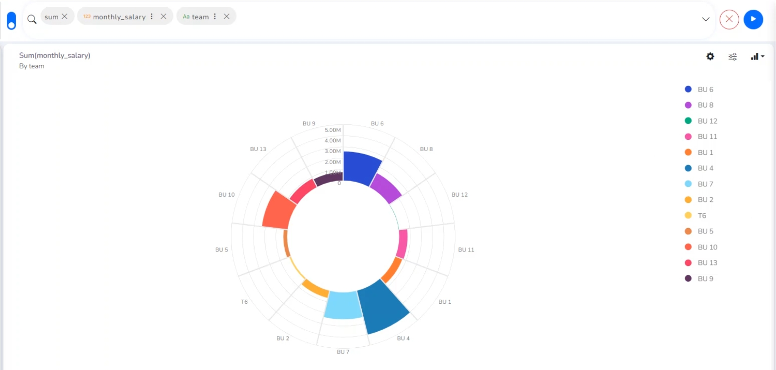
The Circumplex chart, also known as the Polar Area chart or Nightingale Rose chart, is a combination of the Bar chart and Pie chart. Each category may have more than one sub-category, where a section of the disc shows that each subcategory and each section has the same angle. The value of the corresponding sub-category is shown through the area. By changing the radius in a Circumplex chart, users can adjust the area of each segment (based on data).
Check out the illustration on Circumplex chart properties.
Best Situations to Use a Circumplex chart: To display manifold data in the form of a two-dimensional chart of three or more measurable variables represented on axes starting from the same point.
Properties
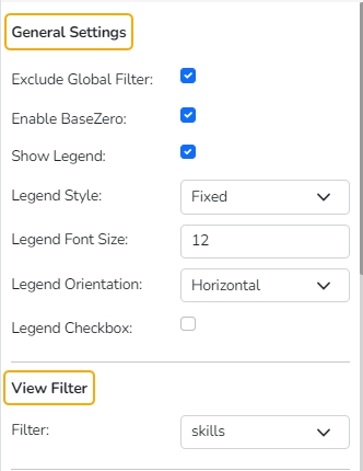
General Settings
Exclude Global Filter: The view gets excluded from the Global Filter condition by putting a checkmark in the box.
Series Color: Select the color for the series using the available color menu.
Enable Base Zero: Base gets presented from Zero using a checkmark in the provided box.
Clockwise Direction: the data values are displayed in a clockwise manner by enabling a checkmark in the given box.
Show Legend: Displays legend by turning on the radio button.
Legend Style: Select one of the following options using the drop-down menu.
Fixed
Floating
The following fields appear when the selected Legend Style option is Fixed.
Legend Font Size: This option allows to increase or decrease the font size of the legend.
Legend Orientation: This option appears when ‘Show Legend’ is enabled, and the selected ‘Legend Style’ is ‘Fixed.’ Users need to select an option out of the given choices using the drop-down menu.
Vertical
Horizontal
View Filter
Filter: Select a filter condition using the drop-down menu.
Series Color
Click the Add Color option to add a new series color.
Each added color field contains an auto-selected color to display a series.
The user can modify the auto-selected colors by using the color pallet.
Chart Properties
Clockwise Direction: Enable the clockwise direction to display the data values in the clockwise pattern in the chart.
Web Stroke Color: Select a color from the given menu.
Category Stroke Color: Select a color using the given menu.
Category Label: Enable the given box to display the category labels.
Doughnut Width: Set (increase/decrease) the width of the doughnut.
Web Type: Select an option from the drop-down menu.
Polygon
Circle
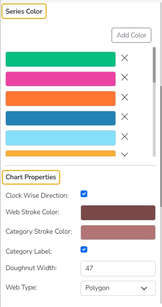
Series Color and Chart Properties
Value Axis
Axis Label: Enable the Primary Value Axis label using a checkmark in the box.
Format Type: Select a desired format type from the drop-down menu (the provided options for this field are: None, Auto, Percent, Thousand, Lacs, Crore, Million, Billion, Trillion, Quadrillion).
Currency Type: Select a currency symbol to be displayed in the view (the provided options for this field are: None, Rupees, Euro, Pound, USD, Yen, Cent).
Precision: Set the after-decimal value (It displays up to 5 precision).
Insights
Text: Provide any information regarding the chart. If any digit or character is required to be highlighted, put it inside two asterisks. (E.g., *70%* or *skills*).
Font Size: Set/modify the Font Size of the Insights text.
Font Color: Select a Font color for the Insights Text.
Text align: There are three alignments to align the text.
Left
Right
Centre
Position: There are two options to position the text.
Bottom
Right
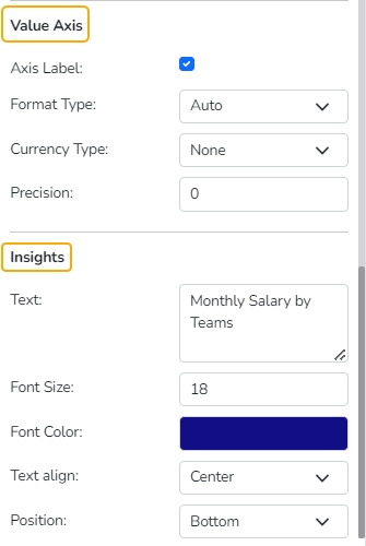
Value Axis & Insights 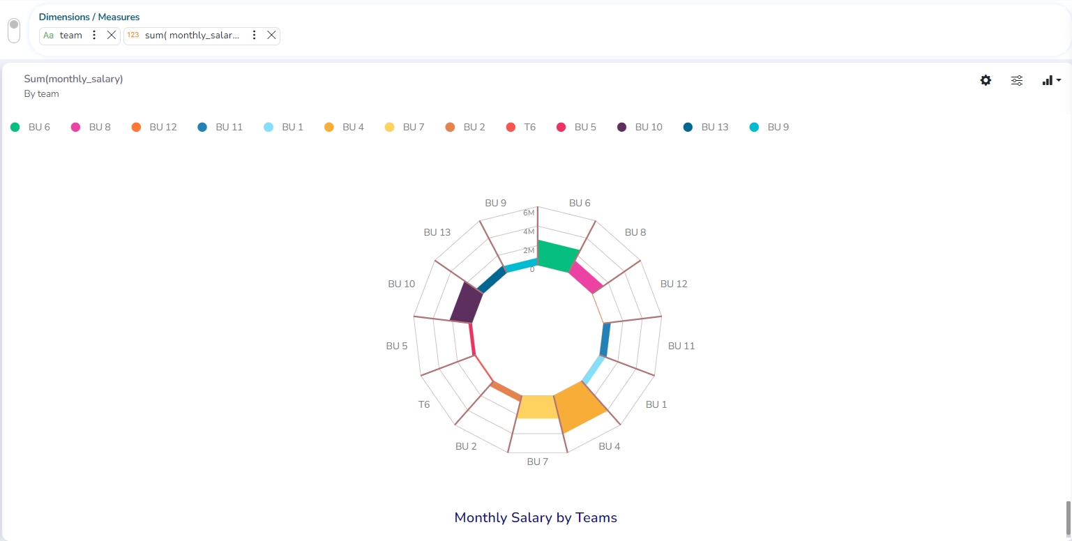
Modified View after applying various Circumplex chart Properties
Pareto chart
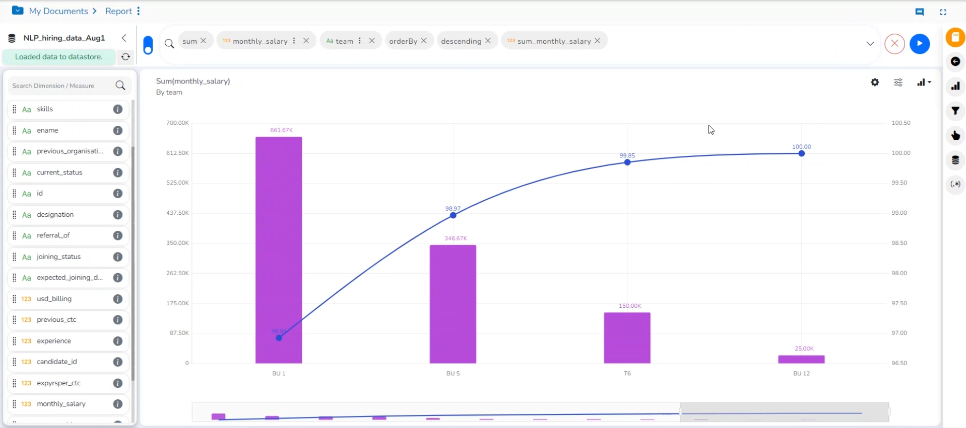
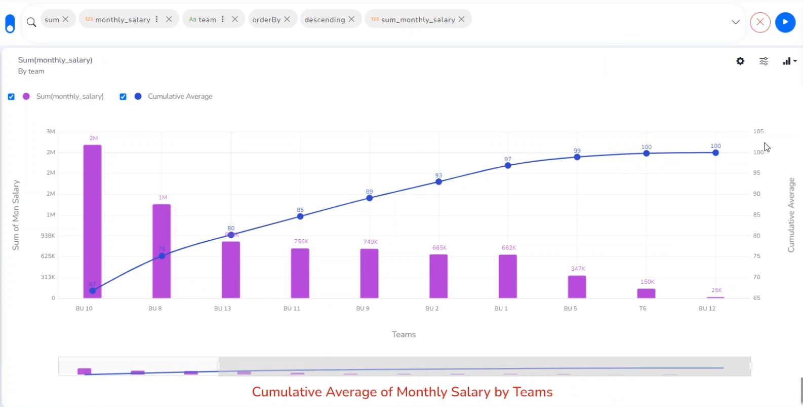
A Pareto chart is a type of chart that contains both bars and a line graph, where individual values are represented in descending order by bars, and the line represents the cumulative average.
Check out the illustration on the Pareto chart properties.
Best Situation to Use a Pareto Chart: To identify the most frequent defects, complaints, or any other factor that the users can count and categorize to focus on where improvement efforts make the most impact.
Variation of this Chart: Pareto Pyramid, Paired Pareto chart
Properties
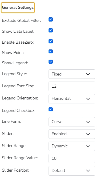
General Settings
Exclude Global Filter: The view gets excluded from the Global Filter condition by putting a checkmark in the box.
Show Data Label: The data label is displayed using a checkmark in the given box.
Enable Base Zero: Base gets presented from Zero using a checkmark in the provided box.
Slicer: the slicer is displayed by enabling a checkmark in the given box.
Show Point: Select show point for the line chart using the drop-down menu.
Show Legend: Use checkmark in the box to the display Legend
Legend Style: Select a style to display Legend.
Legend Font Size: Set the font size of the Legend.
Legend Orientation: Select a legend orientation option from the drop-down.
Legend Checkbox: Provide checkboxes to select and dis-select the Legend values.
Line Form: Select a line form using the drop-down menu.
Slider: Select an option to enable or disable slider.
Slider Range: Select a range type from the drop-down if the slider is enabled.
Slider Range Value: Set the range value for the slider.
Slider Position: Select an option from the drop-down menu to display the Slider position (Default, Left, Right).
Fixed Slider Range: Enable a checkmark in the given box to get a fixed slider range. After setting these properties, the user can't be able to scroll the slider.
View Filter
Filter: Select a filter condition using the drop-down menu.
Category Axis
Title: Provide a title for the axis.
Axis Label: Enable the category axis label using a checkmark in the box.
Label Angle: Select a display angle for the axis label.
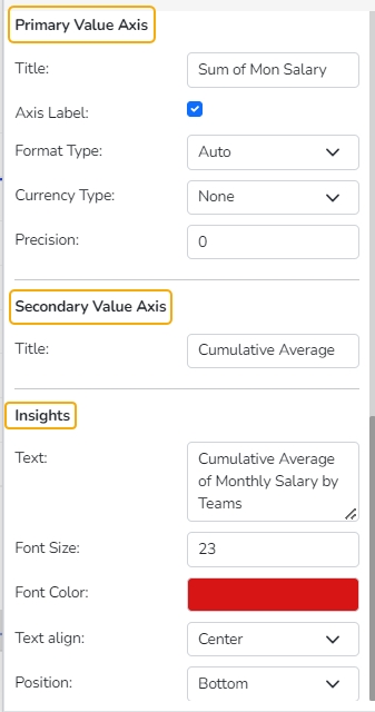
Primary Value Axis
Title: Provide a title for the Primary Value Axis
Axis Label: Enable the Primary Value Axis label using a checkmark in the box.
Format Type: Select a desired format type from the drop-down menu (the provided options for this field are: None, Auto, Percent, Thousand, Lacs, Crore, Million, Billion, Trillion, Quadrillion).
Currency Type: Select a currency symbol to be displayed in the view (the provided options for this field are: None, Rupees, Euro, Pound, USD, Yen, Cent).
Precision: Set the after-decimal value (It displays up to 5 precision).
Secondary Value Axis
Title: Provide a title for the Secondary Value Axis (by default it displays the cumulative average of the selected measure in the ascending order).
Insights
Text: Provide any information regarding the chart. If any digit or character is required to be highlighted, put it inside two asterisks. (E.g., *70%* or *skills*).
Font Size: Set/modify the Font Size of the Insights text.
Font Color: Select a Font color for the Insights Text.
Text align: There are three alignments to align the text.
Left
Right
Centre
Position: There are two options to position the text.
Bottom
Right
Semi Gauge
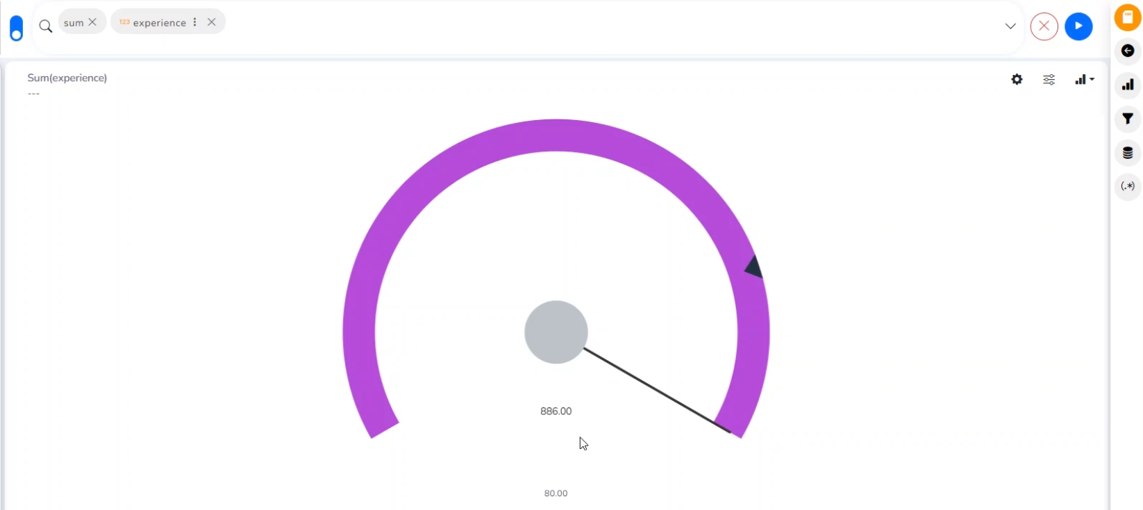
Check out the walk-through on how to set the Semi Gauge chart properties.
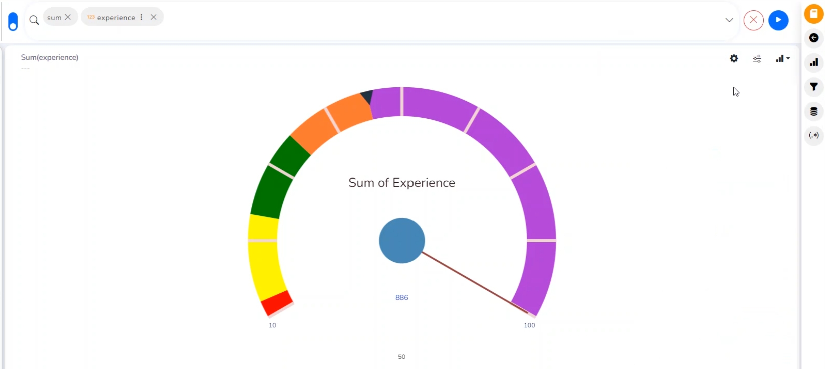
Semi-Gauge charts contain a semi-circle with the needle pointing at the target value. They indicate a specific dataset by utilizing a semi-circle that changes color to indicate whether the monitored data is within the defined limits. Users need to set boundaries (minimum and maximum values) for the gauge scale and various colors to indicate the predetermined ranges. The ‘Show Alert’ option has been provided to demonstrate the situation when the target values cross the set limits. Gauges are used in dashboards, real-time monitors, and reports. They can display Key Performance Indicators (KPIs), progress indicators, and quantity indicators.
Best Situation to use Semi-Gauge: To monitor any performance that contains predefined ranges
Examples: The overall performance of a student/class in an examination.
Properties
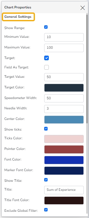
General Settings
Show Range: Use a checkmark in the given box to display ranges on the semi-gauge.
Minimum Value: Set a minimum value to be shown on the chart (It should be less than the maximum set value).
Maximum Value: Set a maximum value to be displayed on the chart (It should be more than the minimum set value).
Target: Enable the target by marking it in the checkbox.
Target Value: Set a target value to display the target in the semi-gauge.
Field as Target: Enable this option to select a Measure field to display the Target.
Aggregation: Select an aggregation type from the given drop-down menu.
Measure: Select a measure field from the drop-down menu to apply the target value.
Target Value: User-defined value to set a target.
Target Color: Set a target color.
Speedometer Width: Set the width of the speedometer through this option.
Needle Width: Set the needle width by using this option.
Center Color: Select a color for the center by using this option.
Show ticks: Use a checkmark in the given box to display ticks on the semi-gauge.
Ticks Color: Select a color for the tick marks shown on the semi-gauge through this option.
Pointer Color: Select a color for the pointer arrow using this option.
Font Color: Select a color for the font of the digit that displays the overall value by using this option.
Marker Font Color: Select a color for the marker fonts displayed on the semi gauge indicating the start and end limit.
Show Title: Use the checkbox with a tickmark to display the chart title.
Title: Insert a title for the chart.
Title Font Color: Select a title font color using this option.
Exclude Global Filter: The View will be excluded from the Global Filter condition by putting a checkmark in the box.
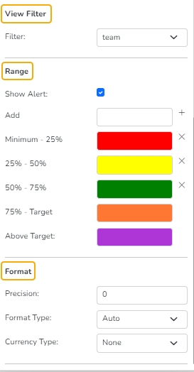
View Filter
Filter: Select a filter condition using the drop-down menu.
Range
Show Alert: Enable various ranges (in %) using a checkmark in the given checkbox.
Add: Use this option to insert a new range.
Value Color: Set a value color.
Base Color: Set a base color.
Format
Precision: Set the after decimal value (It can show up to 5 precision).
Format Type: Select a desired format type from the drop-down menu (the provided options for this field are: None, Auto, Percent, Thousand, Lacs, Crore, Million, Billion, Trillion, Quadrillion).
Currency Type: Select a currency symbol to be displayed in the View (the provided options for this field are: None, Rupees, Euro, Pound, USD, Yen, Cent).
KPI Tile
The KPI Tile displays the sum of quantity for ongoing evaluation.
Check out the given walk-through on how to set the KPI Tile chart properties.
Properties
General Settings
Label: Insert the Label for the displayed value.
Label Color: Select a label color from the menu.
Label Font Size: Set the font size for the label.
Value Color: Select a value color from the menu.
Value Font Size: Set the font size of the displayed value.
Exclude Global Filter: The View will be excluded from the Global Filter condition using a checkmark in the box.
View Filter
Filter: Select a view filter condition from the drop-down menu
Primary Value Axis
Format Type: Select a desired format type from the drop-down menu (the provided options for this field are: None, Auto, Percent, Thousand, Lacs, Crore, Million, Billion, Trillion, Quadrillion).
Currency Type: Select a currency symbol to be displayed in the view (the provided options for this field are: None, Rupees, Euro, Pound, USD, Yen, Cent).
Precision: Set the after-decimal value (It will show up to 5 precision)
E.g., the image displays the Sum of Monthly Salary in INR, where the selected Format is Thousand, and the Precision value is not selected.
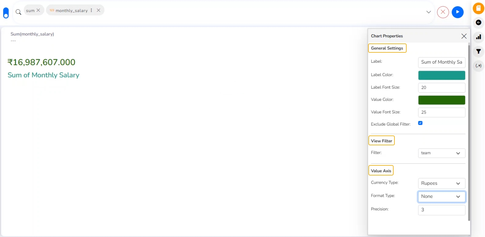
Modified KPI Tile and chart Properties
KPI Tile: Comparative Tile
Check out the given walk-through on how to set the KPI Tile Comparative Tile chart properties.
A KPI Comparative Chart is a type of data visualization that displays key performance indicators and their corresponding values comparatively. It is designed to showcase the performance of multiple KPIs side by side, allowing viewers to quickly compare their values and identify trends, patterns, and variations between different periods, categories, or entities.
Properties
The KPI Comparative Tile contains General Settings, a View Filter, and a Primary Value Axis like the KPI Tile, but it has additional properties such as showing a Trend, a Secondary Value Axis, and a Rule to insert a comparative approach.
Navigate to the Design Workspace.
Select the KPI Comparative Tile component from the list of charts.
Drag a Measure value to the workspace from the selected Data Store.
The selected value appears on the workspace.
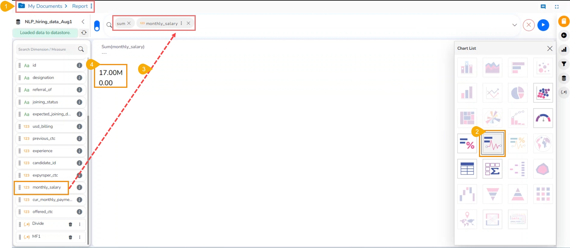
Click the Chart Properties icon.

The Chart Properties tab opens displaying the various properties for the KPI Comparative Tile chart. Set the required properties for the KPI Comparative tile using this tab.
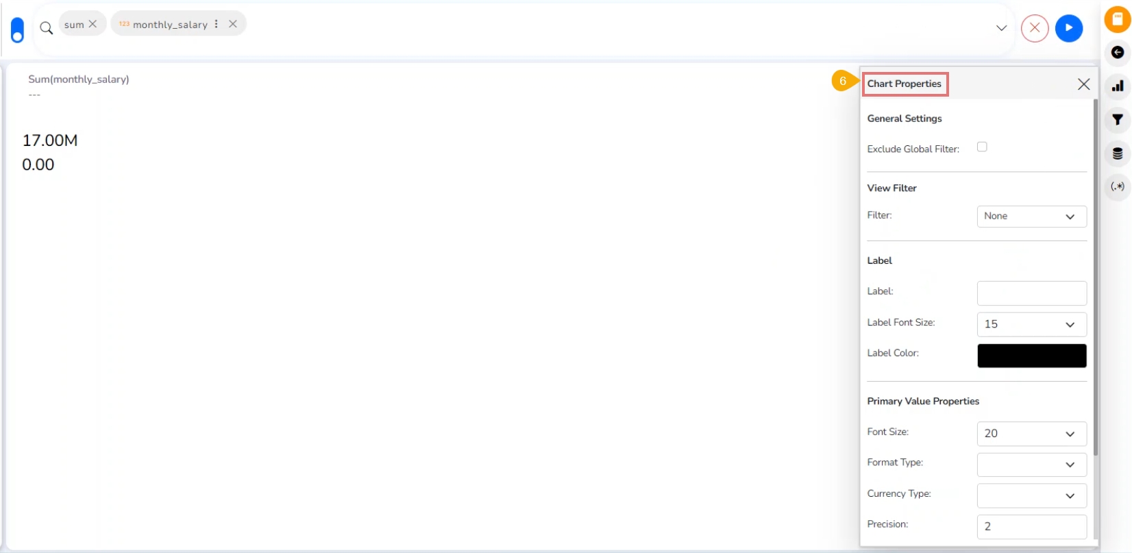
General Settings
Exclude Global Filter: Use a checkmark in the box to exclude the Global filter conditions.
View Filter
Filter: Choose a view filter condition from the drop-down menu.
Label
Label: Insert text to be displayed as Label.
Label Font Size: Select the font size for the displayed label using the drop-down menu.
Label Color: Select the Label color using the menu.
Primary Value Properties
Font Size: Select a font size from the drop-down menu.
Format Type: Select a desired format type from the drop-down menu (the provided options for this field are: None, Auto, Percent, Thousand, Lacs, Crore, Million, Billion, Trillion, Quadrillion).
Currency Type: Select a currency symbol to be displayed in the view (the provided options for this field are: None, Rupees, Euro, Pound, USD, Yen, Cent).
Precision: Set the after-decimal value (It displays up to 5 precision).
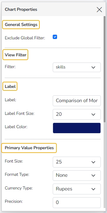
Secondary Value Properties
Provide the Secondary Value Properties to avail the second value for the comparison.
Secondary Value: Select a custom field from the drop-down menu.
Font Size: Select a font size from the drop-down menu.
Format Type: Select a desired format type from the drop-down menu (the provided options for this field are: None, Auto, Percent, Thousand, Lacs, Crore, Million, Billion, Trillion, Quadrillion).
Currency Type: Select a currency symbol to be displayed in the view (the provided options for this field are: None, Rupees, Euro, Pound, USD, Yen, Cent).
Precision: Set the after-decimal value (It displays up to 5 precision).
Trend
Navigate to the Trend properties option.
Show Trend: Use a checkmark in the box to display the trends.
Click the Rules icon.
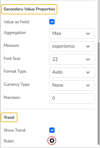
The Rules window opens prompting the user to set new rules for comparison.

Setting Rules
Follow the given steps to set Rules for comparison:
Once the user clicks on the Rules icon, the Rules window opens redirecting the users to set rules for displaying the comparative values.
Configure the required Rules fields, as shown in the following image:
Primary Operator: Select an option from the drop-down menu.
Operation: Select an operation from the drop-down menu to be applied as a condition on the selected Primary Operator.
Secondary Operator: Select an option from the drop-down menu.
Primary Color: Select a color for the primary value field.
Secondary Color: Select a color for the Secondary Value field.
Trend Direction: Select a trend direction using the drop-down menu.
Trend Color: Select a color for the trend icon from the menu.
Click the Apply option to apply the configured Rule.

The Primary and Secondary values are displayed in the selected colors with a Trend directed upward if the rule condition is met.

The user can set multiple Rules by configuring the required fields.
Click the Add icon.
Set another rule where the Primary Value is selected as Greater than or equal to the Secondary Value, and the Trend direction is downward.
Click the Apply option.

The KPI Comparative Tile reflects the crucial changes when the conditions are met as per the set rule.

KPI Tile: Sparkline
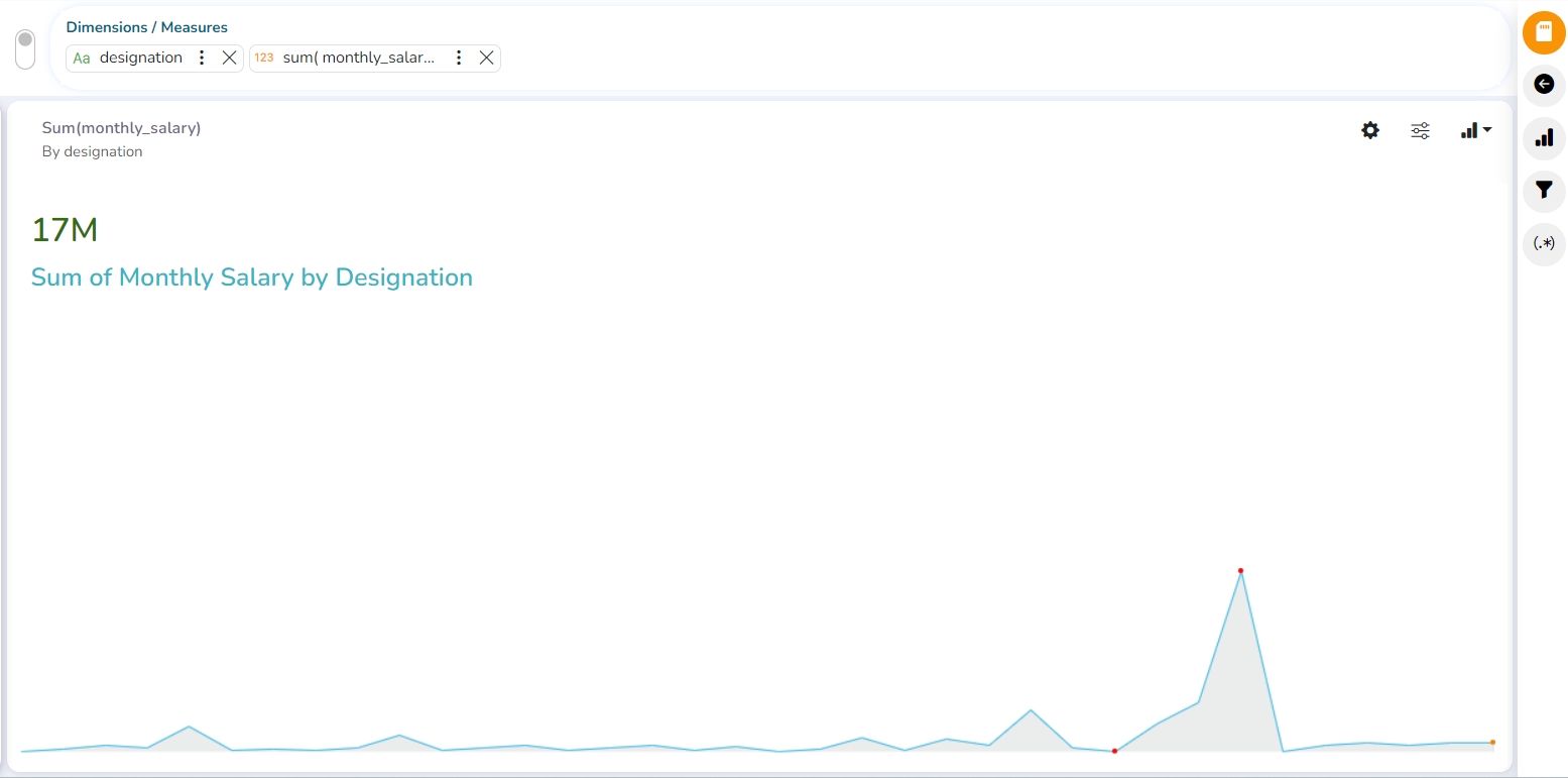
Check out the given walk-through on how to set the KPI Tile: Sparkline chart properties.
The KPI Sparkline combines KPI tile and Sparkline visualization in a single view. It facilitates the users to see KPIs and trends in the same view. The visualization type supports one Dimension and one measure. It does not support the 3rd dragged value and converts the second Dimension into a Measure if dragged on the canvas.
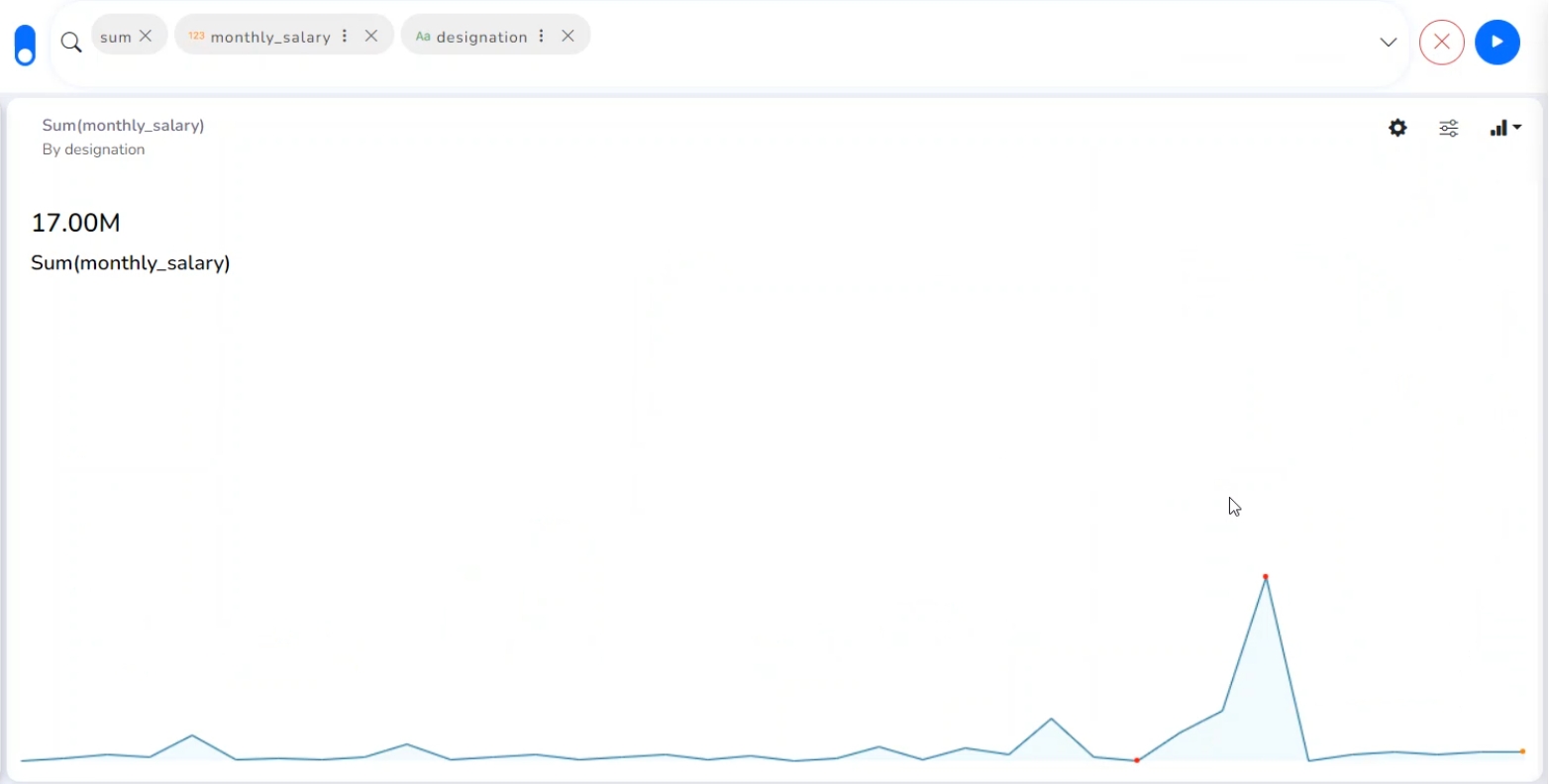
Properties
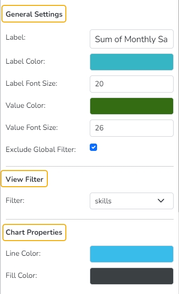
General Settings
Label: Provide a label name by using this field.
Label Color: Select a label color from the menu.
Label Font Size: Set the label font size.
Exclude Global Filter: Enabling this option by a checkmark excludes the selected view from the Global Filter condition.
View Filter
Filter: Select a filter condition to be applied to the view on the storyboard.
Chart Properties
Line Color: Select a line color for the Sparkline chart.
Fill Color: Select a fill color for the Sparkline chart.
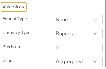
Value Properties
Format Type: Select a desired format type from the drop-down menu (the provided options for this field are: None, Auto, Percent, Thousand, Lacs, Crore, Million, Billion, Trillion, Quadrillion).
Currency Type: Select a currency symbol to be displayed in the view (the provided options for this field are: None, Rupees, Euro, Pound, USD, Yen, Cent).
Precision: Set the after-decimal value to be displayed.
Value: Select an option from the drop-down menu.
Aggregated
Last
Map
Check out the given walk-through on how to set the Map chart properties.
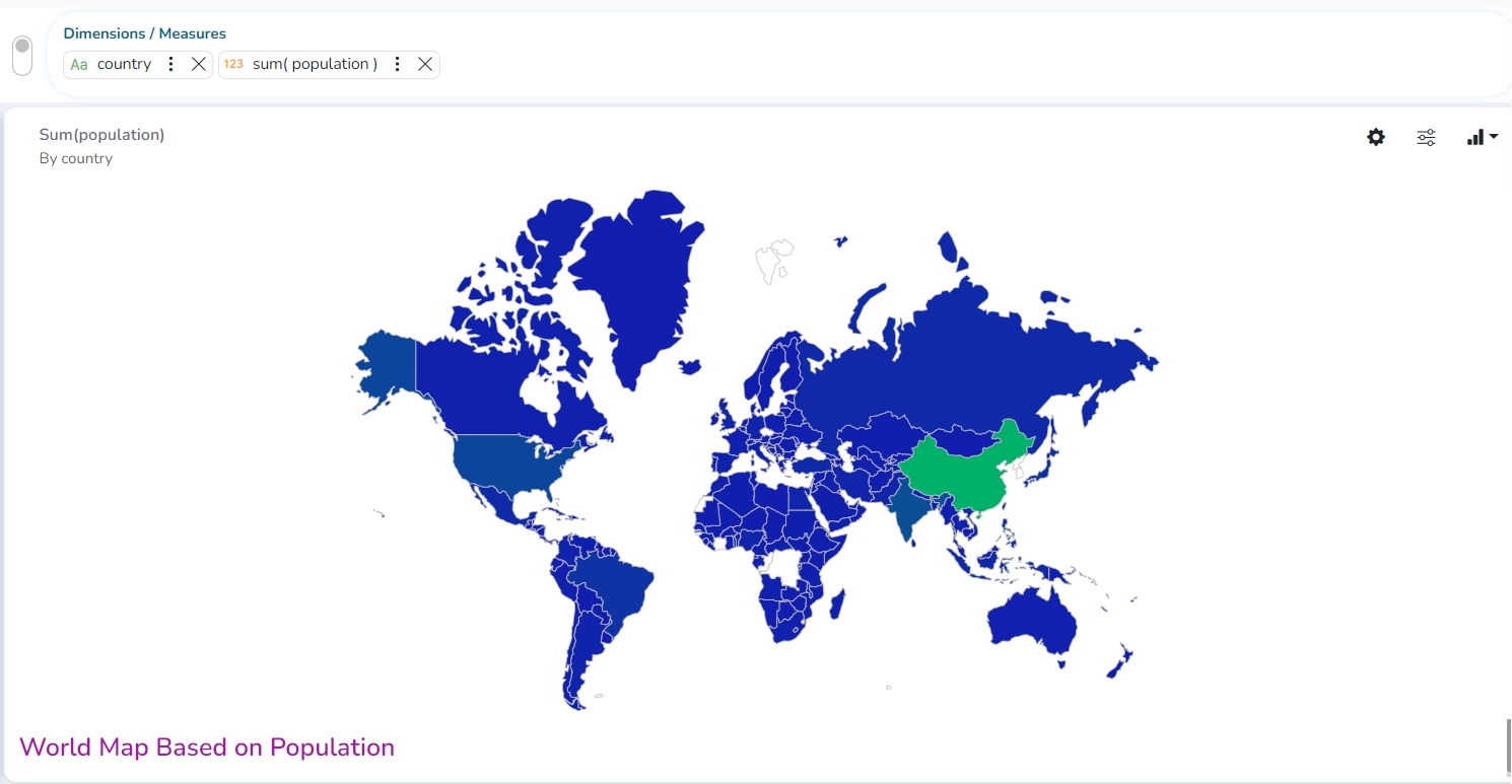
A Map chart allows the users to position their data in a geographical context using different data layers. Users can create a view based on the selected dimensions/measures representing data in the region. The designated area gets colored based on the data. Users have the provisions for changing the visualization.
Best Situation to Use Map: To represent any information in the geographical context.
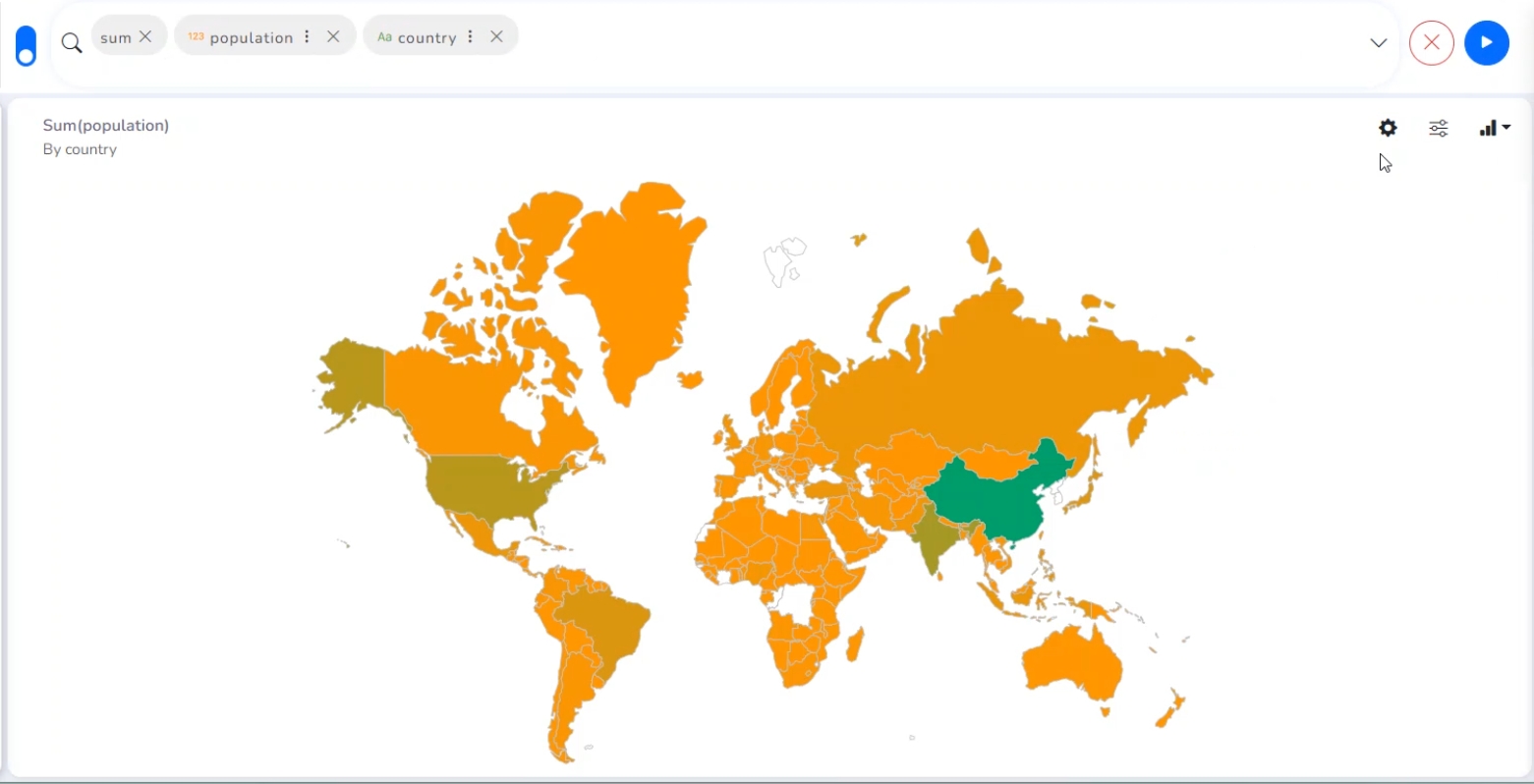
Properties
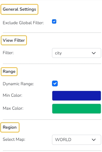
General Settings
Exclude Global Filter: Use a checkmark in the box to exclude the global filter condition.
View Filter
Filter: Select a filter condition to be applied to the view on the storyboard.
Range
Dynamic Range: Enable or disable the dynamic range.
Min Color: Select a color for the minimum value from the drop-down menu.
Max Color: Select a color for the maximum value from the drop-down menu.
Region
Select Map: Select a region using the drop-down menu.
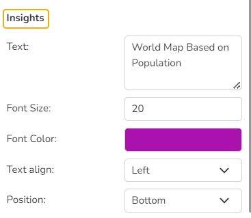
Insights
Text: Provide any information regarding the chart. If any digit or character is required to be highlighted, put it inside two asterisks. (E.g., *70%* or *skills*).
Font Size: Set/modify the Font Size of the Insights text.
Font Color: Select a Font color for the Insights Text.
Text align: There are three alignments to align the text.
Left
Right
Centre
Position: There are two options to position the text.
Bottom
Right
Changing Region
Based on the selected Region the displayed visualization gets changed.
Select a map using the Region drop-down menu.
The map of the selected region gets highlighted based on the chosen dimensions and measures.
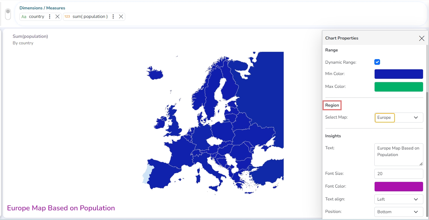
Map of Europe based on count of Population
Data Grid
Check out the given walk-through on how to set the Data Grid chart properties.
The users can see data in tabular format by selecting the Data Grid component from the chart list. Multiple values can be displayed via Grid visualization.
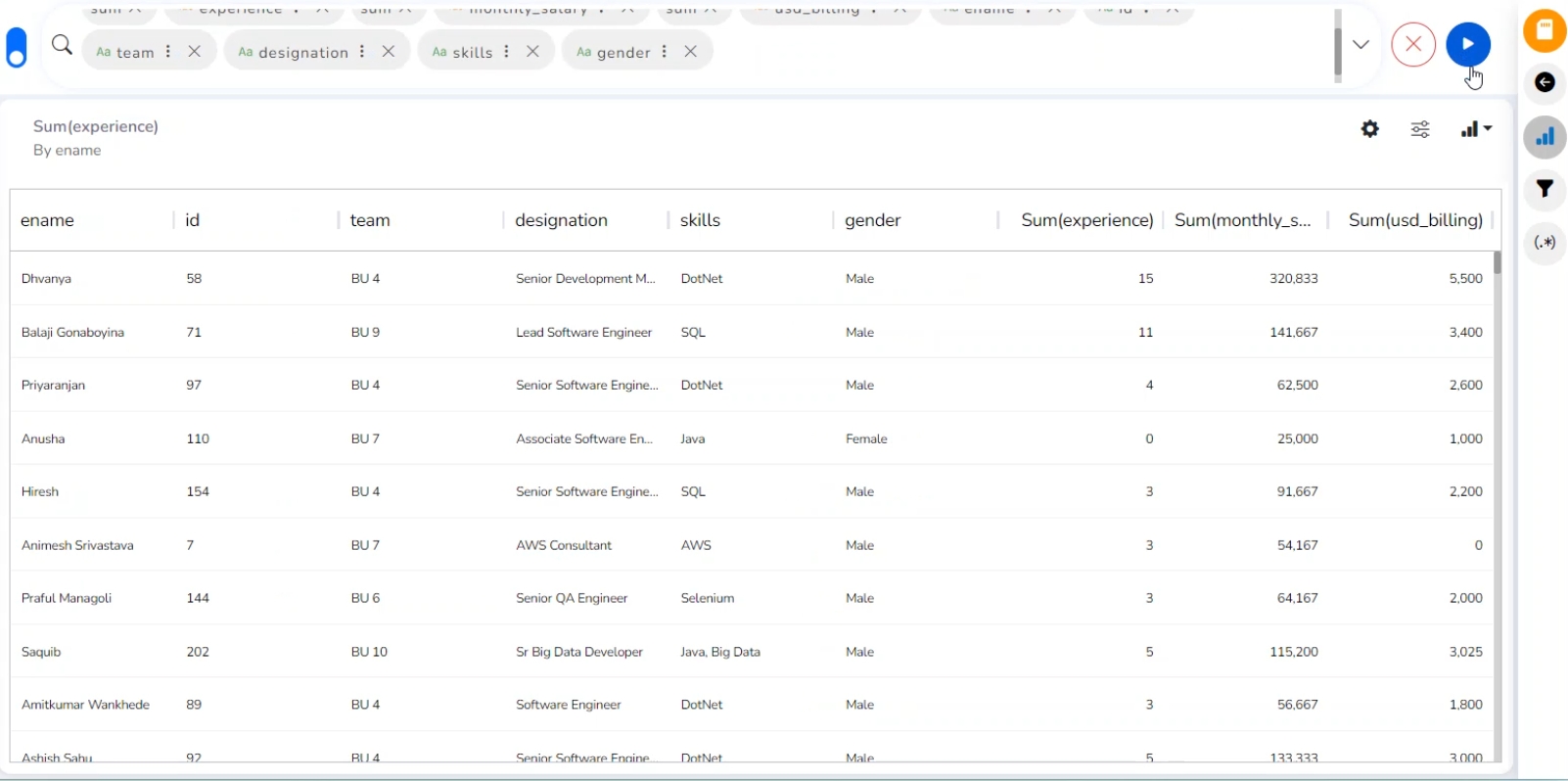
Properties
General Settings
Order: Users can order the displayed data by selecting an option from the given choices:
Ascending
Descending
None
Manual Sort (Users can manually sort the dimensions using the indicator signs).
By selecting an order, the user needs to configure the following fields:
Order By- Select a value option from the drop-down menu to order the data sequence.
Limit- Set a number to display the requested information by this limit.
Font Size: Select a font size from the given choices (Small, Medium, Large).
Bold: Use a checkmark in the box to display the fonts of the heading in Bold.
Italics: Use a checkmark in the box to apply the Italics style to display the heading.
Underline: Use a checkmark in the box to underline the headings of the displayed data columns.
Font Color: Select a font color using the menu.
Background Color: Select a background color using the menu.
Exclude from Global Filter: Use a checkmark in the given box to exclude the view from the Global filter condition.
View Filter
Filter: Select a filter condition from the drop-down menu.
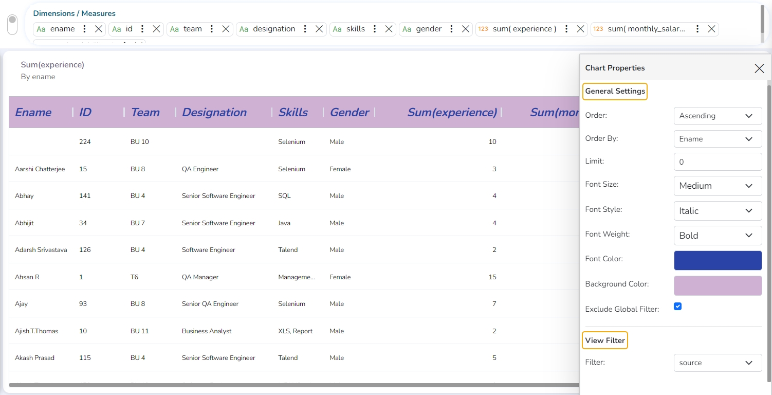
Category Properties of Grid
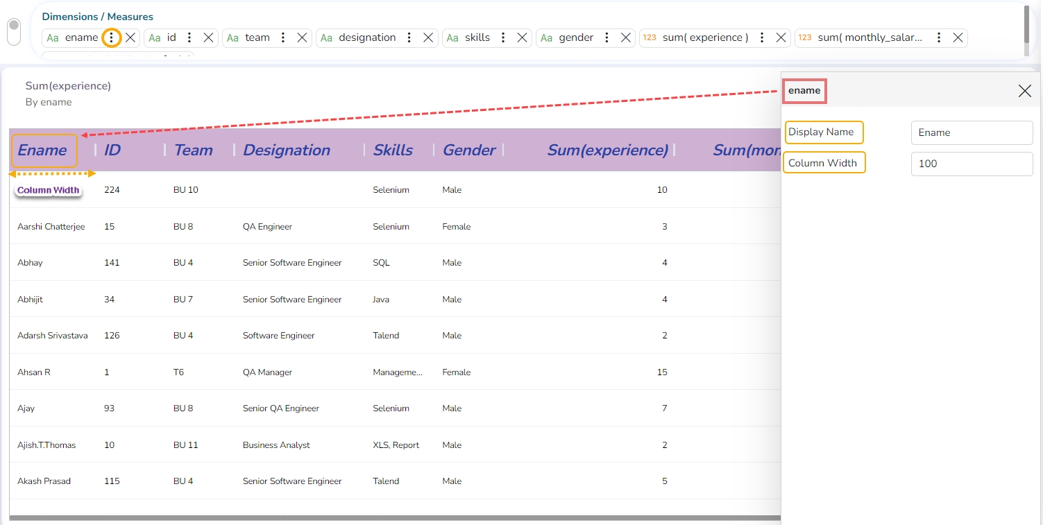
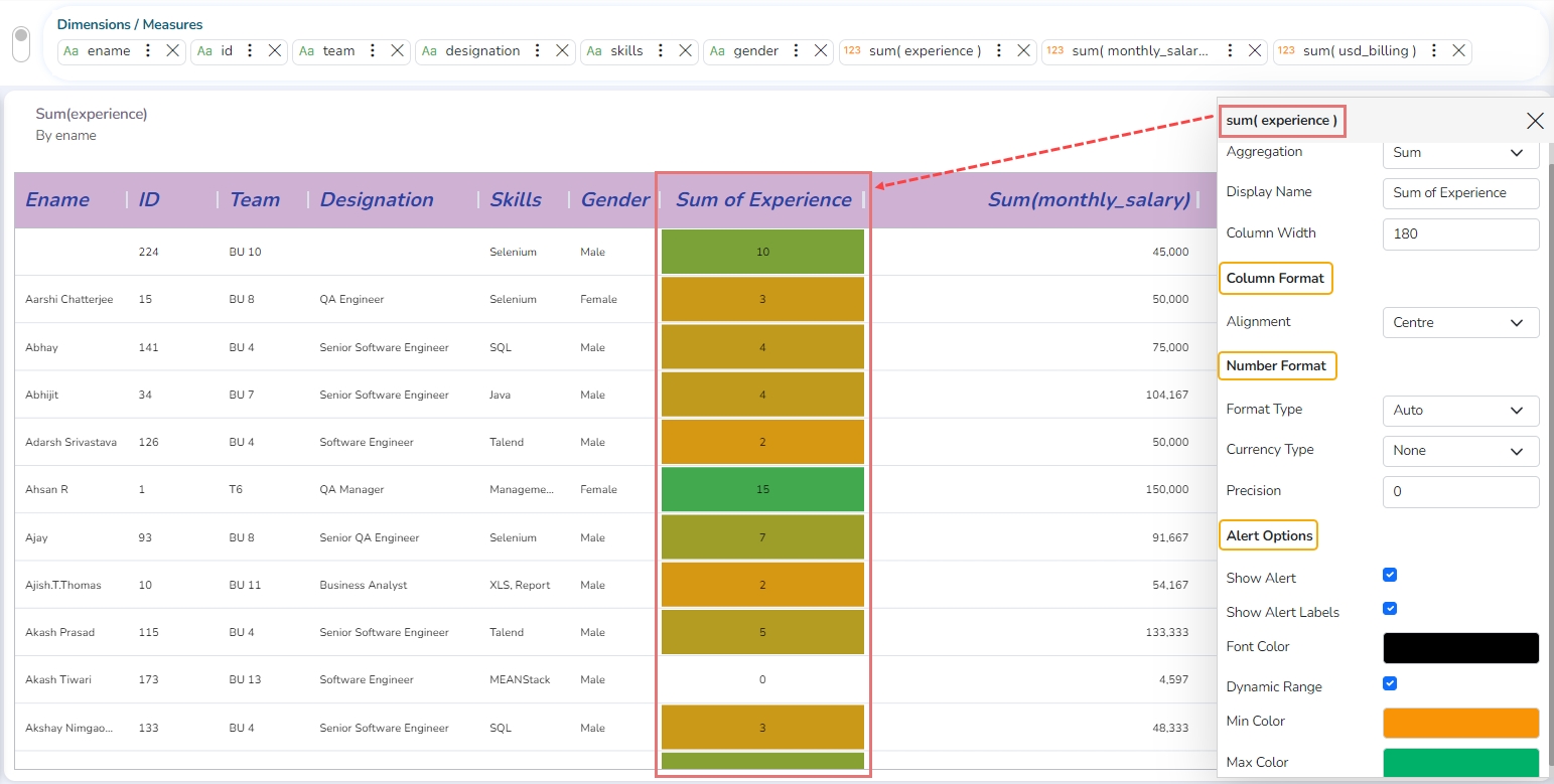
The user can set the width of each column by configuring it from the Category Properties (for Dimensions) and Series Properties (for Measures) in the Data Grid.
Click the
 icon given for a Dimension to open the Category Properties for dragged Dimensions.
The user can modify the following information for a dragged Dimension.
Display Name
Column Width
Series (Measure) Properties of Grid
Click the
 icon given for a Measure to open the Series Properties for a dragged Measures.
The following properties can be modified for a dragged Measure:
Aggregation
Display Name
Column Width
Column Format
Number format
Alert Options
Show Alert
Show Alert Labels
Font Color
Dynamic Range
Min Color
Max Color
Manual Ranges
The user can also set Ranges and their colors manually. The manually set range will be displayed if Dynamic Range is not selected.
Click the Add icon to insert a new Range.
Provide Maximum and Minimum values for the newly added Range.
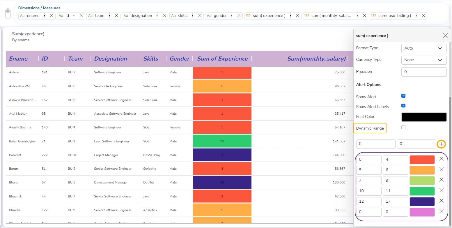
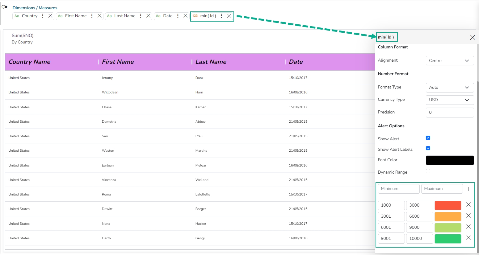
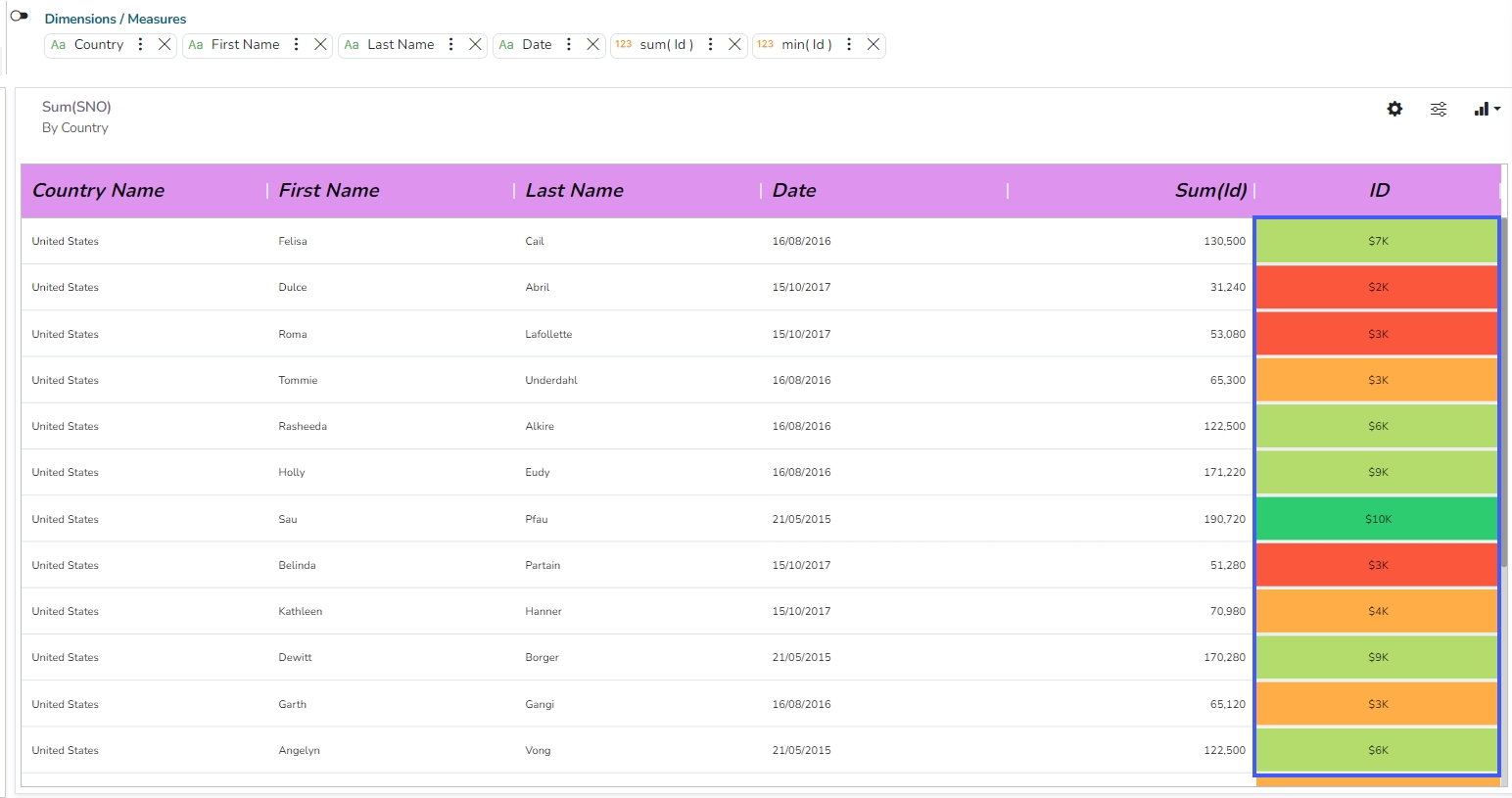
The column will reflect the inserted range of colors based on the values.
Re-ordering of Fields in the Grid
We now support the re-ordering of fields in the Data Grid chart. By allowing field re-ordering, users can present their data in a more logical and meaningful way, improving the overall clarity and usability of the Data Grid chart.
Check out the illustration to understand the field re-ordering functionality for the Grid chart.
Metric Summary
Check out the given walk-through on how to set the Metric Summary properties.
The Metric Summary displays the measure-wise summary. The users can select any number of Dimensions and Measures to show the metric summary.

Properties
General Settings
Measure Description: Provide a heading for the selected dimensions or measures column.
Summary Description: Provide a heading for the displayed summary column.
Colum Type: Two types show the column in a chart view.
Bullet
Progress Bar
Exclude from Global Filter: Enabling this option excludes the view from the Global.
View Filter
Filter: Select a filter condition from the drop-down menu.
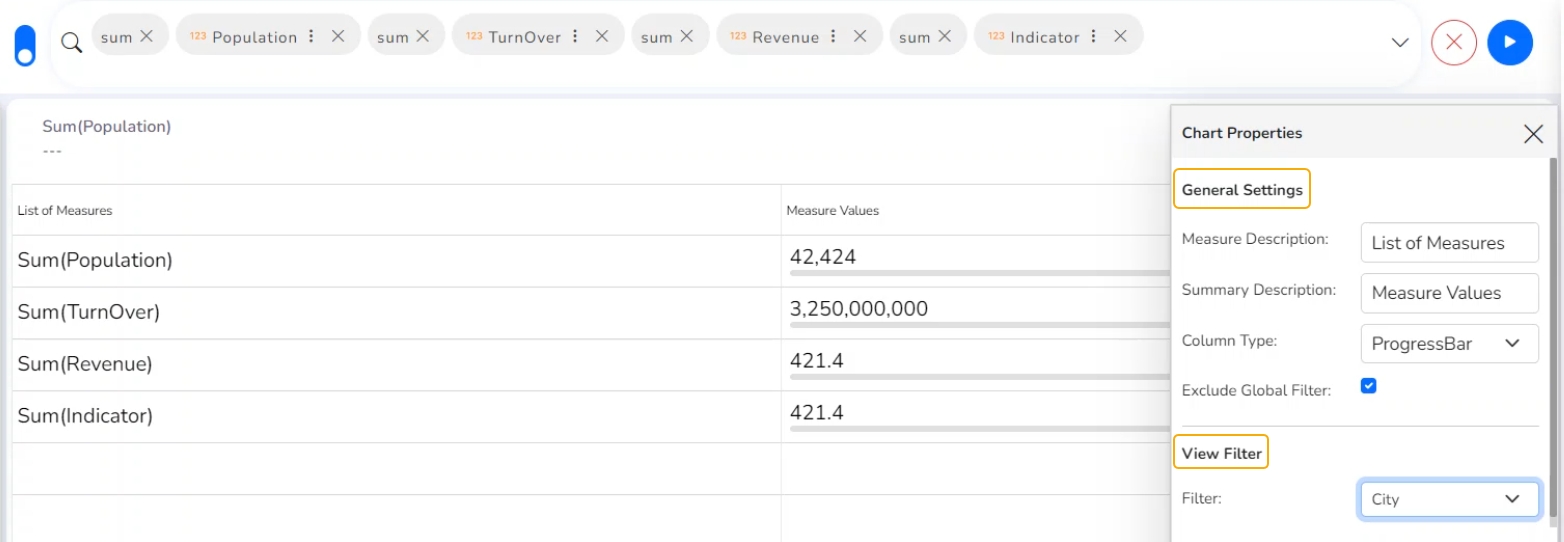
Modifying Measures
The users can modify the series Properties of the selected Measures.

Dissolution/Decomposition chart
Check out the illustration on how to use the Dissolution/Decomposition chart.
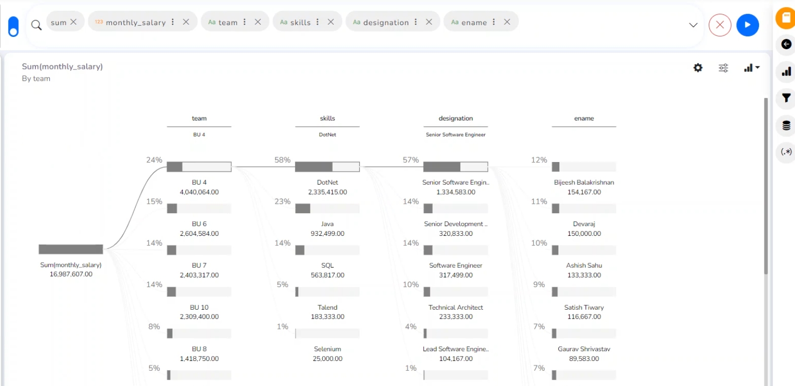
The dissolution chart lets you visualize data across multiple dimensions. It automatically aggregates data and enables drilling into your dimensions in any order. The visualization requires two types of input:
Dimension/ Measures: The metric you would like to analyze. It must be a measure or an aggregate.
Others: One or more dimensions you would like to drill down into (The maximum dimension that can be used is 7).
Properties
You can access the chart-specific properties from the Design page. It gets listed under the Chart Properties icon on the right-top panel.
General Settings
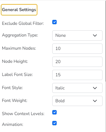
Exclude Global Filter: The view gets excluded from the Global Filter condition by putting a checkmark in the box.
Aggregation Type: The selected aggregation type gets applied to the chart. The supported aggregation types are Percentage and Count.
Maximum Nodes: Set maximum nodes for the Sankey chart.
Node Height: Set Node Height by using this properties field.
Label Font Size: Set the Label Font Size using this properties field.
Font Style: Select a Font Style by selecting an option from the drop-down menu. The supported options are Normal and Italic.
Font Weight: Select an option from the drop-down menu to display the Font weight. The supported options are Normal, Bold, 300, 600, 900).
Show Context Levels: Enable this option to display the context levels based on the user's choice. After enabling this option, the user can right-click on the first node. All the selected Dimensions are listed in the displayed context menu. The user can select a dimension from the context menu to display it as the next level.
Check out the given illustration on how to use the Show Context Levels properties option.
Animation: If the Animation option is enabled, the View will display in an animated format or if disabled it will be static at the position.
Color
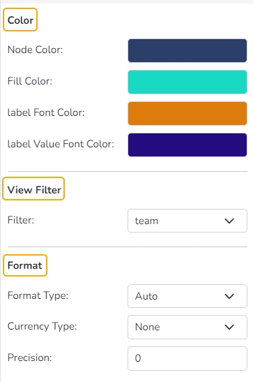
Node Color: Select a node color using the color pallet.
Fill Color: Select a fill color using the color pallet.
Label Font Color: Select a Label Font Color using the color pallet.
Label Value Font Color: Select a Label Value Font Color from the color pallet.
View Filter
Filter: Select a filter condition using the drop-down menu.
Format
Format Type: Select a desired format type from the drop-down menu (the provided options for this field are: None, Auto, Percent, Thousand, Lacs, Crore, Million, Billion, Trillion, Quadrillion).
Currency Type: Select a currency symbol to be displayed in the view (the provided options for this field are: None, Rupees, Euro, Pound, USD, Yen, Cent).
Precision: Set the precision value by using this property field.
Insights
Text: Provide any information regarding the chart. If any digit or character is required to be highlighted, put it inside two asterisks. (E.g., *70%* or *skills*).
Font Size: Set/modify the Font Size of the Insights text.
Font Color: Select a Font color for the Insights Text.
Text align: There are three alignments to align the text.
Left
Right
Centre
Position: There are two options to position the text.
Bottom
Right
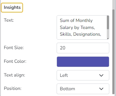
Insights Properties
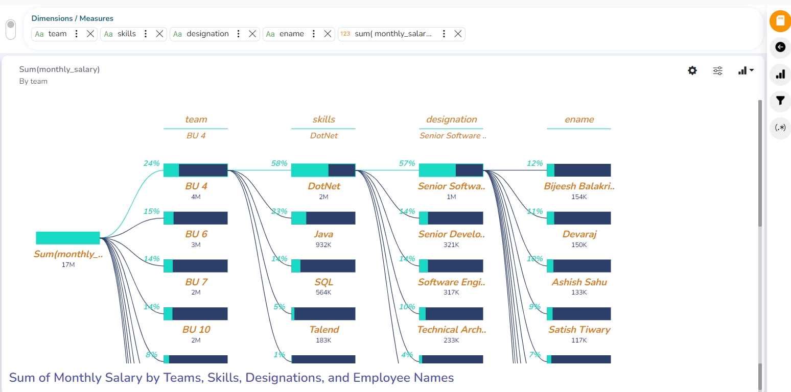
Modified View after applying various Decomposition/ Dissolution Properties
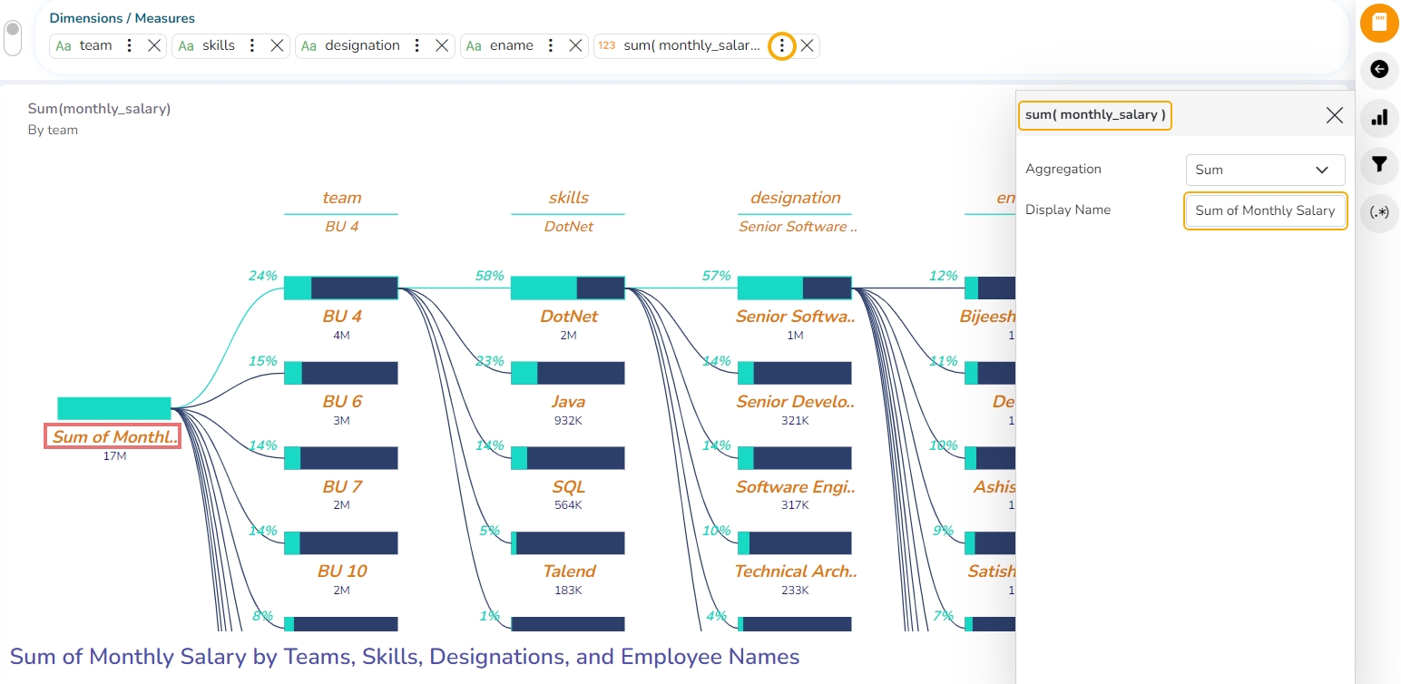
Series Properties
Click the Series Properties provided next to the measure name.
A new window opens.
Configure the required details:
Aggregation-select an aggregation using the drop-down menu (By default, it displays the second aggregation type which is Sum.)
Display Name- provide a name to be displayed in the legend.
The configured Series Properties gets applied to the chart.
Spider chart
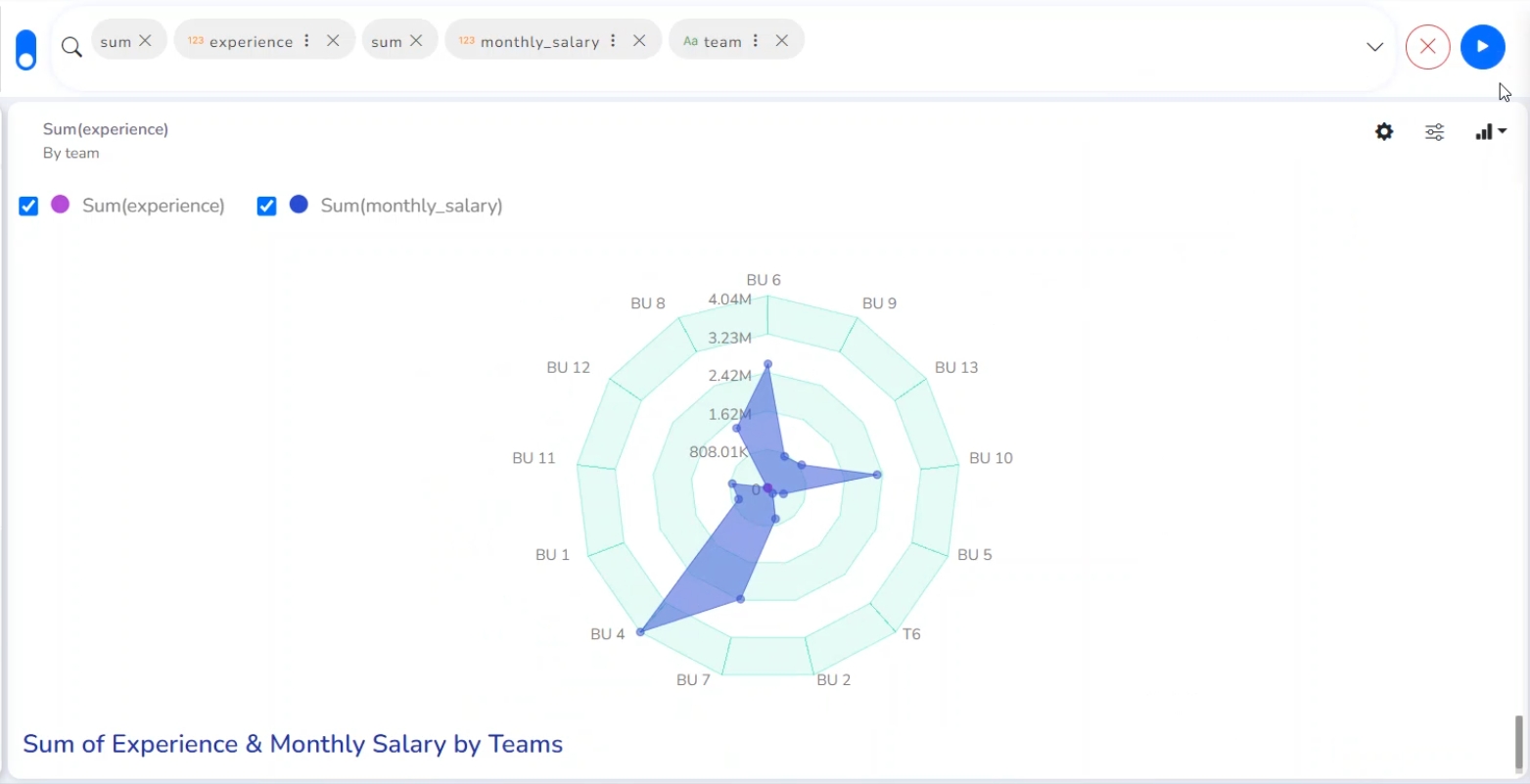
Check out the walk-through on the Spider chart properties.
The Spider chart also known as the Radar chart is used to plot values of each category along the axis which starts at the center of the chart and extends up to the end of the radius. It is a two-dimensional chart type designed to plot one or more series of values arranged in the form of spokes.
Best Situations to use a Spider chart
To analyze performance areas in an organization.
To compare allocated values and spending analysis in different departments.
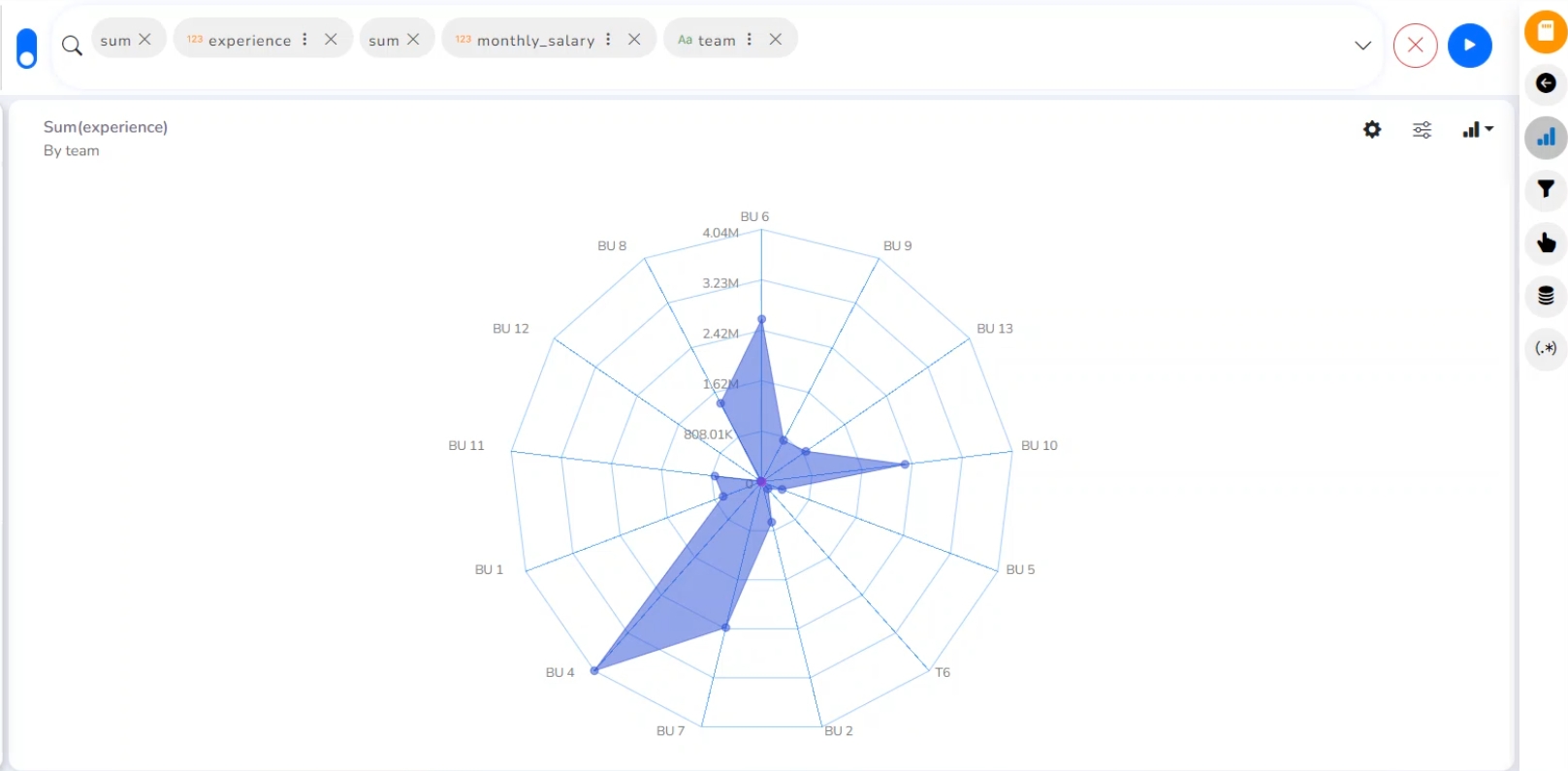
Properties
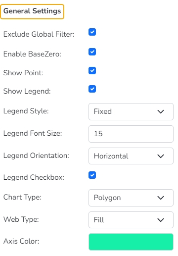
General Settings
Exclude Global Filter: The view will be excluded from the Global Filter condition by putting a checkmark in the box.
Enable Base Zero: Base value gets presented from Zero by using a checkmark in the given box.
Show Point: Enable the Show Point option by using a checkmark in the given box.
Show Legend: Displays legend by turning on the radio button. After enabling ‘Show Legend’, users need to select the following information:
Legend Style: Select one of the following options by using the drop-down menu.
Fixed
Floating
The following fields appear when the selected Legend Style option is Fixed.
Legend Font Size: This option allows to increase or decrease the font size of the legend.
Legend Orientation: This option appears when Show Legend is enabled, and the selected Legend Style is Fixed. Users need to select an option out of the given choices using the drop-down menu.
Vertical
Horizontal
Legend Checkbox: Enable this option with a checkmark to add the checkbox beside the Legend.
Chart type: Select an option from the drop-down menu.
Polygon
Circle
Web type: Select an option from the drop-down menu.
Stroke
Fill
Axis color: Select a color from the given menu.
View Filter
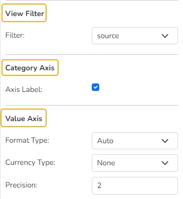
Filter: Select a filter condition using the drop-down menu.
Category Axis
Axis Label: Enable the category axis label by using a checkmark in the box.
Value Axis
Format Type: Select a desired format type from the drop-down menu (the provided options for this field are: None, Auto, Percent, Thousand, Lacs, Crore, Million, Billion, Trillion, Quadrillion).
Currency Type: Select a currency symbol to be displayed in the view (the provided options for this field are: None, Rupees, Euro, Pound, USD, Yen, Cent).
Precision: Set the after-decimal value (It displays up to 5 precision)
Insights
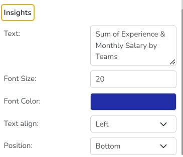
Text: Provide any information regarding the chart. If any digit or character is required to be highlighted, put it inside two asterisks. (E.g., *70%* or *skills*).
Font Size: Set/modify the Font Size of the Insights text.
Font Color: Select a Font color for the Insights Text.
Text align: There are three alignments to align the text.
Left
Right
Centre
Position: There are two options to position the text.
Bottom
Right
Insights
Waterfall chart
Check out the walk-through on the properties of the Waterfall chart.
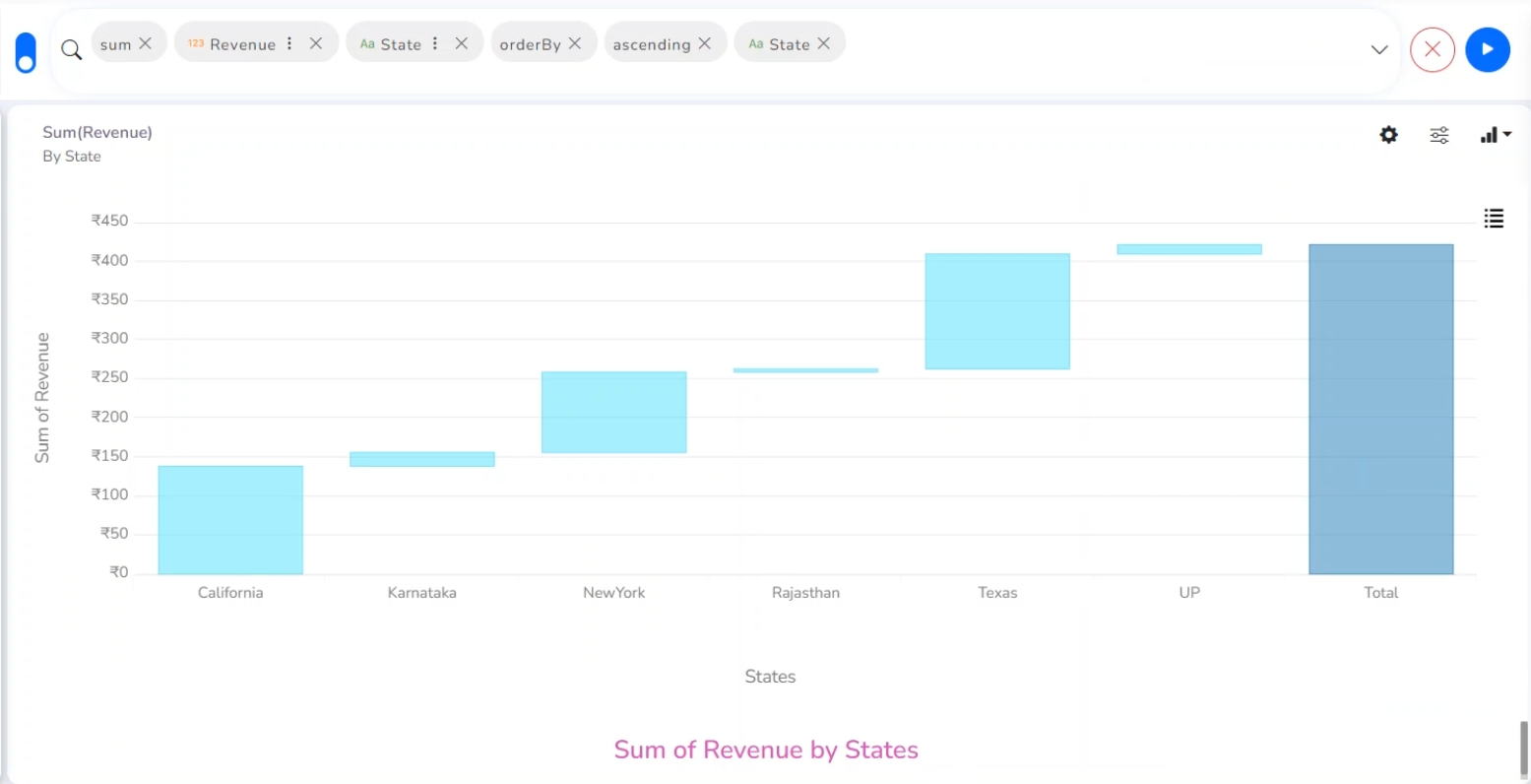
A Waterfall Chart is a form of data visualization that helps in understanding the cumulative effect of sequentially introduced positive or negative values. The Waterfall Chart is used to show how an initial value is increased and decreased by a series of intermediate values, leading to a final value.
Best Situations to Use Waterflow chart:
To show incremental changes in the values over time
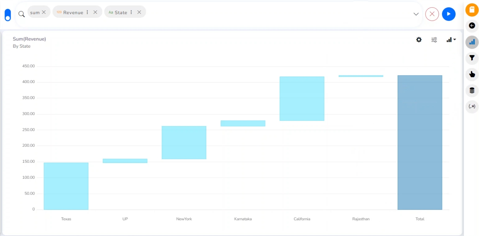
Properties
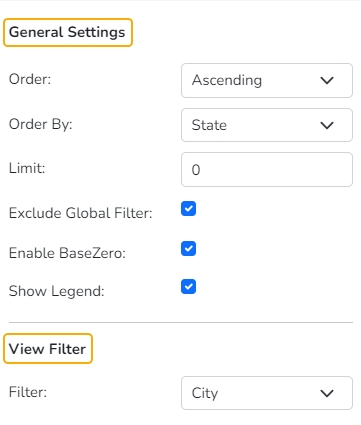
General Settings
Order: Select a sequence for displaying information.
None
Ascending
Descending
Manual Sort: The user needs to sort the dimensions by using the indicator signs manually. By selecting an order (ascending or descending), the user needs to configure the following fields:
Order By- Select a value option from the drop-down menu to order the sequence of the data.
Limit- Set a number to display the requested data by this limit.
Exclude Global Filter: The view gets excluded from the Global Filter condition by putting a checkmark in the box.
Enable Base Zero: Base value gets presented from Zero by providing a checkmark in the box.
Show Legend: By enabling this option the Legend gets added to the chart.
View Filter
Filter: Select a filter condition using the drop-down menu.
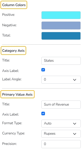
Column Colors
Users can specify colors for the Positive, Negative, and Total fields.
Category Axis
Title: Provide a title for the axis
Axis Label: Enable the Category Axis label by putting a checkmark in the box.
Label Angle: Select a display angle for the axis label.
Primary Value Axis
Title: Provide a title for the Primary Value Axis.
Axis Label: Enable the Primary Value Axis label by putting a checkmark in the box.
Format Type: Select a desired format type from the drop-down menu (the provided options for this field are: None, Auto, Percent, Thousand, Lacs, Crore, Million, Billion, Trillion, Quadrillion).
Currency Type: Select a currency symbol to be displayed in the view (the provided options for this field are: None, Rupees, Euro, Pound, USD, Yen, Cent).
Precision: Set the after-decimal value (It displays up to 5 precision).
Insights
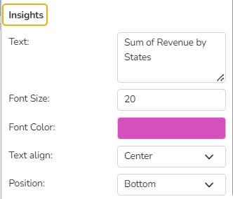
Text: Provide any information regarding the chart. If any digit or character is required to be highlighted, put it inside two asterisks. (E.g., *70%* or *skills*).
Font Size: Set/modify the Font Size of the Insights text.
Font Color: Select a Font color for the Insights Text.
Text align: There are three alignments to align the text.
Left
Right
Centre
Position: There are two options to position the text.
Bottom
Right
The modified chart View after the chart properties get applied.
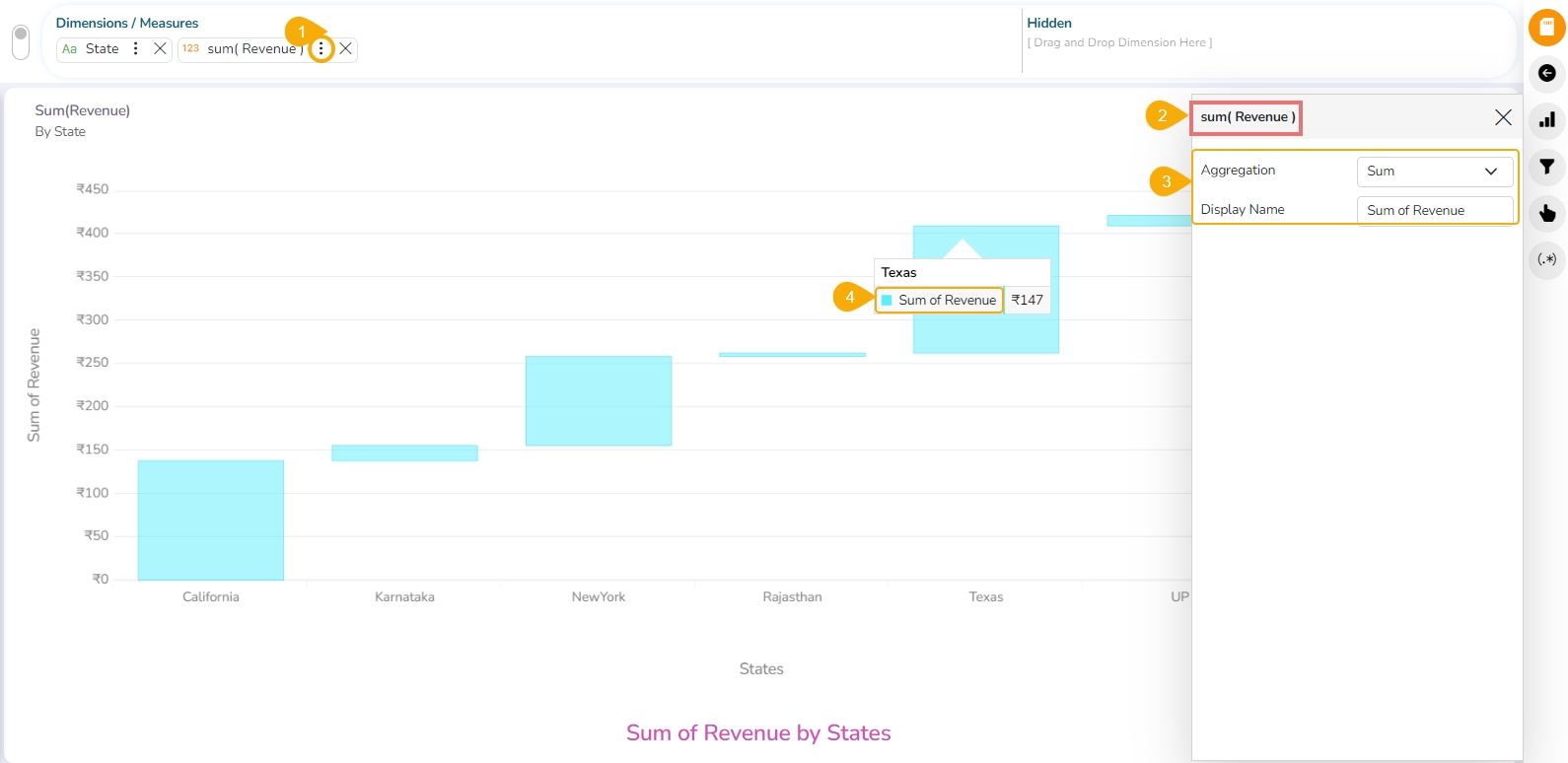
Series Properties
Click the Series Properties provided next to the measure name.
A new window opens.
Configure the required details:
Aggregation-select an aggregation using the drop-down menu (By default, it displays the second aggregation type which is Sum).
Display Name- provide a name to be displayed in the legend.
The configured Series Properties get applied to the chart.
Funnel chart
Check out the given illustration on the Funnel chart properties.
A funnel chart is a specialized chart type that demonstrates the various stages in a process. The chart takes its name from its shape, which starts with a broad head and ends with a narrow neck. Funnel charts help to track progress through a workflow with multiple steps. The user can highlight how well a process is being followed and easily identify any bottlenecks.
Best Situations to Use a Funnel Chart
Funnel charts are suitable for displaying sales conversation data.
Examples:
To evaluate the success of a promotional campaign.
To analyze the recruitment process.
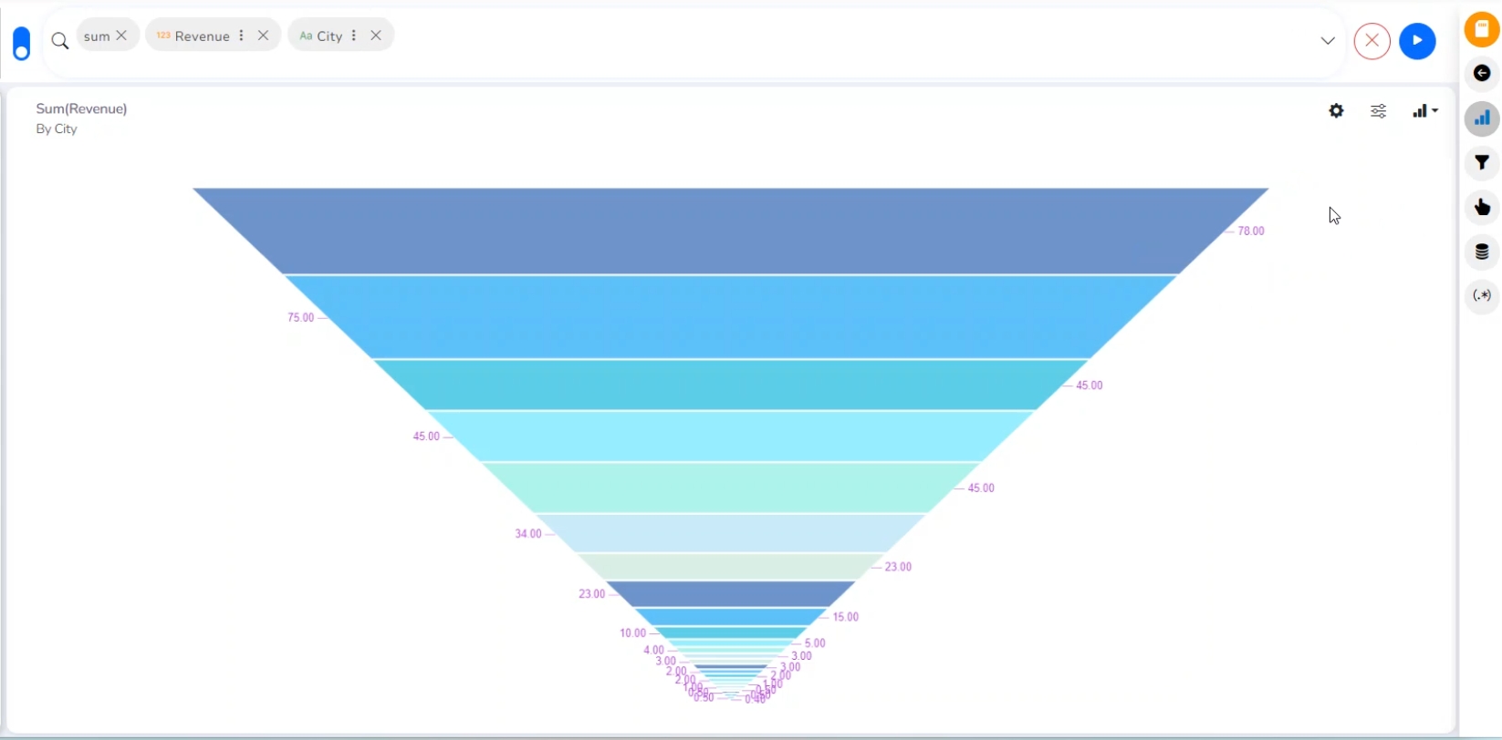
Properties
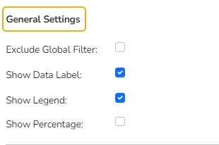
General Settings
Exclude Global Filter: The view gets excluded from the Global Filter condition by putting a checkmark in the box.
Show Data Label: The data label is displayed by using a checkmark in the given box.
Show Legend: Provide a checkmark in the box to display Legend.
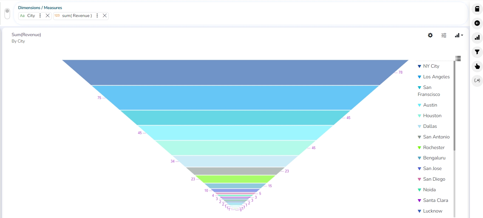
Show Percentage: Provide a checkmark in the box to display the percentage.
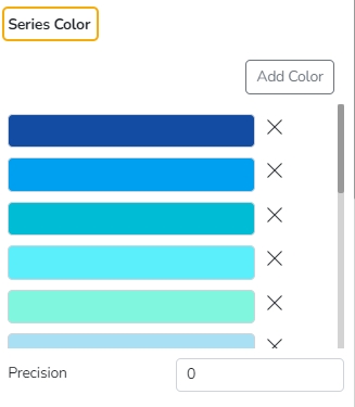
Series Color
Add Color: Use the Add Color option to add or modify various colors to the Funnel chart.
Precision: Insert or remove precision.
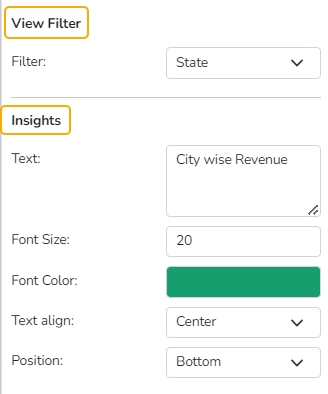
View Filter
Filter: Select a filter category from the drop-down menu.
Insights
Text: Provide any information regarding the chart. If any digit or character is required to be highlighted, put it inside two asterisks. (E.g., *70%* or *skills*).
Font Size: Set/modify the Font Size of the Insights text.
Font Color: Select a Font color for the Insights Text.
Text align: There are three alignments to align the text.
Left
Right
Centre
Position: There are two options to position the text.
Bottom
Right
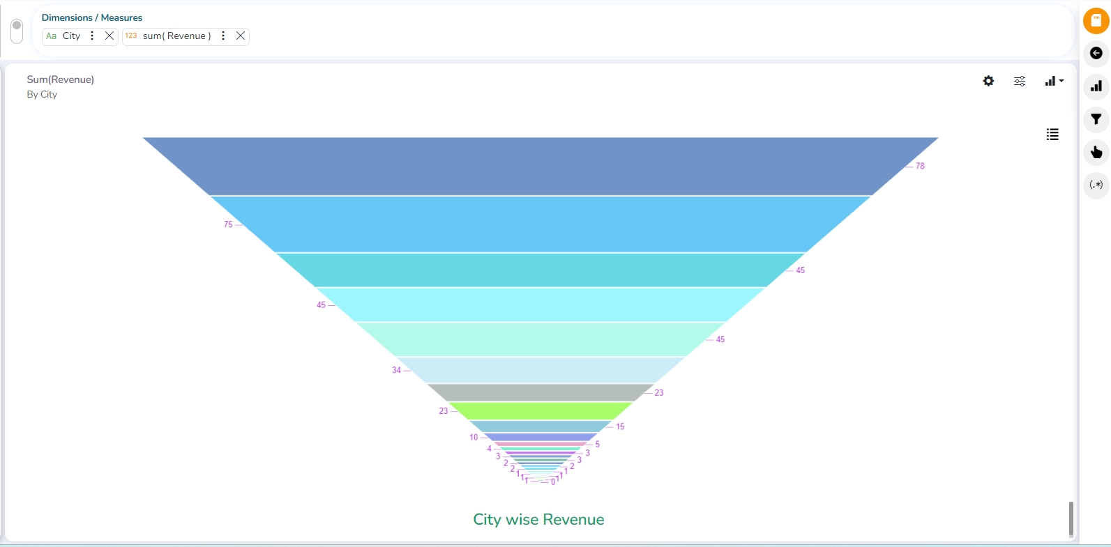
Inverted Funnel chart
Check out the given walk-through on the Properties of the inverted Funnel chart.
Inverted Funnel charts are a great way to track progress through a workflow with multiple steps. They can highlight how well a process is being followed and easily identify any bottlenecks.
The users can invert the funnel chart to see things from a different point of view. It widens at the bottom and narrows at the top pinpointing the various phases in a classified structure. This chart can be used to see the hierarchical structure of an organization or distribution process of fund/salary/profit etc.
Best Situations to Use an Inverted Funnel Chart
To display a hierarchical pattern
Example:
To categorize the administrative structure in an organization
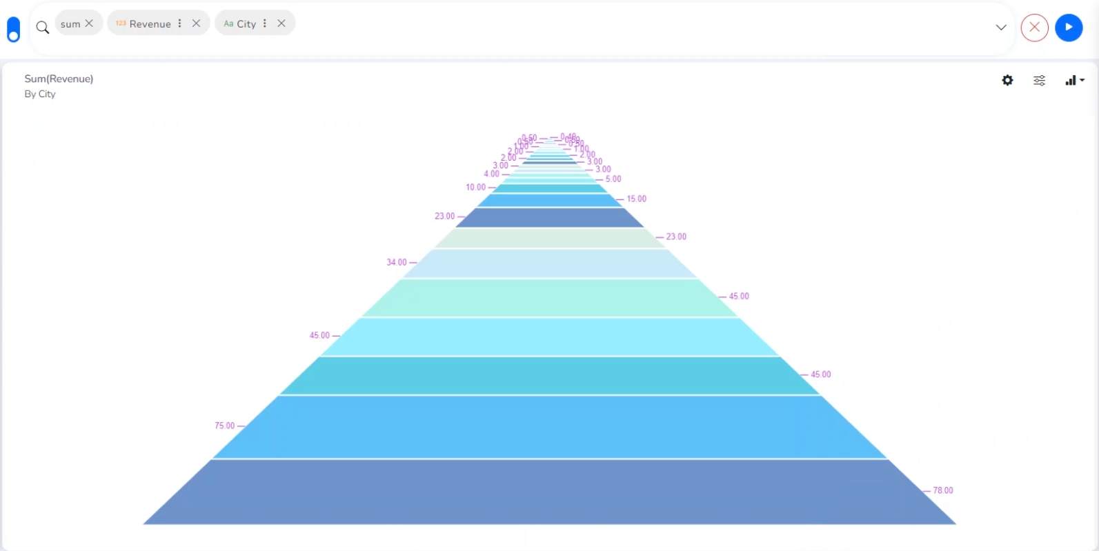
Properties
General Settings
Exclude Global Filter: The view gets excluded from the Global Filter condition by putting a checkmark in the box.
Show Data Label: The data label is displayed by using a checkmark in the given box.
Show Legend: Provide a checkmark in the box to display Legend. After enabling ‘Show Legend,’ users need to select the following information.
Show Percentage: Provide a checkmark in the box to display the percentage.
Series Color
Add Color: Click the Add Color option to insert new colors into the series or modify the added color.
Precision: Set or modify precision value.
View Filter
Filter: Select a filter option from the drop-down menu.
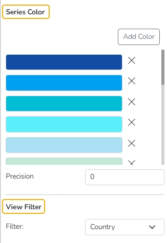
Adding a Color
Click the Add Color option. A new color gets added to the displayed series list.
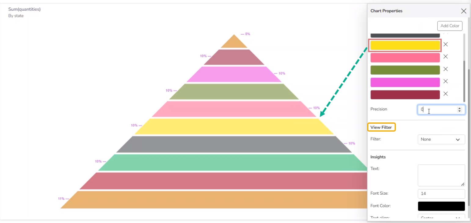
Insights
Text: Provide any information regarding the chart. If any digit or character is required to be highlighted, put it inside two asterisks. (E.g., *70%* or *skills*).
Font Size: Set/modify the Font Size of the Insights text.
Font Color: Select a Font color for the Insights Text.
Text align: There are three alignments to align the text.
Left
Right
Centre
Position: There are two options to position the text.
Bottom
Right
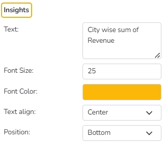
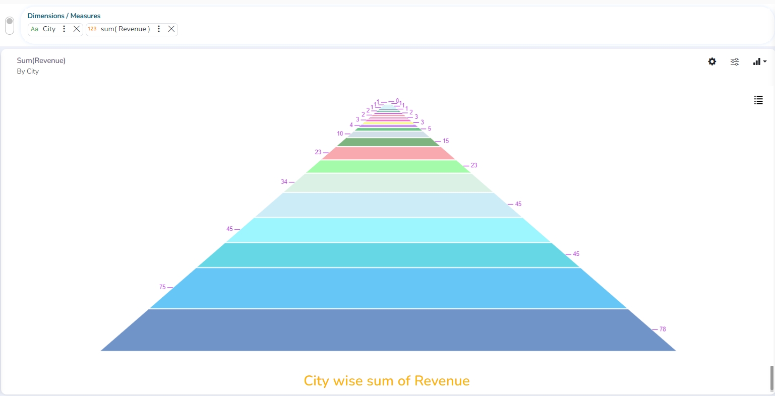
Heat Map chart
Check out the given illustration on Heat Map Properties.
Heat Map Chart, or Heatmap is a two-dimensional visual representation of data, where values are encoded in colors, delivering a convenient, insightful view of information.
Essentially, this chart type is a data table with rows and columns denoting different sets of categories. Each cell in the table can contain a numerical or logical value that determines the cell color based on a given color palette.
Best Situations to Use a Heat Map chart:
Funnel charts are suitable for displaying sales conversation data.
Examples:
To evaluate the success of a promotional campaign
To analyze the recruitment process
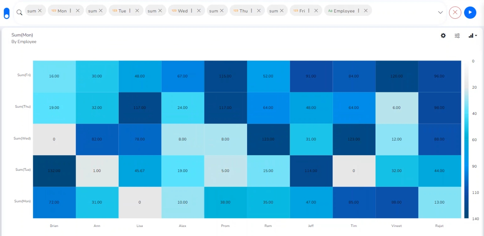
Properties
General Settings
Exclude Global Filter: The view gets excluded from the Global Filter condition by putting a checkmark in the box.
Animation: Chart animation is a technique used to enhance the visual appeal of a chart by adding movement and transition effects.
Base Type: This option will give the visual appeal of a chart by adding some color gradients to the cells.
Plain
Gradient 1
Gradient 2
Gradient 3
Opacity: Opacity is a property of an object's style that determines its level of transparency. It is typically represented as a value between 0 and 1, with 0 being completely transparent and 1 being completely opaque.
Show Text on Cell: The data label gets displayed by using a checkmark in the given box, It always shows in the cell.
Text Color: Select the text color.
Text Font Size: Set the Font Size of the text displayed in the cell.
Show Legend: By enabling this option Legend gets displayed.
Frequency Bar: By enabling this option the Frequency Bar gets displayed on the right side of the chart.
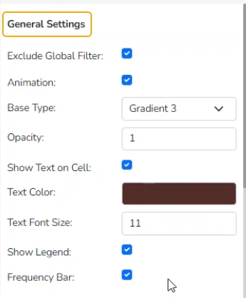
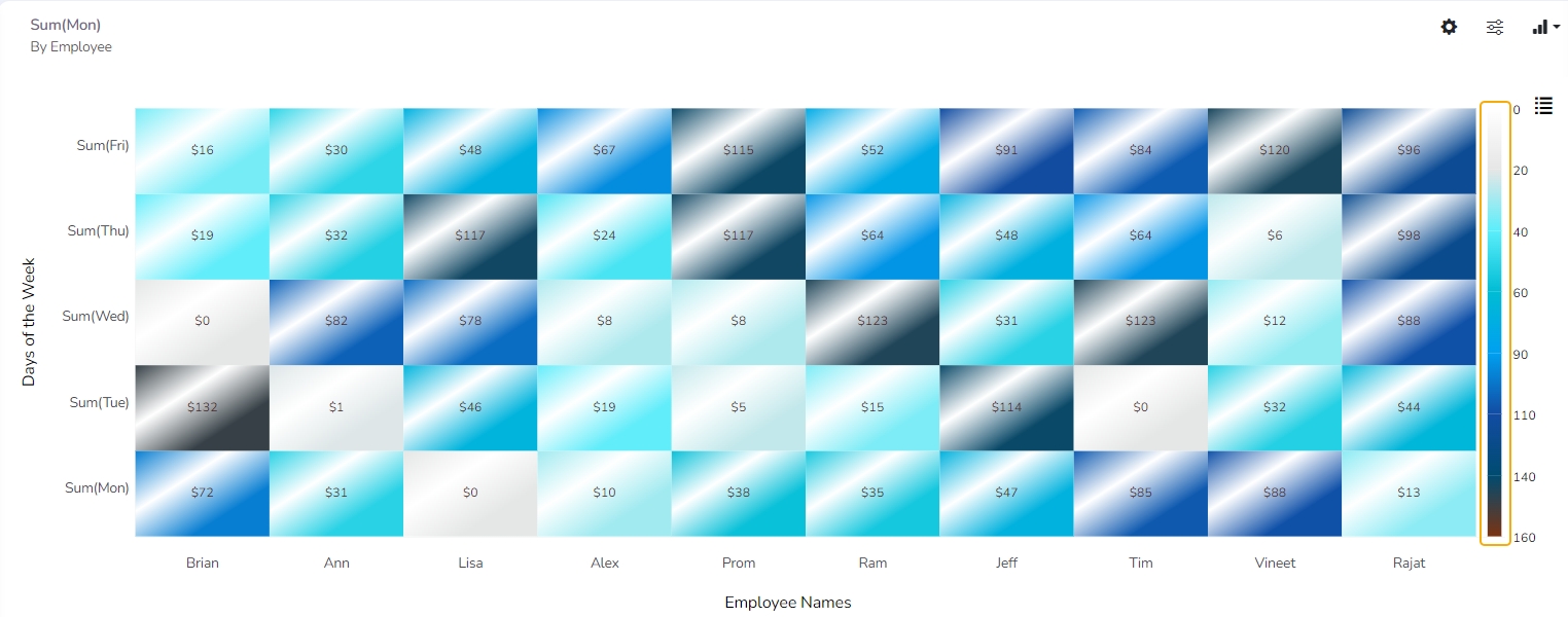
Frequency Range
Use the Add Range option to add a new range in the Heat Map chart.
Pre-selected to and from limits will be also added to the newly added range.
View Filter
Filter: Select a filter value from the drop-down menu.
Category Axis
Title: Provide a title for the X-axis.
Axis Label: Enable the Category Axis label by putting a checkmark in the box.
Label Angle: Select a display angle for the axis label.
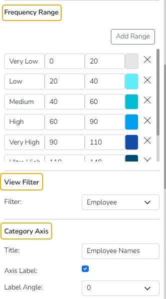
Value Axis
Title: Provide a title for the Primary Value Axis.
Axis Label: Enable the Primary Value Axis label by putting a checkmark in the box.
Format Type: Select a desired format type from the drop-down menu (the provided options for this field are: None, Auto, Percent, Thousand, Lacs, Crore, Million, Billion, Trillion, Quadrillion).
Currency Type: Select a currency symbol to be displayed in the view (the provided options for this field are: None, Rupees, Euro, Pound, USD, Yen, Cent).
Precision: Set the after-decimal value (It displays up to 5 precision)
Insights
Text: Provide any information regarding the chart. If any digit or character is required to be highlighted, put it inside two asterisks. (E.g., *70%* or *skills*).
Font Size: Set/modify the Font Size of the Insights text.
Font Color: Select a Font color for the Insights Text.
Text align: There are three alignments to align the text.
Left
Right
Centre
Position: There are two options to position the text.
Bottom
Right
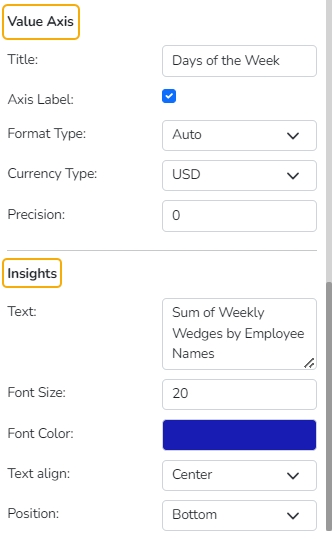
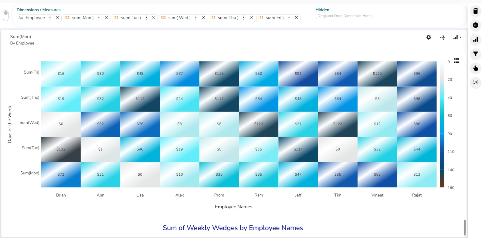
Modified View after applying Heat Map Properties
Geo chart
Check out the illustration on the Geo chart Properties.
Geo chart uses geographic locations as the basis for displaying data. It is used to display data on a map, and can be used to show information such as population density, sales data, or weather patterns. Common types of Geo map charts include Choropleth maps which color regions according to data values, and point maps, which display data as individual points on the map.
The Leaflet is an open-source JavaScript library for creating interactive maps. It is designed to be lightweight and easy to use, and can be used to create a wide variety of map-based visualizations, including geo map charts. This chart is created using an open-source tool called Leaflet.
Best Situations to Use a Geo chart
To display widely spread data or processes in the geographical setup.
Examples
Sales: A point map can be used to display the locations of retail stores and their sales figures, allowing businesses to identify areas where sales are high or low.
To analyze the recruitment process.
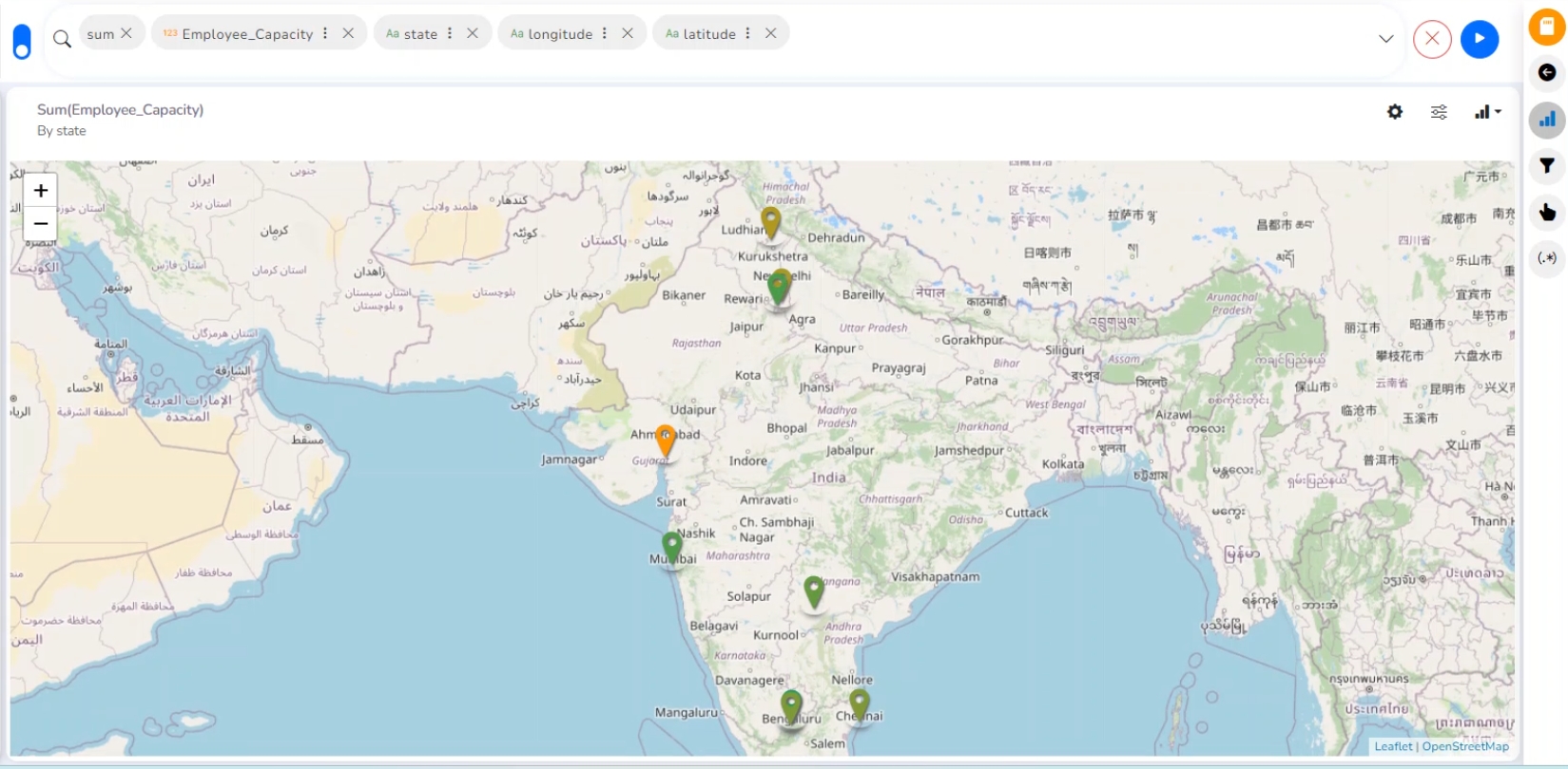
Properties
General Settings
Exclude Global Filter: By enabling this option, the View gets excluded from the Global Filter.
Geometry Type: Select an option from the drop-down menu. the supported options are Marker, Clustered, Trail, and Trip.
View Filter
Filter: Select a filter option from the drop-down.
Range
Dynamic Range: Enable this option to access the dynamic range.
Min Color: Select a color for the minimum range.
Max Color: Select a color for the maximum range.
Insights
Text: Provide any information regarding the chart. If any digit or character is required to be highlighted, put it inside two asterisks. (E.g., *70%* or *skills*).
Font Size: Set/modify Font Size of the Insights text.
Font Color: Select a Font color for the Insights Text.
Text align: There are three alignments to align the text.
Left
Right
Centre
Position: There are two options to position the text.
Bottom
Right
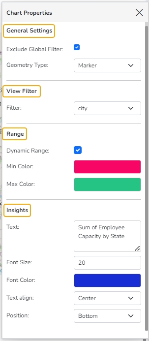
Properties of the Geo chart
Configuring Cell Type
The user needs to configure the Series Properties for the dragged Latitude and Longitude dimensions to plot the Geo chart.
Click the ellipsis icon for the dragged Latitude/ Longitude dimension.
The Properties tab for the selected dimension opens on the right side.
Select the Cell Type option with a valid option (Select Latitude for the dragged Latitude dimension and Longitude for the Longitude dimension).
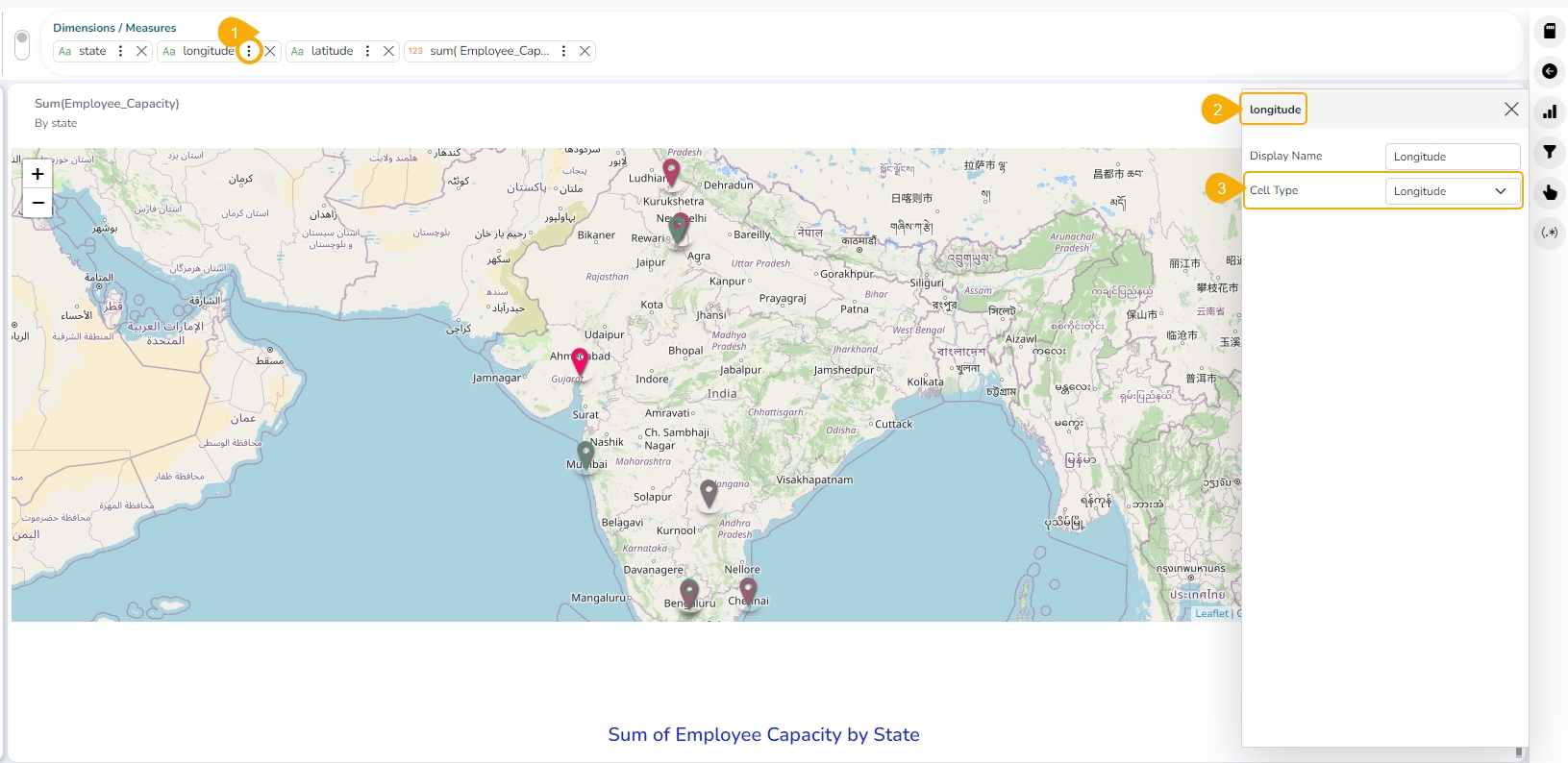
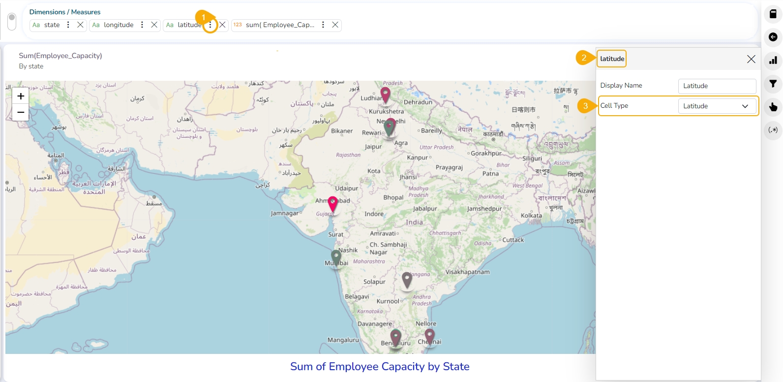
The display of the Geo chart gets changed based on the selected Geometry Type.
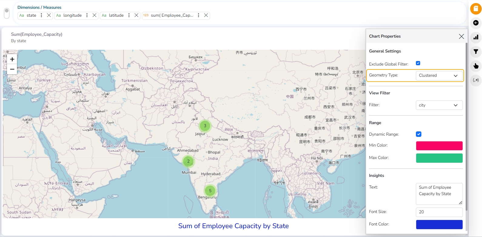
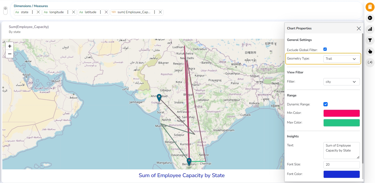
Displaying Trip Geometry Type
The user must drag and drop required Dimensions and Measures to plot a View with Geo chart. Make sure that a relevant Measure has been dragged to the Dimensions/Measures box. E.g.,Employee_Capacity in the given example.
Click the ellipsis icon provided for the dragged Measure.
The Properties tab for that dragged Measure opens on the right side.
Select the Cell Type option as Trip Event.
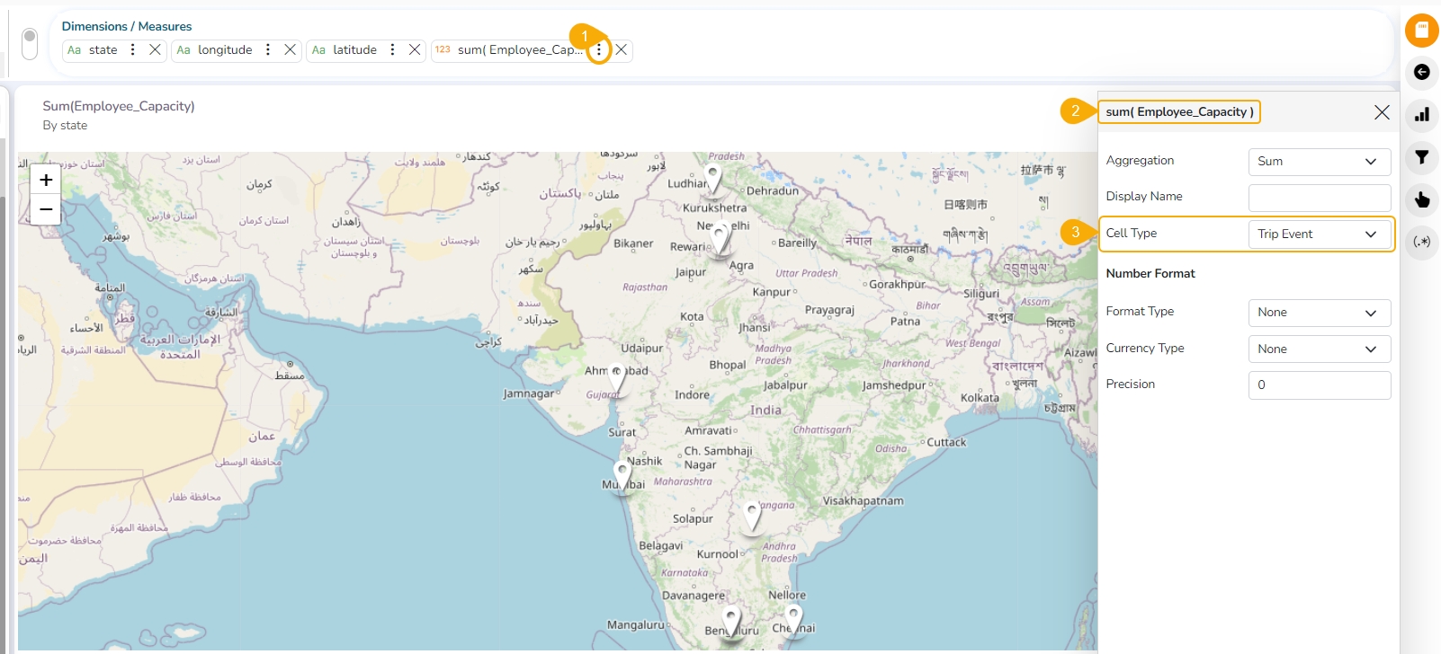
Open the Chart Properties.
Make sure that the selected Geometry Type is Trip to display data for trip Geometry Type.
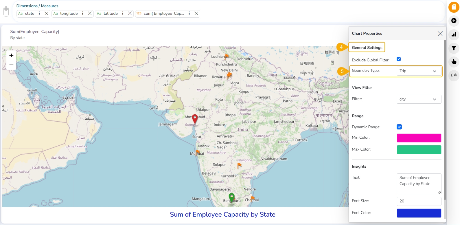
Sankey chart
A Sankey diagram is a visualization used to depict a flow from one set of values to another. The things being connected are called nodes and the connections are called links.
Check out the walk-through on how to configure properties of the Sankey chart.
Best Situations to Use Sankey chart
To show a many-to-many mapping between two domains.
To display multiple paths through a set of stages.
Example: To show mapping on Energy and Resource Flows.
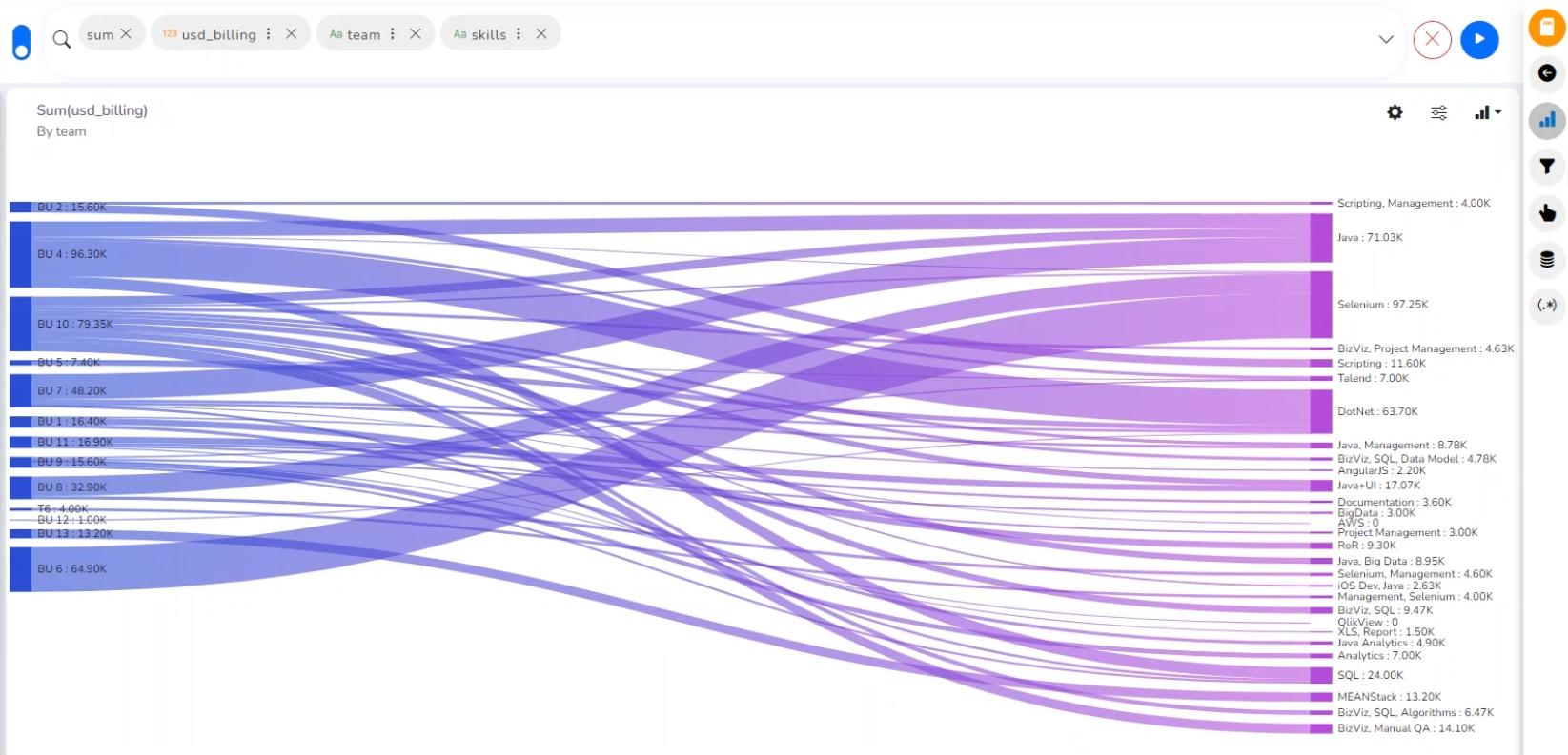
Properties
You can access the chart-specific properties from the Design page. It gets listed under the Chart Properties icon on the right-top panel.
General Settings
Exclude Global Filter: The view gets excluded from the Global Filter condition by putting a checkmark in the box.
Style: Select a style to display the data (the provided choices for this field are Gradient, Source, Target).
Gradient: The color pattern will be gradient from source to target
Source: The color pattern will be from the source to near of target one & for the target another color.
Target: The color pattern will be one for the source & up to the target end another color given.
Animation- If the Animation option is enabled, the View will display in an animated format or if disabled it will be static at the position.
Label Font Size: This is applicable for the labels from 0 to 25, by default label size will be 10
Label Font Style: There are 2 types Normal & Italic which will reflect to label
Label Font Weight: This is of 5 types: Normal, Bold, 300,600,900. Changes will be seen to the labels
Line Opacity: This will define the opacity of the links connecting the nodes, the value should be less than or equal to 1
Node Gap: This is to define the gap between nodes (interlink lines) from 0 to 20, by default it will be 8
Show Percent Value: This will show the percentage value of actual data if the checkbox is enabled or the actual value of data if the checkbox is disabled.
Show Tooltip: If the checkbox is enabled, tooltip will come & vice versa
View Filter
Select a Filter value from the given drop-down menu to use as a View Filter.
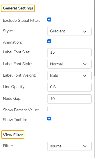
Color
Show Random Color: When the checkbox is enabled it will show the color given on “Level wise color” properties & if enabled it will show random multiple colors.
Label Font Color: Select a Label Font Color using the color pallet.
Level Wise Color: This is to show the color of the chart as per user requirements.
Axis
Format Type: Select a format type from the drop-down menu. The supported options are None, Auto, Percent, Thousand, Lacs, Crore, Million, Billion, Trillion, Quadrillion.
Currency Type: Select a currency type from the drop-down menu. The supported options are None, Euro, Rupees. Pound, USD, Yen, Cent.
Precision: Set Precision value using this field.
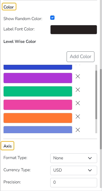
Insights
Text: Provide any information regarding the chart. If any digit or character is required to be highlighted, put it inside two asterisks. (E.g., *70%* or *skills*).
Font Size: Set/modify Font Size of the Insights text.
Font Color: Select a Font color for the Insights Text.
Text align: There are three alignments to align the text.
Left
Right
Centre
Position: There are two options to position the text.
Bottom
Right
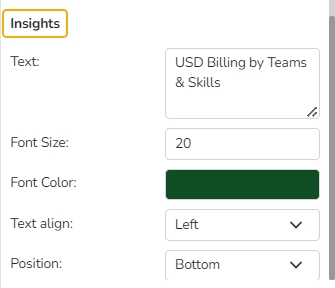
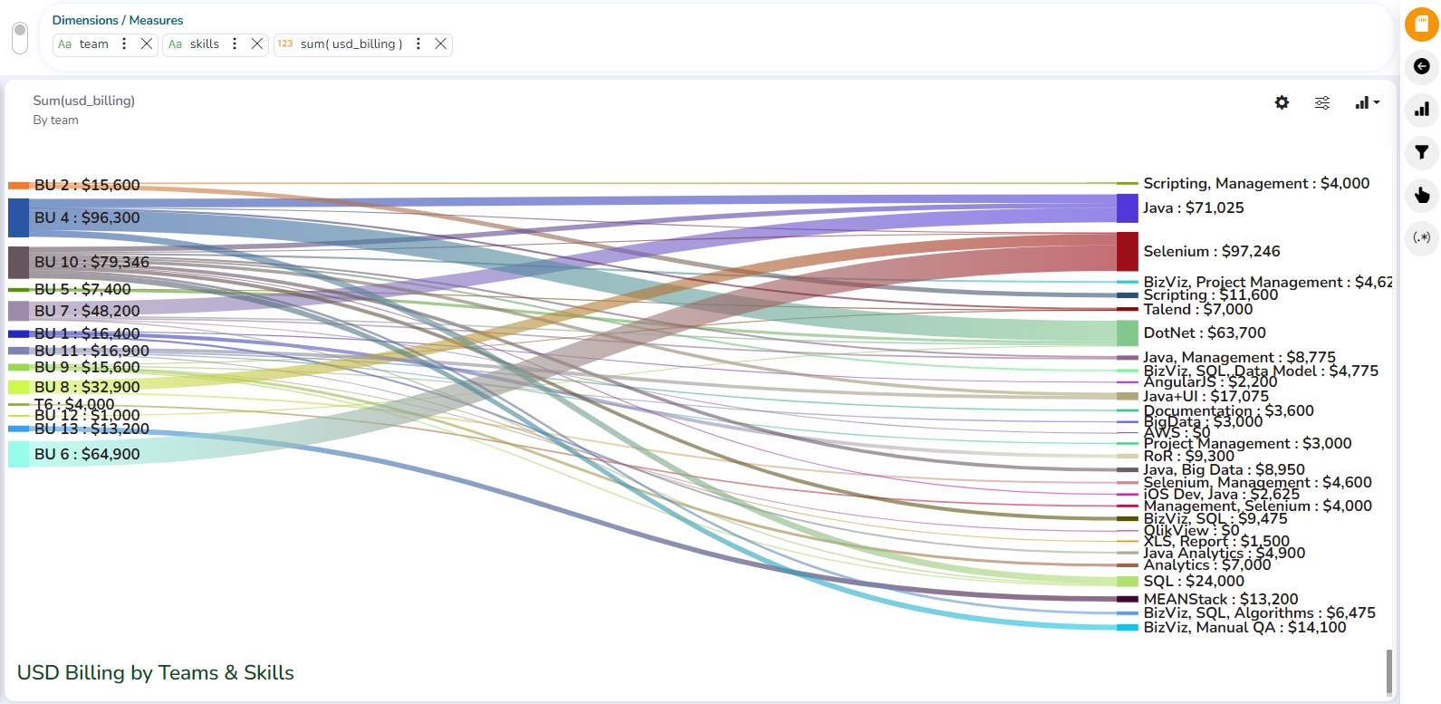
Word Cloud
A word cloud chart is a visual representation of text data, where the most frequently occurring words are displayed in a larger font size and arranged in a cloud-like or cluster format. Word cloud charts are commonly used to quickly represent the most prominent terms or keywords as visuals in a body of text.
Check out the illustration on the Word Cloud chart properties.
Best Situations to Use a Word Cloud Chart
To analyze text data
To identify trends and patterns that would otherwise be unclear or difficult to see in a tabular format
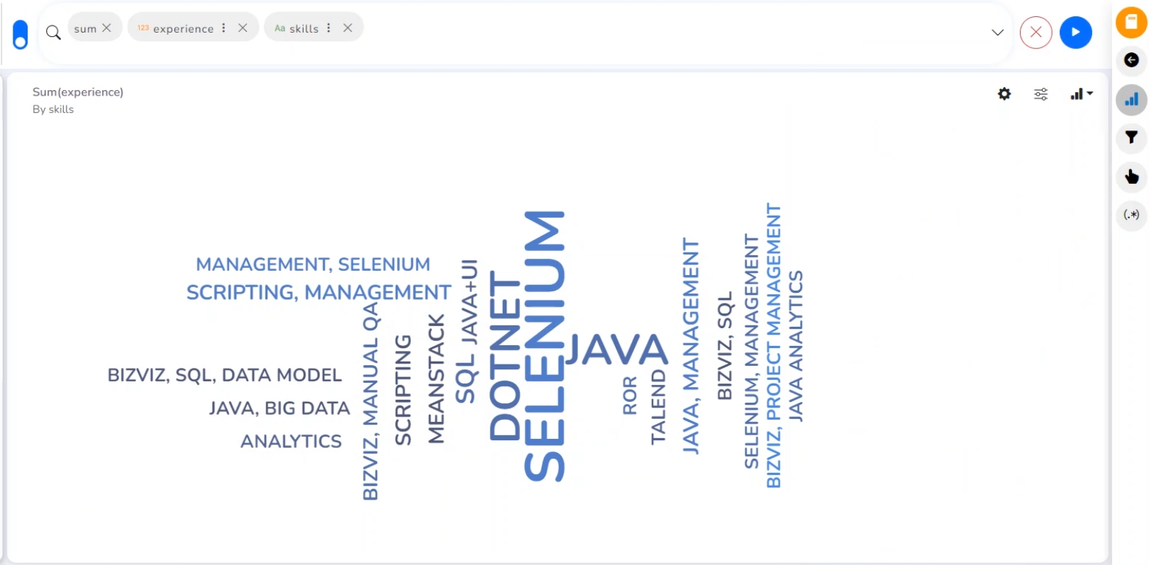
Properties of the Word Cloud Chart
General Settings
The Properties fields provided under the General Settings help the users to configure various chart-related settings.
Exclude Global Filter: Enable this option to exclude the Global Filter.
Shuffle Text: Enable this option to shuffle the text in the Word Cloud.
Shrink To Fit: Enable this option to shrink the text to fit in the chart display.
Show Limited Words: Enable this option to display limited words through the Word Cloud chart.
Exclude Pronouns: Enable this option to exclude the Pronouns from the display of the Data fields.
Animation: If the Animation option is enabled, the View will display in an animated format or if disabled it will be static at the position.
Convert To Case: Select any option to display the chart data in the selected case. The supported options are None, Lower Case, Upper Case, and Title case.
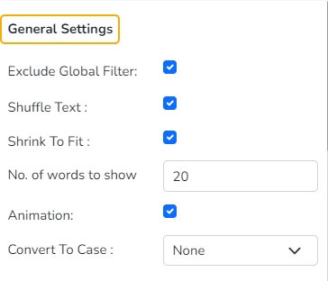
Word Styles
The user can change the style of the words.
Font Family: Select a Font Family from the drop-down menu. The supported Font types are Arial, BizViz Font, BizViz Font Regular, Cambria, Helvetica, Lucida Bright, Monotype Corsiva, Papyrus, Raleway, Roboto, Times New Roman, Ubuntu, and Verdana.
Layout Shape: Select a layout shape using the drop-down menu. The supported layout shapes are Oval, Star, Pentagon, Square, and Circle.
Data Set Type: Select an option using the drop-down menu. The supported dataset types are Word and Paragraph.
Text Opacity: Set text opacity using this field.
Max Font Size: Set the maximum size for the fonts
Min Font Size: Set minimum size for the fonts
Highlight Font Size: Set highlight font size by using this field
Text: If the Exclude Pronoun option is enabled, all the text entered in this field will be excluded from the chart portrayal.

Format
Format Type: Select a format type from the drop-down menu. The supported options are None, Auto, Percent, Thousand, Lacs, Crore, Million, Billion, Trillion, and Quadrillion.
Currency Type: Select a currency type from the drop-down menu. The supported options are None, Euro, and Rupees. Pound, USD, Yen, and Cent.
Precision: Set a precision value using this field.
View Filter
Filter: Select a filter option using the drop-down menu.
Color
This section helps the user to modify the colors or highlight colors based on their needs.
Highlight Color: Select a color using the color pallet as a highlight color.
Show Random Color: Enable or disable Random Colors to be applied or removed from the Word Cloud chart.
Random Colors: Use the Add Color option to insert multiple colors to be used as Random Colors.
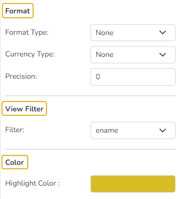
Applying Random Colors
Using the Show Random Color the user can apply random colors to the Word Cloud chart.
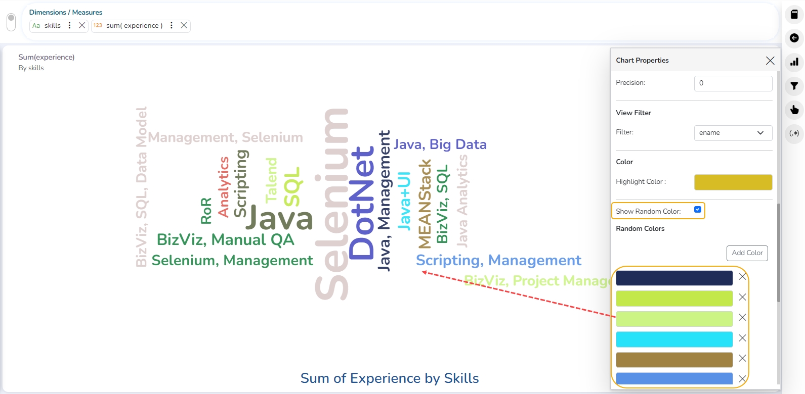
Insights
Text: Provide any information regarding the chart. If any digit or character is required to be highlighted, put it inside two asterisks. (E.g., *70%* or *skills*).
Font Size: Set/modify the Font Size of the Insights text.
Font Color: Select a Font color for the Insights Text.
Text align: There are three alignments to align the text.
Left
Right
Centre
Position: There are two options to position the text.
Bottom
Right
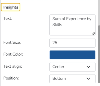
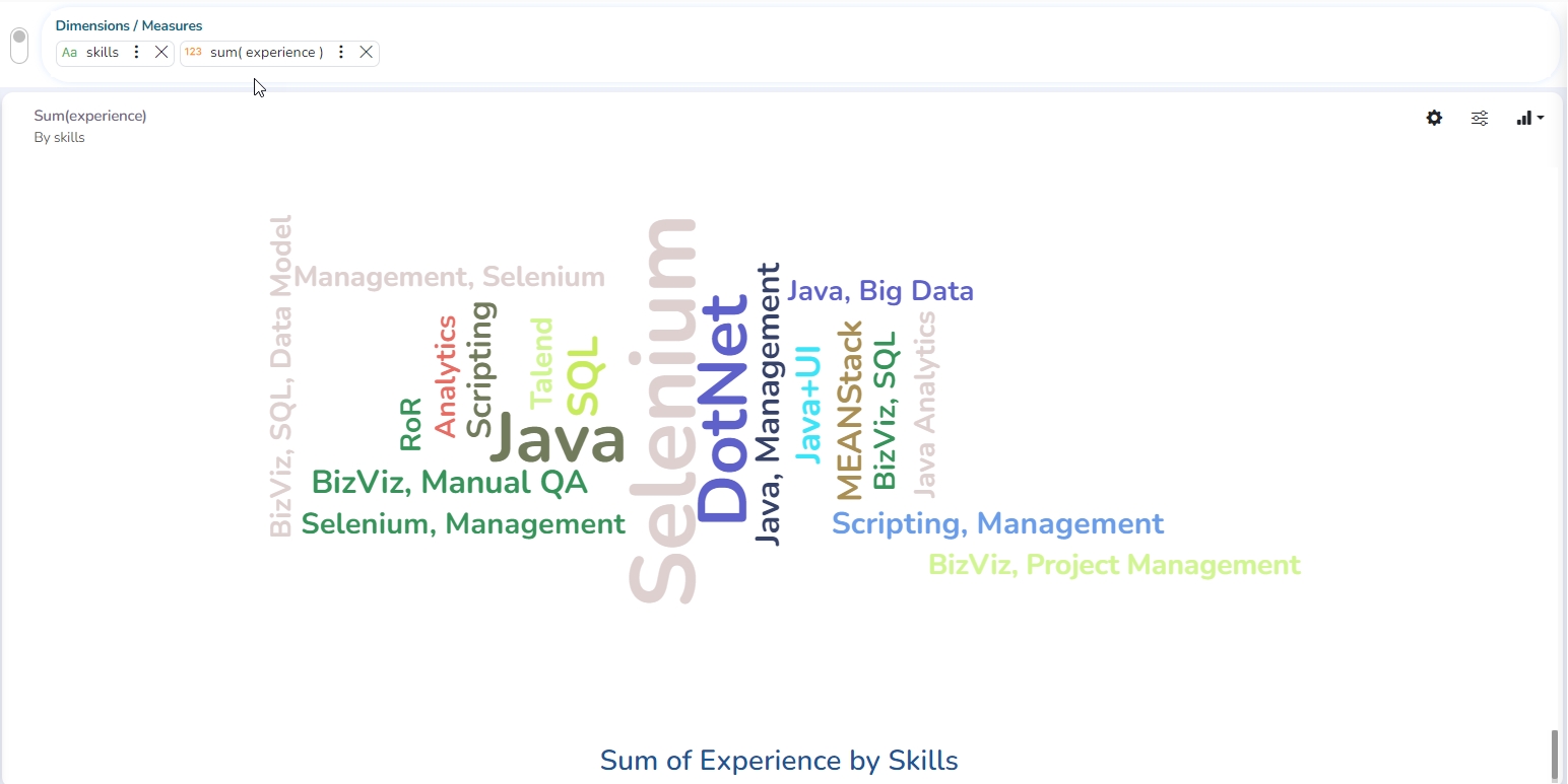
Candlestick chart
A candlestick chart is a financial visualization tool illustrating the price fluctuations of assets such as securities, derivatives, or currencies. Each "candlestick" corresponds to a defined time interval (e.g., minute, hour, day) and conveys four critical data points for that period: the opening price, closing price, highest price, and lowest price. This charting method is widely employed in financial analysis to monitor market trends and inform investment decisions. The Candlestick is popular in analyzing financial aspects due to its ability to visualize a lot of data quickly and effectively, helping traders make more informed decisions.
Best Situations to Use Candlestick Charts
Analyzing Market Sentiment: Candlestick charts reveal whether buyers or sellers dominate the market during a specific period, making it easier to gauge sentiment.
Identifying Reversal Patterns: Traders use them to spot patterns like Doji, Hammer, or Engulfing patterns, which suggest potential trend reversals.
Short-Term Trading: Candlestick charts are ideal for day trading or swing trading since they provide detailed visual information on market action over shorter time frames.
Support and Resistance Levels: Candlestick charts make it easier to identify critical price levels where the market has consistently reversed or consolidated.
Check out the illustration on using the Candlestick chart properties.
Properties of the Candlestick Chart
General Settings
The Properties fields provided under the General Settings help the users to configure various chart-related settings.
Exclude Global Filter: Enable this option to exclude the Global Filter.
Shuffle Text: Enable this option to shuffle the text in the Word Cloud.
Shrink To Fit: Enable this option to shrink the text to fit in the chart display.
Show Limited Words: Enable this option to display limited words through the Word Cloud chart.
Exclude Pronouns: Enable this option to exclude the Pronouns from the display of the Data fields.
Animation: If the Animation option is enabled, the View will display in an animated format or if disabled it will be static at the position.
Convert To Case: Select any option to display the chart data in the selected case. The supported options are None, Lower Case, Upper Case, and Title case.
View Filter
Filter: Select a filter option using the drop-down menu.
Category Axis
The Category Axis consists of several crucial properties for the chart's X-axis.
Title: Define the title for the axis to provide context.
Axis Label: Customize the labels on the axis to improve the readability of the data points.
Label Angle: Adjust the angle of labels to enhance space usage and readability.

Primary Value Axis
The Primary Value Axis provides essential controls for the Y-axis of the chart.
Title: Set a descriptive title for the axis to provide context to viewers.
Axis Label: Customize the labels on the axis for clarity and a better understanding of data values.
Format Type: Select a desired format type from the drop-down menu (the provided options for this field are: None, Auto, Percent, Thousand, Lacs, Crore, Million, Billion, Trillion, Quadrillion).
Currency Type: Select a currency symbol to be displayed in the view (the provided options for this field are: None, Rupees, Euro, Pound, USD, Yen, Cent).
Precision: Set the after-decimal value (It displays up to 5 precision).
Insights
Text: Provide any information regarding the chart. If any digit or character is required to be highlighted, put it inside two asterisks. (E.g., *70%* or *skills*).
Font Size: Set/modify the Font Size of the Insights text.
Font Color: Select a Font color for the Insights Text.
Text align: There are three alignments to align the text.
Left
Right
Centre
Position: There are two options to position the text.
Bottom
Right

Modified View after Applying Various Properties

Benchmark Analysis
Benchmarking analysis is a systematic process used to compare and evaluate an organization's performance against industry standards or best practices. It involves identifying areas for improvement, selecting benchmarking partners, collecting and analyzing relevant data, and implementing improvements based on the findings.
For example, a retail company can compare its customer satisfaction scores with industry benchmarks to identify areas where it needs to enhance its service quality.
Benchmarking analysis allows businesses to identify performance gaps by comparing their performance against industry leaders or competitors. This helps to understand areas where the company is falling behind and needs improvement.
Best Situations to Use a Benchmark Analysis
Performance Evaluation: To identify productivity, efficiency, or profitability gaps by comparing your company to competitors or industry standards.
Identifying Improvement Areas: To spot inefficiencies and adopt best practices for process, product, or service enhancement.
Strategic Decision-Making: To guide market expansion, new product launches, or restructuring by assessing competitors and aligning with industry leaders.
Cost Reduction and Efficiency Gains: Uncover opportunities for cost optimization by comparing operational expenses to industry norms.
Customer Satisfaction: Compare customer satisfaction with industry peers to improve service strategies and retention.
Innovation and Product Development: Gain insights into market trends and competitor offerings for competitive product development.
Compliance and Risk Management: Ensure compliance and mitigate risks by comparing internal practices with industry standards and regulations.
Check out the illustration on the Benchmark Analysis.
Please Note: To plot the data through Benchmark Analysis, select Dates with more data so it can display min, max, and Quantile values properly. E.g., in the given example the Yearly data is showcased.
Best Situations to Use a Benchmark Analysis Chart
Performance Tracking: By comparing the actual data against the set or Historical benchmarks. E.g., Sales Performance, Employee Performance.
Financial Analysis: Budget vs. Actual Expenditures, Profit Margins against industry benchmarks to evaluate financial competitiveness.
Operational Efficiency: Monitoring actual production metrics against targets or actual industry benchmarks.

Properties of a Benchmark Analysis Visualization
General Settings
The Properties fields provided under the General Settings help the users to configure various chart-related settings.
Exclude Global Filter: Enable this option to exclude the Global Filter.
Shuffle Text: Enable this option to shuffle the text in the Word Cloud.
Shrink To Fit: Enable this option to shrink the text to fit in the chart display.
Show Limited Words: Enable this option to display limited words through the Word Cloud chart.
Exclude Pronouns: Enable this option to exclude the Pronouns from the display of the Data fields.
Animation: If the Animation option is enabled, the View will display in an animated format or if disabled it will be static at the position.
Convert To Case: Select any option to display the chart data in the selected case. The supported options are None, Lower Case, Upper Case, and Title case.

View Filter
Filter: Select a filter option using the drop-down menu.

Category Axis
The Category Axis consists of several crucial properties for the X-axis of the chart.
Title: Define the title for the axis to provide context.
Axis Label: Customize the labels on the axis to improve the readability of the data points.
Label Angle: Adjust the angle of labels to enhance space usage and readability.

Primary Value Axis
The Primary Value Axis provides essential controls for the Y-axis of the chart.
Title: Set a descriptive title for the axis to provide context to viewers.
Axis Label: Customize the labels on the axis for clarity and a better understanding of data values.
Format Type: Select a desired format type from the drop-down menu (the provided options for this field are: None, Auto, Percent, Thousand, Lacs, Crore, Million, Billion, Trillion, Quadrillion).
Currency Type: Select a currency symbol to be displayed in the view (the provided options for this field are: None, Rupees, Euro, Pound, USD, Yen, Cent).
Precision: Set the after-decimal value (It displays up to 5 precision).
Insights
Text: Provide any information regarding the chart. If any digit or character is required to be highlighted, put it inside two asterisks. (E.g., *70%* or *skills*).
Font Size: Set/modify the Font Size of the Insights text.
Font Color: Select a Font color for the Insights Text.
Text align: There are three alignments to align the text.
Left
Right
Centre
Position: There are two options to position the text.
Bottom
Right

The Modified Benchmark Analysis View


