Map
Check out the given walk-through on how to set the Map chart properties.
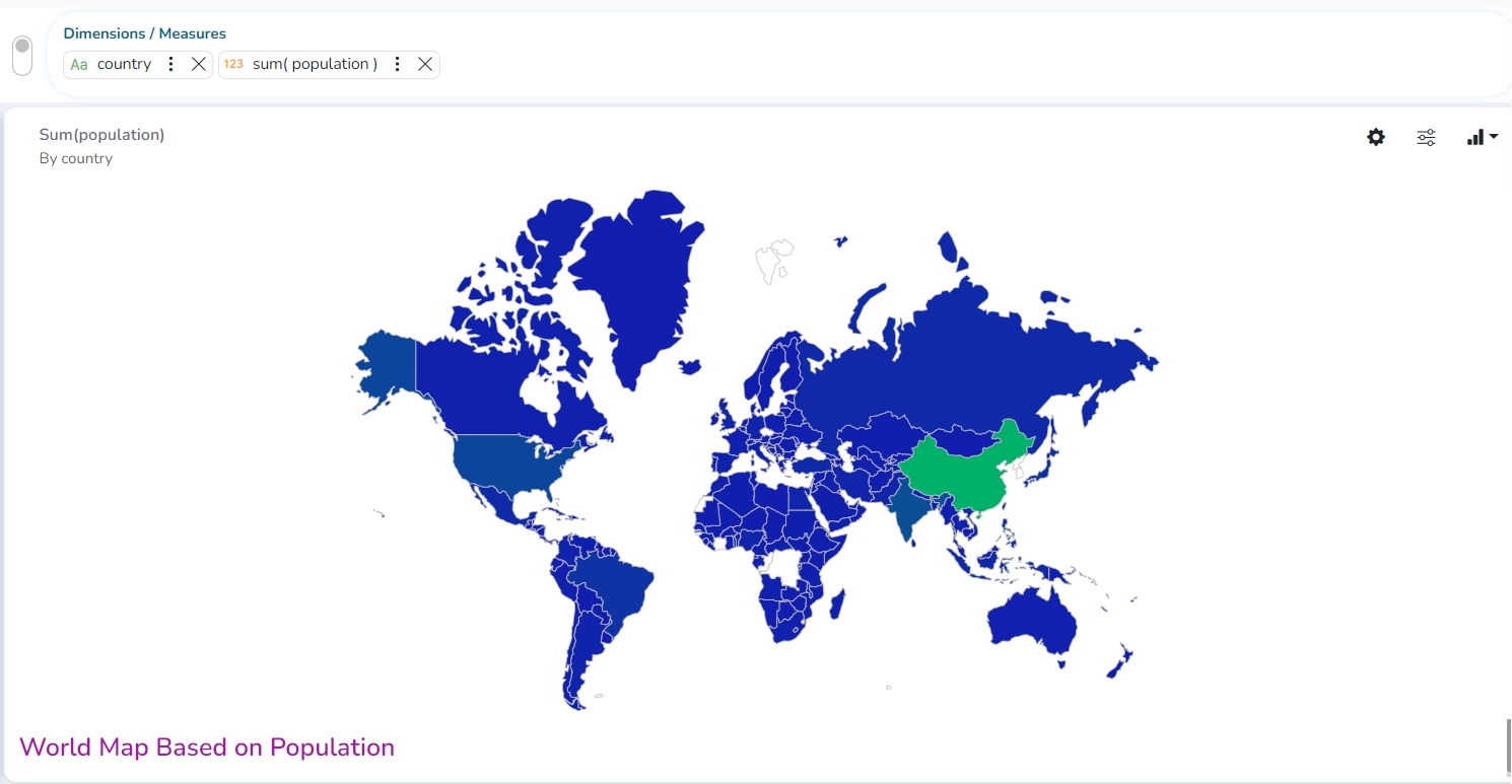
A Map chart allows the users to position their data in a geographical context using different data layers. Users can create a view based on the selected dimensions/measures representing data in the region. The designated area gets colored based on the data. Users have the provisions for changing the visualization.
Best Situation to Use Map: To represent any information in the geographical context.
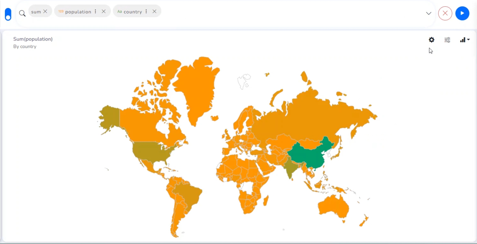
Properties
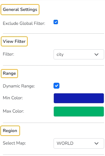
General Settings
Exclude Global Filter: Use a checkmark in the box to exclude the global filter condition.
View Filter
Filter: Select a filter condition to be applied to the view on the storyboard.
Range
Dynamic Range: Enable or disable the dynamic range.
Min Color: Select a color for the minimum value from the drop-down menu.
Max Color: Select a color for the maximum value from the drop-down menu.
Region
Select Map: Select a region using the drop-down menu.
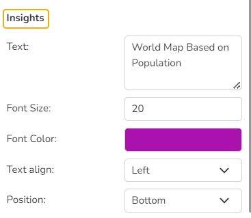
Insights
Text: Provide any information regarding the chart. If any digit or character is required to be highlighted, put it inside two asterisks. (E.g., *70%* or *skills*).
Font Size: Set/modify the Font Size of the Insights text.
Font Color: Select a Font color for the Insights Text.
Text align: There are three alignments to align the text.
Left
Right
Centre
Position: There are two options to position the text.
Bottom
Right
Changing Region
Based on the selected Region the displayed visualization gets changed.
Select a map using the Region drop-down menu.
The map of the selected region gets highlighted based on the chosen dimensions and measures.
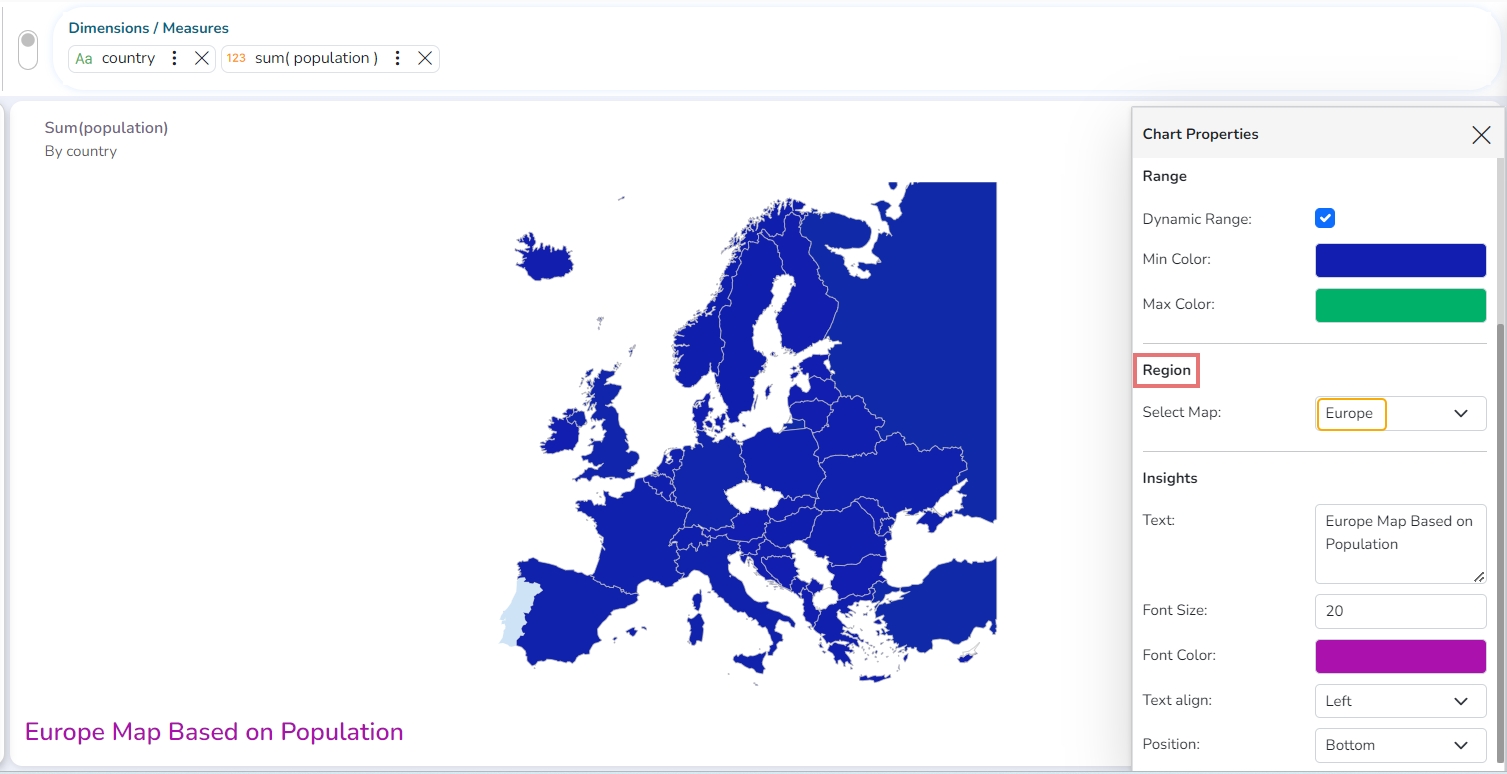
Map of Europe based on count of Population