> For the complete documentation index, see [llms.txt](https://docs.bdb.ai/self-service-visualization-1/llms.txt). Markdown versions of documentation pages are available by appending `.md` to page URLs; this page is available as [Markdown](https://docs.bdb.ai/self-service-visualization-1/chart-gallery/dissolution-decomposition-chart.md).
# Dissolution/Decomposition chart
{% hint style="info" %}
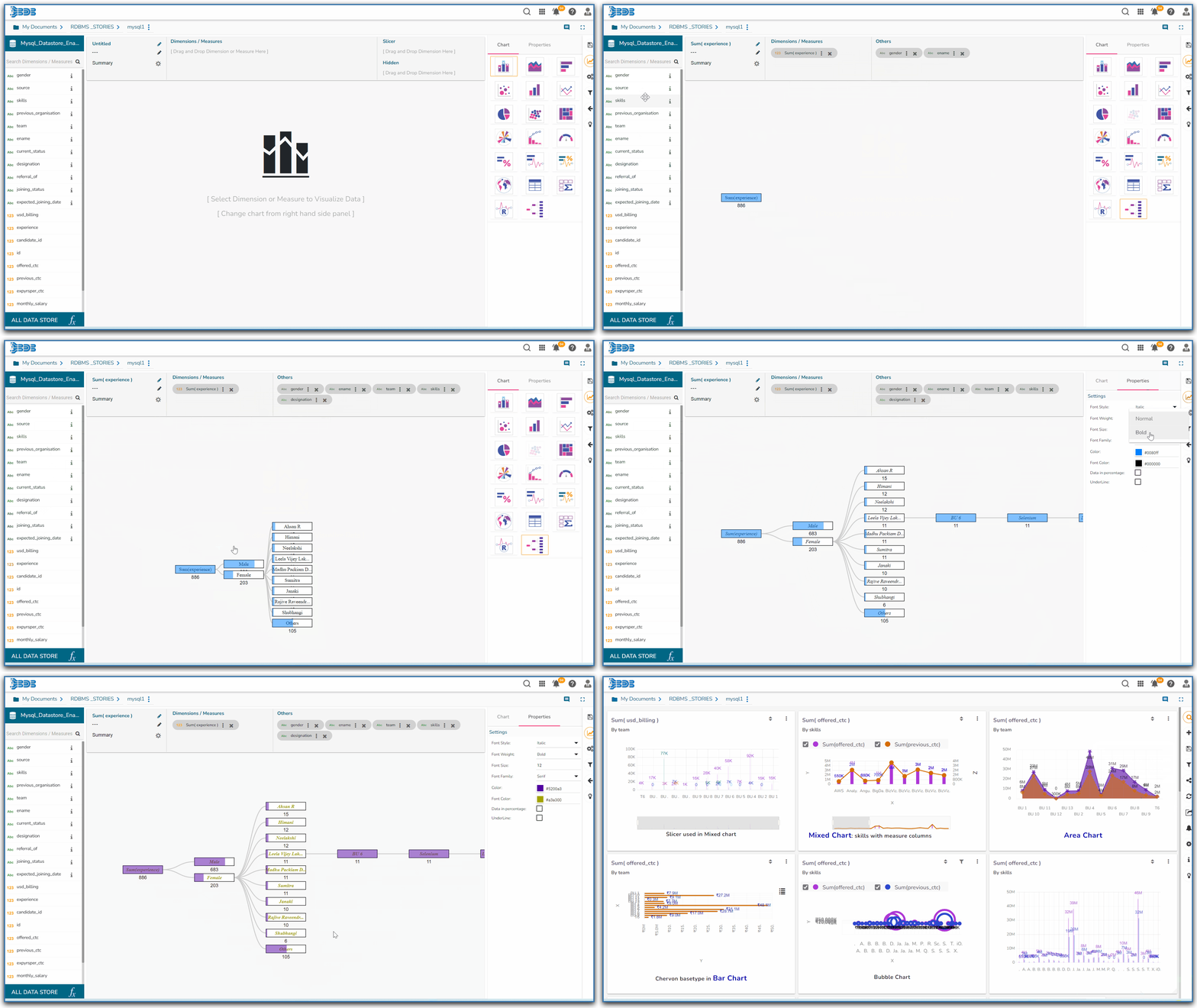
*Check out the given walk-through on how to set the Dissolution chart properties.*
{% endhint %}
The dissolution chart lets you visualize data across multiple dimensions. It automatically aggregates data and enables drilling down into your dimensions in any order.The visualization requires two types of input:
* **Dimension/ Measures:** the metric you would like to analyse. It must be a measure or an aggregate.
* **Others:** one or more dimensions you would like to drill down into (The maximum dimension that can be used is 7)
### **Chart Properties**
1. **Font Style:** Select a font style from the drop-down menu.
2. **Font Weight:** Select a font-weight from the drop-down menu.
3. **Font Size:** Select a font size from the drop-down menu.
4. **Font Family:** Select a font family from the drop-down menu
5. **Color:** Select a color from the drop-down menu
6. **Font Color:** Select a font color from the drop-down menu
7. **Data in Percentage:** Enable data in percentage by turning on the radio button.
8. **Underline:** Enable underline by turning on the radio button.
### **Primary Value Axis**
* **Format Type**: Select a desired format type from the drop-down menu (the provided options for this field are: None, Auto, Percent, Thousand, Lacs, Crore, Million)
* **Currency Type**: Select a currency symbol to be displayed in the view (the provided options for this field are: None, Euro, Rupees, Pound, USD, Yen, Cent)
* **Precision**: Set the after-decimal value (It displays up to 5 precision)
### **Insights**
* **Text:** *Provide any information regarding the chart. If any digit or character is required to be highlighted, put it inside two asterisks. (E.g., \*70%\* or \*skills\*).*
* **Text align:** There are three alignments to align the text.
* Left
* Right
* Centre
* **Position:** There are two options to position the text.
* Bottom
* Right