Common Chart Properties
The chart properties that are commonly found in multiple charting components are explained in this section.
Background Property for charts
Title and Sub-title for charts
X and Y Axis Properties for charts
Legend for charts
Formatter for charts
Axis Setup for charts
Export for charts
Background
Check out the given walk-through on how to apply the Background properties on the Designer charts.

You can insert various background properties and change the display of the chart or various charts in a dashboard.
Once you have associated a data connection with a charting component, you can select the Properties icon to open the chart related properties. To know how to create a Data Connection refer the Establishing a Data Connection section.
The following image displays the default Background Properties that open for the Column chart:

The default data preview for the column chart:

If we modify the Background properties in the following way:
The data preview with the column chart with the applied background properties appears as shown below:

Click the Maximise icon![]() to display the data preview in the full screen.
to display the data preview in the full screen.
The user can add multiple Gradient colors by clicking the Gradient icon![]() from the Background properties panel.
from the Background properties panel.
Click the Gradient icon.

The Background gradient colors window opens.
Click the Add Color option.
A new color gets added for the gradient.
You may change the added color by using the available color pallet.
Click the Save option to save the added colors for the background gradient.
Title & Sub-title
Check out the given walk-through on how to insert Title and Sub-title on the Designer charts.

The user can provide description for Title and Sub-title using the Title and Sub-Title properties fields.
Default Title Properties:

Modified Title Properties:

Default Sub-title Properties:

Modified Sub-title Properties:

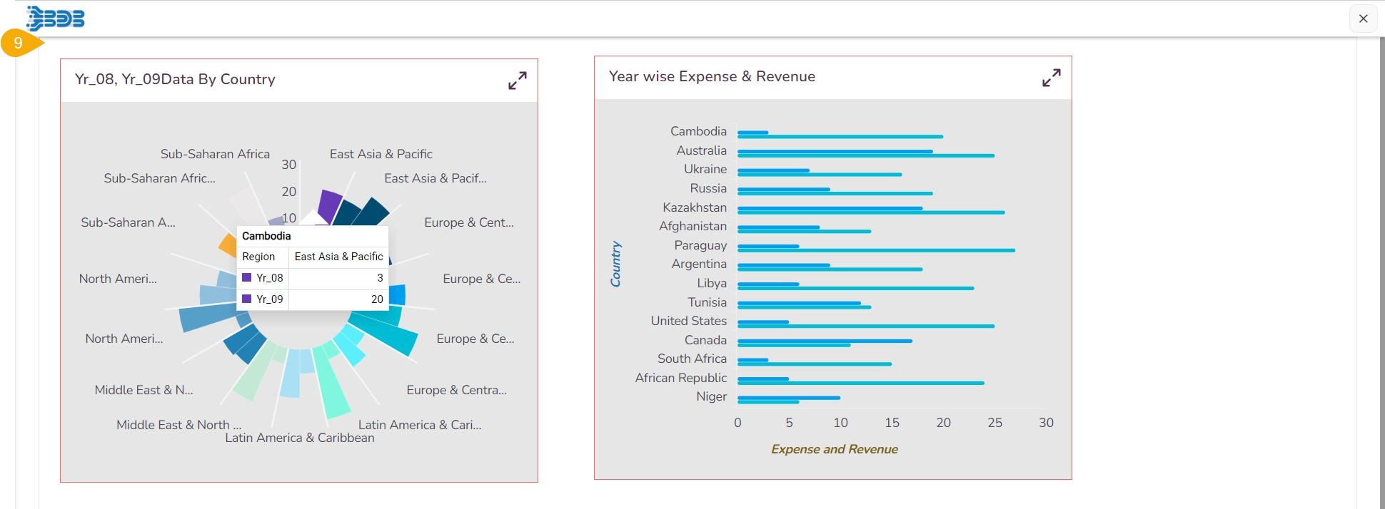
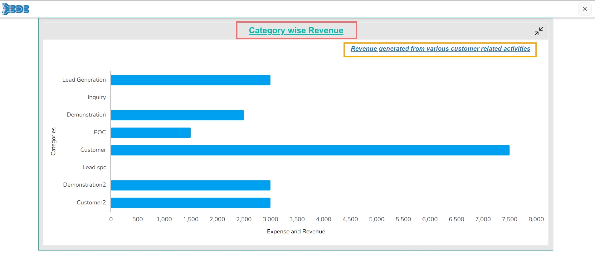
The below-given image displays data preview of a specific data with modified Title and Sub-title properties:
Show Dataset Description
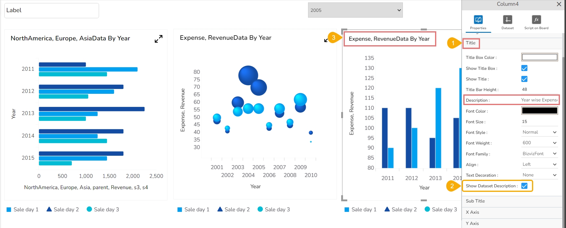
This properties option helps to get a Title for the selected component based on the selected dataset fields. The selected component must be mapped with a dataset.
Open the Title Properties section for a dragged chart component.
Enable the Show Dataset Description option.
It will reflect the Title description based on the selected category and series fields for that charting component ignoring the inserted Title description for that chart.
X & Y Axis Properties
X & Y Axis Properties
Check out the given walk-through on how to modify the X and Y Axis based on their properties on the Designer charts.

The user can modify the default display of the X and Y Axis and the Axis title description by using the given properties.
Default X Axis Properties

Modified X Axis Properties

Default Y Axis Properties

Modified Y Axis Properties

Pre-requisite: To get data preview of any chart it is required to associate a data connection with the selected/ dragged charting component. To know how to create a Data Connection refer the Establishing a Data Connection section.
Data preview with the modified X & Y Axis for a Bar chart

Legend Properties
Check out the given walk-through on how to use the Legend related properties on the Designer charts.

The user can choose to insert a Legend and modify its display using the Legend properties fields provided for a chart.
Formatter
Check out the given walk-through on how to apply Formatter properties on the Designer charts.

Axis Setup
Check out the given walk-through on how to do Axis setup for the Designer charts.

Export Options
Check out the given walk-through on how to use various Export options on the Designer charts.

Exporting Chart
Navigate to the Designer homepage.
Click the Dashboard Designer option.

Click the Add Dashboard option (You can use the New option to create a new dashboard).

The Dashboard Canvas page opens.
Click the Data Connectors icon.

Create a new Data Connection.
Click the Component Library icon.

The charts menu opens.
Select a chart component and drag it to the dashboard canvas. E.g., the Bar chart is used in the image.

Use the Dataset option to associate the data connection with the dragged charting component.
Provide the data fields under the Category and Series.

Open the Component Properties.
The Export Options are displayed.
Use a checkmark to enable the Context menu for the Export options.
The Context menu will appear based on the selected Export options.
Based on the provided information for the following list the information will get exported:
Export Heading
Export Sub-Heading
Export File Name
Global Export Type

Navigate to the dashboard preview screen.
Use the right-click to get the Export Context menu.

Click on an Export category.
The Dashboard gets downloaded in the concerned export option.

Click the Print Preview option to print the Dashboard preview.
Click the Show Data option to display the data in a grid format.

Export Chart to CSV with Plugin Script
Users can export a chart into CSV using a plugin script as well.
Check out the illustration on how to use a plugin script for exporting a chart data into CSV.
Navigate to a dashbord with at least two components. In this case, Bar chart contains mapped data and the Label component is used to map the plugin script.

Click the script icon to open the dashboard level and component level script page.
Choose the Label comopnent.
Enter the plugin script to export the chart data into CSV format.

The chart data will be exported in a CSV file.

Plugin Script used
Export with Formatter
The users can export the chart data with formatter to Excel or CSV formats.
Check out the illustration on exporting a chart data into Excel or CSV with Formatter.
Navigate to a dashbaord and select a charting component mapped with some data.

Open the Formatter properties and define some fomatters for the selected chart.
Unit
Precision
Currency
Position
Number Formatter

Make sure that Excel Options are enabled for the chart.
Click the Preview icon.

Access the Export context menu in the preview mode with right click.
Click on Export to Excel and Export to CSV in turns to export the data into Excel or CSV.

The data will be exported to the .xlsx and .csv files.

Open the exported Excel & CSV files the data will appear in it with the selected formatter options.


Copy Paste Chart Properties
Synchronize the display properties of multiple charting components by using the Copy and Paste Properties options.
The Copy Properties and Paste Properties options given in the component (chart) properties menu provide a convenient way to synchronize the display properties of charting components. The user can easily align your dashboard elements to achieve a cohesive and visually appealing presentation.
The following are the steps to use this functionality:
Open a Dashboard within the Designer canvas.
Identify the charting component whose properties you wish to copy.
Right-click on that charting component to reveal the component context menu.
Select the Copy Properties option from the context menu. The properties of the selected charting component are now copied to the clipboard.
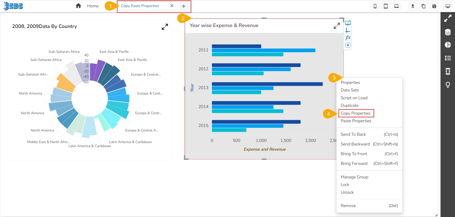
Locate the target charting component that you want to align with the copied properties.
Right-click on the target charting component to display the context menu.
Select the Paste Properties option from the context menu. The properties copied to the clipboard will now be applied to the selected charting component.

The targeted component instantly displays the copied properties of the source component.
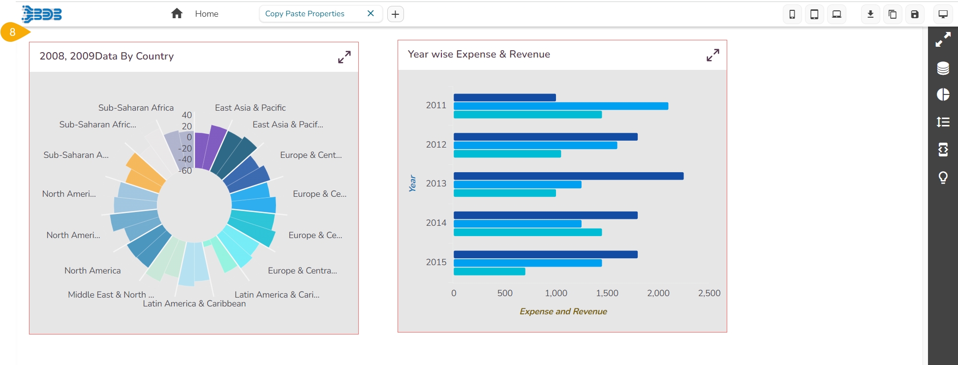
The user can also view the applied changes in the Preview mode of the dashboard.
