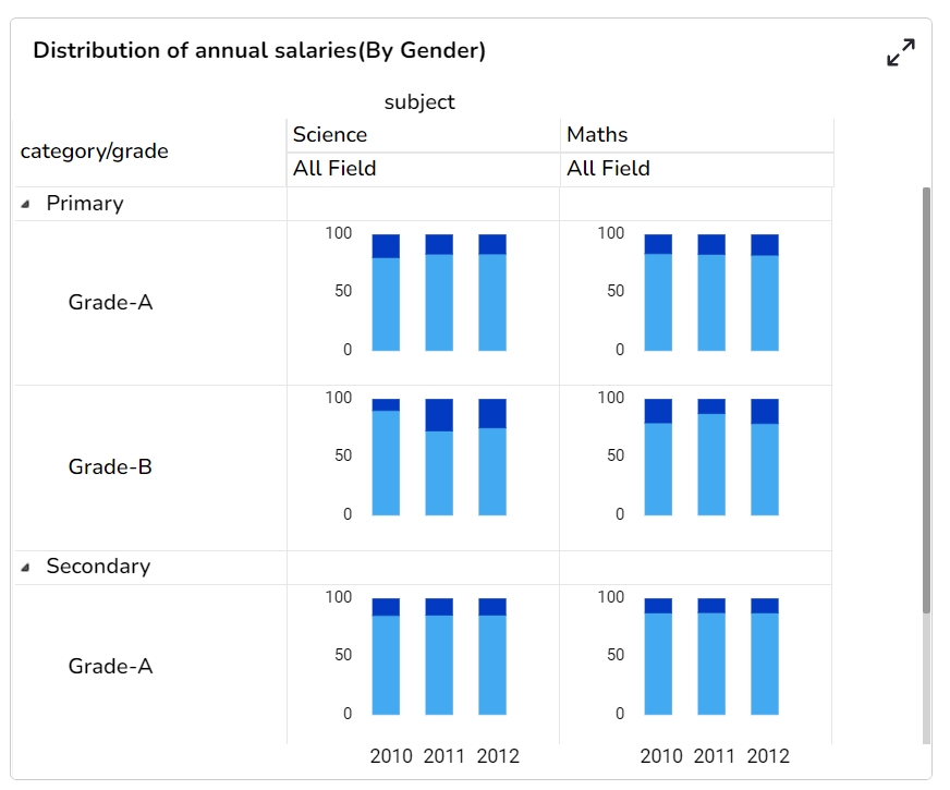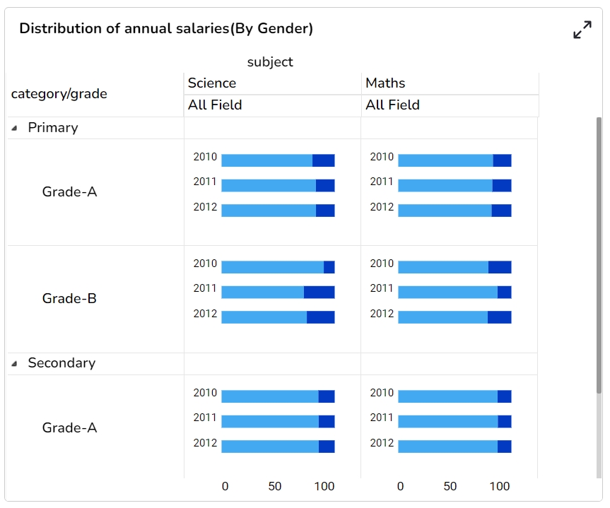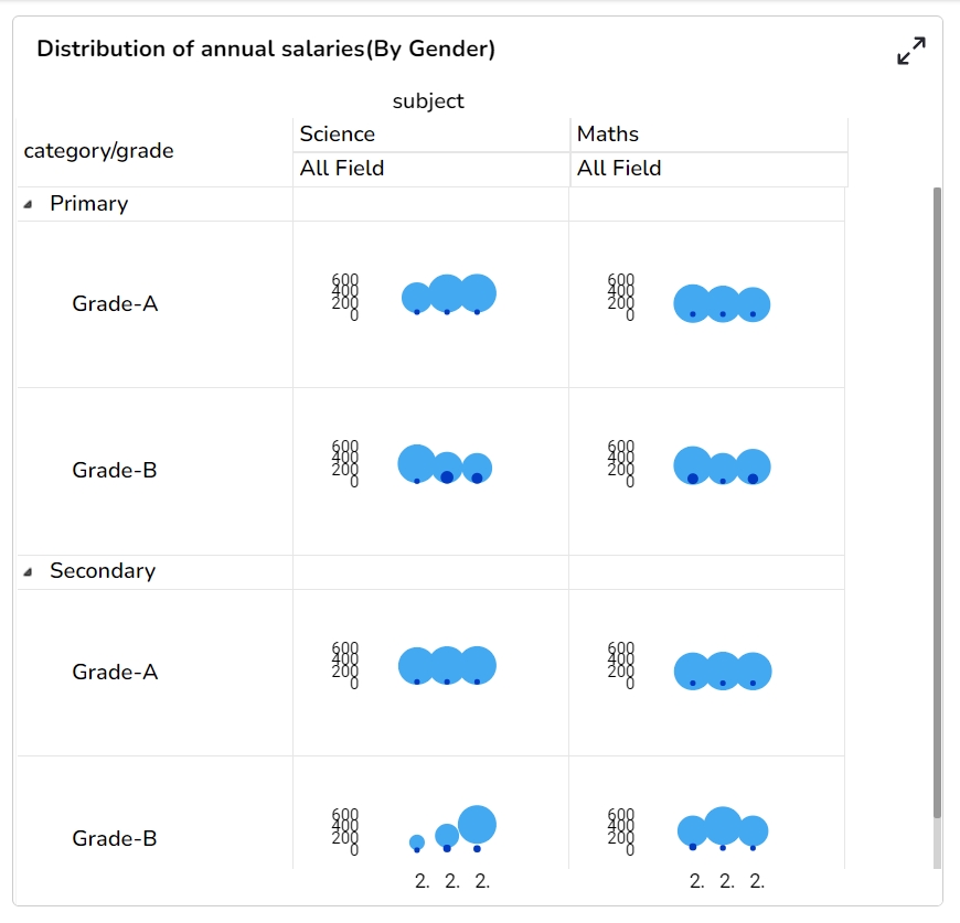
The Trellis chart is a network of small charts. It is a repetition of a chart across a grid. Generally, a minimum of two dimensions are used, one for the grid variable and another for the x-axis within each small chart. Users can analyze the metrics within each chart without a query (a selection) and compare with the rest of the group at the same time via a trellis chart. A chart will be shared on the same Y-axis, so it becomes easier for users to identify irregular behavior among the variables by accurately comparing the metrics across the grid.
Analyze text data
Identify trends and patterns that would otherwise be unclear or difficult to see in a tabular format.
Component Name: The identifier for the chart component within the application.
Left: Specifies the horizontal position of the chart on the display area.
Top: Defines the vertical position of the chart within the layout.
Height: Determines the vertical size of the chart.
The Merge Series properties allow users to configure and customize the merging of data series in the chart. The following fields are available for configuration:
Enable Merge Series: Toggle this option to activate or deactivate the merging of series within the chart. When enabled, multiple data series are combined into a single visualization.
Chart Type: Select the type of chart to be used when series are merged. This determines how the combined data will be presented visually within the chart.
Field Title: Specify a title for the merged data field. This title is displayed in the chart to identify the collective data representation.
To customize the appearance of the Knowledge chart, users can configure the following background properties:
Gradient Rotation: Adjust the angle of the gradient fill to create smooth transitions between colors.
Opacity: Set the transparency level of the background, allowing for varying degrees of visibility.
Gradient: Choose and customize a gradient fill, which includes selecting multiple colors and blending them seamlessly.
The Title properties provide various customization options for enhancing the presentation of the title box within your project. These include:
Title Box Color: Set the background color of the title box for visual distinction.
Show Title Box: Toggle the visibility of the title box, allowing it to be hidden or displayed as needed.
Show Title: Control the visibility of the title text within the title box.
Title Bar Height: Adjust the height of the title bar, enabling better visual balance and space management.
Show Subtitle: Enable or disable the display of the subtitle in the chart.
Description: Add descriptive text or additional information below the subtitle.
Font Color: Select the color for the subtitle text.
Font Size: Specify the size of the subtitle text.
Unit: Define the unit of measurement for the values displayed in the chart.
Precision: Set the number of decimal places to display for numerical values.
Currency: Format the numbers as a currency with the appropriate symbol.
Position: Determine the position of the formatted value (e.g., before or after the number).
Enable Context Menu: Activate a right-click context menu for quick access to export options in the preview mode of the chart.
Export Excel: Save the chart data in an Excel file format (.xlsx).
Export CSV: Export the chart data to a CSV file format (.csv).
Export JPEG: Export the chart as a JPEG image (.jpg).
The Styles properties allow users to customize various aspects of the chart's appearance:
Horizontal Grid Lines: Enable or disable horizontal grid lines in the chart.
Horizontal Line Color: Select the color for horizontal lines.
Vertical Line Color: Choose the color for vertical lines.
Header BG Color: Set the background color for the header of the chart.
Trellis with Line chart
Download the given sample data and map it as mentioned below to plot your Trellis chart:
Use the Year column as Row, Subject column as Column, t1 and t3 columns as Series, and category column as Category to plot the chart as given below:
Width: Sets the horizontal size of the chart.
Initial Visibility: Controls whether the chart is visible when first rendered.
Max Button: An option to enable or disable the maximize button to expand the chart view.
Base Type: Defines the fundamental configuration or type of the chart. The available options for Base type are Plain, Rectangle, Gradient 1, Gradient 2, and Gradient 3.
Row Height: Specifies the height for each row within the chart structure.
Parent Aggregation: Establishes the main aggregation procedure applied to the chart's data.
Aggregation Type: Sets the method of data aggregation to be applied, such as sum or average.
Drawing Mode: Indicates the mode or style used for rendering the chart.
First Column Width: Determines the width of the first column, setting the layout for subsequent columns.
Column Type: Choose the type of column used in the chart, which affects how the merged series is structured and displayed within the chart view.
The Background gradient Colors dialog window opens.
Click the Add Color option to insert more colors.
Click the Save option to save the selected background colors.
Border: Define the thickness and style of the border surrounding the chart.
Border Color: Select a specific color for the chart border to make it stand out or blend in with the background.
Border Radius: Round the corners of the chart border to achieve a softer and more modern look.
Shadow: Add a shadow effect to the chart to create depth and emphasize its placement.
Shadow Color: Customize the color of the shadow to complement the overall design of the chart.
Shadow Transparency: Control how transparent the shadow is, affecting the subtlety of the shadow effect.
Description: Allow for adding descriptive text that complements the main title, offering additional context.
Font Color: Set the color for the title text, ensuring clarity and readability.
Font Size: Specify the size of the title text, aiding in achieving visual hierarchy.
Font Style: Enable the selection of the title's font style, such as italic or normal, to convey emphasis.
Font Weight: Define the thickness of the title text, ranging from light to bold, for added visual impact.
Font Family: Set the typeface of the title text to maintain consistency with other elements.
Align: Align the title text within the title box, with options like left, center, or right for optimal layout.
Text Decoration: Appliy additional stylings, such as underlines to the title text for emphasis.
Show Dataset Description: Enable or disable the dataset description in the title.
Font Style: Choose a font style for the subtitle, such as italic or normal.
Font Weight: Set the weight (boldness) of the subtitle font. Options include Normal, Bold, 300, 600, and 900.
Font Family: Choose the font family for the subtitle text from the available options.
Align: Align the subtitle text to the left, center, or right.
Text Decoration: Apply decorations like underlining to the subtitle text.
Number Formatter: Apply a specific notation or style to the numbers (e.g., Indian, International).
Export PNG: Export the chart as a PNG image (.png).
Export PPT: Export the chart to a PowerPoint presentation (.pptx).
Export PDF: Export the chart as a PDF document (.pdf).
Show Print: Include an option to print the chart directly.
Export Heading: Add a custom heading to the exported file.
Export Sub Heading: Add a custom subheading to the exported file.
Export File Name: Specify the file name for the exported file/dashboard.
Global Export Type: Define the default export format using the drop-down (e.g., Screenshot, Tabular).
Font Color: Adjust the color of the text displayed in the chart.
Font Size: Change the size of the text for clarity and emphasis.
Font Style: Select font styles such as normal, italic, or oblique.
Font Weight: Define the thickness of the text, e.g., normal, bold.
Font Family: Choose the typeface for the chart text.
Text Align: Align text to the left, right, center, or justify it.
Text Decoration: Add text decorations like underline or overline.


