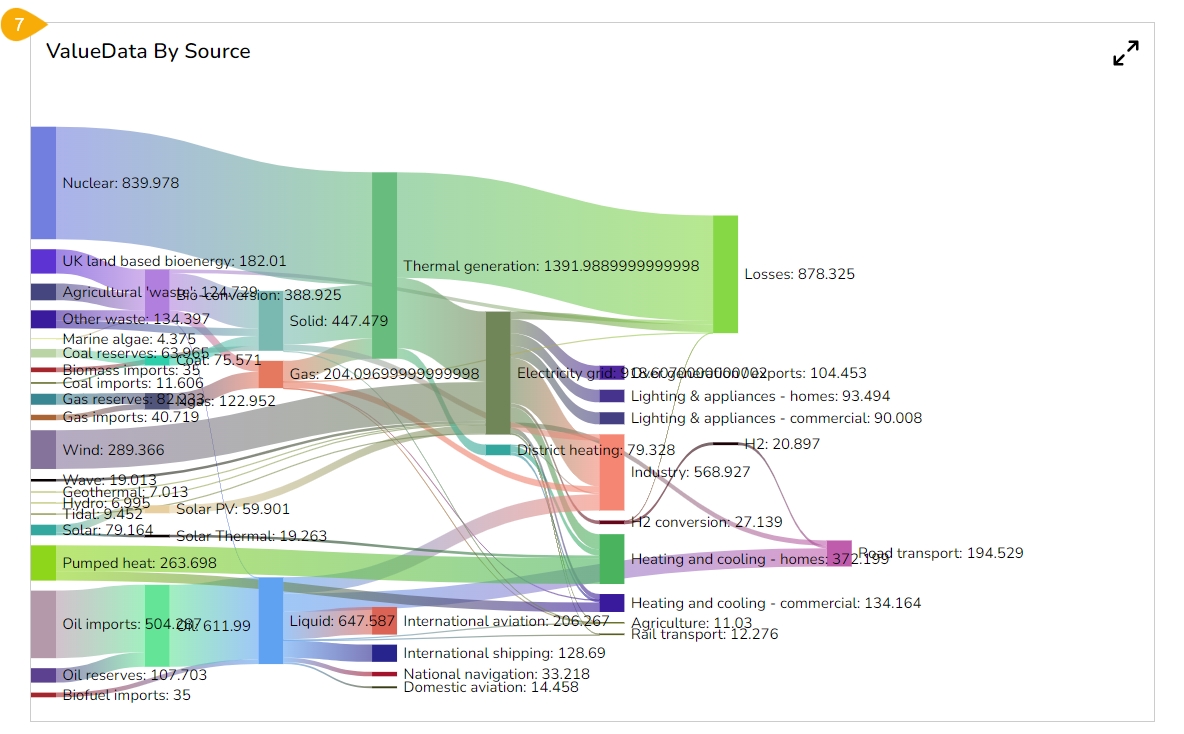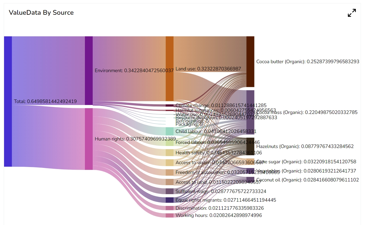
A Sankey chart is a type of flow diagram that represents the flow of data or resources between different nodes or stages of a process. It is a visual tool used to illustrate complex systems or processes and show how different components are interconnected. The chart uses the thickness of arrows or lines to represent the quantity or flow of a variable. The width of each arrow corresponds to the relative size of the flow, making it easier to understand the proportions and relationships between different elements.
When you need to visualize the flow of data or resources between different components of a system or process.
To illustrate the flow of energy, materials, money, or customer journey mapping through a system by identifying the areas of inefficiency or waste. E.g., If an energy analyst wants to identify the areas of energy waste in a manufacturing plant, A Sankey chart can help here to visualize the flow of energy through the different components of the plant, this can help you to build a strategy for improving efficiency by identifying areas where energy is being wasted.
There are following variations of the Sankey chart available to use this chart effectively.
Multi-level Sankey chart: A Multi-Level Sankey chart extends the traditional Sankey chart by allowing multiple layers or levels of nodes. This grants for a more detailed representation of complex systems with subcategories or sub-processes.
Circular Sankey chart: The Circular Sankey chart places the nodes and flows in a circular layout, making it easier to visualize cyclic or feedback processes. It is particularly useful when there are interconnected loops in the flow data.
Marimekko (Mekko) chart: The Marimekko chart, also known as the Mekko chart or Variable Width Bar chart, is a combination of a bar chart and a Sankey chart. Instead of flowing lines, it uses varying width bars to represent the flow between different entities or categories.
Component Name: The unique identifier for the Group column chart.
Left: The position of the chart from the left edge of the containing element.
Top: The position of the chart from the top edge of the containing element.
Height: The vertical dimension of the chart.
The user can show the description of the series and can use the tooltip by enabling it.
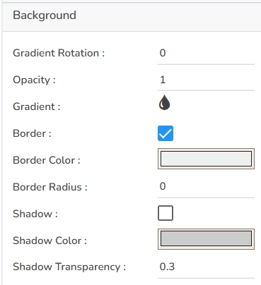
Gradient Rotation: The angle at which the gradient background is applied to the chart.
Opacity: The transparency level of the chart's background.
Gradient: The type and direction of the gradient fill used in the background.
Click the
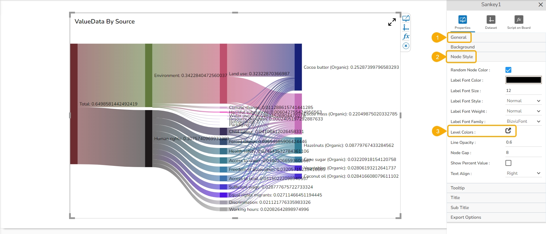
The user can enable and select various Node-specific properties for the Sankey chart by using the Node Style properties fields.
Random Node Color: Assigns random colors to each node.
Label Font Color: Sets the color of the node labels.
Label Font Size: Specifies the size of the font for the node labels.
Label Font Style: Defines the style (e.g., italic) of the node label fonts.
The user can show the series description and get the tooltip by enabling it from the chart properties.
Show Tool Tip: Enable or disable the display of tooltips on the chart.
Click the Show Tool Tip icon to access the Tool Tip Configuration window.
Select the Default option.
Background Color: Choose the background color of the tooltip.
Border Color: Choose the color of the border around the tooltip.
Tooltip Font Size: Set the font size of the displayed text within the tooltip.
Tooltip Font Style: Choose a font style for the tooltip (e.g., Normal, Italic).
Title Box Color: Choose the background color for the title box.
Show Title Box: Enable or disable the display of the title box on the chart.
Show Title: Enable or disable the display of the title text.
Title Bar Height: Set the height of the title bar.
Show Sub Title: Enable or disable the display of the sub-title text.
Description: Add a description text below the sub-title.
Font Color: Select the color of the sub-title text.
Font Size: Specify the size of the sub-title text.
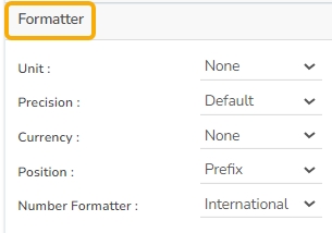
Unit: Define the unit of measurement for the values displayed in the chart.
Precision: Set the number of decimal places to display for numerical values.
Currency: Format the numbers as a currency with the appropriate symbol.
Position: Determine the position of the formatted value (e.g., before or after the number).
The Export Options also helps to provide a heading, subheading, and file name. The user can also select an option for Global Export Type.
Enable Context Menu: Activate a right-click context menu for quick access to export options in the preview mode of the chart.
Export Excel: Save the chart data in an Excel file format (.xlsx).
Export CSV: Export the chart data to a CSV file format (.csv).
Export JPEG: Export the chart as a JPEG image (.jpg).
The user can get the Export Context Menu from the preview mode to download the reports in different export formats.
Navigate to the appearance properties of the Sankey chart.
Open the Node Style properties.
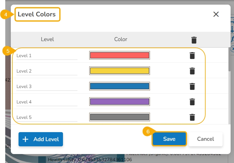
Click the Level Colors icon.
The Level Colors window opens.
Set various colors for the different levels.
Click the Save option.
The level colors get changed accordingly in the preview mode of the chart.
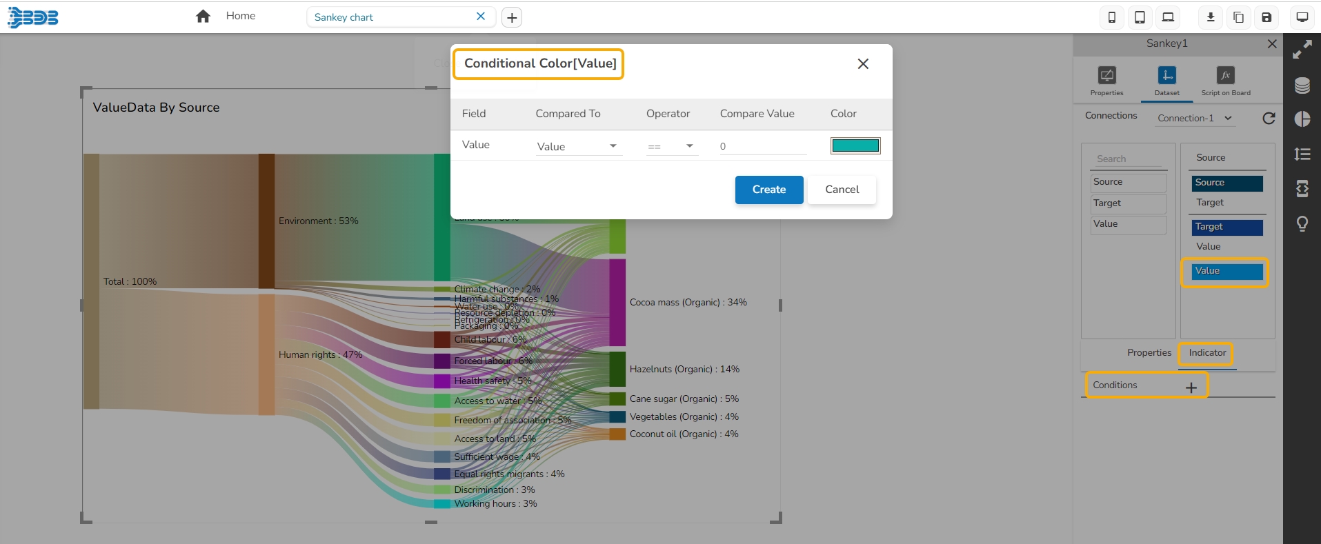
The user can provide color based on the Categories of the Source field and Sub-Categories of the Target field using the Indicators tab. Based on the inserted names the colors get reflected in the preview mode.
Check out the illustration to understand how to provide colors for the source categories and access them in preview mode.
The user can also define Conditional Colors for the value field using the Indicator tab.
Download the given sample data and map it as mentioned below to plot your Sankey chart:
Select the Source column as Source, Target column as Target, and Value column as Value fields to plot the above-mentioned data.
Interactive Sankey chart: Interactive Sankey charts allow users to explore the data by interactively filtering or highlighting specific flows or nodes. This enhances the user experience and provides a more engaging visualization.
Stacked Sankey chart: The Stacked Sankey chart displays multiple flows within a single node, showing the distribution of different sub-flows coming from or going to the same entity.
Width: The horizontal dimension of the chart.
Initial Visibility: Whether the chart is visible when initially rendered.
Max Button: Indicates if a button is available to maximize the chart.
Animation: Whether the chart includes animation effects when rendered or interacted with.
Edge Color Style: Choose a color style option to represent the edge inside the chart (e.g., Gradient, Source, Target).
Highlight Path Style: Choose an option from the drop-down menu to highlight the path style in the chart (e.g., Adjacent, Trajectory).
Click the Add Color option to insert more colors.
Click the Save option to save the added background gradient colors.
Border: The style or type of border surrounding the chart.
Border Color: The color of the border surrounding the chart.
Border Radius: The curvature of the chart's corners.
Shadow: Enable the shadow effect on the chart by marking the given checkbox.
Shadow Color: The color of the shadow effect.
Shadow Transparency: Set the transparency level of the shadow effect.
Label Font Weight: Determines the thickness (e.g., bold) of the node label fonts.
Label Font Family: Select the font family for the node labels.
Level Colors: Colors each level of nodes differently.
Click the Level Colors icon from the Sankey chart properties.
The Level Colors window opens.
Use the Add Level option to add new colors.
Click the Save option to save the colors.
Line Opacity: Adjusts the transparency of the node connector lines.
Node Gap: Sets the gap between the nodes.
Show Percent Value: Toggles the display of percentage values within nodes.
Text Align: Aligns the text within the nodes (left, top, right, bottom).
Tooltip Font Weight: Choose an option to set the boldness of the tooltip fonts (e.g., Normal, Bold, 300, 600, 900).
Tooltip Font Family: Choose a font type from the available list of fonts.
Tooltip Font Color: Choose a color for the tooltip fonts.
Box Width: Select an option from the drop-down to display the width of the tooltip box.
Precision: Set the number of decimal places shown in the tooltip values.
Description: Add a description text below the title.
Font Color: Select the color of the title text.
Font Size: Specify the size of the title text.
Font Style: Choose the font style (e.g., italic or normal).
Font Weight: Set the weight (boldness) of the font. The supported options are Normal, Bold, 300, 600, and 900.
Font Family: Choose the font family for the title text from the given choices.
Align: Align the title text (e.g., left, center, right).
Text Decoration: Apply text decorations (e.g., underline) to the title text.
Show Dataset Description: Enable or disable the dataset description in the title.
Font Style: Choose the font style for the Sub-title (e.g., italic or normal).
Font Weight: Set the weight (boldness) of the font. The supported options are Normal, Bold, 300, 600, and 900.
Font Family: Choose the font family for the sub-title text from the given choices.
Align: Align the sub-title text (e.g., left, center, right).
Text Decoration: Apply text decorations (e.g., underline) to the sub-title text.
Number Formatter: Apply a specific notation or style to the numbers (e.g., Indian, International).
Export PNG: Export the chart as a PNG image (.png).
Export PPT: Export the chart to a PowerPoint presentation (.pptx).
Export PDF: Export the chart as a PDF document (.pdf).
Show Print: Include an option to print the chart directly.
Export Heading: Add a custom heading to the exported file.
Export Sub Heading: Add a custom subheading to the exported file.
Export File Name: Specify the file name for the exported file/dashboard.
Global Export Type: Define the default export format using the drop-down (e.g., Screenshot, Tabular).


