Loading...
Loading...
Loading...
Loading...
Loading...
Loading...
Loading...
Loading...
Loading...
Loading...
Loading...
Loading...
Loading...
Loading...
Loading...
Loading...
Loading...
Loading...
Loading...
Loading...
Loading...
Loading...
Loading...
Loading...
Loading...
Loading...
Loading...
Loading...
Loading...
Loading...
Loading...
The users can set or alter various Form properties using the Properties tab displayed under the Form Settings option. This section explains all the listed Form properties.
Loading...
Loading...
Loading...
Loading...
Loading...
Loading...
Loading...
The Page Settings option helps to Rename, Duplicate, and Delete the selected page of a Form. The Page Settings icon is provided in the Header panel of a Form.
The users get the Question Settings icon next to the Question Save icon for the selected question. This page aims to explain the Question Settings option.
Each published Form is credited with some operations on the BDB Platform. The users can use right-click to access the available Form operations in a context menu.
The Page Settings icon prompts a Rename Page dialog box to rename the Page.
Click the Page Settings icon from the Header panel.
Select the Rename option from the content menu.
The Rename Page dialog window opens.
Provide a new name for the page.
Click the Save option.
A notification message appears.
The selected page gets renamed.
This section aims at describing the various components provided on the page.
Page 1 opens by default for a newly created Form.
The user can start adding questions to the default page.
Click the Add New Page icon to create a new page.
The Create Page dialog box opens.
Provide Page Name.
Click the Save option.
A notification message appears.
The page gets added to the form.
Click the Add New Question icon.
A success message appears.
The question related fields get added to the Form.
Provide the following information to develop a question:
Question: Insert the question text in the given field.
Select Answer Type: Select an answer type using the drop-down menu
The following Answer Types options are provided:
Radio Button
Checkbox
Dropdown
Multi-Select dropdown
Textbox
Number
Textarea
Date Picker
Time
Password
HTML Editor
Attachment
Label
Group Question
Display Name: Displays the inserted question text.
Field Identifier: Data in Forms are stored in JSON format. The Field identifier is a key, and answers are valued; it helps to extract the required data from the DB.
Option: Provide the relevant option. This field appears bade on the selected answer type option. (Here, the selected answer type is Checkbox)
Use the Add option button to add more options
Use the Add other option with input after adding more than 2 options.
Click the Question Save icon to save the question information.
The newly added question gets saved, and a success message appears confirming the action.
Please Note:
These options appear only for Radio Button, Checkbox, Drop-down, Multi-Select Dropdown answer type.
Click the Question Settings icon to get the Question Settings information.
The user can follow the given steps below to create a new form:
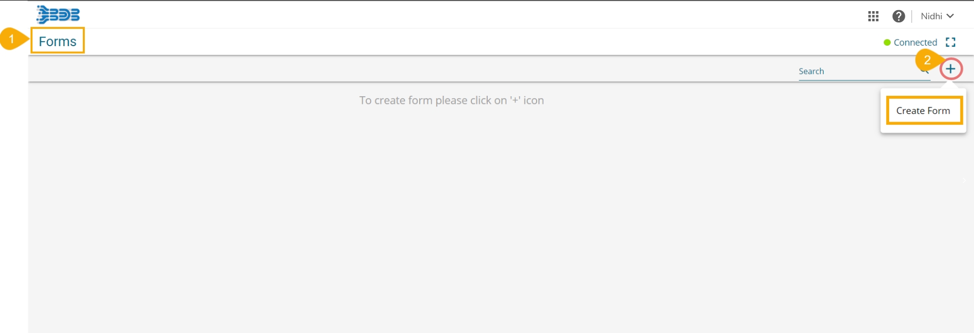
Navigate to the Form landing page.
Click the Create Form icon.
The Create Form window opens.
Provide the following information:
Form Name: Provide a title for the Form.
Form Instruction: Insert a Form Instruction for all the users who access the Form.
Form Logo: Attach an image to be used as Form logo (The image file should be less than 50 KB).
Click the Save option.
A success message appears.
The newly created form gets added to the Form Landing page.
The user gets redirected to the landing page of the newly created form to add a new page (by default).
The newly created Form gets the Connected status by default.
Please Note: The user needs to click the newly created Form tile to open the Form landing page (it opens by default for the first time after creation).
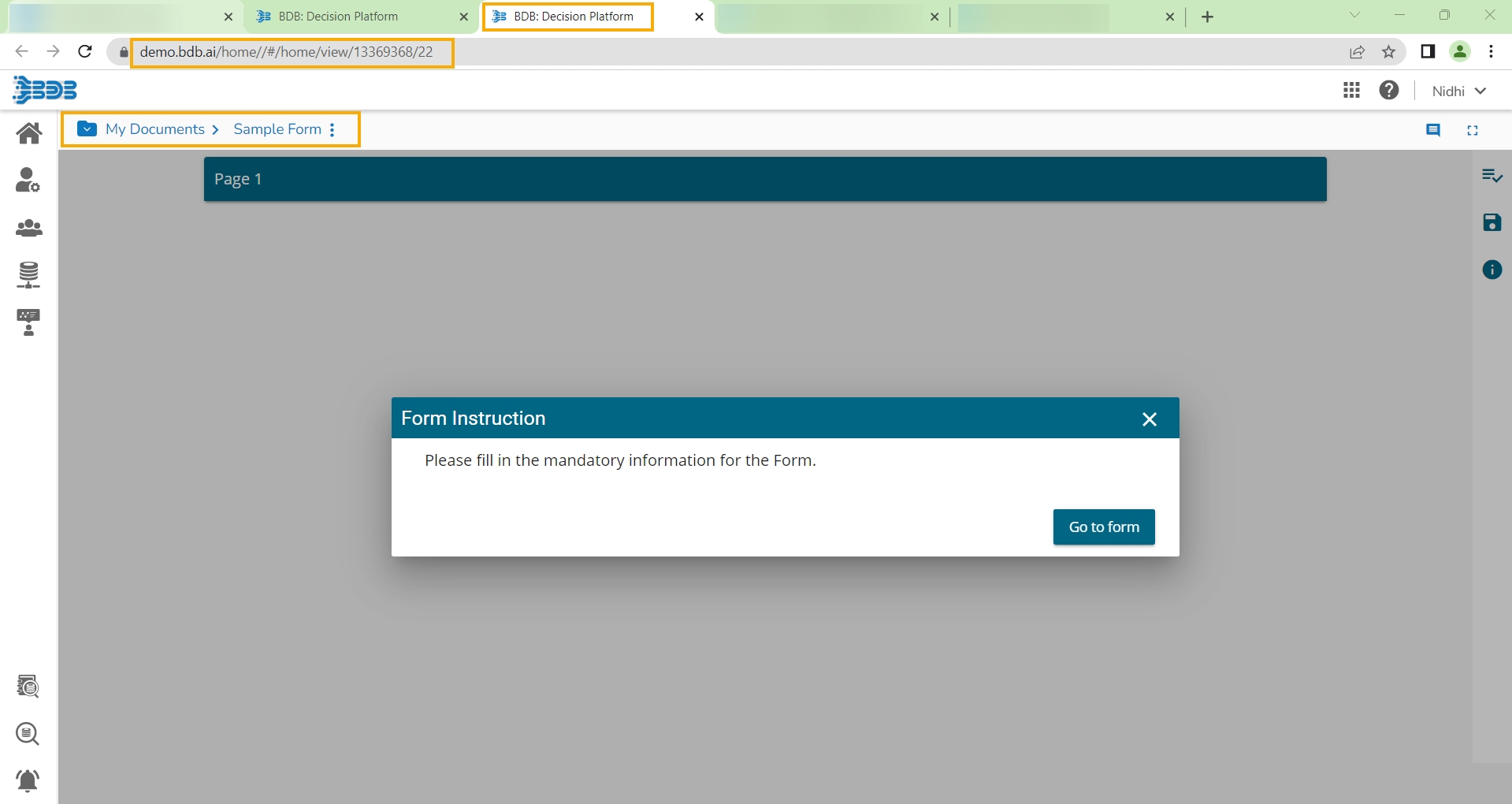
The inserted Form Instruction appears by default in a pop-up window while opening that form in the Preview mode (as shown in the below image). Click the Go to form option to access the form content and give a response.
The Delete option prompts to delete the selected page.
Click the Page Settings icon from the Header panel.
Select the Delete option from the content menu.
A new window opens, asking to confirm the action of deletion.
Click the Yes option if you wish to delete the page.
The page gets deleted.
Please Note: Click the No option if you wish not to delete the page.
The Duplicate option prompts to duplicate the selected page.
Click the Page Settings icon from the Header panel.
Select the Duplicate option from the content menu.
The Duplicate Page window opens.
The page name gets displayed with the 'Copy of’ prefix (E.g., Page 1 gets reflected as Copy of Page 1.)
Click the Save option.
A notification message appears.
The duplicated page gets added down.
By clicking the Question Settings icon, 3 settings options for a question get displayed.
The Duplicate settings option prompts to copy the selected question.
Click the Duplicate option from the menu.
A success message appears to inform the user that the selected question is copied successfully.
The copied question gets added below the selected question as mentioned in the below image:
The Delete option from the Question prompts you to delete the selected question.
A new window opens, asking to confirm the action of deletion.
Click the Yes option if you wish to delete the question.
Click the No option if you wish not to delete the question.
Based on the selected option, the question either remains in the Form or gets removed.
This section explains question related properties.
Placeholder: The set placeholder text appears when the answer field is kept empty as displayed in the following image:
Required: Enabling the required option, the question becomes mandatory to be answered. The question gets a ‘*’ mark to indicate the same.
Disabled: Selecting the No option for this field allows the user to upload multiple files for this. By selecting the Yes option, the question disabled for the user to give a response.
Question Tooltip: Add a tooltip to the right side of this field.
Error Message: The label provided for this field appears as an error message.
Prefix Example: Special characters like $, @, & can be added as a prefix.
Postfix Example: Special characters like $, @, & can be added as a postfix.
The preview page describes:
Default Value: The set value becomes the default value for this field, before user interaction. Having a default value overrides the placeholder text.
Minimum Length: Set minimum length requirement for the field.
Maximum Length: Set maximum length requirement for the field.
Select the type of conditions you want to add to the selected question.
Navigate to the Condition tab displaying on the Question Properties window.
Choose a condition out to the below given choices:
None
Hide Questions
Disable Questions
Click the Save option to save the selected condition.
The selected condition gets applied to the question.
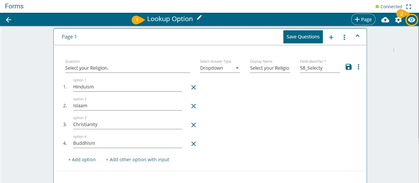
The Lookup tab allows the user to get a lookup option for the Answer types like Radio Button, Checkbox, Dropdown, and Multi-select dropdown. The lookup option can be a saved response to any of the Textbox type questions.
The following steps explain the process to get the Lookup option for a specific question:
Navigate to the Question page selecting a form.
Make sure you have at least two questions:
Question 1 with either of the choices given as answer type out of Radio Button/ Checkbox/ Dropdown/ Multi-select dropdown.
Question 2 with Textbox inserted as the answer type.
Open the Question Properties window for Question 1.
Click the Lookup tab.
Select the Yes option for Lookup.
Select a question using the drop-down menu.
Click the Save option to save the Lookup settings.
Save the questions and publish the form.
Open the responses page for the published form.
See the available options provided for Question no. 1
Give response for the Question no. 2
Save the response.
Check the available options for Question no. 1.
The response for Question no. 2 gets added in the lookup.
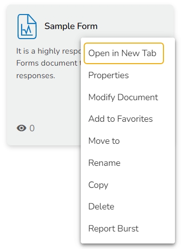
Select the Open in New Tab option using the Context menu.
The form opens in the new tab.
The users can publish the forms created by them to the BDB Platform. The published forms can be accessed on the BDB Platform homepage under the My Documents section.
Click the Publish icon from the header panel of the selected Form.
Or
A pop-up window opens to confirm the action.
Click the Yes option to publish the form.
A success message appears to confirm the action of the publish.
The published form appears under My Documents place of the same BDB Platform account.
Select the Properties option from the context menu.
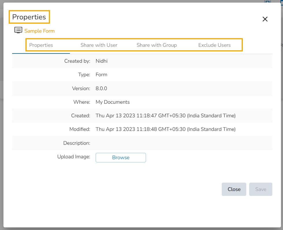
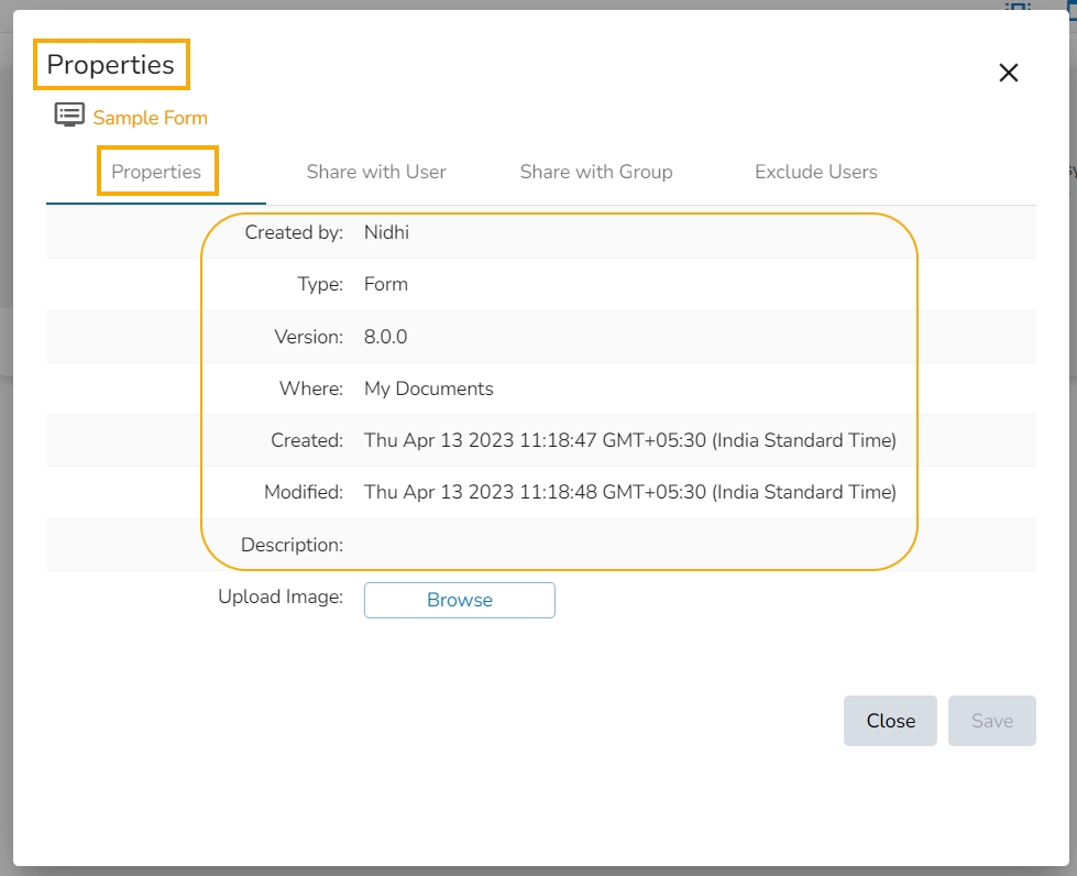
The Properties window appears with four options:
Properties: Displays basic details about the Form creation.
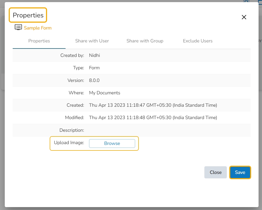
Click the Browse option to upload an image.
Click the Save option to save the update.
A message appears to assure about the update.
The image gets updated to the form.
The Form gets shared with the selected User by using the Share with User option.
Select the Share with User option using the Properties window.
Search for the specific user(s) using the Search bar.
Select a user or multiple users by using a checkbox in the given box.
Click the Save option.
A success message appears stating that the document privilege has been updated.
The Form gets shared with the selected user(s).
The Form gets shared with the selected User Group by selecting the Share with Group option.
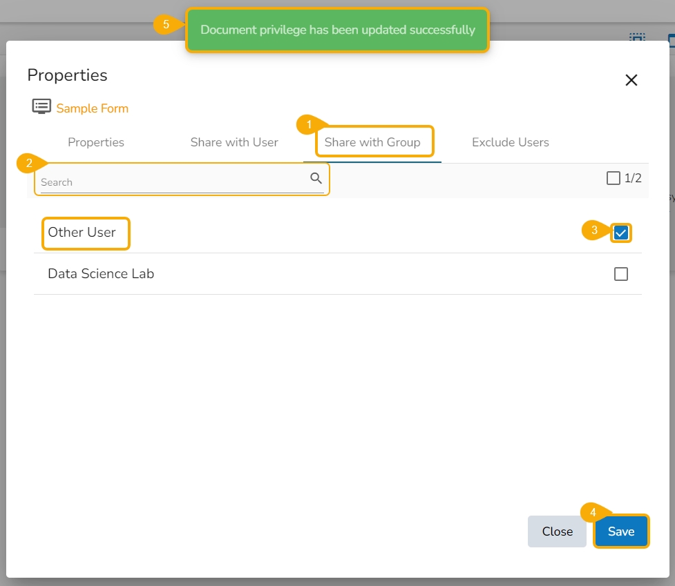
Select the Share with Group option using the Properties window.
Search for the specific user group(s) using the Search bar.
Select a user group or multiple user groups and move to the space given on the right side.
Click the Save option.
A success message appears stating that the document privilege has been updated.
The Form gets shared with the selected user group(s).
The Selected User gets excluded from the rights to access the Form
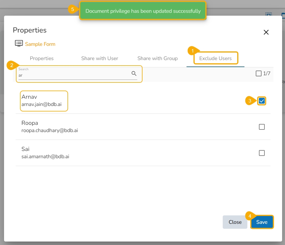
Select the Exclude User option using the Properties window.
Search for the specific user(s) using the search bar.
Select a user or multiple users and move to the space given on the right side. (Use the single arrow icon to move only one user. Use the double arrows icon to move all the users.)
Click the Save option.
A success message appears, and the document privilege gets updated to exclude the selected users.
The Form permission gets excluded for the selected user/users.
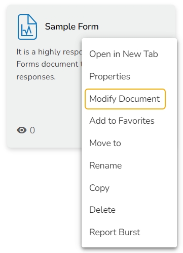
Select the Modify Document option using the context menu.
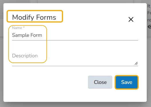
The Modify window opens for the selected form.
Modify the required information:
Name of the Form
Description of the Form
Click the Save option.
The selected information gets modified, and a message appears to assure the same.
The users can get a preview of the selected form by clicking the preview icon provided on the landing header page.
Choose an existing Form from the list/landing page.
Click the Preview icon from the header panel of the selected form.
Or
Click the Options icon for a published Form.
Select the Preview option from the context menu that appears on the Form list.
The preview screen gets displayed for the selected form (the inserted Form instruction opens by default).
Click the Go to Form option.
The Form content opens in the preview mode.
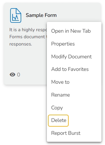
Select the Delete option from the context menu.
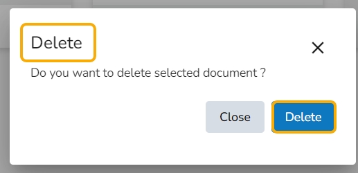
A message window opens to confirm the action.
Select the Delete option to delete the selected form.
The selected form gets deleted.
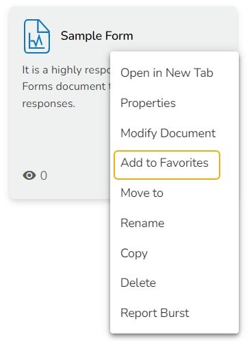
Select the Add to Favorite option from the context menu.
A message appears to assure the success of the action.
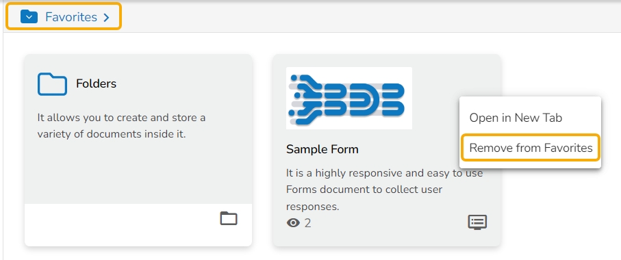
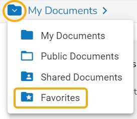
Open the Favorites section.
The selected Form gets added to the Favorites.
Open the context menu option for the same Form.
OR
Use the right-click on the Form which has been added to the Favorites.
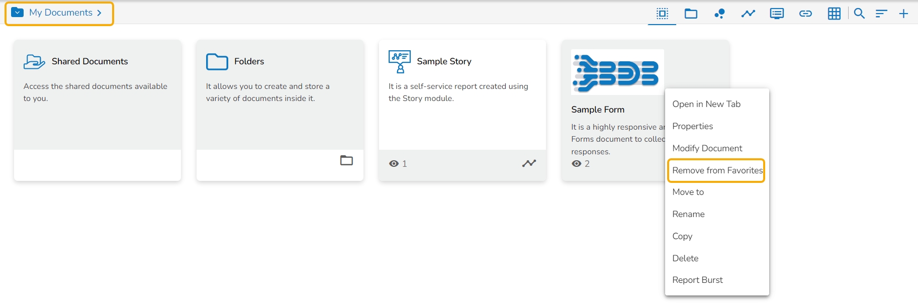
The Remove from Favorite option appears.
The Form gets removed from the Favorites, and a notification message appears stating the same.
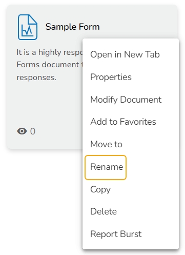
Select the Rename option from the context menu.
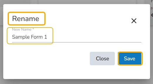
A new window opens prompting to rename the Form.
Provide a New Name for the selected form.
Click the Save option.
The selected form gets renamed.
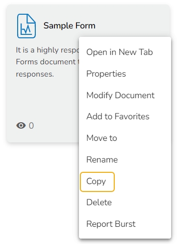
Select the Copy option from the context menu.
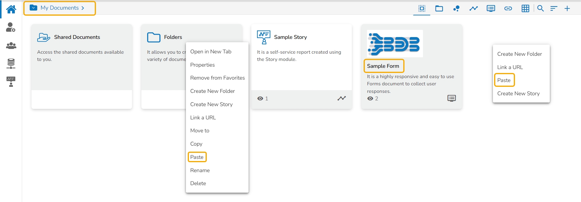
Use the right click on another folder or on the blank space to get the Paste option.
Click the Paste option.
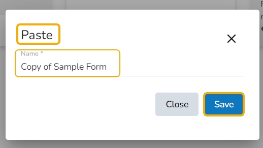
The Paste window opens displaying the selected form name with the 'Copy of-' prefix.
E.g., A form named Sample Form 1 gets a new name, Copy of Sample Form as shown in the following image:
Click the Save option.
The form gets copied to the selected space with the new name.
Click the Publish option using the menu.
Mobile View
Opens the form in the Mobile view
Tablet View
Opens the form in the Tablet view
Large Screen
Opens the form in the Large Screen View
Publish
Redirects to publish the form
Settings
Redirects to the Form Settings page
Form Edit
redirects to edit the questions and Pages
Form Instruction
Displays the inserted Instruction message on the screen
The Form Response module contains all the responses given by the users in a tabular format. The collected responses can be further filtered by Page, Date, or Users. The users can edit the collected responses as well. The list of responses may change according to the user. The ordinary users get to see the responses given by them while the admin/ owner of the form gets to see all the responses given by all the users. The Form Response page can be used to verify the data.
The Preview page of the Form opens with an option to respond to the question once the Form is published.
Respond to the question.
Click the Submit option.
An acknowledge message appears to inform that the shared response has been saved. (The user can also use the Save icon to save a response.)
Click on the link Click here to view the response or View Response icon.
All the collected responses appear in the tabular format.
The admin can further Edit or Delete the collected responses by using the icons given under the Actions column.
Click the Export in Excel icon to download the responses in an excel file.
Click the Filter Response option to filter the responses. The user gets the following options to filter the responses:
Page
Date
Users
This page provides information on how to set properties, theme, and instruction for a Form.
The users can set required settings or change them using this Form option.
Select the Settingsicon from the Options Context menu.
The Form Settings window opens with the following tabs:
Properties
Theme
Form Instruction per user
Click the Save icon to reflect the altered settings in the selected Form.
The users can configure the various Form properties using the Configuration field.
Navigate to the Form Settings window.
Open the Properties tab (It opens by default).
Access the Configurations fields mentioned under the Properties tab and configure the following information:
Expiry Date: Set form expiry date using the drop-down icons. Insert expiry time for the Form manually.
Total number of response: Set a limit to collect responses
Per-user response: Set a limit for a user to give maximum responses
Do you want to show the page list to all users?: Select an option using the drop-down menu (Don’t Show/ Show Dropdown on right Side/ Show List on Left Side)
Do you want to show the question group in the collapse-expand panel?: Choose an option out of the Yes or No options.
Default View Mode: Set a default view for the Form plugin out of the Form Entry or Response options.
Click the Save option to save the configurations.
Please Note: The users get the following messages to notify various Form settings when the condition is fulfilled.
When the Total Set Number of Response(s) is entered.
The user can view the entered responses using the View Response icon.
The user can edit the response by clicking the Click here to edit the response option.
The user needs to contact the support team/ admin to get further details on the same.
When Per user-set limit of the responses is reached.
The user can view the entered responses using the View Response icon.
The user can edit the response by clicking the Click here to edit the response option.
The user needs to contact the support team/ admin to get further details on the same.
The place where a newly created Form gets listed is termed the ‘List Form’ page as it lists all the created/saved/copied Forms by the user.
Navigate to the Form Landing page.
All the created form tiles get listed over here.
The user can search for a specific form by using the Search option.
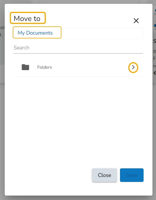
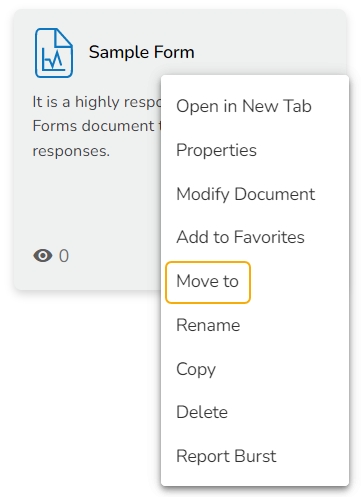
This option allows the user to move the Form from one folder or space to another folder.
Select a Form.
Select the Move To option from the context menu.
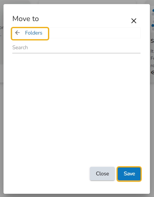
The Move To window appears displaying the available folders.
Select a folder.
Click the Move icon.
The users get redirected to the next screen displaying the selected folder name at the top.
Click the Save option.
A success message appears.
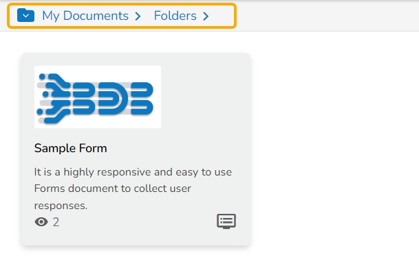
The Form gets moved to the selected space.
Please Note: To view a Form, use a click on the selected Form.
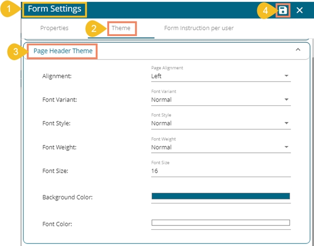
The users can access various themes for the Form Header, Page Header, and Form Body under the Theme tab provided inside the Form Settings window.
The following points attempt to explain the details about each section provided under the Theme tab:
Form Header Theme
Page Header Theme
Form Body Theme
This section helps to set theme properties for questions and answers for a Form.
Font Variant: Choose a variant type out of the options provided in the drop-down menu (Normal/Small Caps)
Font Style: Set Font style out of the options provided in the drop-down menu (Normal/Italic)
Font Weight: Select a Font weight option out of the given choices in the drop-down menu (Normal/Bold)
Font Size: Set the font size by entering a number
Question Left Border: Select and apply color for the left side border of the question.
Font Variant: Choose a variant type out of the options provided in the drop-down menu (Normal/Small Caps)
Font Style: Set Font style out of the options provided in the drop-down menu (Normal/Italic)
Font Weight: Select a Font weight option out of the given choices in the drop-down menu (Normal/Bold)
Font Size: Set the font size by entering a number
Please Note: There is a single Save option provided for all the 3 Form Settings tab. The user needs to click the Save option to save the changes, even though they are related to a single settings tab.
Navigate to the Form Settings window.
Open the Theme tab.
Configure the following options for the Form Header Theme:
Alignment: Set the page header alignment out of the options provided in the drop-down menu (Left/Center/Right)
Font Variant: Choose a variant type out of the options provided in the drop-down menu (Normal/Small Caps)
Font Style: Set Font style out of the options provided in the drop-down menu (Normal/Italic)
Font Weight: Select a Font weight option out of the given choices in the drop-down menu (Normal/Bold)
Font Size: Set the font size by entering a number
Background Color: Choose a color to be applied for the Page Header background using the color menu
Font Color: Choose a font color using the color menu
Click the Save option to save settings for the Form Header


Navigate to the Form Settings window.
Open the Theme tab.
Configure the following options for the Form Header Theme:
Alignment: Set header alignment out of the options provided in the drop-down menu (Left/Center)
Font Variant: Choose a variant type out of the options provided in the drop-down menu (Normal/Small Caps)
Font Style: Set Font style out of the options provided in the drop-down menu (Normal/Italic)
Font Weight: Select a Font weight option out of the given choices in the drop-down menu (Normal/Bold)
Font Size: Set the font size by entering a number
Background Color: Choose a color to be applied for the Form Header background using the color menu
Font Color: Choose a font color using the color menu
Click the Save option to save settings for the Form Header.


Select the Users tab.
Select a user using the drop-down menu.
Click the Apply option.
The responses get filtered by the selected user.
Please Note:
It is mandatory to publish a Form to get responses.
The user can use the Save icon to save the response.
Select the Page tab.
Select a page using the drop-down menu.
Click the Apply option.
The responses get filtered by the selected page.
Select the Date tab.
Provide a Start Date.
Provide an End Date.
Click the Apply option.
The responses get filtered by the selected page.
The display of the Properties field is determined by the Status option.The Properties tab provided under the Form Settings displays a radio button to enable or disable the status of the Form content.
Open the Properties Tab using the Form Settings option. (It opens by default while selecting the Form Settings option.)
The Enable/Disable radio button appears.
By disabling this option, all the properties fields disappear.
The Form content gets disabled, so the user can’t give a response to any of the questions.
The user can insert Form Instruction for a specified user. The instruction gets displayed only for the selected user while opening the preview screen.
Navigate to the Form Settings page.
Click the Form Instruction per user option.
Select a user using the drop-down menu.
Insert a specific instruction in the given space.
Click the Save option.
A notification message appears.
Access the Form preview page from the User account for which the instruction is inserted. The specified instruction appears (as shown in the following image).


